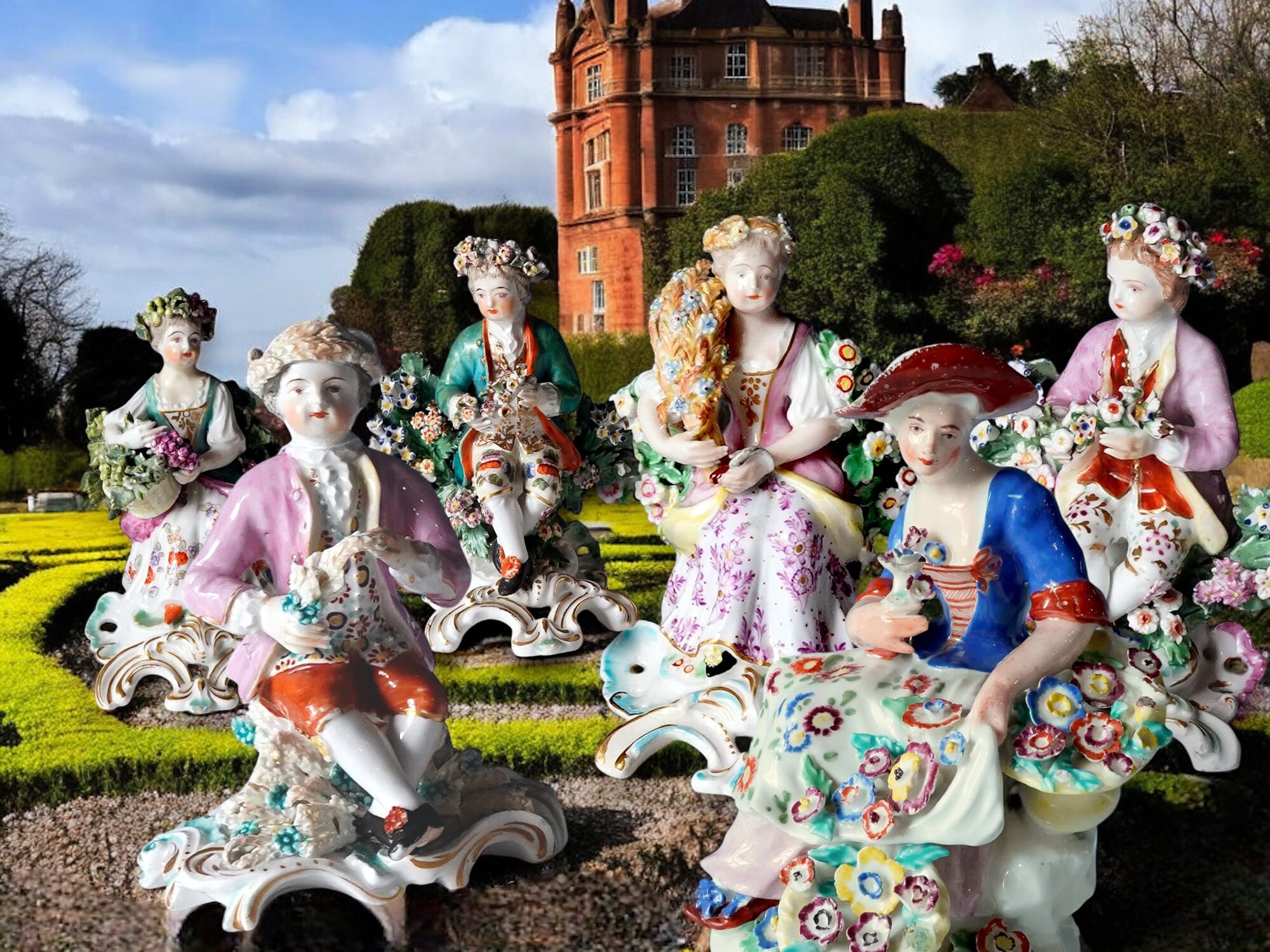
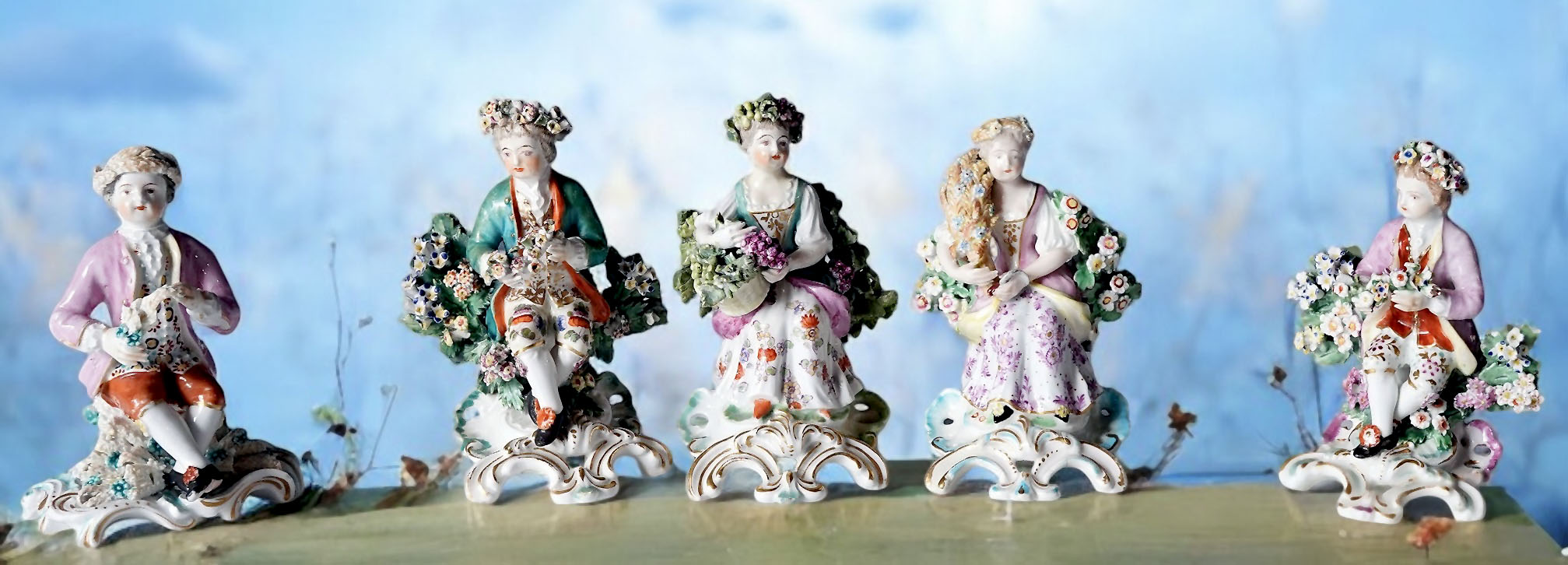
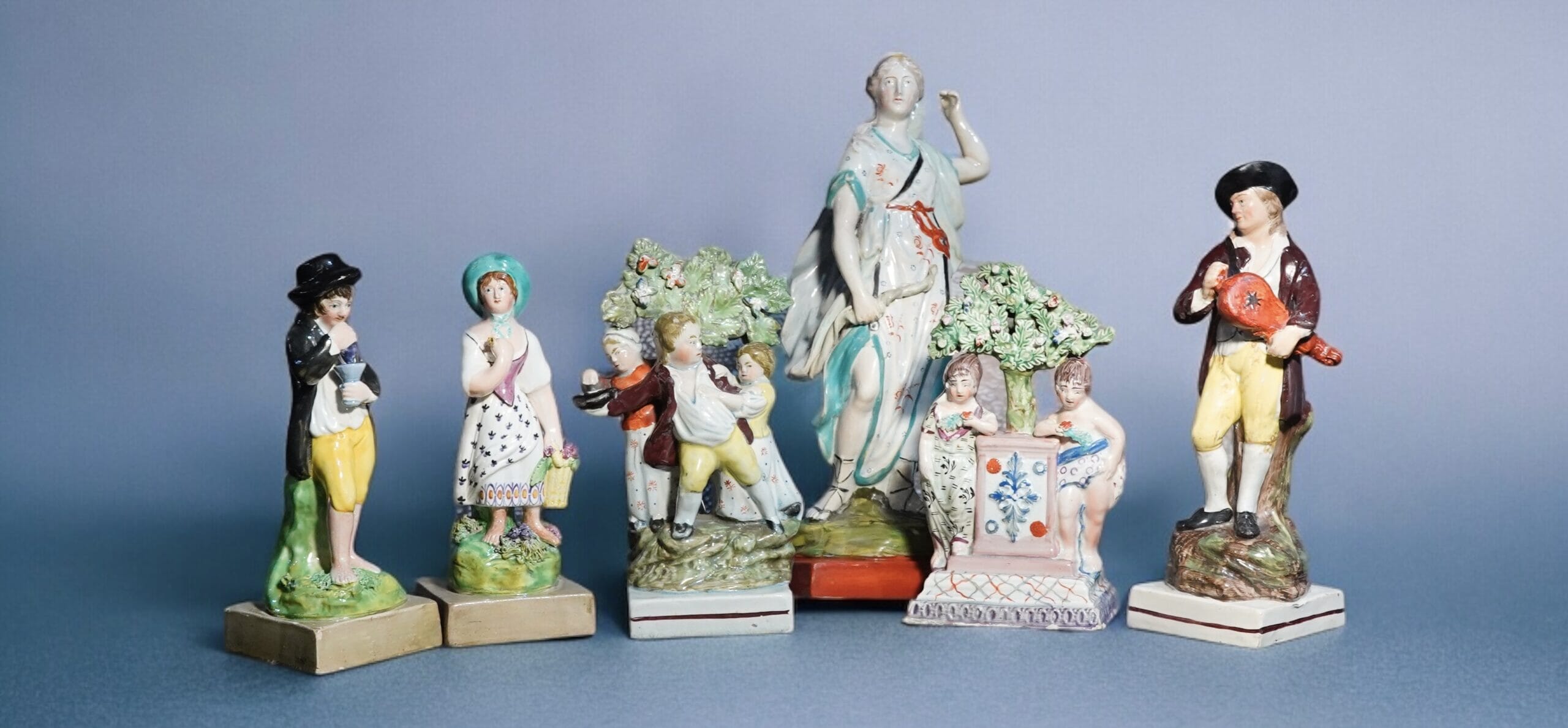
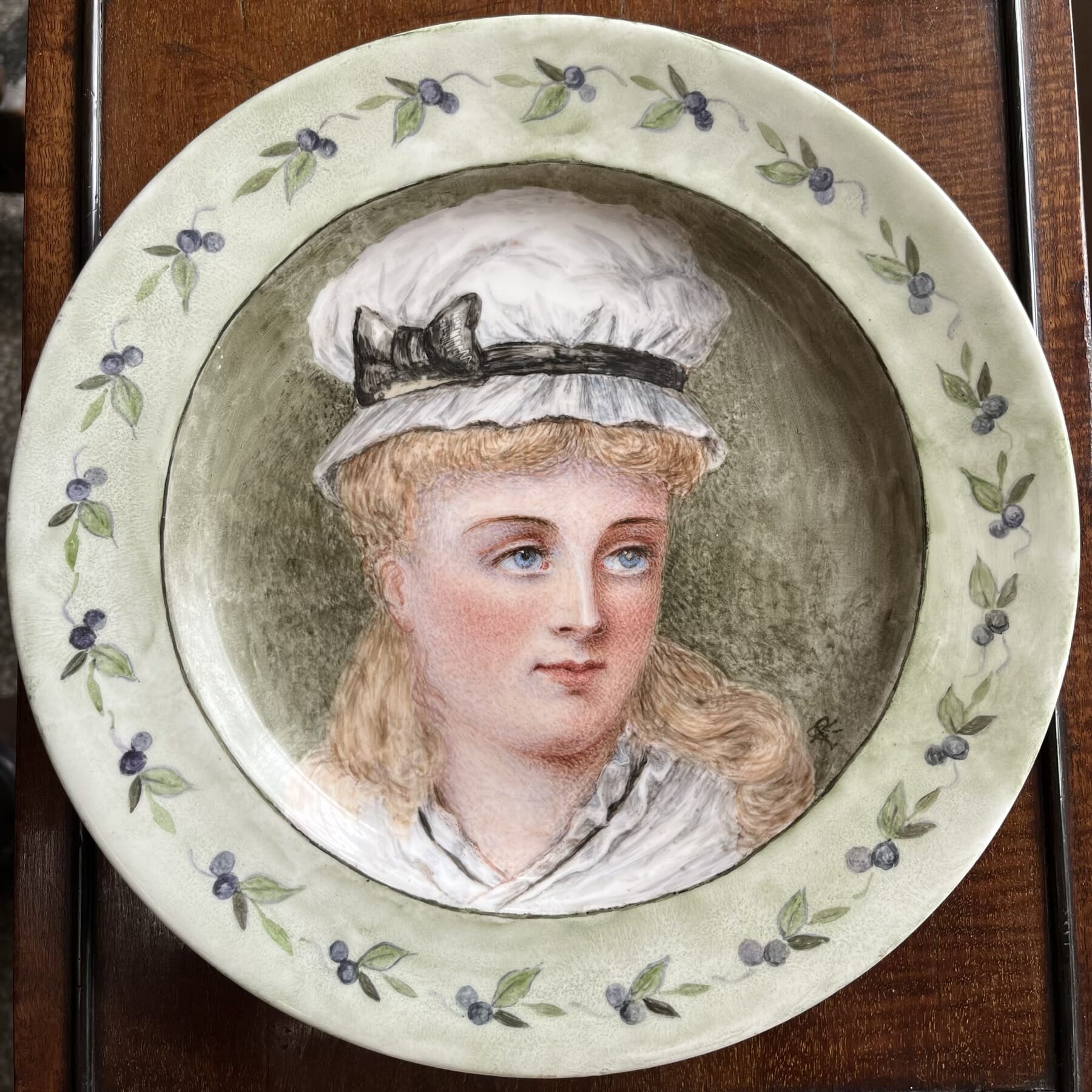
Moorabool has a fascinating group of Derby ‘Seasons’, modelled as children with their respective attributes.
left to right: Spring, Summer, Autumn, Summer, Spring. We have no Winter….
They make for an interesting study, and show the development of the classic rococo-based Derby figures of the latter 18th century.
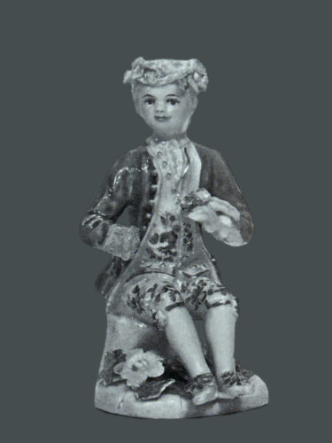
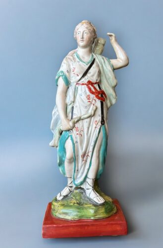
The earliest version appears during the mid-1750’s, belonging to a group of distinctly modelled figures that are often decorated in a muted pallet of colours, known as the ‘pale-family’. These appear with a flat slab base, and the modelling is a little stiff. Note this example has lost his hand & the wheat he holds in it.
Circa 1756
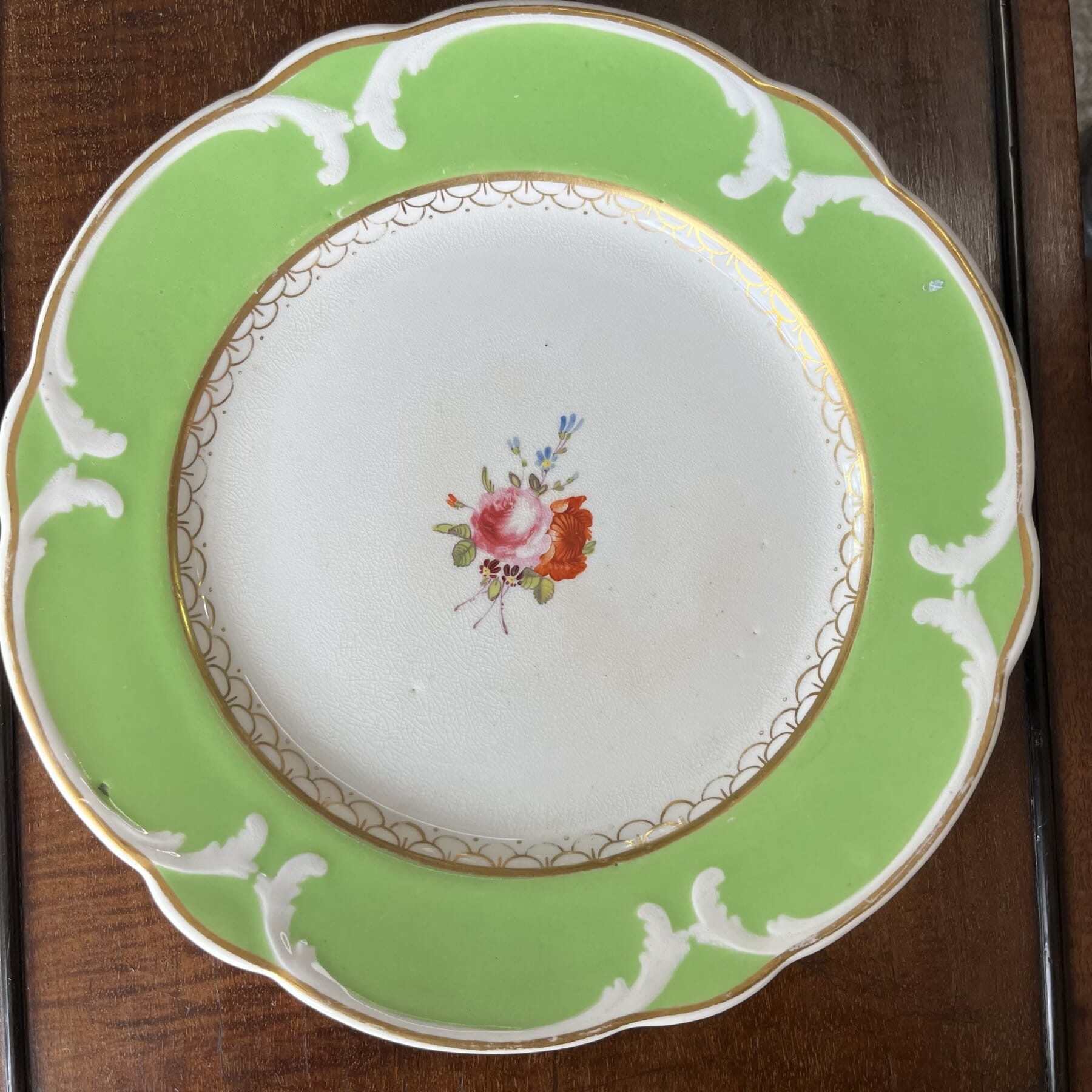
‘Summer’, Pale Family type, 1756-59. ref. Bradshaw ‘Derby Figures’ p72.
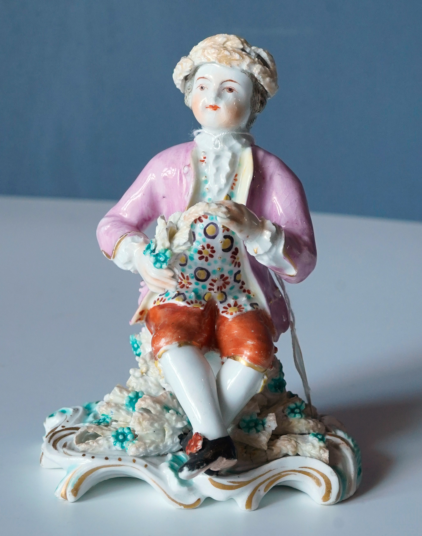
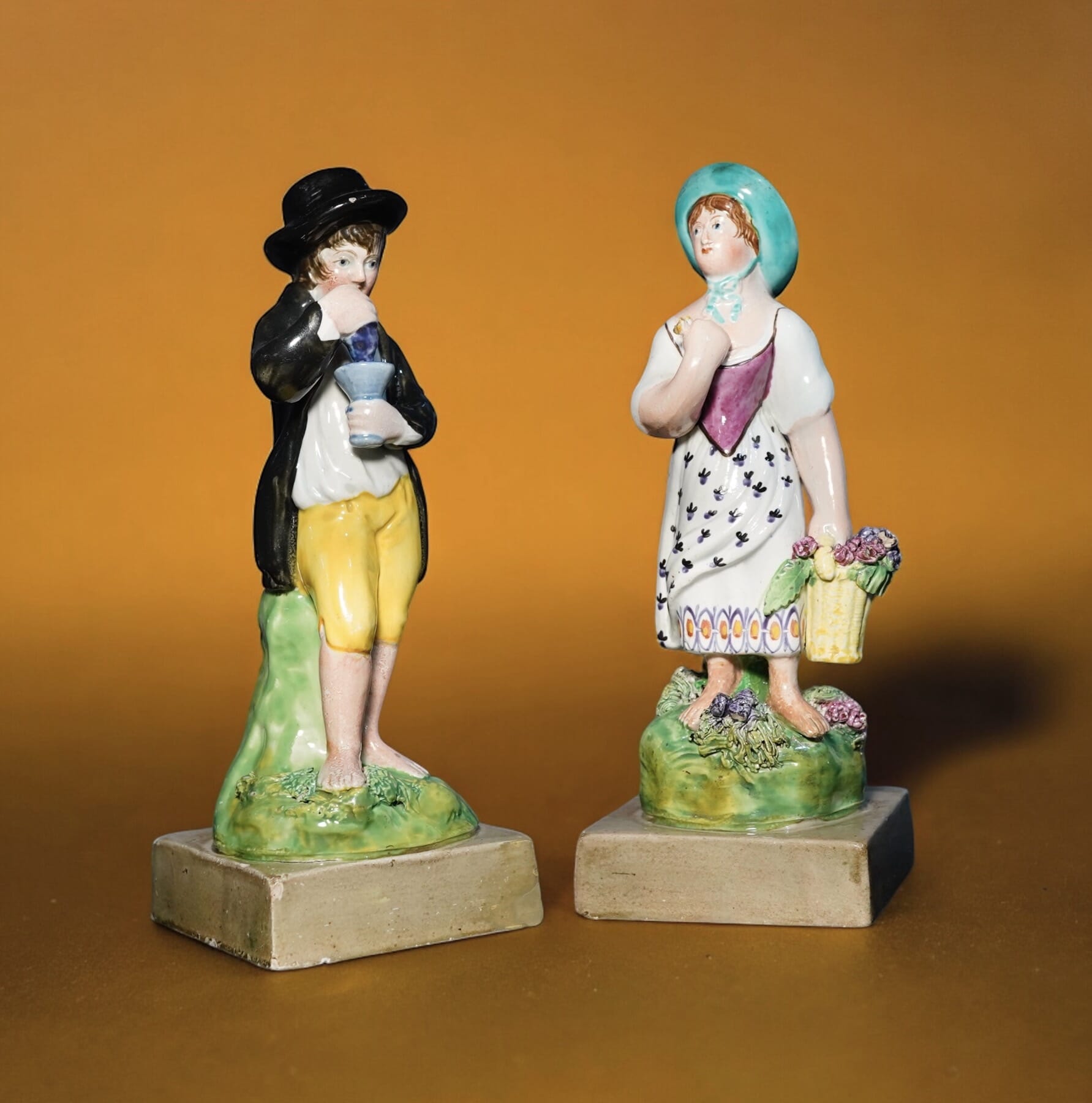
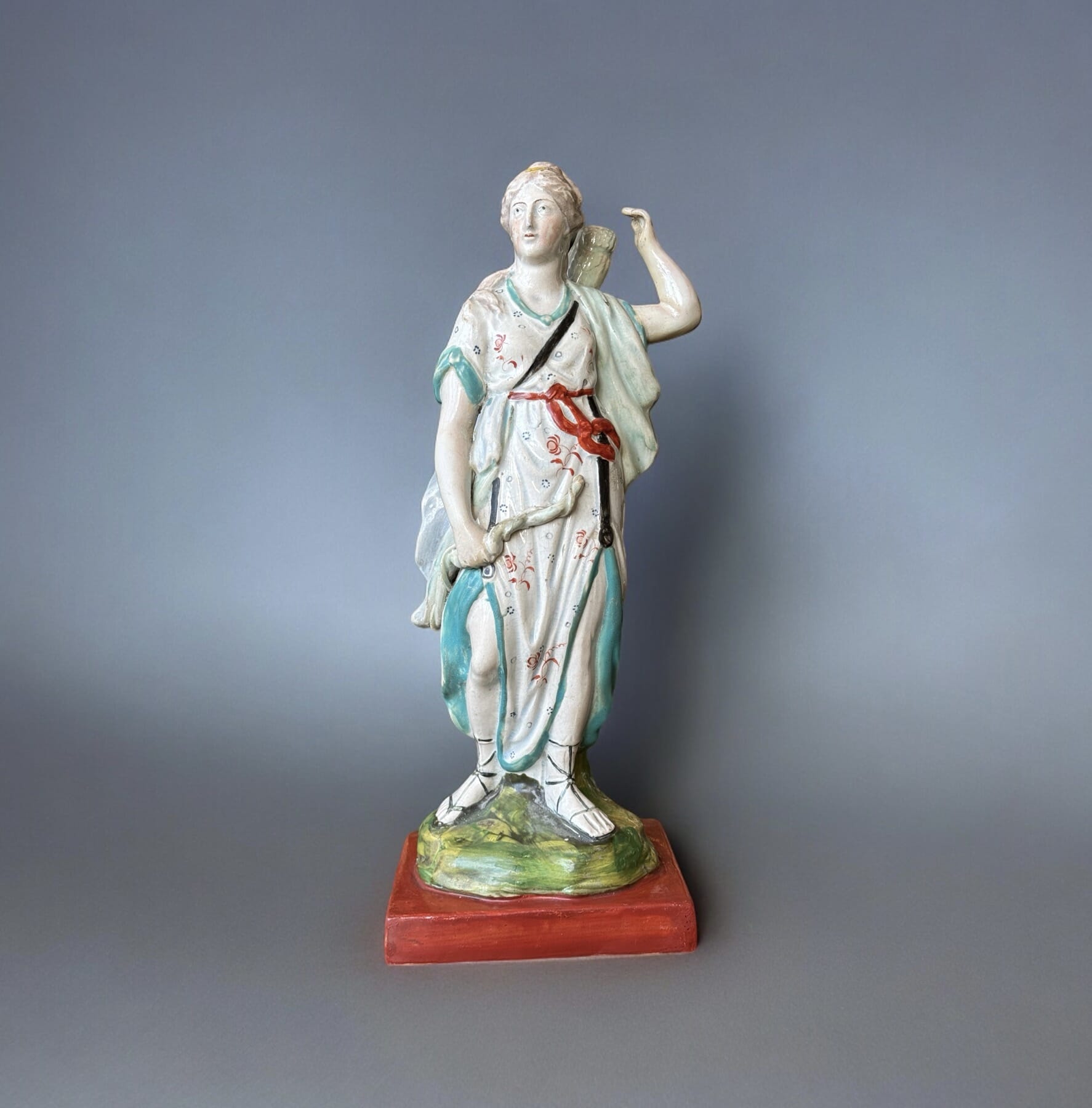
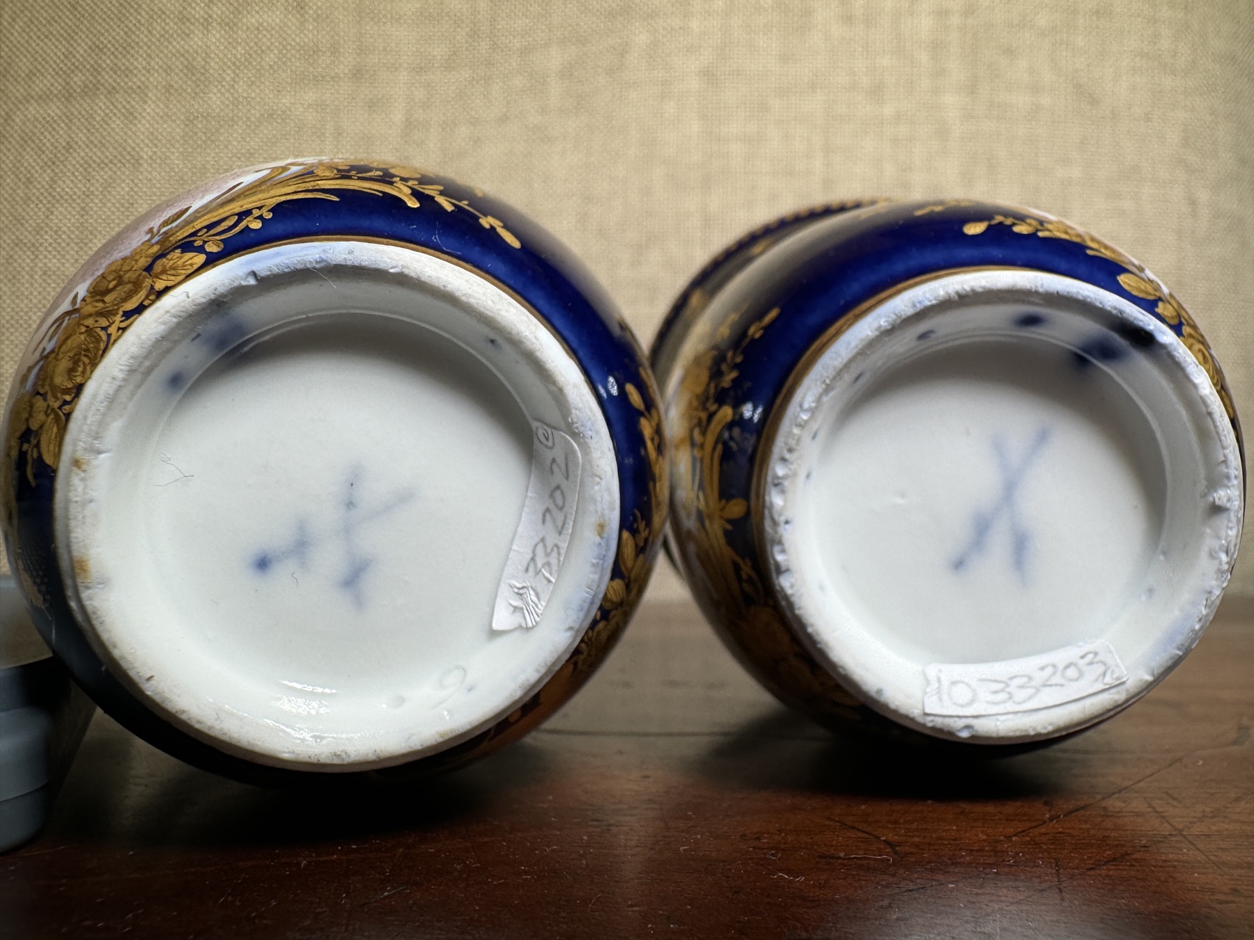
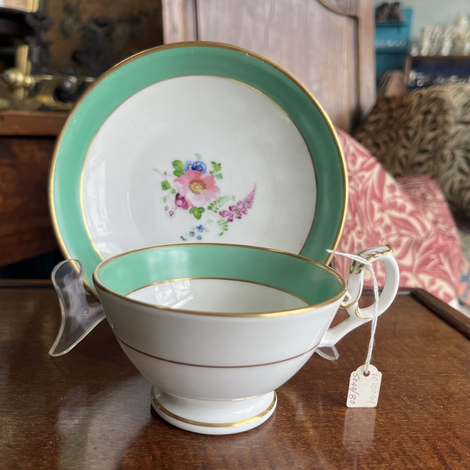
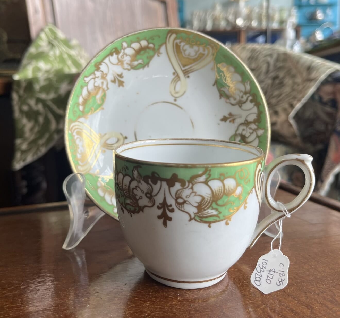
This example, in stock at Moorabool, is late in the ‘Pale Family’ period, or the very beginning of the next period, the ‘Patch Mark’ period, c. 1759-69. The base has an early, rarely-seen rococo scroll moulding, of quite flat form without piercing. The colours are the type used in the 1760’s.
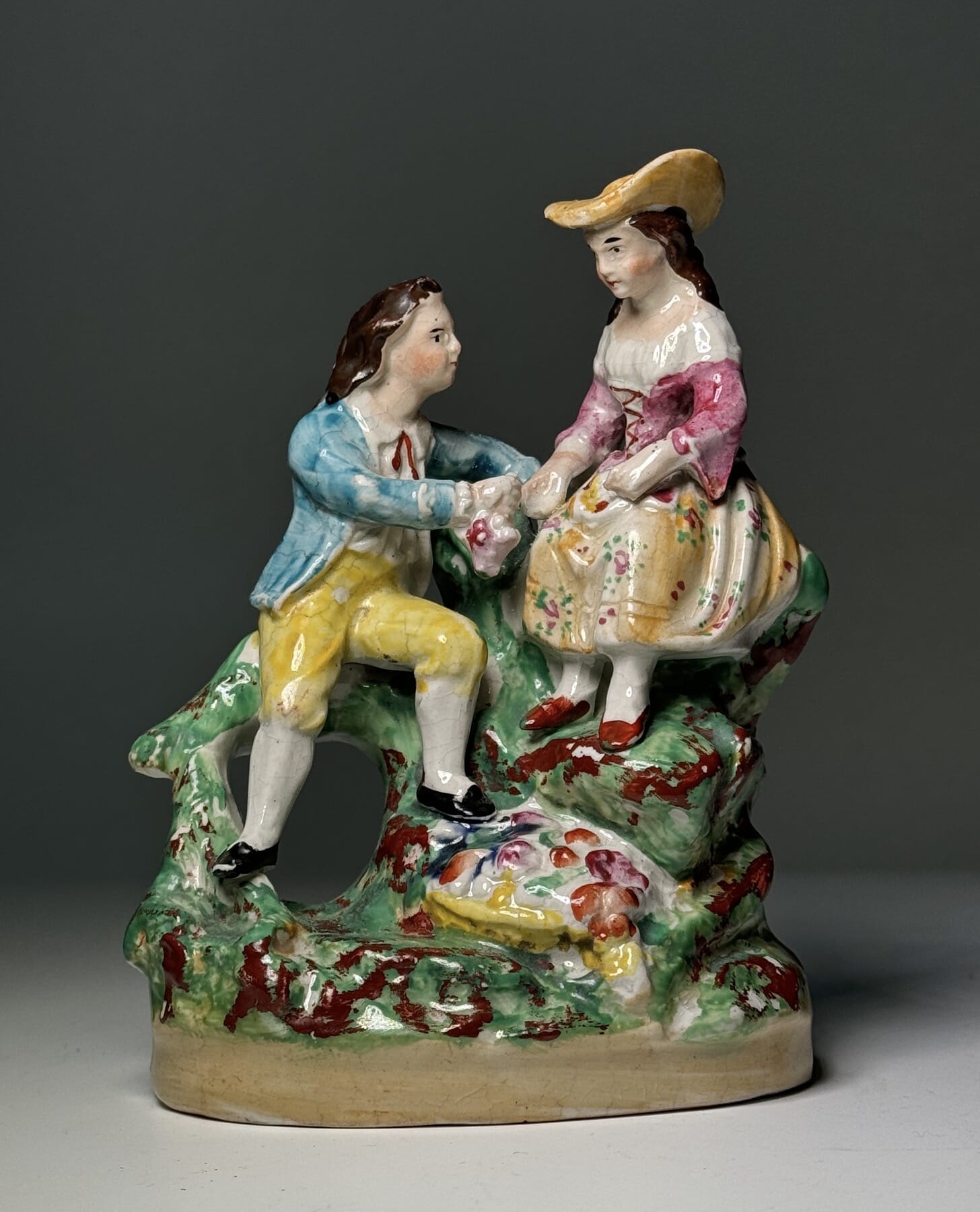
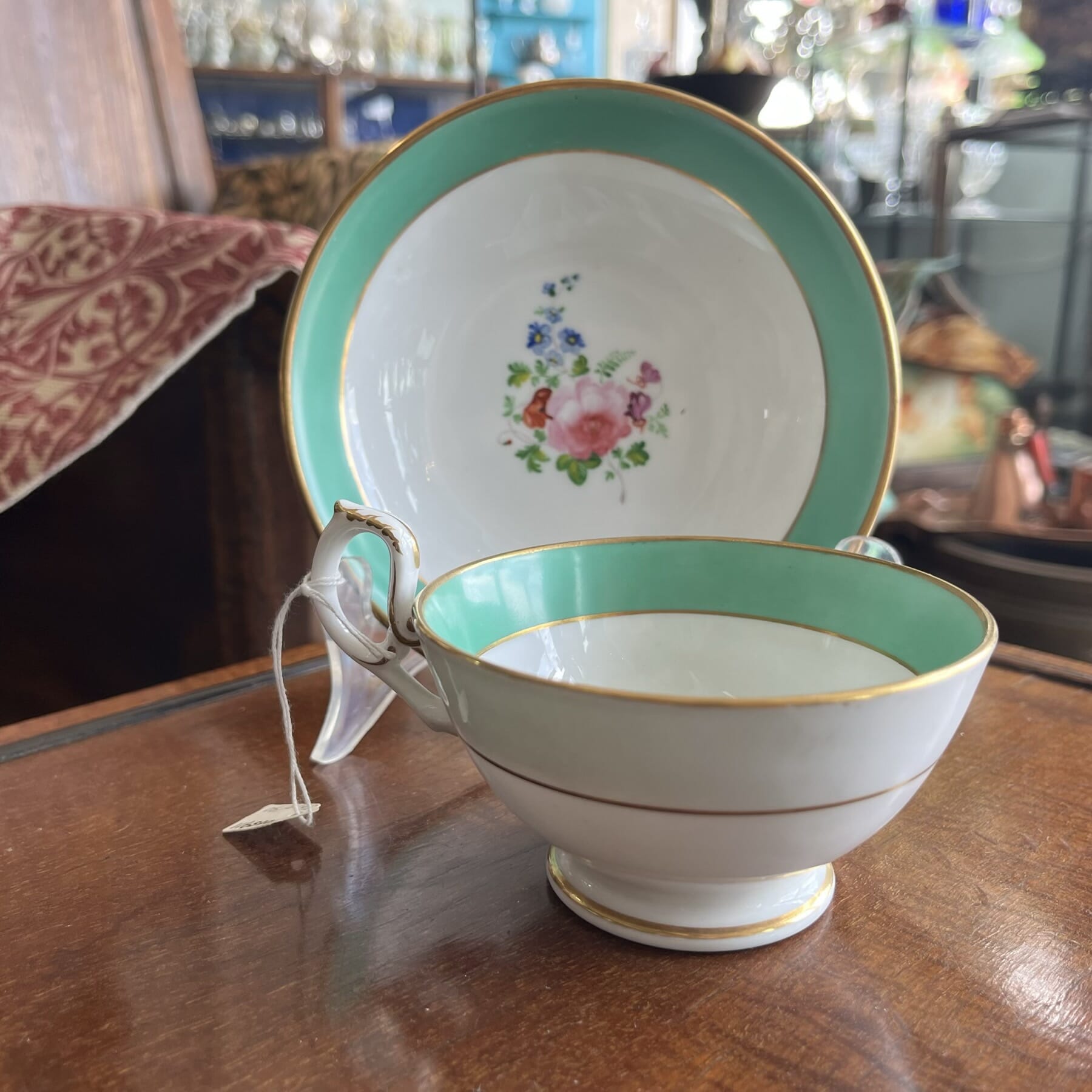
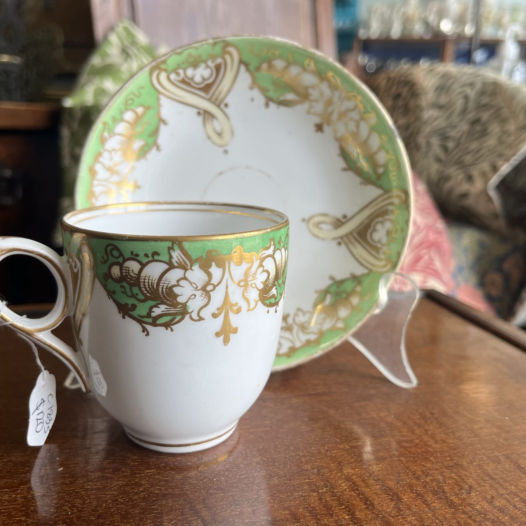
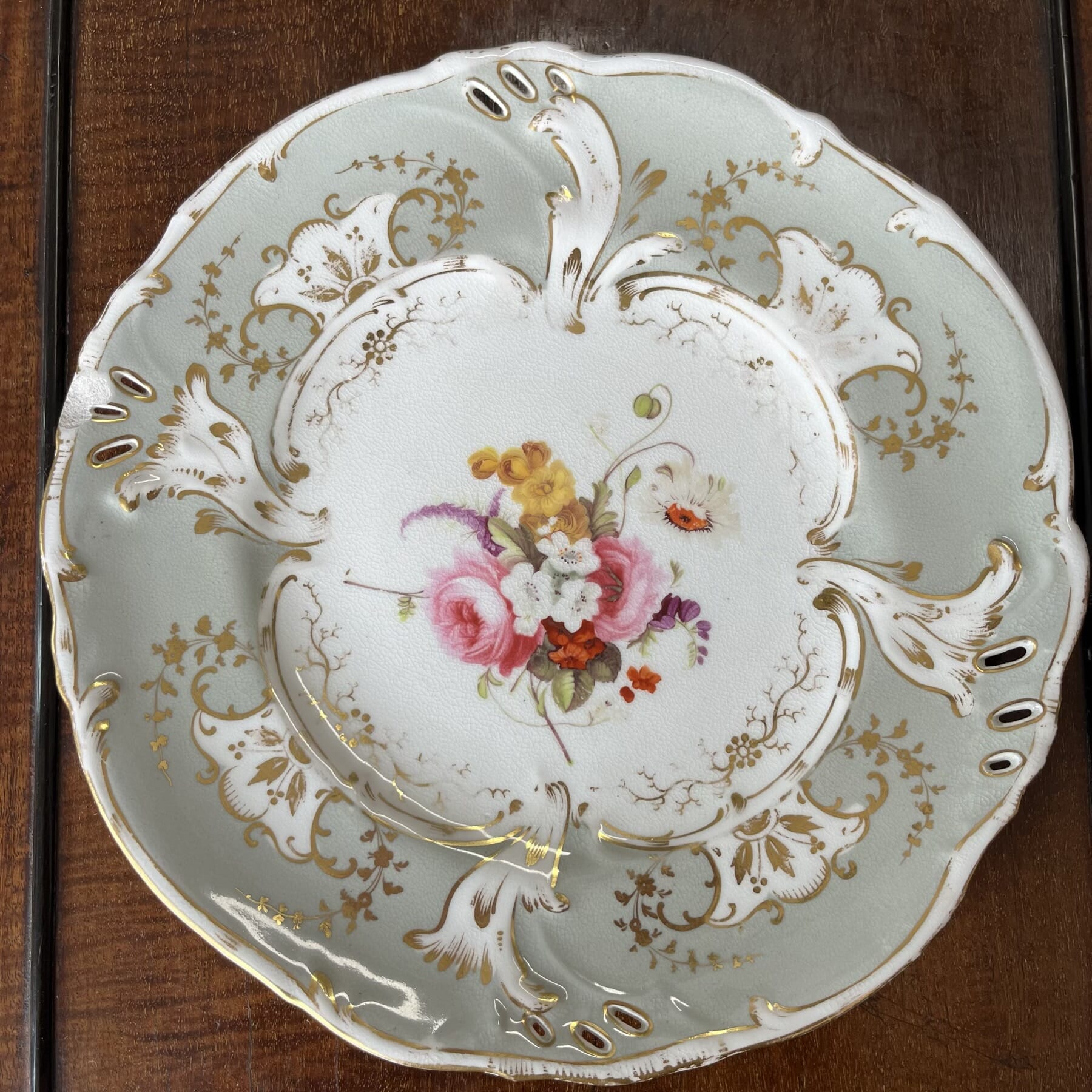
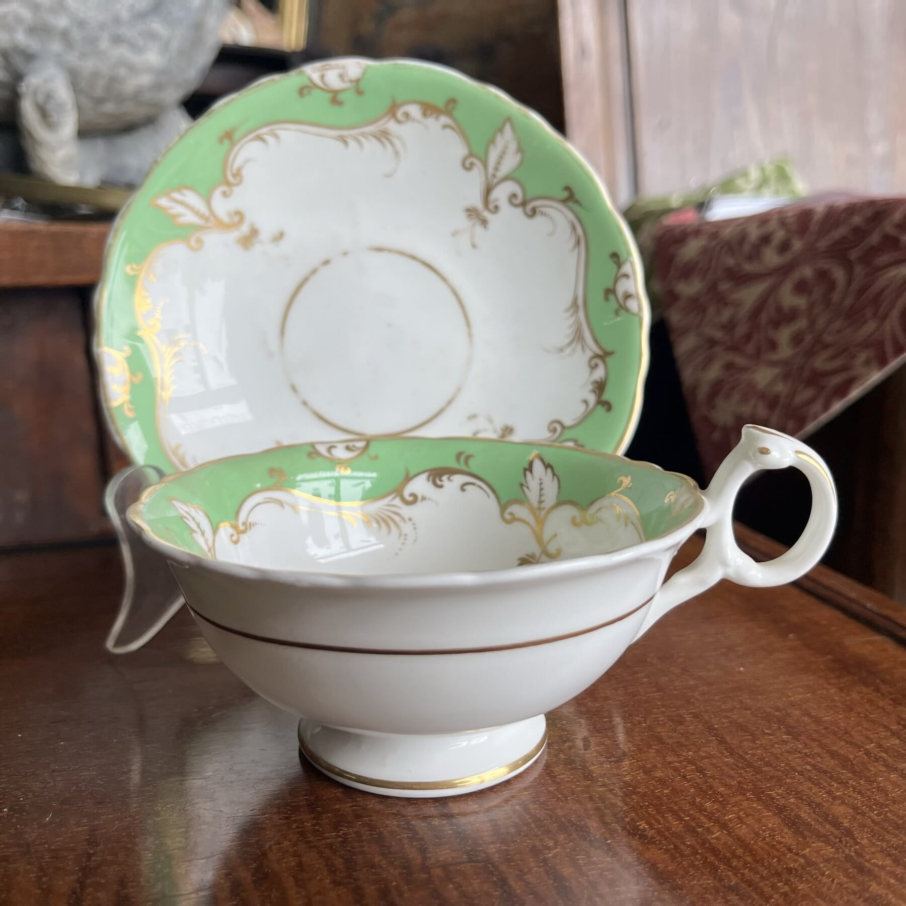
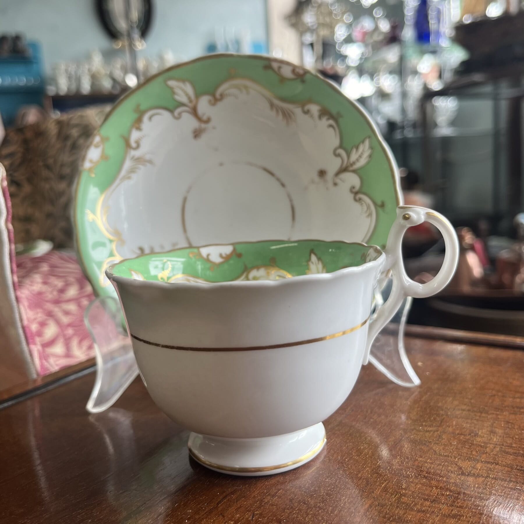
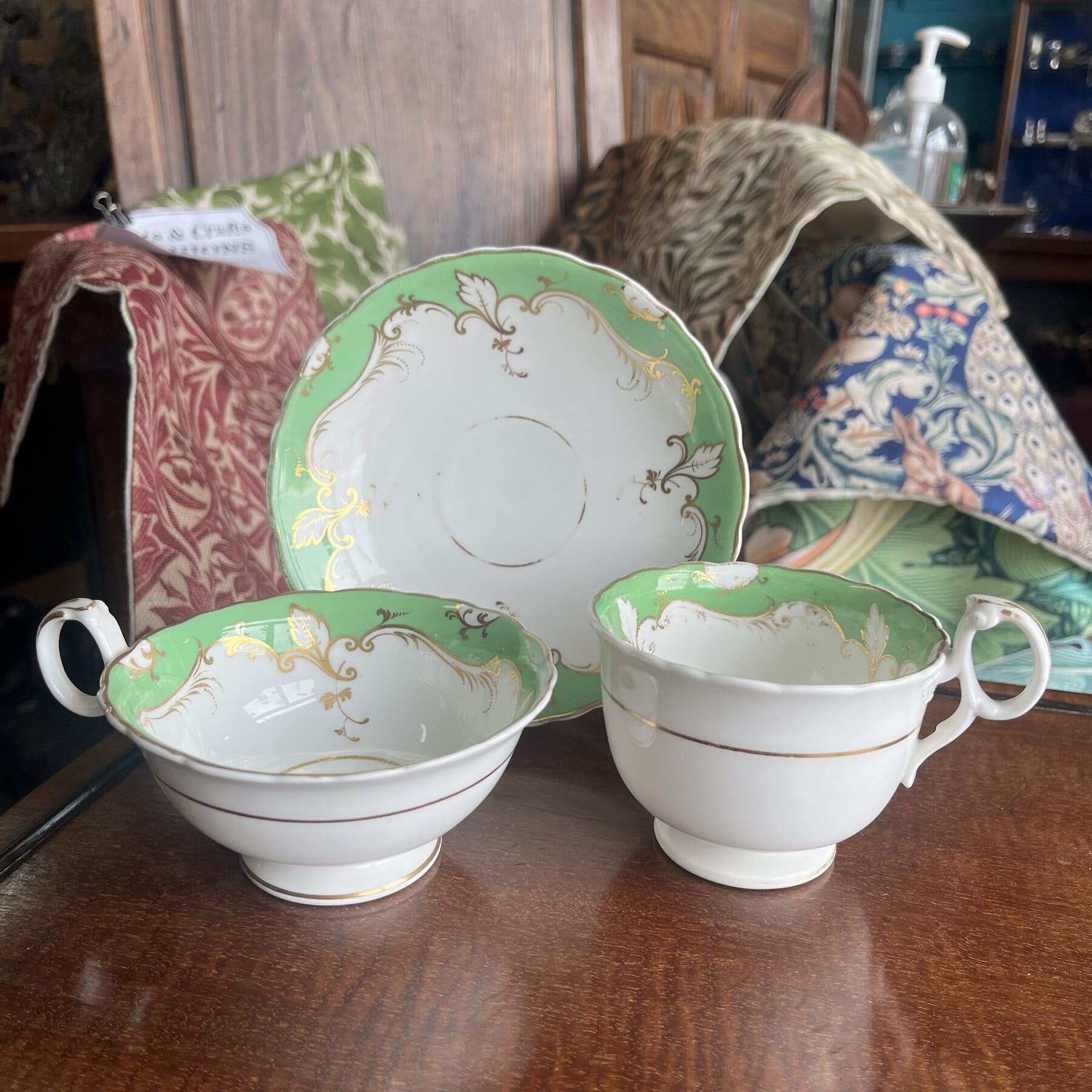
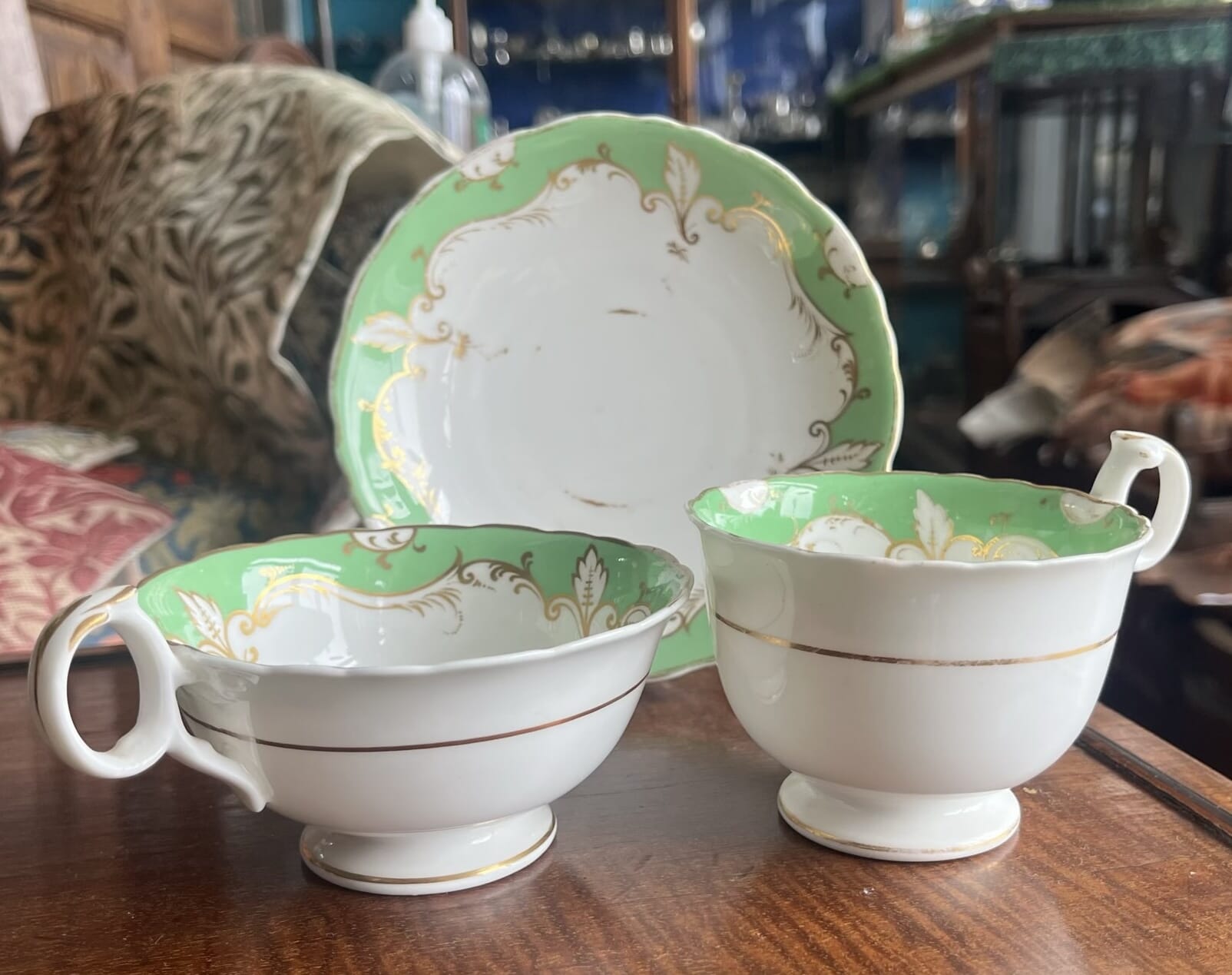
This example, also in stock at Moorabool, shows the latter 18th century style of Rococo scroll base, with scrolls forming feet on which it rests, and a pierced panel to the center.
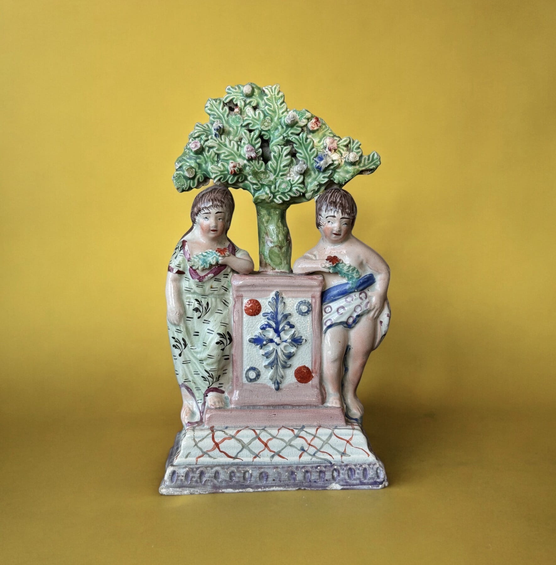
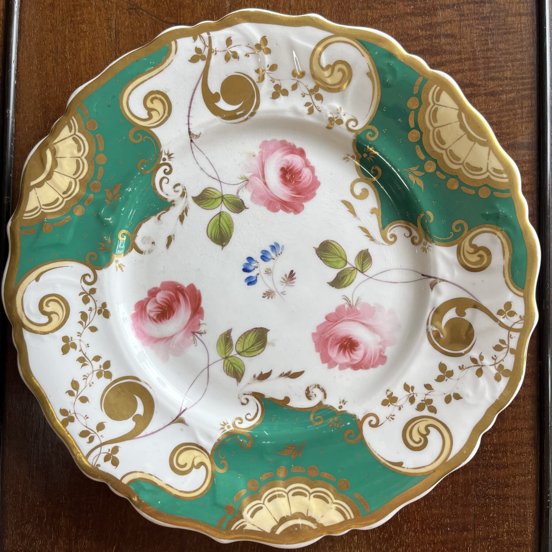
This boy is representing ‘Spring’, with a garland of flowers.
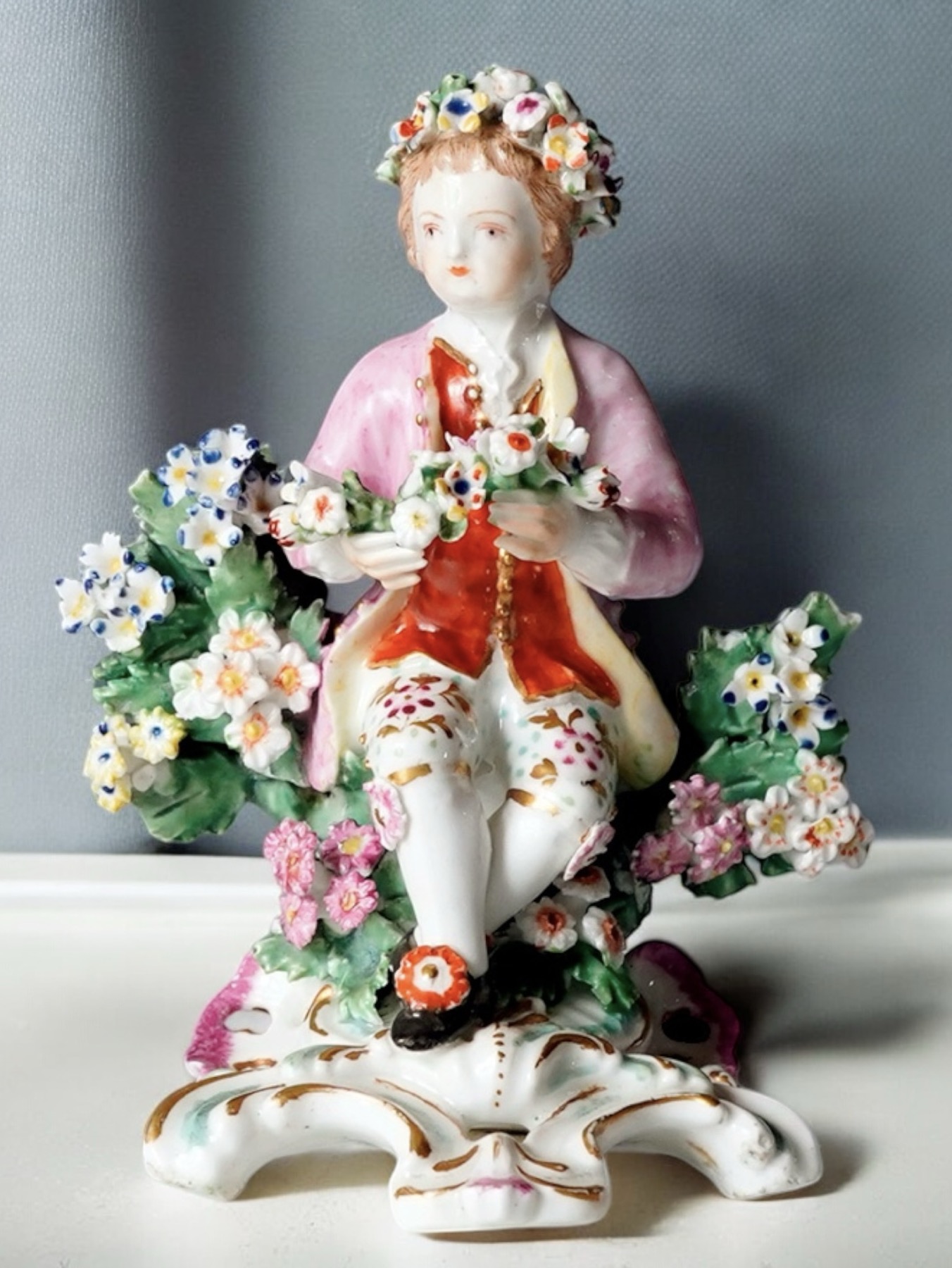
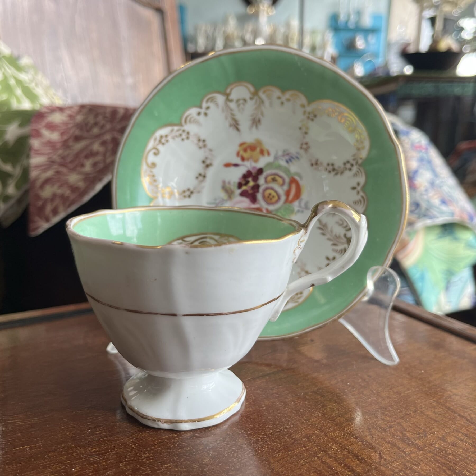
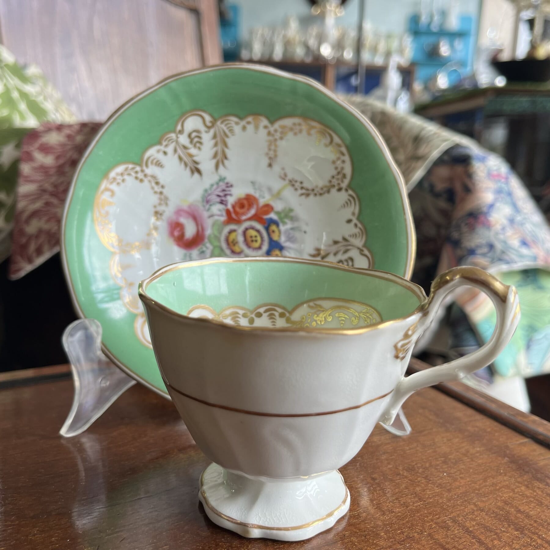
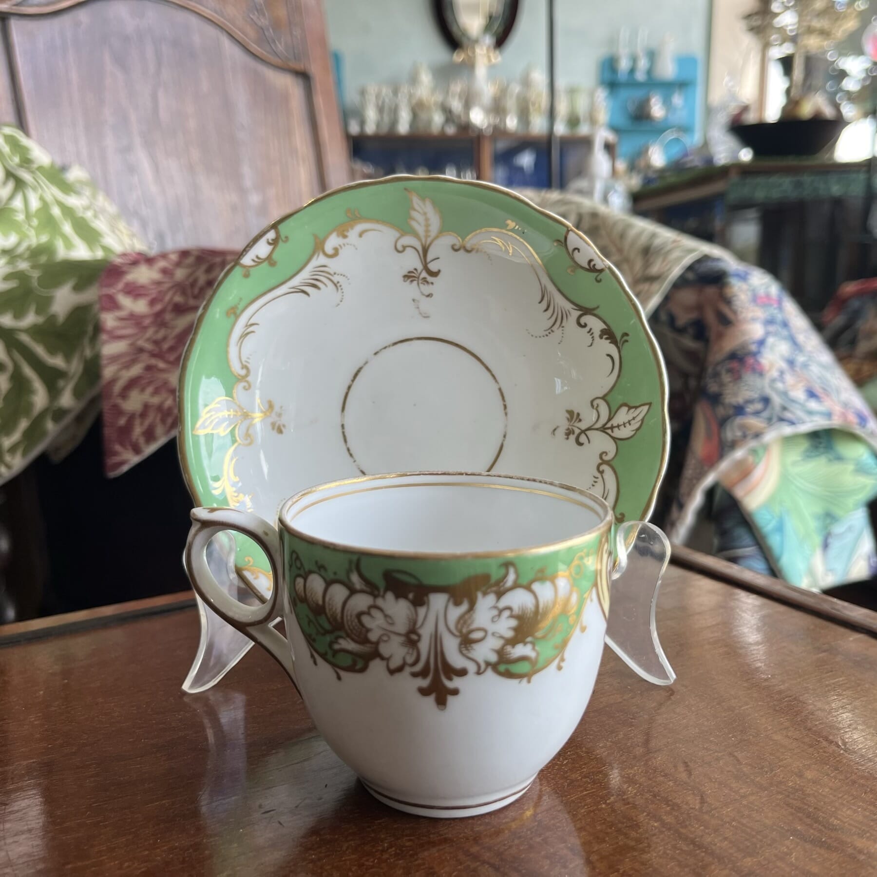
This example, also in stock at Moorabool, shows the latter Rococo scroll base, with scrolls forming feet on which it rests, and a pierced panel to the center.
Once again ‘Spring’, with a garland of flowers. Interestingly, he is not recorded in Bradshaw (Derby Figures), who has only a set of 4 ‘Adolescent Seasons’ listed that are all girls; these boys appear in the earlier sets and were obviously continued into the latter 18th century – it’s a puzzle why he has failed to record them.
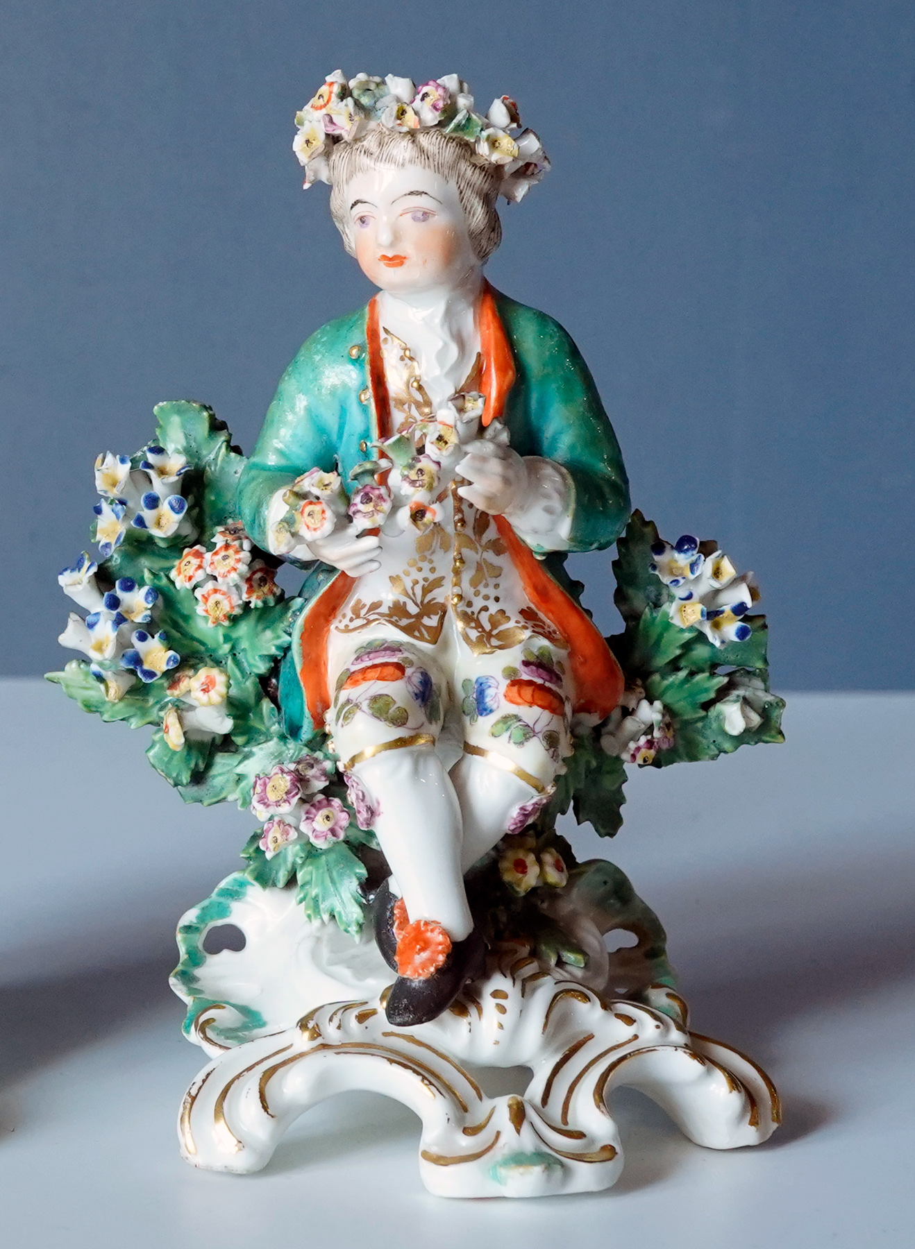
Of course, other factories were actively making ‘Seasons’, with a particularly lovely ‘Spring’ by Bow being a recent addition to Moorabool.com’s stock:
Bow figure of ‘Spring’, with distinct blue enamels, c. 1765. See her here>
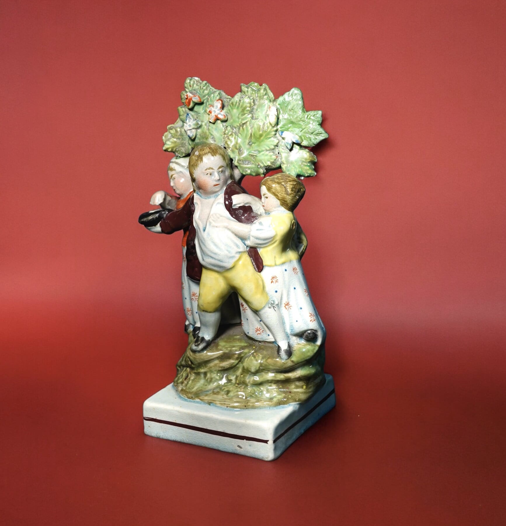
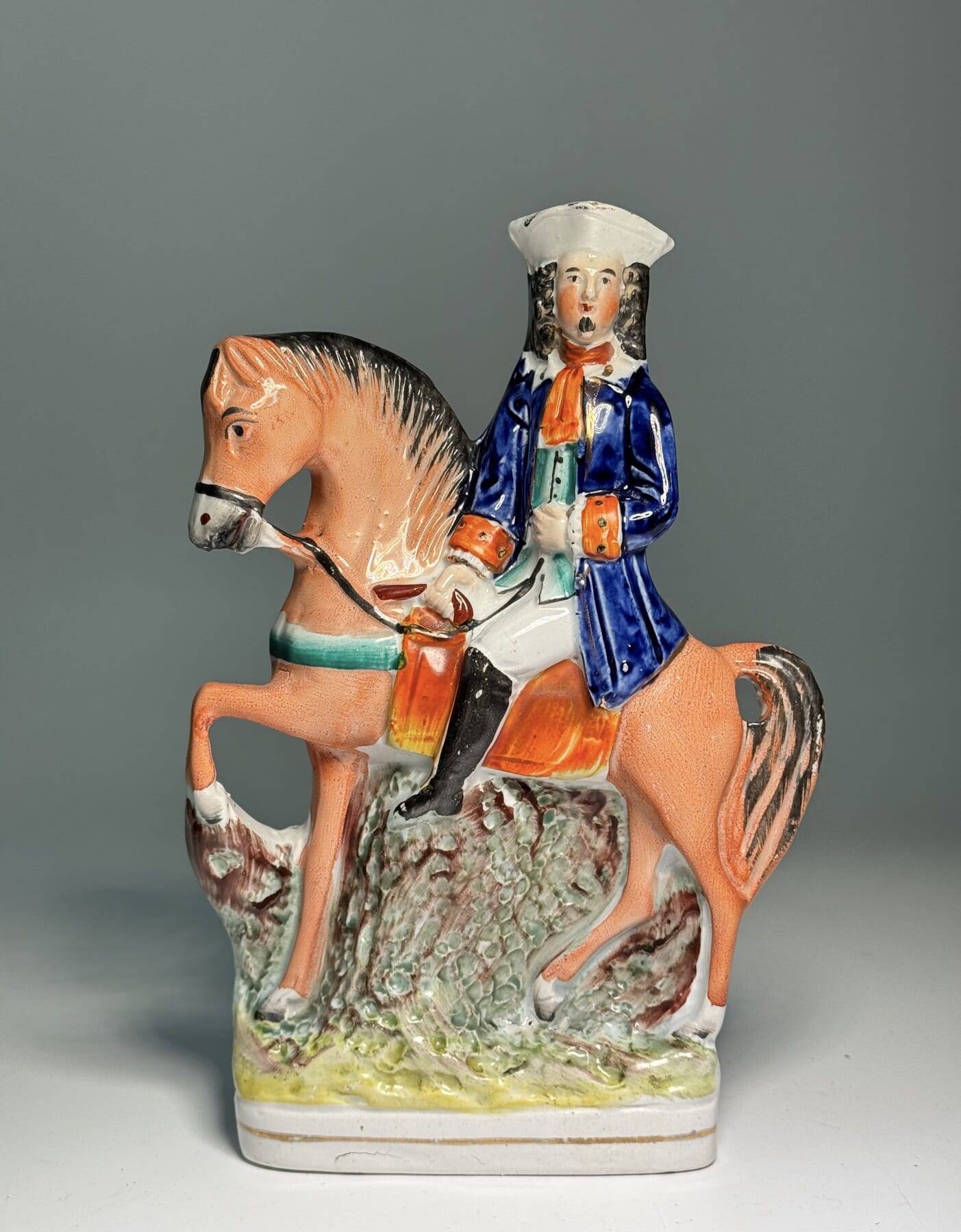
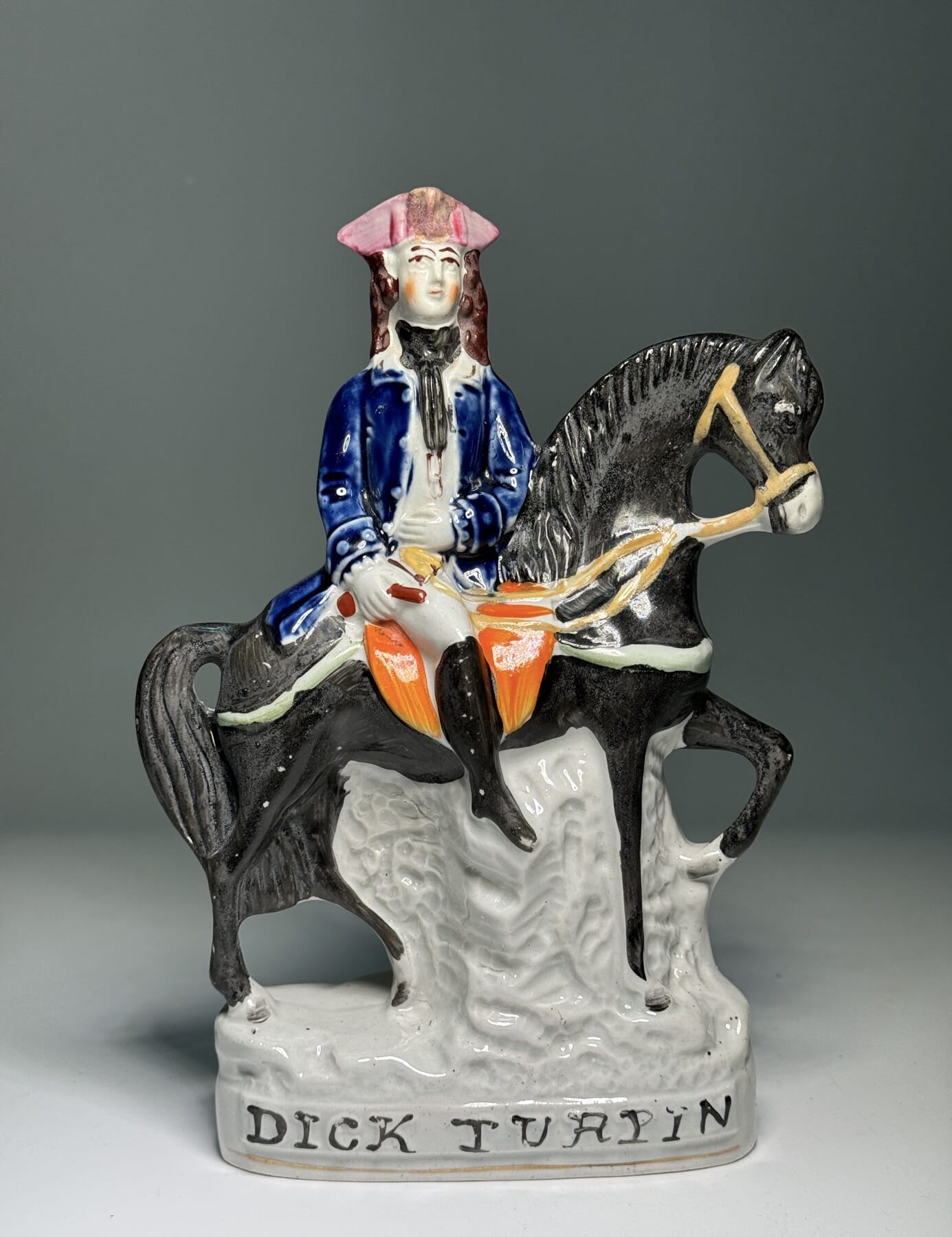
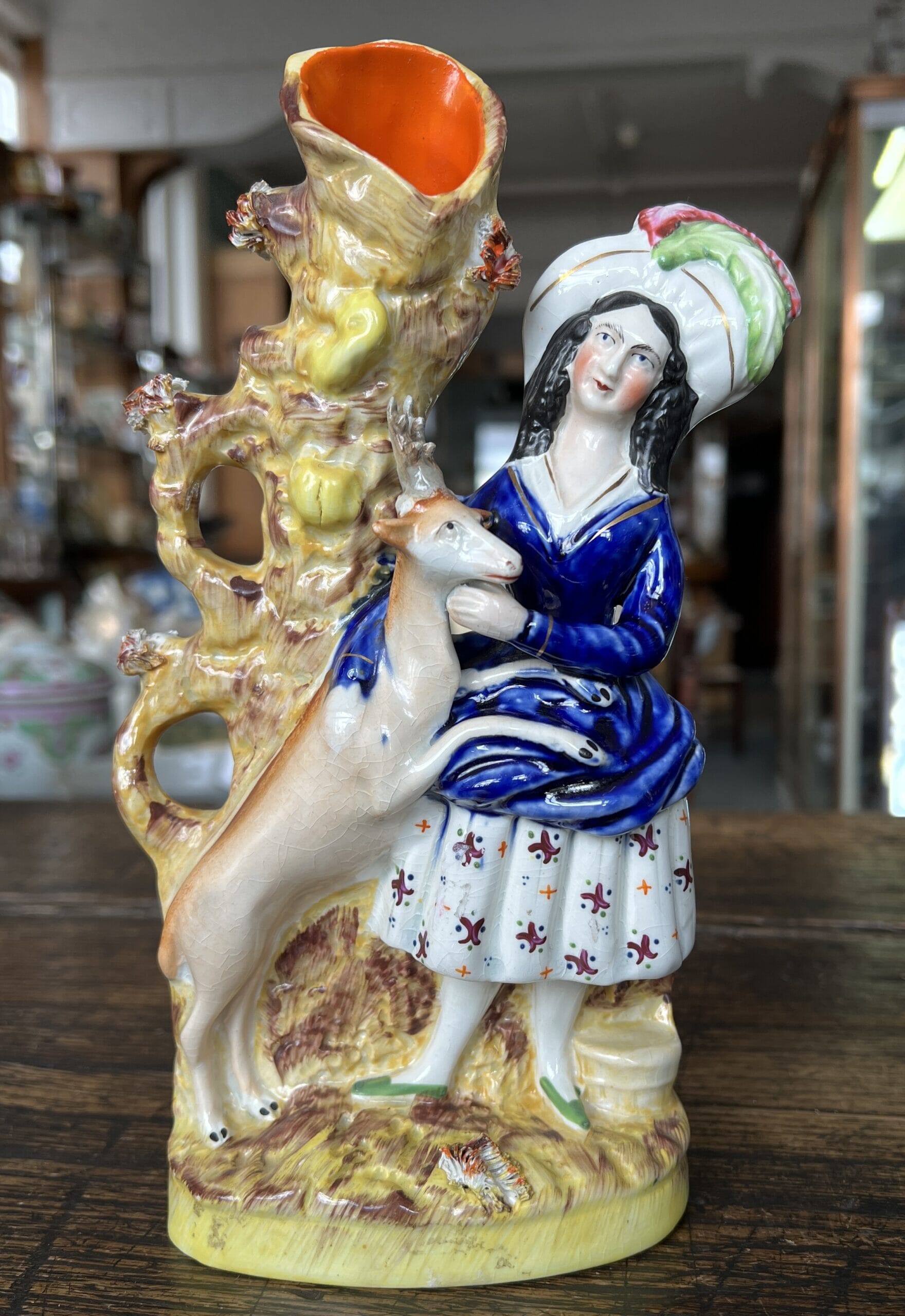
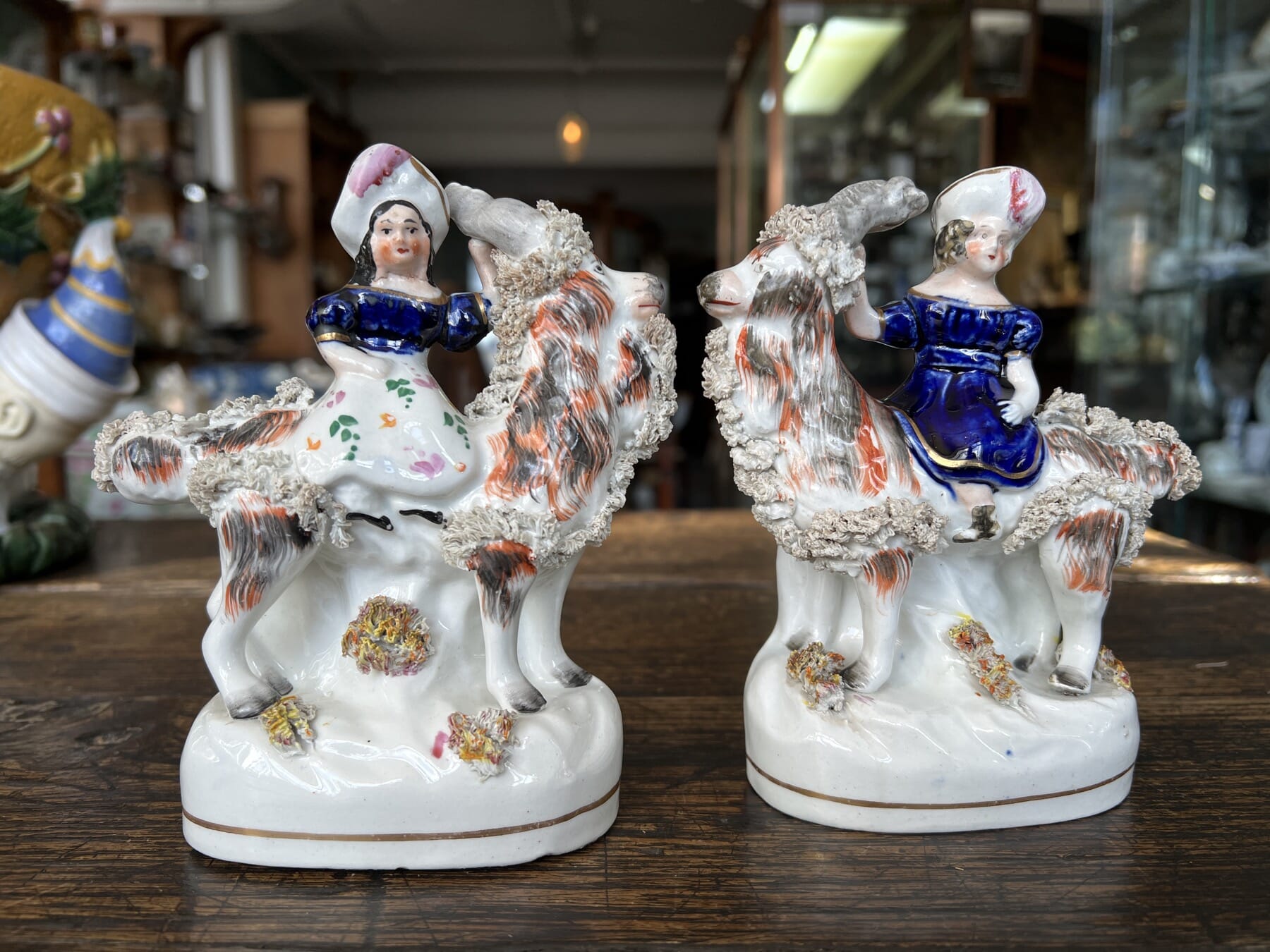
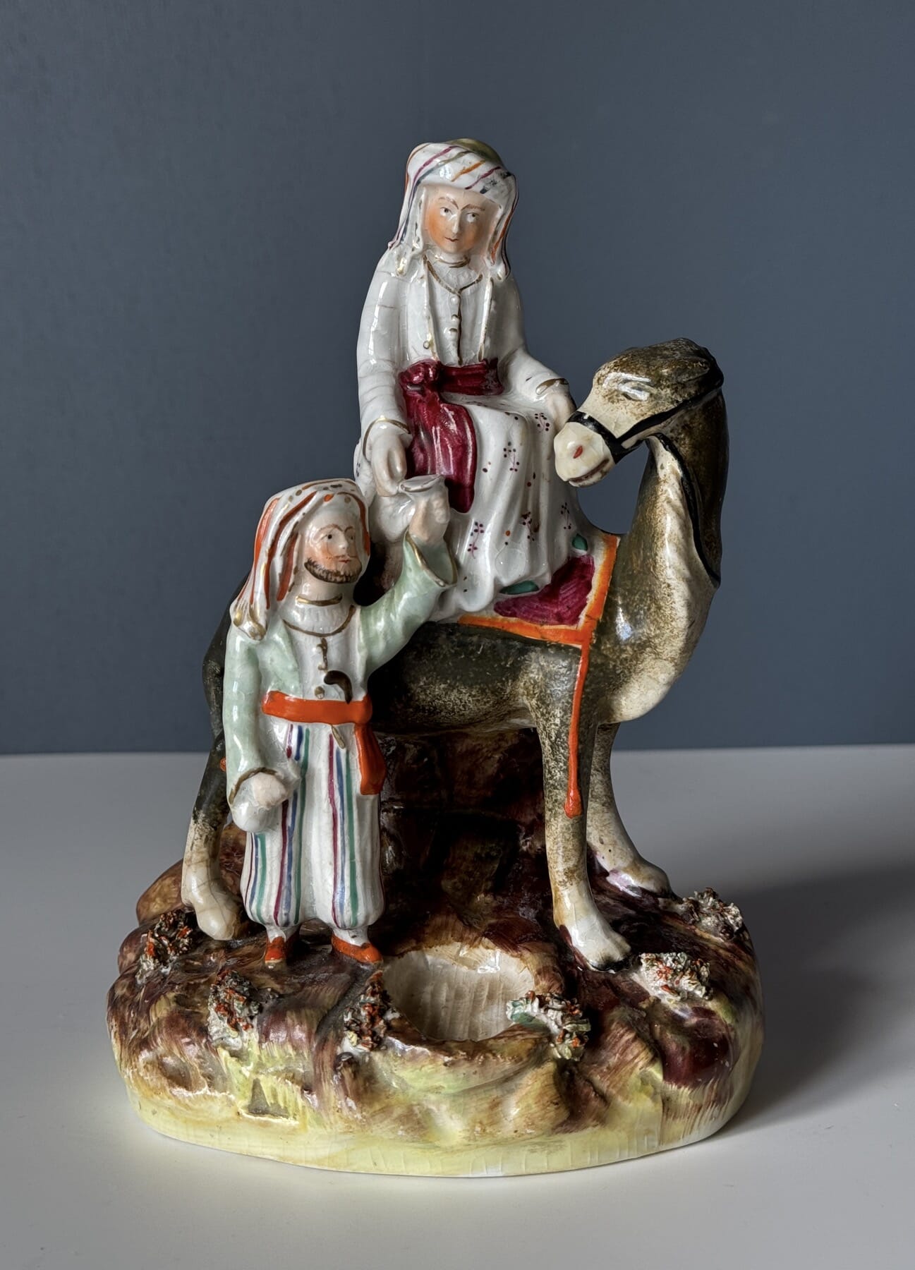
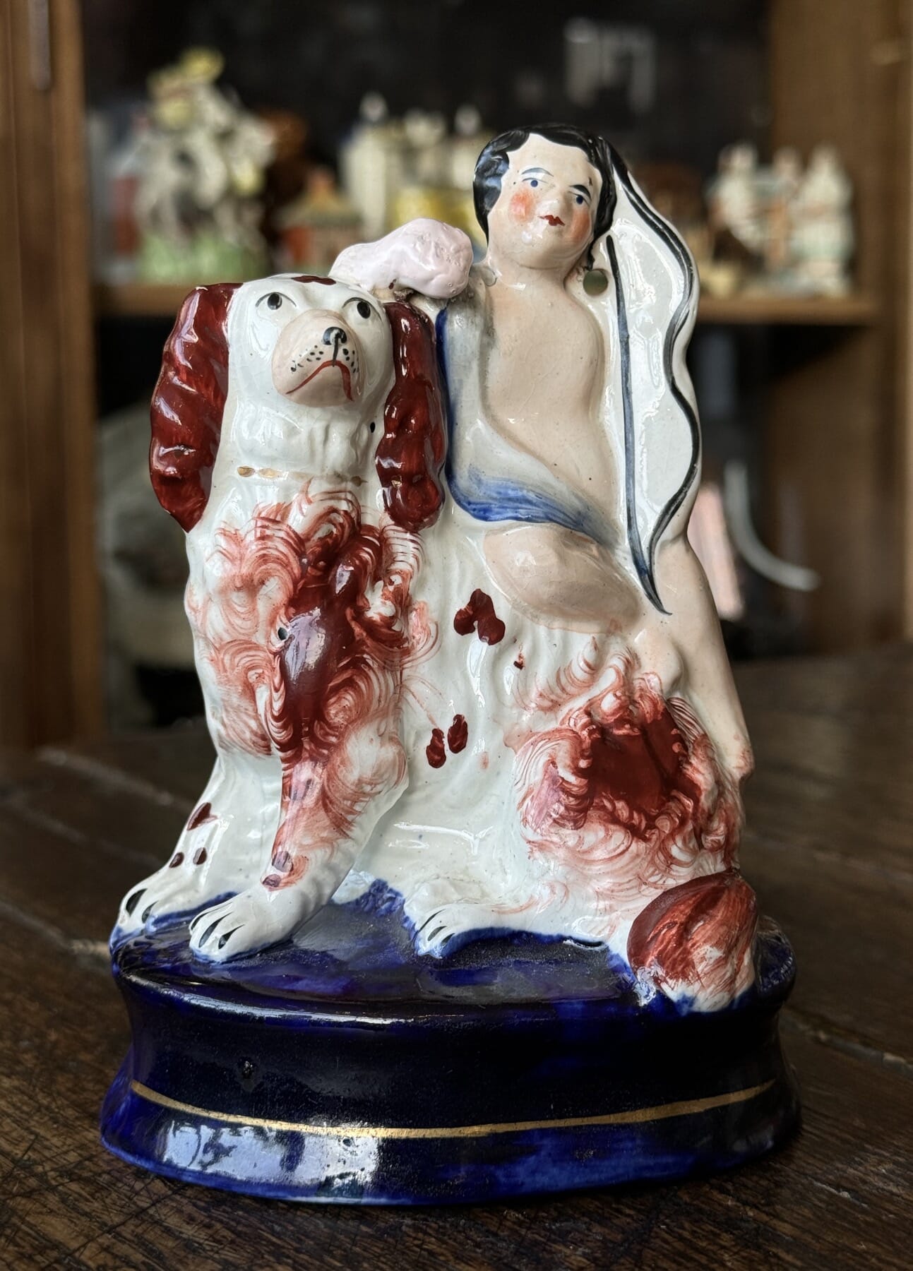
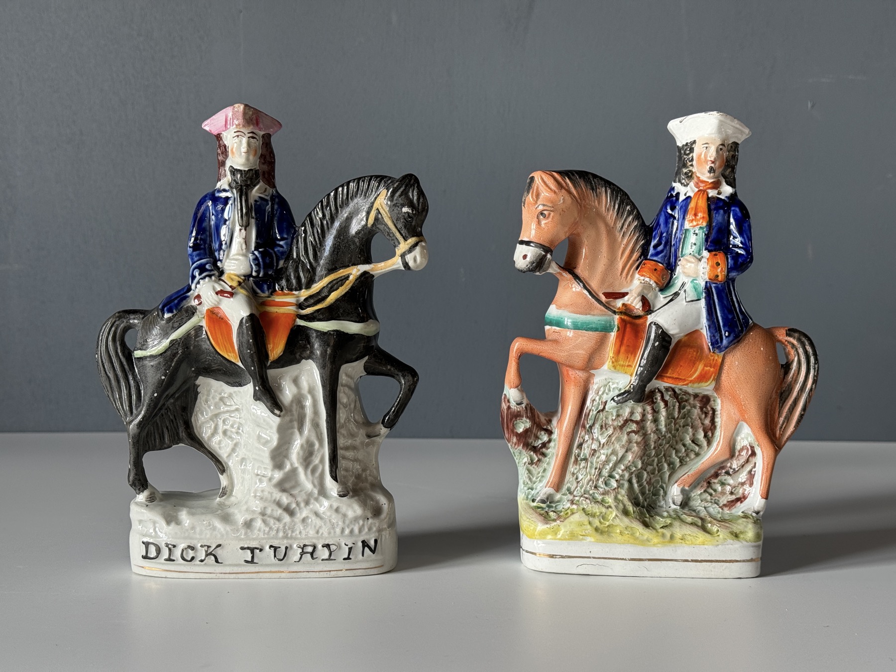
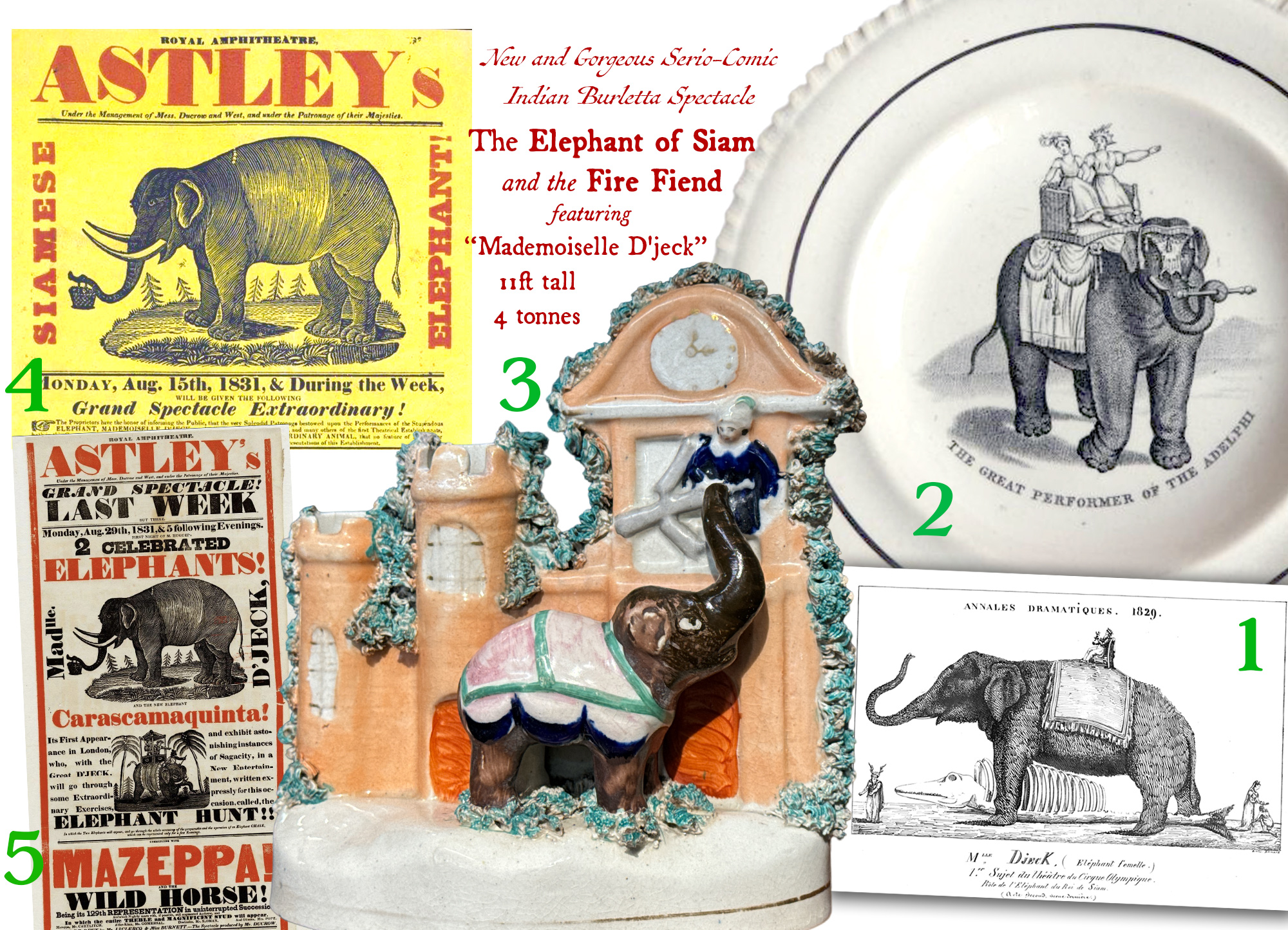
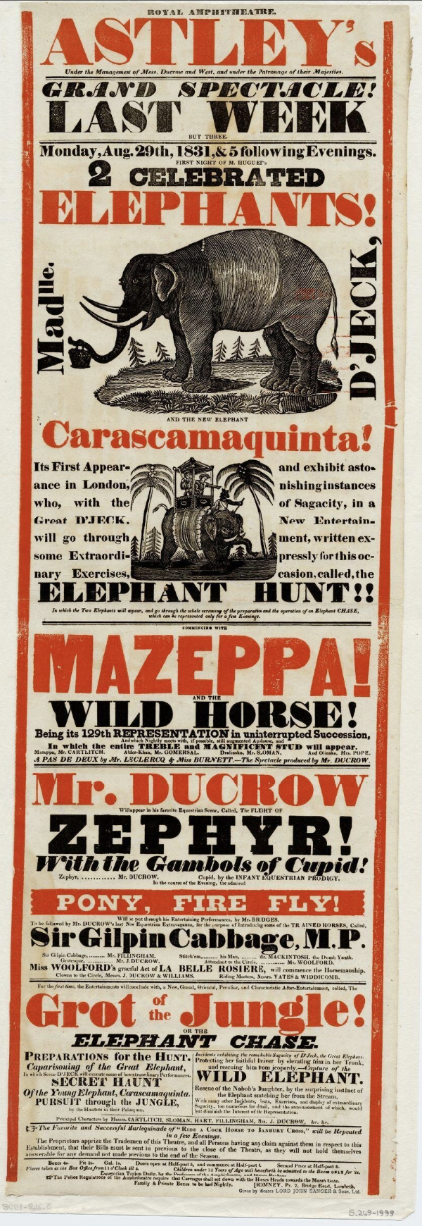
Welcome to our latest Fresh Stock. This one is a ‘Staffordshire Special’, with some early figures dating to the late 18th – early 19th century – as well as a good selection of classic Victorian pieces.
There’s a couple of Highwaymen, one titled ‘Dick Turpin’, the other facing horseman traditionally being his companion Gentleman-Robber, ‘Tom King’ (actually Mathew, not Tom….) .
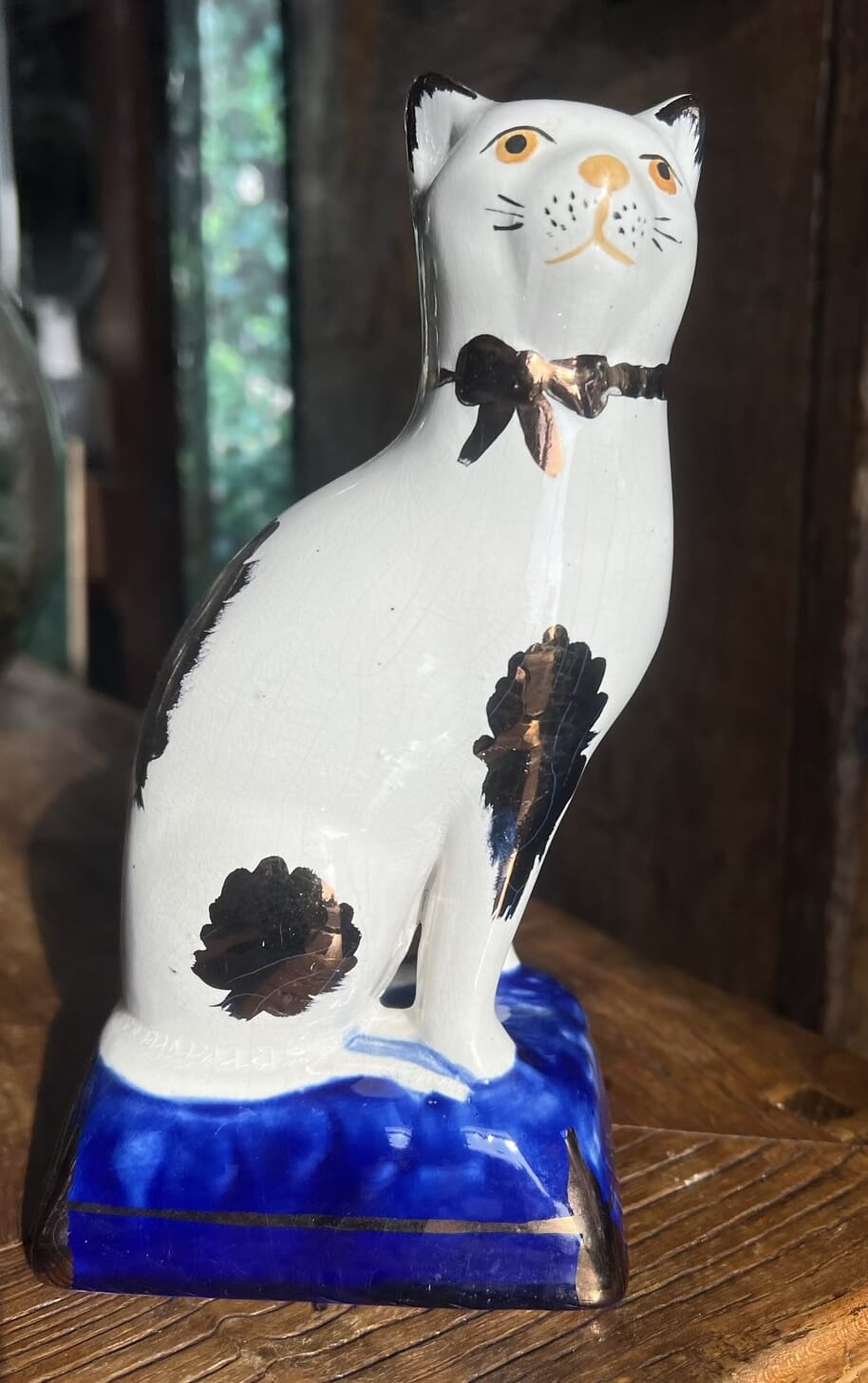
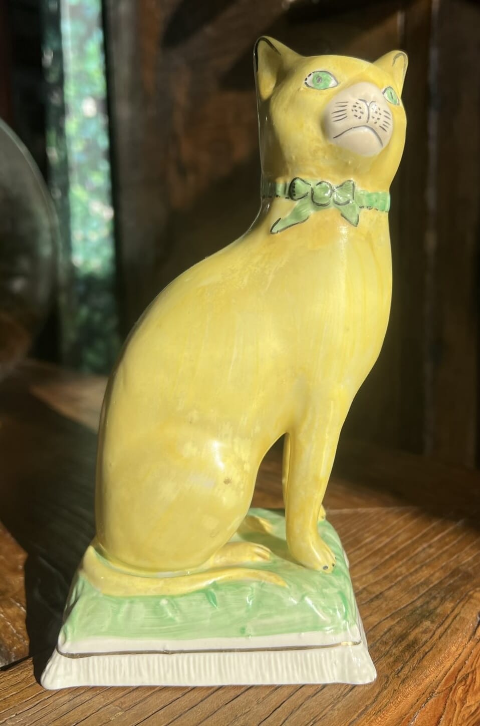
There’s a lovely ‘primitive’ miniature group of Victoria & the love of her life, Albert. There’s cats, dogs, the Royal Children riding goats, and the exotic image of Lady Hester Stanhope riding her camel….
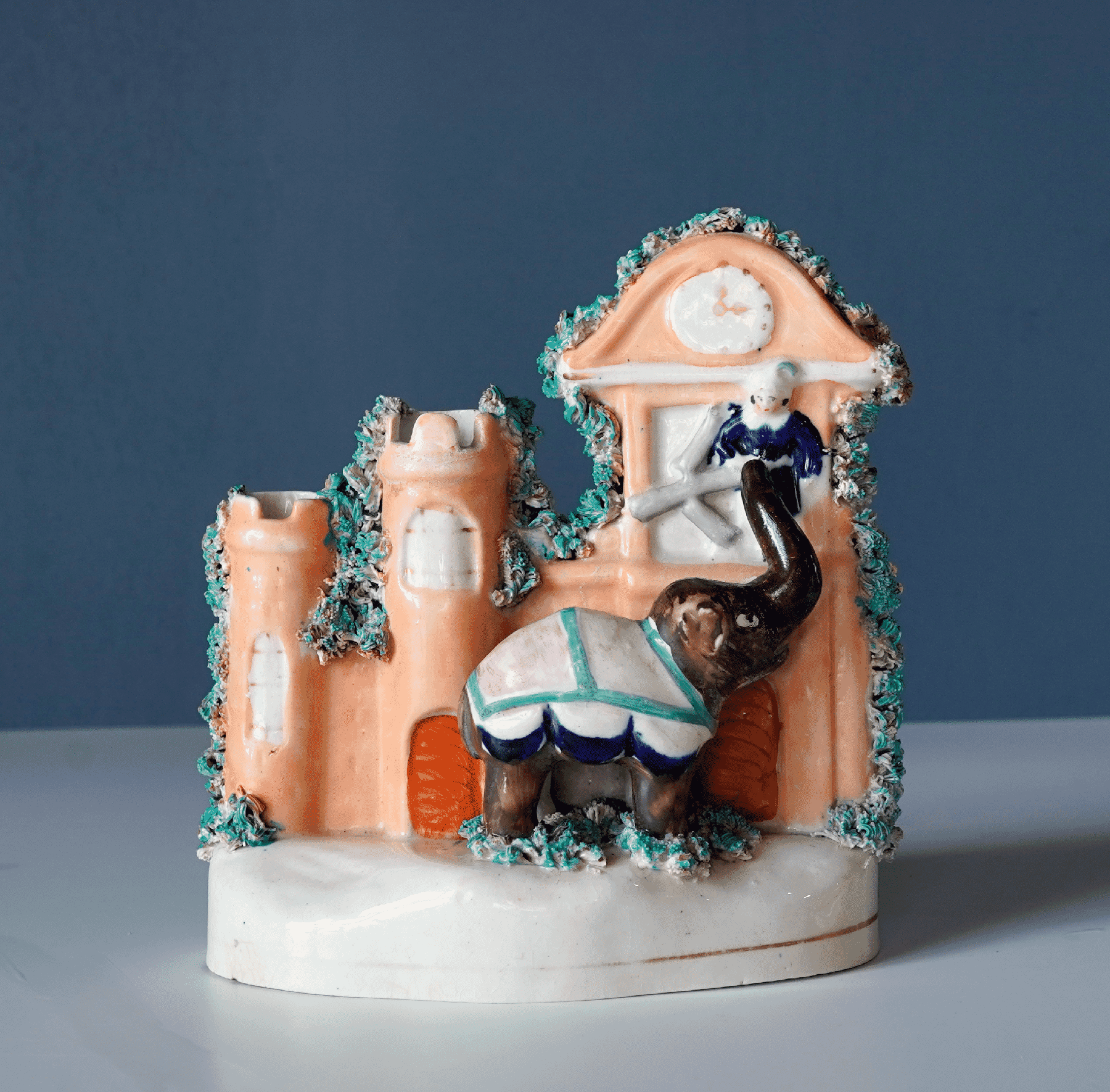
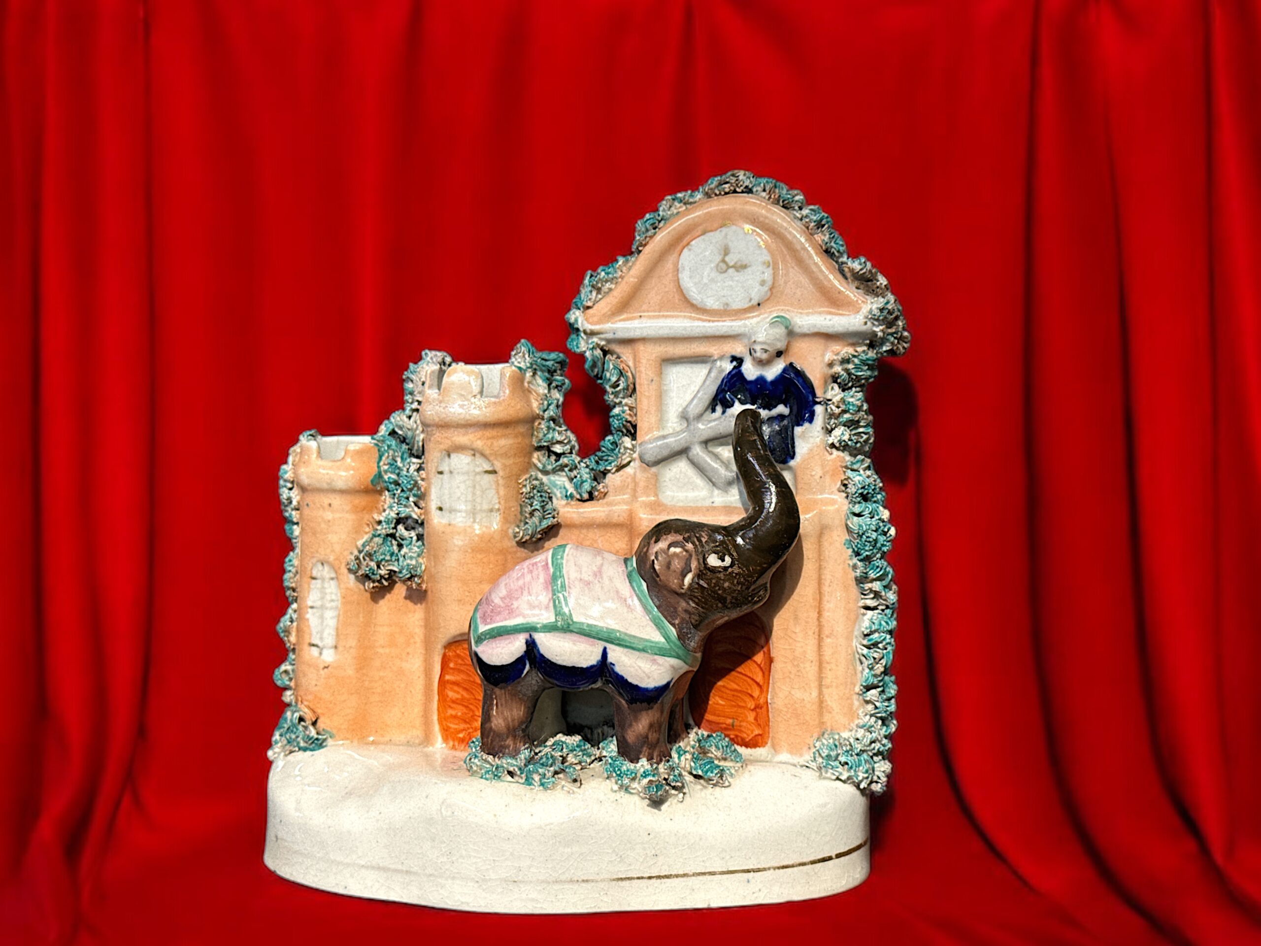
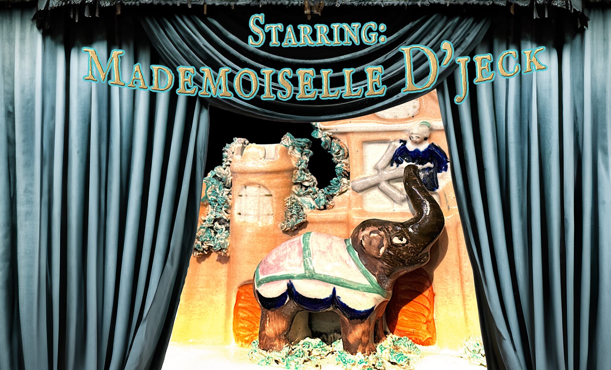
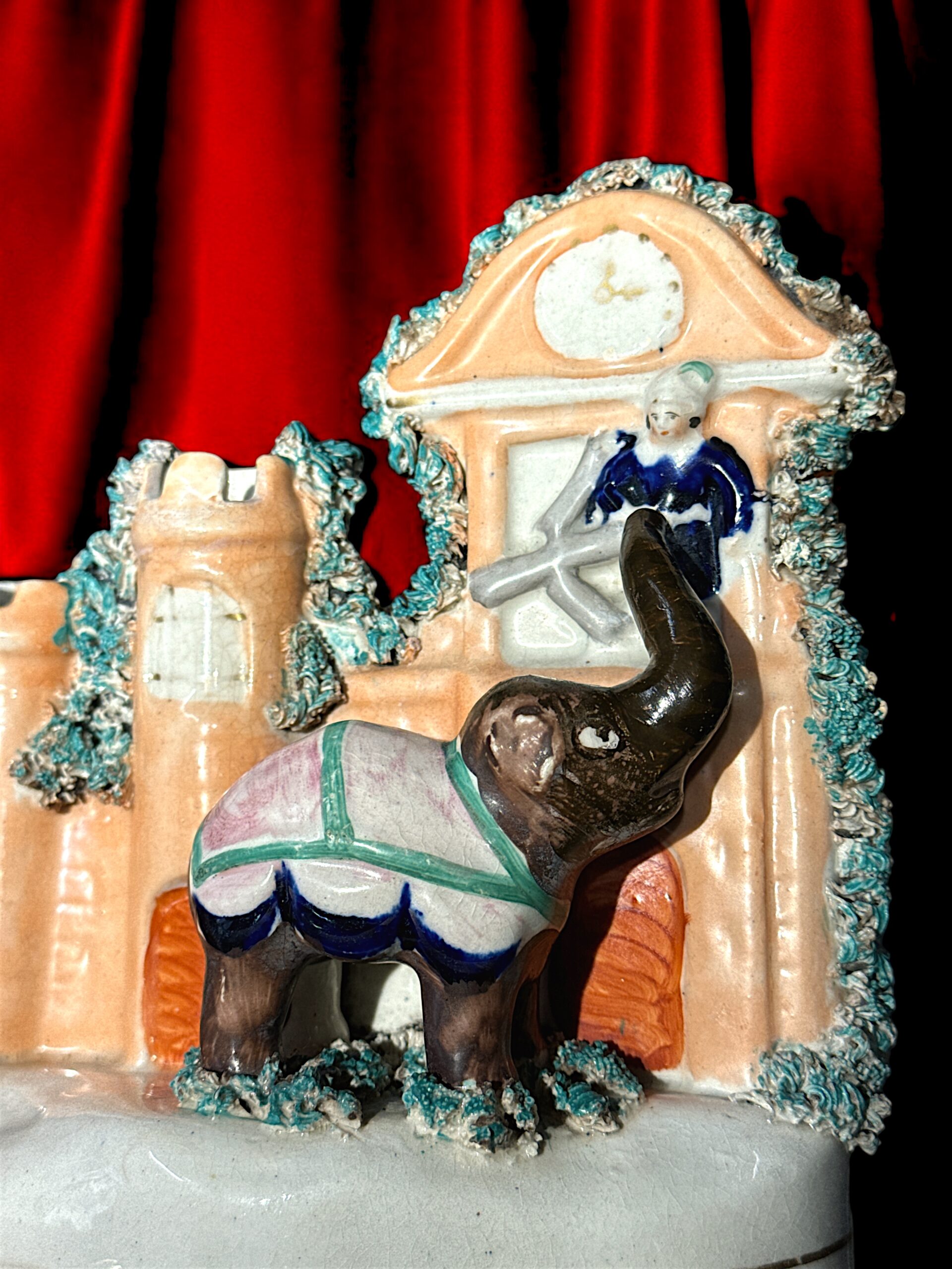
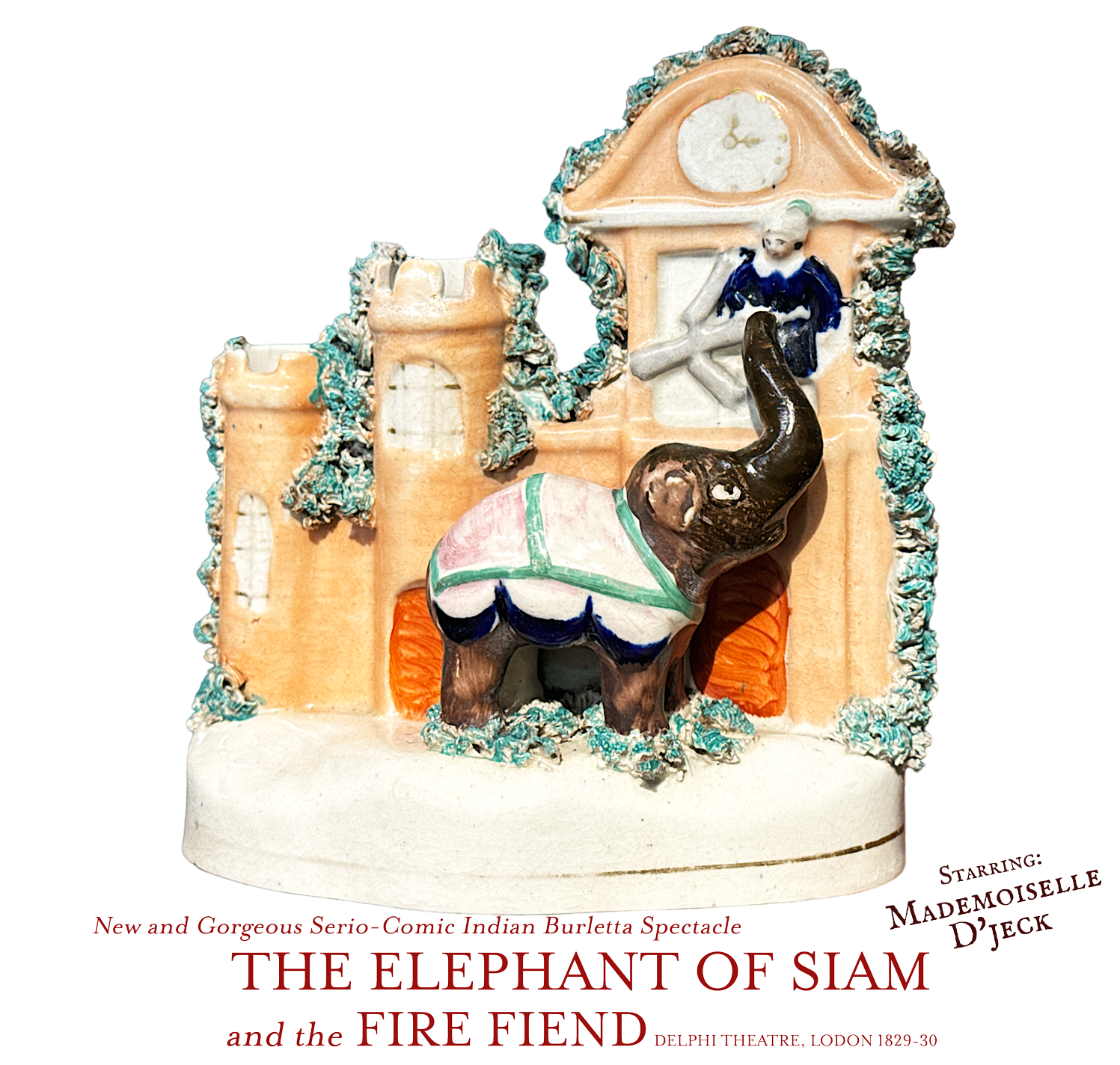
And there’s Mademoiselle d’Jeck, a 4-ton prima-donna…. (see more on her at the end of this post).
These subjects wouldn’t be hard to find on present day social media – and so, this Staffordshire Collection is a great illustration of the ‘Social Media’ aspect fulfilled by these charming, quirky figures from the late Georgian & Victorian eras.
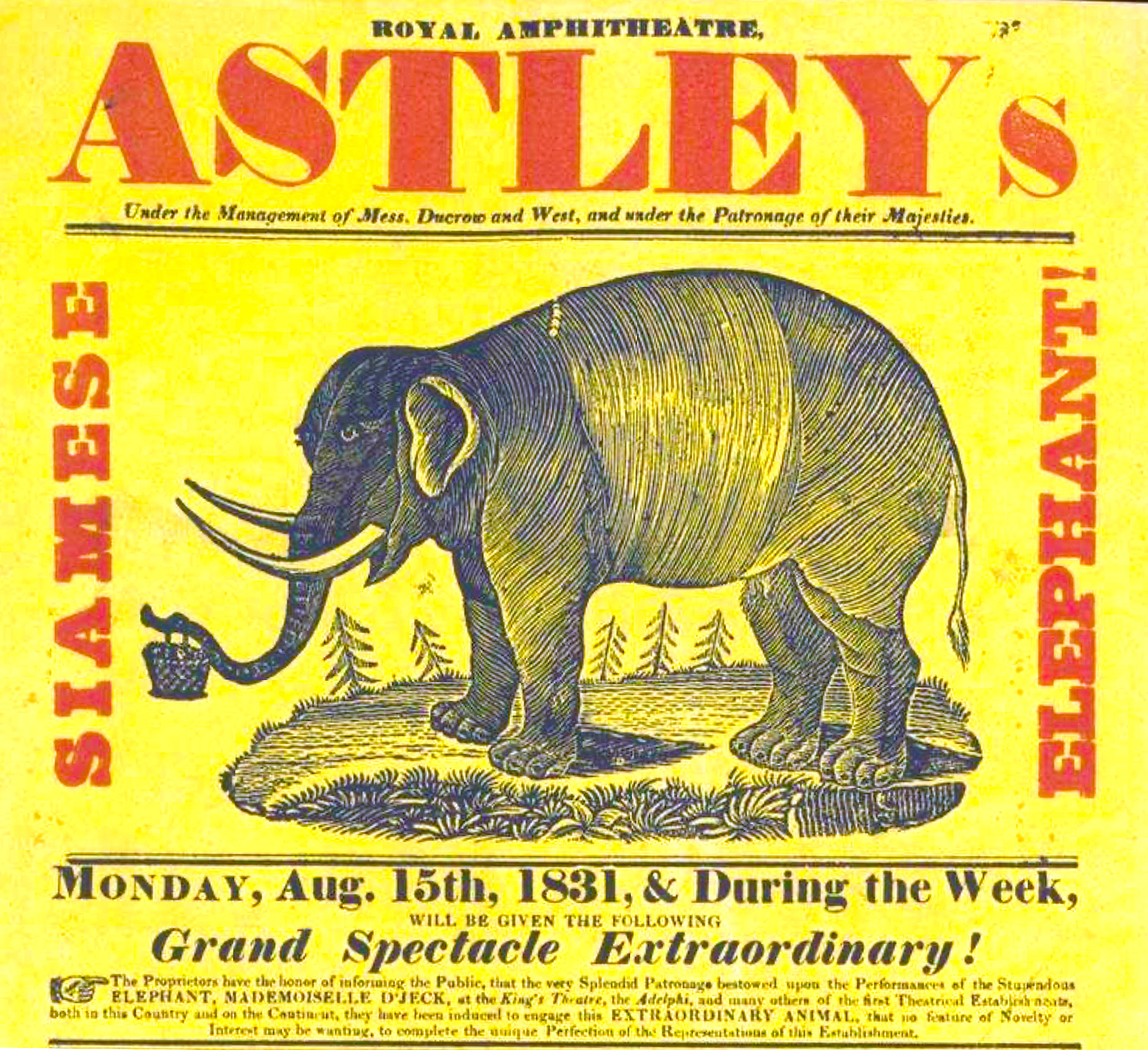
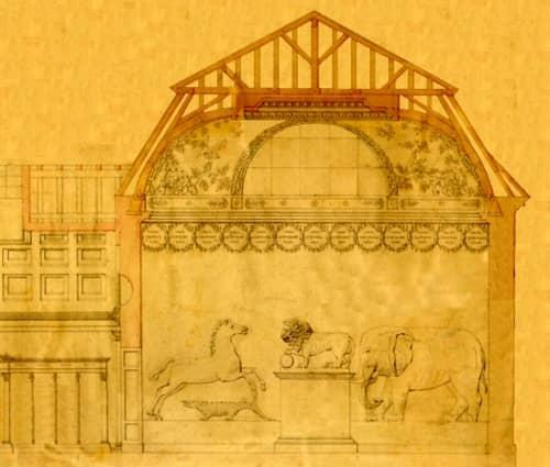
This remarkable Staffordshire group tells the story of one particular elephant: ‘Mademoiselle d’Jeck’, the star of the stage in the decade after the Napoleonic Wars. Starting in England in 1806, she travelled back & forth between the Continent , England, and a tour of America before her untimely death in 1837. This figure dates to around that time, but commemorates an earlier stage appearance. In 1829, she had appeared with great success in the Paris Olympic circus, starring in the play ‘l’éléphant du Roi de Siam‘ (“The Elephant of the King of Siam”). After a short season, and a quick translation into English, the show was launched across the Channel, in the Adelphi Theatre, London, and ran from mid-1829 into early 1830. Mademoiselle d’Jeck was a 4-ton prima-donna…. with her behaviour earning her a reputation as an absolute monster, having broken many people’s bones, and even killing a number of her keepers.
And….she’s still around! Read all about her interesting but sad story as a travelling attraction on our special blog report here >
This rare Staffordshire figure is a visual record of an extraordinary theatrical spectacle, presented in the 1820’s to the eager audiences of London. Attributed in the playbill to Englishman Samuel Beasley Jr. and John Gallott, it was billed as ‘New and Gorgeous Serio-Comic Indian Burletta Spectacle’, and titled ‘The Elephant of Siam and the Fire Fiend‘. However…. an earlier play featuring the same elephant and storyline had opened in Paris in July the same year, at the Cirque Olympique of Antonio Franconi. This piece was entitled ‘l’éléphant du Roi de Siam‘ (The Elephant of the King of Siam) and was penned by Léopold Chandezon and Ferdinand Laloue.
above: 1 – 1829 Paris advert, at the ‘Cirque Olympique’. 2 – Staffordshire child’s plate, c.1830. 3 – Staffordshire group, c. 1840. 4 & 5 – Playbills in the Victoria & Albert Museum.
The plot is a classic romance, with the hand of a princess contested by two suitors, one good (Prince Almansor), one not so good…. and the elephant is the key actor as she thwarts the plots of the bad-egg.
Mademoiselle D’jeck was brought to England mid-1829 to appear on the English stage.
The ‘borrowed’ Elephant Extravaganza took place in December 1829 and into 1830, at London’s famous Adelphi Theatre.
Mademoiselle D’jeck, The Elephant at the Adelphi
Picture this: an enormous stage, meticulously reinforced for an extraordinary star—the Elephant of Siam. This marvel, titled ‘Mademoiselle d’Gelk’ (or D’jeck), wasn’t just a creature of size, but a performer of remarkable talent, commanding a nightly salary of twenty pounds—a princely sum indeed. She was 11 feet tall, 4 tons in weight, and a very pale colour.
Under the leadership of Frederick Yates, the Adelphi Theatre brimmed with innovation and daring. The elephant’s presence wasn’t mere novelty; every action woven seamlessly into the plot, showcasing not only her docility but her profound intelligence. She was tasked with opening chests, shifting a crown from the head of one character to another, and advancing the plot using her bulk to block the view, or in what is shown in this Staffordshire figure, holding her trunk up to the window of a burning palace so the princess can escape – by being grasped with her trunk and lowered to the ground! Considering the actors in the play were London regulars, and she came from France with just a few handlers/trainers who were not there for acting, it is remarkable that she was able to interact with so many different people, night after night – a true testament to her intelligence.
A side story here reinforces this: one particular keeper was not kind to her, using the prongs of a pitch-fork to make her behave; years later, when she had the chance, she killed him. At his inquest, there was little sympathy for him and little blame for Mademoiselle D’jeck, as it was clearly a case of an Elephant’s excellent memory leading to revenge for wrongs done…..
She had arrived in London in 1806, from India or Ceylon, a member of Mr. Thomas Atkins’ traveling menagerie. Travelling with a native mahout who had raised her as a baby, she soon showed signs of being the class ‘prima-donna’ of the entertainment industry: her original mahout was wounded in 1814, and in 1822 she wounded the menagerie’s owner, who sold her to Berlin; there, she continued to hurt those around her….
When she came to Paris to perform in the stage play written just for her, she was responsible for wounding her owner and fracturing the skull of her latest mahout.
After her London appearance at the Adelphi, she spent time touring England with ‘Astley’s’ – where she broke the arm of one handler, wounded and killed two others, and fractured the skull of another. Her reputation as a dangerous beast grew…. and so they shipped her off to perform in New York!
Tournai Museum – 19th c. plan
After her US tour, the 4-ton prima-donna was back on the European tour, with a modification to make her a little safer – her tusks were removed. However, there were dozens more incidents that left a trail of injured handlers. A final straw for Mademoiselle was an ‘incident’ that wounded a spectator, in Geneva in 1837, and she was put down.
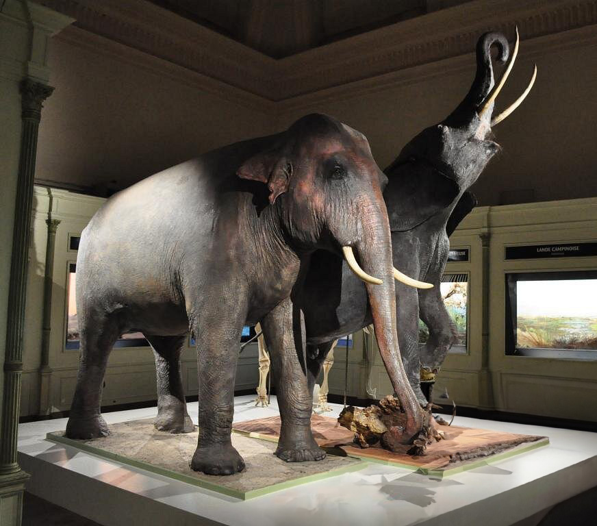
Her hide was secured by a Paris naturalist firm, Maison de Deyrolle, and so Mademoiselle D’jeck lived on , in a way. As a skin, she was sold to Barthélemy Dumortier, botanist, director and founder of the Natural History Museum of Tournai, Belgium. A local cabinet maker was conscripted to build the underbody for the hide, and a local shoe maker spend a mammoth amount of time sewing her hide onto the ‘skeleton’ . The result is still there to bee seen in Tournai, where Mademoiselle D’jeck still stands proud, having survived both world wars. In 2018 was recognised by the Federation of Wallonia-Brussels as part of its ‘federal heritage’.
Mademoiselle D’jeck in Tournai today (front)
This rare figure would most probably date to the time of her turning fame: 1830 would be a touch early for this style of flatpack figure, and as her fame in London was that same year, it would have been in the following years that an image like this would appeal to the public.
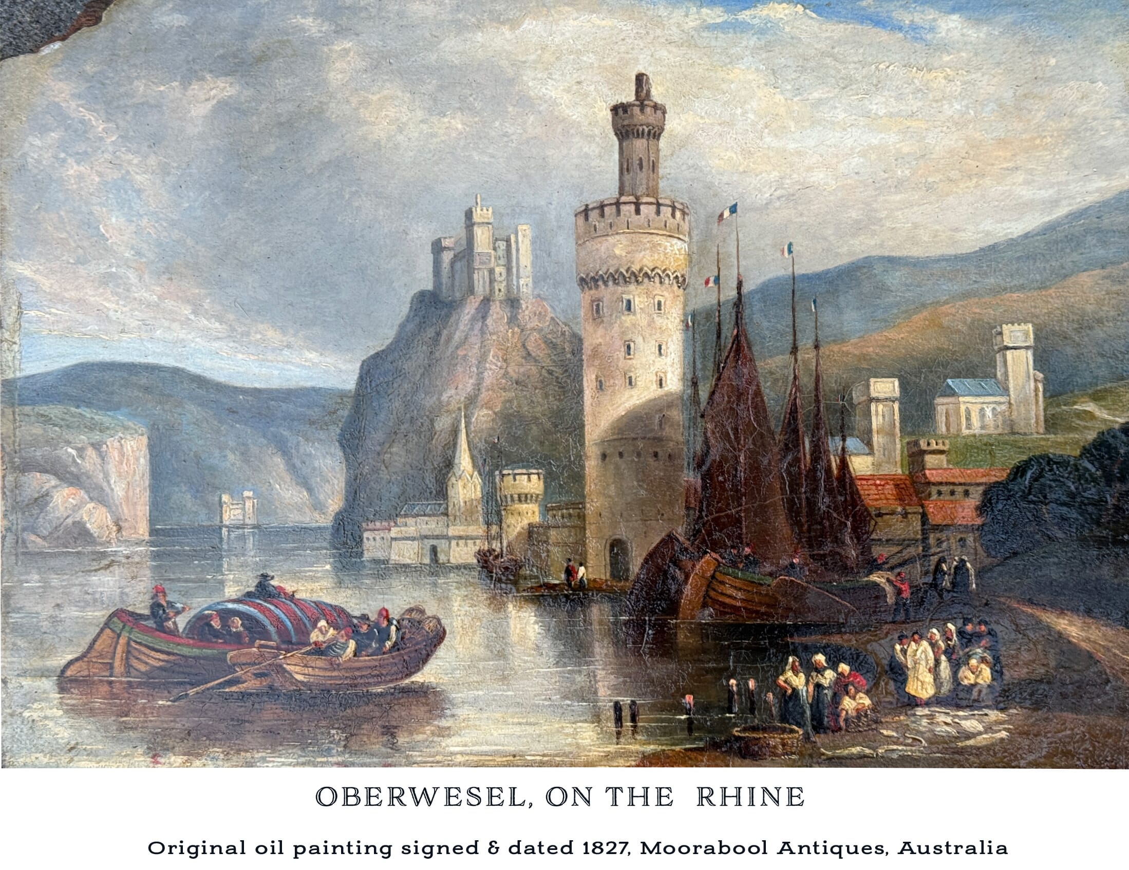
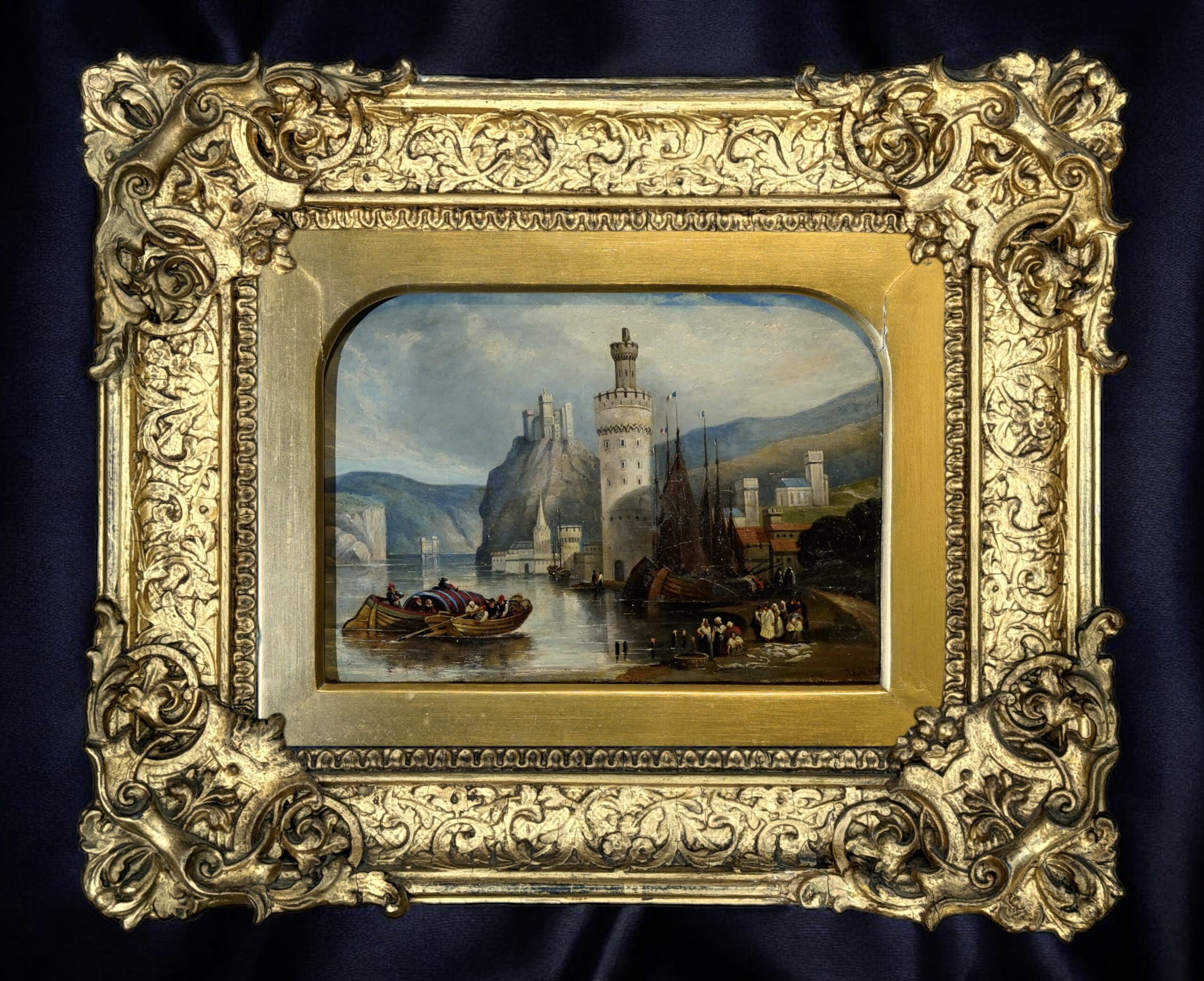
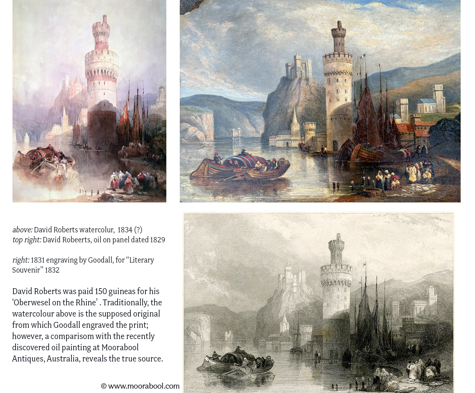
A local customer recently inherited a small number of Antiques from an uncle, including a most interesting oil painting. Set in its original frame, it was in ‘untouched’ condition, and in dire need of a clean.
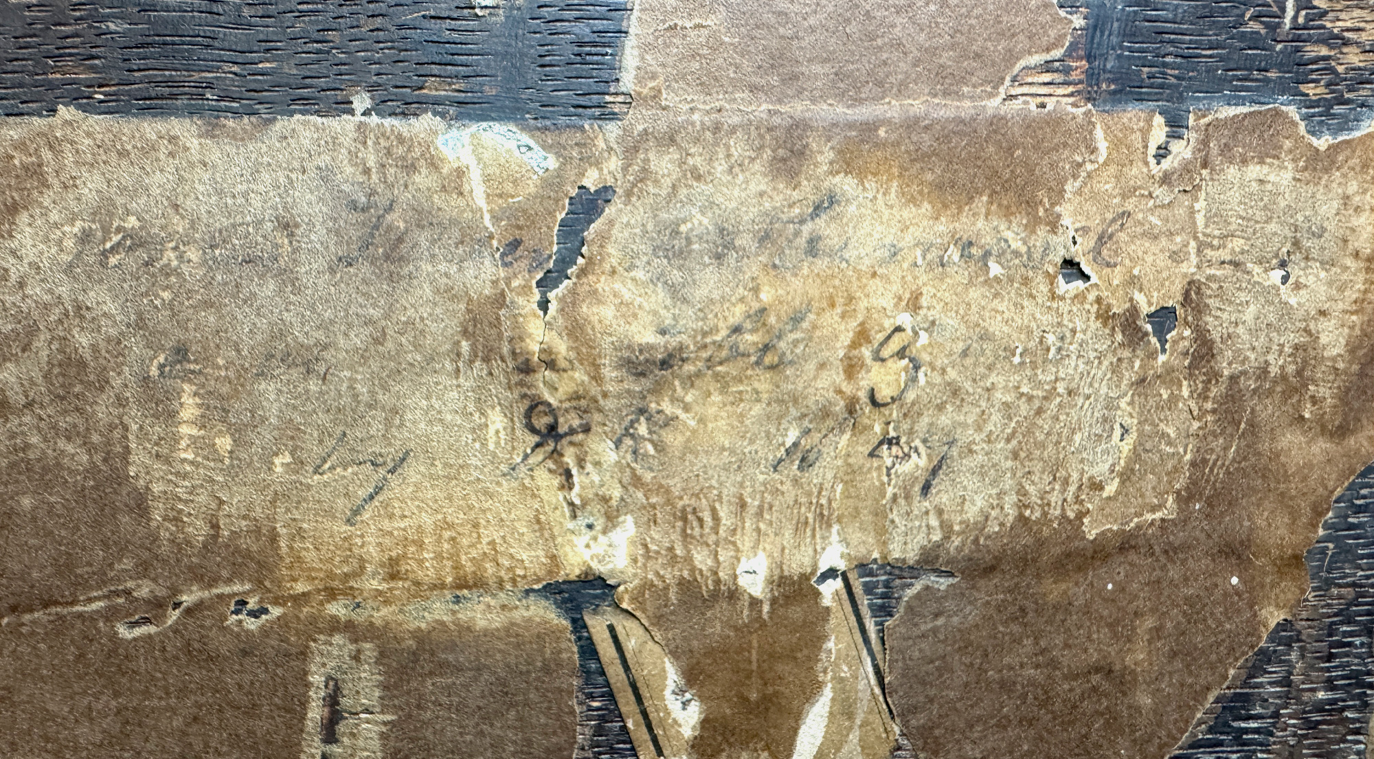
The way it was framed, and the thick yellowing varnish hid the small monogram and date on the lower right, and the back was covered in browning paper. Investigating the back by prising off the backing paper, a fragment of an inscribed pasted label was found, and carefully exposed – it is a descriptive label in what may well be Robert’s own hand:
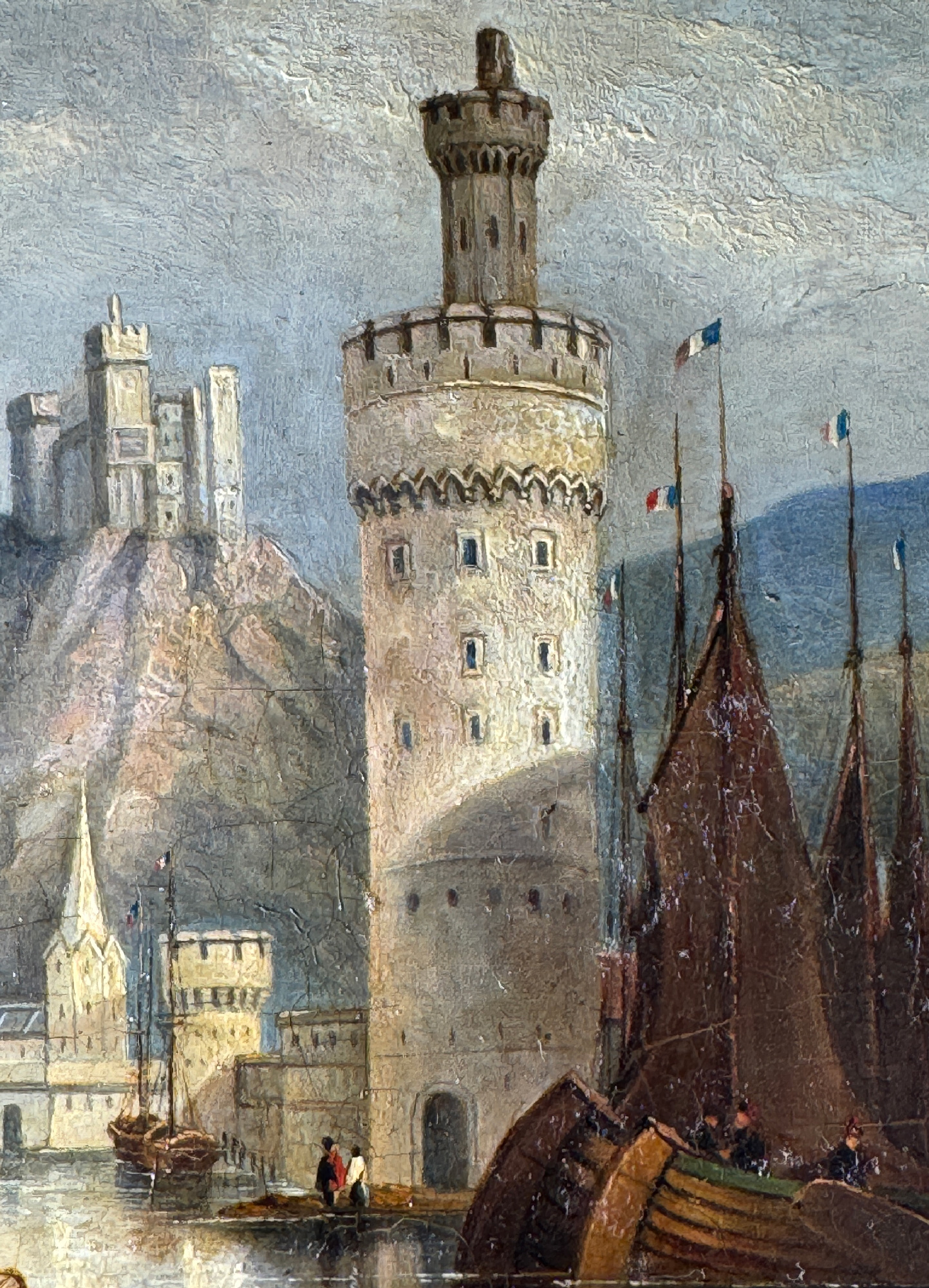
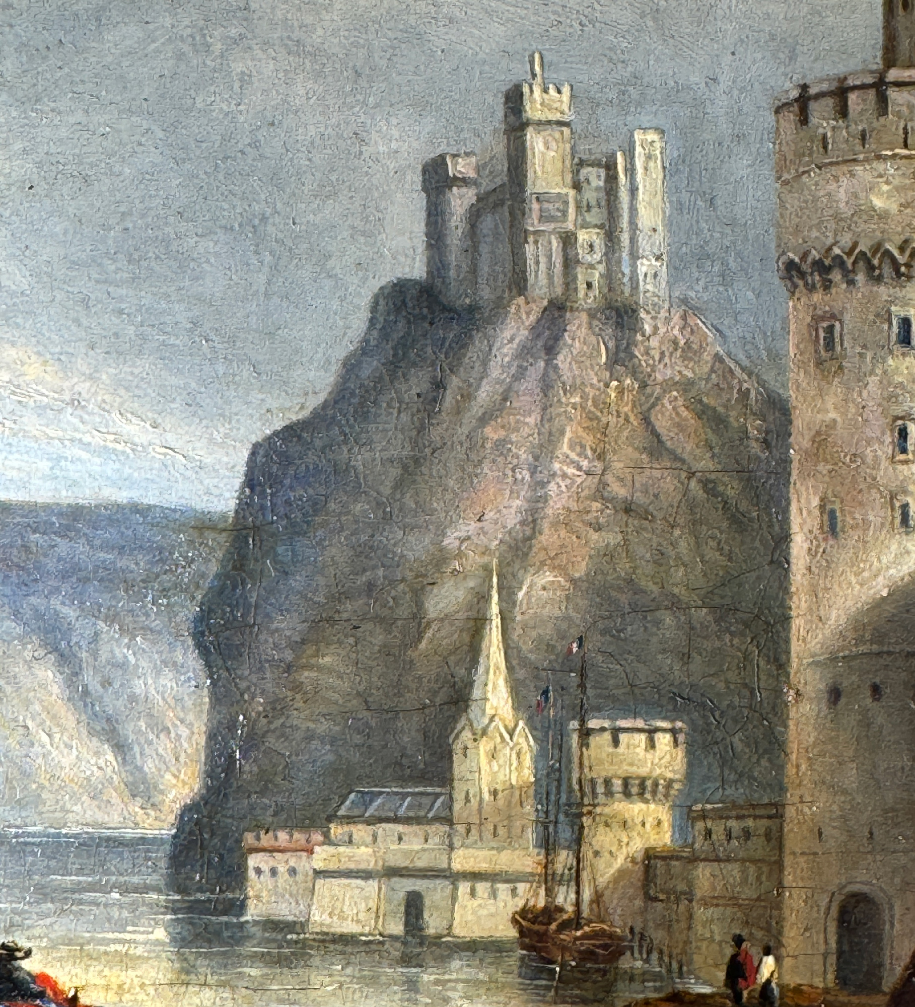
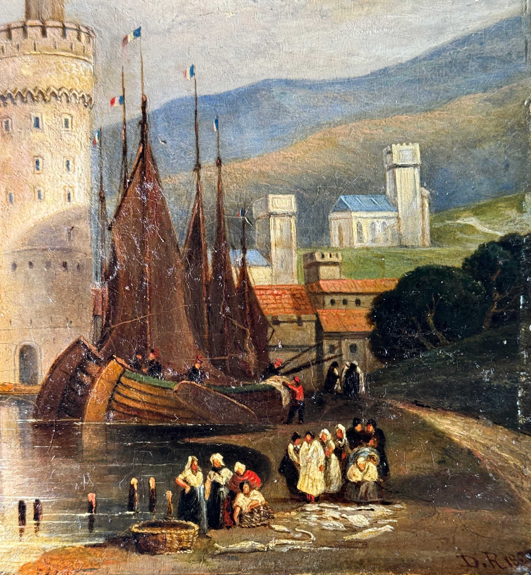
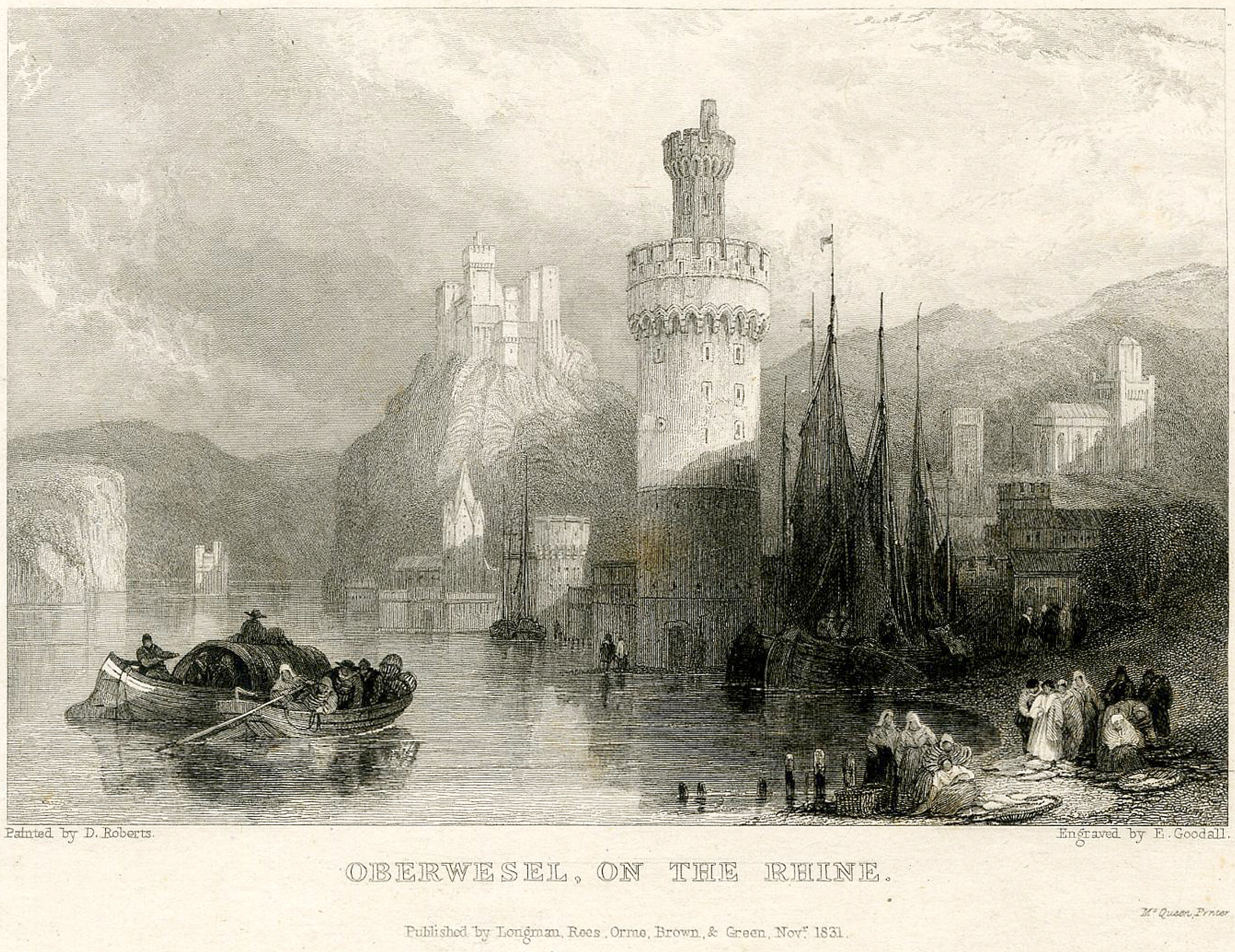
“Round Tower of Oberwesel on the Rhine. between …obleuty and… ….(?) by D R 1829″
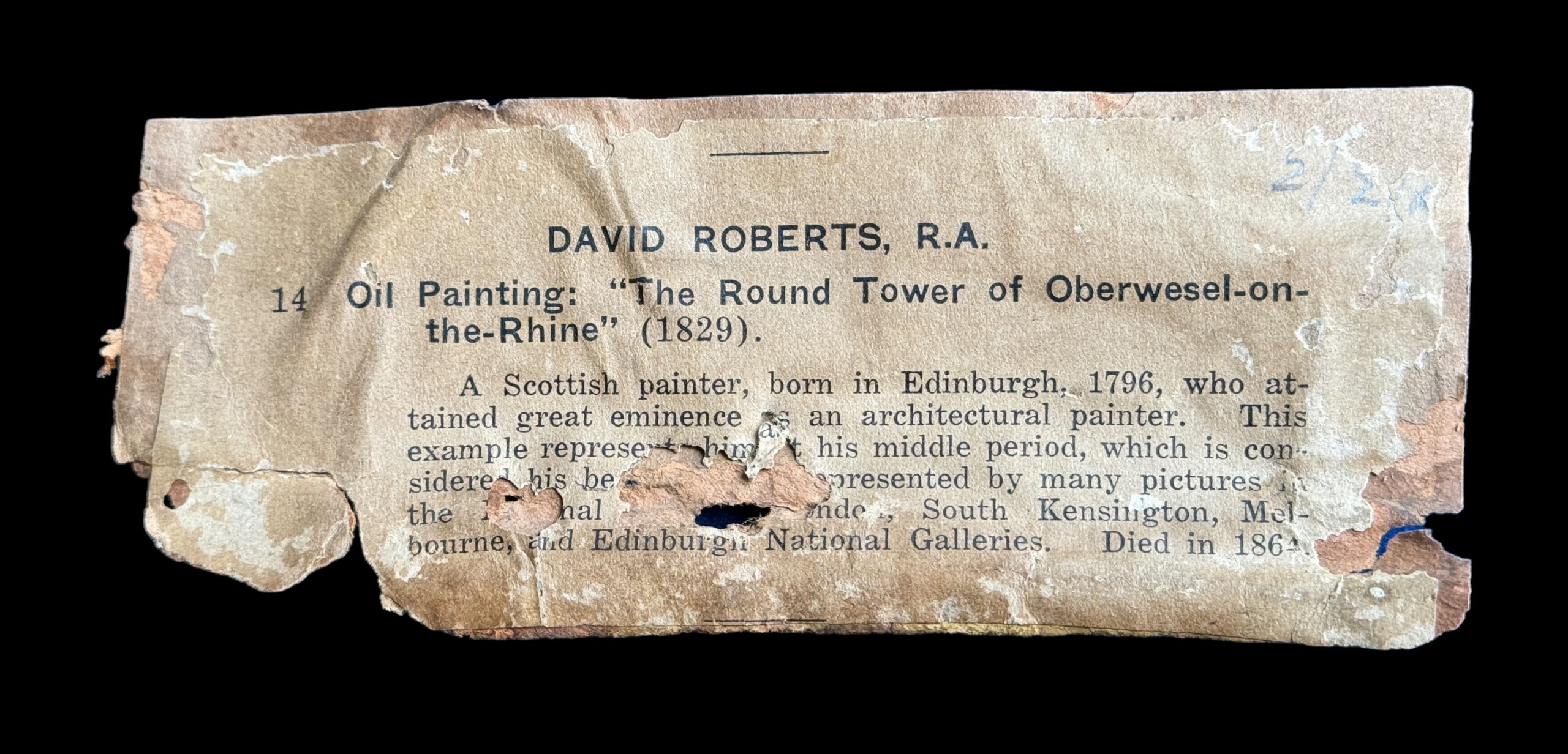
This is repeated in a printed catalogue entry, attached to the outer layer of backing paper, dated in pencil top right “2/2/8? (for a date in the 1880’s). It reads:
DAVID ROBERTS, R.A.
14. Oil Painting” “The Round Tower of Oberwesel-on-the-Rhine” (1829)
A Scottish Painter, born in Edinburgh , 1796, who attained great eminence as an architectural painter. This example represents him in his middle period, which is considered to he his best ….. (He is) … represented by many pictures in the National Gallery London, South Kensington, Melbourne, and Edinburgh National Galleries. Died in 1864″
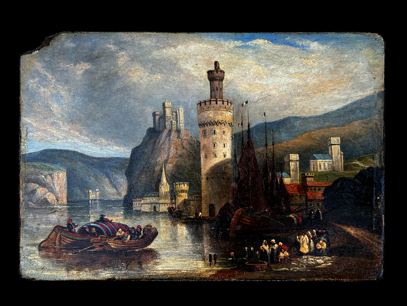
Liberating the wooden panel from the frame revealed the reason for the unusual arched top of the original framing; the top-left corner has been broken off & lost. It also makes the monogram ‘DR’ to the lower right completely visible, and alongside the date ‘1829’. An interesting feature is a round impression like a pinhole, centred right in the middle of the ‘9’: a corresponding one can be seen on the upper right corner, origin unknown.
An online search reveals the print that was made from this painting. The example shown here is in the British Museum, from the first publishing instance in ‘The Literary Souvenir’, published 1832.
David Roberts -Oberwesel- 1831 Print by Goodall, published in the 1832 “The Literary Souvenir” – British Museum
The ‘Literary Souvenir’ original editorial published alongside this print is interesting, and possibly misleading;
“…since he has taken up watercolour painting… he appears to have developed new and more extended powers; as the charming view of Oberwesel, engraved by Goodall…..“
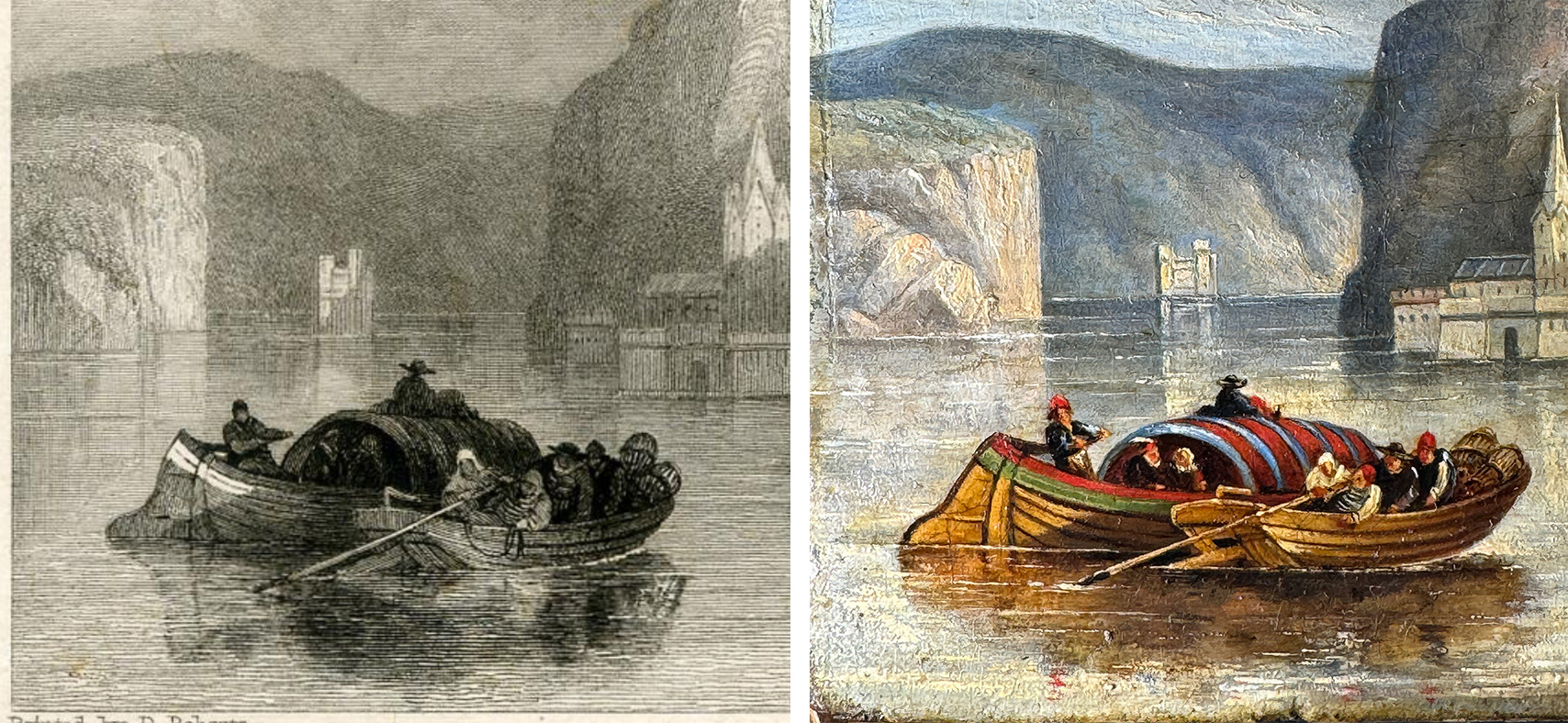
This is claiming the origin of the engraving is a watercolour; however, while several watercolours are known, and recorded by Roberts in his memoirs, they are all after 1832, with one exception: a work on the English art market recently is the same view, signed & dated 1824. However, this was lacking one important detail, suggesting it isn’t the origin of the print either. The oil we are discussing is the closest prototype when we examine the details of the image. Clearly, the watercolour ‘origin’ is an assumption by the ‘Literary Souvenir’ editor, obviously not aware of the source Goodall used when he made his engraving.
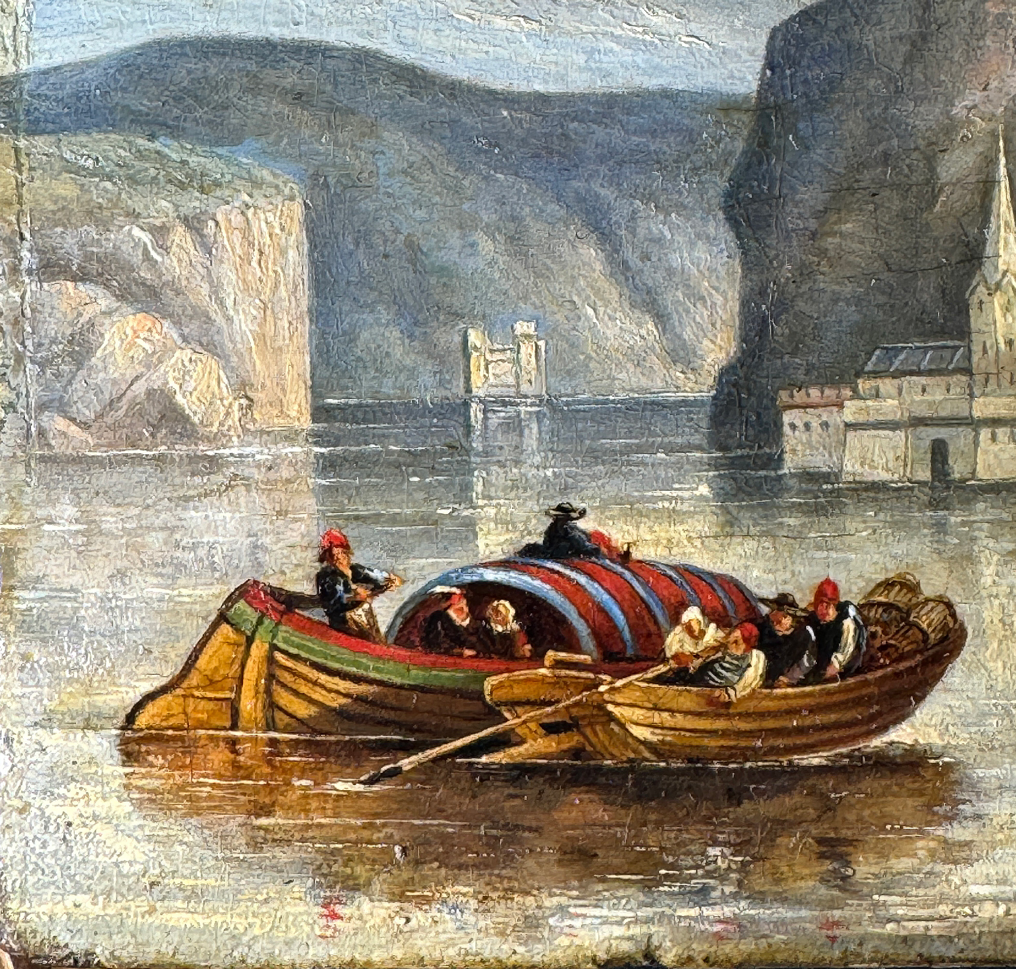
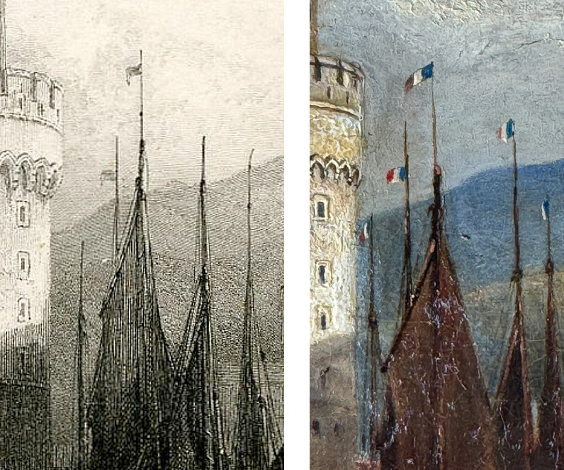
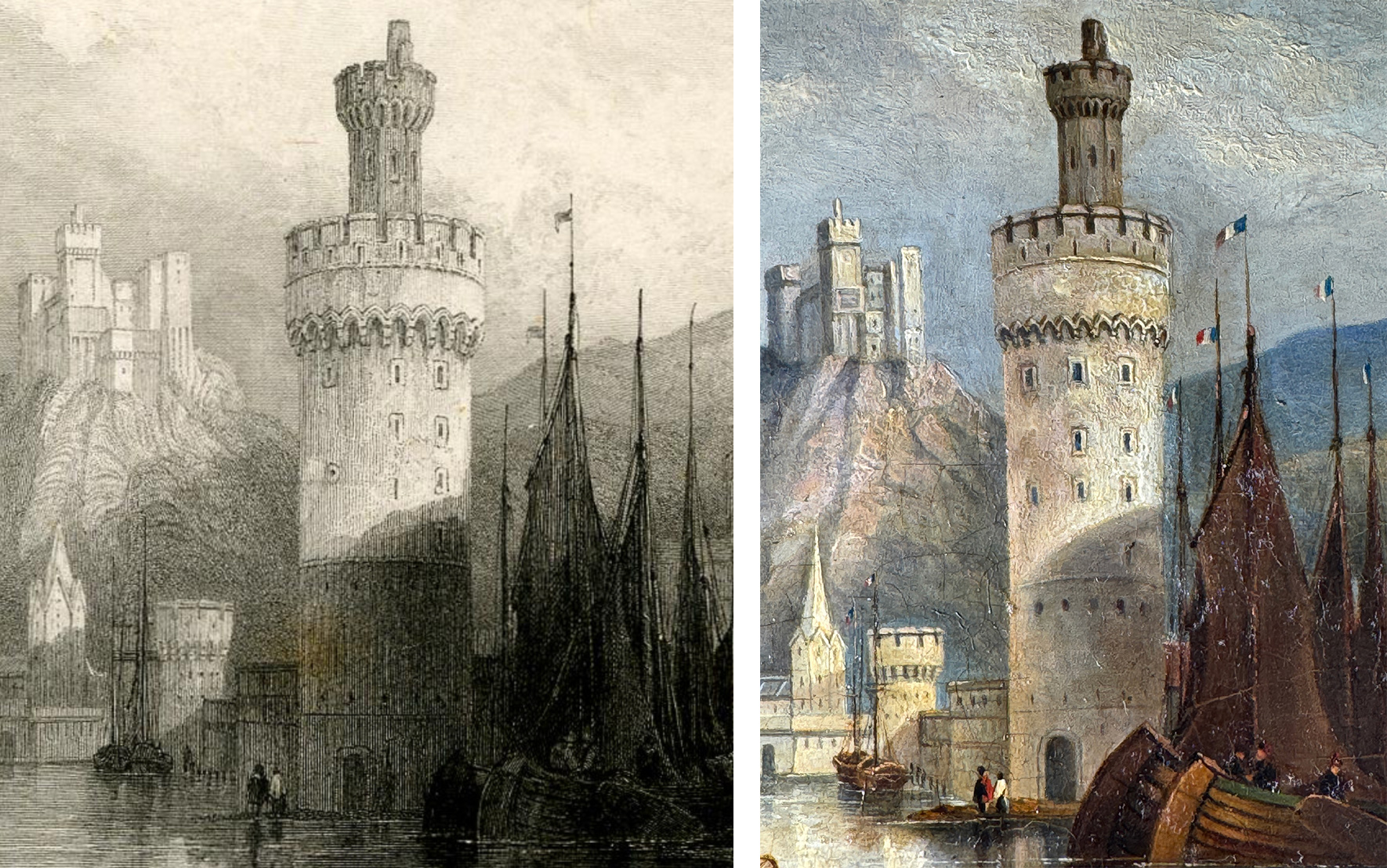
The detail that definitely links the oil, not the watercolour, to the print is the occurrence of flags on the masts of the boats.
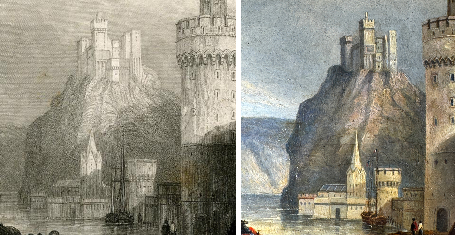
It’s an interesting exercise to compare the print with the painting: it illustrates the ‘artistic license’ of the engraver, as they seek to reproduce a complex composition but inevitably ‘improve’ on the work through their own artistic intuition. The two works become a ‘Spot the Difference’.
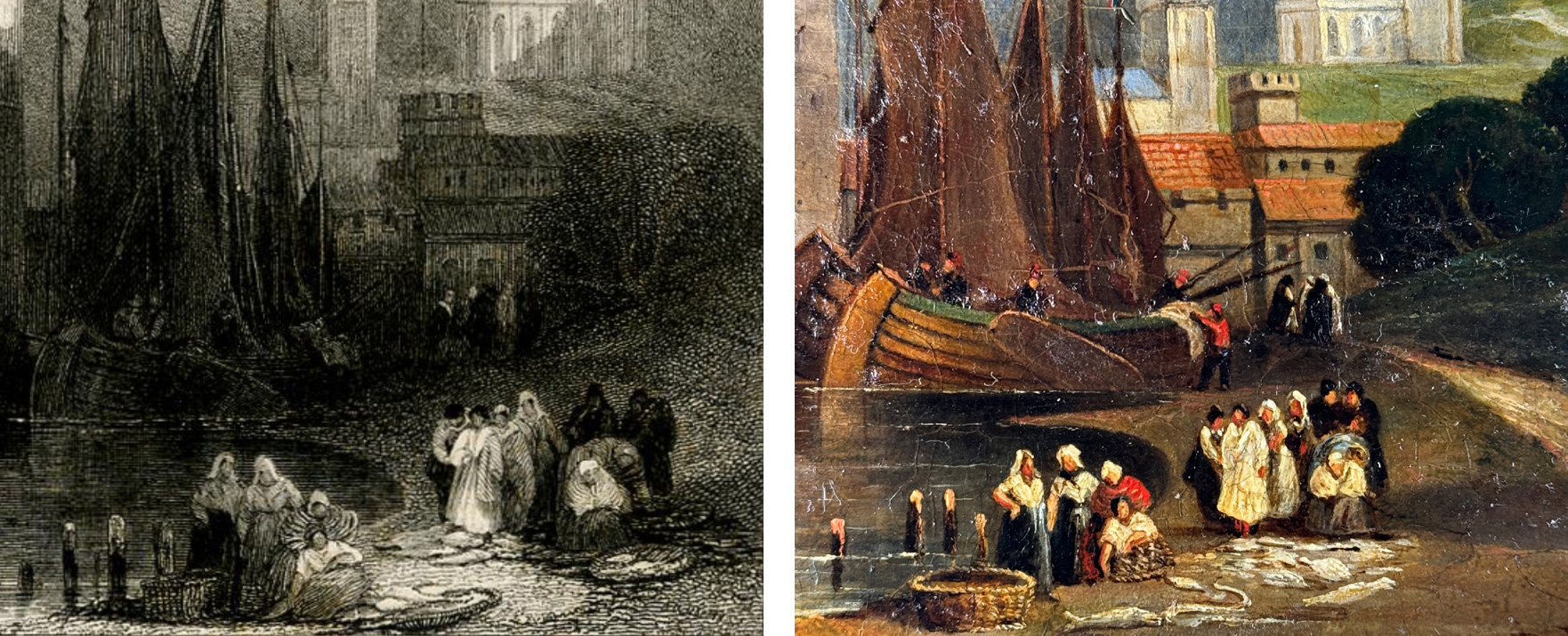
There are a few variations between the print and this oil, such as the spire on the church on the far right. However, the composition is fundamentally the same, and shows clearly that Goodall copied this 1829 painting when he engraved the print in 1831.
In an article titled “The Annuals of Former Years” published in “The Bookseller” December 24, 1858, the high prices paid by “The Literary Souvenir” for scenes are referred to, including “… one hundred and fifty guineas… was paid for .. the “Oberwesel” of David Roberts, by Goodall, executed for this work.”
Today, that is more than £10,000! In real terms, that was more than two years wages for a skilled workman.
In the various outlines of David Robert’s early years, the 1829-32 period is not discussed much.
Roberts is recorded as travelling to Paris in 1829. He obviously went the long-way around, via the Rhine, as the 1831 print of Oberwesel was obviously published after sketching visit in the years prior. With this newly discovered oil, we can date this visit to pre-1829.
An interesting historical detail supports this dating. The Rhine boats alongside the riverside road have a flag flying from each mast tip. The later watercolours have no flags identifiable; the print doesn’t clearly show what flags they are; but the oil painting shows them very clearly to be French flags. This is accurate for the period; the town of Oberwesel was part of the Palatinate, the remnant of the Medieval Holy Roman Empire; in 1802, the French Empire under Napoleon had annexed it. This ended in 1815 with the defeat of Napoleon, when the 1815 Congress of Vienna gave the region to Prussia – but clearly, the French presence was still there in the river traffic.
This work shows the importance of the Rhine to the regions it flows through, the ‘super-highway’ along which vast amounts of trade goods were moved. In the David Roberts depiction, the boat in the foreground carries one of the region’s most important products, a vast iron-bound cask of wine. Perhaps this is a transaction in progress, with French ships awaiting the arrival of the wine-ship to trade with.
Provenance for this piece has proven to be elusive. It doesn’t appear in the publication compiled from Robert’s notes after his death, where he set out to record his achievements each year of his career, including small ink sketches of the works he recalls for each year. It seems the work slipped his mind. However, the print is the definitive proof of its existence. It was found in a Geelong, Australia, collection, amongst paintings that were part of a family inheritance. This collector had most probably found the piece in Melbourne in the mid-latter 20th century.
Moorabool is pleased to offer this important oil in their August 10th Auction on Invaluable.
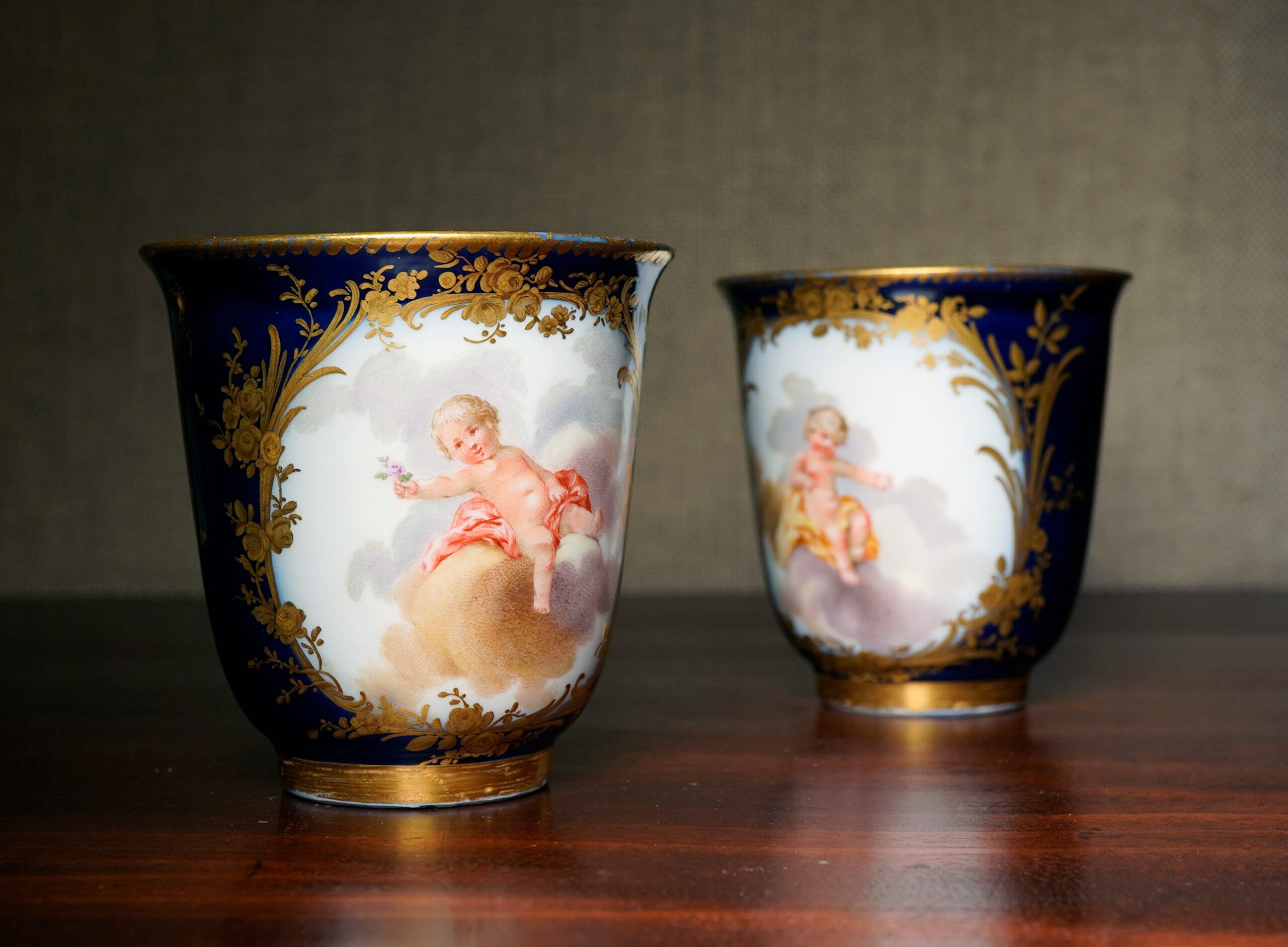
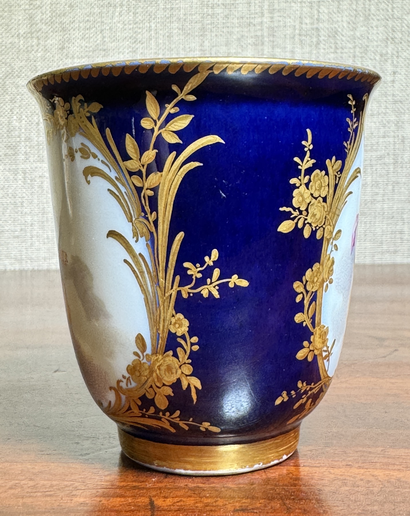
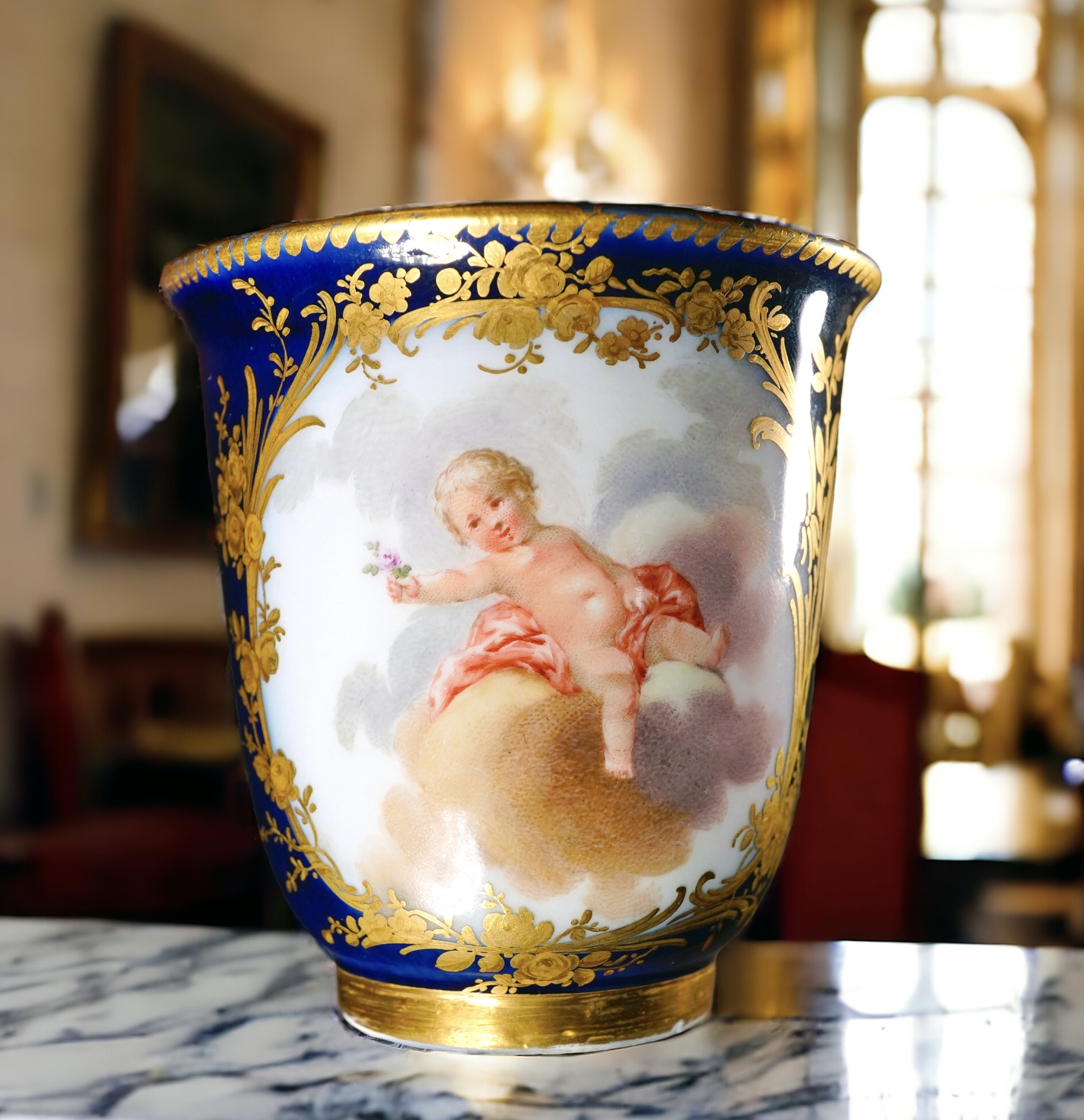
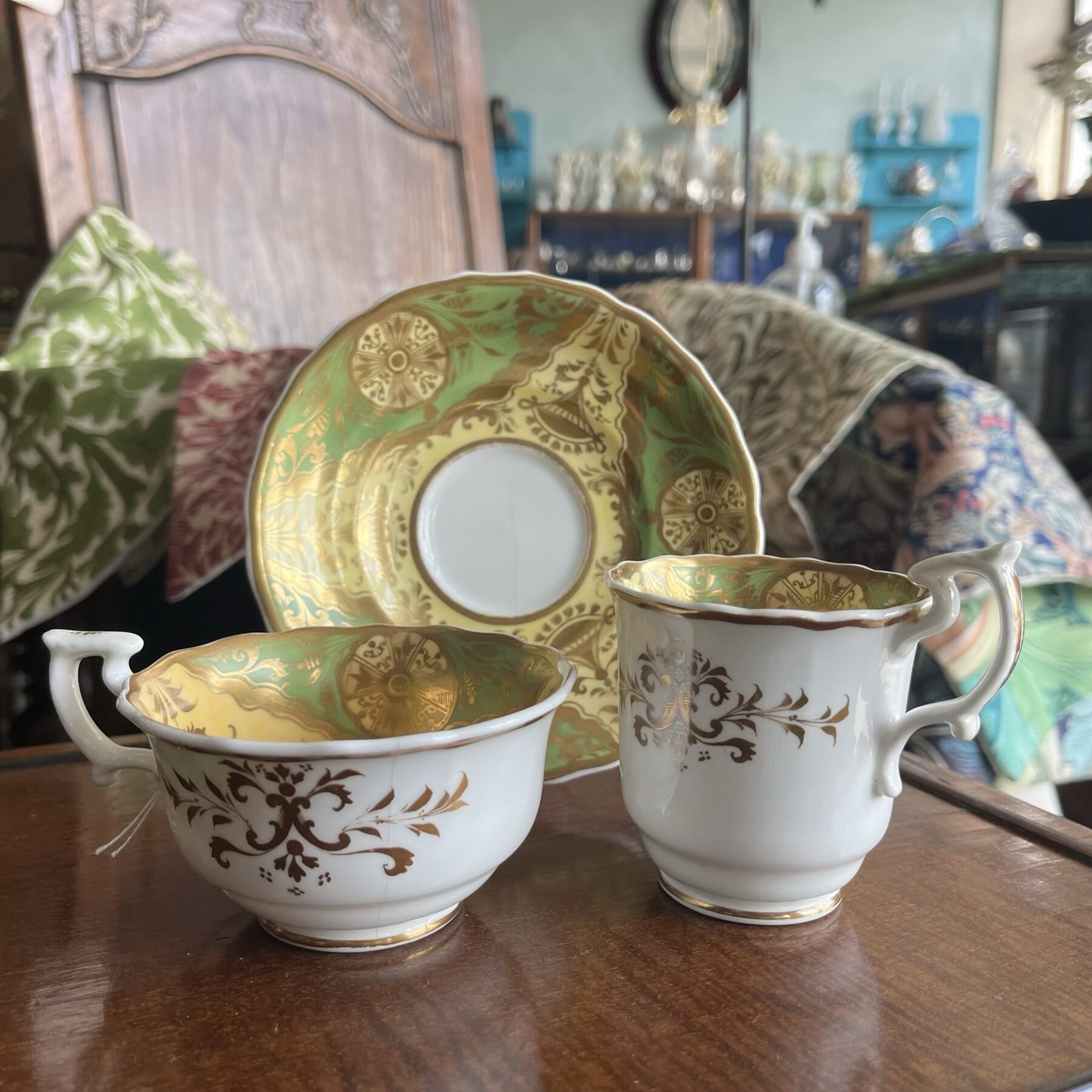
Sometimes, things don’t turn out to be what they look like. While that’s usually a pre-cursor for disappointment when we discover something is made later, or badly damaged – our recent experience was quite the opposite… An enquiry about some ‘Dresden Cups’ with a photo of the two beautiful beakers illustrated here came to us. The pieces looked superb quality, and Sèvres would be a likely candidate – not Dresden, or Meissen as it is more familiarly known.
Handling them for the first time showed them to be even better than the photos. They are absolutely the most stunning items, and their condition exceptional. Turning them up reveals their surprise : a pair of crossed sword marks, for Meissen.
Definitely 18th century, and Vincennes/ early Sèvres style, but Meissen marks; clearly there’s a tale to be told….
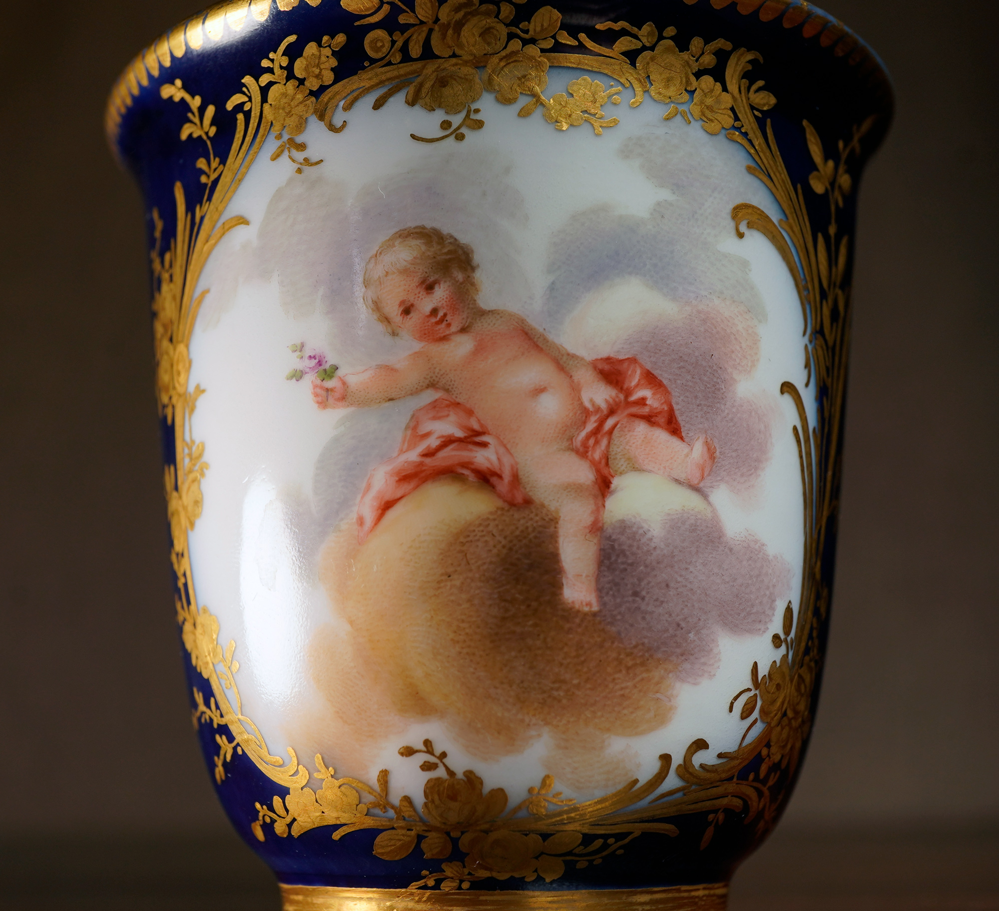
A dive into the books brought up the answer: a rare moment in the world of Meissen, when it no longer led the way in porcelain taste in Europe, but followed the French. Once we had established the period, we were able to attribute the artist: Johann George Loehnig (1743 – 1806).
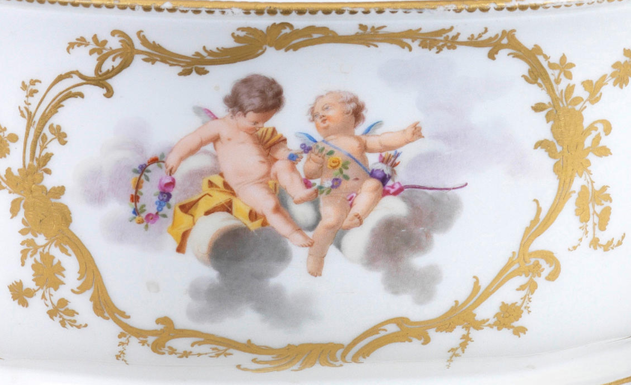
His work is rare. He was listed as one of the 1st-class artists in Meissen between 1764 and 1770. In 1786 he was still listed as a “…figure painter of the most exquisite class” in the manufactory’s list of painters. The artwork source for the lush and expressive putti were mostly provided by Johann Eleazar Zeissig (1737 – 1806), called Schenau, who in turn was inspired by François Boucher (1703 – 1770).”
Sèvres cherubs, 1758-9
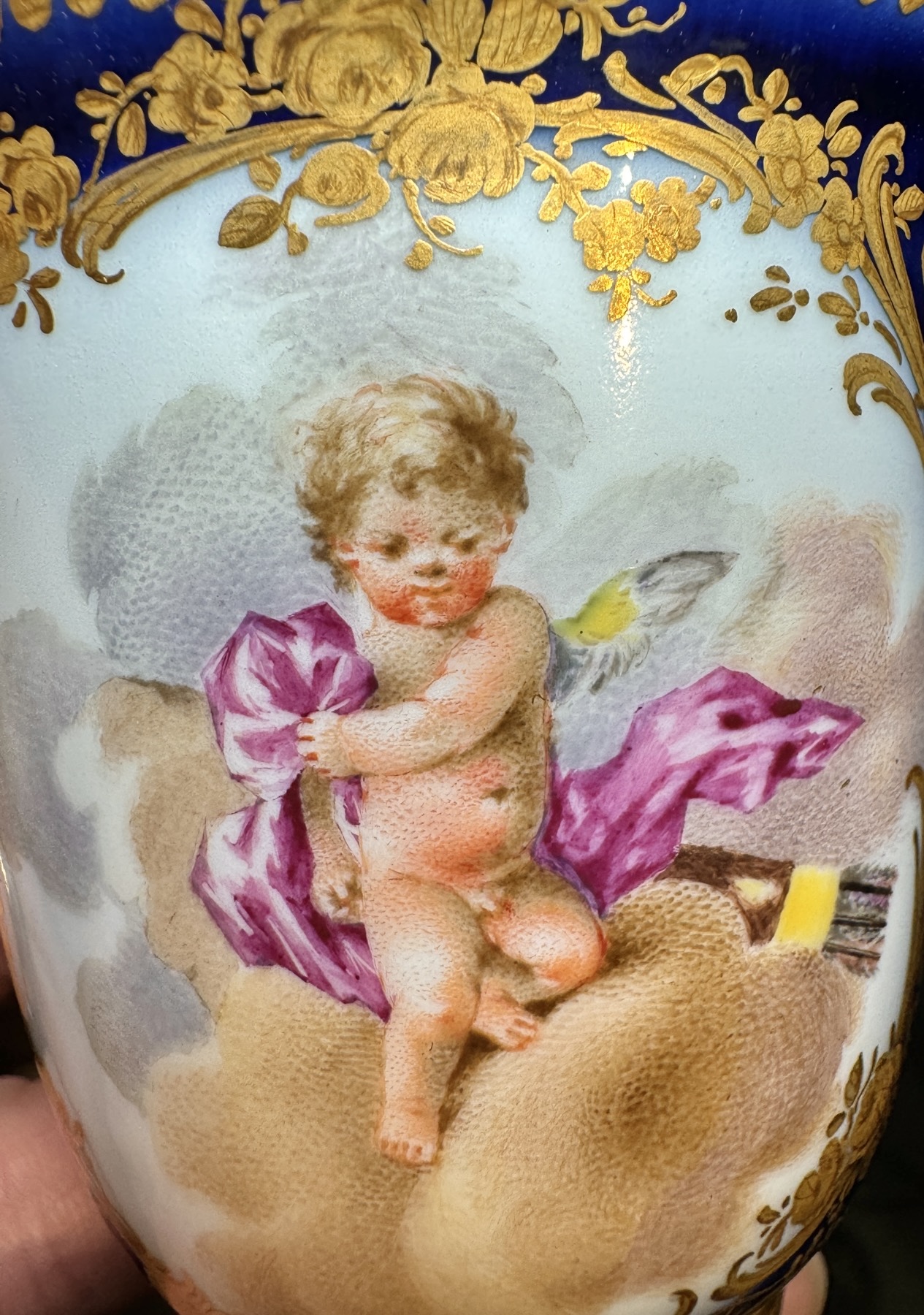
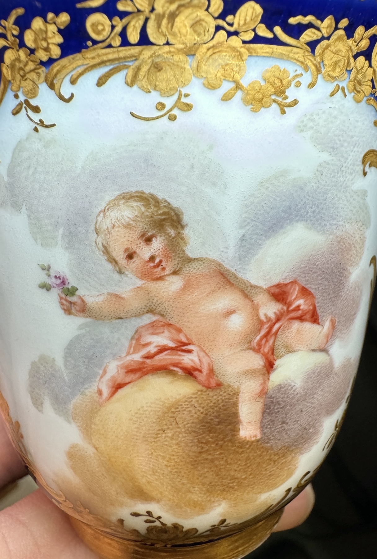
Meissen cherubs, c. 1770
Meissen c. 1770
Meissen c. 1770
Meissen, the pioneering porcelain manufacturer in Europe, had led the field in discovering how to manufacture porcelain, inventing and defining the European taste for porcelain right from their first creations in the first decade of the 18th century. By the 1770’s, they had a large number of competitors, and lost their lead as innovators to other makers. There are several shapes ‘borrowed’ from France, and this cup shows the strong demand for the ‘French’ taste, decorated in a design that first appeared in Vincennes & Sèvres products in the 1750’s. While the Sèvres examples were based on the paintings and prints of Boucher, it has been suggested that the designs for the Meissen examples 25 years later came from the works by Schenau (Johann Eleazar Zeissig), Director of the Royal Academy of Arts in Dresden – who was himself directly influenced by the works of Boucher.
Very few examples are to be found of this direct copying, and appear to be limited to a few very exclusive tea sets – and chocolate, as seen here – made for the most wealthy of customers.
This cup, along with its companion, is said to have come to Australia in the 19th century, to be passed down several generations in Geelong, Victoria, before it was brought into our premises in Geelong in 2024.
Munich Museum tray – illustrated in ‘Meissen Porcelain of the 18th century’ by Hermann Jedding
There is a tea-tray in the Munich Museum which is so exactly related to this cup, we speculate it may be the original for a split-up setting – perhaps a teapot, a coffee/chocolate pot, a sugar bowl, and two cups & saucers sat on this as a dejeuner set. The main scene is Venus and attendant cherubs amongst clouts, while the small panels in the border feature trophies, with the borders around each being the exact leaf & flower design seen on this cup. There is an identical dentil border to the rim.
Above is a detail from Hermann Jedding ‘Meissen Porcelain of the 18th century’ p 104, pl. 179, showing a tray with the exact same figures, ground and fine gilt borders, described as being painted by Johann Georg Loehnig, who “…preferred preferred vessels in royal blue… which he painted with putti, lovers or portraits, often using the stippled dot technique”. He describes the borders: “etched gold tendrils and flowers… the refined delicacy of French taste was also sought in Meissen”.
The tray illustrated is in the Munich Bayerisches Nationalmuseum , dated 1770.
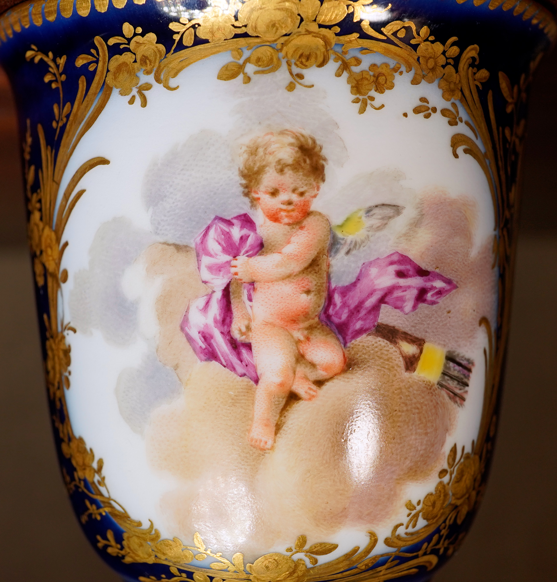
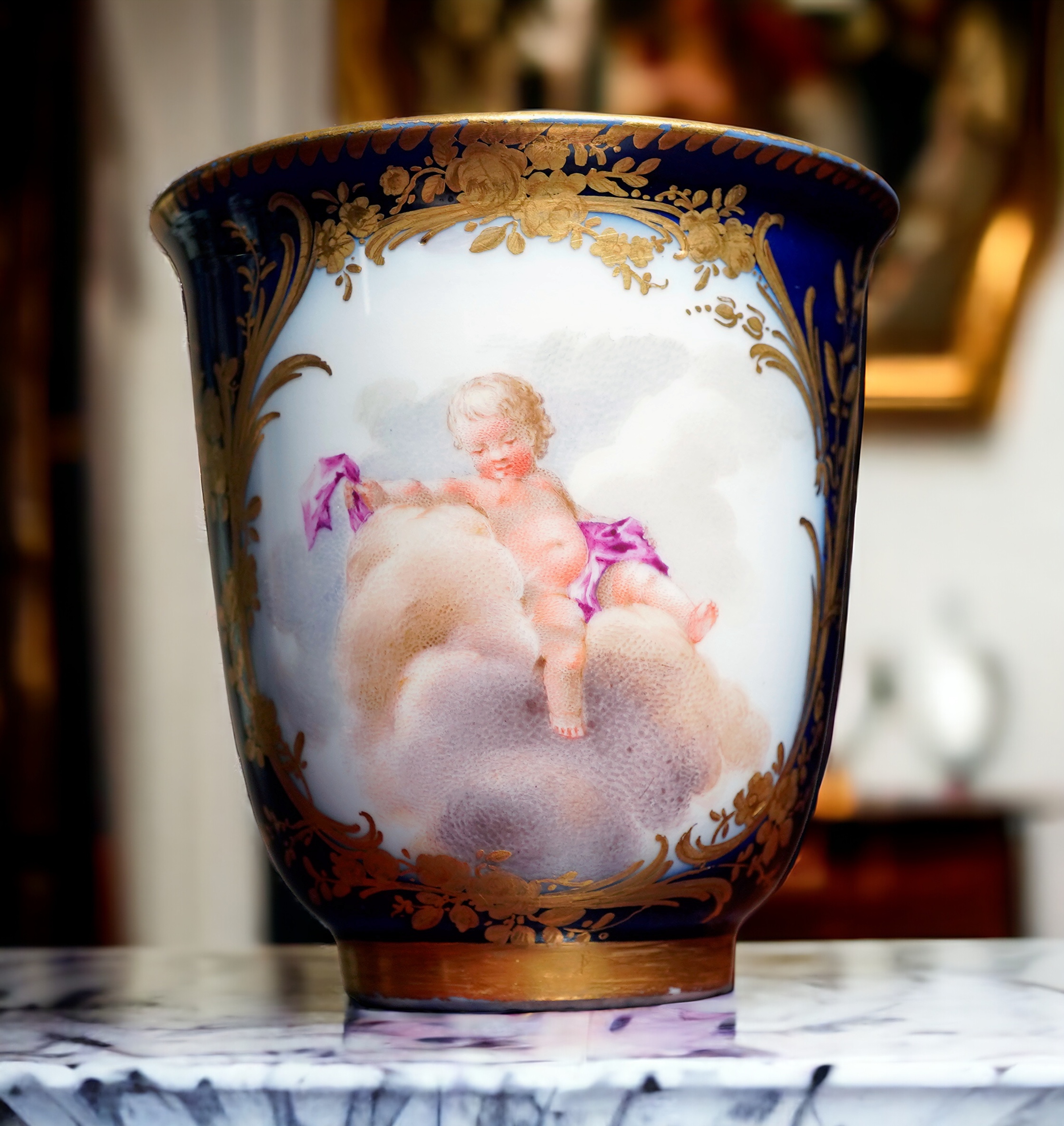
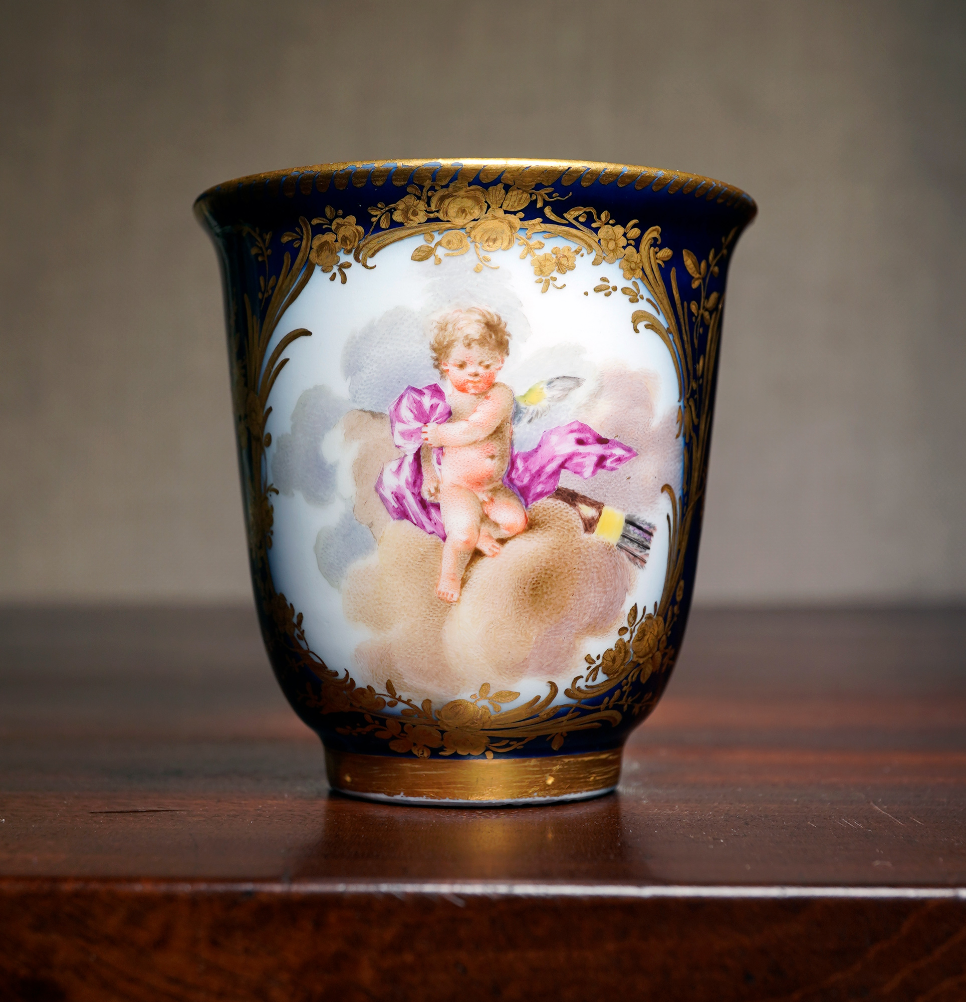
Compare to the border of these beakers – it’s the same, and assumed to therefore be from the same unique commission, circa 1770. This was not a ‘pattern’ of the firm, and each commission would be different in detail, such as the gilt borders. The cherubs and their clouds appear identical in concept – although no colour photograph of the tray could be found.
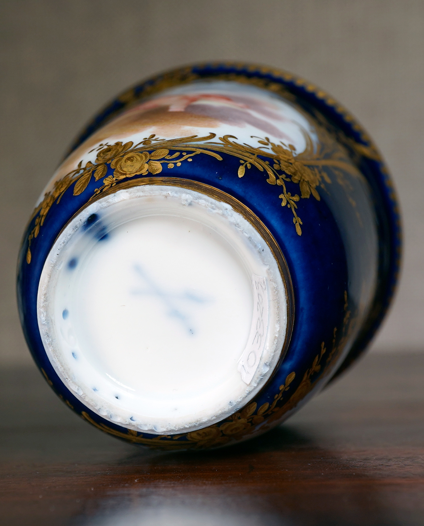
Two rare Meissen chocolate cups, of tall beaker form, superbly painted by Johann Georg Loehnig with two panels of cherubs in clouds, in his distinct ‘stipple’ technique, imitating Vincennes/Sèvres products of the mid-18th century, set within ornate leaf & flowers raised & tooled gold frames, the foot with a solid gold band.
Crossed swords mark in underglaze blue to each, also indistinct underglaze ground-painter’s mark, pressnumer ‘.9′ (or 6’) in the foot rim.
An important Freshly Discovered Colonial work of art by a notable Convict Artist.
This small but detailed watercolour was recently discovered in a Geelong residence. It is no surprise that it turns out to be an important piece of colonial art: it comes directly from the collection of Clifford Craig, the great early collector of Australiana.
Frederick Strange was born in 1807, and claimed to be a ‘portrait and house painter’ from Nottingham, according to records from 1837 when he was arrested for robbery in Colchester. This involved the theft of a number of items from a number of shops, including silver spoons and a gold pocket watch which he was wearing when arrested.
The name ‘Frederick Strange’ may well have been an alias given to the court at this time. Sentenced to Transportation for Life to Van Diemans Land, he was sent on board the ‘Neptune’ late 1837, and arrived in Hobart in early 1838. He was initially ‘unassigned’ – most other convicts were given work in the local region – but an article in the Colonial Times in 1840 shows he was ‘assigned to Mr Woodcock Graves’.
Note: this evidence has apparently been overlooked by previous researches: we have discovered a report in an 1840 Tasmanian paper that adds a fascinating context for the early years of Frederick Strange in Tasmania.
John Woodcock Graves had arrived in Hobart in 1833, and set up a business which advertised itself as able to ‘repair, paint, and varnish carriages, undertake Portrait Miniature and Heraldic painting in Oil and Water, as well as undertake House, Sign and Ornamental Painting’. Strange being assigned to this business was logical, considering his claimed background in England. However…. things were not good at the Graves establishment. In the early 1840’s, John W Graves spent some time in the Debtors Goal and Hospital for the Insane at New Norfolk. This is probably directly related to the 1840 Colonial Times report (above), where despite Strange’s good behaviour & hard work, he claimed Graves was irrational – “so outrageous that the man (ie Strange) is in fear for his life….” .
Colonial Times, Tasmania 1840
Frederick Strange appeared to claim the protection of the Government, he being assigned to Mr. Woodcock Graves. It appeared from his statement that he is an artist, and that he has, ever since he has been assigned to Mr. Graves, been the principal support to the family, and entirely so at the time Mr Graves was away at Sydney; and although he had been at all times unremitting in his endeavours for the family, his master was in the habit of beating him, and has latterly become so outrageous , that the man is in fear of his life; his worship very properly returned him to Government.
Colonial Times, Hobart, 1 December 1840
Soon after Frederick Strange had been ‘returned’, John Woodcock Graves was sent to the “Debtors Goal and Hospital for the Insane at New Norfolk” – for ‘insanity, although probably also edging on the status of ‘Debtor’ if Strange’s claims of being the one who did all the work in the business was true. Frederick Strange is recorded in 1841 as being employed as a ‘Government messenger’, and granted a ‘pass’ of freedom the same year. He set himself up for a respectable life in Launceston as a portrait painter and art teacher.
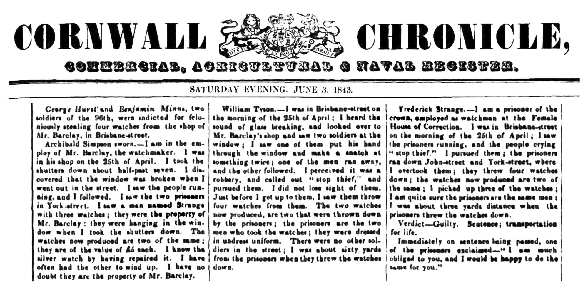
In a newspaper report in June 1843, he describes himself as ‘…a prisoner of the Crown, employed as a watchman at the Female House of Correction…’ . This article is an interesting read, describing a moment of drama he found himself mixed up in one day in Launceston:
The irony is remarkable: In England, Frederick Strange had been convicted for theft, the key item identified as a pocket watch; transported to Tasmania, he was then witness to the opportunistic theft of four pocket watches, by soldiers no less, and gave chase, so when the shop assistant caught up with them, Frederick Strange was standing there with them in his hands… having picked them up after the thieves ran straight towards him and threw them on the ground just three yards away! The soldiers were sentenced to ‘transportation for life’ – and one made the enigmatic remark “I am much obliged to you, and would be happy to do the same for you.” Perhaps there is more to this story than meets the eye…?
Frederick Strange received his ‘ticket of leave’ in 1845, and a conditional pardon in 1849. Throughout the 1850’s he was actively painting and exhibiting his works, while always looking for commissions. He seems to have found favour amongst the Scottish community, and a small number of his portraits survive. His advert in 1855 advertised ‘Lessons given in Landscape Drawing, Portraits painted in oil, or taken by Daguerreotype’.
The inclusion of ‘dagerotype photography’ in his business is interesting. No ‘known’Strange’ photographic images have been discovered, and in some ways it is at complete odds to his profession, as a topographical artist. His images were intended to record the landscapes of his time – but the emergence of absolutely accurate photographs of the same scenes, which took a fraction of the time to produce that a detailed watercolour took to paint, would have rapidly taken away from his painting business. Perhaps the colour factor, which meant a much more pleasing image on the wall, was the one thing that still appealed to his customers.
However, within a few years of the 1855 advert, Frederick Strange lost interest in his painting, and is listed as a ‘Grocer’. He died in 1873, but nothing is attributed to these last years of his eventful life.
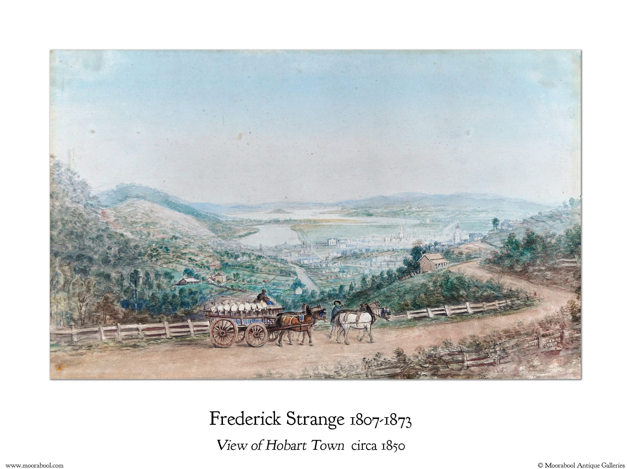
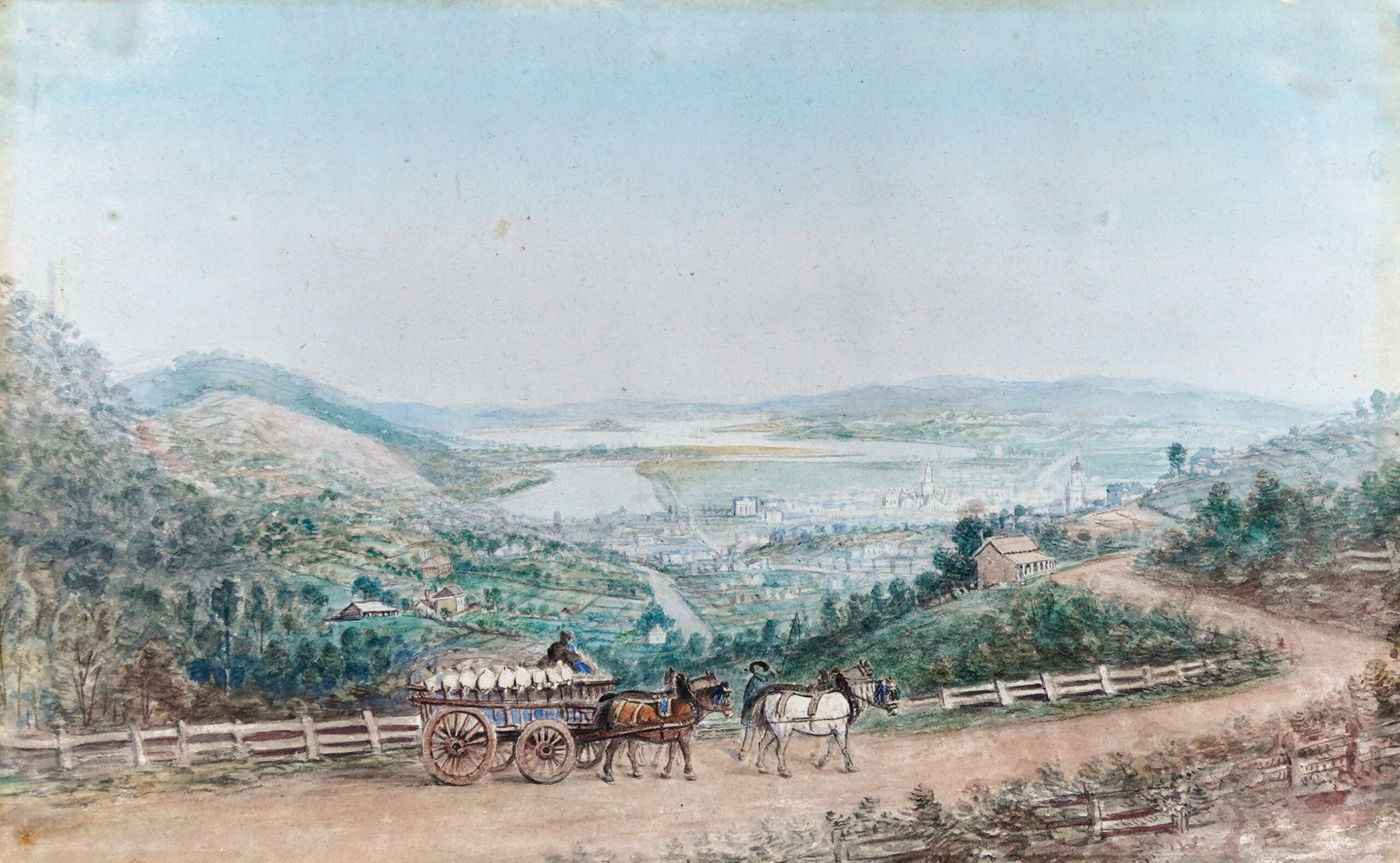
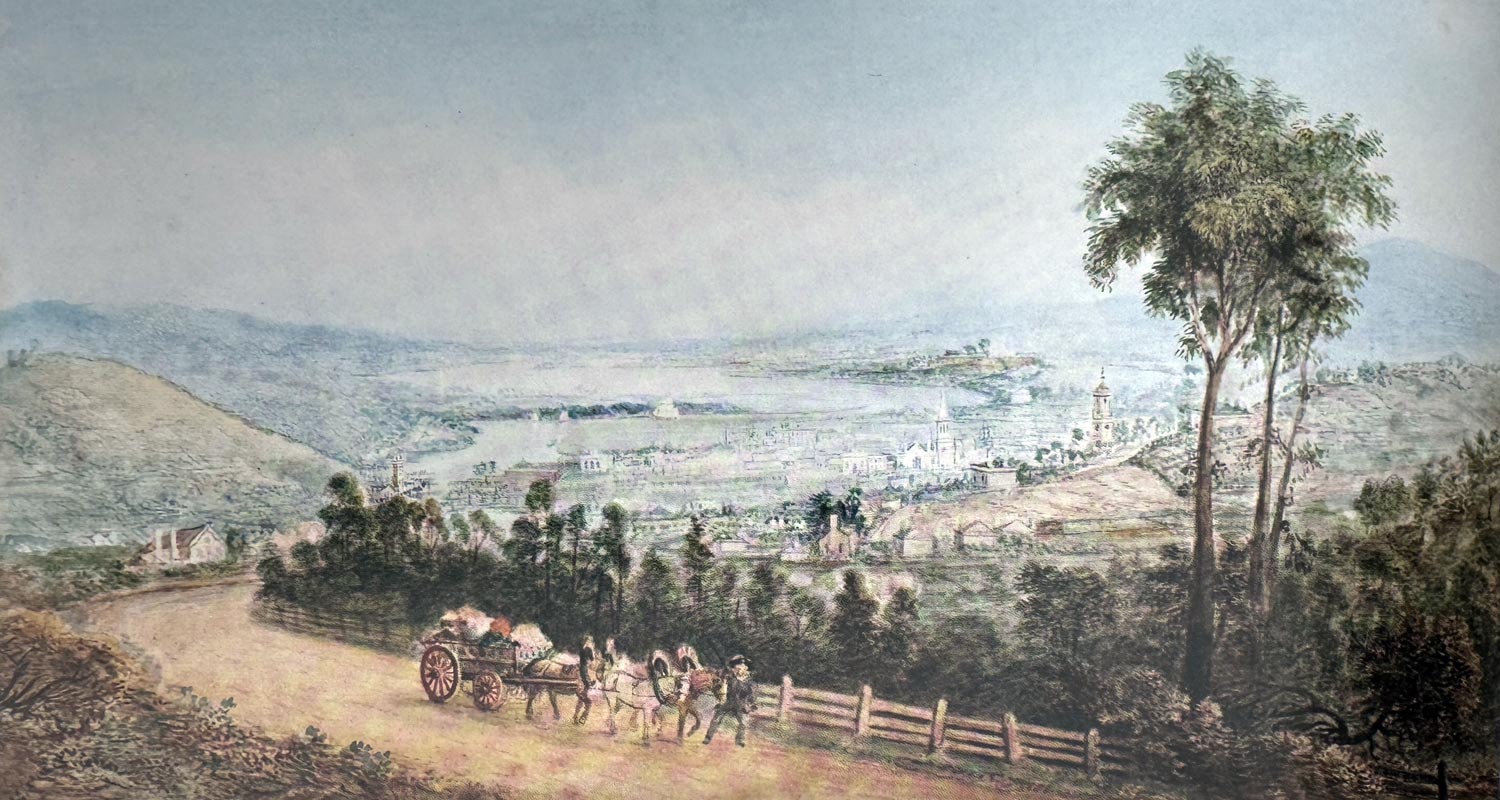
Frederick Strange (1807-1873) – View of Launceston, c.1858. Watercolour and pencil on paper – 35.7×21.9cm. Moorabool Antiques, Geelong
Launceston, 1860 :oil painting by Frederick Strange, Mitchell Library, State Library of New South Wales
Provenance
The interest in convict artists developed in the first half of the 20th century. For Frederick Strange, the key researcher who ‘re-discovered’ him was Clifford Craig. Coming from Melbourne to practice as a doctor in Hobart in the 1920’s, where he fell in love with the early colonial history.
Together with his wife Edith, (who was the driving force behind the establishment of the National Trust of Australia in the 1960’s), the Craigs accumulated a collection of colonial furniture that came to be considered one of the best of its kind in Australia. Having amassed an extensive assortment of early ‘Tasmaniana’, comprising documents, books, maps and prints, they sold 2350 items at a three-day auction at Launceston in 1975.
Prior to this he co-published Early Colonial Furniture in New South Wales and Van Diemen’s Land in 1972.
He lists the known Strange works at the end of his article – 35 in total, all in public collections except for the final two, which are ‘… privately owned in Hobart but no details are available’….
This painting doesn’t appear on his 1963 list, and may well have been one of the two works in Hobart, or an example he found in subsequent years. It was inherited by his son, and the last artwork kept by him as he downsized, before coming to Moorabool Antiques.
The watercolour came to Geelong when he retired there in the 1980’s, and has been in the Craig family ever since.
Location
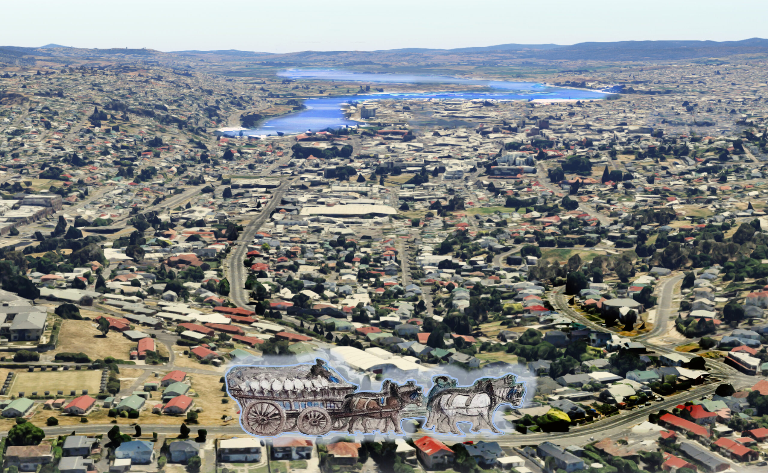
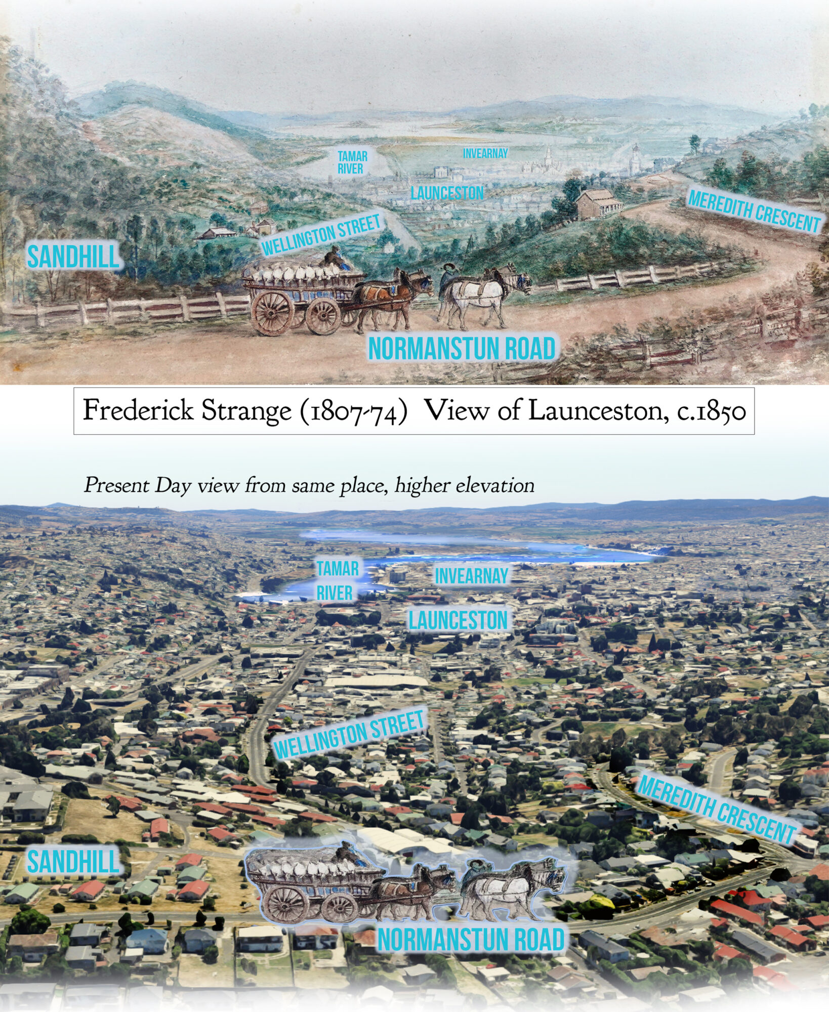
It’s an interesting exercise to compare the present-day view with Strange’s watercolour.
Slide the line to see a then / now comparison.
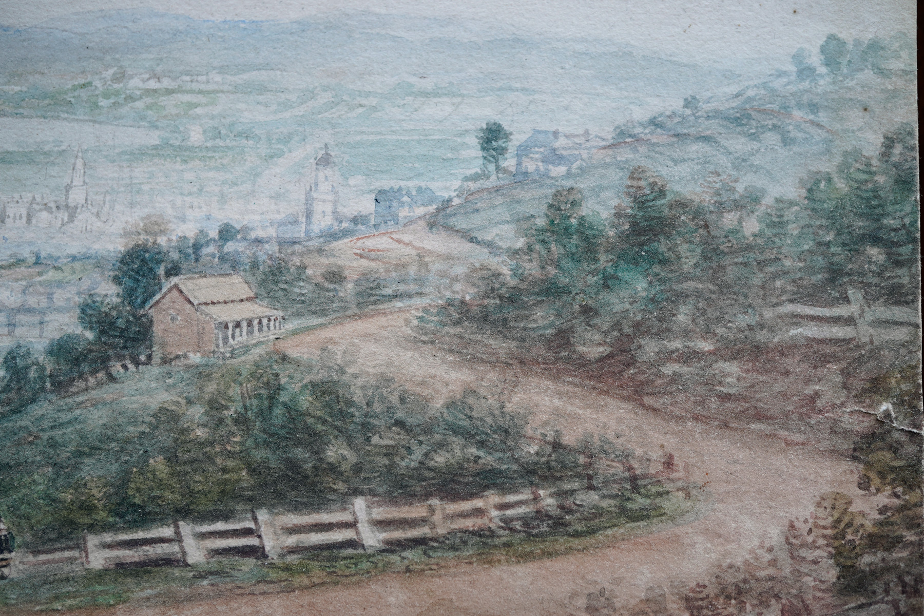
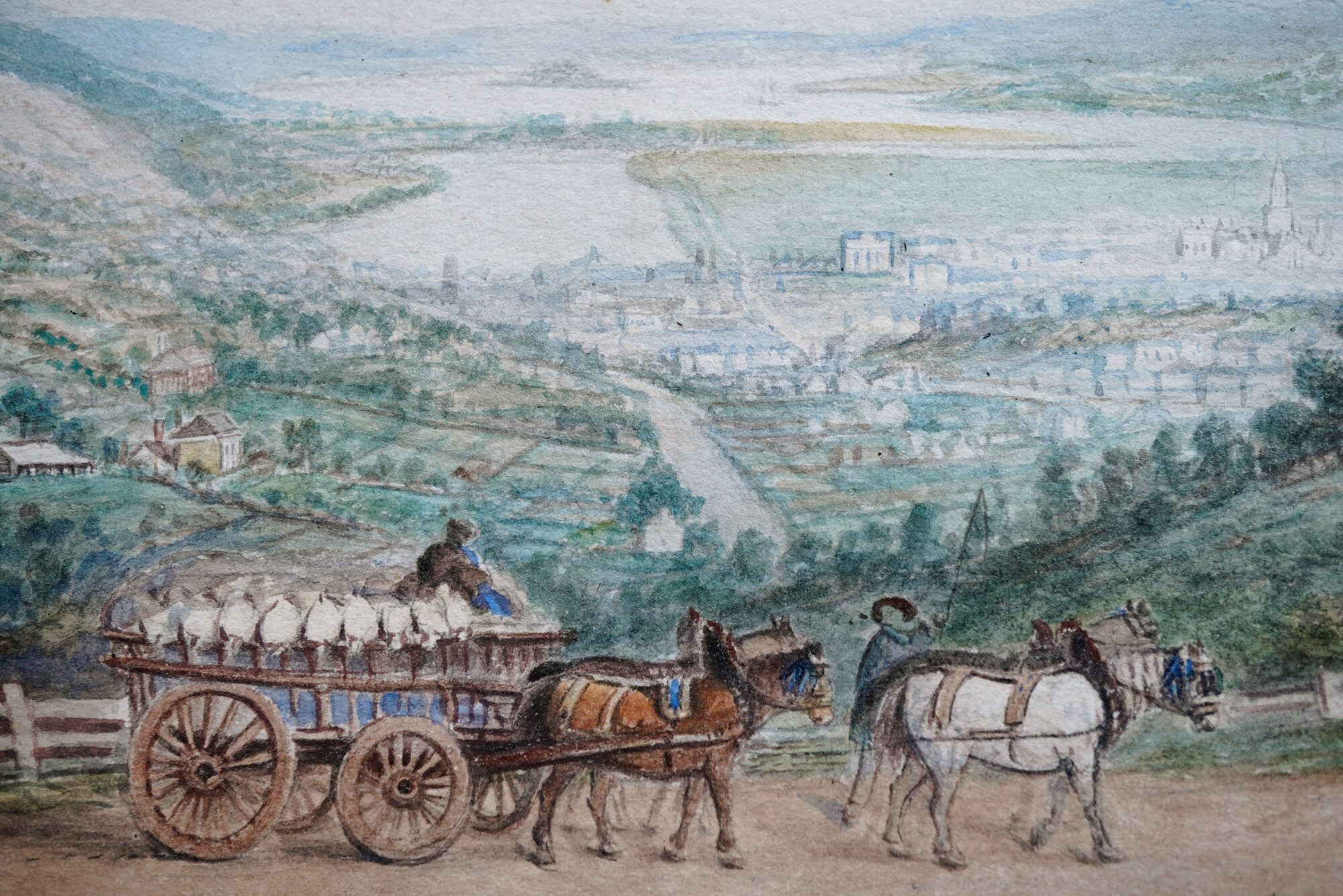
We can pinpoint the location Strange sketched from as being along the route now known as ‘Normanstun Road’. The identity of this suggested location is supported considering the magnificent cart-load of flour sacks passing by: it is the route from the flour mill built at the mouth of the Cataract Gorge in the 1840’s.
Launceston from the South – late 1850’s – Stevens Collection, Melbourne
The other work by Strange that must be noted is in the Stevens Collection, Melbourne, and was exhibited in the 2017 Exhibition “The Enigmatic Mr Strange”, Queen Victoria Museum and Art Gallery. This is another view of Launceston, from almost the same position, with the same post-in-rail fence and even apparently the same cart being pulled by a four-horse team – although the cargo on our example is much more neatly loaded!
Frederick Strange – View of Launceston, circa 1858 – Moorabool Antiques, Geelong
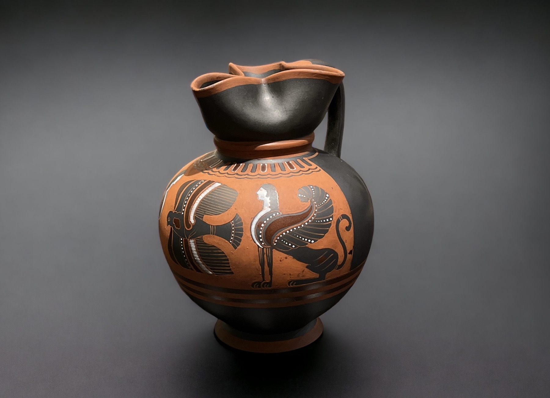
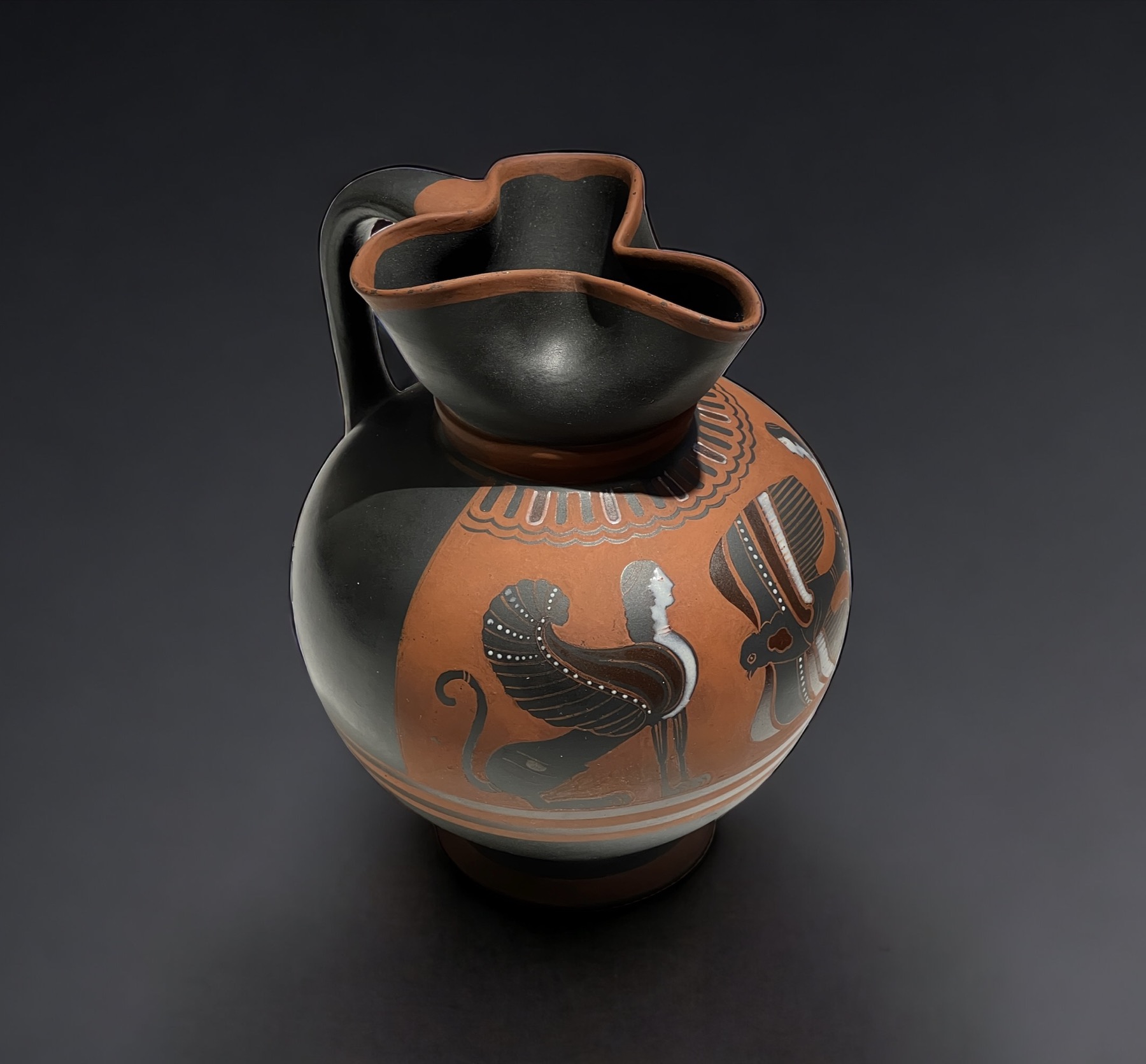
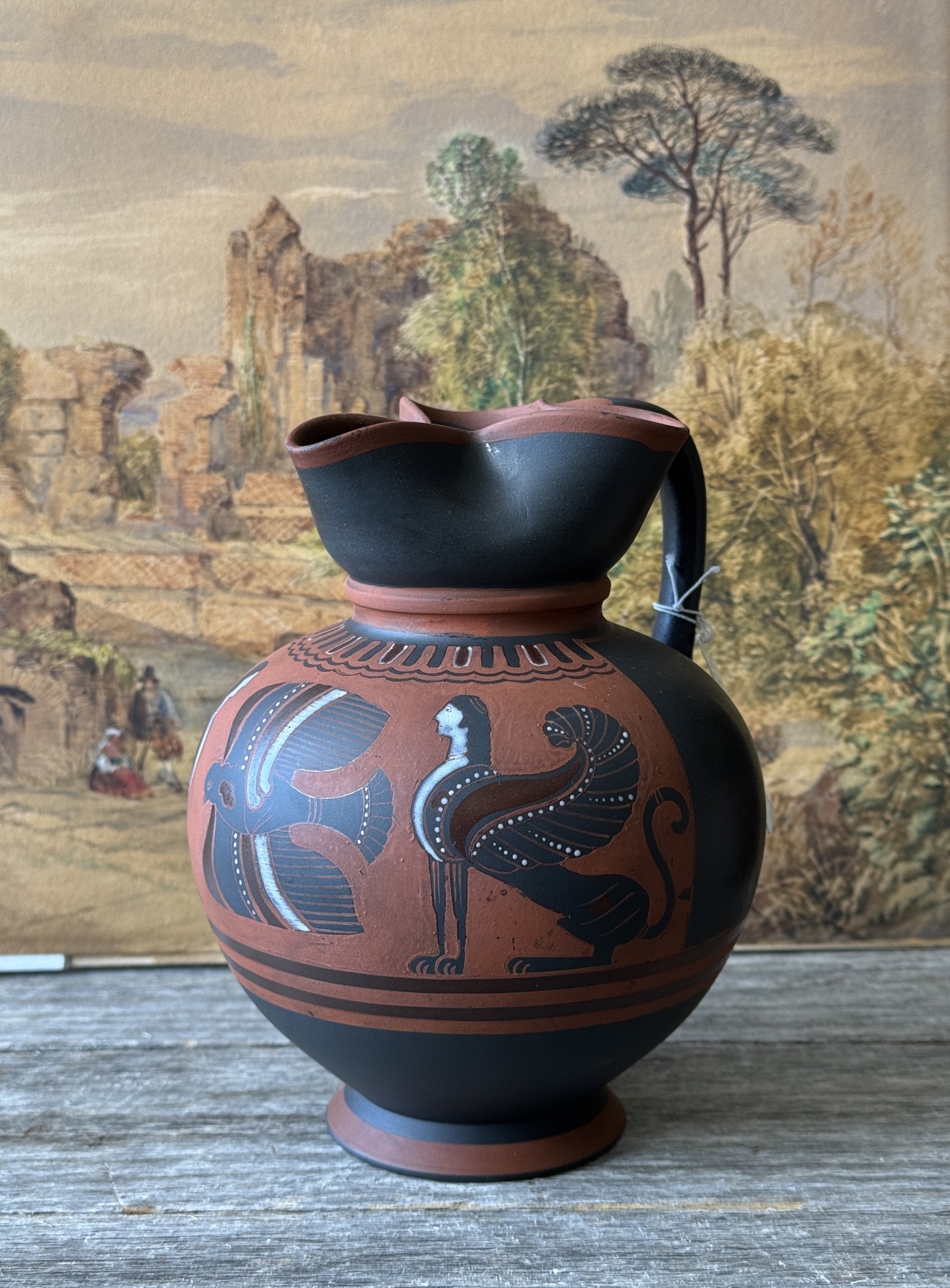
This rare piece of Wedgwood came to Moorabool recently, and is quite a remarkable piece.
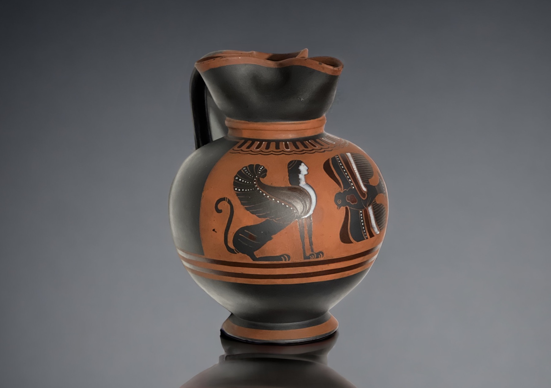
Wedgwood ‘Egyptian’ Jug, registered 1854, at Moorabool Antiques, Geelong
Based on a Greek ‘Black Figure’ jug of the 4th century BC
Black body, added orange slip decoration
The ‘Egyptian’ name perhaps due to the Greek Sphinx depicted.
Made solely for Woodard & Hattersley, Cambridge, from 1854.
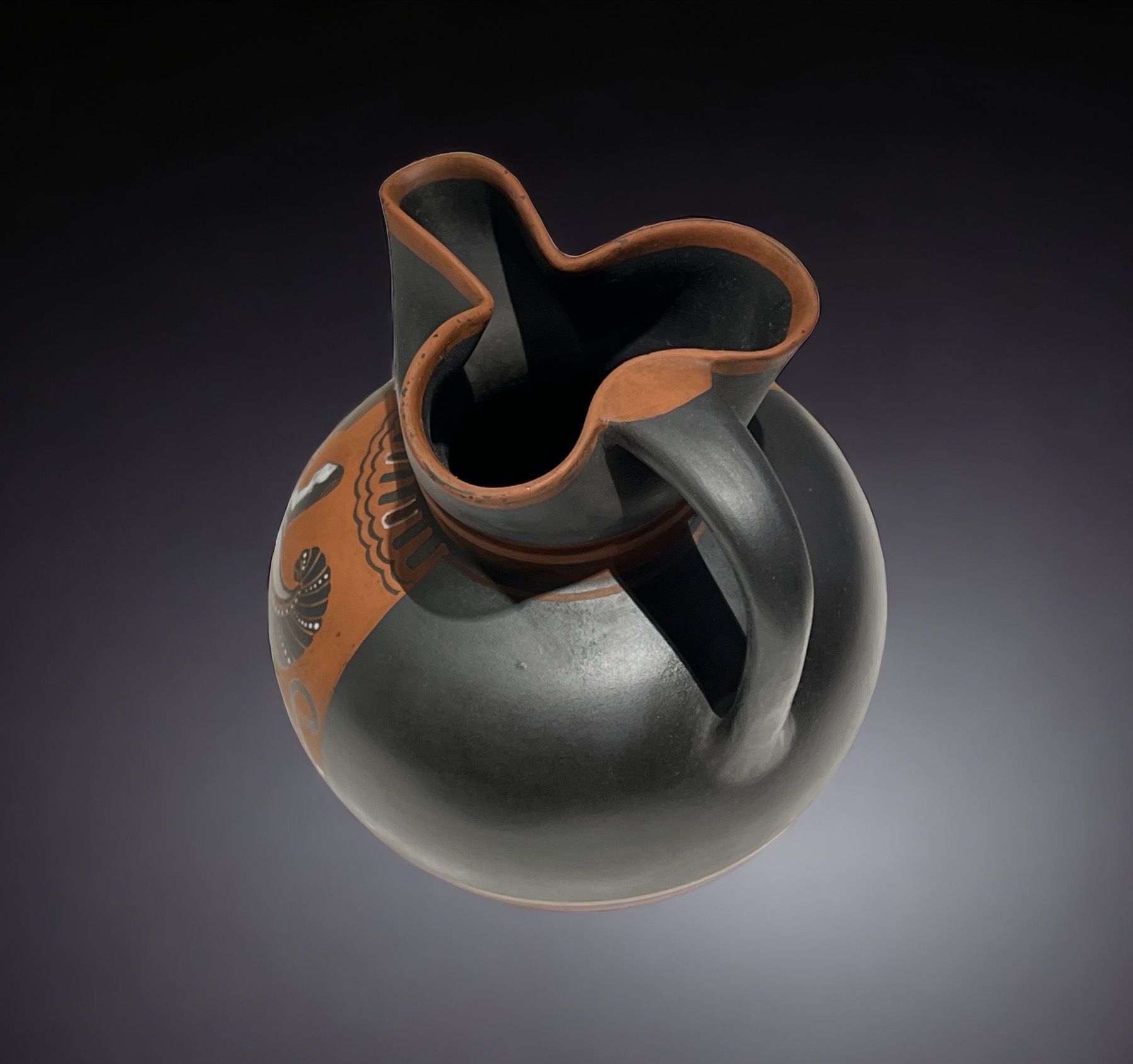
Rare Wedgwood ‘Egyptian Jug’, modelled in black basalt after an Ancient Greek oinochoe, with a faithful painted ‘black-figure’ style panel featuring a bird in flight flanked by two facing sphinx, defined by terracotta slip painted ground colour, with bands below to the foot & to the trefoil lip, the figures with white enamel highlights.
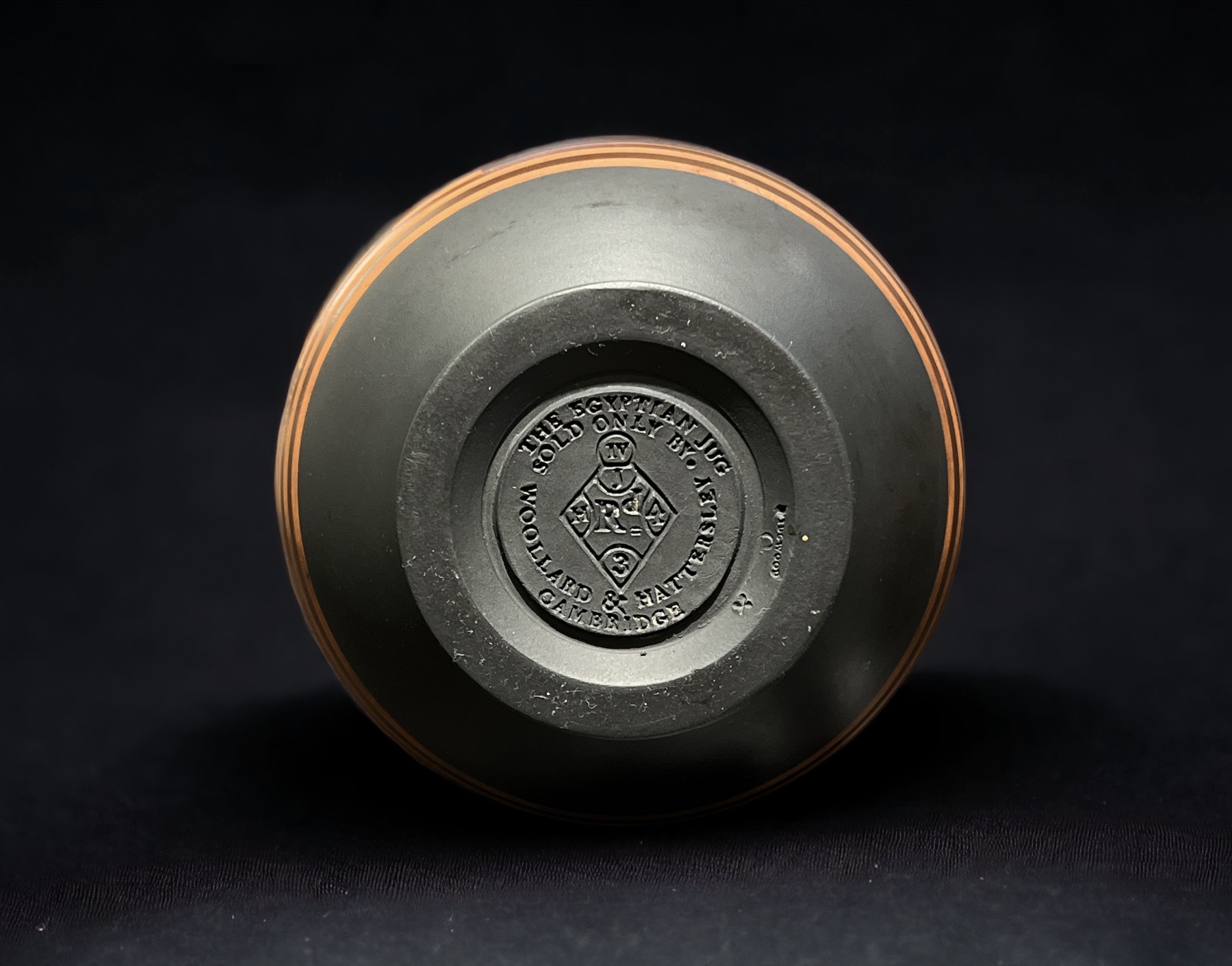
Large impressed registration triangle, with circular inscription “THE EGYPTIAN JUG / SOLD ONLY BY º / WOOLLARD & HATTERSLEY / CAMBRIDGE”. , also ‘WEDGWOOD” and modeller’s marks.
Wedgwood Egyptian Jug
This rarity was made for Woollard & Hattersley, who had the design registered in April 1854 as ‘The Egyptian Jug’ (ref. British Museum’s description), and made at Wedgwood. Established in 1761, Woollard & Hattersley were grocers, who also listed themselves as ‘ University Providers’. Their adverts list the various beverages they stocked, no doubt in great demand in the many Cambridge University halls. This jug is sometimes listed as an ‘ale jug’, and would be quite useful as one – perhaps a promotional giveaway of the early Victorian period….
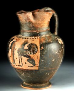
Greek original, Attic, 5th century BC
It is a superb example of the interest in re-imagining the classical world through the ‘revival’ movements – with one glaring mistake: although claiming to belong to the ‘Egyptian’ removal, it is in fact a faithful copy of a Corinthian Greek archaic style oinochoe, dating to the 6th century BC!
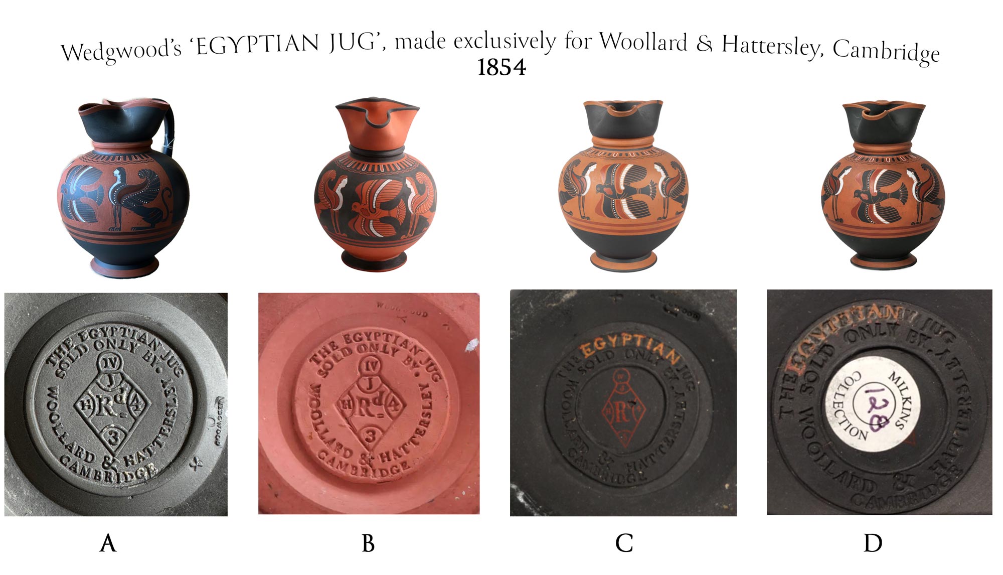
There were several versions made. Although apparently not in the literature, there are two examples in auction records that have a clue to the ambiguous ‘Egyptian’ naming: they are impressed-marked “THE CANTERBURY JUG” instead of “THE EGYPTIAN JUG” – but then the decorator of the jug has painted over the top of the impressed mark, with “EGYPTIAN” !
A- example @ Moorabool Antiques, solid black body with red painted background EGYPTIAN JUG B- solid red ware example, the background painted in black – EGYPTIAN JUG C- solid black, red printed registration diamond, red painted background CANTERBURY / EGYPTIAN D- solid black, red printed registration diamond, red painted background CANTERBURY / EGYPTIAN
‘The Canterbury Jug ‘ was perhaps a reference to an example of a Greek oinochoe jug, in the collection of an antiquarian of the region, as yet untraced. The design was registered in 1854, but promptly re-named, as shown by examples with ‘Egyptian’ painted over ‘Canterbury’. The marking stamp was then modified for the following products, creating the inaccurate name ‘Egyptian Jug’. It is a rarity amongst Wedgwood products due to the registration & patron mark.
A curios example sold in America recently (C) bears the registration diamond for 1854, but also a painted inscription for the word ‘Egyptian’. Careful examination reveals a different impressed word beneath – ‘CANTERBURY’ – so originally it was inscribed ‘THE CANTERBURY JUG’. Another example was sold in America with the exact same feature (D), meaning it was not a unique production issue. We can conclude this mark was original, but for some reason, the name of the custom-order by Woollard & Hattersley was changed to ‘EGYPTIAN’. Subsequent productions also differ in the way the registration diamond is shown; one is printed on in red, while the other is impressed.
Based on a Corinthian Greek ‘Black Figure’ jug of the 6th century BC
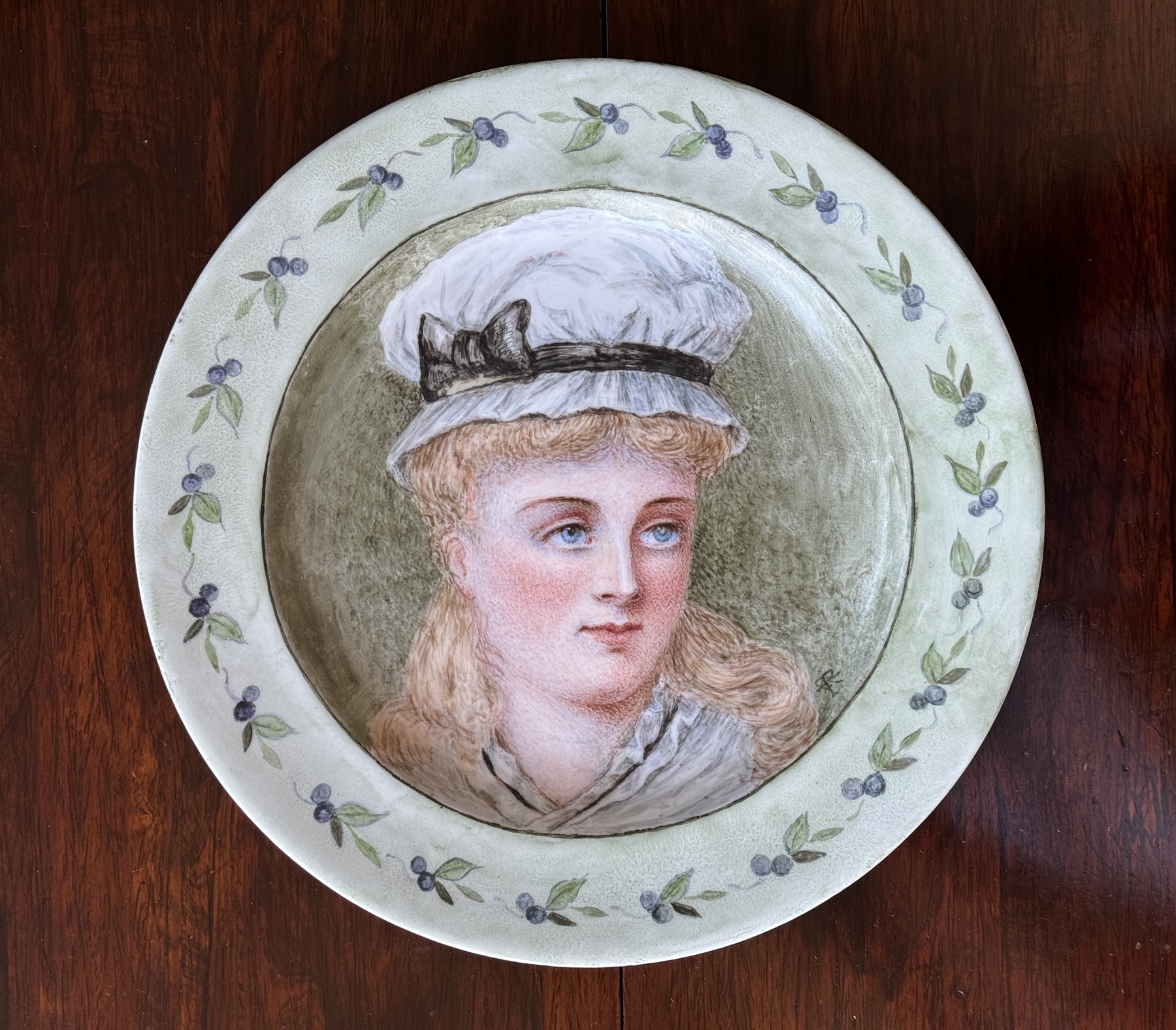
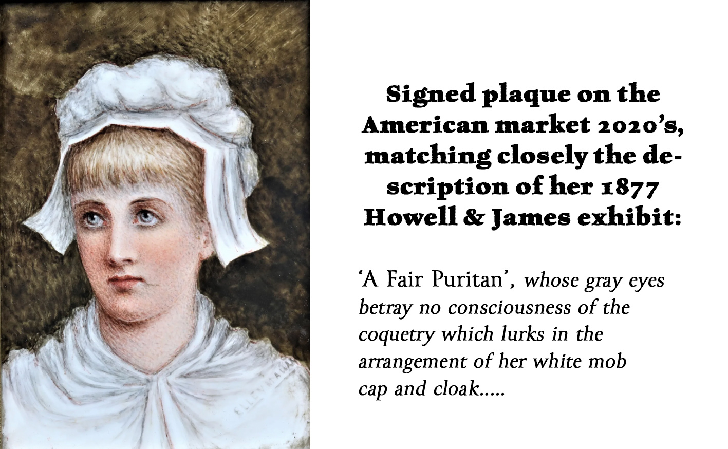
A fascinating piece of English porcelain has come to Moorabool, which if it wasn’t for the original 1876 exhibition label on the back, would just be an ‘interesting amateur-decorated decorative plate’. However, the name, date & place allows us to extract a story from this piece, which includes a close association with Charles Dickens, and a High Court Judge in Australia!
The porcelain is an anonymous blank, probably of Staffordshire manufacture. Onto it is painted an ‘Aesthetic Movement’ portrait, as was popular in the mid-late Victorian era. Such a piece is not unusual in the Antique World, as it was a favourite occupation for young ladies to learn to paint on porcelain. Watercolour painting was a standard part of any young ladies education, and it is noted that the artist of this piece, Ellen Ross, was a fine watercolorist. A step up from watercolour was painting onto porcelain. For this, studios ran classes, and for the more wealthy, a painting instructor would bring the materials to the students, take away their work to be fired, and bring back the results.
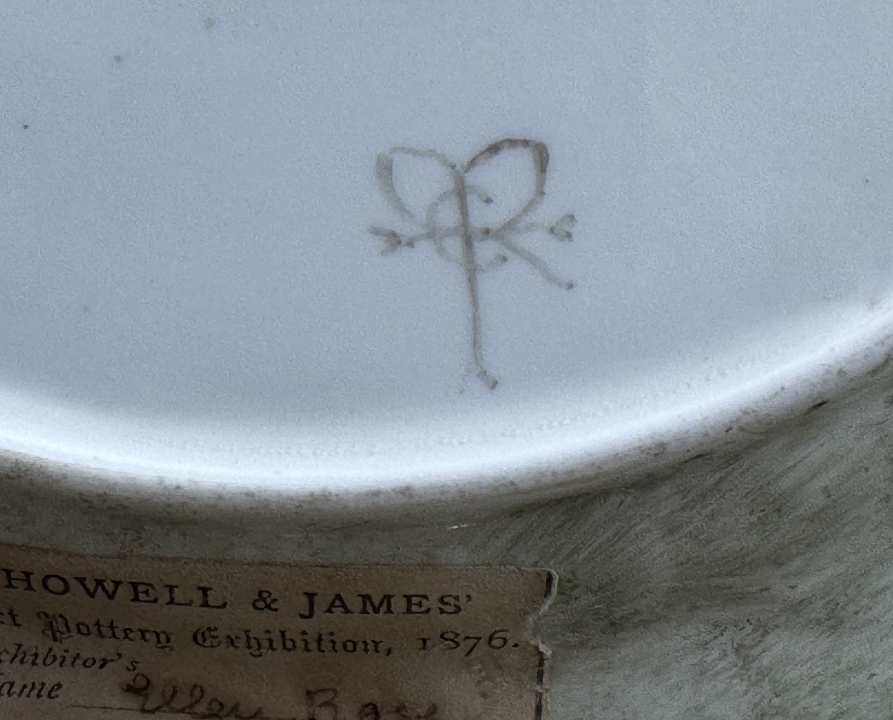
The important part of this plate is the paper label on the back. While it is signed with an elaborate monogram, there’s no record of this in the literature; the paper label, however, is the vital clue as it declares her name ‘Ellen Ross’.
Ellen Ross / Mallam’s monogram mark ‘ER’. This mark is not recorded anywhere else in the literature – and other pieces by her sighted are signed ‘Ellen Mallam’ in full. She was married in 1868, and this piece was made 1876, or slightly earlier, 1874-5…. several years after marriage. If you look at the top of the ‘R’ in the monogram, it could be interpreted as an ‘M’ – probably intentional.
Howell & James ‘Art Pottery Exhibition’ label, dated 1876, with Ellen Ross filled in as painter of exhibit no.3. The partially lost text next to it may have been a title – or could it be an update on her name – the second word looks distinctly like ‘Mallam’, her married name…
Ellen Ross is not noted as an artist or decorator – but we have the entry in Howell & James’s exhibition catalogues, where she is recorded as ‘Mrs Mallam (Ellen Ross)’. Clearly she was married around this time, and with the dates, place & two names it is possible to pinpoint her; Ellen Mary Anne Hyde Ross, born in St Pancras in 1837 (or 42, or 43 in other online records!?), she married solicitor Dalton Robert Mallam in 1868 in Kensington, London. They had 6 children.
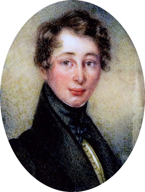
Charles Dickens, miniature at the Dickens Museum, London, painted by Janet Ross (Barrow), when aged 18, and not yet famous.
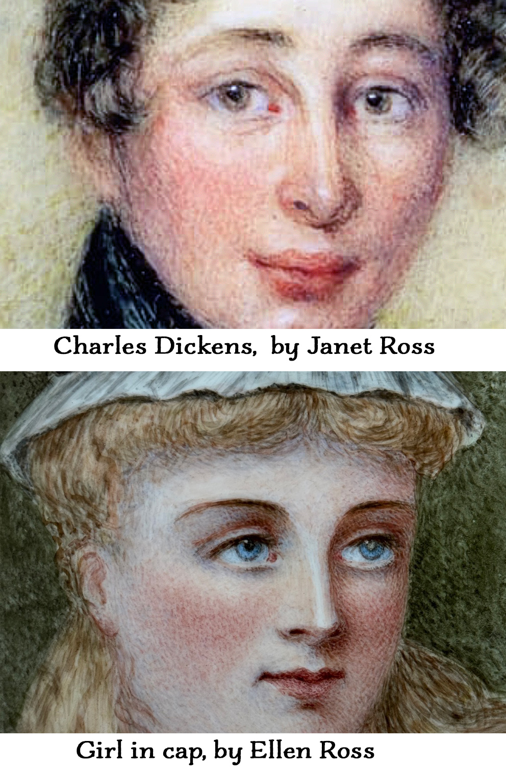
Ellen Mallam came from an interesting family; they were well-off, and close to the Dickens family. Their father was a solicitor & well connected. Ellen’s older sister Janet showed great promise as a miniature artist, and went on to become a miniaturist of note. Her work is held in major collections, such as the Victoria & Albert Museum. She married into the Dickens family, and was his aunt. Fascinatinly, one of her early works is an image regarded as the earliest depiction of Charles Dickens, now in the Charles Dickens Museum, London. In return, Dickens may have immortalised her in his book ‘Nicholas Nickleby’ as ‘Miss La Creevy’, a ‘miniature painter’….
As a young lady, part of Janet’s education would have included drawing & painting. For this, a ‘painting master’ would have been called on. His lessons would have included watercolour painting – and the skill of both Ellen and Janet would have led to their advancement to lessons in the art & technique of miniature painting.
We can imagine the young Ellen growing up with older sister Janet, and seeing her success as a miniature artist; perhaps they had the same painting master? Or did her older sister teach her? Certainly, there is a strong likeness to the technique of miniature painting in Ellen’s works, namely the use of pure strokes of colour in a series of lines.
That it was considered a prestigious occupation worthy of a Lady is shown in the list of the artists who presented pieces for the annual China Painting Exhibition held at the Regent Street store of Howell & James, Jewellers with premises on Regent Street and highly regarded dealers in luxury. Lady Willoughby, Viscountess Hood (neé Havell), the Countess of Warwick, and Colonel Hope Crealock of South Africa’s ‘Zulu War’ fame were all painters who exhibited. Indeed, Lady Augusta Cadogan, daughter of 3rd Earl Cadogan & Aunt of Queen Victoria was both a patron, and exhibited works by her own hand in 1877 and 1878.
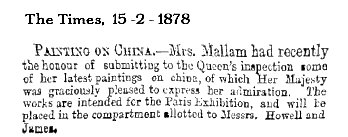
In fact, the gentle art of China Painting was worth of the attention of Queen Victoria herself:
Ellen Mallam ne. Ross presented to Queen Victoria 1878
She also appears in the Yorkshire Industrial Exhibition, held in York 1879.
The Australian Connection
We’re always looking for links to ‘down-under’, which adds a local context to a piece. This work unexpectedly came up with one: a son of Ellen & Dalton Mallam, Ross Ibbotson Dalton Mallam, was born in 1878. Like his father, he entered the legal profession, moved to Adelaide Australia in 1902, and ended up a Supreme Court Judge (1928-33) in the Northern Territory, before ill-health led to him relocating to Melbourne. You can read more about him on the NT Supreme Court’s website >
It’s been an interesting study, to discover the connections and stories circling around this portrait plate. Ellen Ross / Mallam was certainly born into an interesting place and time, being so familiar with the Dickens family, and receiving high praise for her artistic skills from none other than Queen Victoria……. There may be other pieces from Ellen’s early stages still to be discovered, signed with the monogram ‘ER’ as seen here – and definitely more with her full married name, Ellen Mallam. Let us know if you have any!
Welcome to our first Fresh Stock for 2024. We have a fine selection of interesting items for you to browse, including Sterling, Old Sheffield Plate, Australian Pottery, and a whole range of ‘Green’ ceramics…..
The exceptional piece this time is a plate, which bears an original Exhibition label from 1876. With the place it was exhibited, and the name of the artist, we were able to discover a fascinating ‘back-story’ – with close links to Charles Dickens and an Australian High Court judge from 100 years ago…..
Ellen Ross ‘china painting “HOWELL & JAMES” of Regent Street, exhibition label 1876
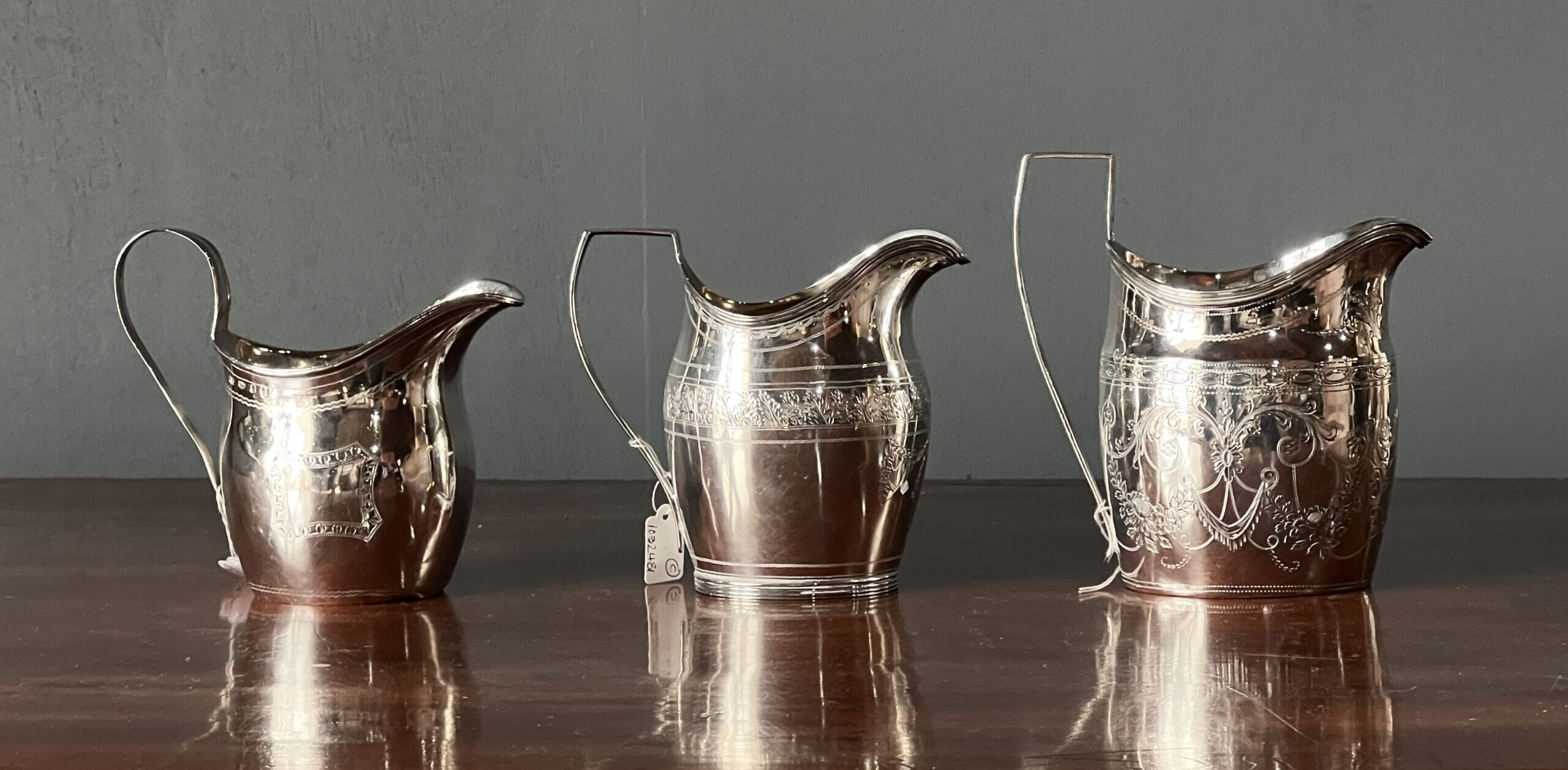
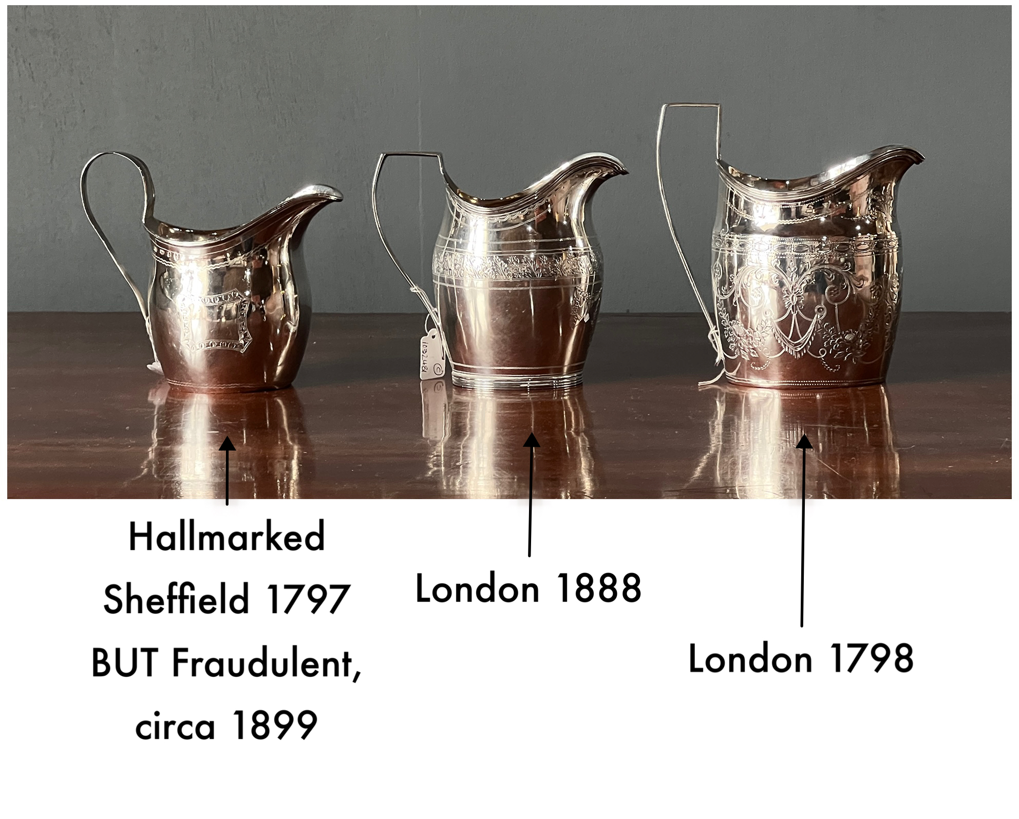
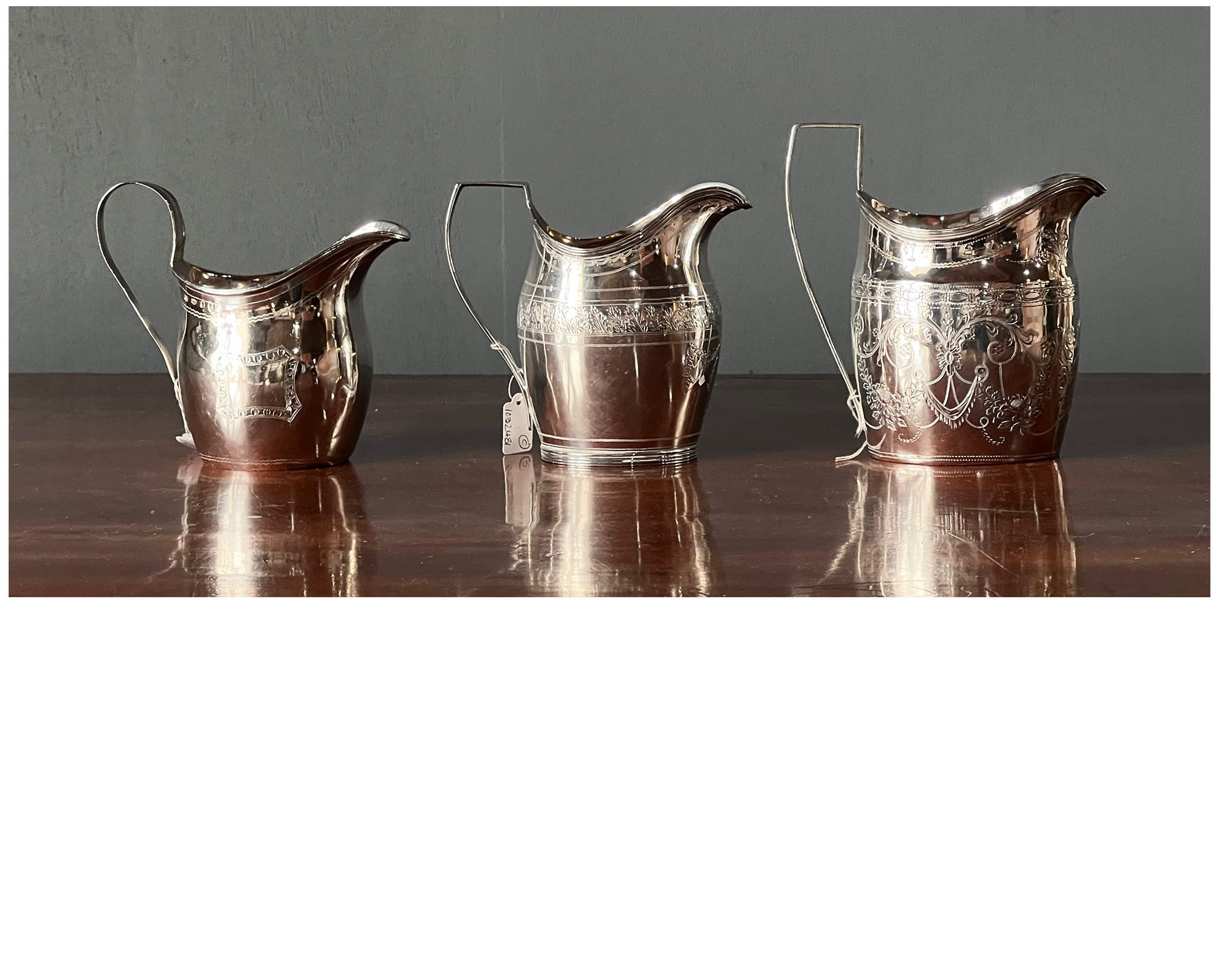
These three jugs look very similar, and yet only one is genuine. Below is a Genuine engraved jug of 1798, a Victorian version of 1888, and another Victorian…. but with marks claiming it is Sheffield 1797. Can you pick the fake?
Slide down the bar on below image to reveal the dates
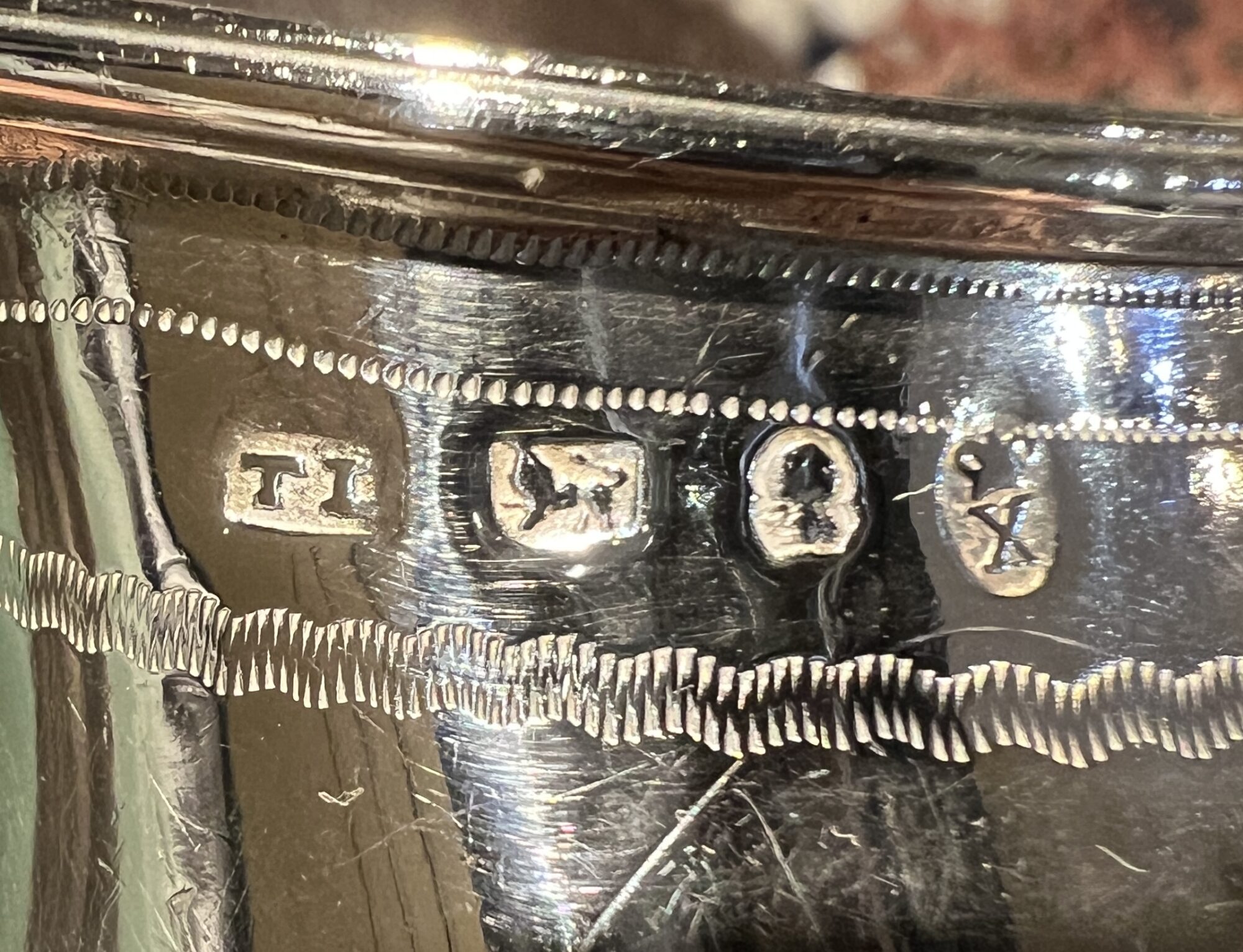
Late 19th century Sterling Silver milk jug, of helmet shape, with elegant curved handle, the body with engraved lines to rim, a central reserve with initials ‘JJC’ to one side , the other blank. Hallmarked for Birmingham 1795, also ‘TL’ for an unknown maker –a mark used in documented ‘fraudulent’ pieces of Sterling Silver discovered in the premises of Reuben Lyon in the late 19th century.
The FAKE sterling silver hallmarks, claiming to be Birmingham 1797
The fraudulent nature of this piece of Sterling Silver is an interesting study. The hallmarks are clear, and ye have something different about their wear; particularly notable is the background, which shows up lumps & bumps not usually seen in hallmarks. This is because normal hallmarks verified at the assay office have been struck into the piece using a die, with a flat end incised with the initials; the background is therefore flat. The ‘bumps’ indicate this piece is cast at the time of making, ie. there is some texture from the casting medium that cannot be buffed out from the recessed marks……… something that is only done by a forger. This maker’s mark ‘TD’ appears to be copying T.P. Dexter’s mark, which was only registered in 1805. As the registry of marks was not published or accessible in the 19th century like it is now, it would not have been possible for a forger to look up the active dates of a silversmith. In this case, it is a decade out, making identification easier. In 1899, the London Goldsmith’s Company published a booklet to expose a group of fakes they had detected and destroyed recently. At the premises of 70-year old Reuben Lyon of Holborn, more than 200 fraudulently hallmarked ‘Antique’ pieces were found by officers of the Goldsmith’s Guild, and the hallmarks of ‘around 50’ makers on the pieces recorded and published. The ‘TD’ mark is one of them.
These pieces were destroyed by the guild. This is still their practice, and they constantly assess the trade in Anbtqiuue silver to ensure that fraudulent pieces are not circulating as genuine. A silver collector witnessed this in action in London recently: visiting one of the seller son silver, a man entered with a portable anvil, the fake was brought out, and completely mashed into a formless lump with a hammer!
Interestingly, an article written about forged silver at the time refers to the technique of casting marks, ‘…adopted by a forger a year or so ago, who recieved his due punishment…’ This suggests the evidence of casting in a piece puts it into an 1890’s context, 100 years after the marks they were depicting.
The fakes were detected, and their source investigated by the Guild. Reuben claimed innocence, stating he had purchased the goods ‘from a man named ‘Clarke’ …. who had subsequently disappeared’. He was fined £3,000, an immense amount for the time. It was the end of him and his business…..
This was a time of intense interest in English Silver from the Georgian period, especially by the Americans – and the occasional Australian. I wonder if ‘Clarke’ tried selling to this lucrative market of wealth Australians, far away from the eyes of the Goldsmith’s Guild? This jug came from a local source, and may well have been imported into Australia as an ‘Antique’ around turn of the century, despite it being pretty recently made!
The irony is, this is now a rarity; in the UK, the Guild has ‘taken care’ of any examples, and only in a place like Australia are there examples to be seen…. at least knowingly!
Moorabool’s Guarantee: All items offered are as described regarding date, condition, and description.
We offer a money-back guarantee, for any return within reasonable time, excluding postage.
Buy with confidence!
POSTAGE
Getting your goods need not be expensive!
We make sure Postage is as affordable as possible – our experienced in-house team can ship safely anywhere in the world, for the best possible price.
Ask for a quote…
Use the ‘Compare Products’ below to keep track of items of interest.