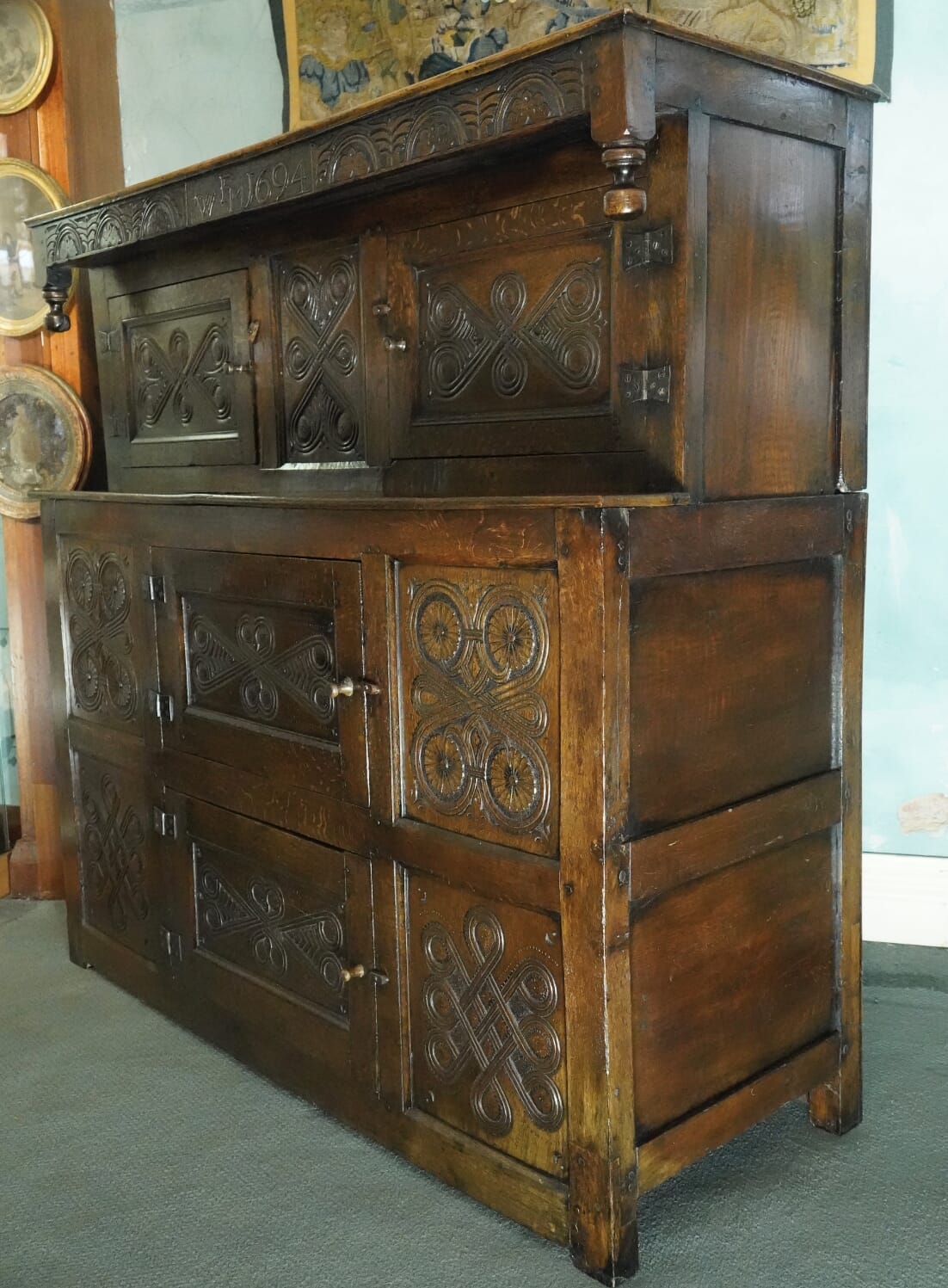
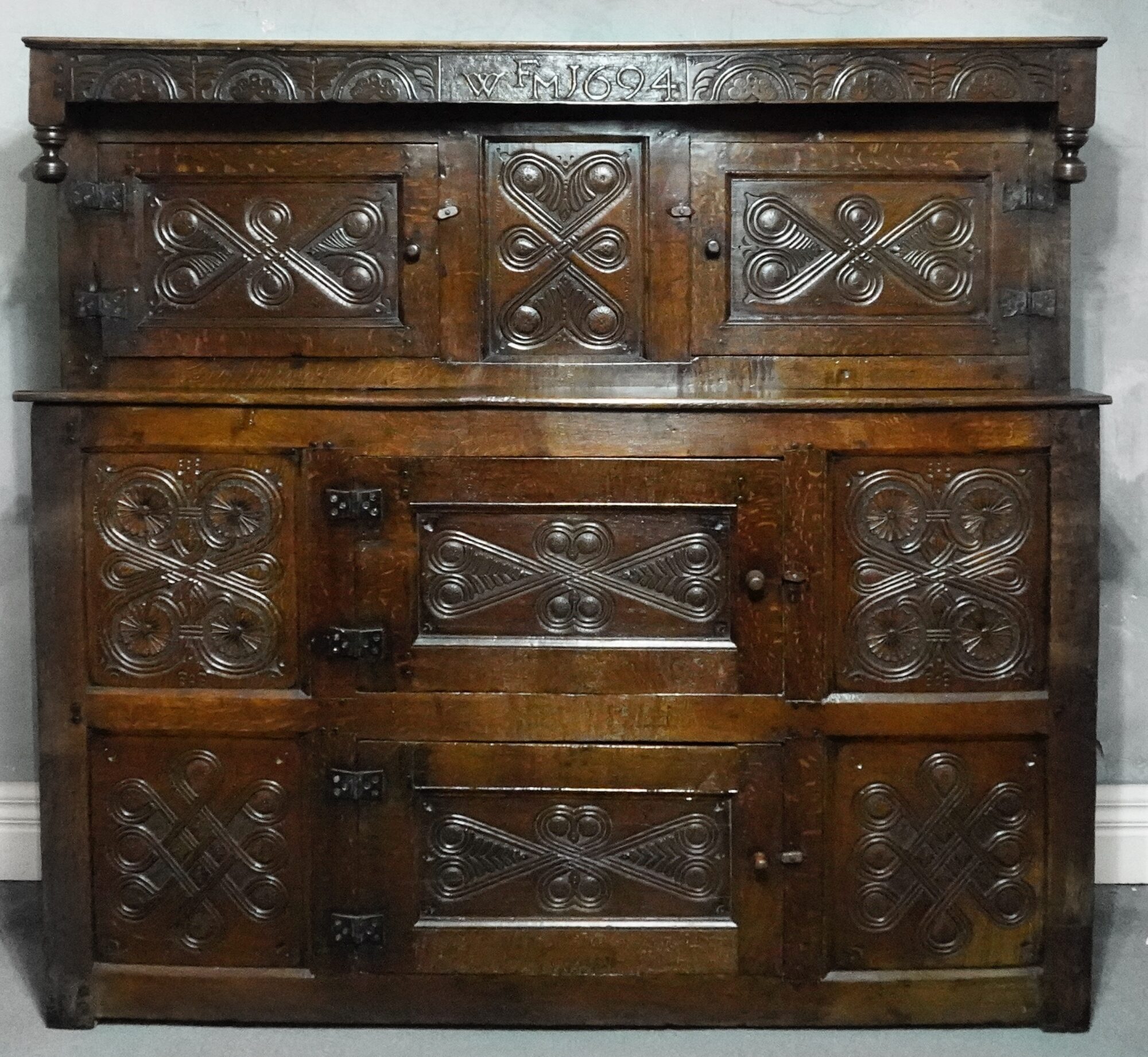
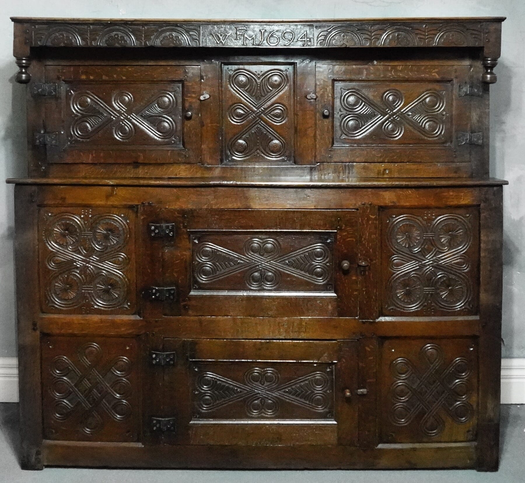
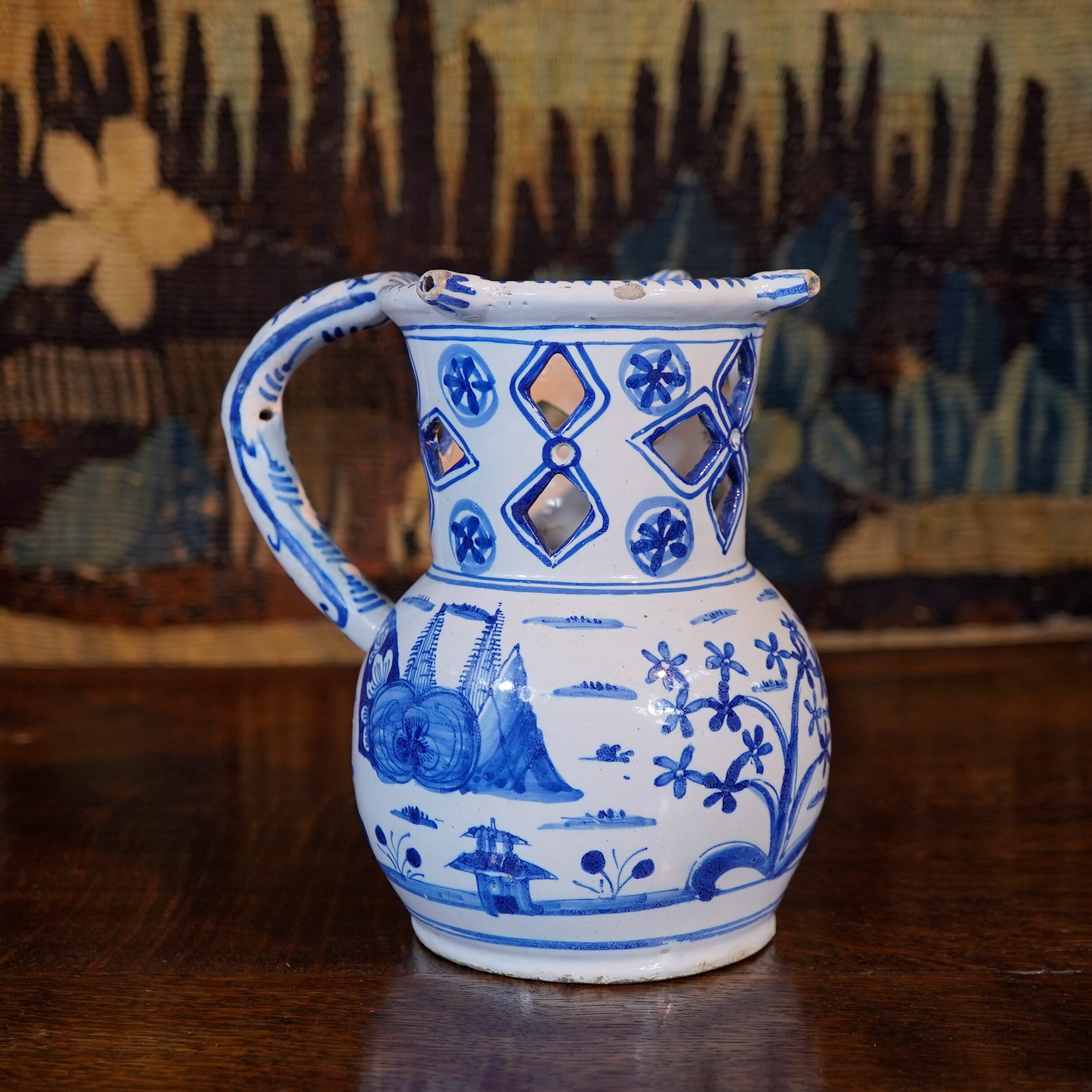
This handsome large piece of early Oak furniture is sometimes called a ‘Court Cupboard’, although this should really refer to a more open version intended to display the wealth of a household for all to see. With its enclosed doors, this example fits the definition of ‘cwpwrdd deuddarn‘, meaning ‘cupboard two-piece’. This literally describes their construction, in two parts, a feature that was not necessary in a construction sense, but certainly a help when being moved – speaking from practical experience!
They have their origins in the Medieval period, where a large, solid cupboard would act as a safe place to stash your valuables. Housed in the main chamber. they were the equivalent of a sideboard. You could keep all your pottery platters, mugs, the pewter – and in wealthier households, any silver plate that was needed to impress guests. The tops would surely have made a fine display space for status symbols such as nicely polished brassware and blue & white delft.
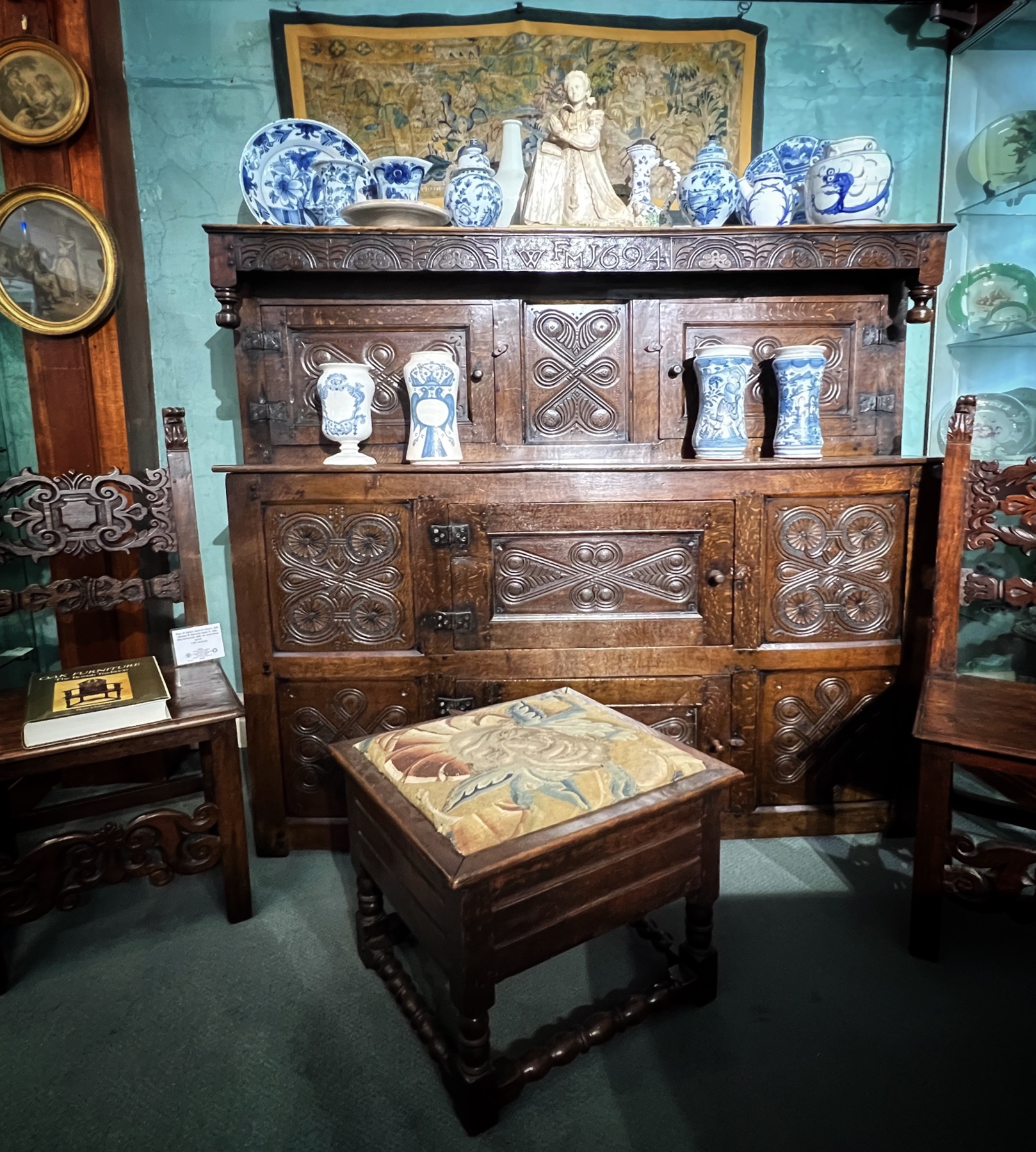
The Deuddarn presently at Moorabool Antiques, Geelong
What makes this example particularly appealing is the colour; it has a lovely honey tone, with an excellent patination. Some can appear ‘black’, and on closer examination, there is a layer of dark varnish over the oak. This varnish was a favorite of the Victorians who believed anything old, large & heavy had to be blackened to look authentic….
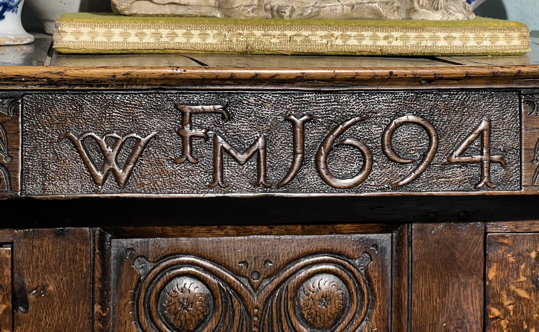
The date is original; it is wise to view such dates with scepticism, as they were also a favorite alteration of genuine pieces undertaken by the Victorians; however, the patination is consistent and the carving harmonious .
The initials are another part of the story; the represent a marriage, with the family name in the center starting with ‘F’. Their names were ‘W’ and ‘M’ – let’s call them ‘Wmffre & Megan Fluellen’. This lavish piece of furniture was commissioned for the well-to-do couple in 1694, quite possibly as a marriage piece.
In the wonderful 2-volume book on ‘Welsh Furniture’ by Richard Bebb, it was a pleasant surprise to discover a remarkably similar example. Page 325 bears several deuddarn examples from different regions, but no. 567 stands out: when viewed next to our example, we see the same principal construction methods, the same details such as the pendants or ‘droppers’ on the upper corners, but most of all, the doors have the same carving. This elaborate series of scrollwork is almost Celtic in appearance, and this is no coincidence; a strong association with the distant past was always present amongst the Welsh, and their ancient pagan memories of ritual spirals representing eternal truths were surely echoed in these designs.
#567: possibly Breconshire
The book places the origin of this piece as ‘possibly Breconshire’, a region of central Wales. Such opinions of regional styles are formed by furniture connoisseurs over a lifetime, depending on examining pieces that are in situ in undisturbed family farmhouses , and especially in the small local parish churches. What is fascinating is the dates found on both these very similar pieces. Our example is dated 1694; theirs is 8 years later, 1702. There are differences in the layout of the doors, and the doors on ours are all carved vs, just the top 3 of the illustrated. However, the similarities allow us to attribute this magnificent piece to ‘possibly Breconshire’, and isn’t it great to have an actual date – 1694 – rather than having to take a ‘Circa’ guess!
In today’s world-wide situation, ‘Armchair Travel’ is a necessity. The difficulty in heading off on a grand tour is huge, and the likelihood of being marooned somewhere due to closed borders is high. Stick to google street view exploration for the moment!
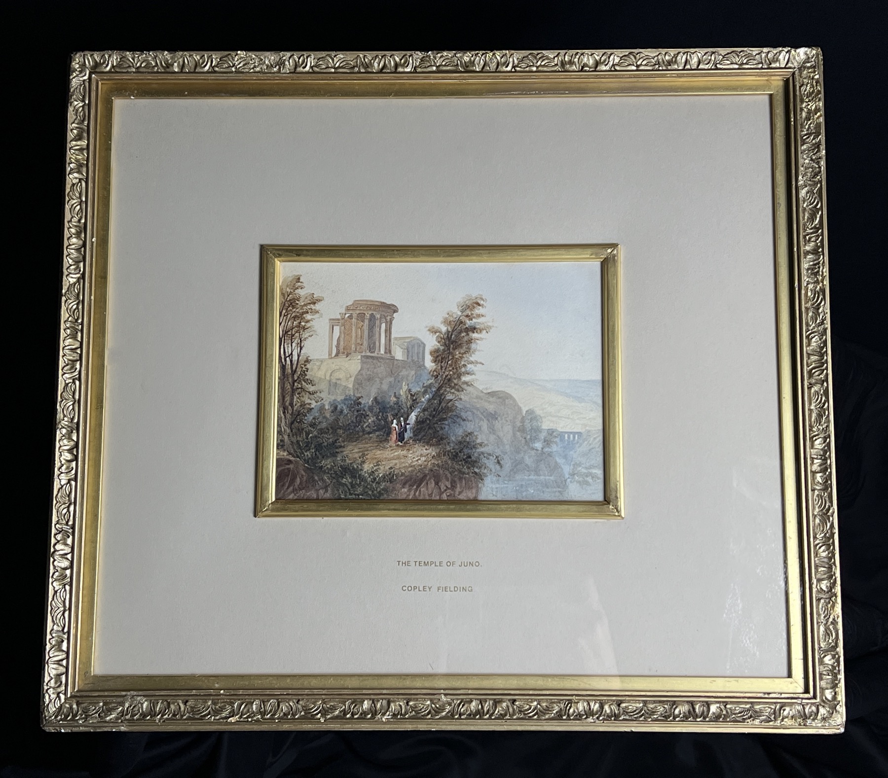
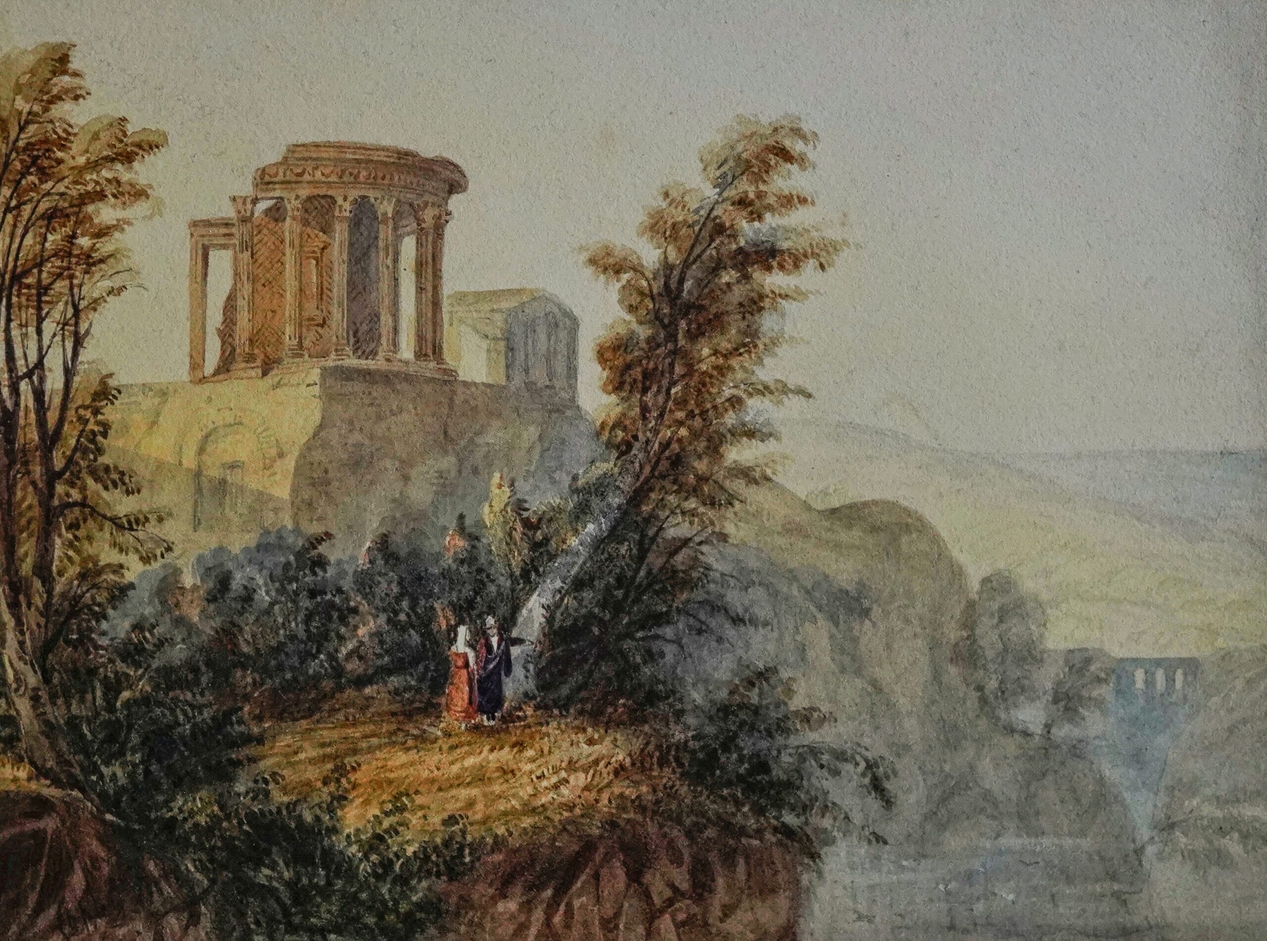
A recent discovery at Moorabool reveals the idea has been around a long time. Finely detailed and depicting an ancient ruin in a dramatic landscape, the work is signed Copley Fielding.
Copley Fielding watercolour, Ruins at Delphi, circa 1820
Copley Fielding (1787-1855) was a very talented artist of the Georgian period. Born in the Midlands in 1787, he was the son of a portrait painter (Nathan Theodore Fielding), who gave him the inspirational ‘Vandyke’ name as tribute to the famous artist. The inspiration worked, as he showed strong talent at an early age. In 1810, he entered the Royal Academy schools, being taught by John Varley and becoming a close friend of William Blake. The same year he was an associate exhibitor of the Royal Society of Watercolours (RWS), later serving as President. In 1824 he won a gold medal at the Paris Salon, alongside Constable. He exhibited constantly in the RWS exhibitions, and a smaller number of his oil paintings at the Royal Academy.
Copley Fielding ‘Delphi Ruins’
Anthony Vandyke Copley Fielding (1787-1855) National Portrait Gallery, London -by Sir William Boxall
Best known for his atmospheric ‘Romantic’ landscape views in the British Isles, and windswept seascapes, there are a small number of works in his repertoire depicting exotic overseas locations: Rome, Naples, and this example, the temples of Delphi in Greece. They are all imaginative – he never travelled out of Britain!
The scene in this work is the famous temple complex at Delphi, Greece. His direct inspiration would have been an artist’s sketch – it was a ‘top-10 destination’ for anyone with artistic ability on the ‘Grand Tour’, and in his RWS position he would have constantly come across people who had been there with their sketchbook. However, he has enhanced it to make it more impressive; the ruins are less ‘ruined’, the rounded form of the Tholos being remarkably intact, and the rectangular Temple of Apollo apparently still having its roof!
Copley Fielding’s ‘View of Delphi’ at Moorabool Antiques, Australia
The title on the old mount it is in is most confusing, and perhaps illustrates the nature of Copley Fielding’s inspiration: there is no ‘Temple of Juno’ at Delphi, although the mountainous scene is clearly meant to be Delphi. Several temples of Juno elsewhere in the Classical world survived and were sketched, but all are standard rectangular constructions. Clearly something got lost in translation between sketchbook and watercolour brush, by either the original artist, or the mount-maker of this work.
Copley Fielding’s Signature
The rare Copley Fielding depictions of foreign lands include Rome, Naples, Greece (such as ours) and exotic Middle-Eastern landscapes. They are all ‘flights of imagination’: he was a true ‘Armchair Travelling-Artist’. How interesting that this work depicts the Temples at Delphi, regarded as the very center of the world by the ancient Greeks, the start and finish of all journeys.
Copley Fielding’s background landscape.
His works are represented in a large number of major collections around the world, including the V&A and the Tate, London, The Met NY, The Art Gallery of NSW, and our very own National Gallery of Victoria in Melbourne.
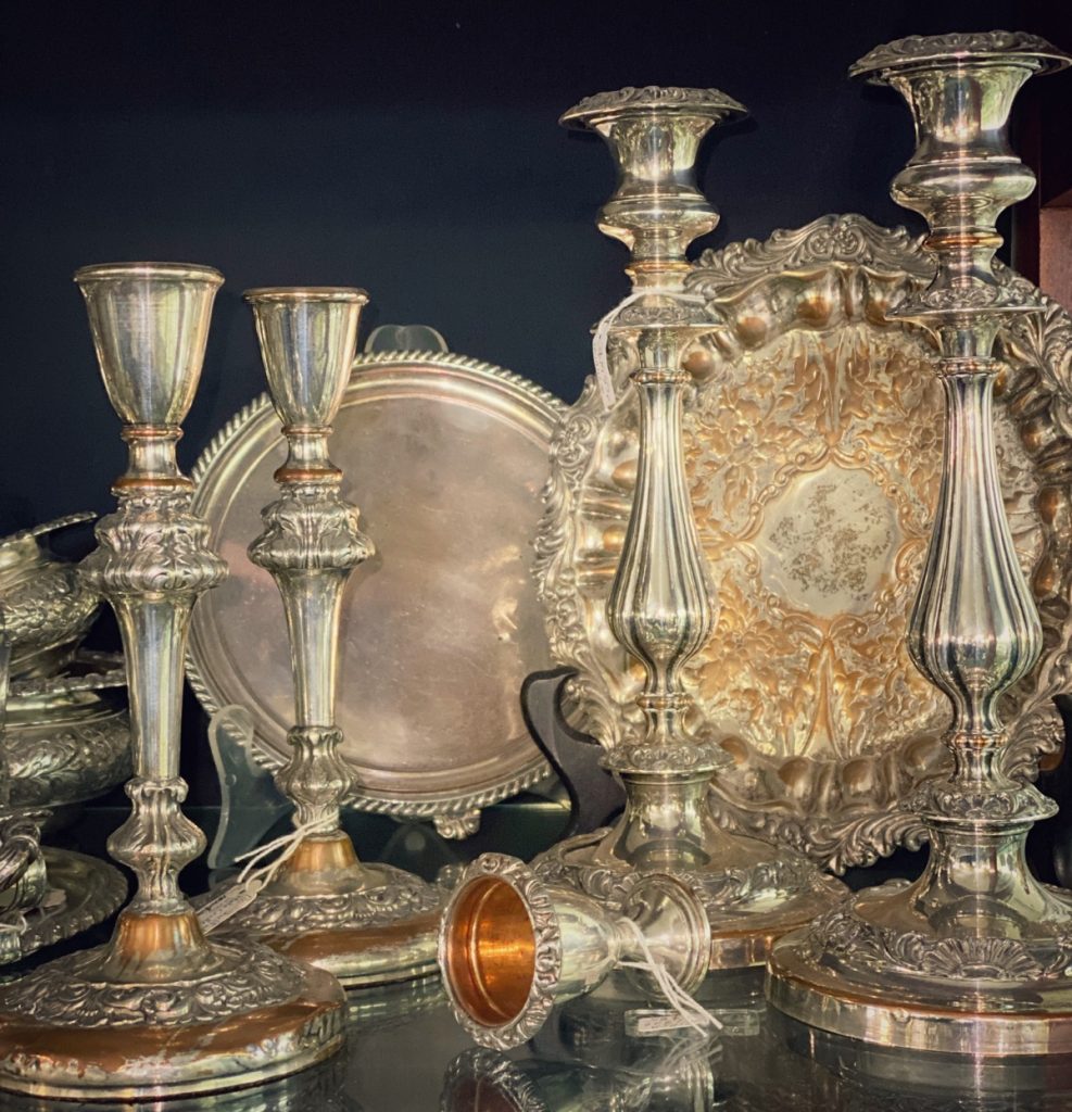
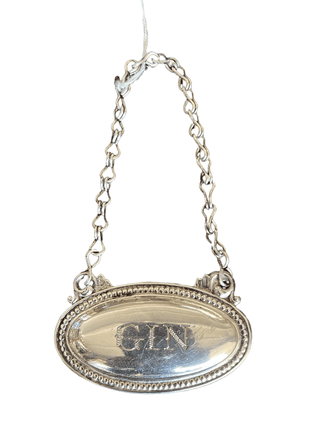
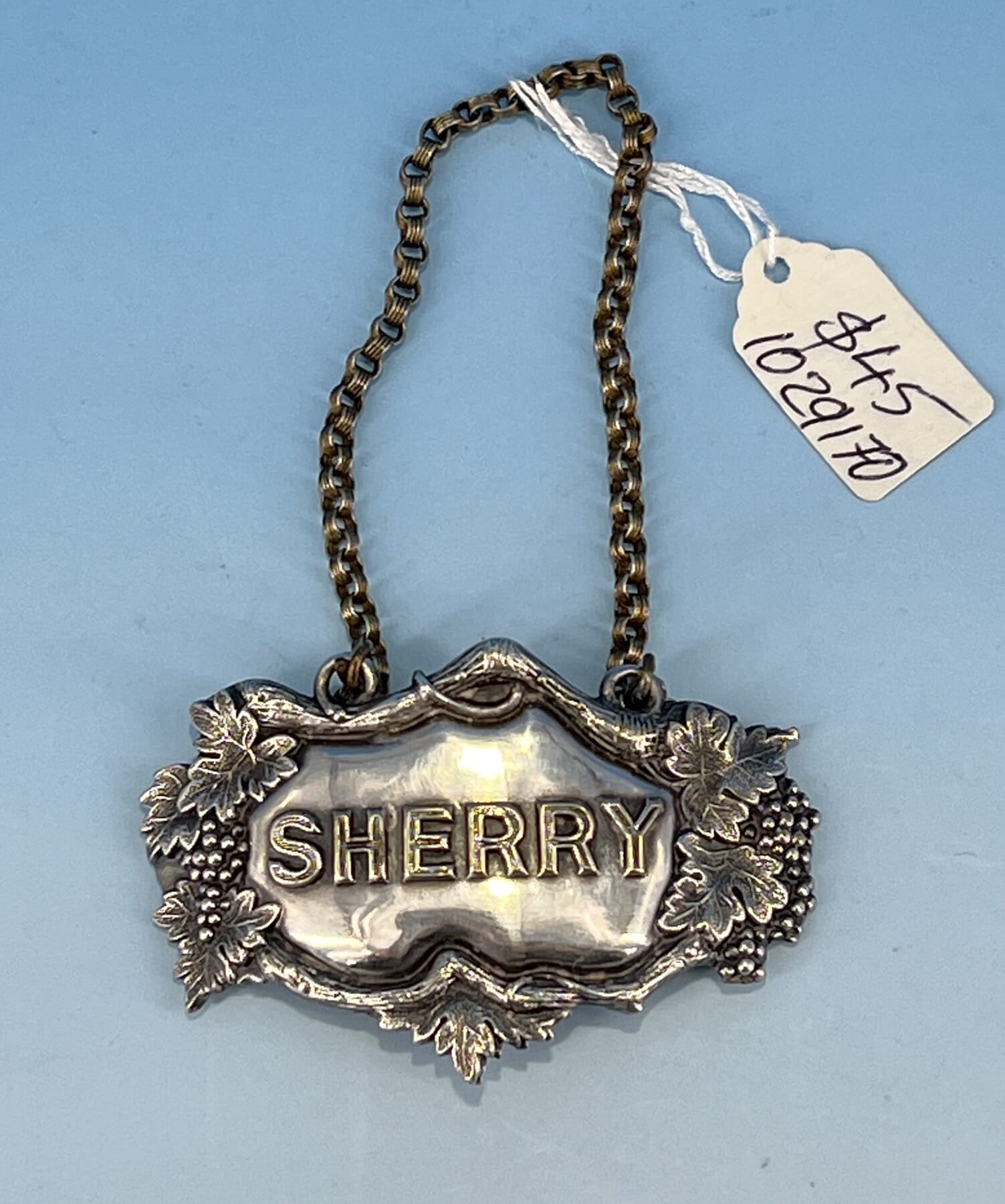
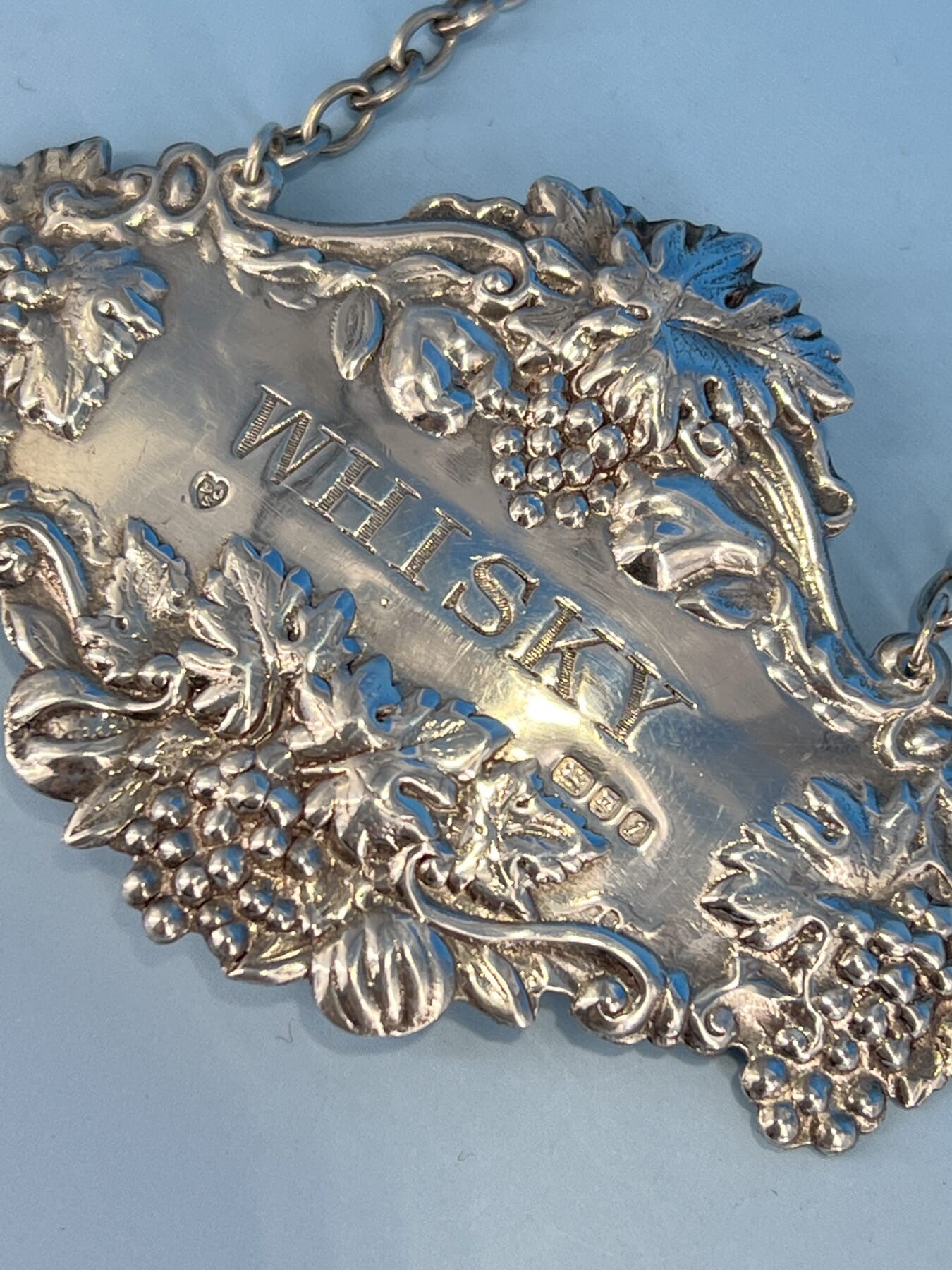
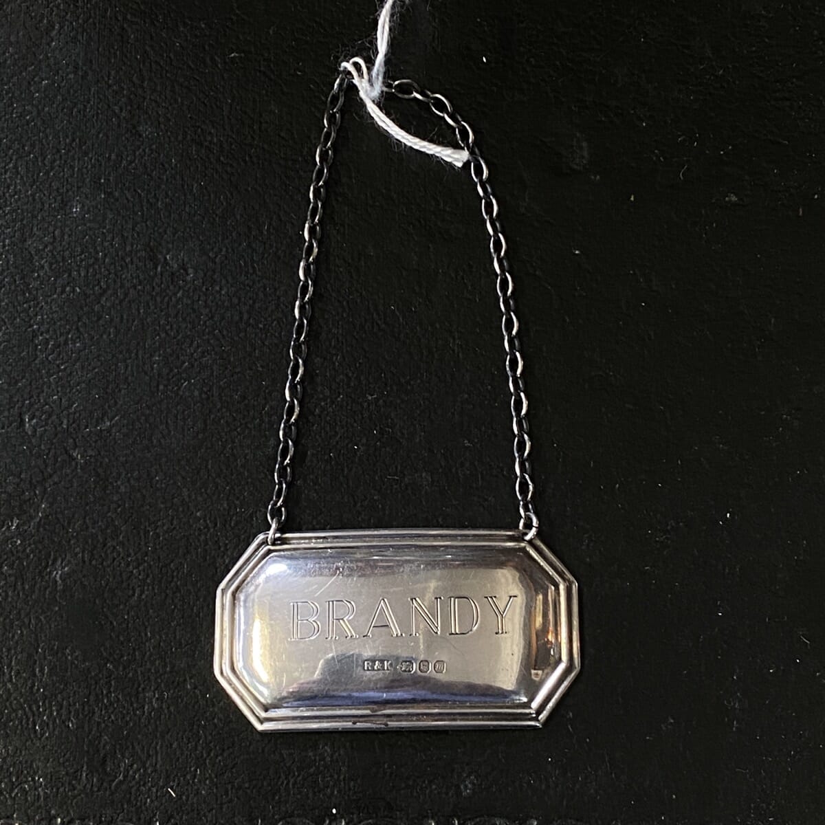
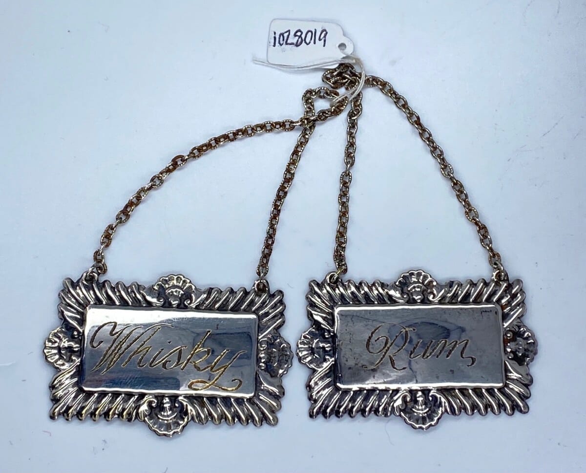
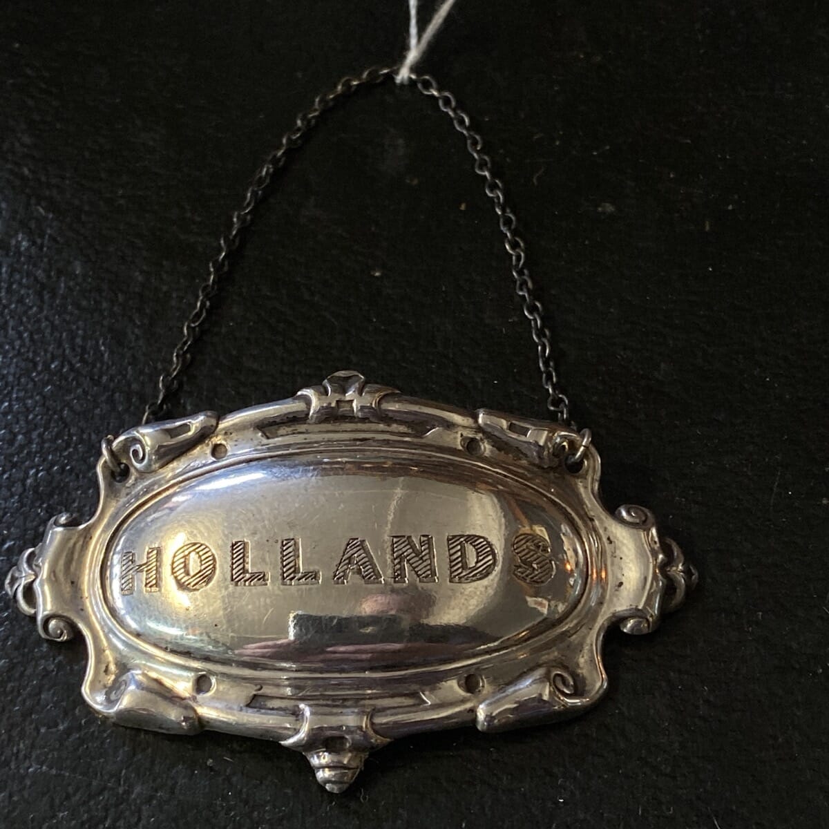
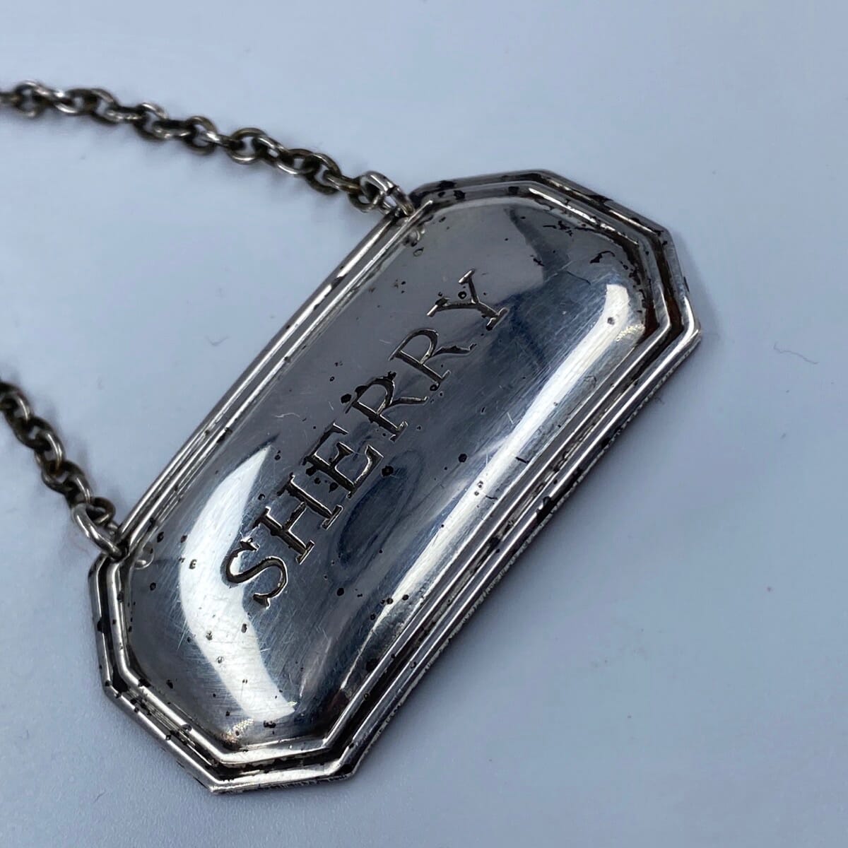
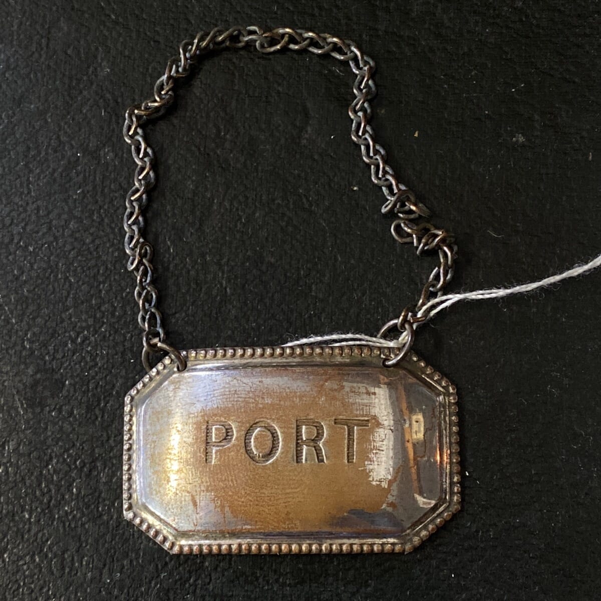
Wine has always been a part of an English gentleman’s meal. In the past it was considered safer to drink than the water…. and to do so with style was important. Glasses were once pretty basic, but as the Georgian period continued, they became works of art. So too did the presentation of the beverages; wine accessories such as decanters, silver plaques with the names of the drinks, and coasters became a necessity at any refined table.
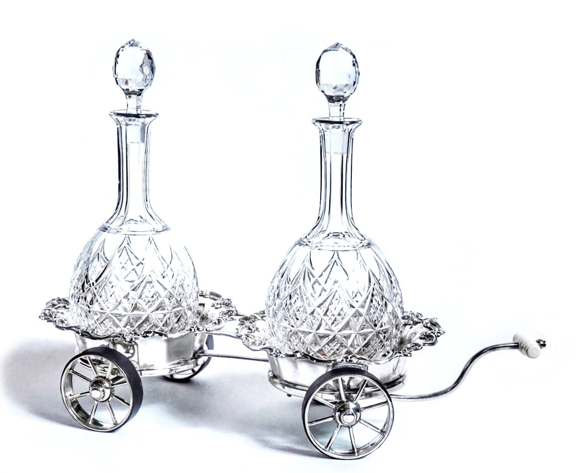
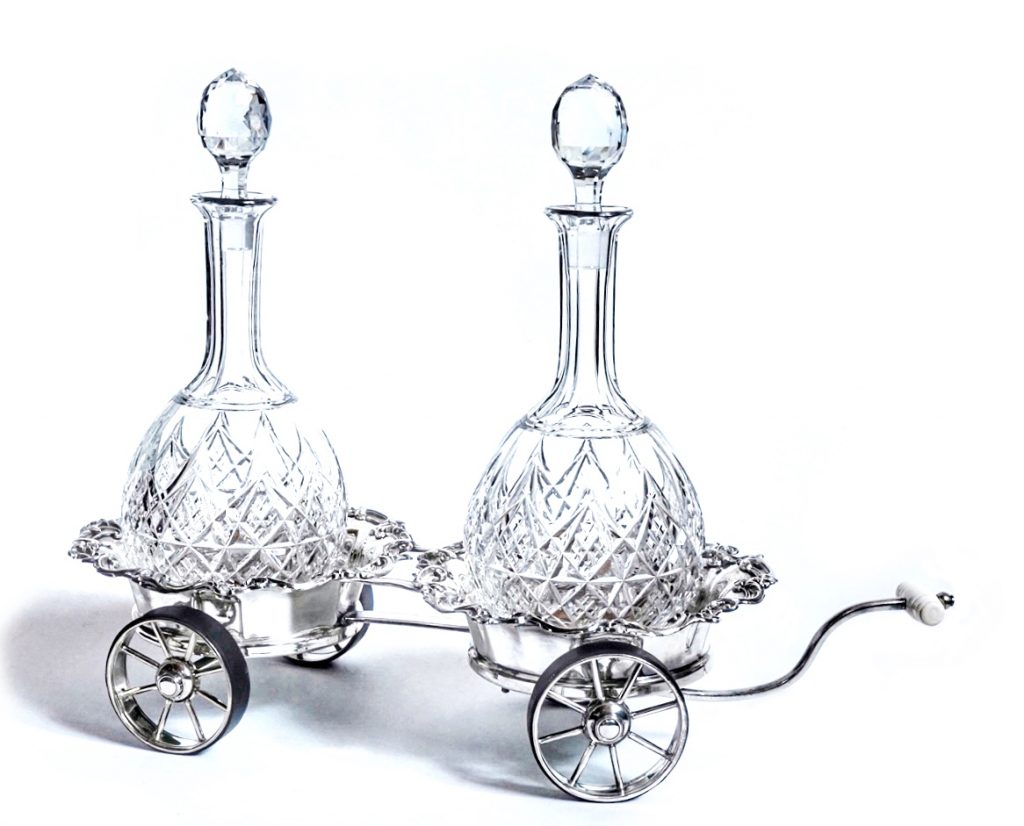
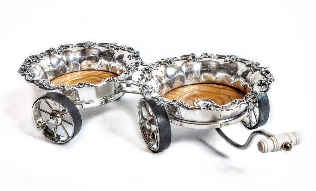
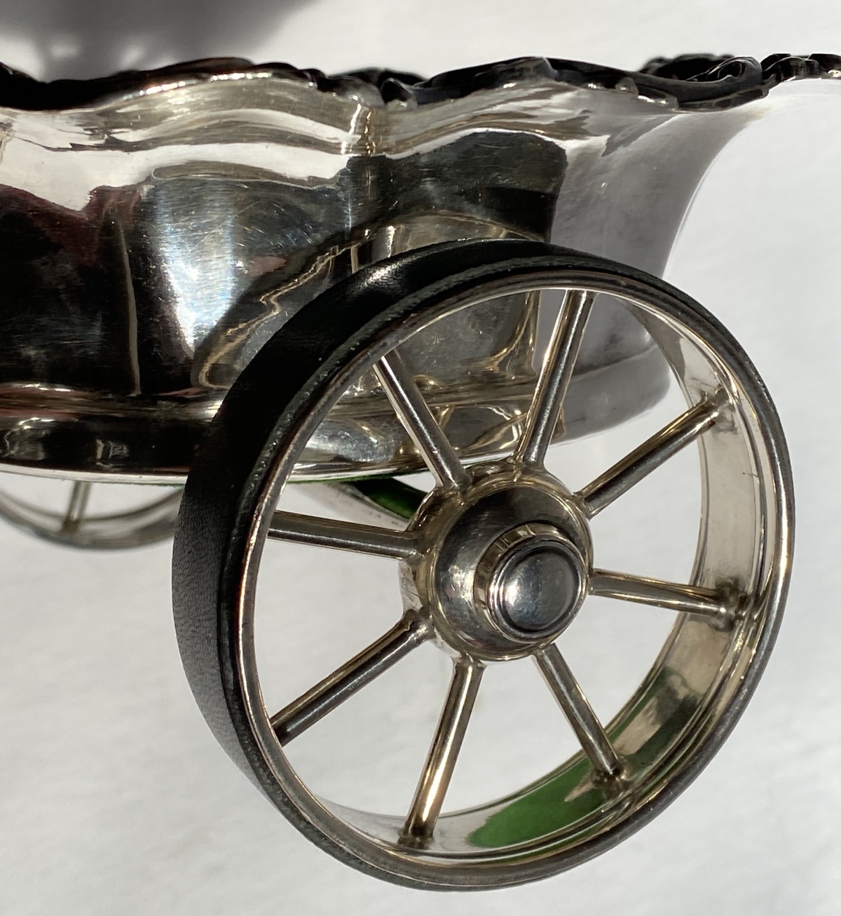
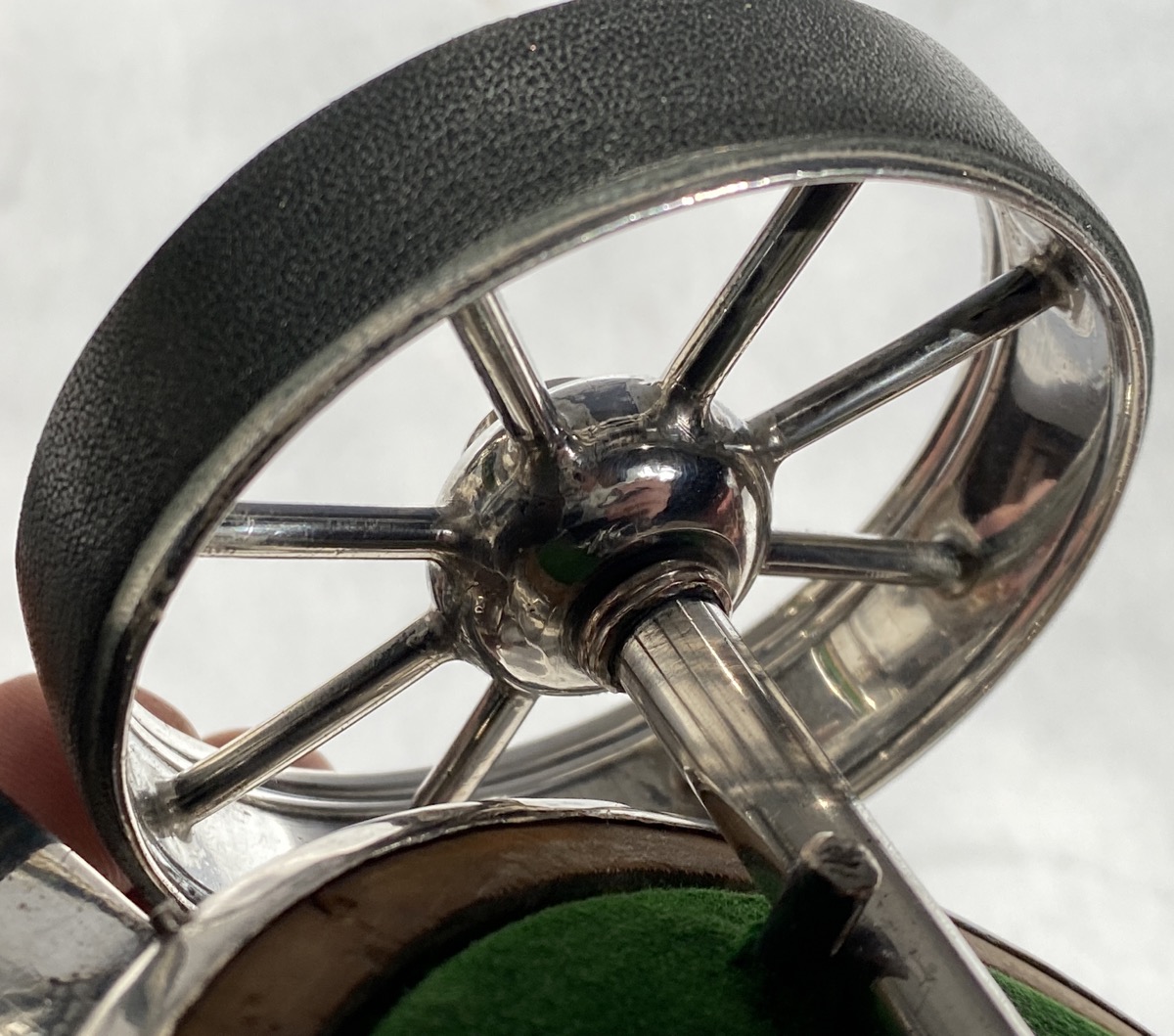
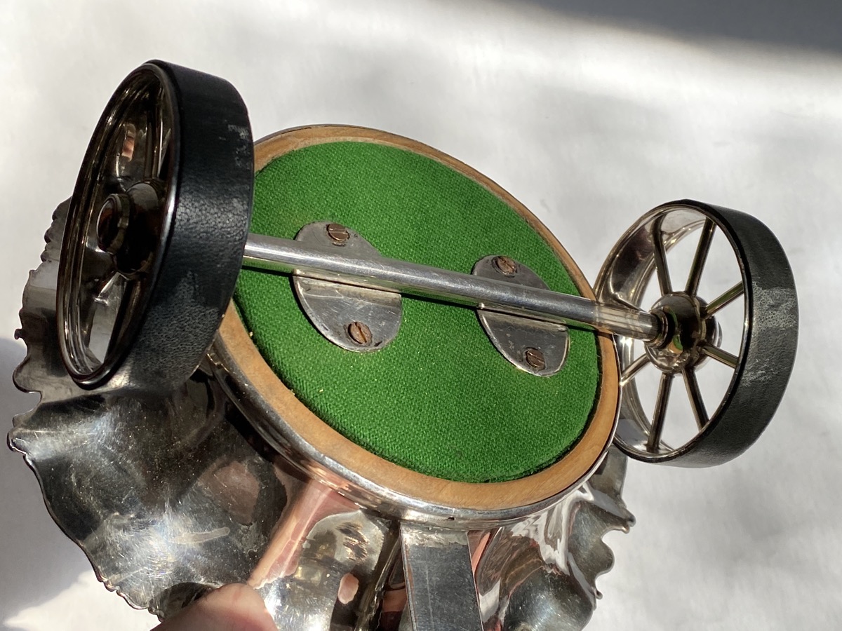
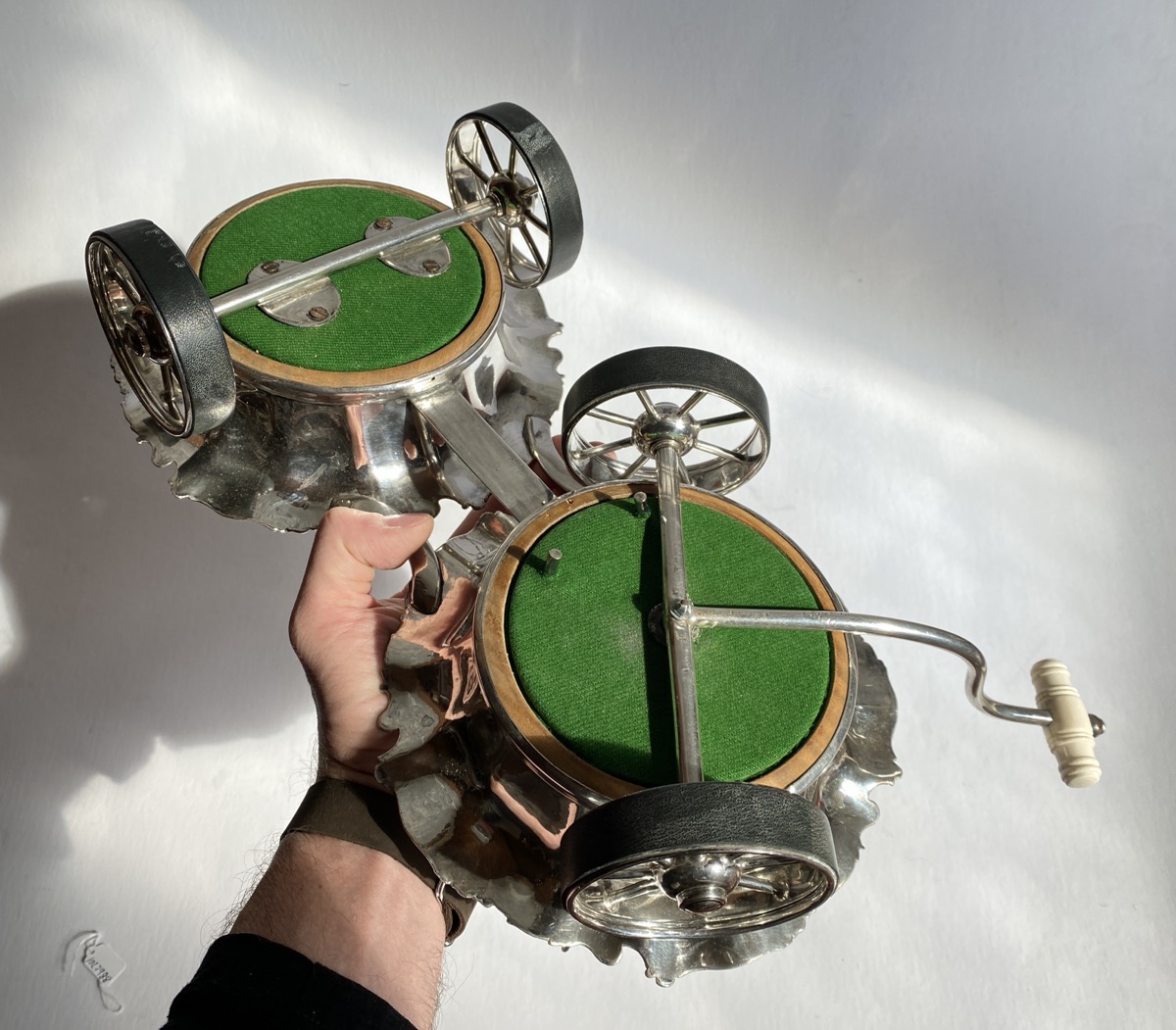
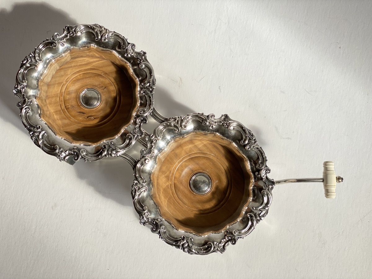
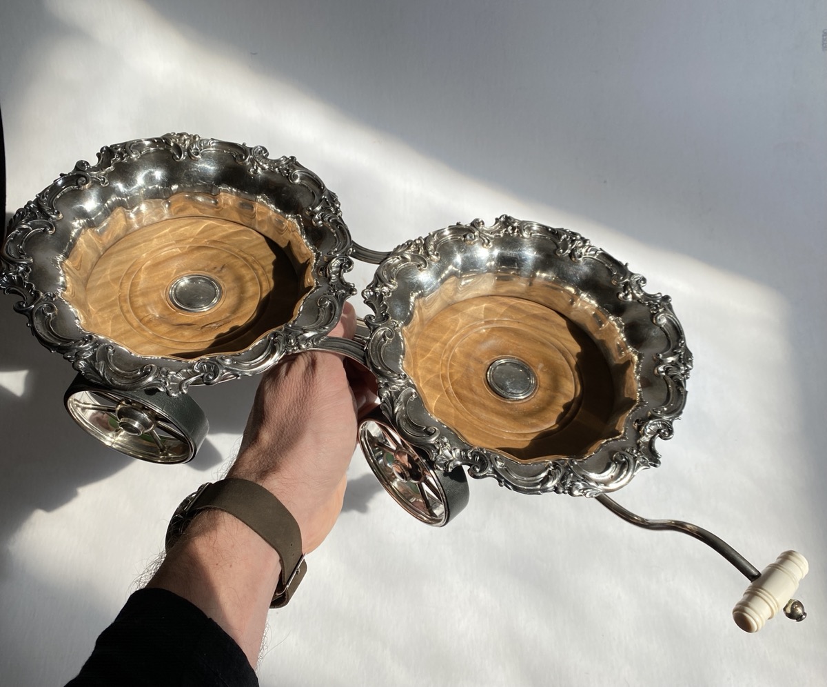
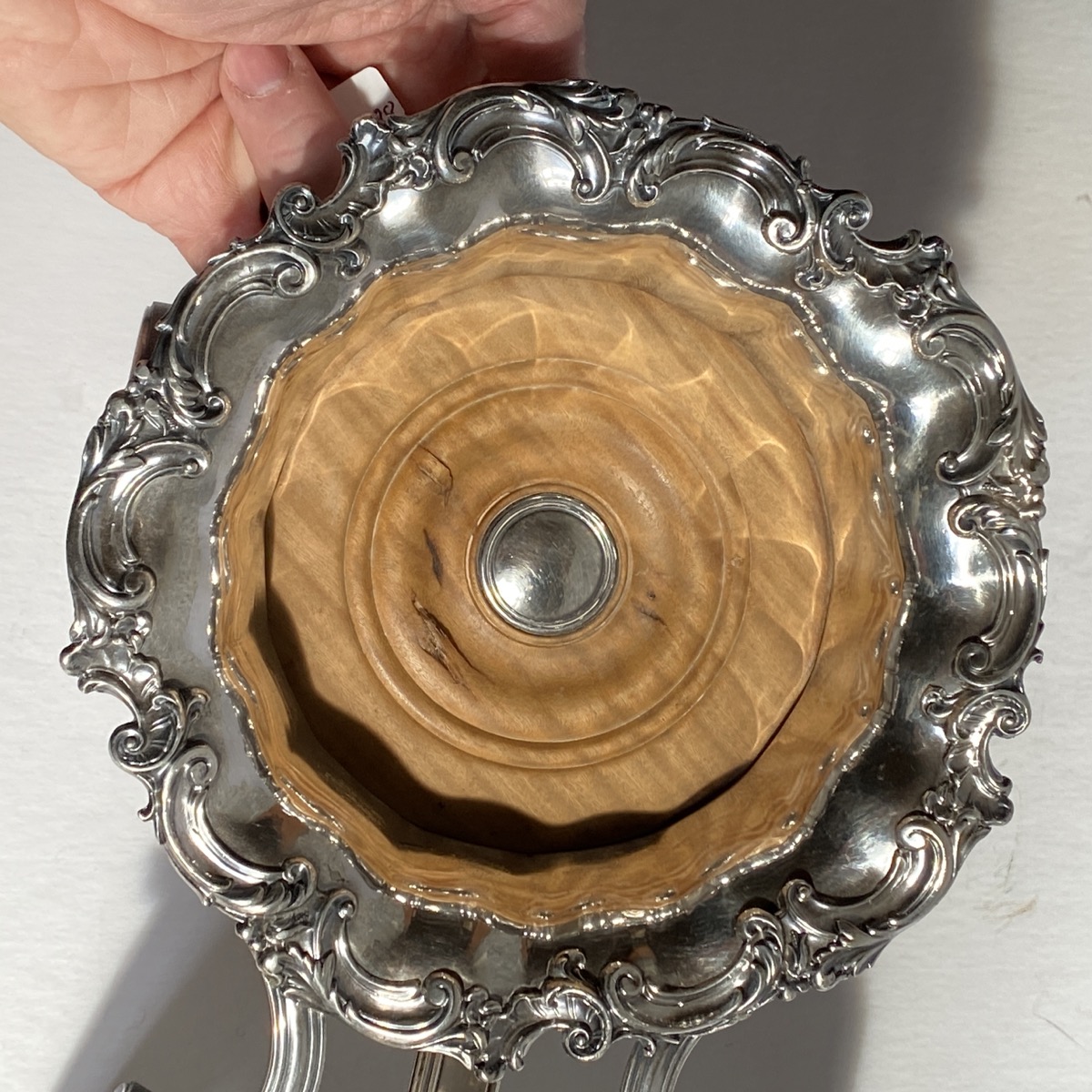
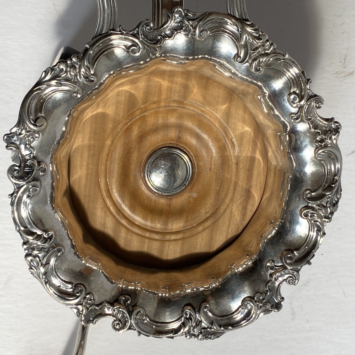
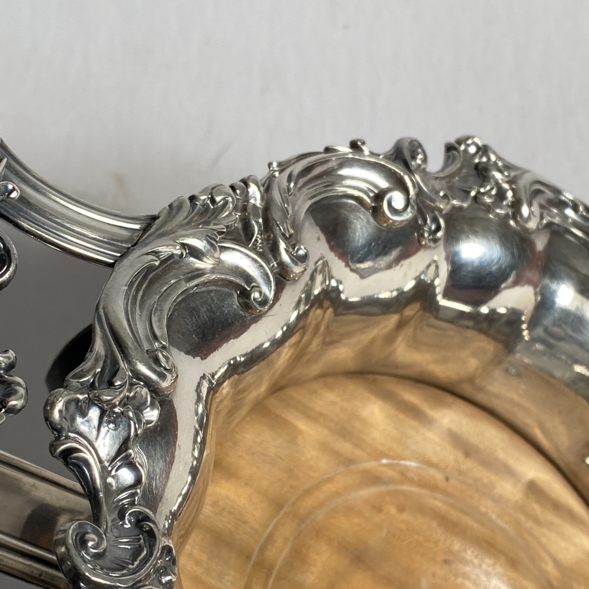
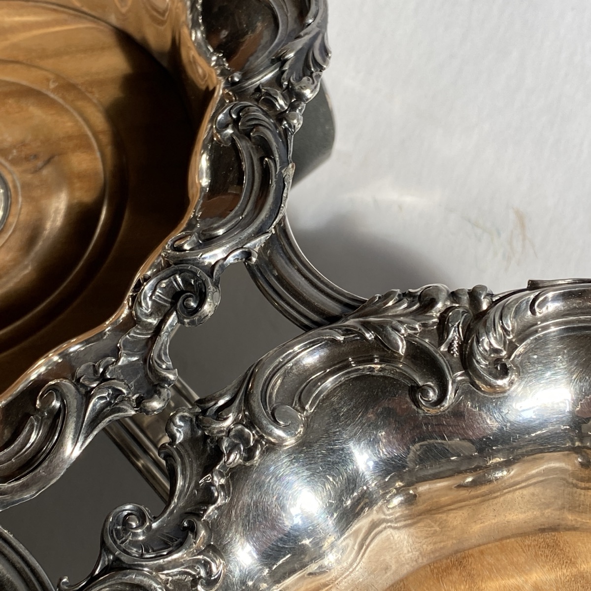
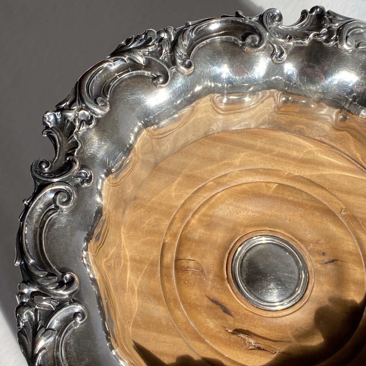
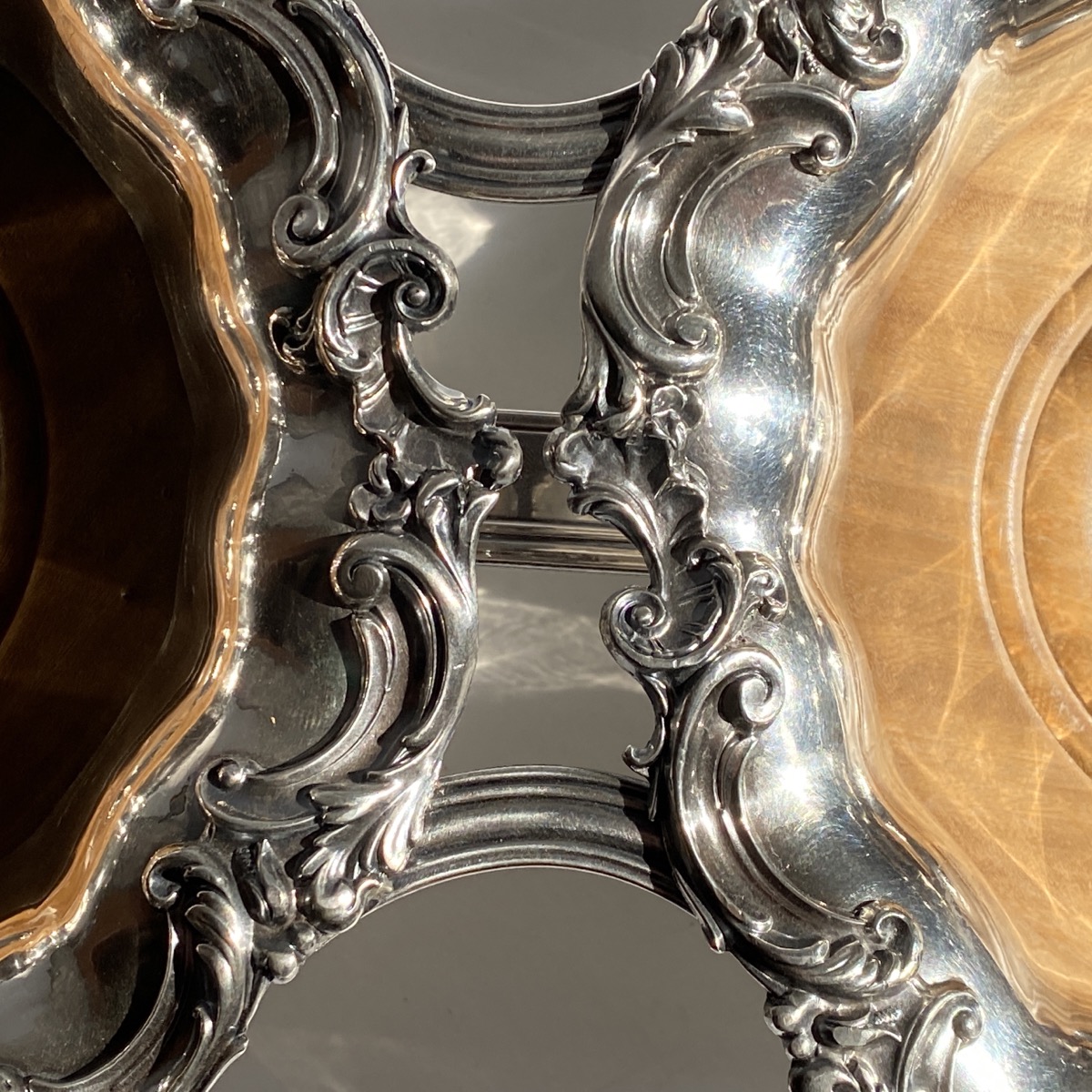
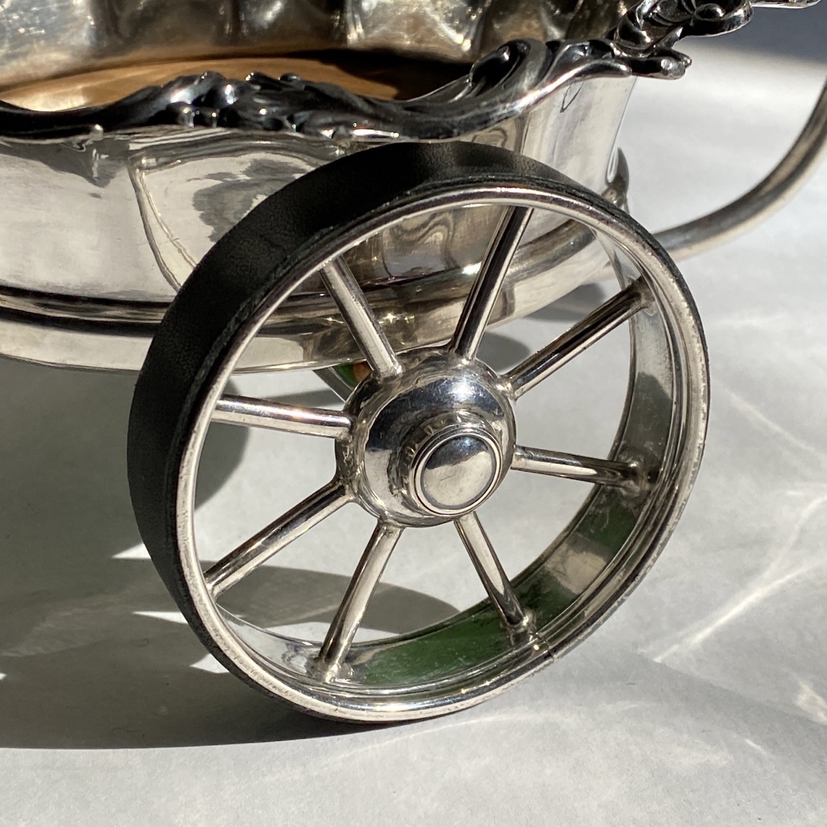
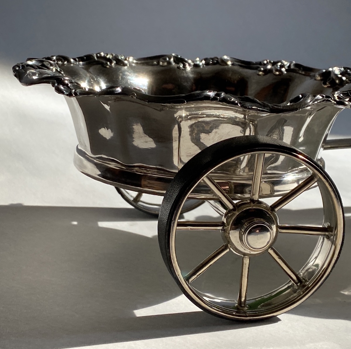
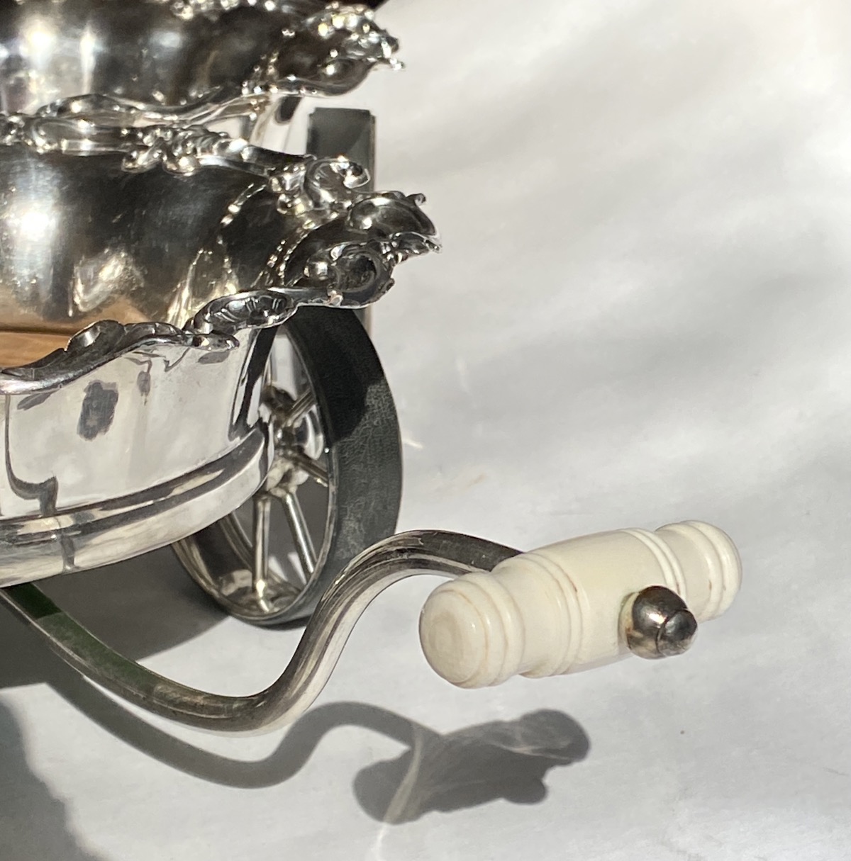
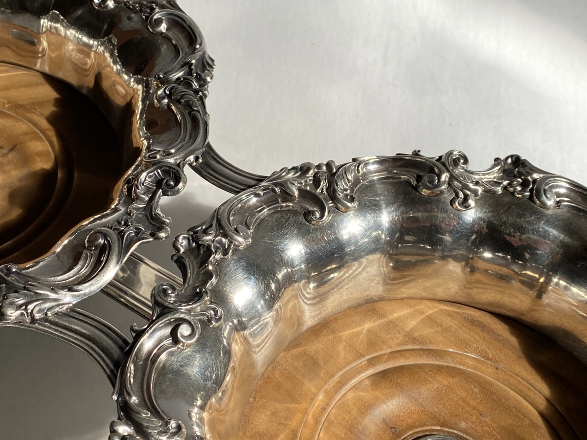
The ultimate recently ‘rolled’ through our door; a wheeled cart to transport two full decanters down the table with ease!
Old Sheffield Plate Wine Wagon (with later decanters) c.1820
This piece is constructed from a copper/silver body known as ‘Old Sheffield Plate’. Old Sheffield Plate is a fascinating collecting field, and the go-to book is the 1912 ‘Old Sheffield Plate by Frederick Bradbury. He was active in the late 19th century, and published his lavish book full of hundreds of photographic illustrations and records of the manufacturers and their products. The information he records is important as it was compiled just a generation or two from the time the Plate was last in production, and many of his sources were the workmen trained in the production of the type, 50 years later. He also had a personal connection, with an ancestor being one of the manufacturers he was writing about.
Old Sheffield Plate with characteristic ;blush; of copper showing through the silver covering.
Old Sheffield Plate is an important step in the evolution of silverwares, and should not be confused with silver plating, or electroplate. This modern method, invented in 1840 by Elkington, meant that any base-metal item could be moulded and then dipped into the plating solution, coming out covered in silver. Quick, easy & very cheap. Old Sheffield Plate is the opposite. The basic material was laboriously made by hand. Basically, a slab of Sterling grade silver and another of copper were heated, then rolled together through a press to form a sheet. These flat sheets could then be formed into the desired shapes, ie. teapots, trays, or wine coasters. There is a seam on anything that required a vertical wall, and this was silver-soldered. A breath on a suspected seam results in a clear indication of a seam, and is a collector’s favourite method of identifying Sheffield Plate. Another feature is the rims of a vessel; if left exposed, the layered nature of the body is obvious, and so the intricately stamped-out silver borders, often Rococo scrollwork, was laboriously silver-soldered along the rims.
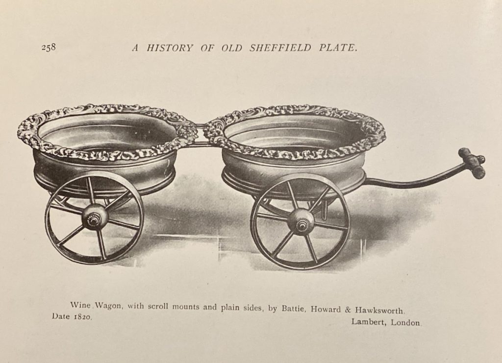
Old Sheffield Plate Wine Waggon, by Battie, Howard & Hawksworth, c.1820
Bradbury illustrates the exact same ‘Wine Wagon’ we have, and identifies the maker as Battie, Howard & Hawksworth, dating it to 1820.
WineWagon by Battie, Howard & Hawksworth illustrated in Bradbury, 1912
He has a tale on the subject, and saw in interesting enough to include in his book:
The origin of the ” wine wagon ” we must attribute to the inventive genius of Sir E. Thomason, of Birmingham, and in this connection the following extracts from his memoirs will be read with interest :
” Many years since, Lord Rolle called upon me at my establishment, and said that he had dined with His Majesty George IV. the day before, and that His Majesty was pleased to remark that he regretted that his noble guests who sat on either side of him were constrained to rise from their seats to pas the wine, and observed to him (Lord Rolle), ‘as you have said that you are going to Birmingham to-morrow, you had better call upon Thomason who may invent some plan to obviate this inconvenience.’
I suggested to Lord Rolle that decanter stands upon wheels was, in my opinion, the only method to be adopted ; and as I held the beautiful dies containing the victories of the late war, forty in number, viz., from the landing in Portugal to the capture of Paris, and the settling of Napoleon at St. Helena, I recommended to place these medals around the flat perpendicular edges of the bottle stands, which would fill up four, thereby adapting them to two waggons, the whole made of silver and richly gilt, and each waggon to have beautifully ornamented wheels.*His lordship approved of my suggestions, and requested that no time should be lost in executing them, and when done to forward them to the Marquis of Conyngham. On their arrival, His Majesty expressed his entire approbation of the thought. Some time afterwards the King presented them to the Duke of Wellington.”
Frederick Bradbury, 1912
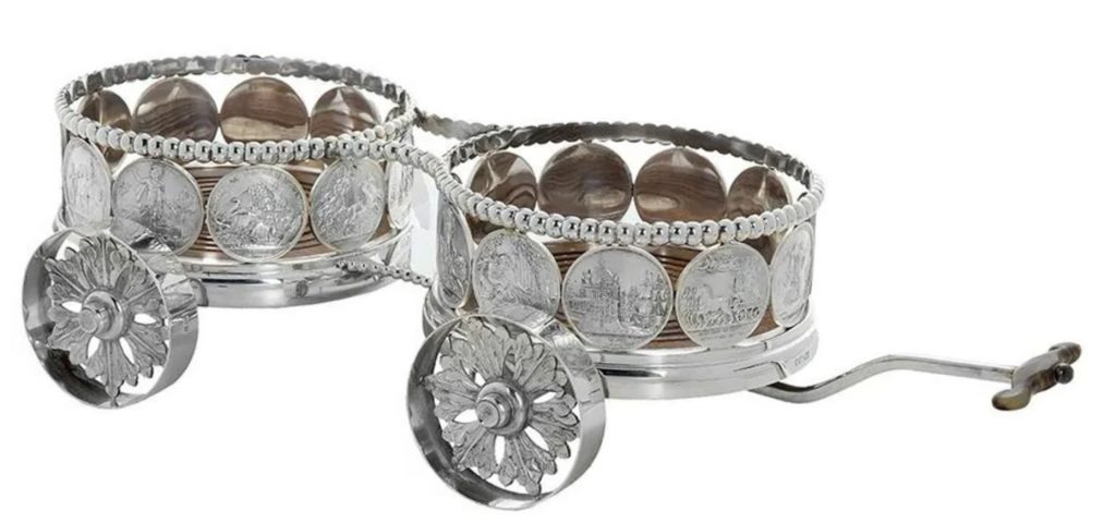
One of Wellington’s Wine Waggon, as described by Thomason via Bradbury. The medallions are by James Mudie, and commemorate the British Victories in the Napoleonic Wars.
This is the story related by Bradbury, via the memoirs of Thomason, one of the major manufacturers of Old Sheffield Plate luxury items in Sheffield in the early 19th century. The items he is describing are these remarkable constructions, created for George IV who then presented it to the Duke of Wellington in 1826. The pair can still be seen in his preserved residence at Aspley House, on the corner of Hyde Park, London – considered the only preserved example of an English aristocratic townhouse from its period.
However, Bradbury was not convinced in this being the actual origin of the type, stating in a footnote:
Notwithstanding what is here recorded, wine waggons not very dissimilar to those illustrated are to be met with in both silver and Old Sheffield Plate apparently made late in the 18th century. Whether, however, such have been put together at a more recent date in the form of wine waggons from pairs of coasters, cannot be said with certainty.
We are pleased that our example of a ‘Wine Wagon’ is absolutely original, being a documented product of Battie, Howard & Hawksworth of Sheffield. It is in splendid condition, despite being completely ‘black’ when it came in. Many hours of patient cleaning later, the original silver was found to be in excellent, unworn condition – a rarity with Old Sheffield, which is well known for its tendency to ‘blush’ as the copper starts to show through the silver. It is now ready to grace the table of some fresh Stylish Imbiber….
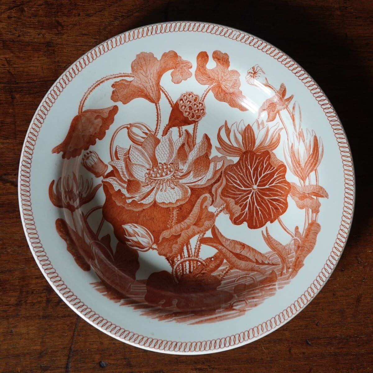
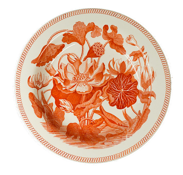
Three early 19th century Wedgwood Pearlware pieces bearing the ‘Water Lily’ pattern, sometimes known as ‘Darwin’s Lily’.
A collection of a scarce Wedgwood pattern has recently come to Moorabool. What a fascinating tale this pattern has to tell…..
Commonly called ‘Darwin’s Water Lilly’ , or just ‘Darwin’, it is one of the few Wedgwood printed patterns of the first decade of the 19th century that was not Oriental in inspiration, and in fact an original creation.
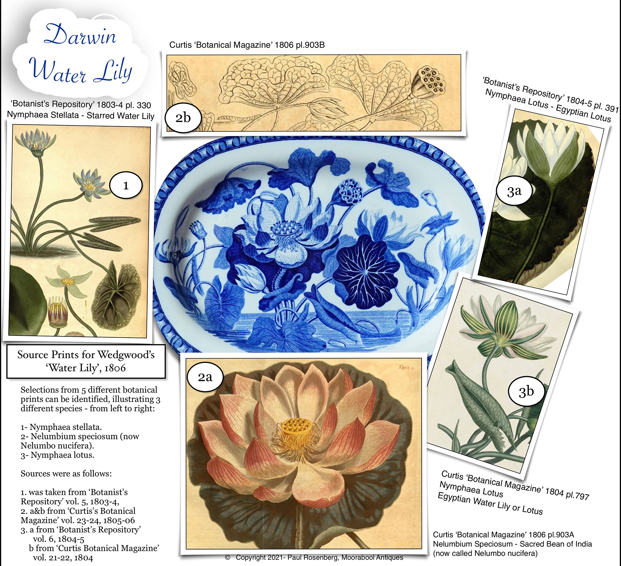
The source prints for the Wedgwood pattern, from ‘Curtis’s Botanical Magazine’ and ‘The Botanist’s Repository’, dating to 1803-6
The inspiration for the design was pulled from several different engravings in Botanical magazines of 1803-6, and shows specimens of three types of the ‘Nymphaeaceae’ family, commonly called ‘water lily’ – left to right they are: 1 -‘nymphaea stellata’, or starry water lily, 2 -‘nelumbium speciosum’, or sacred Lotus of India, 3 -‘nymphaea lotus’, or Lotus of Egypt.
The original version designed in 1806 was printed in brown as a basis for enamel decoration; this is said to be the earliest instance of printing in brown that can be accurately dated.
The British Museum’s plate from the Darwin Family, delivered 1808.
The extra leaf in the 1815+ versions.
The difference between this earliest example and those slightly later is very subtle; a half-submerged leaf at 5 o’clock is the best indicator, not appearing in the 1807 version, but there by the circa 1815 examples.
Onglaze red was used from late 1809. In 1811 blue was introduced and become a favourite. Underglaze red appears in 1828. A later 19th century version was named ‘Old Water Lily’.
But why is it so often called the ‘Darwin’ pattern? It turns out it’s a family affair. In the British Museum is a plate, very similar to our brown printed example, and another is in the Victoria & Albert, both from the same source: the family of Charles Darwin. In older literature, there is a story about them being from a service made by Josiah I Wedgwood for his friend Dr. Erasmus Darwin, on occasion of his marriage in 1781. However, this date is far too early for the pieces we are examining. The present conclusion is it was designed by John Wedgwood – the eldest son of Josiah Wedgwood, a noted horticulturist who was co-founder of the Royal Horticultural Society, Kew.
Eramus Darwin, 1792-3, by Joseph Wright of Derby, now in the Derby Art Gallery.
It was ordered in 1807 by Dr. Robert Darwin, son of Erasmus Darwin, and father of the famous Charles Darwin. He received it in 1808.
Robert Darwin, from an oil painting by James Pardon (1811-1829) (source:wikicommons)
The Darwin family and the Wedgwood family were intimately linked. Josiah Wedgwood and Erasmus Darwin were both part of the ‘Lunar Society’, the incredibly forward-thinking group of scientists and engineers that regularly met to discuss the exciting new world of science & technology – and botany – that was emerging in the late 18th/ early 19th century. A friendship was obviously formed, and several generations of inter-marriages followed. Erasmus’s son Robert married Josiah’s daughter Susannah, and their son, Charles Darwin, married his cousin – Emma Wedgwood, daughter of the second Josiah Wedgwood and his wife Elizabeth. She was therefore the daughter of his mother’s brother, and genetic problems are obvious in the generations that followed… Much has been written about the irony of Darwin’s fascination with aspects of genetics and evolution in nature – including how in-breeding caused a species to be fragile – and he himself wrote of his genetic concern for his own family….
Analysing the image source reveals the draftsman who created the ‘Water Lily’ design used multiple images, combined. Four source botanical images have been identified in the literature, one of which is a double – the following diagram shows which part comes from which publication. (Slide the divide for the arrows. )
SWIPE LEFT & RIGHT TO ENGAGE THE LOCATION ARROWS
The use of five different prints, from two of the botanical journals of the time, shows the designer was well aware of ‘botanical correctness’. They keep the leaf type of all three specimens separated and correct, and by combining the two prints of the Nymphaea lotus – no. 3 below – they show their scientific interest in the accurate description of species the botanists were striving for. The suggestion that it was John Wedgwood, co-founder of the Royal Horticultural Society (along with Sir Joseph Banks) makes perfect sense.
John Wedgwood (1766-1844)
In the Wedgwood archives, a letter written to John’s brother Josiah Wedgwood II by the manager Thomas Byerley, states:
Onglaze red, c. 1815
‘Your brother is extremely active and intelligent, and is fast paving the way for a radical form, and will greatly benefit the concern ’.
Unfortunately, John retired from the firm in 1812, leaving just a handful of fascinating precise botanical statements as his ceramic legacy.
We’re pleased to have a selection from the earliest products of Wedgwood in this mesmerising pattern – a chamberpot and dish in the blue of the 1820’s, three red plates from around 1820, and an example of the earliest short-lived brown print. The final piece is a 20th century Wedgwood re-creation, limited edition for the Wedgwood Collectors…… enjoy!
Moorabool’s Wedgwood ‘Water Lily’ offerings, midyear exhibition 2021. All 1815-25 except for the tankard, which is 20th century.
As the world watches the competition for Olympic Gold in Tokyo, we have a 100-year-old masterpieces of Japanese goldsmith’s work to share.
[metaslider id=91726 cssclass=””]
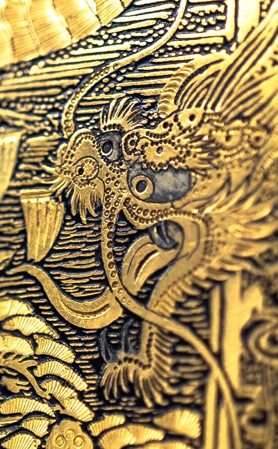
We were stunned when this small yet precious object walked into our shop recently. While we have had similar before, they inevitably are plain on the inside – often just with an empty space for cigarettes. This one is special: on opening, we see a place for a few of the required cigarettes – but inhabiting the other side is everything you need for an outing: this case is an all-in-one ‘evening bag’!
The mirror opens up to reveal a compartment with an ivory plaque, while below the small frieze of birds above is a surprise: two coin holders, such as the Victorians used for sovereigns and half-sovereigns.
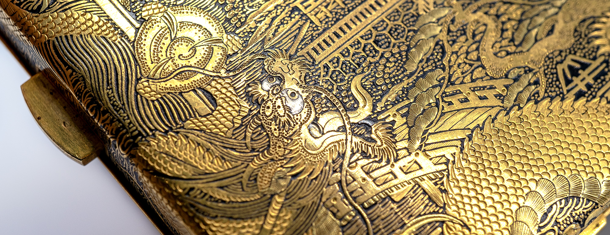
The work is intensely beautiful, with two tones of gold along with small silver details (dragon’s eyes) contrasting vividly against a patinated iron ground. We call this ‘Damascened’, as Damascus was a point from which the art spread in the centuries after the decline of the Roman Empire. It reached Japan by the Asuka Period (592-710), and ‘Nunome Zo-gan’ ( ‘symbolizing inlaying‘ ) is the Japanese word for the technique.
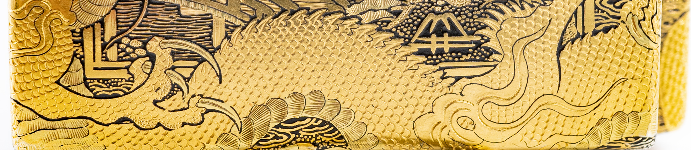
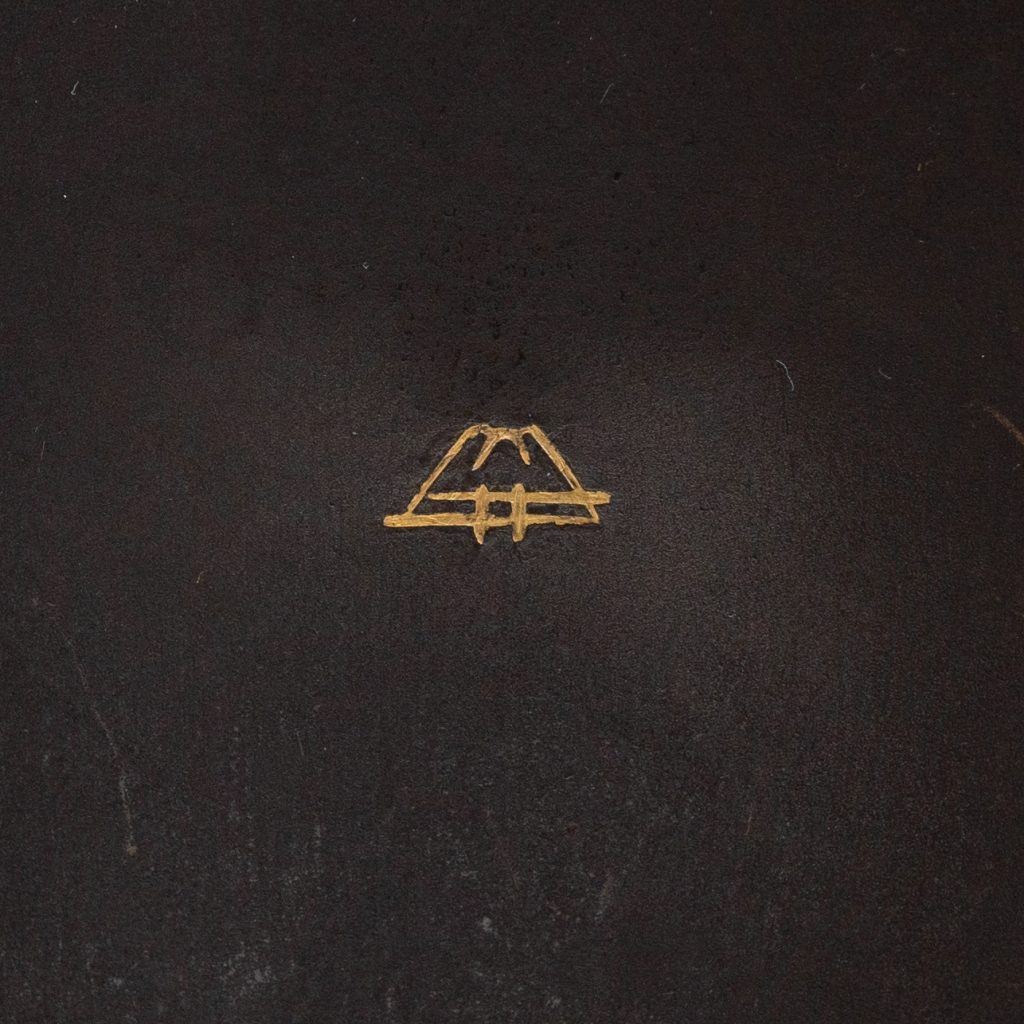
You may not have noticed the signature hidden in plain sight… the one inside is well isolated, being inlaid gold on a bare iron ground, and depicting Mt Fuji. This is the mark of the “Fuji Damascene Company”, operating 1912-26. The outside has a splendid view of Mt Fuji off in the distance behind the temple tower – but down in the foreground is this same signature, amongst the plants of the garden.
Yoshitoyo Fujii
The Fujii Damascene Co. Mark, c.1912-26
Mt Fuji was appropriate as the mark, as ‘Fujii’ is the name of the firm’s founder – Yoshitoyo Fujii. Born 1868 into a metal-crafters family, he developed the family business into a thriving international ‘luxury goods’ supplier. They produced brooches, cufflinks, necklaces, card cases, cigarette cases, writing sets, vases, table boxes…. a long list of superbly detailed items. Some of his works were selected to represent Japan in the numerous overseas exhibitions that were so popular of in the earlier 20th century, where he won numerous medals. His works were presented to the Japanese Royal Family – he was regarded as the best craftsman of the Damascene ‘Nunome Zogan’ technique. Ironically, his work is not pure to the ancient Zogan technique: he developed a new technique, for which he received a patent: an etching method of housing his inserts, suggesting an acid being used to get the fine lines needed, not just a chisel.
The results are certainly spectacular, as these close-up photos reveal. This is a remarkably beautiful object to hold, and must have been a pleasure to use on a ‘night out’ by the lucky individual who received this as a gift 100 years ago: it certainly would have been a highlight at any party, back in the 1920’s!
We are always fascinated by the origins of things…. when and where did it all begin?
In the porcelain world, it was of course China, around 1,000 years ago. This was so foreign and magical to the Europeans that pieces which made the perilous journey across the globe were only affordable by the most wealthy, being far more valuable than gold.
This all changed as the lure of such riches led to experimentation, and the first instance of a European porcelain body appears in the Medici courts in the 16th century, bankrolled by Francesco I; today, only 70 pieces have been identified, and the enterprise was a dead-end.
An example of Rouen Porcelain in the Sevres Museum.
The next successful production appears in France. In Rouen, a pottery industry had for many years been producing Faience – earthenware pieces with a white tin-glaze, as an imitation of a white porcelain body. They developed a distinct design, known as a ‘Lambrequin’ – a border with repetitive symmetrical floral elements, borrowed from Baroque designs often seen in embroideries, metalworks, and related artistic products. In 1673, a privilege to make porcelain was granted to Louis Poterat, and he seems to have experimented without a viable production of commercial scale resulting – only a possible dozen Rouen porcelain pieces have ever been identified. A 1702 comment in the petition from the next factory mentioned described the Rouen effort at porcelain manufacturing as this:
“…..(they) did nothing more than approach the secret, and never brought it to the perfection these petitioners have acquired”.
-1703 Saint Cloud Royal Petition
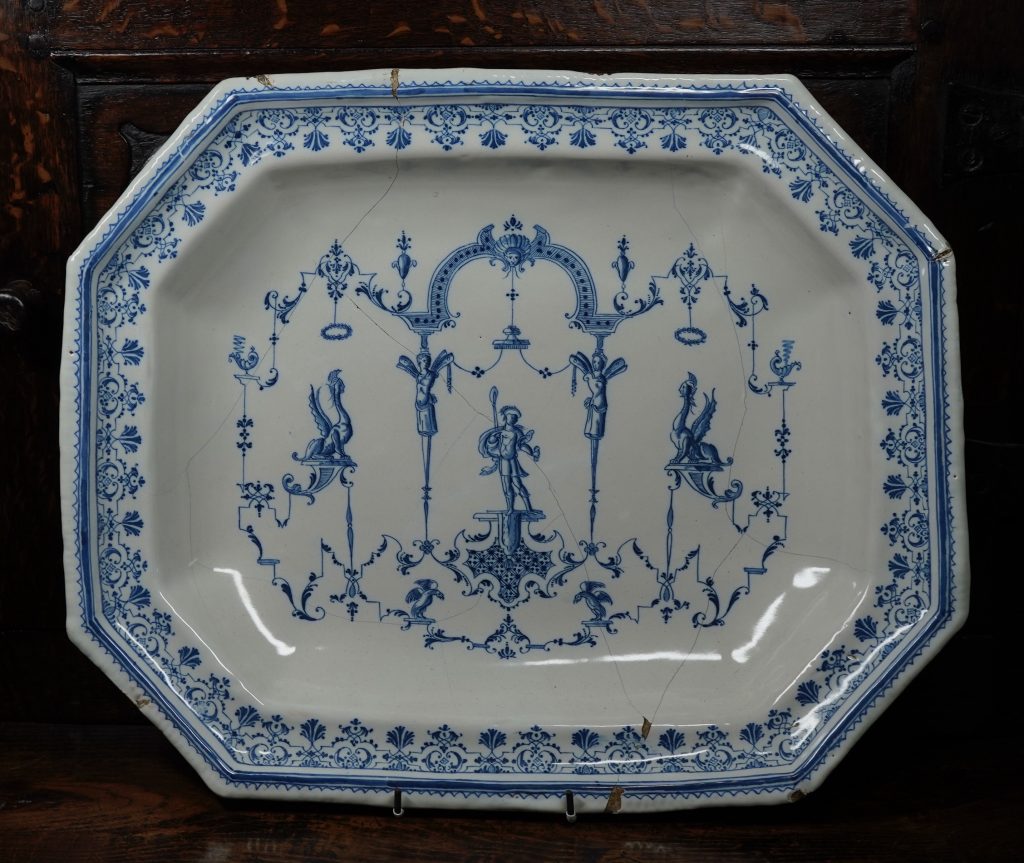
A French Faience (tin-glazed earthenware) charger from the late 17th century, showing the distinct ‘Lambrequin’ borders seen on Saint Cloud porcelain products. The designs are ‘le style de Berain’, taken from the 17th century designs of Berain, who was influenced by earlier Baroque designs which had borrowed heavily from Roman wall paintings! This example in the Rosenberg Collection, Geelong, is probably Moustiers (Clerissy workshop), but is typical of the type made at Rouen during the period discussed.
The first commercially successful porcelain manufacturer is the factory at Saint Cloud. This manufactury, like Rouen, began as a faience producer. A 1664 ‘Royal Privilege’ was given to a Parisian merchant named Claude Révérend, ‘..to produce faience and to imitate porcelain in the manner of the Indies (China) ‘ As a merchant, he was importing faience from Holland, and would have been very familiar with the superior Chinese porcelains. He selected a manufacturing base, and in 1666 set out to make faience products – in the manner of Rouen – on the outskirts of Paris, at Saint-Cloud. Within a few months, Claude Révérend had passed ownership to his brother, Francois Révérend. He had actually lived for many years in Rouen, and it is no surprise that these first products of Saint Cloud faience are very close to Rouen products.
Three examples of Saint-Cloud porcelain currently in stock at Moorabool – links below.
An artist employed at this time to paint the tin-glazed faience wares named Pierre Chicaneau is the important character in the development of the first commercial porcelain production in Europe. He is possibly from Rouen, and George Savage speculated in his 1960 “Seventeenth and Eighteenth Century French Porcelain” that he may have been exposed to the porcelain experiments while there. He begins at Saint Cloud in the 1660’s, and in 1674 he was made the firm’s director. He died in 1677, and it is the documents provided by his widow’s petition to the King for a Royal Privilege to make porcelain that gives us the full story of what was happening in Saint Cloud through the late 1660’s and early 1670’s; active pursuit of the secret of making porcelain. His widow wrote in the 1700 petition
“Pierre Chicaneau, having applied himself for many years to the making of faience and having arrived at a very high level of perfection in this work, wanted to push his knowledge still further and find the secret of making true porcelain; for this purpose he undertook several experiments with different materials and tried different finishing techniques, which resulted in works that were almost as perfect as the porcelain of China and the Indes”
-1700 Saint Cloud Royal petition by the Chicaneau family
They go on to state the first success – a repeatable, commercial prospect that allowed manufacturing of the product – was achieved by the firm around 1693. Dr Martin Lister, physician to Queen Anne in England and prolific writer, visited the works in 1698, writing;
“I saw the potterie of St Clou with which I was marvellously well pleased, for I confess I could not distinguish betwixt the pots made there and the finest China ware I ever saw. It will, I know, be easily granted me that the painting may be better designed and finished because our men are far better masters of that art than the Chineses; but the glazing came not the least behind theirs, not for whiteness, nor the smoothness for running without bubbles. Again, the inward substance and matter of the pots was, to me, the very same, hard and firm as marble, and the self same grain on this side vitrification. Farther, the transparency of the pots the very same.”
[yith_wc_productslider id=”80404″]
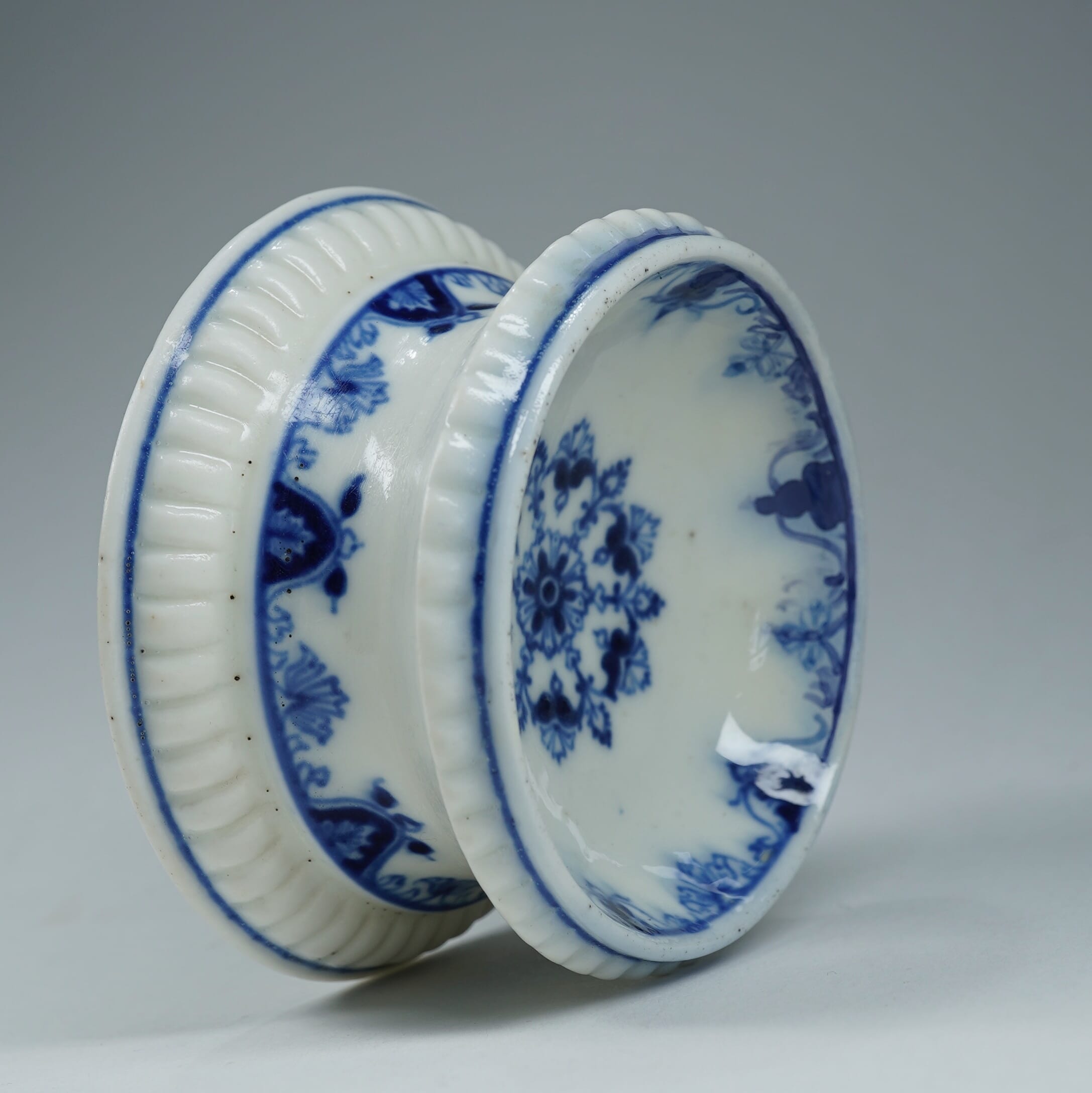
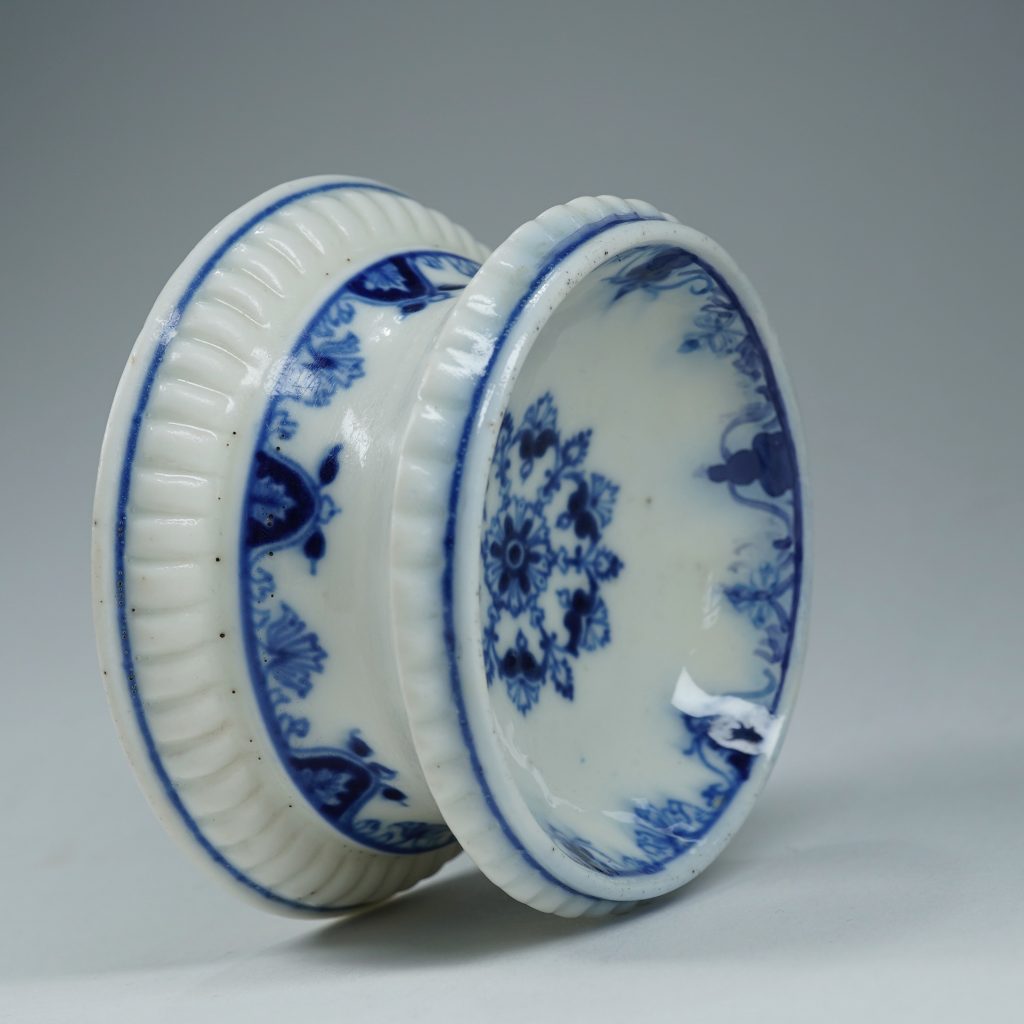
Examples of Saint Cloud in Moorabool’s current stock – click for more
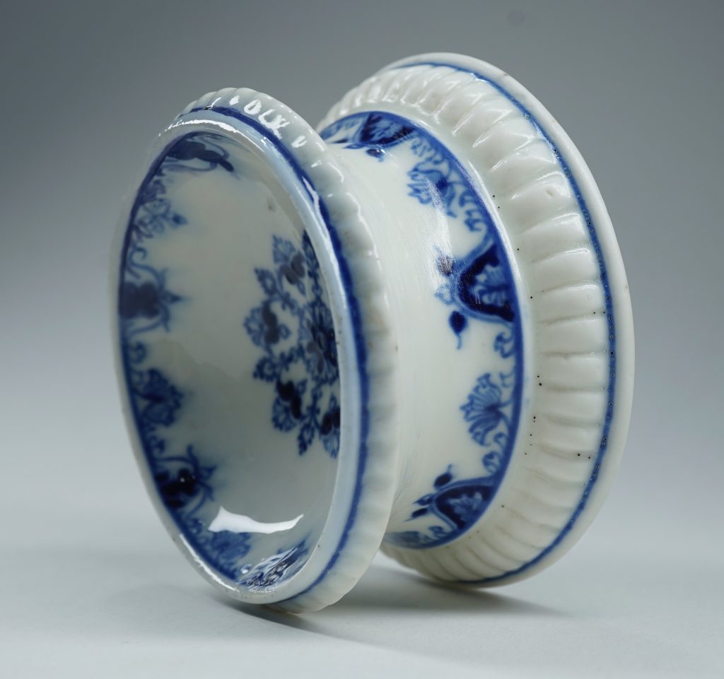
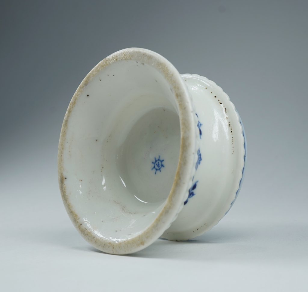
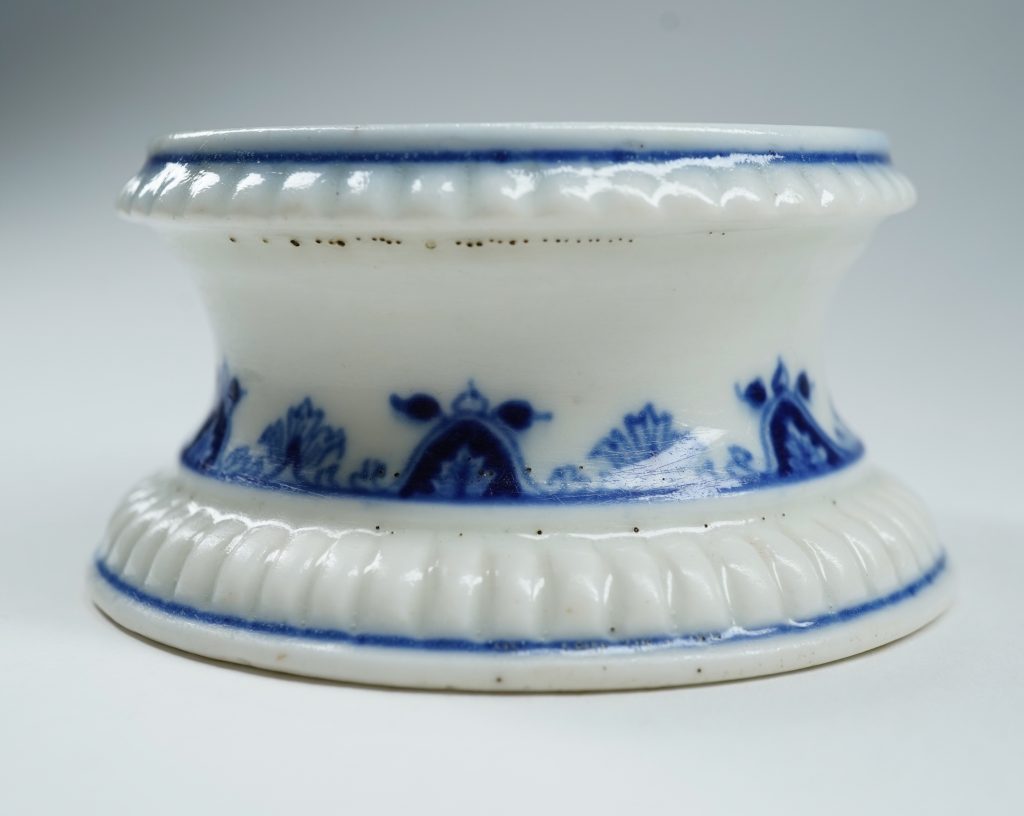
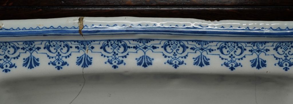
Moorabool is pleased to offer a piece of this earliest commercial production from what can be seen as the first European Porcelain Manufacturer*. Our piece was a necessity on the elegant tables of the time, where salt was an important – and expensive – commodity that enhanced the dining experience. It was also a status symbol, as while the Crown imposed a tax on salt (la gabelle), exemption was made for the privileged Nobles and Clergy.
Saint Cloud Salt circa 1700
Several of these open salts would have been scattered down the table amongst diners. There are metal examples of the same form, and clearly the porcelain copies them.
Moustiers Faience Lambrequin border from the dish illustrated previously.
The decoration is classic Saint-Cloud, with a repeating pattern of lambrequin motifs in underglaze blue. Such decoration appears on the full range of Saint-Cloud shapes, such as cups & saucers, cosmetic jars, and even eggcups. Comparing the patterns on ours with other examples is fascinating, as it appears the artist was not faithful to any specific design – there are endless slight variations regarding the location of the various leaves, flowerheads, and the symmetrical tendrils that define them.
[metaslider id="80388"]
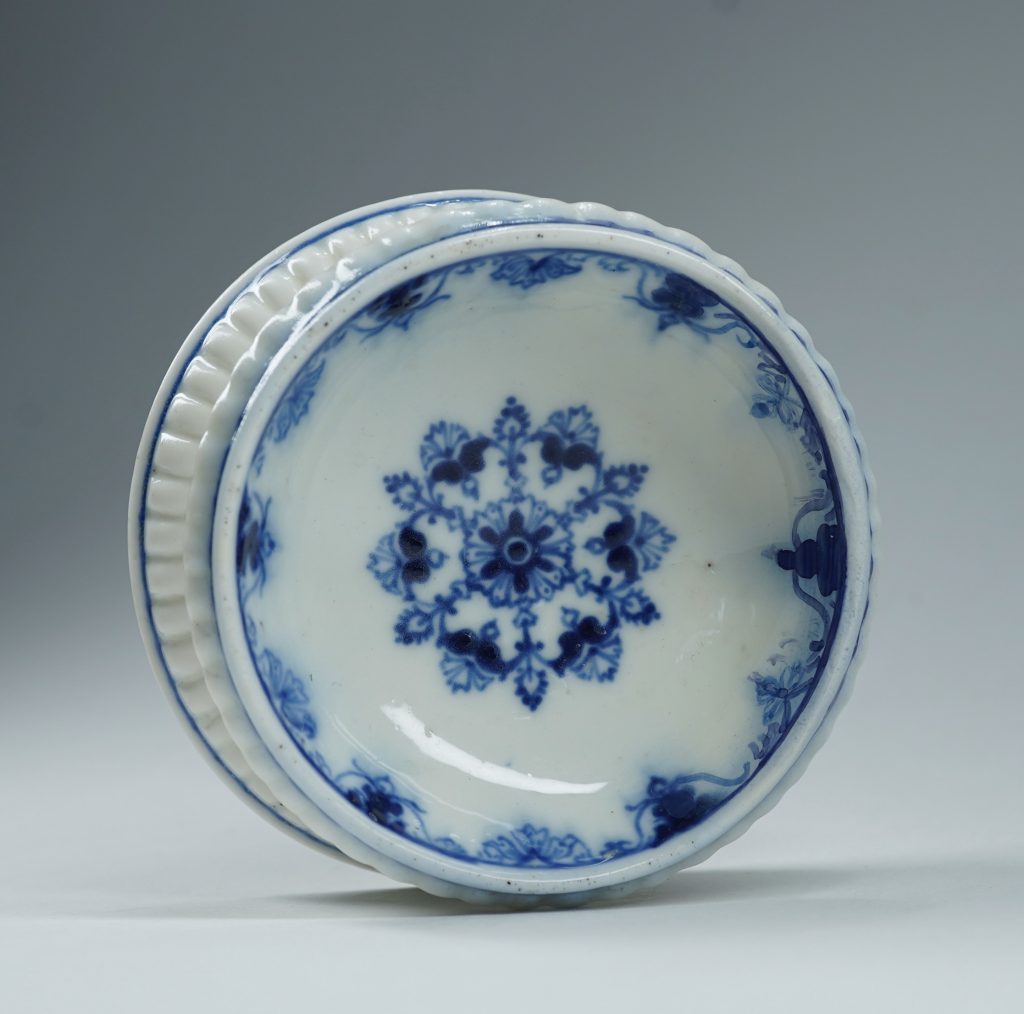
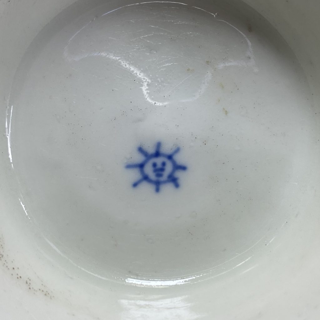
The ‘Sun’ mark is the earliest Saint-Cloud mark, and refers to the most important patron in France – Louis XIV, the ‘Sun King’. The factory location at Saint-Cloud was chosen because of the King’s younger brother, Duc d’Orleans, had an estate there, and became a patron of the fledgling factory. Louis XIV died in 1715, and the mark would most probably not have been used after that date; the more usual ‘St C’ begins during the second decade of the 18th century, and is identifiable as being post- 1722 by the addition of a ‘T’ beneath, indicating the change of Director to Henri Trou in that year. They continued making similar porcelain wares throughout the 1730’s-40’s, and finally closed in 1766.
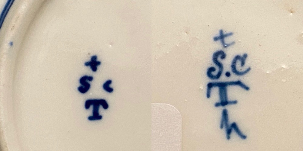
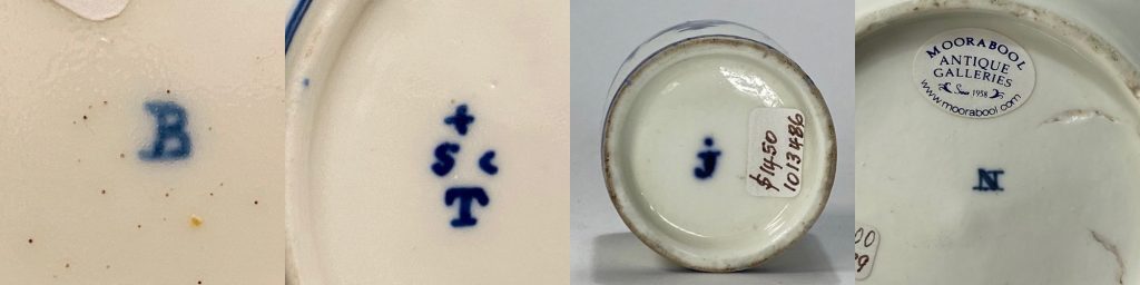
Saint Cloud ‘Sun King’ mark on our salt, 1693-1722.The standard Saint-Cloud mark, including the ‘T’ for Trou. The second example (Rosenberg Collection, Geelong) has an extra ‘h’, a painter’s mark. Not all Saint Cloud pieces are marked – and some have ‘painters marks’, usually an alphabet letter. This selection in Moorabool stock, or in the Rosenberg Collection.
Other examples can be seen various museum collections around the globe; the Musée des Arts Décoratifs in Paris has 5 examples, of which 2 have the ‘Sun’ mark and are dated 1697-1700, while the other three are unmarked and catalogued “Saint Cloud or Paris”, post-1700 (reflecting the other porcelain manufactories in Paris who copied Saint Cloud in the early 18th century). In 1997, the collection catalogue (Christine Lahaussois) suggests a date of 1697-1700. In 1999, the catalogue for a NY exhibition (“Discovering the Secrets of Soft-Paste Porcelain at The Saint-Cloud Manufactory”, editor Bertrand Rondot) illustrates three of the same examples as definite Saint-Cloud, and dates them all post-1700, with the closest to our example (including a Sun mark) being 1700-1715.
George Savage “Seventeenth and Eighteenth Century French Porcelain” 1960
Bertrand Rondot (editor) “Discovering the Secrets of Soft-Paste Porcelain at The Saint-Cloud Manufactory” 1999
Aileen Dawson “French Porcelain -a catalogue of the British Museum Collection” 1994
Christine Lahaussois “Porcelaines de Saint-Cloud, La collection du Musee des Arts Décoratifs” 1997
*I should note; when I use the term ‘Porcelain’ in this article, it is best described as ‘Artificial Porcelain’, meaning it was not the same as the Chinese products, as it lacked one of the main ‘stiffening’ ingredients. This is commonly called ‘Soft-Paste’, and defined the earliest French and English products. True Porcelain, in the Chinese manner, was produced by the Chinese from around the Song Dynasty (900 AD), and in Europe, the experiments at Dresden (and subsequent production at Meissen) were by chance identical in their basic ingredients, and this product is known as ‘Hard Paste’.
There is also a ‘Soft-Paste’ twist, with some fascinating experimental products appearing in England in the latter 17th century, possibly pre-dating the French efforts. John Dwight of Fulham was awarded a patent for porcelain in 1671, and may well have been successful – but not commercially!
Moorabool is often a place of meeting, both for people who enjoy Antiques – and for the Antiques themselves! We have occasionally been guilty of ‘match-making’ in the Antique world, discovering pieces that were quite literally made to be together…. but somehow became separated. It’s a thrill to re-unite pieces.
Ready for the harvest…..?
In today’s ‘Premium Fresh’ there is a rather sweet Vienna figure of a lady. Very early, she is circa 1755, and her costume is very distinct – very well dressed – and yet she carries a sickle and bundle of wheat. There’s more wheat behind her waiting to be cut; clearly she is a ‘Harvester’ off to sickle the wheat crop – but take a look at her shoes! How would they be practical in the fields…?
Vienna figure c.1755 Fresh to Moorabool’s stock
Vienna ‘Lady with Squirrel’ c.1755
While today we tend to place these lovely pieces in cabinets or a mantel shelf, in the 1750’s in Europe they were intended for the table. A scene would be set up along the length of a grand table, to entertain the guests with depictions of the gods, the Greek myths, a hunt, or in the case of a group of one group of interesting Vienna figures, “Pastoral Pursuits’.
The definitive book on these early figures helps us understand their purpose. ‘Ceremonies Feasts Costumes : Viennese Porcelain Figures during the reign of Maria Theresia’ is a splendid 2007 publication with large clear illustrations, detailing hundreds of Vienna figures from the 1740’s until the 1780’s. A private businessman, Du Paquier, had started the porcelain works in Vienna as early as 1719 ( making it the second true porcelain manufacturer in Europe, after Meissen), but by 1744 he was financially struggling, and the Viennese State purchased the works. This was of course ruled by Maria Theresia, the Empress of Austria, and she loved a good party… the porcelain works were an excellent source of the needed table wares, and this included table figures.
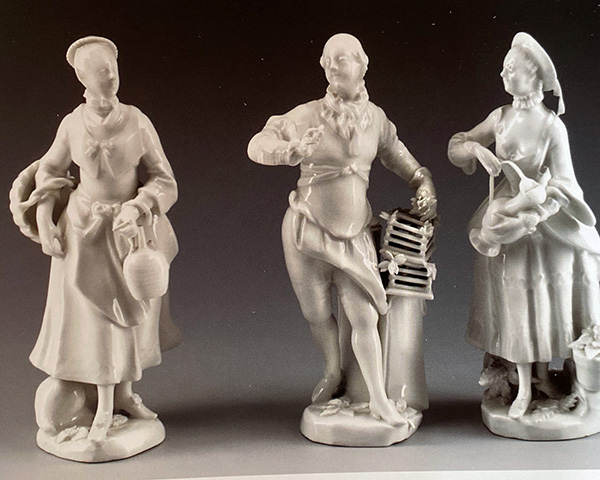
Vienna ‘Pastoral Pursuits’ figures, 1755-60
We find a series of well-dressed ladies & gents going about various occupations such as picking grapes, making wine, collecting milk…. and our lovely lady harvesting wheat. They’re an example of the idealisation and romantic notion that prevailed in the courts of 18th century Europe that the peasant lifestyle was an idyllic, carefree one. France of course excelled in this – think Mary Antionette and her role-playing as a milkmaid – and other courts tended to follow the fashions of France. Dinner parties could have an ‘Arcadian’ theme, meaning everyone would be dressed as a ‘commoner’ of some sort, but in silk and satin instead of the rough cotton the authentic garb would have been made of! These fancy-dress banquets had a curious way of dispersing the guests along the table – a lottery game would decide – giving the evening a sparkle of uncertainty in what was otherwise a very formalised environment.
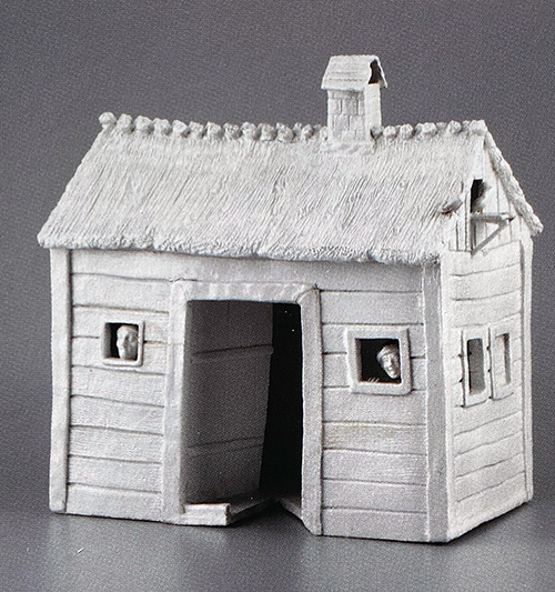
A Vienna Porcelain ‘Shepherd’s House’, circa 1755
Some rare survivors are model buildings for a table setting – also recorded in parallel in Meissen productions – suggesting the appearance of the table, with this banquet’s theme being Wirtschaft, meaning ‘Economy’ or ‘Workplace’ . This is the perfect fit for our lovely lady with the sickle. She’s actually a Princess, pretending to be a Harvester for the evening…..!
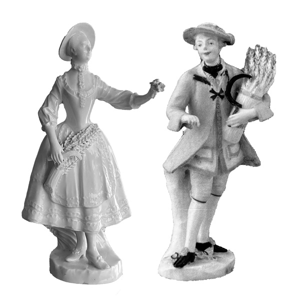
While exploring this fascinating topic, I came across a colourful ‘Cavalier as reaper’ group illustrated in the before mentioned book. Our lovely lass isn’t illustrated, but a comparison with the ‘Cavalier’ figure leads us to an exciting conclusion: this is surely a long-lost partner figure.
Introducing…. Vienna ‘Cavalier & Companion as Reapers’ , circa 1755
Moorabool Antiques 2020
Together at last… virtually, thanks to Photoshop!
Reunion…. the figure on the left is Vienna, circa 1755-60, in stock at Moorabool. To the right is a ‘Harvester’ circa 1755-60, illustrated in ‘Ceremonies Feasts Costumes : Viennese Porcelain Figures during the reign of Maria Theresia’ (Appendix #2) from the Umeleckoprumyslové Museum, Prague {86.269} . The two share numerous similarities, including size, decorative ’embroidery’ moulding to the clothing – and even the same shoes! – the only difference being the Prague figure is painted, the Moorabool left white. Their complementing poses and similar detailing lead us to propose they were originally conceived as a pair.
They are both tinglaze- but did you know there is a difference between ‘Delft’ and ‘delft’…. ?
‘Tinglaze’ describes the pottery products with a thick lead glaze containing an opaque white made from the oxide of tin. The result is the body of coarse buff-coloured pottery is covered with a pleasing glossy white, similar to porcelain. When decorated with colours, the results could be spectacular – but unlike the enamels on porcelain, the colours on tinglaze embed themselves into the thick tin oxide /lead glaze, giving them a distinct appearance we sometimes refer to as ‘inglaze’. This is a quick, single-pass process, as the colours soak into the chalk-like surface, with no room for correction; this is the basis for the ‘painterly’ spontaneous style seen in the decoration of tinglaze Delftwares. The above print shows the glazing process, with a pile of biscuit-fired plates being dipped into a huge vat of lead & tin oxide glaze…. off to the right the men are probably putting decoration onto the results. From here it would go into a kiln for a second time, fixing the glaze and the decoration into a glass-like surface over the pottery body – often very obvious in an antique piece as it is prone to chipping and revealing the body beneath. Illustration from a 1794 Dutch publication on trades by Gerrit Paape.
The blue & white decorated pottery with tinglaze surface is a familiar sight in the Antiques world, instantly recognisable as ‘Delft’. This name comes from the city in Holland where vast quantities were made and exported from the 17th century.
Dutch Delft vases, once display pieces in groups like this; Circa 1730-60. see them here >>
One of the export markets was England. The fashion in England for the blue & white had been well established by the importing of Chinese porcelains, and this is obvious when you look at the styles produced; some are direct copies of Chinese patterns.
Left is English Pottery, right is Chinese Porcelain, all mid 18th century
Left is English Pottery, right is Chinese Porcelain, all mid 18th century
But England of course already had a long history of pottery manufacturing, with ample clay to make their own. While the imported Dutch Delft was a less expensive option to imported Chinese Porcelain, it was only natural that the enterprising English potters imitated the Dutch, and produced their own tin-glazed pottery.
Attribution is difficult at times – we find a number of manufacturers which are virtually impossible to separate – the esteemed Victoria & Albert Museum in London itself constantly describes pieces as ‘London or Bristol’….. We can’t just go by the decoration, as movement of artists to different firms is well documented – including to & from from Holland. The body can be a help – although once again, there is much trade in clays both in England and even across the channel! At times, an attribution can only be made to a country: English or Dutch? And this leads to a problem, with the name ‘Delft’ describing a pottery type, not an origin. The main division needed is the Dutch from the English, and so a subtle method has been devised:
We us ‘Delft’ with a capital D for Dutch – and ‘delft’ in lowercase for English products!
1695 ‘Queen Mary’ Dutch Delft charger in the Rosenberg Reference Collection, Geelong.
Of course England not only imported Dutch Delft – they imported their new King & Queen with the regents William & Mary (1689-1702). These Dutch monarchs brought with them close connections with Holland, and it is no coincidence that the English delft productions start appearing in volume in this late 17th century period. This was a time of great prosperity for the English, and while the Continent had Holland to supply their tin-glaze needs, the English delft works were kept very busy supplying local needs – and found a ready market in the distant American colonies. London was an early producer, followed by Bristol, Liverpool, Belfast and Glasgow. All of these were trading ports eager for the overseas market, and English delft is often found in American archaeological sites of the period. It was written at the time that in Liverpool, ‘every merchant was concerned in a pot house made of delf’.
A late piece of English delft, this vessel is London – or Liverpool (!) – and an example can be dated to post-1800 by the name of the Soy merchant who had their name promoted on it – which also gives evidence of its usage; a soy vessel! The shape in an earlier 18th or 17th century context would be a drinking mug at a tavern. See this item here >>
Delftware found a perfect niche market in the lower-middle strata of society of the time; while Chinese porcelain was superior, it was also expensive. Local porcelain had not yet commenced, and while the Germans and French were producing porcelain from the early 18th century, it was only for those of ‘great means’ – out of reach for most people. Delft had the same look for a fraction the price. The age of English delft lasts from the late-17th century until the mid-18th, when a combination of local porcelain production (Bow, Chelsea, Worcester….) and over the next few decades, the increasing volume/decreasing price of imported Chinese porcelain reduces the demand for the cheaper local products, and all manufacturers quickly disappear by the start of the 19th century.
A rare English delft ‘Puzzle Jug’ – the puzzle being how on earth do you drink from it with those holes! (hint: there is a hole halfway down the inside of the handle visible here also…. a future blog post will explain all!) This has proven to be a difficult piece to date – the style picks up elements of 17th/early 18th century Chinoiserie pieces, and they are known from that period – but another example in the collection of Mr & Mrs Morgan, illustrated in ‘Dated English Delftware’ (Lipski & Archer 1985, p231, #108) is the same decoration, and dated 1729. A large number of English delft pieces bear dates, allowing a terrifically useful chronology to be put together. When the name of an individual, or an event commemoration is included, it also allows a place of manufacture to be established. This piece doesn’t, and so it is ‘London or Liverpool’ and circa 1730. See this item here >>
Moorabool has some superb pieces of delft – and Delft – in stock at the moment – as well as the other Continental equivalent products of Faience (France), Fayence (Germany) and Maiolica (Italy) – all basically the same soft earthenware body hidden beneath a thick glaze filled with white tin oxide… but they’re a good topic for another post!
Rarely seen, these solid silver handles are sculptural works of art. They are Dutch, date to the mid-17th century, and have a fascinating lineage we can trace back to Renaissance Italy and the collections of the Dutch master Rembrandt himself.
“Fingers were made before Forks” is an old English saying often used to justify eating with one’s fingers. It’s also the truth – for most people. When you look at the art of the middle ages, you’ll often see the peasants in a Brugel tavern scene just shoving the food in.
Detail from painting by PIETER BRUEGHEL III (1589-1634) – knives, but no forks…..
The rich, however, had an advantage: knives. These expensive accessories were a luxury item, and allowed one to keep ones fingers unsoiled while eating…. simply chop it, then stab the morsel with the pointy end, and use this handy device to get it to your mouth. Revolutionary! Even more luxurious and high-tech was the fork.
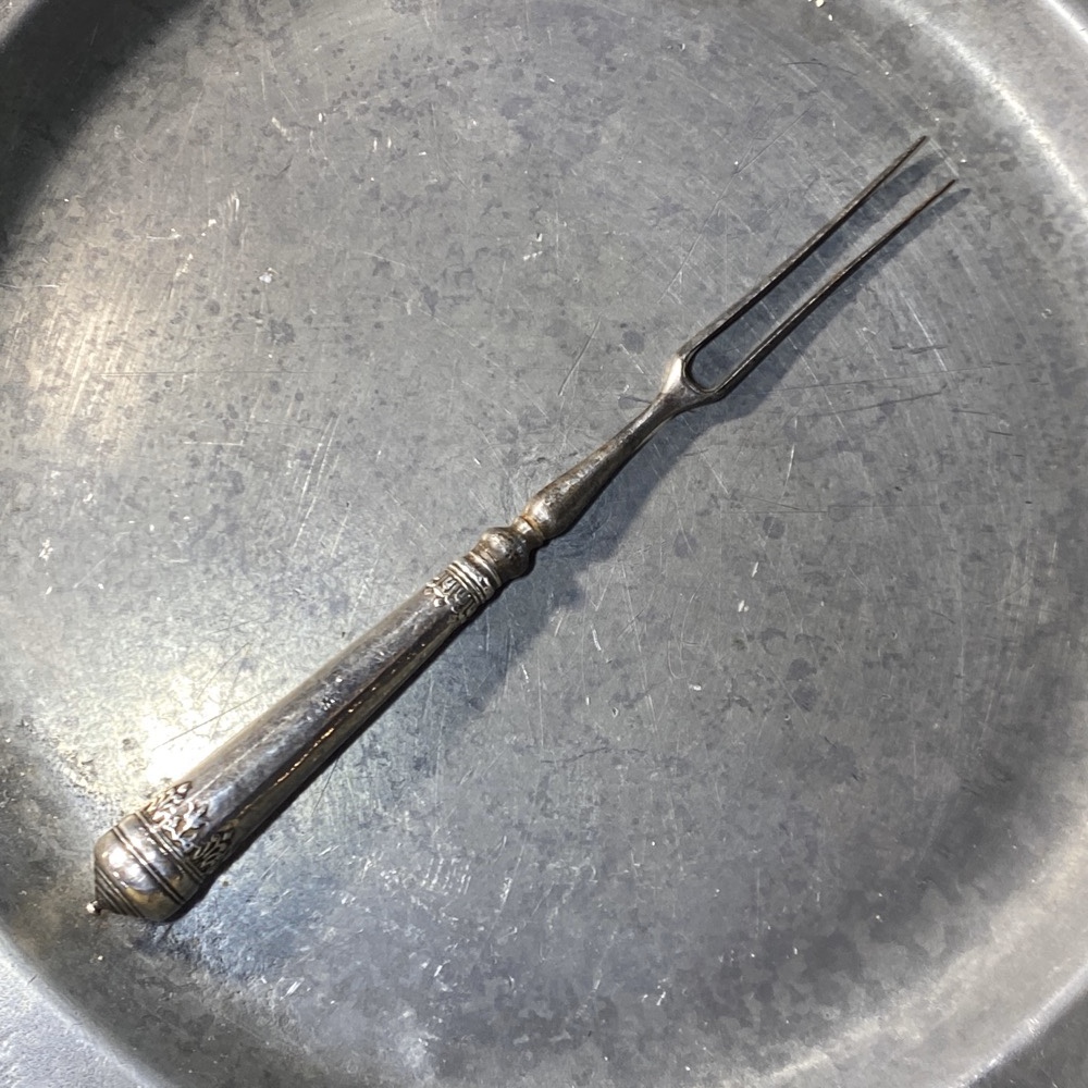
English silver handled fork, William & Mary period, circa 1695. See it here >>
St. Peter Damian, an 11th century Benedictine monk, criticized a Byzantine-born Venetian princess for her extravagance : “…such was the luxury of her habits … she deigned not to touch her food with her fingers, but would command her eunuchs to cut it up into small pieces, which she would impale on a certain golden instrument with two prongs and thus carry to her mouth.” Shocking indeed!
English Silver knife & fork, curiously by a cutler named ‘SPOON’ – circa 1700. See them here>>
A fork, when used with a knife, allowed a rhythm to eating, with both hands occupied – very civilised indeed, but only for those with the means. It wasn’t until the 18th and 19th centuries, and the age of mass production, that cutlery as we know it becomes an everyday item for all society.
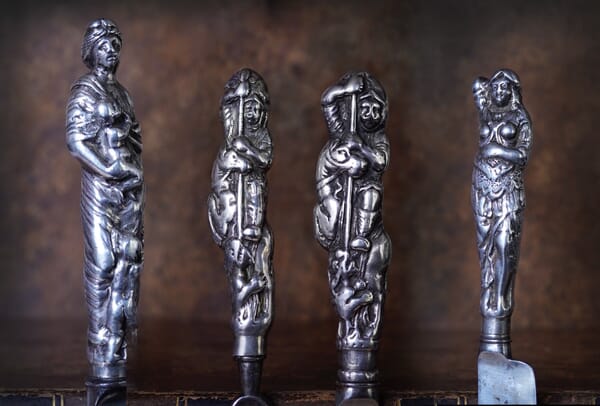
Dating to the ‘privilege period’ is the collection of solid-silver handled cutlery pieces we recently discovered in a Melbourne collection. Examine the photos – when no blade is visible, they are nothing short of sculpture. Small-scale 360-degree sculptures in the Baroque manner, and obviously intended to impress. There were perfectly functional cutlery shapes, also in luxurious materials such as ivory available at the same time- but to have your knife and fork with St George slaying the Dragon on it was a whole other level…..
Moorabool’s 17th century Dutch silver ‘figural’ cutlery handles.
Their design is ancient looking, medieval or Middle Ages. The figure of ‘Charity’ could well be a Roman goddess from 2,000 years ago! So where does their design originate?
Unsurprisingly, there’s a link to the Classical world, as the Italian Renaissance artists drew much inspiration from the classical past that surrounded them. Of note here is Francesco de’Rossi, il Salviati (1510-1563), an Italian artist of great merit. His designs for luxury goods are well known due to original sketches being treasured and replicated extensively, engraved and copied and used as inspiration by artisans ever since.
Salvati’s knife handle designs of the mid-16th century, engraved by Cherubino Alberti in the early 17th century.
Rembrandt’s version of Salviati’s original, done while in his possession circa 1620
The Dutch connection comes through the fascination the Low Countries had with the Classical past. Italy was a destination for anyone seeking Culture, and back in Holland, designs seen abroad were appreciated and incorporated. Artists often did the ‘Grand Tour’, and collections contained drawings and paintings of the results. Over time, these were assimilated by artists back in Holland, even if they never went to Italy themselves….. One such artist was Rembrandt – and amongst his drawings are a remarkable series of Designs for Knife Handles. When we consider where & when he operated, we have an intriguing link to the Dutch great master – he had seen such handles, and owned some Salviati sketches of them, and created his own studies in pen & wash. This shows the great interest in these luxurious Baroque pieces from Italy – and naturally the Dutch craftsmen were able to create something to satisfy this curiosity, in the form of Ivory and Silver handles.
The series of handles we have at Moorabool are complete with their original fittings – three with knife blades and one with a fork. These are very helpful in dating the pieces. First, the fork is the early 2-prong form. This appears in the earliest examples of the 15th century, and disappears in the early 18th century.
The shape of the knife is quite distinctive, having a straight blade and a tip with a sudden taper at the end. While this is a very early Continental form, appearing in Italian pieces from the 15th century, it also appears in Dutch examples of the 17th century, before other styles take hold.
These rarities are the feature pieces of our current collection of mostly English cutlery, beginning in the 17th century and continuing into the 18th and 19th. But none have the flamboyance of these silver handles…. imagine the interesting person they must have belonged to!
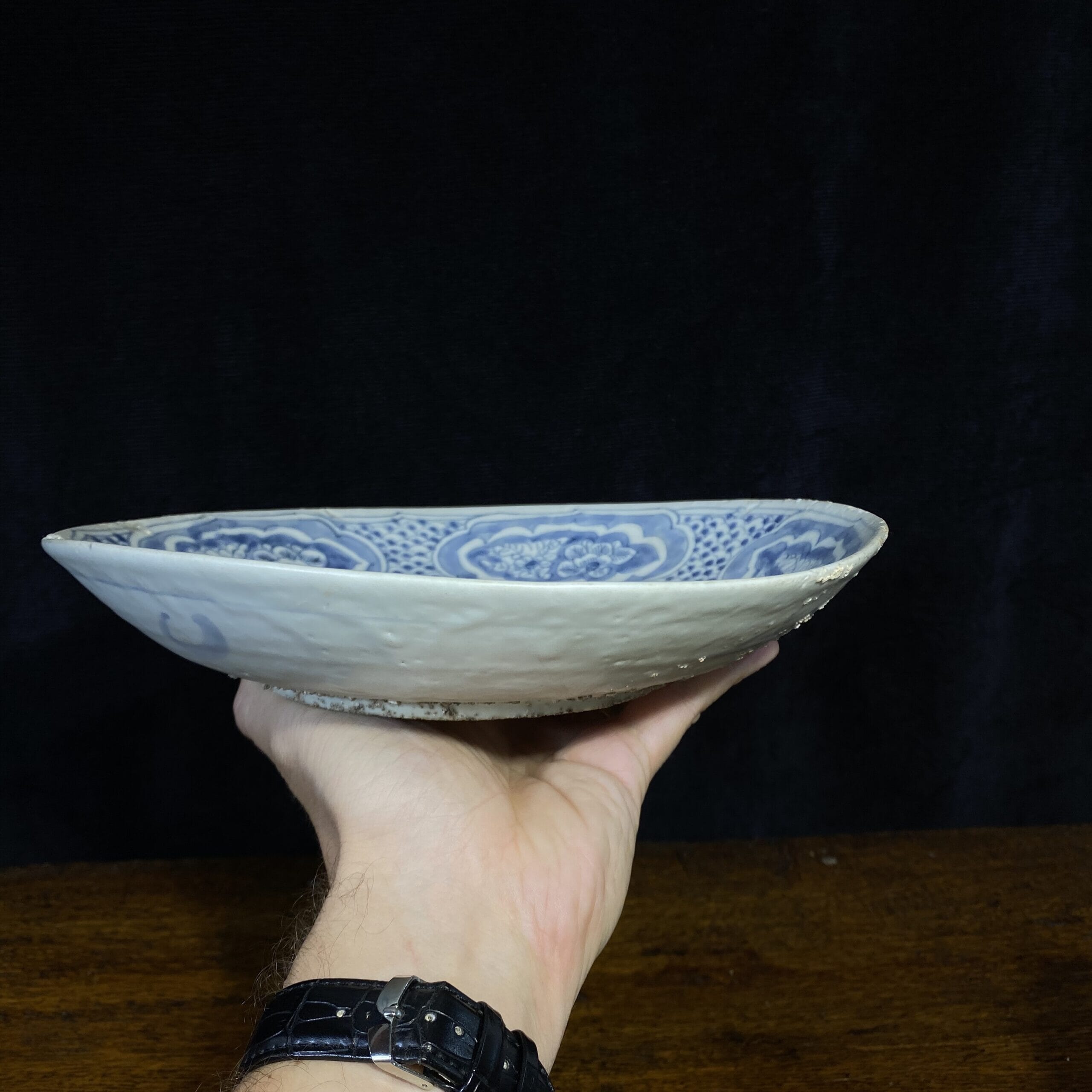
A selection of Zangzhou pieces, either from the Binh Thuan wreck (1608) or of the exact type recovered from it in 2002.
Zangzhou (Changchow) is a major production centre for this type of distinct porcelain body, and appears to have been focused on the export market to South-East Asia in the 16th-17th century. Older literature discusses them as ‘Swatow’ or ‘Provincial’ Ming, but excavations in the 1950’s in Fujian Provence located numerous ceramic production centres, with Zangzhou on the Jiulong River giving the name to this category of ceramics.
The wares are varied, with blue & white, celadon, and polychrome enamels all appearing. The best way to examine the product is through the Binh Thuan Shipwreck, which was filled with tens of thousands of pieces from this source. This ship went down in circa 1608, and contained a large number of blue & white pieces, as well as enamelled wares and pieces with blue underglaze and enamelled colours overglaze. This rarely survives in good condition as it is vulnerable to wear, especially in the context of a shipwreck….
Fragile onlgaze colours on Zangzhou porcelain – the bowls at the back were once decorated like the rare example in the foreground, all from the Binh Thuan Shipwreck (1608), but seawater wears it off…. the example at the right has never been under the sea.
Sharp pebbles on the base of Zangzhou wares were to stop it sticking to the kiln during firing. Very dangerous on polished surfaces!
One way to recognise this product is through the firing technique; dishes & bowls were placed onto rough granitic sand, which allowed the pot to be safely removed from the kiln without sticking. In the shipwreck examples, this still survives in its original extent; in pieces that made it to market, this has been carefully removed prior to sale as it is extremely sharp!
Moorabool’s Guarantee: All items offered are as described regarding date, condition, and description.
We offer a money-back guarantee, for any return within reasonable time, excluding postage.
Buy with confidence!
POSTAGE
Getting your goods need not be expensive!
We make sure Postage is as affordable as possible – our experienced in-house team can ship safely anywhere in the world, for the best possible price.
Ask for a quote…
Use the ‘Compare Products’ below to keep track of items of interest.