As the world watches the competition for Olympic Gold in Tokyo, we have a 100-year-old masterpieces of Japanese goldsmith’s work to share.
[metaslider id=91726 cssclass=””]
We were stunned when this small yet precious object walked into our shop recently. While we have had similar before, they inevitably are plain on the inside – often just with an empty space for cigarettes. This one is special: on opening, we see a place for a few of the required cigarettes – but inhabiting the other side is everything you need for an outing: this case is an all-in-one ‘evening bag’!
The mirror opens up to reveal a compartment with an ivory plaque, while below the small frieze of birds above is a surprise: two coin holders, such as the Victorians used for sovereigns and half-sovereigns.
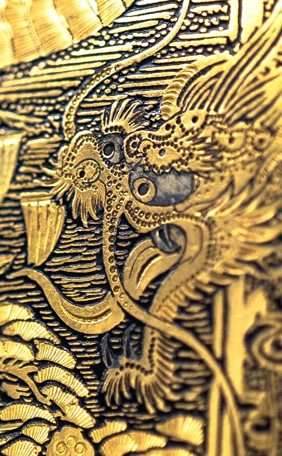
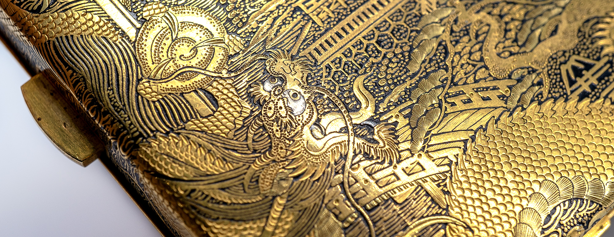
The work is intensely beautiful, with two tones of gold along with small silver details (dragon’s eyes) contrasting vividly against a patinated iron ground. We call this ‘Damascened’, as Damascus was a point from which the art spread in the centuries after the decline of the Roman Empire. It reached Japan by the Asuka Period (592-710), and ‘Nunome Zo-gan’ ( ‘symbolizing inlaying‘ ) is the Japanese word for the technique.
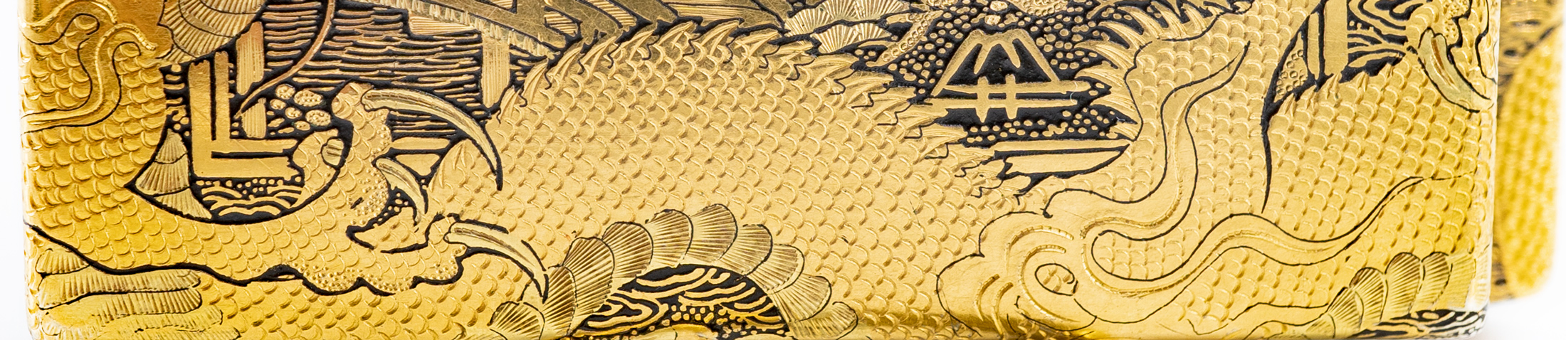
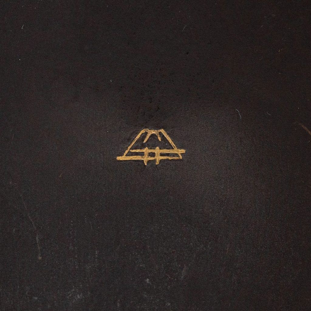
You may not have noticed the signature hidden in plain sight… the one inside is well isolated, being inlaid gold on a bare iron ground, and depicting Mt Fuji. This is the mark of the “Fuji Damascene Company”, operating 1912-26. The outside has a splendid view of Mt Fuji off in the distance behind the temple tower – but down in the foreground is this same signature, amongst the plants of the garden.
Yoshitoyo Fujii
The Fujii Damascene Co. Mark, c.1912-26
Mt Fuji was appropriate as the mark, as ‘Fujii’ is the name of the firm’s founder – Yoshitoyo Fujii. Born 1868 into a metal-crafters family, he developed the family business into a thriving international ‘luxury goods’ supplier. They produced brooches, cufflinks, necklaces, card cases, cigarette cases, writing sets, vases, table boxes…. a long list of superbly detailed items. Some of his works were selected to represent Japan in the numerous overseas exhibitions that were so popular of in the earlier 20th century, where he won numerous medals. His works were presented to the Japanese Royal Family – he was regarded as the best craftsman of the Damascene ‘Nunome Zogan’ technique. Ironically, his work is not pure to the ancient Zogan technique: he developed a new technique, for which he received a patent: an etching method of housing his inserts, suggesting an acid being used to get the fine lines needed, not just a chisel.
The results are certainly spectacular, as these close-up photos reveal. This is a remarkably beautiful object to hold, and must have been a pleasure to use on a ‘night out’ by the lucky individual who received this as a gift 100 years ago: it certainly would have been a highlight at any party, back in the 1920’s!
A Victorian favorite The Victorians loved the romance of the countryside. This was the period when the majority of people came to live in the ‘urban sprawl’ of the large cities like London, and the countryside became a distant place of idyllic beauty. Artists were constantly using this nostalgia for a flower-filled country life as their inspiration, and country cottage watercolours became best-sellers.
We have three nice works fresh in, including some colourful & well-priced works by William Affleck (1869-1943).
The very respected Birket Foster was in great demand, and the story is told of the race from the station to his studio by competing dealers when he had work to sell!
Such paintings were in great demand in the late 20th century, but have slumped since. Foster’s works have surpassed $200,000, with his larger works averaging $20-50,000. While a little sun-touched, our example is a well priced example of his work. Let the race begin…..
It’s always rewarding to discover something that has not been identified before. In the British Ceramics world, this is possible even in Australia….
This curious figure turned up in Melbourne recently, and is obviously a depiction of Dr Syntax, a creation of the British writer William Combe which led to a series of books describing his bumbling catastrophical travels. They were illustrated by the contemporary illustrator Rowlandson, beginning in 1812 with ‘The Tour of Dr Syntax in Search of the Picturesque’. From the illustrations in these books, the Derby factory created a series of humorous small-scale figures. Moorabool had one example a few years ago.
left: the figure in front of an illustration from an 1820’s Dr Syntax publication . –> see more
These are well documented by the late Bradbury in his definitive work ‘Derby Figures’. The problem is, some figures had not been recorded in Britain, and these are referred to in the publication as ‘Unknown to the Author’.
We’ve found two of these ‘Unknown’ figures in the past in Australia: could this be the third?
A look through the list finds items G11-24 are all Dr Syntax, and three are listed as ‘unknown to author’. Of these the only likely candidate is No. 13: ‘Dr Syntax Crossing a Lake’.
Looking at our figure, we believe it is a perfect candidate for the missing No. 13, as he steps off a rocky shore into a lake – apparently too distracted by the picturesque surroundings to notice!
We are always fascinated by the origins of things…. when and where did it all begin?
In the porcelain world, it was of course China, around 1,000 years ago. This was so foreign and magical to the Europeans that pieces which made the perilous journey across the globe were only affordable by the most wealthy, being far more valuable than gold.
This all changed as the lure of such riches led to experimentation, and the first instance of a European porcelain body appears in the Medici courts in the 16th century, bankrolled by Francesco I; today, only 70 pieces have been identified, and the enterprise was a dead-end.
An example of Rouen Porcelain in the Sevres Museum.
The next successful production appears in France. In Rouen, a pottery industry had for many years been producing Faience – earthenware pieces with a white tin-glaze, as an imitation of a white porcelain body. They developed a distinct design, known as a ‘Lambrequin’ – a border with repetitive symmetrical floral elements, borrowed from Baroque designs often seen in embroideries, metalworks, and related artistic products. In 1673, a privilege to make porcelain was granted to Louis Poterat, and he seems to have experimented without a viable production of commercial scale resulting – only a possible dozen Rouen porcelain pieces have ever been identified. A 1702 comment in the petition from the next factory mentioned described the Rouen effort at porcelain manufacturing as this:
“…..(they) did nothing more than approach the secret, and never brought it to the perfection these petitioners have acquired”.
-1703 Saint Cloud Royal Petition
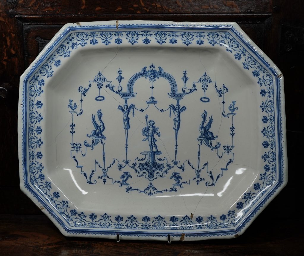
A French Faience (tin-glazed earthenware) charger from the late 17th century, showing the distinct ‘Lambrequin’ borders seen on Saint Cloud porcelain products. The designs are ‘le style de Berain’, taken from the 17th century designs of Berain, who was influenced by earlier Baroque designs which had borrowed heavily from Roman wall paintings! This example in the Rosenberg Collection, Geelong, is probably Moustiers (Clerissy workshop), but is typical of the type made at Rouen during the period discussed.
The first commercially successful porcelain manufacturer is the factory at Saint Cloud. This manufactury, like Rouen, began as a faience producer. A 1664 ‘Royal Privilege’ was given to a Parisian merchant named Claude Révérend, ‘..to produce faience and to imitate porcelain in the manner of the Indies (China) ‘ As a merchant, he was importing faience from Holland, and would have been very familiar with the superior Chinese porcelains. He selected a manufacturing base, and in 1666 set out to make faience products – in the manner of Rouen – on the outskirts of Paris, at Saint-Cloud. Within a few months, Claude Révérend had passed ownership to his brother, Francois Révérend. He had actually lived for many years in Rouen, and it is no surprise that these first products of Saint Cloud faience are very close to Rouen products.
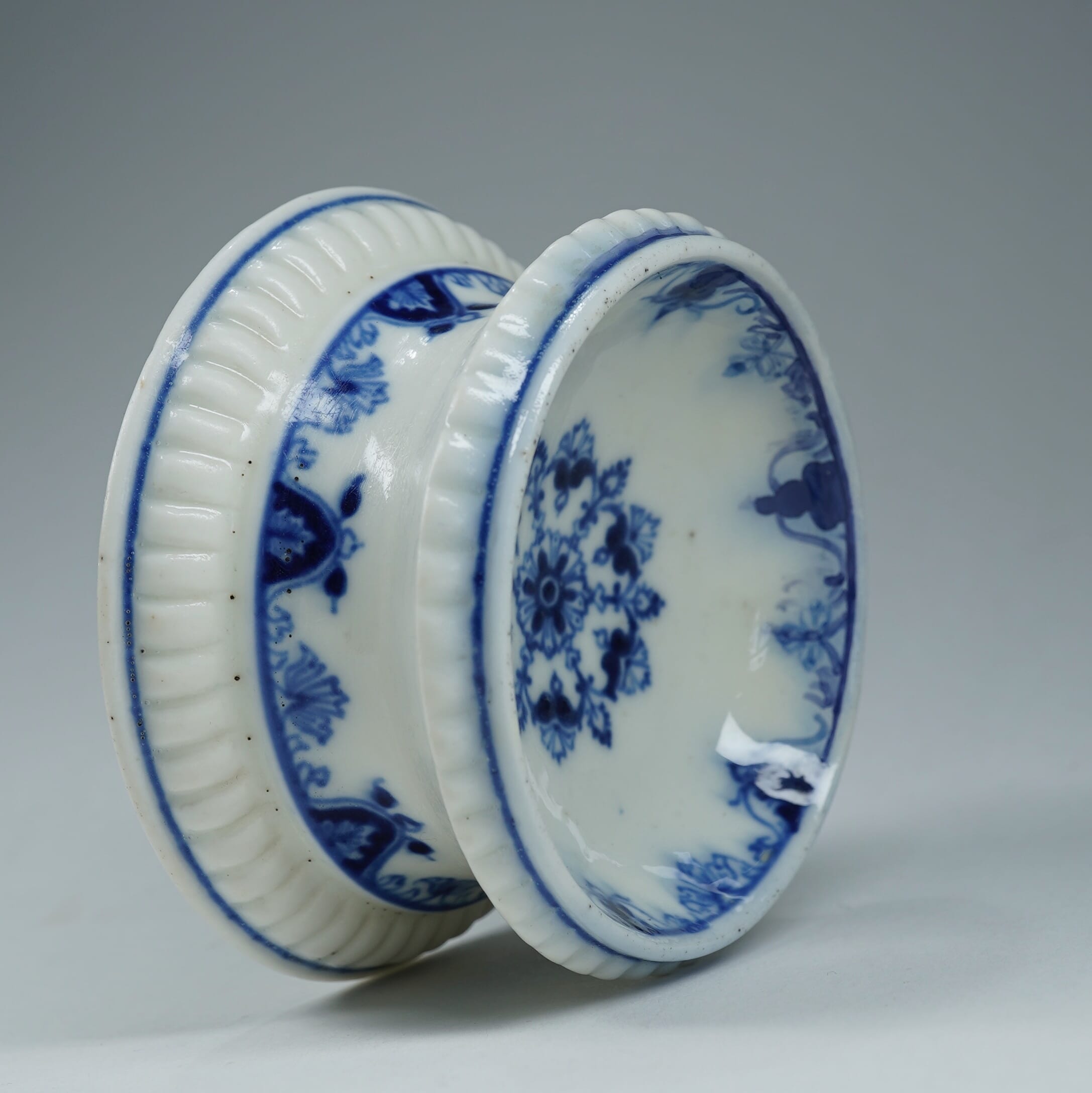
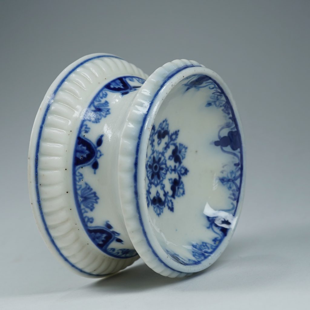
Three examples of Saint-Cloud porcelain currently in stock at Moorabool – links below.
An artist employed at this time to paint the tin-glazed faience wares named Pierre Chicaneau is the important character in the development of the first commercial porcelain production in Europe. He is possibly from Rouen, and George Savage speculated in his 1960 “Seventeenth and Eighteenth Century French Porcelain” that he may have been exposed to the porcelain experiments while there. He begins at Saint Cloud in the 1660’s, and in 1674 he was made the firm’s director. He died in 1677, and it is the documents provided by his widow’s petition to the King for a Royal Privilege to make porcelain that gives us the full story of what was happening in Saint Cloud through the late 1660’s and early 1670’s; active pursuit of the secret of making porcelain. His widow wrote in the 1700 petition
“Pierre Chicaneau, having applied himself for many years to the making of faience and having arrived at a very high level of perfection in this work, wanted to push his knowledge still further and find the secret of making true porcelain; for this purpose he undertook several experiments with different materials and tried different finishing techniques, which resulted in works that were almost as perfect as the porcelain of China and the Indes”
-1700 Saint Cloud Royal petition by the Chicaneau family
They go on to state the first success – a repeatable, commercial prospect that allowed manufacturing of the product – was achieved by the firm around 1693. Dr Martin Lister, physician to Queen Anne in England and prolific writer, visited the works in 1698, writing;
“I saw the potterie of St Clou with which I was marvellously well pleased, for I confess I could not distinguish betwixt the pots made there and the finest China ware I ever saw. It will, I know, be easily granted me that the painting may be better designed and finished because our men are far better masters of that art than the Chineses; but the glazing came not the least behind theirs, not for whiteness, nor the smoothness for running without bubbles. Again, the inward substance and matter of the pots was, to me, the very same, hard and firm as marble, and the self same grain on this side vitrification. Farther, the transparency of the pots the very same.”
[yith_wc_productslider id=”80404″]
Examples of Saint Cloud in Moorabool’s current stock – click for more
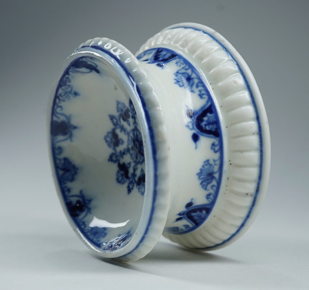
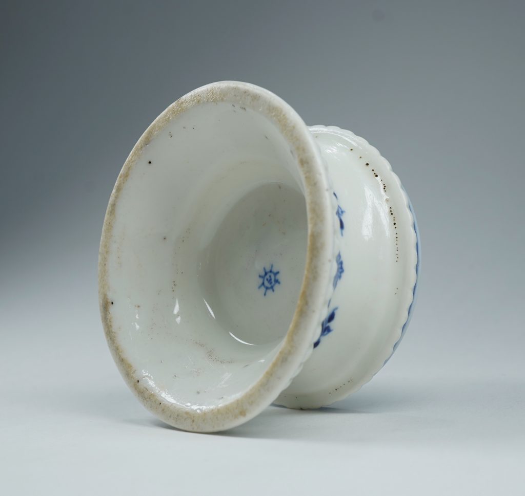
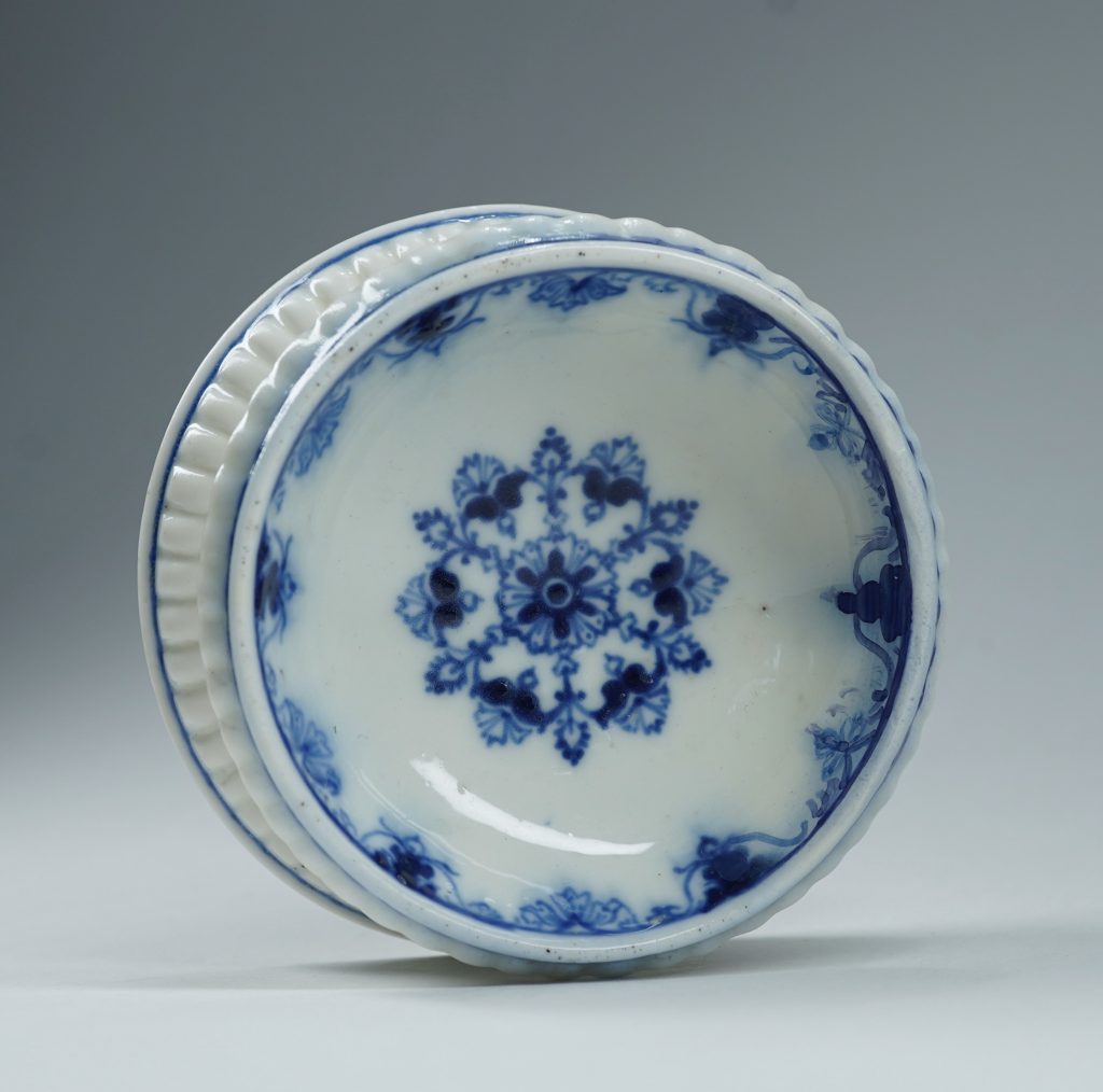
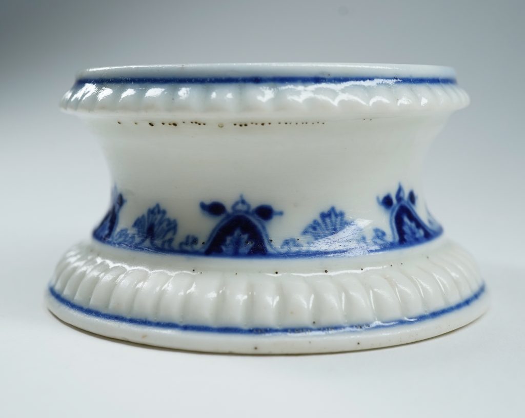
Moorabool is pleased to offer a piece of this earliest commercial production from what can be seen as the first European Porcelain Manufacturer*. Our piece was a necessity on the elegant tables of the time, where salt was an important – and expensive – commodity that enhanced the dining experience. It was also a status symbol, as while the Crown imposed a tax on salt (la gabelle), exemption was made for the privileged Nobles and Clergy.
Saint Cloud Salt circa 1700
Several of these open salts would have been scattered down the table amongst diners. There are metal examples of the same form, and clearly the porcelain copies them.
Moustiers Faience Lambrequin border from the dish illustrated previously.
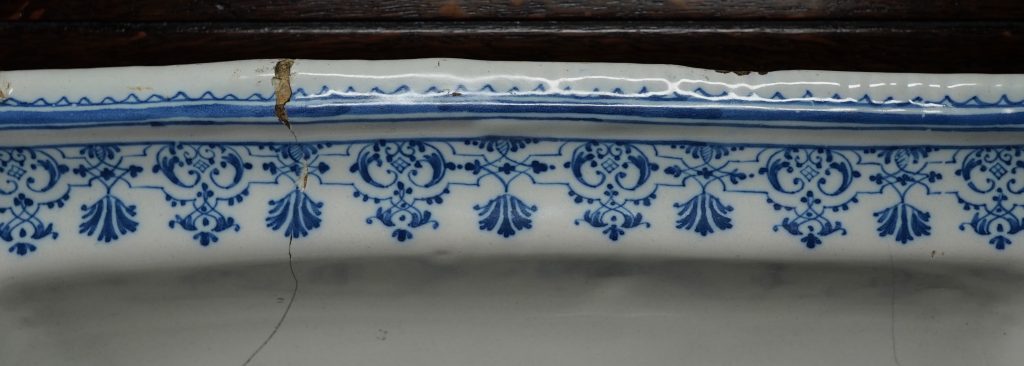
The decoration is classic Saint-Cloud, with a repeating pattern of lambrequin motifs in underglaze blue. Such decoration appears on the full range of Saint-Cloud shapes, such as cups & saucers, cosmetic jars, and even eggcups. Comparing the patterns on ours with other examples is fascinating, as it appears the artist was not faithful to any specific design – there are endless slight variations regarding the location of the various leaves, flowerheads, and the symmetrical tendrils that define them.
[metaslider id="80388"]
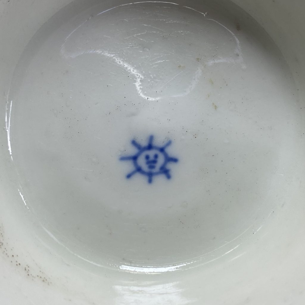
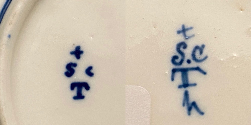
The ‘Sun’ mark is the earliest Saint-Cloud mark, and refers to the most important patron in France – Louis XIV, the ‘Sun King’. The factory location at Saint-Cloud was chosen because of the King’s younger brother, Duc d’Orleans, had an estate there, and became a patron of the fledgling factory. Louis XIV died in 1715, and the mark would most probably not have been used after that date; the more usual ‘St C’ begins during the second decade of the 18th century, and is identifiable as being post- 1722 by the addition of a ‘T’ beneath, indicating the change of Director to Henri Trou in that year. They continued making similar porcelain wares throughout the 1730’s-40’s, and finally closed in 1766.
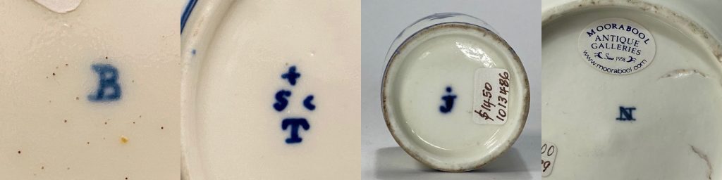
Saint Cloud ‘Sun King’ mark on our salt, 1693-1722.The standard Saint-Cloud mark, including the ‘T’ for Trou. The second example (Rosenberg Collection, Geelong) has an extra ‘h’, a painter’s mark. Not all Saint Cloud pieces are marked – and some have ‘painters marks’, usually an alphabet letter. This selection in Moorabool stock, or in the Rosenberg Collection.
Other examples can be seen various museum collections around the globe; the Musée des Arts Décoratifs in Paris has 5 examples, of which 2 have the ‘Sun’ mark and are dated 1697-1700, while the other three are unmarked and catalogued “Saint Cloud or Paris”, post-1700 (reflecting the other porcelain manufactories in Paris who copied Saint Cloud in the early 18th century). In 1997, the collection catalogue (Christine Lahaussois) suggests a date of 1697-1700. In 1999, the catalogue for a NY exhibition (“Discovering the Secrets of Soft-Paste Porcelain at The Saint-Cloud Manufactory”, editor Bertrand Rondot) illustrates three of the same examples as definite Saint-Cloud, and dates them all post-1700, with the closest to our example (including a Sun mark) being 1700-1715.
George Savage “Seventeenth and Eighteenth Century French Porcelain” 1960
Bertrand Rondot (editor) “Discovering the Secrets of Soft-Paste Porcelain at The Saint-Cloud Manufactory” 1999
Aileen Dawson “French Porcelain -a catalogue of the British Museum Collection” 1994
Christine Lahaussois “Porcelaines de Saint-Cloud, La collection du Musee des Arts Décoratifs” 1997
*I should note; when I use the term ‘Porcelain’ in this article, it is best described as ‘Artificial Porcelain’, meaning it was not the same as the Chinese products, as it lacked one of the main ‘stiffening’ ingredients. This is commonly called ‘Soft-Paste’, and defined the earliest French and English products. True Porcelain, in the Chinese manner, was produced by the Chinese from around the Song Dynasty (900 AD), and in Europe, the experiments at Dresden (and subsequent production at Meissen) were by chance identical in their basic ingredients, and this product is known as ‘Hard Paste’.
There is also a ‘Soft-Paste’ twist, with some fascinating experimental products appearing in England in the latter 17th century, possibly pre-dating the French efforts. John Dwight of Fulham was awarded a patent for porcelain in 1671, and may well have been successful – but not commercially!
A part Victorian tea service in today’s Fresh Stock has an interesting tale to tell.
A glance at the mark suggests two possibilities: ‘Dresden’, ie made in the German city famous for the Meissen works, and ‘Worcester’. It’s neither!
The printed mark is typical of Staffordshire makers in the mid 19th century, and describes the pattern; a wreath of flowers in the Dresden style. They often had their name directly below such a mark, and indeed here we see 293 ‘Worcester’ written here.
But something’s not right: this is unlike any Worcester products, being printed and painted in quite a loose manner, and on porcelain which isn’t the usual pristine Worcester bone china…. closer investigation reveals a very interesting feature: the ‘Worcester’ is hand-painted over a printed name! Careful study reveals ‘G. F. Bowers & Co’ to be the carefully concealed maker’s name.
George Frederick Bowers & Co. were a Staffordshire porcelain maker from 1842-68, a perfect date for this type of teawares & decoration. But how did ‘Worcester’ come to blot out their name? It seems unlikely that Bowers workers would do such a thing as the name was an important part of advertising, allowing a household to order replacements from the right firm. This appears to be a case of Porcelain Fraud: as Worcester was well-known and expensive, the logic conclusion is that a retailer has added the mark fraudulently in order to pass it off to an unsuspecting customer as ‘Worcester’!
John Rosenberg with his first ‘Antique’ – a Staffordshire spill, purchased around 1950!
With sadness we note the passing of John Rosenberg, founder of Moorabool Antiques, after a short illness on Friday 19th June.
He went to his first auction aged 7, with his Grandmother. This was at ‘Kerleys Auctions’, Geelong; Aged 80, he was still buying, and went along to Kerley’s last-ever Auction before they closed down early 2020. This was also to be his last auction, as the sudden appearance of cancer took his strength.
We’ll have much more to share on this in the near future; if you have any memories of John (which we could share, anonymously) please feel free to email them to Paul.
A regular feature at our Antique Fairs!
He was dearly loved by many, a thorough gentleman of the old-school type, and passionate his whole lifetime about his chosen profession, Antiques. This passion radiated from him, and was catching to those fortunate enough to spend time in conversation with him!
What a month….. we’re sorry to have been ‘away’ for the past 6 weeks, and no doubt the ‘C’-crisis is a glaringly obvious reason, as the world is paralysed by the hidden menace of the virus pandemic.
But the real reason is the other ‘C’: Cancer. John Rosenberg, founder of the firm back in the 1950’s, was taken to Hospital quite unwell in late March, and cancer was found. He has undergone major surgery – the result is that the doctors were satisfied they got it all. This is a great relief to us all.
Needless to say, this ensured our attention was no longer on our ‘Fresh Stock’ updates – and the timing with the required shop closure due to covid-19 was remarkable. John is now back home and is recovering well – but is of course itching to get back to the shop!
John recovering back at home this week.
We have just instigated our ‘Recovery’ plan, representing both our post-Covid and John’s new reality, both of which require ‘social distancing’….. so we now have an Appointments booking service on our website. When you are thinking of visiting Moorabool, simply pop into our web page and with a few clicks you can find a time, weekdays 10-4, plus a few hours on a Saturday. This will allow us to comply with the strict requirements for businesses to stay social-distancing aware. John also has his own appointment page, with a Wednesday afternoon time-slot for anyone who would like to catch up. He’ll be up in the Lorraine Rosenberg Reference Library, a great place to experience his passion for ceramics…. so many tales to tell!
Our ‘Fresh Stock Tuesdays’ were constant weekly tasks for the past 6 years…. and while we are most certainly not ceasing the release of fresh stock, it’s time for a change to this method. We will shortly have ‘Something Fresh’ to share….
A young John Rosenberg, back in the 1950’s when he joined the Dealers Association.
We were of course heading into our 2020 Fair time, to open May 1st in the Malvern Town Hall. This is postponed until the same time next year, but was to be a special occasion for Moorabool: a young John Rosenberg joined the Victorian Antique Dealers Association (now the AAADA) in 1958, the year they held their first Fair in the Malvern Town Hall. It had been born the previous year, and young John was asked to join by a local ‘founding member’. He was able to exhibit in the 1959 Malvern Fair for the first time – and continued to do so for the next 59 years straight! 2019 would have been the 60th Melbourne Dealers Fair Moorabool had exhibited in, but was cancelled. This year, 2020, was then to be the 60th….. now we look forward to making 2021 that milestone!
The late Lorraine Rosenberg, pictured at the Dealers Fair in the Malvern Town Hall, some time in the 1960’s.
We had great plans…. our stand was going to ‘pop’, with a unique design celebrating 60 years, and some stunning Fresh pieces sourced just for the occasion. Instead, these will be released as part of our ‘SOMETHING FRESH’ over the next few months.
We hope you’re all keeping well, and that our website has been a source of consolation in these peculiar times….
Best wishes & stay safe, from Paul Rosenberg, John Rosenberg, & all @ Moorabool…. …. still very much in business !
We’ll leave you with a ‘Fresh’ photo- this is a wonderfully wild ‘ShiShi’ , the Japanese version of the the Chinese Buddhist lion-dog, or ‘Foo’ dog. He’s a censor, his head lifting off to take the incense – with the smoke coming out his mouth, nostrils, ears, and between the spines down his back! Meiji period, earlier 19th century. Coming to Moorabool stock shortly!
A Japanese porcelain ‘ShiShi’ censor, Meiji period, earlier 19th century – coming soon!
In light of the current situation gripping the World…. Moorabool is closing our physical shopfront and concentrating on this website.
Moorabool wishes all customers the best of health, and please take care out there. We are still functioning behind the scenes, manning our website, and our postal system will continue, although naturally not as quick as usual. If you are buying/selling, we are available by email, facetime, or telephone; our website is monitored, so please feel free to continue on as ‘usual’ as possible in this rapidly changing world….
As soon as we are ‘free’ of this invisible menace, we will have some exciting events to promote – having used all this down-time to prepare!
Sincere best wishes, from John Rosenberg, Paul Rosenberg, Alard Pett, Lindsay Wilson, and all @ Moorabool Antiques, Geelong.
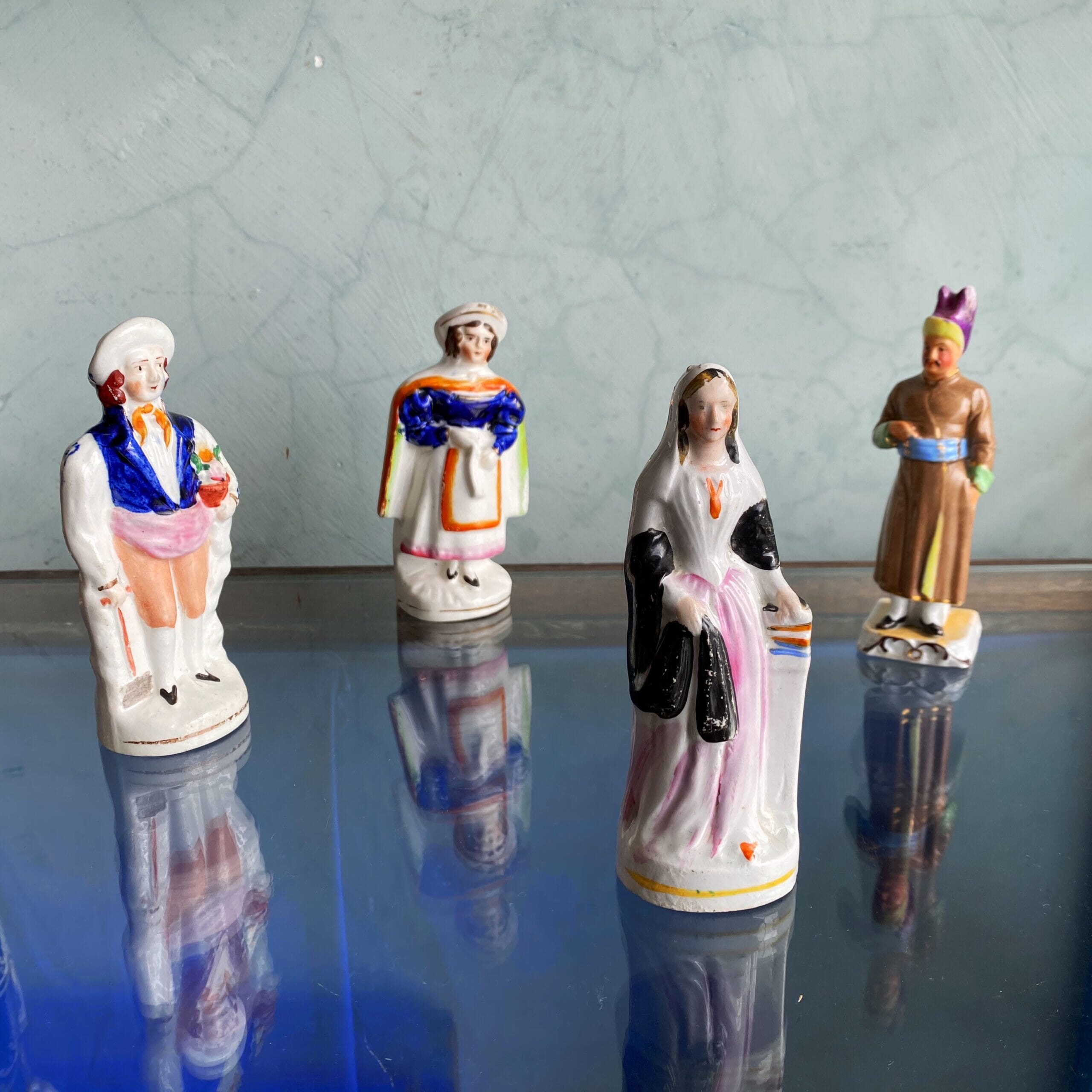
Staffordshire figures of the 1860’s including Florence Nightingale (and a German porcelain Turk!)
Illustrated here is Florence Nightingale & friends practicing ‘Social Distancing’ …. She was of course responsible (in the 1850’s) for the very first idea of how to contain a disease as it spread…. she would approve whole-heartedly of the incredible response our Governments are undertaking to tackle this age-defining catastrophe that is currently unfolding….
Moorabool is often a place of meeting, both for people who enjoy Antiques – and for the Antiques themselves! We have occasionally been guilty of ‘match-making’ in the Antique world, discovering pieces that were quite literally made to be together…. but somehow became separated. It’s a thrill to re-unite pieces.
Ready for the harvest…..?
In today’s ‘Premium Fresh’ there is a rather sweet Vienna figure of a lady. Very early, she is circa 1755, and her costume is very distinct – very well dressed – and yet she carries a sickle and bundle of wheat. There’s more wheat behind her waiting to be cut; clearly she is a ‘Harvester’ off to sickle the wheat crop – but take a look at her shoes! How would they be practical in the fields…?
Vienna figure c.1755 Fresh to Moorabool’s stock
Vienna ‘Lady with Squirrel’ c.1755
While today we tend to place these lovely pieces in cabinets or a mantel shelf, in the 1750’s in Europe they were intended for the table. A scene would be set up along the length of a grand table, to entertain the guests with depictions of the gods, the Greek myths, a hunt, or in the case of a group of one group of interesting Vienna figures, “Pastoral Pursuits’.
The definitive book on these early figures helps us understand their purpose. ‘Ceremonies Feasts Costumes : Viennese Porcelain Figures during the reign of Maria Theresia’ is a splendid 2007 publication with large clear illustrations, detailing hundreds of Vienna figures from the 1740’s until the 1780’s. A private businessman, Du Paquier, had started the porcelain works in Vienna as early as 1719 ( making it the second true porcelain manufacturer in Europe, after Meissen), but by 1744 he was financially struggling, and the Viennese State purchased the works. This was of course ruled by Maria Theresia, the Empress of Austria, and she loved a good party… the porcelain works were an excellent source of the needed table wares, and this included table figures.
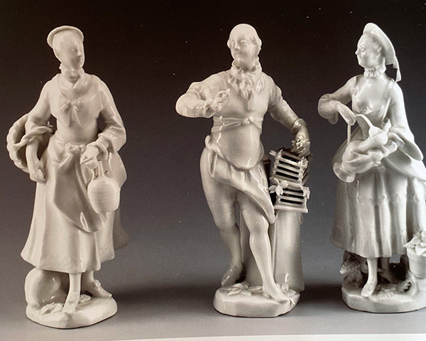
Vienna ‘Pastoral Pursuits’ figures, 1755-60
We find a series of well-dressed ladies & gents going about various occupations such as picking grapes, making wine, collecting milk…. and our lovely lady harvesting wheat. They’re an example of the idealisation and romantic notion that prevailed in the courts of 18th century Europe that the peasant lifestyle was an idyllic, carefree one. France of course excelled in this – think Mary Antionette and her role-playing as a milkmaid – and other courts tended to follow the fashions of France. Dinner parties could have an ‘Arcadian’ theme, meaning everyone would be dressed as a ‘commoner’ of some sort, but in silk and satin instead of the rough cotton the authentic garb would have been made of! These fancy-dress banquets had a curious way of dispersing the guests along the table – a lottery game would decide – giving the evening a sparkle of uncertainty in what was otherwise a very formalised environment.
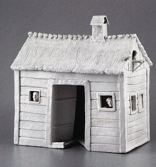
A Vienna Porcelain ‘Shepherd’s House’, circa 1755
Some rare survivors are model buildings for a table setting – also recorded in parallel in Meissen productions – suggesting the appearance of the table, with this banquet’s theme being Wirtschaft, meaning ‘Economy’ or ‘Workplace’ . This is the perfect fit for our lovely lady with the sickle. She’s actually a Princess, pretending to be a Harvester for the evening…..!
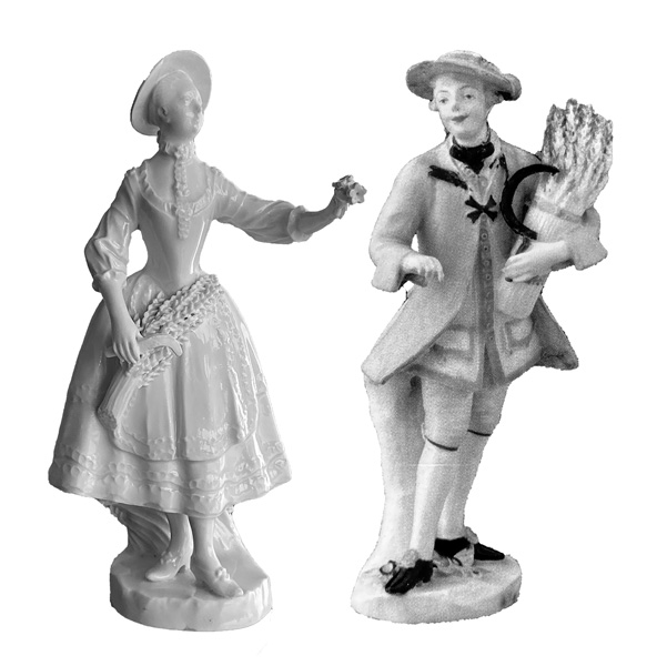
While exploring this fascinating topic, I came across a colourful ‘Cavalier as reaper’ group illustrated in the before mentioned book. Our lovely lass isn’t illustrated, but a comparison with the ‘Cavalier’ figure leads us to an exciting conclusion: this is surely a long-lost partner figure.
Introducing…. Vienna ‘Cavalier & Companion as Reapers’ , circa 1755
Moorabool Antiques 2020
Together at last… virtually, thanks to Photoshop!
Reunion…. the figure on the left is Vienna, circa 1755-60, in stock at Moorabool. To the right is a ‘Harvester’ circa 1755-60, illustrated in ‘Ceremonies Feasts Costumes : Viennese Porcelain Figures during the reign of Maria Theresia’ (Appendix #2) from the Umeleckoprumyslové Museum, Prague {86.269} . The two share numerous similarities, including size, decorative ’embroidery’ moulding to the clothing – and even the same shoes! – the only difference being the Prague figure is painted, the Moorabool left white. Their complementing poses and similar detailing lead us to propose they were originally conceived as a pair.
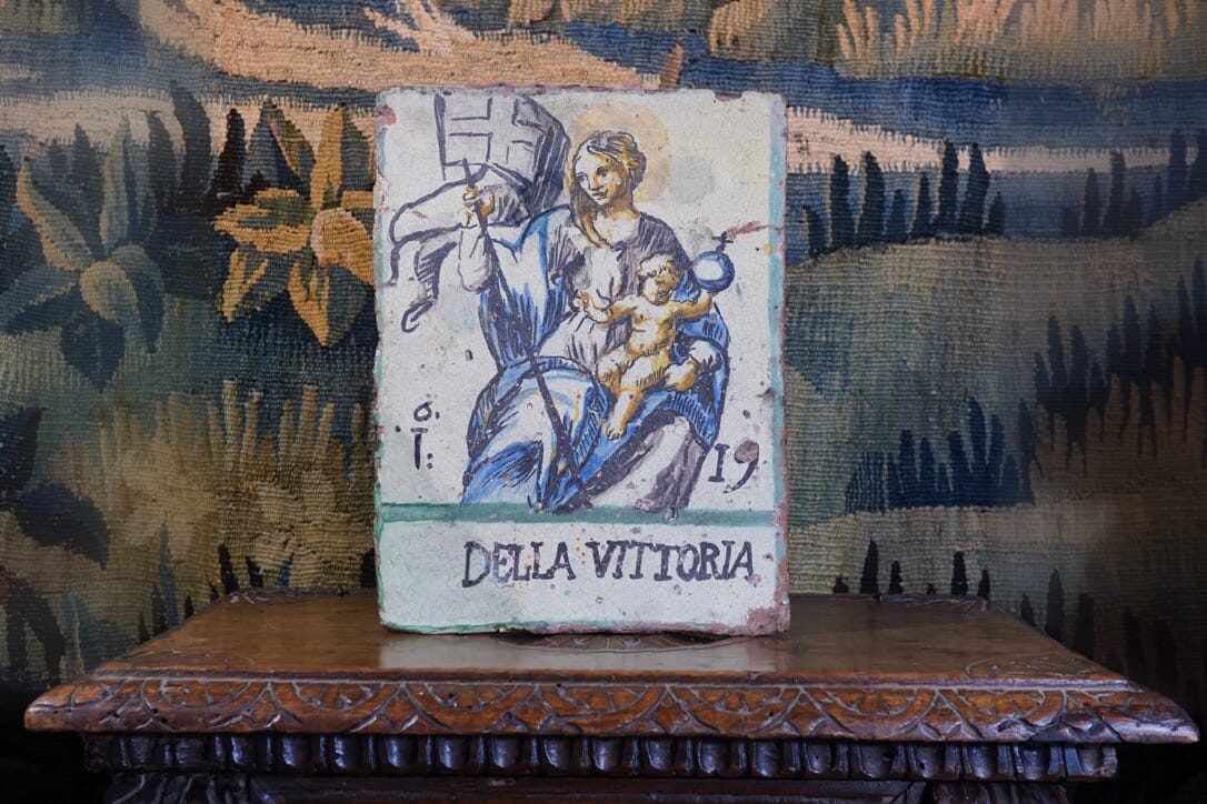
A fascinating fresh item at Moorabool is this tinglaze plaque – inscribed & dated ‘Della Vittoria / 1619’. It depicts a Madonna and Child, with her arm supporting a spear/staff from which flutters a banner with a cross.
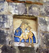
A depiction of a crowned Madonna & Child, set in a wall in the village of Sommana, north of Naples.
These plaques are a common sight in the Mediterranean countries, in shrines on country roads and on building facades in the towns. Private houses have them inside their walls as a sort of ‘private chapel’. Some where no doubt painted in oils, but the tinglaze pottery panels were the perfect medium for exterior display. They have lasted exposed to the elements for hundreds of years, the clay strong & well fired and the pigments unfading.
A typical Italian roadside shrine with a Madonna image.
Their purpose was a simple dedication of faith. Roadside shrines generally appear at a place of spiritual significance for the locals, and a colourful plaque would act as a vivid reminder of that significance to all who passed. Some are public declarations of perceived miracles, a thank-you for the protection from some tragedy.
In Deruta, the city of potters, the various churches and chapels are full of these plaques, commissioned and dedicated by individuals who were keen to record their own miracles and faith; there’s a builder falling from a building, a horse tipping upside down and throwing his rider, and updated versions incorporating cars crashing!
In Castelli, the Church of San Donato has a roof of dedication plaques from the early 17th century
A unique ceiling filled with tile panels can be seen in the Church of San Donato, Castelli, with a vast variety beginning with many dated examples in the early 17th century. It is in this context our example was made; being dated is a great start, but where was it made – and why?
This title is interesting: ‘Della Vittoria’ translates as ‘Our Lady of Victories’, a title given to the Madonna in the context of a military victory. This image of Mary militarised is quite a rarity – she’s usually shown very differently, a merciful mother rather than a militant one.
The inscription on our plaque; the lower left corner is a restoration, with just the edge of the D surviving; the space at far left may have contained an ‘M’ as an abbreviation of ‘Madonna’.
The famous ‘Madonna della Vittoria’ by Andrea Mantegna, 1495-6, originally in Mantua Italy, but ‘borrowed’ by Napoleon on his rampage in 1797 and never given back….. now in the Louvre, Paris.
Interestingly, ‘Madonna della Vittoria’ is the title of a fabulous work by Andrea Mantegna, now in the Louvre. This was commissioned by Francesco II Gonzaga, the ruler of the city of Mantua and the leader of the Italian League’s resistance to Charles VIII of France’s incursion into Italy in the late 16th century. He had fought to a stand-still victory at the battle of Fornovo in July 1495; one year later, the newly commissioned painting by the court artist Mantegna was carried into the newly built Santa Maria della Vittoria, commemorating Mary’s help in the historic victory. It now hangs in the Louvre, having been souvenired by Napoleon during his domination of Italy in the late 18th century!
Following this train of thought, the plaque in question was perhaps another celebration of a victory; however, while 1619 is within the timeframe of the ’30 years war’, (1618-48) the first decade was a series of conflicts in Northern Europe, not relating to Italy. The plaque is therefore best described as a dedication or shrine image, rather than an example commemorating an event – the date 1619 being the year of dedication.
The inspiration for the unusual image is one of two things; either a creation of an unknown artist on the pottery workshop, direct from his imagination – or perhaps it is a copy of an elegant work depicting a militaristic Madonna which has not survived the tides of war that have swept over Europe ever since this plaque’s creation in 1619; rather ironic!
Moorabool’s Guarantee: All items offered are as described regarding date, condition, and description.
We offer a money-back guarantee, for any return within reasonable time, excluding postage.
Buy with confidence!
POSTAGE
Getting your goods need not be expensive!
We make sure Postage is as affordable as possible – our experienced in-house team can ship safely anywhere in the world, for the best possible price.
Ask for a quote…
Use the ‘Compare Products’ below to keep track of items of interest.


 They were illustrated by the contemporary illustrator Rowlandson, beginning in 1812 with ‘The Tour of Dr Syntax in Search of the Picturesque’. From the illustrations in these books, the Derby factory created a series of humorous small-scale figures. Moorabool had one example a few years ago.