
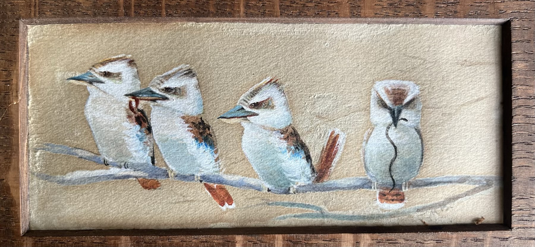
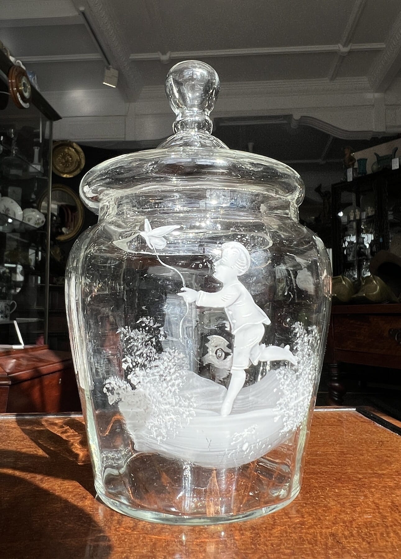
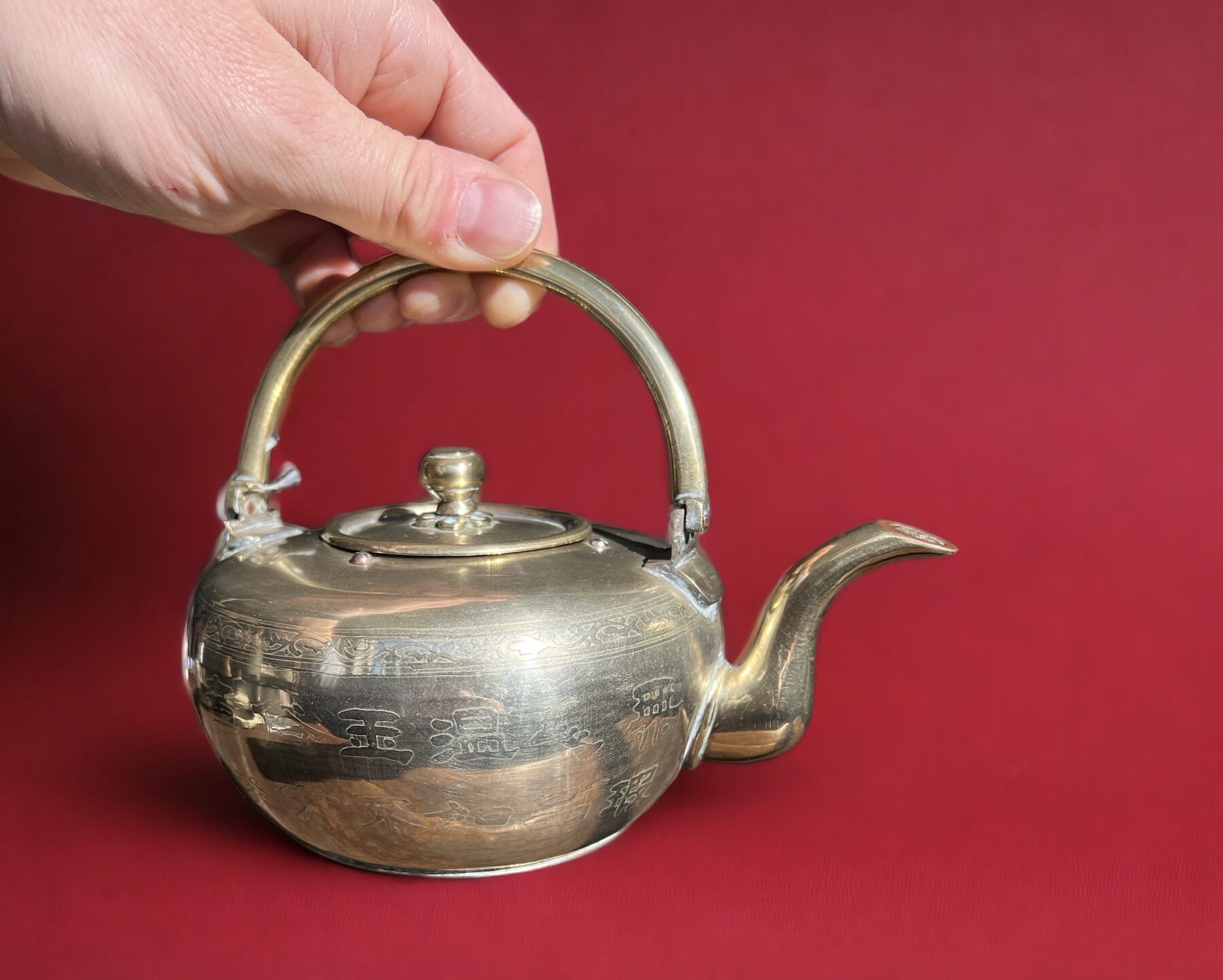
Moorabool has always stocked Chinese, Japanese, and South-East Asian Antiques.
Here’s a preview of items to be released shortly.
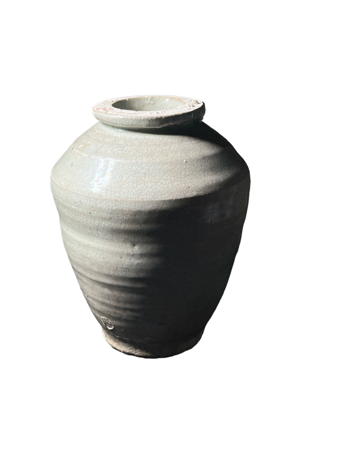
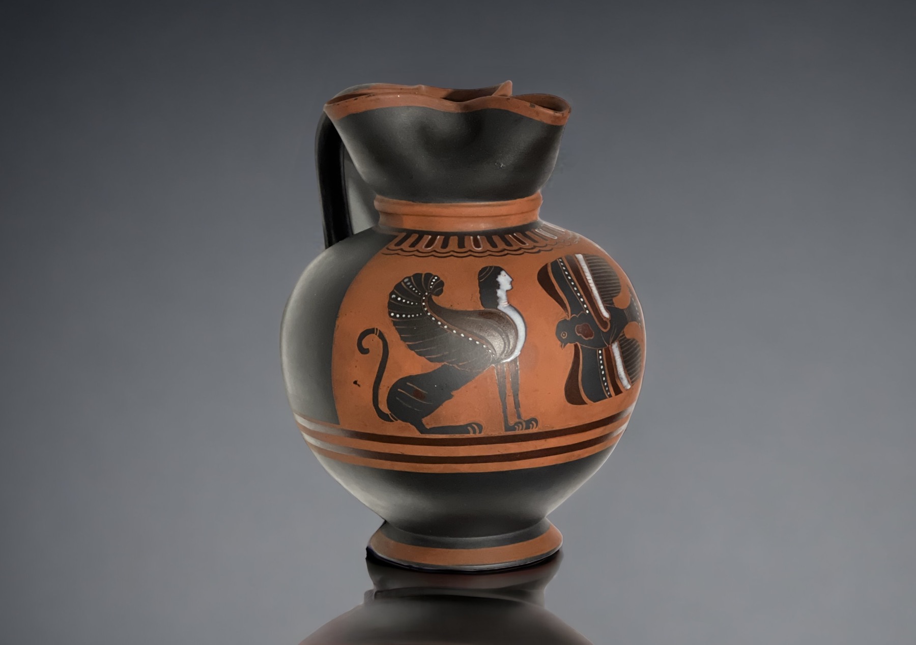
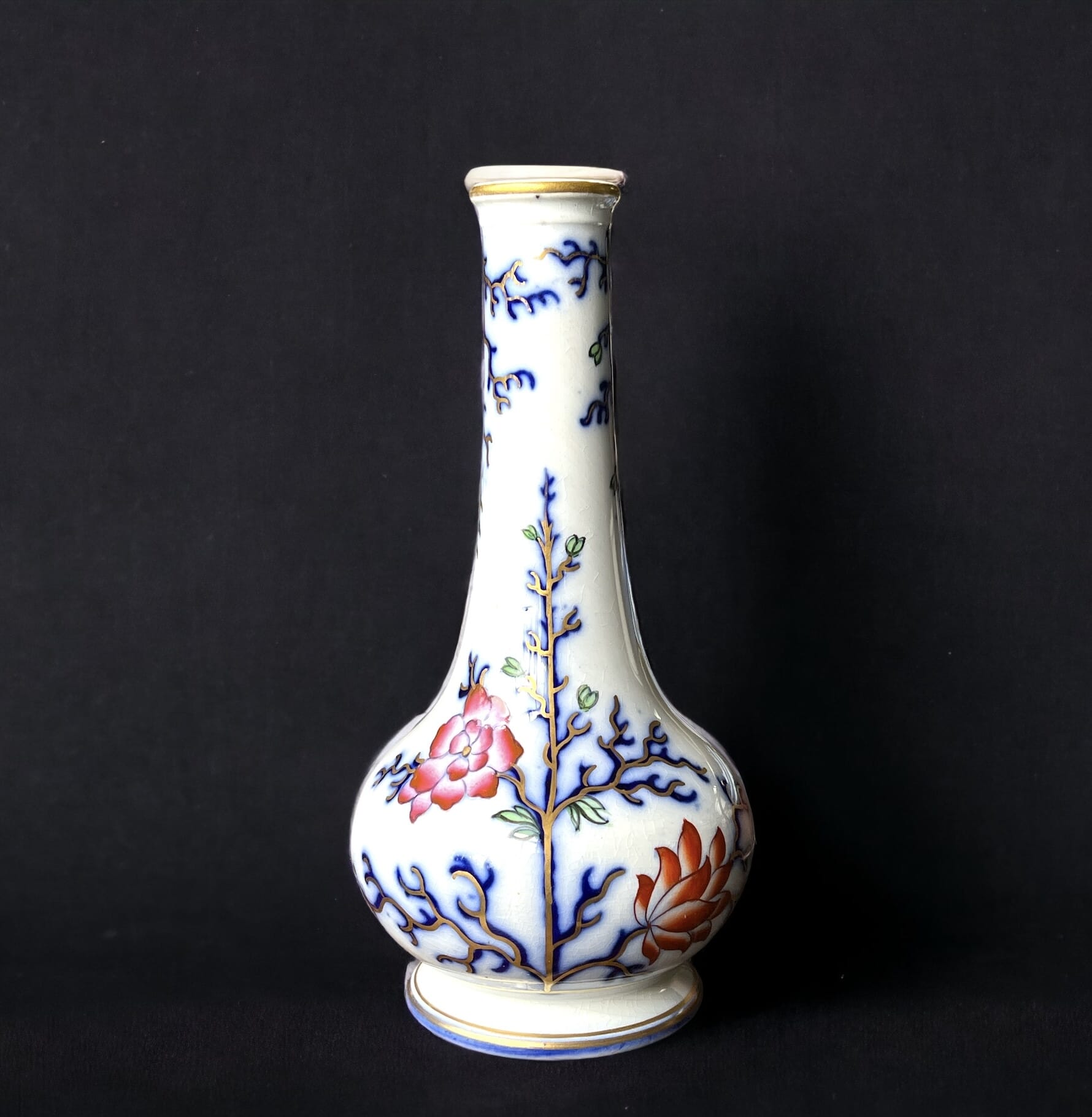
20cm high
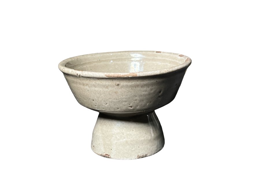
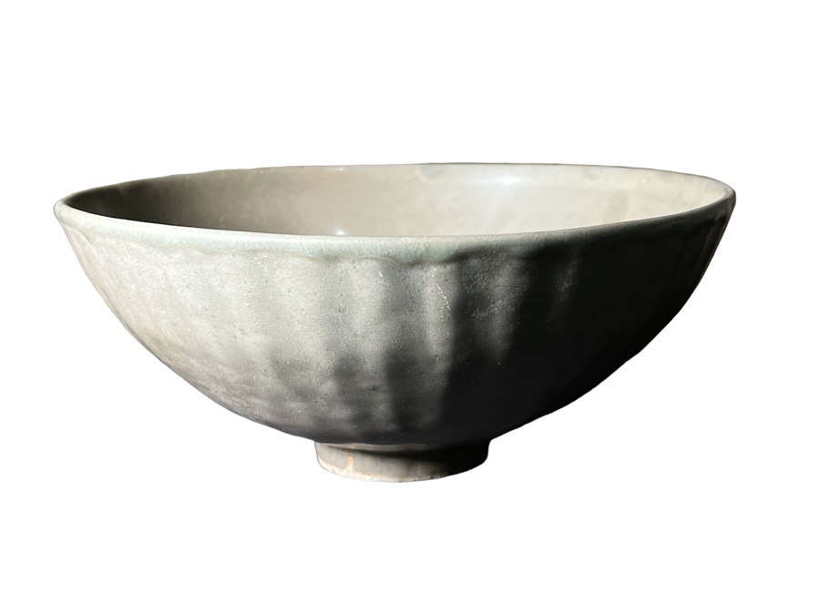
Moorabool has always stocked Chinese, Japanese, and South-East Asian Antiques.
Here’s a preview of items to be released shortly.
The second half of 2023 will see a fine collection of Nautical interest added to Moorabool.com. Ships & Shipping feature in paintings & prints, and there’s a number of model ships being made seaworthy – or at least desk-worthy!

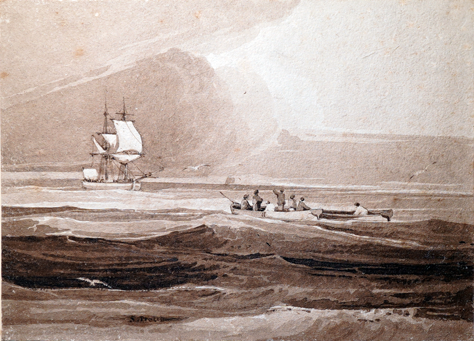
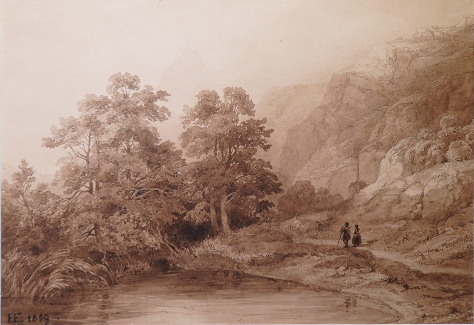
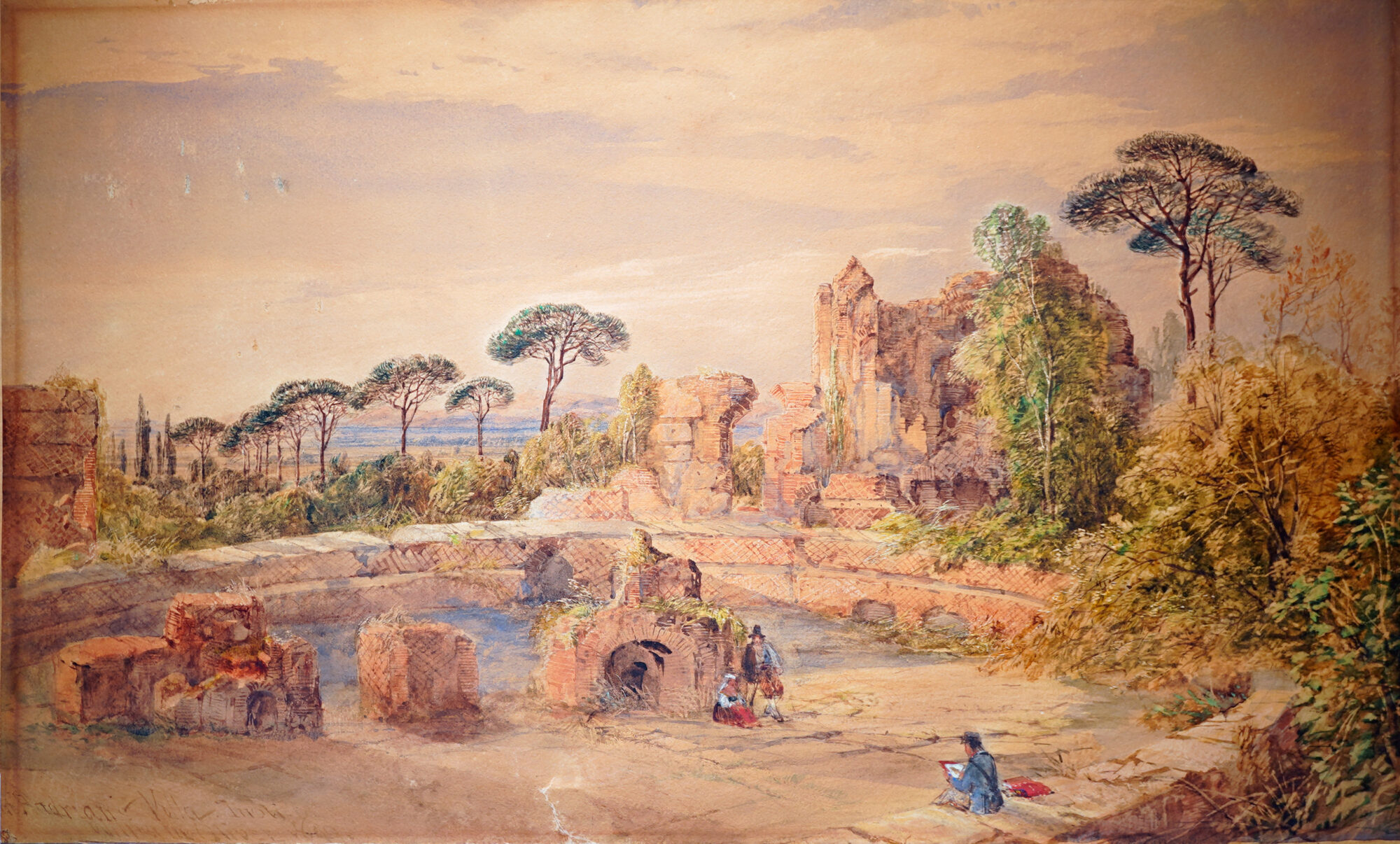
An interesting sepia watercolour by Skinner Prout (1806-1876)
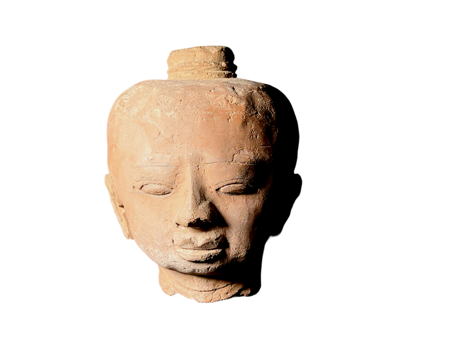
Moorabool Antiques have some terrific Ancient Artefacts to offer, currently being researched & prepared.
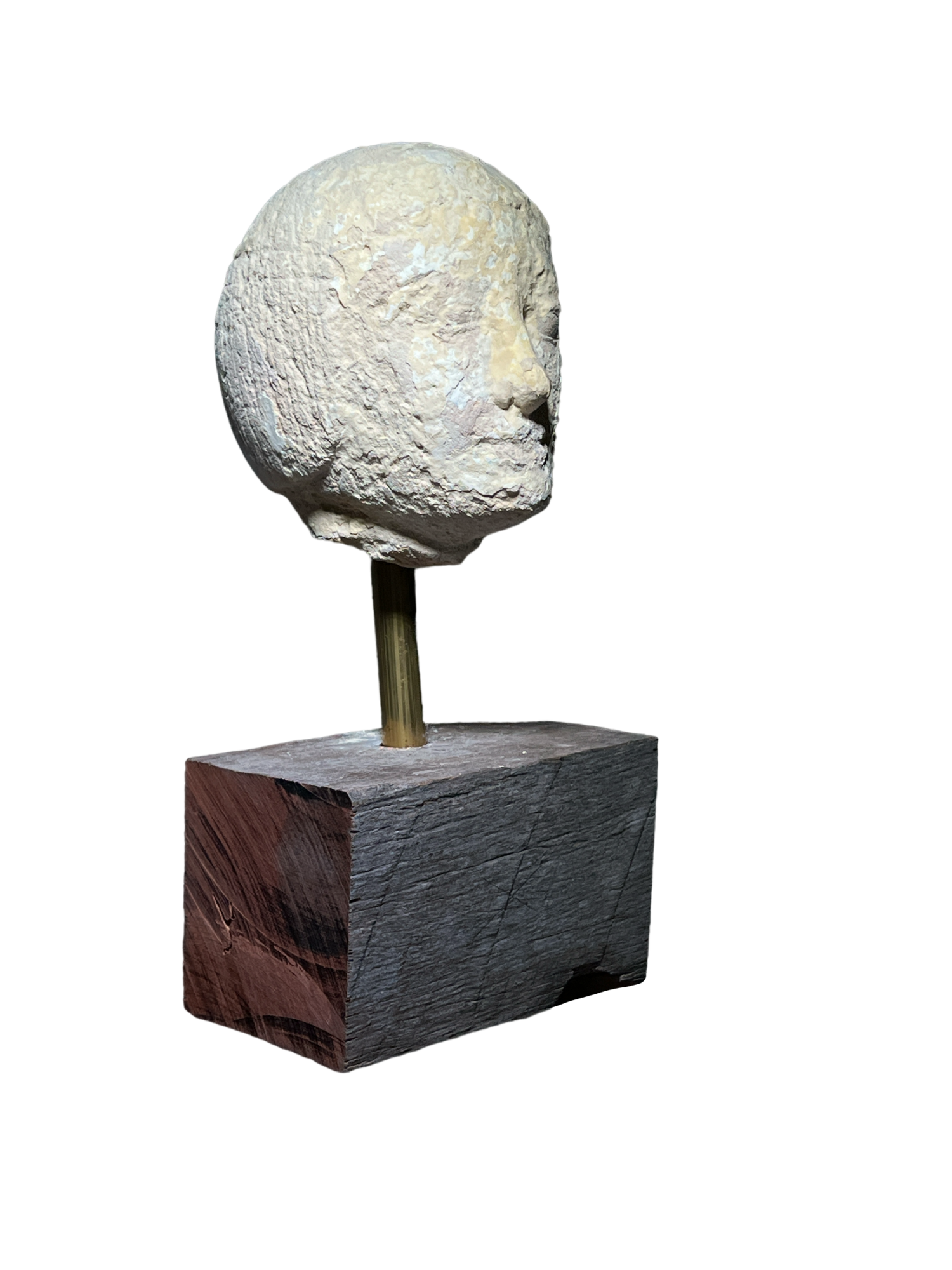
Egyptian limestone head of an official,
Middle Kingdom, circa 2,000 BC
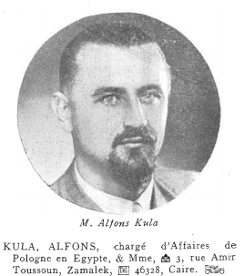
Provenance: the collection of Alfons Kula (1907-2001) , Chargé d’Affaires for Poland in Egypt during the 1920’s-30’s, who emigrated to Australia after WWII, thence by descent.
We have a number of notable pieces from this collection, dispersed in Melbourne recently.


Moorabool has a vast amount of Art to present in the near future, from 17th-18th century drawings to 20th century Australiana.
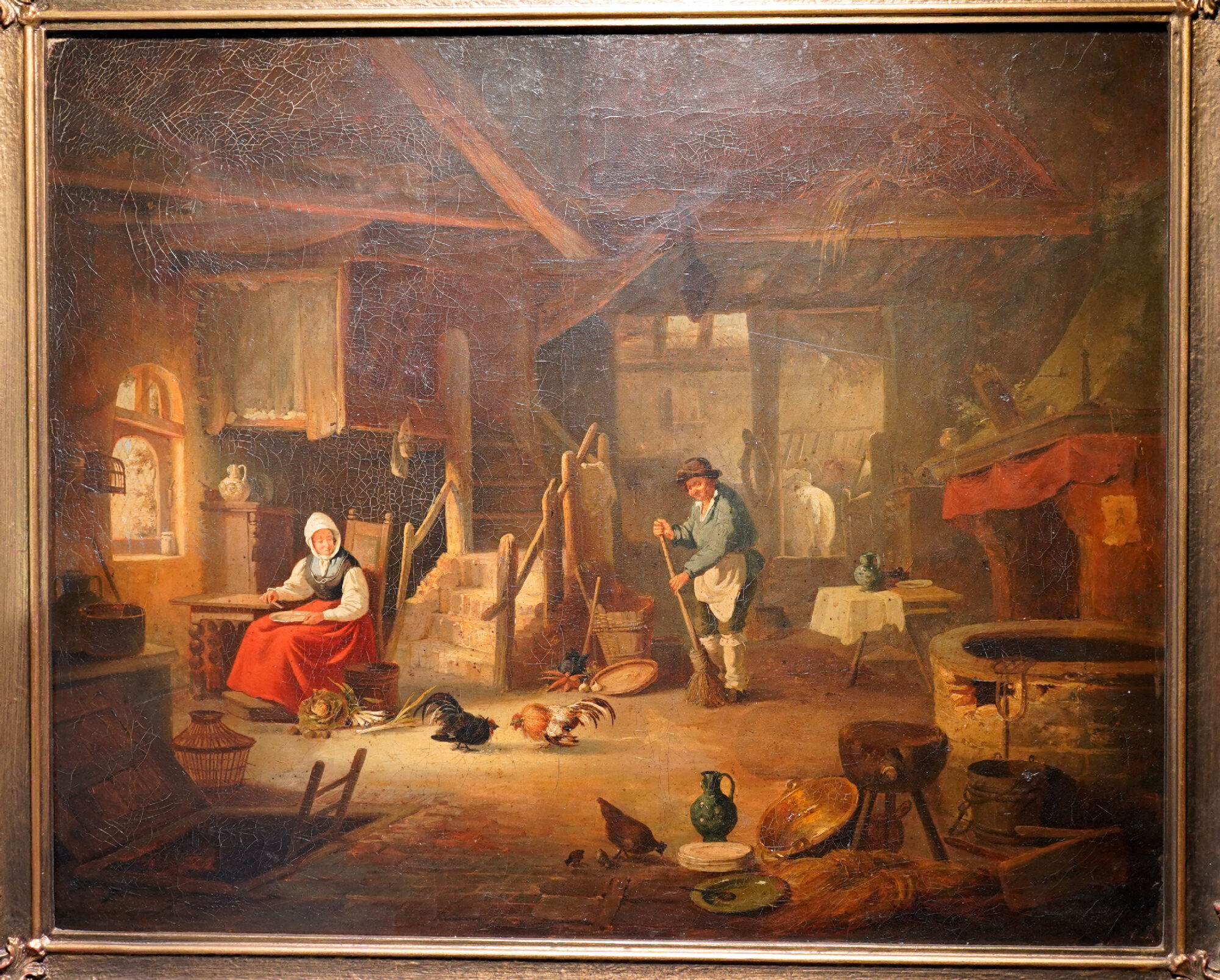
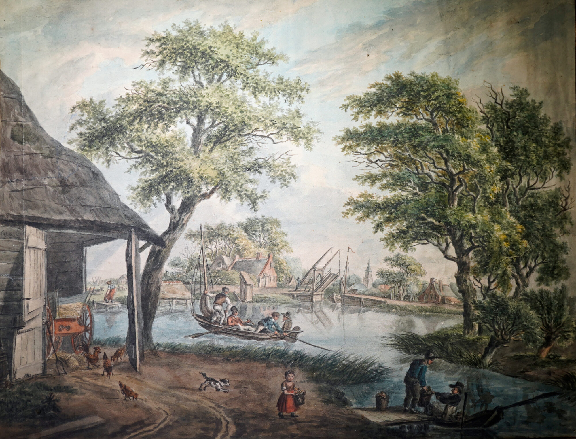
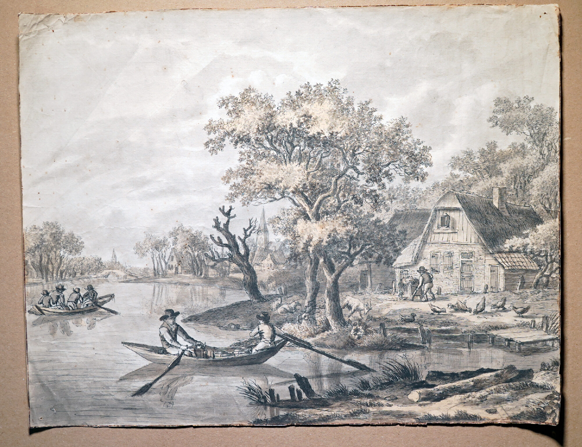
The concept of ‘Genre’ – everyday scenes – became an artistic trend in the 17th century, and has remained ever since. Moorabool has a fascinating group of Oil & Watercolour artworks of landscapes – mostly Dutch – populated by people going about their everyday lives. They become fascinating windows into the past.
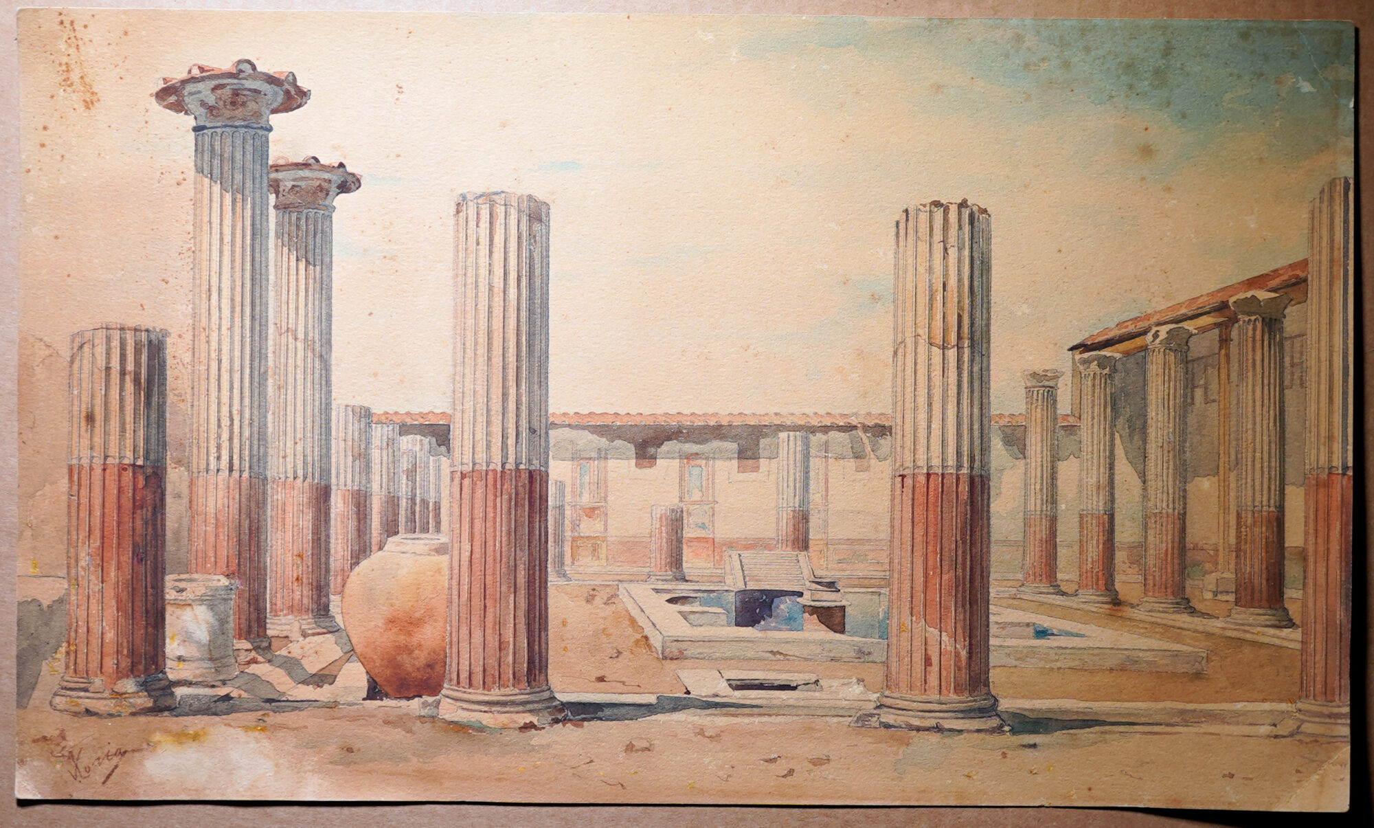
Taking the Grand Tour was the essential event in a Gentlemans – an Ladies – life. It ensured adventure and cultural credentials once back at home in England – and of course, a souvenir or two to show off with was essential! While ancient artefacts were brought back, many seem to have grought back replicas – probably oblivious that the Ancient Greek pot they had bought from the tomboralli was still warm from the kiln….
A large number of artists also went on a Grand Tour, to study and copy the Ancient Greek & Roman remains.
The Grand Tour selection at Moorabool covers all these origins – alongside a stock of original Ancient Art & Artefacts.
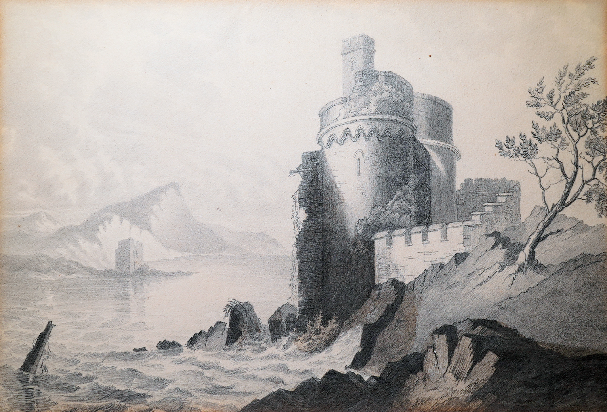
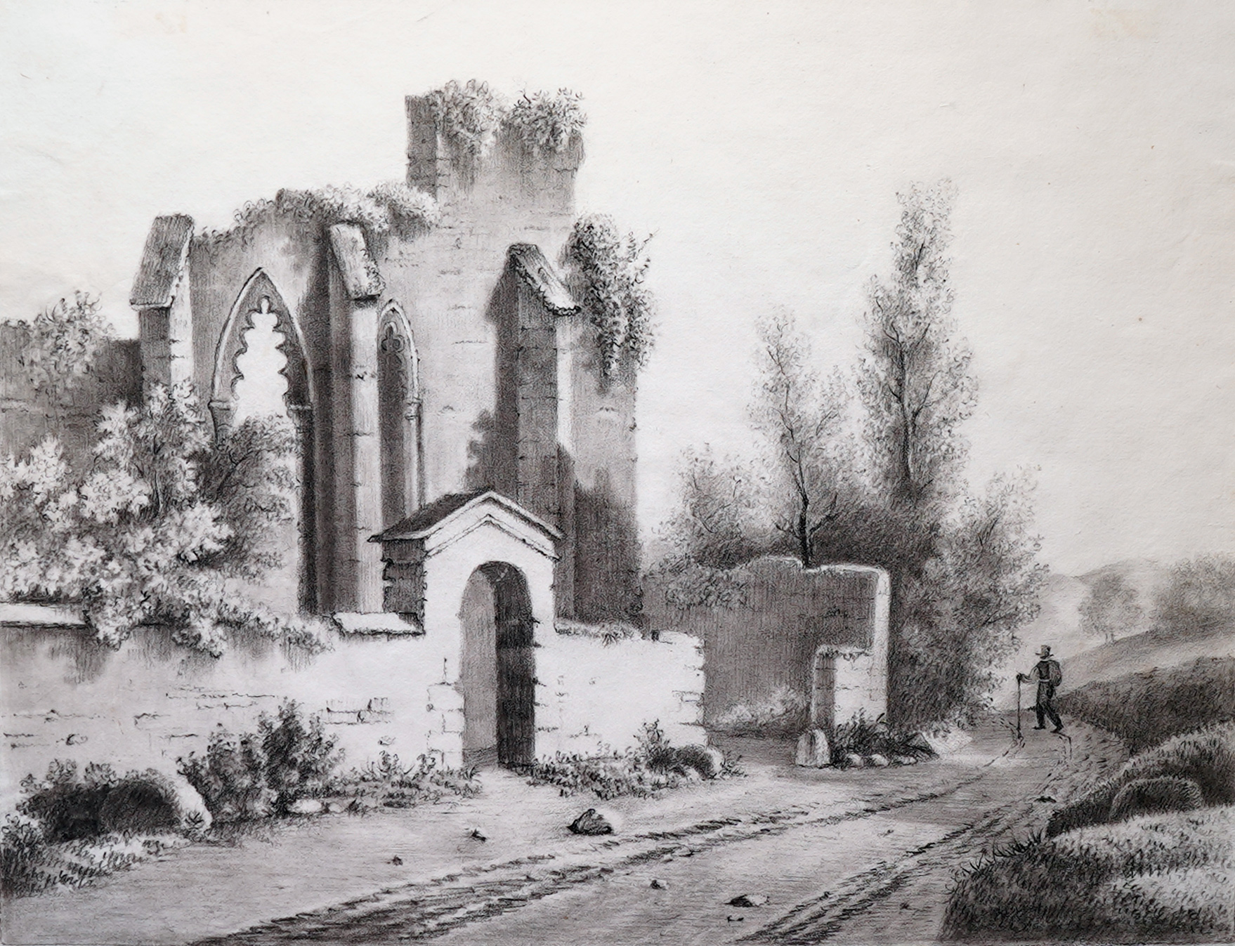
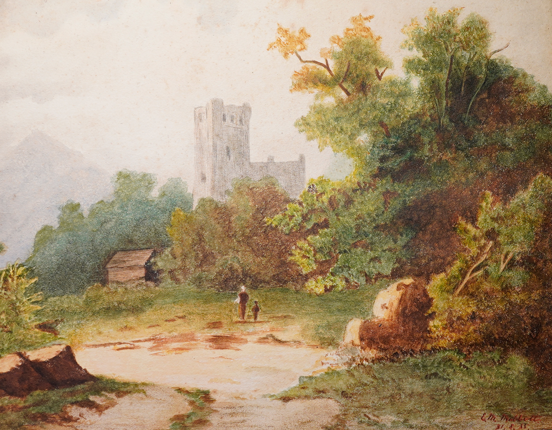
‘Romantic’ Landscape art is based on the exploration of the wilderness, the rugged far-flung parts of Britain & the Continent that were often hard to access, but rewarded with spectacular ‘Picturesque’ sights. This was a late 18th century movement, and was embraced by a large number of artists in Britain.
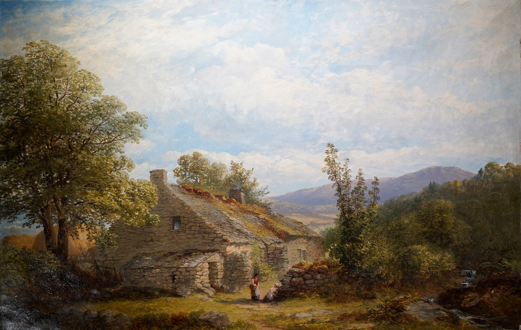
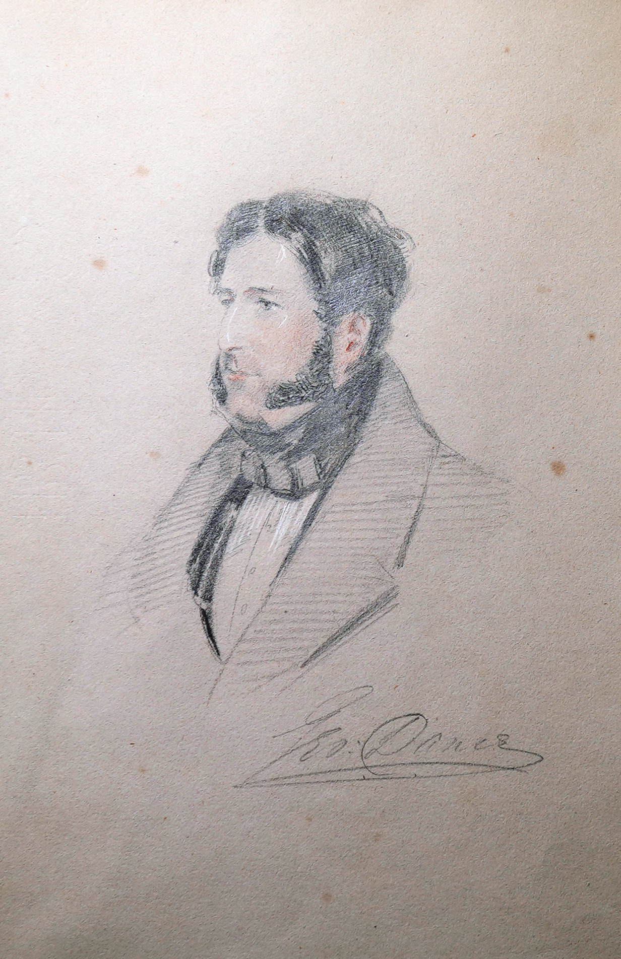
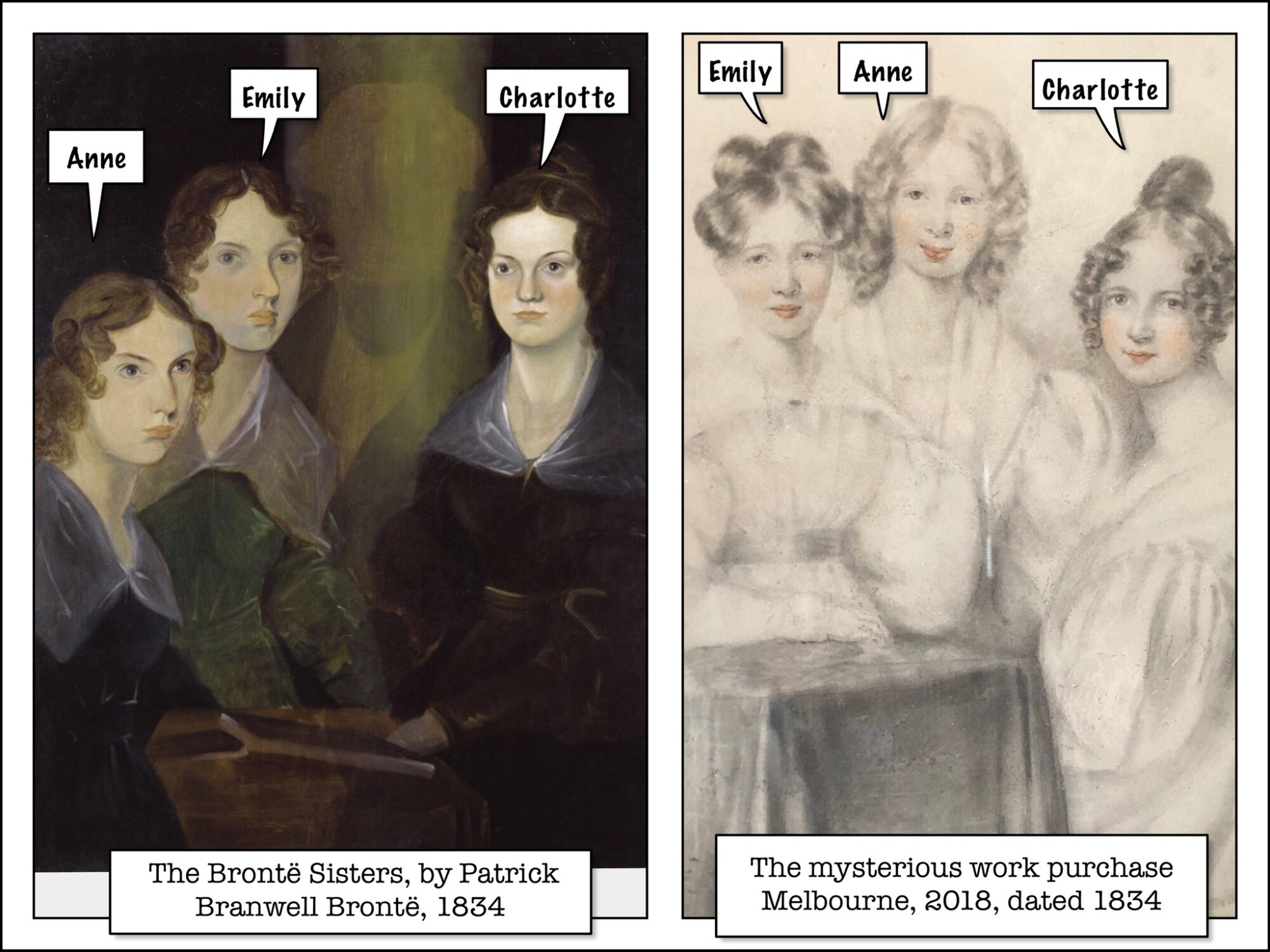
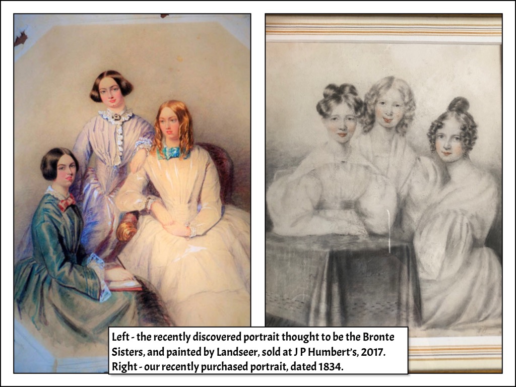
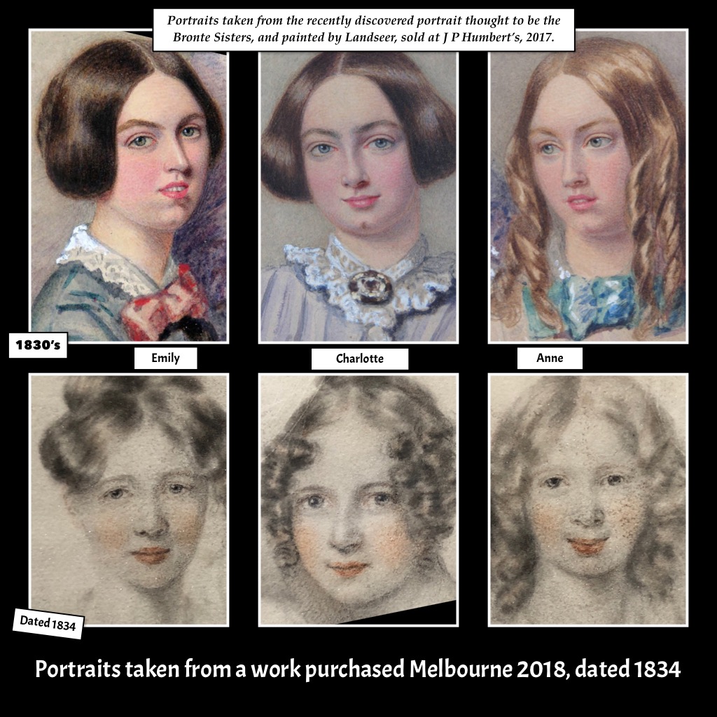
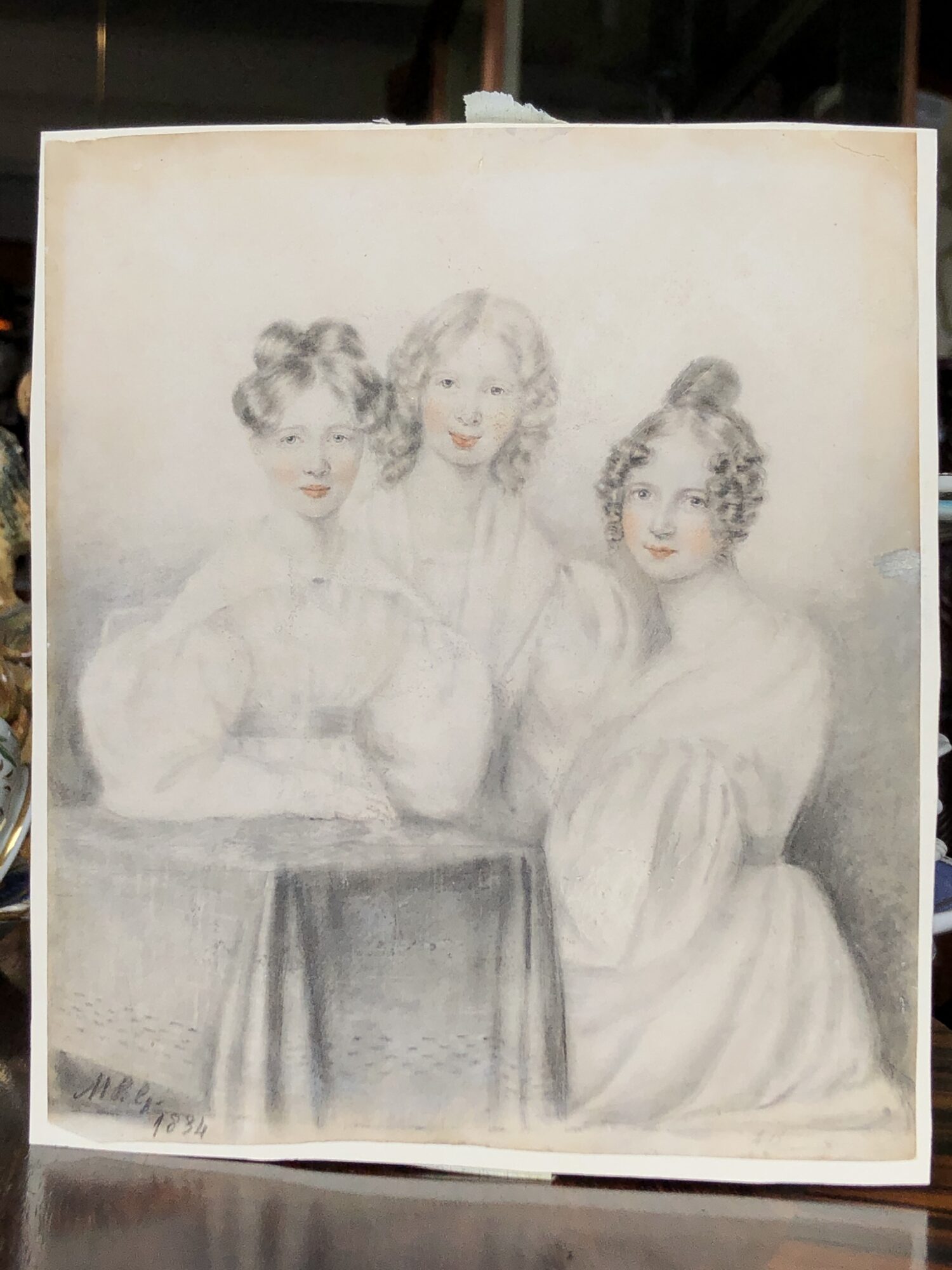
Is this an early depiction of the Bronte Sisters?
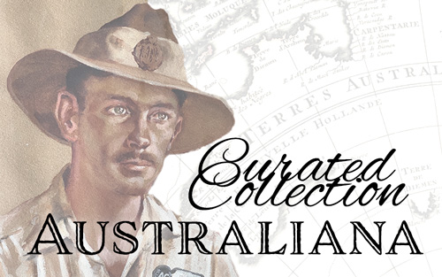
Have a preview of interesting Australiana currently being prepared for sale.
Feel free to email any questions.
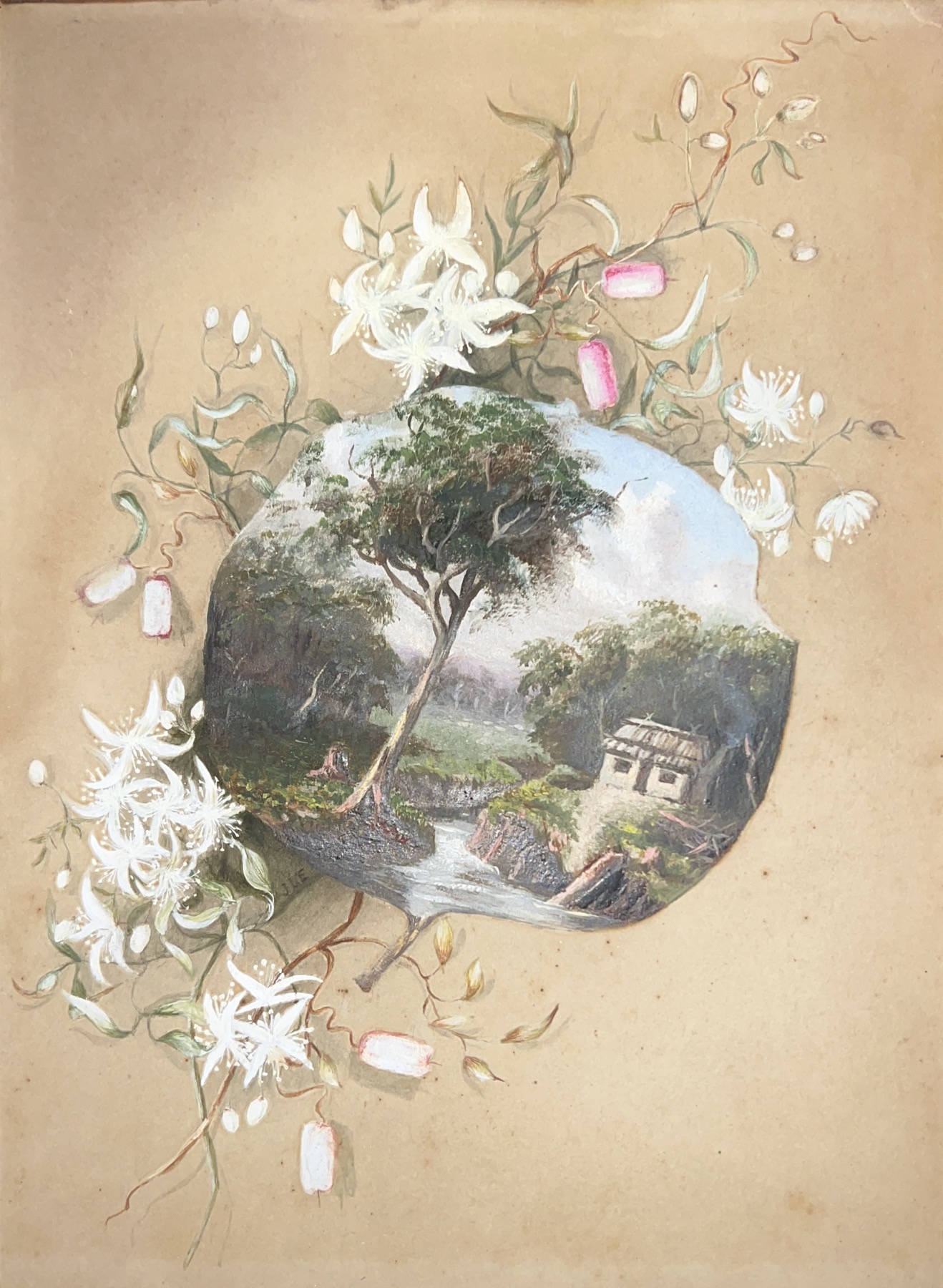

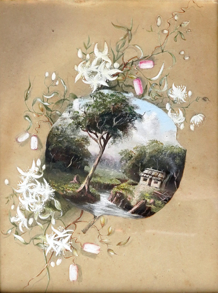
A fantastic story is emerging from three small works purchased in 2022. Two are miniature landscapes of Australian bush scenes; the other is a similar scene, Trompe l’oeil style on a gum leaf, surrounded by Australian wild flowers.
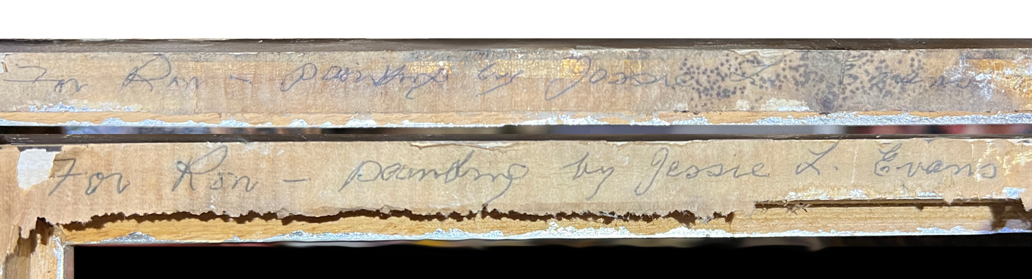
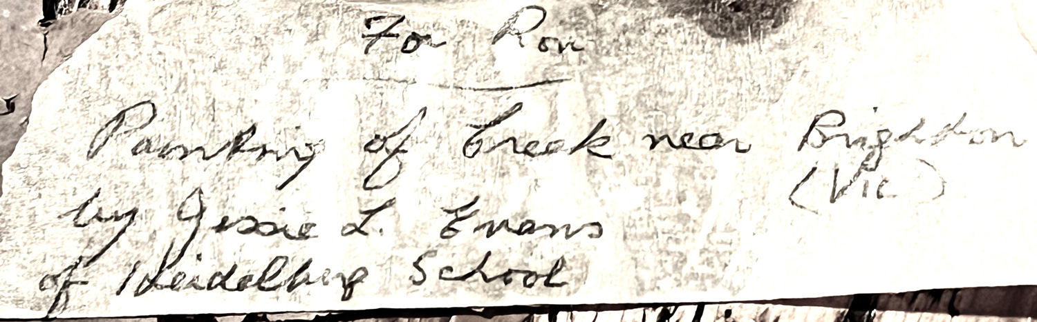
All were in original, neglected frames, and the backs all had the same artist attribution, added in pencil along with the instruction ‘For Ron’:
‘Painting by Jessie L. Evans, of Heidelberg School’.
As is often the case with later attributions, this doesn’t make much sense when we look at her published works. She was very much an artist of the impressionistic school, like the other Heidelberg greats.
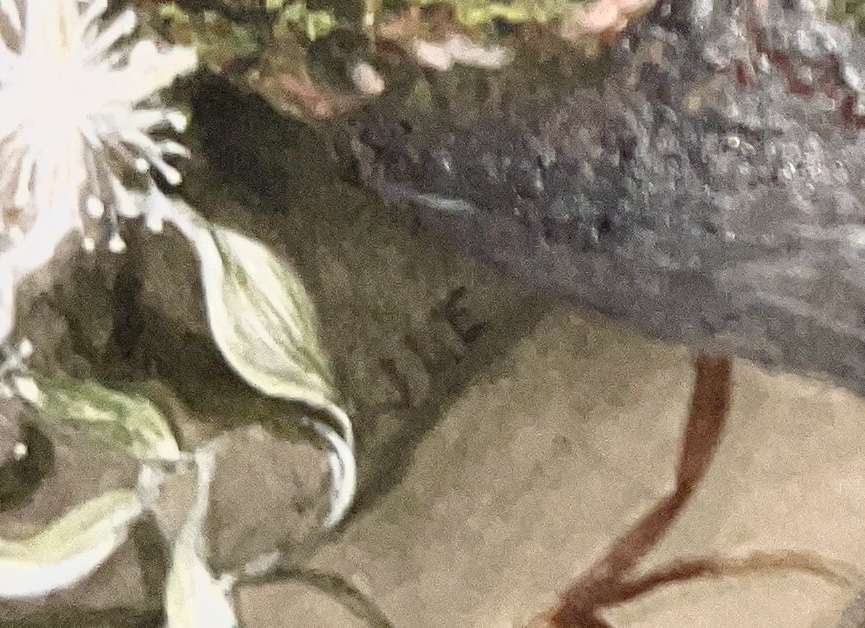
However, there is one very interesting clue visible: the gum leaf has a signature with the correct initials – ‘JLE’ – for Jessie Laver Evans.
This suggests that this piece at least is by her hand.
The other pair however have no visible signature. Only one thing to do: de-frame them and look at the back!
Nine times out of ten, there’s nothing of significance to be seen on the back of a de-framed picture. This is an example of when there is – not only a name for the artist, but also a date, and most excitingly, a direct link to Jessie L Evans!
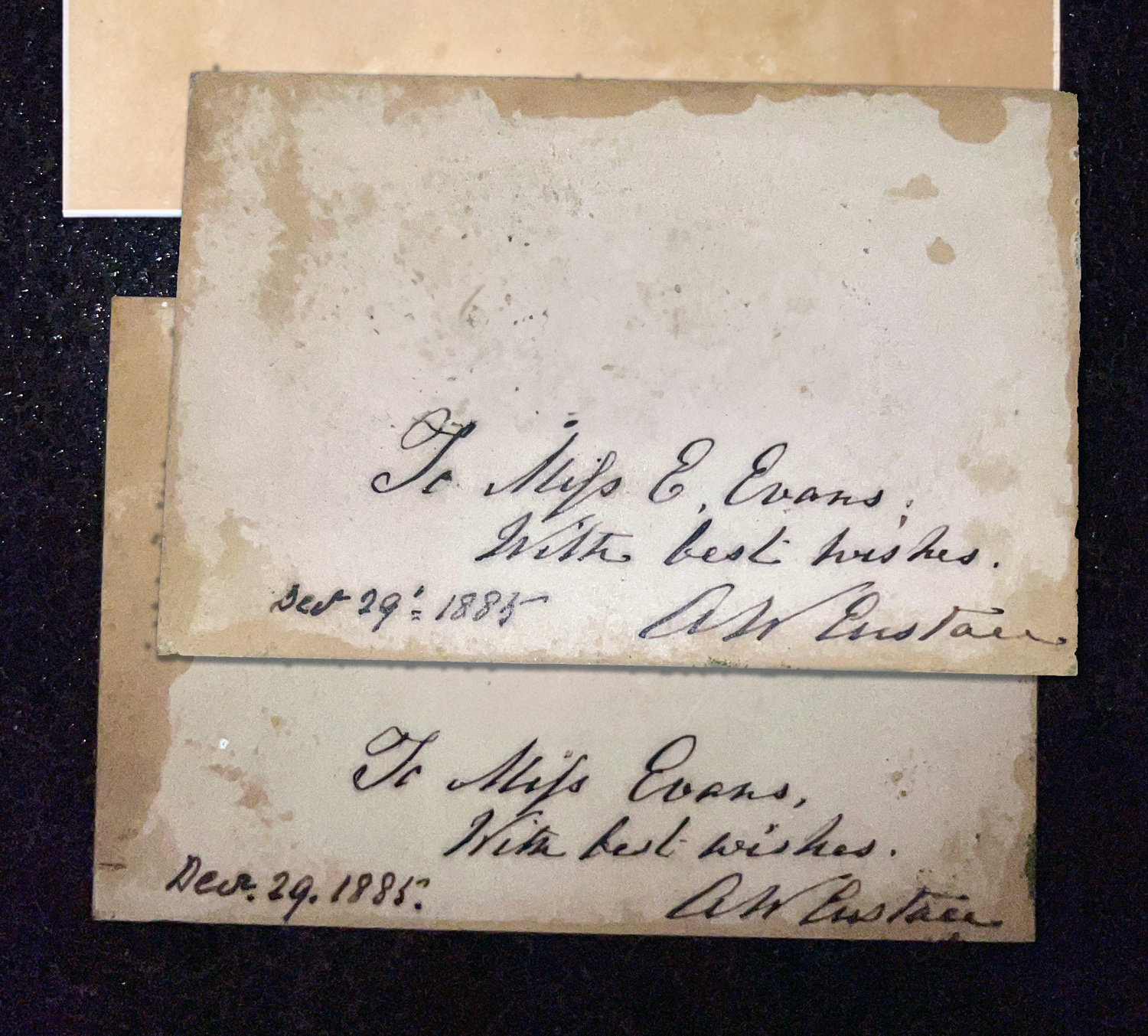
This dedication, a few days after Christmas in 1885, shows a direct connection between Alfred William Eustace, a well-respected colonial painter of the Goldfields era, who was 65 when he met ‘Miss Evans’, aged 25. At this stage, Alfred Eustace was famed for his paintings on broad, flat gum tree leaves, and in the early 1880’s had several exhibitions of these very Australian works in Melbourne galleries.
Miss Evans attended Melbourne’s National Gallery of Victoria Art School 1880-91, so she no doubt came into contact with Eustace at one of his Melbourne exhibitions; the watercolour we are examining is the visual proof, as it is an accurate impression of his oil-on-leaf creations – with her own addition, the wildflowers that surround it. This is an early work, when she is just learning to paint and has yet to ‘find her style’. She did this in the following years, being taught at the Art School by Frederick McCubbin, E. Phillips Fox, and Tudor St George Tucker, having as her fellow students

More to come on this exciting piece of research, with a blog post dedicated to the story of Jessie ( her father wouldn’t let her be ‘commercial’ and sell her paintings as it would appear her father couldn’t support her …. but she still opened a gallery in central Melbourne!) and the remarkable tale of Alfred William Eustace, ‘Gumleaf-Painter to Her Majesty’ !

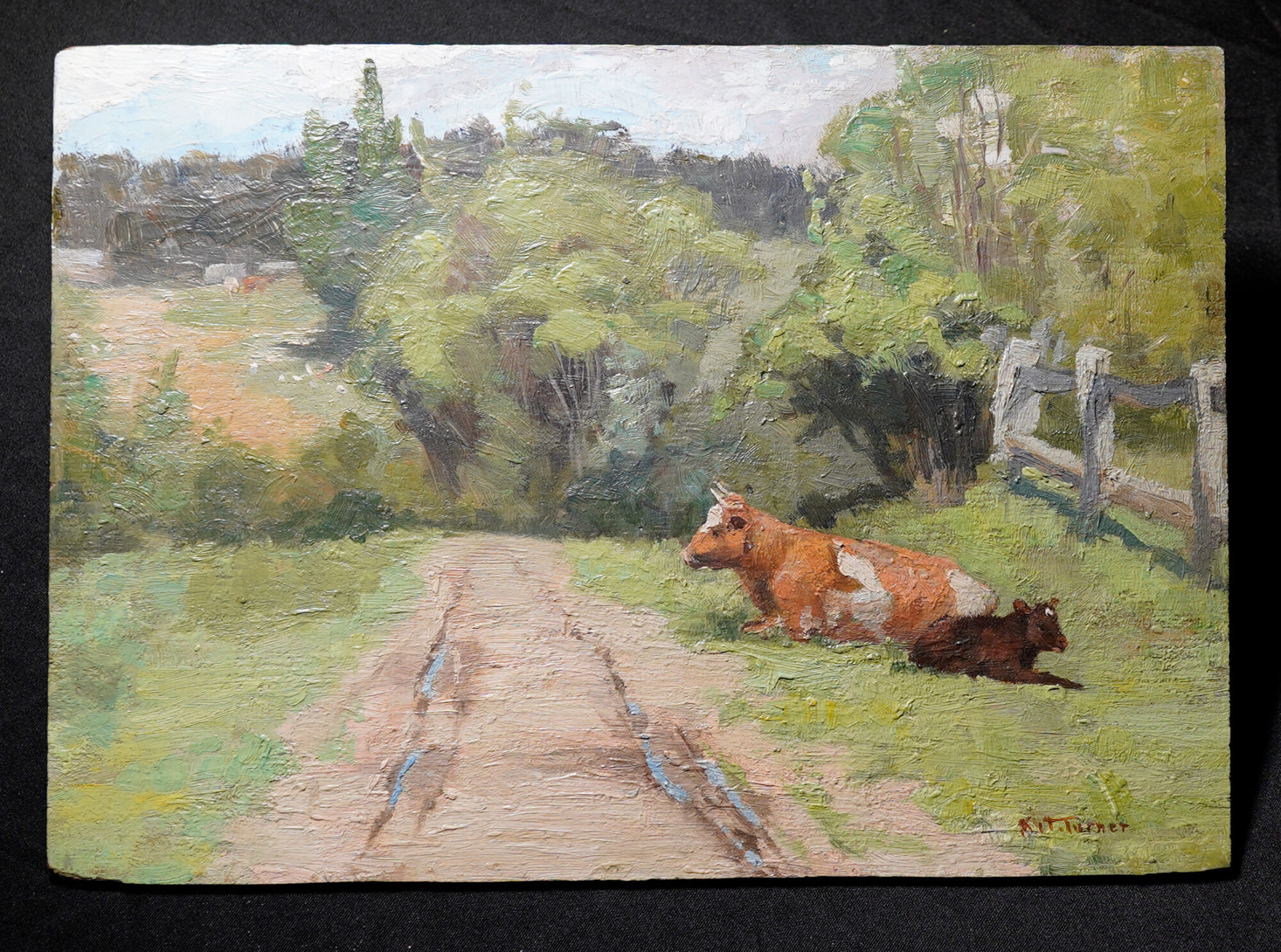
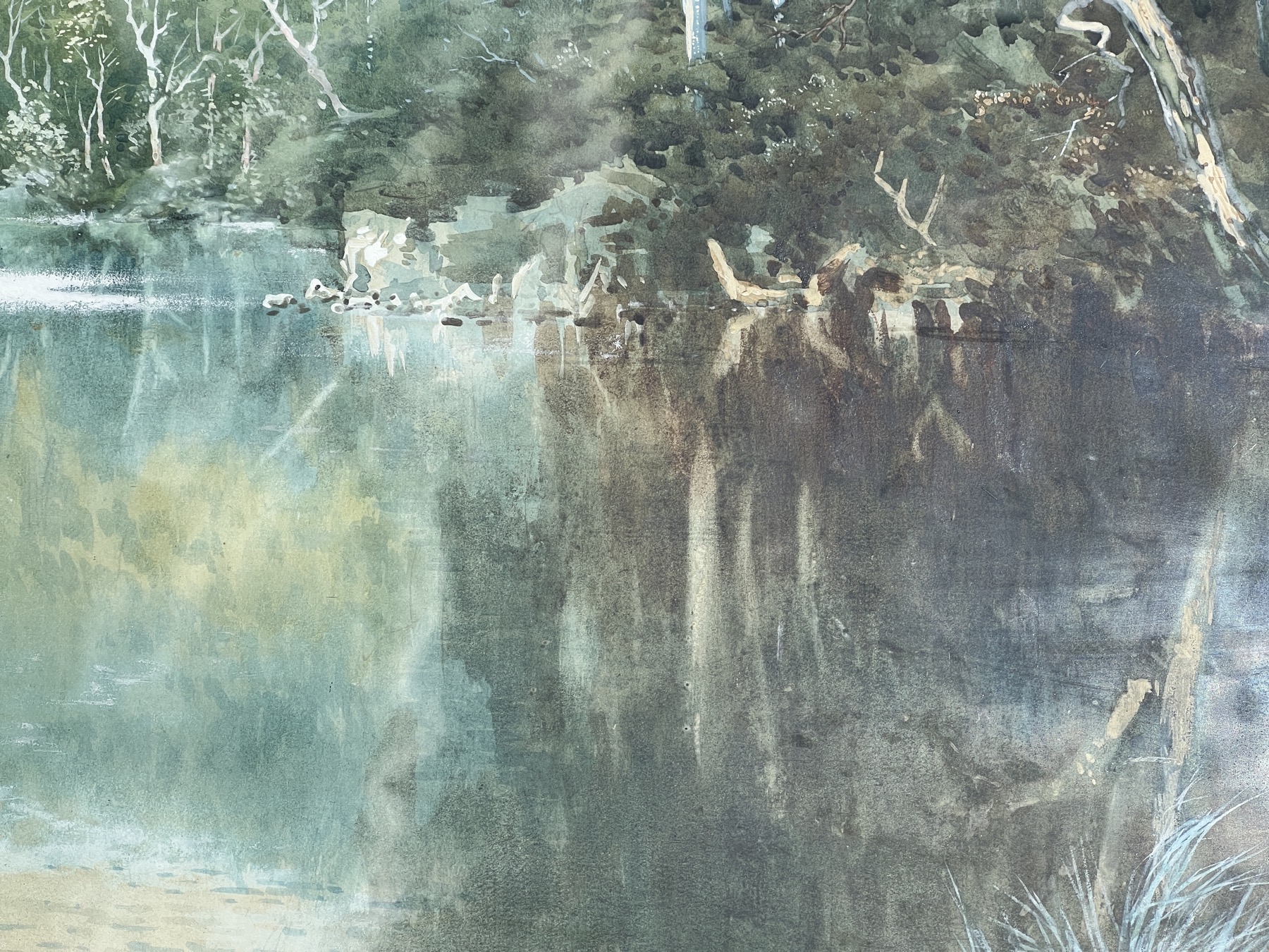
Little-known artist Kit Turner has a fascinating tale to tell. Born in England, she studied art & copper smithing, travelled to NZ where she was an accomplished arts & crafts metal worker, married a fellow metalsmith, and moved to Melbourne where she lived at Eltham. There she became familiar with Walter Withers of ‘The Heidelberg School’. That’s his house, visible in the distance over the creek, beyond the chickens and the cows, in the oil above by Kit.
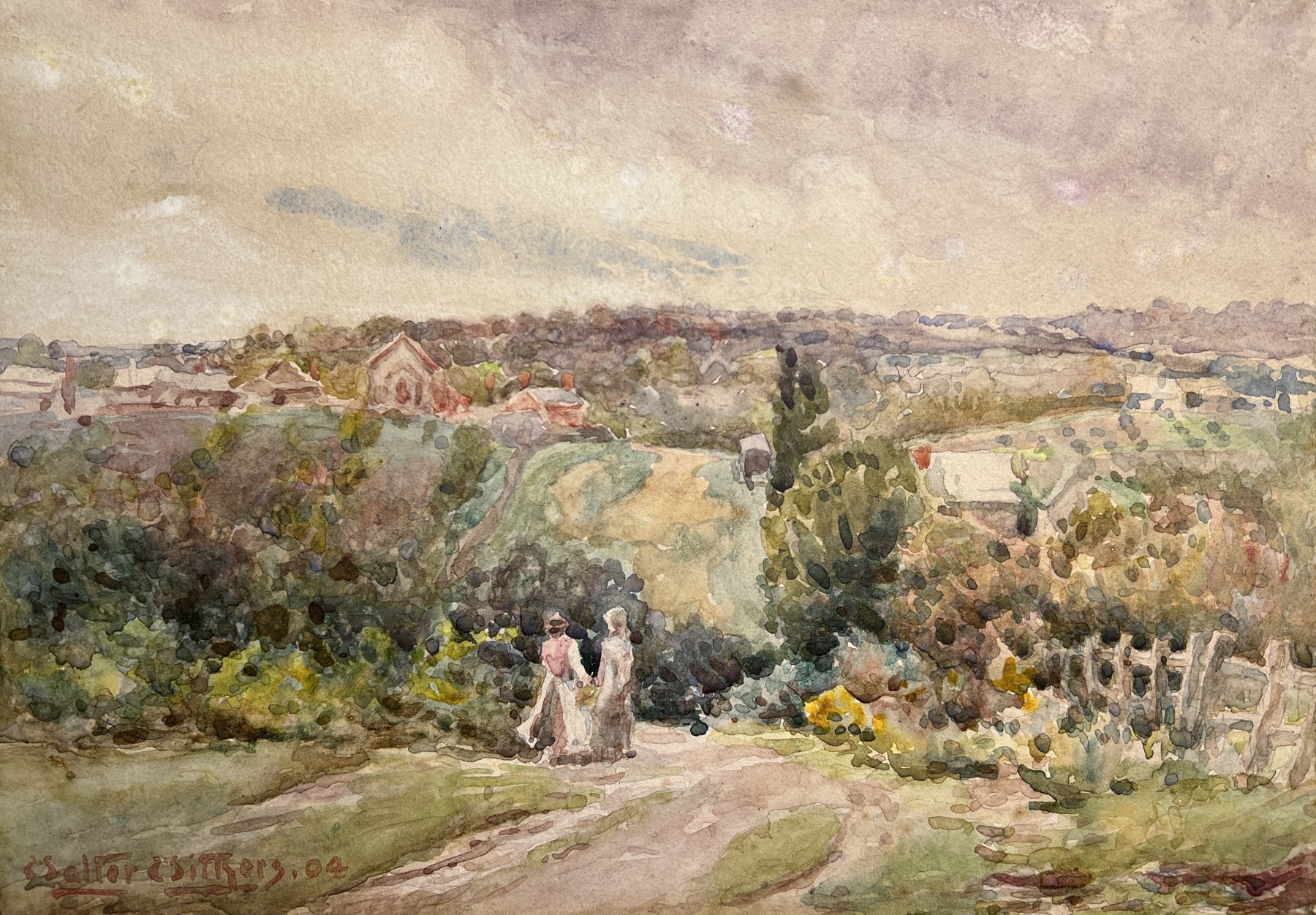
We also have a Walter Withers watercolour, painted from the other side looking towards where Kit would have painted this picture… and Walter depicts two ladies, one quite young, the other older…. Mrs Withers…. or could it be Kit?
Walter’s daughter, Margery, was also an artist; there’s a watercolour by Margery (in the Eltham Council’s collection) titled ‘Kit Turner’s House’. It’s a view from the place shown above, looking at a different angle: Kit Turner has painted her oil view literally just outside the door of her studio. On a recent information-gathering trip to Eltham, we were elated to discover her house – and studio – are still standing! No records or literature seem to note this. We have gathered a terrific lot of info on Kit Turner, metal-worker and painter in oils, including photographs of her in her studio.
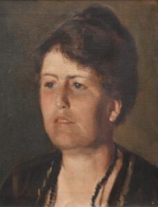
In one of those moments of serendipity, at an auction in Melbourne, 2023, there was a Margery Withers oil portrait of a Woman – which is the clear, strong features of Kit Turner herself…..
More info to come on a special blog post on Kit & the Withers, including Australian Sterling Silver by Kit Turner and more works. If anyone has any other pieces, please contact us.
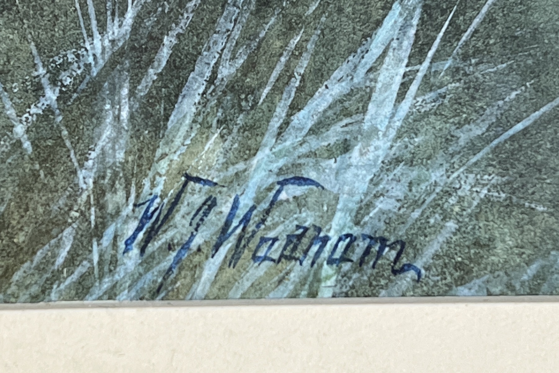
A fascinating story evolves from this large watercolour. The style is very unusual for the period, being a technique much used in the latter 20th century; however, the artist is a well documented English-Australian, who was active here in the 1870’s-80’s.
British born, the Wadham brothers William Joseph and Alfred Sinclair were the sons of a notable deaf & dumb painter, Benjamin Brassett Wadham (1816-1904).
W.J. had his first painting accepted by the Walker Art Gallery, Liverpool, aged 14. He migrated to Australia in 1885 – his brother followed in 1887. They had exhibitions in Melbourne in 1889 and 1895, which were well received. They settled in Adelaide, joining the South Australian Society of Arts.
They ran “Wadham & Sinclair’s Fine Art Institute” in Adelaide where they also gave lessons; travelling extensively, they were in New Zealand in 1896, Western Australia in 1897. Alfred returned to London in that year, and also in 1897 their works were well received at the London Exhibition of Dominion Art, attended by the Prince of Wales.
Joseph continued to travel, visiting & painting in South Africa and Canada as well as New Zealand and Australia. He helped found the Royal British Society of Artists which held their first exhibition in 1902. In latter years, he opened a commercial Art Gallery in Sydney, selling notable British artists including Birket Foster, Lord Leighton, Moreland, Wilkie, and the Pre-Raphaelite master, Sir John Millais.
He sold up the Gallery & moved back to England in 1923.

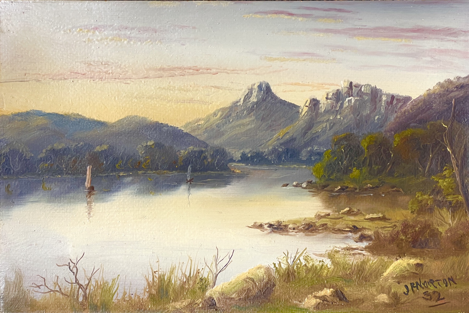
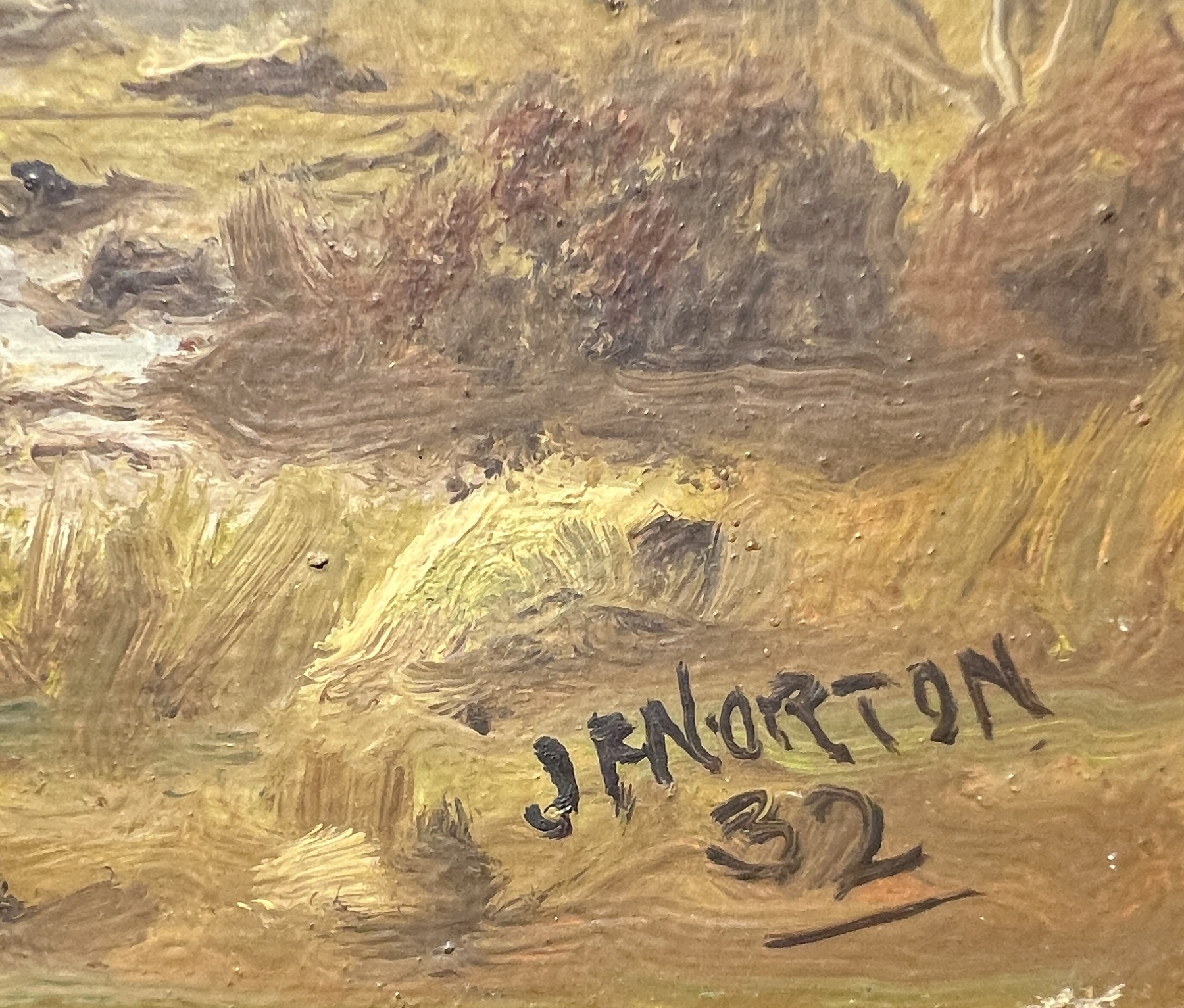
John. F. Norton has been recorded in the Art Literature as ‘Active 1898-1918’.
These two oils are clearly dated 1932, indicating a much later working period than recorded. As many works in the sales records are not dated, they may belong to this later period of his work.
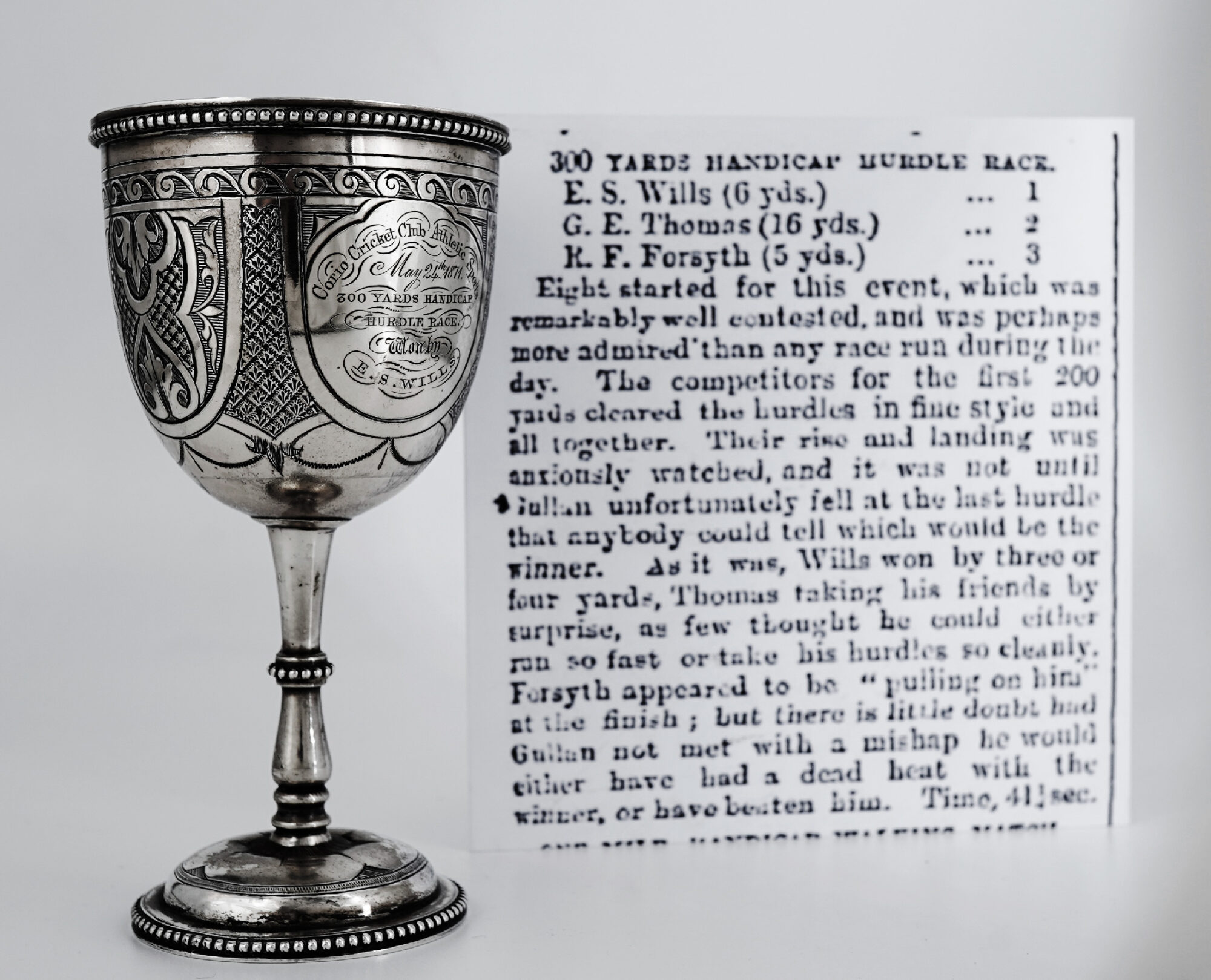
Here’s unimportant piece of Sporting Memorabilia…. particularly for Geelong residents who follow ‘The Cats’.
Bonjour…. in celebration of today’s French significance, we have a nice array of French items for you to browse, Fresh to Stock at Moorabool.
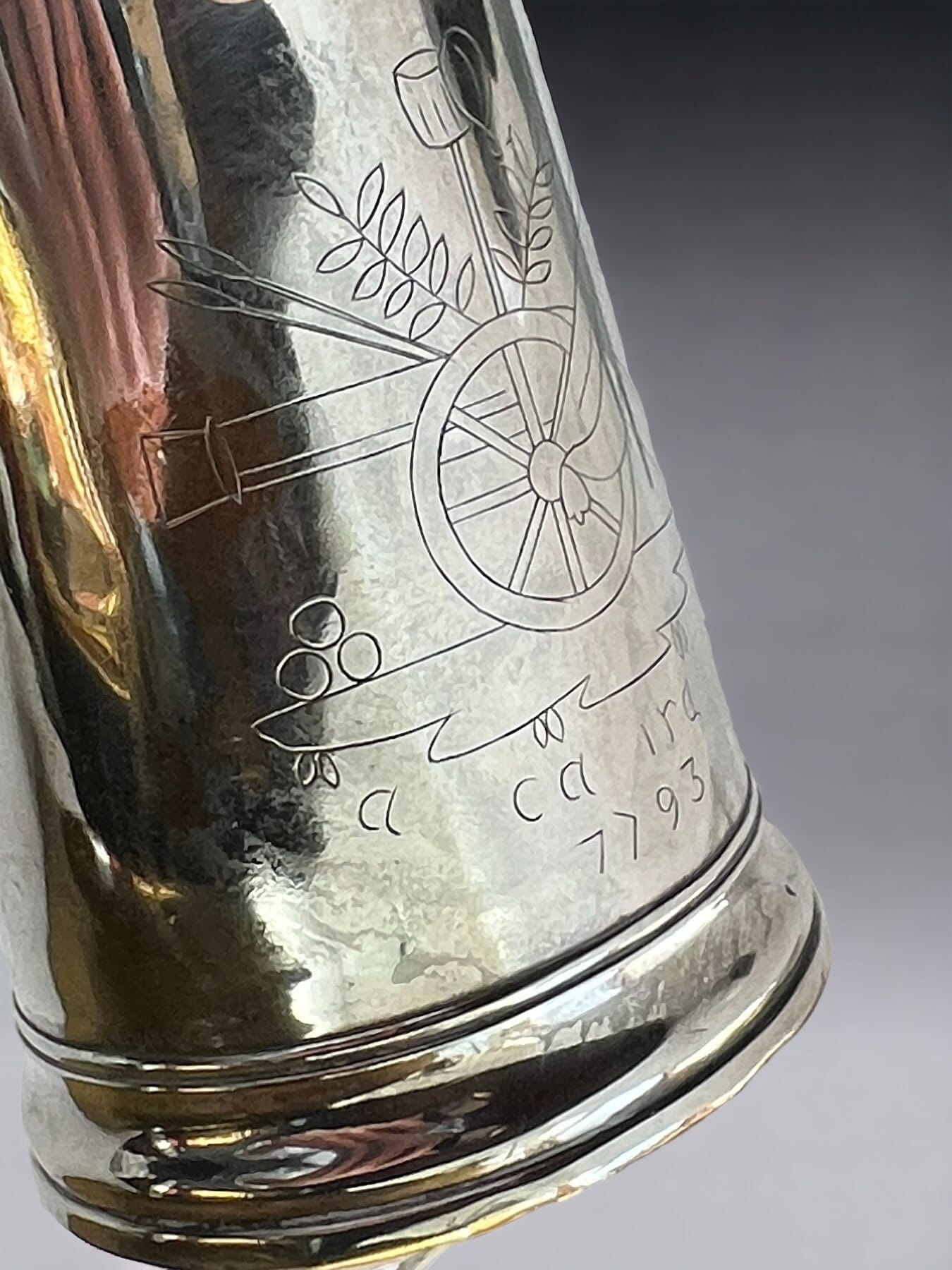
This interesting Revolutionary relic celebrates 1793: the year the Revolution ‘crossed the line’, executing the King & Queen, and purging the Ancien-Regime from France. The Cannon and cannonballs show the militant direction the revolution took, as 1793 was also the year France declared war on pretty well every European nation. Below is an inscription, ‘a ca ira’ – It’ll be OK, or as the Australian slang goes, ‘No worries!’
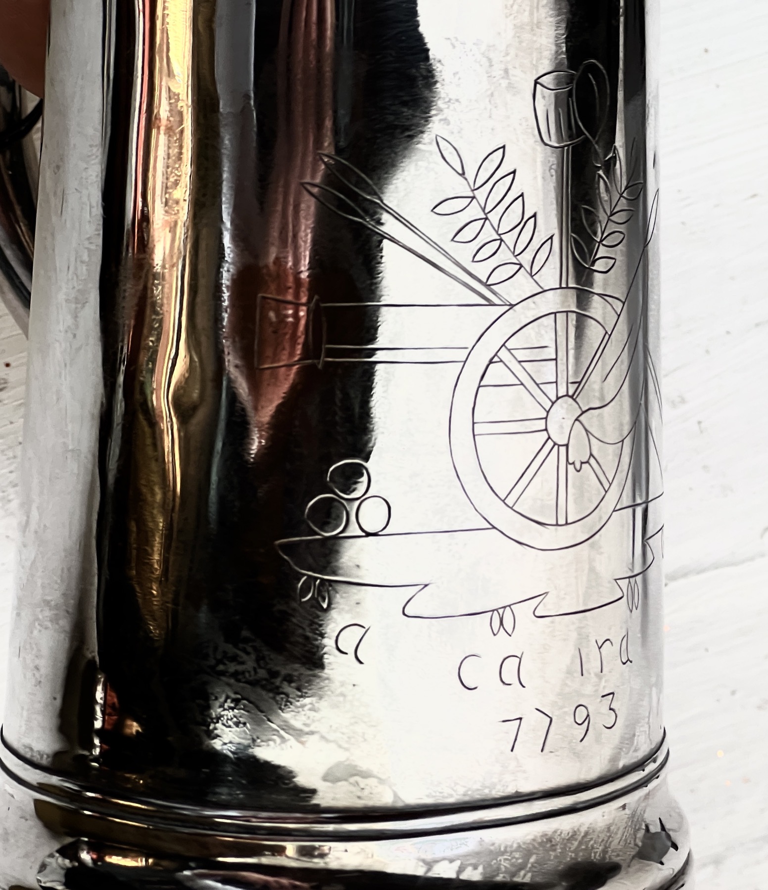
This is the chorus of a popular French song, ‘Ca Ira’. Ironically, the music is slightly older than the revolution, said to be a favourite of Marie Antoinette who would play it on her harpsichord. The words were put to it around 1790, and came to include a reference to Marie – calling her ‘the Austrian Slave’ ….
It was said to be the great Benjamin Franklin, while in France at the time as representative of the fledgling United States, who inspired the chorus. He had successfully led the revolution to free the people of America from tyranny – inspirational for the French seeking something similar. When asked for an opinion on France’s revolution, he would reply in broken French “Ça ira, ça ira” (“It’ll be fine, it’ll be fine”).
It was a ‘working song’ for the preparations for the first Fête de la Fédération, held on the 14th July 1790, being the one year anniversary of the storming of Bastille – and still celebrated 232 years later…..
‘Ca Ira’ is repeated after every verse: the verses were elaborated on and changed as the revolution progressed; an earlier version goes:
“An armed people will always take care of themselves.
We’ll know right from wrong,
The citizen will support the Good.Ah ! It’ll be fine, It’ll be fine, It’ll be fine
When the aristocrat shall protest,
The good citizen will laugh in his face,
Without troubling his soul,
And will always be the strongerAh! It’ll be fine, It’ll be fine, It’ll be fine…”
By the end of the revolution, as the blood of the nobles flowed, the words used were:
”aristocrats to the lamp-post
Ah! It’ll be fine, It’ll be fine, It’ll be fine
the aristocrats, we’ll hang them!If we don’t hang them
We’ll break them
If we don’t break them
We’ll burn them…..We shall have no more nobles nor priests
Ah! It’ll be fine, It’ll be fine, It’ll be fine
Equality will reign everywhere
The Austrian slave shall follow him
Ah! It’ll be fine, It’ll be fine, It’ll be fine
And their infernal clique
Shall go to hell
Ah! It’ll be fine, It’ll be fine, It’ll be fine….”
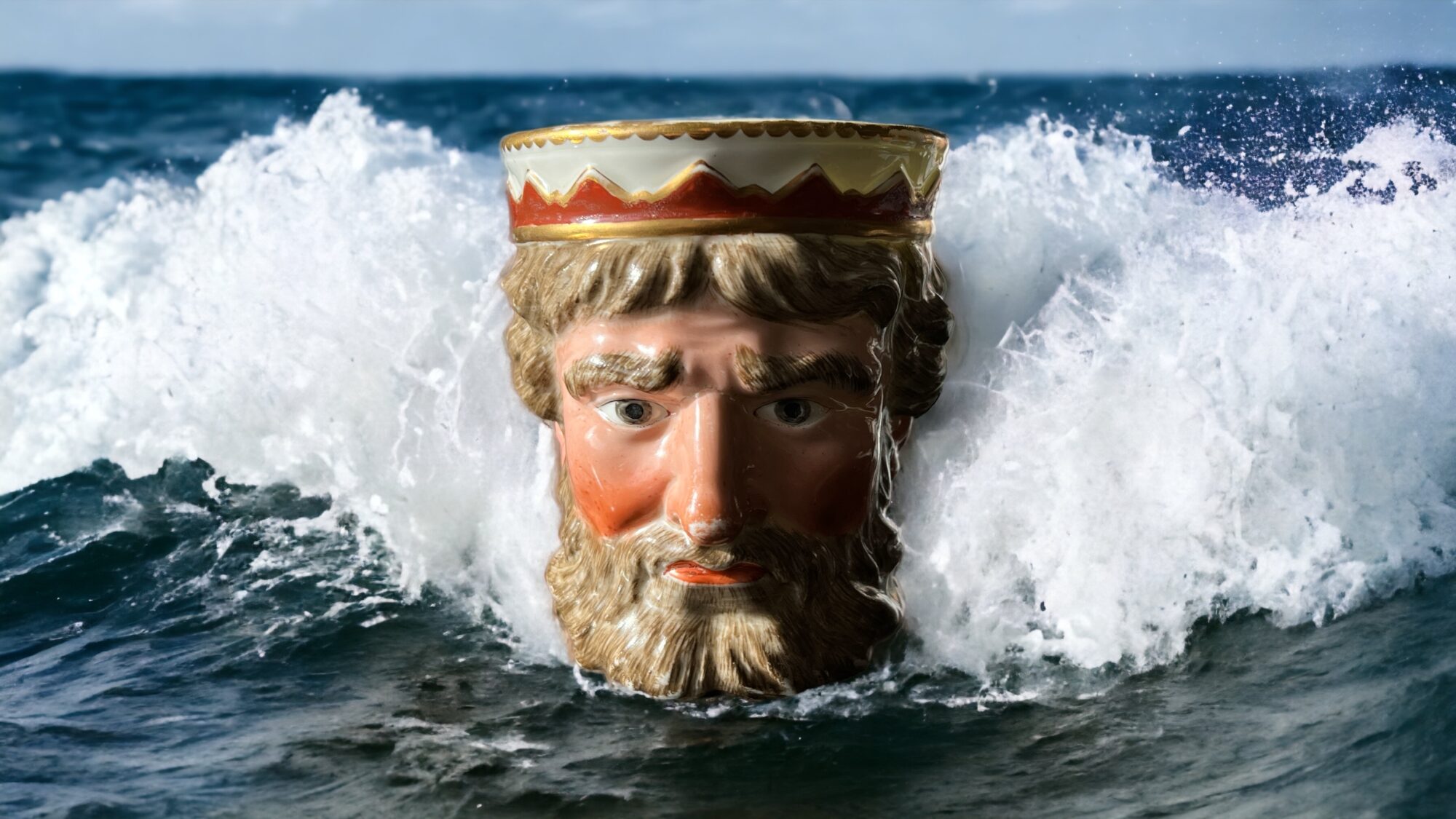
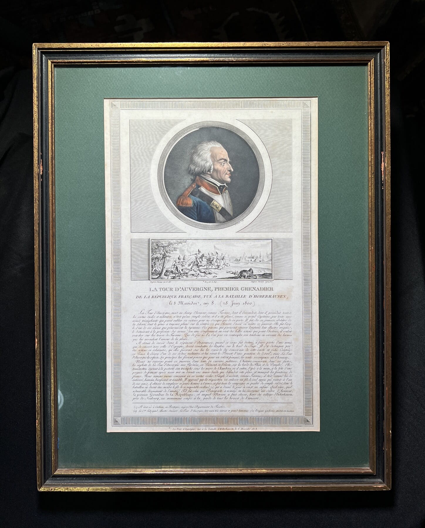
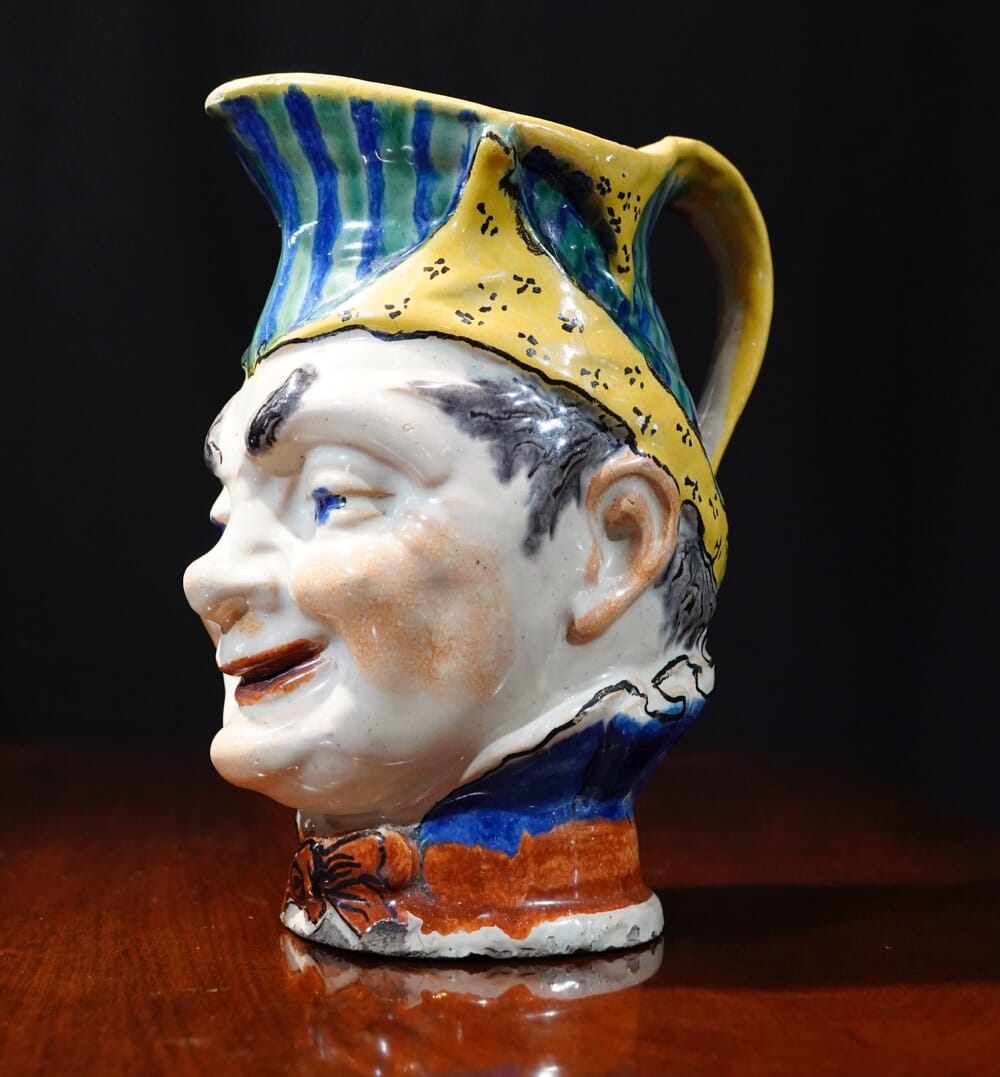
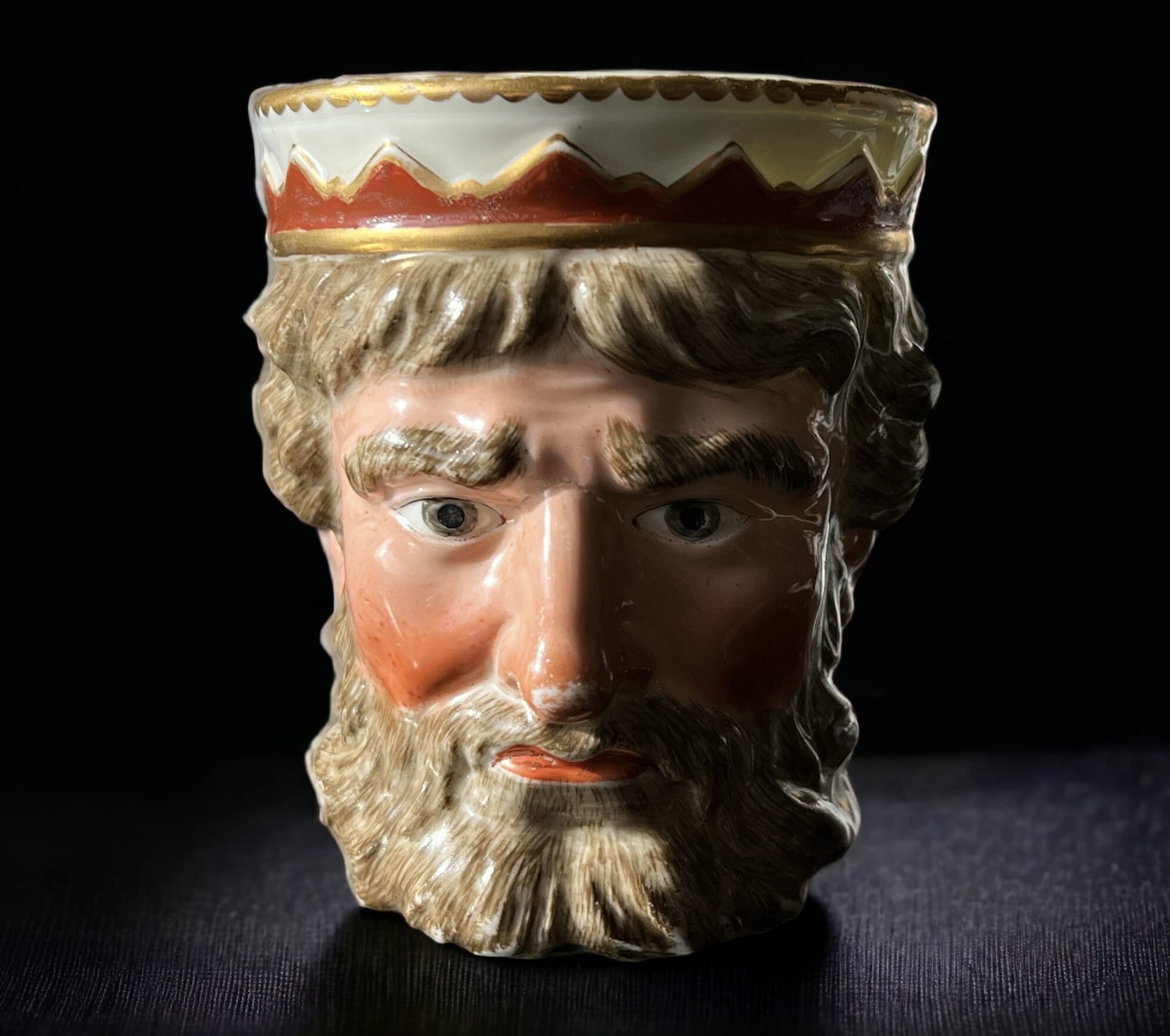
1793 was the year ‘The Terror’ began. After Louis XVI and Marie Antionette lost their heads, the purge of the ancien regiem gathered pace as more and more privileged aristocrats came under suspicion of not being loyal. Heading the purge was Georges Jacques Danton. As head of the ‘Committee of Public Safety’, he was able to remove all opposition, using that French favourite, the guillotine. Until one day, he himself met the same fate for not being radical enough! The ‘character jug’ below is French, of the Revolutionary period – and looks just like him. Read More to follow our attribution of this character to the feared Georges Danton.
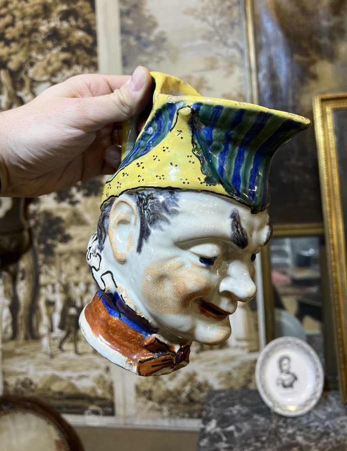
Often mis-labelled a ‘Toby Jug’, this is an early version of a comical jug that becomes popular in the latter 19th century, sometimes identified as ‘Puck’. We believe this head jug is a distinctive character, and as it belongs to the period of the French Revolution, his identity must be found in that timespan. His appearance matches that of Georges Jacques Danton (17591794), an important public figure of the late 18th century in France, and the perfect candidate for a slightly humorous head mug like this.
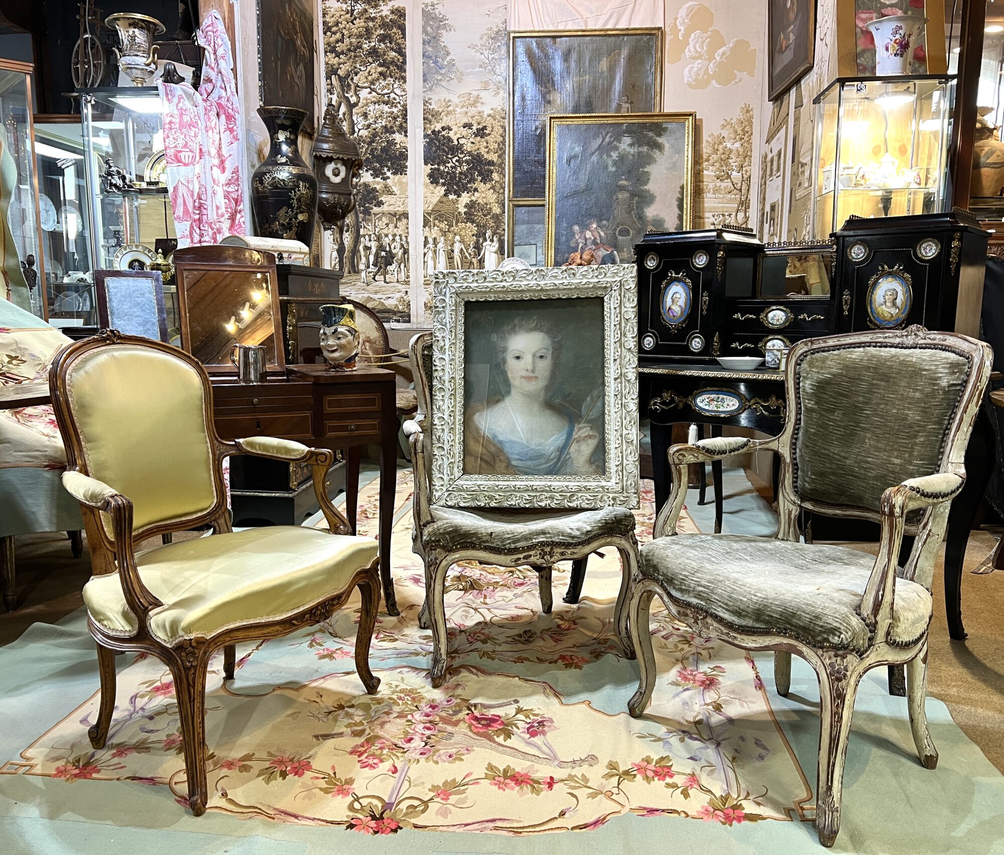
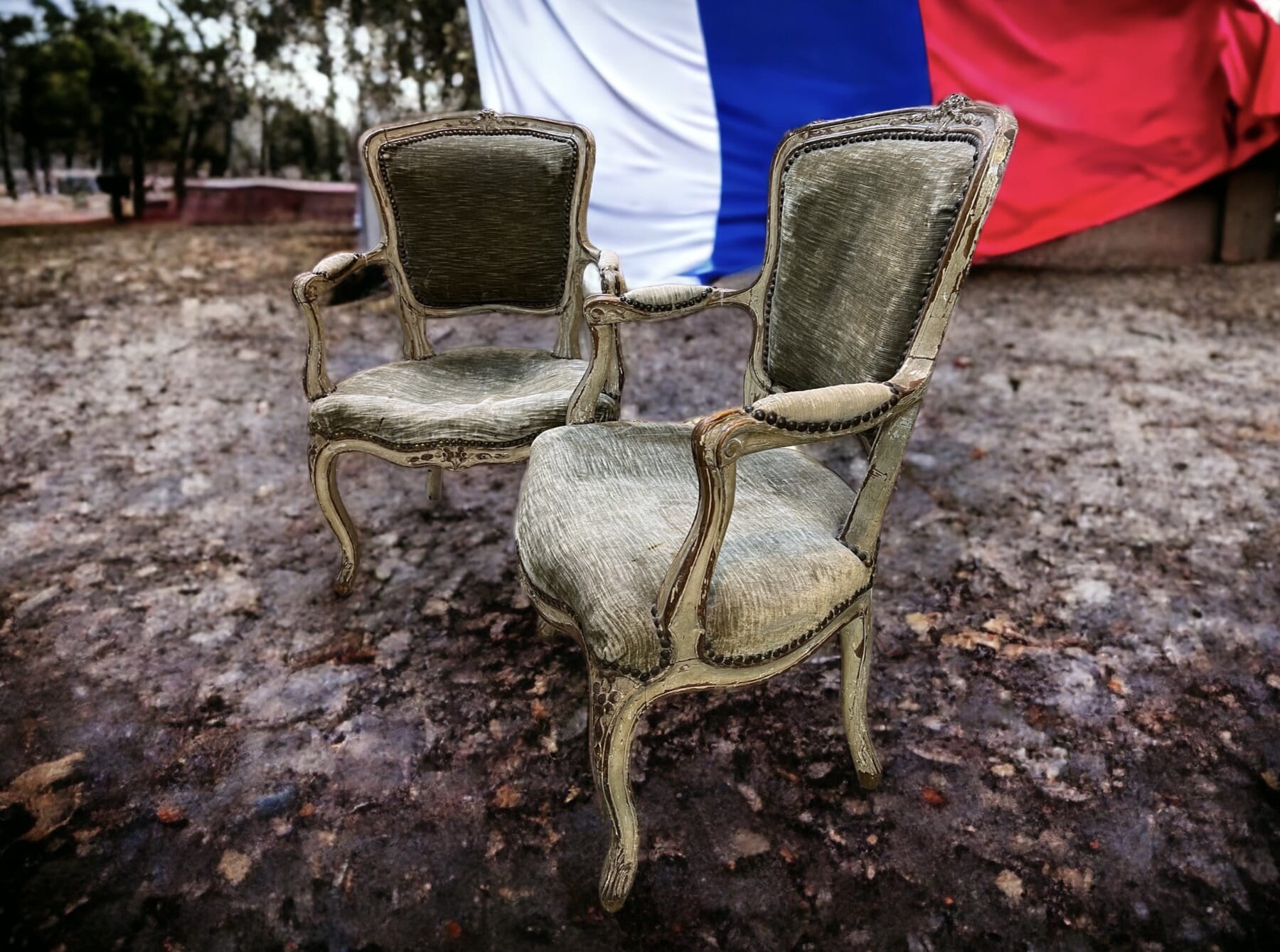
In the upstairs centre of our Geelong premises we have constructed a ‘French Salon’. The walls are the basis, being a series of rare surviving early 19th century wallpaper panels. They were never used – they still have the trim marks along the edges, usually cut-off when installed.
The fabrics you see are all rather special – Aubusson weavings, including large floor carpet, wall panels, large & small upholstery panels, curtain pelmets, and even a pair of shield-shape fire screens…. all unused, purchased in France on the eve of WW1, shipped out, and left in the boxes until now. In other words, brand-new Antique fabrics, ready for the keenest of French decorators…. we’re hoping they will sell as a complete group, otherwise there will be a split-up into groups. Email if this sounds interesting.
There’s also a series of rather special French pieces, some already online, with more to be added shortly.
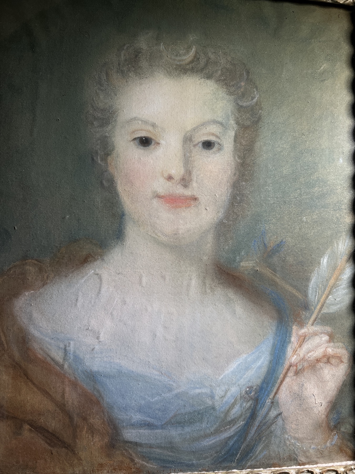
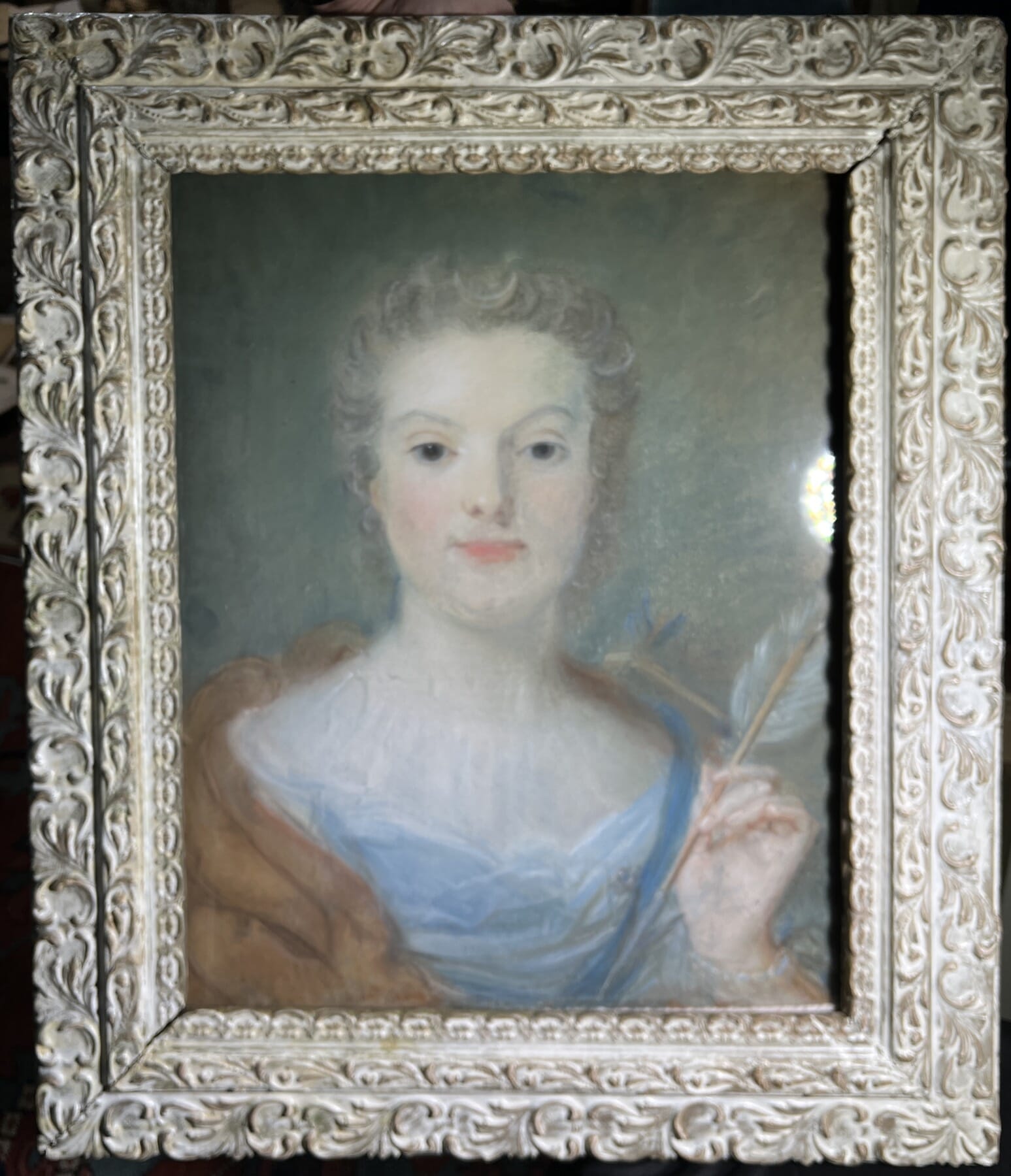
Note the portrait in the centre: this is signed & dated pastel, a portrait of Jeanne-Marie- Malles, aged 18, as ‘Dianna the Huntress’. It’s by the pastel master, Jean Baptiste Perronneau (1716-83), regarded by leading scholar in the field, Neil Jeffares, as one of the two ‘best pastel portraitists‘ of the 18th Century (alongside M. de La Tour 1704–1788).
See this exciting freshly identified piece here >
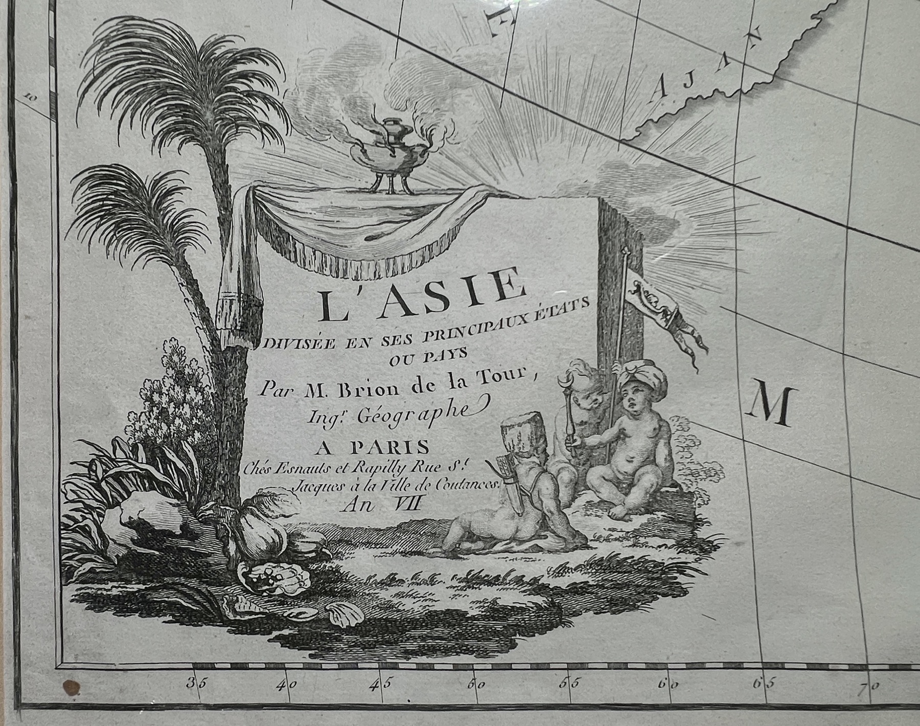
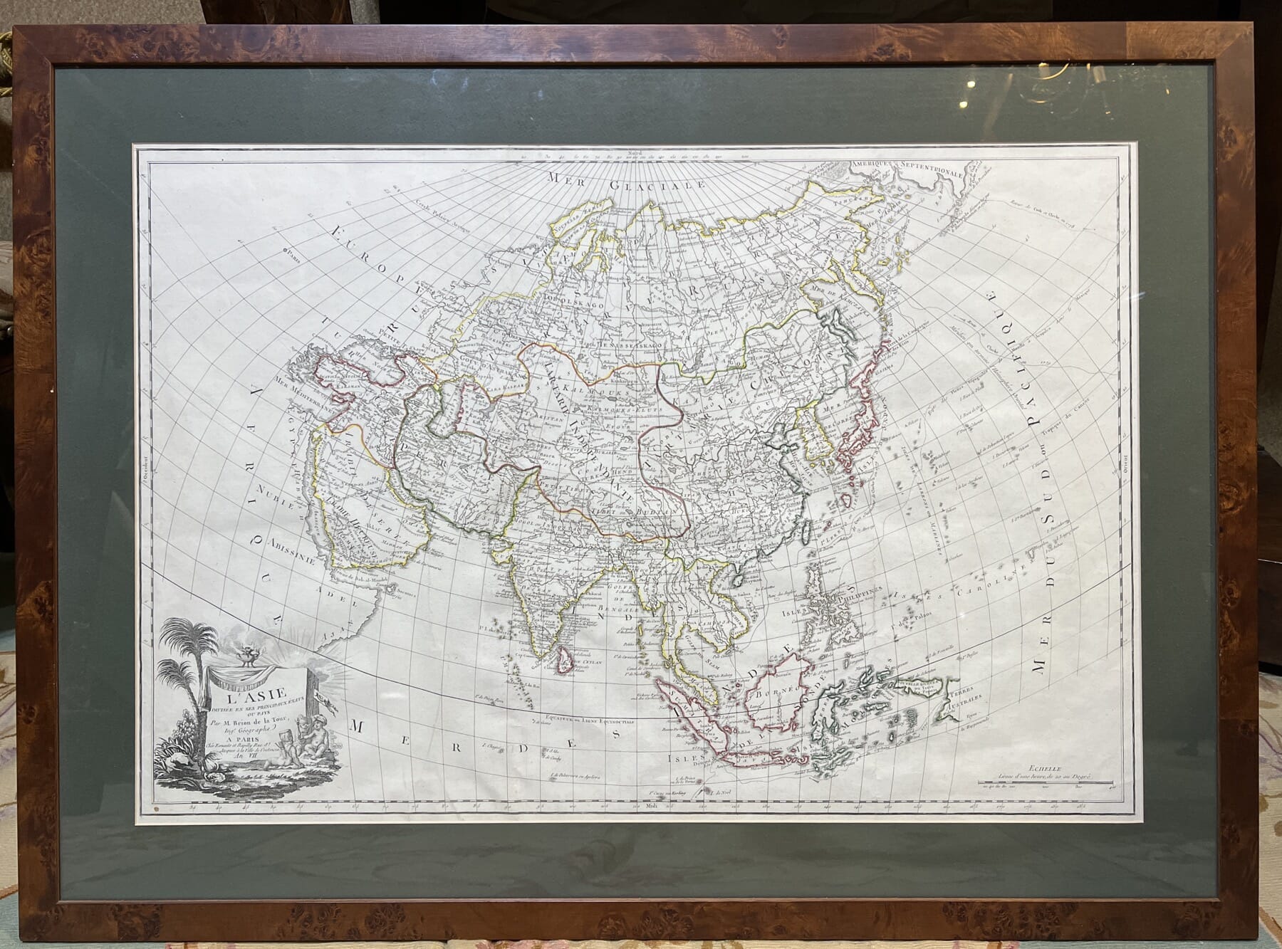
There’s a strong French Connection with Australia: we could well have been a French colony…..
This interesting map shows just the top left of Australia,

As a footnote, I can’t resist posting a pair of rare hand coloured French ‘Australiana’ lithographs. They reflect the French interest in Australia – just days after the first British colonists arrived at Botany Bay in 1788, the French appeared, having travelled along the southern coast and then arriving right at the spot the British had chosen for their new colony. Coincidence? Not quite – Louis XVI was very interested in the idea of a colony in the South Seas, to compete with the British, and had instructed Lapérouse to report on the British actions on the Great Southern Land.

Of course, the Revolution soon took hold back in France – but science & exploration still carried on. In 1785, Jean François de Galaup, comte de Lapérouse was put in charge of a mission to the Pacific. The voyage of Lapérouse took a keen interest in the Great Southern Land, made keener by the colonising actions of their main competition, the British. They had arrived on the 18th January, after 252 days sailing from Britain. Lapérouse had been exploring for several years, but in one of those serendipity occurrences history throws up, arrived at the same point as the British just 6 days later! They stayed for six weeks, and then sailed off never to be seen again….
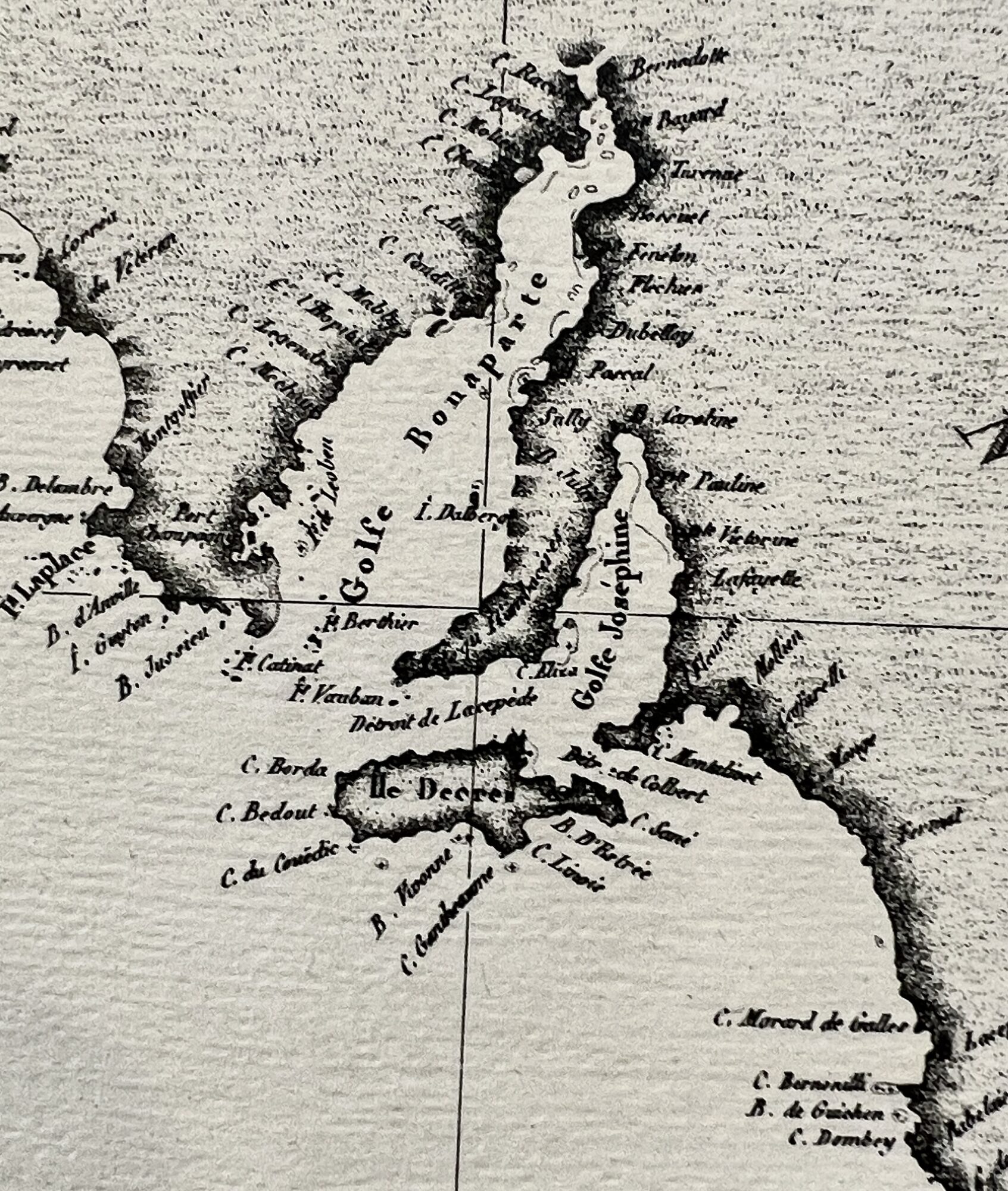
Nicolas Baudin was the next Frenchman to explore the South Pacific. He was selected by Napoleon in 1798 to explore the southern coast of Australia, or ‘New Holland’ as it was known. While the right-hand portion was the British colony of New South Wales, there was so much more promising land as-yet unclaimed. The tension between the French & the English is illustrated by the events at ‘Encounter Bay’, now in South Australia: Mathew Flinders was completing the first-ever complete navigation of Australia when he stumbled across Baudin’s ship heading the other direction… with the same intent! They cautiously approached, uncertain if they were meant to be enemies or allies, as when Bourdain had left France, they were at war. However, in the name of science, they met peacefully and proceeded on their way. While Baudin died on the way back to France, the charts made it and were published, including all the French names he had given to the features he mapped – ‘Napoleon’s Land’ features ‘Gulf de Napoleon’ next to ‘Gulf de Josephine’, for example. Unfortunately, Mathew Flinders had already mapped & named the same areas, giving them good British names like ‘Spencer Gulf’, names which were officially published a little later, and which remain to today.
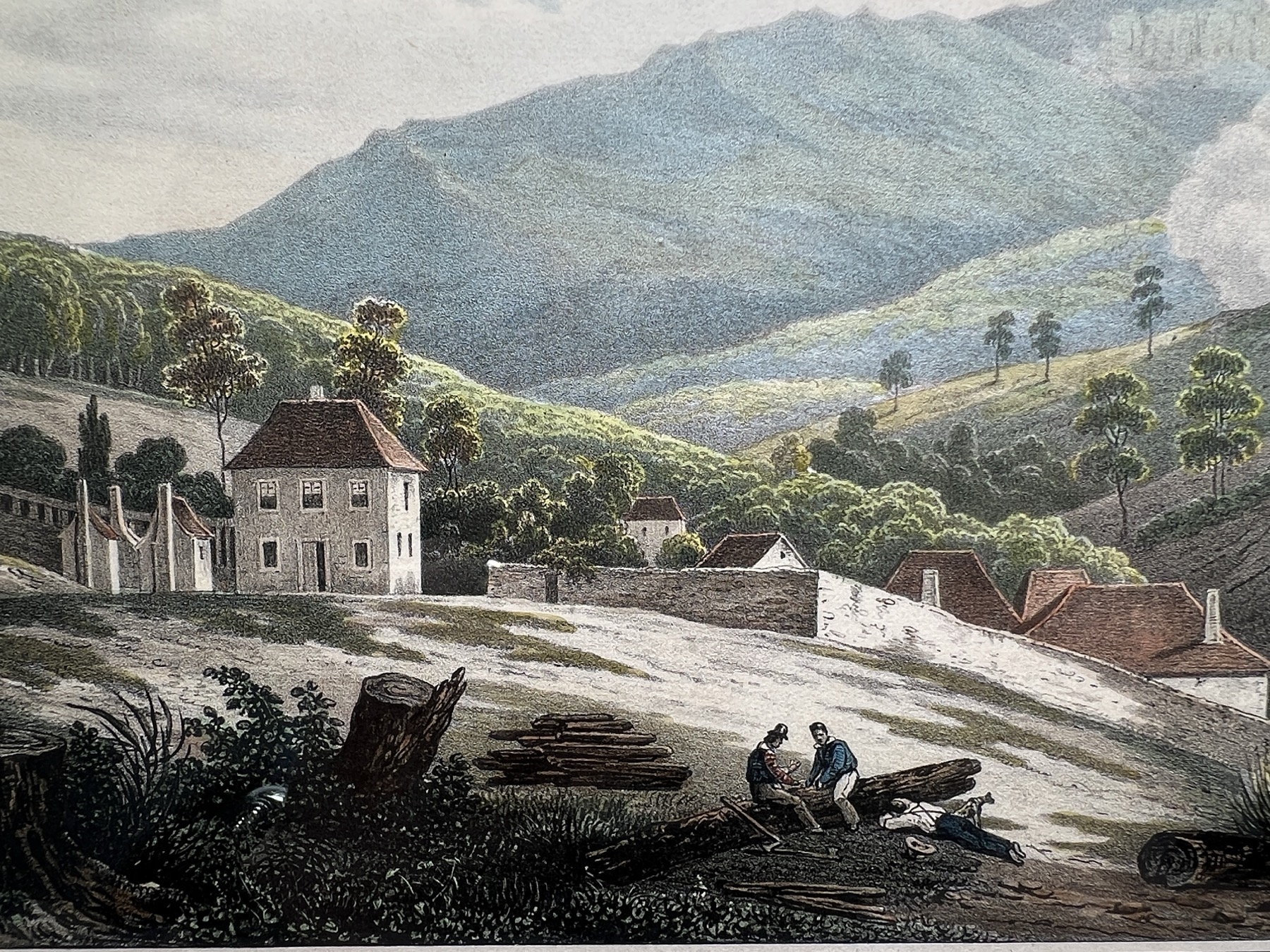
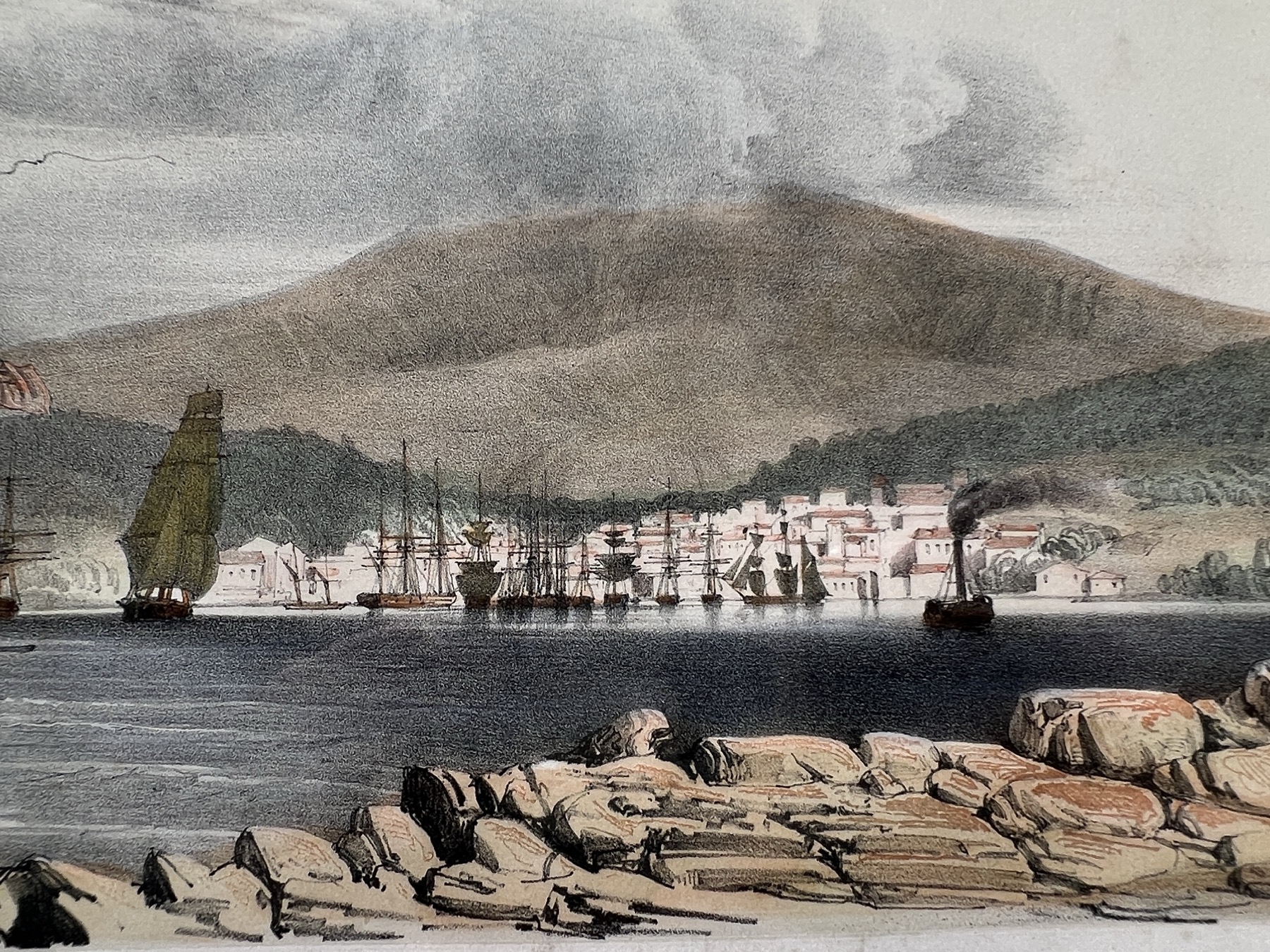
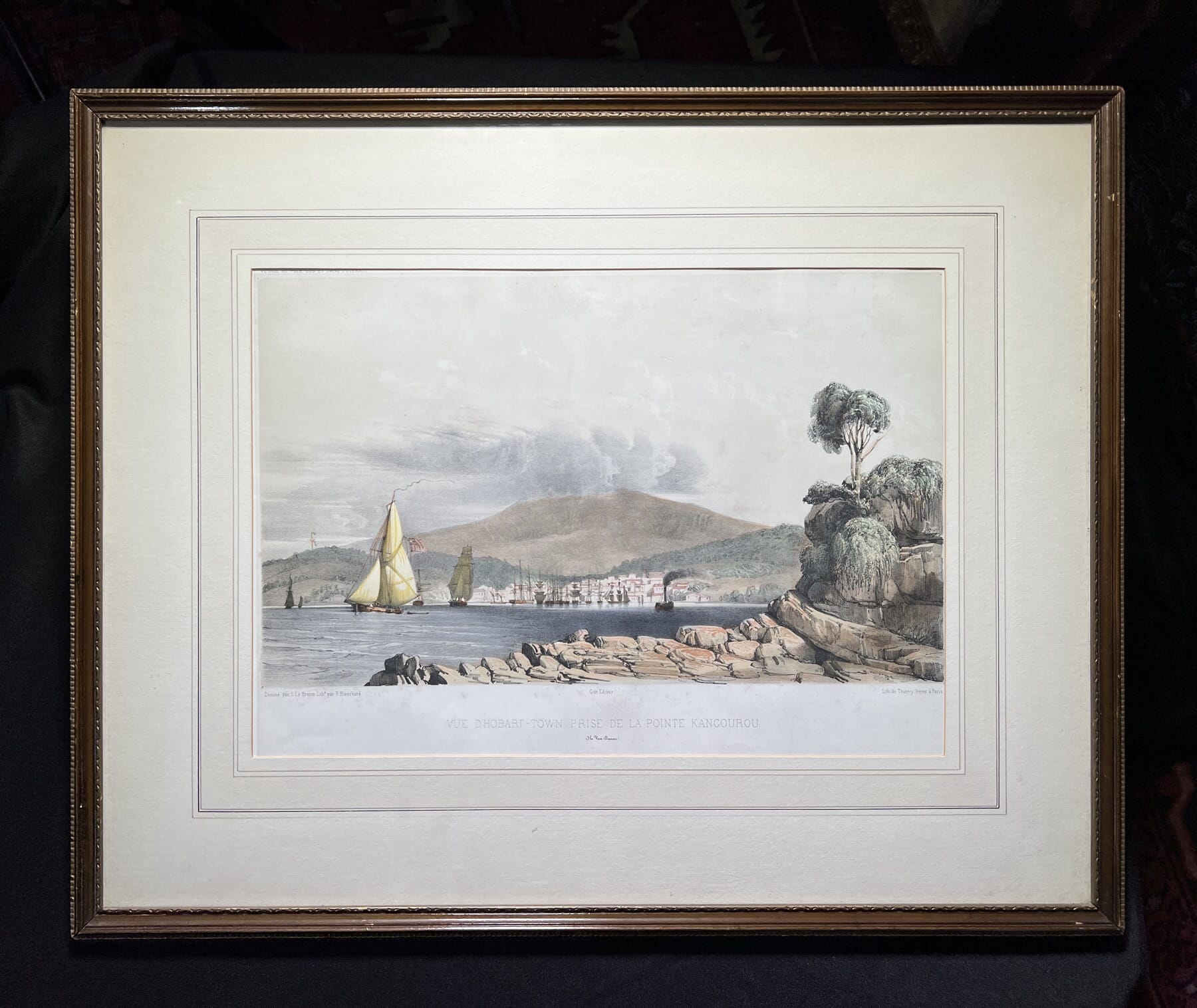
The fine French views of Hobart were published in 1833, the result of yet another French expedition to the region: confusingly, in a ship named in honour of the lost Lapérouse expedition: another Astrolabe, under Dumont D’Urville. He was instructed by the re-instated French monarch, Louis-Phillipe, to head south & claim the South Pole for France!
He left France on his first voyage in 1826, and was away for three years in total, visiting Hobart in 1827 to re-supply, when the sketches that were used for these lithographs were made. His voyage was published in ‘Voyage de la corvette “l’Astrolabe’, 1833, from which these come.
He was also responsible for solving the mystery of the disappearance of Lapérouse and his Astrolabe – which he did, discovering relics of the wreck on Vanikoro, in the Solomon Islands.
So Australia has a fair share of French History to celebrate!
Vive la France, tout le monde!

We’re always in the process of documenting Fresh Stock items ready for release. The process can take some time, as so many of our pieces are obscure & need a lot of time to decipher their story.
In these pages, you’ll find a ‘Preview’ of upcoming items, with our research being added as it is prepped ready for sale.
If you’re interested – and if you have any info to add – please send us a message.


Notable items that will have their own mini-exhibition online, currently being researched & catalogued.
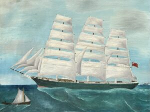
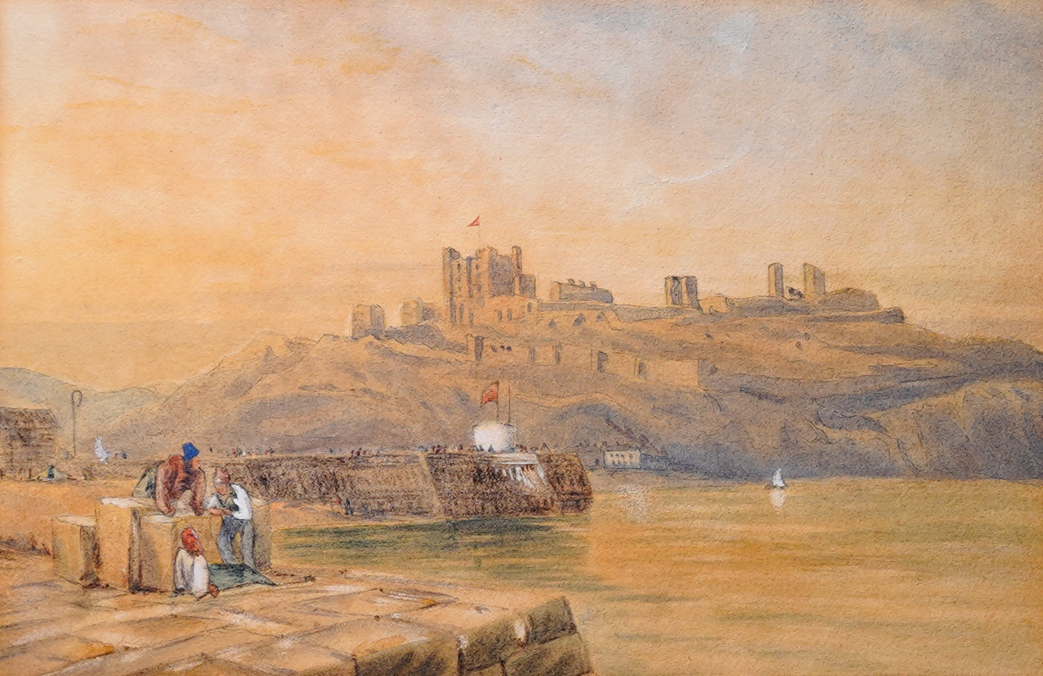
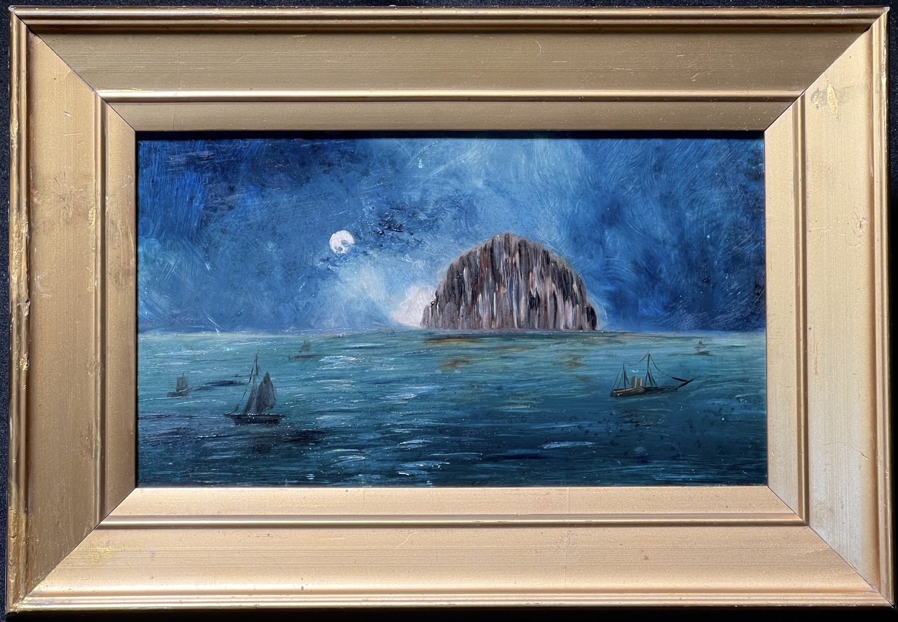
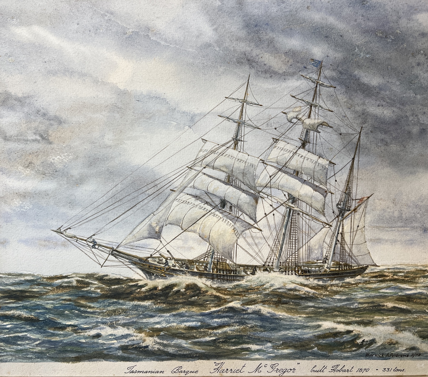
Art & Artefacts relating to the sea.
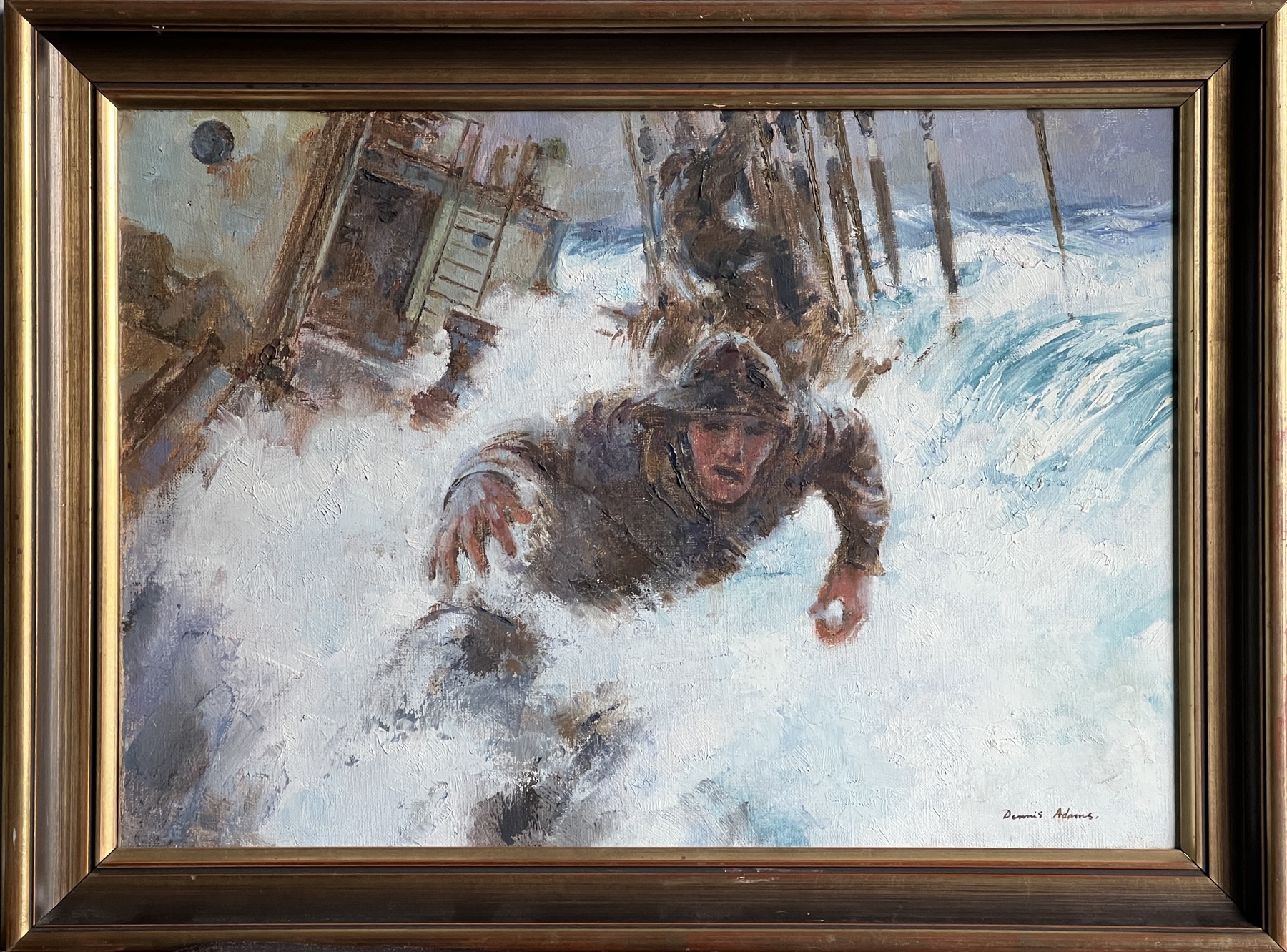
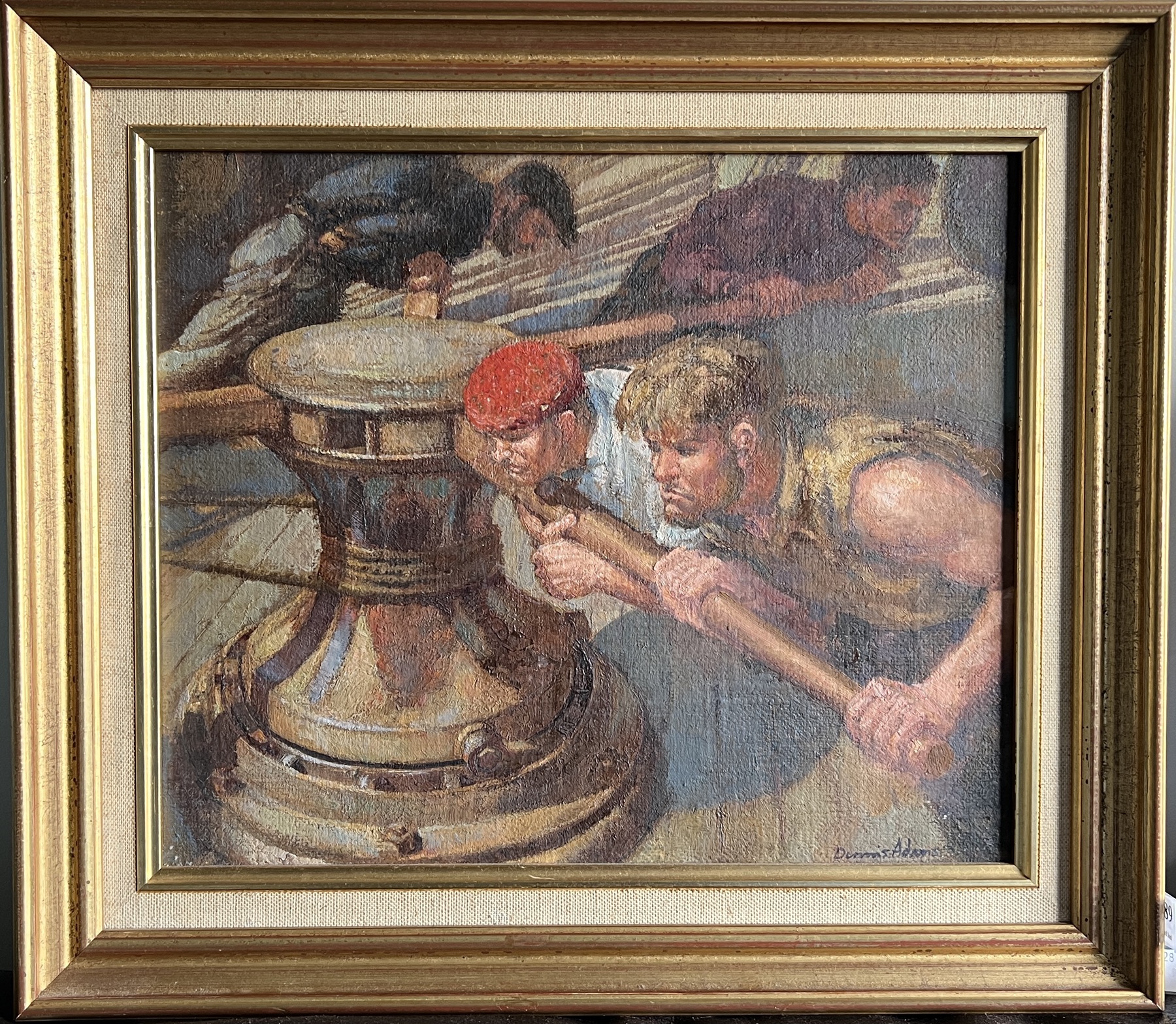
Dennis Adams (1914-2001) – in Nautical Art
Denis Adams was an Australian artist who had a passion for the sea. Born in Sydney in 1914, he grew up in the country – but visits to Sydney led him to the docks and the romance of sail, as he watched the few remaining sailing ships pass Sydney Heads for distant ports. His father was a retired seaman, and his head was full of his tales of life on board the ‘Last of the Windjammers’.
He was studying art at the Julian Ashton Art School in Sydney, but really wanted to head off to London to study at the Royal Academy of Arts. His decisive moment came when he enrolled as crewman on one of Finnish ship owner Gustaf Erikson’s regular fleet of windjammers which loaded grain for Europe on the Yorke Peninsula of South Australia. He finally achieved his goal, as an ‘able-bodied’ passenger, meaning he was willing to work as needed on the voyage – but still paid 6 shillings a day! In 1935, he left for England, to study Art in London – and made good use of his time onboard, sketching & painting the everyday events of life on a sailing ship. Returning in 1939, he joined the war effort: along with other artists, he was part of the ‘camouflage squad, designing military camouflage – and in 1942, was sent to the Pacific as an official war artist.
After the war, his artistic career continued, mainly as a maritime artist. He taught art at the East Sydney Technical College.
His art, which came to include bronze sculpture, is represented throughout Australia, with a multitude of public sculpture commissions for various war memorials, including many examples of bronzes & oils in the Australian War Memorial in Canberra.
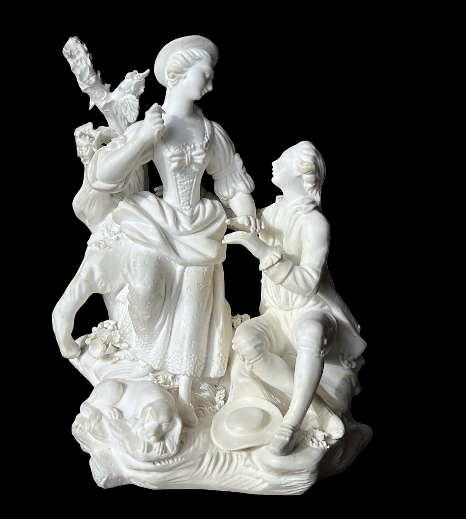
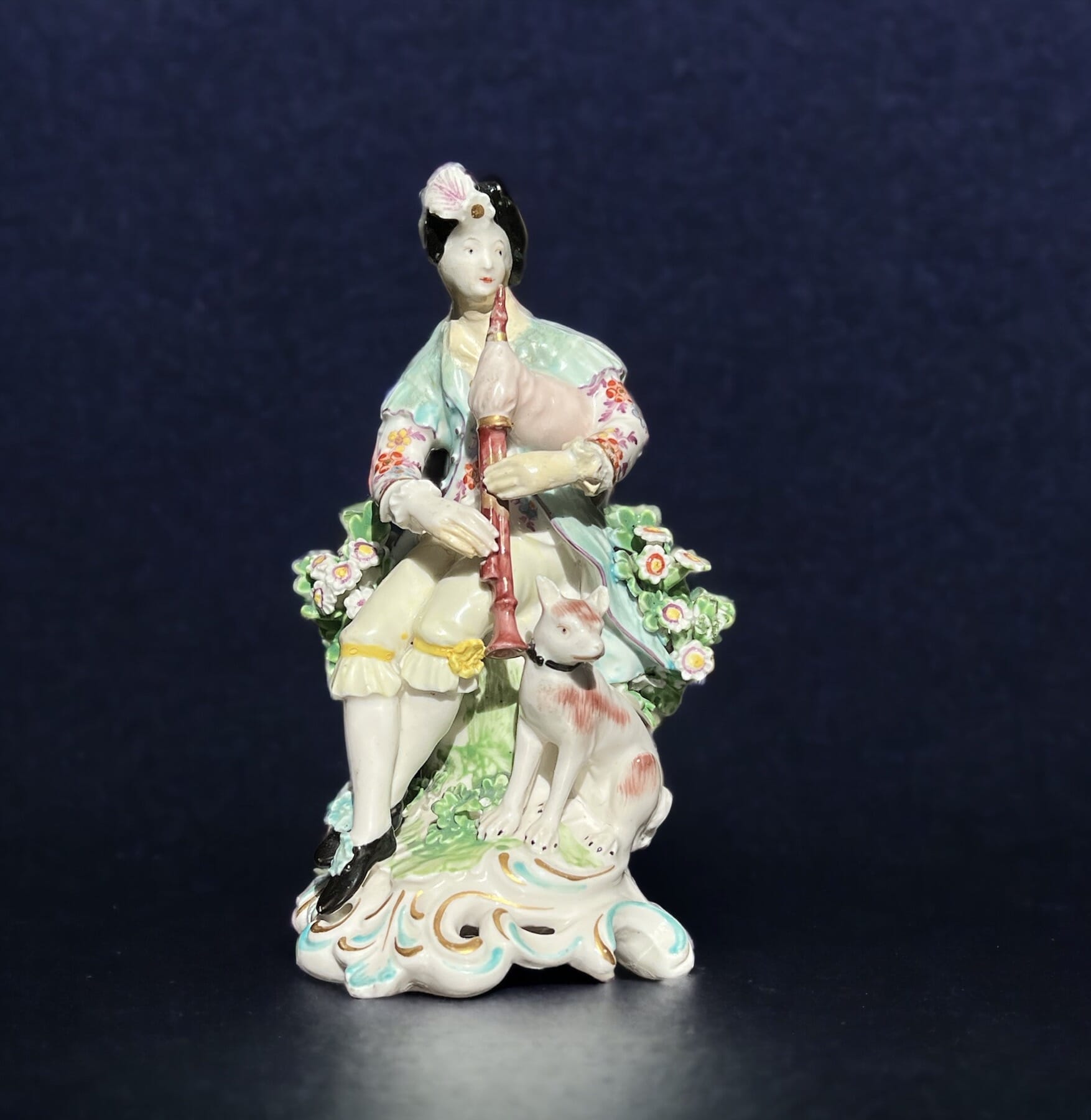
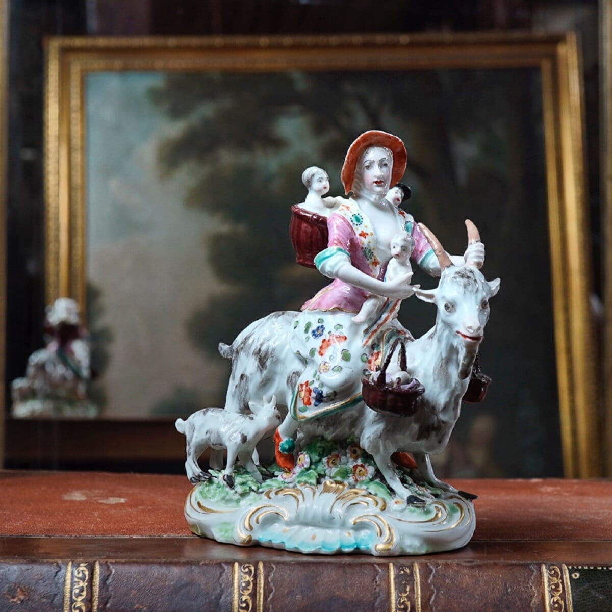
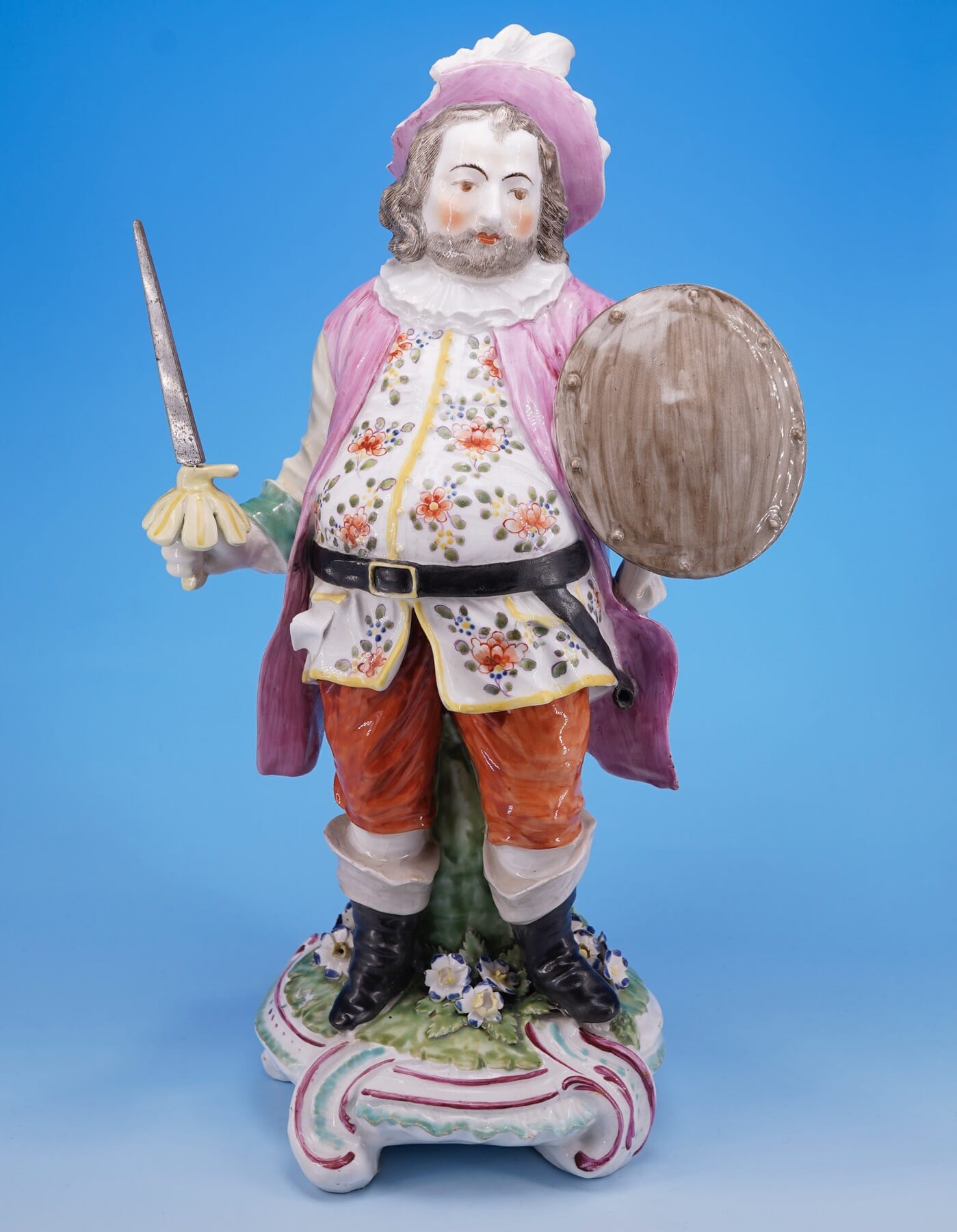
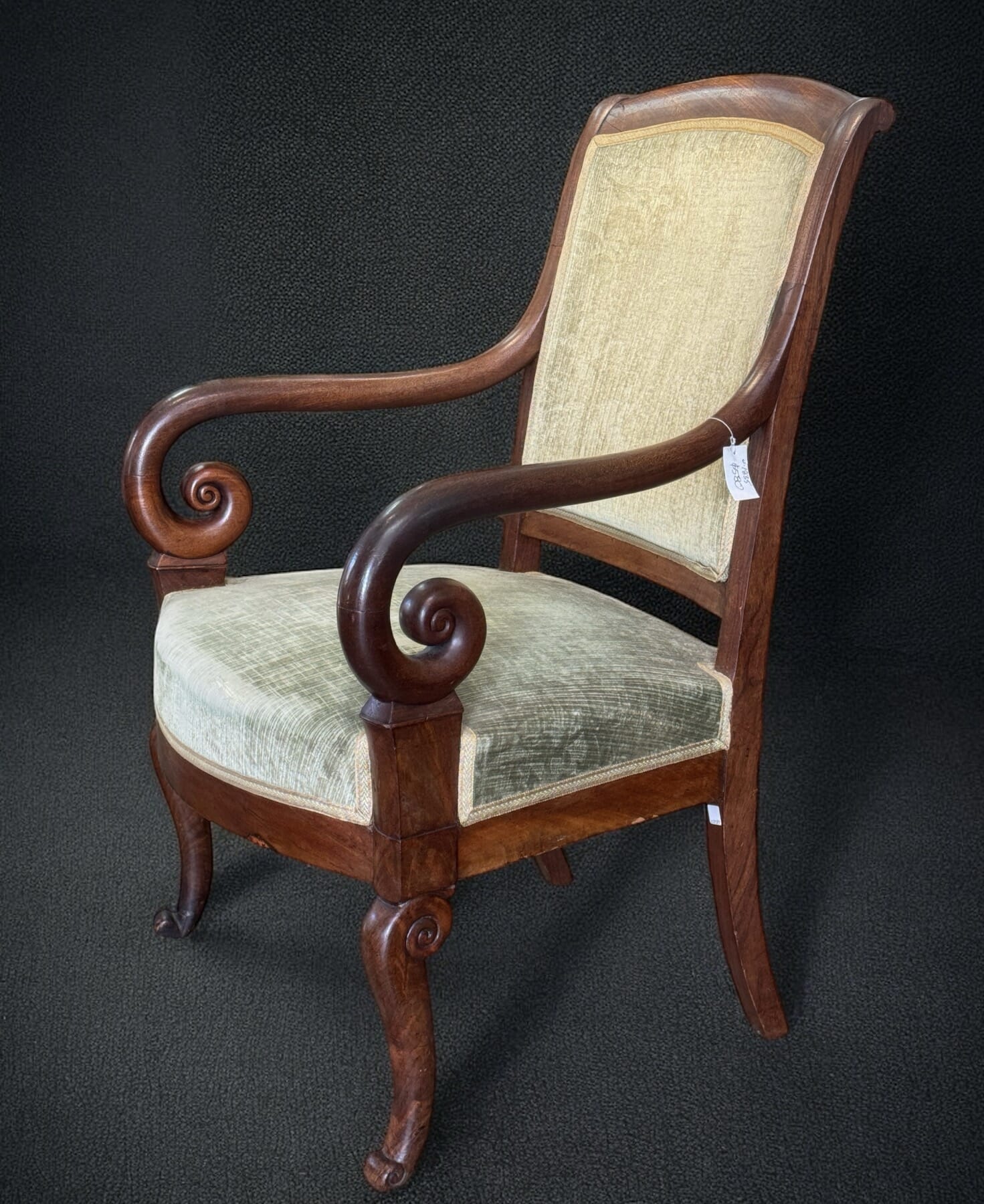
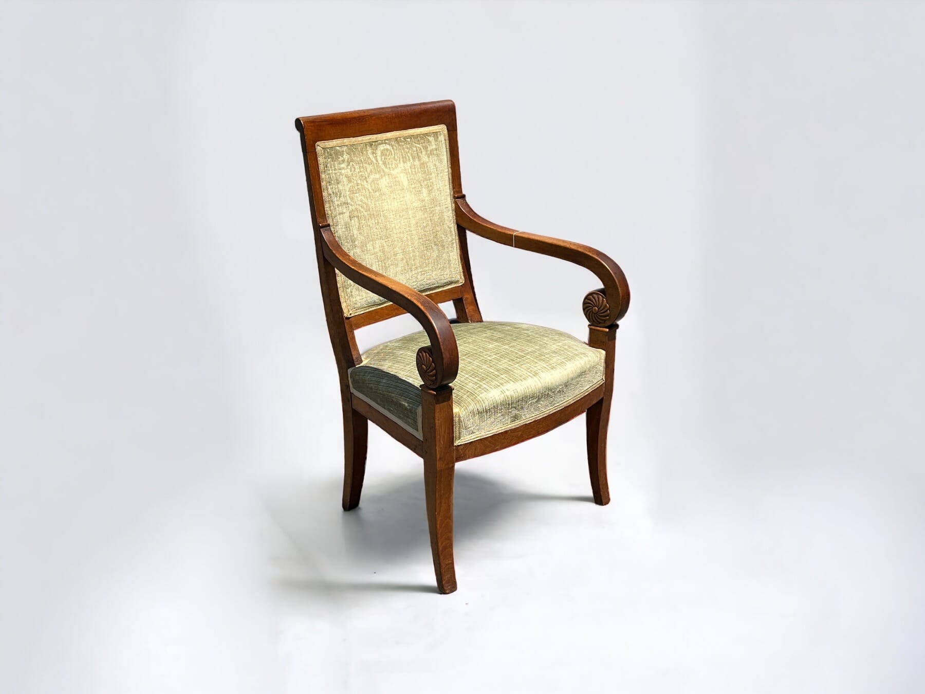
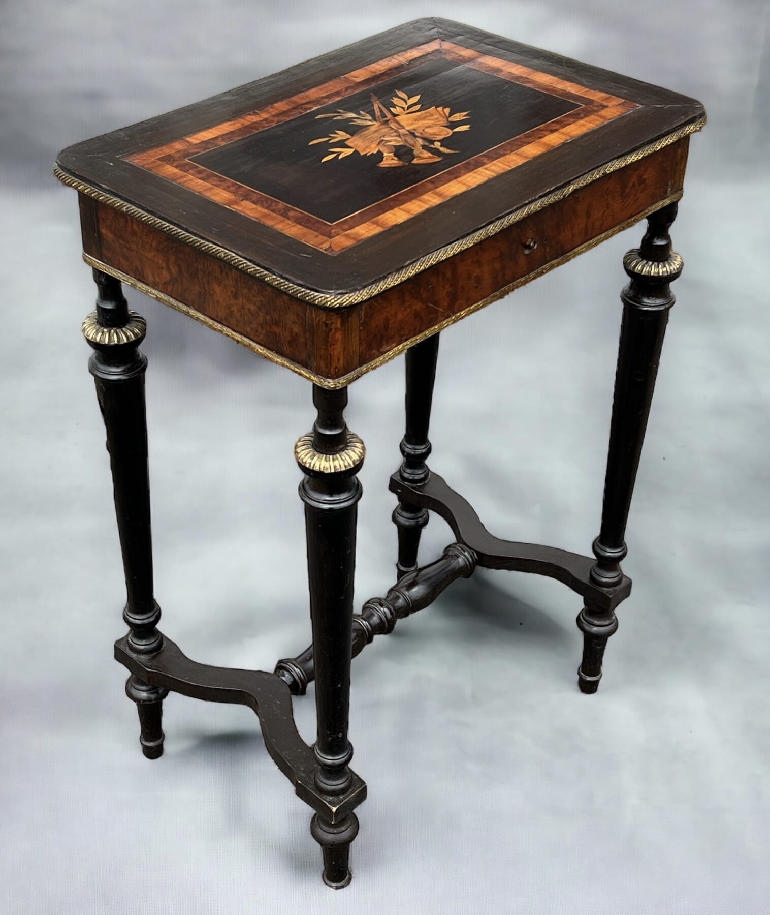
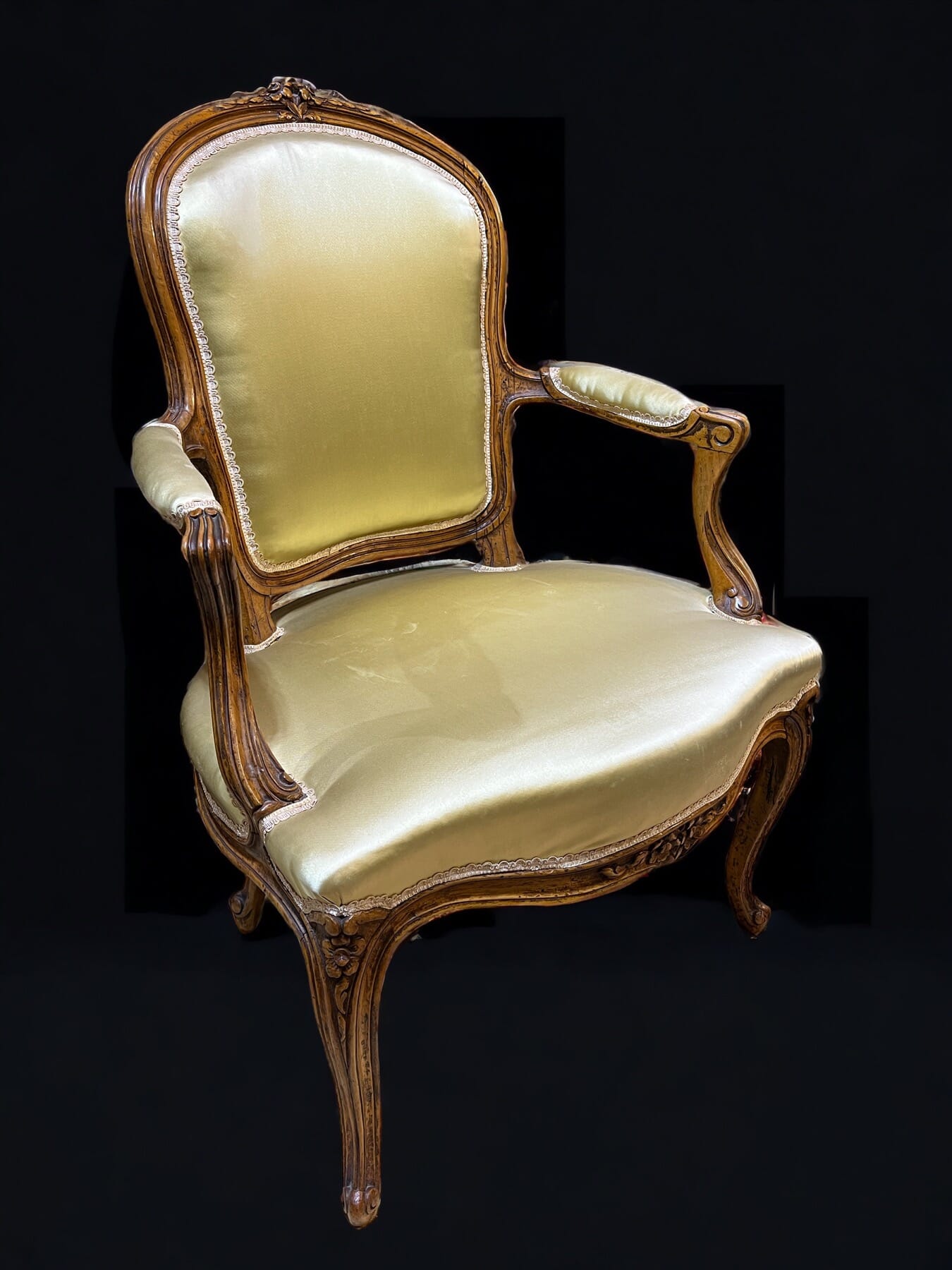
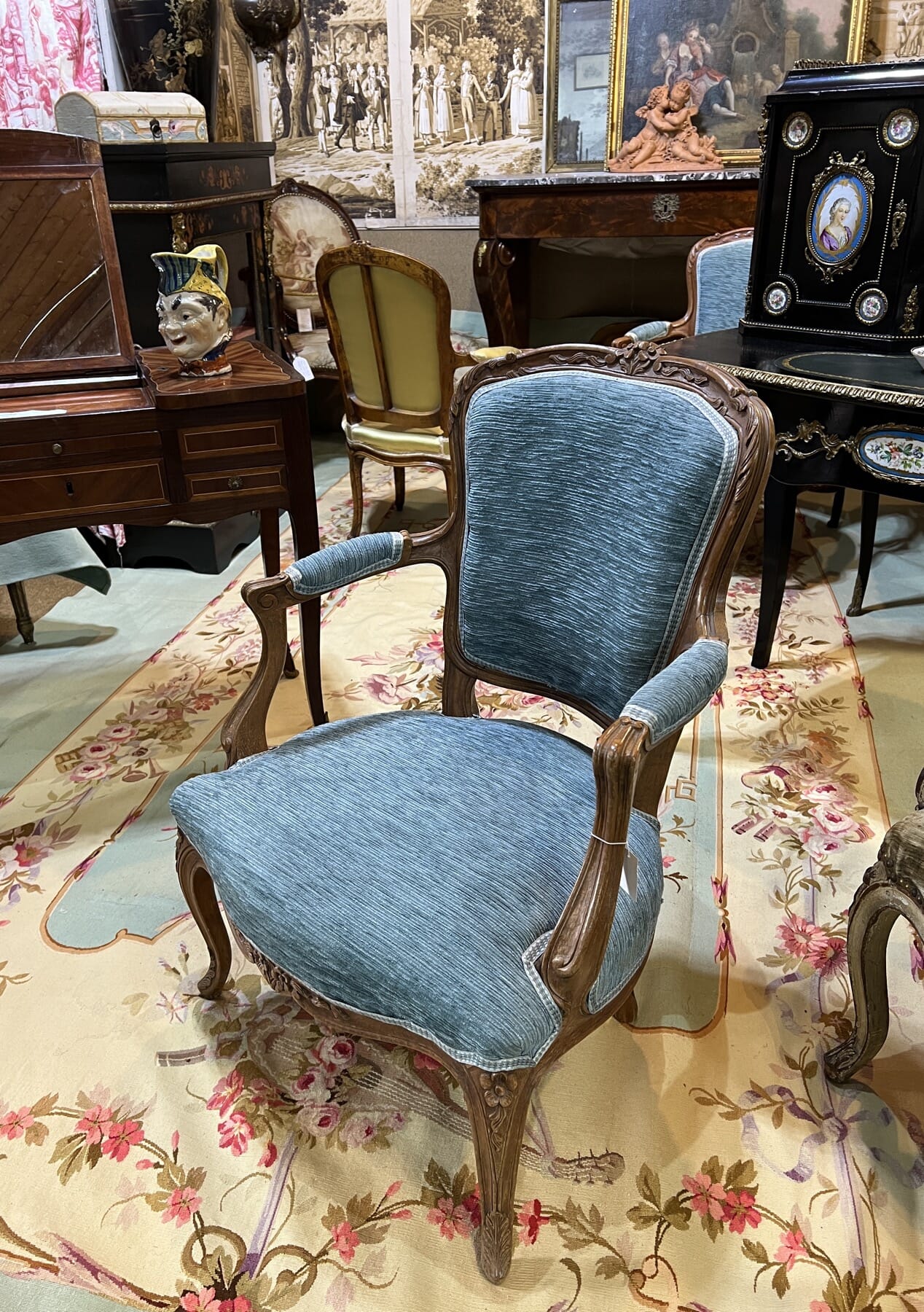
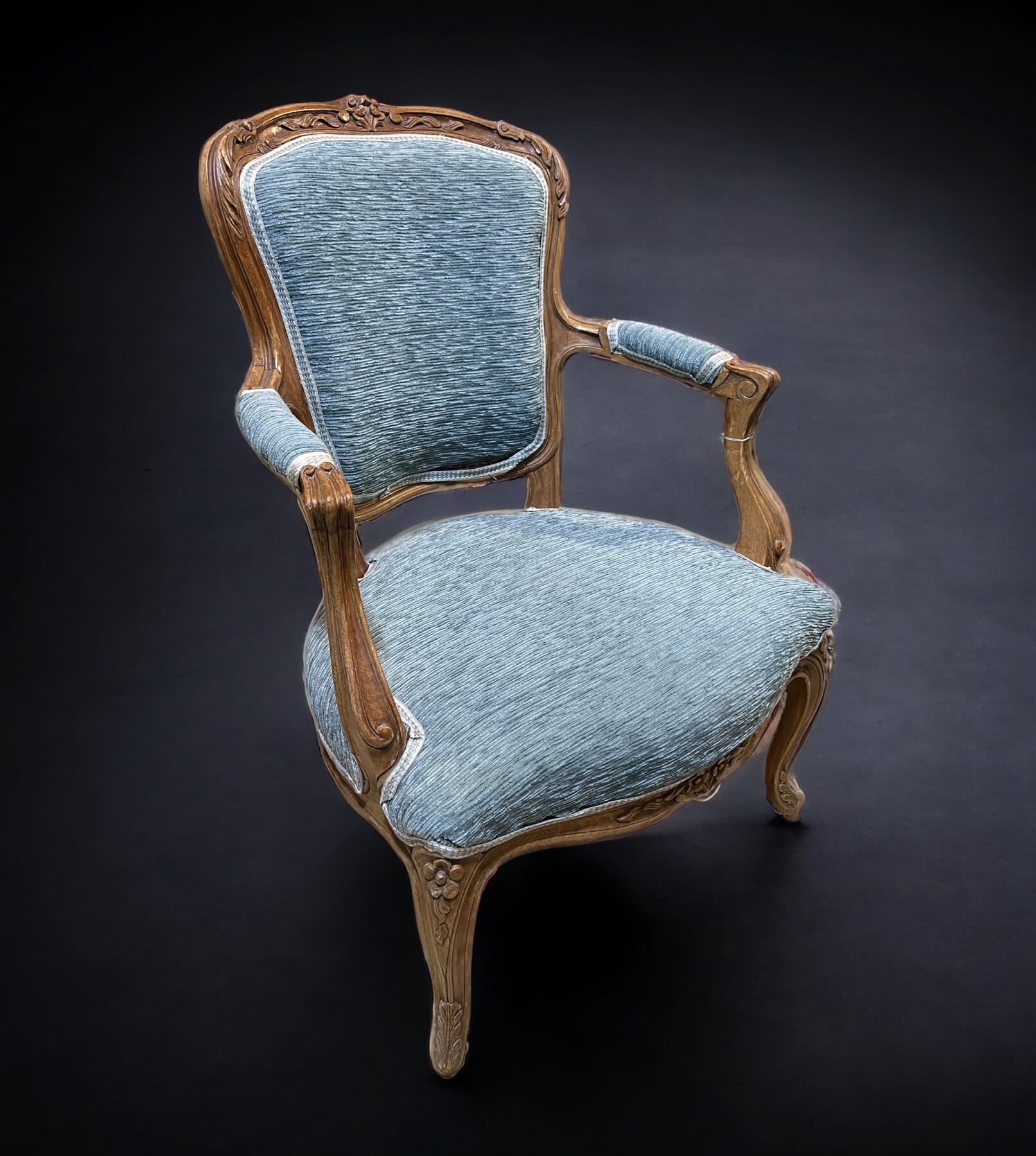
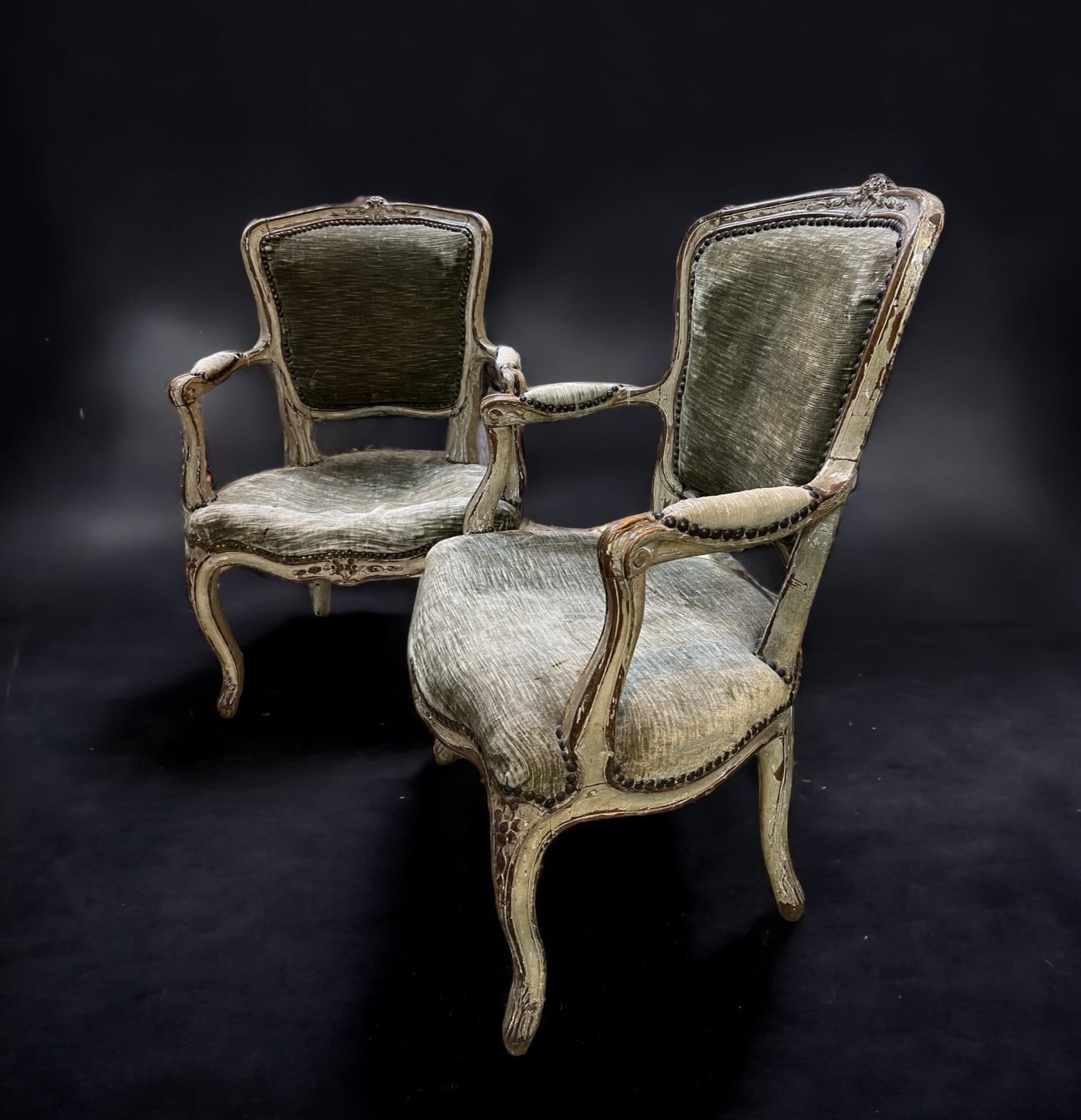
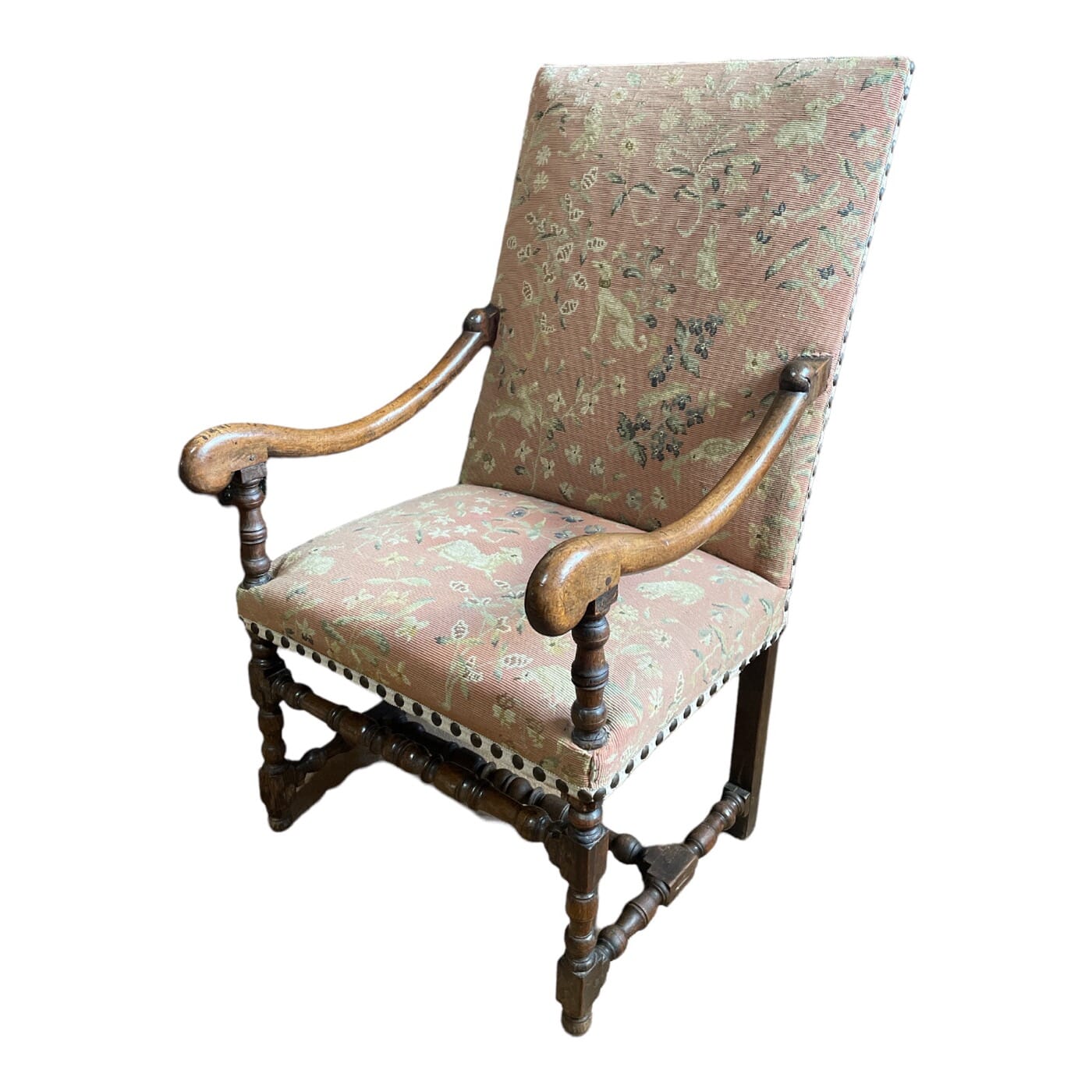
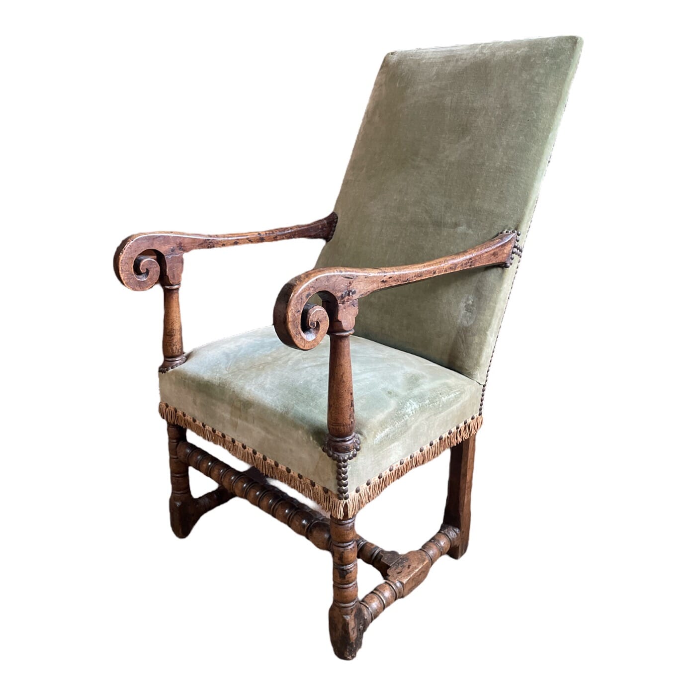
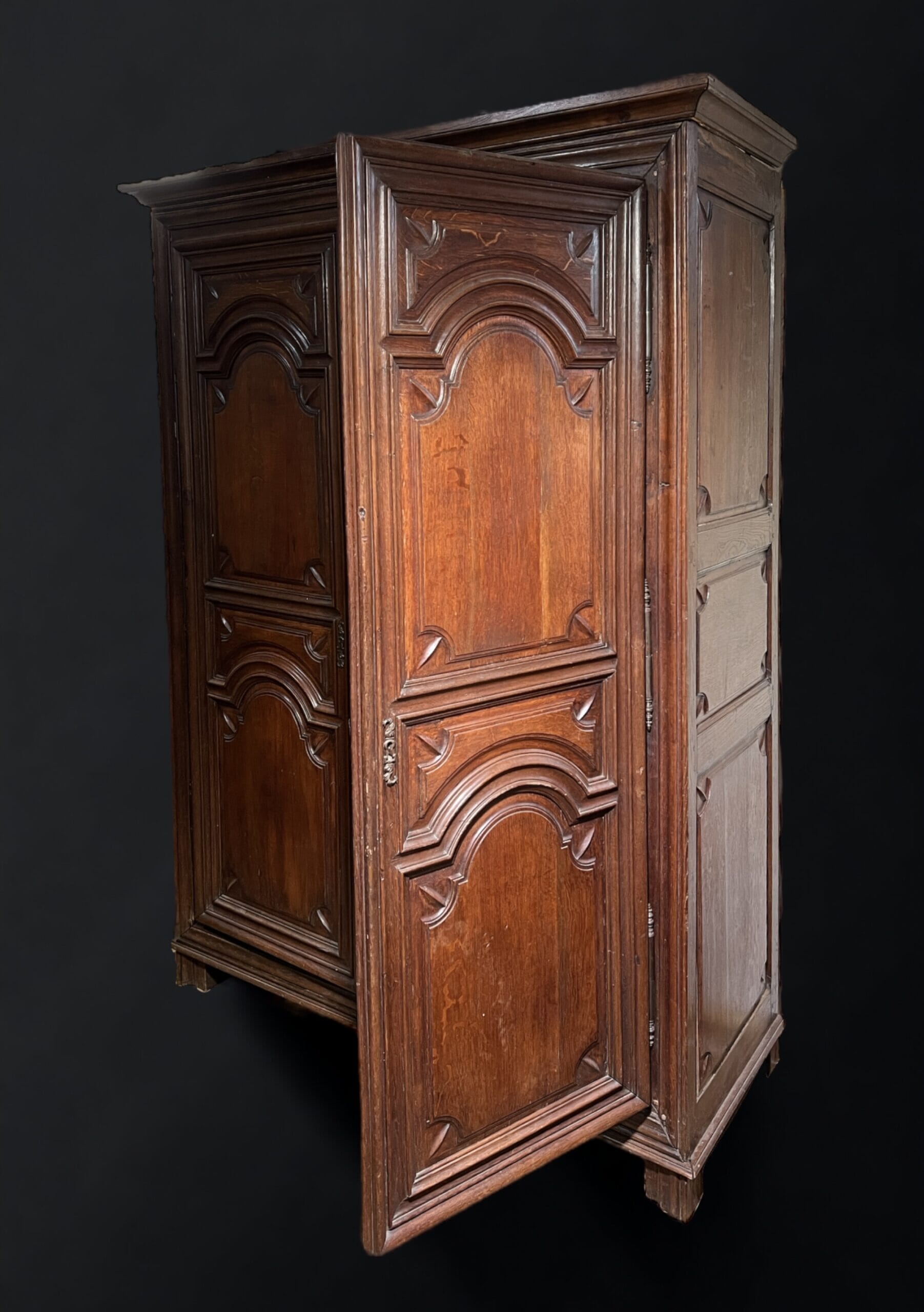
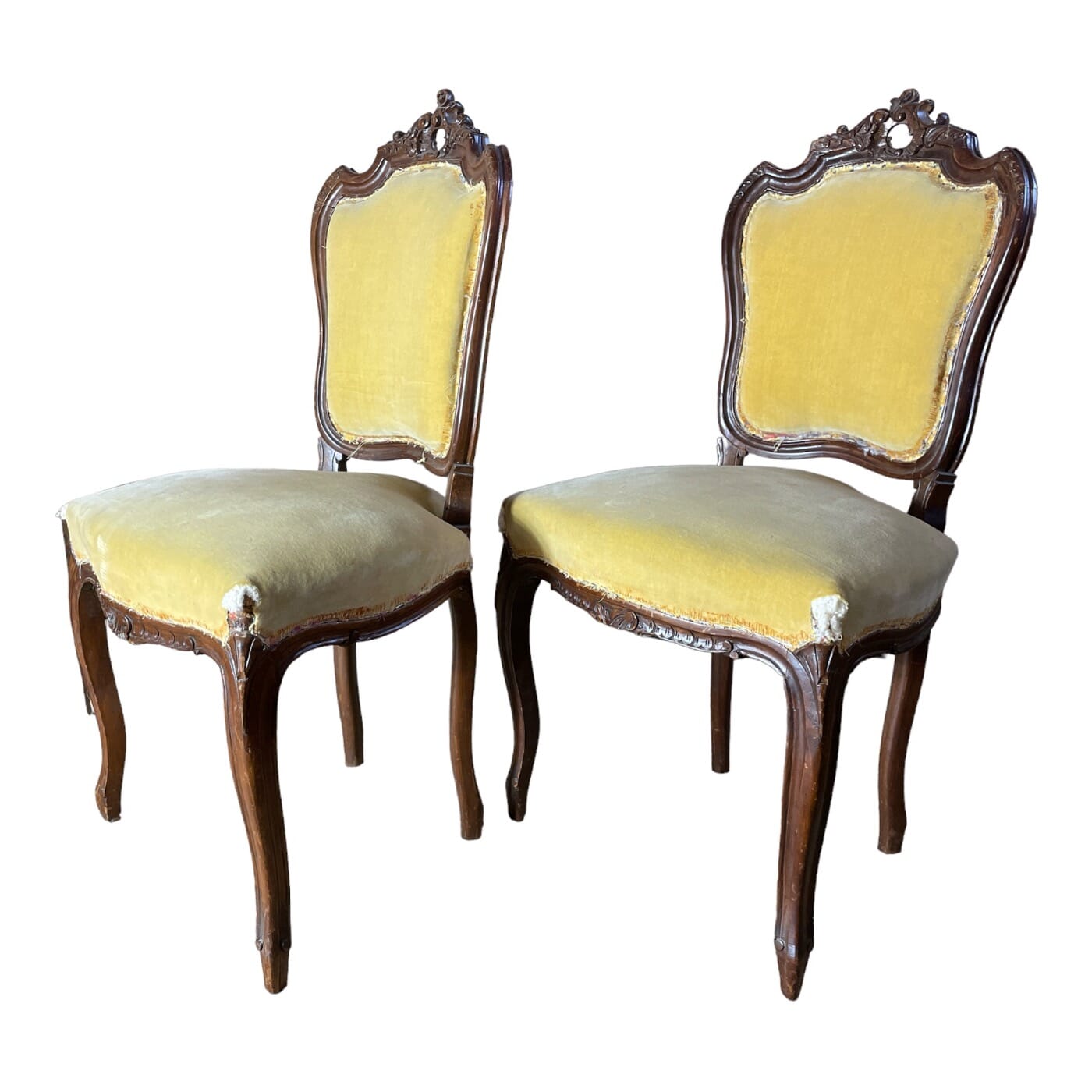
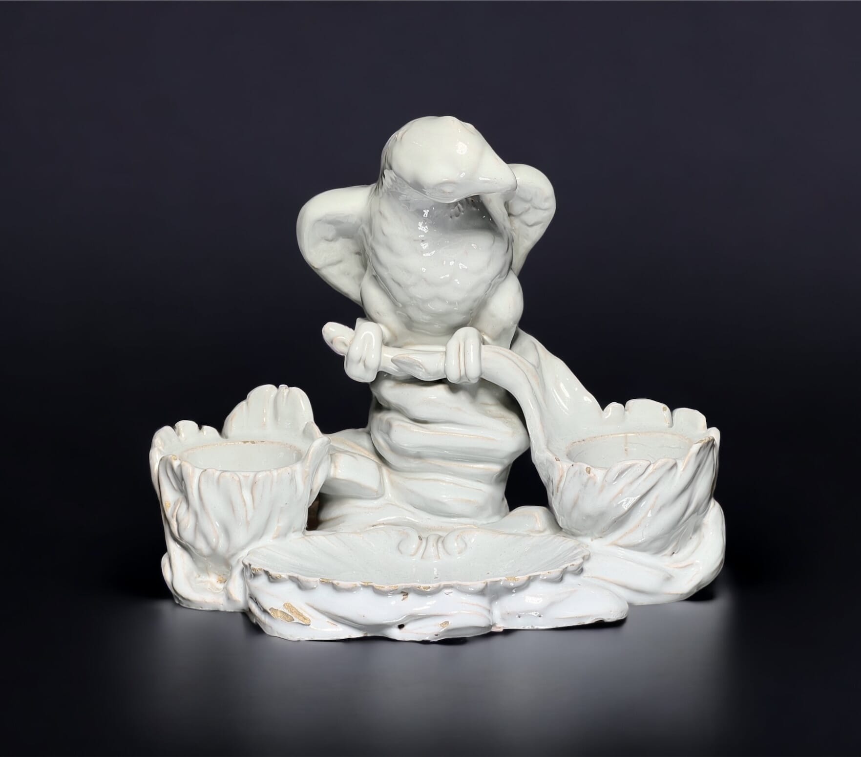
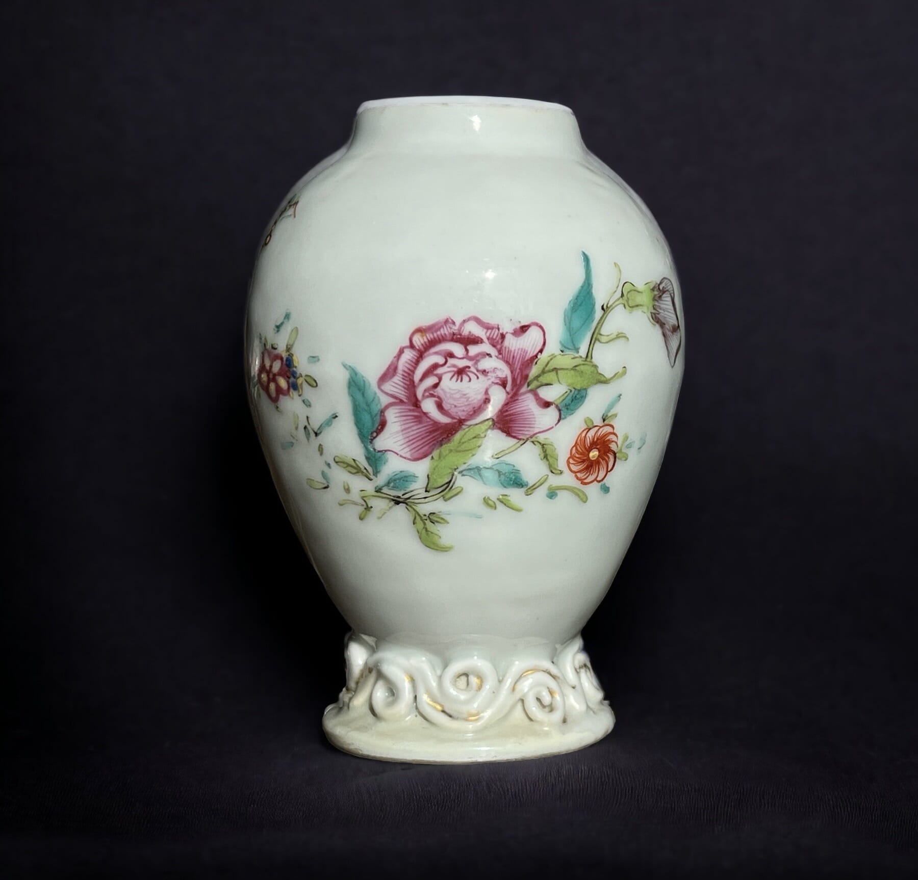
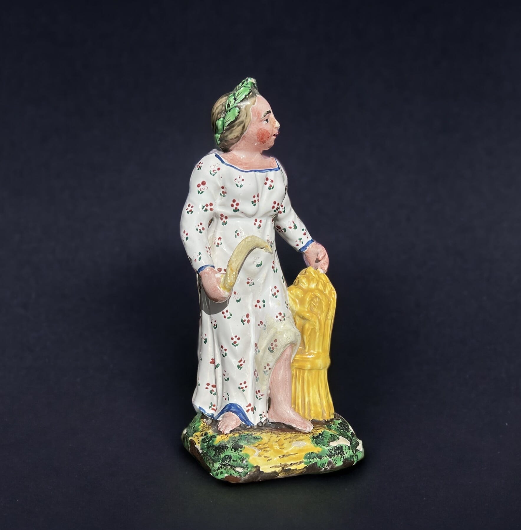
We’re having our own Grand Tour here…. fascinating art & artefacts which caught the attention of the Georgian Gentry, and still have enormous appeal.
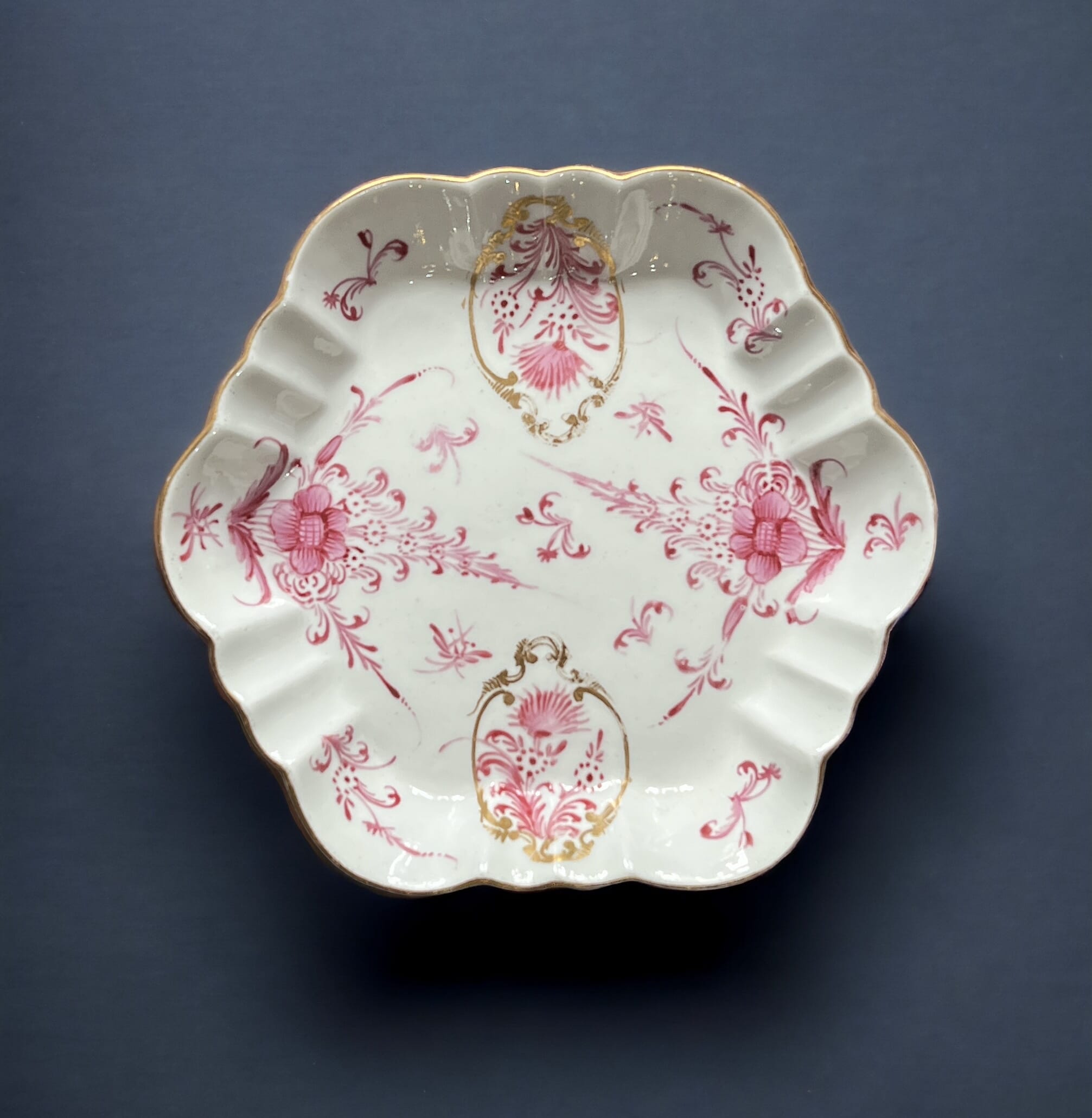
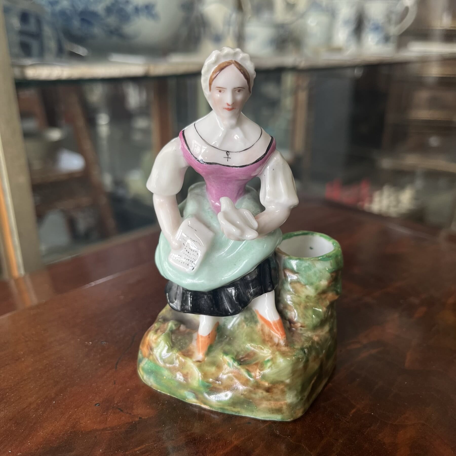
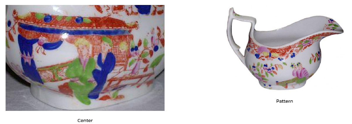
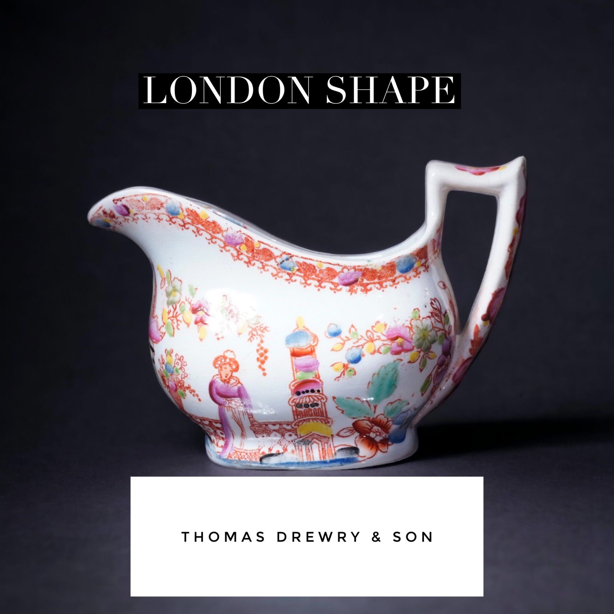
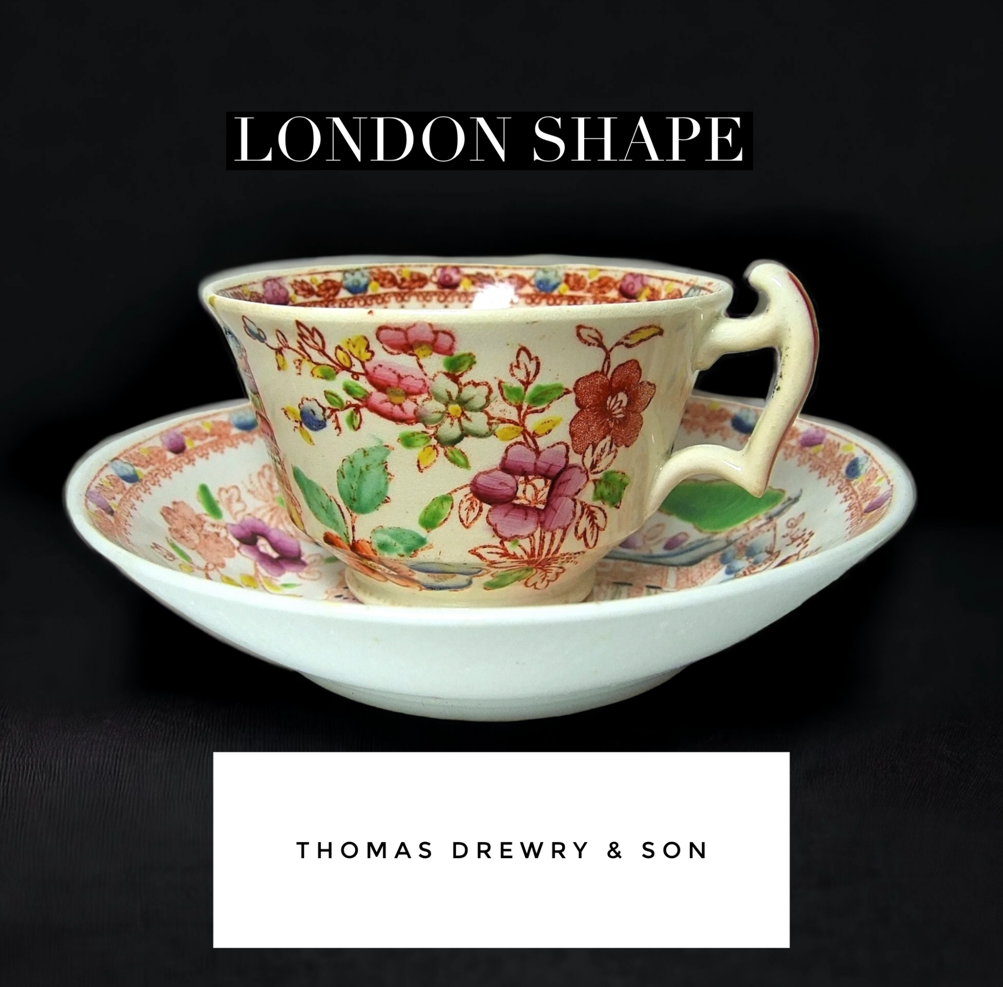
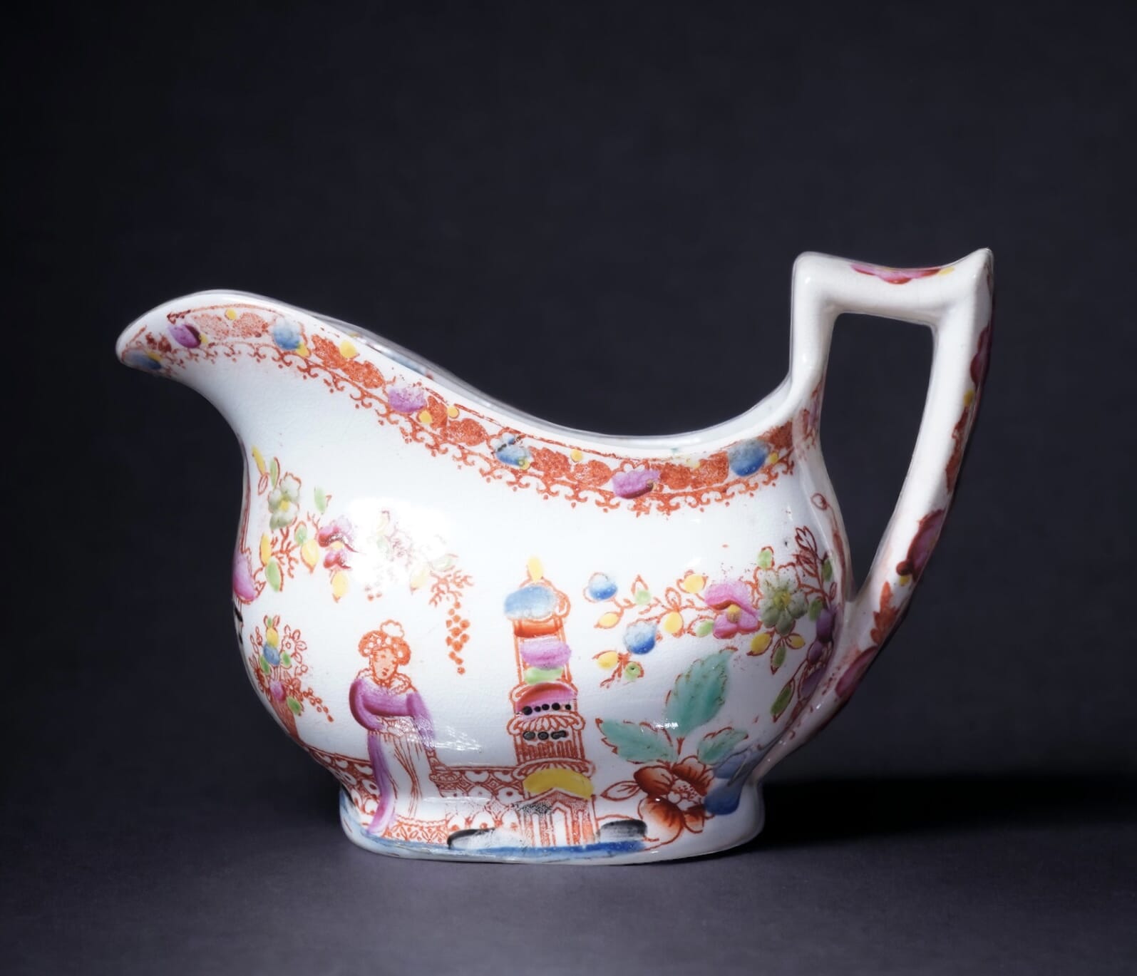
An interesting rarity has just been unearthed at Moorabool.


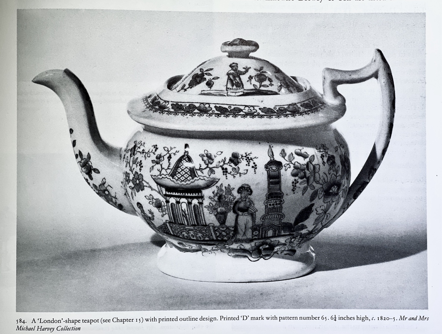
Godden in his ‘Staffordshire Porcelain’ is the initial source of attribution, using the style of piece & pattern to date it to the 1820’s, and then refine it down to two possible makers with ‘D’ surnames. Drewry- also spelt Drewery – is the most likely of the two, in his opinion. They are recorded in the directories 1818, and disappear after the 1830 publication. Godden illustrates the London-shape teapot with the same pattern and ‘D’ mark on p415. Distinct to this maker (apparently not found elsewhere) is the plain handle form, without a spur on the inside towards the bottom; also distinct is the handle wrapping down the body and terminating by touching the actual foot of the jug.
A selection of similar patterns, made by the Hilditch firm. These are identified by marked examples, set out in a 2003 publication, ‘Hilditch Porcelain – A Collector’s Guide’ by Margaret Hewat & June M. Owen.
The similarity to the Drewry pattern is no coincidence; the Hilditch works were located in Lane End, Staffordshire, just over the road from the Drewery works. The engraver responsible for the copper plates used to print the transfer was not exclusively employed by these companies; rather, he would be a freelance operator, taking on the work when it was needed. Somewhere like Drewry would not need his services very often – this was pattern 65, and such printing plates could stay in use for many years before needing replacement. If you examine the details of the prints of these Hilditch products, and the other similar works such as Newhall, it is clear that the same engravers are at work for multiple firms – making this marked example an important clue to unravelling the correct attribution of these charming transfer printed wares.
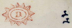
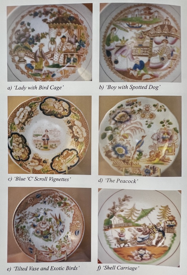
This pattern is recorded by the Transferware Collector’s Club database as pattern #2552, titled ‘Pavilion & Tower’ ( no. 65) by Thomas Drewry & Son, Lane End, Staffordshire. A related pattern is their #3327, a pattern known as ‘Tea House’ (See photo below). In the documented example, there is a number next to the mark – as there is with this example & others of this pattern that have been recorded, all ’65’. Clearly this is the pattern number for this pattern, 65.
The numbers on the ‘Tea House’ example are interpreted as ’44’, but seem to more likely be meant as ’77’ – just a few patterns along from this ‘Pavilion & Tower’ pattern. Comparing the two reveals a very close look.
This piece is a fine example of how time disappears in this field: unravelling the above story took quite a while, with widespread resources to consult and bring together to tell the story. And yet, look at the price: Rarity doesn’t necessarily mean ‘expensive’ !

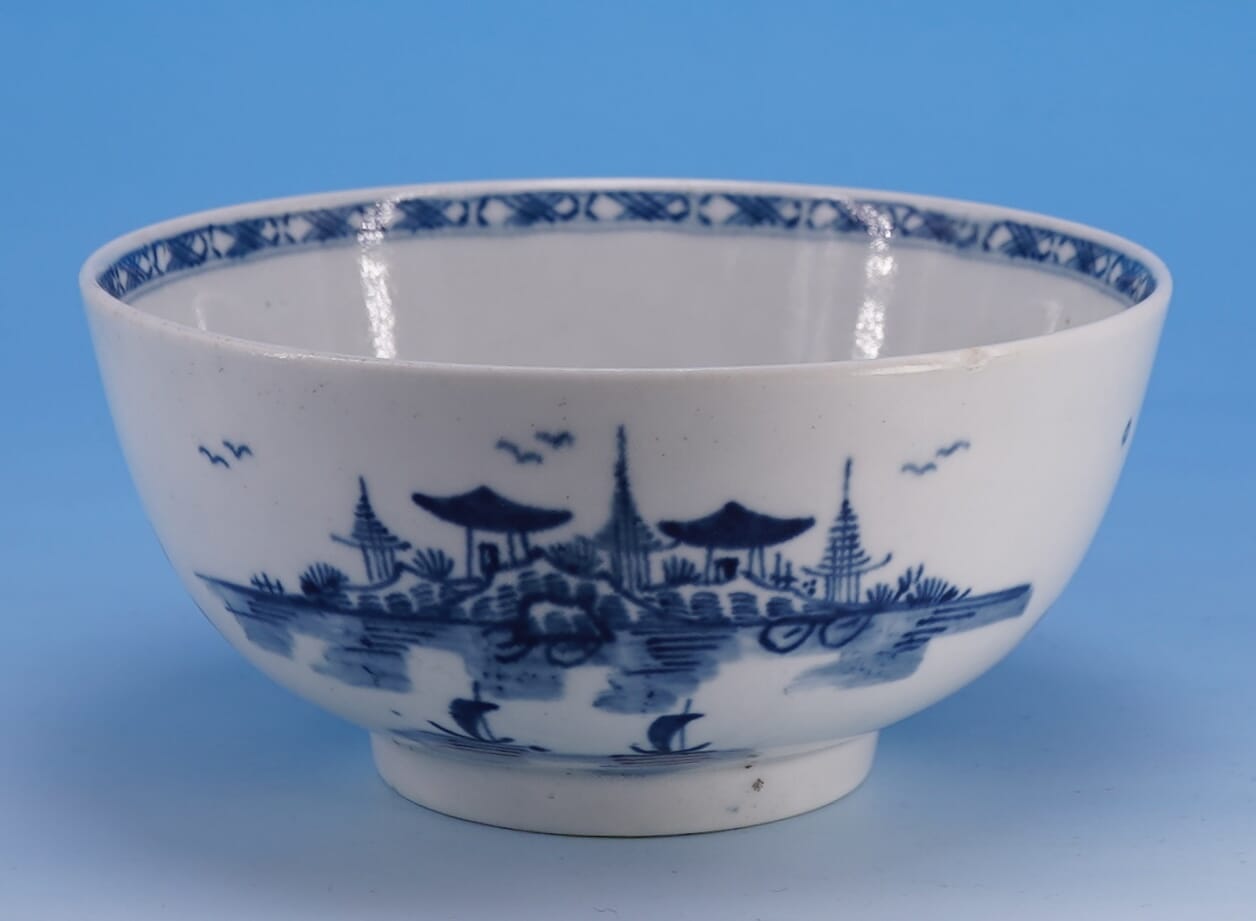
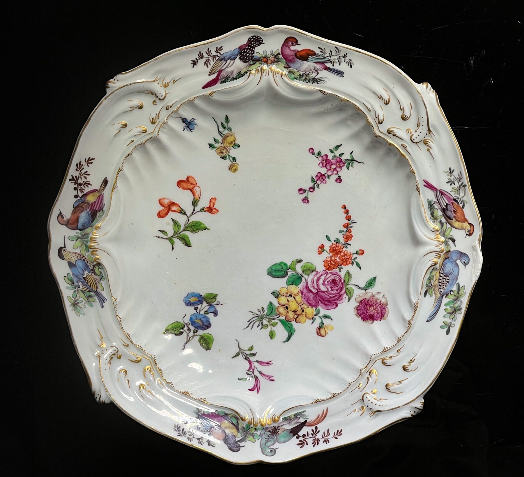
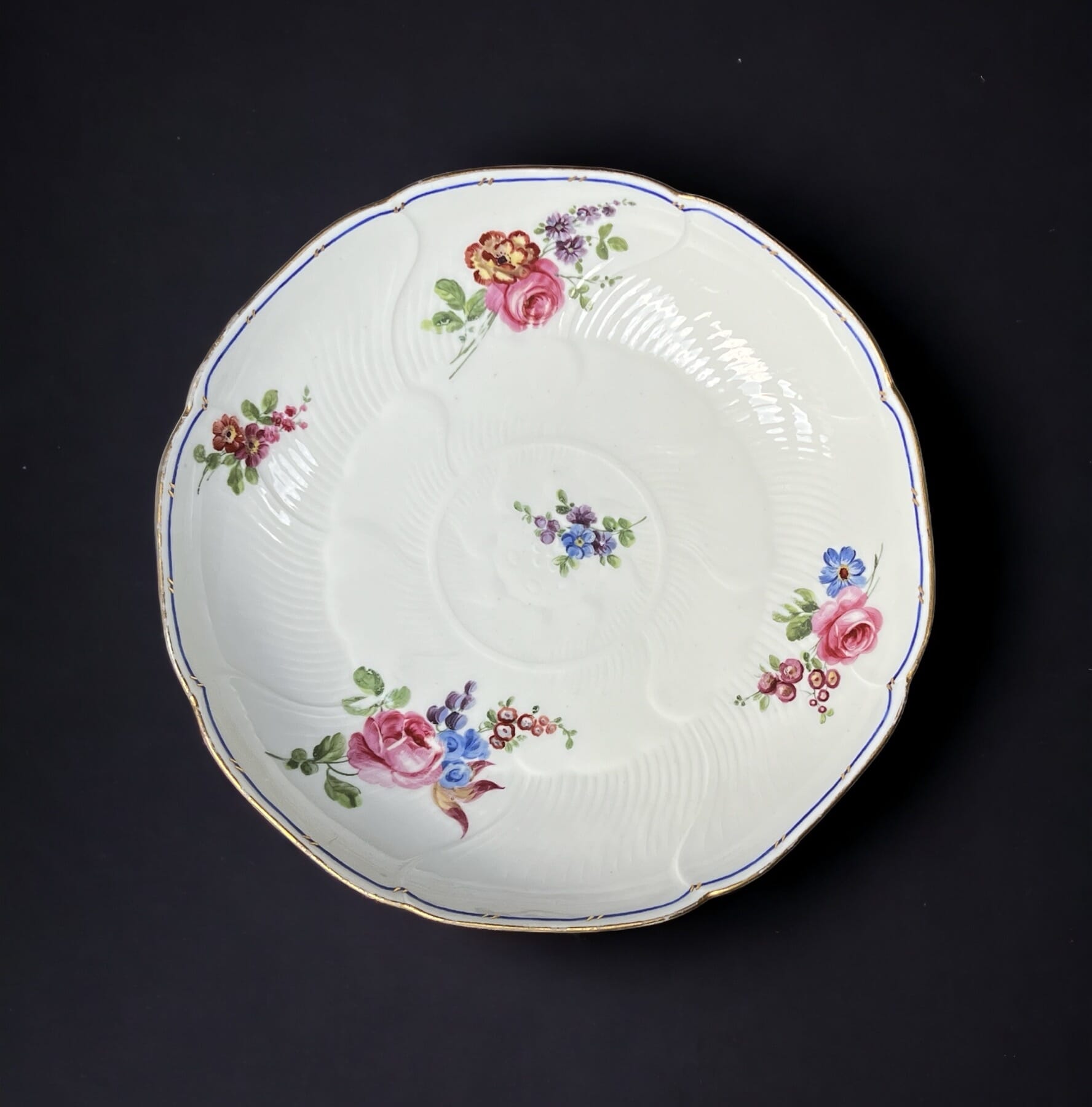
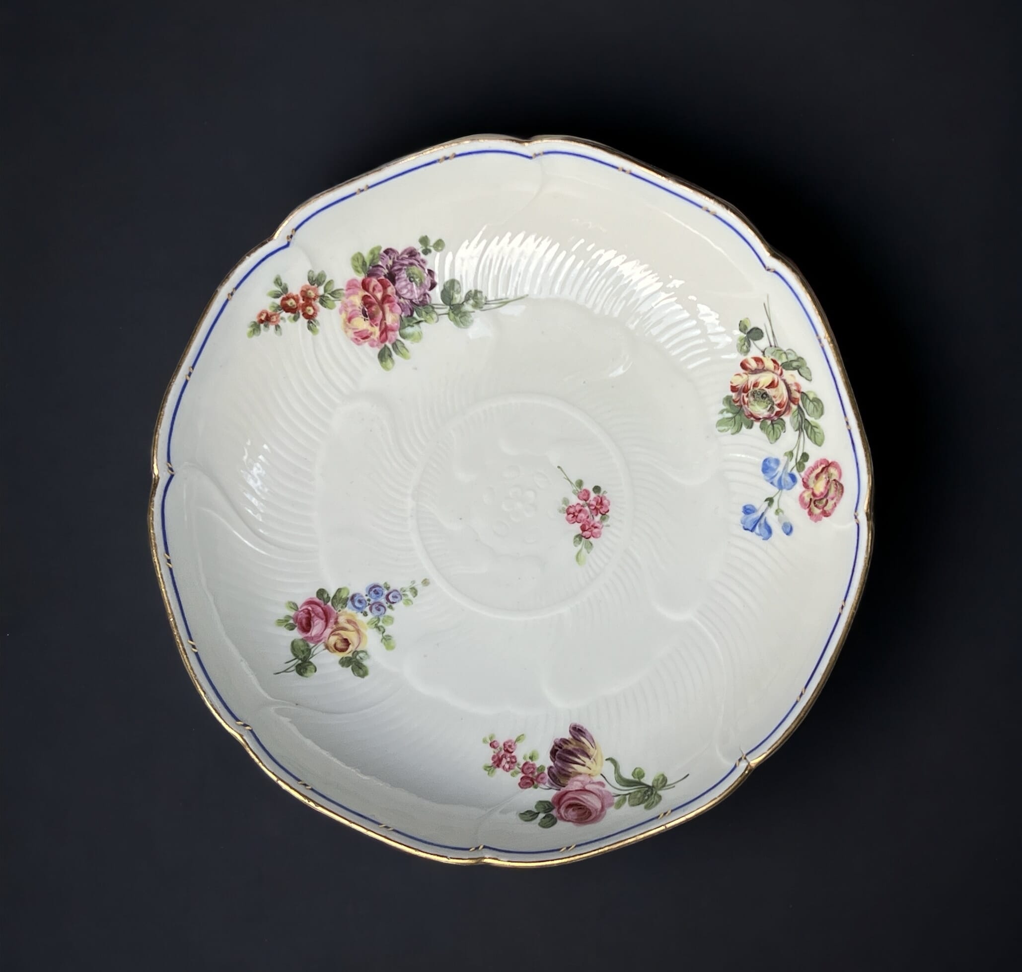
There’s a fine selection of Fresh Stock to browse, from Victorian Glass to 18th century Worcester.
And there’s just two days to make the most of our 15% off sale, ending tomorrow!

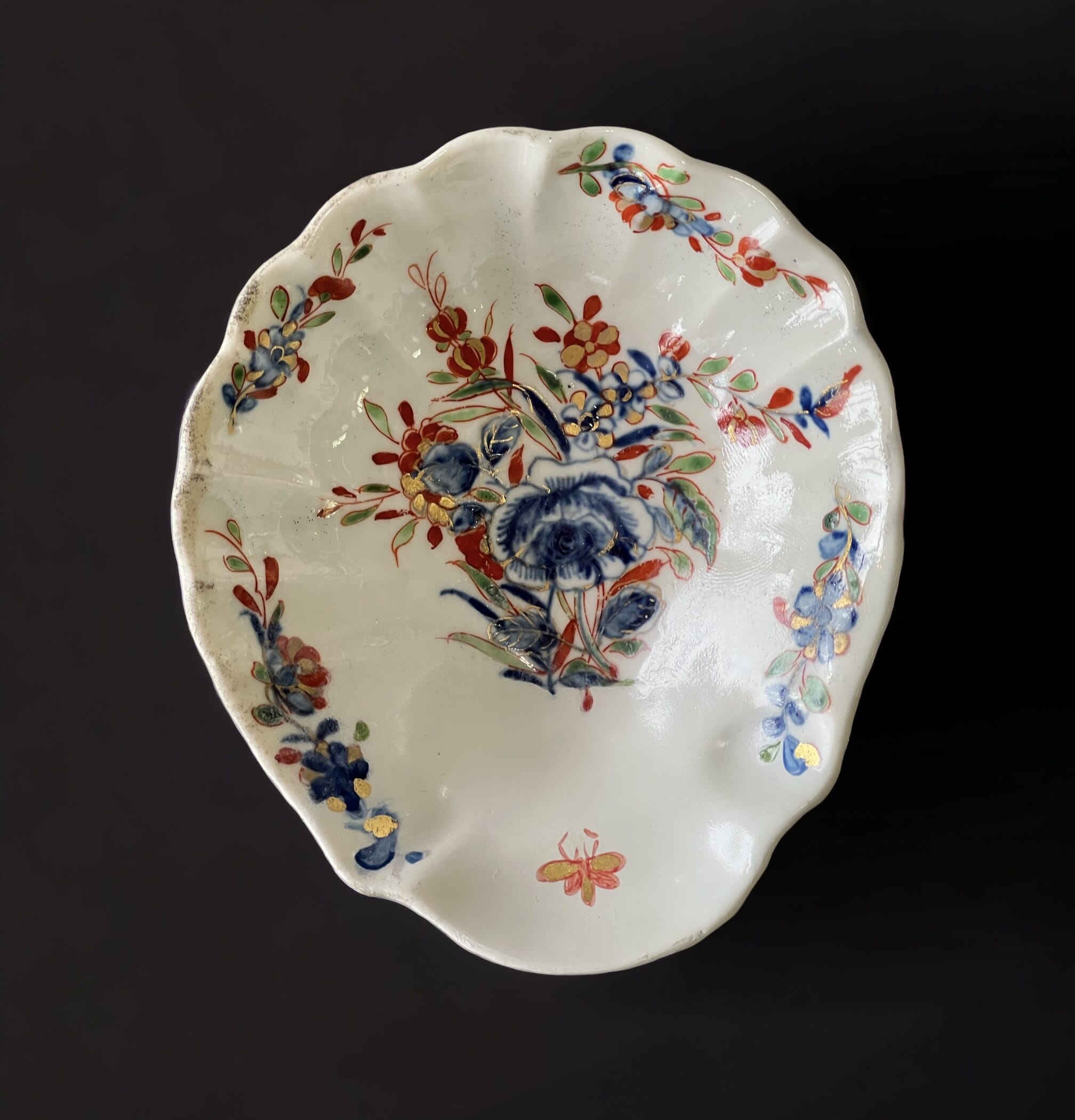
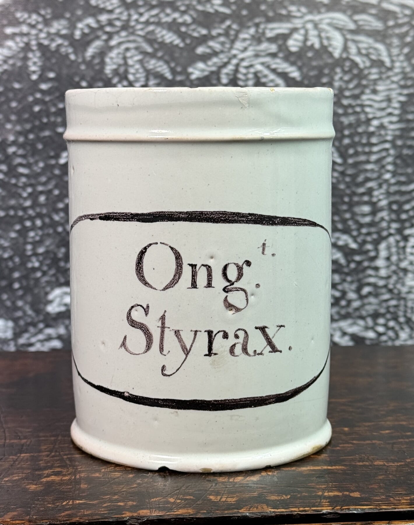
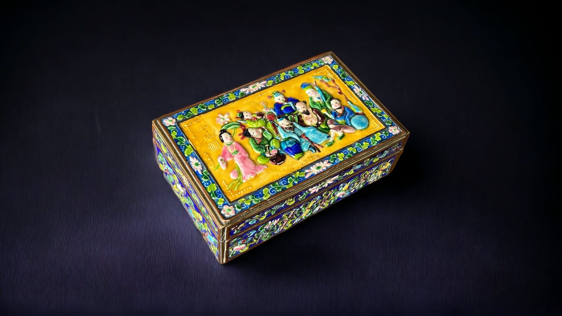
Chinese, Japanese, Vietnamese… some terrific pieces Fresh to stock.
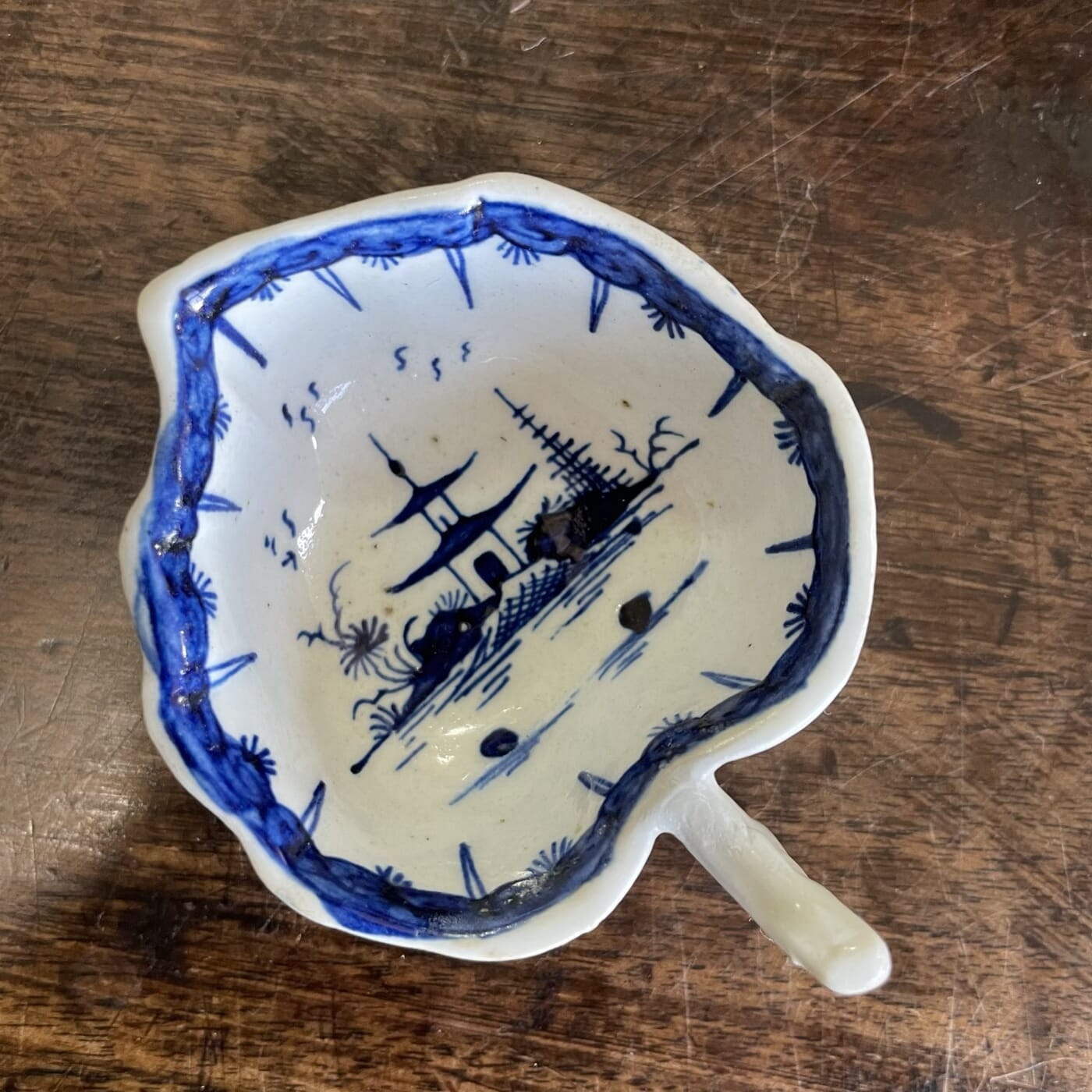
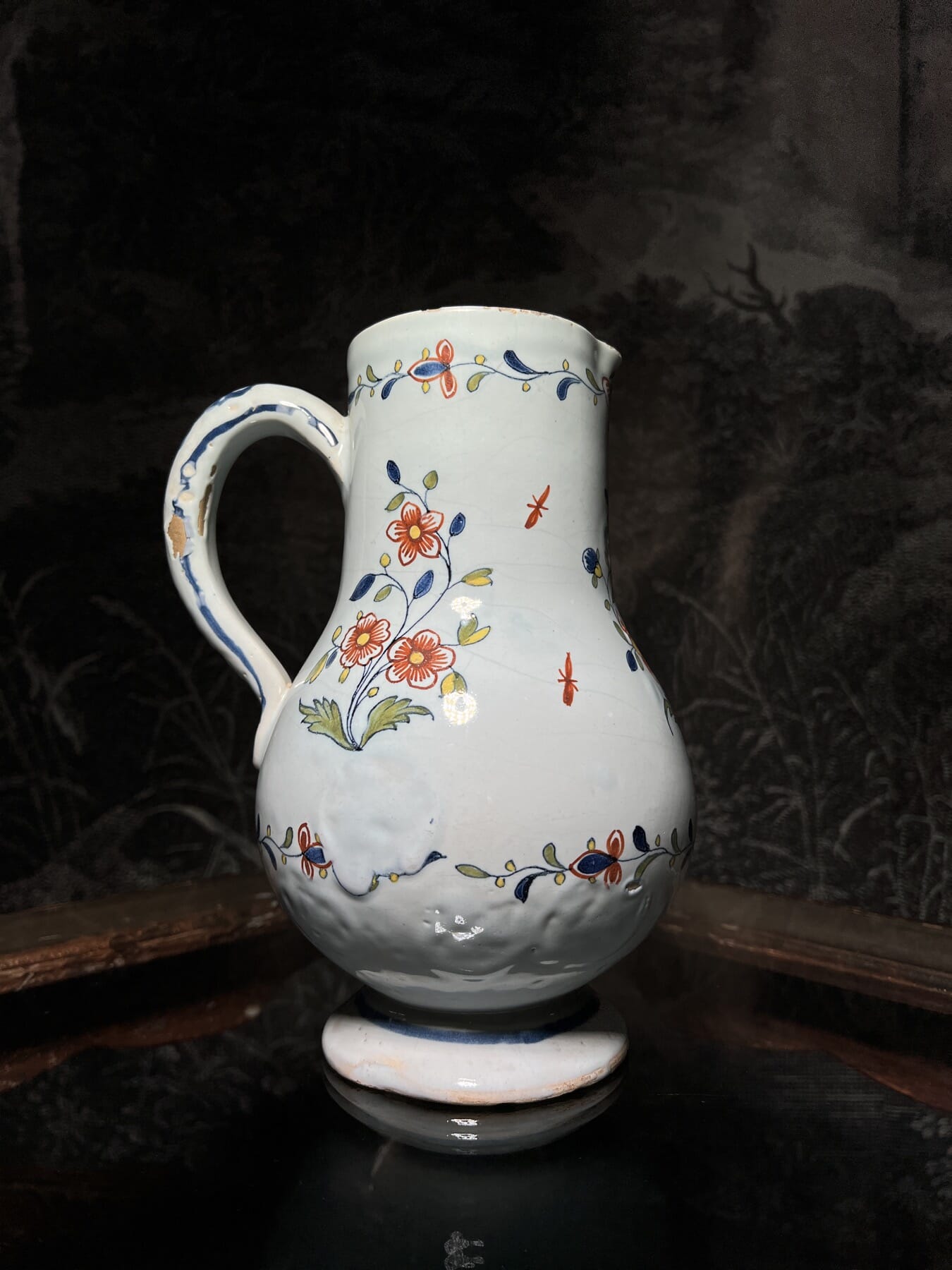
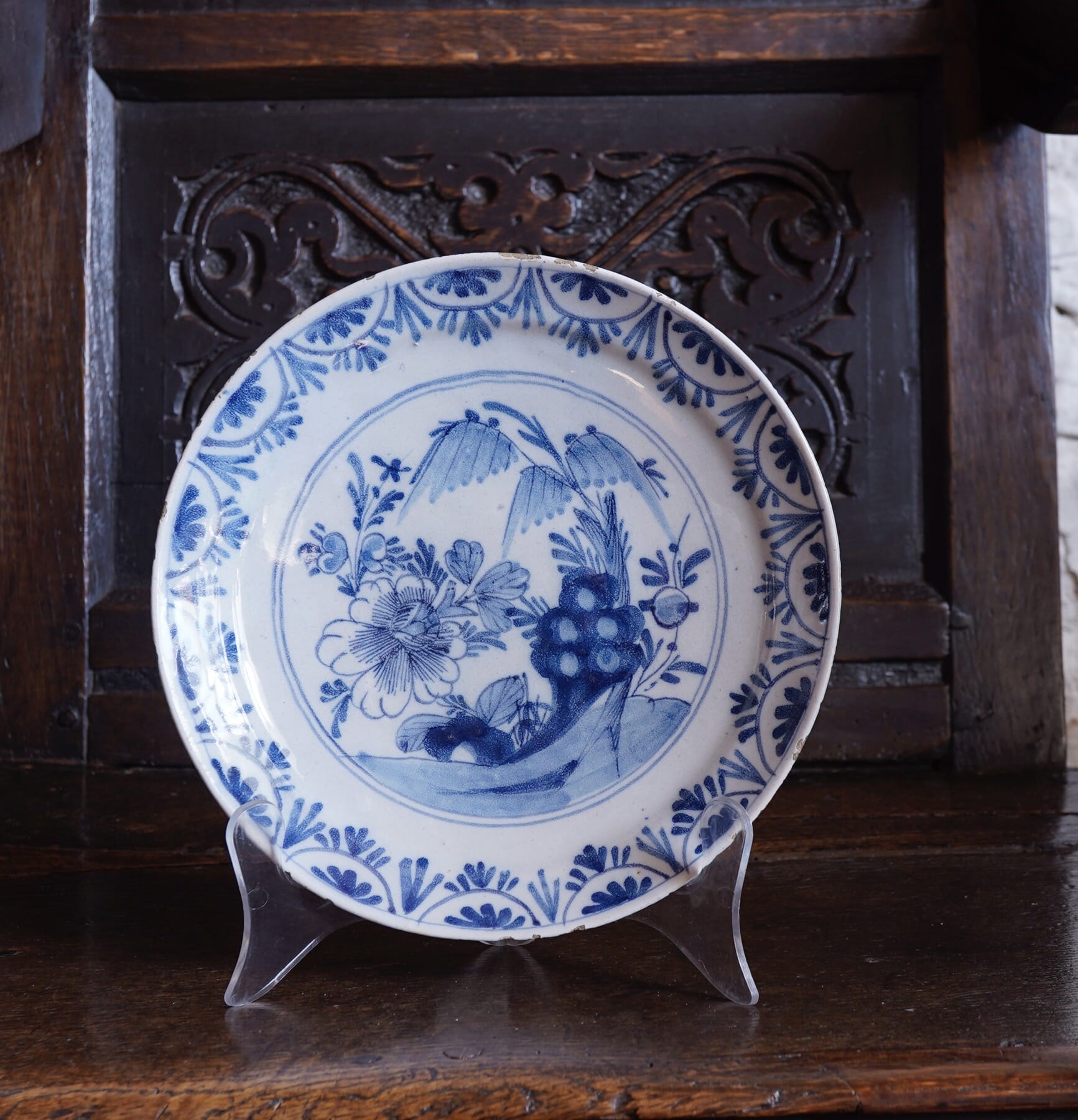
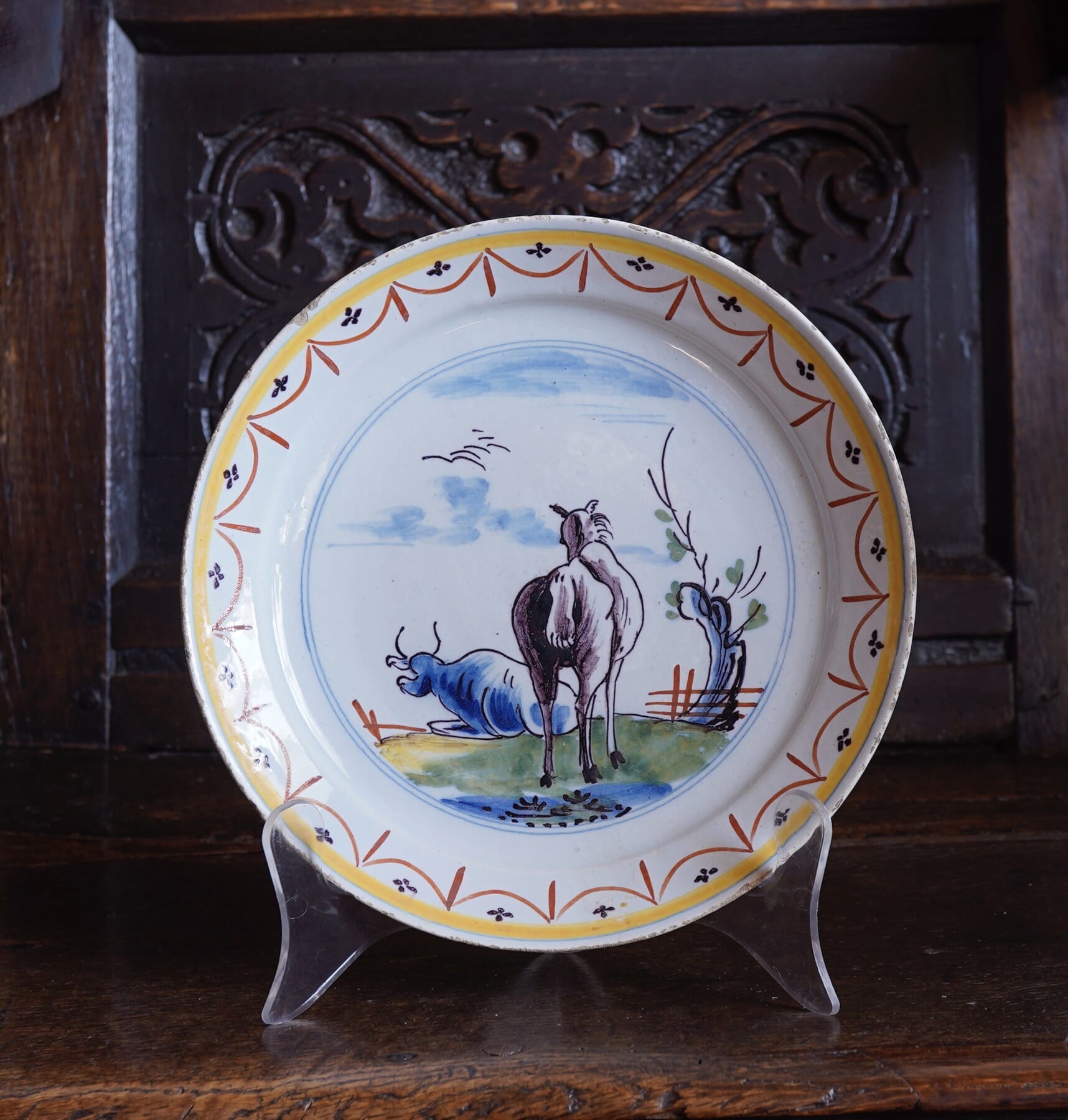
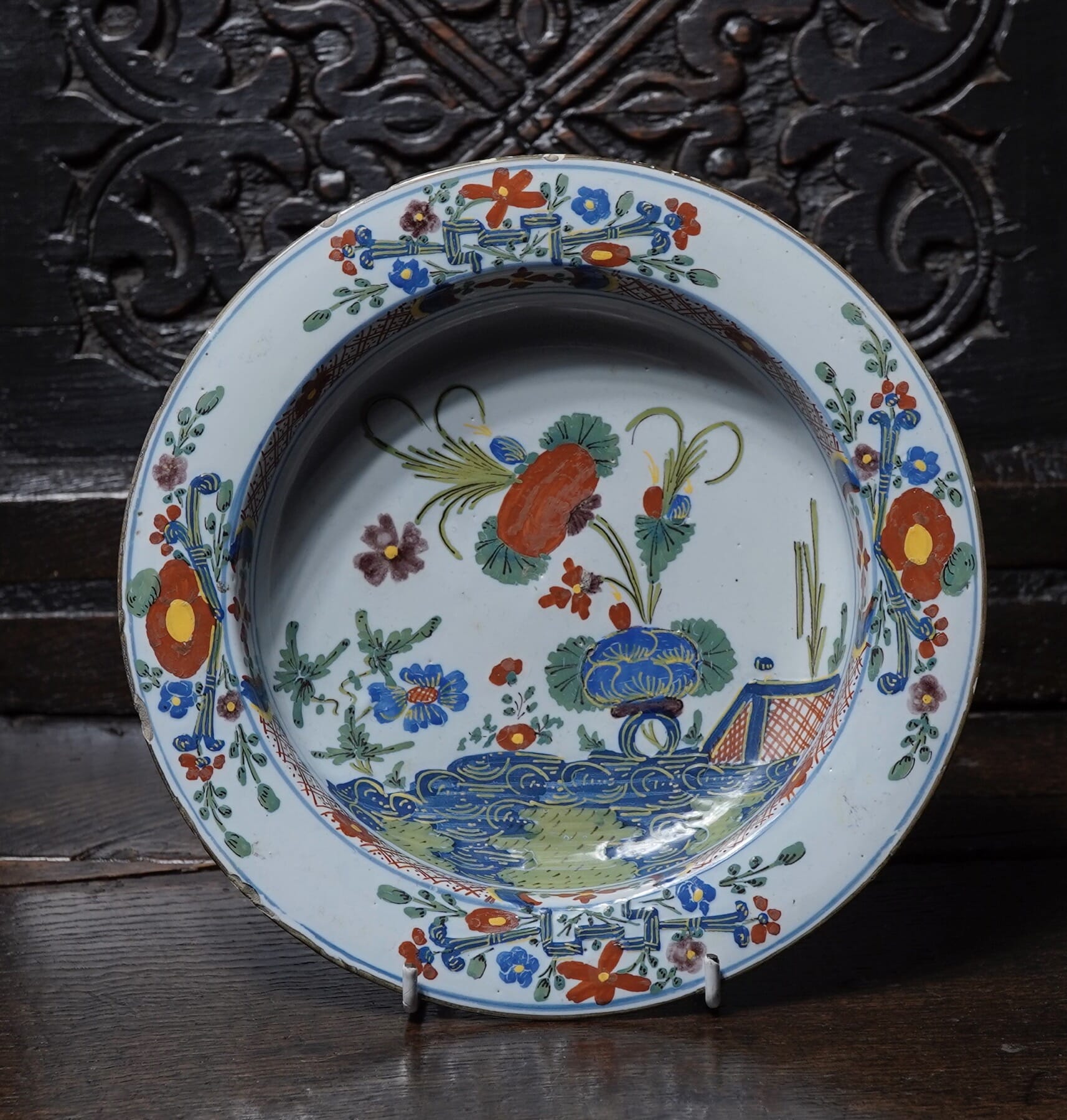
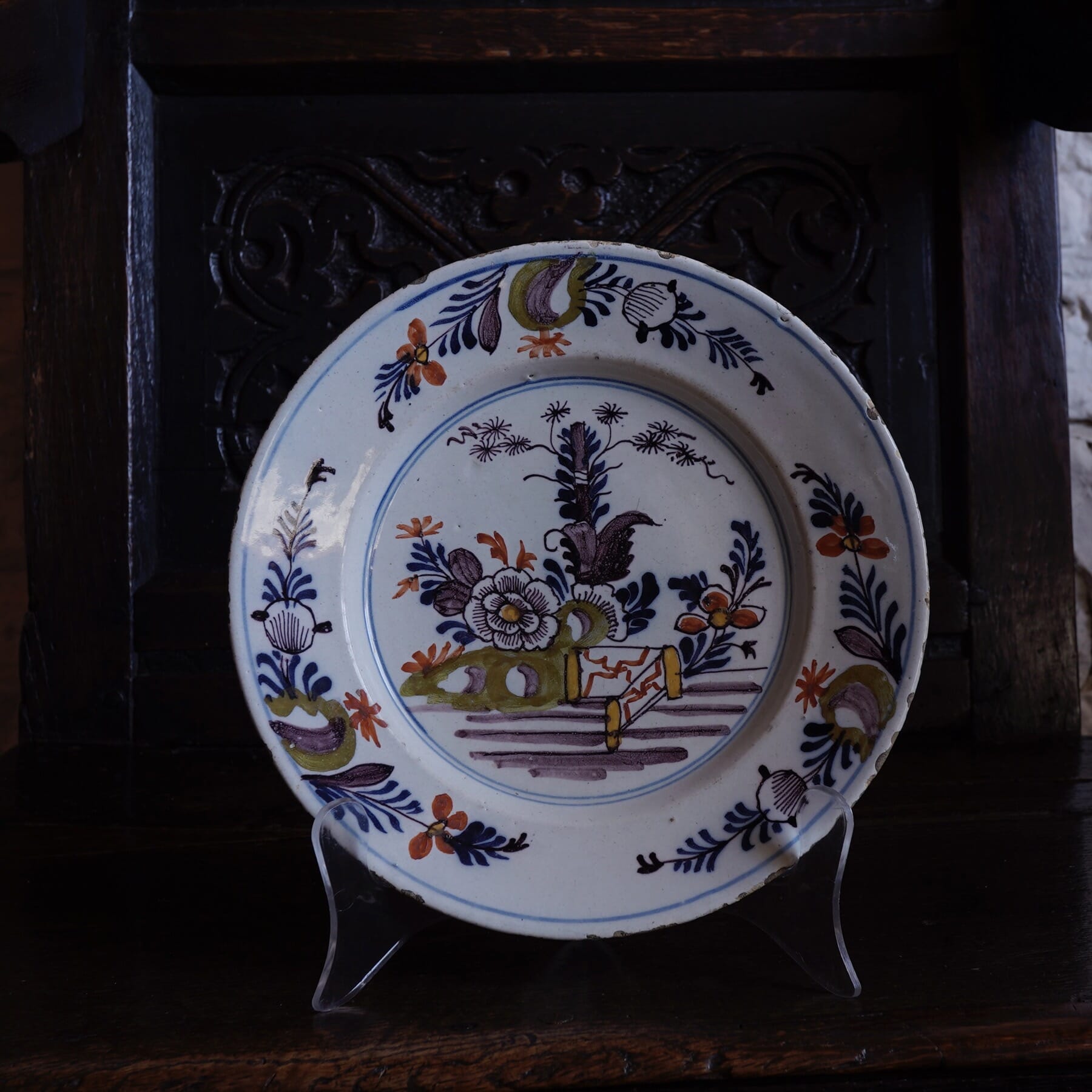
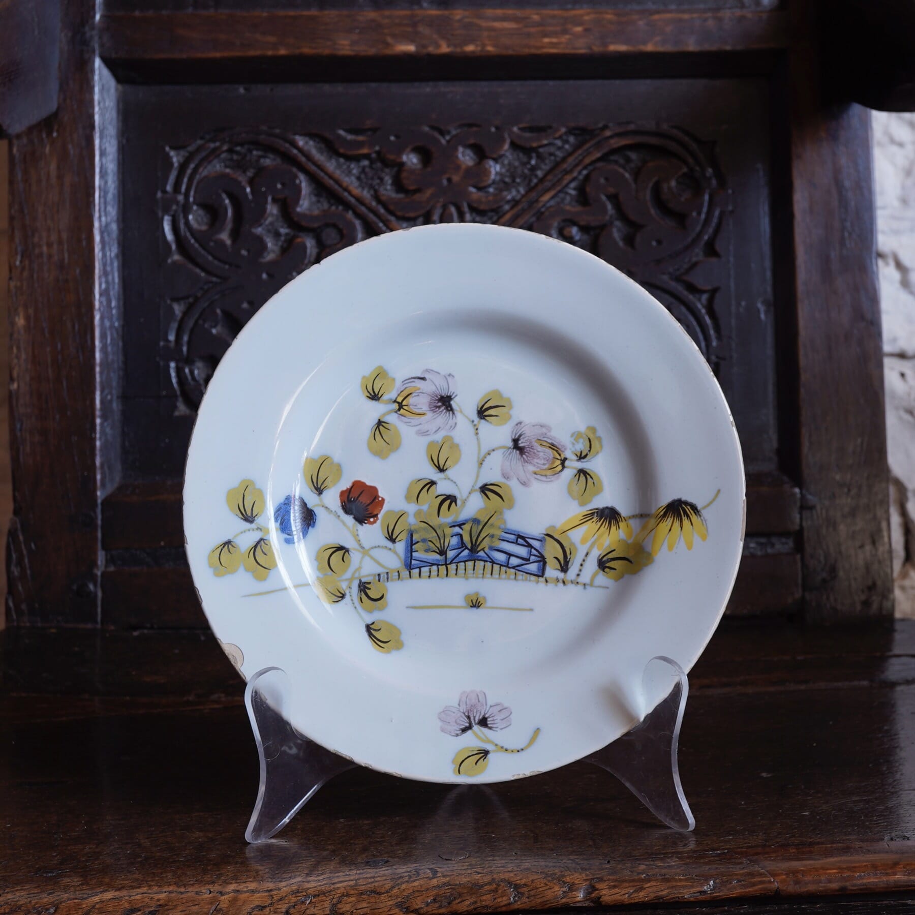
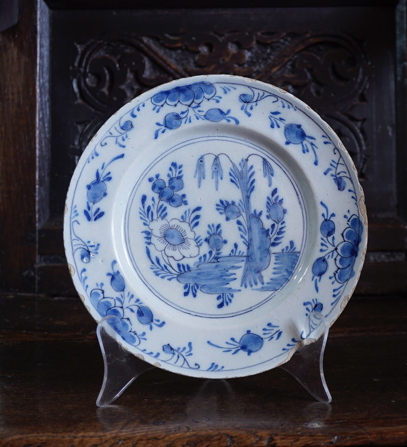
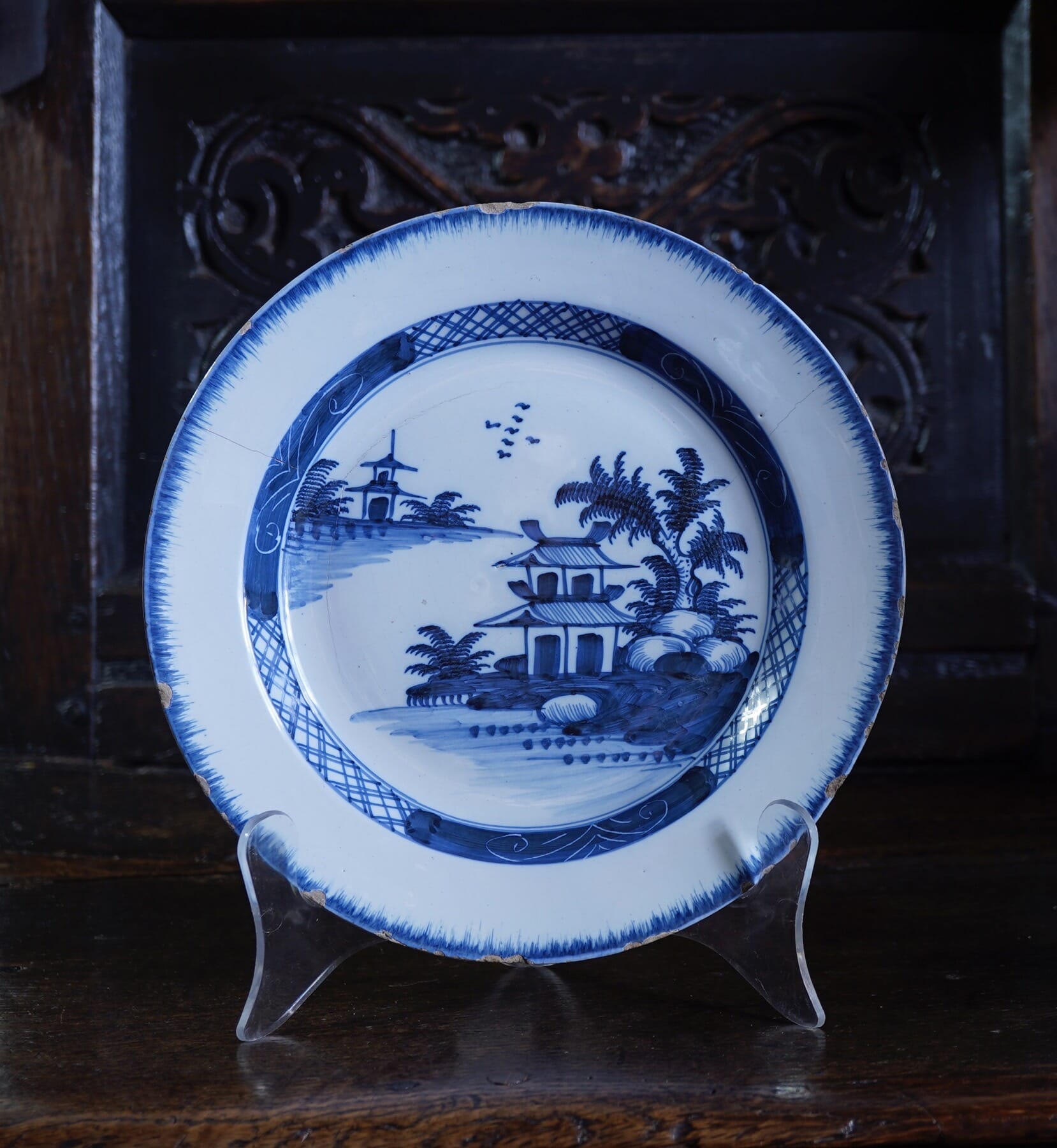
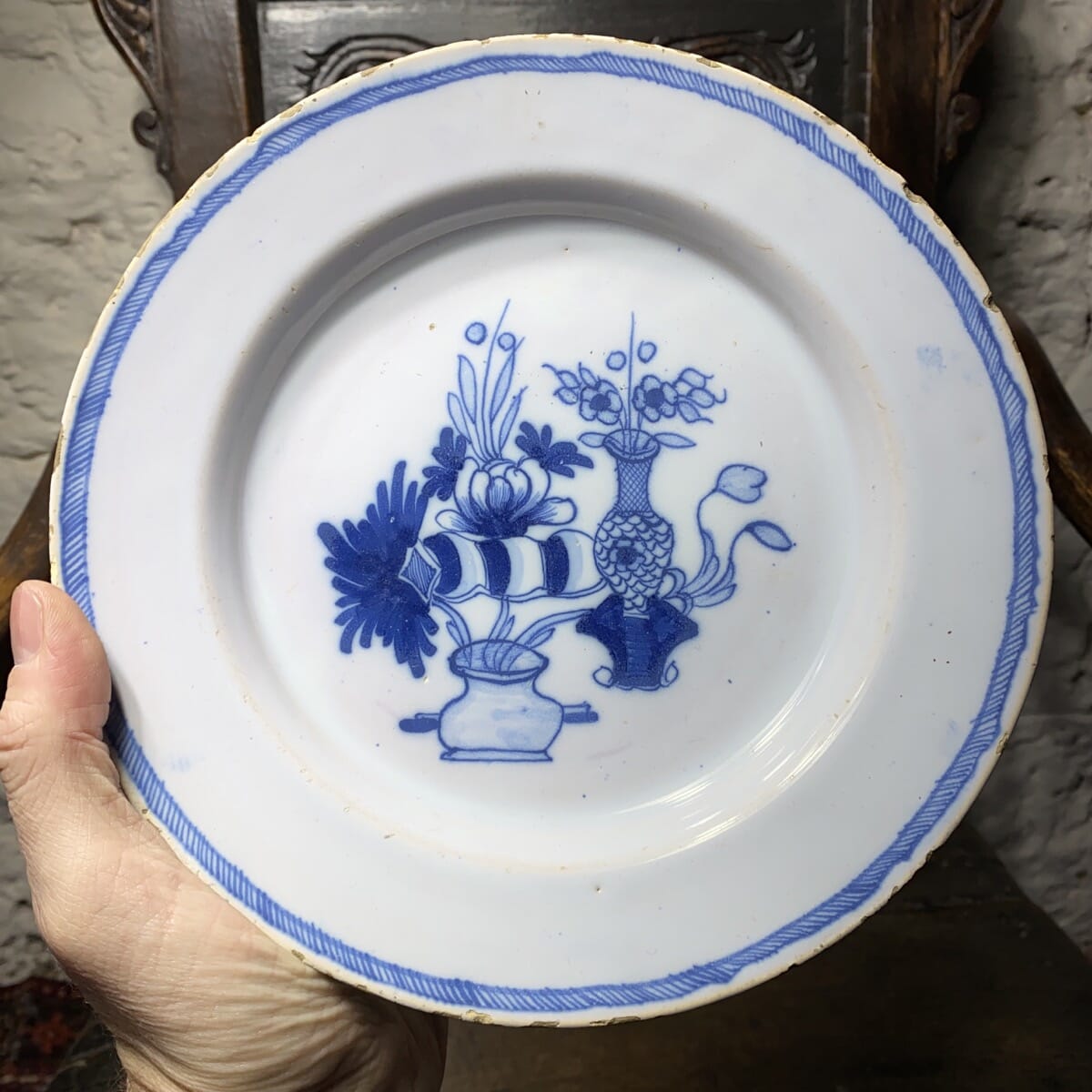
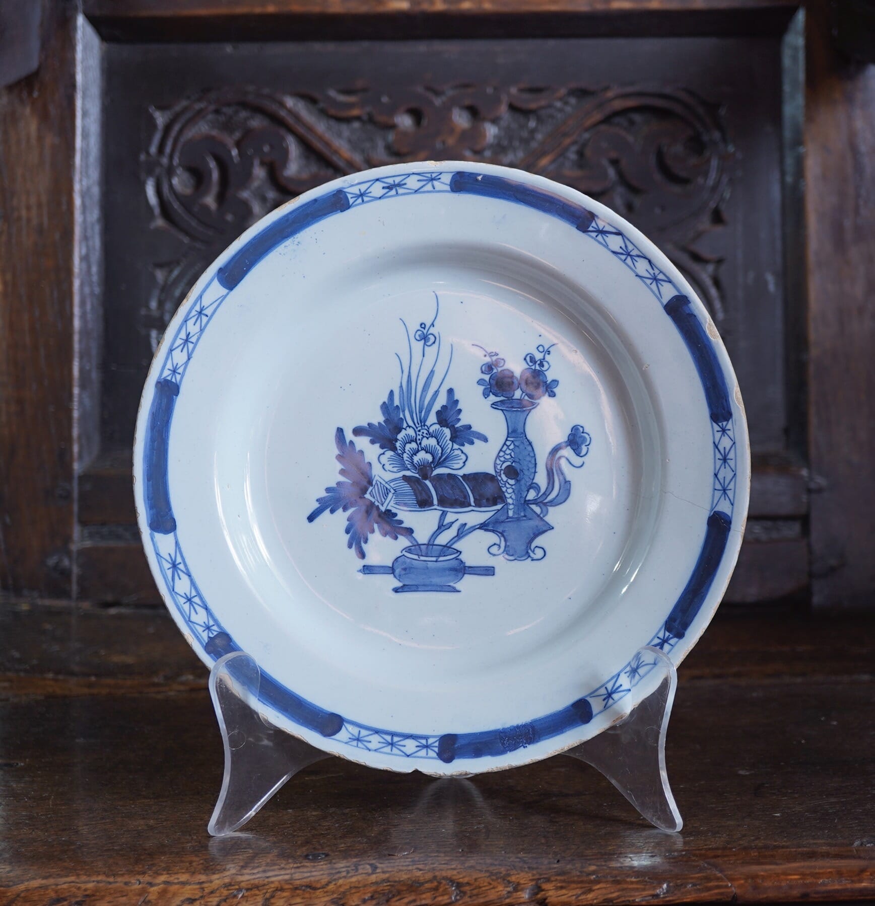
We have some Fresh ‘Delft’ and ‘delft’ pottery.
What’s the difference? -Capital D is for the Dutch Delft, while the English version is designated a lower-case ‘d’. France calls it ‘Faience’, Germany ‘Fayence’, and Italy ‘Maiolica’.
Of course, it’s all the same technology: Tin oxide (a white powder) is added to the glaze to make it opaque and white, similar to the more technical porcelain. The reason can be seen when there’s a chip that reveals the clay body underneath: inevitably, it’s a coarse reddish-brown colour, nowhere near as attractive as the tinglaze white for a background.
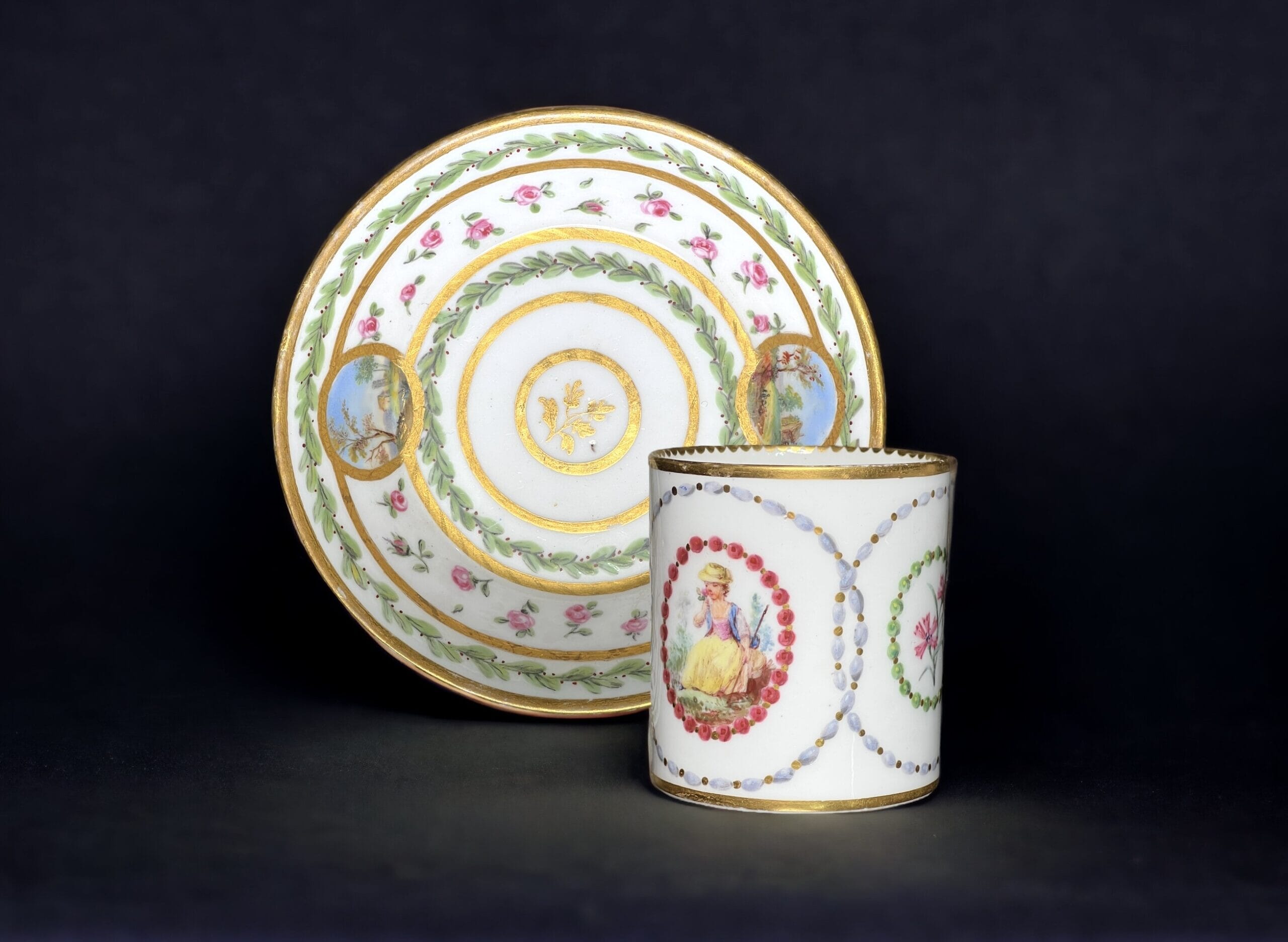
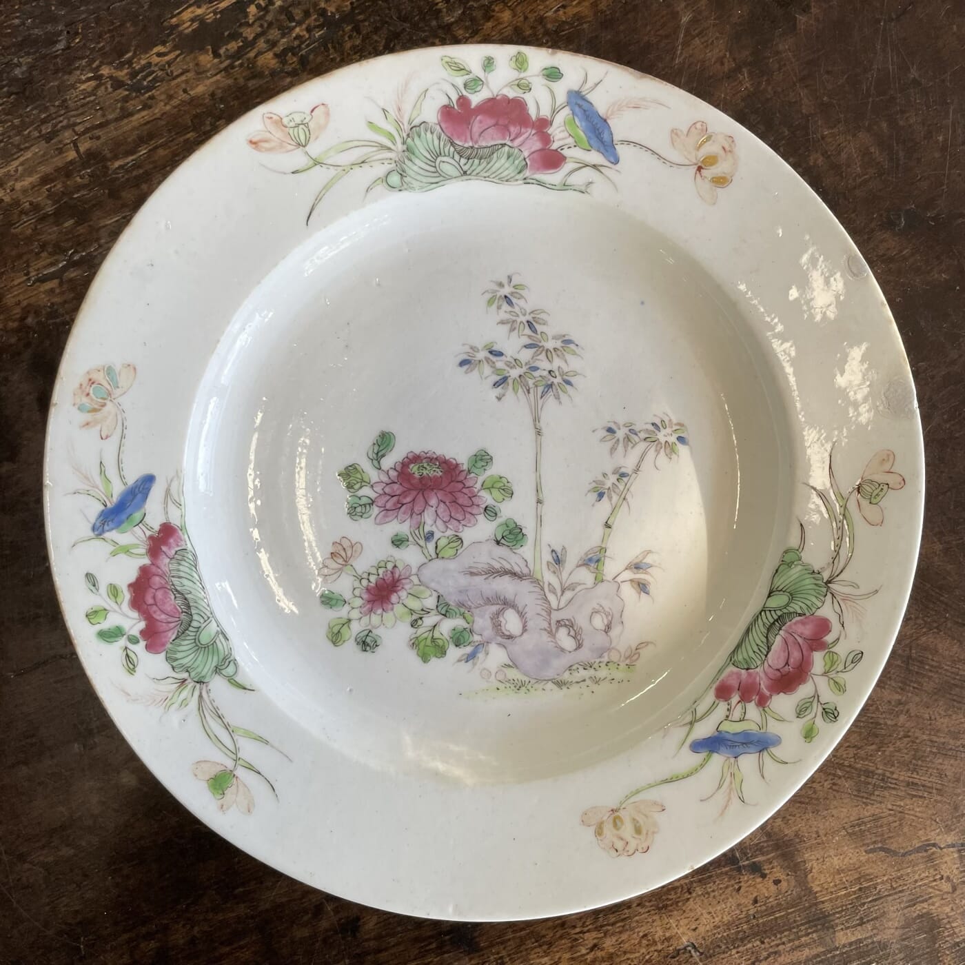
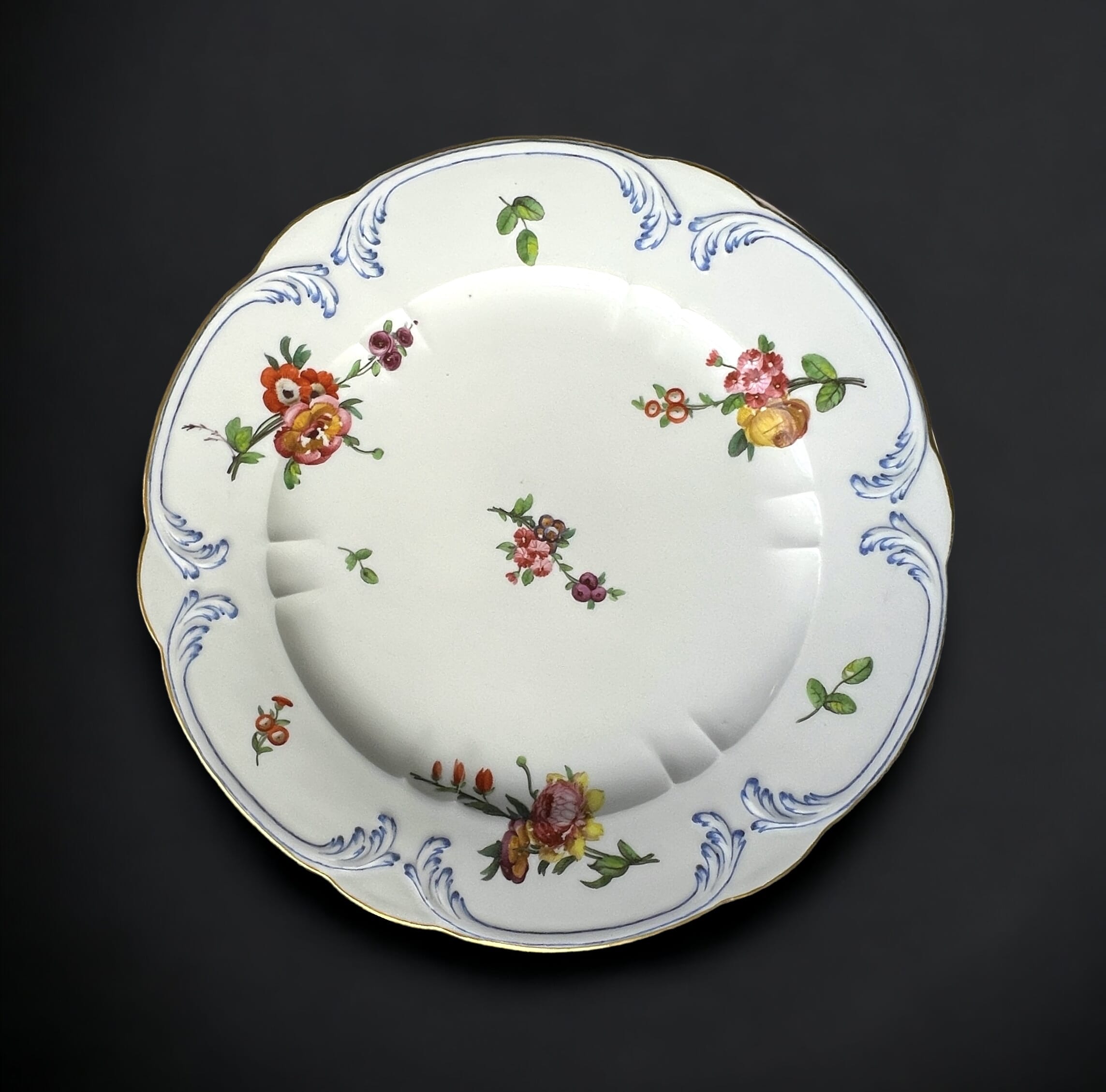
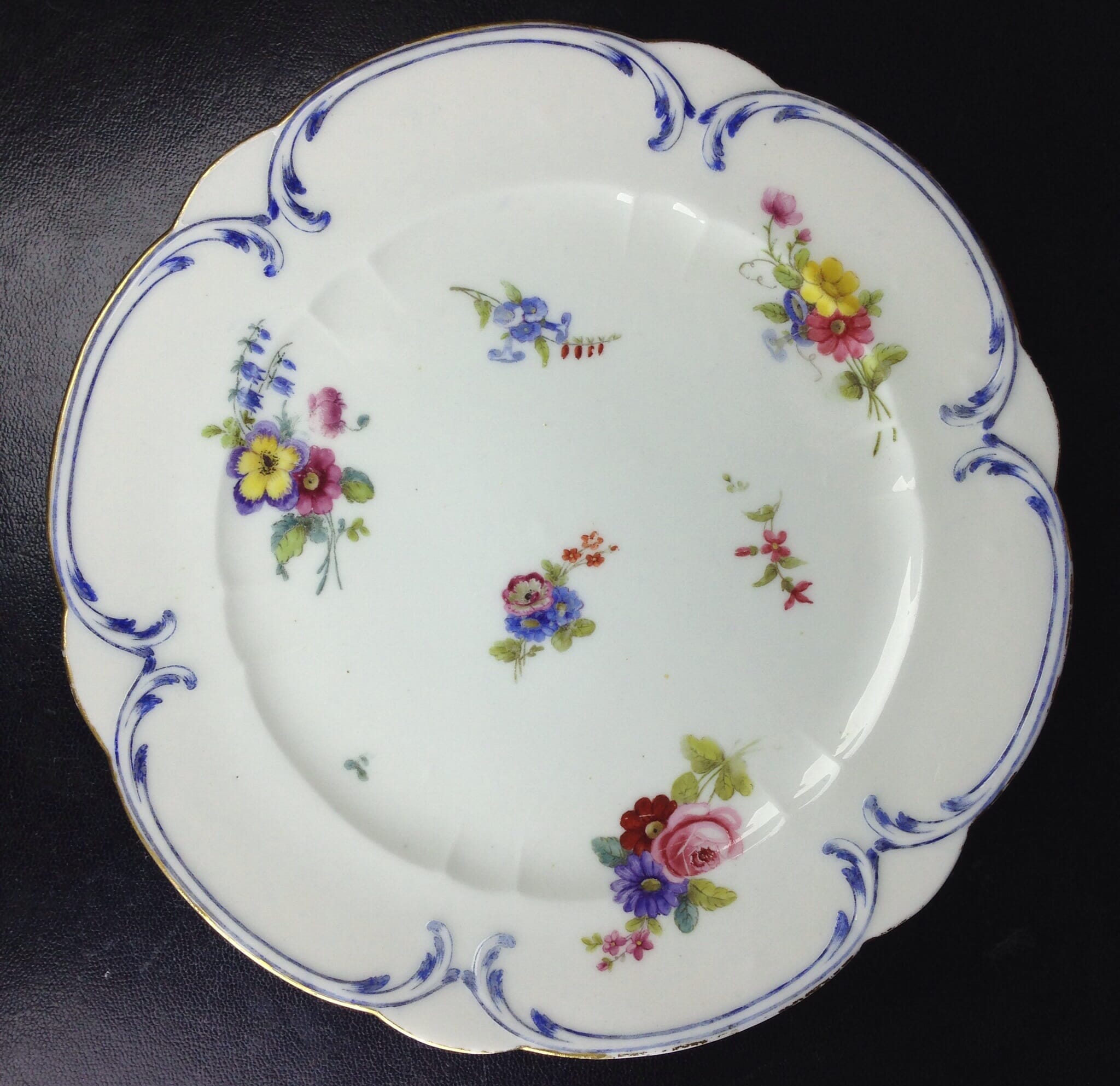
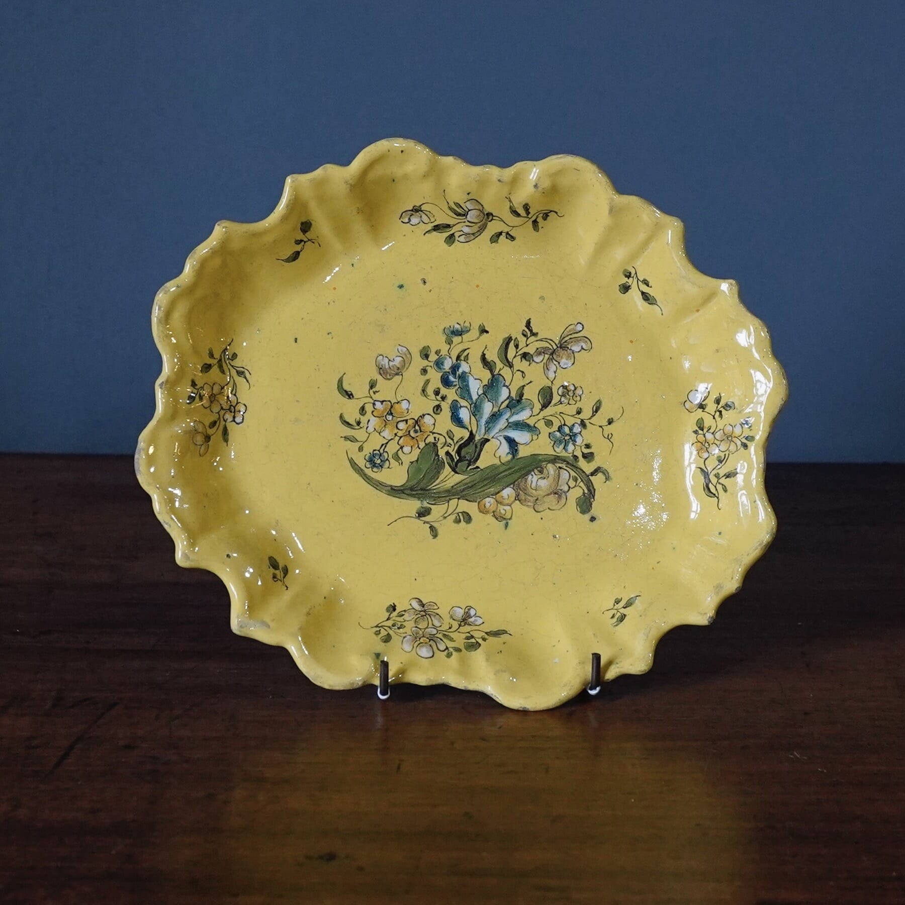
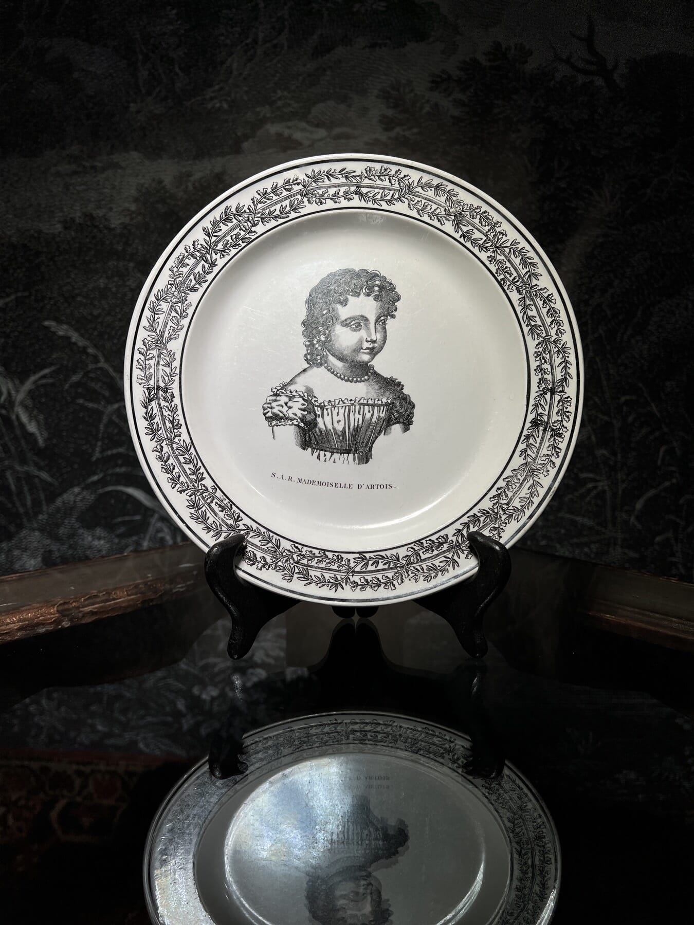
A fine selection of 18th century English & Continental Ceramics, including some ‘Superb Sèvres’.