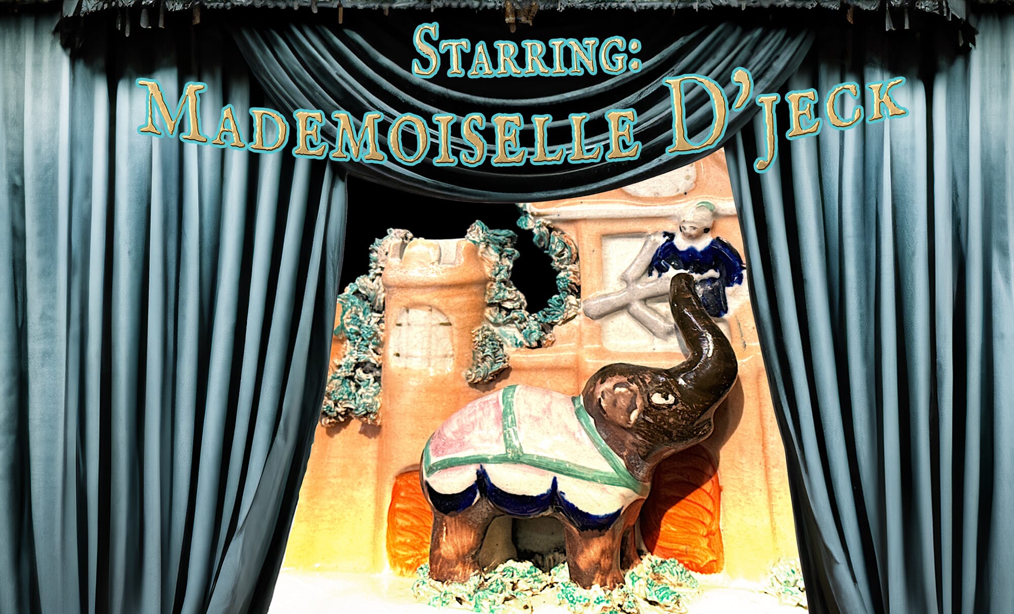
Mademoiselle d’Jeck was a 4-ton prima-donna….
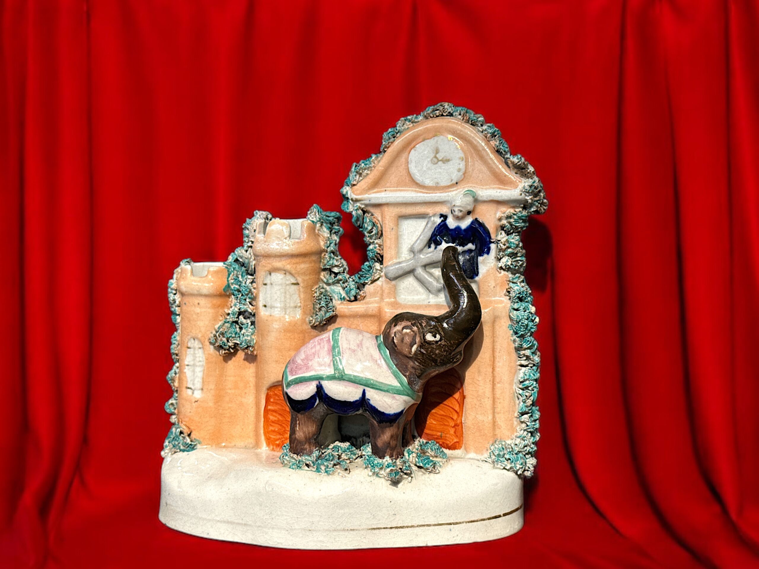
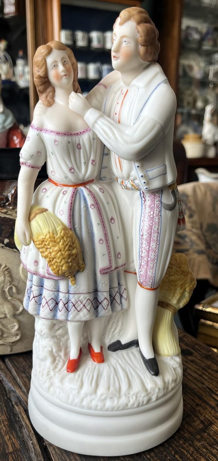
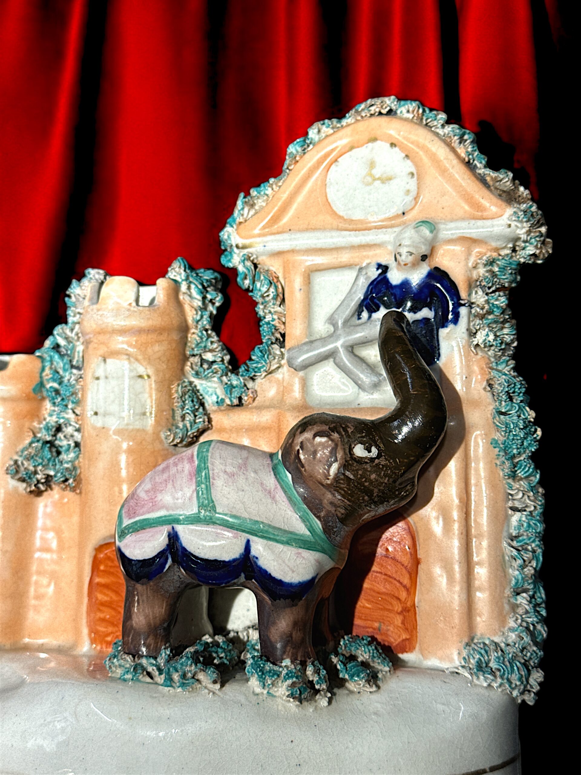
This rare Staffordshire figure is a visual record of an extraordinary theatrical spectacle, presented in the 1820’s to the eager audiences of London.
Attributed in the playbill to Englishman Samuel Beasley Jr. and John Gallott, it was billed as ‘New and Gorgeous Serio-Comic Indian Burletta Spectacle’, and titled ‘The Elephant of Siam and the Fire Fiend‘.
However…. an earlier play featuring the same elephant and storyline had opened in Paris in July the same year, at the Cirque Olympique of Antonio Franconi. This piece was entitled ‘l’éléphant du Roi de Siam‘ (The Elephant of the King of Siam) and was penned by Léopold Chandezon and Ferdinand Laloue.
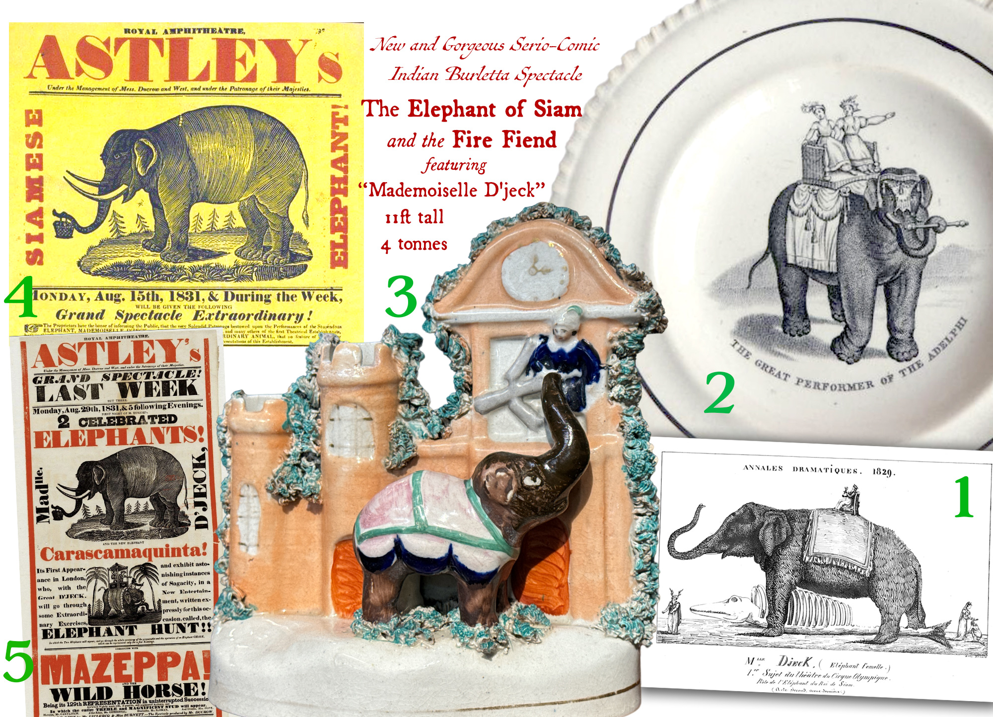
above: 1 – 1829 Paris advert, at the ‘Cirque Olympique’. 2 – Staffordshire child’s plate, c.1830. 3 – Staffordshire group, c. 1840. 4 & 5 – Playbills in the Victoria & Albert Museum.
The plot is a classic romance, with the hand of a princess contested by two suitors, one good (Prince Almansor), one not so good…. and the elephant is the key actor as she thwarts the plots of the bad-egg.
Mademoiselle D’jeck was brought to England mid-1829 to appear on the English stage.
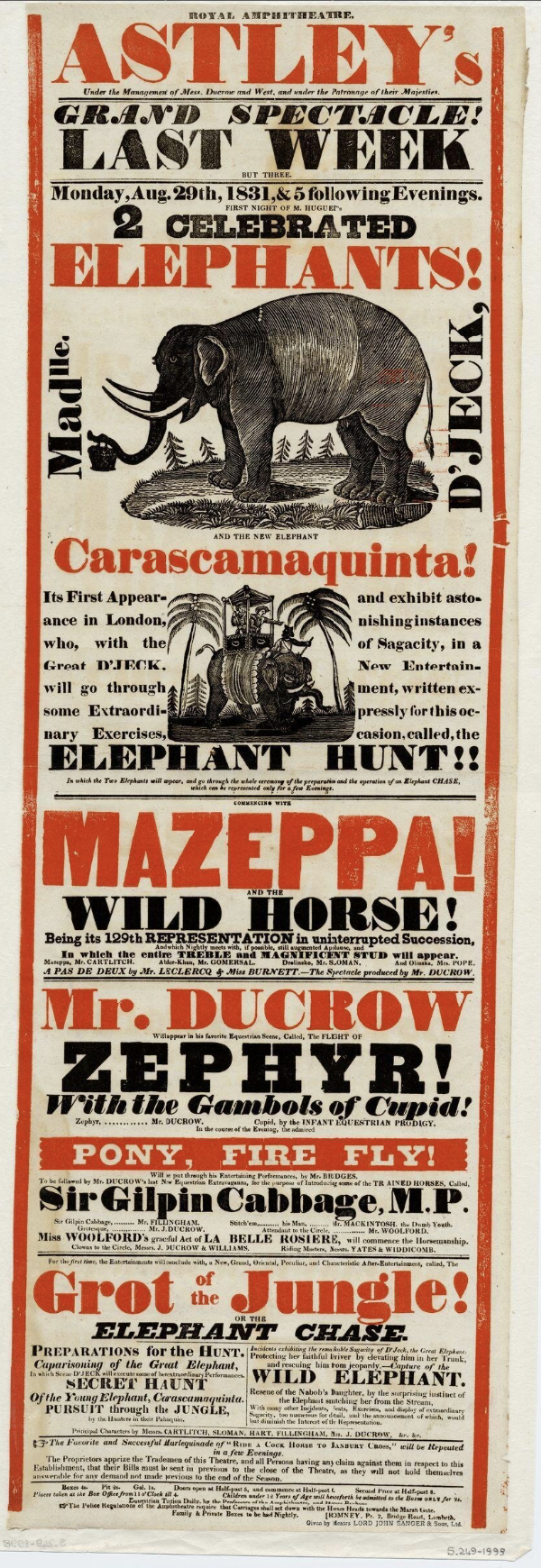
The ‘borrowed’ Elephant Extravaganza took place in December 1829 and into 1830, at London’s famous Adelphi Theatre.
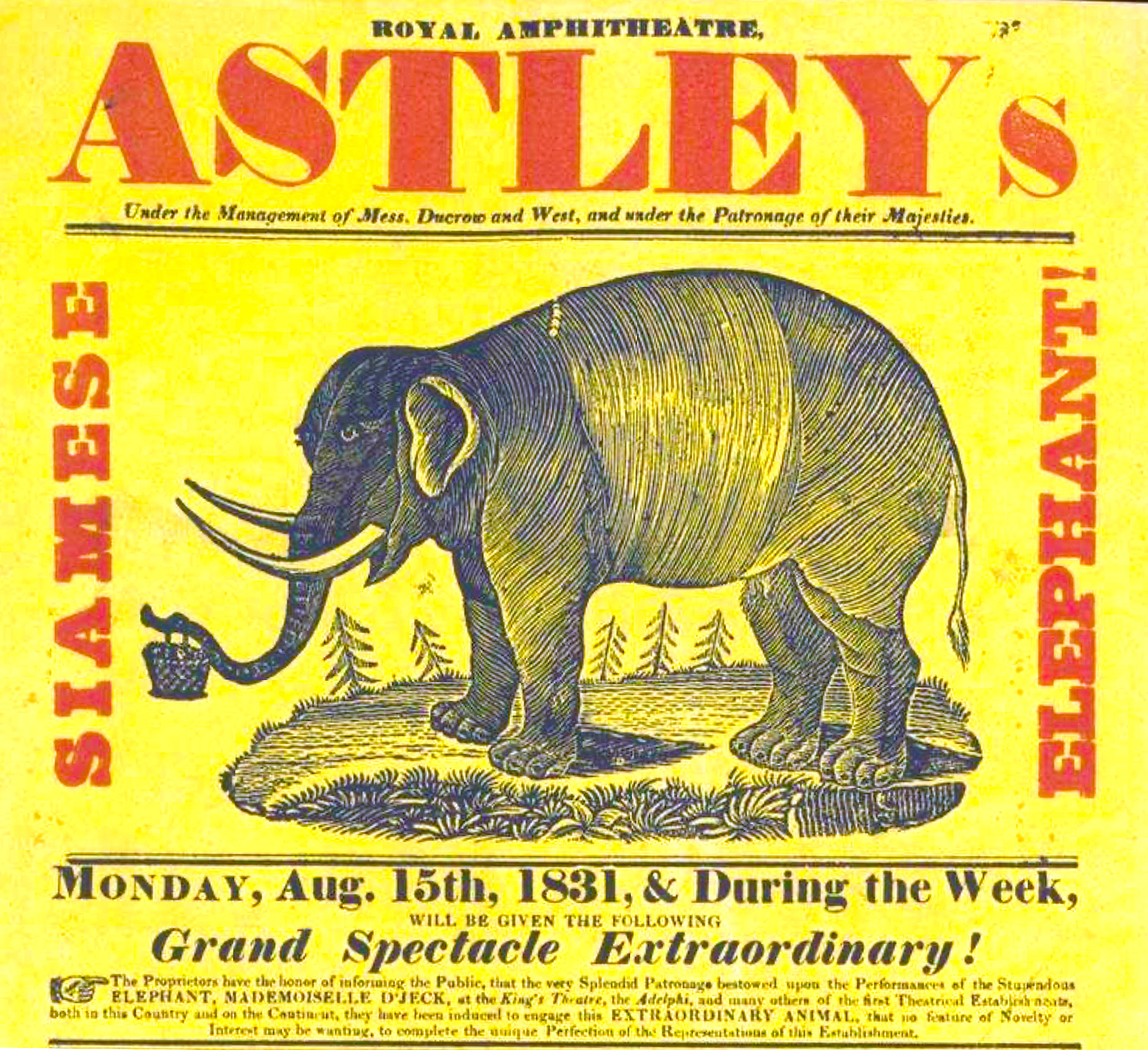
Picture this: an enormous stage, meticulously reinforced for an extraordinary star—the Elephant of Siam. This marvel, titled ‘Mademoiselle d’Gelk’ (or D’jeck), wasn’t just a creature of size, but a performer of remarkable talent, commanding a nightly salary of twenty pounds—a princely sum indeed. She was 11 feet tall, 4 tons in weight, and a very pale colour.
Under the leadership of Frederick Yates, the Adelphi Theatre brimmed with innovation and daring. The elephant’s presence wasn’t mere novelty; every action woven seamlessly into the plot, showcasing not only her docility but her profound intelligence. She was tasked with opening chests, shifting a crown from the head of one character to another, and advancing the plot using her bulk to block the view, or in what is shown in this Staffordshire figure, holding her trunk up to the window of a burning palace so the princess can escape – by being grasped with her trunk and lowered to the ground! Considering the actors in the play were London regulars, and she came from France with just a few handlers/trainers who were not there for acting, it is remarkable that she was able to interact with so many different people, night after night – a true testament to her intelligence.
A side story here reinforces this: one particular keeper was not kind to her, using the prongs of a pitch-fork to make her behave; years later, when she had the chance, she killed him. At his inquest, there was little sympathy for him and little blame for Mademoiselle D’jeck, as it was clearly a case of an Elephant’s excellent memory leading to revenge for wrongs done…..
She had arrived in London in 1806, from India or Ceylon, a member of Mr. Thomas Atkins’ traveling menagerie. Travelling with a native mahout who had raised her as a baby, she soon showed signs of being the class ‘prima-donna’ of the entertainment industry: her original mahout was wounded in 1814, and in 1822 she wounded the menagerie’s owner, who sold her to Berlin; there, she continued to hurt those around her….
When she came to Paris to perform in the stage play written just for her, she was responsible for wounding her owner and fracturing the skull of her latest mahout.
After her London appearance at the Adelphi, she spent time touring England with ‘Astley’s’ – where she broke the arm of one handler, wounded and killed two others, and fractured the skull of another. Her reputation as a dangerous beast grew…. and so they shipped her off to perform in New York!

After her US tour, the 4-ton prima-donna was back on the European tour, with a modification to make her a little safer – her tusks were removed. However, there were dozens more incidents that left a trail of injured handlers. A final straw for Mademoiselle was an ‘incident’ that wounded a spectator, in Geneva in 1837, and she was put down.
Her hide was secured by a Paris naturalist firm, Maison de Deyrolle, and so Mademoiselle D’jeck lived on , in a way. As a skin, she was sold to Barthélemy Dumortier, botanist, director and founder of the Natural History Museum of Tournai, Belgium. A local cabinet maker was conscripted to build the underbody for the hide, and a local shoe maker spend a mammoth amount of time sewing her hide onto the ‘skeleton’ . The result is still there to bee seen in Tournai, where Mademoiselle D’jeck still stands proud, having survived both world wars. In 2018 was recognised by the Federation of Wallonia-Brussels as part of its ‘federal heritage’.
This rare figure would most probably date to the time of her turning fame: 1830 would be a touch early for this style of flatpack figure, and as her fame in London was that same year, it would have been in the following years that an image like this would appeal to the public.

V&A Museum poster for 1831:
https://collections.vam.ac.uk/item/O1170934/poster-unknown/?carousel-image=2006AH6415