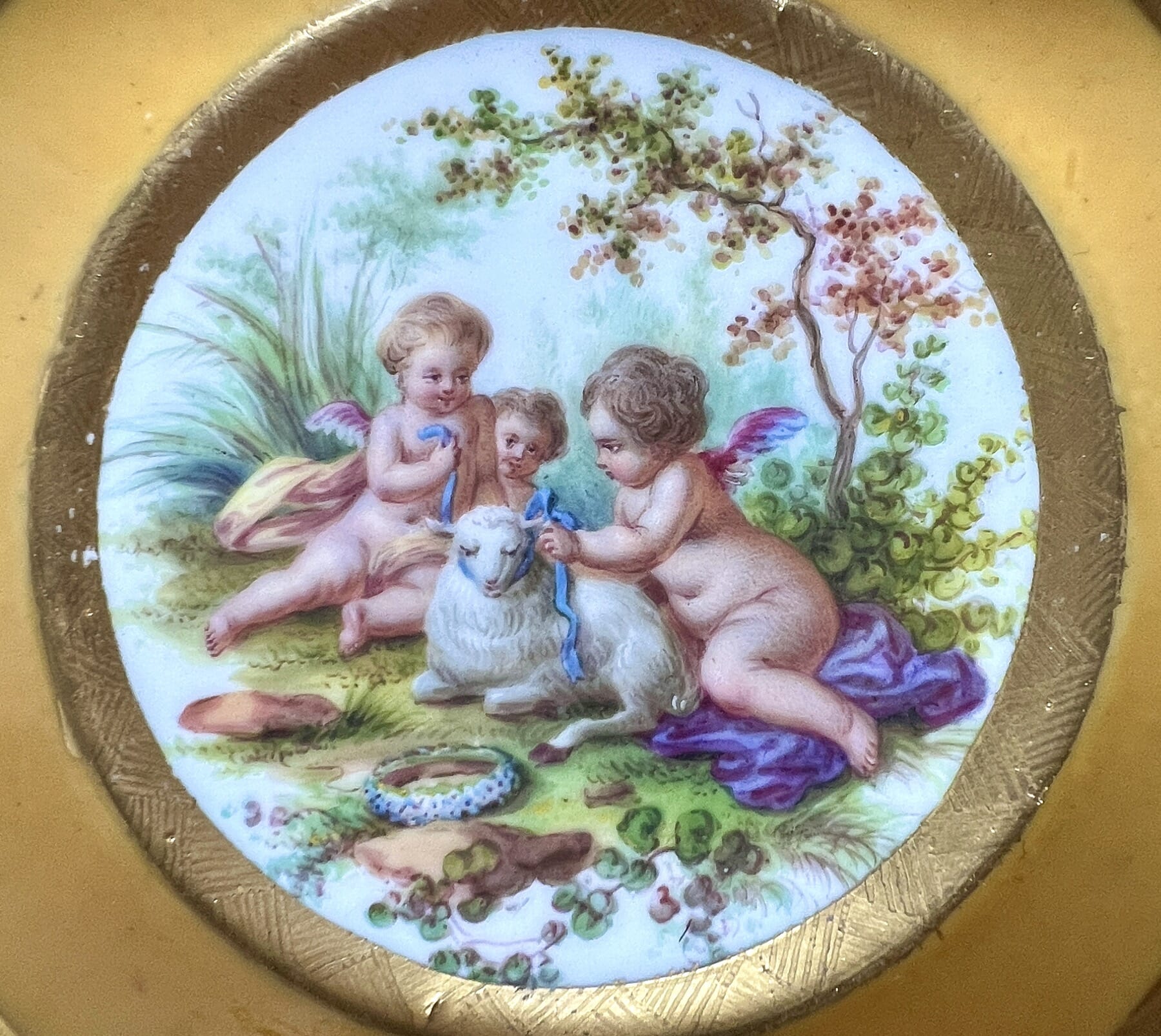
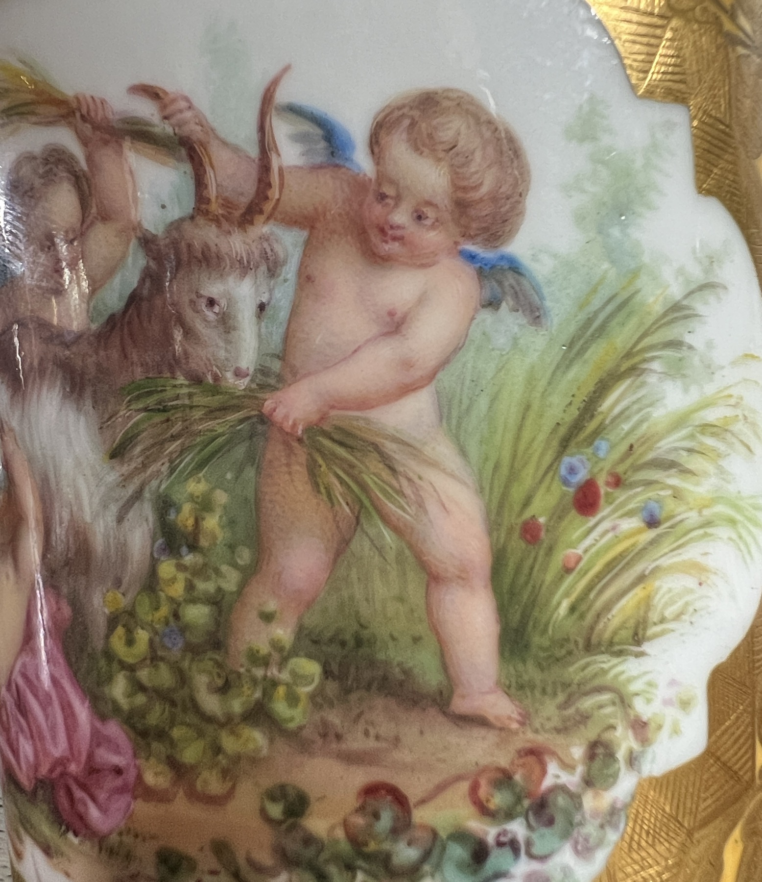
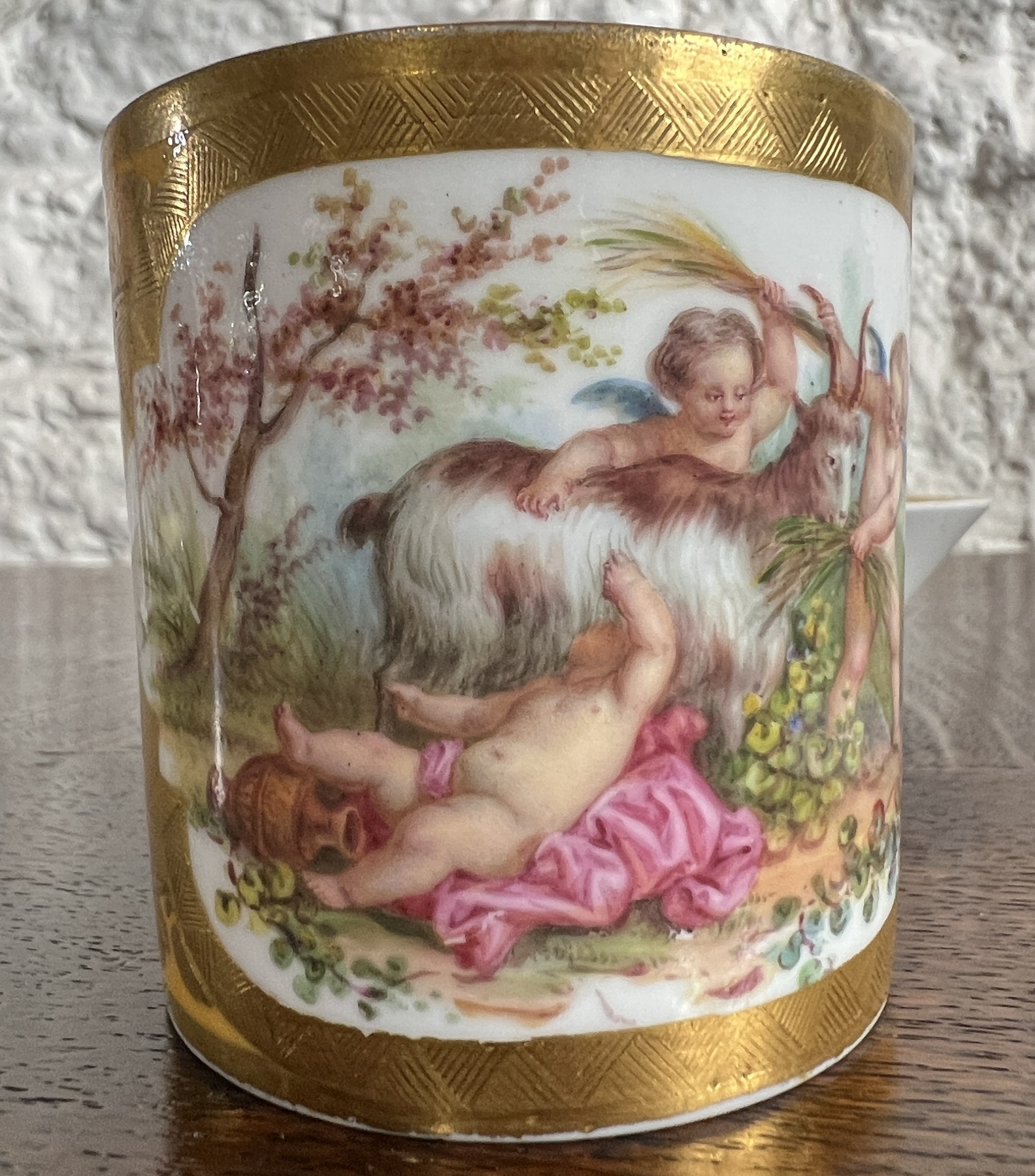
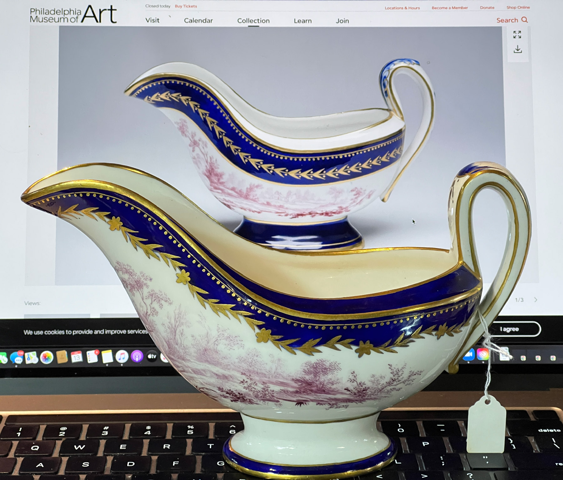
This extraordinary example of Tournai porcelain shows the quality they were able to produce.
Tournai Sauceboat c.1770
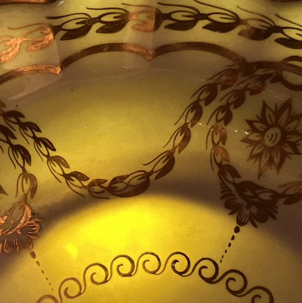
Dating to circa 1770, the elegant form with robust yet stylish handle, and boat-shaped stand, is a premonition of the Neoclassical simplicity which comes to dominate French design in the last decades of the 18th century. While this aspect looks forward, the decoration is the opposite. It is taken from a print published mid 18th century, after a painting by Francois Boucher, and is the essence of the Rococo style.
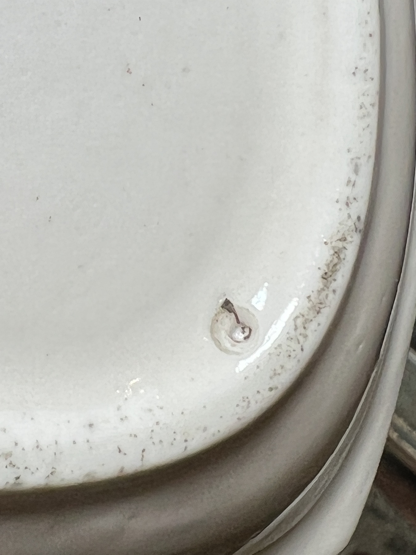
The mark is always misunderstood: ‘crossed swords are Meissen’ is the usual assessment, however this piece is clearly soft-paste porcelain, not the hard-paste of Meissen. As a vast number of other makers ‘borrowed’ crossed swords, it is easily attributed to one of these fraudulent makers, like Samson of Paris. However…. this mark is well documented on Tournai porcelain. In the underglaze blue & white products, it is not uncommon. Gold on glaze is rare, but does appear on their better decorated pieces, suggesting it was a mark for their ‘premier products’.
There is a single example in public collections, not published in the literature. This is a sauceboat in the Philadelphia Museum of Art (id=#1968-172-1) , documented on their website. It lacks the stand, but has the same lavish decoration – with a few variations.
In the fore is our example; the back shows the Philadelphia Museum’s slight variation.
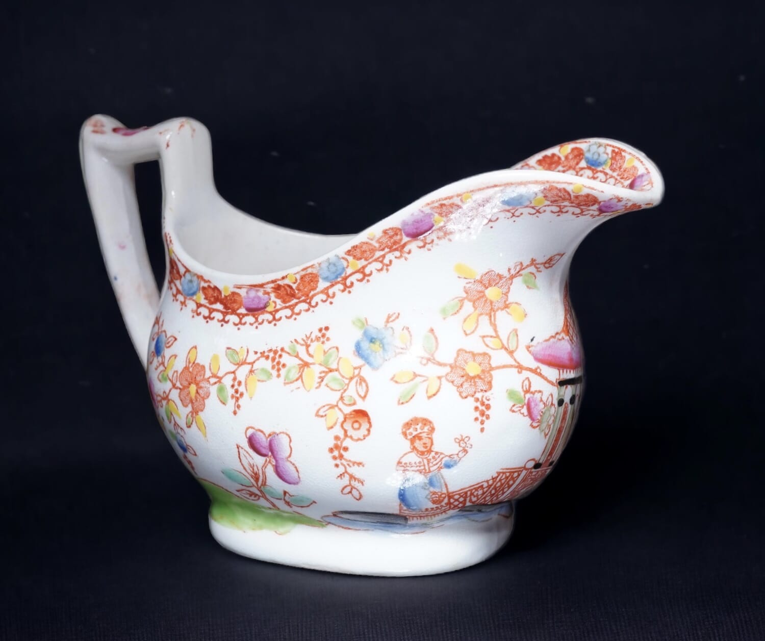
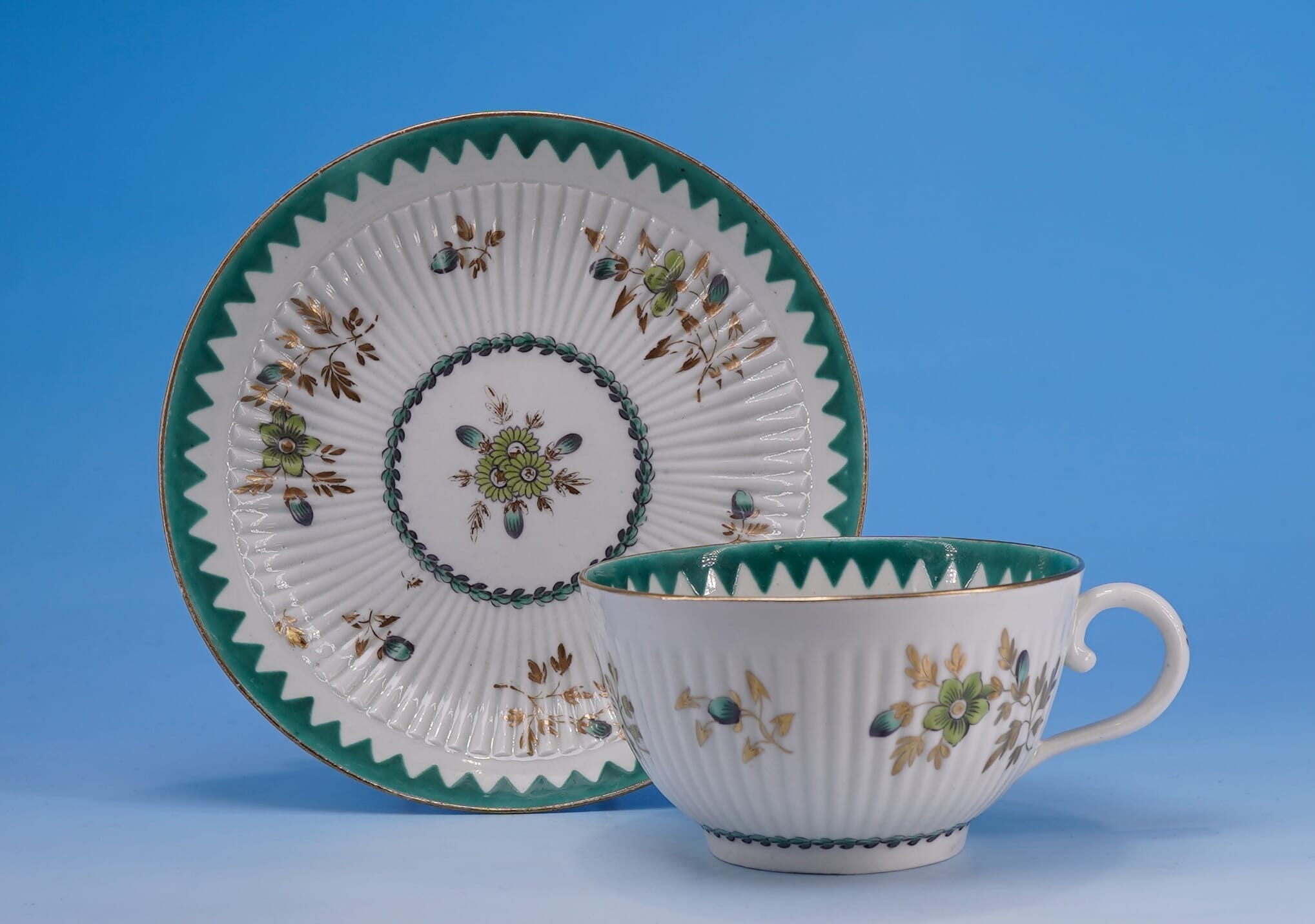
An interesting rarity has just been unearthed at Moorabool.
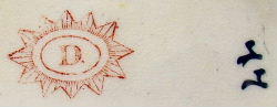
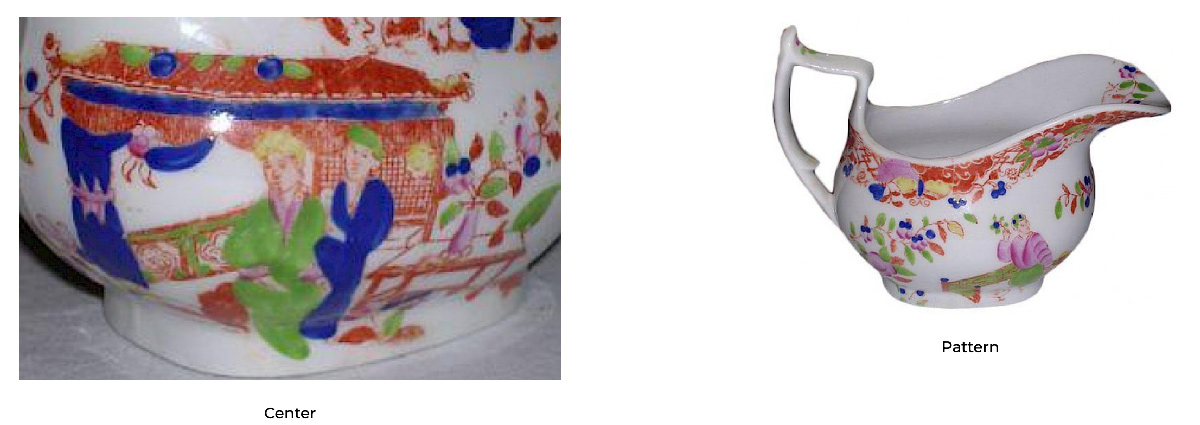
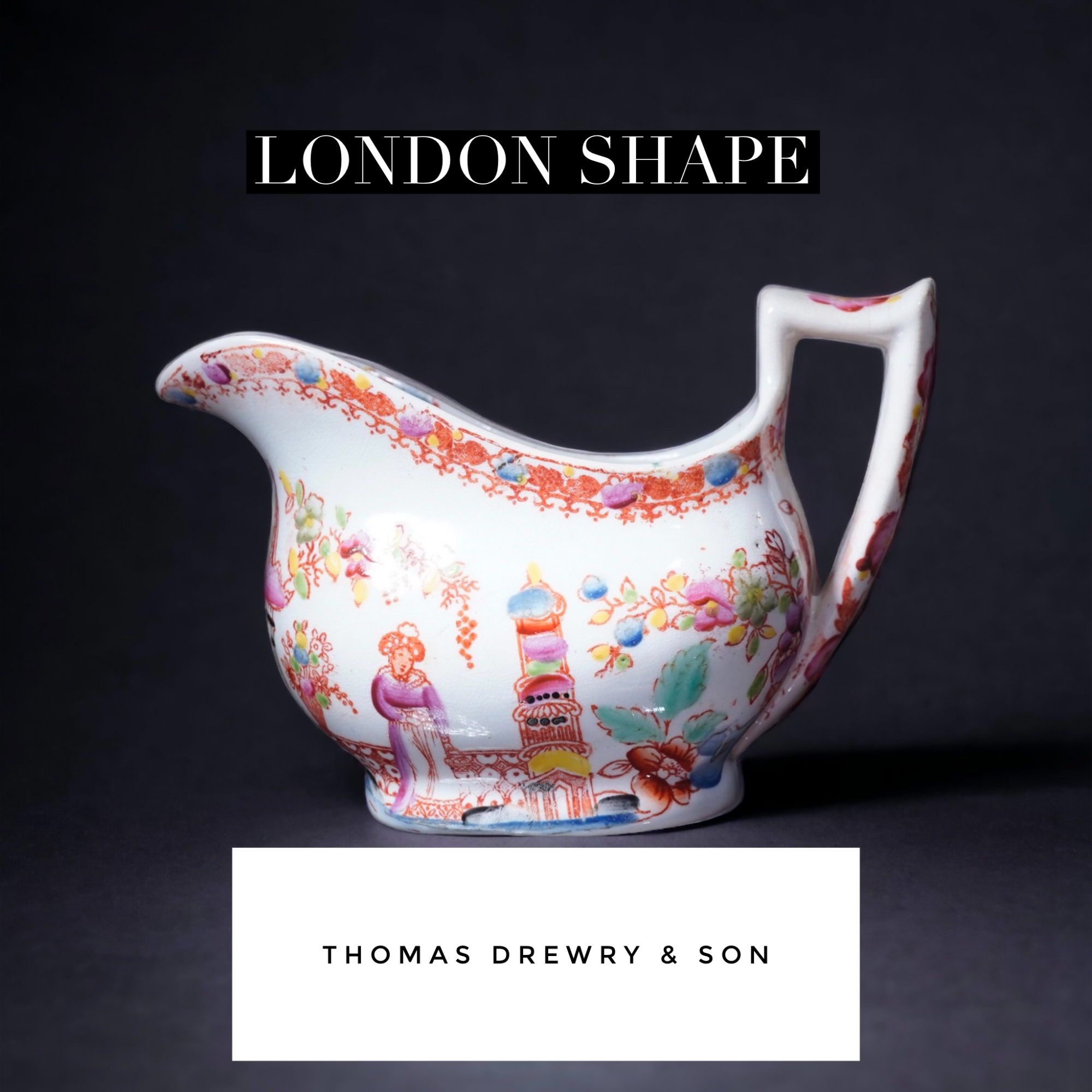
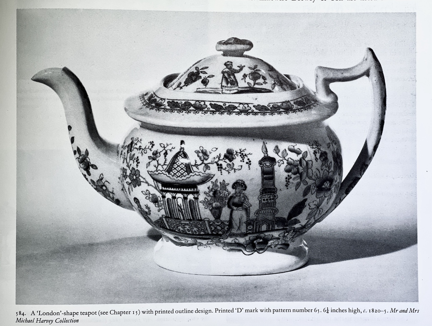
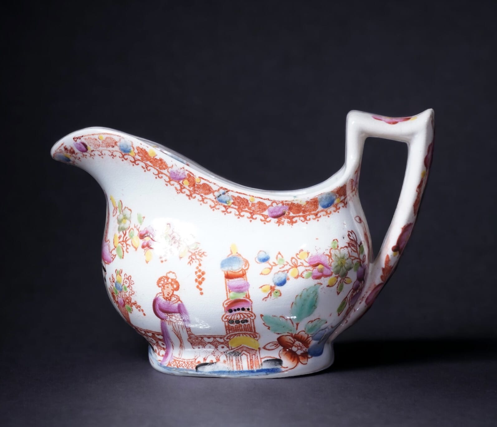
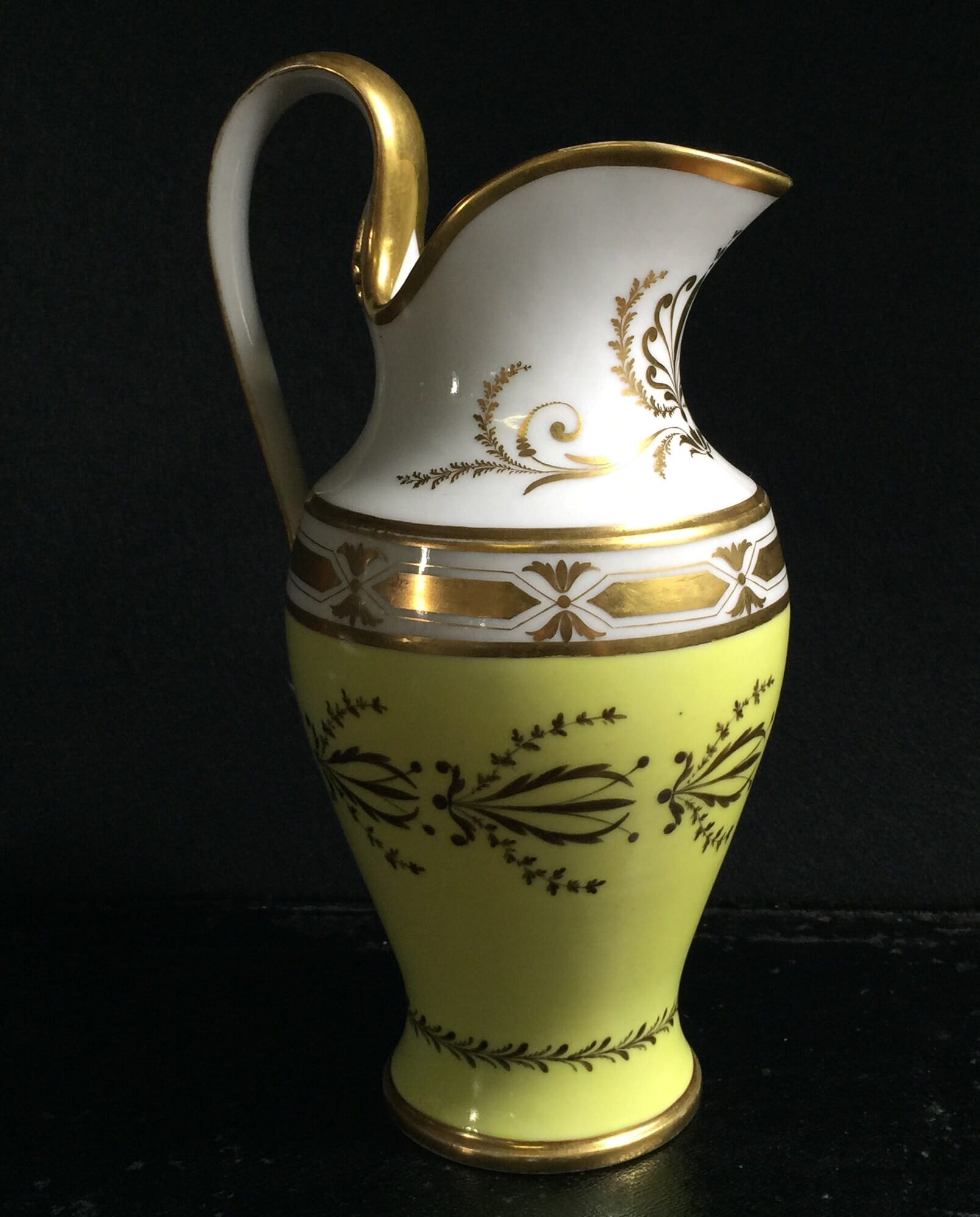
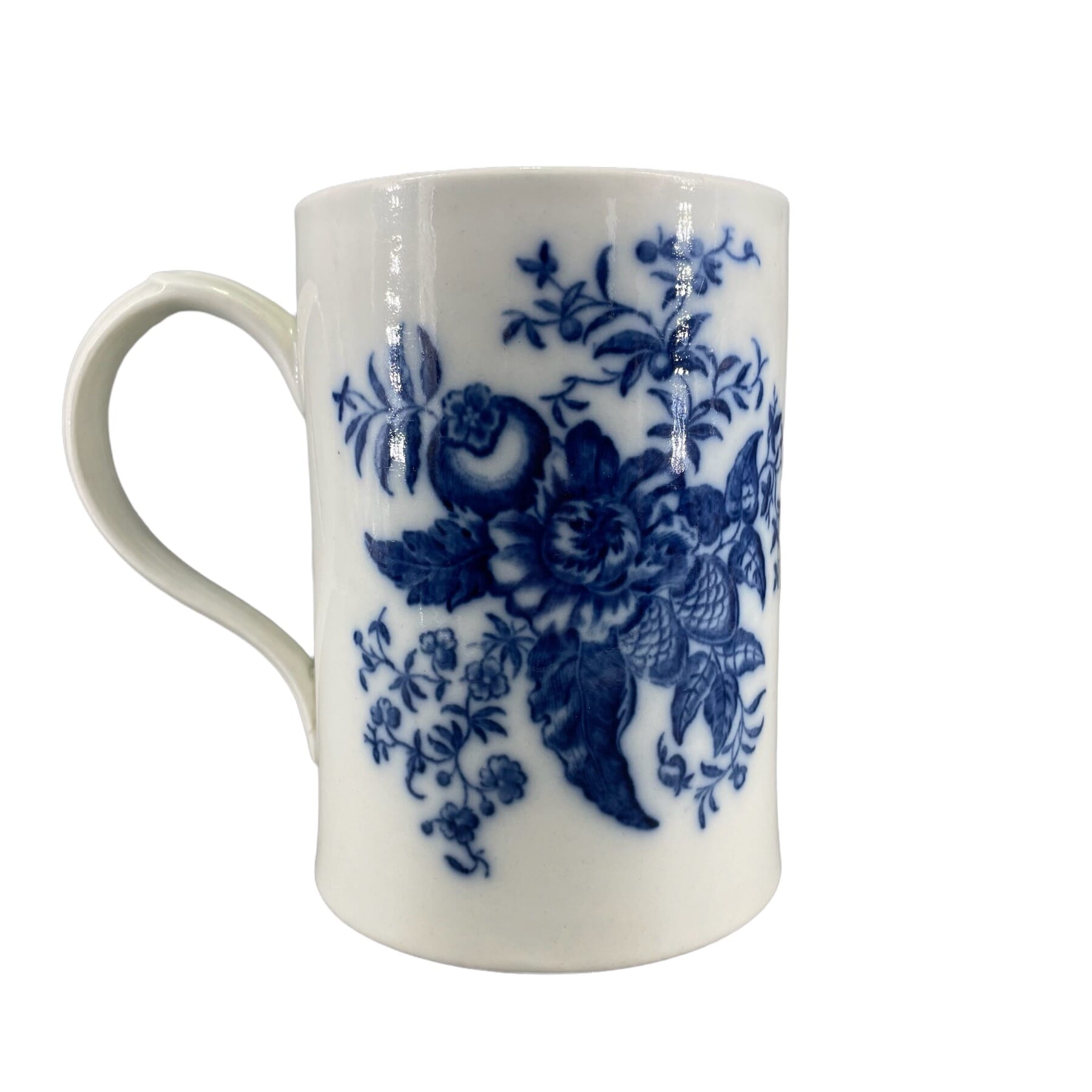
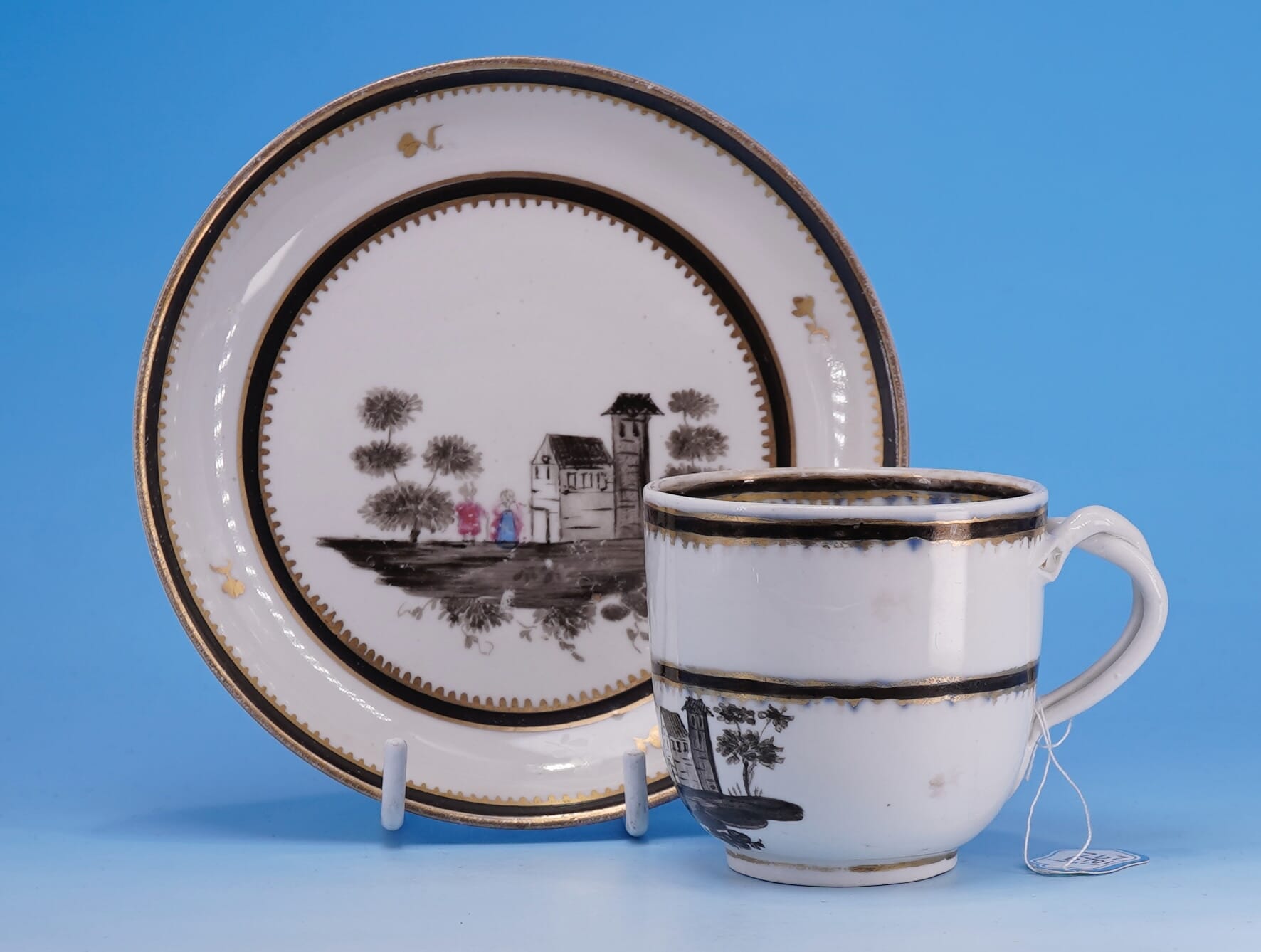
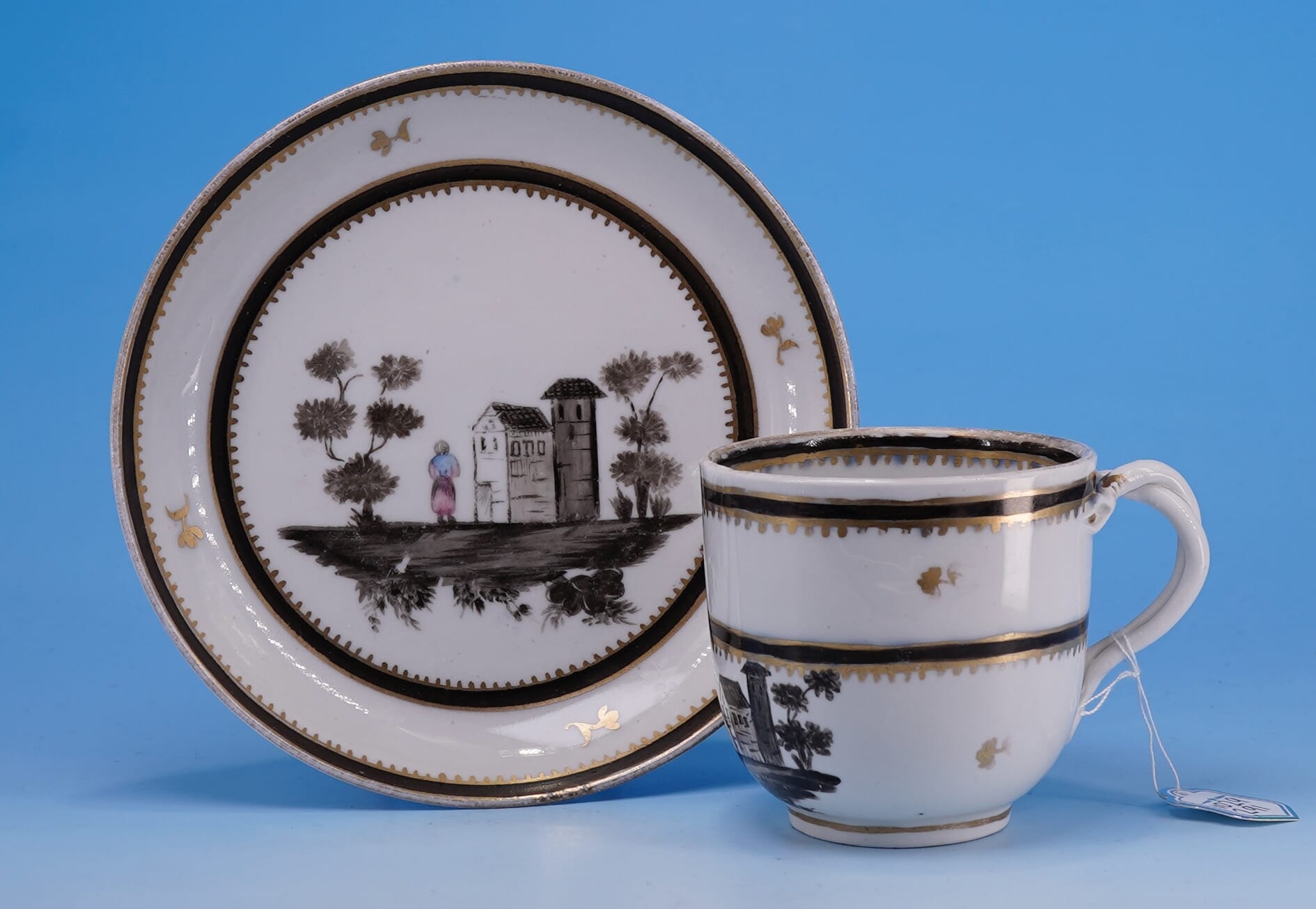
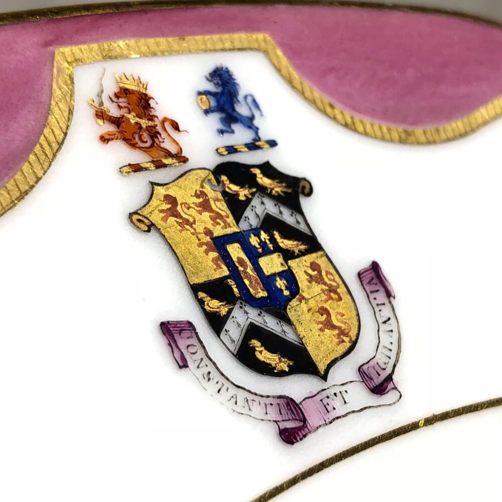
Godden in his ‘Staffordshire Porcelain’ is the initial source of attribution, using the style of piece & pattern to date it to the 1820’s, and then refine it down to two possible makers with ‘D’ surnames. Drewry- also spelt Drewery – is the most likely of the two, in his opinion. They are recorded in the directories 1818, and disappear after the 1830 publication. Godden illustrates the London-shape teapot with the same pattern and ‘D’ mark on p415. Distinct to this maker (apparently not found elsewhere) is the plain handle form, without a spur on the inside towards the bottom; also distinct is the handle wrapping down the body and terminating by touching the actual foot of the jug.
A selection of similar patterns, made by the Hilditch firm. These are identified by marked examples, set out in a 2003 publication, ‘Hilditch Porcelain – A Collector’s Guide’ by Margaret Hewat & June M. Owen.
The similarity to the Drewry pattern is no coincidence; the Hilditch works were located in Lane End, Staffordshire, just over the road from the Drewery works. The engraver responsible for the copper plates used to print the transfer was not exclusively employed by these companies; rather, he would be a freelance operator, taking on the work when it was needed. Somewhere like Drewry would not need his services very often – this was pattern 65, and such printing plates could stay in use for many years before needing replacement. If you examine the details of the prints of these Hilditch products, and the other similar works such as Newhall, it is clear that the same engravers are at work for multiple firms – making this marked example an important clue to unravelling the correct attribution of these charming transfer printed wares.
from the ‘Transferware Collector’s Club’ database, on the ‘Teahouse Pattern’ jug illustrated below, with the note “The numerals “44” alongside the “D” mark are more likely a worker’s number than a pattern number”. We propose that it is indeed a pattern number, and should be read as ’77’ – see image below for the pattern.
This pattern is recorded by the Transferware Collector’s Club database as pattern #2552, titled ‘Pavilion & Tower’ ( no. 65) by Thomas Drewry & Son, Lane End, Staffordshire. A related pattern is their #3327, a pattern known as ‘Tea House’ (See photo below). In the documented example, there is a number next to the mark – as there is with this example & others of this pattern that have been recorded, all ’65’. Clearly this is the pattern number for this pattern, 65. The numbers on the ‘Tea House’ example are interpreted as ’44’, but seem to more likely be meant as ’77’ – just a few patterns along from this ‘Pavilion & Tower’ pattern. Comparing the two reveals a very close look.
Drewry Pattern 77(?) from The Transfer Collector’s Club website. Note the difference in the handle: this example is the same as the other numerous London-shape handles with a spur on the inside, while the (apparently) unique feature of the example we are documenting is having no spur.
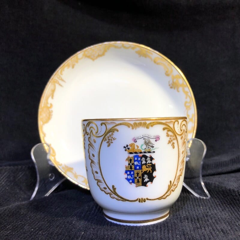
Drewry & Son, Lane End, London Shape jug, pattern 65, marked ‘D’ in sunburst, at Moorabool Antiques, Australia
Example of Drewry porcelain London-shape teapot, pattern 65, now known as the ‘Pavilion & Tower’ pattern, here illustrated in Godden’s ‘Staffordshire Porcelain’
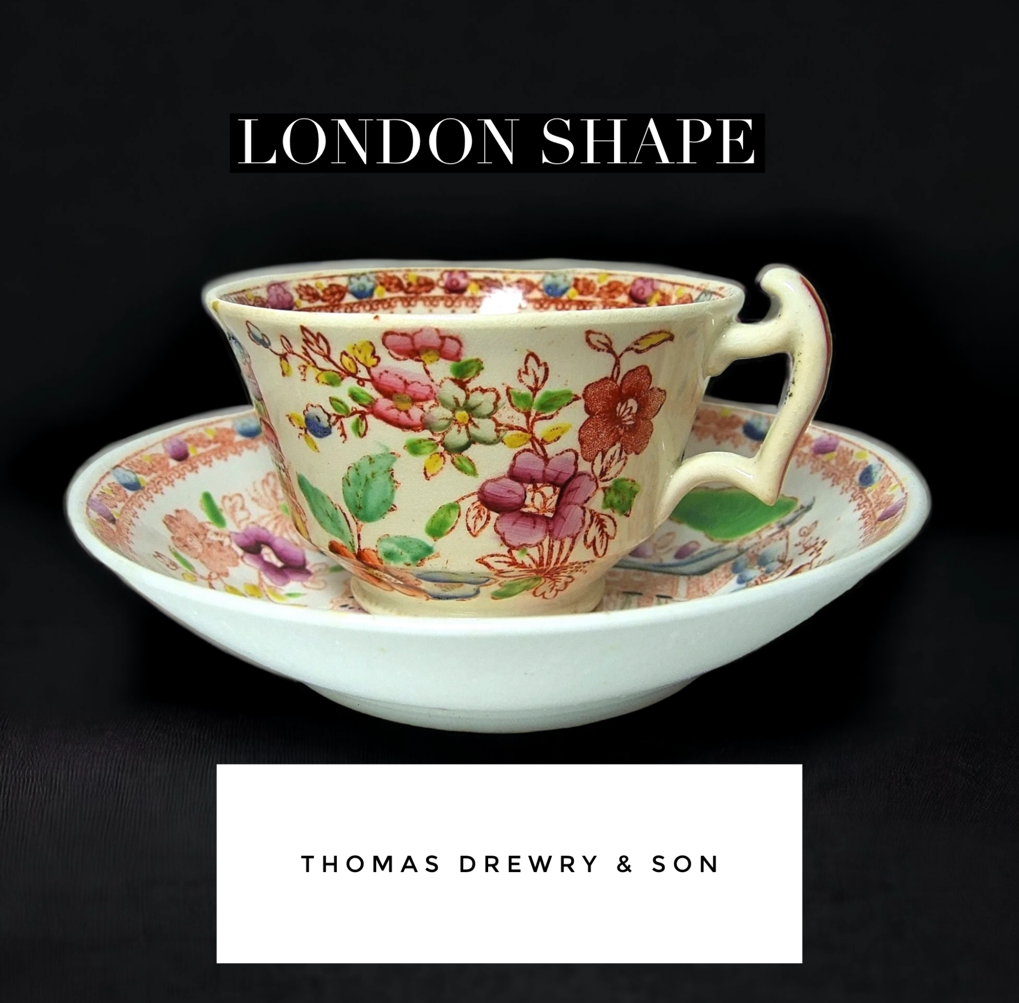
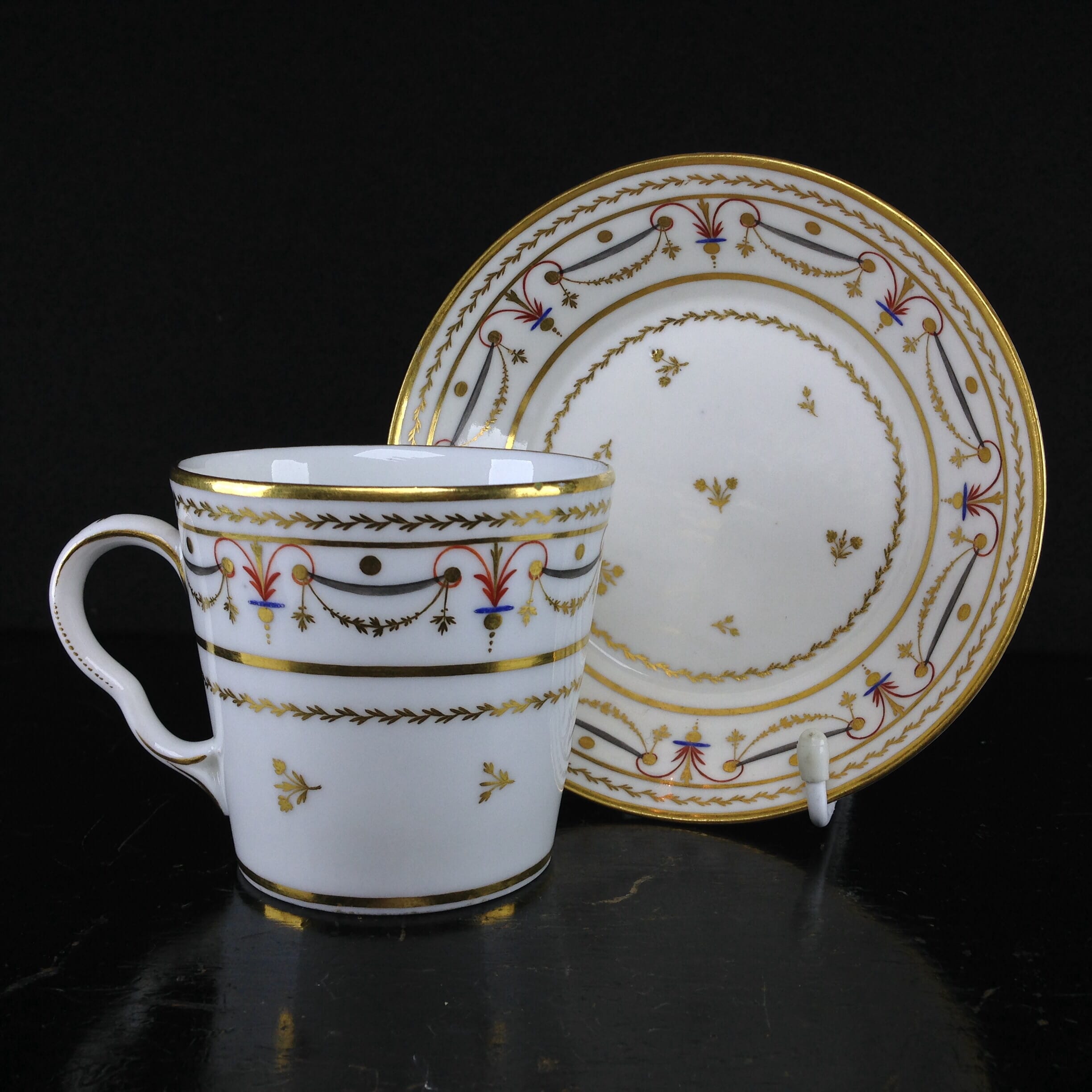
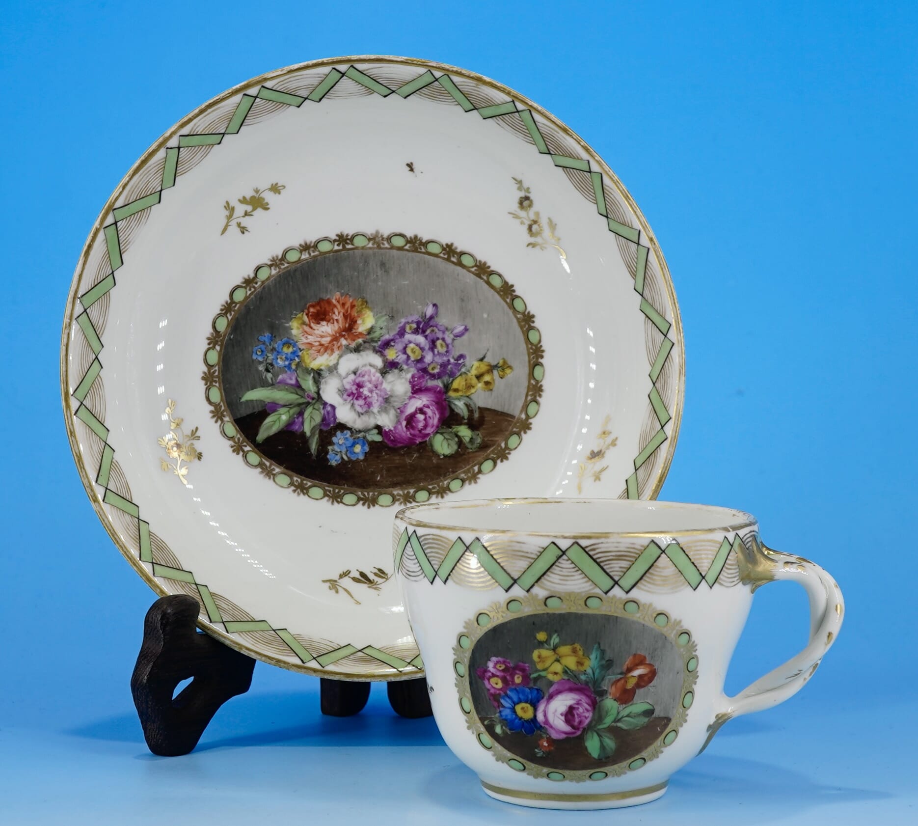
Drewry & Son ‘London Shape’ Cup & Saucer, pattern 65, circa 1818-30
This piece is a fine example of how time disappears in this field: unravelling the above story took quite a while, with widespread resources to consult and bring together to tell the story. And yet, look at the price: Rarity doesn’t necessarily mean ‘expensive’ !
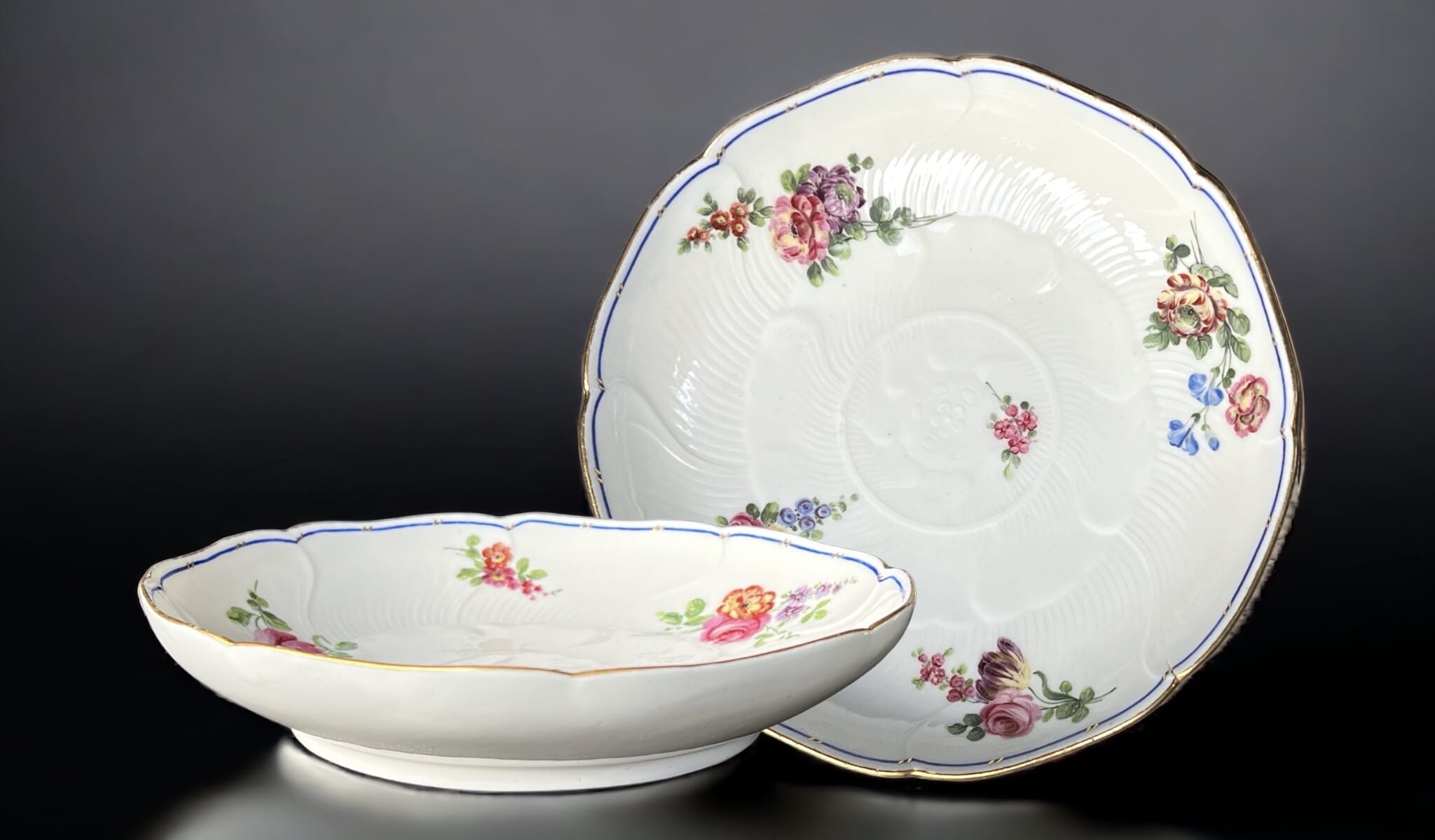
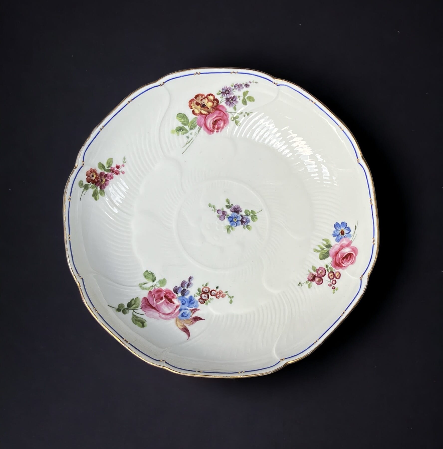
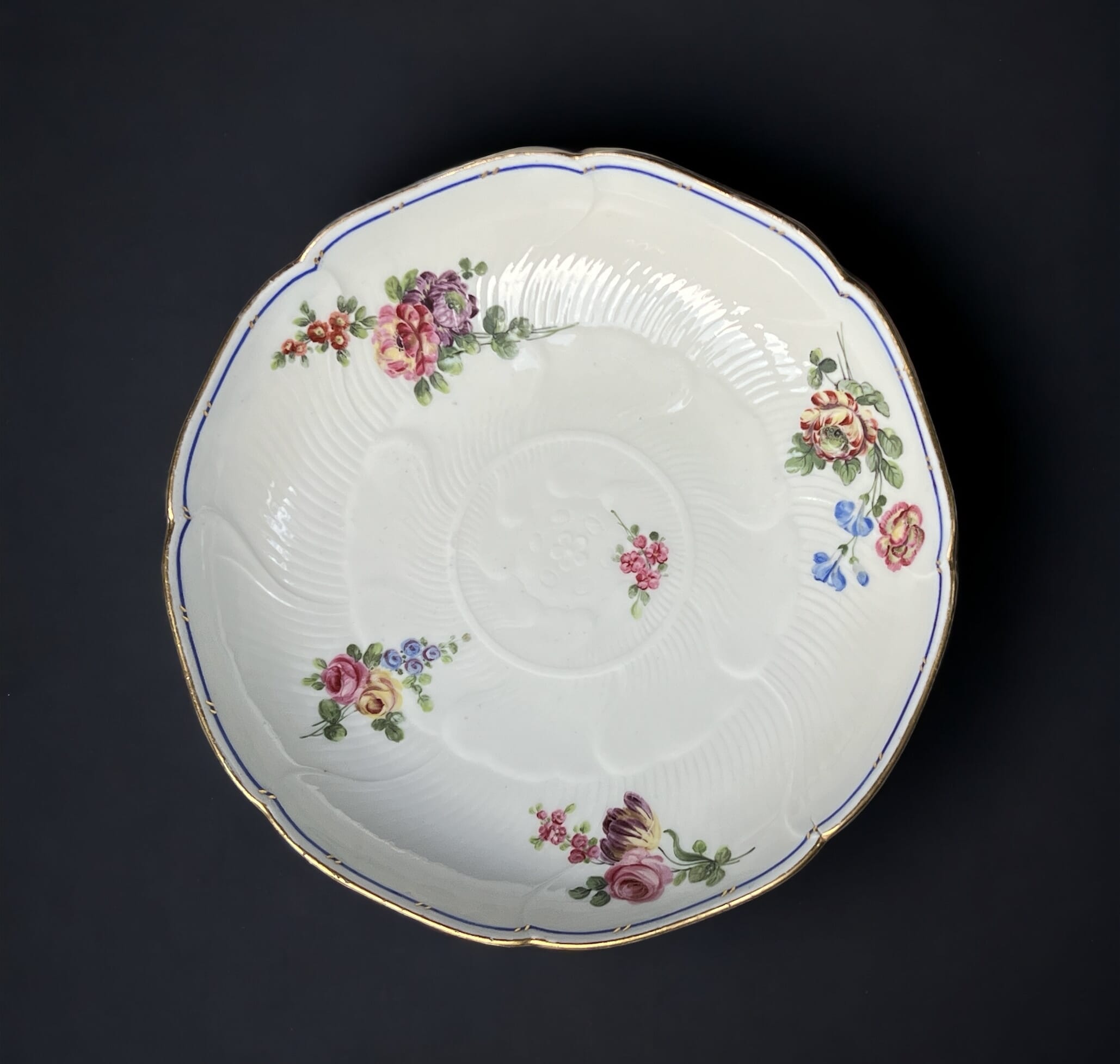
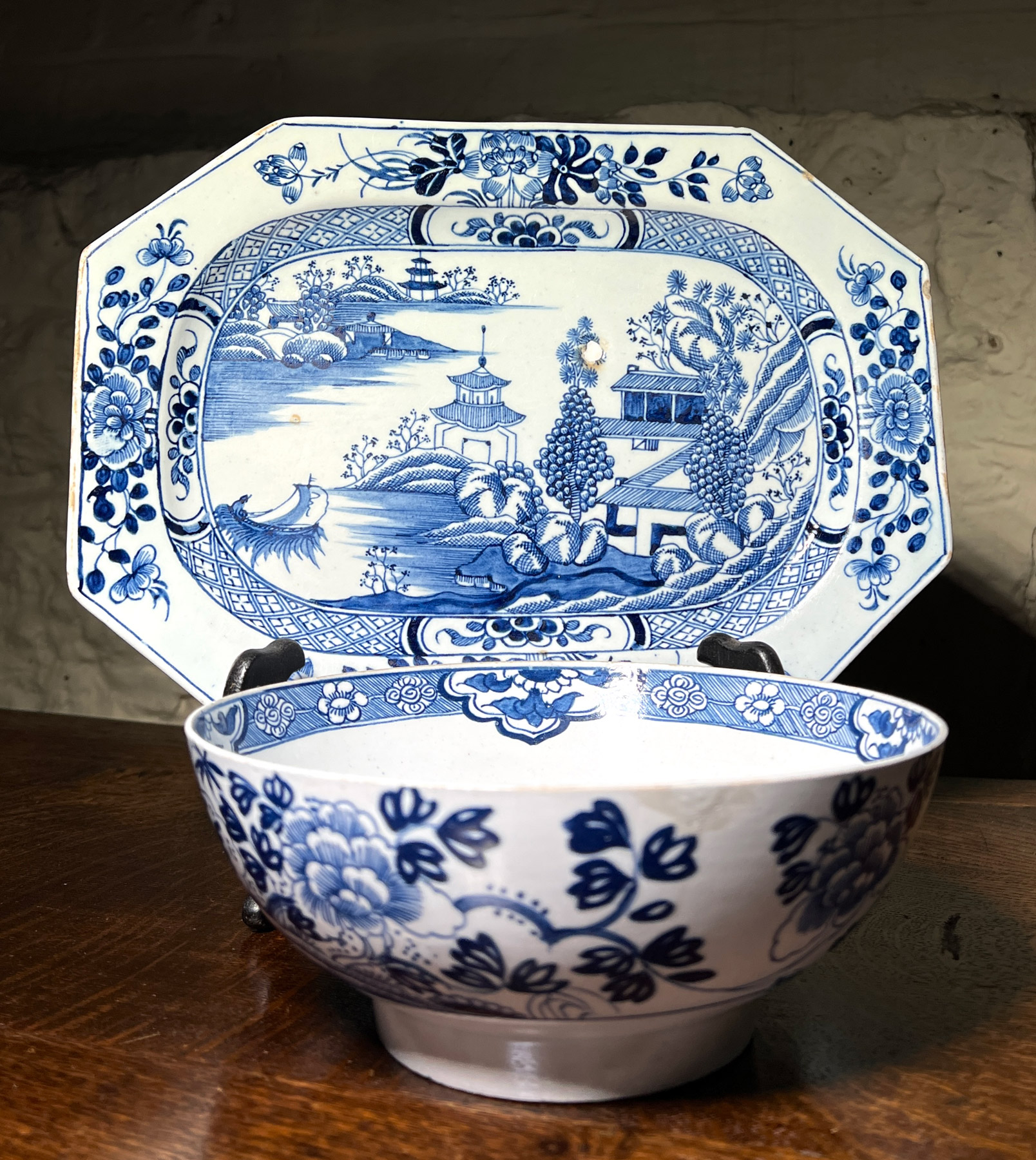
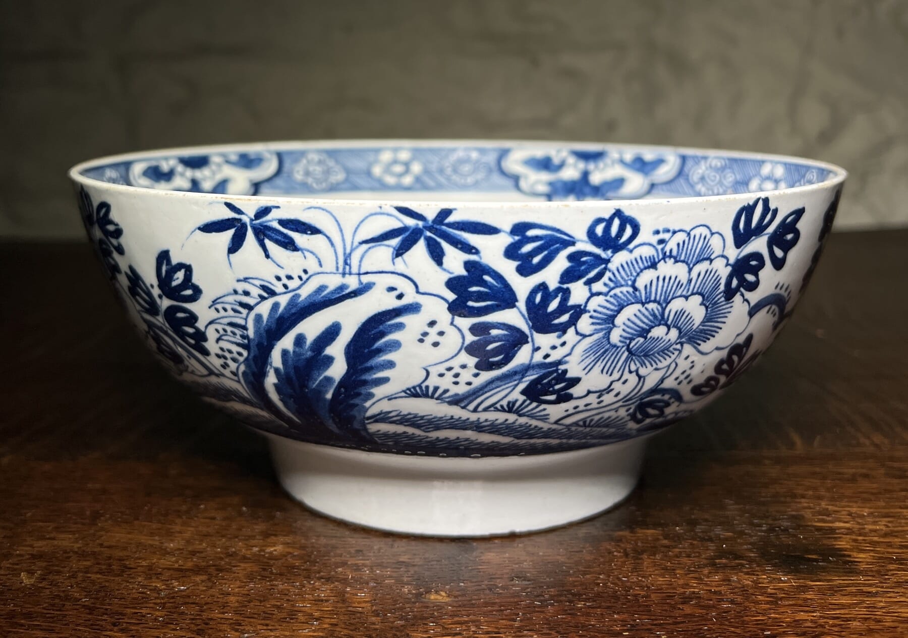
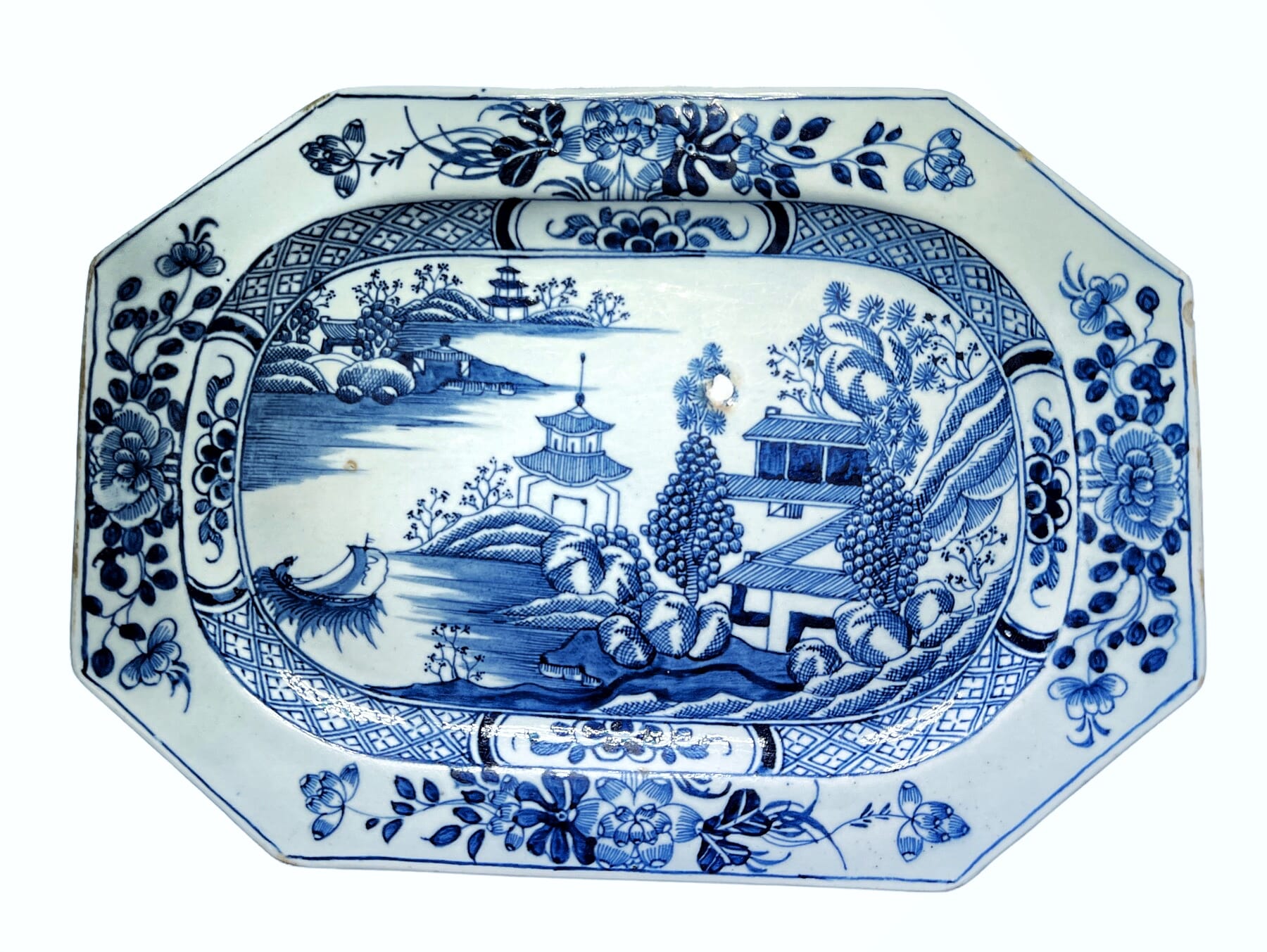
There’s a splendid pair of Sèvres dishes fresh to Moorabool.
Sèvres Porcelain, 1764
This shape is a compotier rond, and was a component of the large services, used alongside other shaped serving dishes in the centre of the table. A setting for a dozen might have two compotier rond, while the larger services, such as the massive Service Camaïeu Carmen de Fontainebleau (used by the Royal Family) had several dozen of this elegant dishes available.
Sevres 1764. Moorabool Antiques, Australia
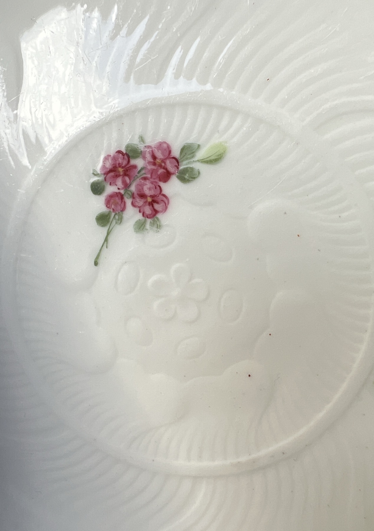
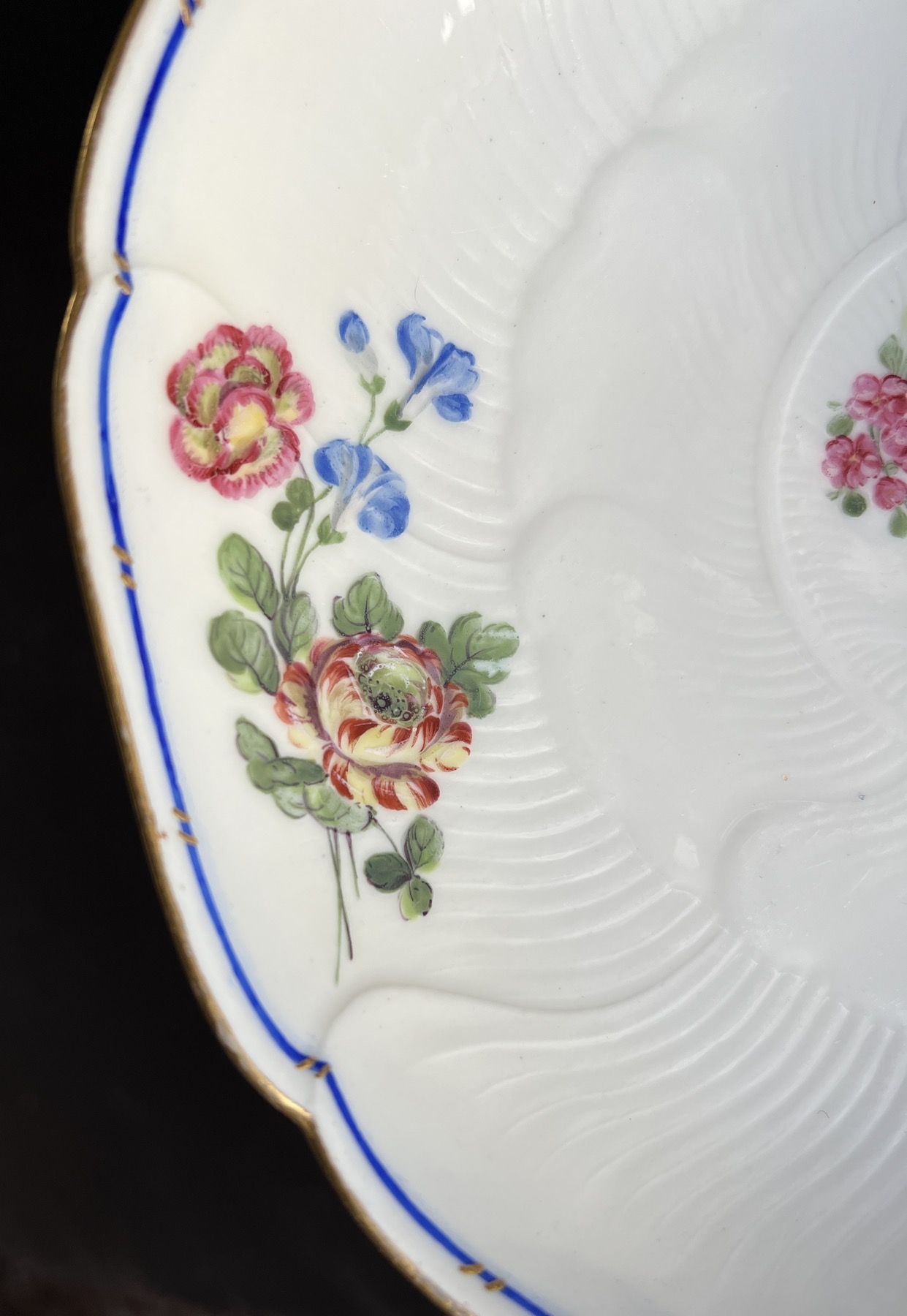
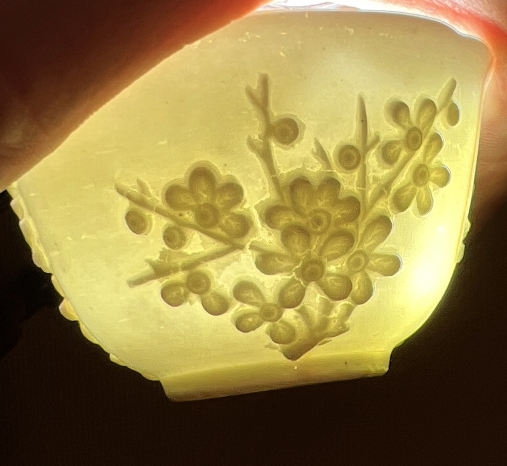
The moulded pattern allows the beauty of the moulded porcelain to show in a way the more painted patterns cannot.
The elegant lotus flower design is borrowed from Chinese Export origins, where lotus-moulded dishes were a common sight in the early 18th century.
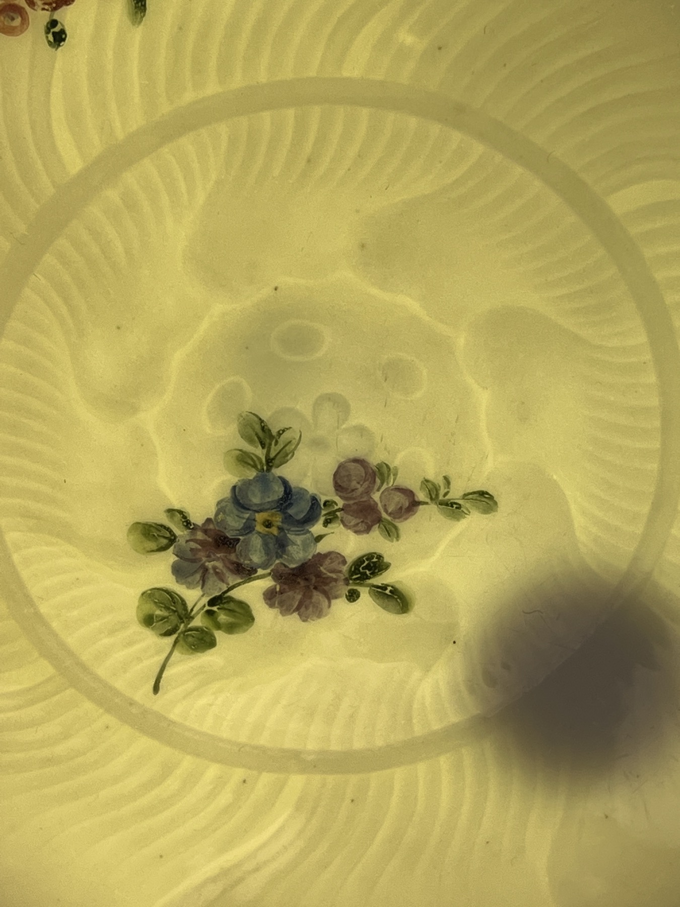
Sevres 1764. Moorabool Antiques, Australia
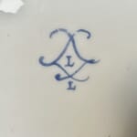
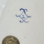
Louis-Françcois Lécot’s mark, ‘L’, on Sevres with ‘L’ for 1764. Moorabool Antiques, AustraliaSevres with ‘L’ for 1764. Moorabool Antiques, Australia
One of the dishes simply has the crossed ‘L’s’ mark, enclosing the date letter ‘L’ for 1764. The other example is the same, but also has a painter’s mark: ‘L’. This allows us to put a name on the painter of the flowers: Louis-Françoise Lécot . He appears in the factory wages lists in 1763, after possible earlier unpaid work as a pupil from about 1761. He worked as a flower painter in 1764 – but is then absent from any reference the following year, giving him the working period 1763-4…. a perfect match for this dish. He does re-appear, after spending 6 years somewhere else, when he is documented as a hard-paste artist in 1771 (as opposed to the soft-paste that was the only body available at Sèvres in the 1760’s). His work is then remarkable and distinct, specialising in dramatic imitation lacquer pieces, with gilt or platinum/silver chinoiseries painted in the highest Rococo manner, or the exotic ‘Etruscan’ grotesques inspired by discoveries in Italy during the 1770’s. These styles were the latest fashion for the French aristocrats, and bring to mind the lavish productions of the high-end Paris firms competing with Sèvres for the top-end customers. As Sèvres was the King’s factory, he enforced a monopoly on the industry, where colours & gilt decoration was exclusive to his own factory; the loop-hole found by eager factory owners was to attract an aristocratic patron to protect them – Clignancourt was under the protection of the Comet de Provenance (the future Louis XVIII) and Rue Thiroux was under the protection of the Queen, Marie Antoinette. Both produced very high quality hard-paste products in the 1770’s, and would have eagerly employed a Sèvres-trained artist such as Lécot. Locré & Russinger, otherwise known as La Courtille, was another such factory, minus the aristocratic protection; they ran afoul of the King’s Sèvres monopoly, with 2,000 pieces of illegal coloured & gilt porcelain being seized in 1780 – indicating they were producing a large amount of high quality hard-paste wares. Despite this set-back, they continued to make superbly decorated pieces as if nothing had happened….
Could Lécot have spent his time in some such Paris porcelain manufacture, learning the technique for decorating the hard-paste porcelain body? While he was away, Sèvres purchased the recipe for pâte tendre (hard paste) from Pierre-Antoine Hannong, the youngest son of Paul-Antoine Hannong, whose father had established the faience works in Strasbourg in the early 18th century . As often happens with generations, Paul-Antoine made a success of the firm when he introduced the first hard-paste porcelain production in France, in the mid-1750’s. He died in 1769, and his son, Pierre-Antoine became head. Two years later, he sold the secret of Hard-Paste to the Sèvres factory. They took a while, but once the right ingredients were sourced, Hard-Paste was made (alongside Soft-Paste) from the mid 1770’s onward.
A Lécot decorated Sèvres garniture, 1775-6 – sold at Christies NY in 2000 for $1.1 million US….
When he returned in 1771, Lécot was able to paint on the new Hard-Paste body. He worked on some truly impressive hard-paste orders, and all major collections seem to feature his dramatic 1780’s Chinoiseries. This early example of his Soft-Paste work from his brief appearance at Sèvres in 1763-4 is a lovely rarity.
ref. Rosalind Savill, The Wallace Collection Catalogue of Sèvres Porcelain, London, 1988, Vol. III, pp. 1043-4 for more on Leçot.
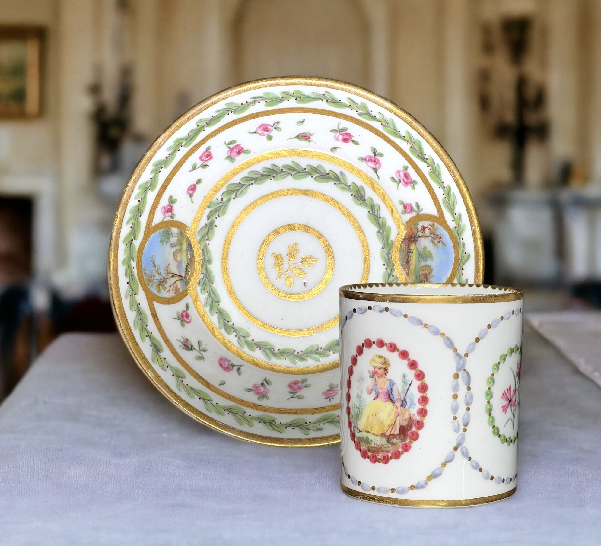
Jean Bouchet, active at Sèvres 1757-93
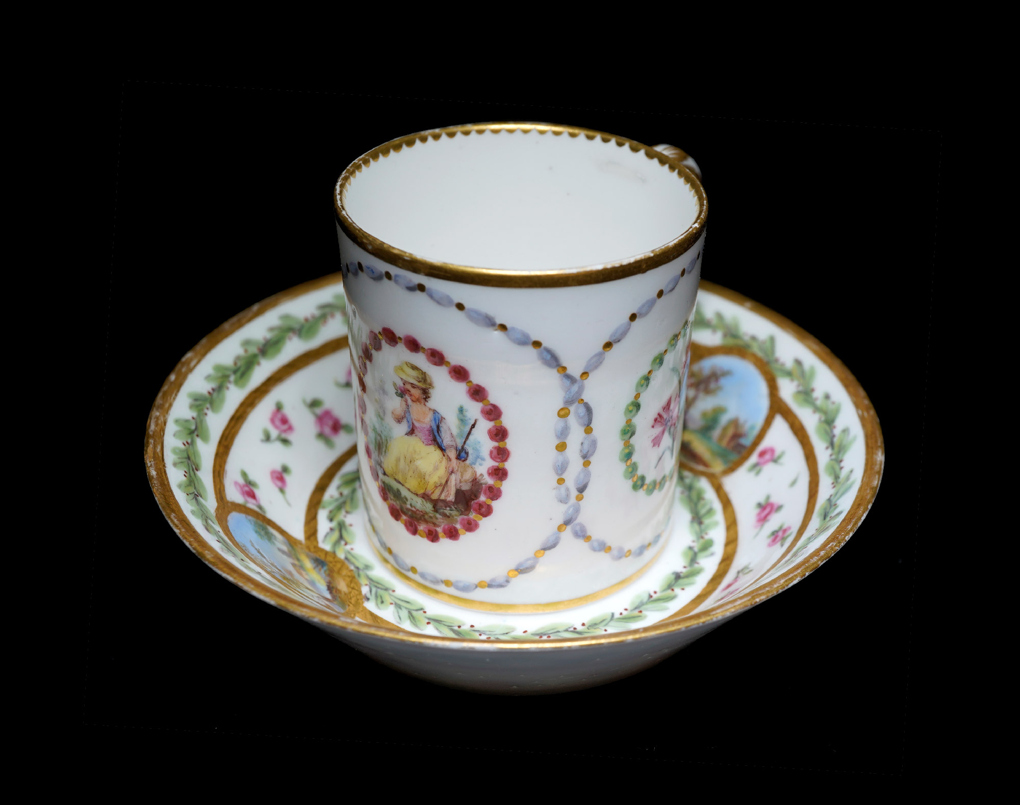
Sèvres cup & saucer, scenic panels by Jean Bouchet, dated 1781
This lovely cup and saucer are a ‘recently married’ pair. While the saucer has been in the Rosenberg Reference Collection in Geelong for a while as a fine example of Sèvres, the cup is a recent acquisition; remarkably, it is the same artist at work at Sèvres in the same year, 1781. While there is a difference in the details, the overall harmony makes them a delightful rarity. And of course, they have a story to tell…..
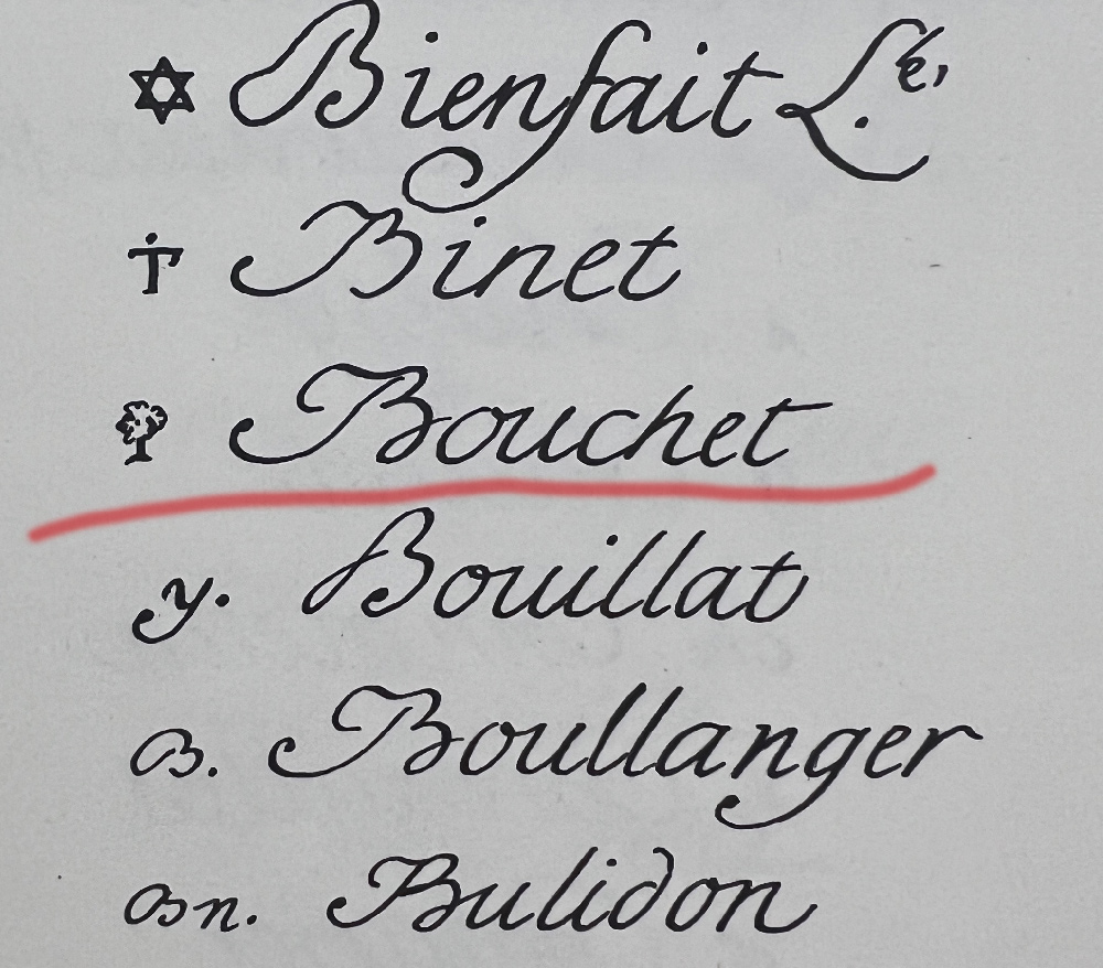
The artist is Jean Bouchet. He used a pictorial mark, a ‘tree’. While in the factory records – and the subsequent publications that used this as their source for what the marks looked like – he carefully drew a realistic tree with roots, trunk and layered foliage, while in practice he simplified it into something that looks like a furry lollypop…. This would have taken much less time & concentration!
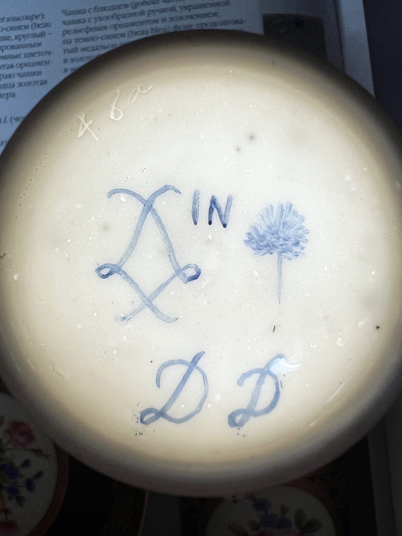
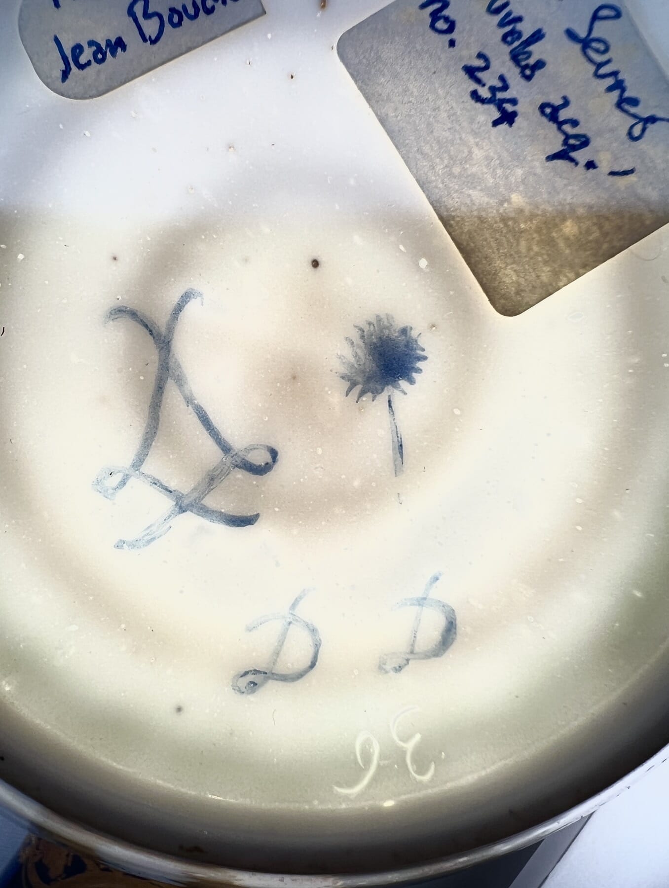
Factory records with Bouchet’s ‘tree’ mark Mark on our Sèvres cup by Jean Bouchet, dated 1781Mark on our Sèvres saucer, scenic panels by Jean Bouchet, dated 1781The marks on the Sèvres cup & saucer by Jean Bouchet, with transmitted light to show the workman’s incised mark.
The cup and the saucer are both 1781, dated with the same ‘DD’ in a distinct cursive script, the hand-writing of Jean Bouchet; there is also his distinct mark, a tree symbol. He is recorded as active at Sèvres 1763-93, a painter of human figures, landscapes, and flowers. He is very well represented in major collections, with his small landscapes being very appealing to original customers and present-day connoisseurs alike.
Jean Chauvaux jeune‘s ‘bead’ borders
The cup has another painter’s mark also – ‘IN’, the mark of Jean Chauvaux jeune, a gilder active 1765-1802. As there is not a great deal of gilding on the cup, we would suggest he was responsible for the unusual ‘bead necklace’ painting of the borders, where they are given highlights & shadows to make them appear rounded.
The incised workman’s marks 36 & 48a are both recorded by Saville in the Wallace Collection’s catalogue, vol III pp1130&1133. ’36’ is recorded 1770-90’s, while ’48a’ is recorded 1777-92. There are no names associated with these individuals.
In the British Royal Collection, both ’36’ and ’48a’ are present in several assemblages, including a set of very similar cups & saucers from the same period.
Sevres Cup & a Saucer by Jean Bouchet, 1781. Moorabool Antiques, Geelong
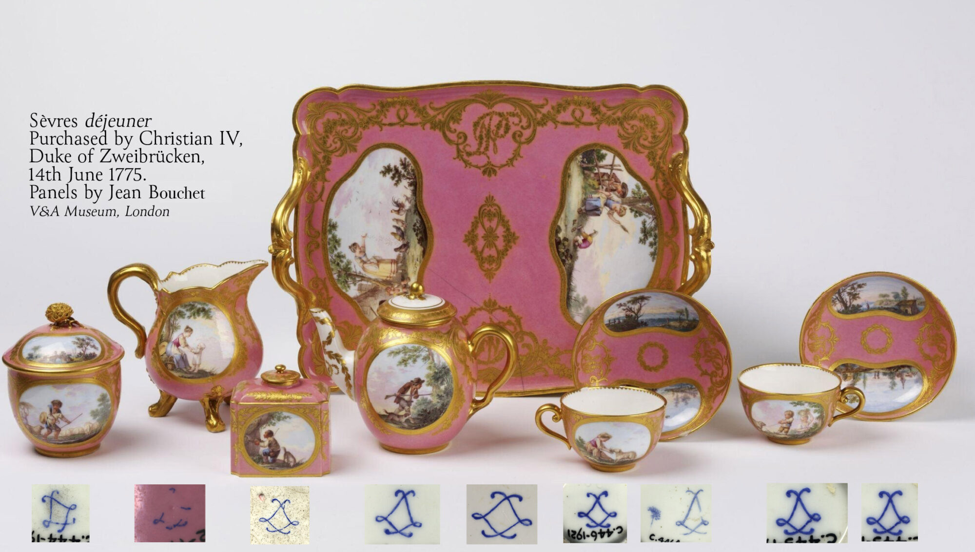
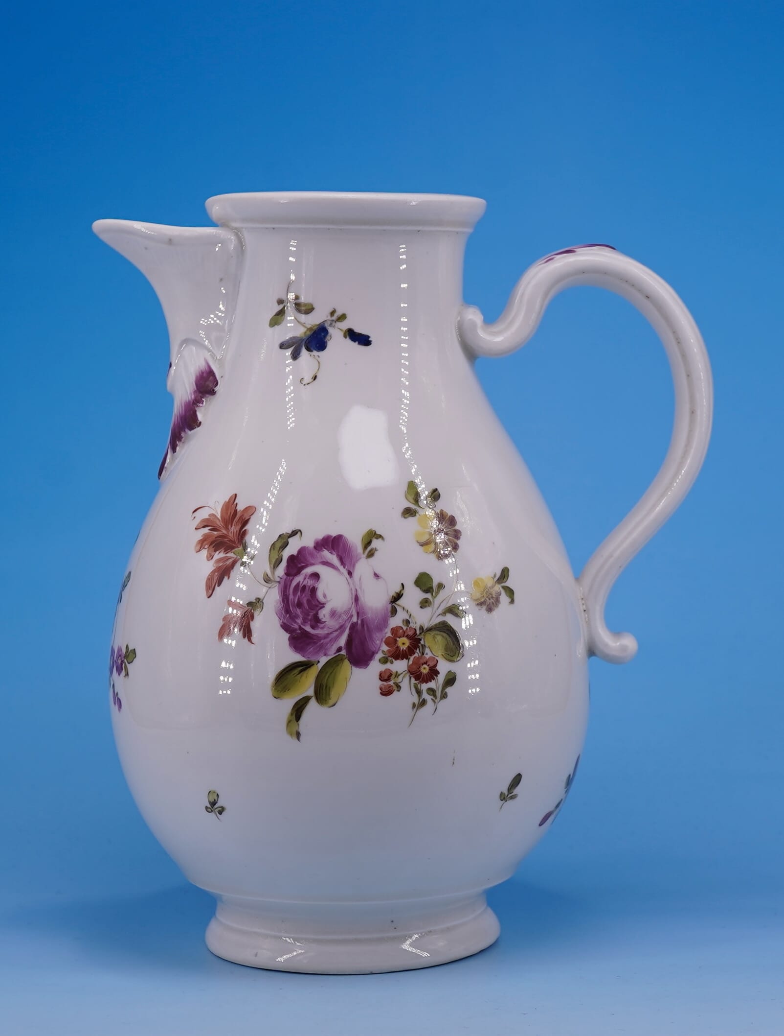
A complete déjeuner by Jean Bouchet, in the V&A Museum, London
It’s rare to see a complete group of porcelain from this era still together. This set in the Victoria & Albert Museum, South Kensington, is a fascinating rarity to study. It was bequeathed to the museum in 2015, and leading expert Rosalind Savill has identified it as one of four déjeuners bought by Christian IV, Duke of Zweibrücken, on the 14th June 1775. This was just 3 days after the event of the decade in France, the coronation of Louis XVI which the Duke naturally attended. Their cost was 840 livres, the equivalent of tens-of-thousands in today’s currency…. an expensive souvenir!
The marks on Sèvres should follow the rules and be very logical, but in practice they can be quite random. The system was there to provide the company with a way of tracking the various production steps and those responsible for the work: in a perfect scenario, the répareur, or workman who puts it all together, incised his particular mark, and both the artist and the gilder would include their mark. Then the factory mark, the crossed ‘L’s’ for Louis were painted, and inside them the code for the year it was decorated.
As you can see in the dejéuner set examples above, this isn’t always the case: of the nine components of the existing set, just a single example has a painter’s mark, here the ‘tree’ of Jean Bouchet, and none have a year mark! It is only the monogram found on the tray, along with the factory records recording Bouchard’s work on the commission, and the solid provenance that allow this remarkable set to be dated. This helps explain the number of non-conforming Sèvres items we come across, which have no date code or artist’s mark. They were quite probably part of a set where only a few items were marked.
Reference: Savill, Rosalind: A Sèvres Porcelain Tea Service in the Victoria and Albert Museum with Surprising Credentials, French Porcelain Society Journal, Vol. II, 2005, pp. 39-46.
Of course, fraud is always a concern, and later-decorated pieces can often be non-conforming – but usually, a date code is part of the deception, with the first years ‘A B C’ for 1754, 55 & 56 being the favourite – the trouble is, the style of decoration & object type was often not yet invented at that date, a dead giveaway!
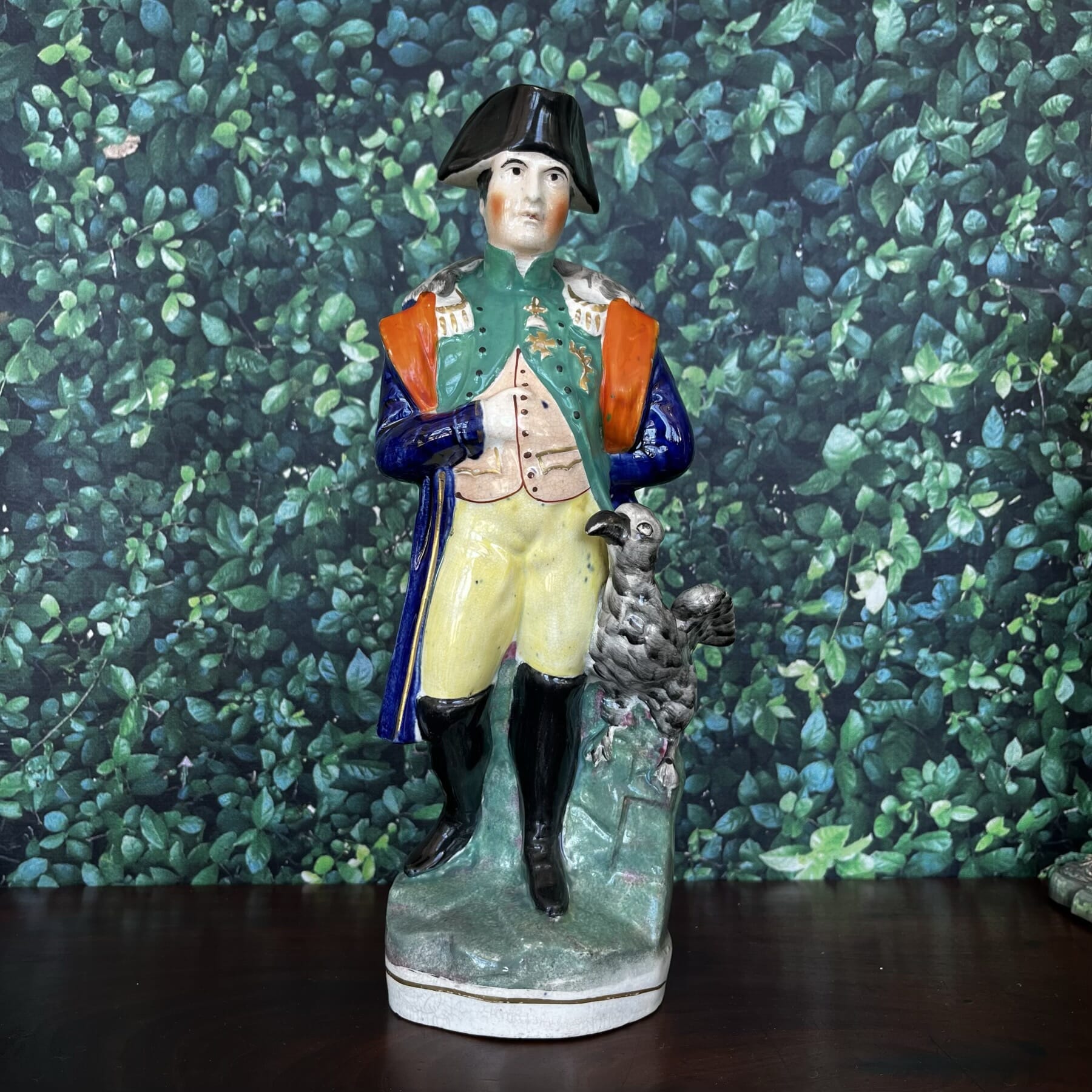
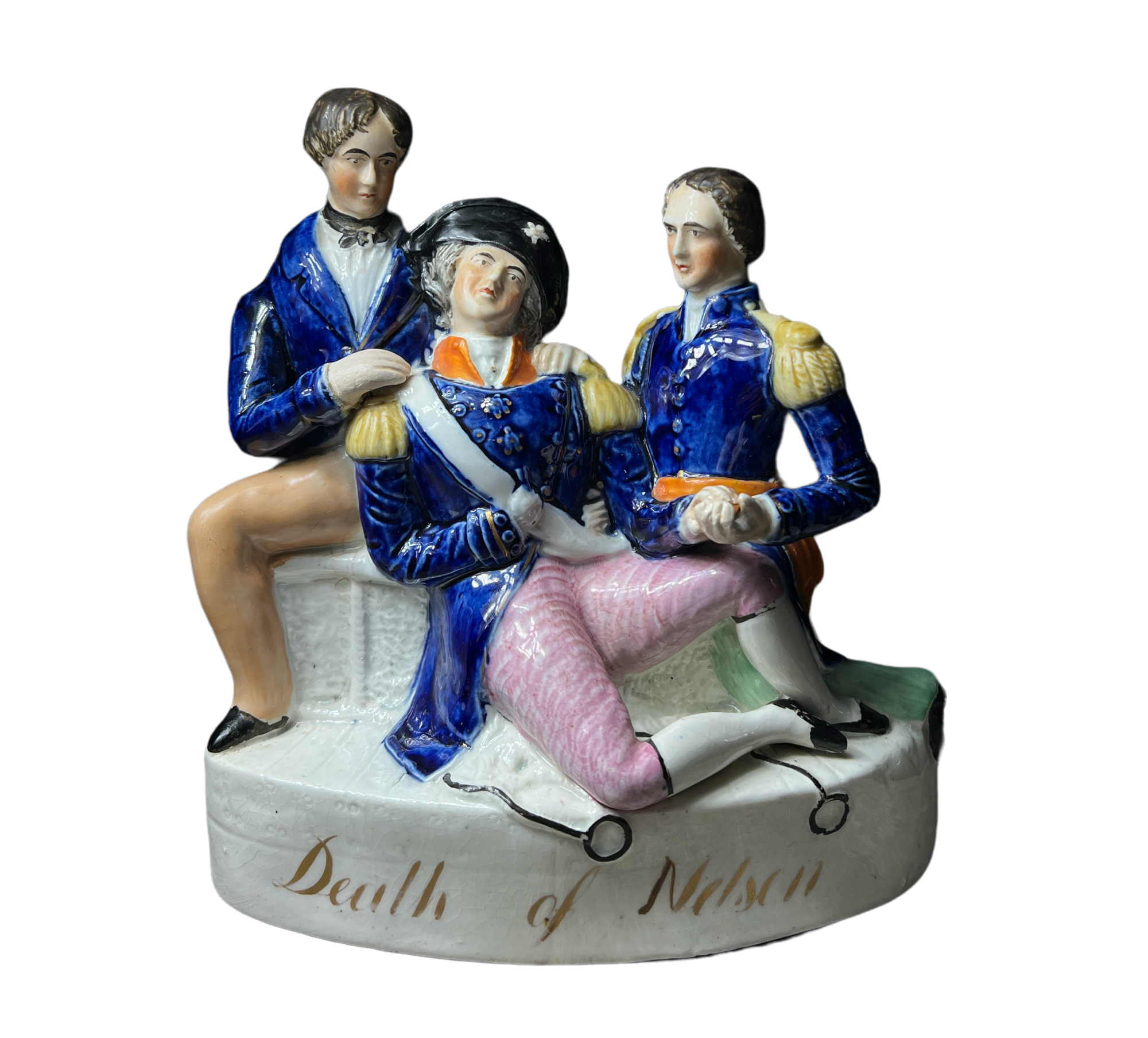
Trafalgar, 1805: It was a tragedy of heroic proportions: the battle with the French was won, but the admiral responsible, Nelson, was dead. While the event happened in 1805, it still had the imagination of the public 40 years later, when the Staffordshire figure illustrated here was made to dramatically illustrate the event.
In the words of William Beatty, Surgeon on the Victory who published his account in 1807:
About fifteen minutes past one o’clock, which was in the heat of the engagement, he (Nelson) was walking the middle of the quarter-deck with Captain HARDY, and in the act of turning near the hatchway with his face towards the stern of the Victory, when the fatal ball was fired from the Enemy’s mizen-top; which, from the situation of the two ships (lying on board of each other), was brought just abaft, and rather below, the Victory’s main-yard, and of course not more than fifteen yards distant from that part of the deck where His LORDSHIP stood. The ball struck the epaulette on his left shoulder, and penetrated his chest. He fell with his face on the deck. Captain HARDY, who was on his right (the side furthest from the Enemy) and advanced some steps before His LORDSHIP, on turning round, saw the Serjeant Major (SECKER) of Marines with two Seamen raising him from the deck; where he had fallen on the same spot on which, a little before, his Secretary had breathed his last, with whose blood His LORDSHIP’s clothes were much soiled. Captain HARDY expressed a hope that he was not severely wounded; to which the gallant Chief replied: “They have done for me at last, HARDY.”—”I hope not,” answered Captain HARDY. “Yes,” replied His LORDSHIP; “my backbone is shot through.”……..
CAPTAIN HARDY ordered the Seamen to carry the Admiral to the cockpit; …. The Reverend Doctor SCOTT, who had been absent in another part of the cockpit administering lemonade to the wounded, now came instantly to His LORDSHIP ….. (Nelson said) “take care of my dear Lady HAMILTON, HARDY; take care of poor Lady HAMILTON. Kiss me, HARDY.” The Captain now knelt down, and kissed his cheek; when HIS LORDSHIP said, “Now I am satisfied. Thank GOD, I have done my duty.” Captain HARDY stood for a minute or two in silent contemplation: he then knelt down again, and kissed HIS LORDSHIP’S forehead. HIS LORDSHIP said: “Who is that?” The Captain answered: “It is HARDY;” to which HIS LORDSHIP replied, “GOD bless you, HARDY!” After this affecting scene Captain HARDY withdrew, and returned to the quarter-deck, having spent about eight minutes in this his last interview with his dying friend.
….The Surgeon again left him, and returned to the wounded who required his assistance; but was not absent five minutes before the Steward announced to him that “he believed HIS LORDSHIP had expired.” The Surgeon returned, and found that the report was but too well founded: HIS LORDSHIP had breathed his last, at thirty minutes past four o’clock; at which period Doctor SCOTT was in the act of rubbing HIS LORDSHIP’S breast, and Mr. BURKE supporting the bed under his shoulders.
Thus died this matchless Hero….” 1809
AUTHENTIC NARRATIVE OF THE DEATH OF LORD NELSON: WITH THE CIRCUMSTANCES PRECEDING, ATTENDING, AND SUBSEQUENT TO, THAT EVENT; THE PROFESSIONAL REPORT ON HIS LORDSHIP’S WOUND, AND SEVERAL INTERESTING ANECDOTES . BY WILLIAM BEATTY, M.D.
Nelson memorabilia was a big market throughout the earlier 19th century. This is no surprise when we consider the potential market: England had spent a long time struggling with France, and the soldiers & sailors who went through the experience in the early 19th century – in their teens or twenties – were in their ‘old-age’ years by the 1840’s when this figure was made – the perfect time to buy a figure with sentimental appeal for the mantel! And perhaps, as a present from the next generation, given to the Grandfather who would entertain with his stories of ‘… back when I was in the Navy….’ .
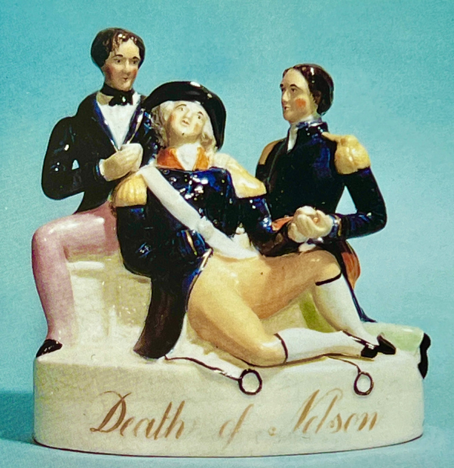
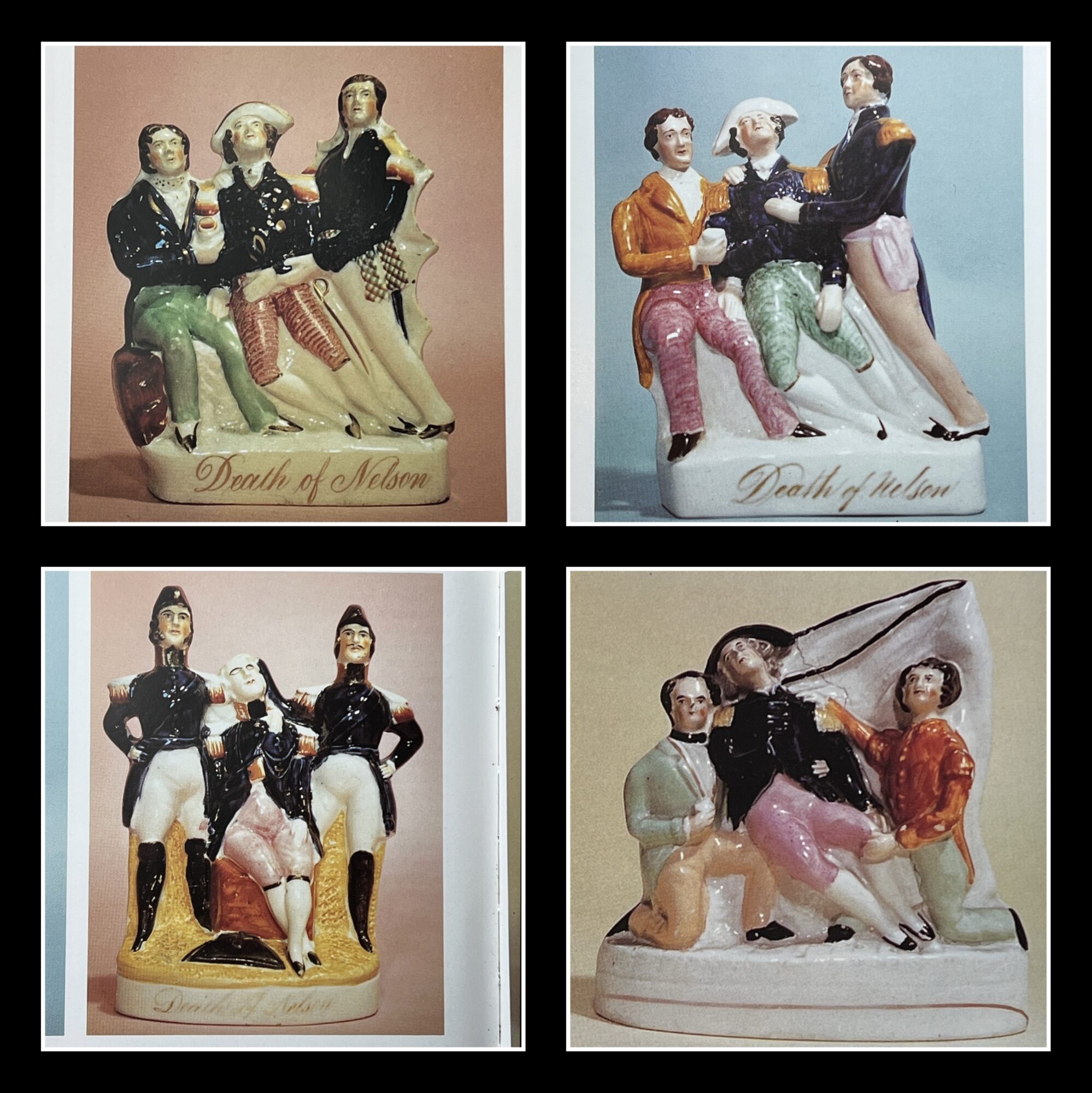
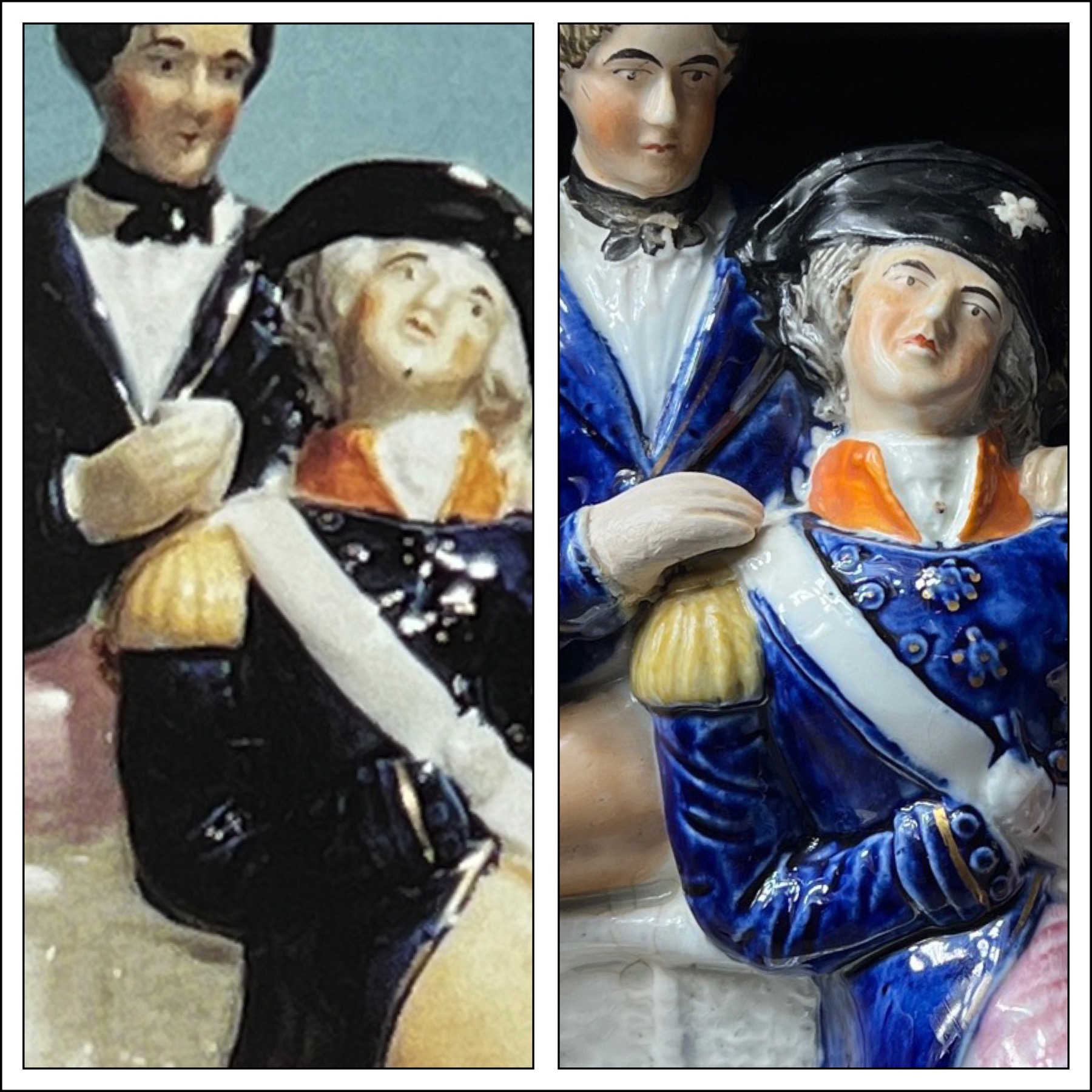
This group is rare: there are several different depictions, by different factories, with the three figures in the group. In Harding, vol. 1 p92, there are 5 variations illustrated; 4 are ‘E’ rarity, suggested at £3-400. This version, however, is ‘C’ rarity: £1,000 – £2,000. The figures are well modelled, the painting well executed, and the most distinct point-of-difference is the pair of lanyards with rings attached, moulded & painted black front center.
Harding’s example of the rare version of ‘Death of Nelson’
The other 4 Staffordshire ‘Death of Nelson’ groups, as recorded by Harding.
left- Harding’s example, note cup in hand. right- our example, much finer details.
The visible fingers of both officers have been restored in our example – although Nelson has somehow survived intact! Examining the illustrated example reveals a mistake the restorer made: the figure on the left should have a glass of water he is offering to Nelson, not included with the restoration.
This comparison with the example in Harding’s book also emphasizes the superior quality of our example – the detailing seems much crisper, which may simply mean it came out of a newly made mould, as opposed to the harding example, where the mould was well-used and details less distinct.
It’s a fine & desirable rarity, despite its flaws!
With the tale of his death as told above, we can identify the figures comforting Nelson. To his left is the gent who should have a glass in his hand; this would fit the part played by the Reverend Doctor Scott, who was ‘administering lemonade to the wounded’ and gave Nelson liquid when he requested it. To his right is an officer, holding his hand; this would be Hardy; famously, towards the end, Nelson said ‘Kiss me, Hardy’.
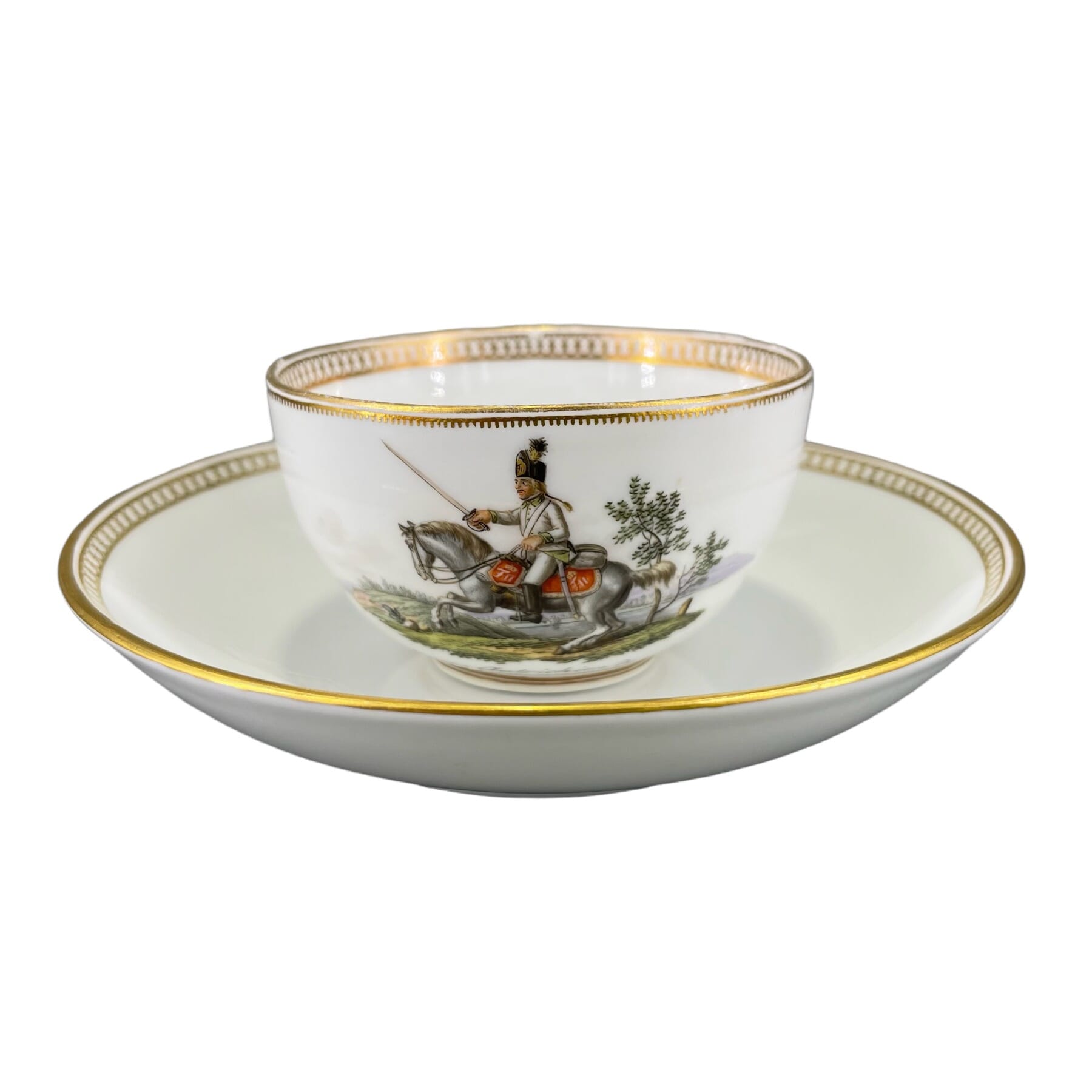
A wonderful selection of Vienna, Meissen, Sevres and other finely decorated ceramics for your perusal! Mainly 18th century, you’ll find Bow, Worcester & Caughley, plus some French & German – but in particular, a fine selection of early Vienna porcelain.
This group of Vienna is a part-set, with just 3 pieces remaining – beautifully painted with flower panels on dark ‘earthy’ grounds, they are individual masterpieces in their own right!
Vienna Flower Painting 1785
The vienna is original 18th century; the Sevres cup & saucer, shown at the top & in detail here, is 18th century porcelain, but was decorated in the 19th century – by a very skilled artist. Stunning!
The Bow pieces in today’s ‘Fresh’ are rather fine examples of their early products of the 1750’s. The blue is a distinct lovely rich deep tone. The fluid quality of the painting is superb – echoing the imported Chinese Export wares of the period, but in their own way. The large charger has a number of very unusual features, including the central pagoda with its buttressed supports, and the speedy boat at lower left, piloted by a hunched over figure in the stern, the movement shown by a radiating wake!
Each piece has a damage – the charger a factory flaw to the central tree, the punchbowl a chip & crack to rim restored – hence their tempting prices, $1650 on the charger and $850 on the punchbowl.
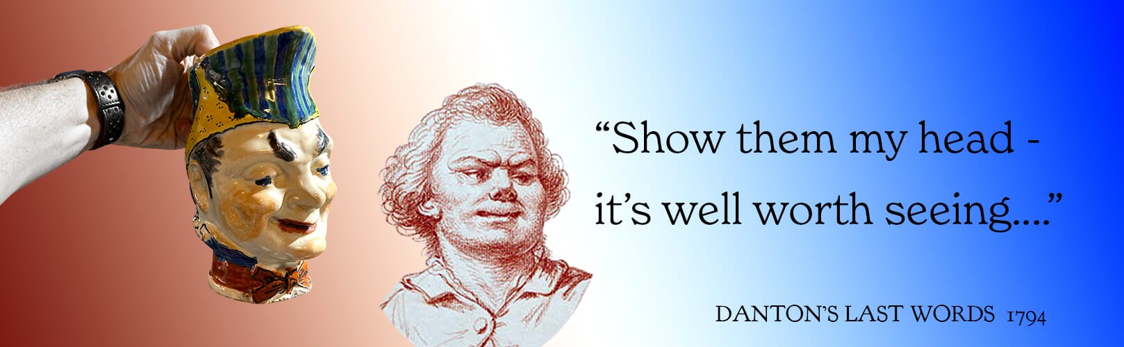
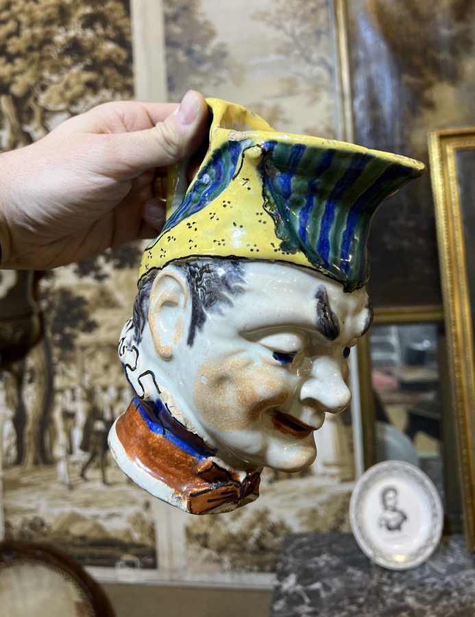
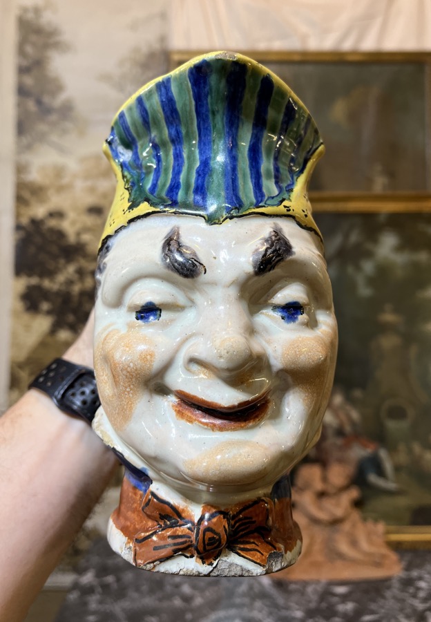
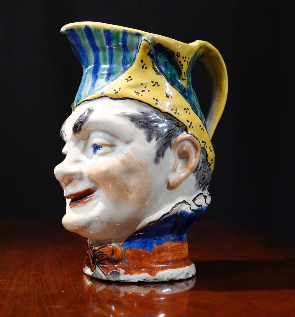
Often mis-labelled a ‘Toby Jug’, this is an early version of a comical jug that becomes popular in the latter 19th century, sometimes identified as ‘Puck’. We believe this head jug is a distinctive character, and as it belongs to the period of the French Revolution, his identity must be found in that timespan. His appearance matches that of Georges Jacques Danton (17591794), an important public figure of the late 18th century in France, and the perfect candidate for a slightly humorous head mug like this.
Contemporary French depictions of Denton give you a good idea of his appearance:
Is this Georges Jacques Danton? French Faience jug, c. 1795
Danton was President of the Committee of Public Safety, a part of the Revolutionary Government whose purpose was to protect it’s seat of power. As such, he was able to achieve dictatorial power for the committee; however, he soon found himself in trouble as the whole scheme got away from him. He be came noted for his corruption, and mocked by the general population. The infamous ‘Reign of Terror’ was fatal for him; beginning in 1793, preemptive executions of anyone suspected of being an enemy of the government took place, directed by the sinister Robespierre. Danton became a moderate, disgusted by the slaughter, and tried to calm things down. However, this very action led to his arrest and trial on April 3rd, 1794.
Hauled before the Revolutionary Tribunal with several other political moderates, he put up such a fight that it was feared he would sway the tribunal with his rhetoric. However, the decision had already been made. The acused were denied the right to have witnesses appear on their behalf, and then two days later the verdict was passed in the absence of the accused, who had been removed from the courtroom to prevent unrest among the trial’s observers. Their execution was scheduled for the same day.
Danton’s Execution, with his head fulfilling his last wish, 1794
Dragged to the guillotine with several others, he was executed.
“I leave it all in a frightful welter,” he said;
“not a man of them has an idea of government.
Robespierre will follow me; he is dragged down by me. Ah, better be a poor fisherman than meddle with the government of men!”
The reference to a poor fisherman’ was probably a reference to Saint Peter, as Danton had reconciled to Catholicism. His last words to the crowd were, “My only regret is that I am going before that rat Robespierre.”
Danton’s true last words, however, were addressed to his executioner:
“Don’t forget to show my head to the people – it’s well worth seeing” !
Danton’s Last Words
Events went as Danton foresaw. The committees presently came to quarrel with the intense opinions of Robespierre. Just three months after Danton’s execution, The Reign of Terror was ended when Robespierre was himself executed. His assent to the execution of Danton had deprived him of the single great force that might have supported him against the Revolutionary committee.
This remarkable head mug dates to this period of political upheaval. He wears the red, white & blue around his neck, in the high collared fashion of the time.
How ironic that his last words were lived out in clay, with an enterprising potter making a mug of his head, for all to see and remember the remarkable Danton, the moderate who tried, and failed to tame the Revolution.
Welcome to our ‘Fresh Stock’ update – these items are fresh to our stock , and fresh to this website.
Today it’s some Wonderful Worcester.
Dr John Wall (1708-1776) Founder of Worcester Porcelain Worcester Porcelain Museum;
Dr Wall, or ‘First Period Worcester’, is the earliest period of this important English porcelain maker. Dr John Wall was a fascinating 18th century Gentleman, a practical doctor who helped found the charitable hospital at Worcester, becoming wealthy and well-known in the process. In 1751, along with William Davies and 13 other businessmen, he established the Worcester works on the banks of the River Severn, Worcester. Davies was an apothecary, not far removed from alchemy in the mid-18th century, and actively experimenting in the quest for a porcelain body. Together with Wall, and the help of the group of investors, the distinct Worcester porcelain body was developed. There were many other attempts at making porcelain in England at this time. Bristol had a porcelain factory, and Chelsea and Bow were active in London, while Derby also had a porcelain works. Liverpool, Lowestoft and Bristol followed soon after in their respective cities. 60 miles from Worcester, Caughley made almost identical wares (before the age of copyright…). The pottery makers of Staffordshire soon began their own porcelain production, and so there are quite a number of makers of porcelain in England in the last half of the 18th century.
Dr Wall Worcester dish, c.1770 – coming soon to Moorabool.com
Confusingly, some of these other makers used the same ‘C’ crescent mark as Worcester. So how do we tell Worcester from the rest? A simple answer may be ‘Quality’. They always had a high standard, at least once they worked out how to consistently produce the same results from their kilns. But many other makers also produced high quality wares, and the decoration is often very similar, following the demands of taste. Without copyright, it was easy to copy a popular design.
The answer to identifying early Worcester is the body. They had developed a soft-paste, or artificial porcelain. Unlike the Chinese – and the Continental porcelains, like Meissen – it lacked a vital ingredient found in ‘true’, or hard-paste porcelain. This ingredient was responsible for the stability, or hardness of the body, and this in turn meant it was more durable. Especially important considering the teawares that came to be a major part of their business; if a teapot cracked when hot liquid was poured in, it was not good for business – and this was what often happened to the likes of early Bow and Derby. Worcester prided itself in the ability to withstand hot water ‘shock’ – but was resistant, not crack proof. We do see an awful lot of Worcester teapots with classic spreading hot-water cracks.
One of the 15 initial partners in the Worcester concern was Richard Holdship. He was somehow aware of a struggling porcelain manufactory at Bristol, the works of Benjamin Lund. This had begin in 1749, with the granting of an exclusive licence to mine ‘soaprock’ at the Lizard, Cornwall. When this special ingredient was combined with their clay, Lund’s Bristol porcelain had a different quality to other English porcelains of the period. The soaprock unified the body, allowing it to distribute heat better, for example when boiling water was poured into it. Lund produced a limited line of products for a limited time, and by 1751, was in financial strife. Holdship was able to come in and buy-out the works, including the equipment, workmen, even Lund himself came to Worcester to the new works there. Most importantly, the Worcester firm now had the rights to the soap-rock of Cornwall, and added to their clay, produced the fine body we are used to with 18th century Dr Wall Worcester.
Translucency-Caughley, Chelsea, Worcester- circa 1760’s-70’s
So how do we identify this Worcester body? A very simple process: hold it up to the light! A porcelain body by definition is translucent. This means the light is able to penetrate into the structure of the fired clay, and some finds its way through. When it strikes the minerals inside – such as the soap-stone – part of the light spectrum will be absorbed, with the remainder of the spectrum escaping to the viewer’s eye, resulting in a certain colour tone. In the case of Worcester with the soap-stone, it’s a greenish tone we look for.
The green tone is apparent when light is shone through the porcelain.
Other English porcelain translucency – some mild green, but not as much as Worcester.
This of course isn’t definitive test – there are variations, decoration changes things, and other factories could also produce green-tinged bodies. But combined with visual cues like patterns and shapes, spotting Worcester becomes a much simpler task.
Dr Wall Worcester Translucency c. 1775
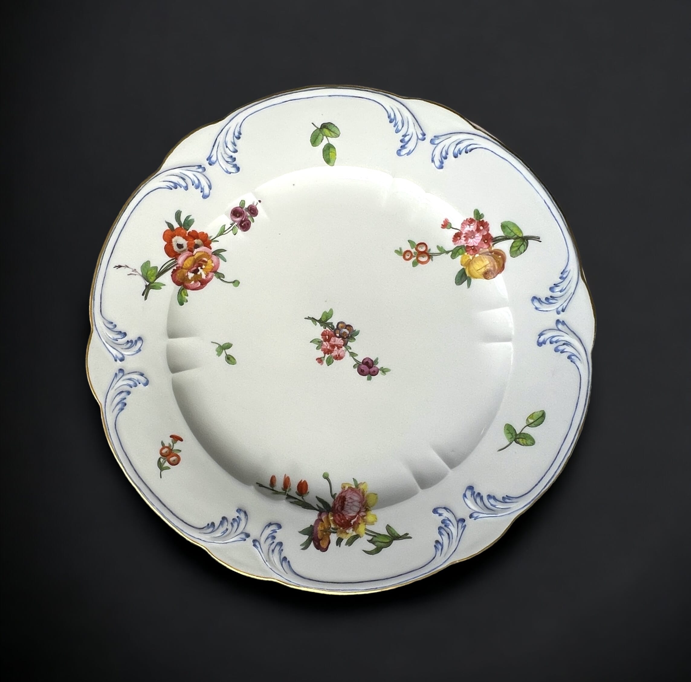
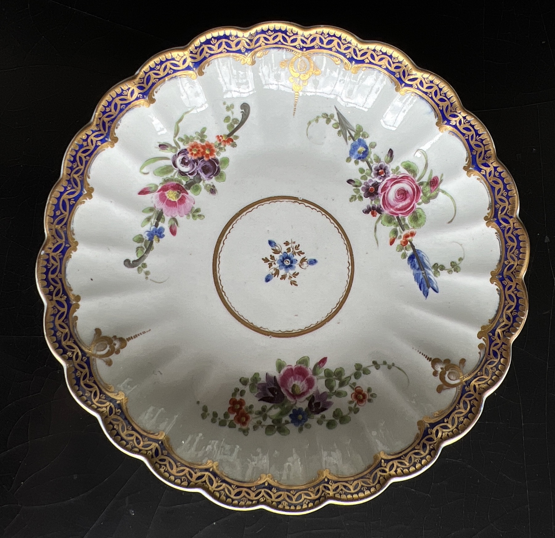
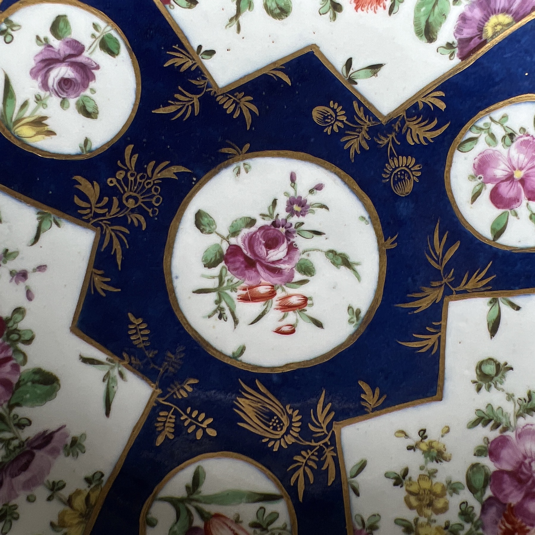
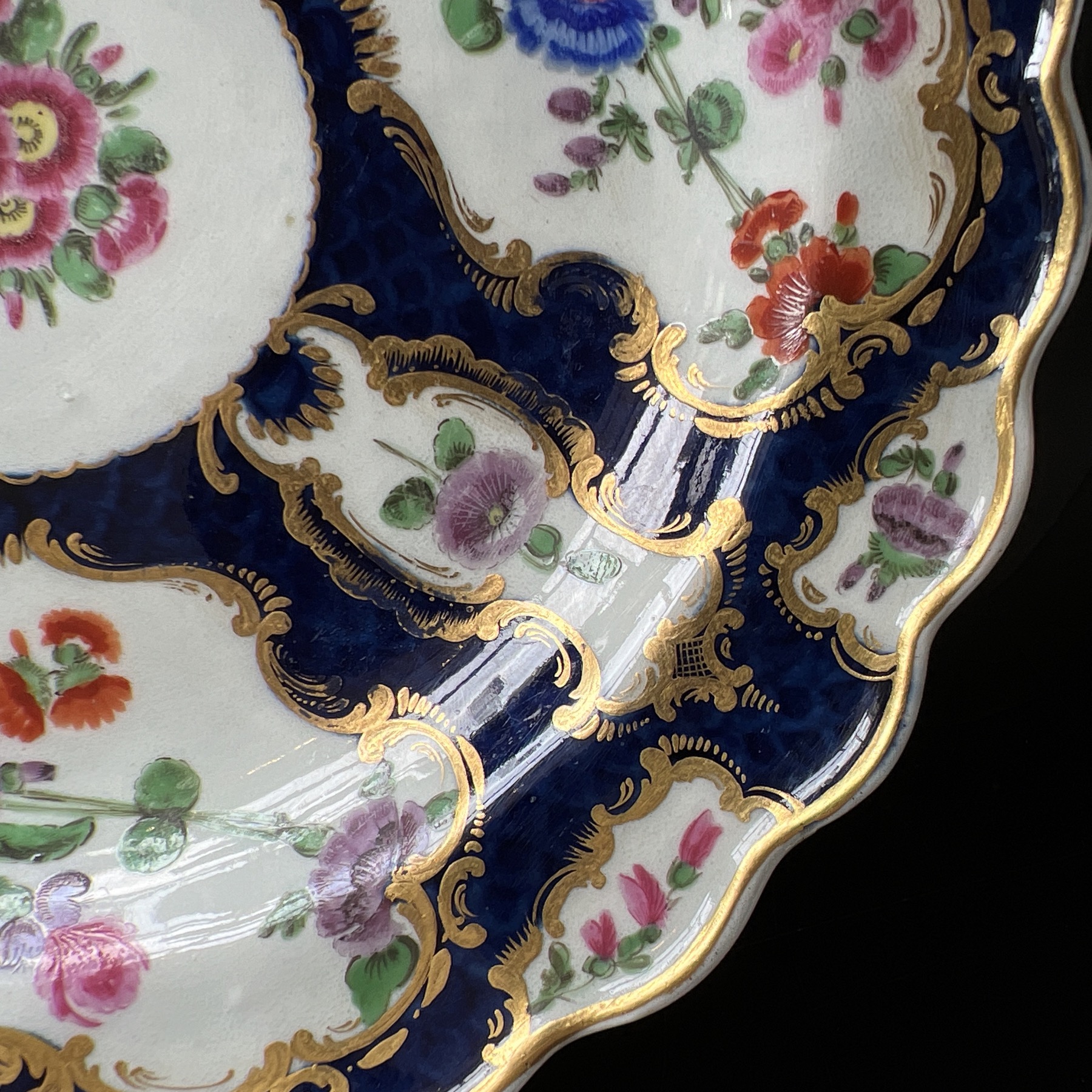
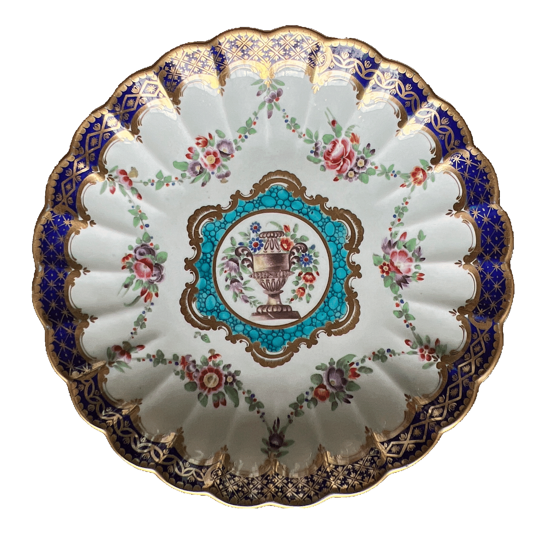
This week, our Fresh Stock release has a series of superb Worcester ‘Saucer Dishes’, painted in the various Rococo patterns of the later 18th century. Literally a dish-sized ‘saucer’ shape, there was one, or sometimes two included in a tea service, intended to hold the cake or nice little knibbles the ‘Lady of the House’ was to serve when offering tea in the fashionable sitting room to visitors.
The ‘Marriage’ pattern is beautiful, with hidden symbols of Cupid amongst the flower sprigs. Apparently George III liked this pattern, and had a service made for Kew House. The older tale was it was to celebrate his marriage, although there are no records as such; however, the name ‘Marriage’ for the pattern is totally appropriate considering the hidden symbols of a bow, a quiver, and a lover’s knot.
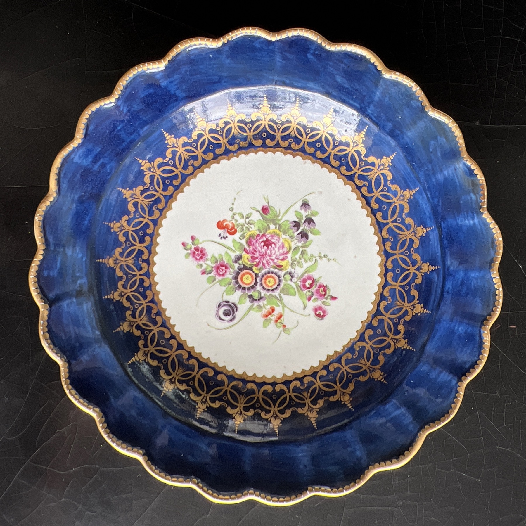
Dr Wall Worcester ‘Powder Blue’ plate, c. 1770
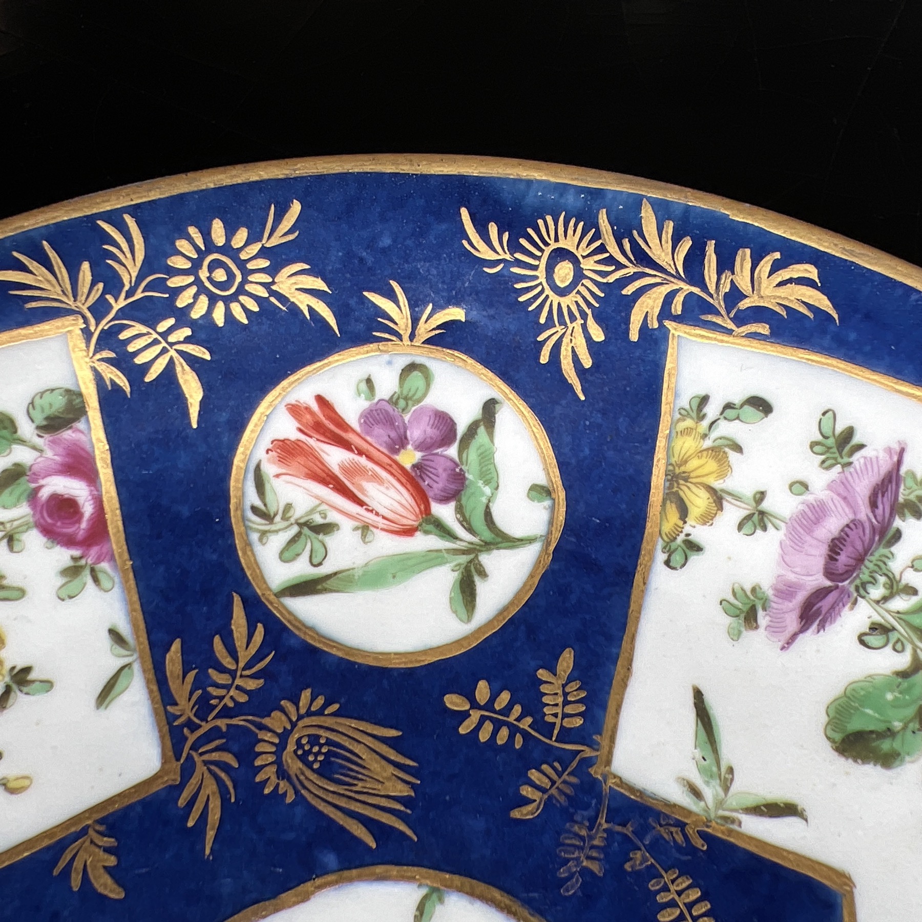
The ‘Powder Blue’ example is fascinating, in that the flowers are lavish and flamboyant – but the fan-shaped reserves are outlined in a simple straight line of gold, with no scrolls to be seen. This reflects an earlier period, when Chinese porcelains from the Kanxi reign were coming into Europe with similar decoration. The ‘powder-blue’ ground is literally created as it sounds – a powder of blue cobalt pigment is blown onto the piece, which is treated with an oil to make it sticky; where the white panels are to be, a paper stencil cutout is attached. Once fired, this leaves the white panels to be painted by the factory artists. in the case of this plate, the artist was very good – the same hand is at work on a jug in the Zorensky Collection, along with the very stylish flower sprays. This gilding is the thick & rich ‘honey gilding’ , once again created exactly as described – honey is used to suspend the gold and apply it to the porcelain, where it burns off & leaves the gold in place when fired.
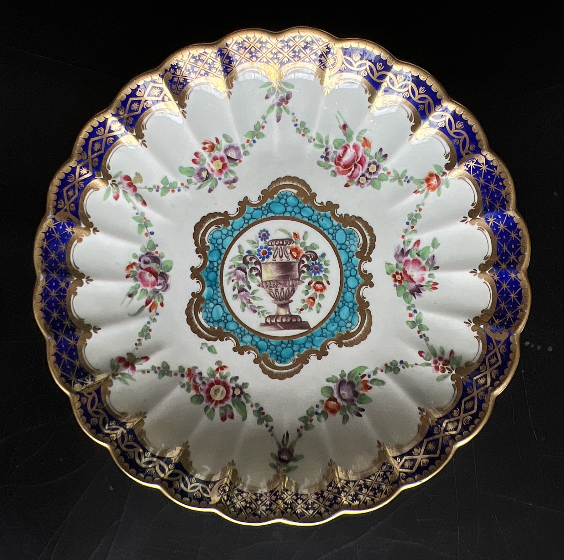
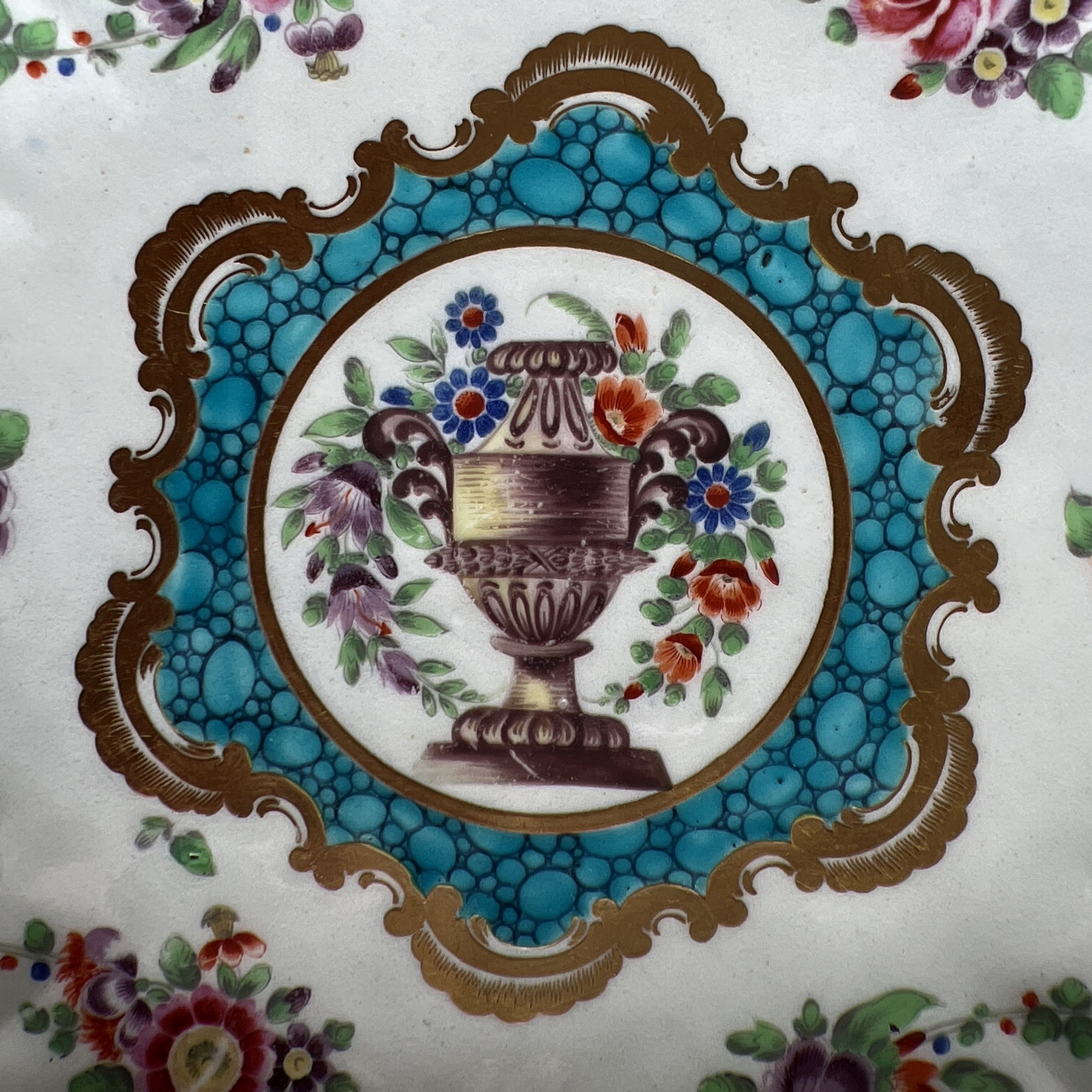
Dr Wall Worcester Saucer Dish, French Shape, c.1770
The example with the urn in the centre is Dr Wall Worcester at its best. This fluted shape is known as the ‘French’ shape, and was very popular for tea wares. The combination of the central flower-clad urn and the colourful swags of flowers hanging from suspension amongst the rich gilding around the rim is enhanced by the startling splash of turquoise ‘caillouté‘ work, a French word meaning ‘pebbly’. It’s based on the luxurious Sevres imports of the time, and the whole look & feel of these flamboyant pieces deserve their ‘French’ title.
Enjoy!
Remember, we post world-wide at the most reasonable rates – ask for a quote.
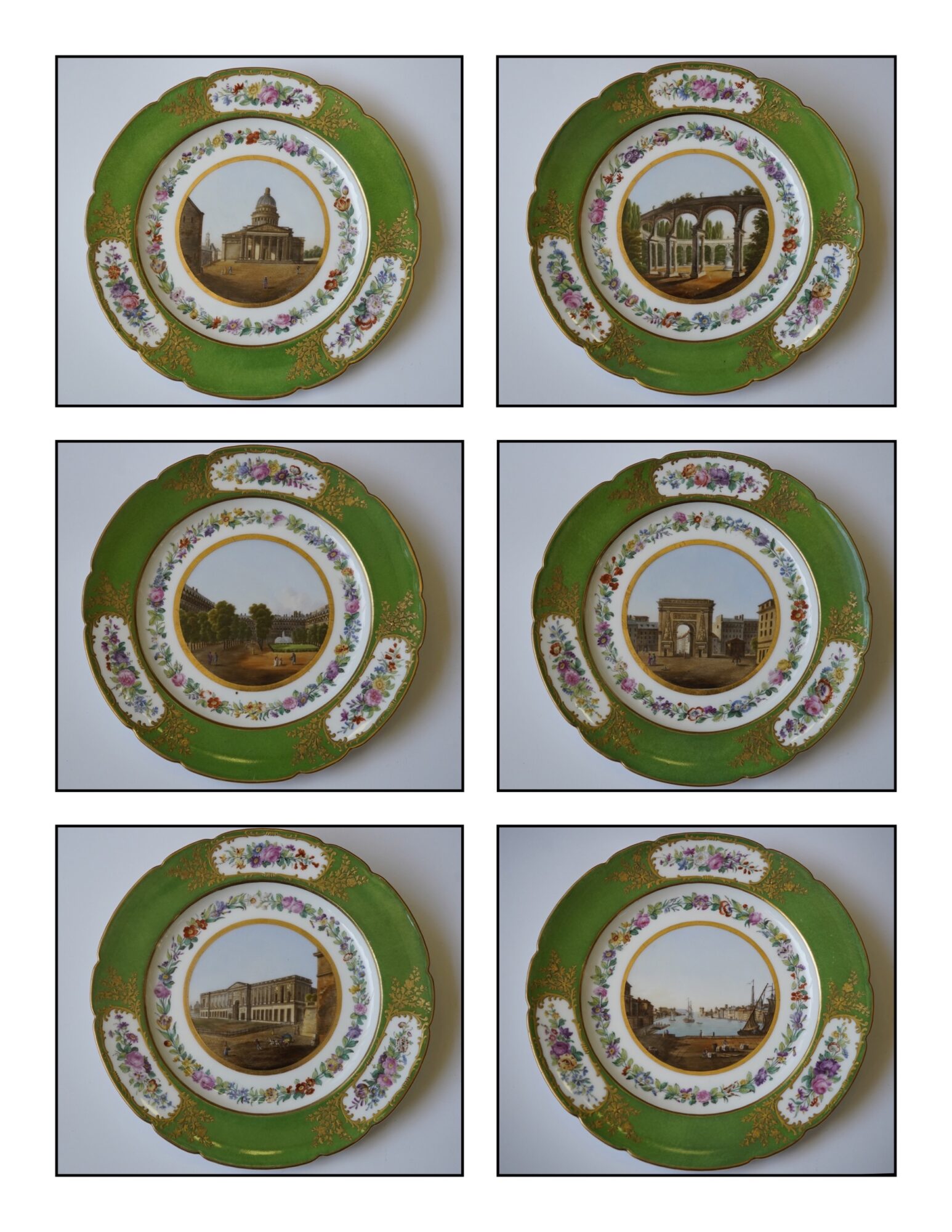
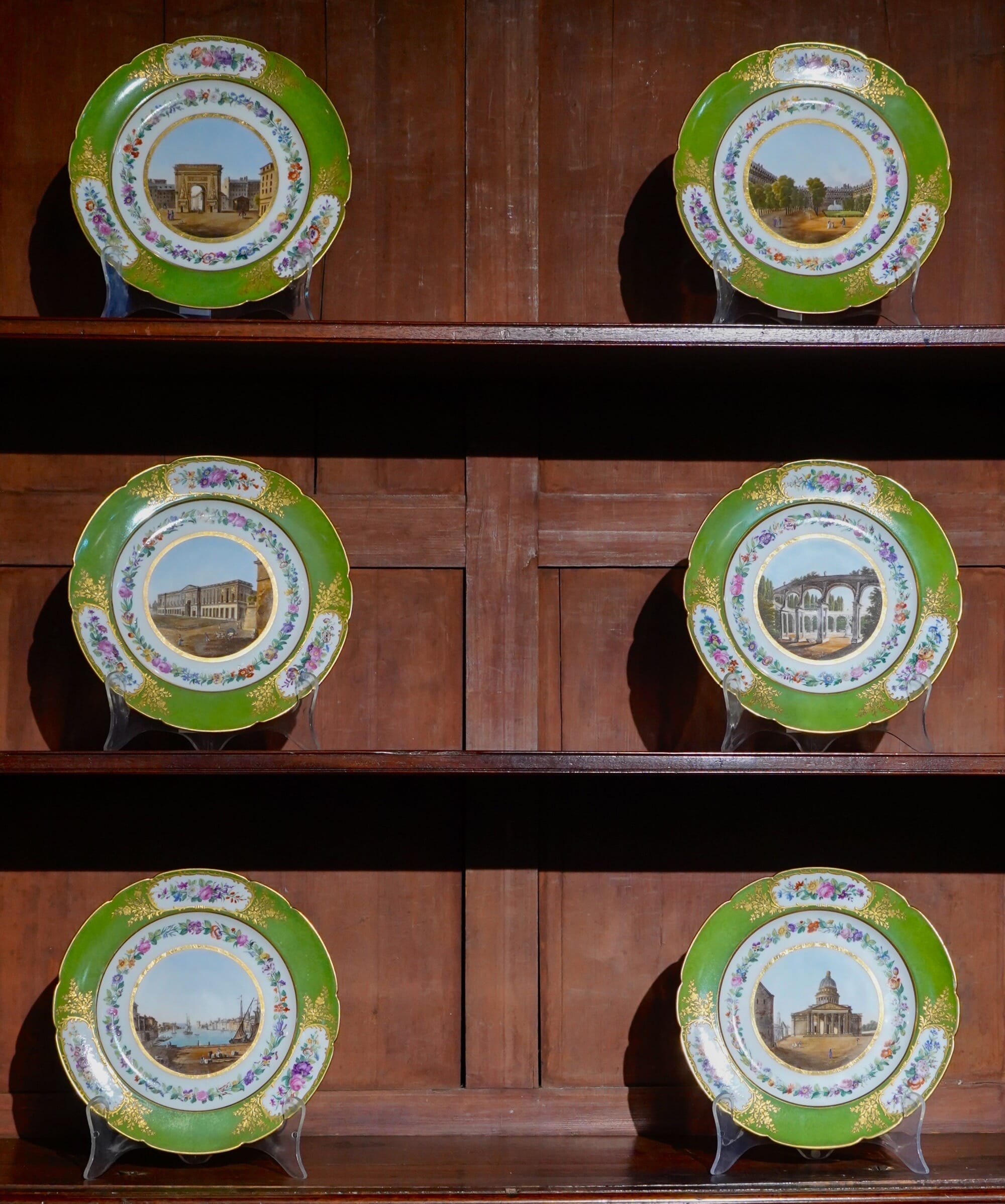
Fresh to Moorabool are a series of scenic plates. Dating to the earlier 19th century, they are stunning examples of quality china-painting, worthy of a ‘fine-art’ title.
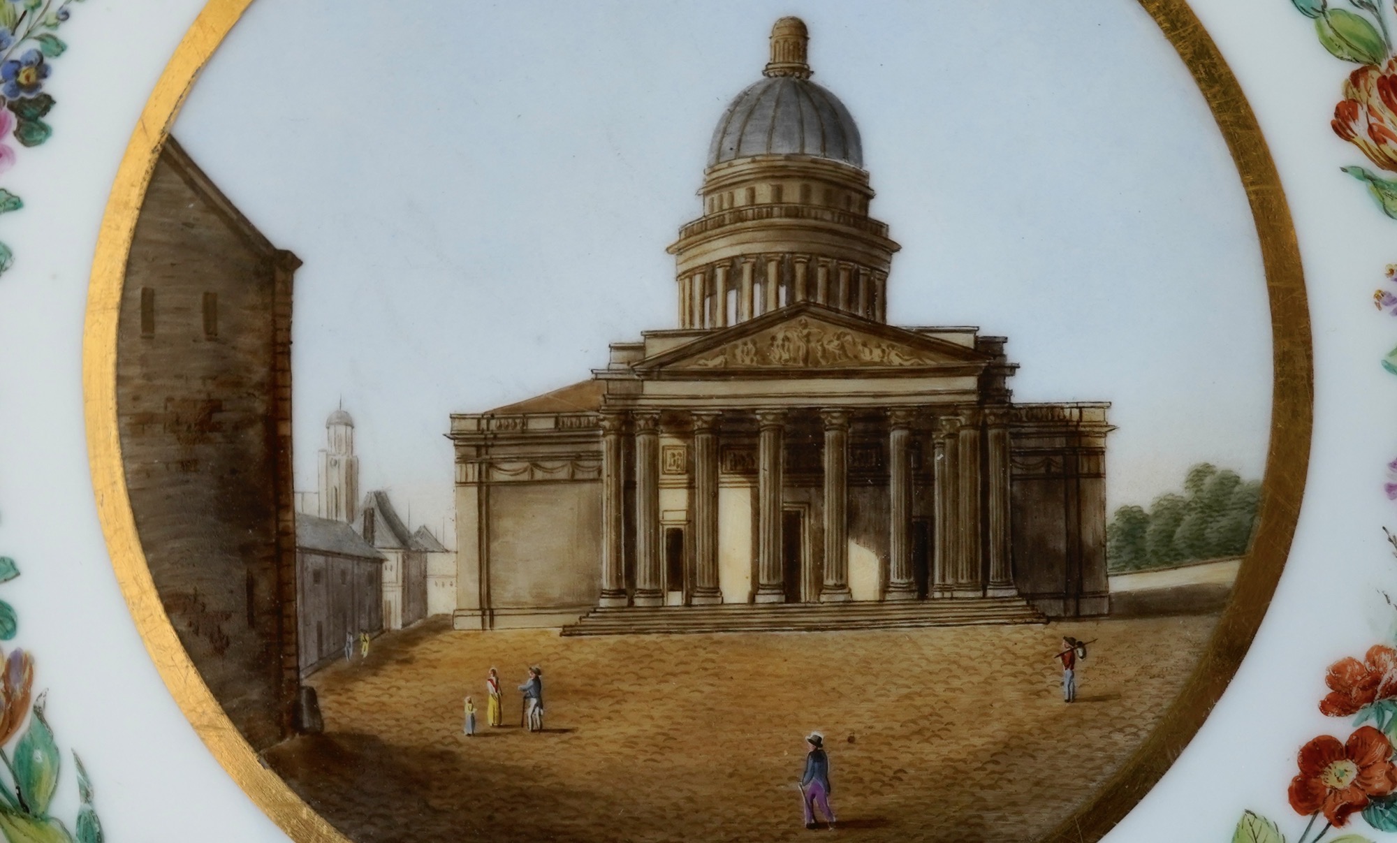
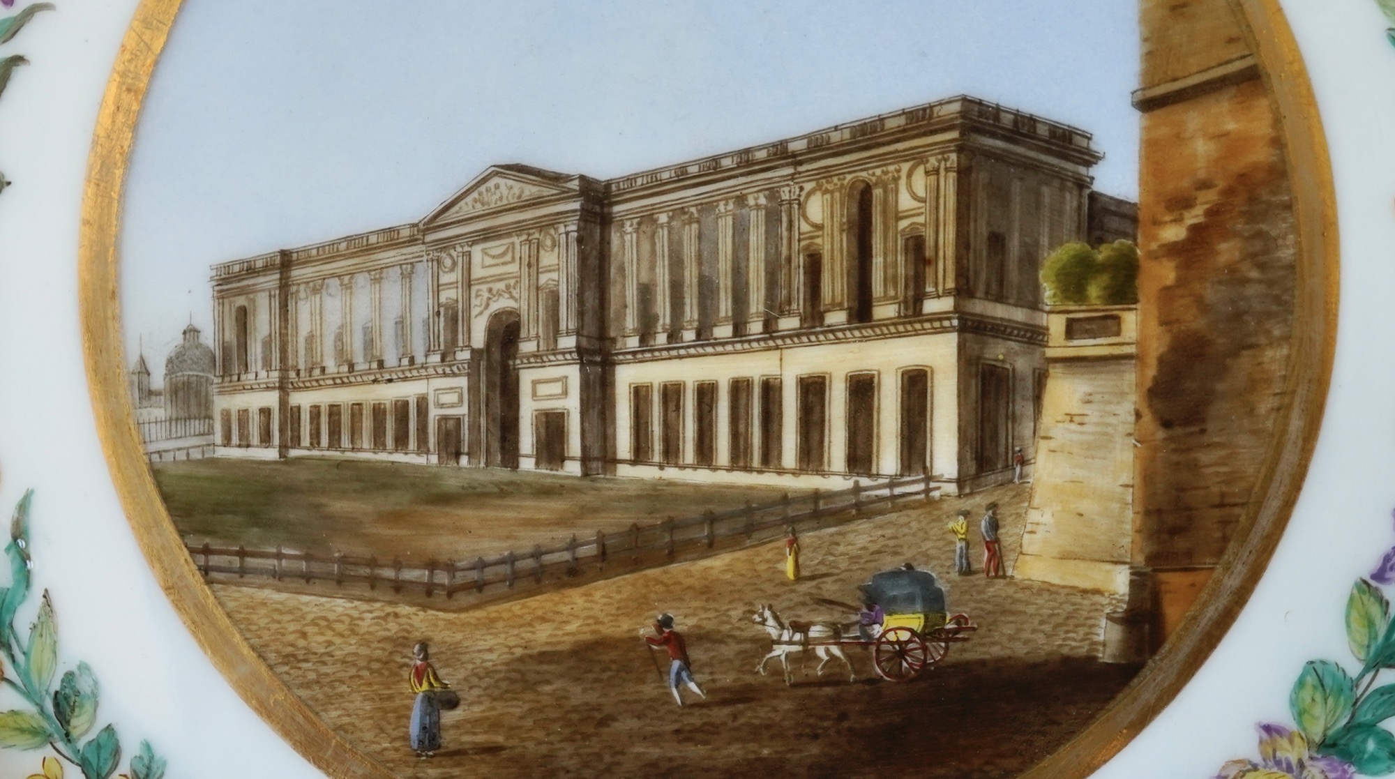
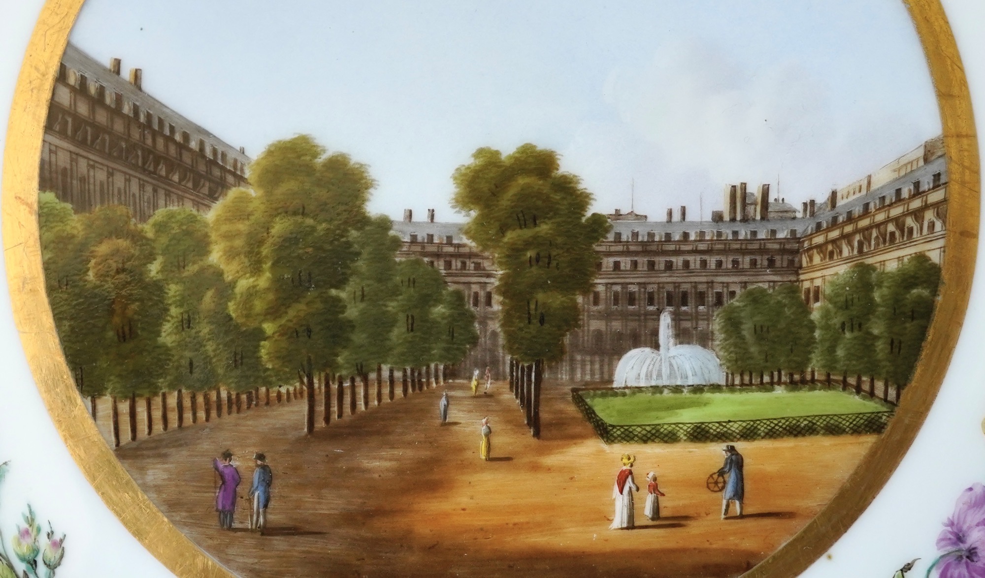
Scenic dessert service, with superb hand-painted Parisstreet scenes, by Feuillet c.1830
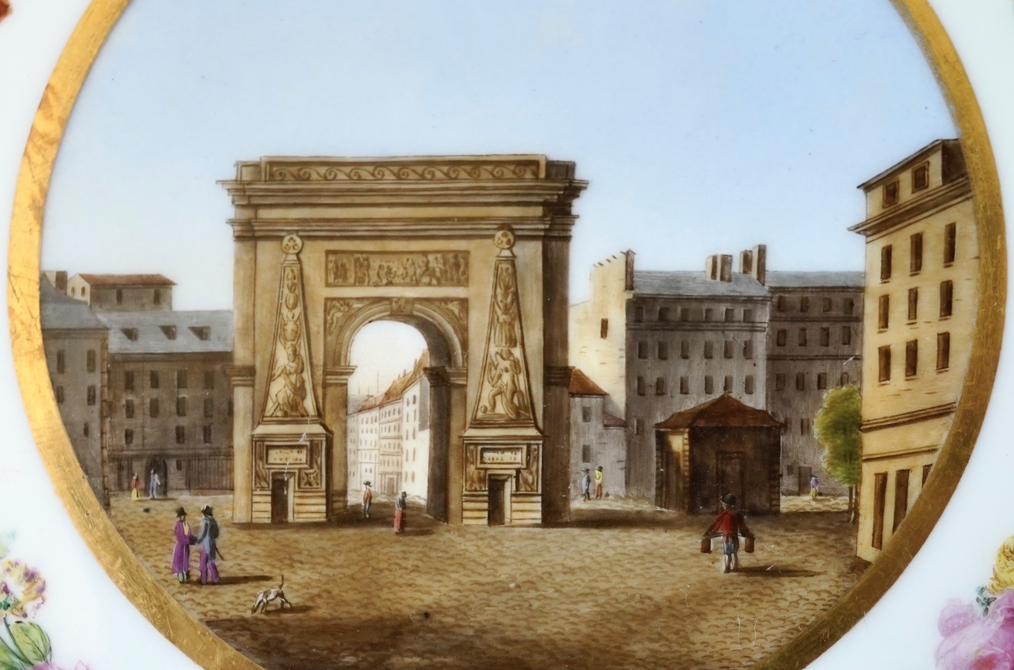
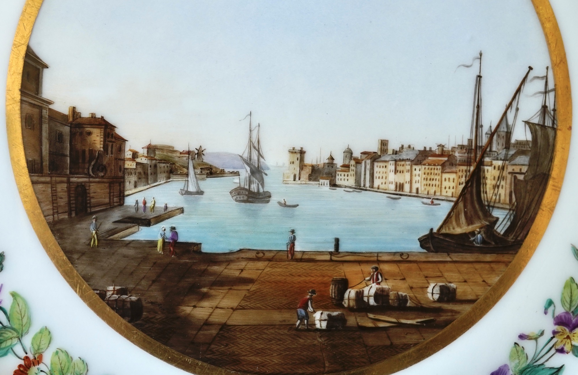
The first is a ‘dessert service’ – not that it would be used for food! It is particularly flamboyant, with scenes of Paris (and one of the port of Marseilles) within flower wreaths, with panels of flowers on a green ground enhanced with raised gilt flowers…. evoking the luxury of the Royal French factory, Sevres. Clearly, this was made for someone to take a piece of France home with them – in a way, a superior souvenir! It features large hand-painted scenes to the base of each, including: The Pantheon, Versailles, The Gardens of Versailles, Palais Royal, Porte Saint-Denis, and a view of the harbour at Marseilles.
The Pantheon, Paris, painted on a plate by Feuillet c.1830
Versailles
Colonnade dans le Parc de Versailles, on a plate by Feuillet c.1830
Palais Royal, on a plate by Feuillet c.1830
Port de Saint-Denis, on a plate by Feuillet c.1830
Paris Porcelain Scenic service, Marseilles harbour, by Feuillet c.1830
They are each titled with the identity of the view to the back, and are also all nicely marked – which is a terrific feature of Paris Porcelain of this period. The artists usually marked their products, especially those who had the better quality output. The idea seems to have been ‘advertising’ – a clear name and address stamped & fired onto the back allowed an Englishman, for example, to trace their source to the workshop – in order to buy his own souvenir of Paris! At this period (late 18th – 19th century_ there were more ‘decorating studios’ than manufacturers of porcelain in Paris, decorating blank porcelain with their own patterns. The porcelain therefore is not necessarily the defining factor in identification of a piece. Thankfully, they made it simple for us with their marks.
Feuillet’s hand painted mark, Paris Porcelain c. 1830
This service is the product of Jean-Pierre Feuillet, the son of a pastry chef to the the Prince de Condé. He learnt to paint in Chantilly, at a school funded by the Prince. He must have really appreciated his father’s pastries, as when Jean-Pierre showed ambition to open a decorating studio in Paris, he did so under the Prince’s protection, in 1814. This establishment on the Rue de la Paix became renown for the highest quality decoration, a ‘supplier to the aristocracy’. As such, his styles were the absolute latest, featuring all the Neo-Classical lavishness of the Restoration period. Each piece is usually hand-marked ‘Feuillet’. He took on a partner, Boyer, who continued at the same address after Feuillet’s death in 1834, mantained the creation of fine quality porcelains, and proudly marked marked ‘Boyer, successor to Feuillet’.
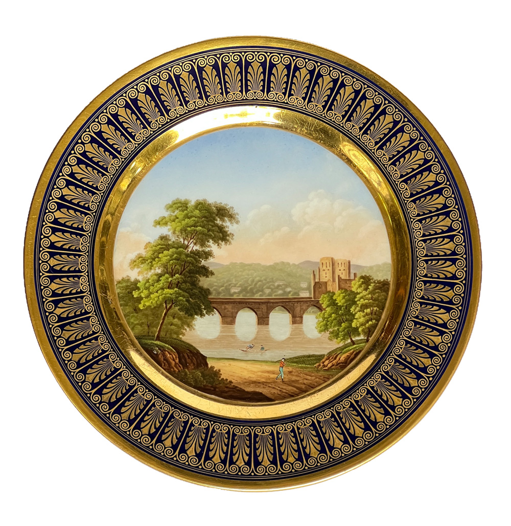
Alongside this service is the following scenic plate with a rich ‘Empire’ gilt border.
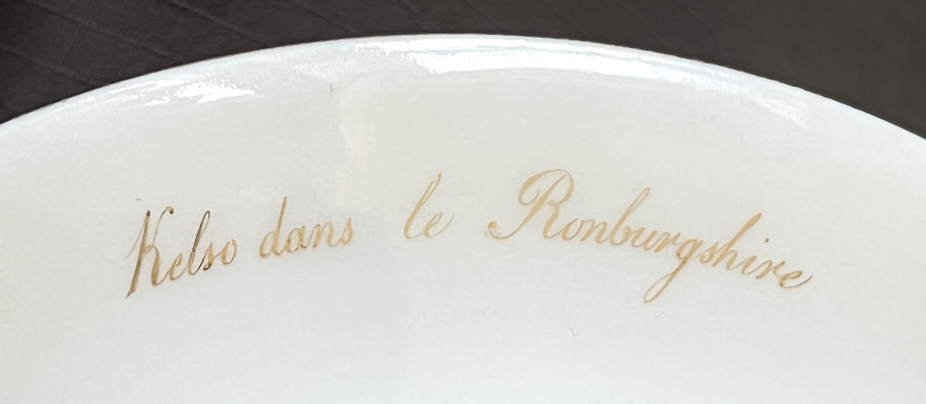
View of Kelso, Roxburgh, Scotland, on a Paris Porcelain plate by Honoré circa 1825
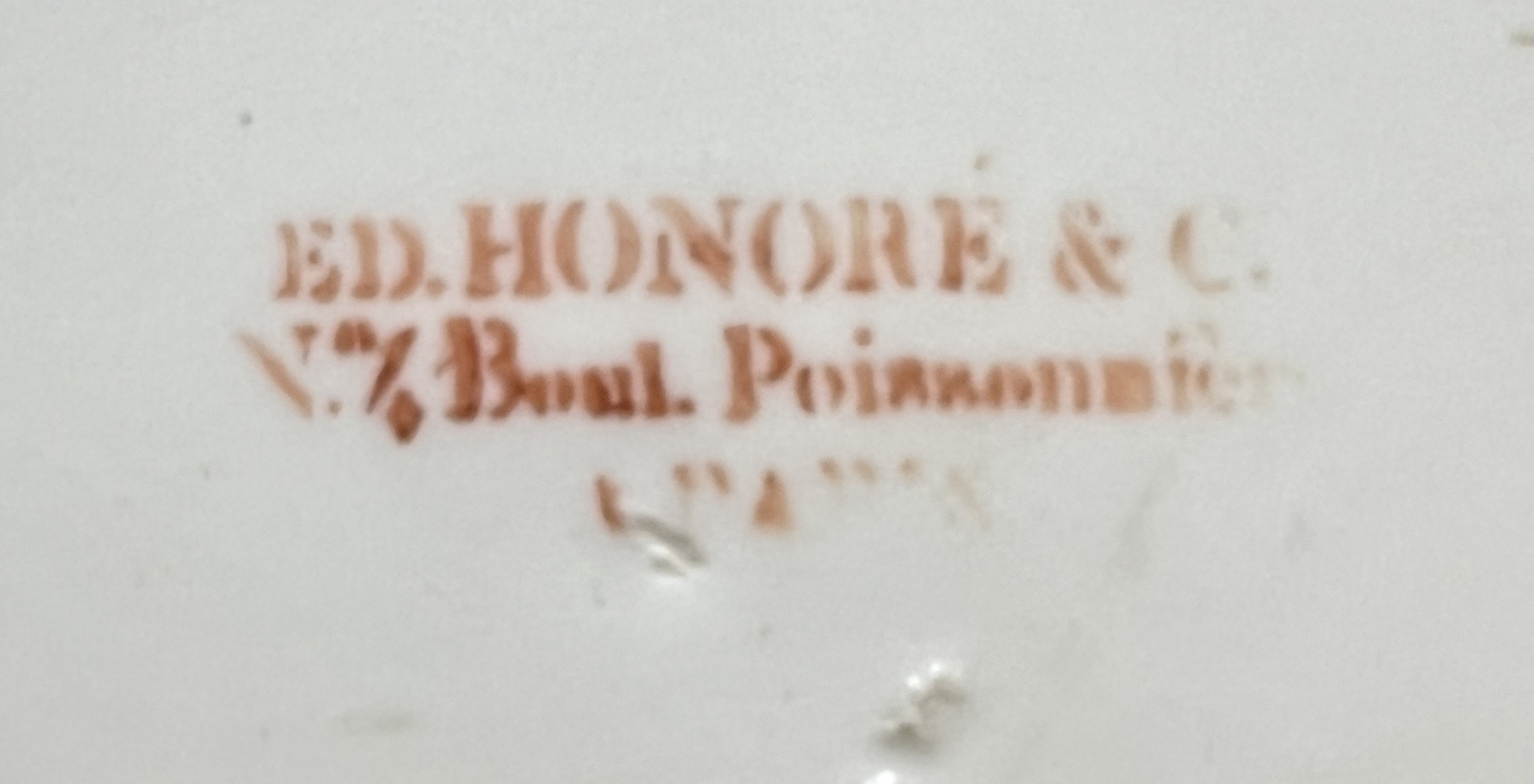
This magnificent plate is the product of Edouard Honoré, a familiar name in the Empire period porcelains of Paris. His Uncle François was in partnership with the Dagoty brothers, and had produced some of the most stunning high quality Paris products of the earlier 19th century. In 1820 they parted, and Edouard Honoré seems to have set up his own studio & showroom on Petite Rue Neuve Saint-Gilles. His Uncle, François Honoré, had actually begun his business there in 1807, partnering with an earlier studio which he took over. When François Honoré and Dagoty parted in 1820, their studio and salesroom at 4 Boulevard Poissonière was superior to Saint-Gilles, and Edouard Honoré was established there by 1824. Uncle François remained in the background as a silent partner. This plate has the mark for this latter half of the 1820’s, with the Boulevard Poissonière address – but is interesting in that it doesn’t appear exactly in any of the reference books, being almost the mark referring the ‘Ancienne Maison Dagoty’, but leaving out that reference to the previous proprietor of the address, and being set as a straight line text rather than the curved version of the before mentioned. (ref. de Guillebon, ‘ Paris Porcelain’ 1972 , p332 #74 for the closest variation, as mentioned)
Our variation of Edouard Honoré’s mark, c. 1825. A variation to those illustrated in the literature.
The scene is, like the Feuillet plates mentioned above, inscribed on the back. However, there’s a rather odd problem!
Kelso dans le Ronburgshire
The title to the back reads ‘Kelso dans le Ronburgshire’ – so we’re looking for a town called Kelso, in Ronburgshire. Sounds almost German – but a quick search reveals there is only one Kelso that is appropriate, and it is in the Scottish borderlands! And therefore, the ‘Ronburgshire’ is meant to be ‘Roxburghshire’, ie the Shire of Roxburgh, Scotland. This spelling is found in German language texts of the time, perhaps giving a clue to the origin of the scene depicted on the plate.
Kelso, depicted in an 1833 copy from ‘Minstrelsy of the Scottish Border’
As with the Feuillet service, the scenes depicted were copied from books of engravings. Sometimes the original can be found – nothing definite for theses examples yet. However, a German publication would be a great place to start researching this beautiful depiction of Kelso. The bridge over the River Tweed depicted was constructed around 1800, and the towers are that of the ruined 12th century Kelso Abbey.
English scenes like this are not common in Paris products of this period – no doubt, it was also part of a magnificent large service, each plate depicting a British scene. A perfect souvenir for a homesick Scot in Paris in the 1820’s!
Visit the page for the pieces mentioned in this article by clicking on their image below.
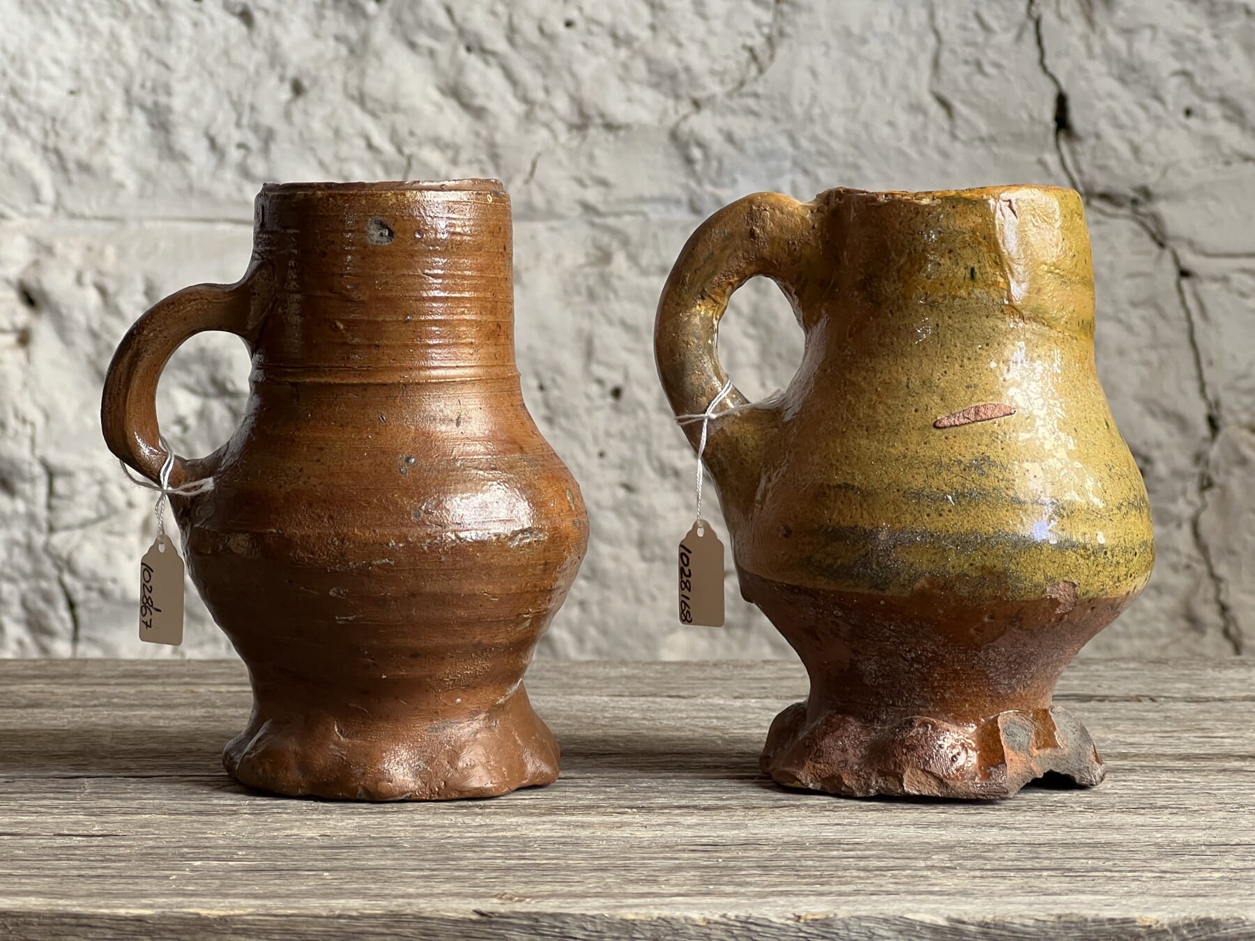
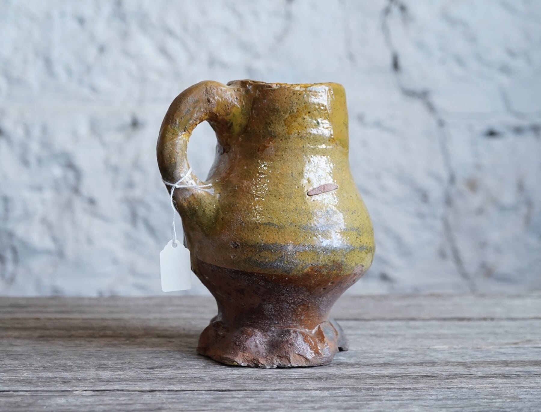
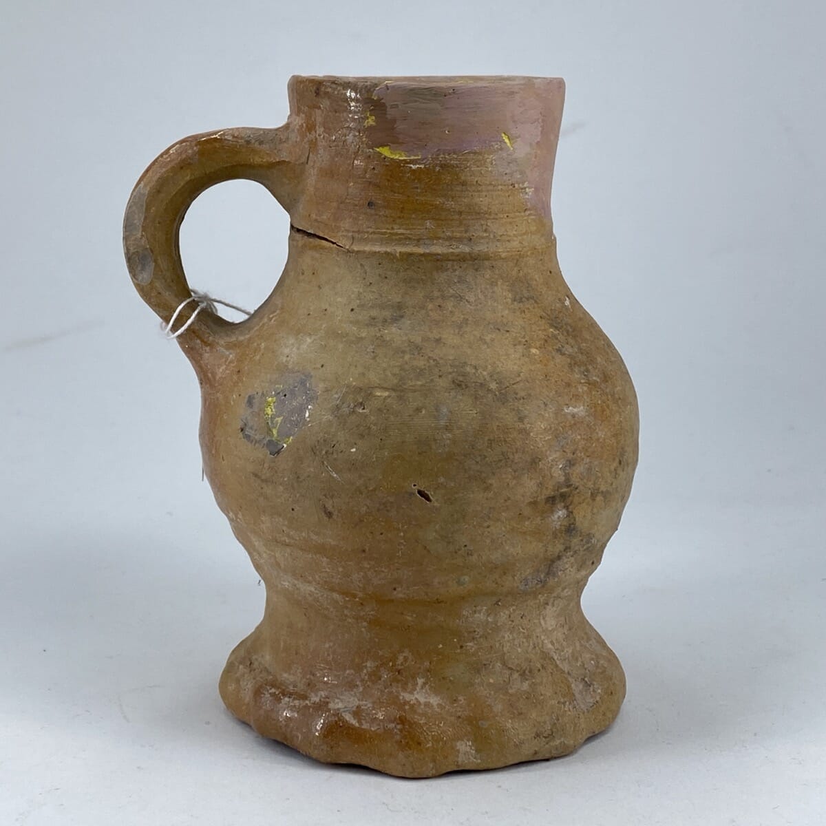
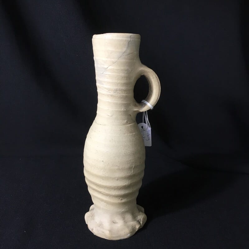
We’re used to ‘rip-offs’, where popular brand shoes & sunglasses are copied & sold for a fraction the price. An interesting Medieval drinking mug just in at Moorabool is proof it has been going on forever!
This interesting Medieval drinking mug recently came in to stock at Moorabool . It has all the characteristics of an English Medieval piece, well-known from the archaeological excavations of Medieval Kilns in North Yorkshire & Somerset, refuse in places like London and York. There are often thousands of stoneware shards found – and the occasional complete example – and this volume is due to their extremely robust nature. Known as ‘Stoneware’, it is a very high-fired ceramic which for all intents & purposes turns to a stone-like substance in the kiln. It doesn’t decay or even stain easily, and can only be destroyed by physical means such as shattering against something harder. As the refuse heaps most broken household discards ended up on contained much softer rubbish, these pieces often appear with just the initial damage they received that caused them to be thrown away – with the broken edge still sharp. Even when a piece has been in the Thames river for 500 years, tossing in the current, it can still have good shape – although any glaze is softer, and often worn away. I spent my spare time in my London days down on the banks of the Thames, picking up these amazing shards from so long ago, and have a prized collection here in our Reference Collection at Moorabool.
German Rhenish Stoneware shards, 16th-17th century, Reference Collection of Moorabool Antiques, Geelong
Close-up of the lead glaze, note the green spots.
But there is something odd about this English piece of pottery, which nagged at me to have a second look: it actually looks more German, like the Rhinish stonewares of Raeren and Sieburg which were imported into Medieval England in vast quantities. So what makes it English?
The body is the main indicator, and secondly, the glaze that sits on it. The body is a light pinkish colour, burning brown in places. This is sometimes found in the ‘Border Wares’ of Northern Yorkshire, or the Somerset potteries to the west, and combined with a mottled yellow glaze with green spotting, it conforms to documented English Medieval types.
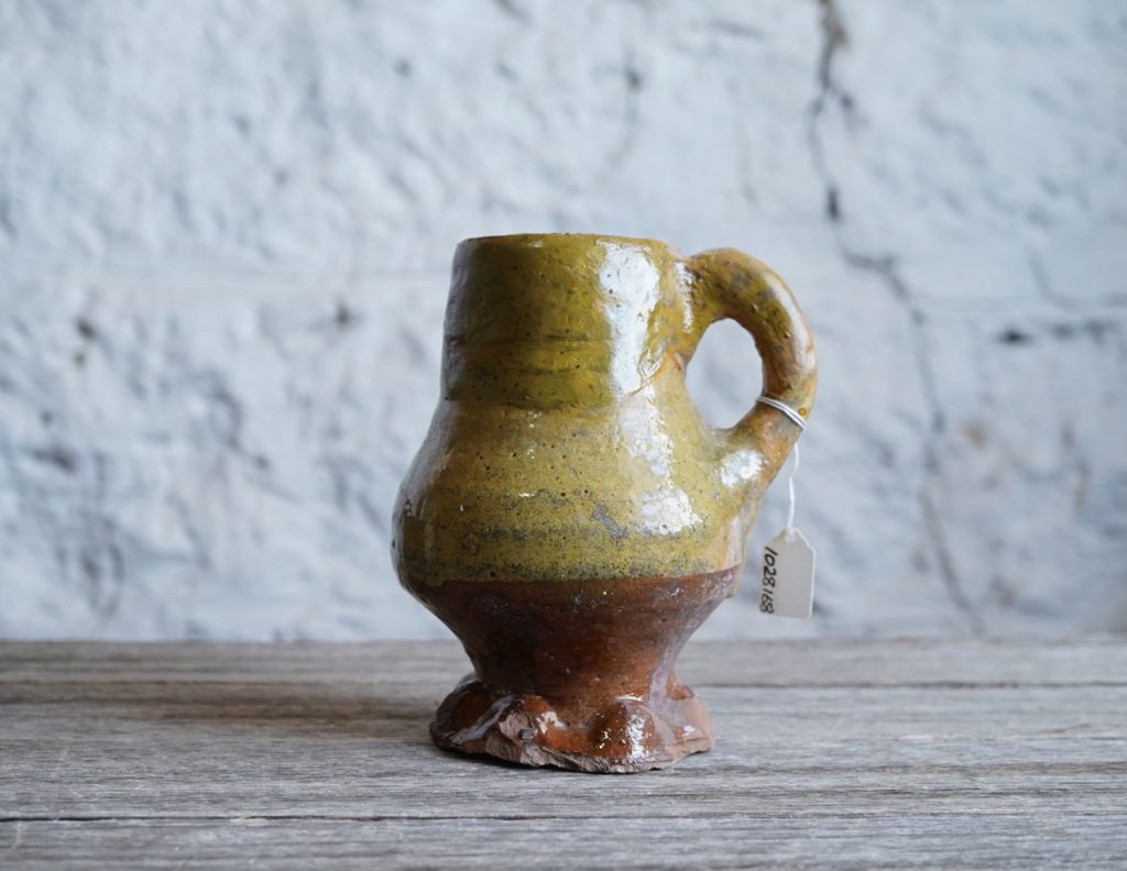
The decoration is perhaps a little fancier than most examples, achieved by dipping it in a tub of tinted lead-glaze, with just the top half done in the yellow, the base carefully painted in a clear glaze, which brings out the iron-rich red hue of the clay.
English Stoneware with lead glaze, 14th-15th century
The Germans didn’t utilize lead glazes in this manner, but instead developed the beautiful lustrous salt-glaze, achieved by throwing a salty water solution into a super-hot firing kiln; this salt (sodium chloride) vaporizes and reacts with the steam produced to form a new compound – hydrogen chloride – which forms a bond with any silica in the clay body of the pots. Any Iron – which causes the reddish-brown colour of the clay – is a bonus, as it acts as a ‘flux’ to speed up the process, and also gives the rich brown colour to the result. This was the method all the 15th-17th century pots imported from Germany to England were finished in, making identifying shards from excavations in England simpler to identify. In the mid 17th century, the Salt Glaze technology comes to London, and then elsewhere including Yorkshire, and it becomes a little more difficult to define origin.
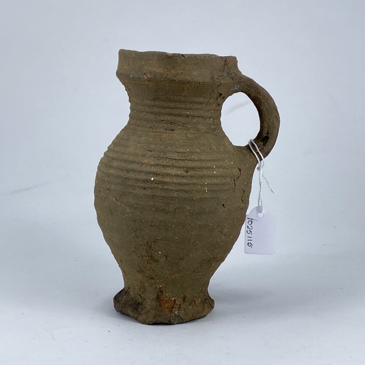
Sieburg Stoneware example, 14th-15th century
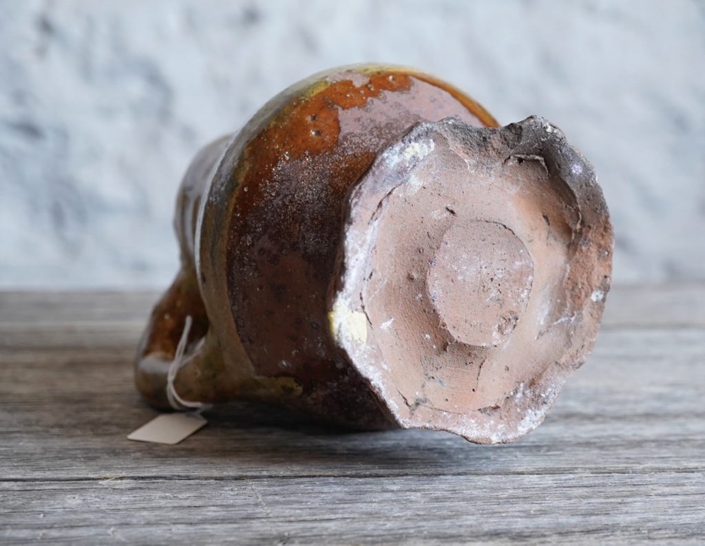
Our example is therefore a Medieval ‘hybrid’. The shape is German, with a ‘thumbed’ base very much like the imported German pieces of the 14th-15th century . This was the usual method of finishing the base of the wheel-turned German stoneware mugs, and serves a function: it raises the base of the pot off the surface it sits on, meaning it is less likely to shatter the main body if placed down carelessly. The main pot was thrown on a wheel, and then a small loop of clay added to the base using the thumb & forefinger, creating a ruffled spreading foot we call ‘thumbed’.
The odd, ‘thumbed’ base on our example
While most English Medieval pottery has a simple flat base, there are examples of English Border Wares imitating this method of thumbing – but they are looking on it more as a decorative element, not as a functional structure. These pieces have had a thumb involved, but it has merely pushed in a groove multiple times around the foot, causing it to spread the clay in a pie-crust pattern, entirely from the outside. The German method pushes ‘out’, and the English method pushes ‘in’. Our example is a surprisingly accurate replica of the German ‘push-out’ idea, on an English pot.
Left: Sieburg German Stoneware, 14th-15th century Right: English, 14th-15th century
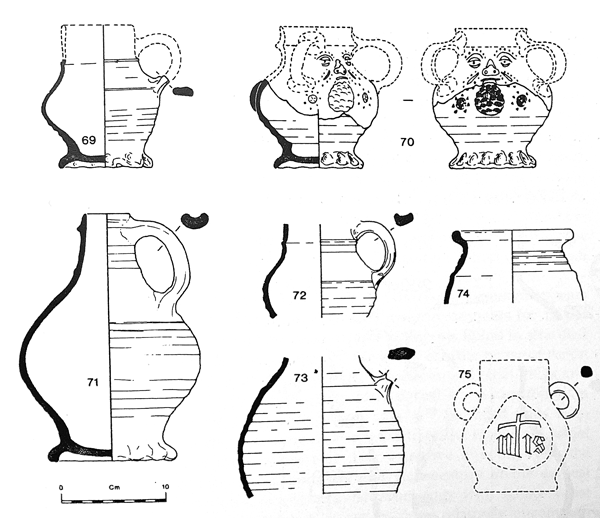
Museum of London , Kingston-type with ‘thumbed’ foot.
Searching through the literature on English Medieval Pottery, there are multiple examples of the before mentioned push-in thumbing, but finding a push-out was very difficult; eventually, I tracked down an example in the collection of the Museum of London. In Pierce & Vince ‘Surrey Whitewares’ (p72) this ‘small round drinking jug’ is described as ‘…without parallel…in excavated pottery from London’. In shape it resembles the Kingston-type small rounded forms, but differs from it in detail. It appears to have been made as a copy of 14th-century German drinking jugs …. pronounced throwing marks can be seen around the body, and the base is thumbed in a manner that recalls the suggested German prototypes’.
It’s great to find another attribution for a German source for the design, and the unparalleled classification makes it an extreme rarity.
German & Donyatt mugs, excavated in Taunton, Somersett, 14th-15th century
The Donyatt-excavated ‘thumbed’ base shard (4/43) in the site report, and the foot of our mug.
A further example is interesting, coming from the Somerset town of Donyatt. In the definitive book ‘Excavations in the Donyatt Potteries’, there is an example illustrated next to a German one, with the notes explaining they were found together in the same refuse heap,in the Somerset town of Taunton in the 1977 excavations of ‘Kennedy’s Yard’. As it is a line drawing, we cannot compare the surface detailing, but it bears a close resemblance to our example. We are familiar with Donyatt wares from the 18th-19th century, when they were prolific producers of slip-glaze & ornately decorated curios like money boxes, often inscribed & dated. Comparing the glazes to examples in our Reference Collection in Geelong shows a close similarity in materials – the clay is lower-fired in our 19th century money box examples, but contains the iron-red staining evident in the Medieval mug. The glaze is referred to in the literature as ‘Amber glaze with copper green flecking’ – copper oxide was splashed through the glaze, and is recorded in the medieval period, becoming very common later, giving the green highlights to the distinct slip glaze that developed. And under the heading ‘Thumbed bases’, it states ‘Thumbed bases, so typical a feature in medieval pottery are found in both 14th- and 16th century Donyatt jugs’. When looking at the referenced archaeological shards from the kiln sites. we find a host of the ‘push-in’ thumb decoration to the feet of vessels – but only one single ‘out-pushing’ example that would raise the vessel on a rippled base – as seen in our example, and the German products. This shard exhibits ‘patchy amber to green glaze’ – like our example- and is apparently a very scarce type of foot at Donyatt.
left & right: a pair of Dynott money boxes, slip glaze, dated 1869 – of. type made from the 17th century onward – center the English mug, showing how the clay, slip & glaze all compare favorably with Donyatt Pottery.
Our case for this being a 14th-15th century Donyatt Pottery jug/mug is strong!
Having a drink at a public house seems an impossible luxury for any Melbourne people in the present covid-crazy world – we’re hoping it will be a reality by Christmas…
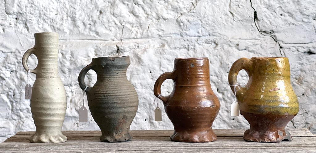
Our lineup of early drinking mugs, fresh to moorabool.com (except for the far left example….)
Meanwhile, we have a great little illustration of how you would have swilled your brew 600 years ago…. and for the first time on moorabool.com, you will be able to ‘virtually’ turn the illustrations around in your hand!
Did you find the secret to viewing the above image?
These are ‘spins’, a method of presenting 360º views of items via your browser. You’ll find that you can also expand the image to cover your entire screen – or zoom in to view details close-up on any of the views. It’s great fun on a touch device such as a phone or tablet – use your finger to spin the item, then double-tap to zoom! On a computer, it’s similar but you’ll use a mouse to indicate which direction you wish to ‘spin’. Each spin takes some time to set up, but we’re gradually introducing more & more ‘spins’ for your viewing pleasure – small items are easiest, we have yet to try a bookcase !
Click the smaller image above to load that spin in the space above.
Our latest Stock Release includes these drinking vessels, 13th-16th centuries.
Having this collection of incredibly early drinking vessels is possible due to the nature of their construction: high-fired ‘stoneware’ is a clay that has been taken up to a very high temperature, over 1,000ºc. This literally turns it into a stone-like substance, and the result was a very durable object. If damaged ( the handle is the weakest part), it would survive being thrown into the rubbish heap – or in places like London and Amsterdam, into the nearest waterway. The canals of Amsterdam are a terrific source for these early pottery pieces, as is the Thames in London, constantly throwing up interesting pieces for the mudlarkers.
left: German Raeren stonewares and other imported ceramics recovered from the Pottergate fire deposit dated to 1507 (Cellar H), Norwich, excavated in the 1970’s.
The 1507 fires in Norwich destroyed a good half of the houses in the flourishing city, but the hardy stonewares were still well preserved in the rubble when excavated 470 years later.
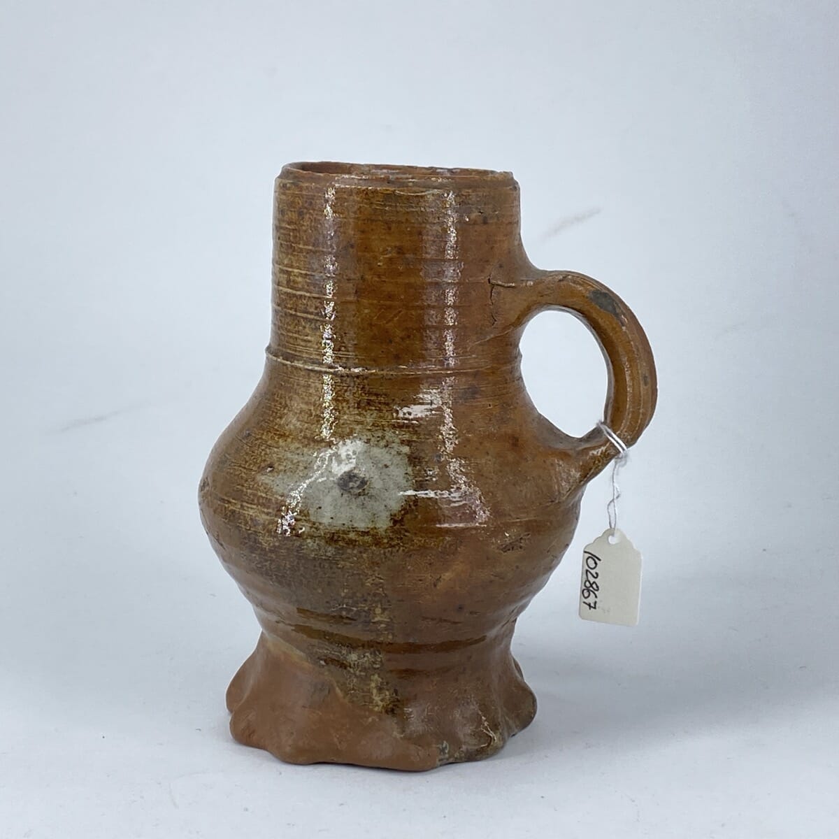
These stoneware examples were imports from Raeren, Germany. Note the top left example – it is the original model for the rare English copy we currently have in stock. See the blog post on this Medieval English Rarity here >>
Dating these pieces is possible due to archaeological excavations, with dates of occupation layers being scientifically identified – but there is a much older and more fun way also. The Dutch artists of the 16th-18th century loved to show the lively state of the peasants, drinking and dancing in what appears to be an endless party. Inside taverns or out in the town square, the Dutch genre paintings show endless examples of people drinking from these mugs, and by dating the painting, we can date the vessels shown in almost photographical detail within them.
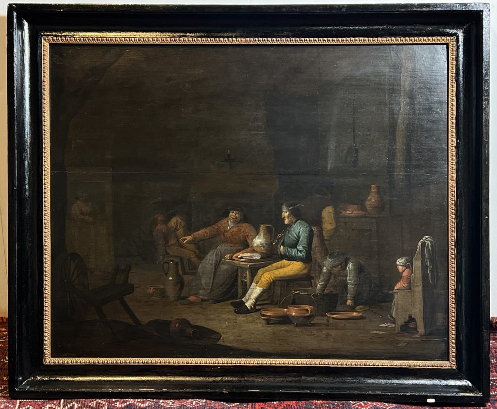
Pieter Brueghel the Younger (1562-1638) is one such artist, and we are excited to have a possible unsigned work by him. We purchased it because of the ceramics, which were peeping out from beneath a thick layer of old dark varnish: the image that emerged after careful conservation is remarkable, and of high quality – but unsigned. This is not unusual for Brueghel, with many of his accepted works not having a signature – or often just some small initials hidden somewhere in the scene, like a piece of paper on the wall! We’ve looked and looked, but nothing appears – so the next step is to put it before the Pieter Brueghel the Younger experts in Europe for a verdict. One point very much in its favour is that while it has a few similar elements, compared to the established Brueghel works, it is a completely fresh composition. While there are many 18th-20th century copies of his well-known works, there is no original for this one to be copied from, supporting the originality of this painting. Stay tuned for more on this one!
(There will be an in-depth analysis posted on this blog in the near future)
Moorabool’s Guarantee: All items offered are as described regarding date, condition, and description.
We offer a money-back guarantee, for any return within reasonable time, excluding postage.
Buy with confidence!
POSTAGE
Getting your goods need not be expensive!
We make sure Postage is as affordable as possible – our experienced in-house team can ship safely anywhere in the world, for the best possible price.
Ask for a quote…
Use the ‘Compare Products’ below to keep track of items of interest.


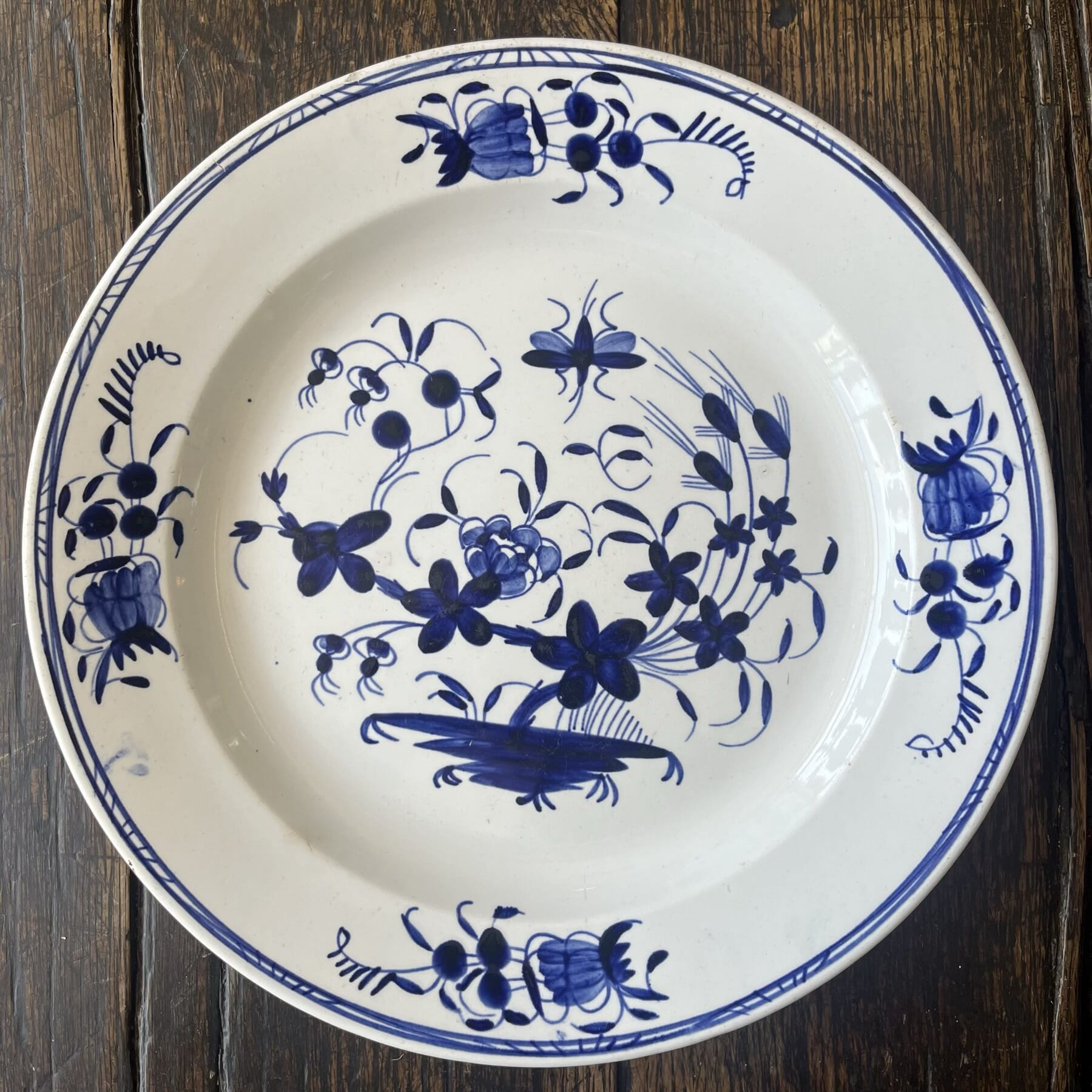
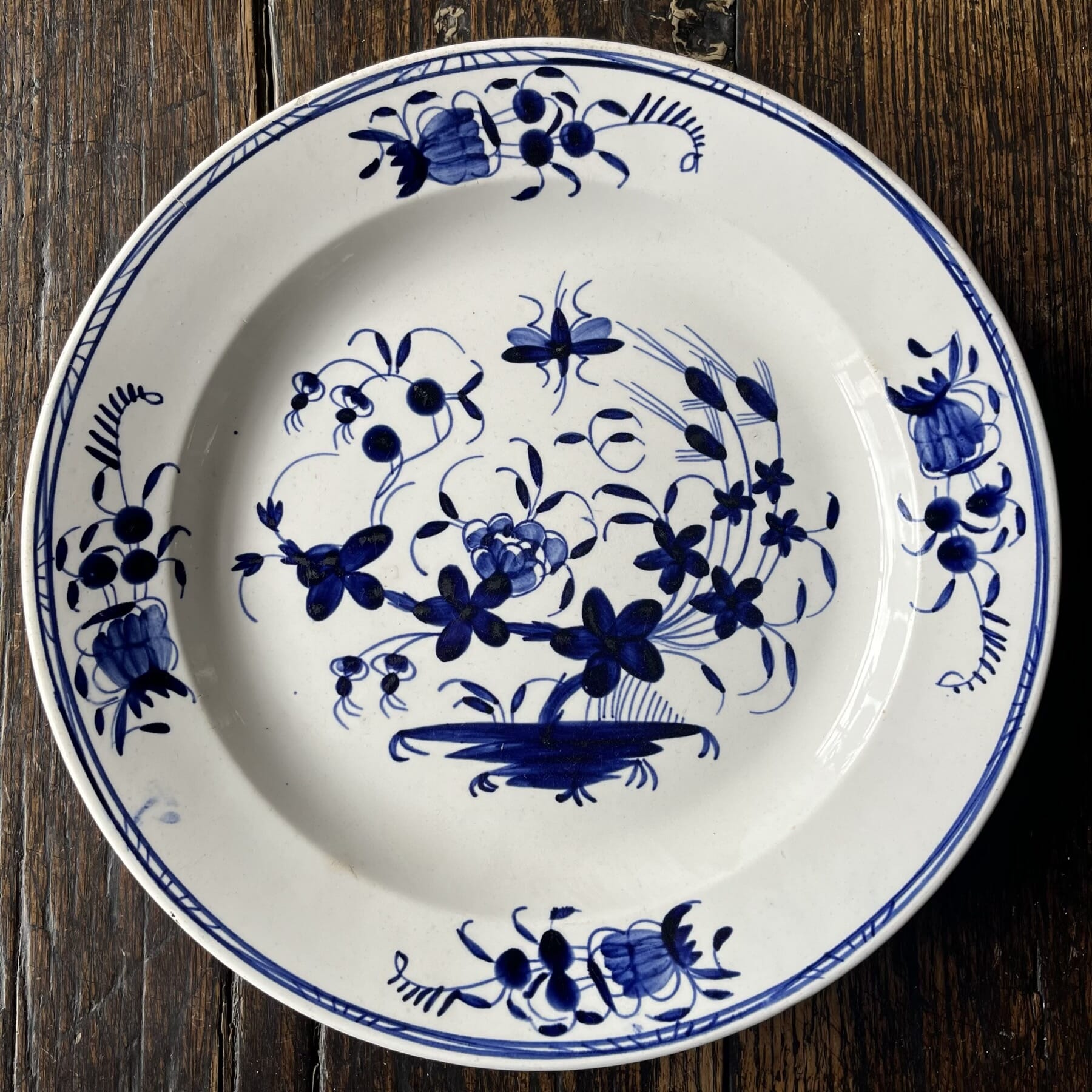
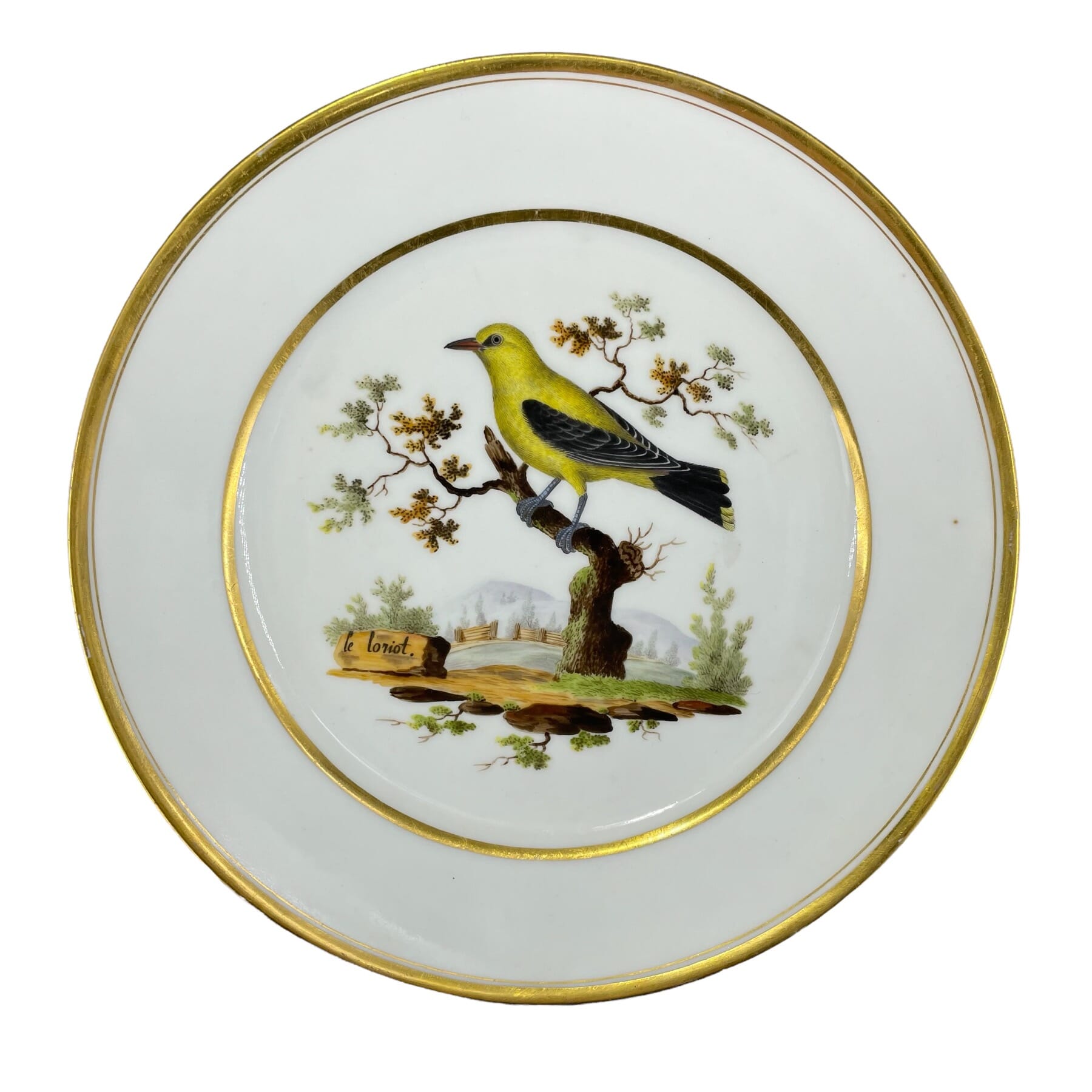
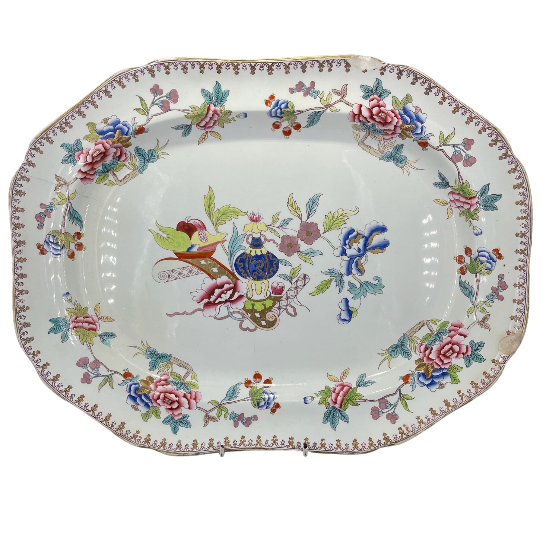
 Tournai style pottery plate, Oriental Garden, C. 1830$285.00 AUD
 Tournai sauceboat & stand, Boucher cherubs, mazarin & gilt borders, c.1770$3,250.00 AUD
 Tournai style pottery plate, Oriental Garden, C. 1830$285.00 AUD
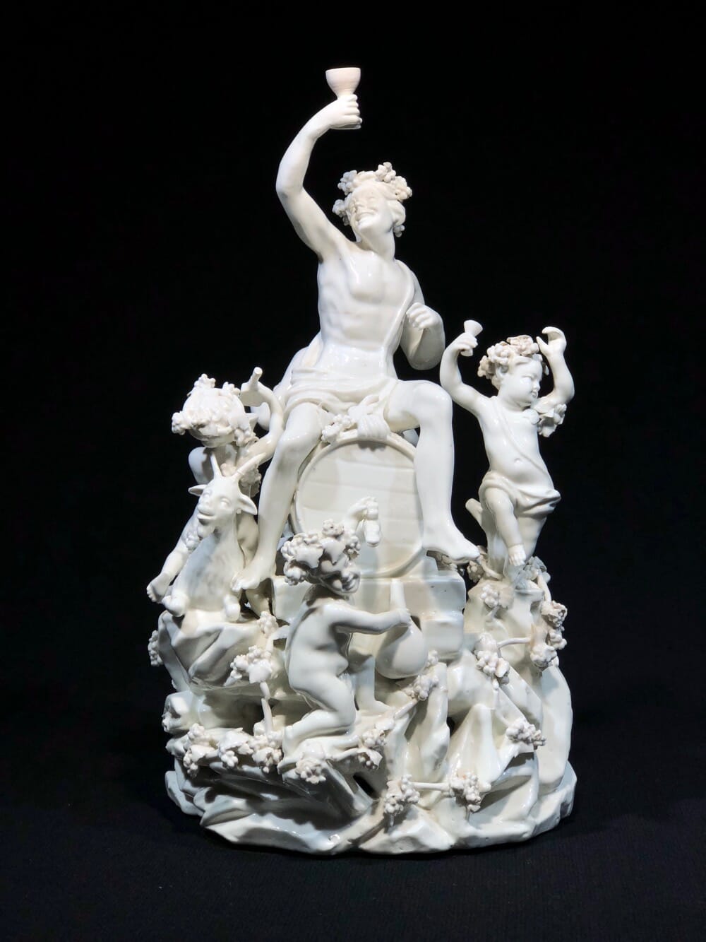
 Tournai figure group ‘Bacchus’ with cherubs, circa 1770Sold
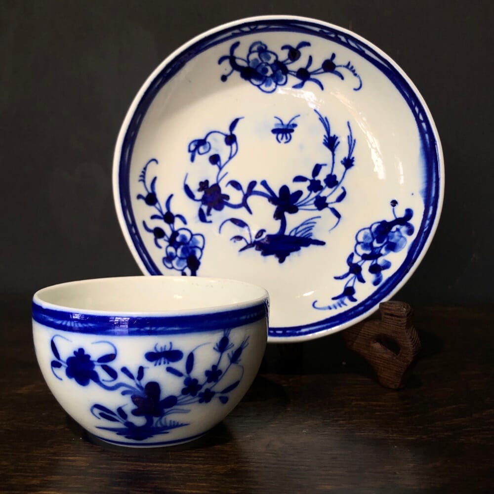
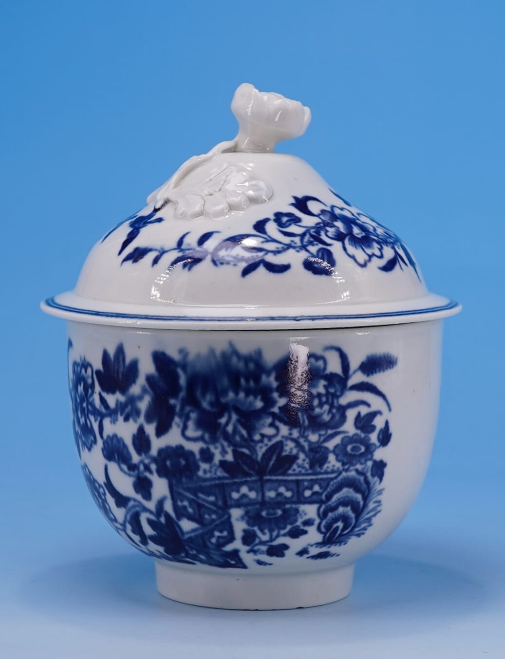
 Tournai teabowl & saucer, Oriental Garden, circa 1780$365.00 AUD