Posted on

Fresh Stock – Ceramics, Art, and…. Batons!

It’s an eclectic mix today, with a fine selection of diverse items to browse.


There’s some fascinating ‘Local Music History’ items, in particular conductor’s batons.
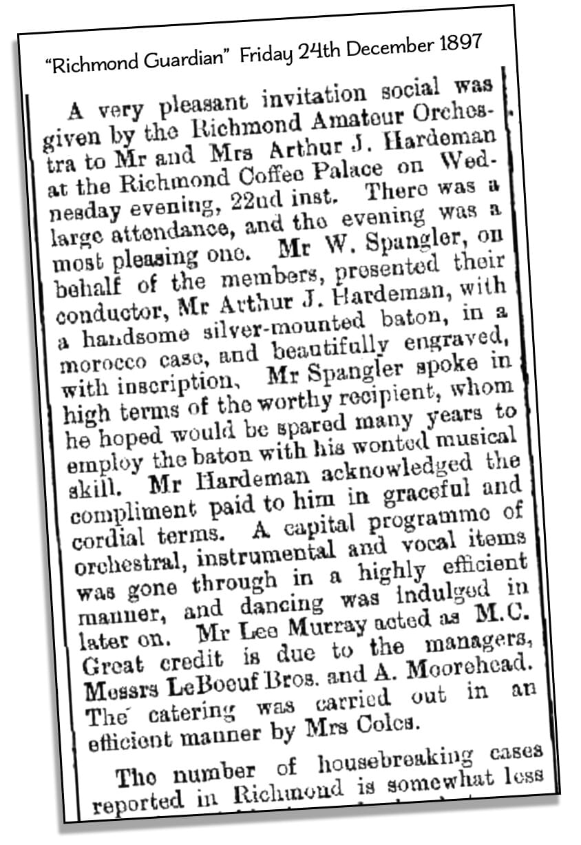
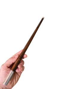
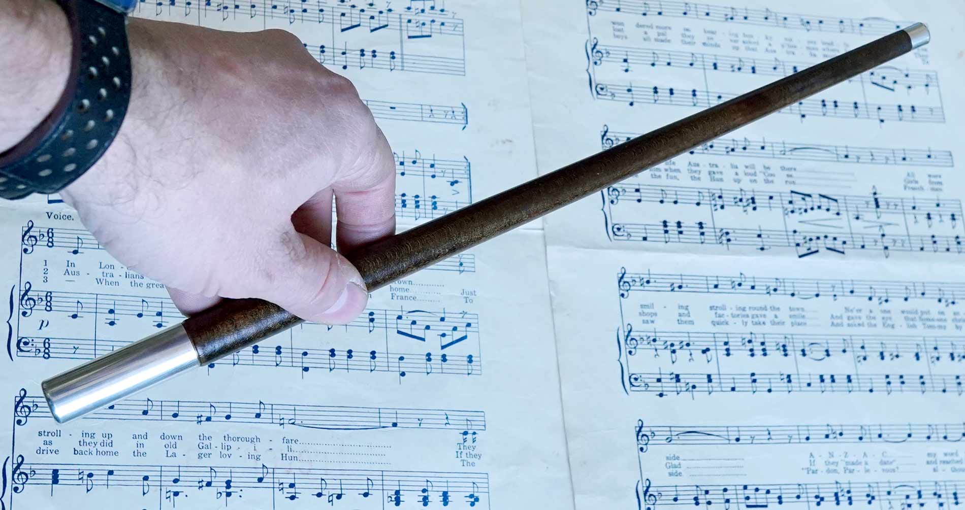
The first is a presentation piece, made in Melbourne and still in its original box, with a lengthy inscription explaining its significance: given to Professor Hardeman in 1897 by the Richmond Amateur Orchestra. This opens up some fascinating research, where we found an 1897 newspaper description of the event which describes the exact baton in great detail!


1897 Australian Silver mounted conductor's baton, Hardeman, Richmond Orchestra

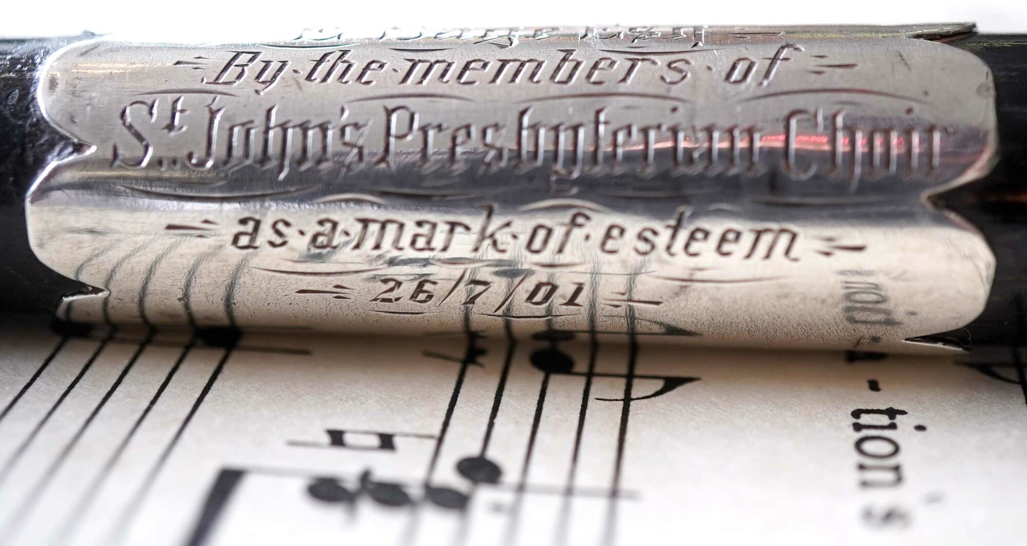
The second is a simpler form, presented to E. Sage by the St Johns Presbyterian Choir, Ballarat. This interesting piece has a moonstone set in the end, and would have been made by a local jeweller.

As well, there are some other batons of a similar period – very useful for anyone considering a career in amateur (or professional) orchestra!
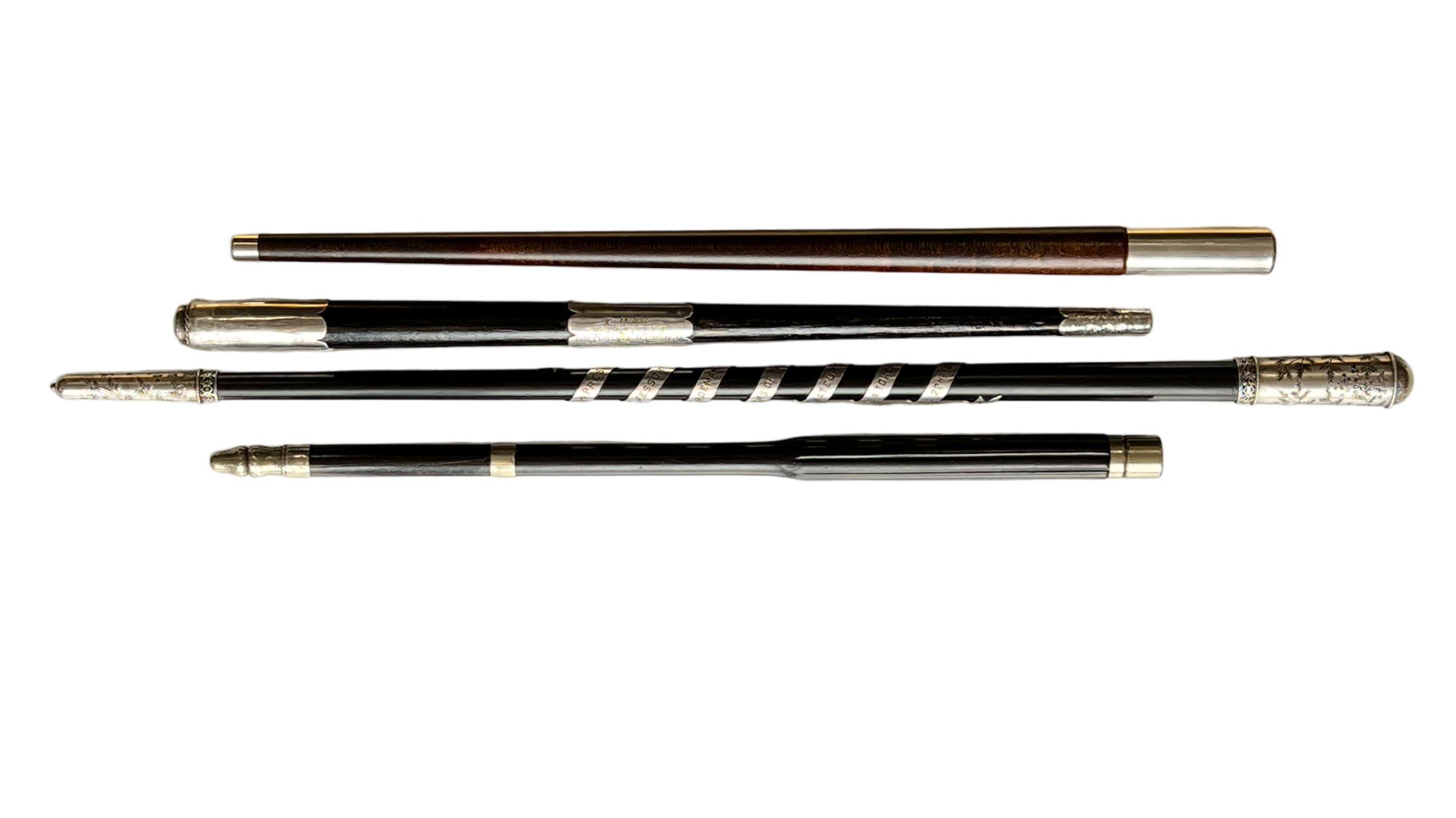
Antique Conductor's Batons - Moorabool Antiques Geelong
Antique Conductor’s Batons
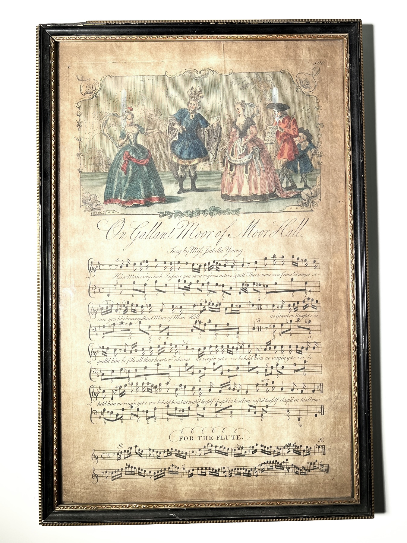
Moor of Moor Hall, c. 1740

This illustrated piece of music was printed in London in 1740.
It’s from a ‘Burlesque Opera’  first performed in 1737,  ‘The Dragon of Wantley‘.

It contains the line: “He’s a Man every inch I assure you, stout vig’rous active & Tall…” !

While on the surface it’s a comic tale for entertainment, the lyurics are open to interpretation – the Dragon perhaps representing the excesses of a corrupt government, and Moore the hero who defends the common people…. a theme still very active in today’s politics and pop-culture….

Fresh Art

Fresh Stock

Posted on

A Tournai Sauceboat

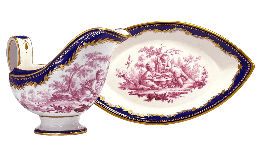
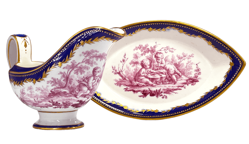
Tournai Sauceboat c.1770

This extraordinary example of Tournai porcelain shows the quality they were able to produce.

Tournai Sauceboat c.1770

Dating to circa 1770, the elegant form with robust yet stylish handle, and boat-shaped stand, is a premonition of the Neoclassical simplicity which comes to dominate French design in the last decades of the 18th century. While this aspect looks forward, the decoration is the opposite. It is taken from a print published mid 18th century, after a painting by Francois Boucher, and is the essence of the Rococo style.

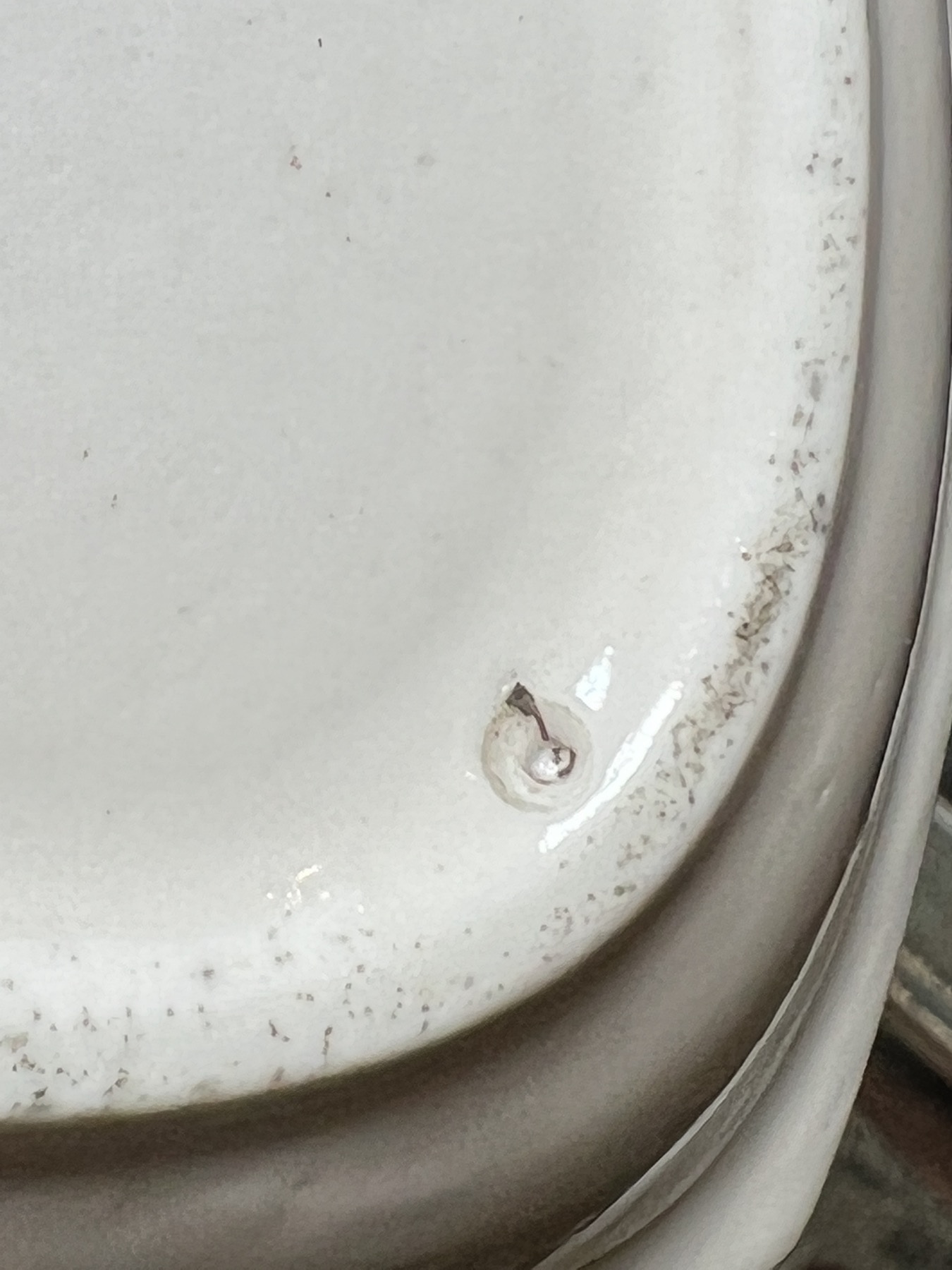
The mark is always misunderstood: ‘crossed swords are Meissen’ is the usual assessment, however this piece is clearly soft-paste porcelain, not the hard-paste of Meissen. As a vast number of other makers ‘borrowed’ crossed swords, it is easily attributed to one of these fraudulent makers, like Samson of Paris.
However…. this mark is well documented on Tournai porcelain. In the underglaze blue & white products, it is not uncommon. Gold on glaze is rare, but does appear on their better decorated pieces, suggesting it was a mark for their ‘premier products’.

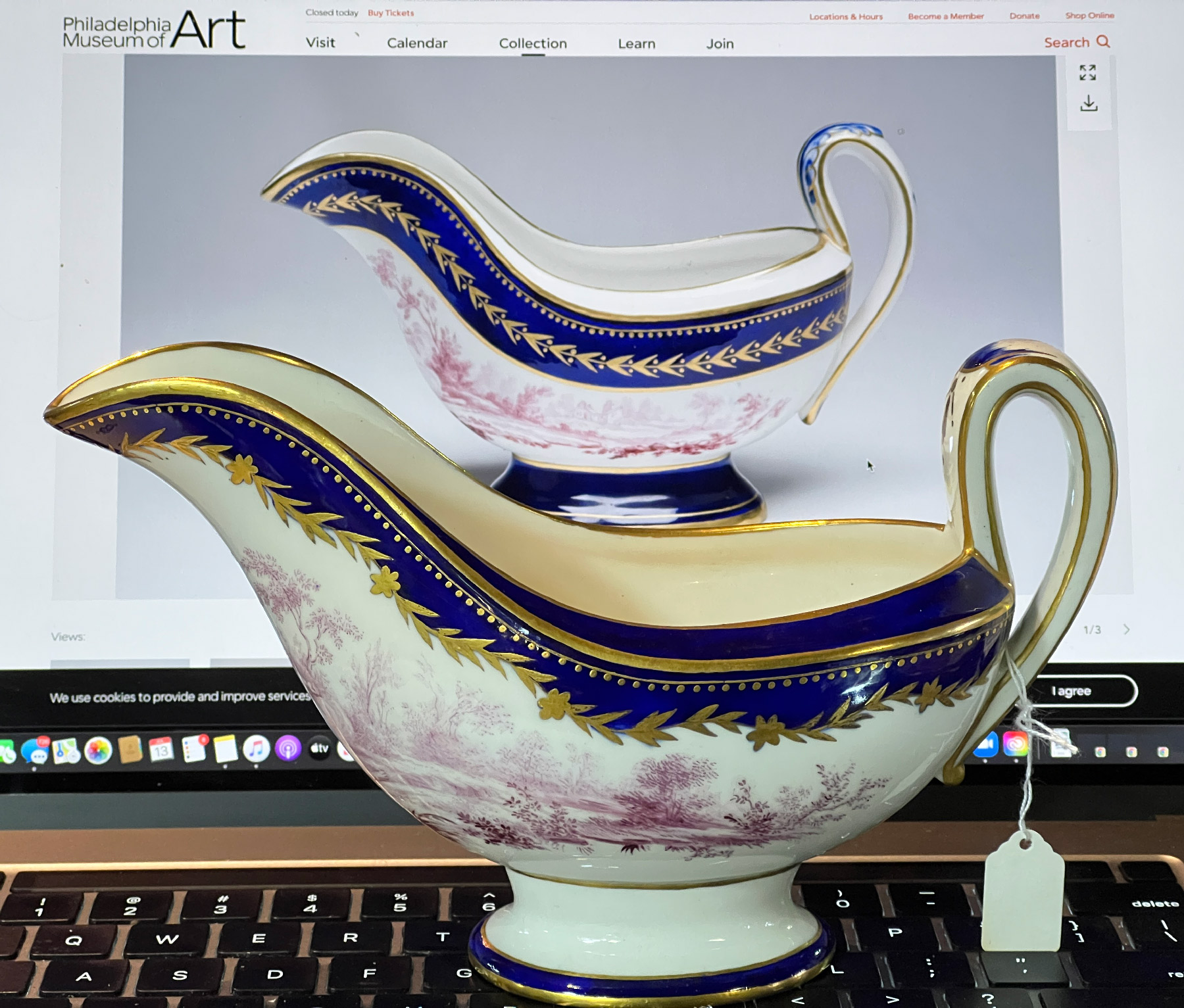
There is a single example in public collections, not published in the literature. This is a sauceboat in the Philadelphia Museum of Art (id=#1968-172-1) , documented on their website. It lacks the stand, but has the same lavish decoration – with a few variations.

A stunning recent discovery shows Tournai porcelain at its best - a Sauceboat & Stand with Cherubs after Boucher, c. 1770
In the fore is our example; the back shows the Philadelphia Museum’s slight variation.
Posted on

Conductor’s Batons

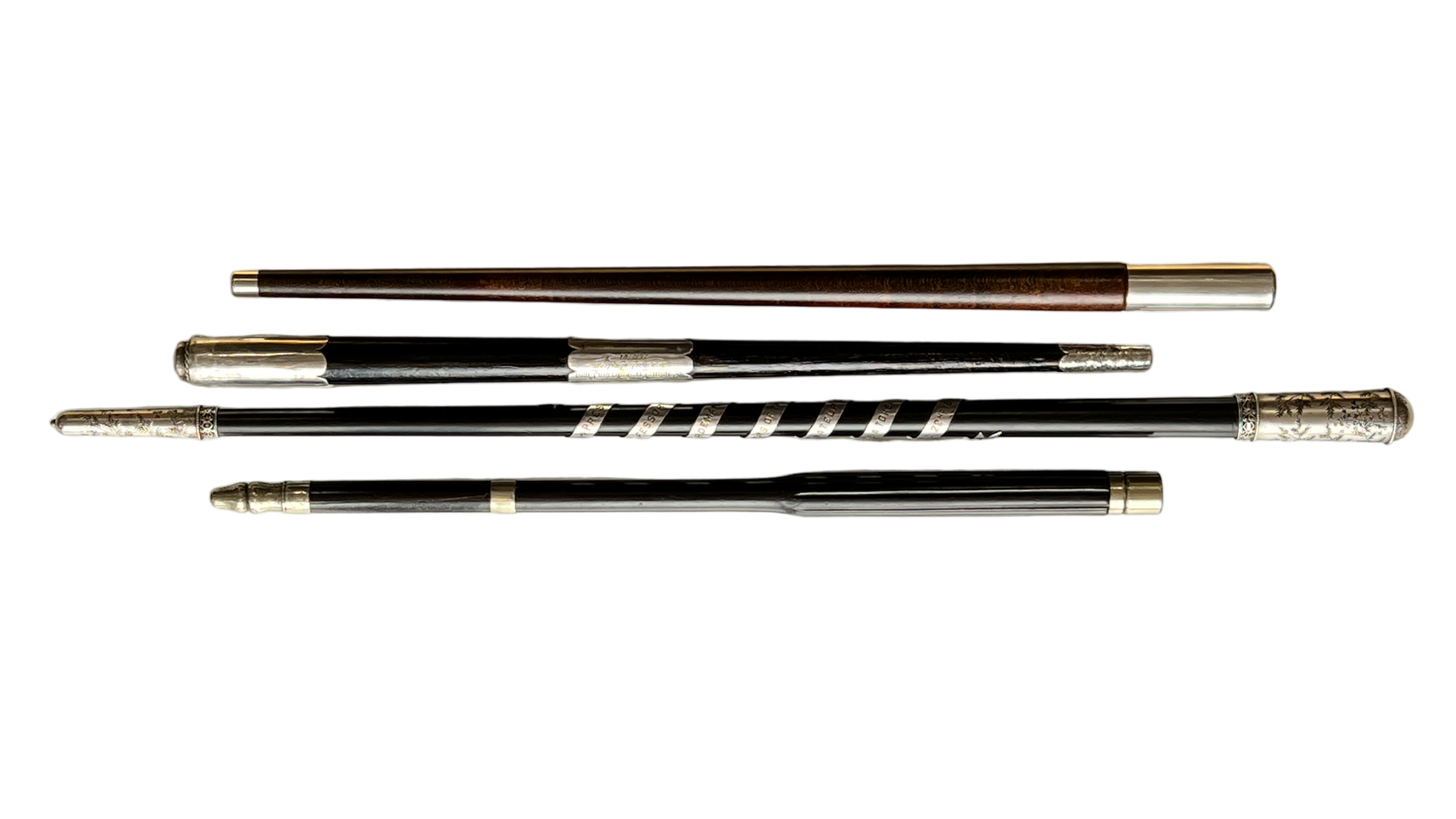
Any conductor needs a few batons – and Moorabool has a few of these rarities ‘fresh to stock’.

They include three with inscriptions – some fascinating records of social history, one just a baffling enigma.

Antique Conductor's Batons - Moorabool Antiques Geelong

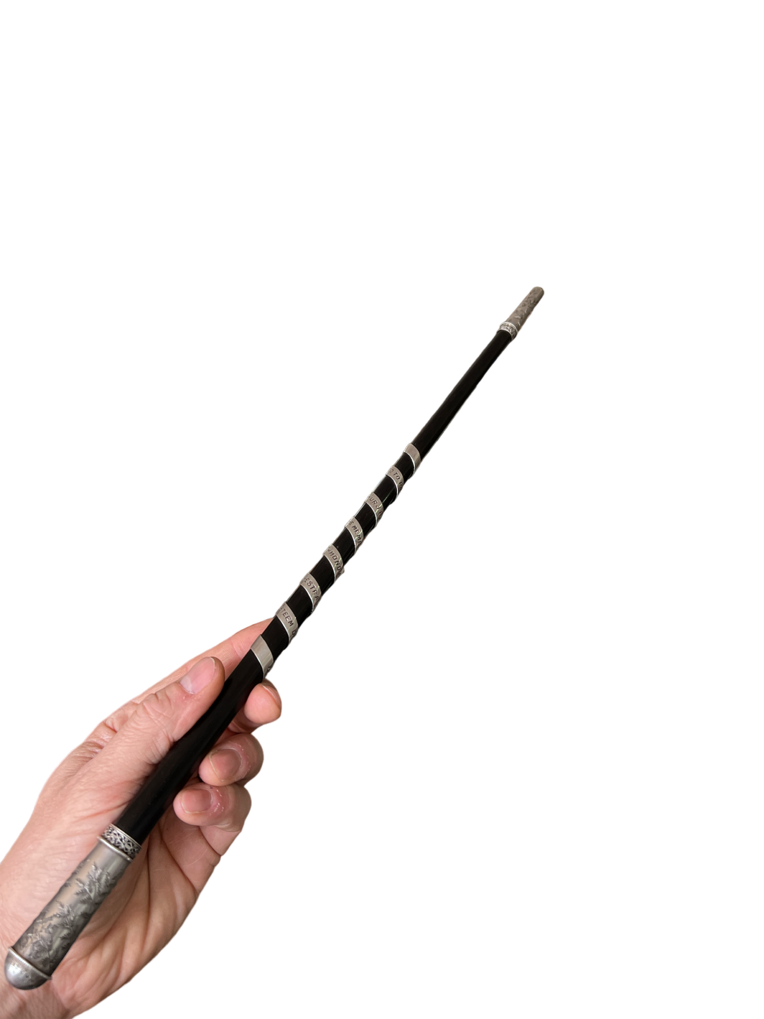
Perhaps you’re needing a baton for your Amateur Orchestra – like ‘Professor’ Arthur Hardeman? He was the recipient of a magnificent ebony example with silver mounts including an inscription winding its way down the shaft on a long silver ribbon: “Presented to Professor Arthur J Hardeman by members of the Richmond Amateur Orchestra as a Token of Esteem, 1897” .

Hardeman was a Melbourne musician, son of a Pianoforte dealer, and seems to have made his living giving lessons and performing with his ‘orchestra’. They gave him this magnificent Melbourne-made baton in 1897… as outlined in the newspaper article of the time:

Professor Hardeman's Presentation Baton, 1897
Professor Hardeman’s Presentation Baton, 1897
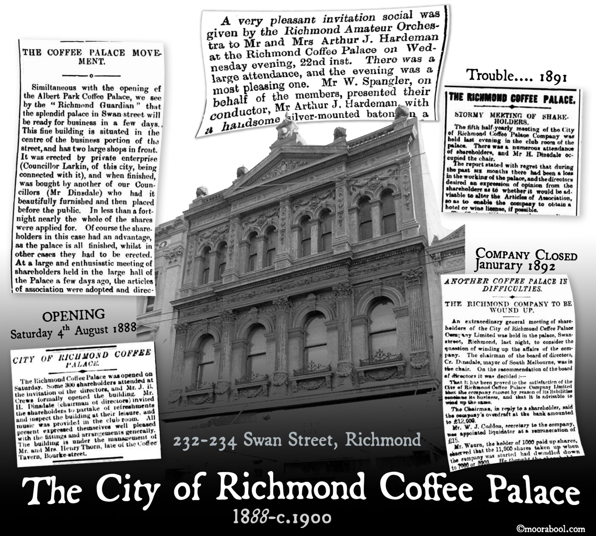
The City Of Richmond Coffee Palace, 232-234 Bridge Road, Richmond, constructed 1888

There’s a wealth of social history to be explored on this subject, including the untold story of the ‘City of Richmond Coffee Palace’, and ‘Professor’ Hardeman’s interesting background.

Read more about the baton & the presentation in our special blogpost on this piece >>

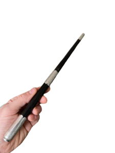
There are several other batons also, all fresh to stock – quite a collection. The other definite Australian example is also ebony, and has a presentation inscription also: “Pres’ted to E. Sage Esquire, by the members of St John’s Presbyterian Choir, as a mark of esteem, 26/07/01”.

E. Sage's Presentation Baton, Ballarat, 1901
E. Sage’s Presentation Baton, Ballarat, 1901
E. Sage's Presentation Baton, Ballarat, 1901
E. Sage’s Presentation Baton, Ballarat, 1901

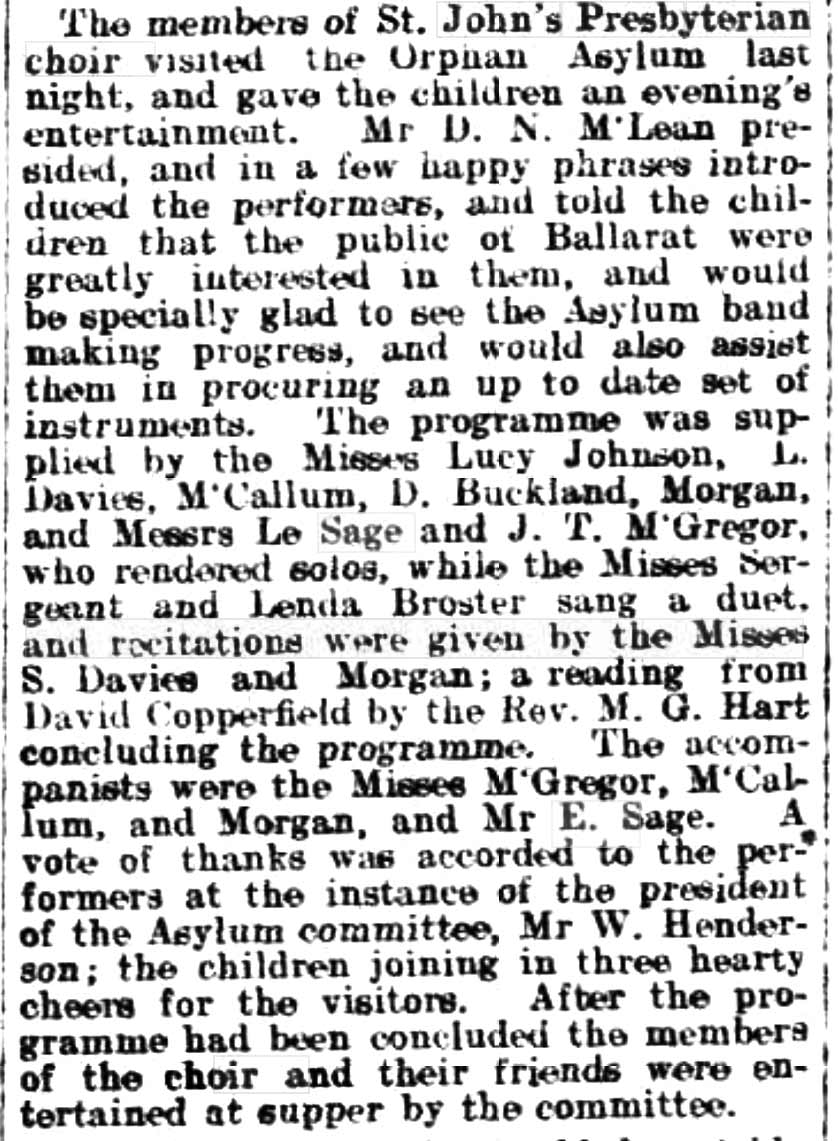
E. Sage was a Ballarat identity, very active in the musical entertainment world from the 1890’s. He taught piano and voice in Ballarat, and helped form a musical group, called the ‘Curlew Orchestra’, for the ‘purpose of promoting the study of instrumental music and the entertainment of the inmates of the charitable institutions, and generally assisting by concerts in aid of worthy objects’.

Sage, StJohns Choir, Ballarat Star July 1905

In 1902, for example, there’s a report of an event he presided over: “The members of St John’s Presbyterian choir visited the Orphan Asylum last night, and gave the children an evening’s entertainment. Mr D. N. McLean presided, and in a few happy phrases introduced the performers, and told the children that the public of Ballarat were greatly interested in them, and would be especially glad to see the Asylum band making progress….”

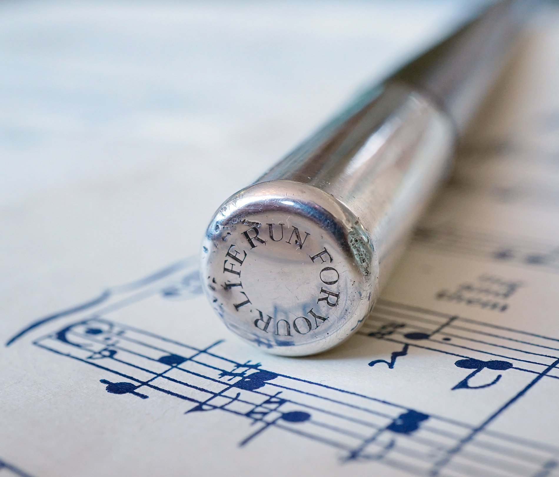
RUN FOR YOUR LIFE American silver & Walnut Baton
RUN FOR YOUR LIFE American silver & walnut conductor’s baton

Another rather puzzling baton has a cryptic message: RUN FOR YOU LIFE ….. is engraved onto the end. This example is American Silver, by Reed & Barton. It dates to the 1910-20 period – but nothing turns up valid to a musical origin when you look for the words inscribed. Maybe someone has an idea of what ‘RUN FOR YOUR LIFE’ might be relating to?
Let us know, if you do!

RUN FOR YOUR LIFE - American Reed & Barton silver mounted baton, c. 1920
RUN FOR YOUR LIFE – American Reed & Barton silver mounted baton, c. 1920
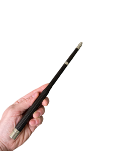
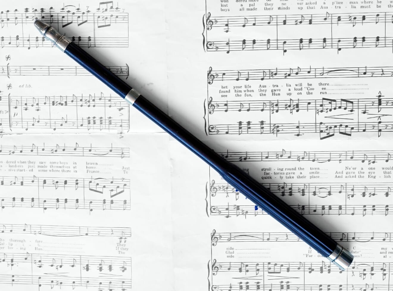
Antique Ebony Conductor's Baton
Antique Ebony Conductor’s Baton

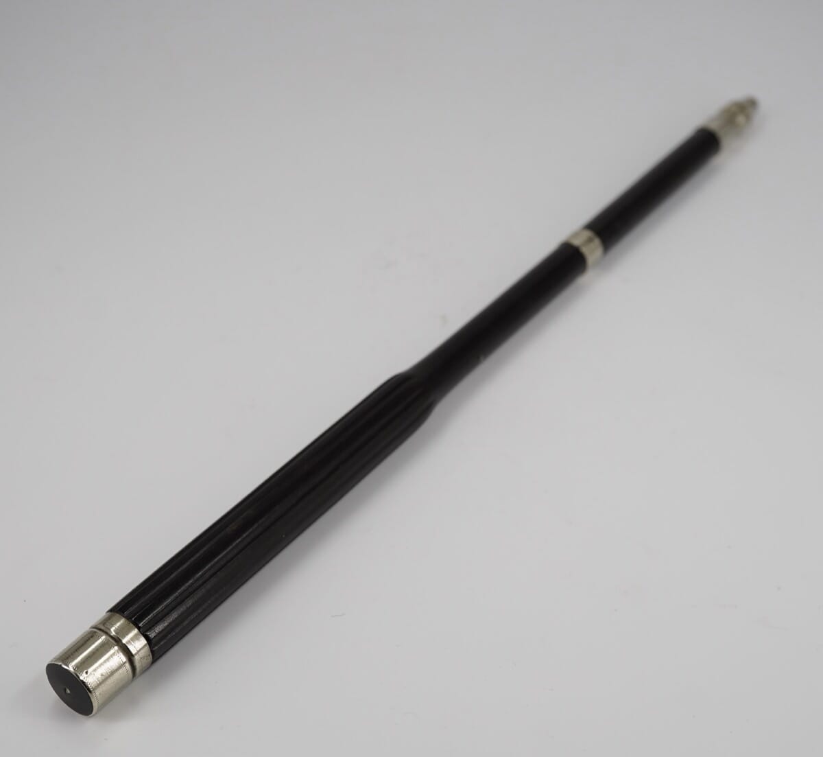
The final one is just a nice baton, no inscriptions. It has a ribbed body, making it much easier to hold. All we need is an orchestra to try it out on……

Posted on

Fresh Stock – Fine Fans, Coffee Cans, Usable Glasses, Vertu…

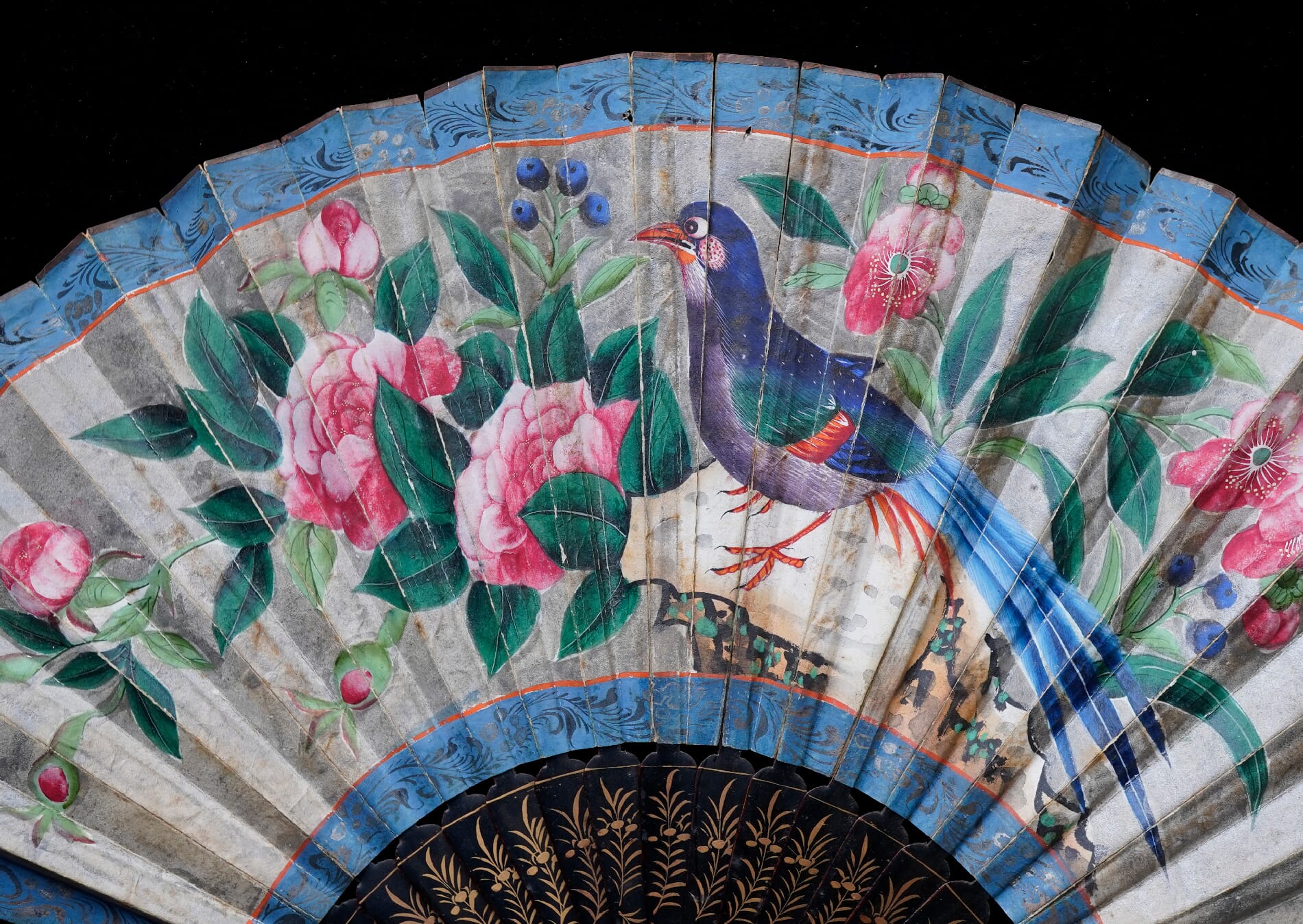
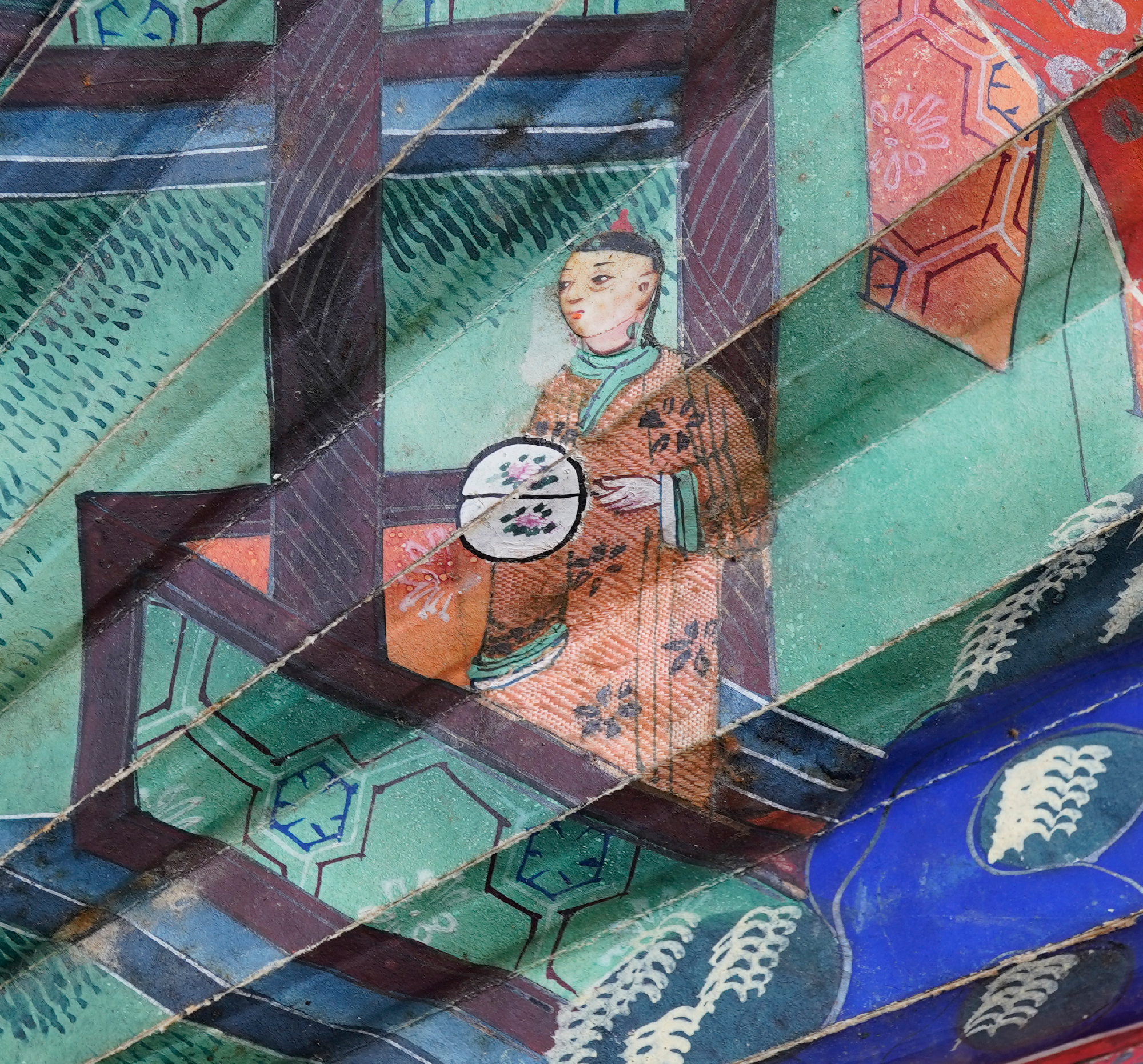
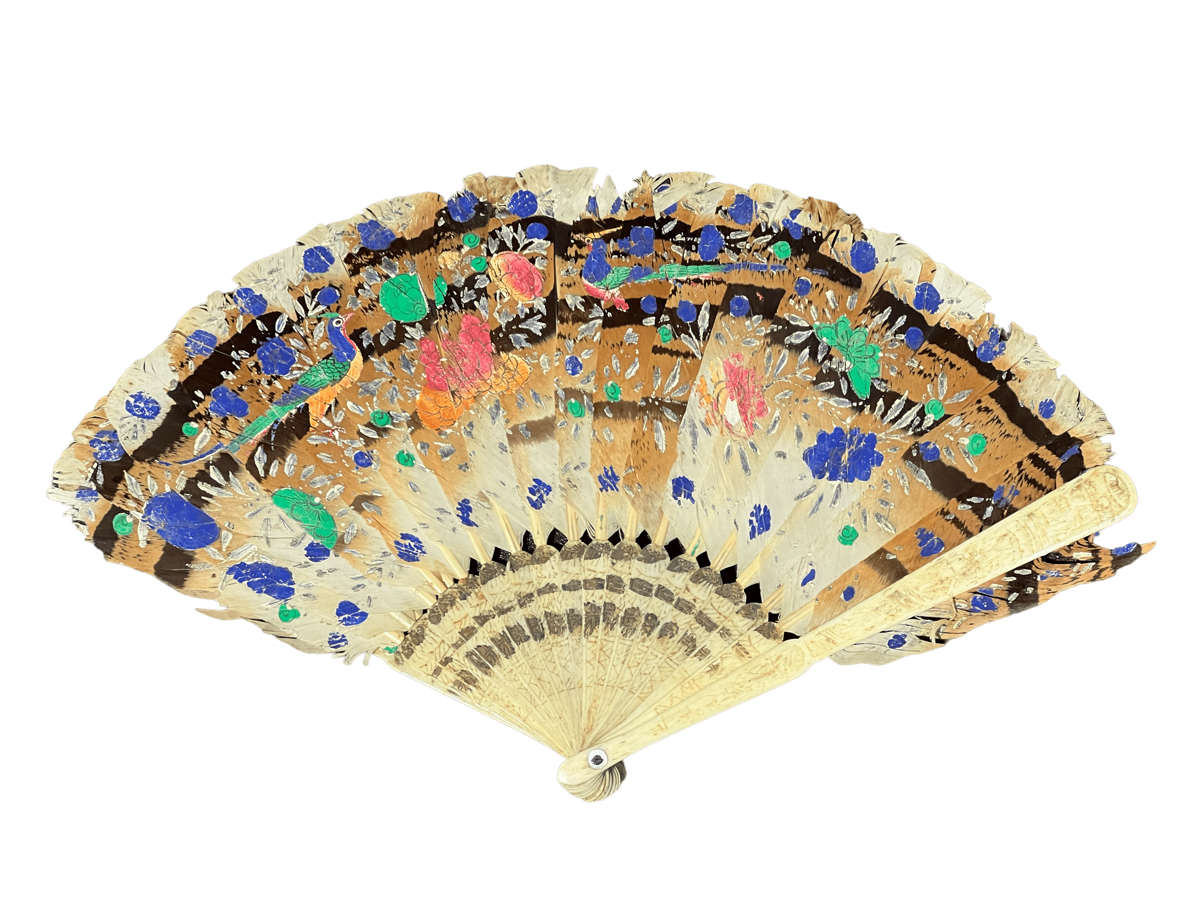
Chinese Export Bird Fan - dertail - c. 1850

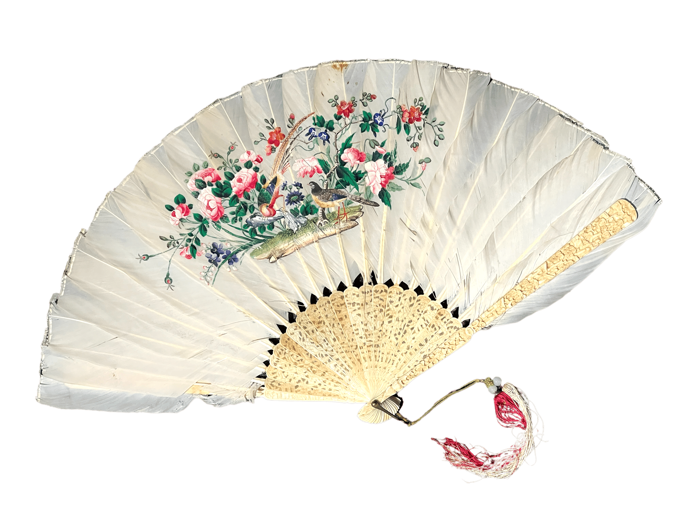
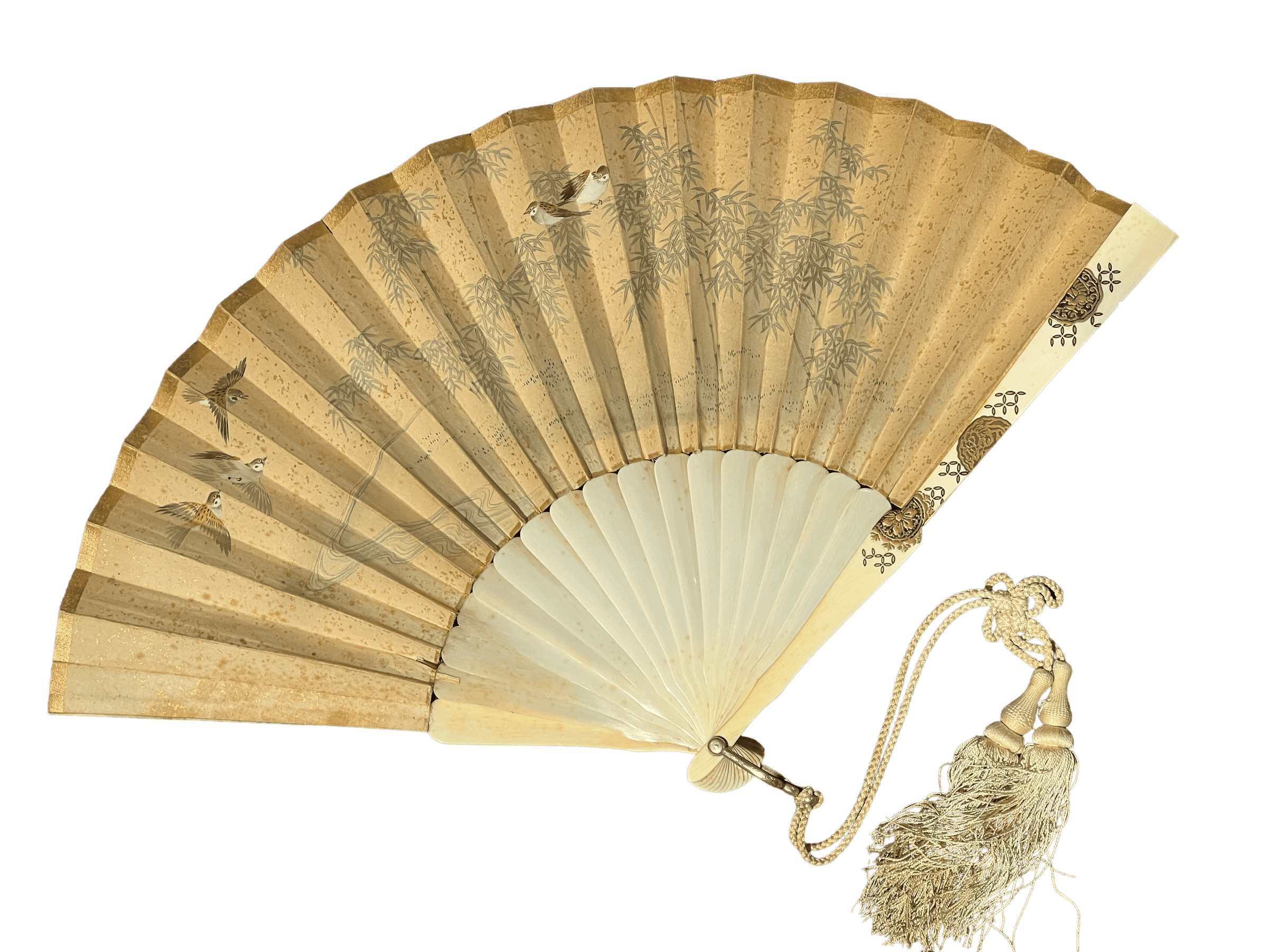
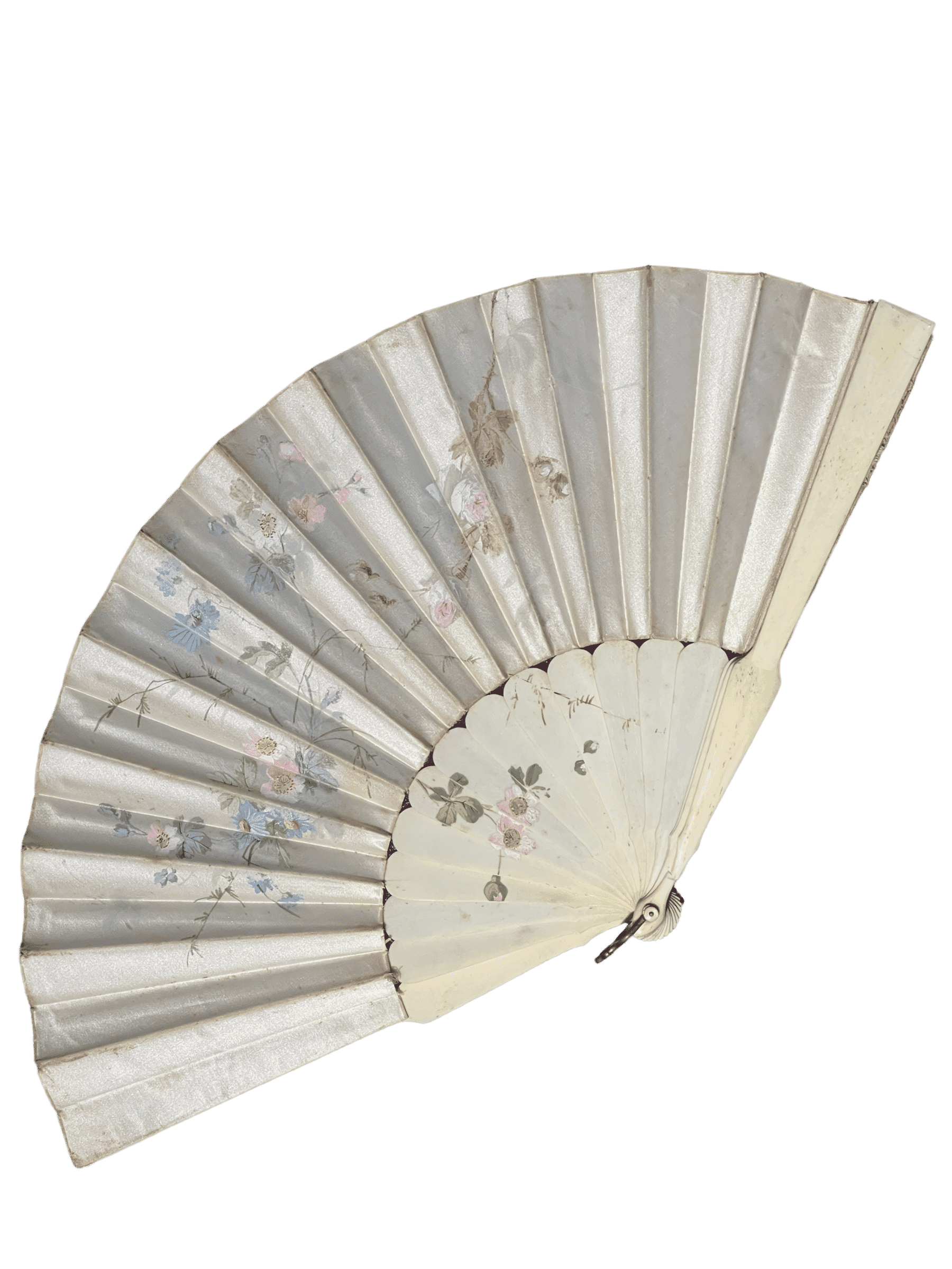
An exciting selection of Fresh items have just been posted on moorabool.com. We have a wide variety of quality items this release, everything from an 18th century fan painted with Roman Ruins, to a Melbourne Silversmith’s presentation trowel for a Camberwell church, made by the President of the Carlton Football Club – who was also a rarely-identified colonial silversmith!

Fans

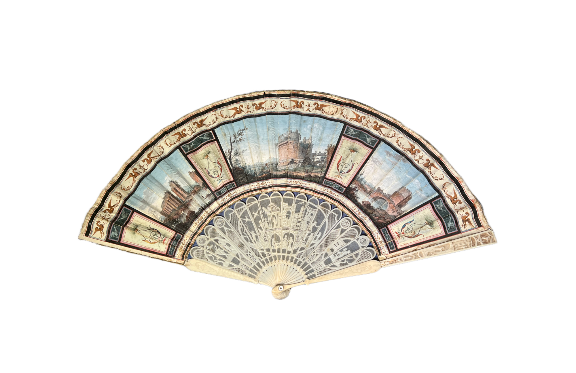
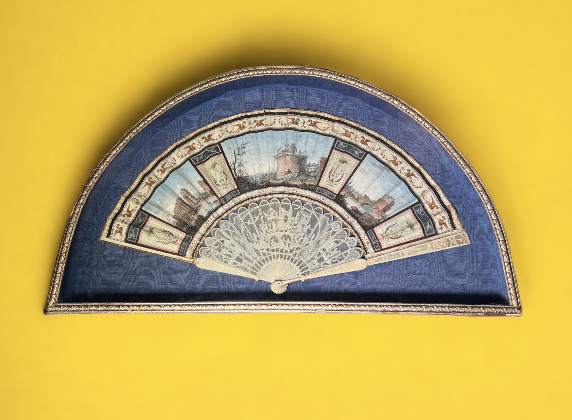
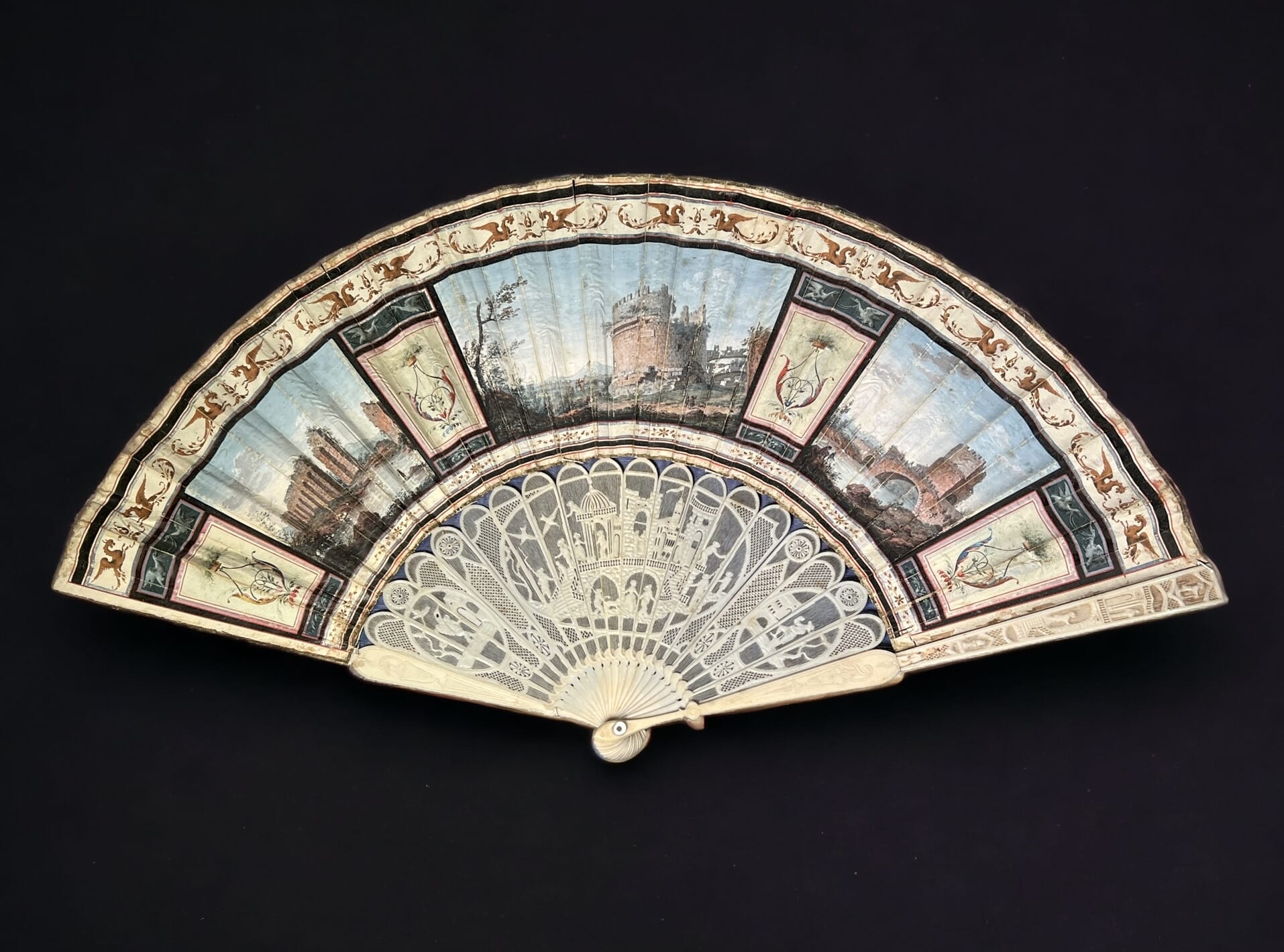
'Grand Tour' fan, Views of Rome, Italian c.1785
‘Grand Tour’ fan, a Masterpiece painted with panels of ‘Views of Rome’, Italian c.1785
Grand Tour fan, Rome, Pompeii, Rococo carved scenic sticks, c. 1785
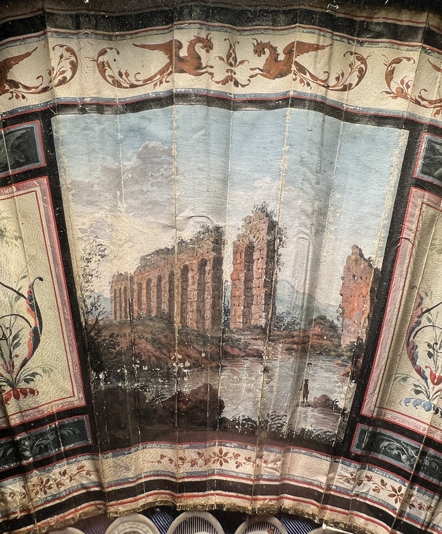
A Roman viaduct painted on the Italian fan, c. 1785

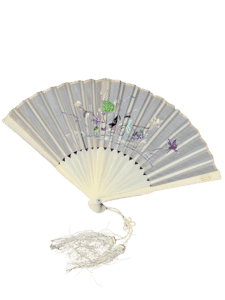
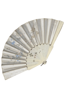
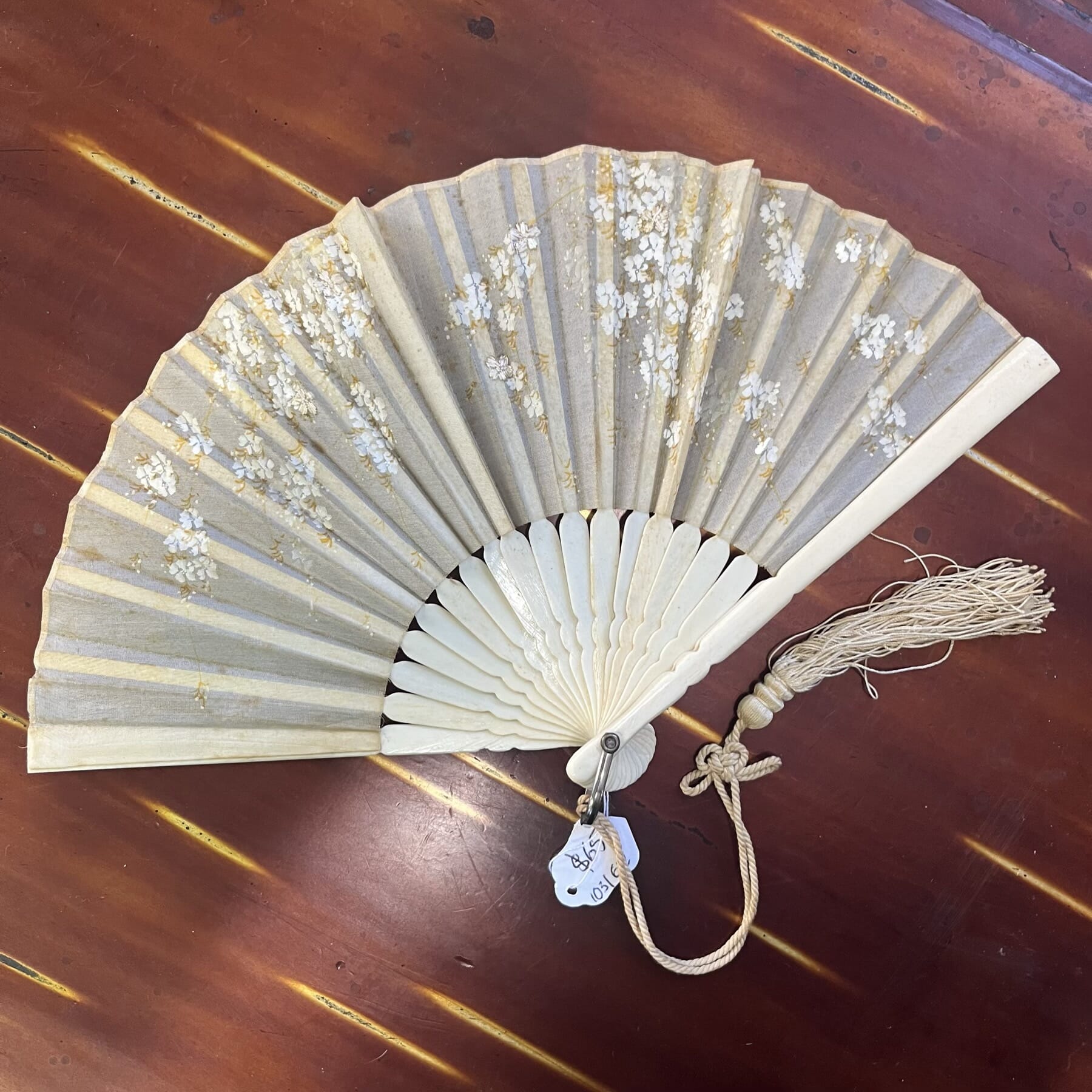
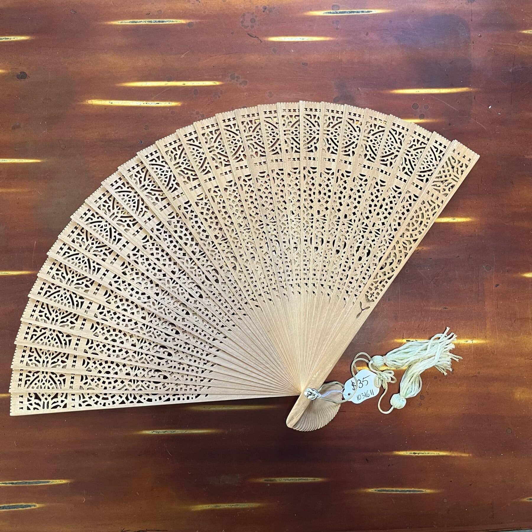
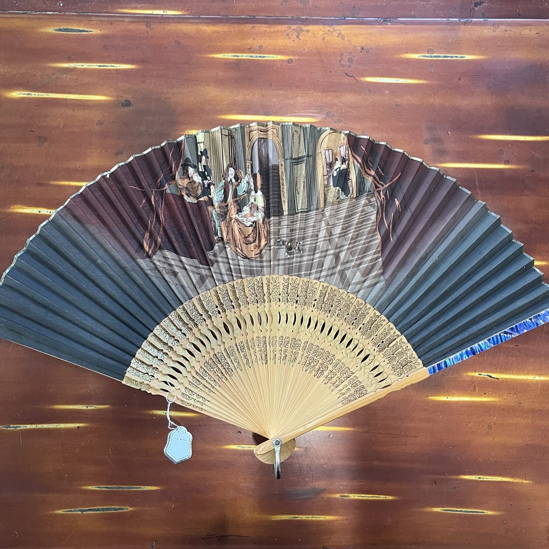
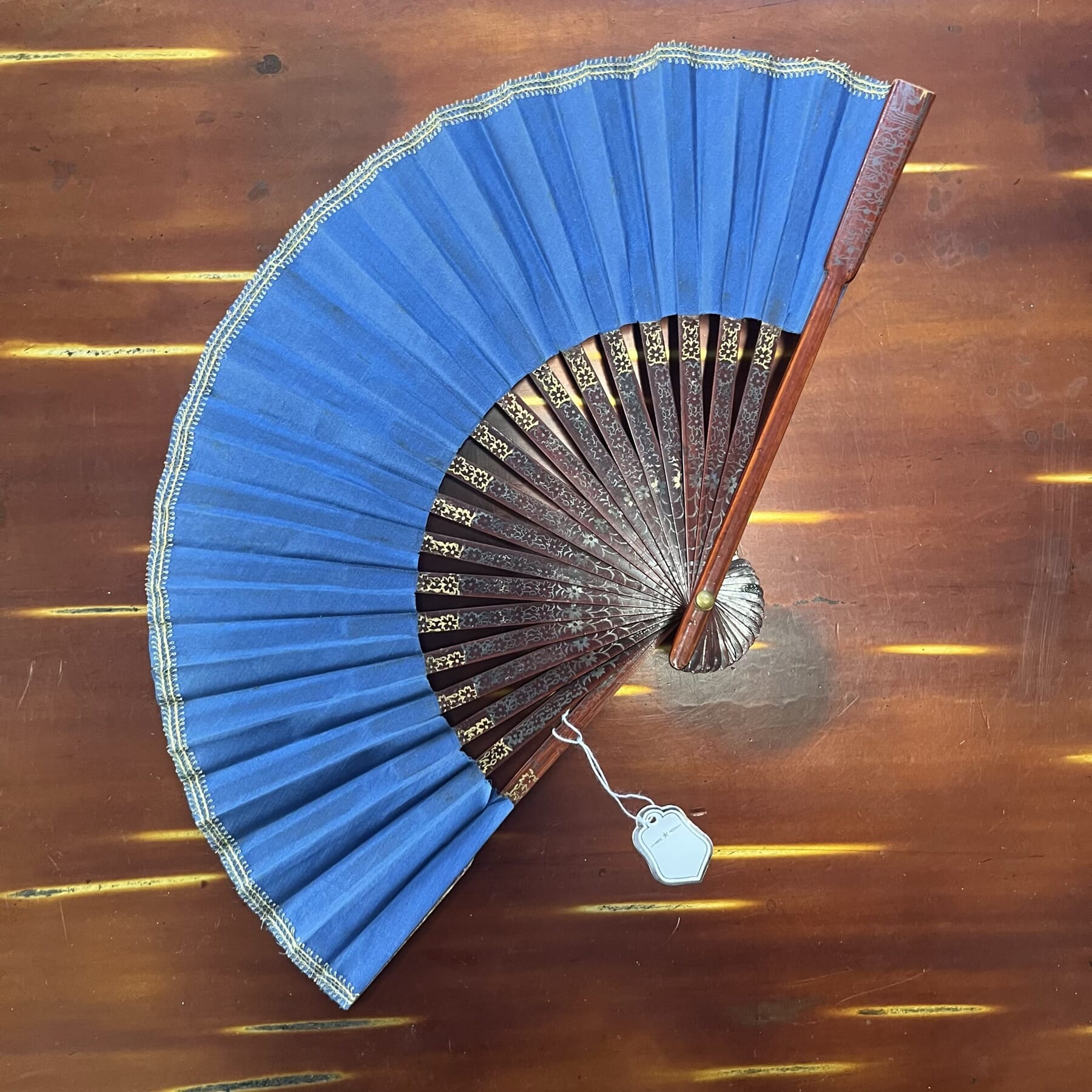
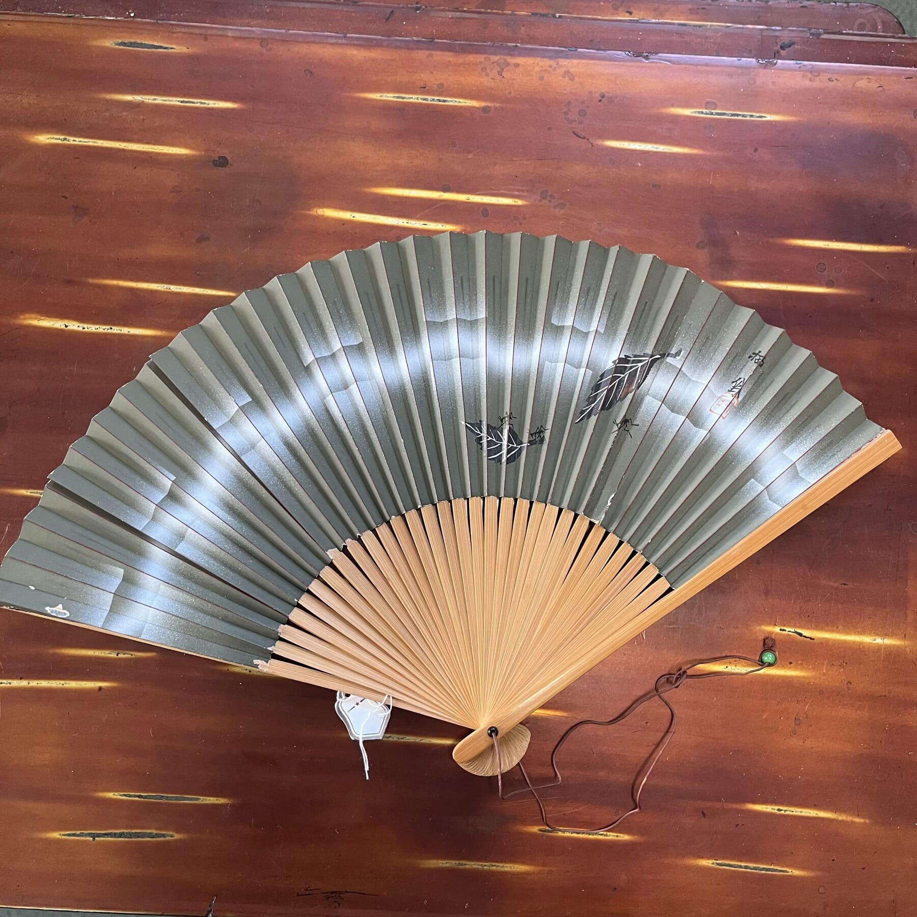
Are you a Fan fan? They were once a social necessity, not for keeping cool, but for hiding behind in social encounters…. at least in a European context. Those Europeans who headed to warmer climates must have been very glad of them though, as they were a handy way of keeping cooler in the hot colonial climates.
We have a fine selection, some of which come from the collection of the late Lorraine Rosenberg. She was the driving force behind Moorabool Antiques from the beginning in the 1960’s, and an avid collector of textiles & fans.


The key piece in today’s release is a French ‘Grand Tour’ fan from the late 18th century: the detail on this is stunning, with hand-painted views of Roman ruins and very finely carved sticks. The lines that make up the background are almost as fine as a hair!

Grand Tour fan, Rome, Pompeii, Rococo carved scenic sticks, c. 1785
A ‘pleasure folly’ with lots of activity, superbly carved to the sticks, with a fine web of cuts making the background. note the size of the pin-head, upper right.
Grand Tour Italian Fan
Grand Tour Italian Fan in wall mounted box-frame.

It is conveniently housed in a custom made ‘fan box’, designed to hang on the wall.


None of the others have this mounting – they are all foldable & unmounted – but we are able to provide a fan shadow-box on request, please ask for a quote.

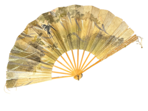
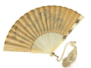
  • Antique Fans at Moorabool Antiques, Geelong
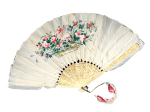
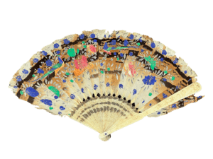
  • Chinese white feather fan, fine Birds & Flowers painting, intricate carved ivory ends, c. 1820
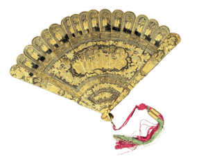
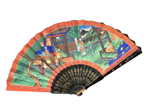
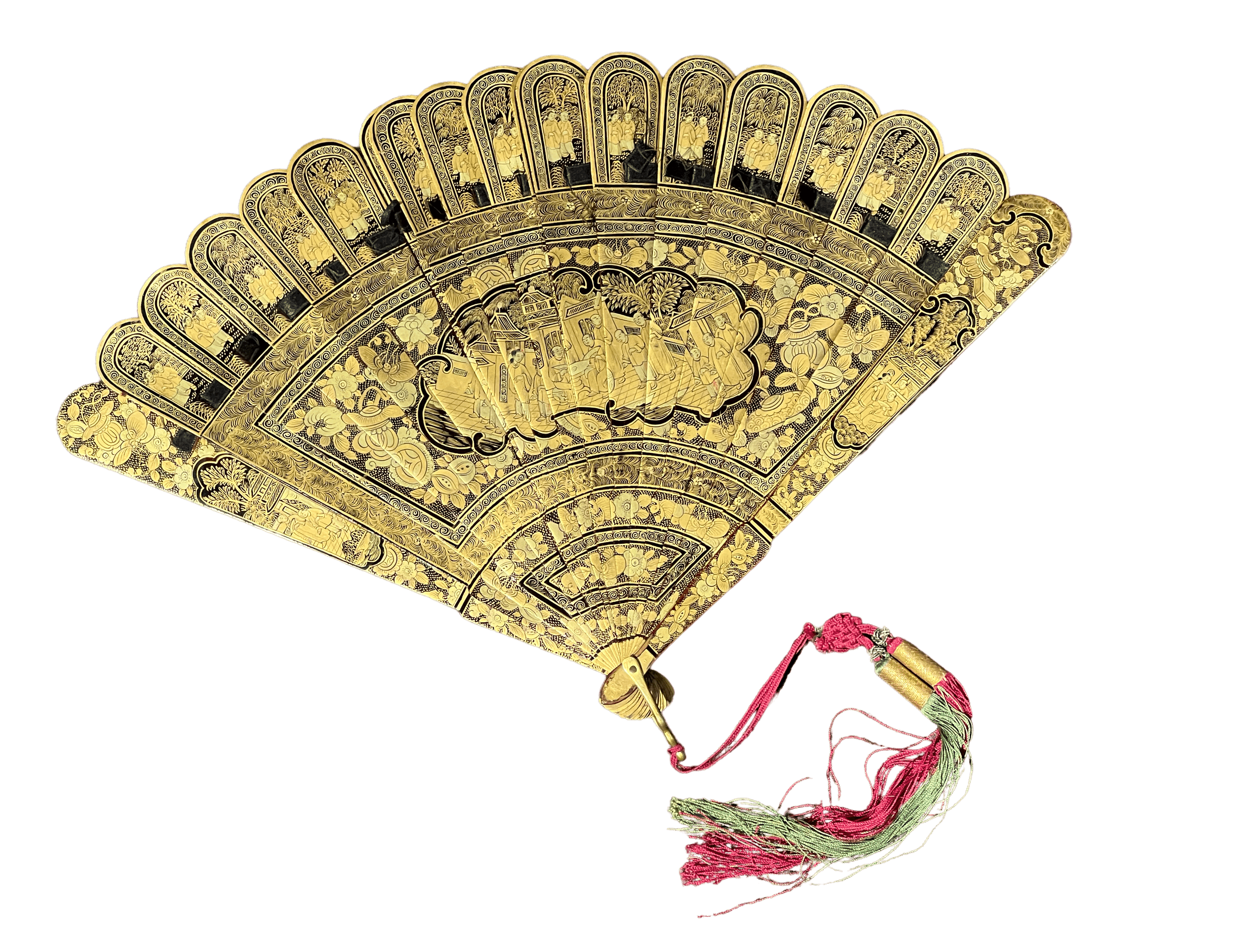
  • Chinese Export brisé black lacquer fan, fine gilt scenes, Canton c. 1840
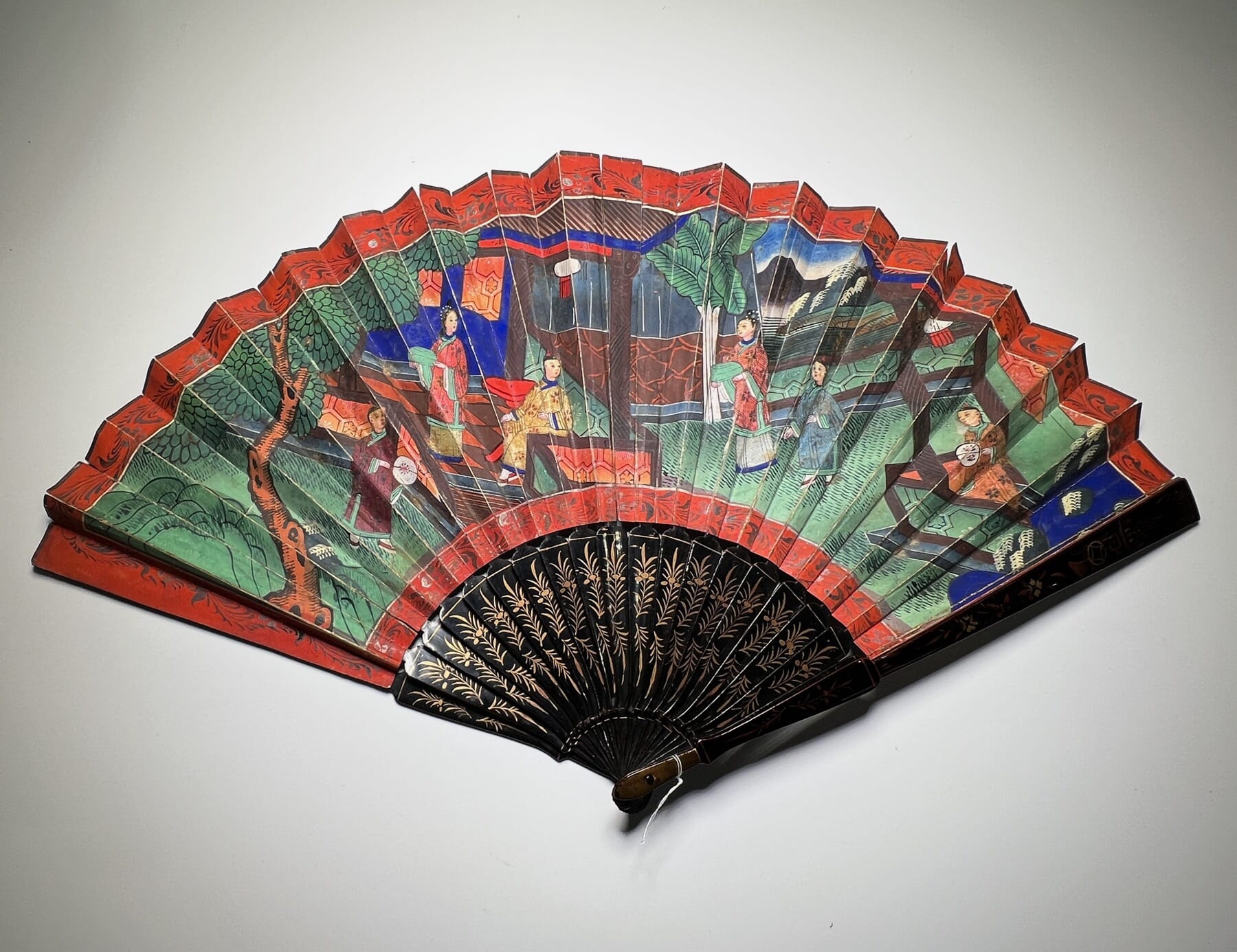
  • Chinese Export Lacquer & Painted Fan c. 1850
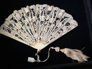
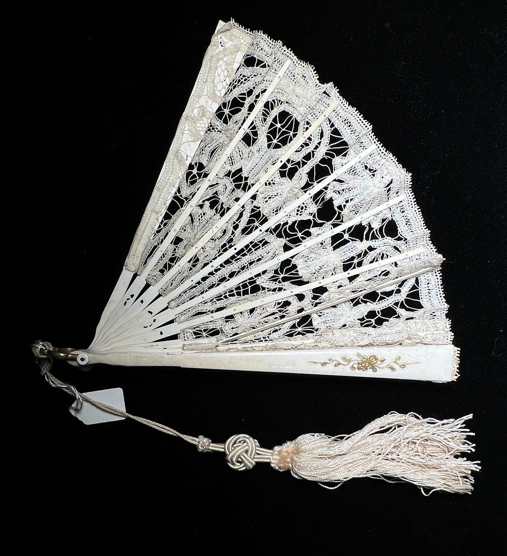
  • Brussels Lace Fan c. 1860

The Chinese Export fan below features applied silk costumes to the inhabitants, and ivory faces beautifully detailed.
In this gent’s hand is a fan – of course!

Dates to circa 1850.

See the fans here…. with more to come shortly.

A Camberwell Rarity

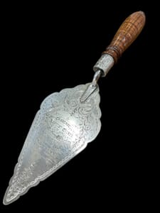
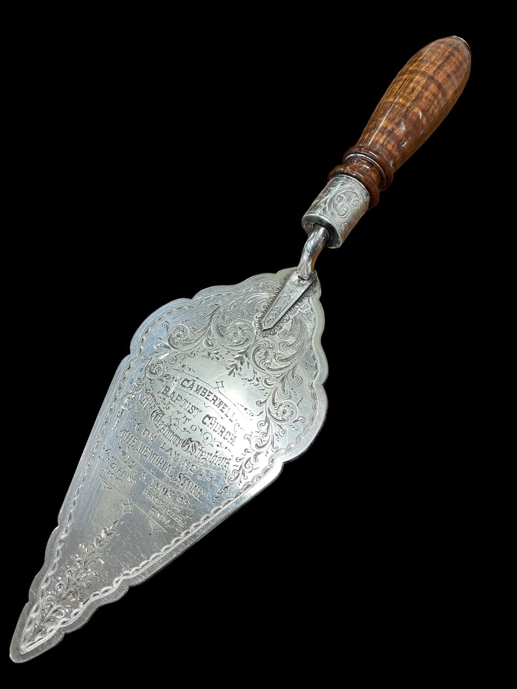
The Melbourne-made presentation trowel in today’s ‘Fresh Stock’ is a terrific piece of Australiana. It has a fiddleback Blackwood handle, and a silver-plate blade, beautifully inscribed:

Australian Silver & Blackwood Trowel, Robertson Silversmith Melbourne 1903

“CAMBERWELL BAPTIST CHURCH / Mrs Westmore G Stephens / ON LAYING / THE MEMORIAL STONE / 12.9.1903. / J.F. Gibbins Archt. / Fraser & Currie Contrs.”

It turns out this was a building built in 1903 on the site of the present building, a brick church constructed in 1940. We tried to find the stone that this trowel was used to ‘lay’ – but no luck, perhaps a Melbourne local may know…. email us if you’re familiar with the church, located right near the Camberwell Junction.
The maker of this trowel is also not very well documented. Robert Robertson came to Melbourne in 1852, and operated as a jeweller throughout the goldfish years, using a rarely seen hallmark ‘RR’. When his son joined the firm, it was ‘Robert Robertson & Son’ – try saying that fast! This piece bears another rarely seen mark, not in the literature – ‘R&S ROBERTSON’.

Robert-Roberston-SIlversmith-Melbourne
Robert Robertson, Silversmith & Footballer – Melbourne, 1887


Research into his career as a silversmith revealed very little documentation – he was a wholesale silversmith, meaning he made pieces for retail jewellers, and they often put their own hallmarks on the pieces they sold. However, he is well documented for a very ‘Melbourne’ reason: Australia Rules Football!

He took up the ‘new’ sport very early, possibly playing in an 1869 match for the Carlton Football Club. He twice captained the team in 1871, was the Carlton Vice President 1871-73, and then from 1874-84 was the Carlton Football Club President!

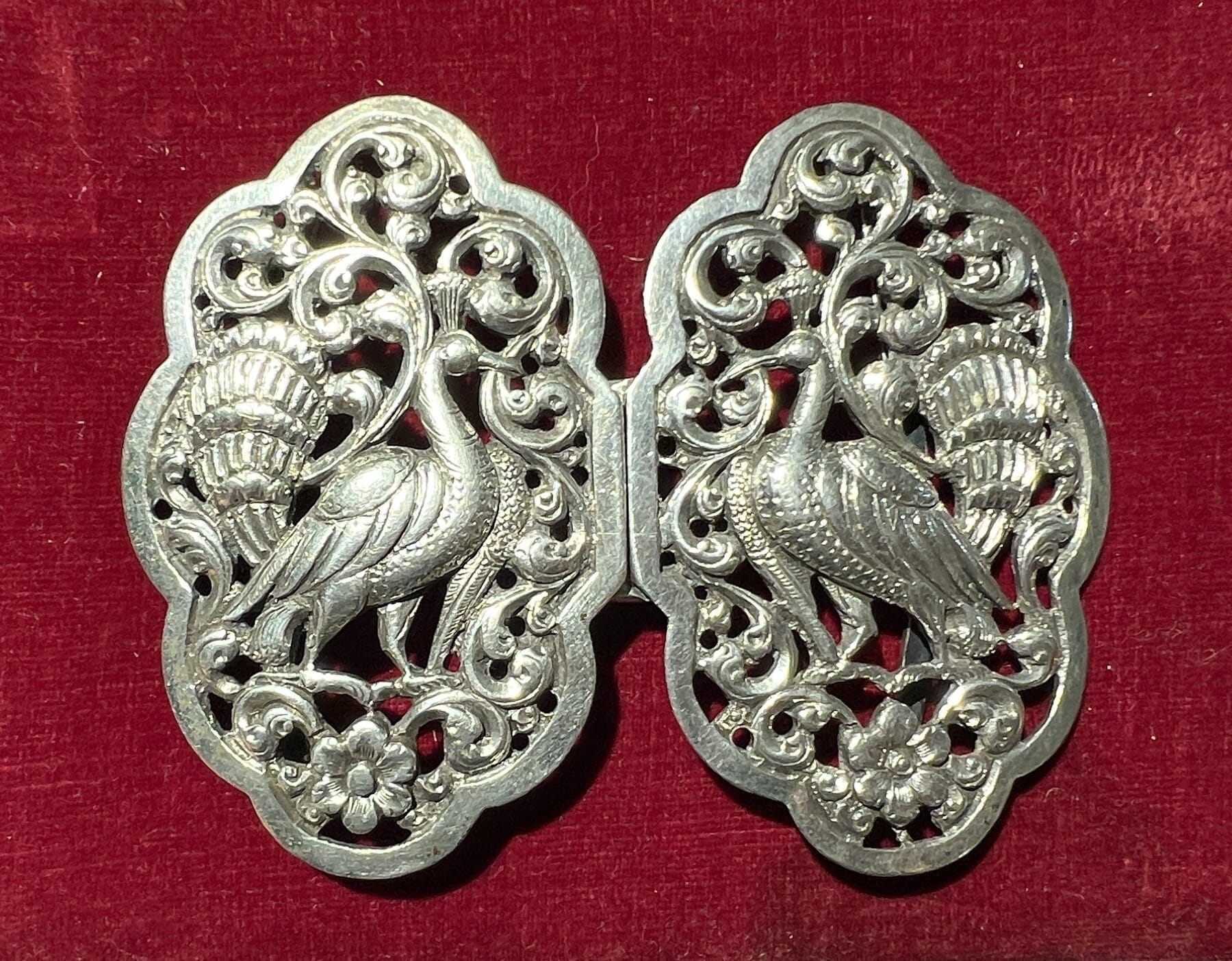
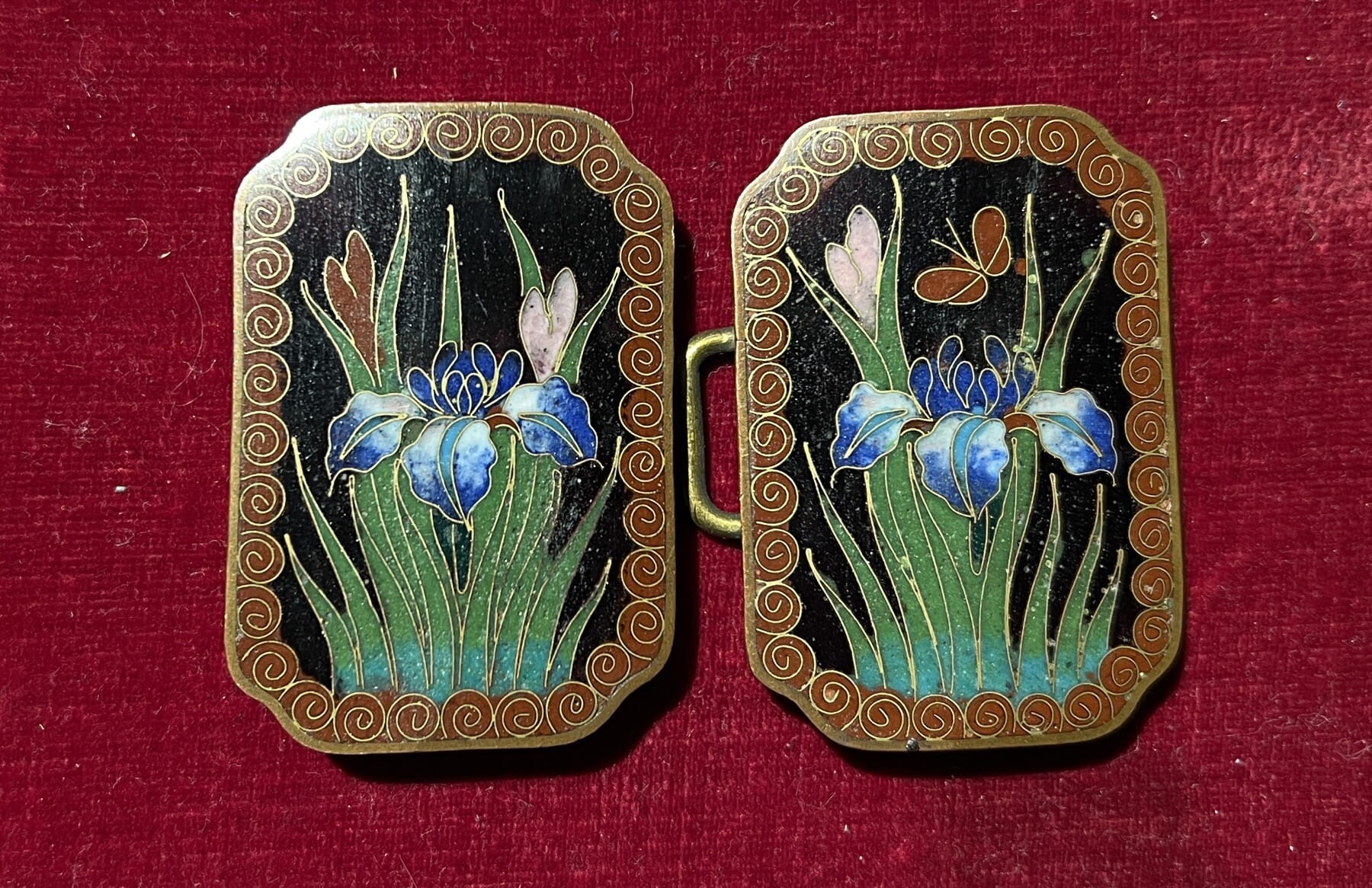
Beautiful Buckles

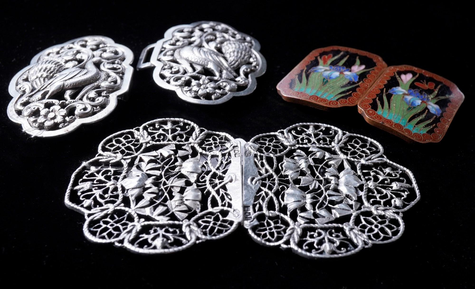
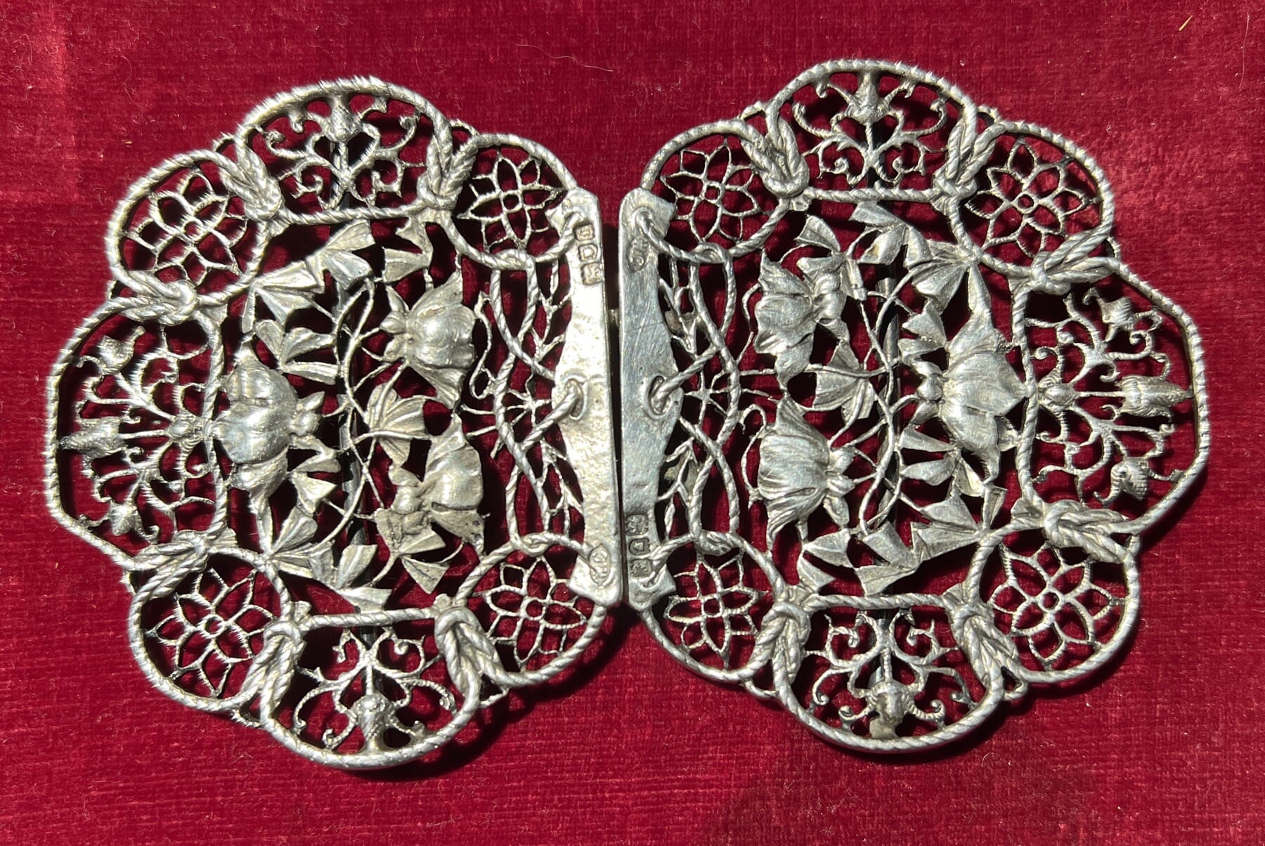
These exquisite items were used by the fashionable Victorian lady to clasp their thin belts they wore at their waist. The Art-Nouveau example in particular is a very fine example.

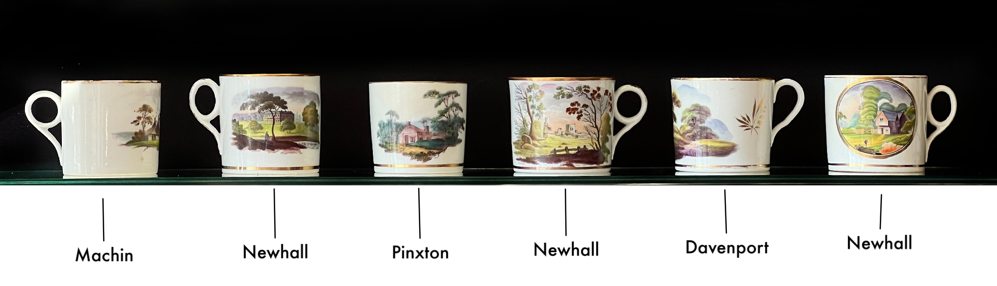
Early 19th century English Porcelain Coffee Cans at Moorabool Antiques, Geelong

Coffee Cans

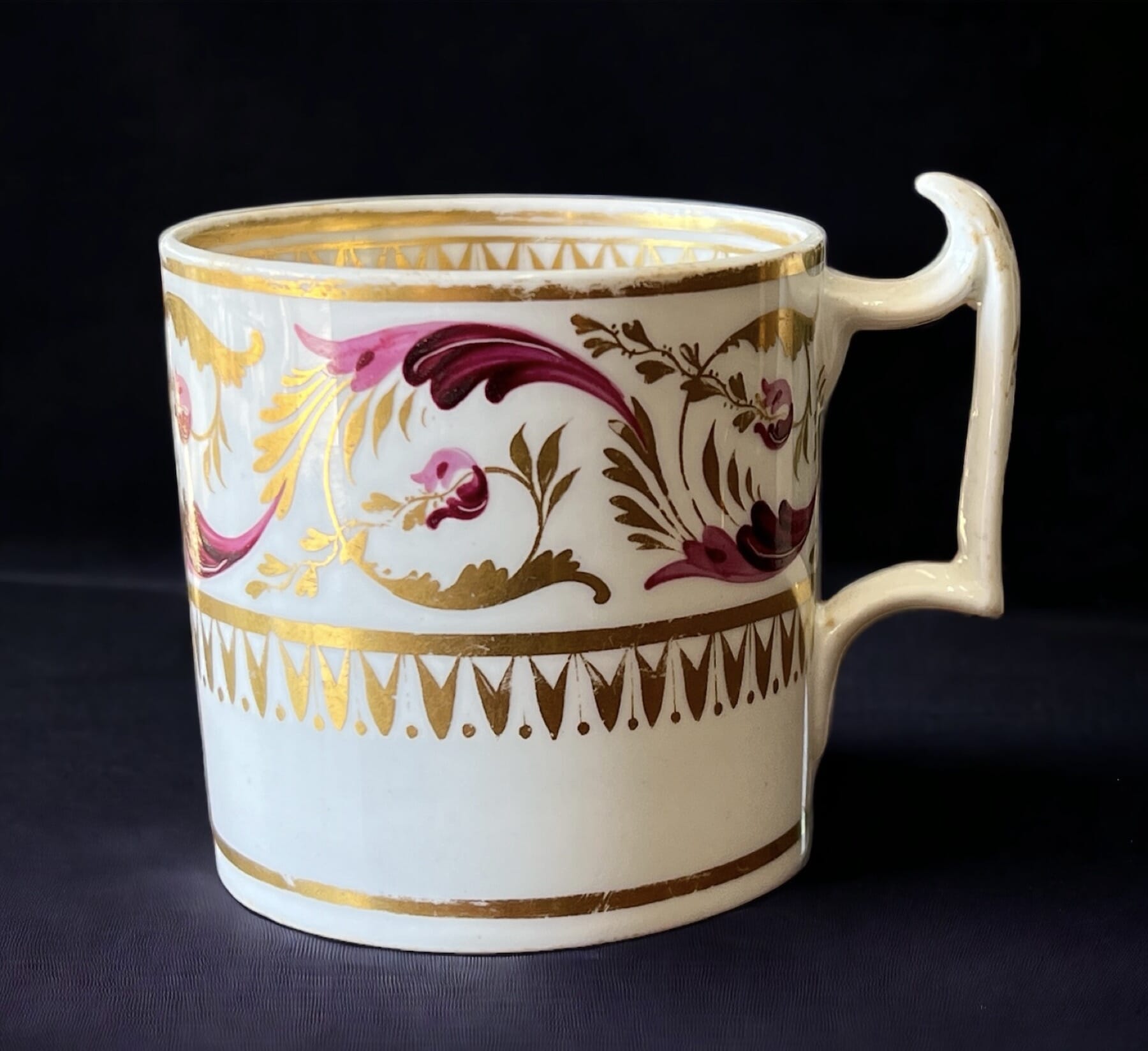
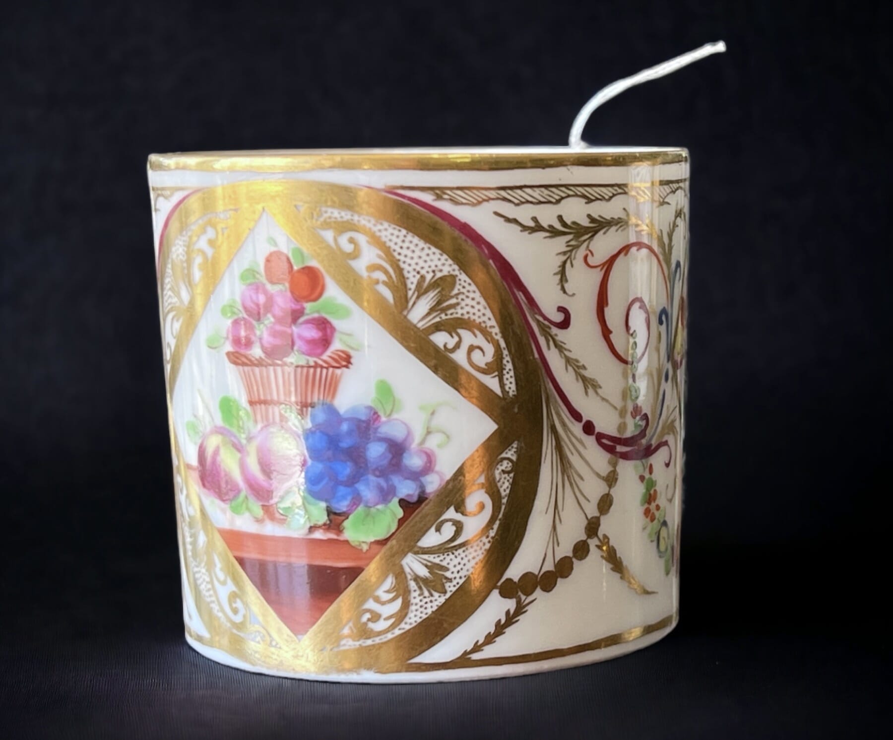
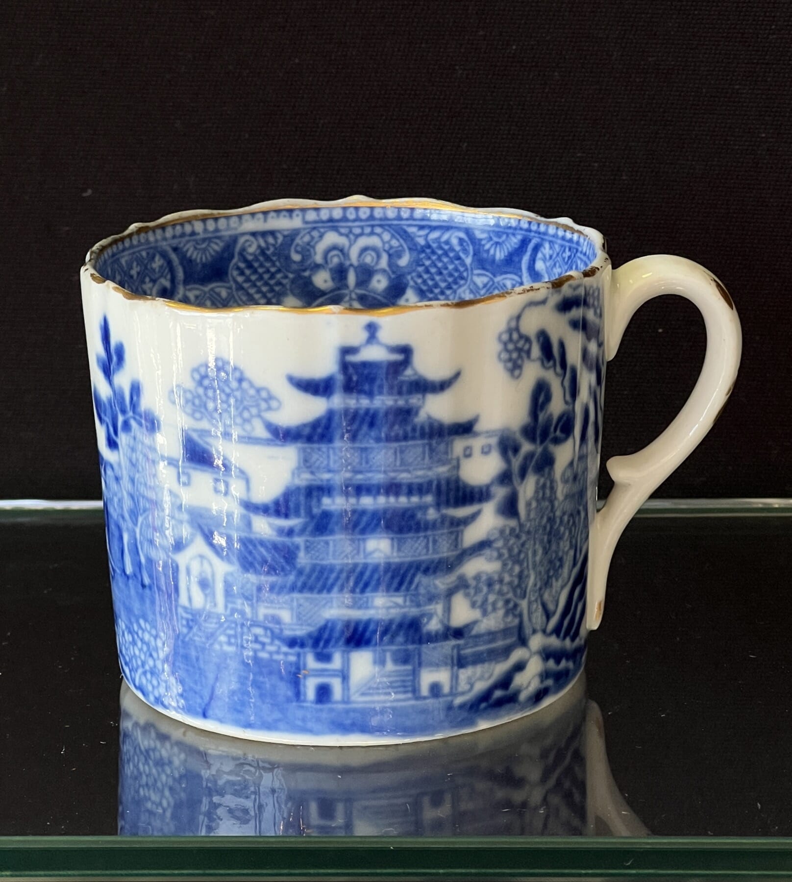
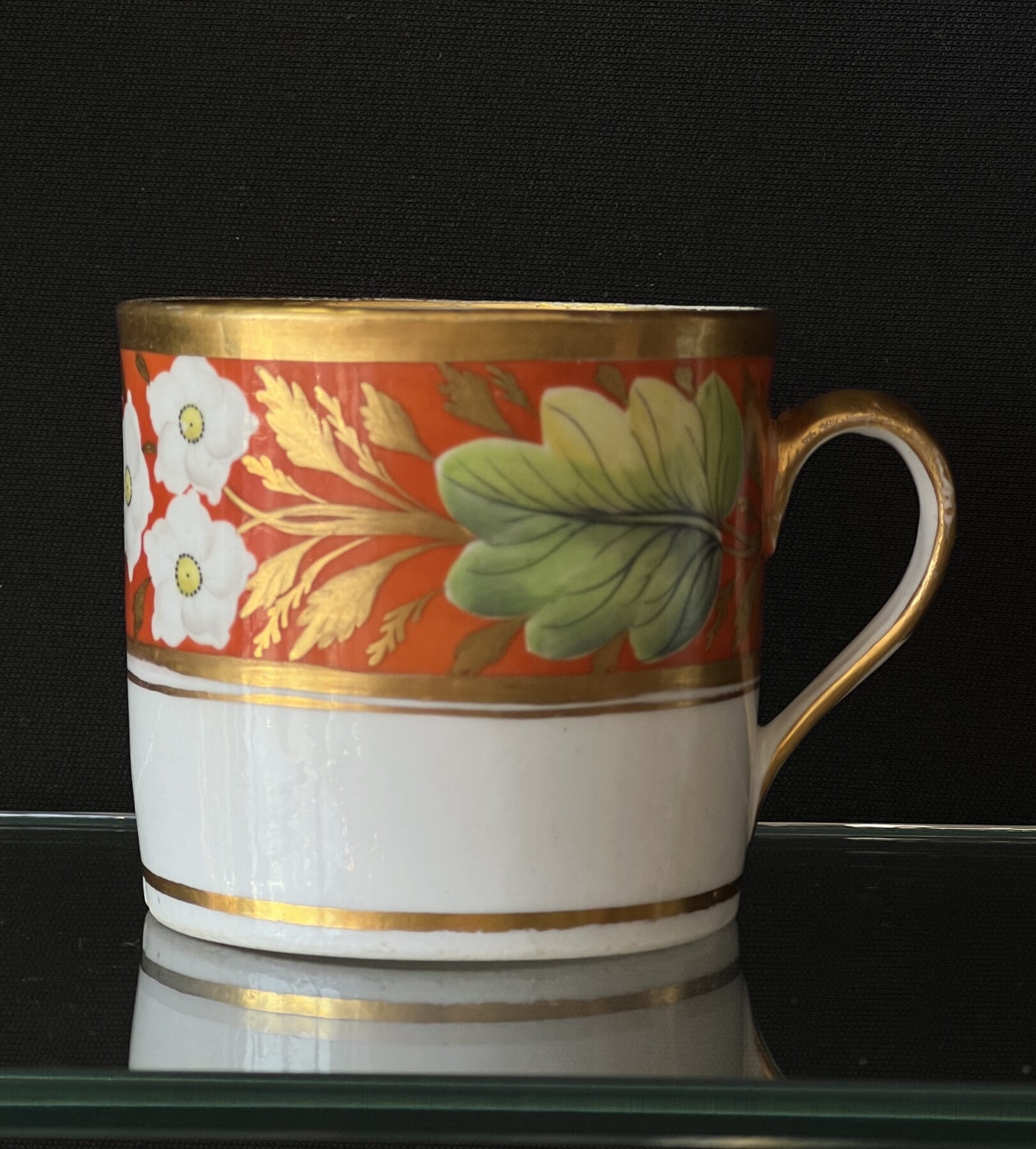
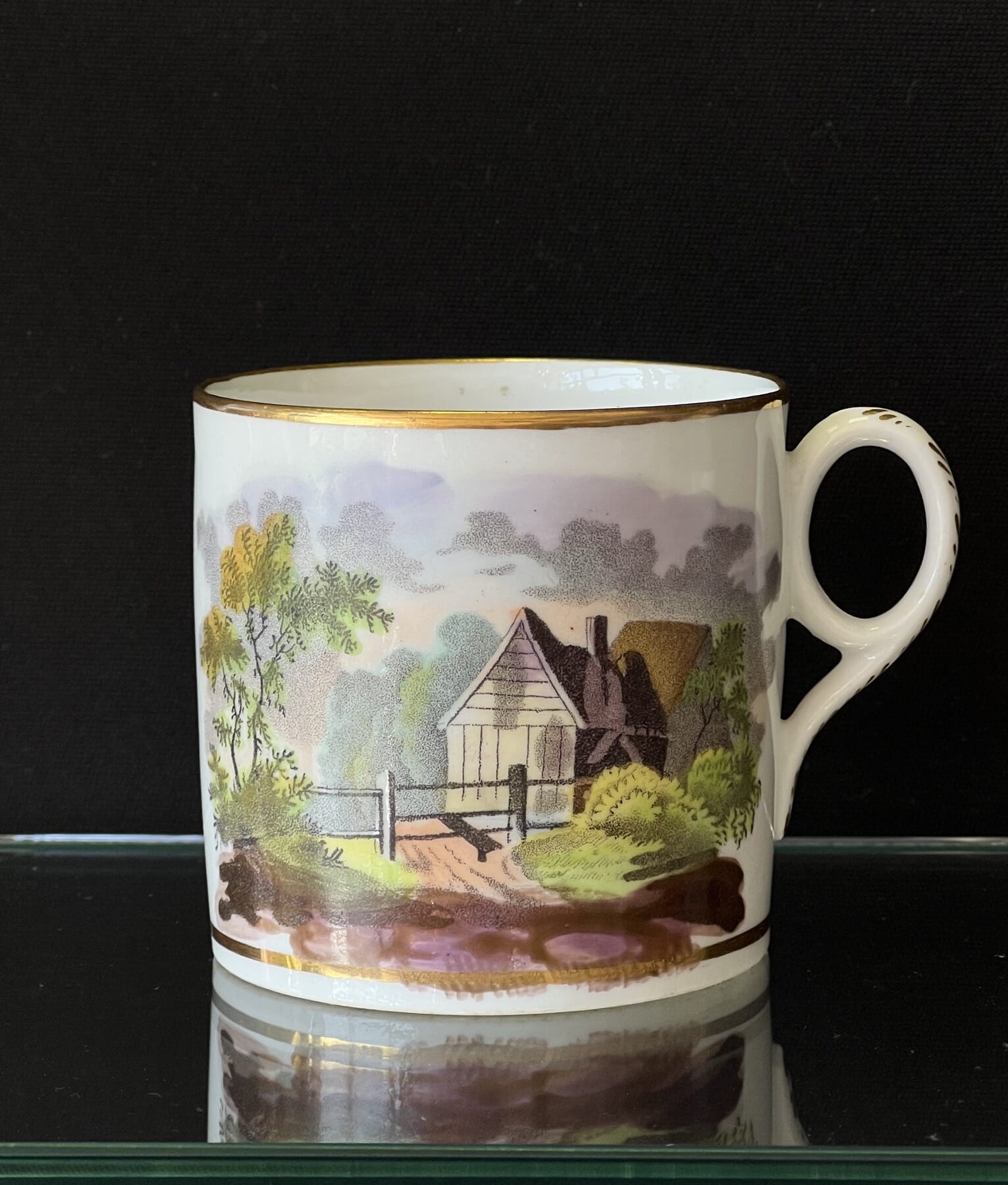
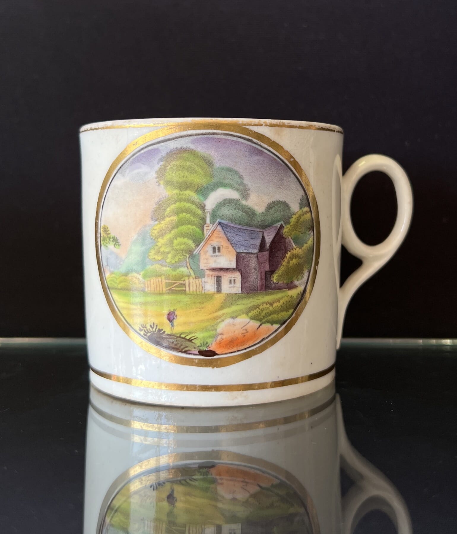
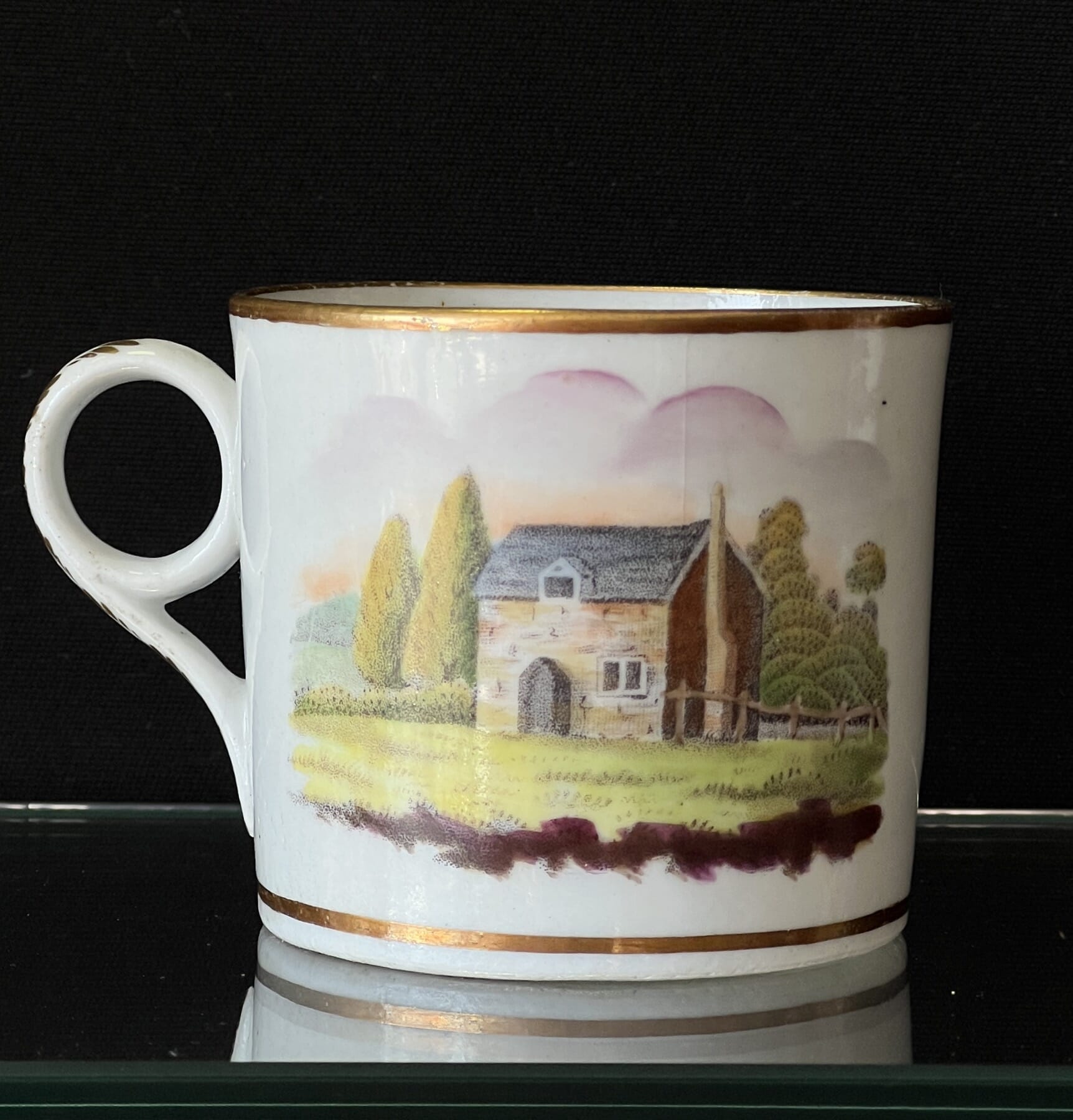
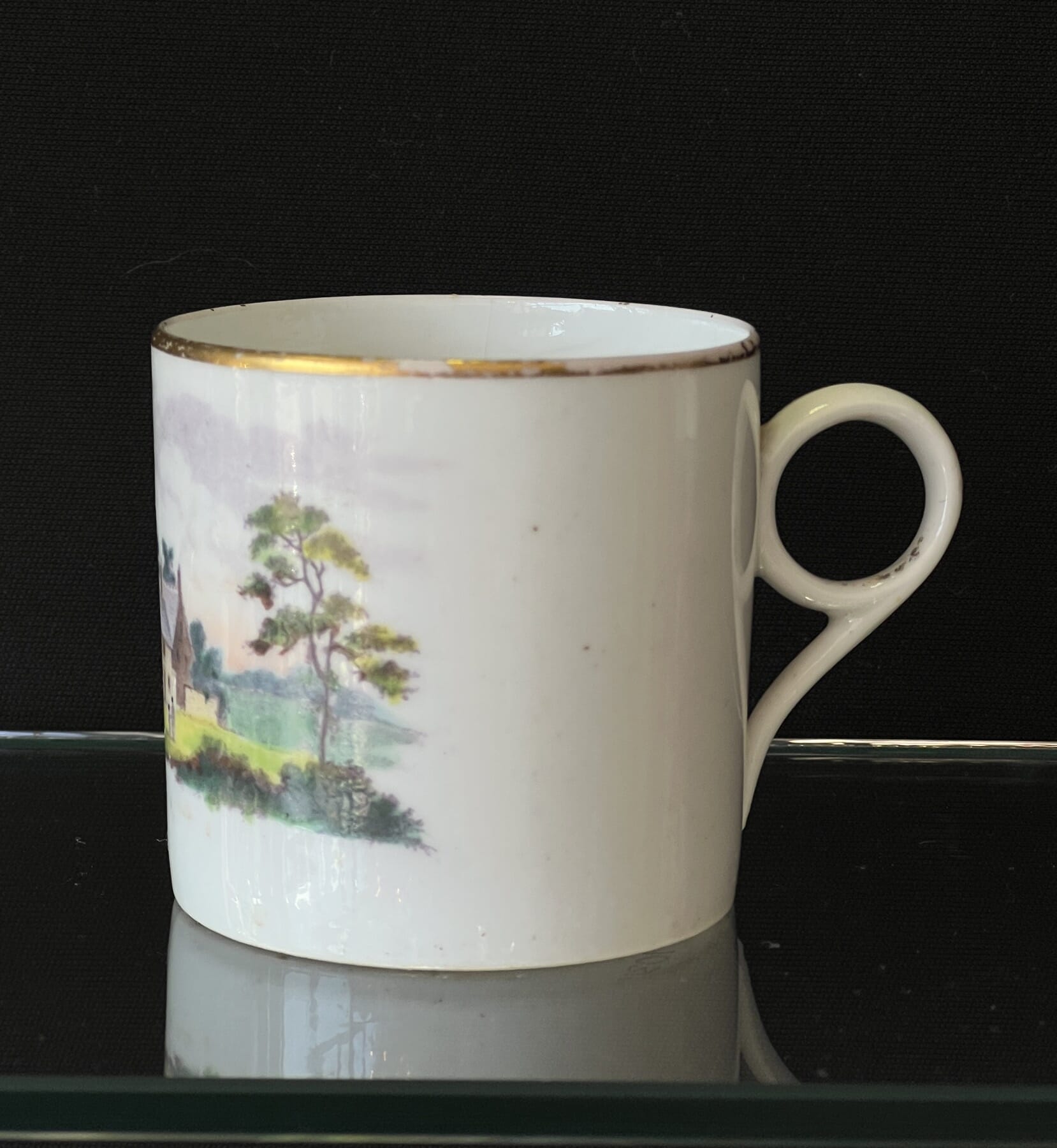
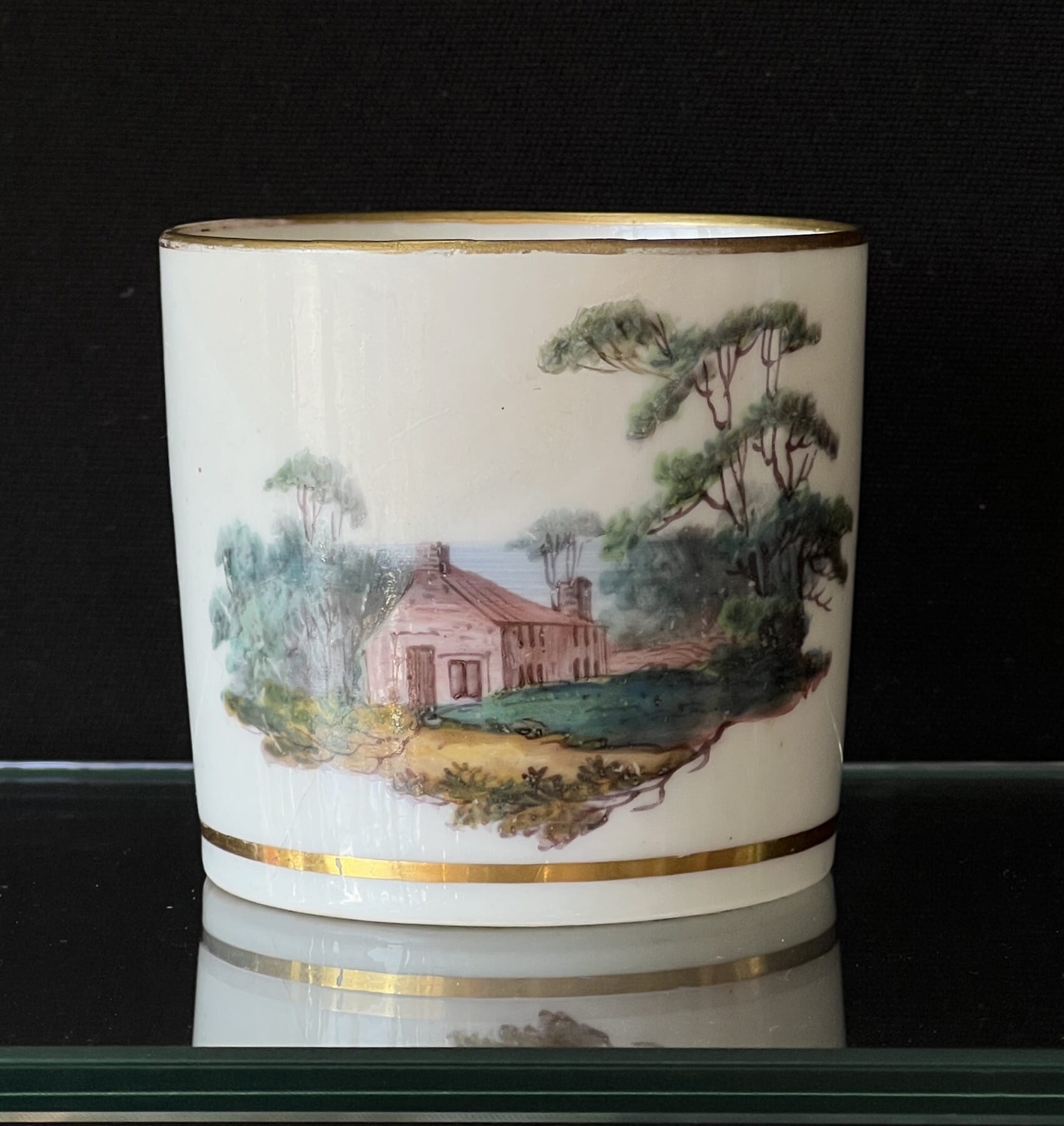
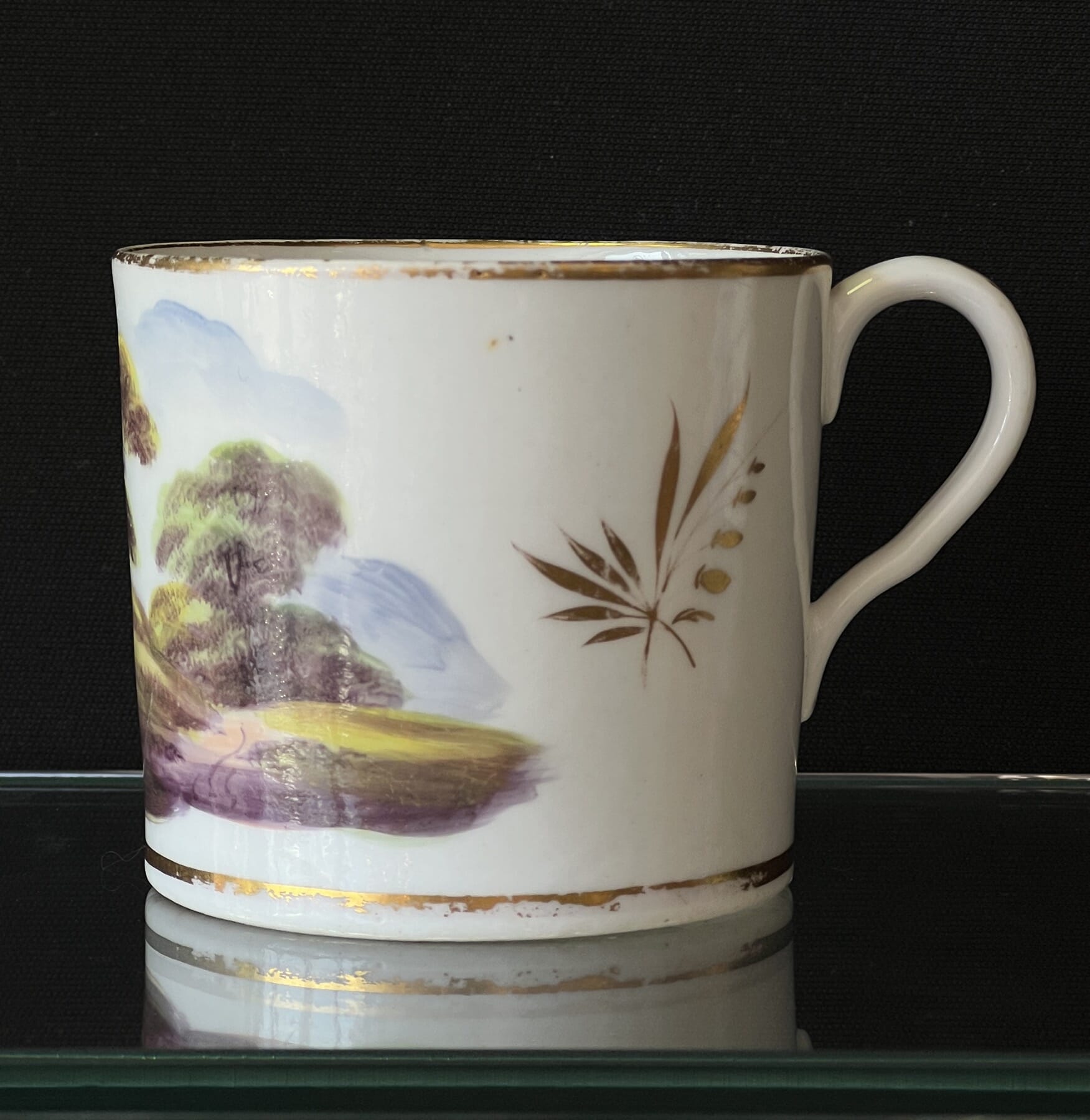
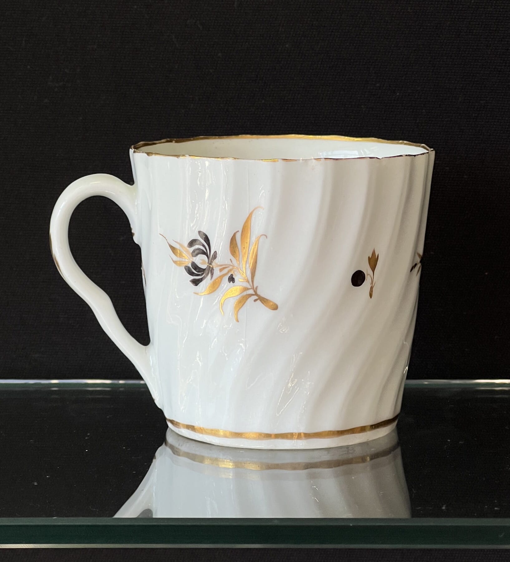
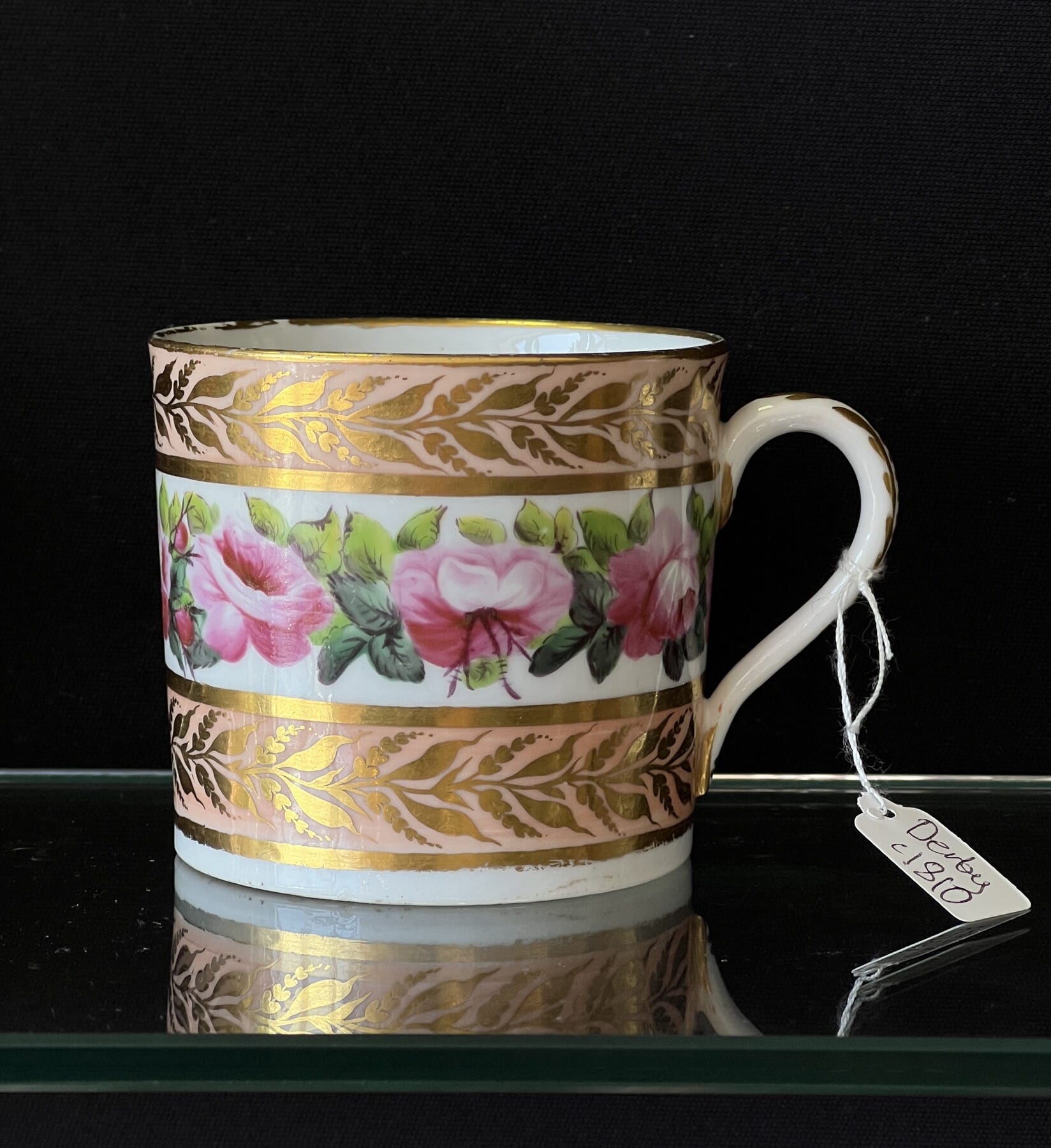
For all Coffee Can Collectors – here’s a gorgeous group of miniature masterpieces, including a selection of landscapes…. plus other early 19th century makers, including Pinxton, Machin, Spode, Derby, Coalport, Flight Worcester, Derby, Coalport, and two fine French examples.

Fresh to Stock

Previews…..

We have some exciting pieces due to be released shortly – have a preview here:

Posted on

Fresh Stock: Arts & Crafts, Ida R. Outhwaite fairy, WMF, + More…

Welcome to the latest offerings from Moorabool Antiques.

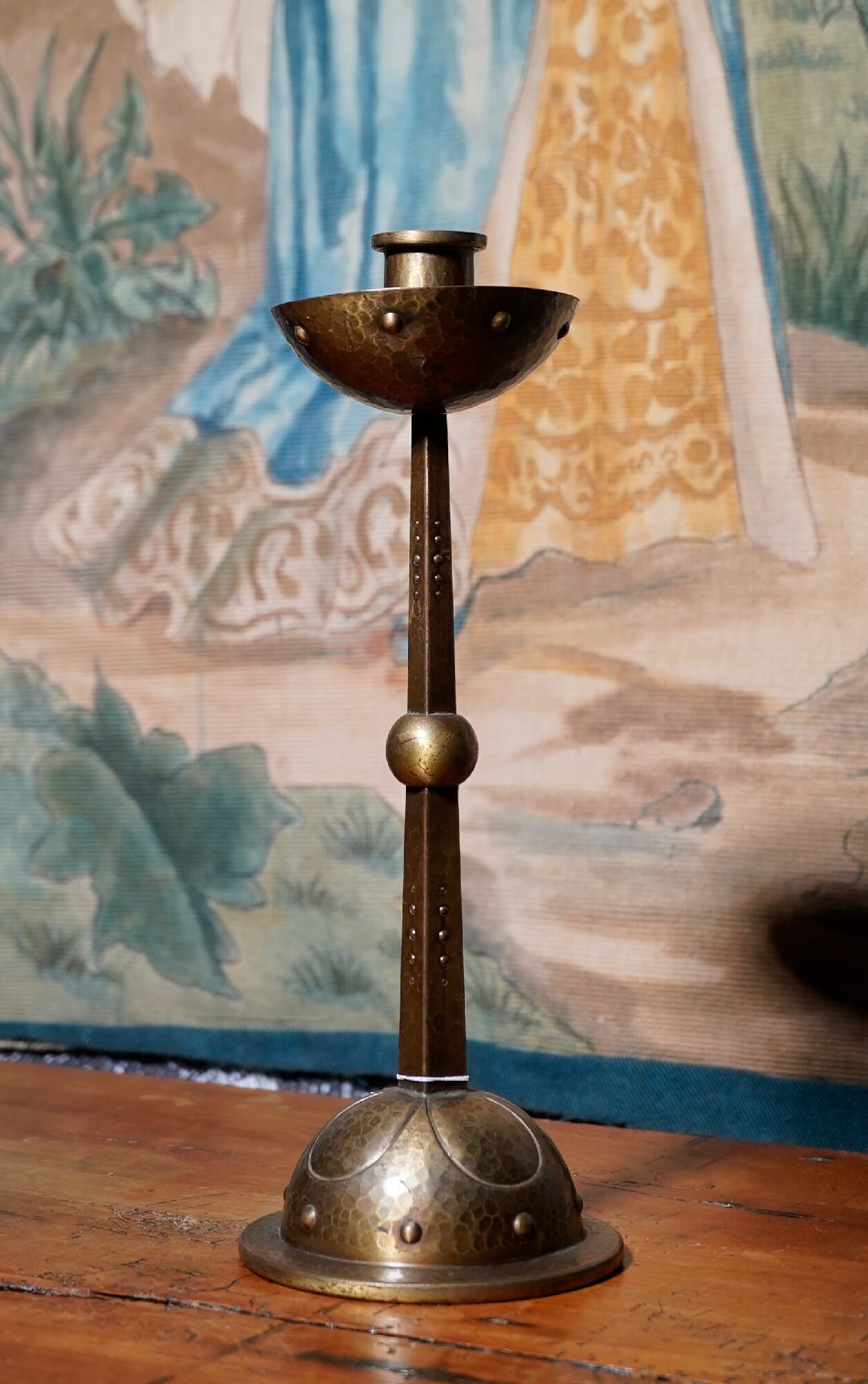
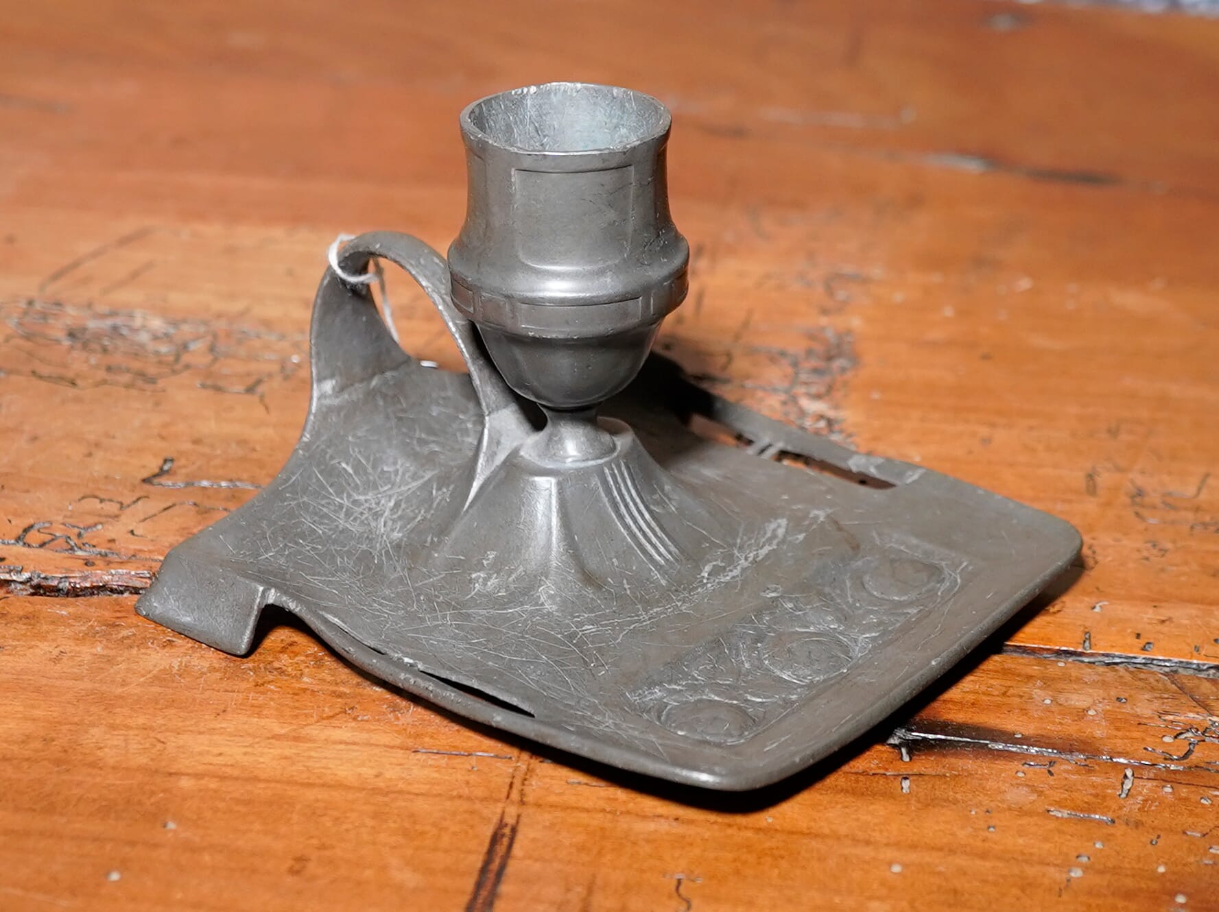
Fresh to stock is a wonderful selection of Furniture, Silver, Pewter, Ceramics & Pottery with one thing in common….. they belong to the fertile artistic period in the late 19th/early 20th century, where styles such as the Pre-Raphaelites, the Arts & Crafts, the Art Nouveau, and the more ‘Modernist’ designs all found their roots.

Fire-screen containing an actual lyre bird’s tail between glass, circa 1900 – ex-Moorabool Antiques stock.

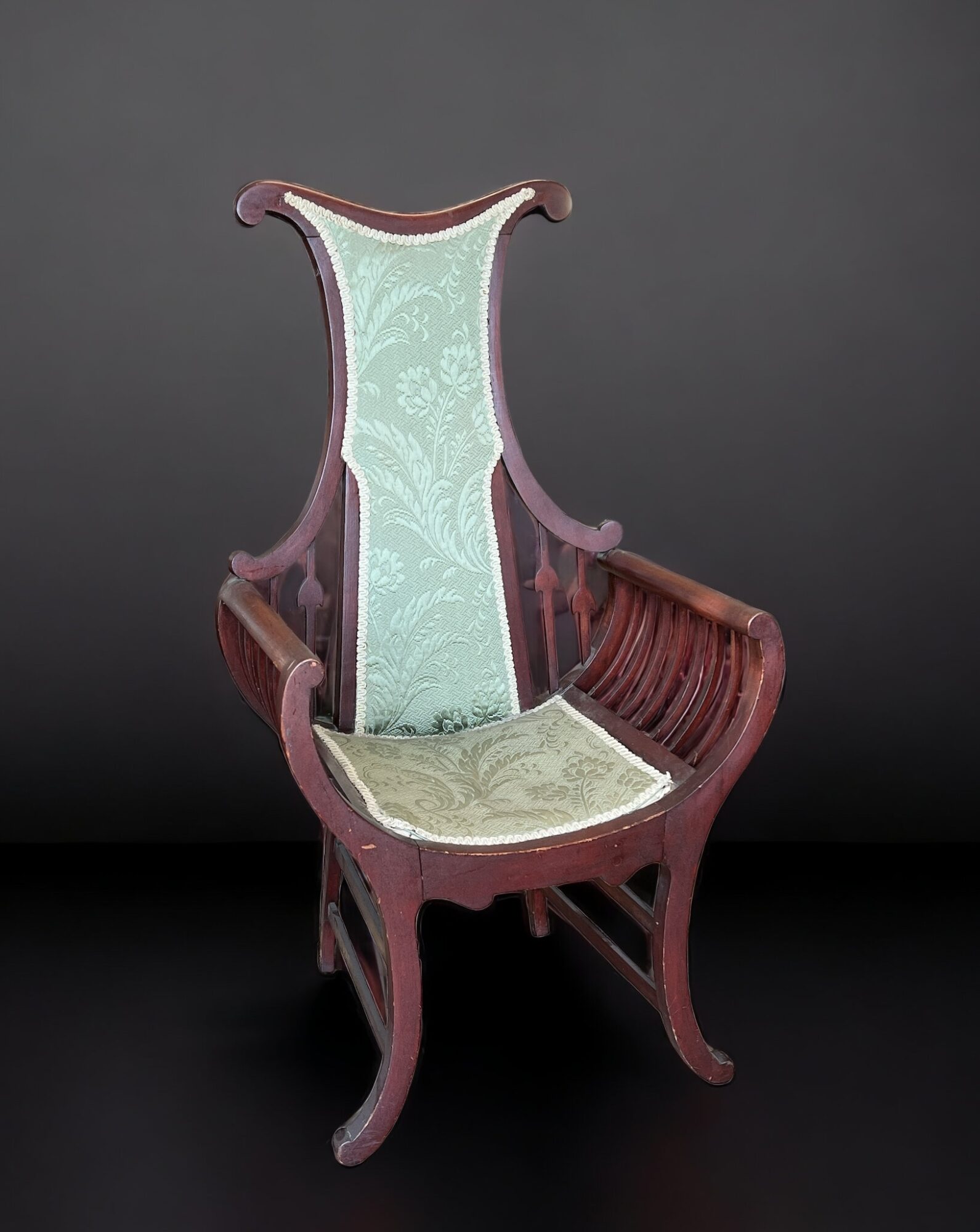
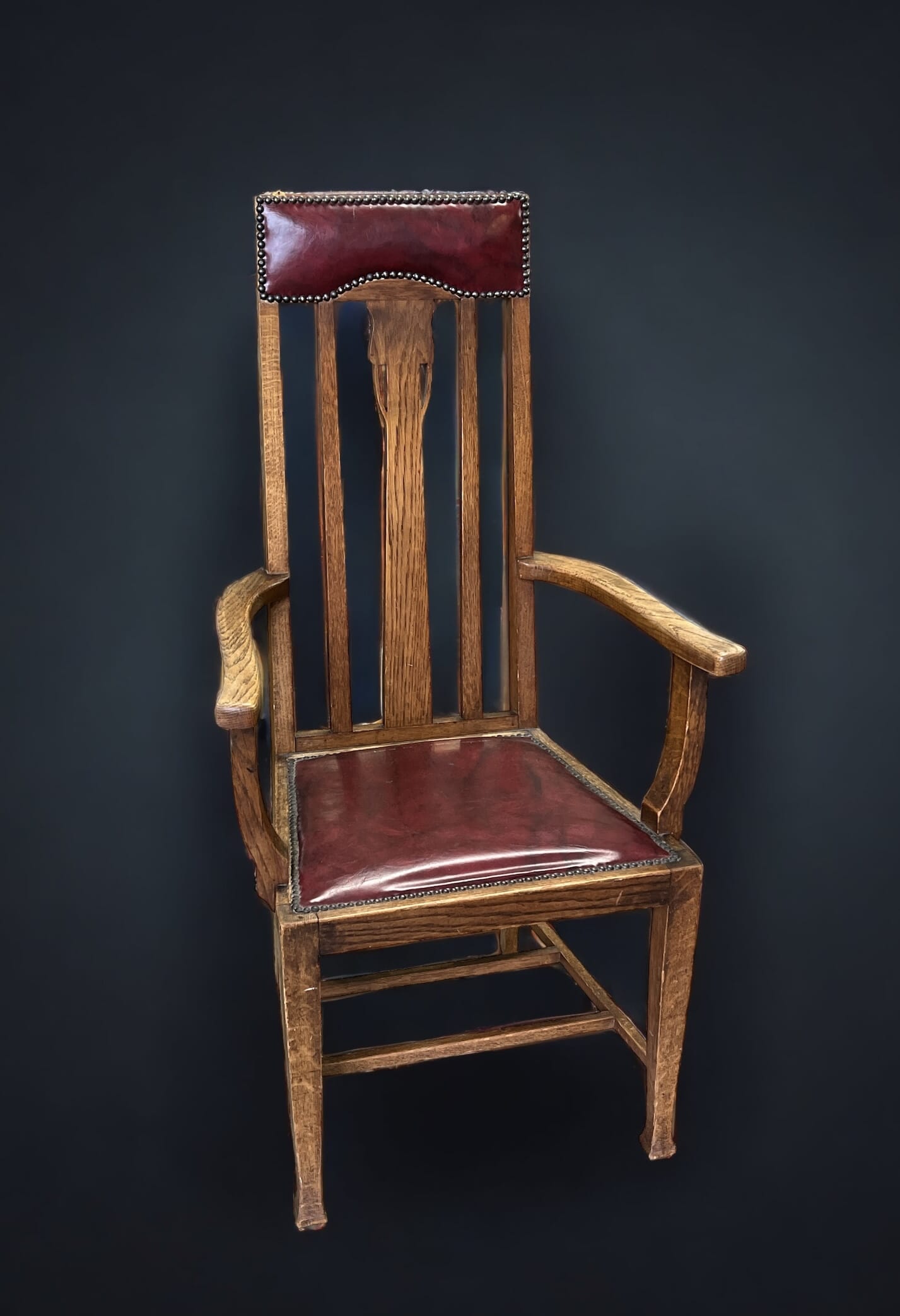
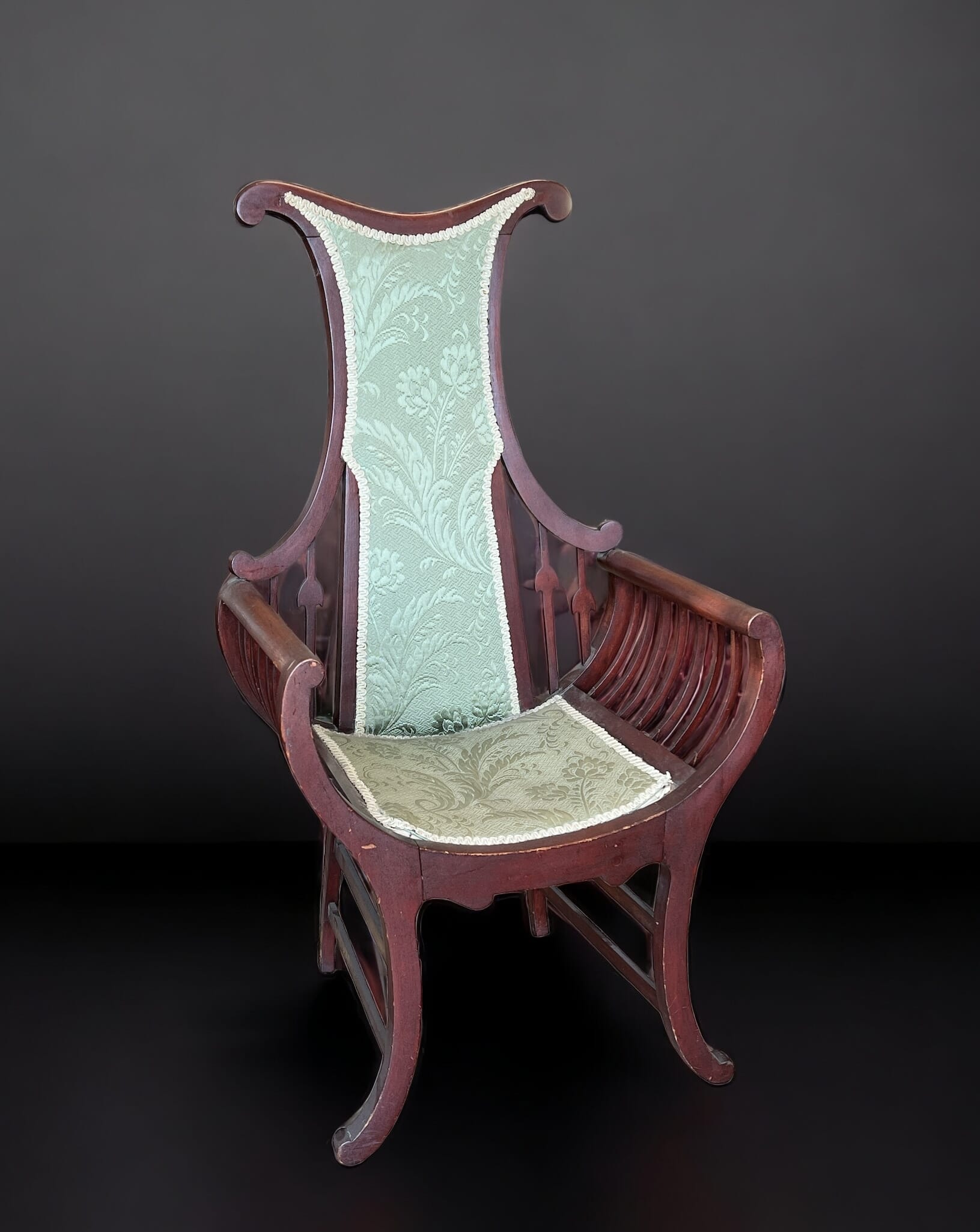
In Australia, the period saw a flourishing group of artists exploring the rest ideas from Europe, but giving them an Australian meaning. The elaborate Art-Nouveau style of the ‘throne chair’ in today’s Fresh Stock is a fine example: made from Australian hardwood, the remarkable design is a complete departure from the Victorian tradition of how a chair should look. The tall, skinny back is rather distinct, taking on the form of a lyre bird’s tail.

Australian Hardwood Art Nouveau chair, Lyre-bird back, c. 1910

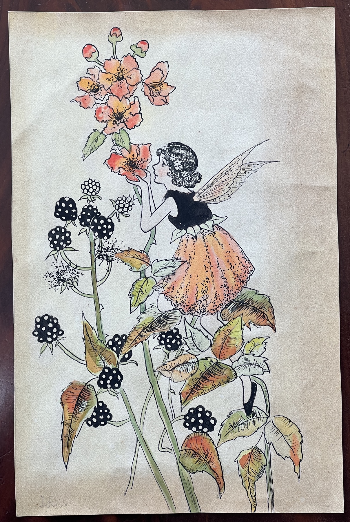
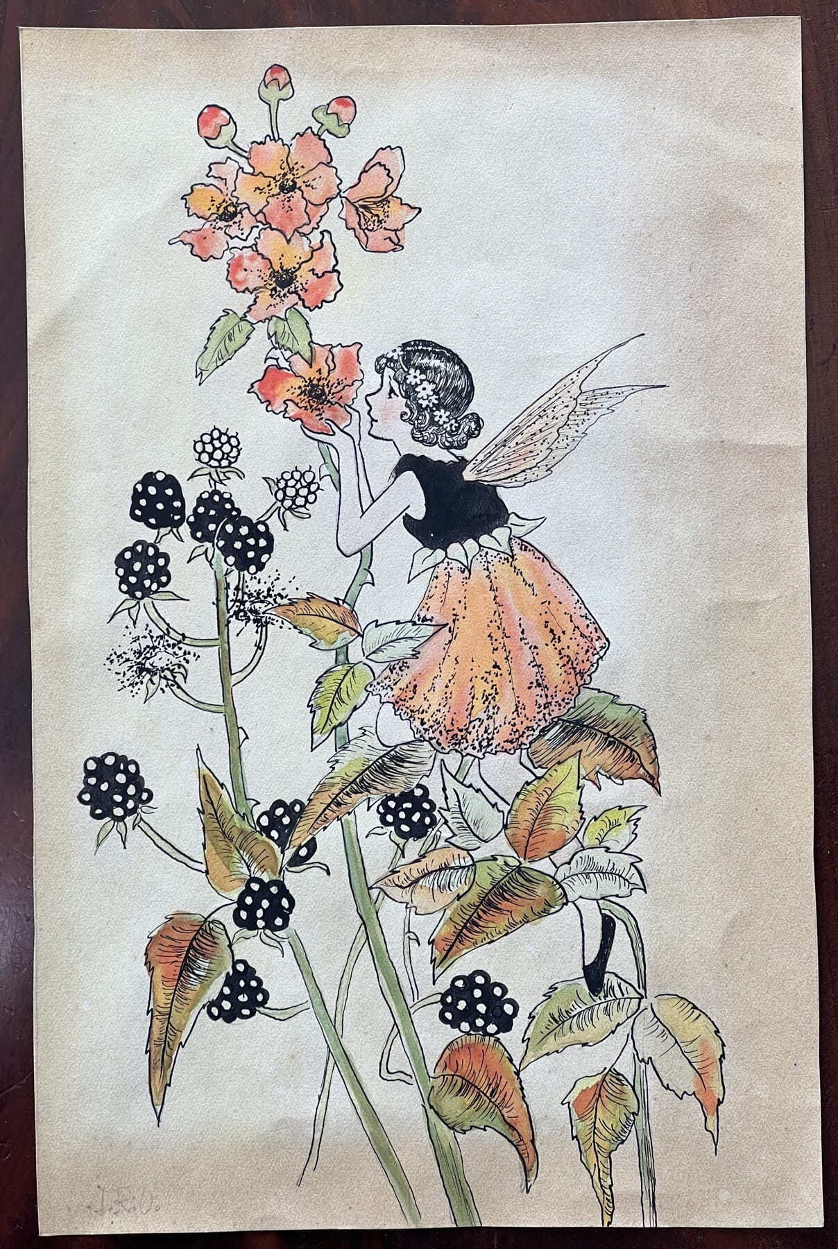
One of the highlights of this year is the watercolour recently identified amongst the many paintings in the collection of the late John Rosenberg. It’s an Ida Rentoul Outhwaite fairy, familiar from the many children’s books she illustrated in the 1920’s-30’s. While her style is borrowing from the overseas greats of book illustration of the time – Beardsley, Rackham and Greenaways – she invents an endless contrast to anything else produced prior by incorporating the Flora & Fauna of Australia.
(This example is not the best to illustrate this theme, as it has nothing Australian in it – the Blackberry being an introduced pest, and therefore also its attendant fairy!)

Ida Rentoul Outhwaite original watercolour, c.1933 at Moorabool Antiques
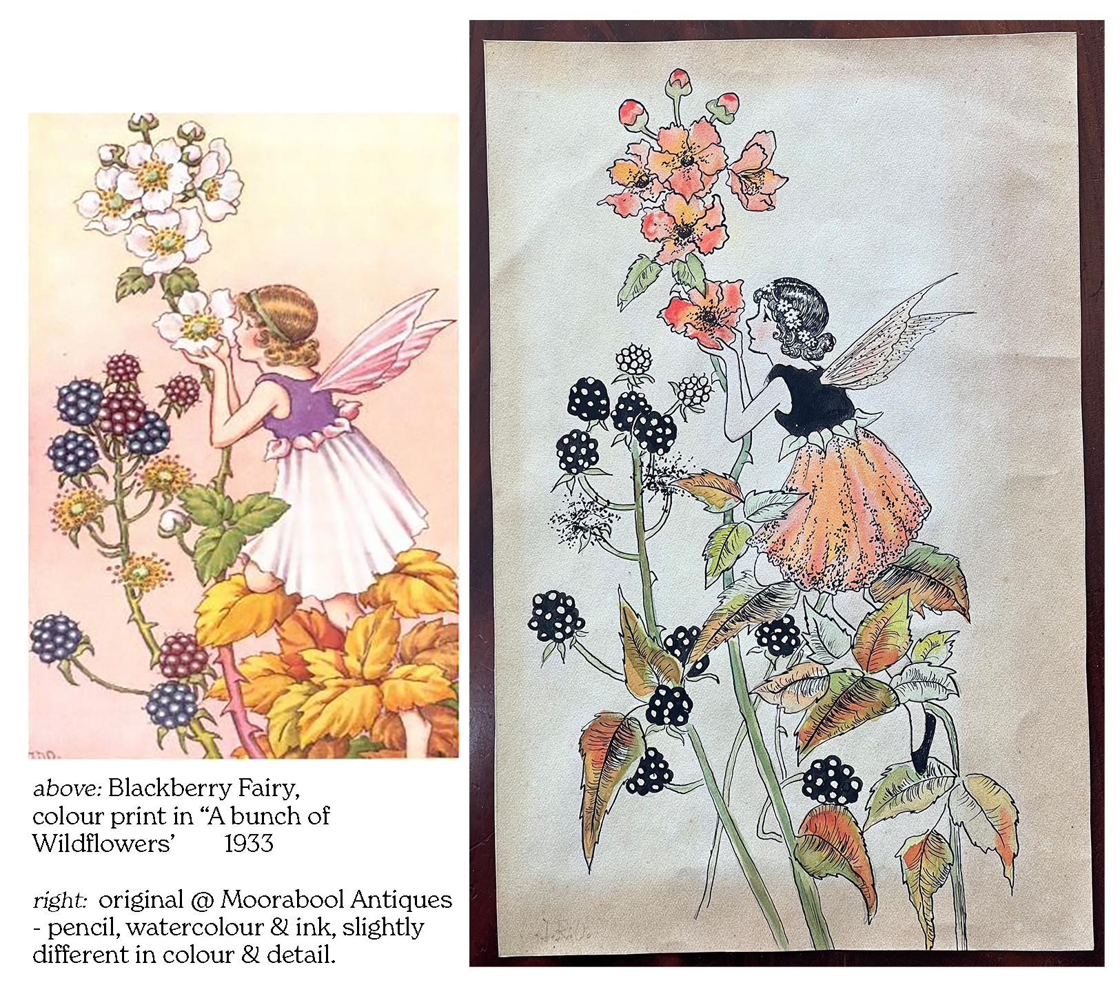
Ida Rentoul Outhwaite's 'Blackberry Fairy' from 'A bunch of wildflowers' 1933 - with original signed sketch
Spot the Difference!

While many of these are now broken up for their prints, this example isn’t a print: it’s an original pencil sketch, which has been coloured with watercolours & finished with her signature black ink outline and details. It is a prototype sketch for the illustration of ‘The Blackberry Fairy’, one of 6 colour prints included in her 1933 publication ‘A Bunch of Wildflowers’. It was badly framed in such a way that the signature – her initials ‘I.R.A.’ – were covered by the mount! Taking it off & discovering the printed version was quite a thrill: note the differences between our version and the printed version, indicating there must be another with the different details out there, from which the print for the book was made.

Henry Wilkinson and Co, 1892
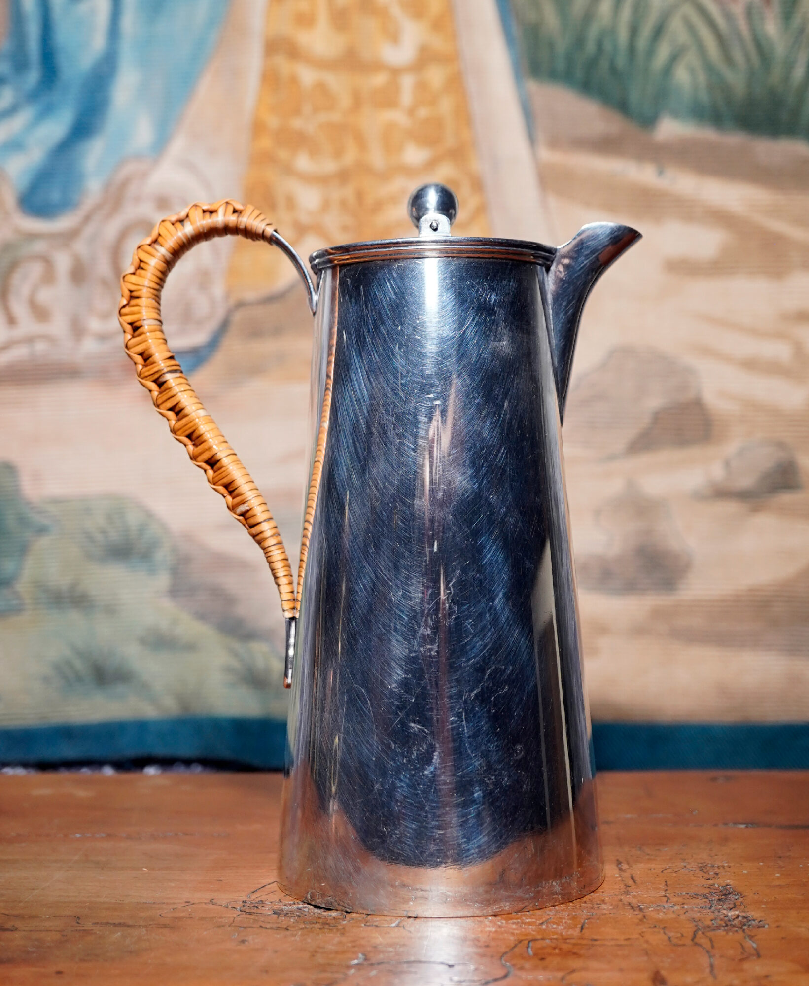
Silverplate jug showing Christopher Dresser influence, Henry Wilkinson and Co, made in 1892. This precise date is possible as the hallmark was only registered that year – and they also sold out & therefore ceased to use it the same year!

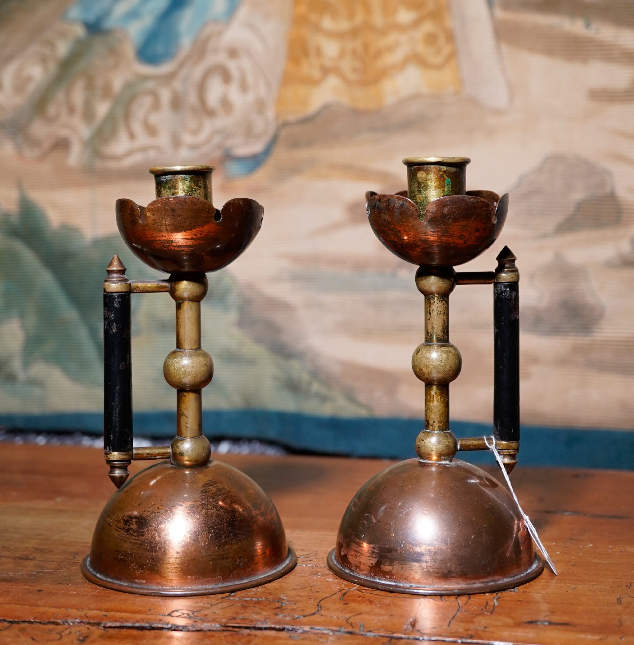
The greatest of the Art & Crafts ‘influencers’ was Dr Christopher Dresser. His design philosophy was radical in the Victorian world, which by the 1870’s was stagnating, repeating earlier designs in ever-more complex convulsions of rococo scrolls and classical columns. Instead, he looked to the East – being the first European to be granted a travel passport in Japan in the 1870’s, where he travelled from end to end, examining Japanese crafts and then bringing the simplicity and elegance of good design back to England. He spent a huge amount of effort influencing manufacturers to create elegant, useful wares. In today’s fresh stock are a number of pieces that look like they should be made well into the 20th century – but are in fact 19th century products. Dresser freely distributed his designs, and published a number of books on the subject; many potters and metal workers used these designs as they caught the attention of the ‘hip-crowd’ of the late 19th century. He was the ‘Social Media Influencer’ of his time!

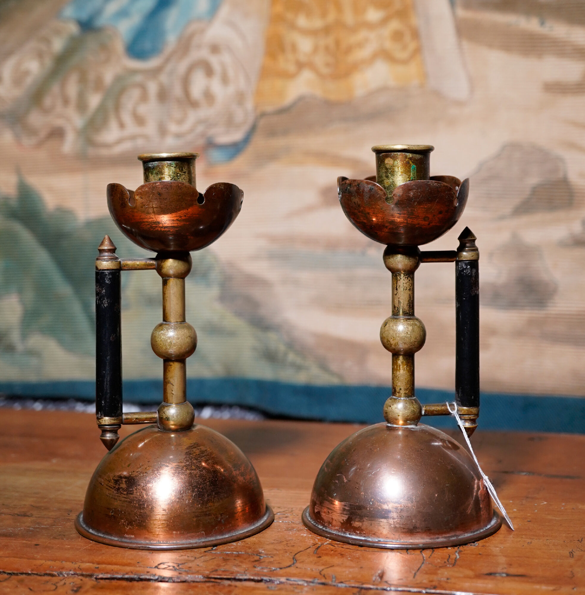
Pair of Christopher Dresser candlesticks, designed & made 1885, probably by Benham & Froud for the Art Furnishers' Alliance, London.
Pair of Christopher Dresser candlesticks, designed & made 1885, probably by Benham & Froud for the Art Furnishers’ Alliance, London.
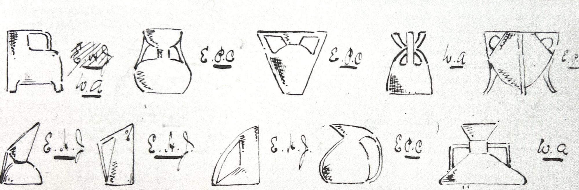
Designs of Dr Christopher Dresser, from his account book for Linthorpe Art Pottery, 1881. Now in the Getty, LA.
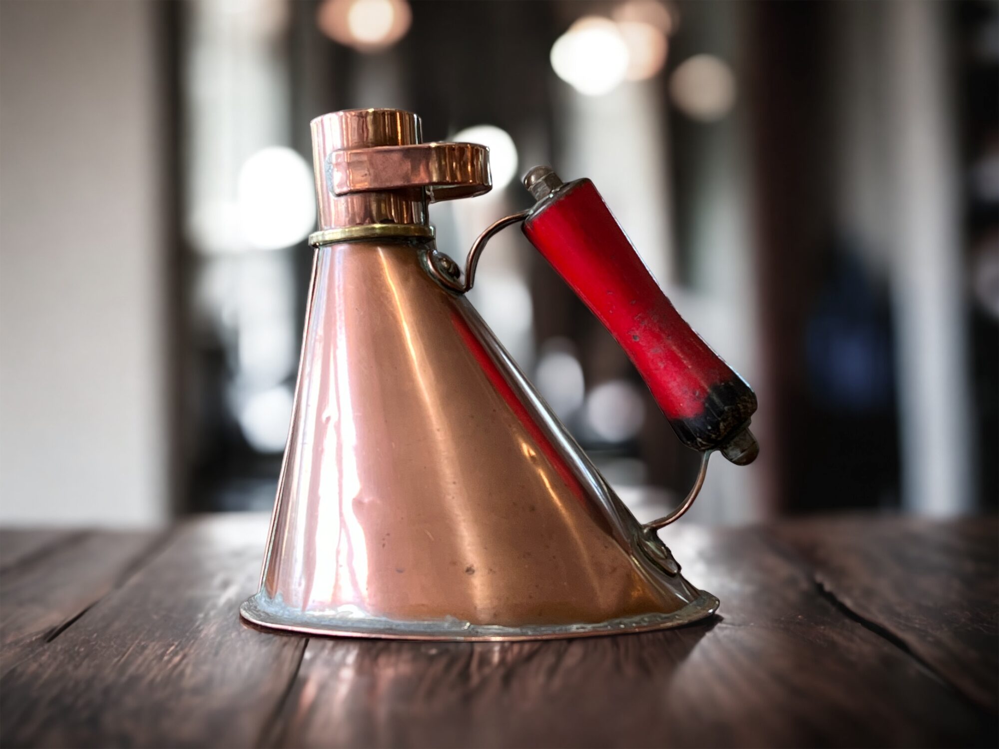
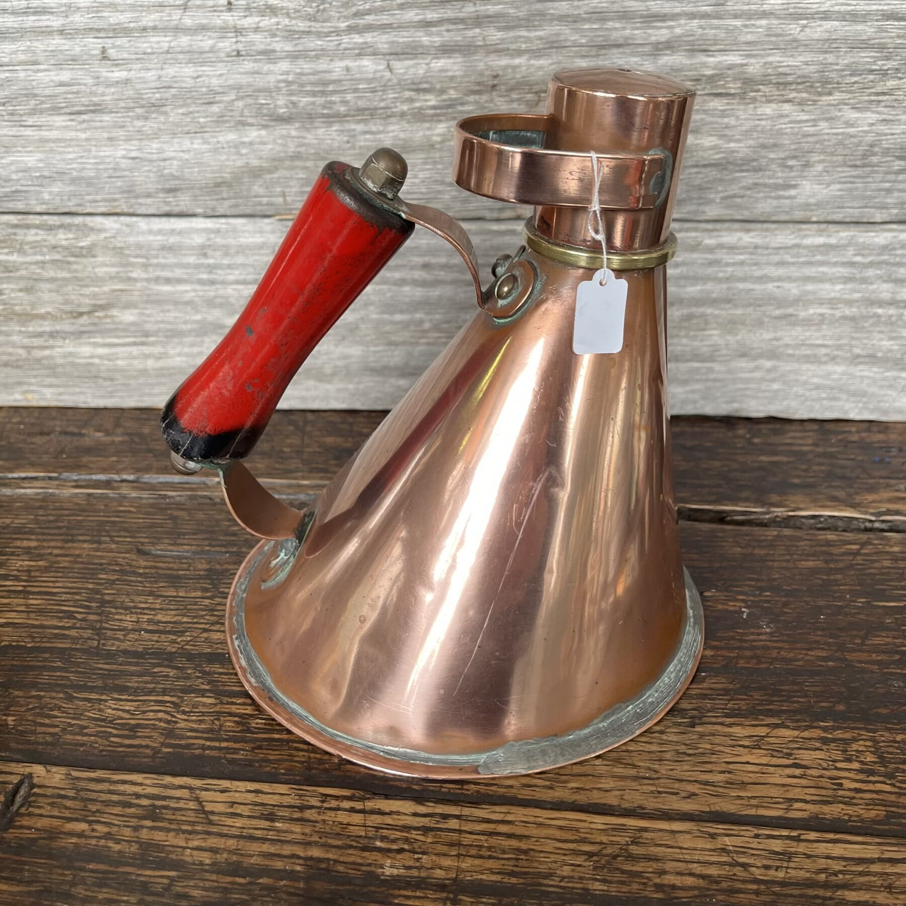
A case of mistaken identity…. this piece looks a lot like a famous Dresser design, and the craftsmanship is very similar to makers of Dresser pieces such as Benham & Froud – however, it is an industrial item, being an oil can from a canal boat!
This reflects Dresser’s own philosophy very closely: form follows function: the broad base is stable in choppy seas, and the form is simple for a metal worker to create from flat sheets. The handle angle ensures steady flow of the contents, in all a very well designed piece, created by a practical industrial mind – just no Christopher Dresser’s.
Arts & Crafts vase, Hutton
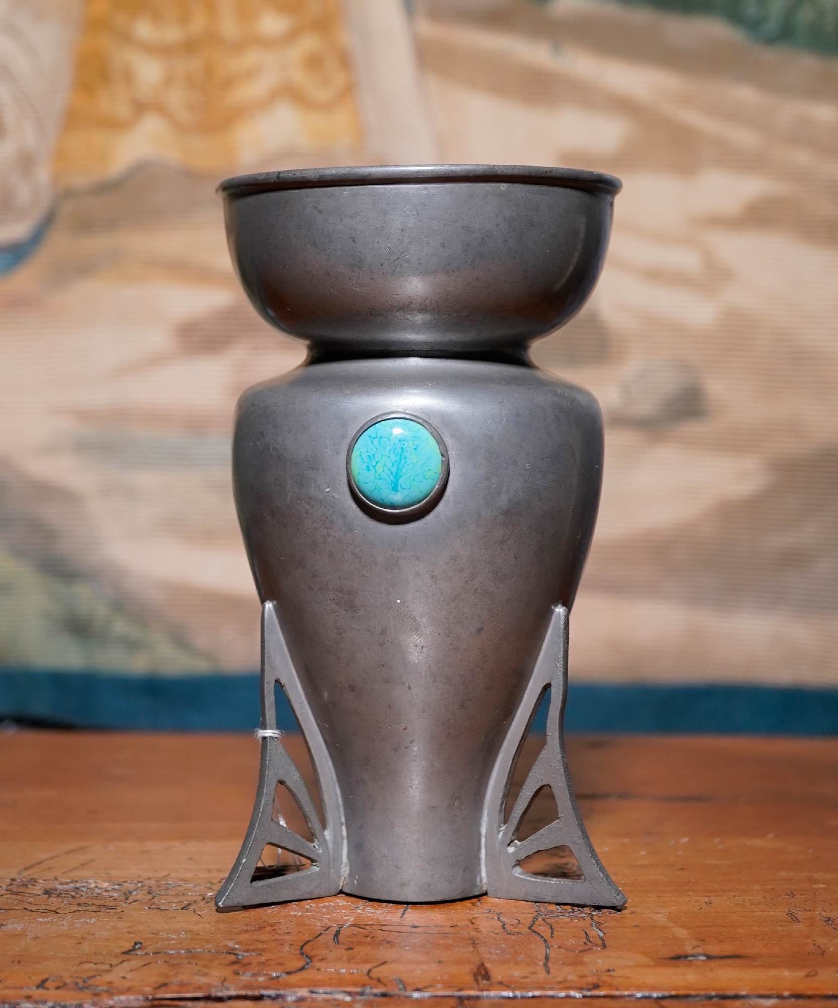
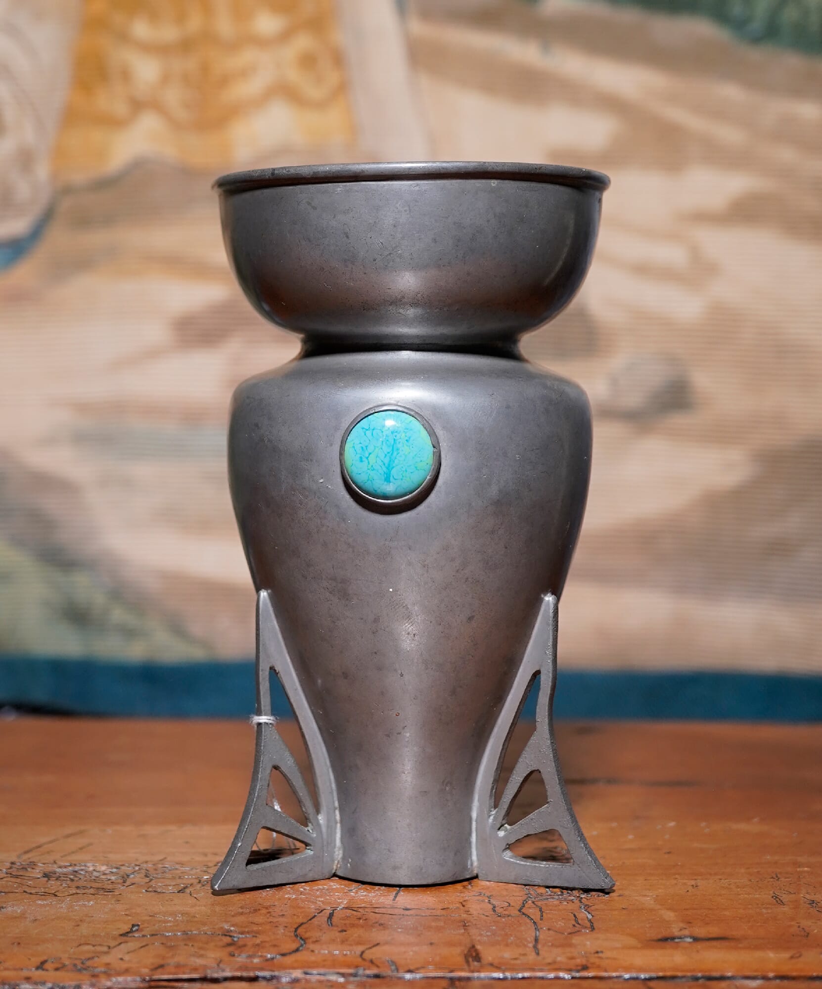
Arts & Crafts Pewter vase, by W. Hutton, Sheffield, c.1905. The inset ceramic plaques are possibly from the Ruskin Pottery in Staffordshire, known to have provided similar pieces to other manufacturers. The design is very similar to those of Archibald Knox, at the same period, circa 1905.
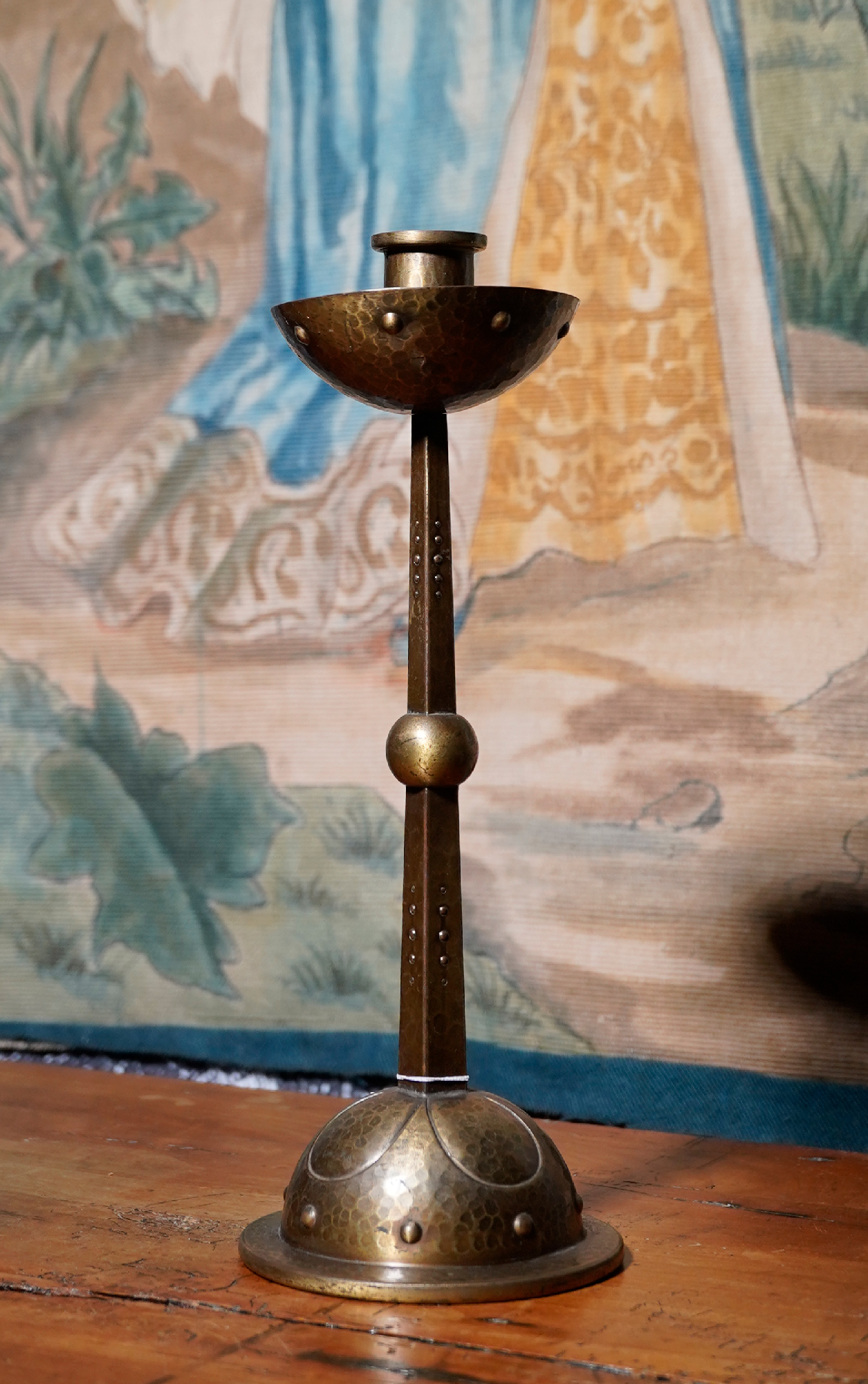
WMF Jugendstil candlestick, circa 1900
WMF (Germany) Jugendstil candlestick, circa 1900

On the Continent, the Arts & Crafts movement took its own direction. In Germany, the Jugendstil , literally translating as ‘Youth Style’, produced some remarkable objects that still appeal to the modern eye due to their ‘sophisticated simplicity’.
The candlestick shown here is WMF, circa 1900, and retains the rare original patinated finish. It has a style that could date to anywhere in the 20th century, but was actually conceived in the last years of the 19th – remarkable.

On a different trajectory was the French designs we know as ‘Art Nouveau’. This style borrowed from the preceding Rococo style, with organic forms that appear to grow – but took it to new extremes.

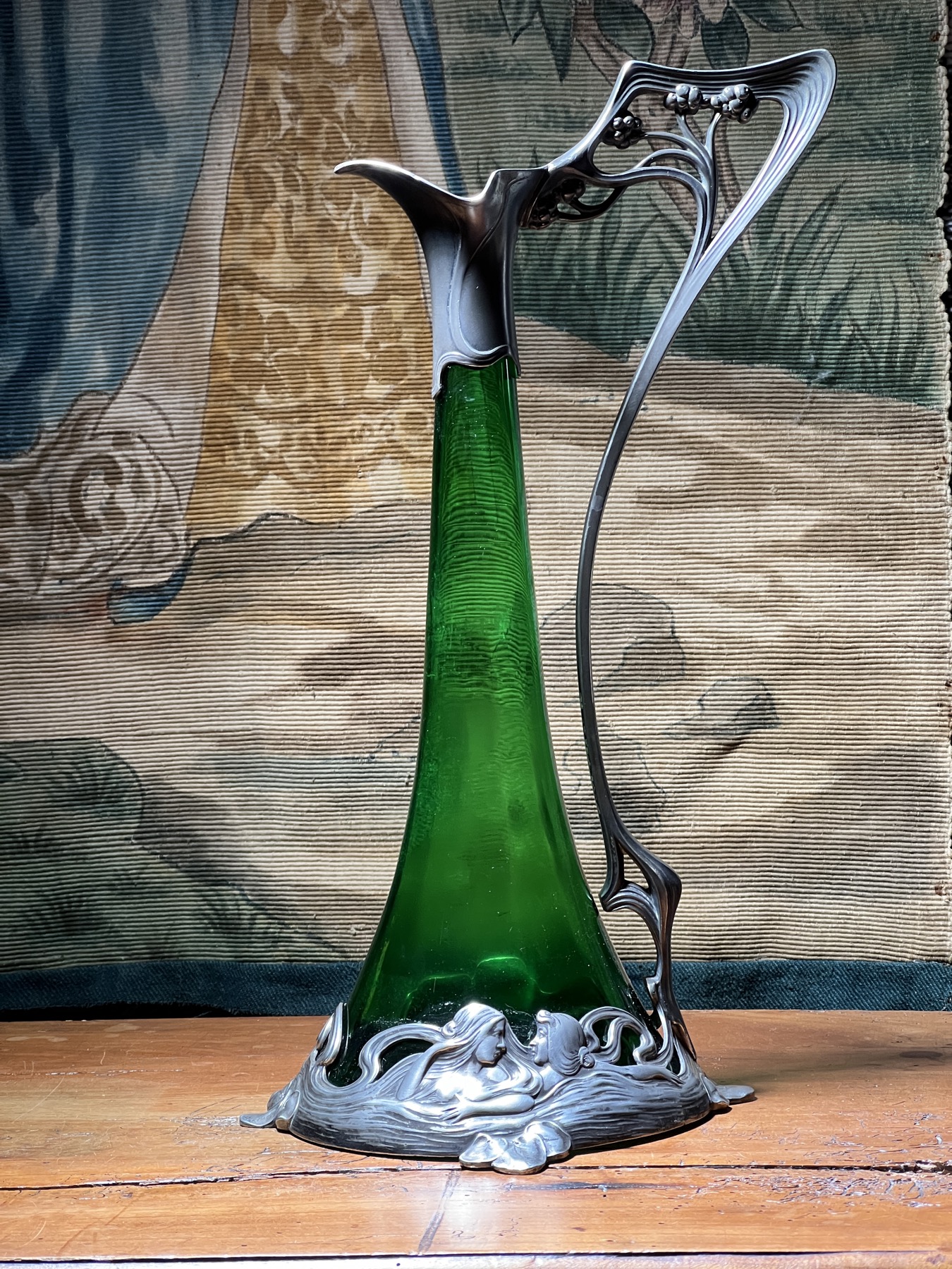
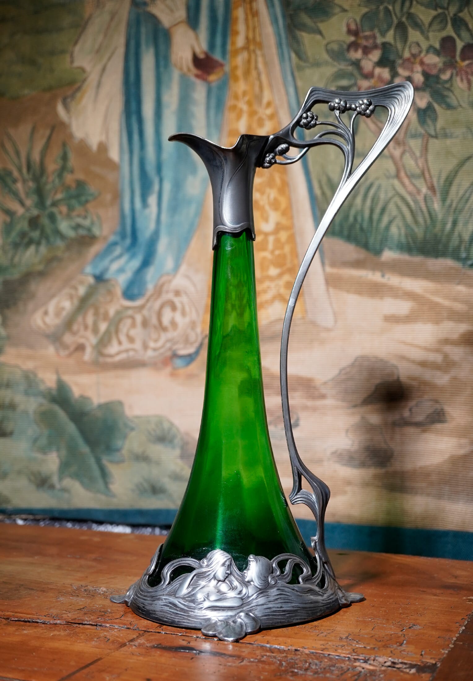
WMF Art Nouveau waternymph claret jug, circa 1900


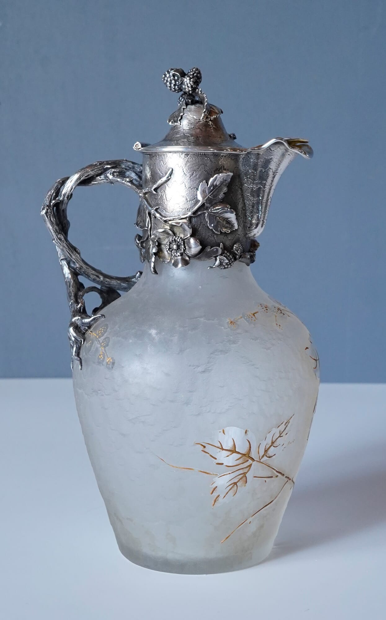
Also by WMF is this remarkable claret jug. The very tall, skinny sea-green glass vessel is encased & protected by a flowing stream around the foot, from which emerge water-nymphs: the ‘waves’ are actually their long flowing hair. An organic handle that looks like it grew rises up to the pewter mouth, with a beautiful spray of flowers moulded in the round within the protected elbow.

It’s a splendid example of Art Nouveau at its best.

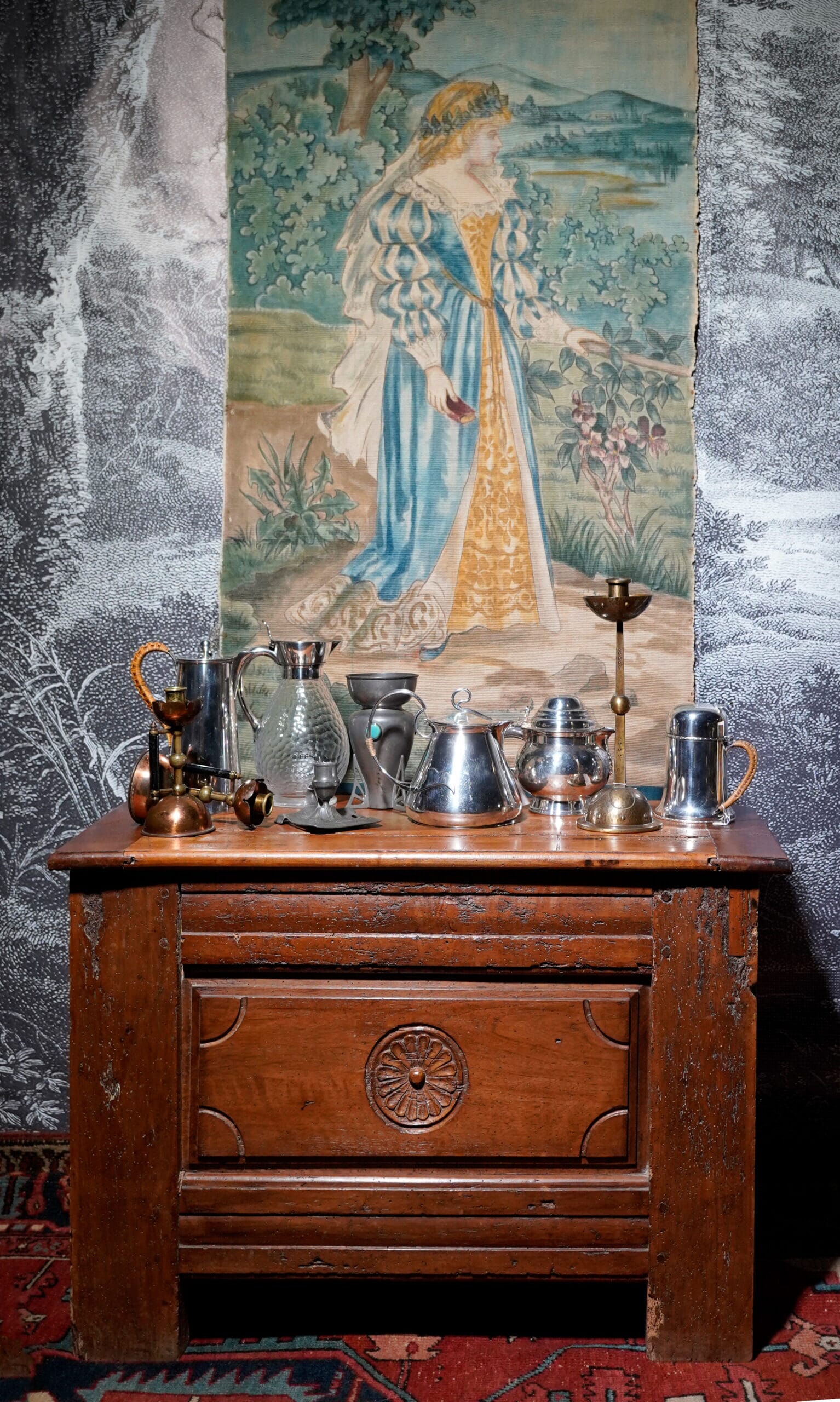
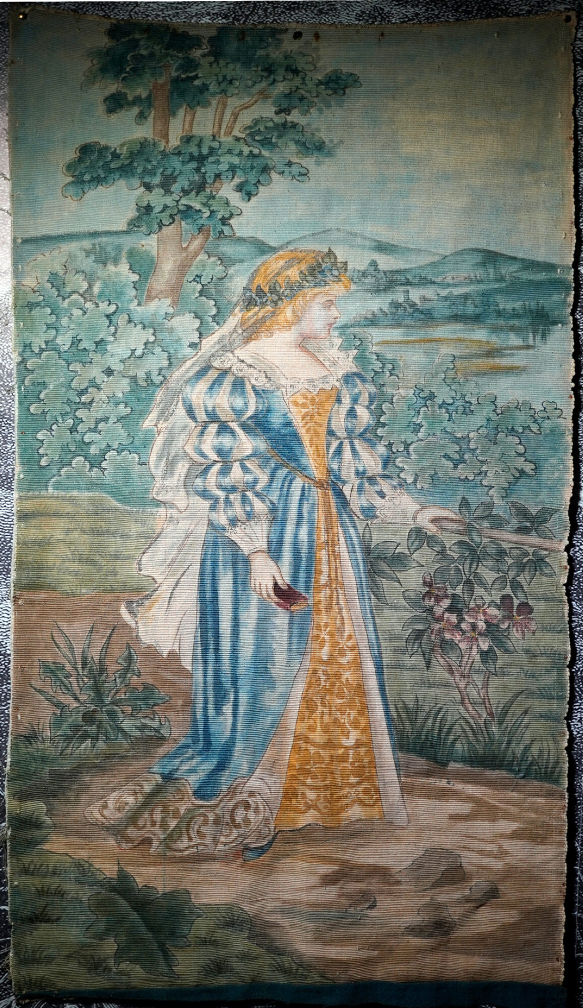
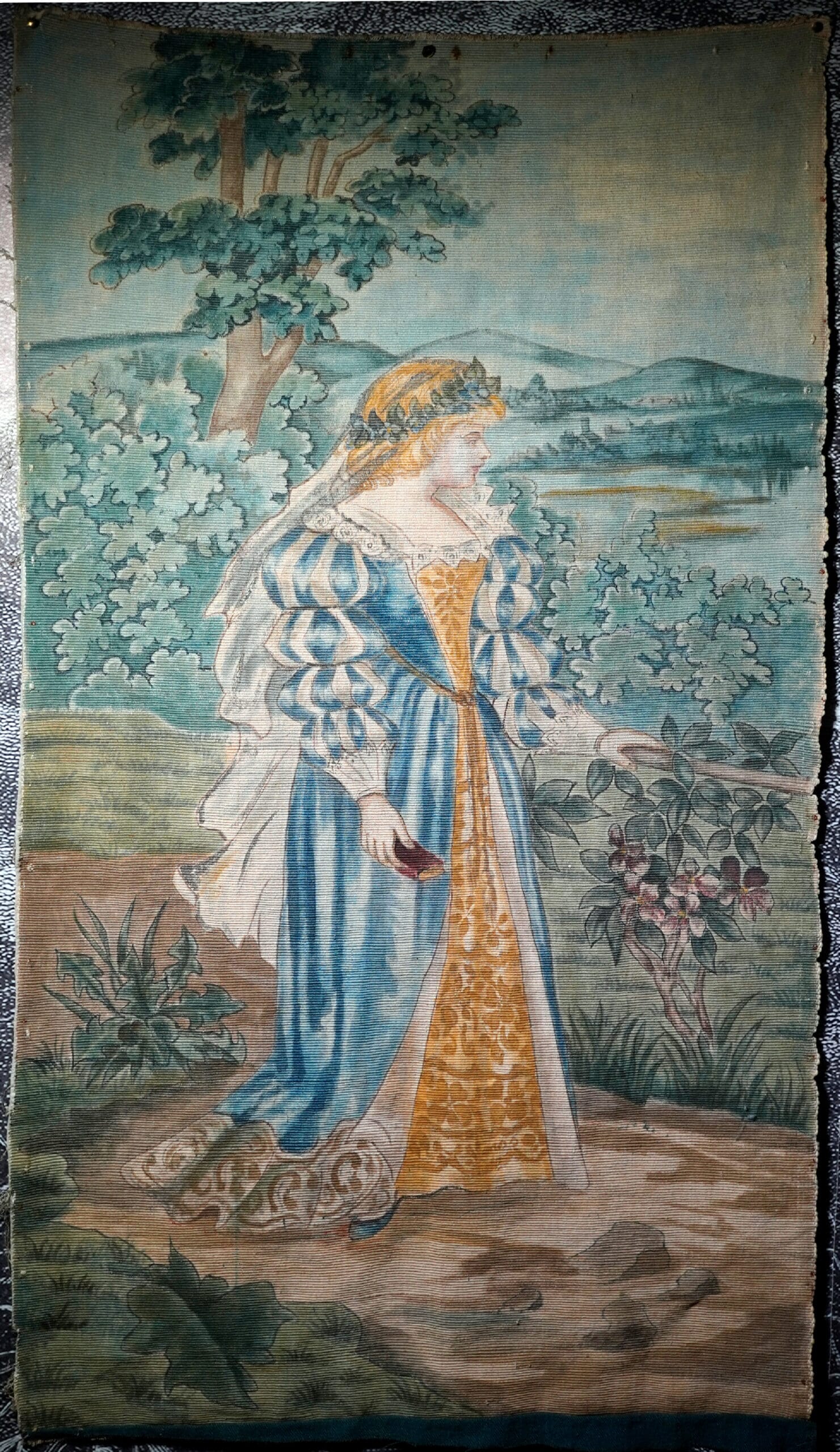
Pre-Raphaelite wall hanging, circa 1880

This large wall hanging is an example of anther closely related style of the period, the Pre-Raphaelites. Formed by mostly painters who sought to break away from the genre painting of the Victorian era, instead of looking for something new, they looked back – deciding that anything from Raphael onwards was not worth looking at, but the earlier artists were more valuable as as influence. This beauty depicted here in watercolour on a heavy fabric (probably upholstery fabric) is a fine example of the ideal; she is splendidly dressed in middle-ages clothing, and holds a book in one hand showing her intellect. Behind her is a landscape containing trees and a distant town amongst hills – the whole very reminiscent of the actual tapestry weavings of William Morris and his wife, May. While this example is ‘only painted’, it is very well done – the paints would have soaked into the fabric quickly, and great skill is shown in the control and tonal variation achieved. It is in fact a cross-over from the Textile Arts to the Fine Arts of painting – unfortunately not signed, but by a very competent artist.
Presently unframed, it was once stretched on a wooden stretcher. It would be fine as a wall hanging as-is (if kept in a dark place) – or to fully respect it, we can have it framed in a UV-resisting glass frame to preserve it for the future.

Please enjoy all the other unmentioned pieces shown below!

Fresh Stock

Posted on

Fresh Stock 20th July – Birds & More

Welcome to our latest ‘Fresh Stock’. We have an excellent selection for you , including a fine flock of bird-art, some stunning Victorian pieces,Ruby glass, and more silver.

Preview Graphic

First, a quick website tip: have you seen our new ‘PREVIEW’ section?
This area will be kept up-to-date with items currently being prepared for Fresh Stock.
Some pieces are more difficult to catalogue than others – in particular, the Art with the indistinct signature, and the Porcelain with no marks at all…. you’ll be able to see items that have just come in, and information added as they are researched. Finally, they will be released as a ‘Fresh Stock’ release.

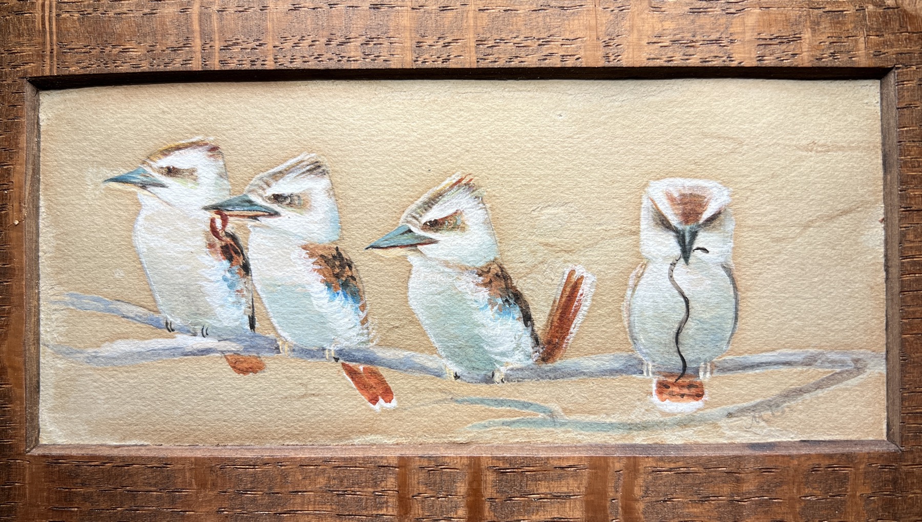
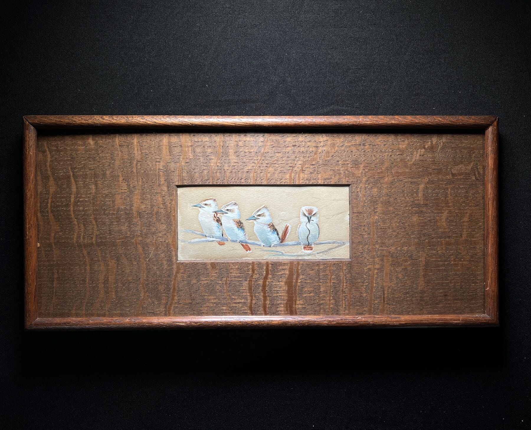
Kookaburra Artwork c. 1907

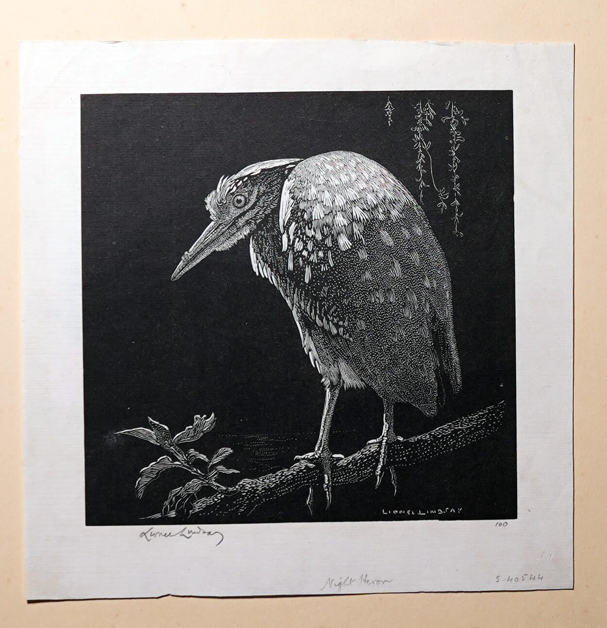
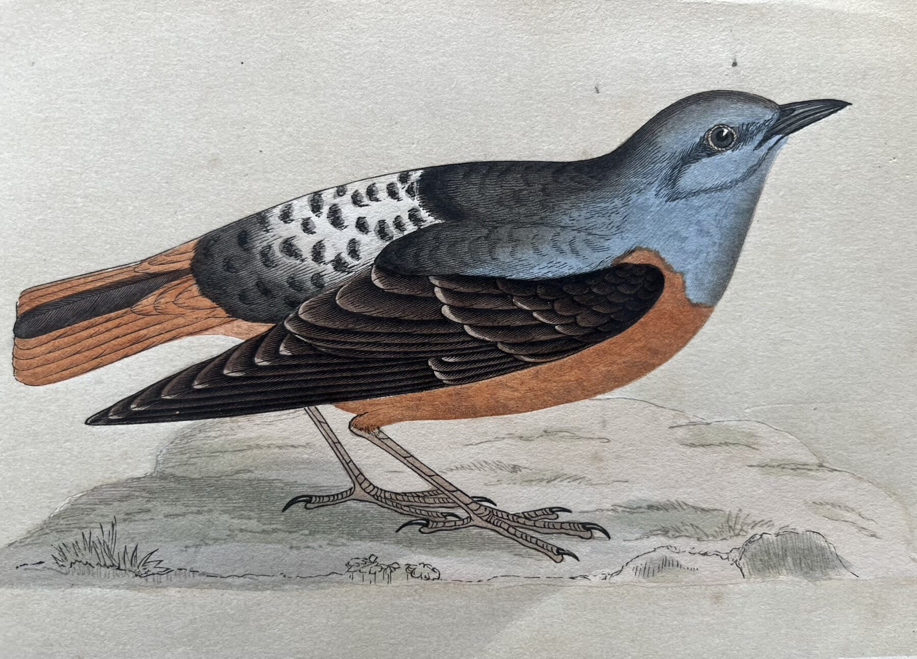
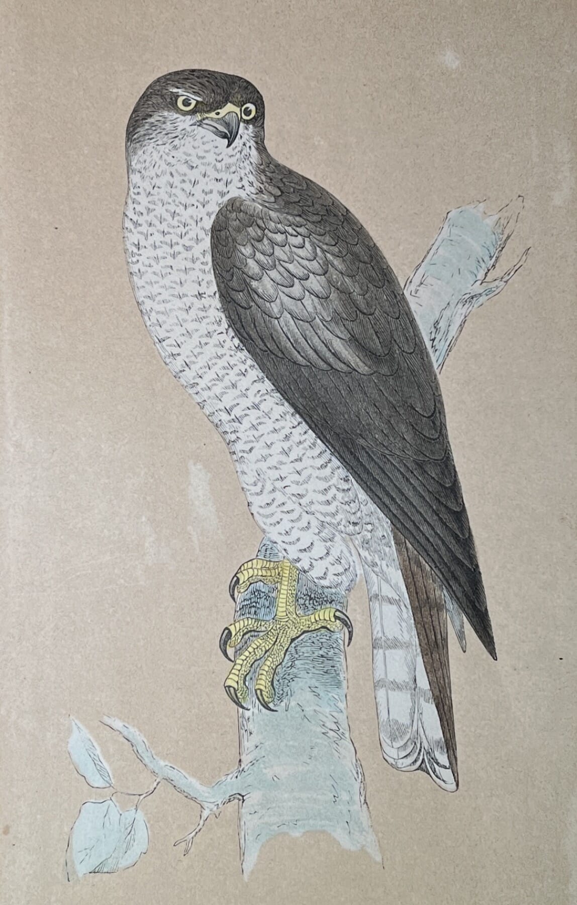
Ornithological Delights

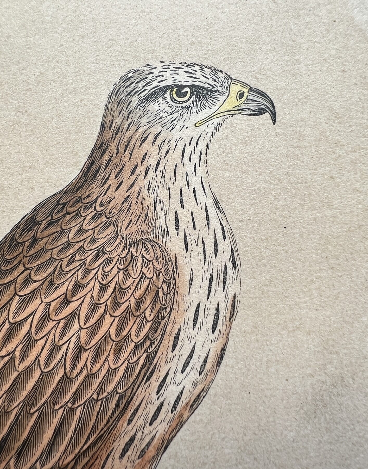
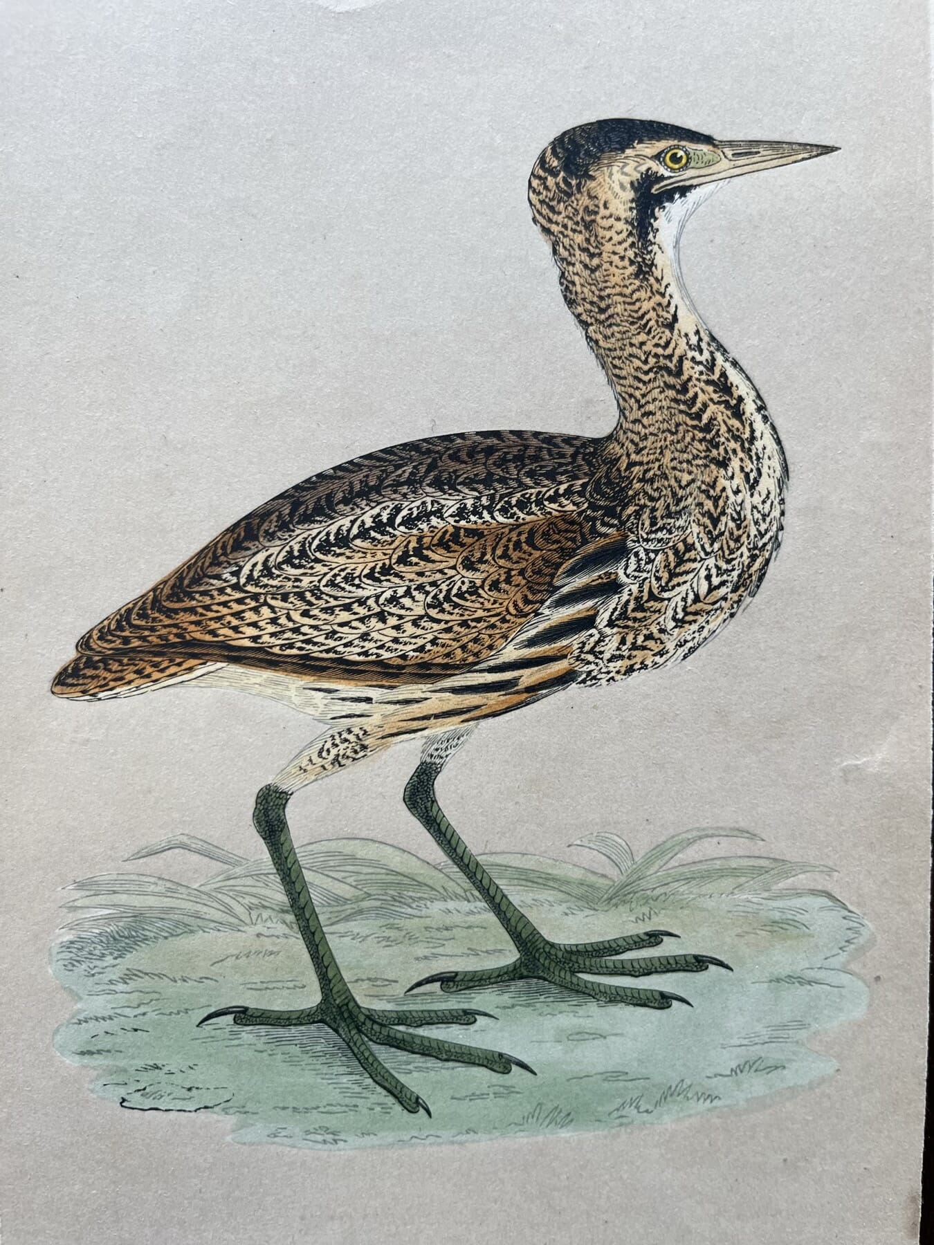
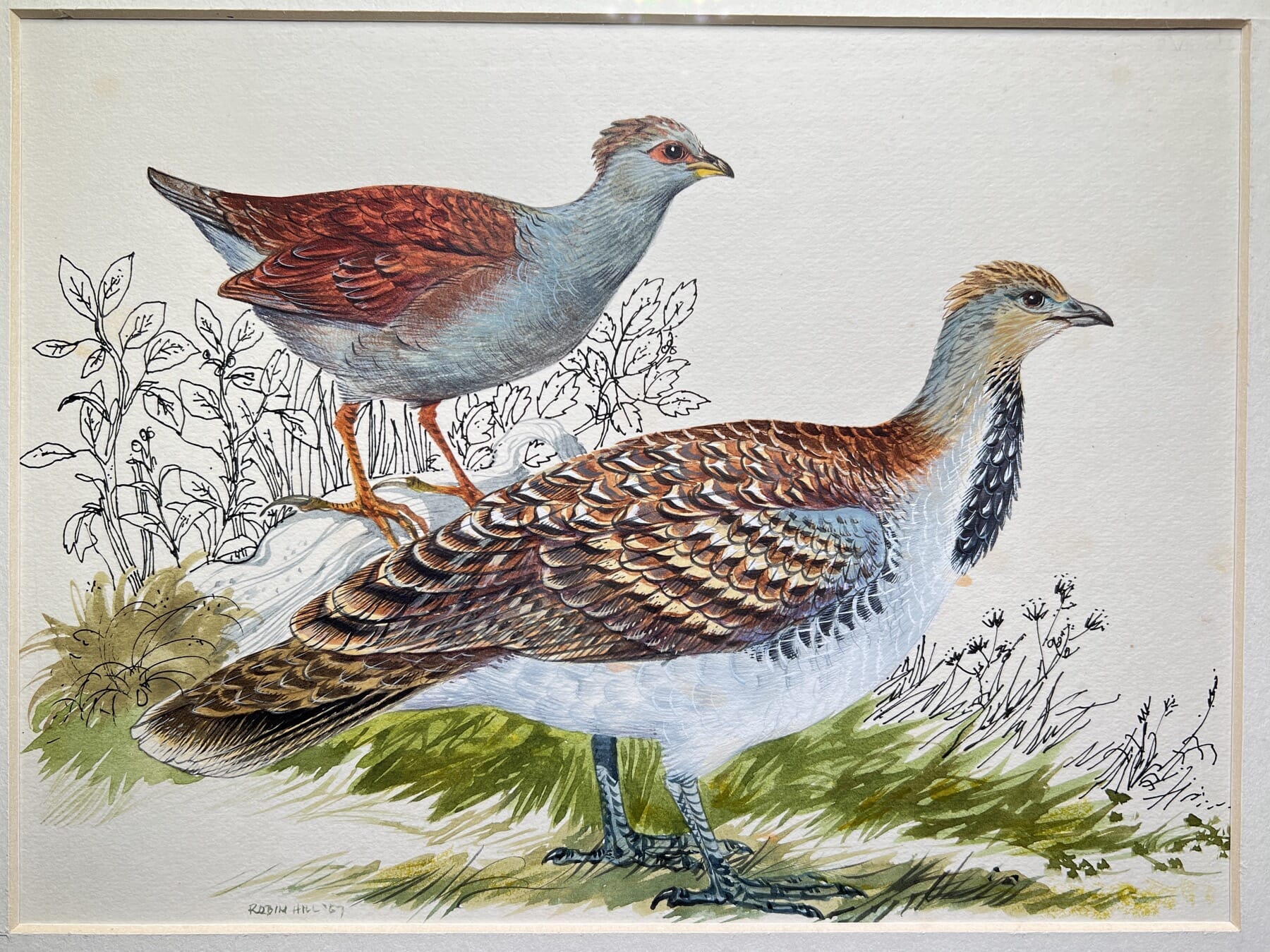
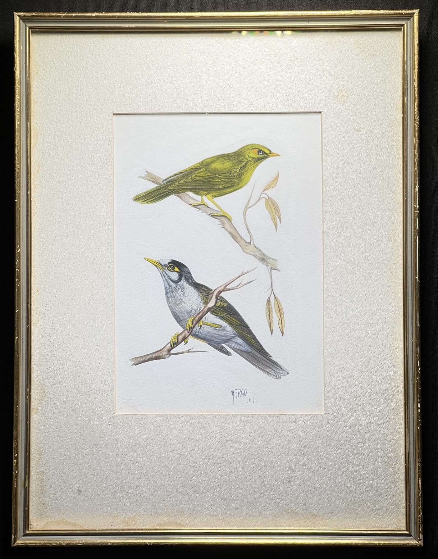
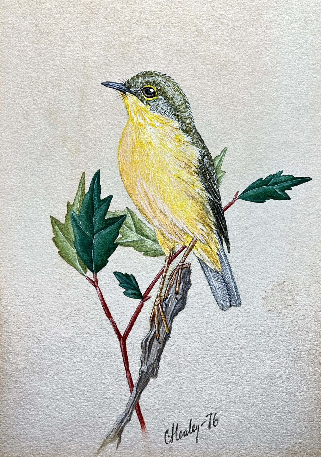
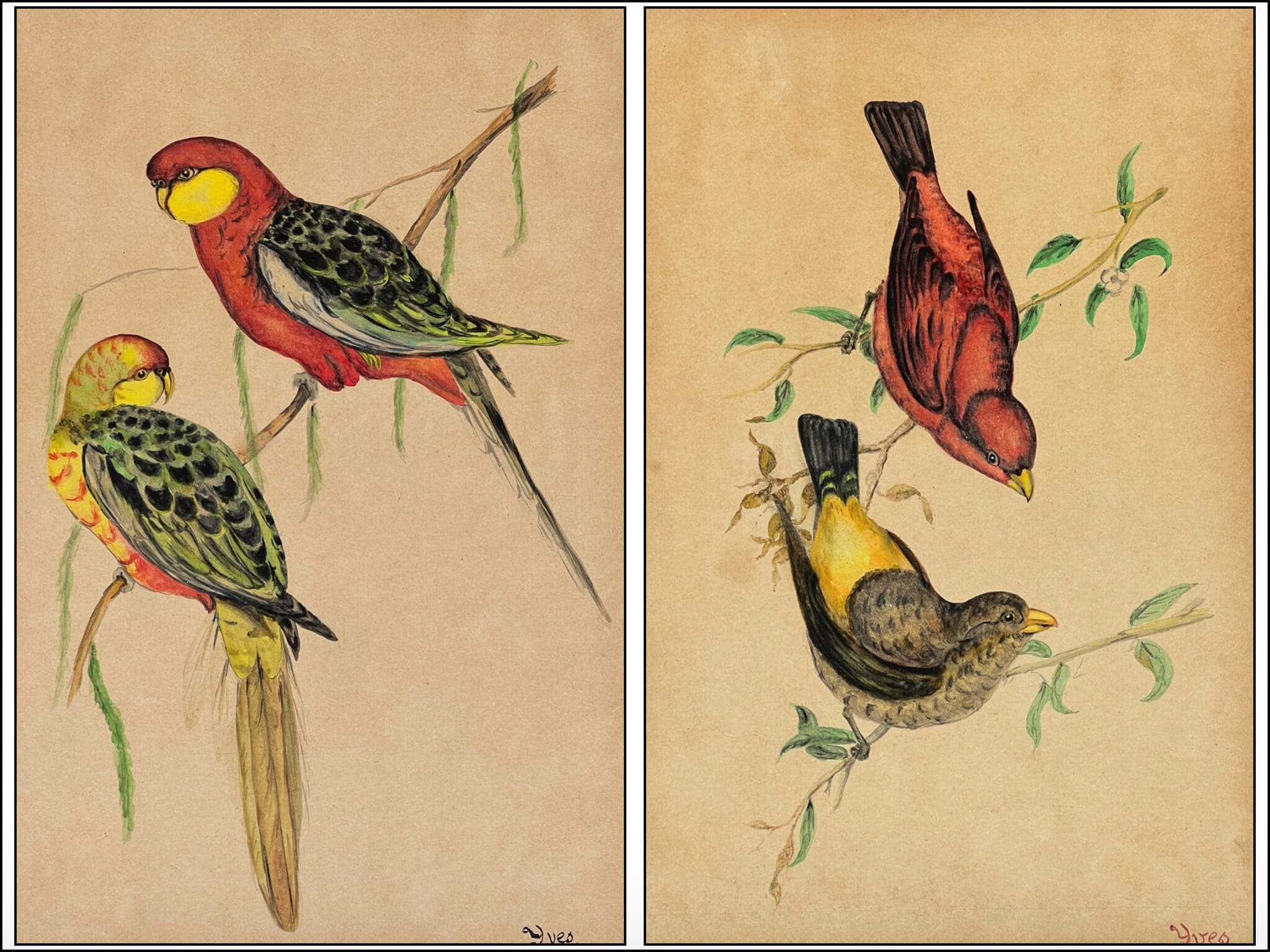
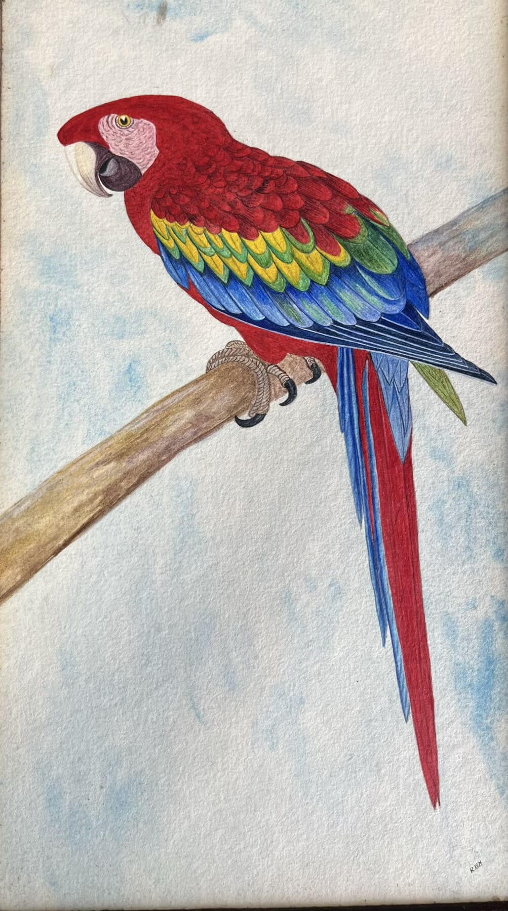
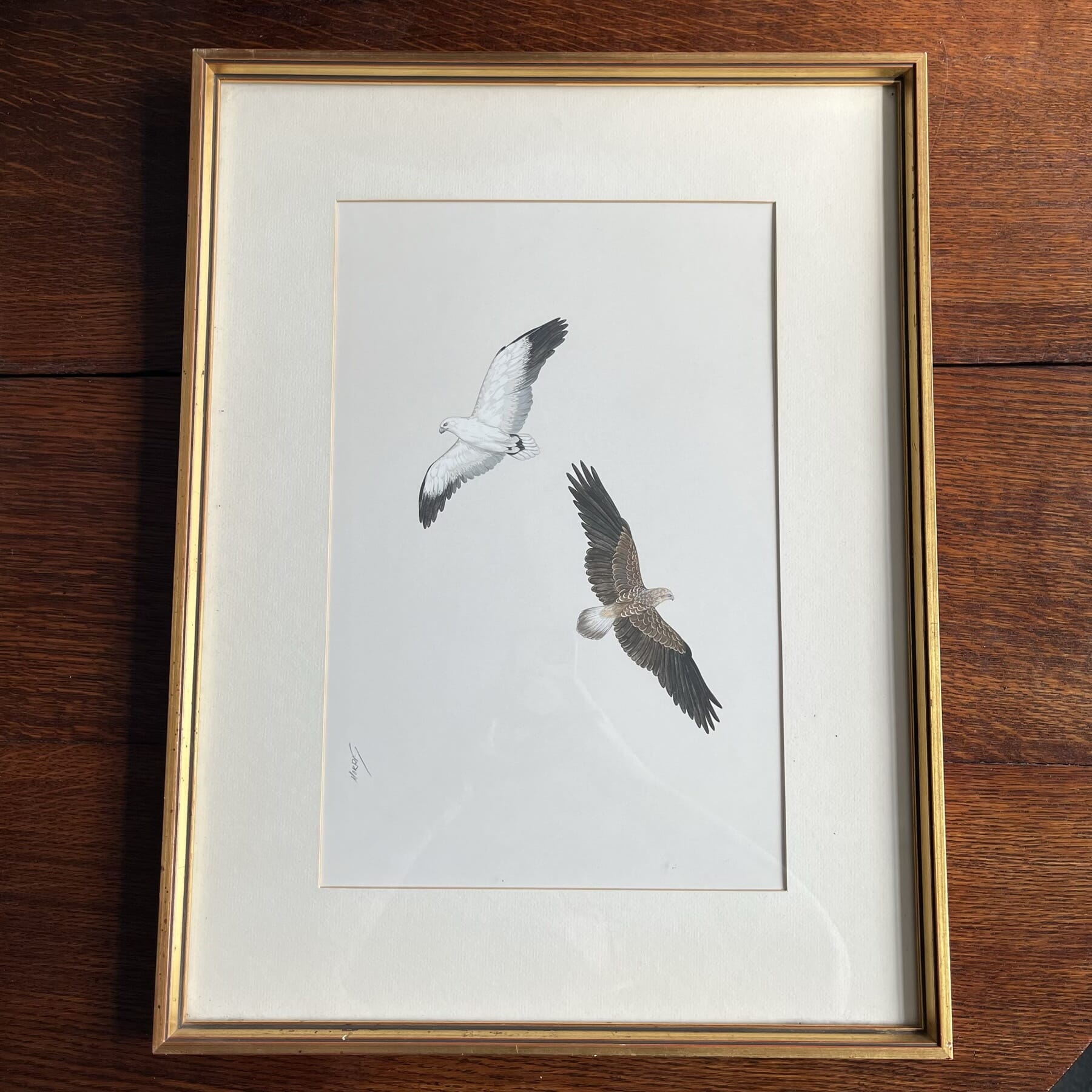
We have a group of Birds…. a flock, for sure. Some of these are prints, but others are original artworks. Several are the original painting from books on birds……. enjoy!

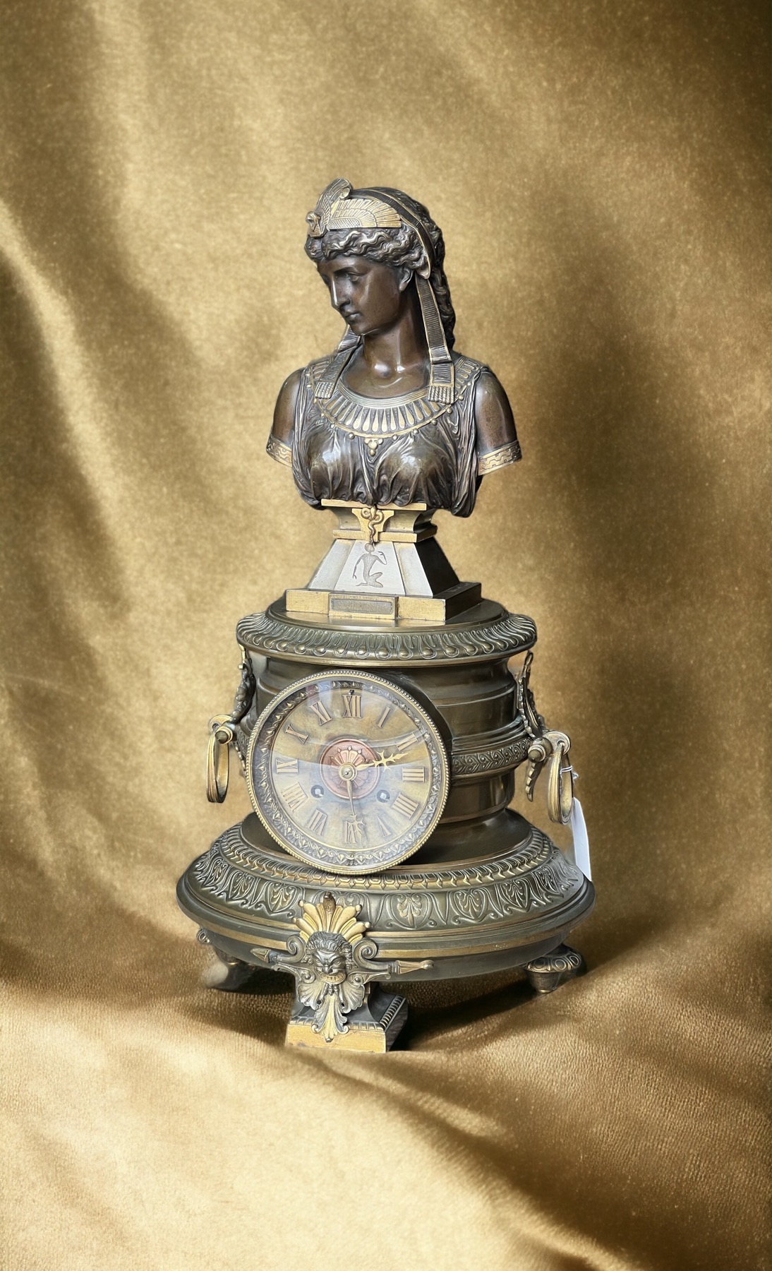
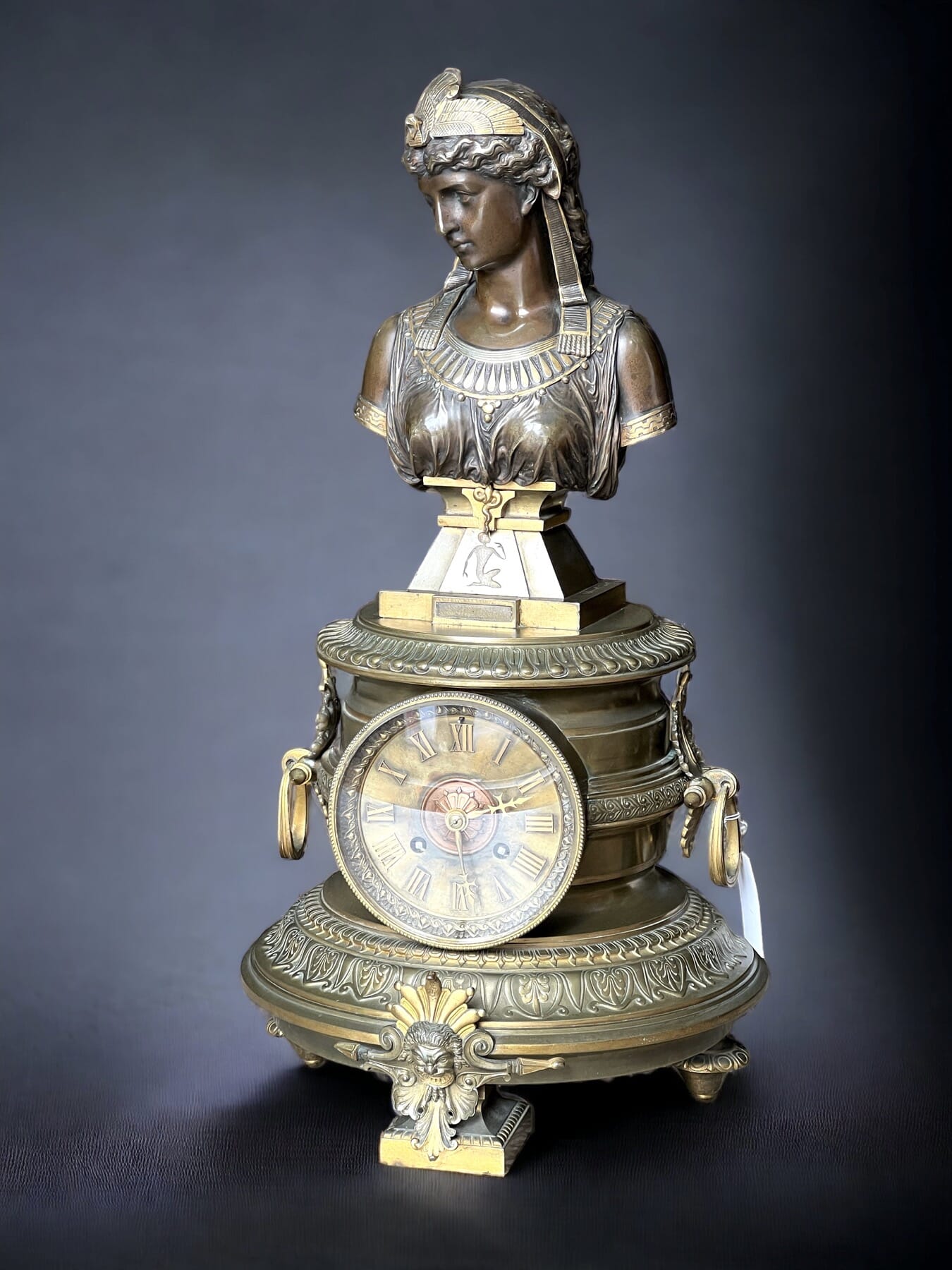
French ‘Cleopatra’ Clock, c.1895

Cleopatra French Clock 1895
‘Cleopatra’ French Clock, circa 1895

This impressive large & heavy clock is French, a fine example of the Egyptian Revival fashion of the late 19th century.
The top is dominated by a superb partially gilt bronze bust of Cleopatra, by the prominent French sculptor Eutrope, and the works are by the top Paris maker, Lemaire.

FRESH to STOCK…….

Posted on

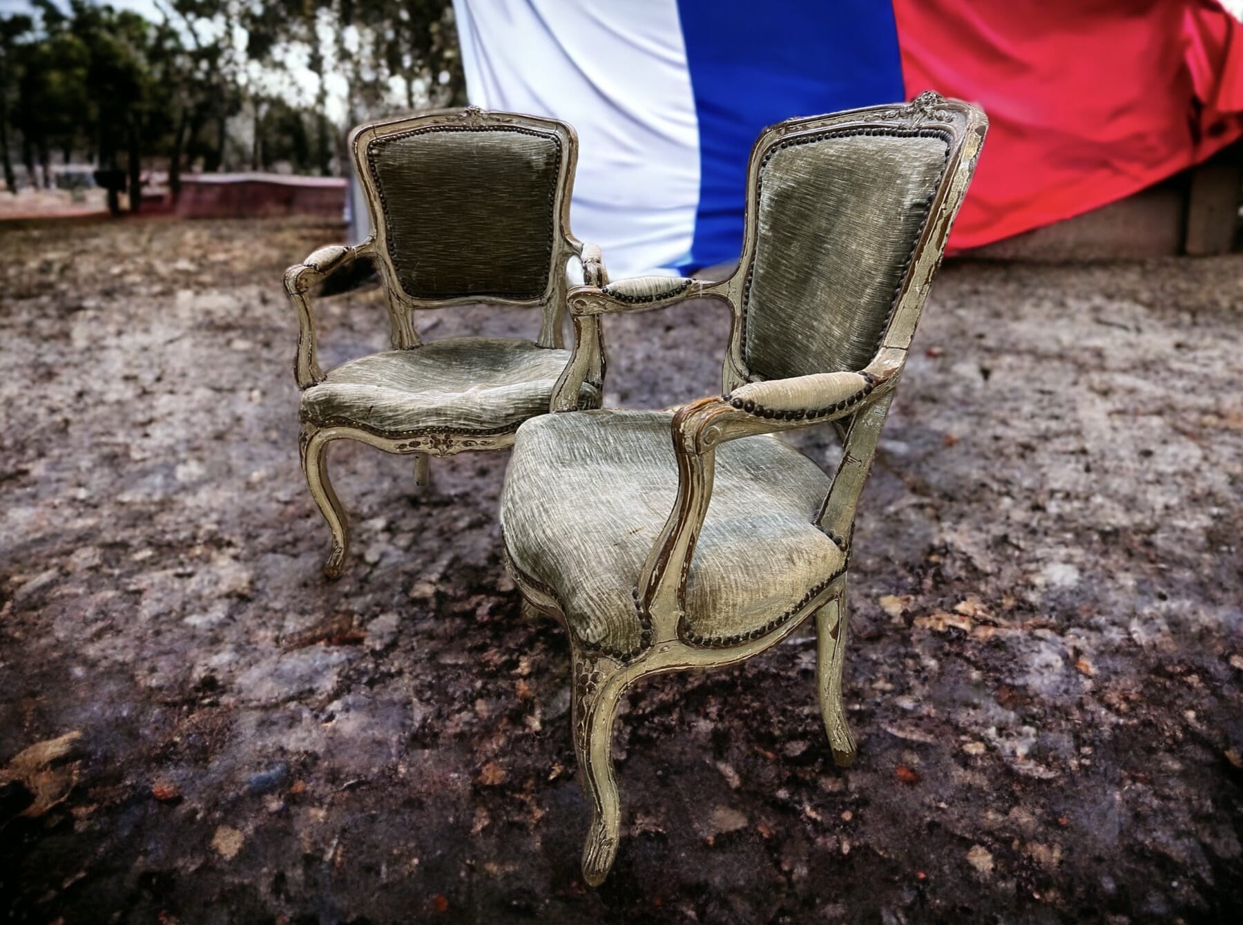
Vive La France!

Bonjour! French Antiques at Moorabool, Geelong

Bonjour…. in celebration of today’s French significance, we have a nice array of French items for you to browse, Fresh to Stock at Moorabool.

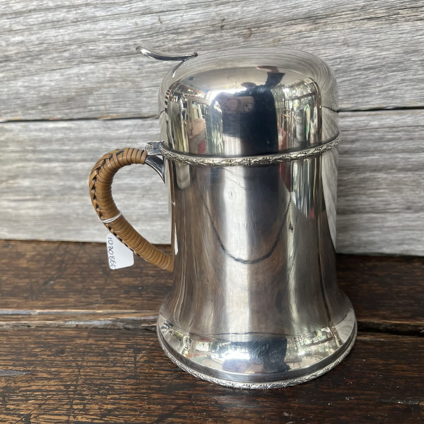
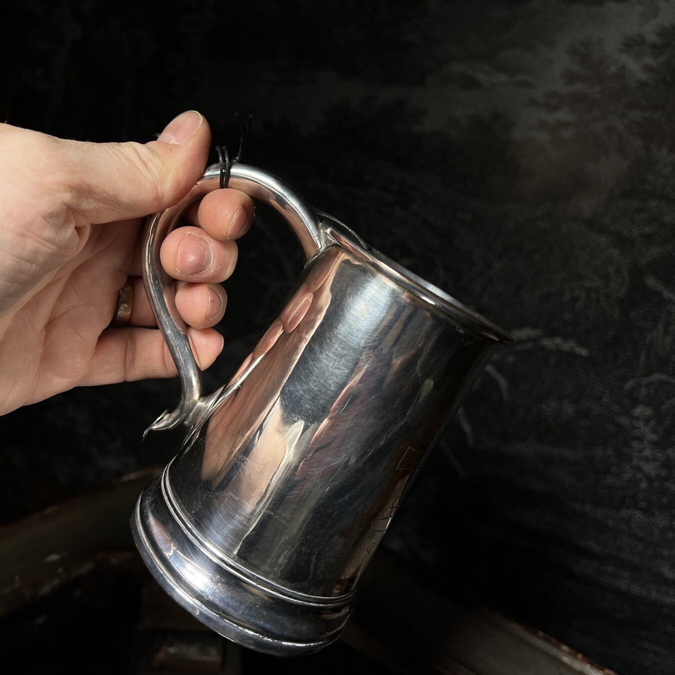
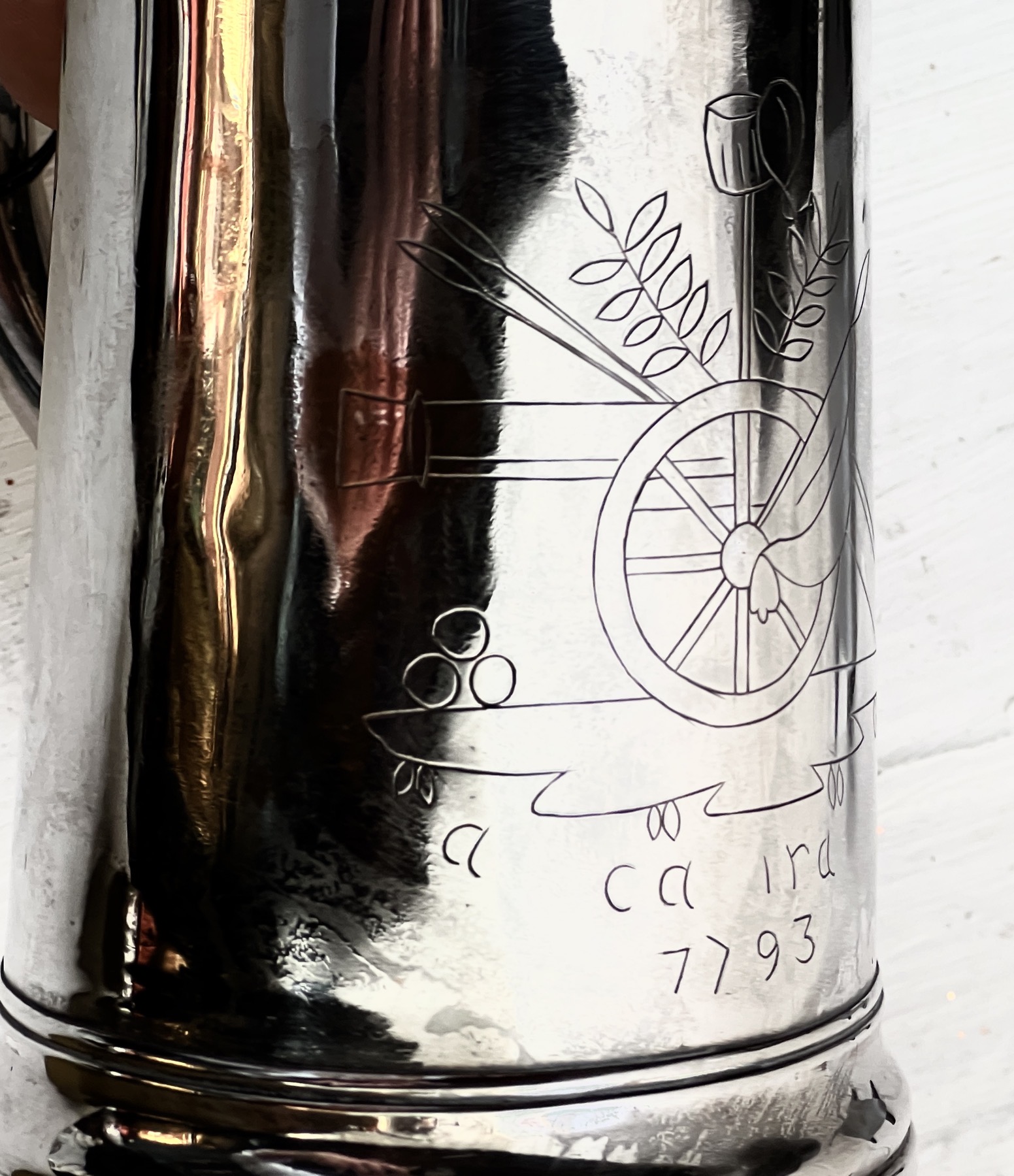
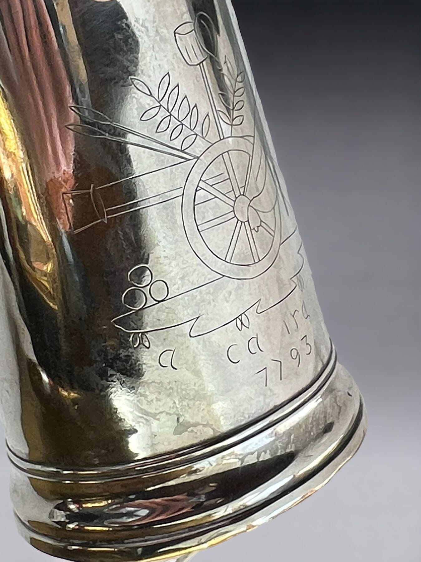
French ‘close-plated’ tankard (the French version of Old Sheffield Plate) with Revolutionary engraving, dated 1793

This interesting Revolutionary relic celebrates 1793: the year the Revolution ‘crossed the line’, executing the King & Queen, and purging the Ancien-Regime from France. The Cannon and cannonballs show the militant direction the revolution took, as 1793 was also the year France declared war on pretty well every European nation. Below is an inscription, ‘a ca ira’ – It’ll be OK, or as the Australian slang goes, ‘No worries!’

A ca ira…. It’ll be OK

This is the chorus of a popular French song, ‘Ca Ira’. Ironically, the music is slightly older than the revolution, said to be a favourite of Marie Antoinette who would play it on her harpsichord. The words were put to it around 1790, and came to include a reference to Marie – calling her ‘the Austrian Slave’ ….

It was said to be the great Benjamin Franklin, while in France at the time as representative of the fledgling United States, who inspired the chorus. He had successfully led the revolution to free the people of America from tyranny – inspirational for the French seeking something similar. When asked for an opinion on France’s revolution, he would reply in broken French “Ça ira, ça ira” (“It’ll be fine, it’ll be fine”).

It was a ‘working song’ for the preparations for the first Fête de la Fédération, held on the 14th July 1790, being the one year anniversary of the storming of Bastille – and still celebrated 232 years later…..

Ca Ira’ is repeated after every verse: the verses were elaborated on and changed as the revolution progressed; an earlier version goes:

“An armed people will always take care of themselves.
We’ll know right from wrong,
The citizen will support the Good.

Ah ! It’ll be fine, It’ll be fine, It’ll be fine
When the aristocrat shall protest,
The good citizen will laugh in his face,
Without troubling his soul,
And will always be the stronger

Ah! It’ll be fine, It’ll be fine, It’ll be fine…”

By the end of the revolution, as the blood of the nobles flowed, the words used were:

”aristocrats to the lamp-post
Ah! It’ll be fine, It’ll be fine, It’ll be fine
the aristocrats, we’ll hang them!

If we don’t hang them
We’ll break them
If we don’t break them
We’ll burn them…..

We shall have no more nobles nor priests
Ah! It’ll be fine, It’ll be fine, It’ll be fine
Equality will reign everywhere
The Austrian slave shall follow him
Ah! It’ll be fine, It’ll be fine, It’ll be fine
And their infernal clique
Shall go to hell
Ah! It’ll be fine, It’ll be fine, It’ll be fine….”

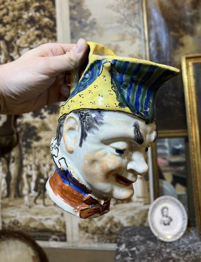
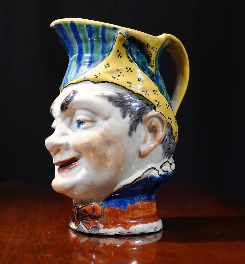
1793 was the year ‘The Terror’ began. After Louis XVI and Marie Antionette lost their heads, the purge of the ancien regiem gathered pace as more and more privileged aristocrats came under suspicion of not being loyal. Heading the purge was Georges Jacques Danton. As head of the ‘Committee of Public Safety’, he was able to remove all opposition, using that French favourite, the guillotine. Until one day, he himself met the same fate for not being radical enough! The ‘character jug’ below is French, of the Revolutionary period – and looks just like him. Read More to follow our attribution of this character to the feared Georges Danton.

Georges Jacques Danton? head jug, c. 1795 - Moorabool Antiques, Australia

Often mis-labelled a ‘Toby Jug’, this is an early version of a comical jug that becomes popular in the latter 19th century, sometimes identified as ‘Puck’. We believe this head jug is a distinctive character, and as it belongs to the period of the French Revolution, his identity must be found in that timespan. His appearance matches that of Georges Jacques Danton (17591794), an important public figure of the late 18th century in France, and the perfect candidate for a slightly humorous head mug like this. 

Read more about the Danton Jug here >>

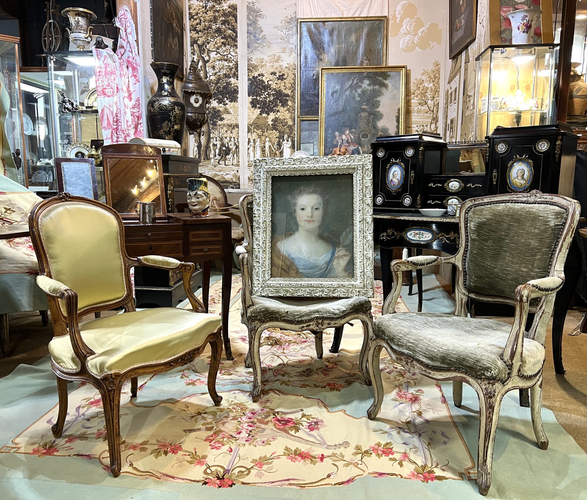
The ‘French Room’ at Moorabool Antiques

Moorabool Antiques, Geelong - French Room
Moorabool Antiques, Geelong – French Room
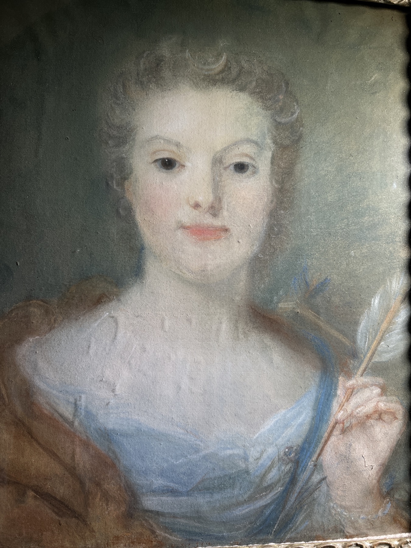
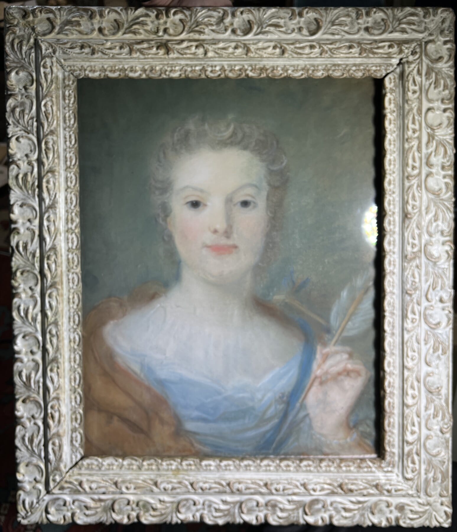
Jean-Baptiste Perronneau pastel portrait 1751 at Moorabool Antiques, Geelong, Australia
Jean-Baptiste Perronneau pastel portrait, signed & dated 1751

In the upstairs centre of our Geelong premises we have constructed a ‘French Salon’. The walls are the basis, being a series of rare surviving early 19th century wallpaper panels. They were never used – they still have the trim marks along the edges, usually cut-off when installed.
The fabrics you see are all rather special – Aubusson weavings, including large floor carpet, wall panels, large & small upholstery panels, curtain pelmets, and even a pair of shield-shape fire screens…. all unused, purchased in France on the eve of WW1, shipped out, and left in the boxes until now. In other words, brand-new Antique fabrics, ready for the keenest of French decorators…. we’re hoping they will sell as a complete group, otherwise there will be a split-up into groups. Email if this sounds interesting.
There’s also a series of rather special French pieces, some already online, with more to be added shortly.

Note the portrait in the centre: this is signed & dated pastel, a portrait of Jeanne-Marie- Malles, aged 18, as ‘Dianna the Huntress’. It’s by the pastel master, Jean Baptiste Perronneau (1716-83), regarded by leading scholar in the field, Neil Jeffares, as one of the two ‘best pastel portraitists‘ of the 18th Century (alongside M. de La Tour 1704–1788).

See this exciting freshly identified piece here >

French Furniture


There’s a strong French Connection with Australia: we could well have been a French colony…..
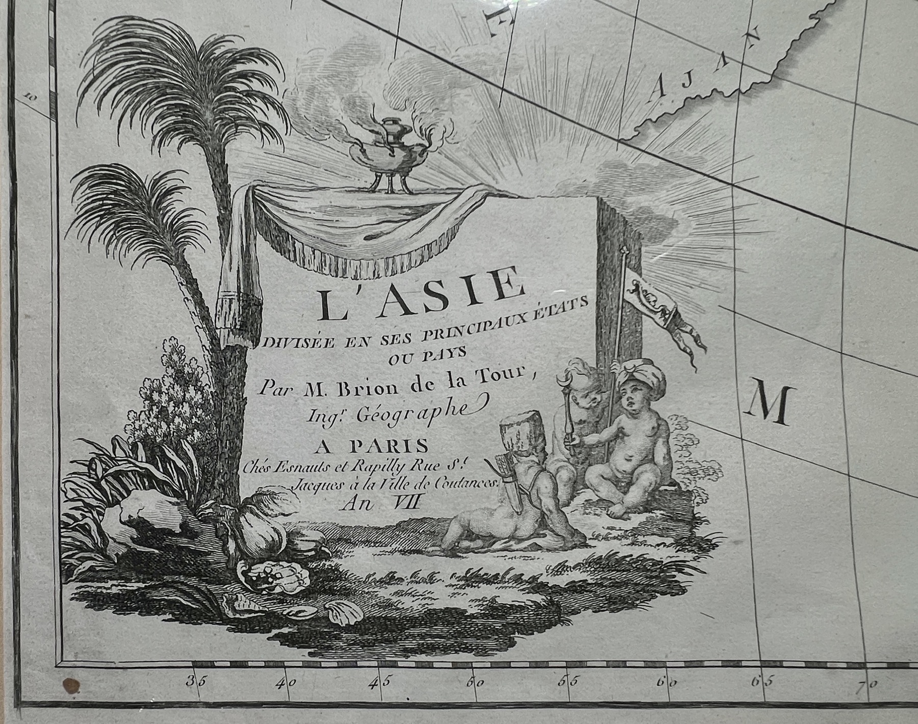
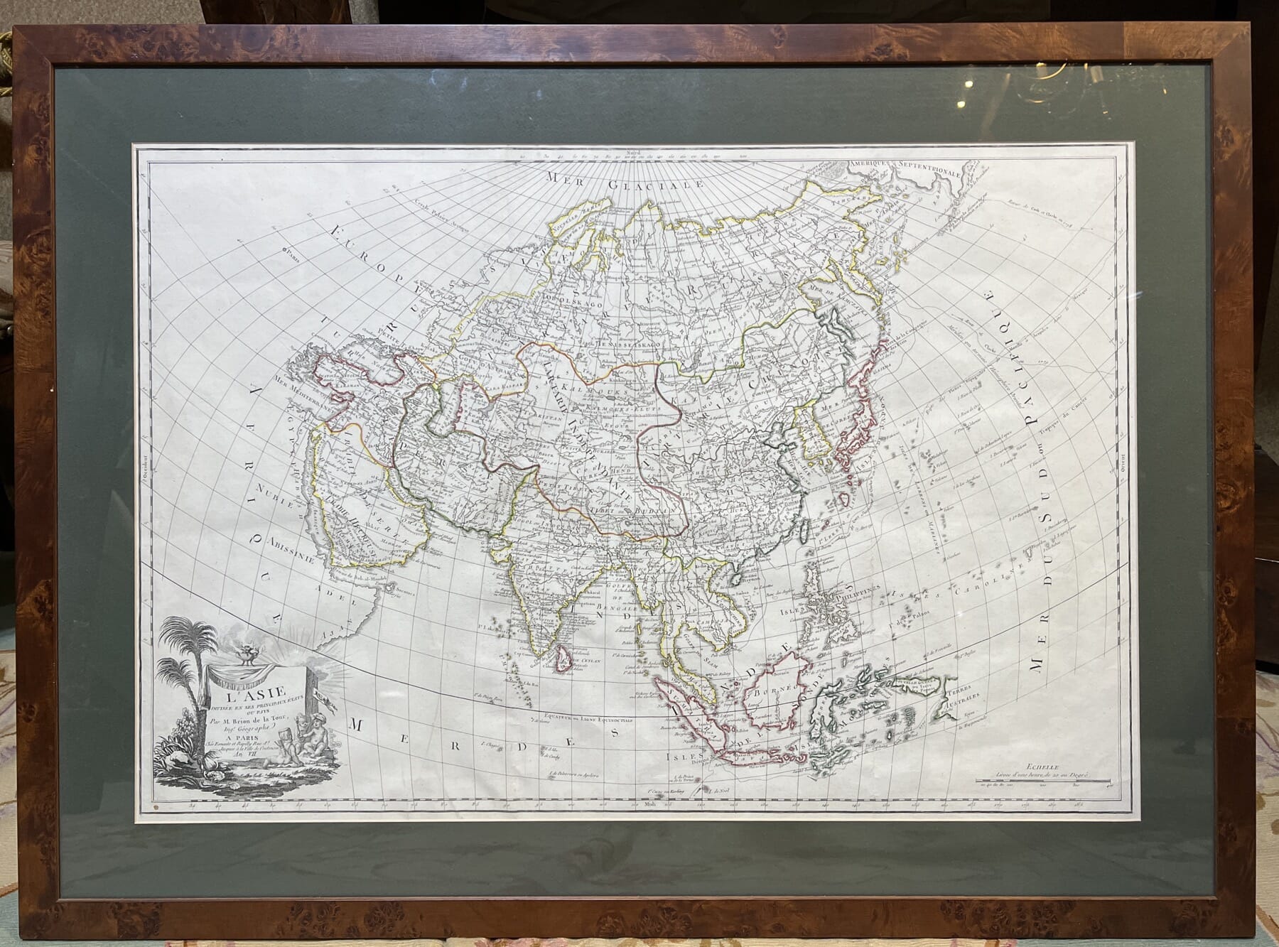
This interesting map shows just the top left of Australia,

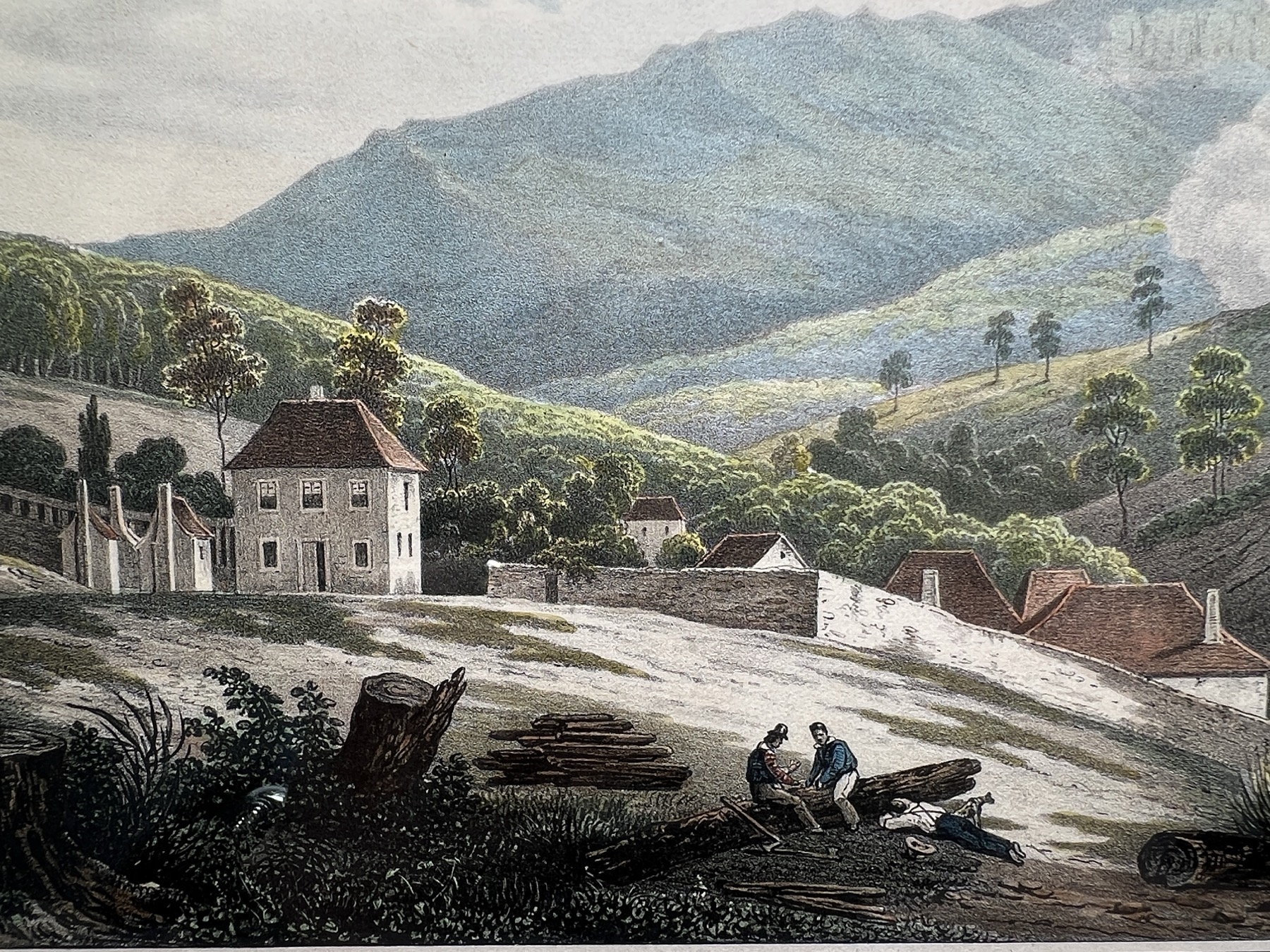
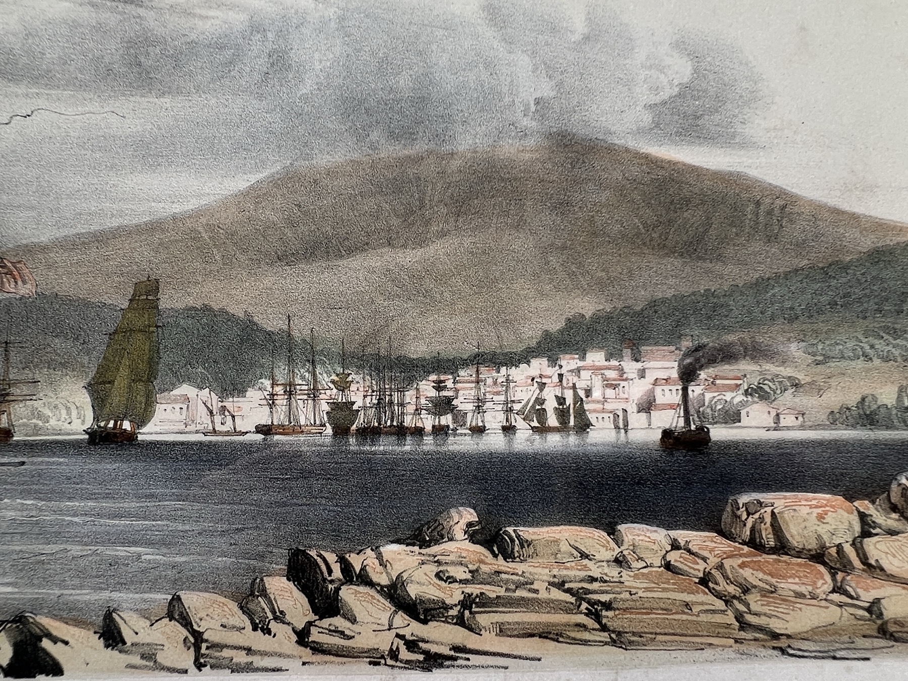
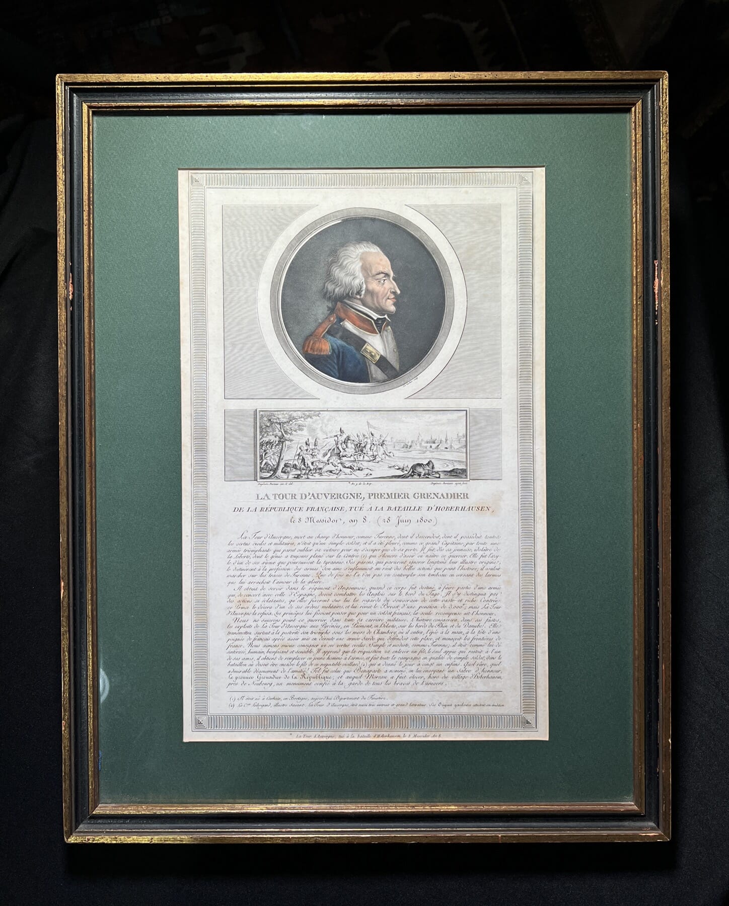
As a footnote, I can’t resist posting a pair of rare hand coloured French ‘Australiana’ lithographs. They reflect the French interest in Australia – just days after the first British colonists arrived at Botany Bay in 1788, the French appeared, having travelled along the southern coast and then arriving right at the spot the British had chosen for their new colony. Coincidence? Not quite – Louis XVI was very interested in the idea of a colony in the South Seas, to compete with the British, and had instructed Lapérouse to report on the British actions on the Great Southern Land.

Note ‘An VII’ – Year 7 …. the Revolutionary fresh start to date years began in 1791, making this map 1798.
Nouvelle Holland, on the 1792 map – depicting Lapérouse’s exploration, up to the moment he sailed direct to ‘Port Jackson’ and encountered the fledgling British colony in 1788. He left his dispatches and charts – luckily – as after leaving the coast, he was never seen again. No outward-plot of his voyage is shown….


Of course, the Revolution soon took hold back in France – but science & exploration still carried on. In 1785, Jean François de Galaup, comte de Lapérouse was put in charge of a mission to the Pacific. The voyage of Lapérouse took a keen interest in the Great Southern Land, made keener by the colonising actions of their main competition, the British. They had arrived on the 18th January, after 252 days sailing from Britain. Lapérouse had been exploring for several years, but in one of those serendipity occurrences history throws up, arrived at the same point as the British just 6 days later! They stayed for six weeks, and then sailed off never to be seen again….

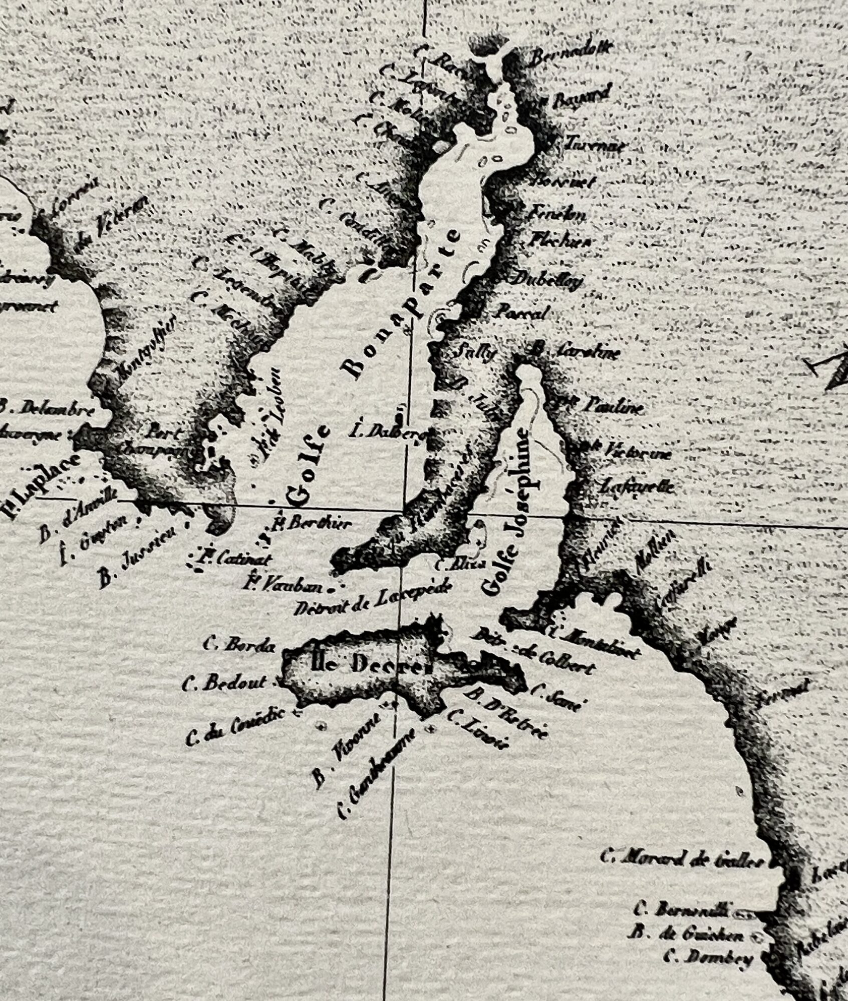
Baudin's Map of South Australia, note the names!
Baudin’s Map of South Australia, note the names!

Nicolas Baudin was the next Frenchman to explore the South Pacific. He was selected by Napoleon in 1798 to explore the southern coast of Australia, or ‘New Holland’ as it was known. While the right-hand portion was the British colony of New South Wales, there was so much more promising land as-yet unclaimed. The tension between the French & the English is illustrated by the events at ‘Encounter Bay’, now in South Australia: Mathew Flinders was completing the first-ever complete navigation of Australia when he stumbled across Baudin’s ship heading the other direction… with the same intent! They cautiously approached, uncertain if they were meant to be enemies or allies, as when Bourdain had left France, they were at war. However, in the name of science, they met peacefully and proceeded on their way. While Baudin died on the way back to France, the charts made it and were published, including all the French names he had given to the features he mapped – ‘Napoleon’s Land’ features ‘Gulf de Napoleon’ next to ‘Gulf de Josephine’, for example. Unfortunately, Mathew Flinders had already mapped & named the same areas, giving them good British names like ‘Spencer Gulf’, names which were officially published a little later, and which remain to today.

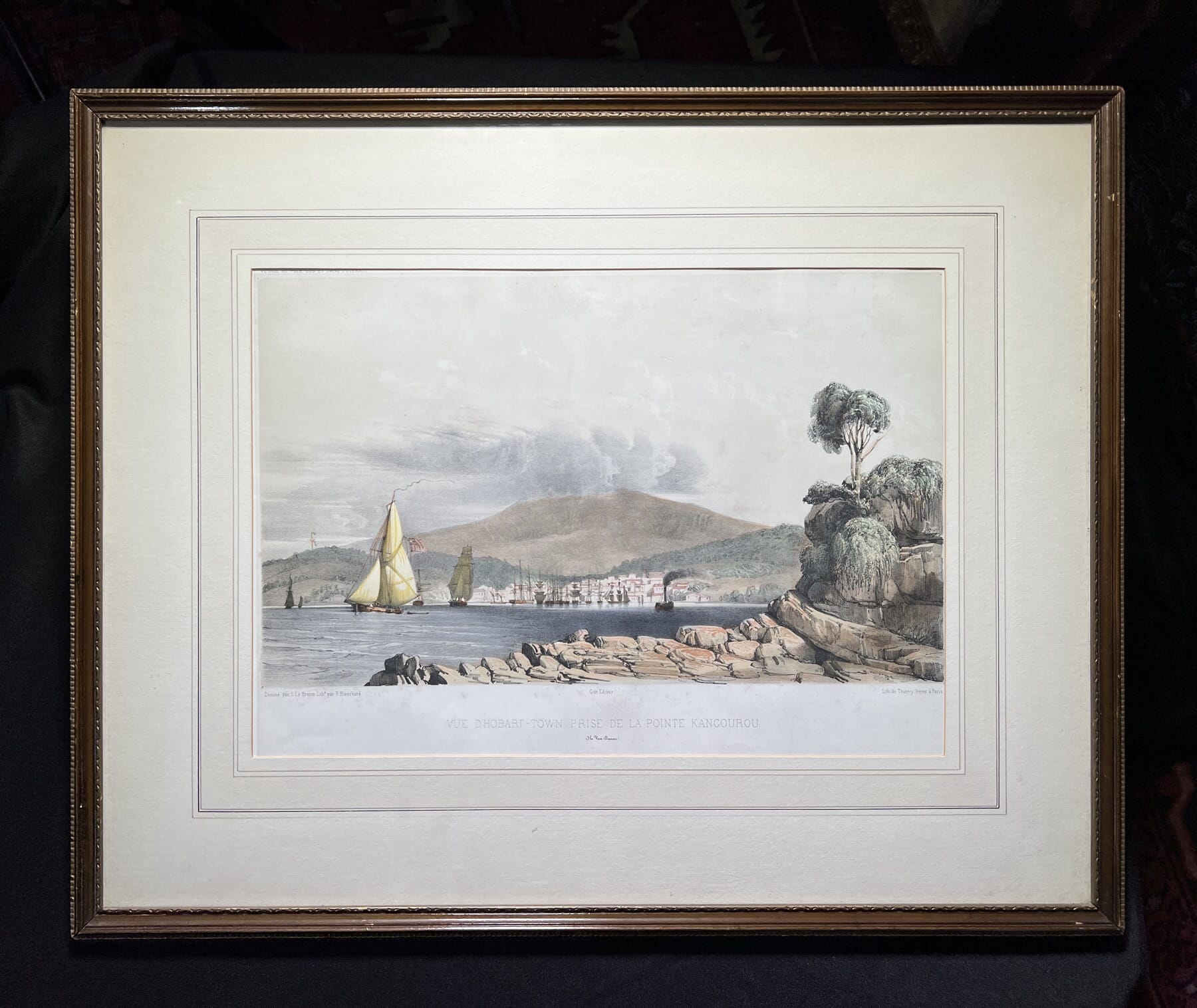
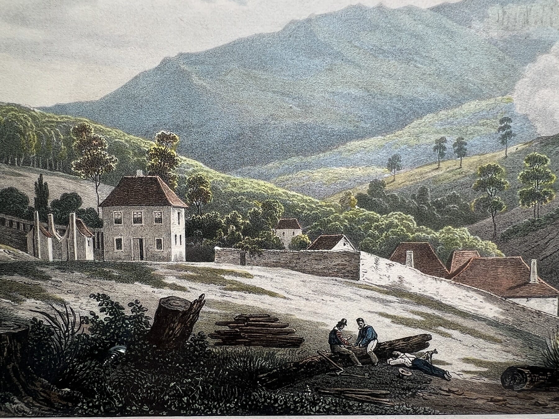
Hobart, during the stop-over of the Astrolabe, 1827
Hobart 1821
Hobart, during the stop-over of the Astrolabe, 1827

The fine French views of Hobart were published in 1833, the result of yet another French expedition to the region: confusingly, in a ship named in honour of the lost Lapérouse expedition: another Astrolabe, under Dumont D’Urville. He was instructed by the re-instated French monarch, Louis-Phillipe, to head south & claim the South Pole for France!

He left France on his first voyage in 1826, and was away for three years in total, visiting Hobart in 1827 to re-supply, when the sketches that were used for these lithographs were made. His voyage was published in ‘Voyage de la corvette “l’Astrolabe’, 1833, from which these come.

He was also responsible for solving the mystery of the disappearance of Lapérouse and his Astrolabe – which he did, discovering relics of the wreck on Vanikoro, in the Solomon Islands.

So Australia has a fair share of French History to celebrate!

Vive la France, tout le monde!

French Fresh stock for Bastille Day….

Posted on

Fresh Stock – fans, furniture, & potlids.

Staffordshire at Moorabool Antiques, Geelong

Today we have a range of interesting items Fresh to Moorabool.com for you to enjoy.

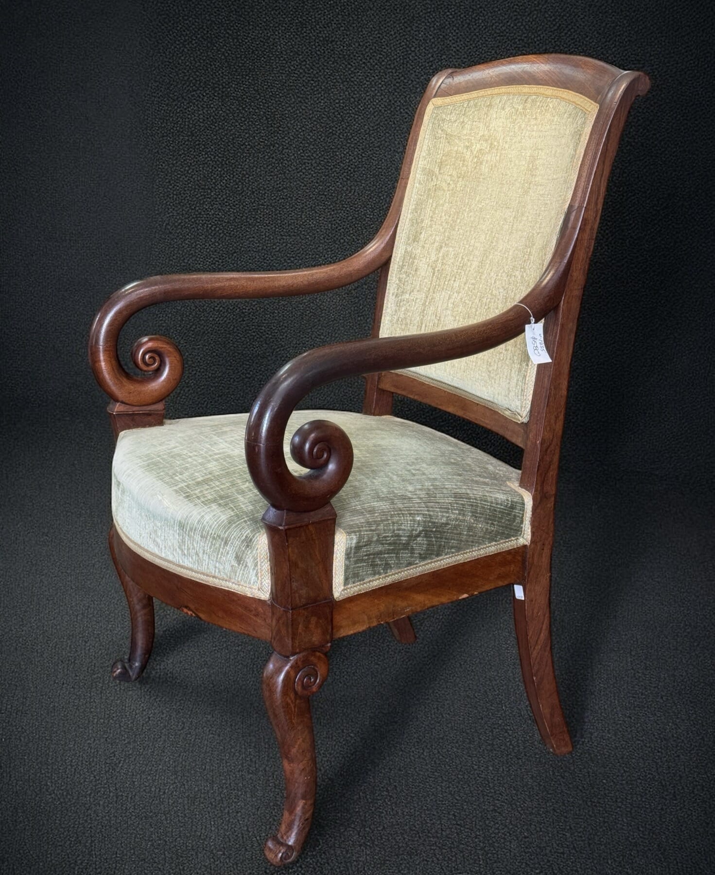
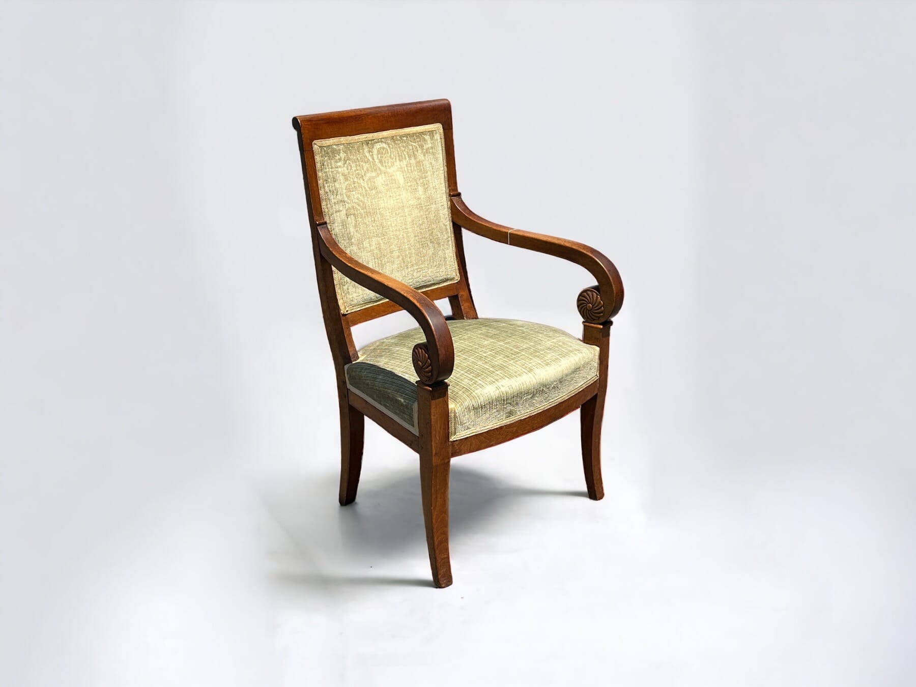
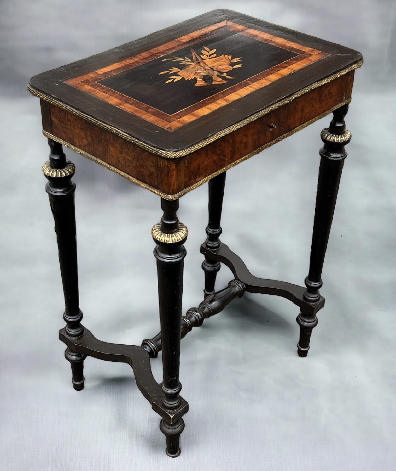
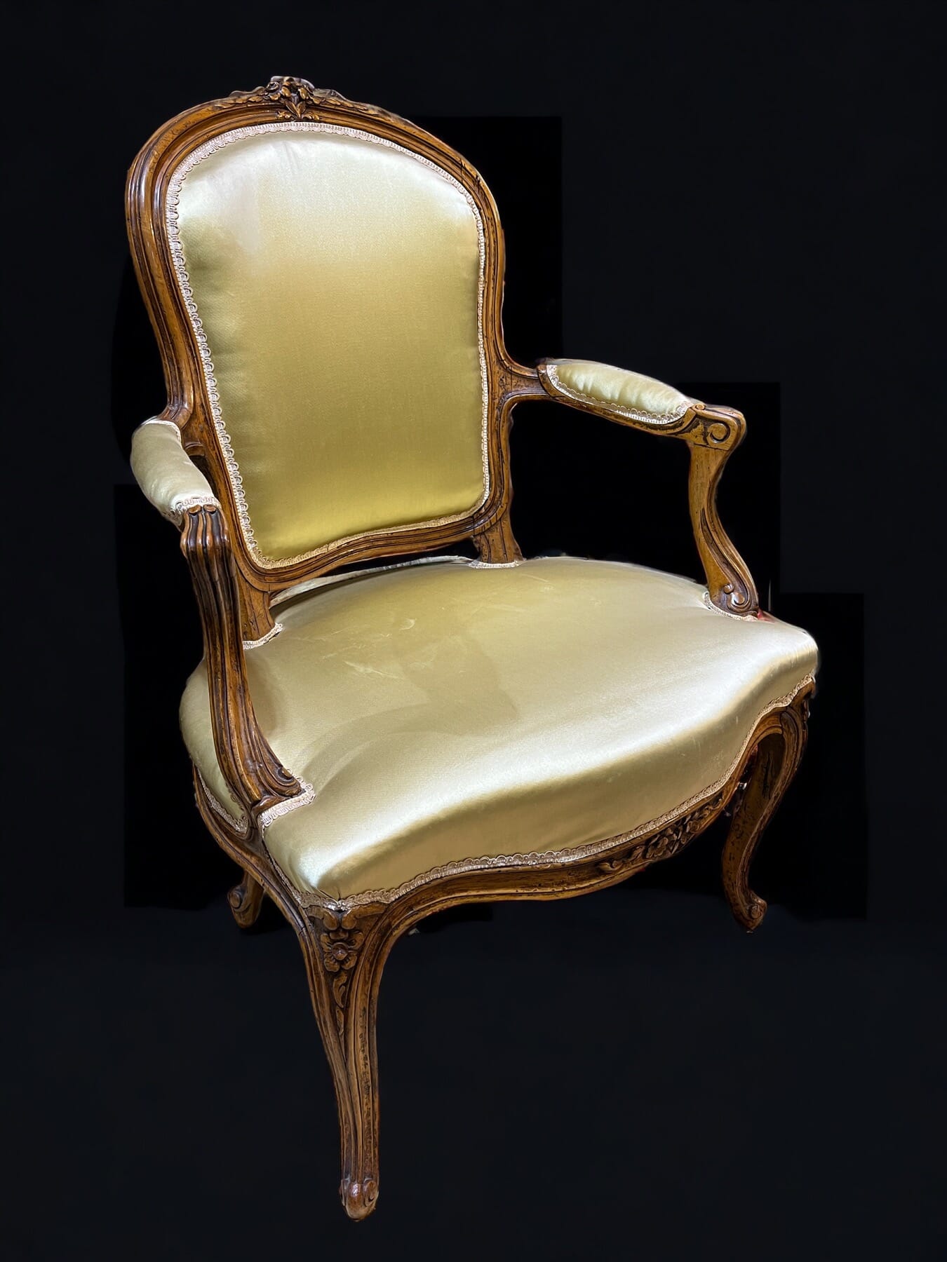
There’s a very respectable Mahogany display case, and a William IV Mahogany chest-of-draws with excellent colour.

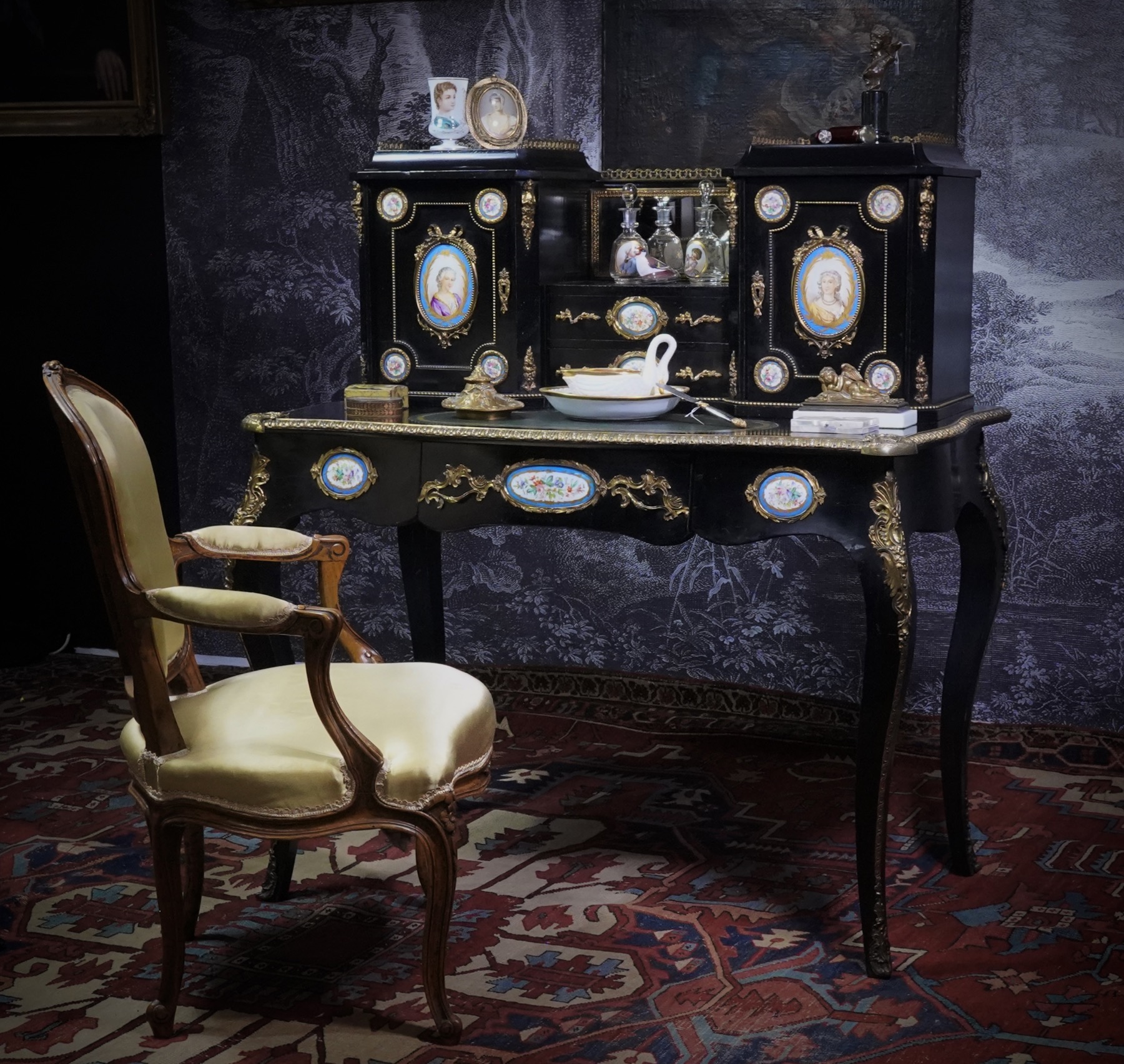
Louis XVI – style Desk, c. 1875

The French ebonized desk is a rather flamboyant example of the latter 19th century interest in Louis XVI furniture – complete with inset hand-painted panels in the Sevres style.

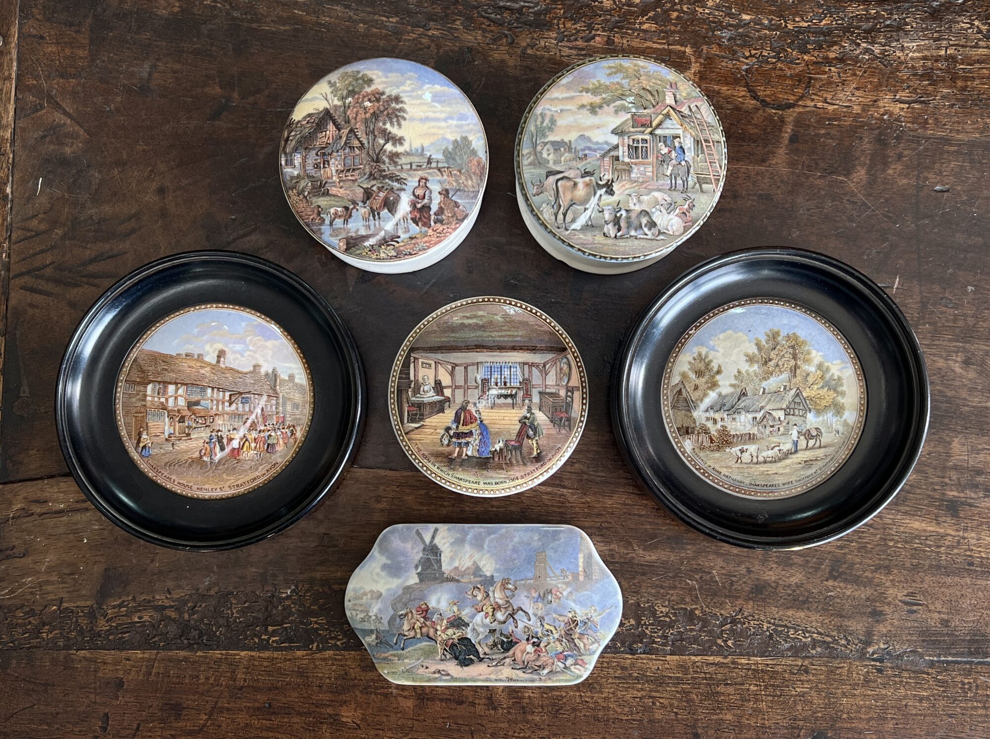
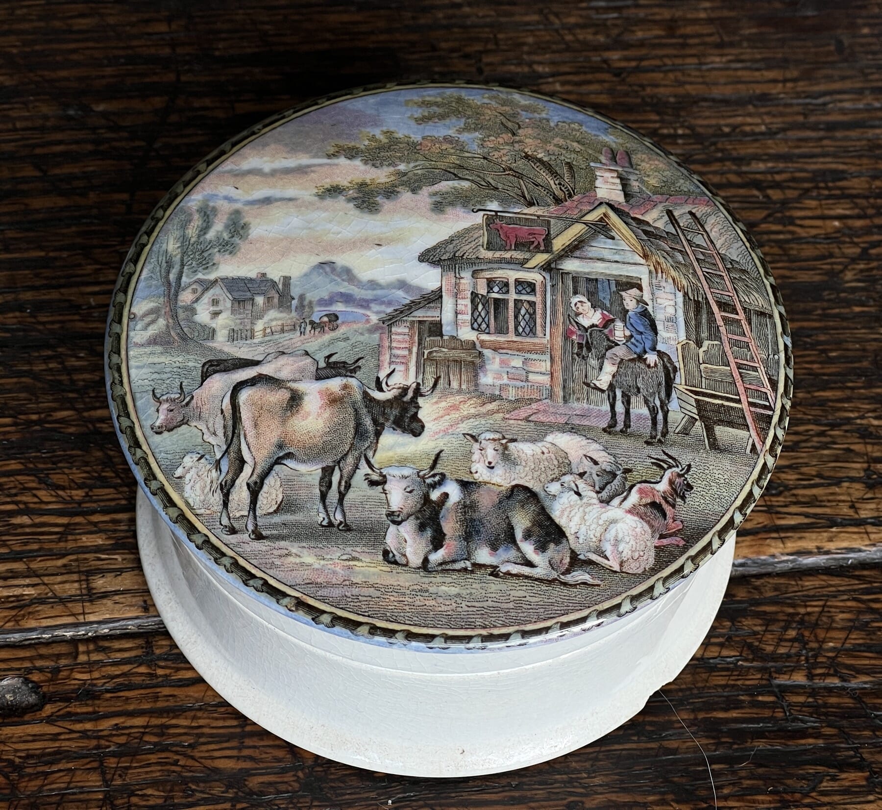
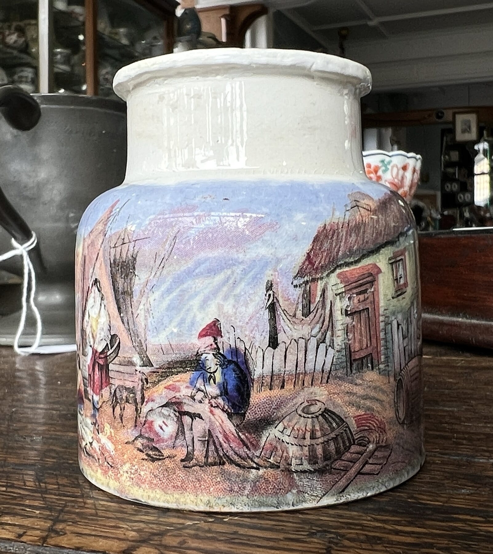
Pratt Potlids at Moorabool Antiques, Geelong, Australia
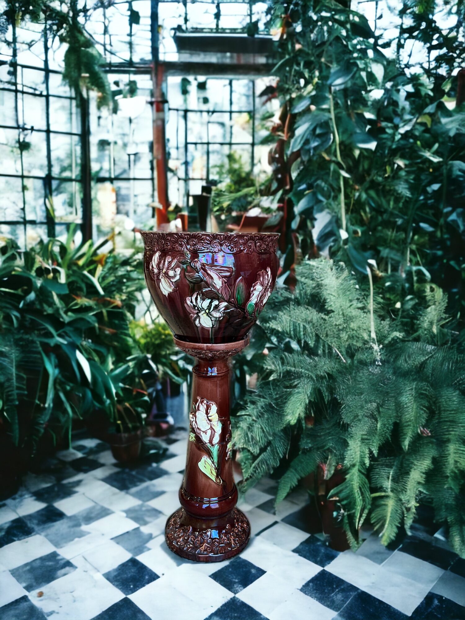
English Majolica jardiniere & stand, c. 1870

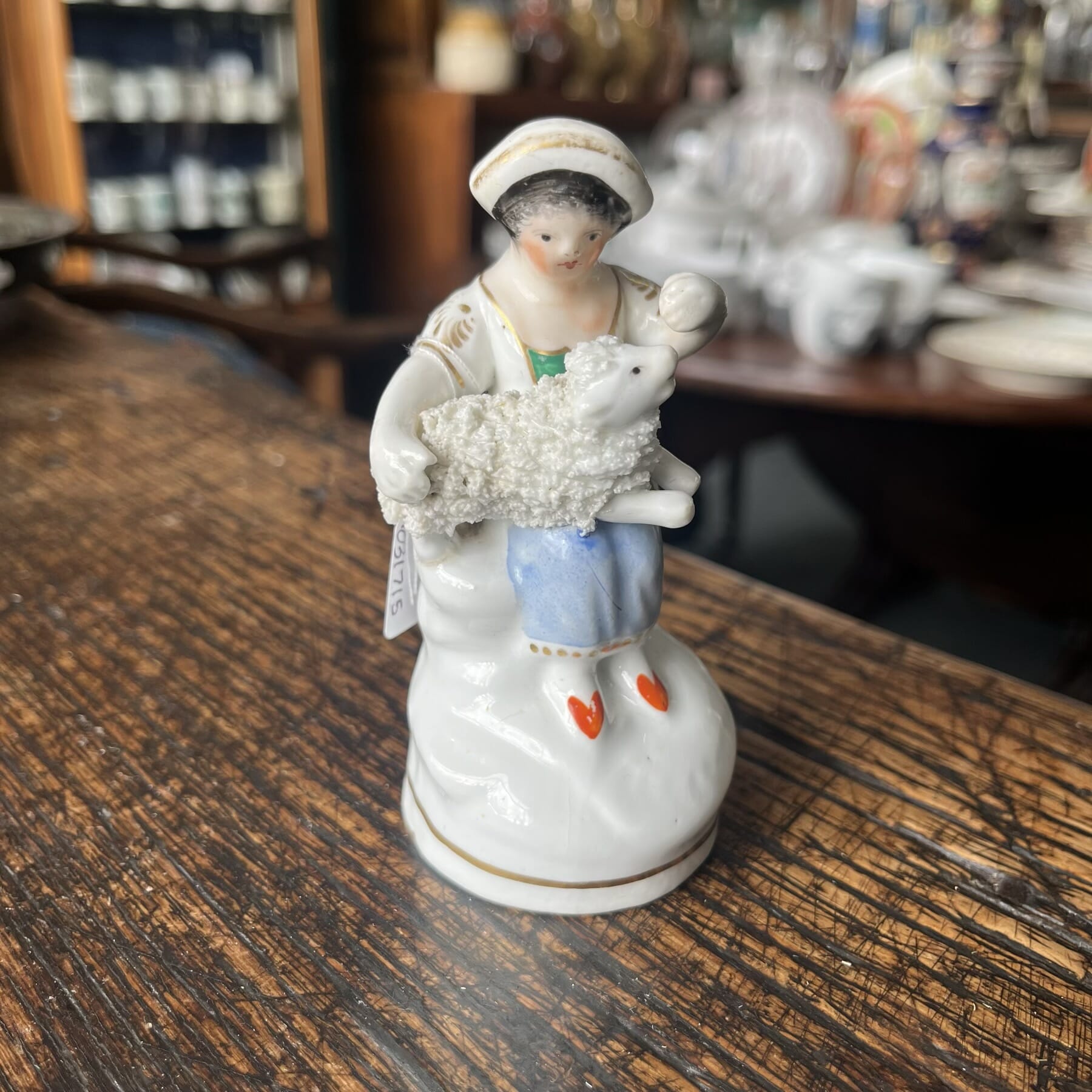
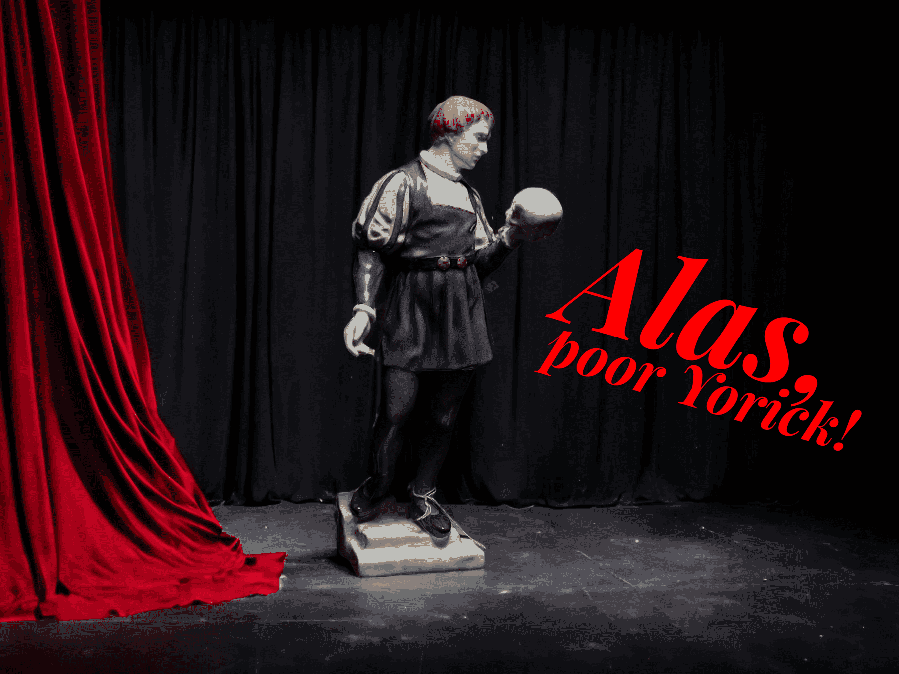
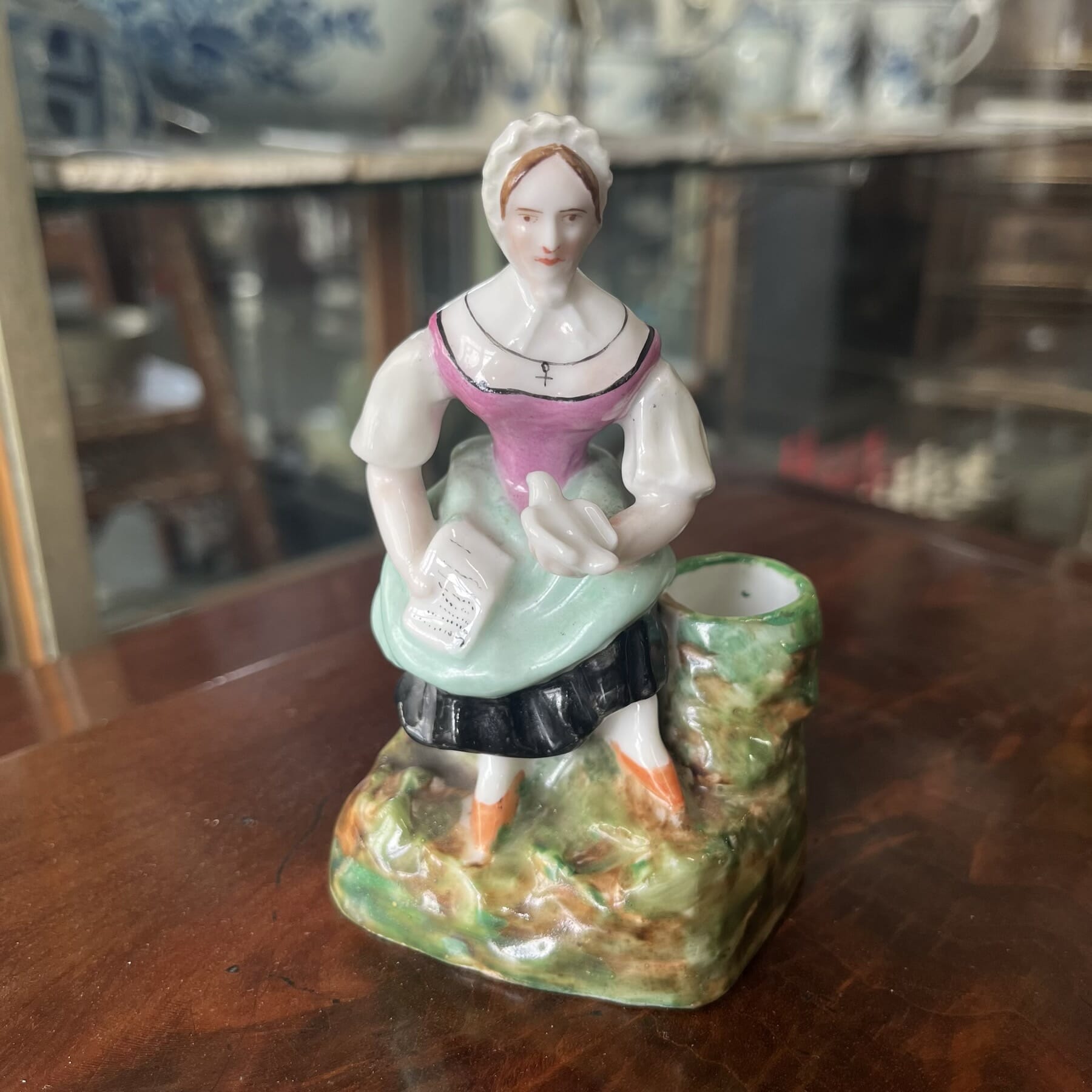
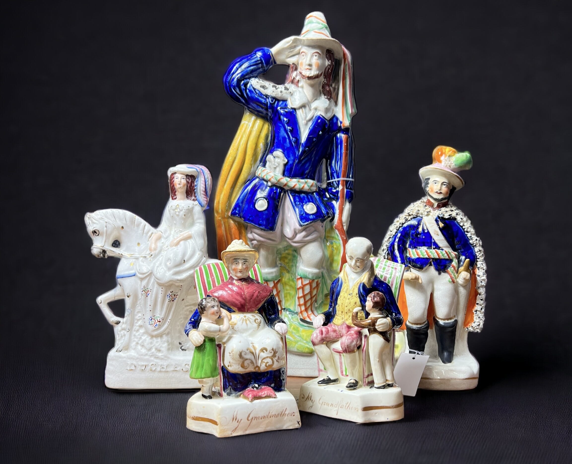
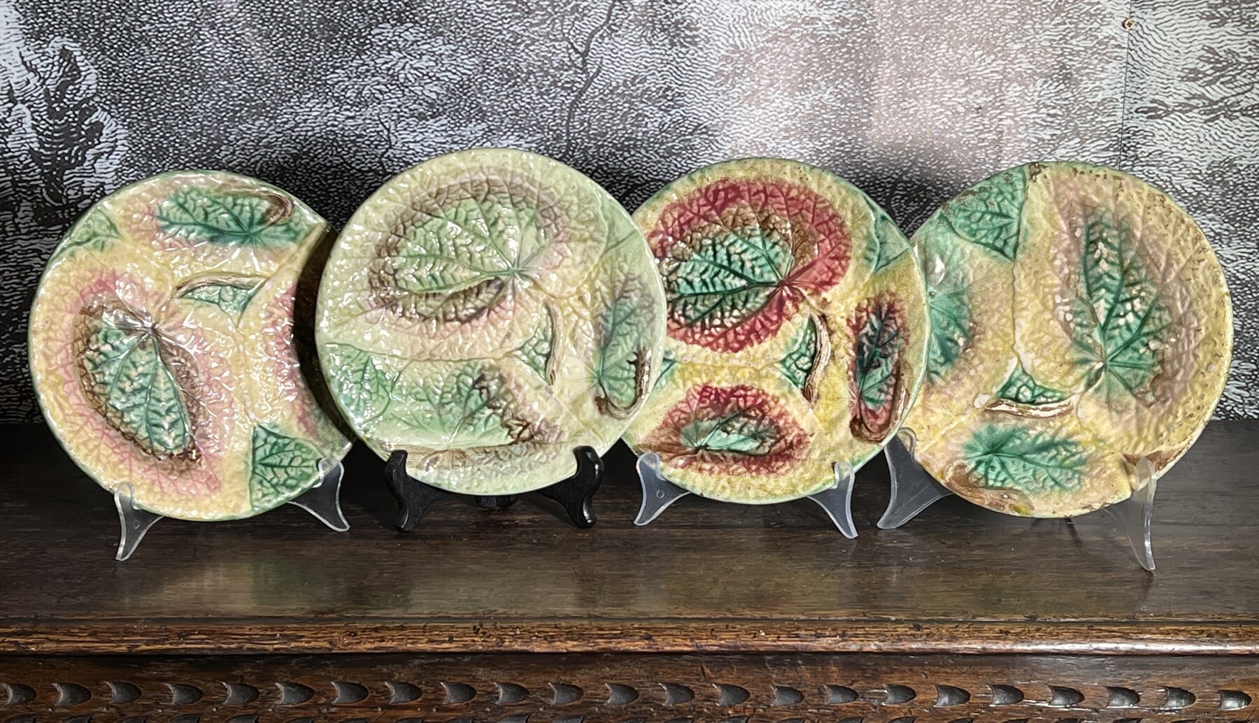
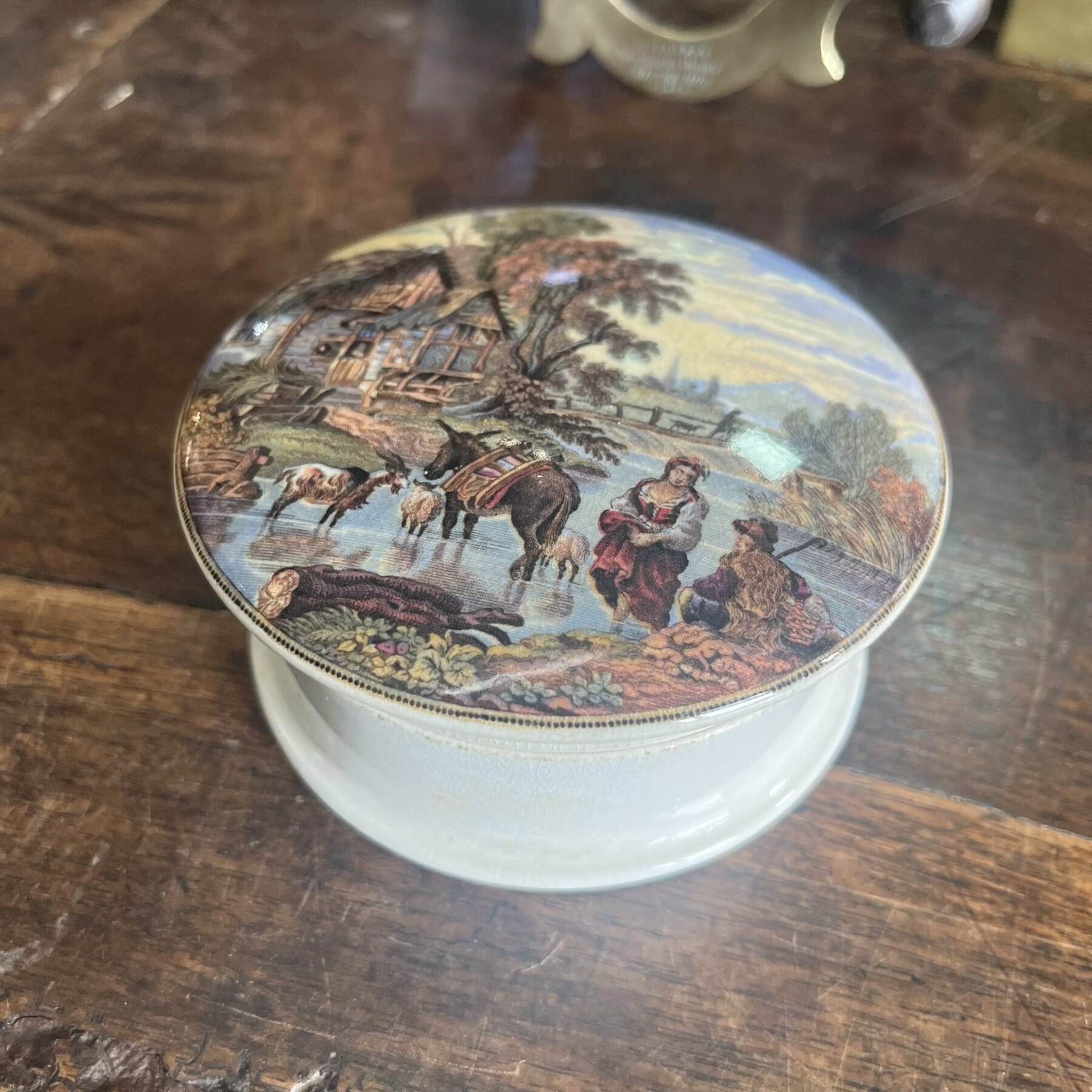
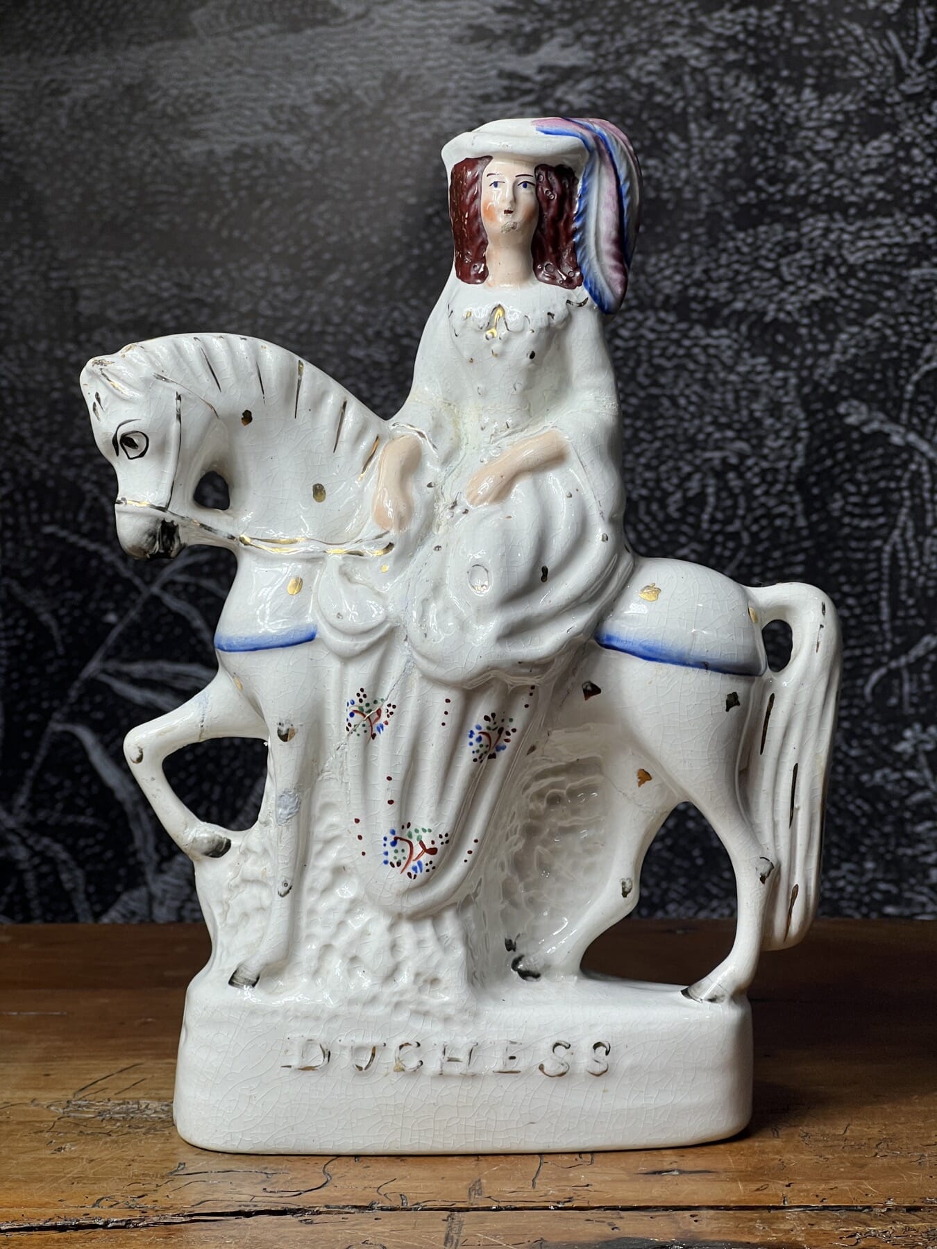
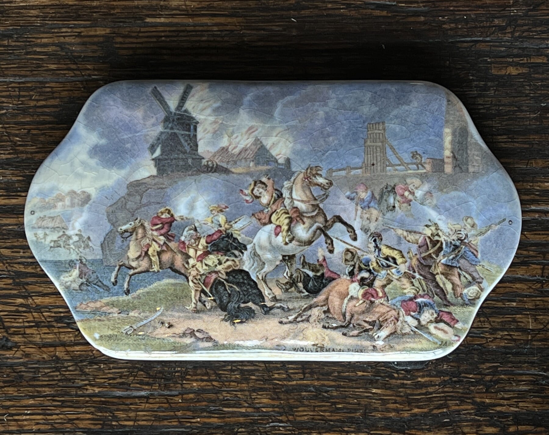
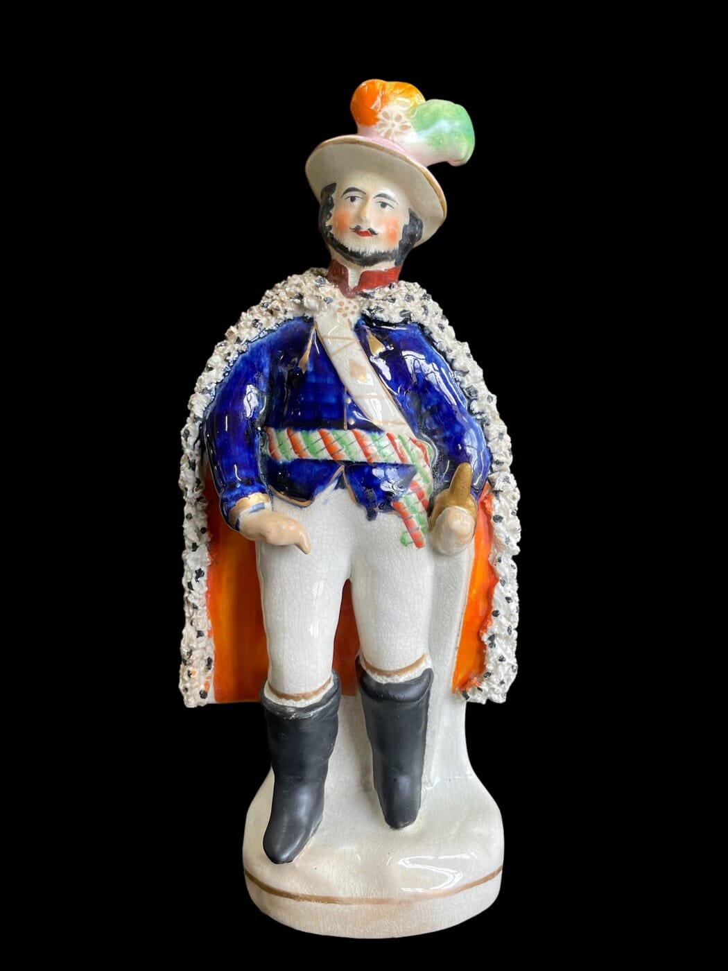
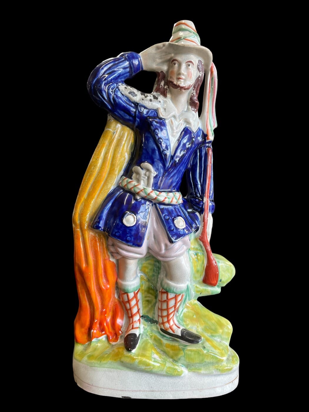
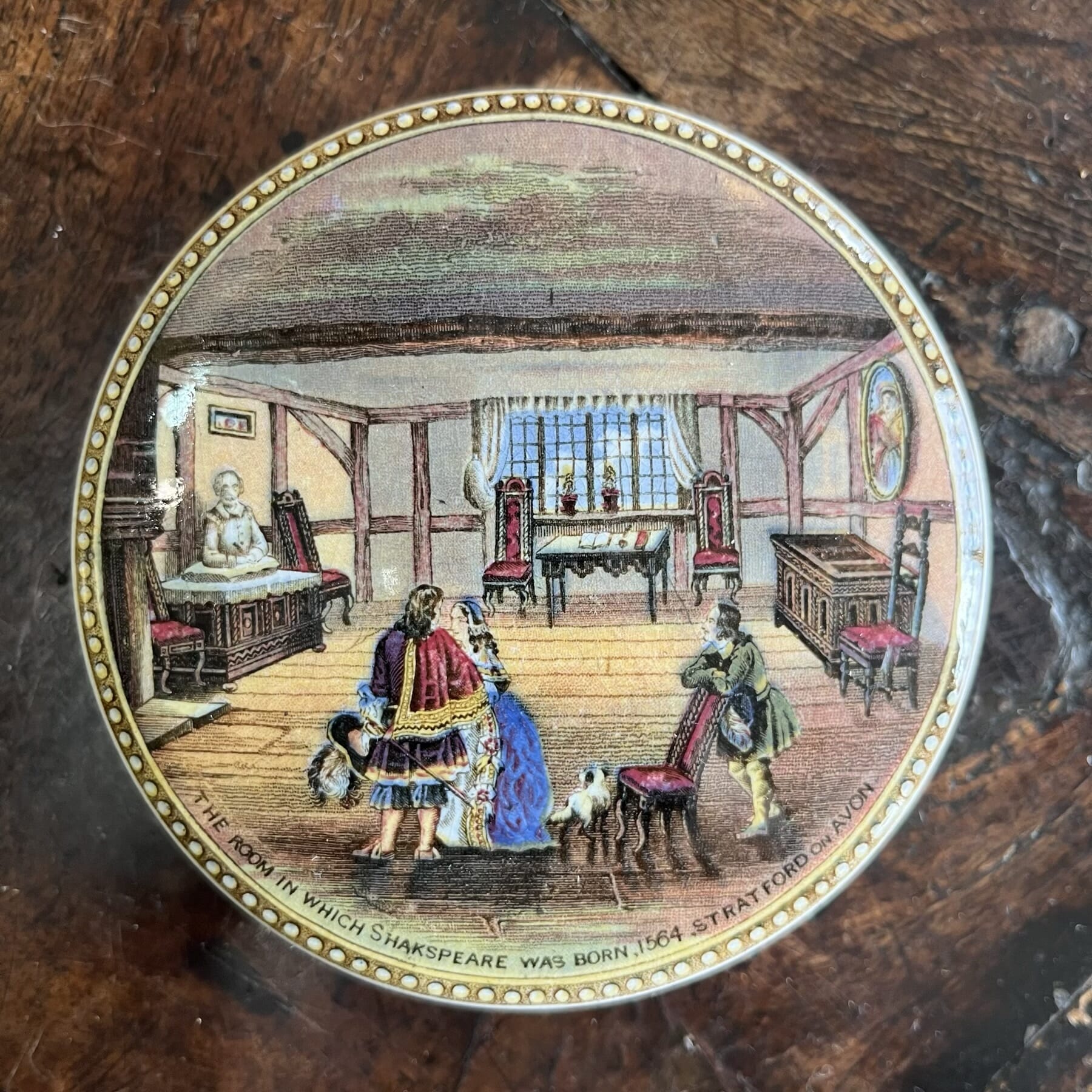
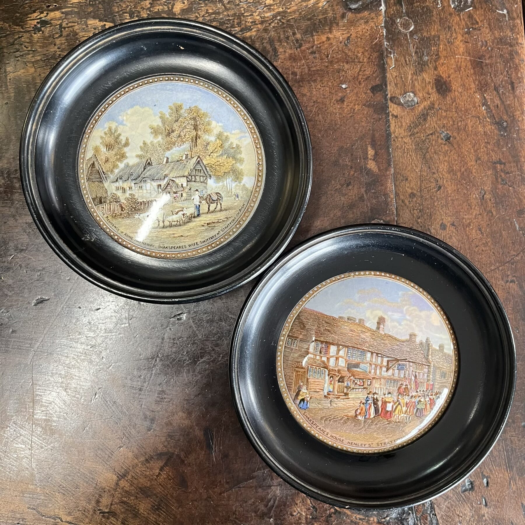
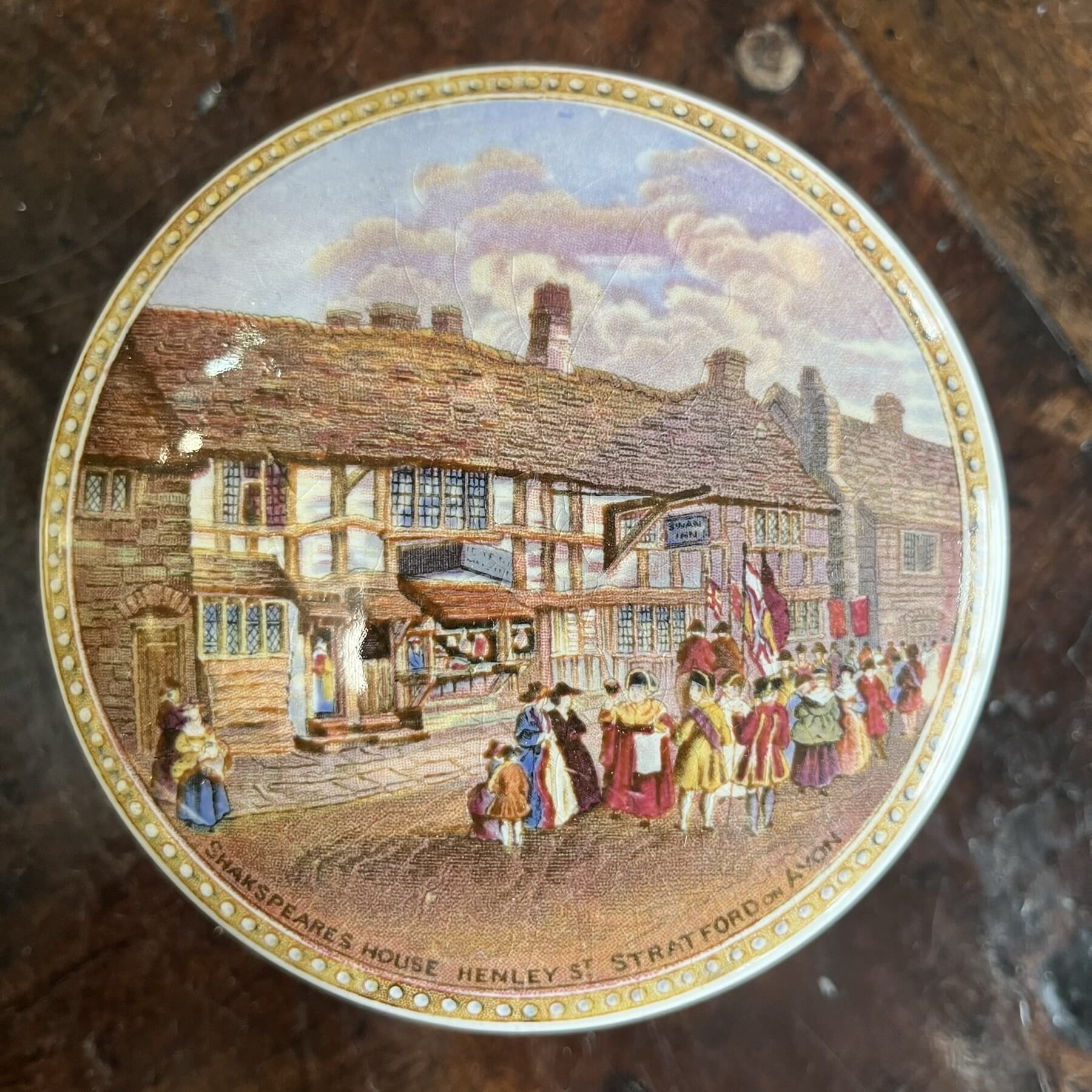
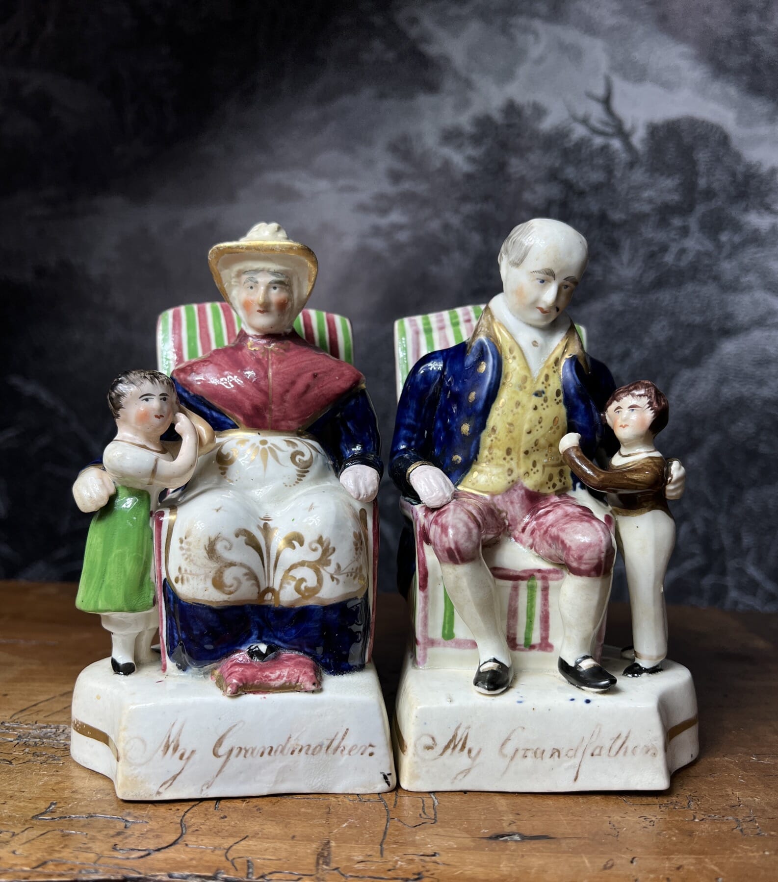
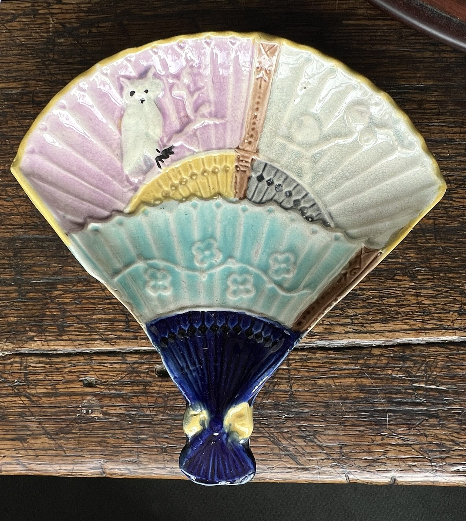
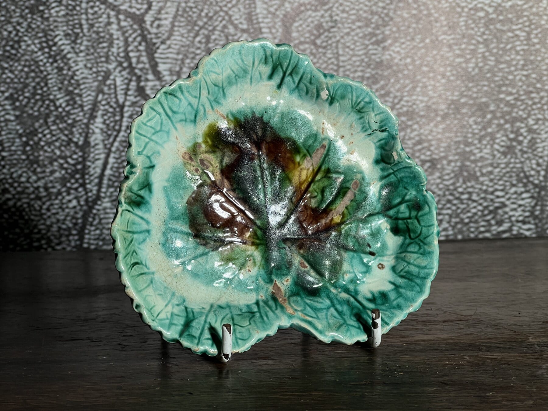
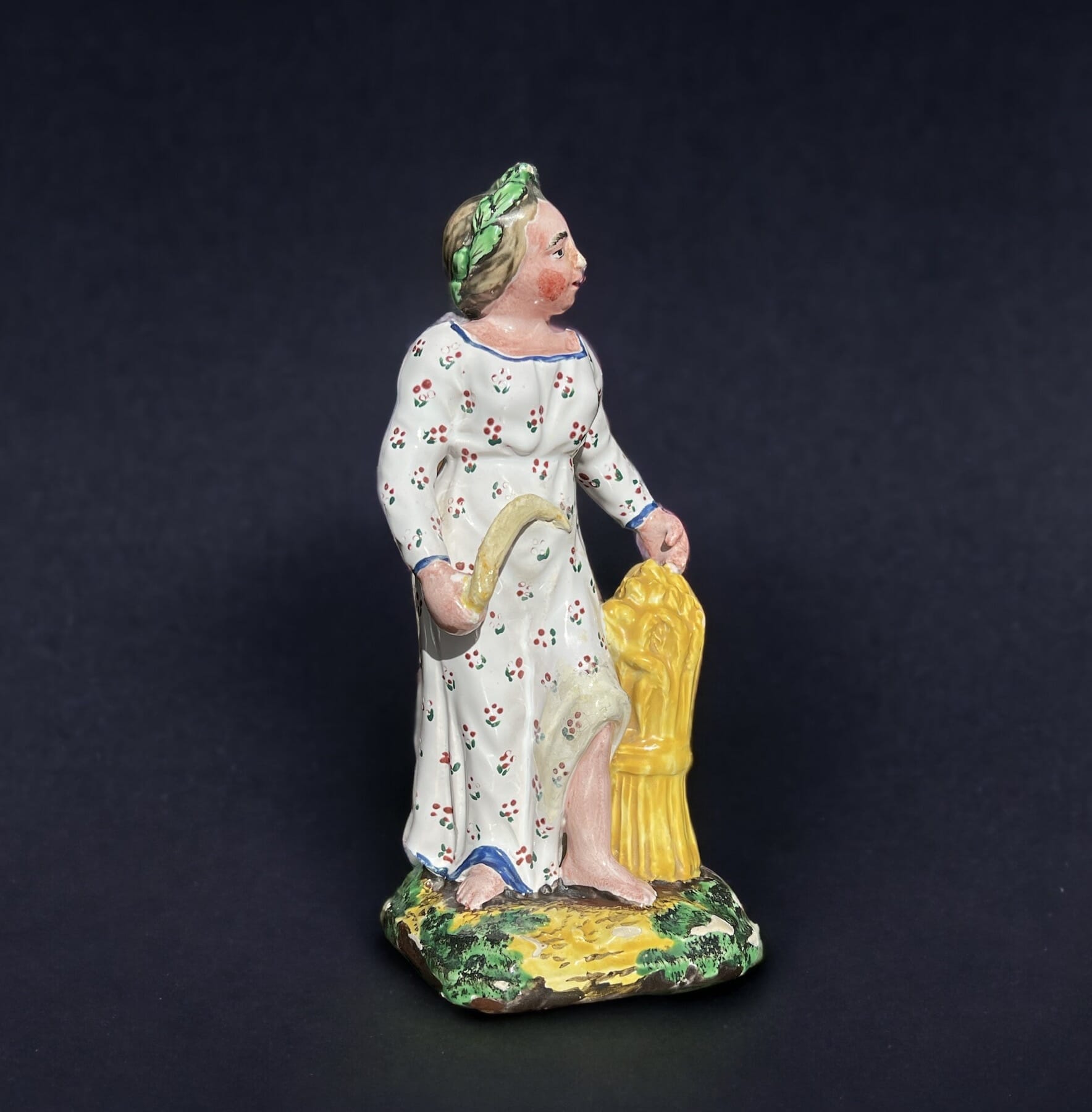
There’s a nice group of Pottery to browse, including Staffordshire Figures of Theatrical characters, a collection of Pratt printed ‘pot lids’ from the 1850’s, including the sought-after Shakespeare images, and some Majolica.

The jardinière & stand shown here is magnificent, with life-size Lillies in the Aesthetic Movement style. While this has an impressed mark to the base ‘JAPAN’ – this is not indicating it was made there – it’s a typical example of English Majolica. Rather, the ‘JAPAN’ mark is indicating the pattern, referring to the source of inspiration for the Aesthetic Movement’s designers.

Posted on

Fresh Stock – last chance at EOFY sale, 15% off!

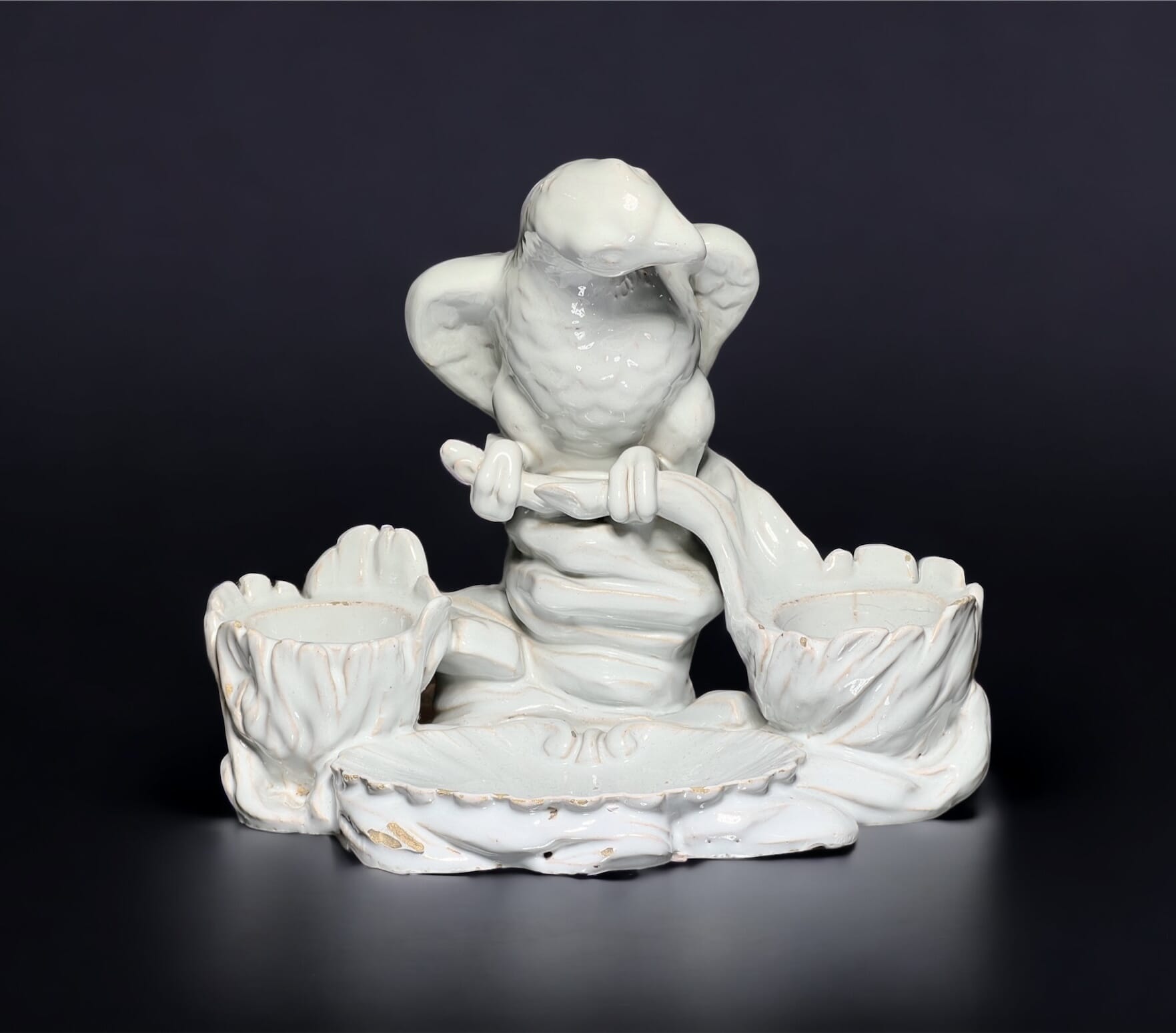
Tinglaze deskset with parrot

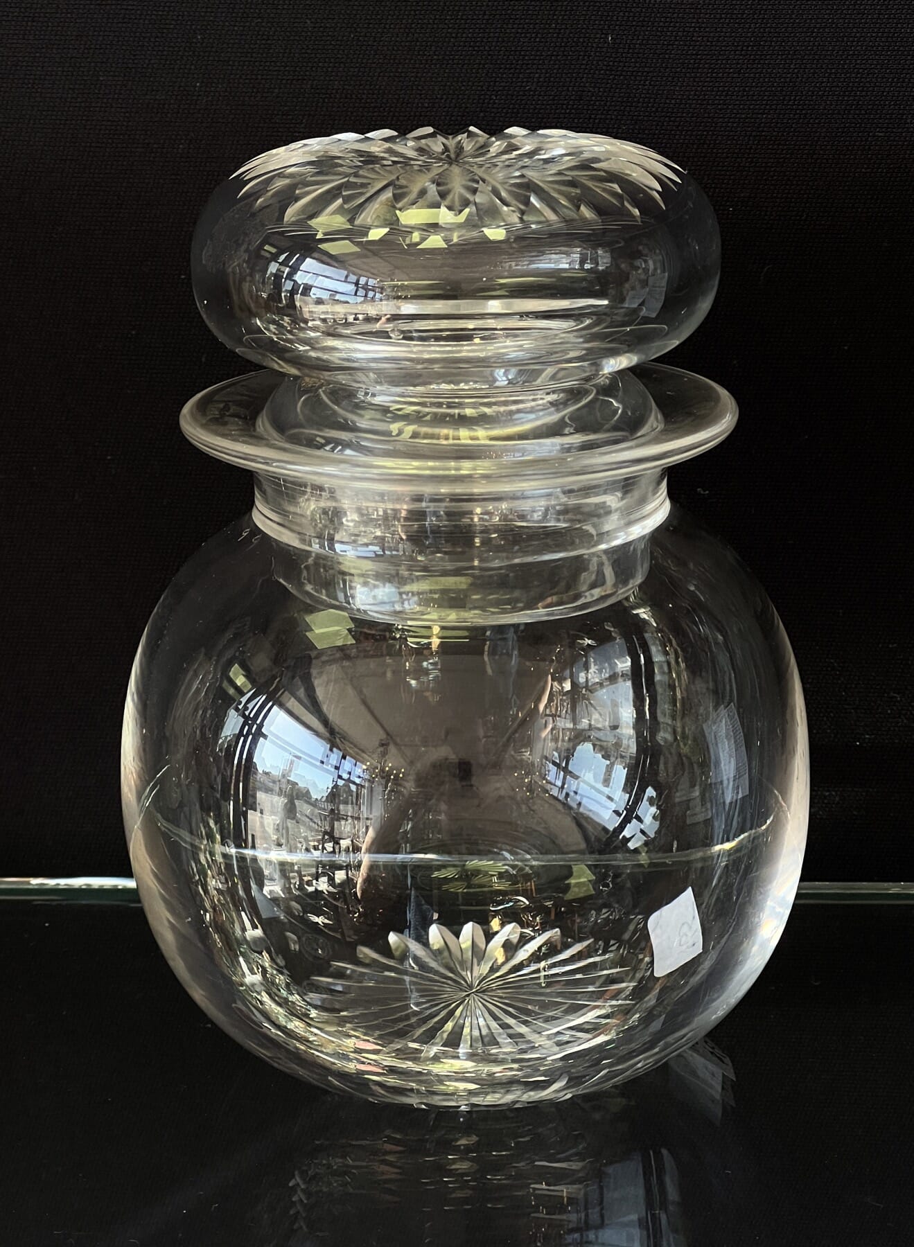
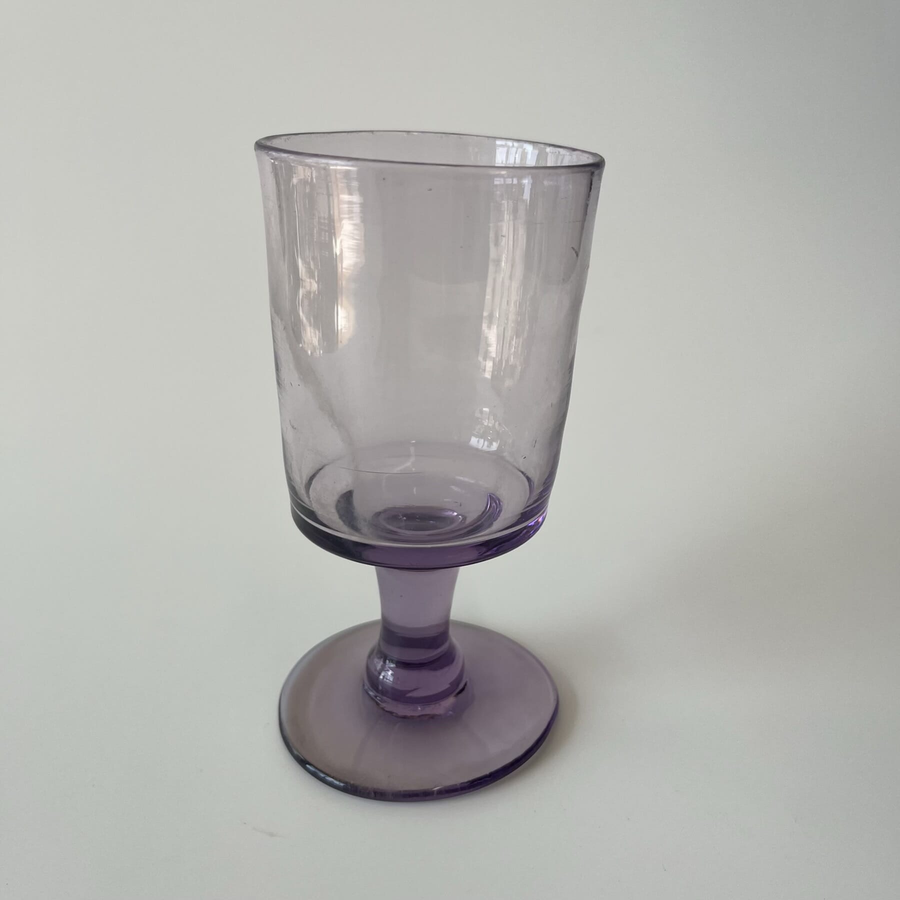
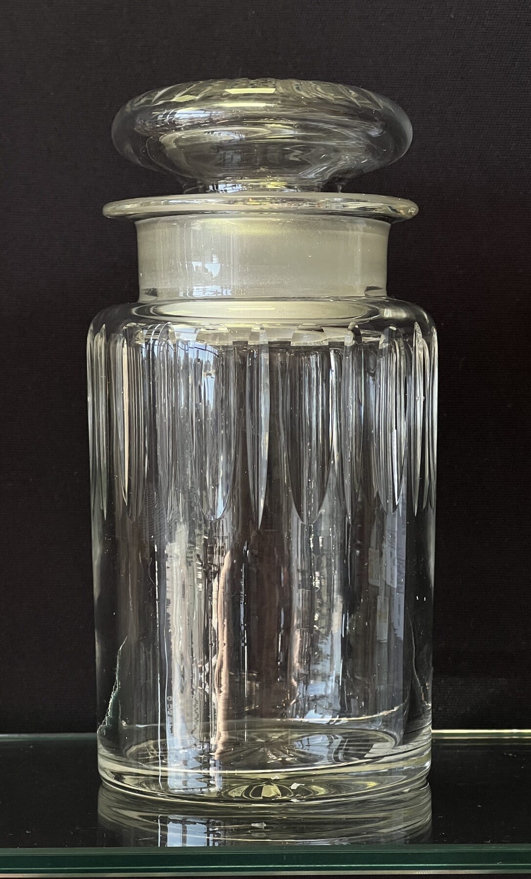
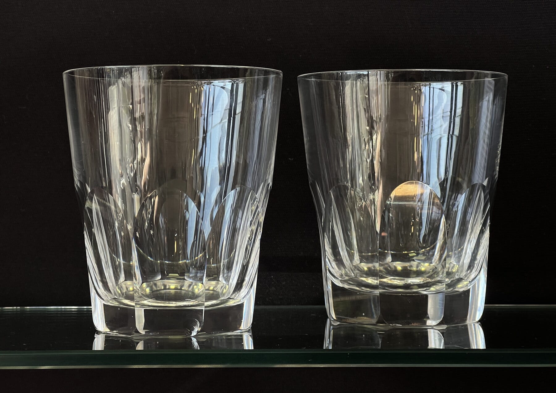
There’s a fine selection of Fresh Stock to browse, from Victorian Glass to 18th century Worcester.

And there’s just two days to make the most of our 15% off sale, ending tomorrow!

Asian Fresh Stock

Chinese, Japanese, Vietnamese… some terrific pieces Fresh to stock.

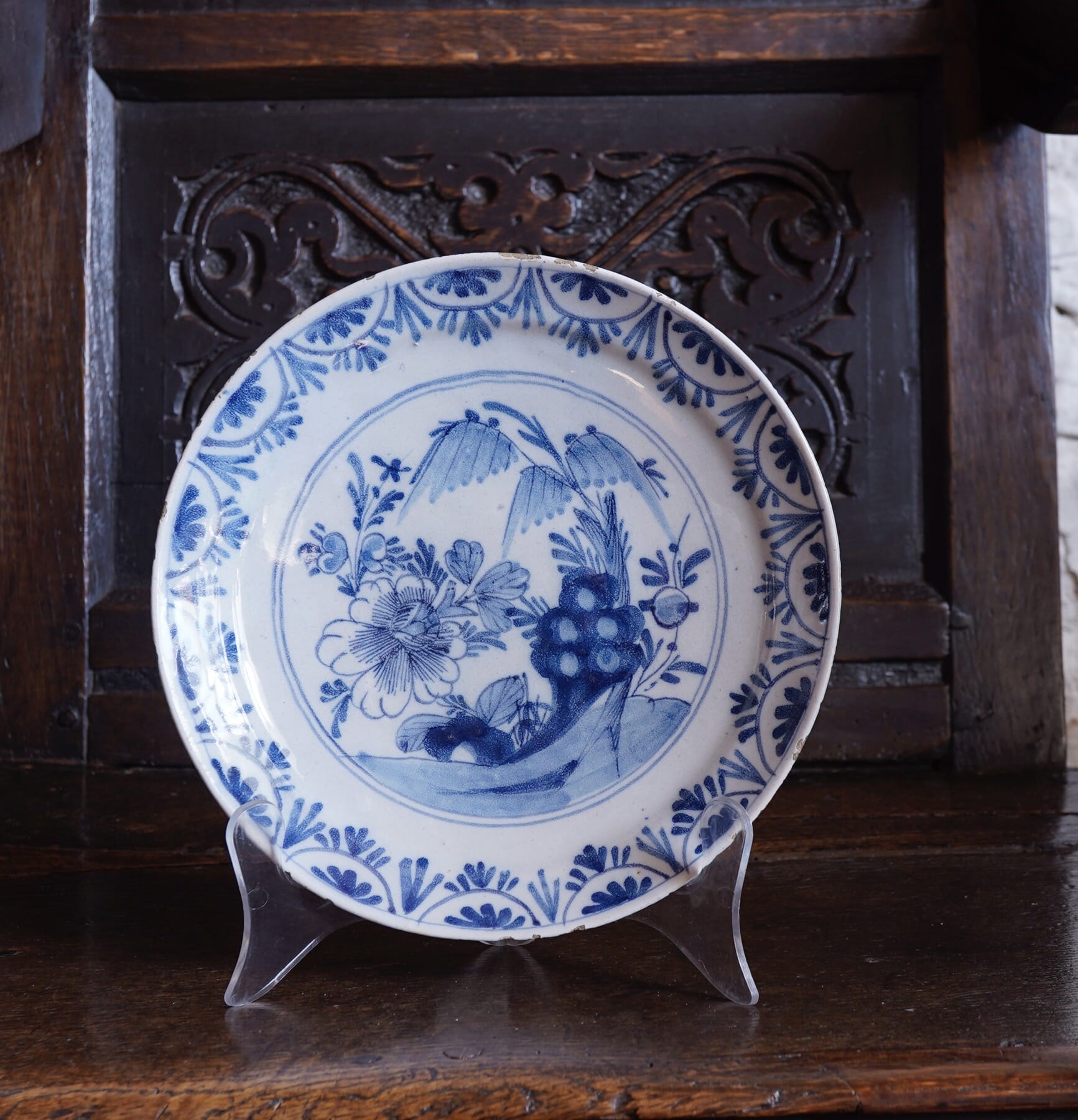
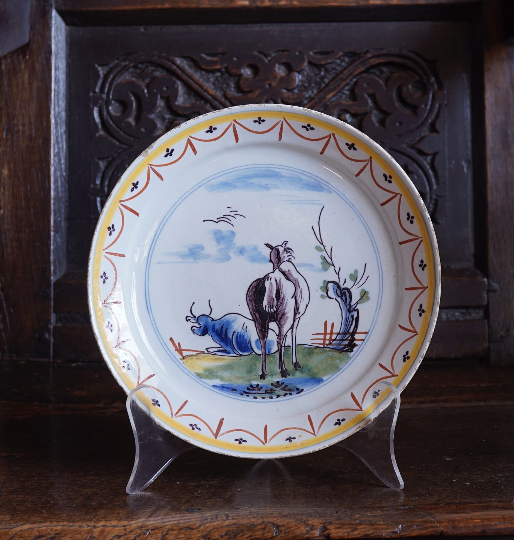
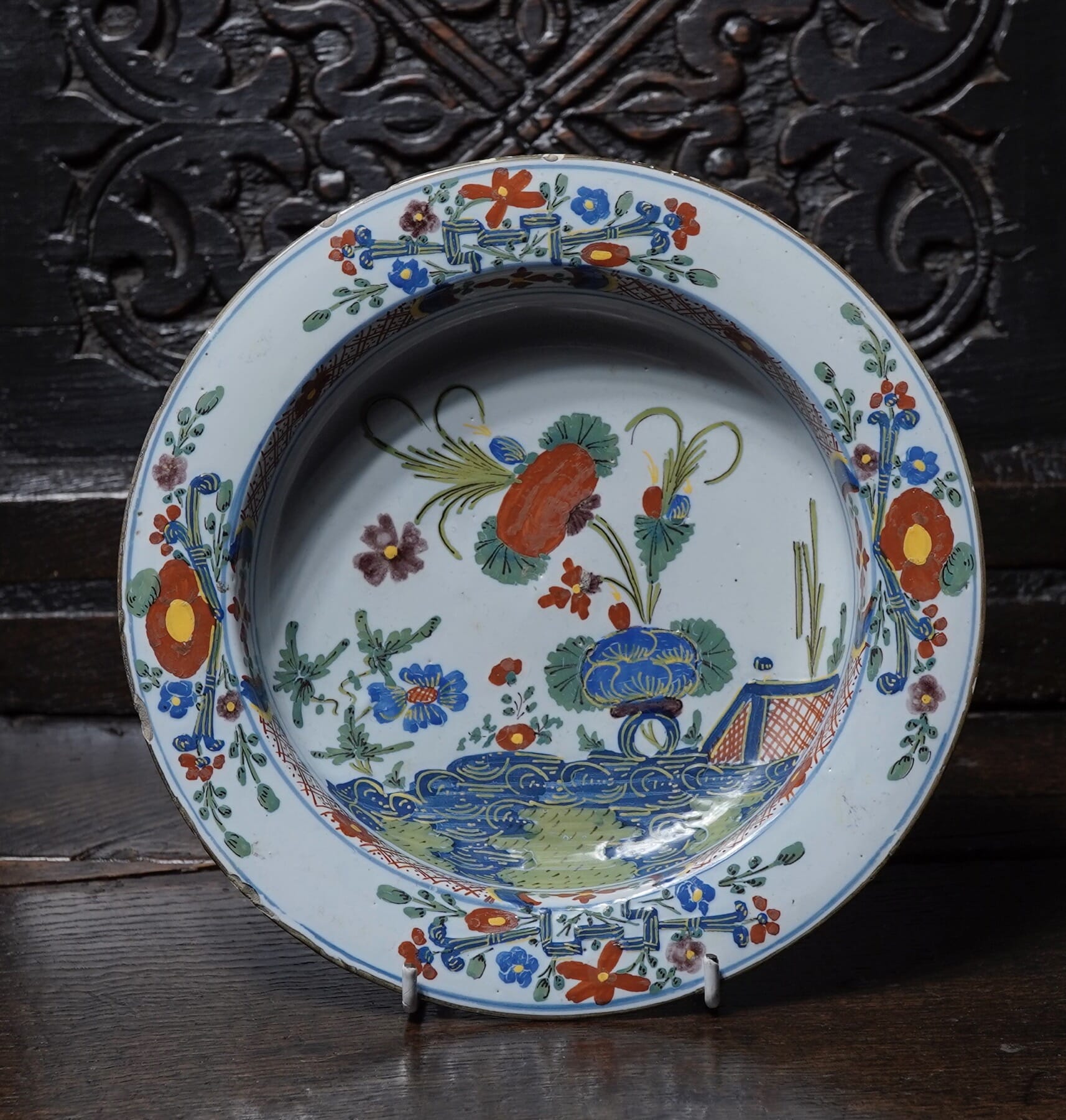
Delft & delft…

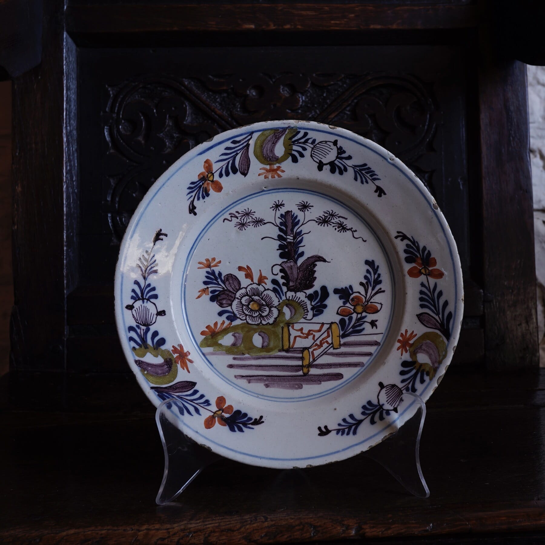
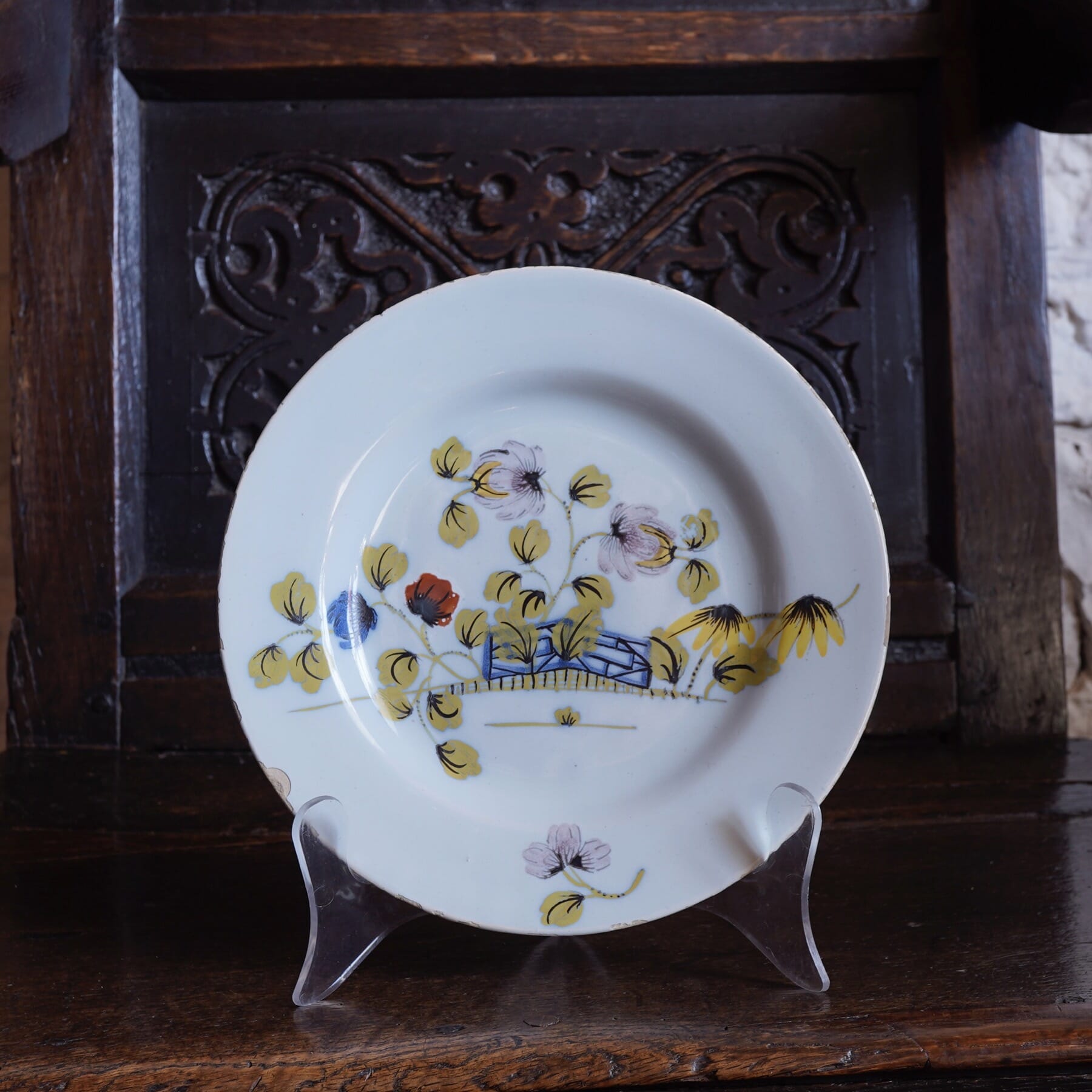
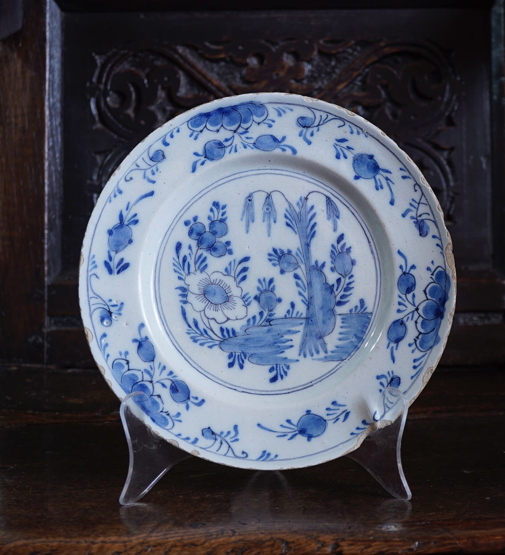
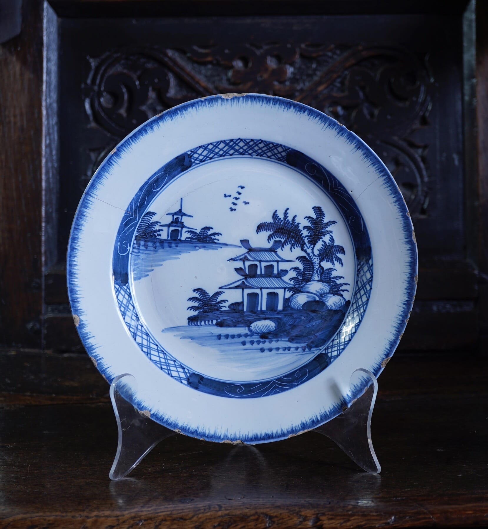
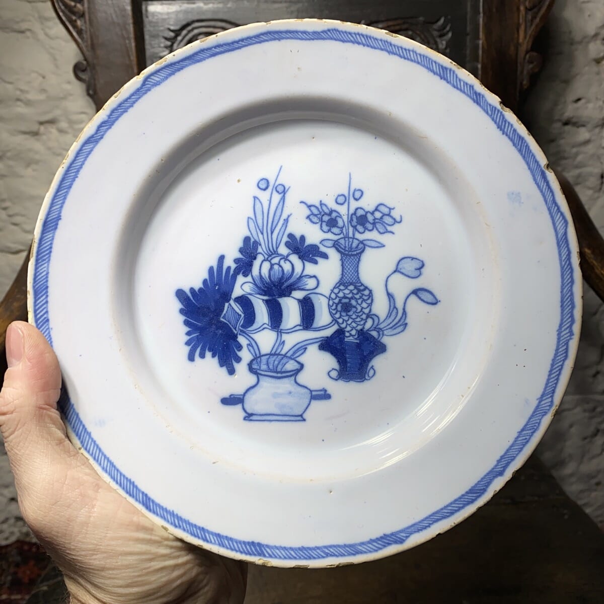
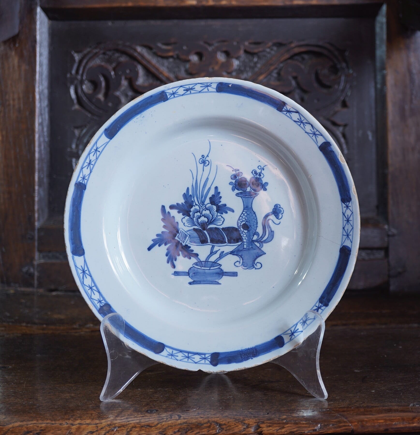
We have some Fresh ‘Delft’ and ‘delft’ pottery.
What’s the difference? -Capital D is for the Dutch Delft, while the English version is designated a lower-case ‘d’. France calls it ‘Faience’, Germany ‘Fayence’, and Italy ‘Maiolica’.
Of course, it’s all the same technology: Tin oxide (a white powder) is added to the glaze to make it opaque and white, similar to the more technical porcelain. The reason can be seen when there’s a chip that reveals the clay body underneath: inevitably, it’s a coarse reddish-brown colour, nowhere near as attractive as the tinglaze white for a background.

18th century Porcelain

A fine selection of 18th century English & Continental Ceramics, including some ‘Superb Sèvres’.

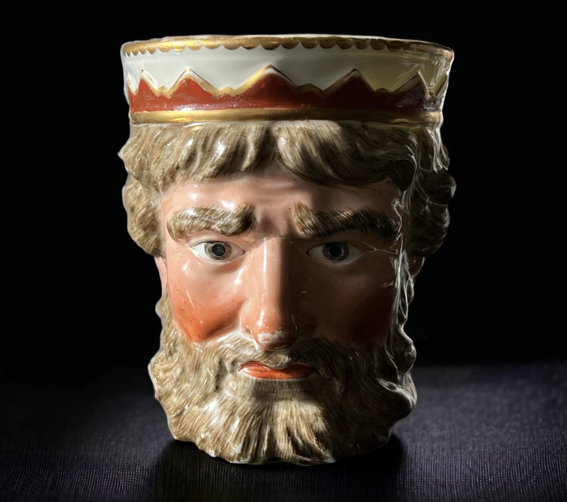
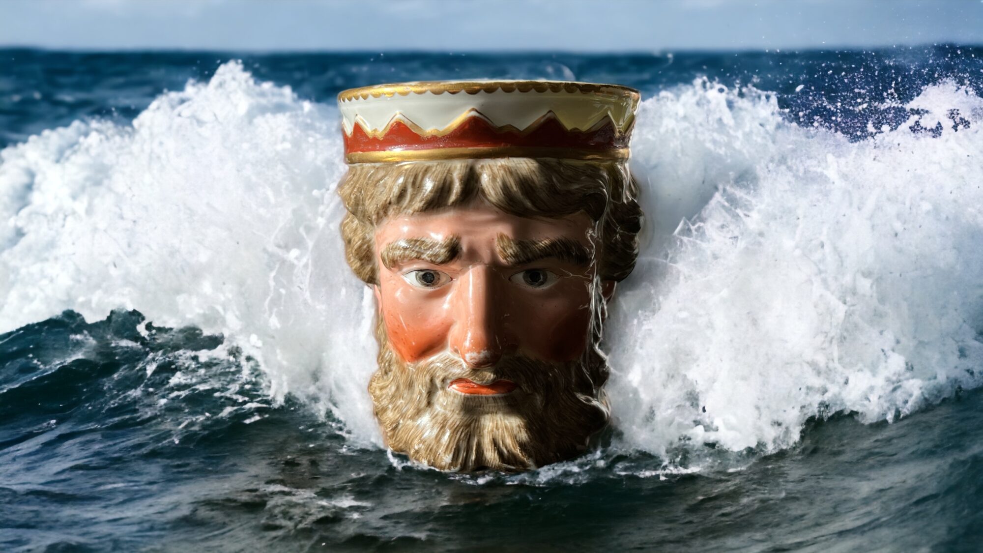
Derby Neptune Mug.... in its natural habitat! Moorabool Antiques, Geelong
Derby ‘King Neptune’ Mug, circa 1790…. in its natural habitat! artwork ©Moorabool Antiques, Geelong
Posted on

Some Stunning Sรจvres

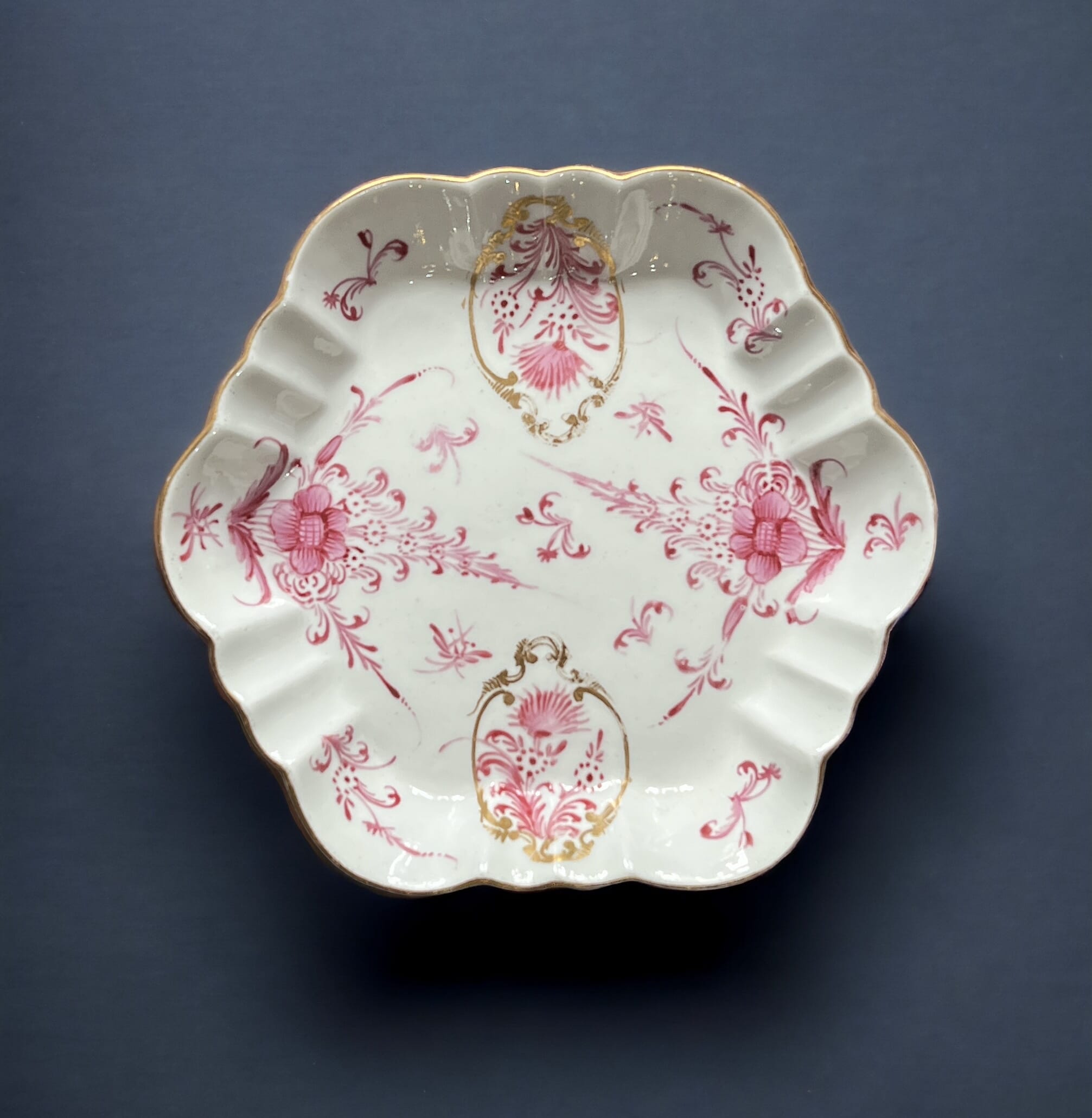
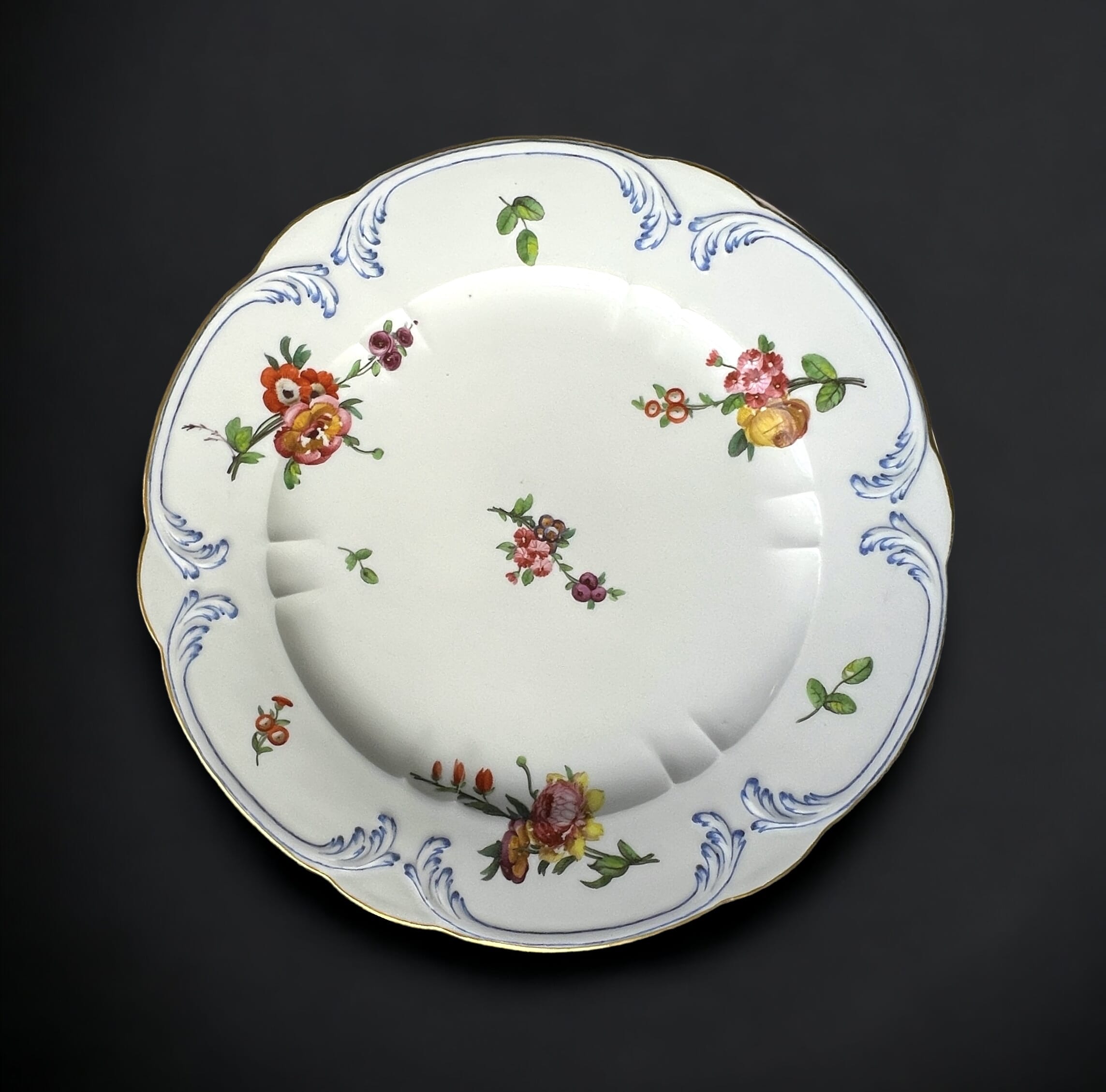
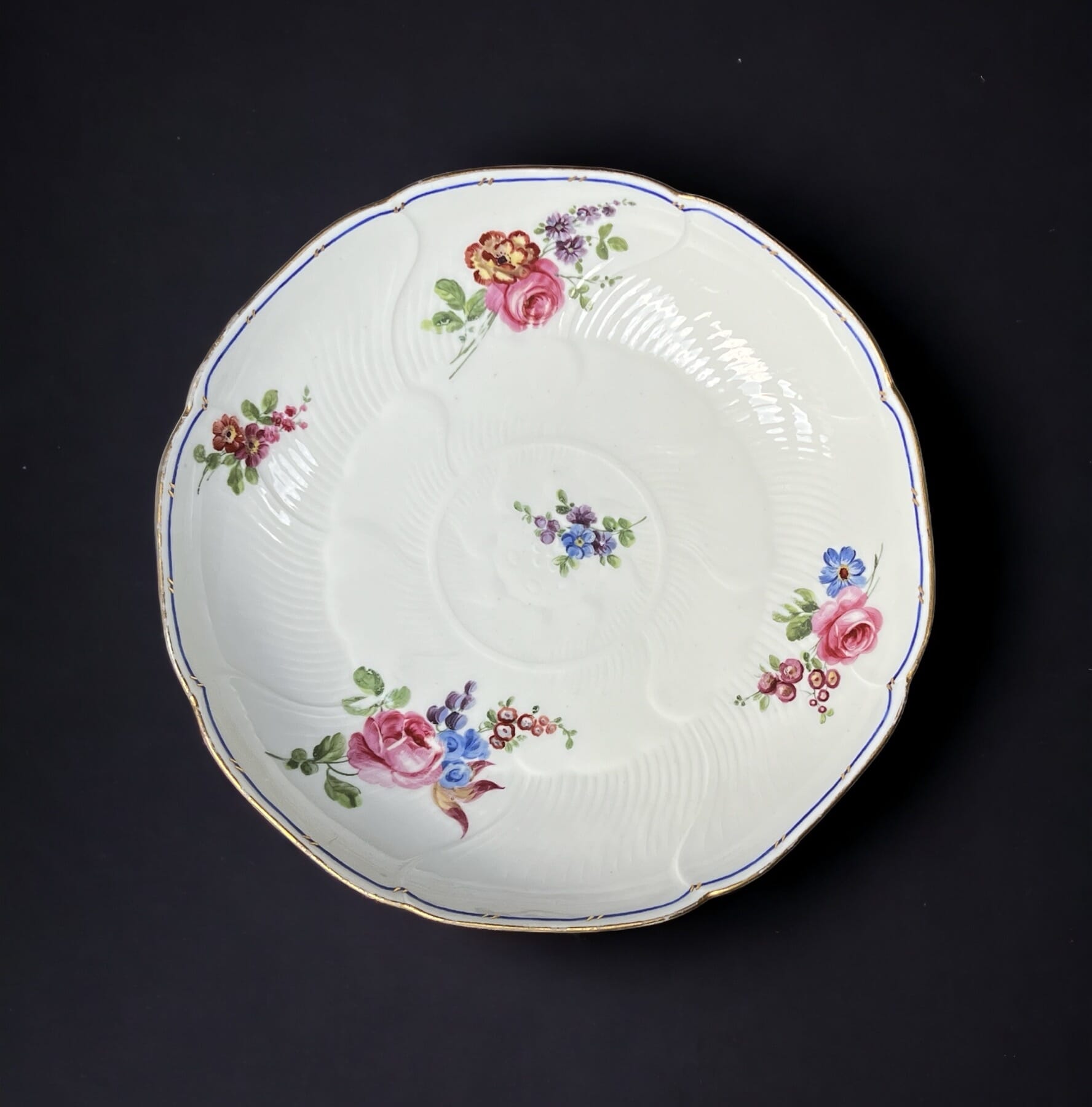
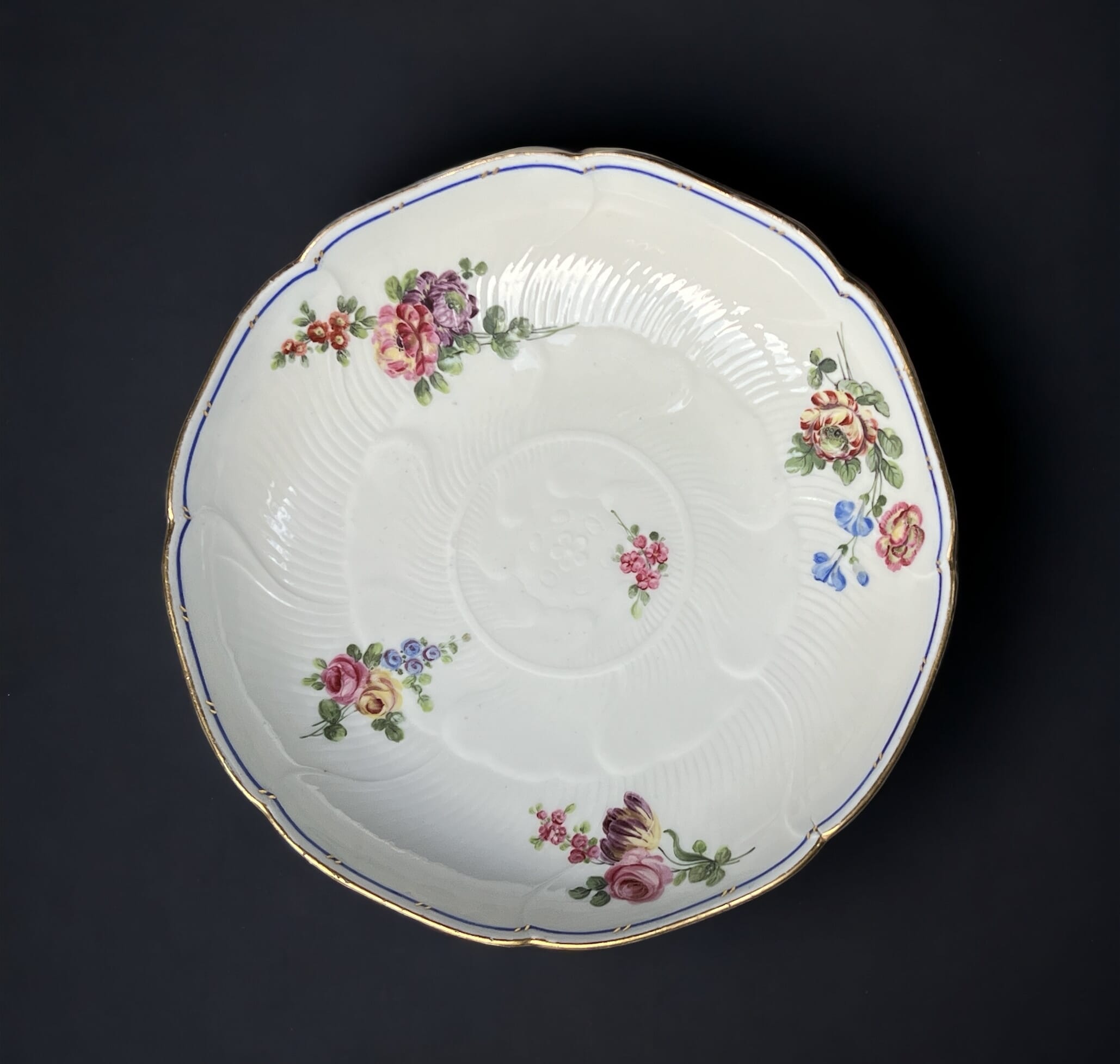
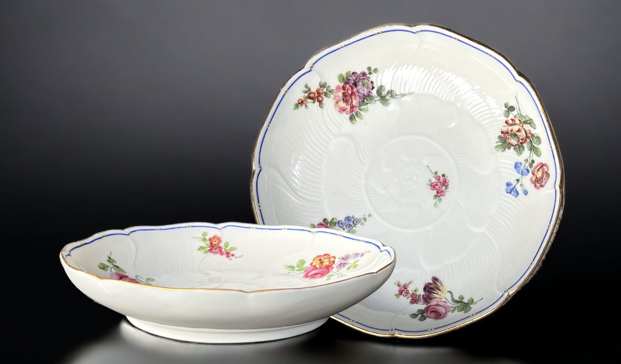
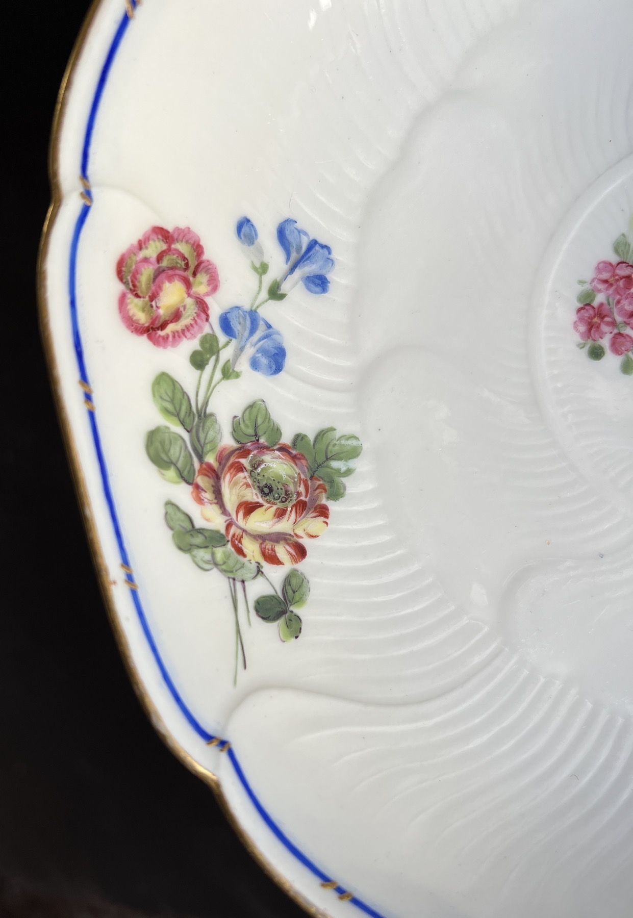
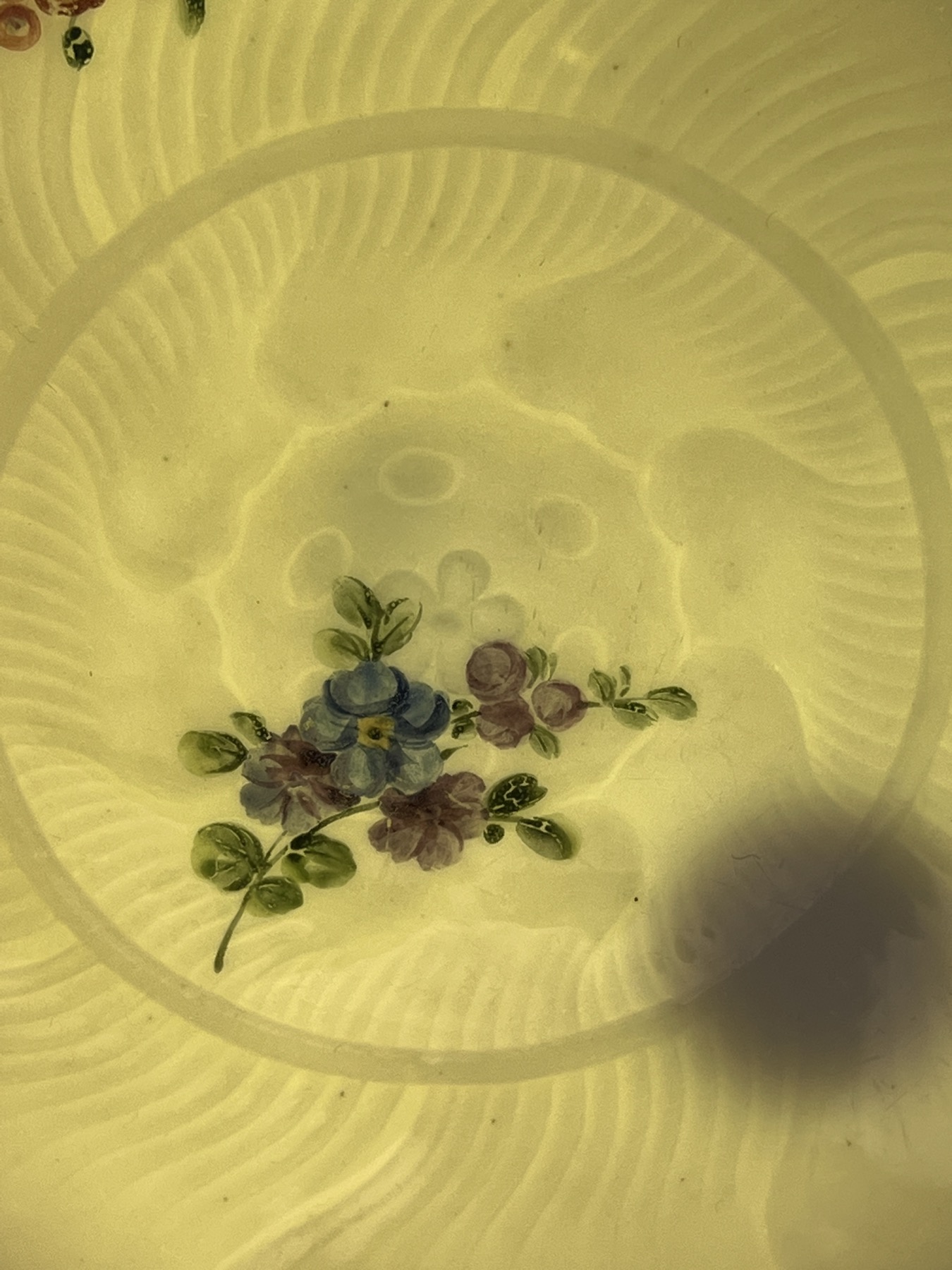
Sรจvres lotus-moulded dish, compotier rond, flower sprays, dated 1764

There’s a splendid pair of Sèvres dishes fresh to Moorabool.

Sèvres Porcelain, 1764

This shape is a compotier rond, and was a component of the large services, used alongside other shaped serving dishes in the centre of the table. A setting for a dozen might have two compotier rond, while the larger services, such as the massive Service Camaïeu Carmen de Fontainebleau (used by the Royal Family) had several dozen of this elegant dishes available.  

Sevres 1764. Moorabool Antiques, Australia

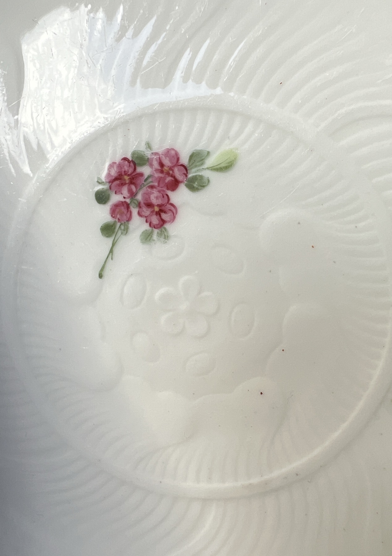
The moulded pattern allows the beauty of the moulded porcelain to show in a way the more painted patterns cannot. 

The elegant lotus flower design is borrowed from Chinese Export origins, where lotus-moulded dishes were a common sight in the early 18th century. 

Sevres 1764. Moorabool Antiques, Australia

One of the dishes simply has the crossed ‘L’s’ mark, enclosing the date letter ‘L’ for 1764. The other example is the same, but also has a painter’s mark: ‘L’. This allows us to put a name on the painter of the flowers: Louis-Françoise Lécot . He appears in the factory wages lists in 1763, after possible earlier unpaid work as a pupil from about 1761. He worked as a flower painter in 1764 – but is then absent from any reference the following year, giving him the working period 1763-4…. a perfect match for this dish. He does re-appear, after spending 6 years somewhere else, when he is documented as a hard-paste artist in 1771 (as opposed to the soft-paste that was the only body available at Sèvres in the 1760’s). His work is then remarkable and distinct, specialising in dramatic imitation lacquer pieces, with gilt or platinum/silver chinoiseries painted in the highest Rococo manner, or the exotic ‘Etruscan’ grotesques inspired by discoveries in Italy during the 1770’s.
These styles were the latest fashion for the French aristocrats, and bring to mind the lavish productions of the high-end Paris firms competing with Sèvres for the top-end customers. As Sèvres was the King’s factory, he enforced a monopoly on the industry, where colours & gilt decoration was exclusive to his own factory; the loop-hole found by eager factory owners was to attract an aristocratic patron to protect them – Clignancourt was under the protection of the Comet de Provenance (the future Louis XVIII) and Rue Thiroux was under the protection of the Queen, Marie Antoinette. Both produced very high quality hard-paste products in the 1770’s, and would have eagerly employed a Sèvres-trained artist such as Lécot. Locré & Russinger, otherwise known as La Courtille, was another such factory, minus the aristocratic protection; they ran afoul of the King’s Sèvres monopoly, with 2,000 pieces of illegal coloured & gilt porcelain being seized in 1780 – indicating they were producing a large amount of high quality hard-paste wares. Despite this set-back, they continued to make superbly decorated pieces as if nothing had happened….

Could Lécot have spent his time in some such Paris porcelain manufacture, learning the technique for decorating the hard-paste porcelain body? While he was away, Sèvres purchased the recipe for pâte tendre (hard paste) from Pierre-Antoine Hannong, the youngest son of Paul-Antoine Hannong, whose father had established the faience works in Strasbourg in the early 18th century . As often happens with generations, Paul-Antoine made a success of the firm when he introduced the first hard-paste porcelain production in France, in the mid-1750’s. He died in 1769, and his son, Pierre-Antoine became head. Two years later, he sold the secret of Hard-Paste to the Sèvres factory. They took a while, but once the right ingredients were sourced, Hard-Paste was made (alongside Soft-Paste) from the mid 1770’s onward.

Lécot decorated garniture, 1775-6 Christies 2000
A Lécot decorated Sèvres garniture, 1775-6 – sold at Christies NY in 2000 for $1.1 million US….

When he returned in 1771, Lécot was able to paint on the new Hard-Paste body. He worked on some truly impressive hard-paste orders, and all major collections seem to feature his dramatic 1780’s Chinoiseries. This early example of his Soft-Paste work from his brief appearance at Sèvres in 1763-4 is a lovely rarity.

ref. Rosalind Savill, The Wallace Collection Catalogue of Sèvres Porcelain, London, 1988, Vol. III, pp. 1043-4 for more on Leçot.


Jean Bouchet, active at Sèvres 1757-93

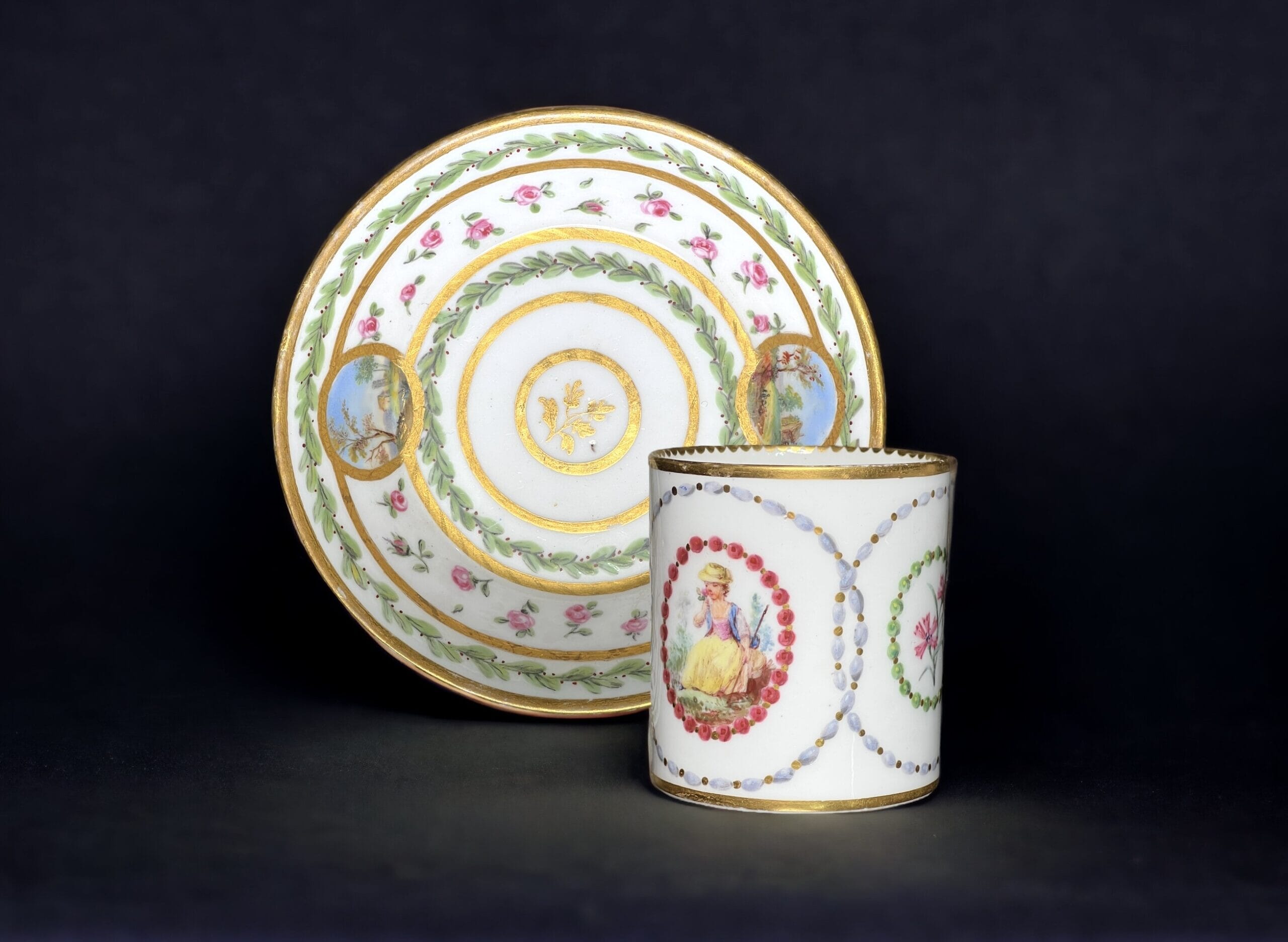
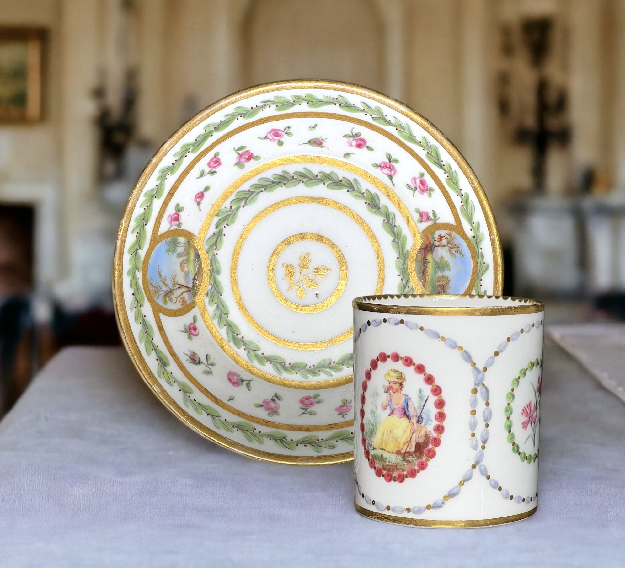
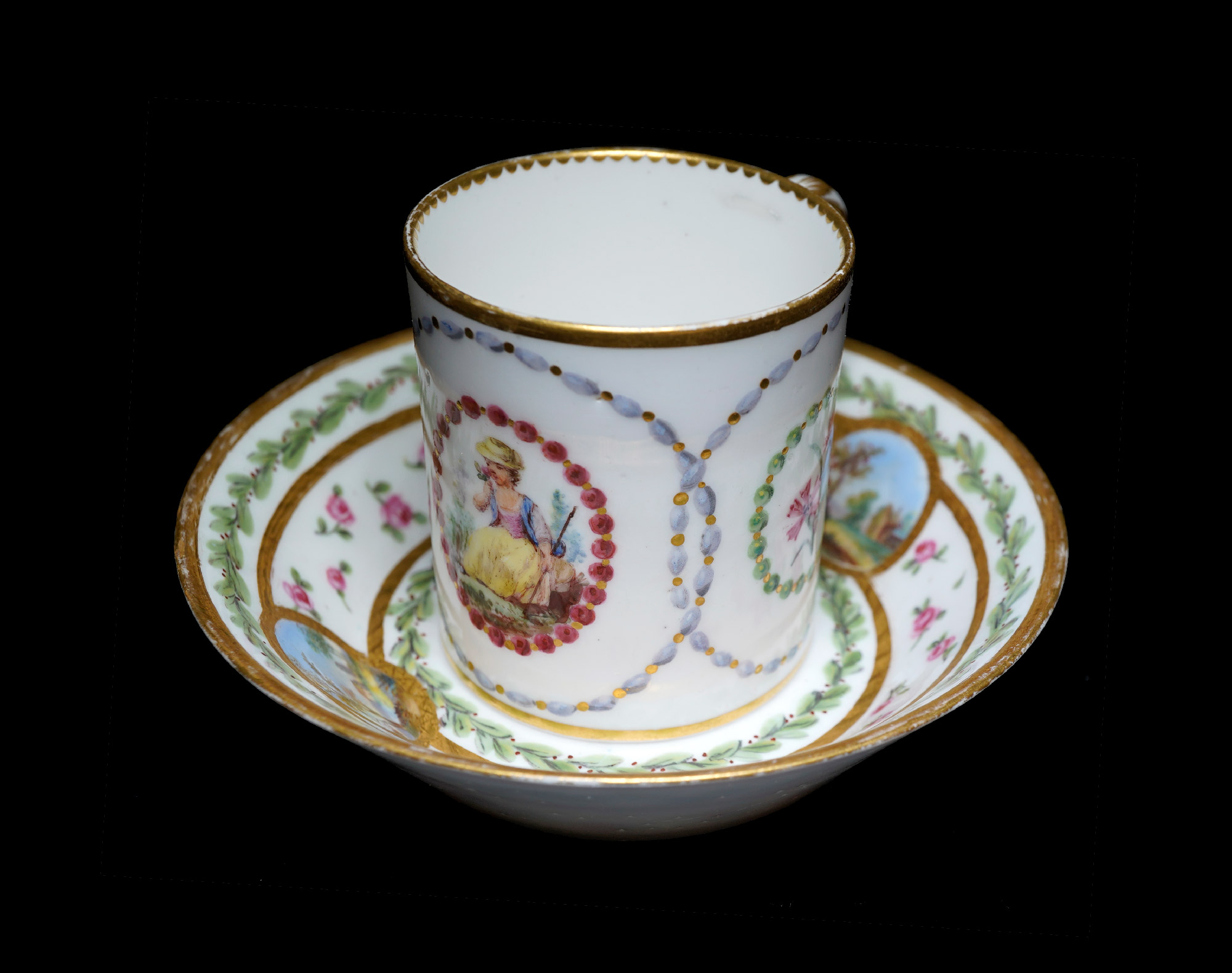
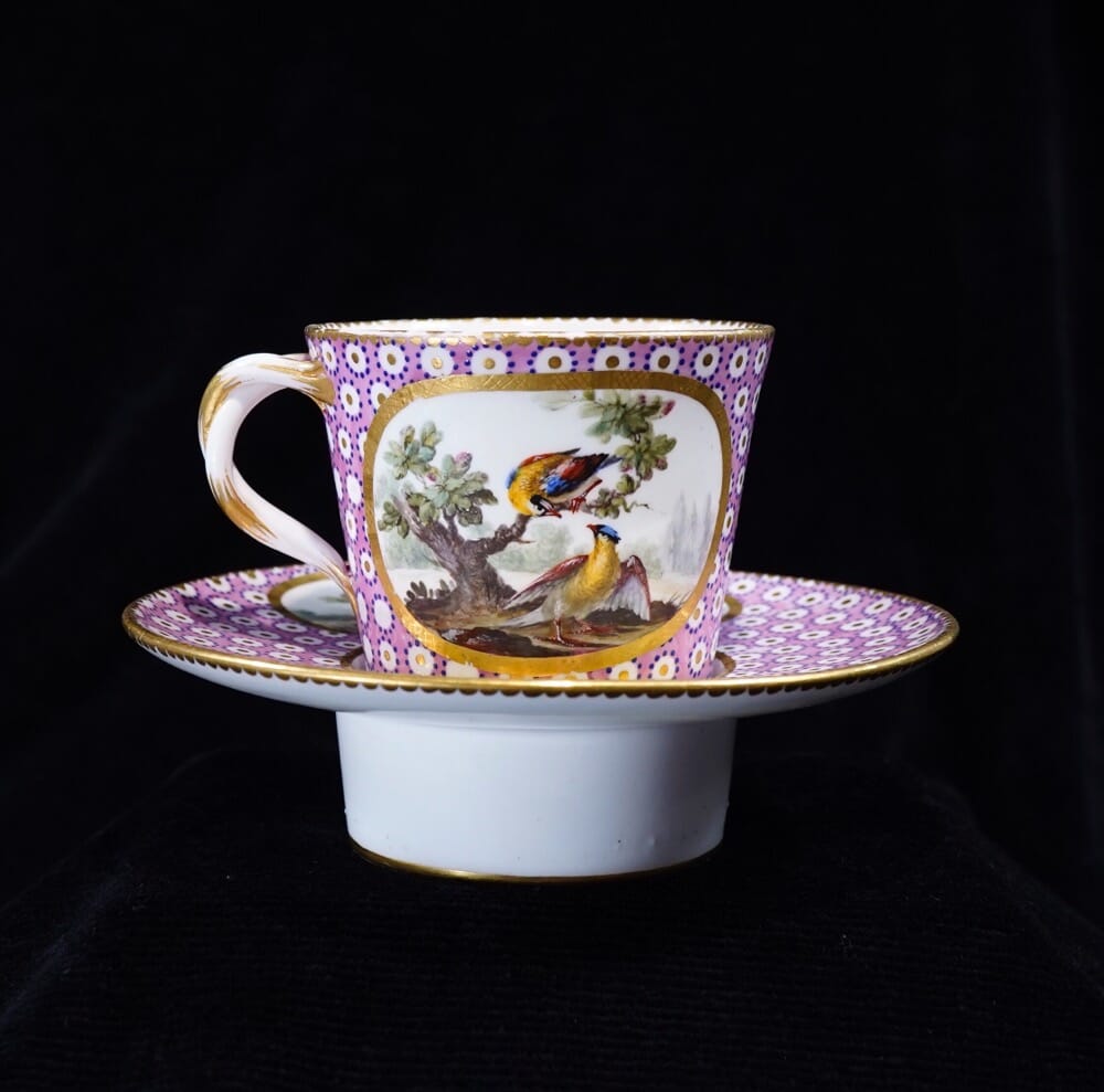
Sèvres coffee can & saucer, scenic panels by Jean Bouchet, dated 1781
Sèvres cup & saucer, scenic panels by Jean Bouchet, dated 1781

This lovely cup and saucer are a ‘recently married’ pair. While the saucer has been in the Rosenberg Reference Collection in Geelong for a while as a fine example of Sèvres, the cup is a recent acquisition; remarkably, it is the same artist at work at Sèvres in the same year, 1781. While there is a difference in the details, the overall harmony makes them a delightful rarity. And of course, they have a story to tell…..

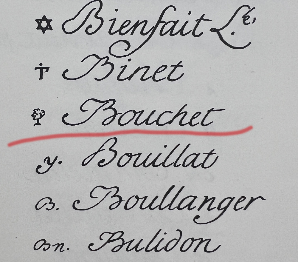
The artist is Jean Bouchet. He used a pictorial mark, a ‘tree’. While in the factory records – and the subsequent publications that used this as their source for what the marks looked like – he carefully drew a realistic tree with roots, trunk and layered foliage, while in practice he simplified it into something that looks like a furry lollypop…. This would have taken much less time & concentration!

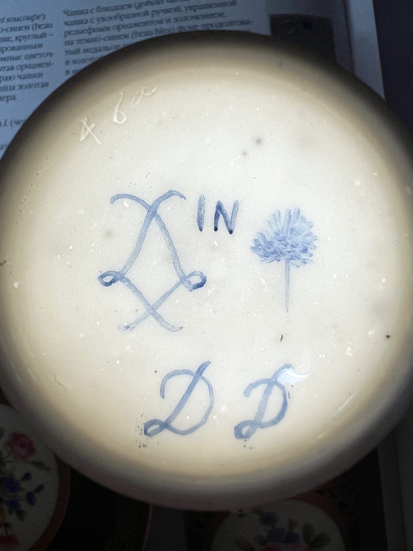
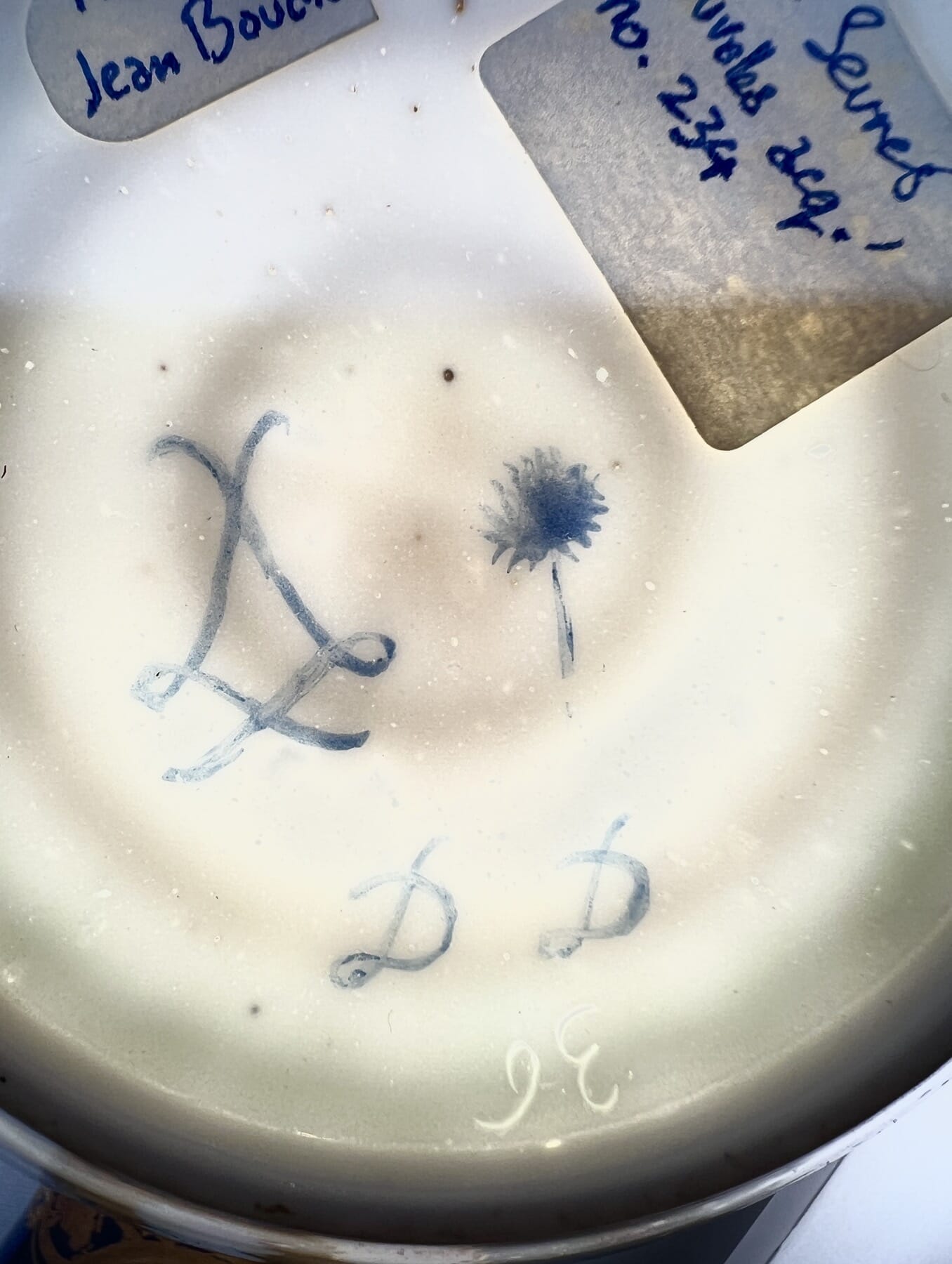
The cup and the saucer are both 1781, dated with the same ‘DD’ in a distinct cursive script, the hand-writing of Jean Bouchet; there is also his distinct mark, a tree symbol. He is recorded as active at Sèvres 1763-93, a painter of human figures, landscapes, and flowers. He is very well represented in major collections, with his small landscapes being very appealing to original customers and present-day connoisseurs alike.

Jean Chauvaux jeune‘s ‘bead’ borders

The cup has another painter’s mark also – ‘IN’, the mark of Jean Chauvaux jeune, a gilder active 1765-1802. As there is not a great deal of gilding on the cup, we would suggest he was responsible for the unusual ‘bead necklace’ painting of the borders, where they are given highlights & shadows to make them appear rounded.

The incised workman’s marks 36 & 48a are both recorded by Saville in the Wallace Collection’s catalogue, vol III pp1130&1133. ’36’ is recorded 1770-90’s, while ’48a’ is recorded 1777-92. There are no names associated with these individuals.

In the British Royal Collection, both ’36’ and ’48a’ are present in several assemblages, including a set of very similar cups & saucers from the same period.

Sevres Cup & Saucer By Bouchet 1781
Sevres Cup & a Saucer by Jean Bouchet, 1781. Moorabool Antiques, Geelong

See our cup & saucer here >>

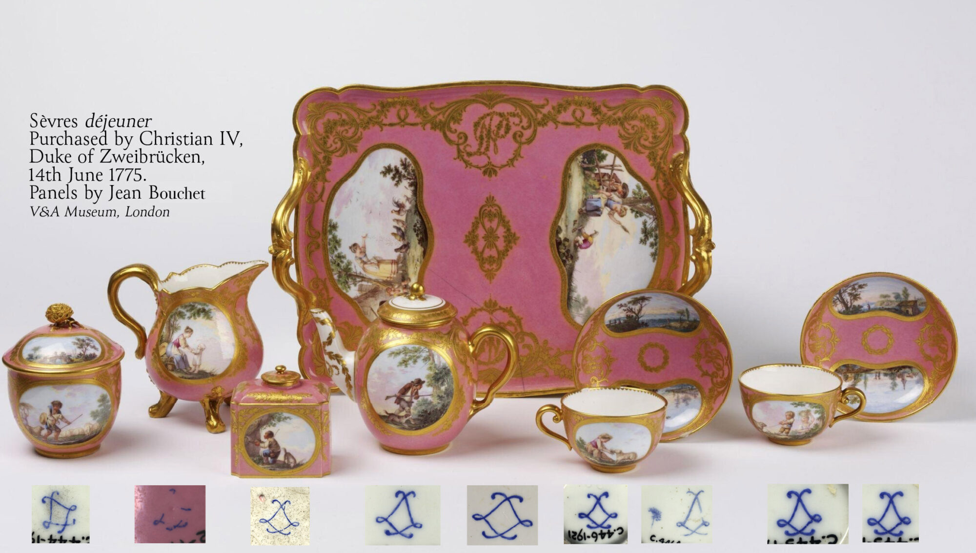
A complete déjeuner by Jean Bouchet, in the V&A Museum, London

It’s rare to see a complete group of porcelain from this era still together. This set in the Victoria & Albert Museum, South Kensington, is a fascinating rarity to study. It was bequeathed to the museum in 2015, and leading expert Rosalind Savill has identified it as one of four déjeuners bought by Christian IV, Duke of Zweibrücken, on the 14th June 1775. This was just 3 days after the event of the decade in France, the coronation of Louis XVI which the Duke naturally attended. Their cost was 840 livres, the equivalent of tens-of-thousands in today’s currency…. an expensive souvenir!

Marks correspond to the piece above. Note no date letters, and only a single artist’s mark. See this at the V&A Museum here >>
1777 Sevres Plate by Michel - explainer -©Moorabool.com
1777 Sevres Plate by Ambroise Michel- see below. ©Moorabool.com

The marks on Sèvres should follow the rules and be very logical, but in practice they can be quite random. The system was there to provide the company with a way of tracking the various production steps and those responsible for the work: in a perfect scenario, the répareur, or workman who puts it all together, incised his particular mark, and both the artist and the gilder would include their mark. Then the factory mark, the crossed ‘L’s’ for Louis were painted, and inside them the code for the year it was decorated.


As you can see in the dejéuner set examples above, this isn’t always the case: of the nine components of the existing set, just a single example has a painter’s mark, here the ‘tree’ of Jean Bouchet, and none have a year mark! It is only the monogram found on the tray, along with the factory records recording Bouchard’s work on the commission, and the solid provenance that allow this remarkable set to be dated. This helps explain the number of non-conforming Sèvres items we come across, which have no date code or artist’s mark. They were quite probably part of a set where only a few items were marked.

Reference:  Savill, Rosalind: A Sèvres Porcelain Tea Service in the Victoria and Albert Museum with Surprising Credentials, French Porcelain Society Journal, Vol. II, 2005, pp. 39-46.

Of course, fraud is always a concern, and later-decorated pieces can often be non-conforming – but usually, a date code is part of the deception, with the first years ‘A B C’ for 1754, 55 & 56 being the favourite – the trouble is, the style of decoration & object type was often not yet invented at that date, a dead giveaway!


Our Sèvres Stock