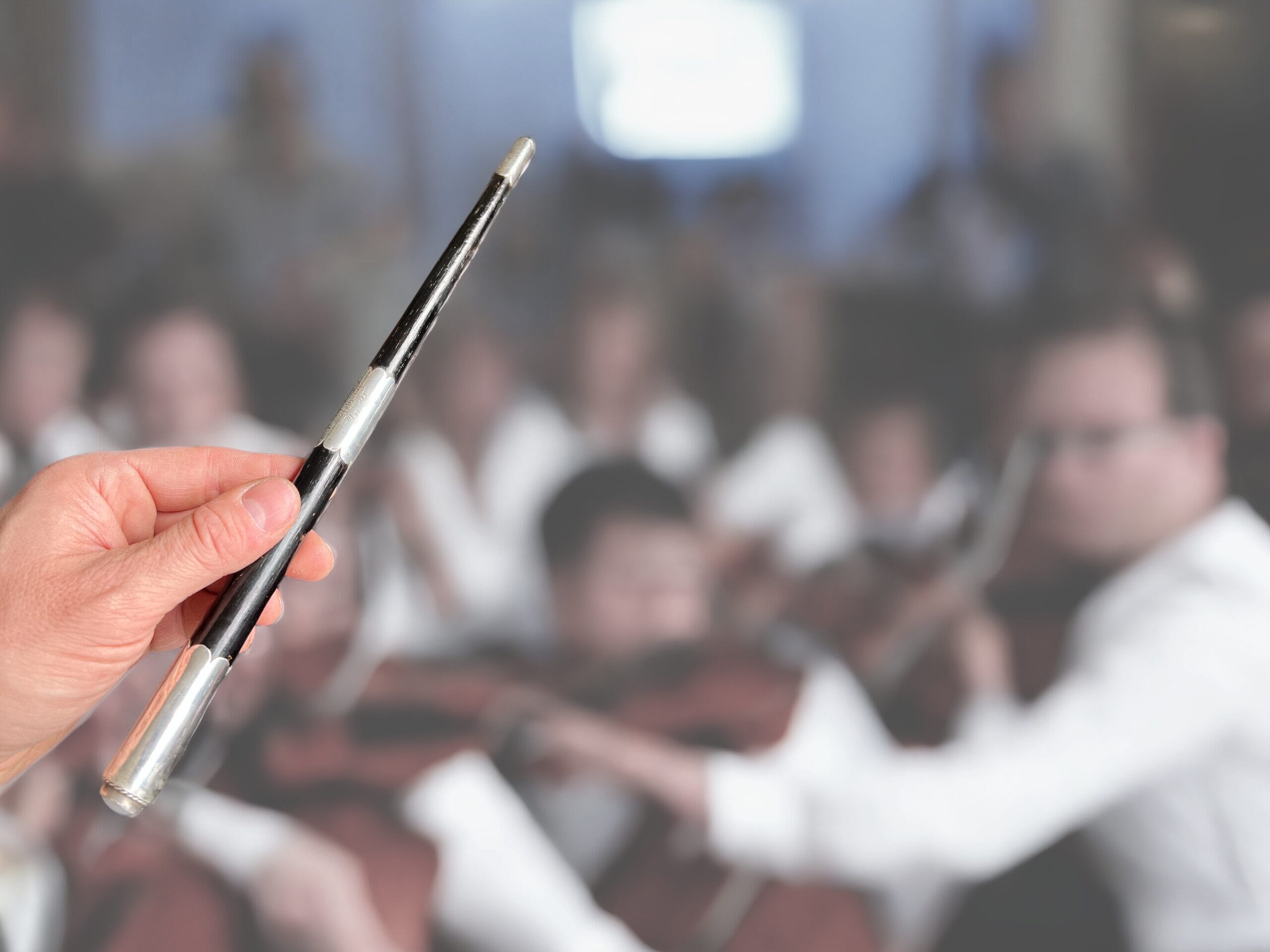
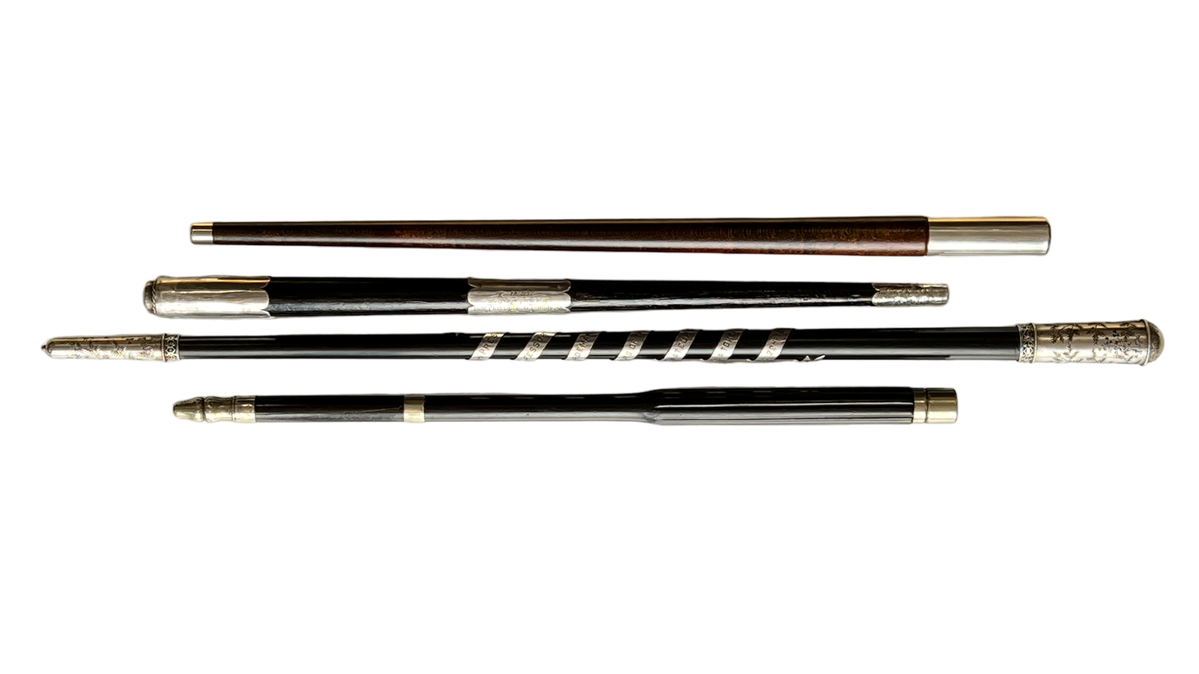
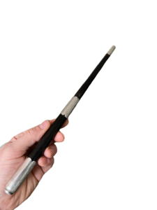
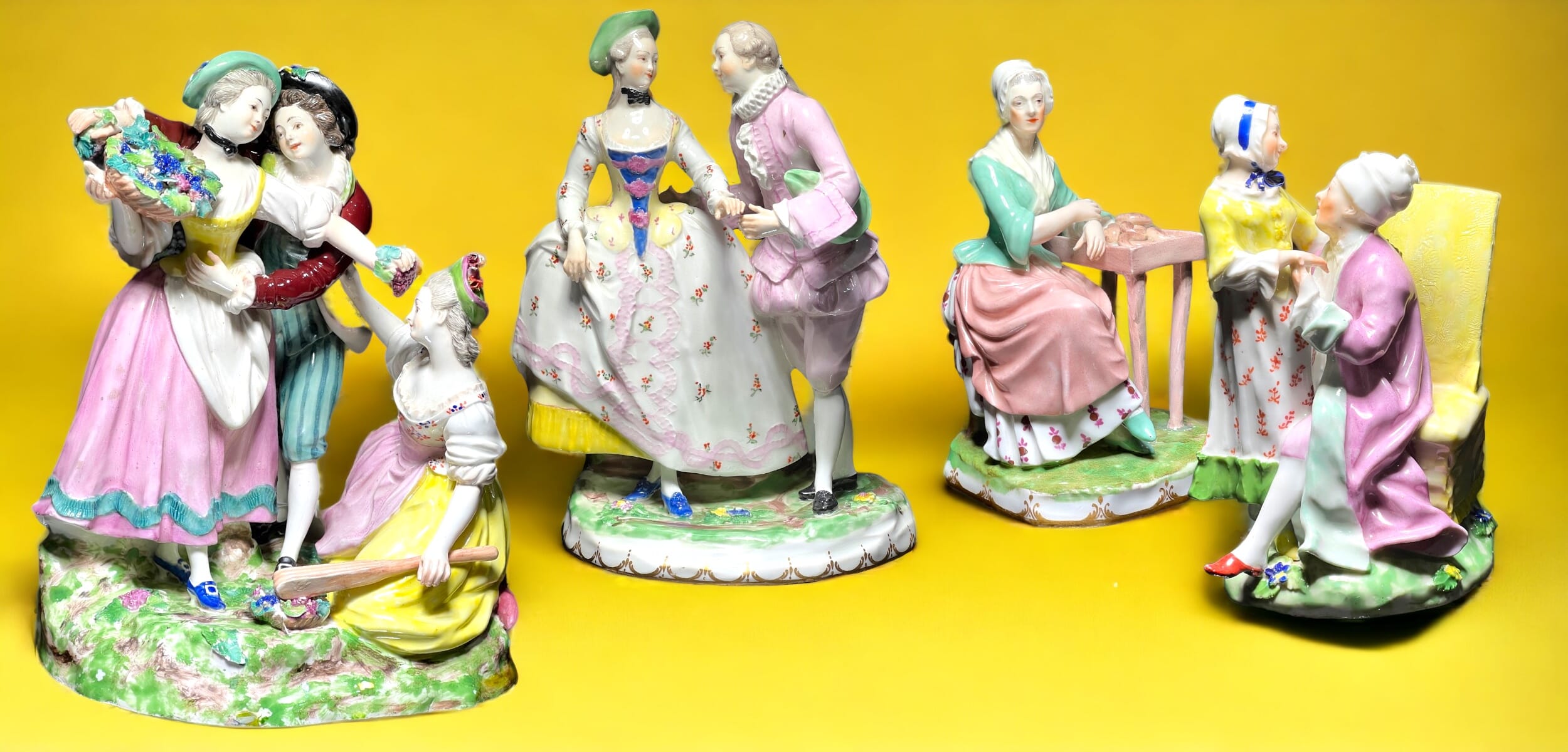
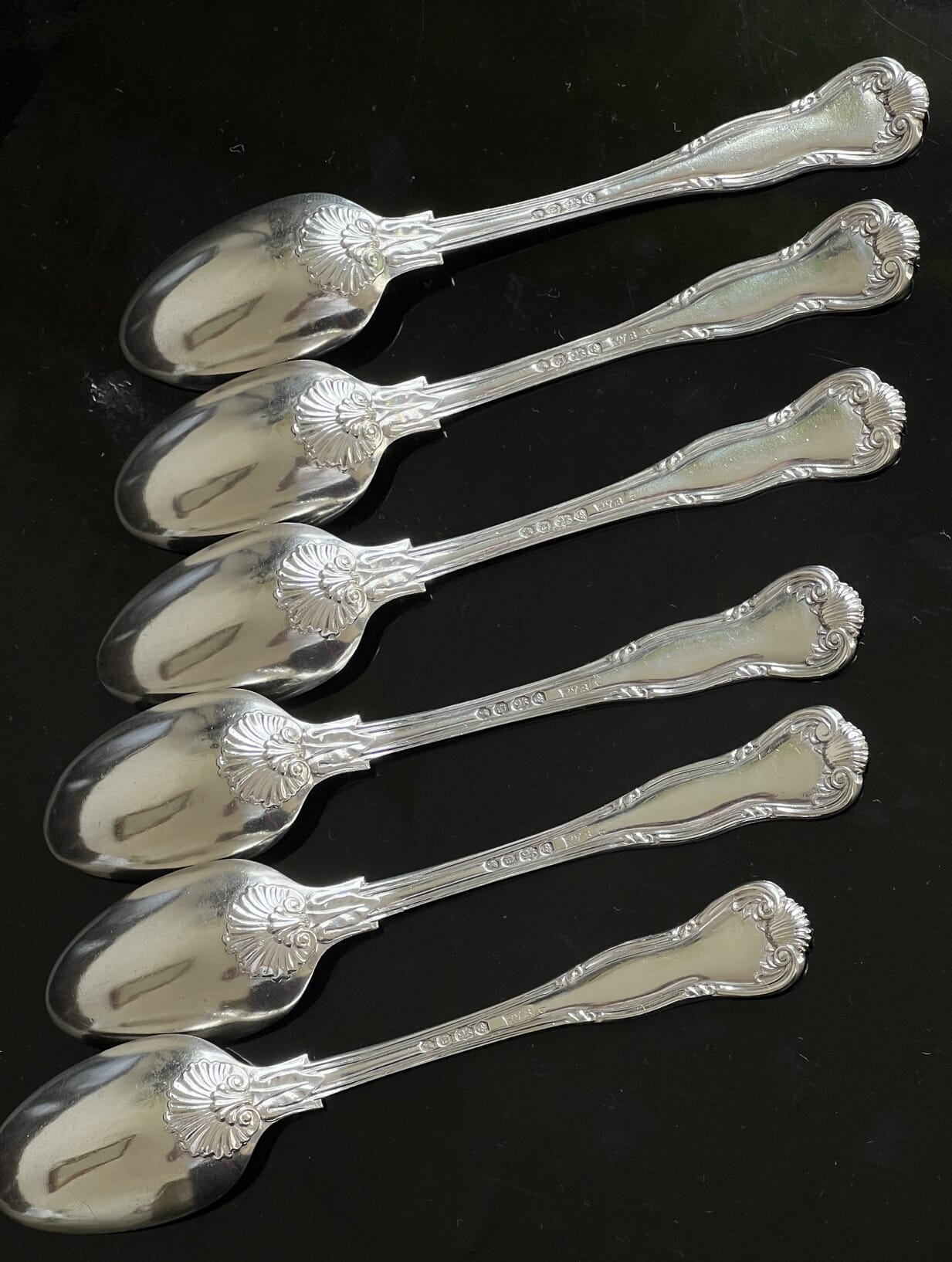
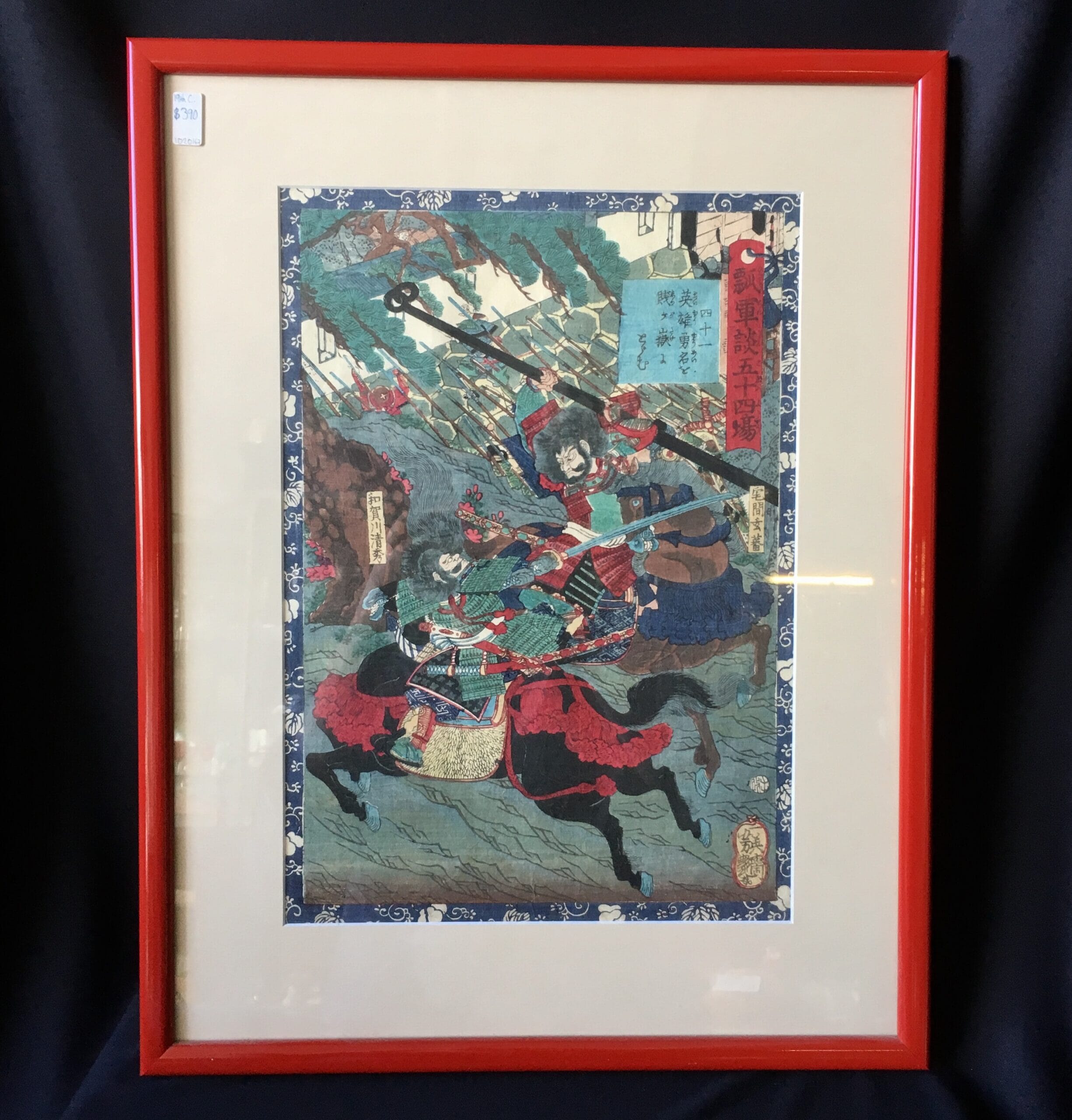
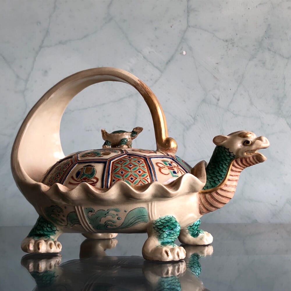
Any conductor needs a few batons – and Moorabool has a few of these rarities ‘fresh to stock’.
They include three with inscriptions – some fascinating records of social history, one just a baffling enigma.
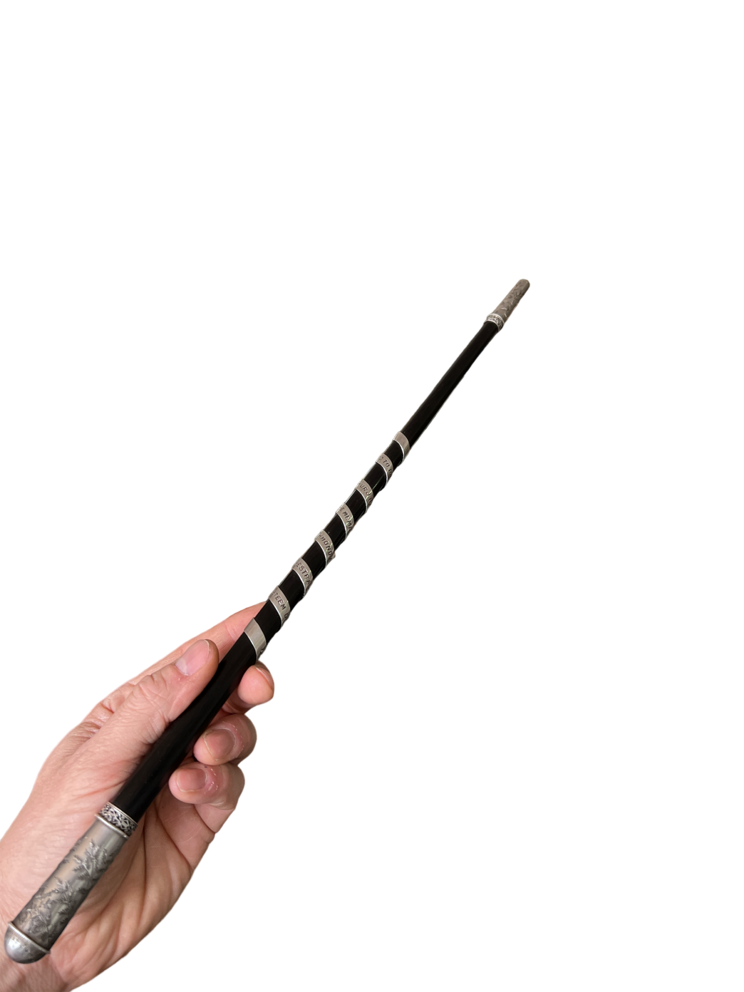
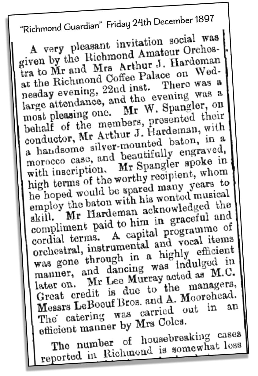
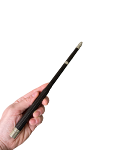
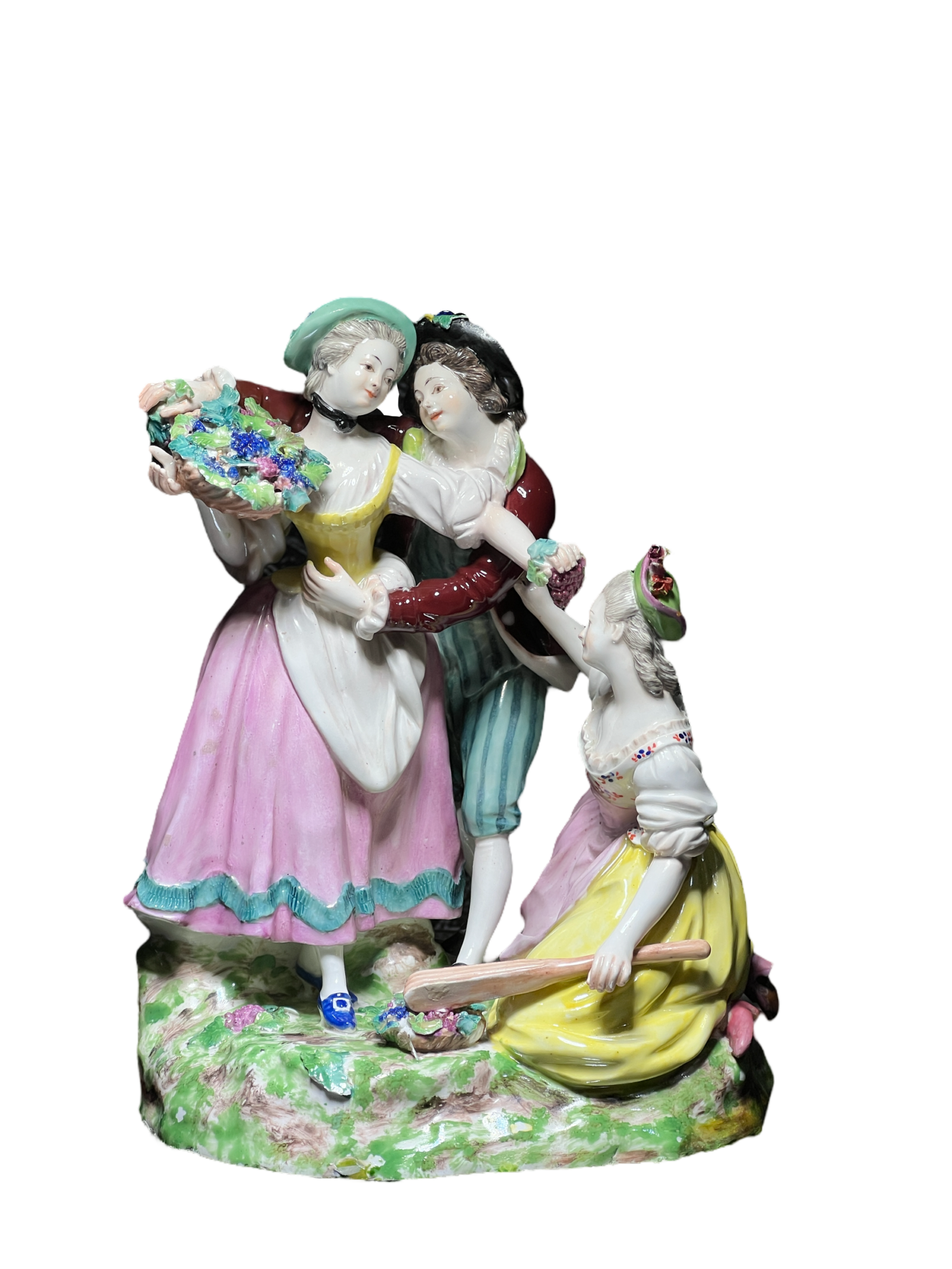
Perhaps you’re needing a baton for your Amateur Orchestra – like ‘Professor’ Arthur Hardeman? He was the recipient of a magnificent ebony example with silver mounts including an inscription winding its way down the shaft on a long silver ribbon: “Presented to Professor Arthur J Hardeman by members of the Richmond Amateur Orchestra as a Token of Esteem, 1897” .
Hardeman was a Melbourne musician, son of a Pianoforte dealer, and seems to have made his living giving lessons and performing with his ‘orchestra’. They gave him this magnificent Melbourne-made baton in 1897… as outlined in the newspaper article of the time:
Professor Hardeman’s Presentation Baton, 1897
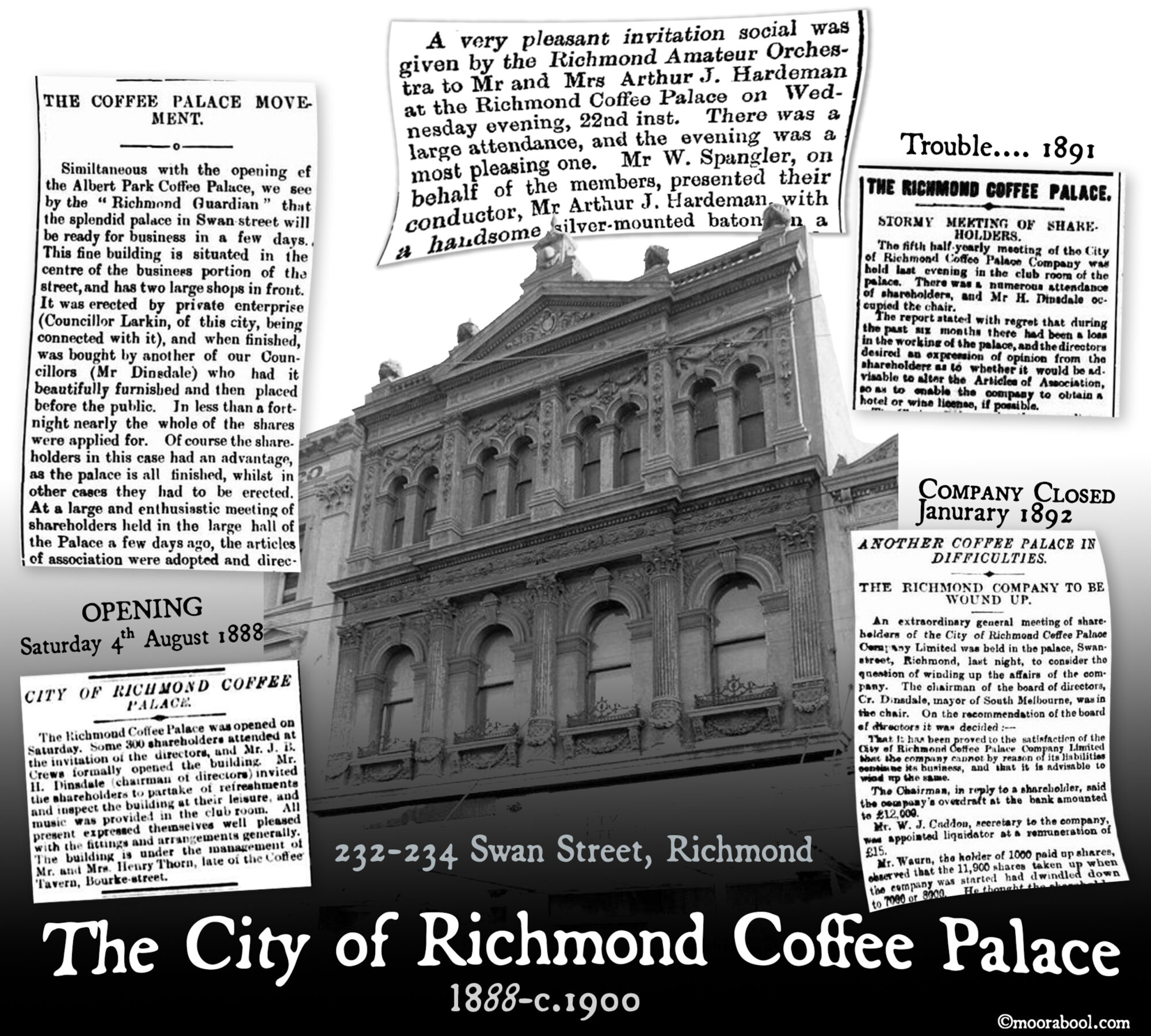
There’s a wealth of social history to be explored on this subject, including the untold story of the ‘City of Richmond Coffee Palace’, and ‘Professor’ Hardeman’s interesting background.
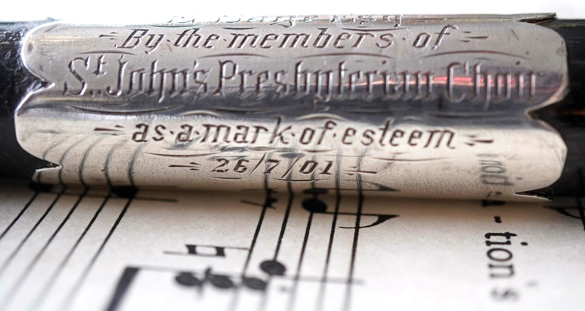
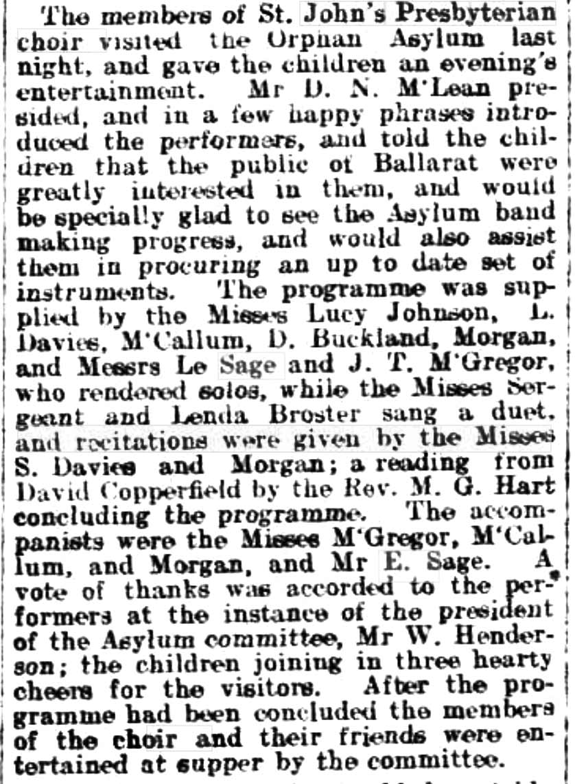
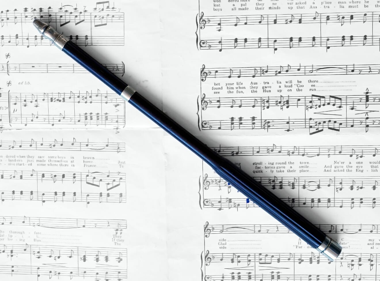
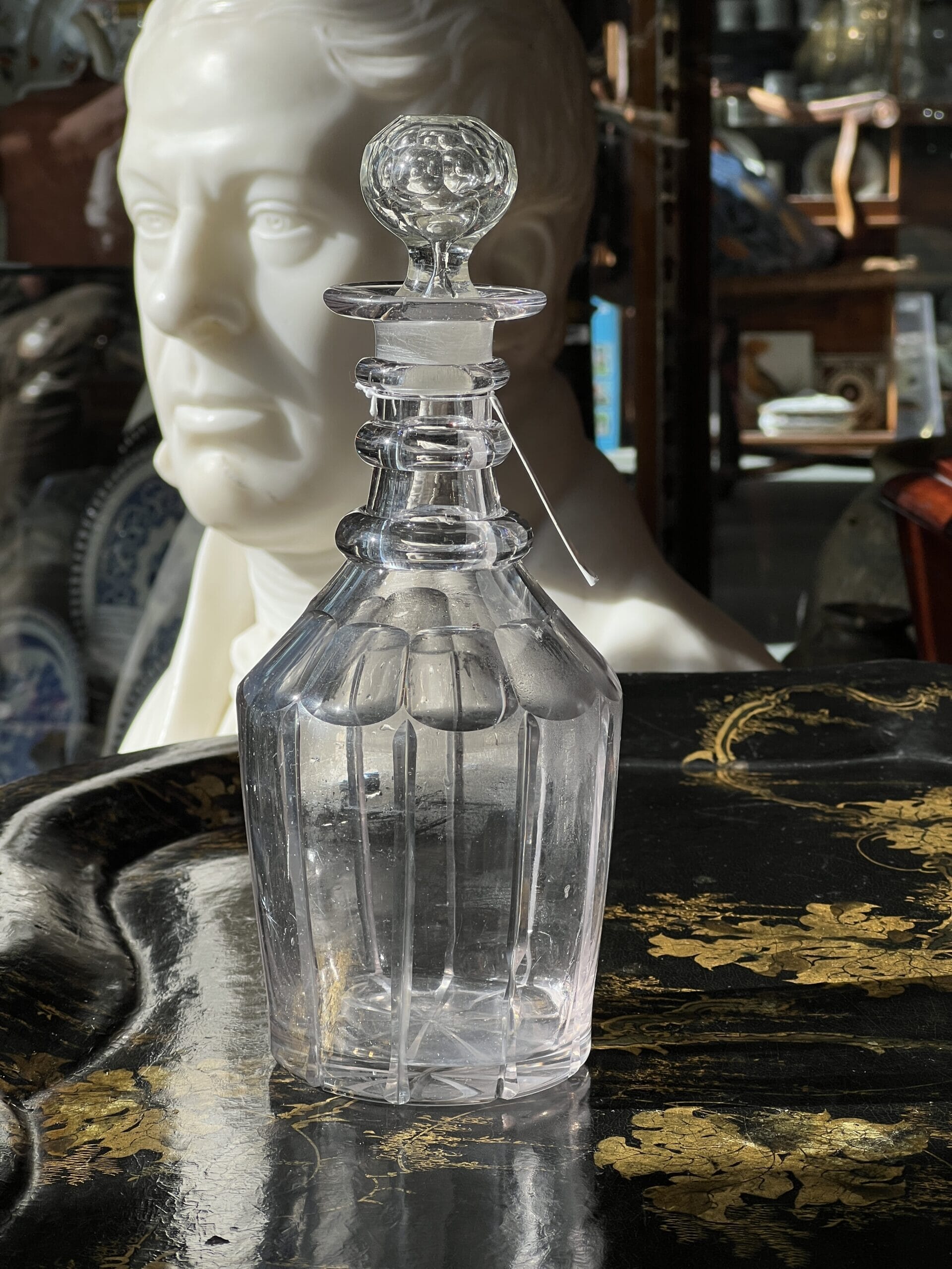
There are several other batons also, all fresh to stock – quite a collection. The other definite Australian example is also ebony, and has a presentation inscription also: “Pres’ted to E. Sage Esquire, by the members of St John’s Presbyterian Choir, as a mark of esteem, 26/07/01”.
E. Sage’s Presentation Baton, Ballarat, 1901
E. Sage’s Presentation Baton, Ballarat, 1901
E. Sage was a Ballarat identity, very active in the musical entertainment world from the 1890’s. He taught piano and voice in Ballarat, and helped form a musical group, called the ‘Curlew Orchestra’, for the ‘purpose of promoting the study of instrumental music and the entertainment of the inmates of the charitable institutions, and generally assisting by concerts in aid of worthy objects’.
In 1902, for example, there’s a report of an event he presided over: “The members of St John’s Presbyterian choir visited the Orphan Asylum last night, and gave the children an evening’s entertainment. Mr D. N. McLean presided, and in a few happy phrases introduced the performers, and told the children that the public of Ballarat were greatly interested in them, and would be especially glad to see the Asylum band making progress….”
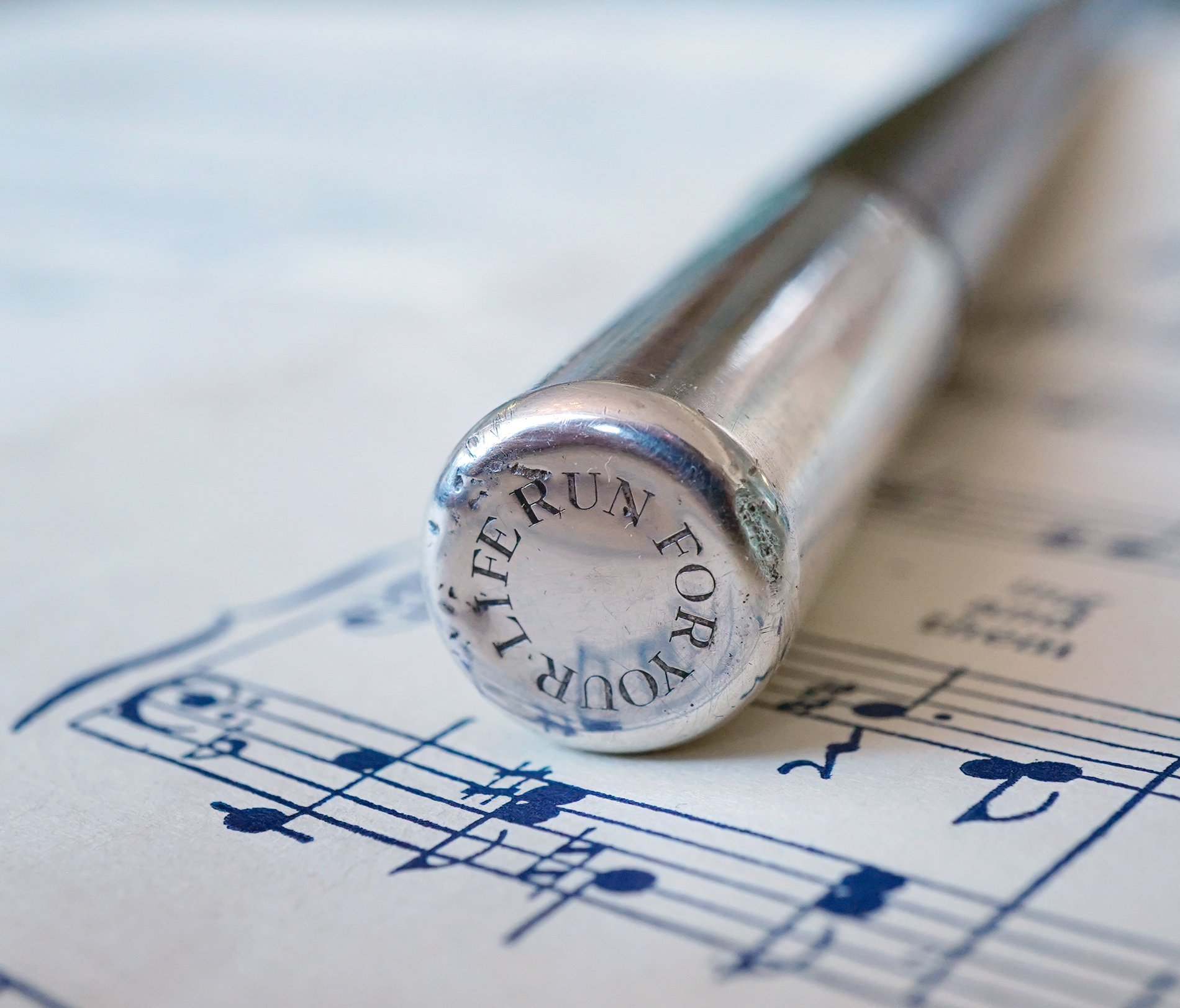
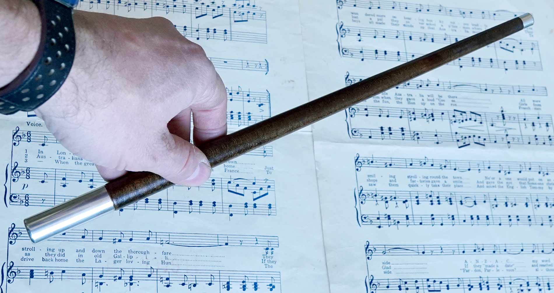
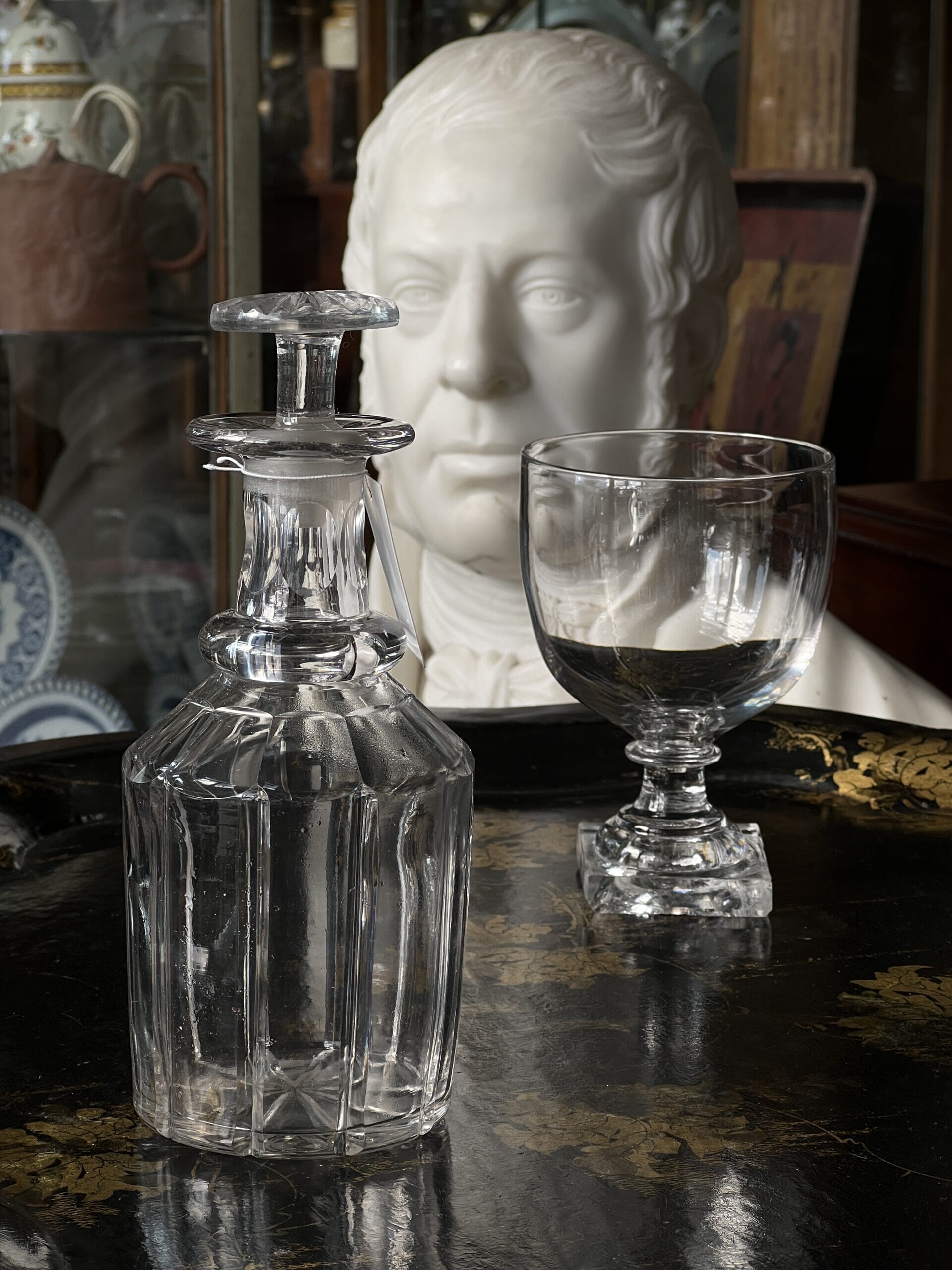
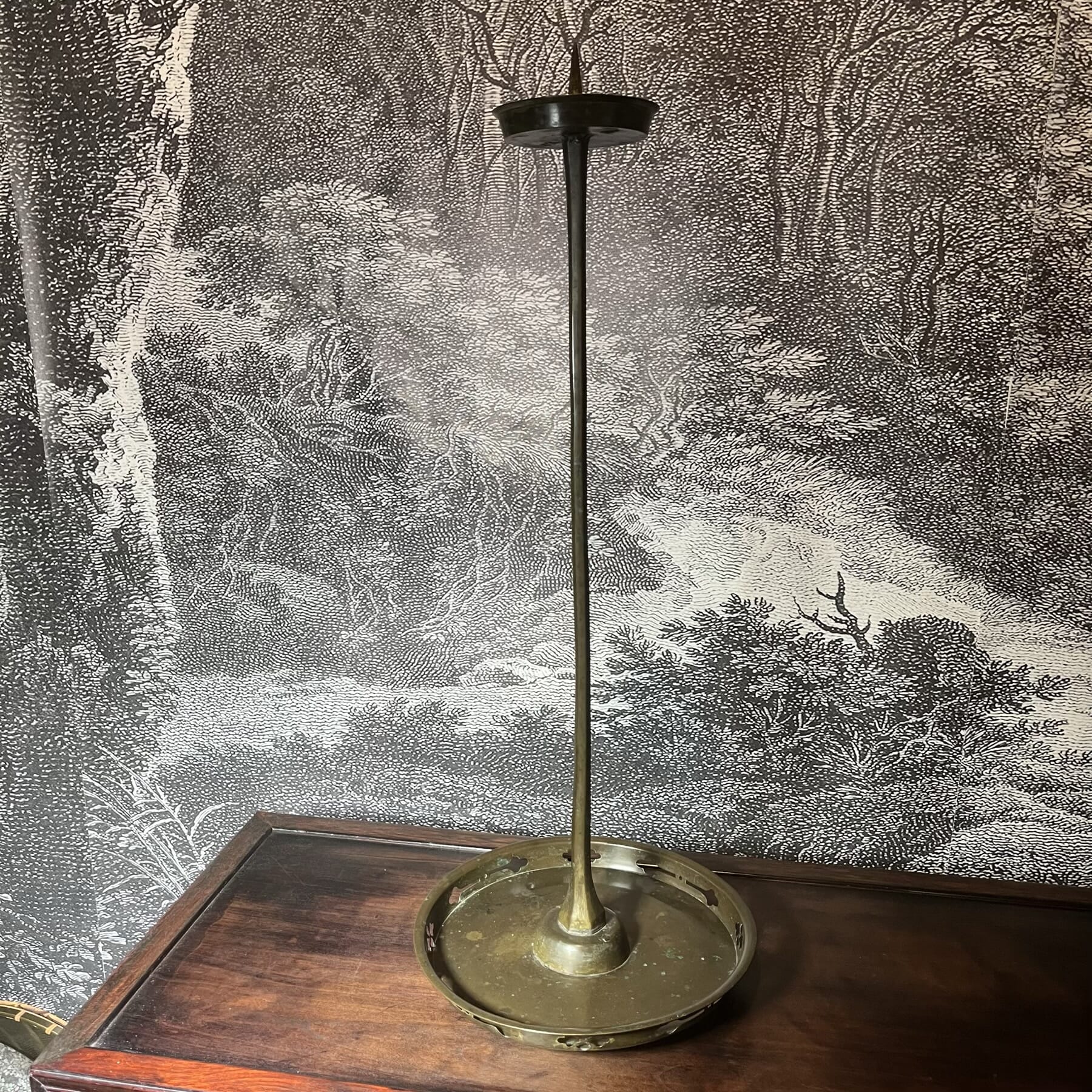
RUN FOR YOUR LIFE American silver & walnut conductor’s baton
Another rather puzzling baton has a cryptic message: RUN FOR YOU LIFE ….. is engraved onto the end. This example is American Silver, by Reed & Barton. It dates to the 1910-20 period – but nothing turns up valid to a musical origin when you look for the words inscribed. Maybe someone has an idea of what ‘RUN FOR YOUR LIFE’ might be relating to? Let us know, if you do!
RUN FOR YOUR LIFE – American Reed & Barton silver mounted baton, c. 1920
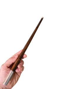
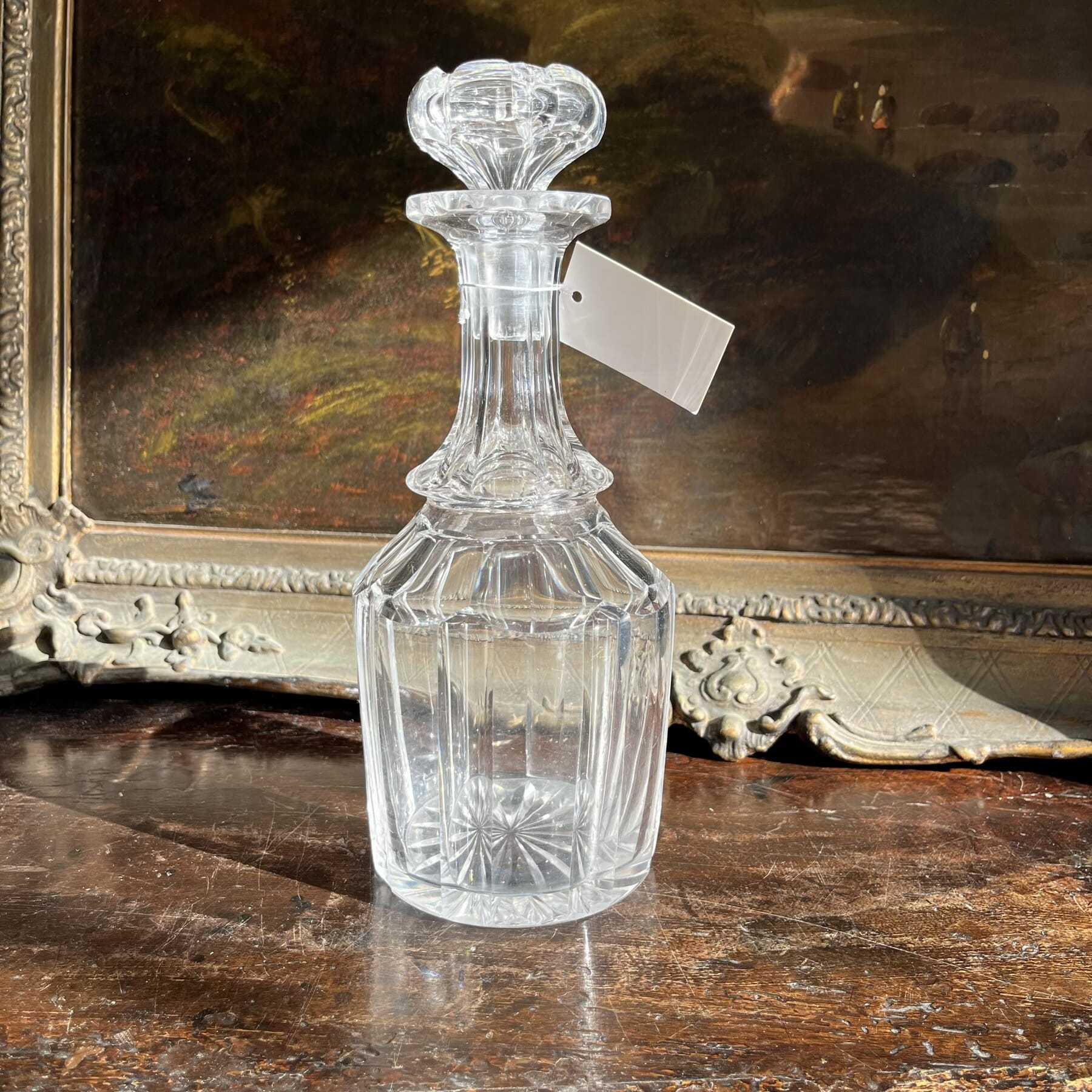
Antique Ebony Conductor’s Baton
The final one is just a nice baton, no inscriptions. It has a ribbed body, making it much easier to hold. All we need is an orchestra to try it out on……
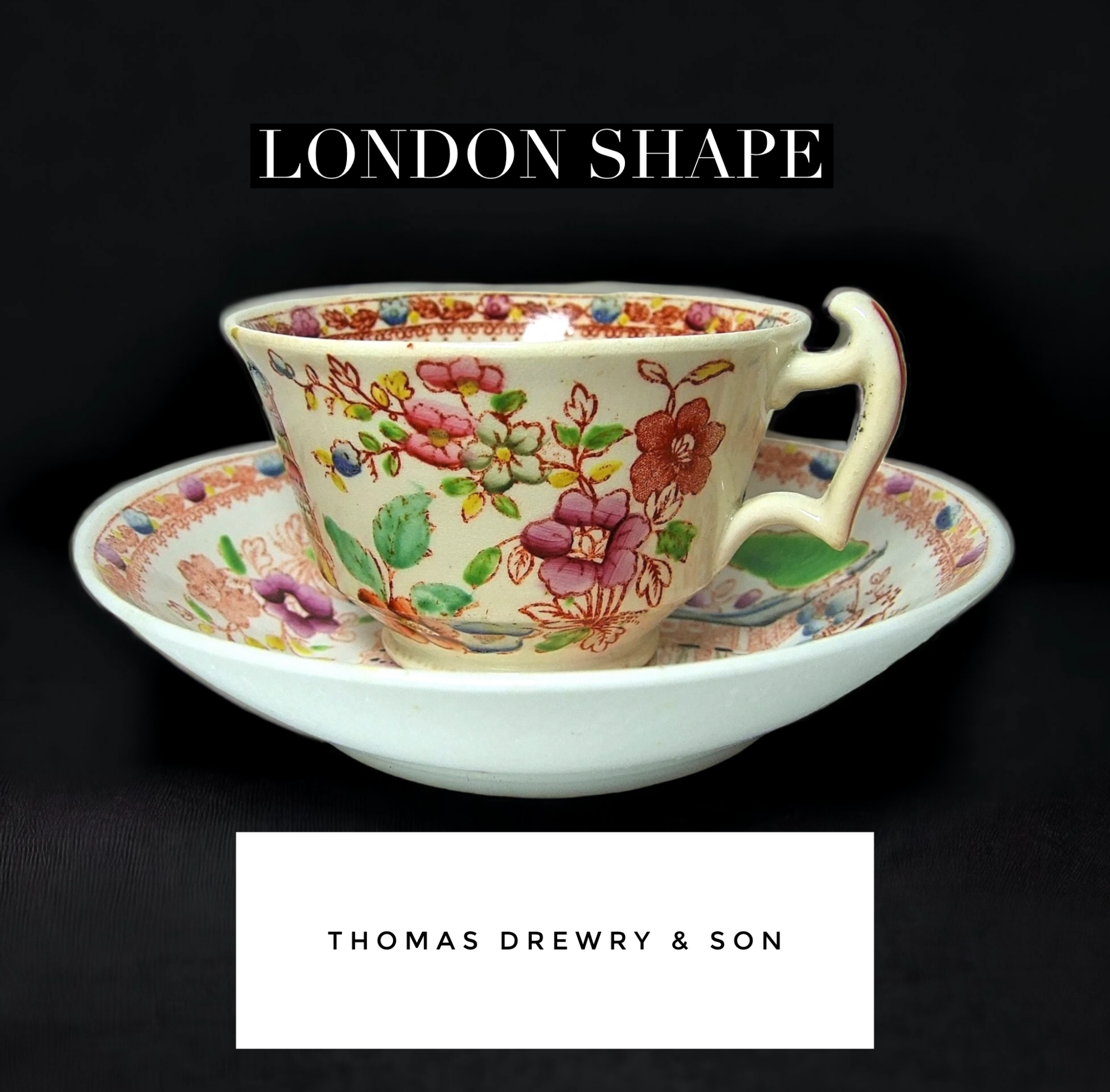
An interesting rarity has just been unearthed at Moorabool.
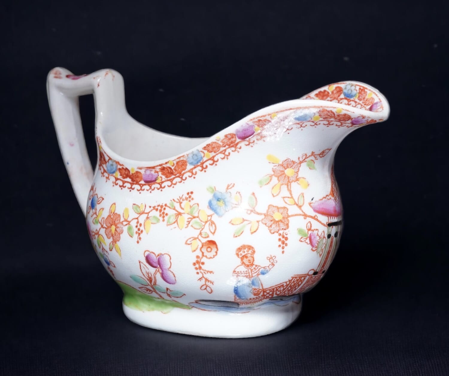
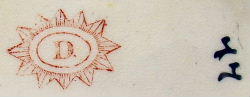
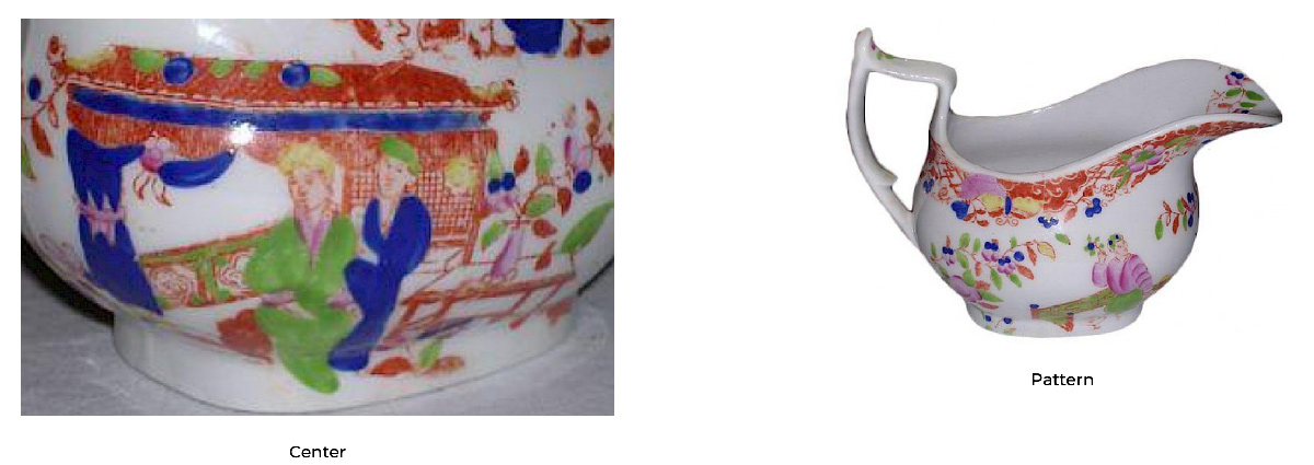
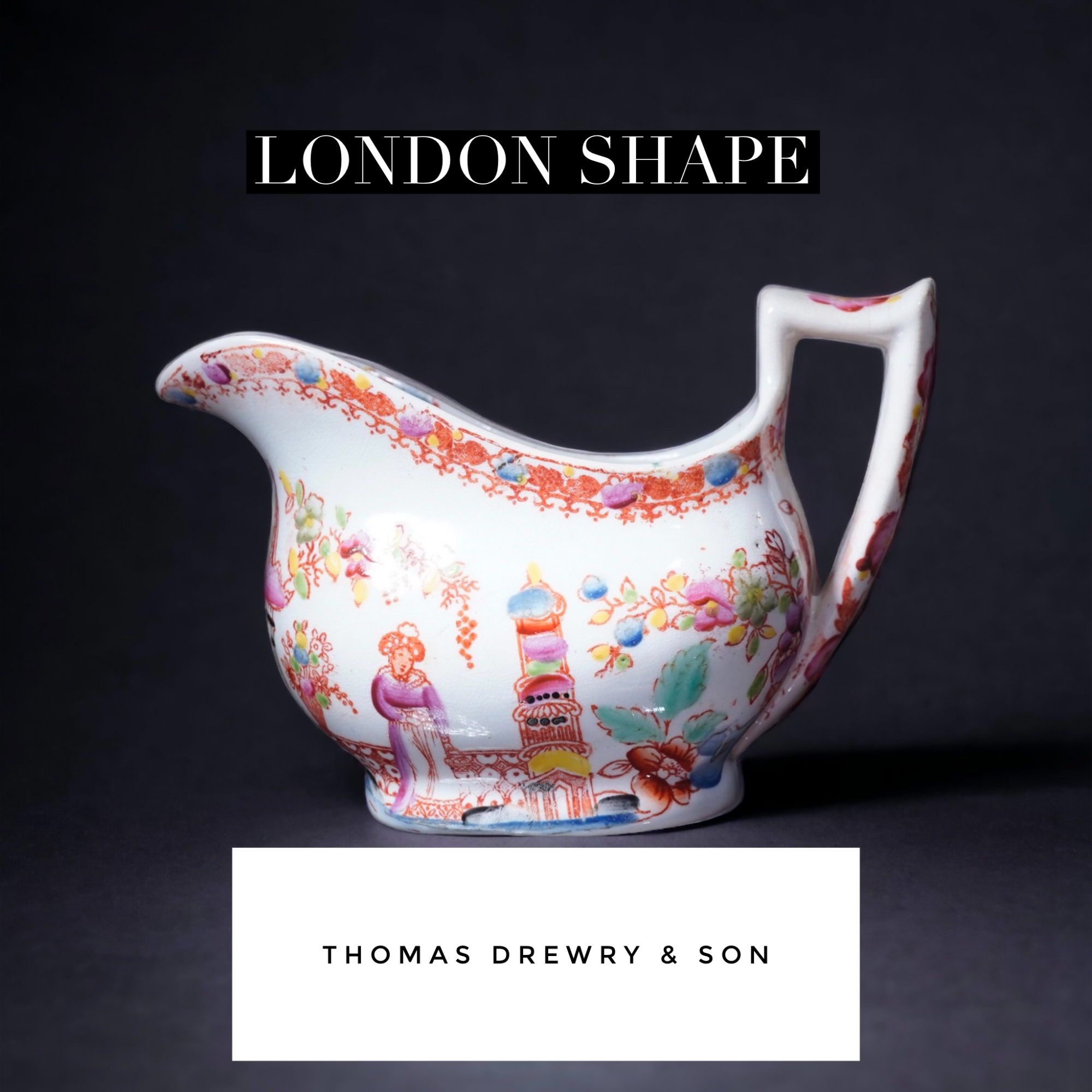
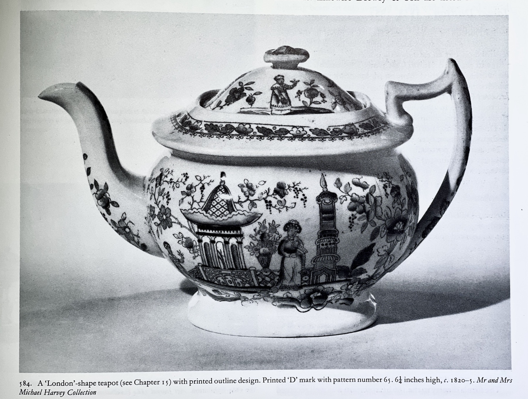
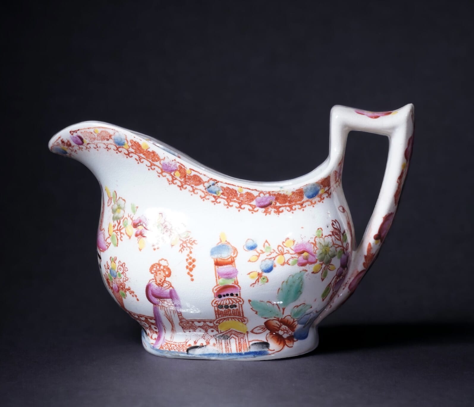
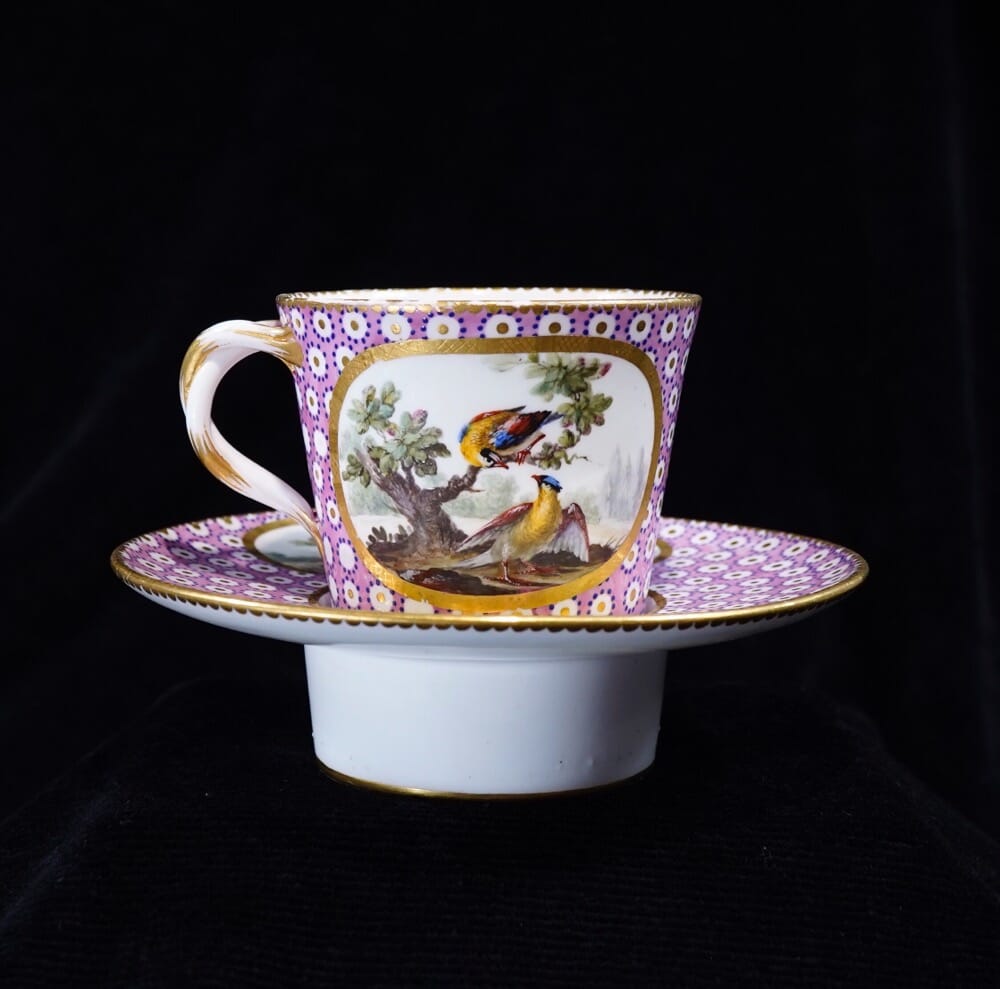
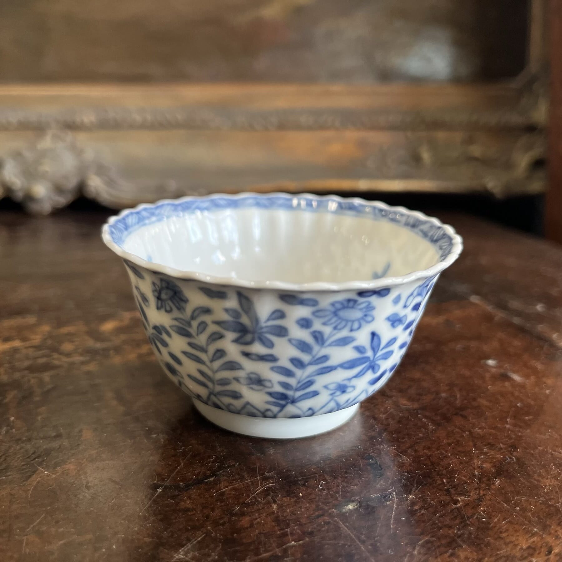
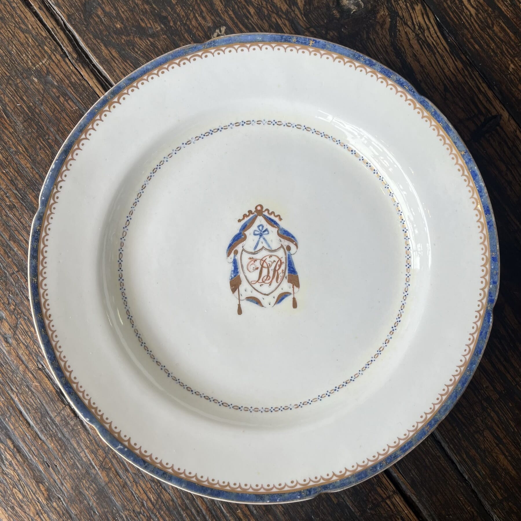
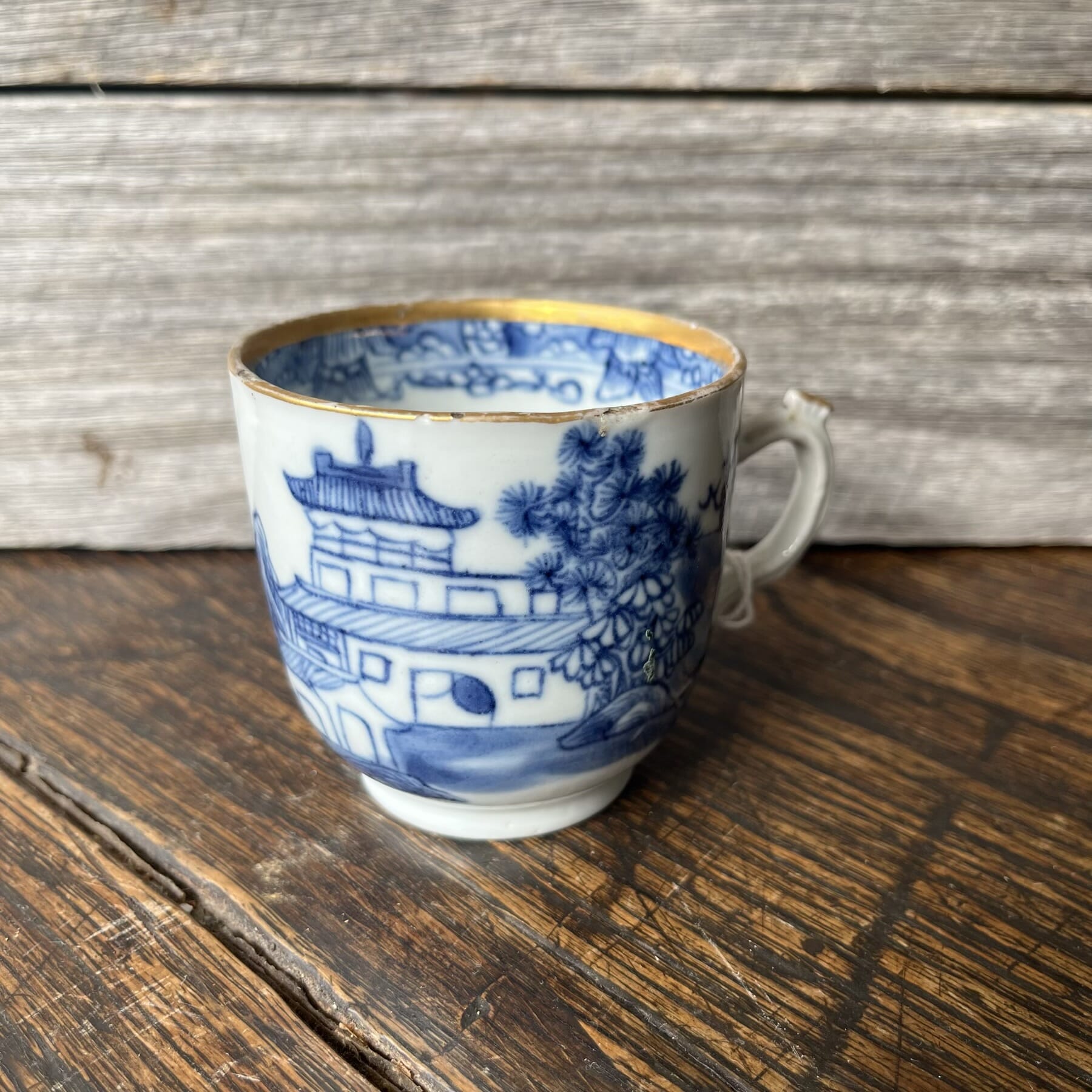
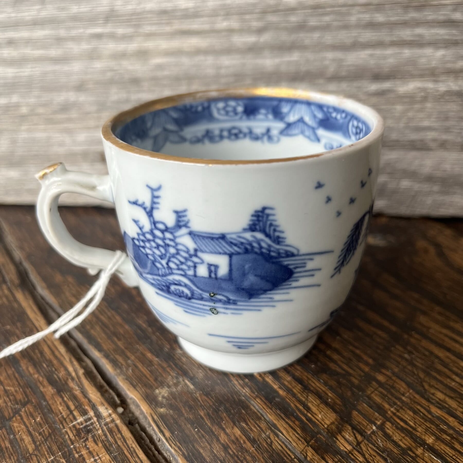
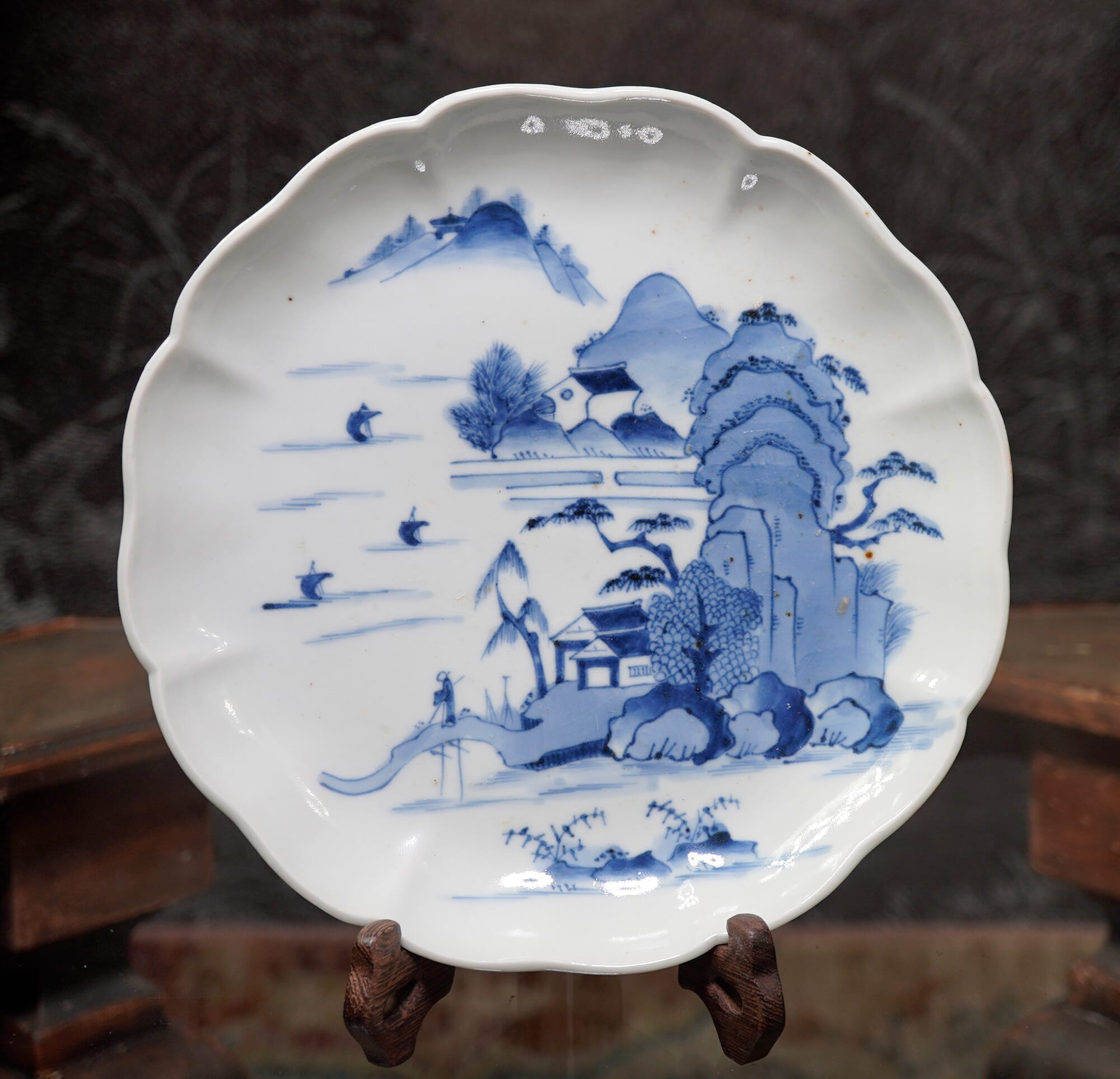
Godden in his ‘Staffordshire Porcelain’ is the initial source of attribution, using the style of piece & pattern to date it to the 1820’s, and then refine it down to two possible makers with ‘D’ surnames. Drewry- also spelt Drewery – is the most likely of the two, in his opinion. They are recorded in the directories 1818, and disappear after the 1830 publication. Godden illustrates the London-shape teapot with the same pattern and ‘D’ mark on p415. Distinct to this maker (apparently not found elsewhere) is the plain handle form, without a spur on the inside towards the bottom; also distinct is the handle wrapping down the body and terminating by touching the actual foot of the jug.
A selection of similar patterns, made by the Hilditch firm. These are identified by marked examples, set out in a 2003 publication, ‘Hilditch Porcelain – A Collector’s Guide’ by Margaret Hewat & June M. Owen.
The similarity to the Drewry pattern is no coincidence; the Hilditch works were located in Lane End, Staffordshire, just over the road from the Drewery works. The engraver responsible for the copper plates used to print the transfer was not exclusively employed by these companies; rather, he would be a freelance operator, taking on the work when it was needed. Somewhere like Drewry would not need his services very often – this was pattern 65, and such printing plates could stay in use for many years before needing replacement. If you examine the details of the prints of these Hilditch products, and the other similar works such as Newhall, it is clear that the same engravers are at work for multiple firms – making this marked example an important clue to unravelling the correct attribution of these charming transfer printed wares.
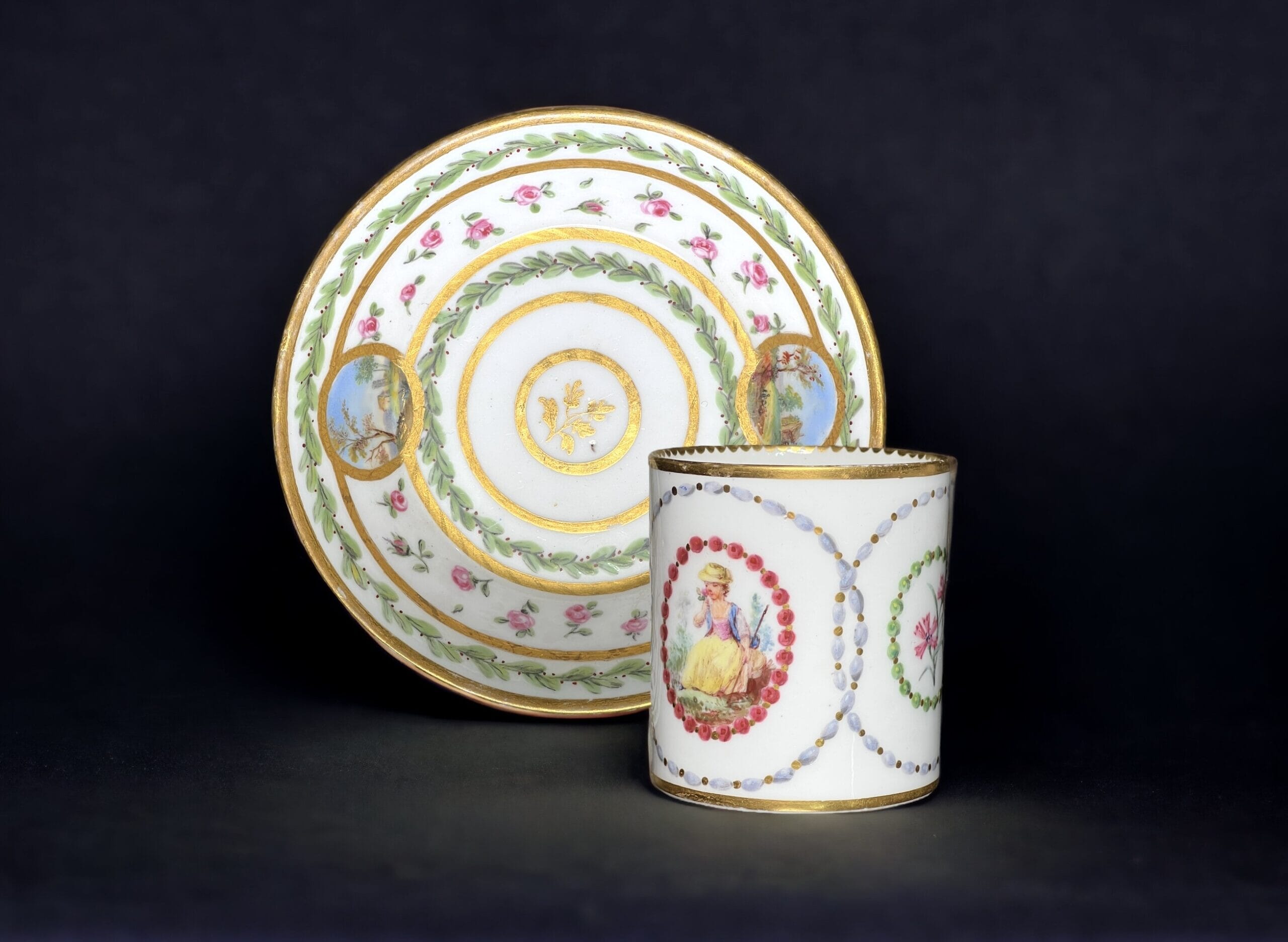
from the ‘Transferware Collector’s Club’ database, on the ‘Teahouse Pattern’ jug illustrated below, with the note “The numerals “44” alongside the “D” mark are more likely a worker’s number than a pattern number”. We propose that it is indeed a pattern number, and should be read as ’77’ – see image below for the pattern.
This pattern is recorded by the Transferware Collector’s Club database as pattern #2552, titled ‘Pavilion & Tower’ ( no. 65) by Thomas Drewry & Son, Lane End, Staffordshire. A related pattern is their #3327, a pattern known as ‘Tea House’ (See photo below). In the documented example, there is a number next to the mark – as there is with this example & others of this pattern that have been recorded, all ’65’. Clearly this is the pattern number for this pattern, 65. The numbers on the ‘Tea House’ example are interpreted as ’44’, but seem to more likely be meant as ’77’ – just a few patterns along from this ‘Pavilion & Tower’ pattern. Comparing the two reveals a very close look.
Drewry Pattern 77(?) from The Transfer Collector’s Club website. Note the difference in the handle: this example is the same as the other numerous London-shape handles with a spur on the inside, while the (apparently) unique feature of the example we are documenting is having no spur.
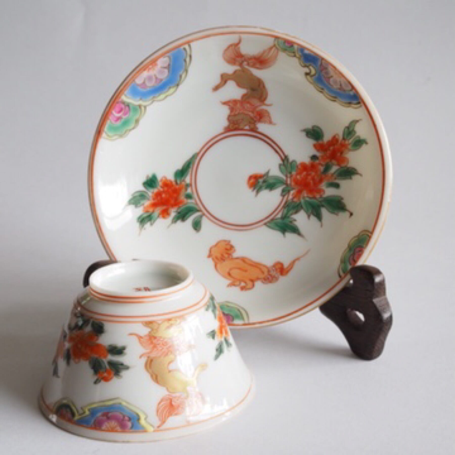
Drewry & Son, Lane End, London Shape jug, pattern 65, marked ‘D’ in sunburst, at Moorabool Antiques, Australia
Example of Drewry porcelain London-shape teapot, pattern 65, now known as the ‘Pavilion & Tower’ pattern, here illustrated in Godden’s ‘Staffordshire Porcelain’
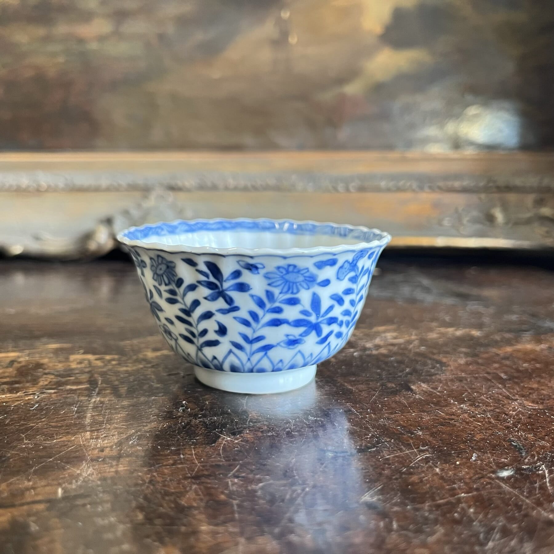
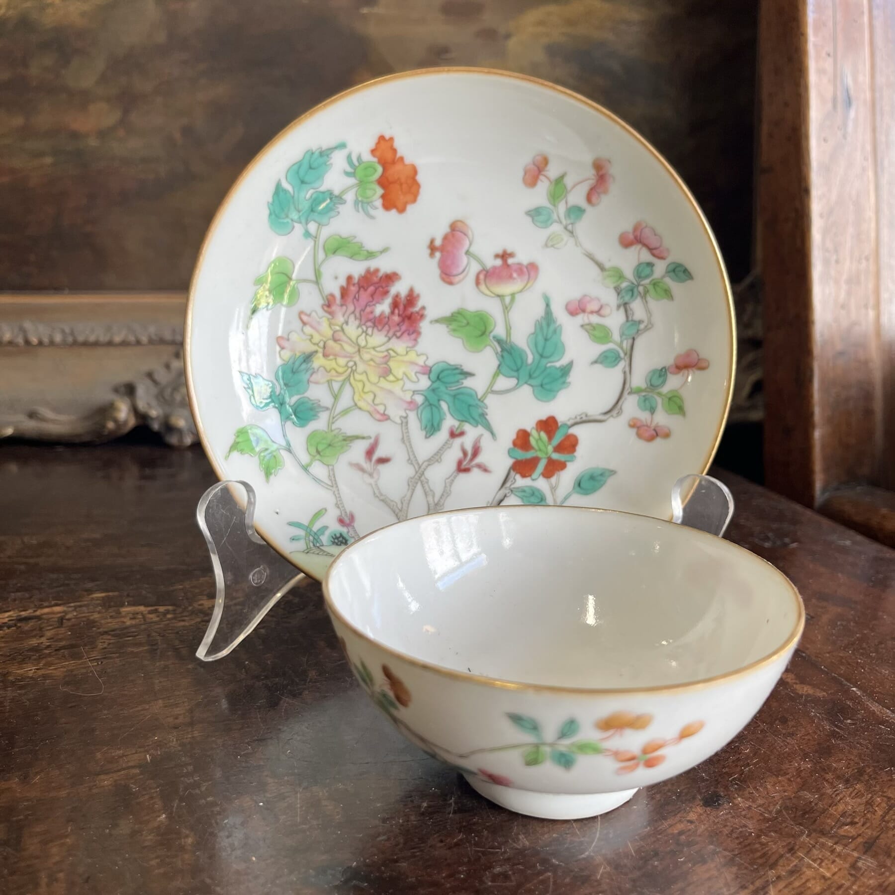
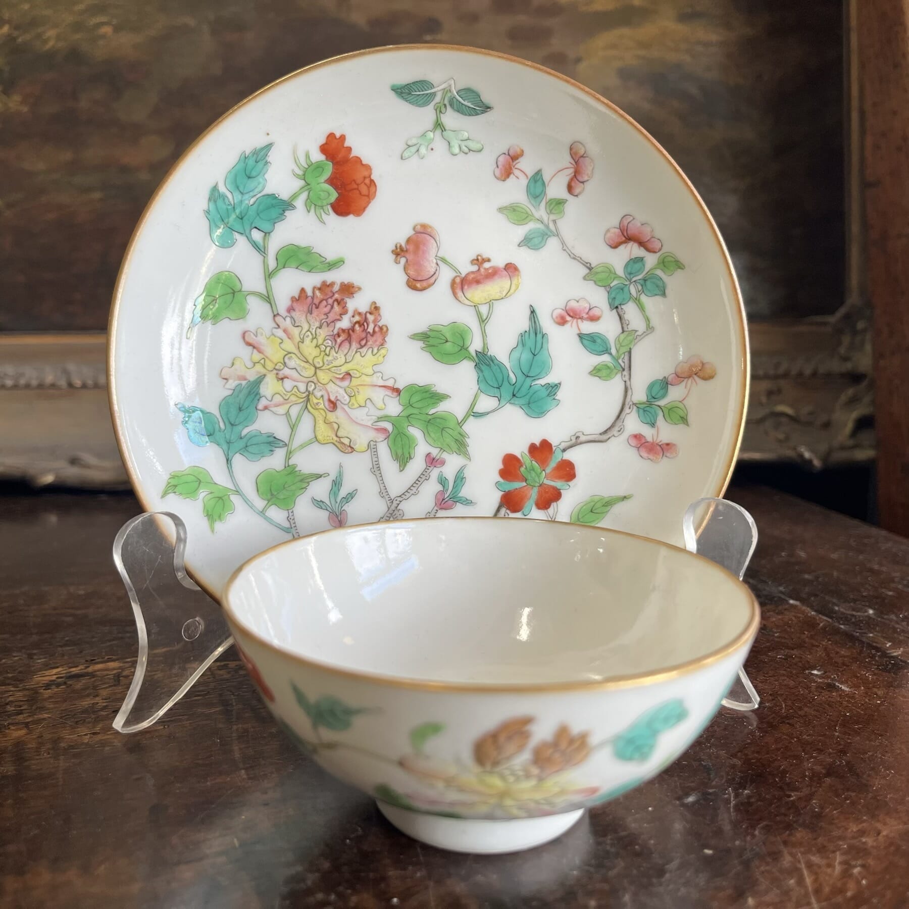
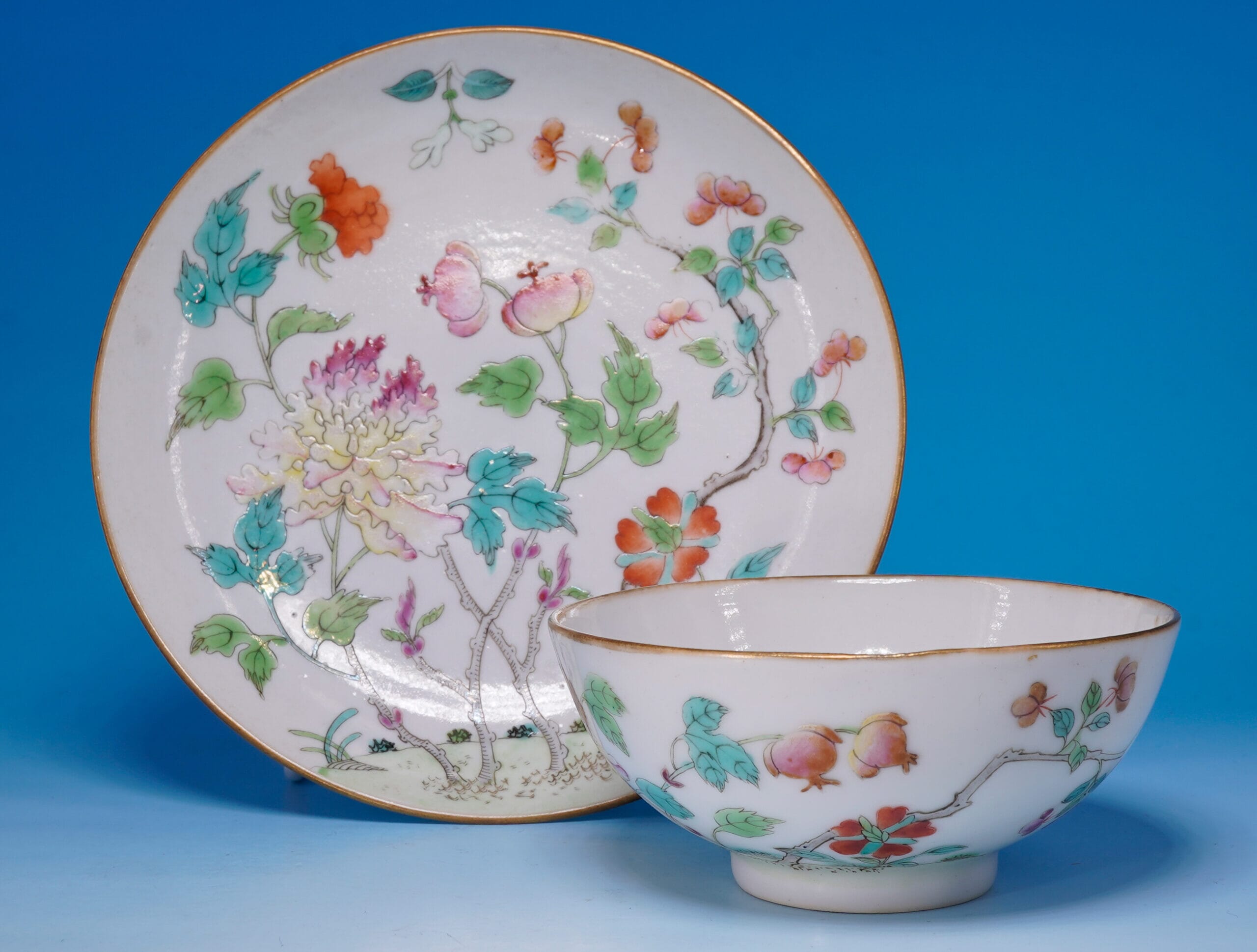
Drewry & Son ‘London Shape’ Cup & Saucer, pattern 65, circa 1818-30
This piece is a fine example of how time disappears in this field: unravelling the above story took quite a while, with widespread resources to consult and bring together to tell the story. And yet, look at the price: Rarity doesn’t necessarily mean ‘expensive’ !
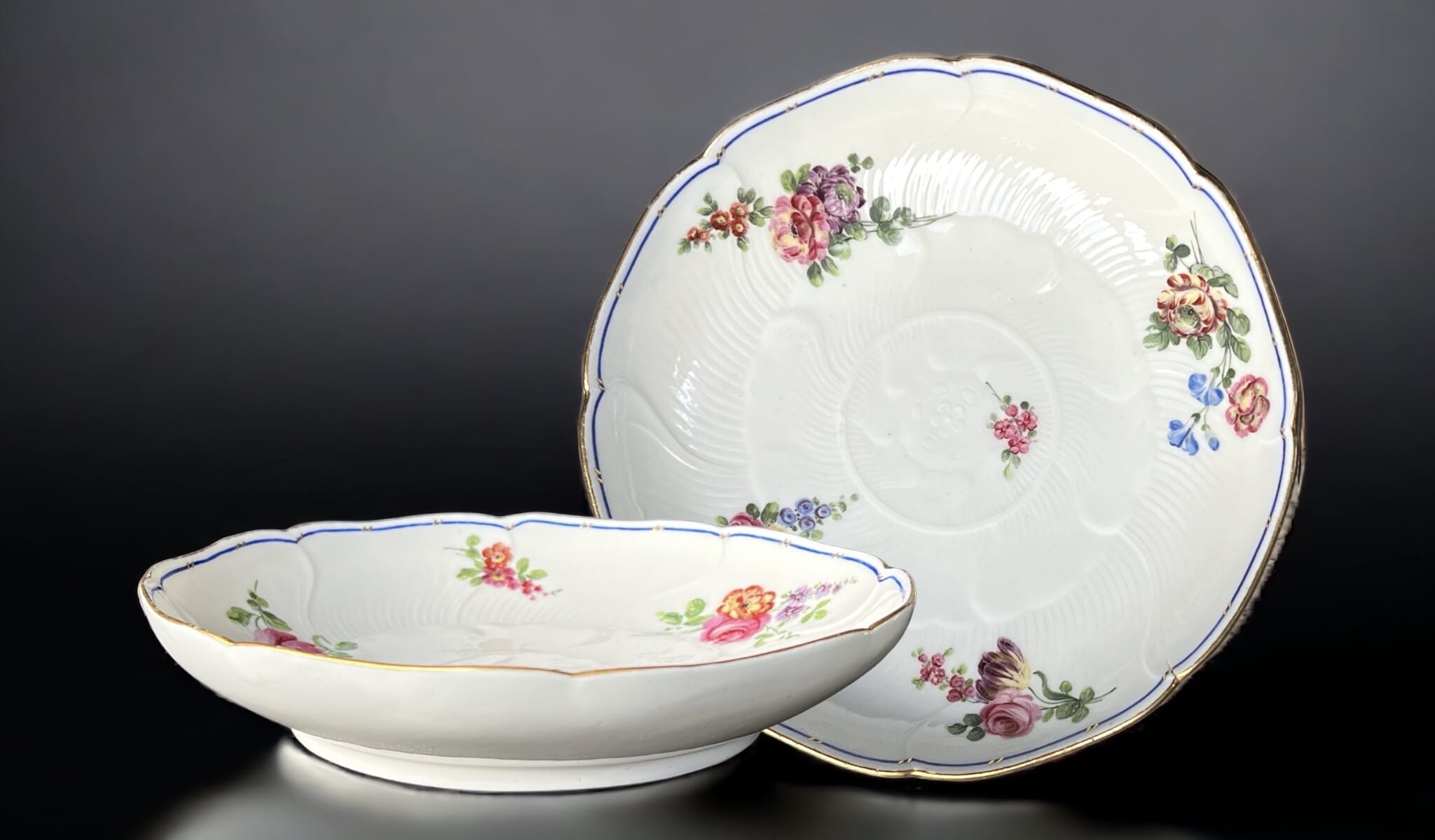
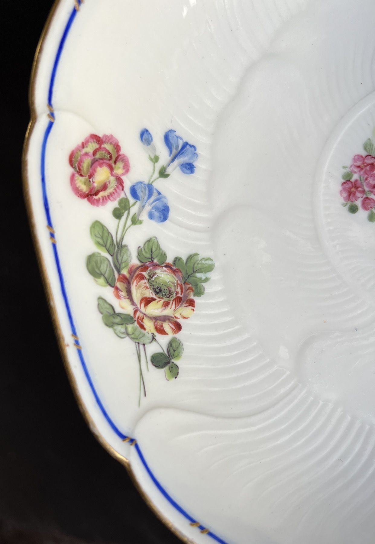
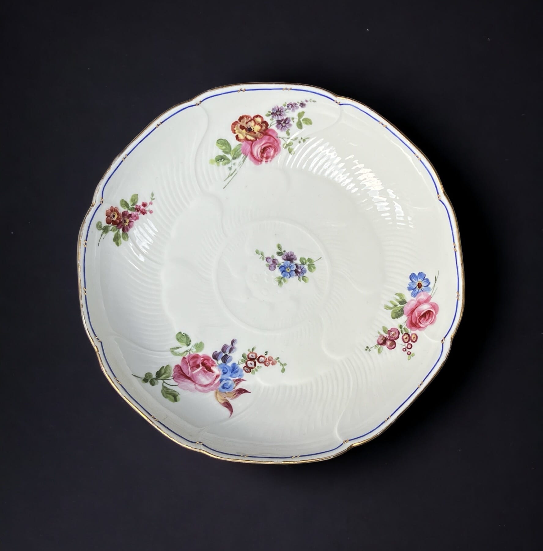
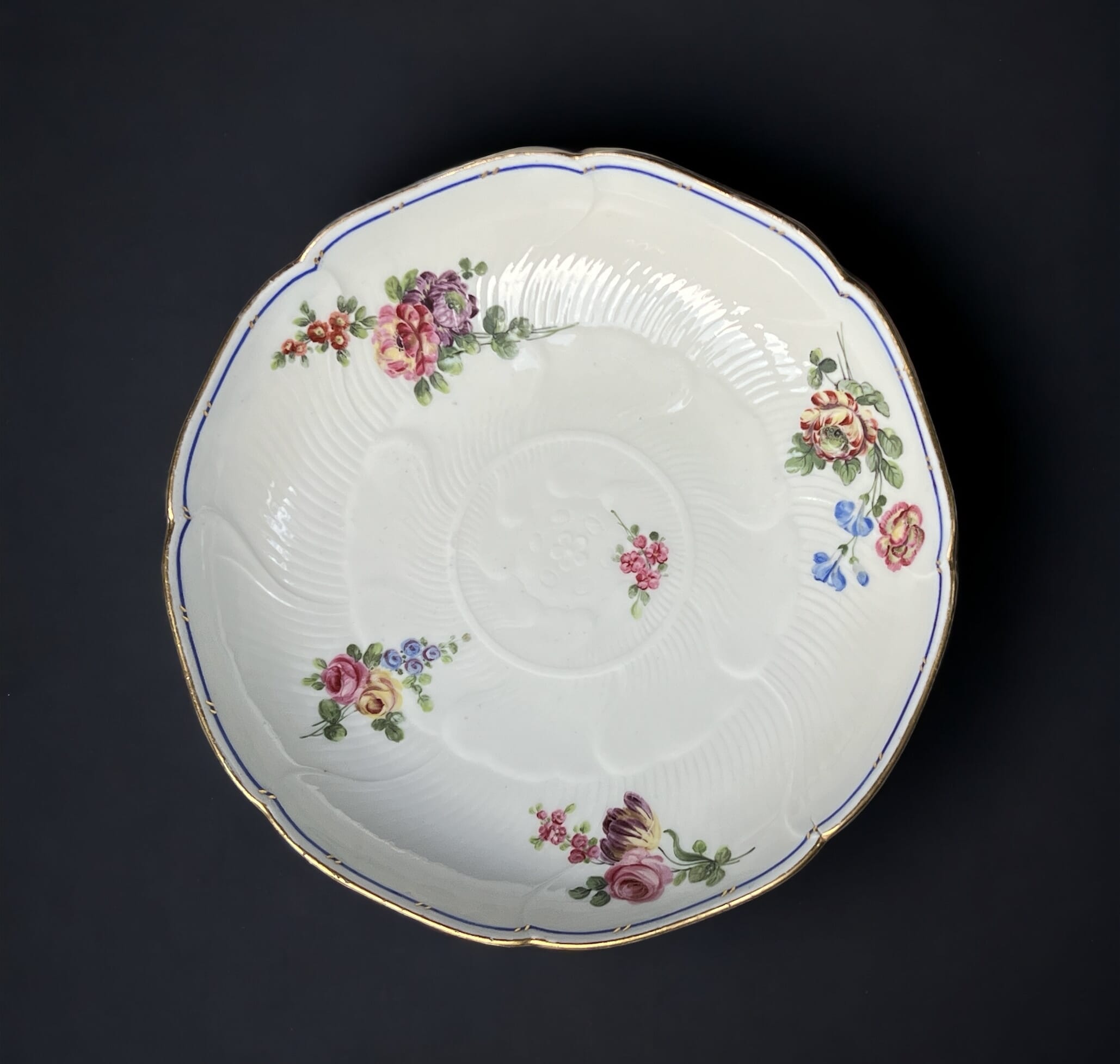
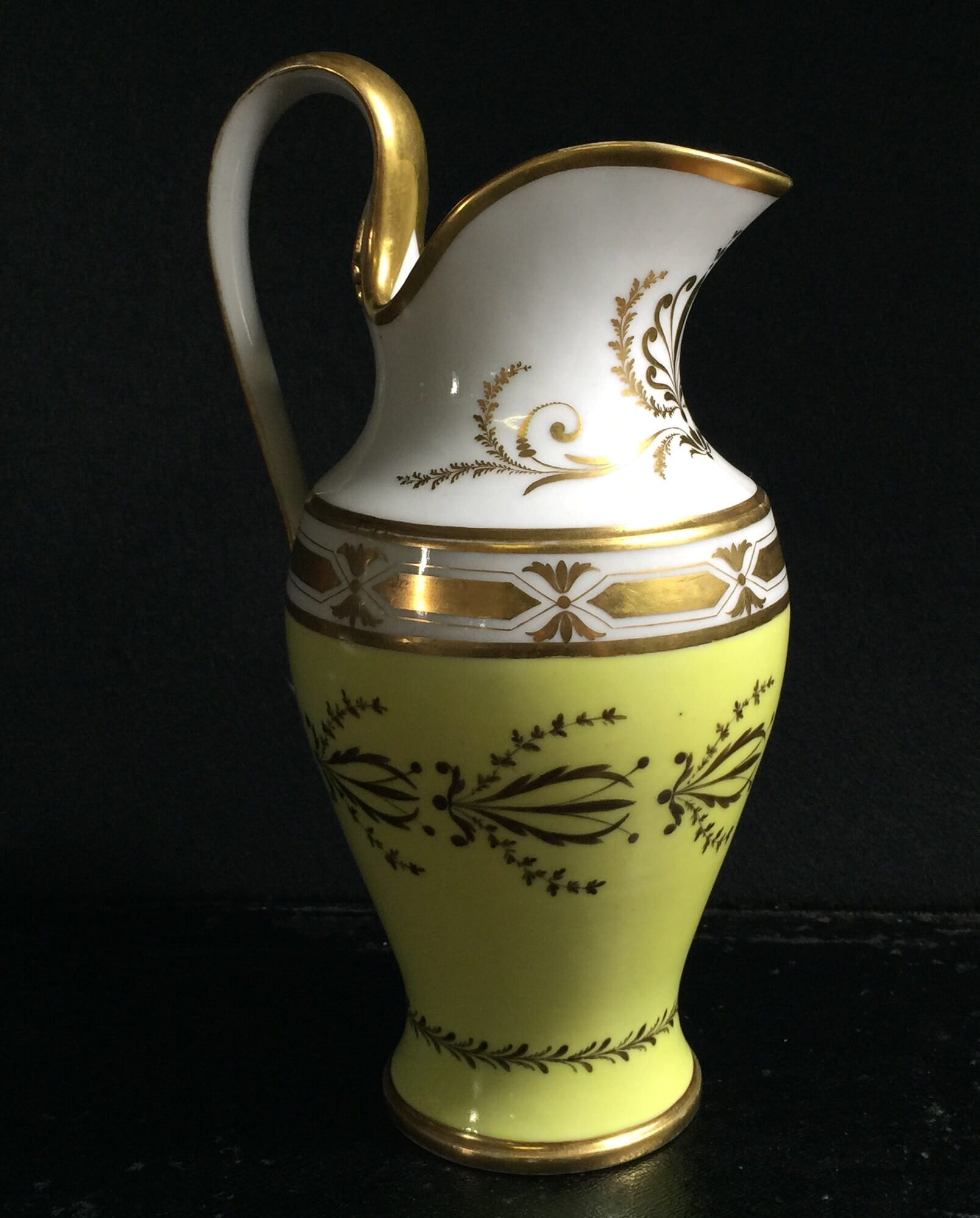
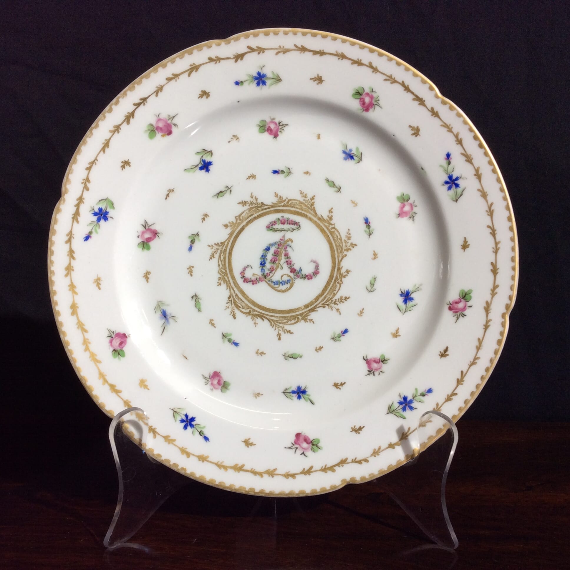
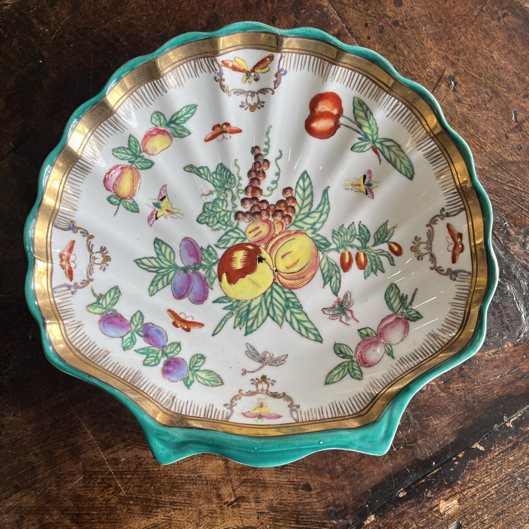
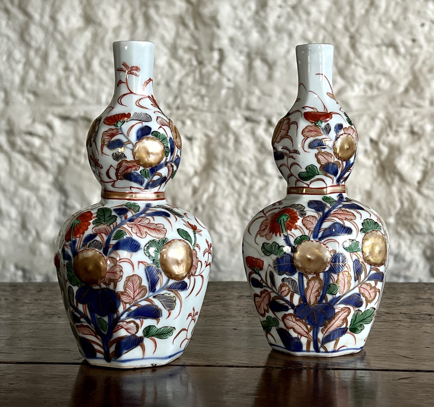
There’s a splendid pair of Sèvres dishes fresh to Moorabool.
Sèvres Porcelain, 1764
This shape is a compotier rond, and was a component of the large services, used alongside other shaped serving dishes in the centre of the table. A setting for a dozen might have two compotier rond, while the larger services, such as the massive Service Camaïeu Carmen de Fontainebleau (used by the Royal Family) had several dozen of this elegant dishes available.
Sevres 1764. Moorabool Antiques, Australia
The moulded pattern allows the beauty of the moulded porcelain to show in a way the more painted patterns cannot.
The elegant lotus flower design is borrowed from Chinese Export origins, where lotus-moulded dishes were a common sight in the early 18th century.
Sevres 1764. Moorabool Antiques, Australia
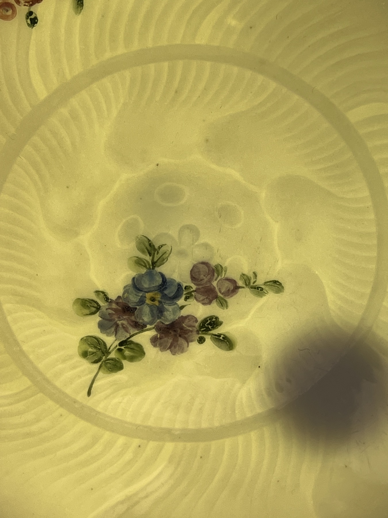
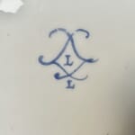
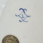
Louis-Françcois Lécot’s mark, ‘L’, on Sevres with ‘L’ for 1764. Moorabool Antiques, AustraliaSevres with ‘L’ for 1764. Moorabool Antiques, Australia
One of the dishes simply has the crossed ‘L’s’ mark, enclosing the date letter ‘L’ for 1764. The other example is the same, but also has a painter’s mark: ‘L’. This allows us to put a name on the painter of the flowers: Louis-Françoise Lécot . He appears in the factory wages lists in 1763, after possible earlier unpaid work as a pupil from about 1761. He worked as a flower painter in 1764 – but is then absent from any reference the following year, giving him the working period 1763-4…. a perfect match for this dish. He does re-appear, after spending 6 years somewhere else, when he is documented as a hard-paste artist in 1771 (as opposed to the soft-paste that was the only body available at Sèvres in the 1760’s). His work is then remarkable and distinct, specialising in dramatic imitation lacquer pieces, with gilt or platinum/silver chinoiseries painted in the highest Rococo manner, or the exotic ‘Etruscan’ grotesques inspired by discoveries in Italy during the 1770’s. These styles were the latest fashion for the French aristocrats, and bring to mind the lavish productions of the high-end Paris firms competing with Sèvres for the top-end customers. As Sèvres was the King’s factory, he enforced a monopoly on the industry, where colours & gilt decoration was exclusive to his own factory; the loop-hole found by eager factory owners was to attract an aristocratic patron to protect them – Clignancourt was under the protection of the Comet de Provenance (the future Louis XVIII) and Rue Thiroux was under the protection of the Queen, Marie Antoinette. Both produced very high quality hard-paste products in the 1770’s, and would have eagerly employed a Sèvres-trained artist such as Lécot. Locré & Russinger, otherwise known as La Courtille, was another such factory, minus the aristocratic protection; they ran afoul of the King’s Sèvres monopoly, with 2,000 pieces of illegal coloured & gilt porcelain being seized in 1780 – indicating they were producing a large amount of high quality hard-paste wares. Despite this set-back, they continued to make superbly decorated pieces as if nothing had happened….
Could Lécot have spent his time in some such Paris porcelain manufacture, learning the technique for decorating the hard-paste porcelain body? While he was away, Sèvres purchased the recipe for pâte tendre (hard paste) from Pierre-Antoine Hannong, the youngest son of Paul-Antoine Hannong, whose father had established the faience works in Strasbourg in the early 18th century . As often happens with generations, Paul-Antoine made a success of the firm when he introduced the first hard-paste porcelain production in France, in the mid-1750’s. He died in 1769, and his son, Pierre-Antoine became head. Two years later, he sold the secret of Hard-Paste to the Sèvres factory. They took a while, but once the right ingredients were sourced, Hard-Paste was made (alongside Soft-Paste) from the mid 1770’s onward.
A Lécot decorated Sèvres garniture, 1775-6 – sold at Christies NY in 2000 for $1.1 million US….
When he returned in 1771, Lécot was able to paint on the new Hard-Paste body. He worked on some truly impressive hard-paste orders, and all major collections seem to feature his dramatic 1780’s Chinoiseries. This early example of his Soft-Paste work from his brief appearance at Sèvres in 1763-4 is a lovely rarity.
ref. Rosalind Savill, The Wallace Collection Catalogue of Sèvres Porcelain, London, 1988, Vol. III, pp. 1043-4 for more on Leçot.
Jean Bouchet, active at Sèvres 1757-93
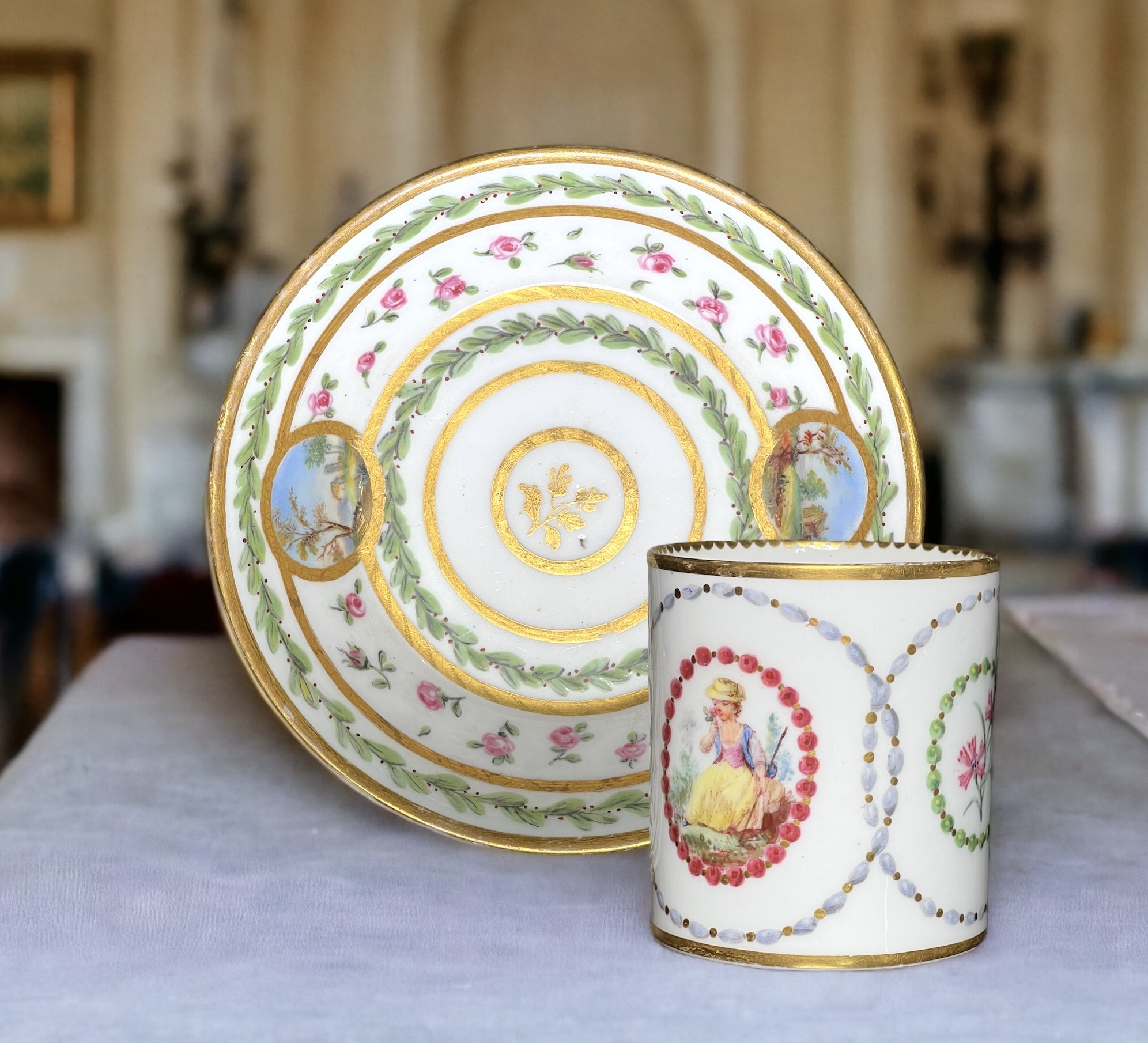
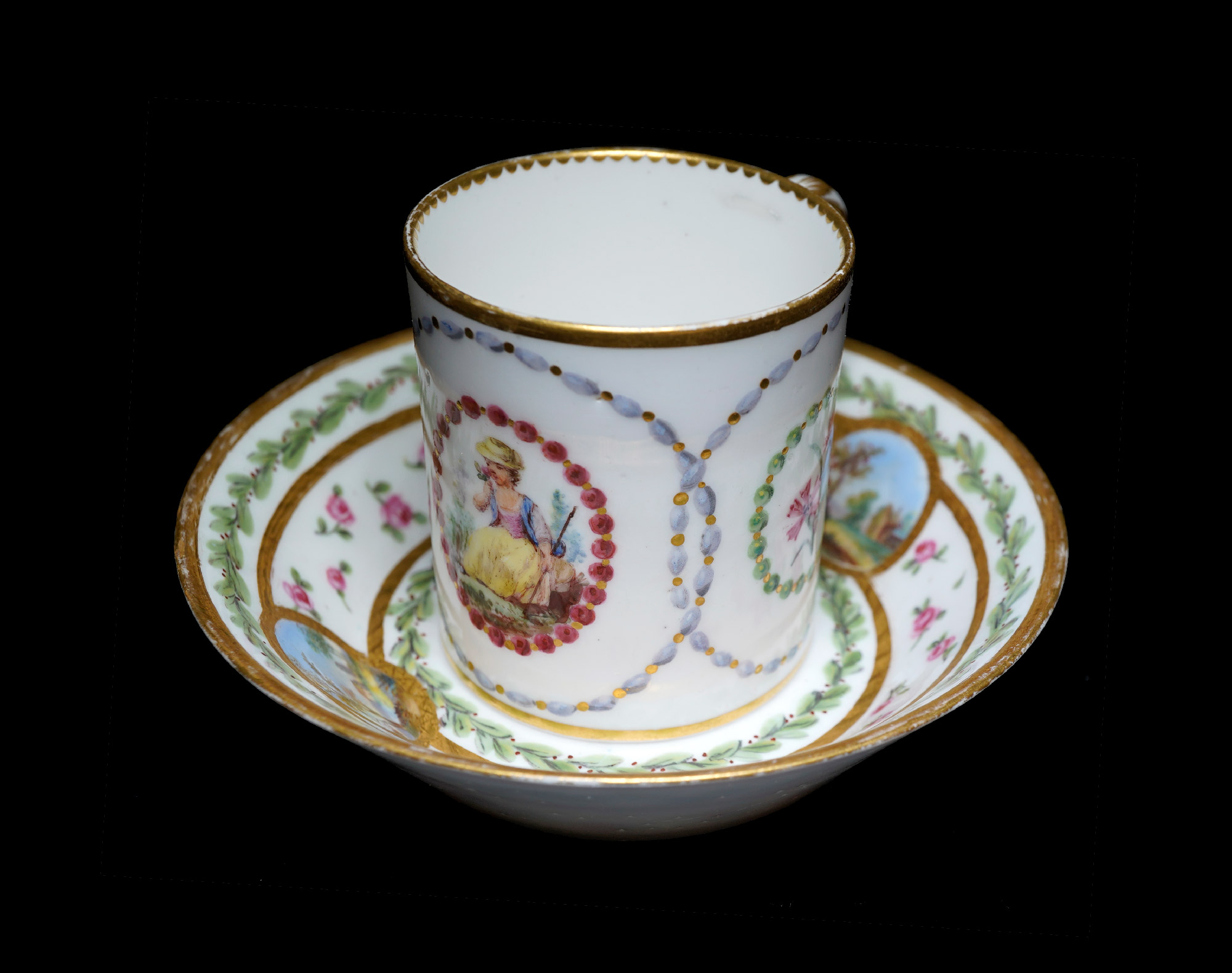
Sèvres cup & saucer, scenic panels by Jean Bouchet, dated 1781
This lovely cup and saucer are a ‘recently married’ pair. While the saucer has been in the Rosenberg Reference Collection in Geelong for a while as a fine example of Sèvres, the cup is a recent acquisition; remarkably, it is the same artist at work at Sèvres in the same year, 1781. While there is a difference in the details, the overall harmony makes them a delightful rarity. And of course, they have a story to tell…..
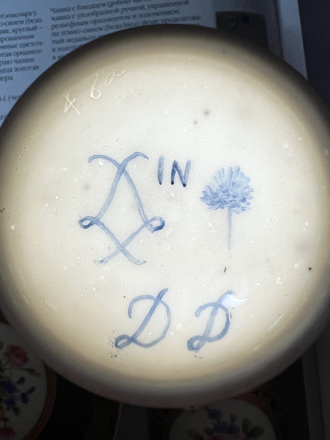
The artist is Jean Bouchet. He used a pictorial mark, a ‘tree’. While in the factory records – and the subsequent publications that used this as their source for what the marks looked like – he carefully drew a realistic tree with roots, trunk and layered foliage, while in practice he simplified it into something that looks like a furry lollypop…. This would have taken much less time & concentration!
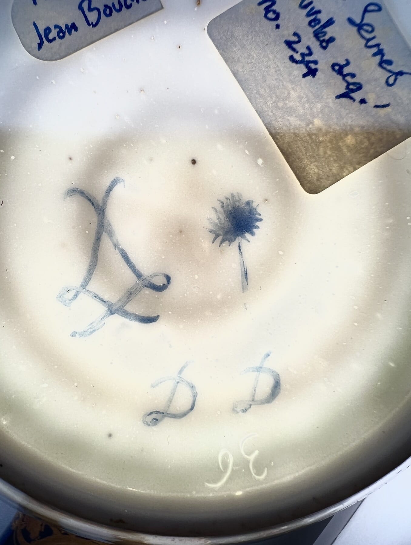
Factory records with Bouchet’s ‘tree’ mark Mark on our Sèvres cup by Jean Bouchet, dated 1781Mark on our Sèvres saucer, scenic panels by Jean Bouchet, dated 1781The marks on the Sèvres cup & saucer by Jean Bouchet, with transmitted light to show the workman’s incised mark.
The cup and the saucer are both 1781, dated with the same ‘DD’ in a distinct cursive script, the hand-writing of Jean Bouchet; there is also his distinct mark, a tree symbol. He is recorded as active at Sèvres 1763-93, a painter of human figures, landscapes, and flowers. He is very well represented in major collections, with his small landscapes being very appealing to original customers and present-day connoisseurs alike.
Jean Chauvaux jeune‘s ‘bead’ borders
The cup has another painter’s mark also – ‘IN’, the mark of Jean Chauvaux jeune, a gilder active 1765-1802. As there is not a great deal of gilding on the cup, we would suggest he was responsible for the unusual ‘bead necklace’ painting of the borders, where they are given highlights & shadows to make them appear rounded.
The incised workman’s marks 36 & 48a are both recorded by Saville in the Wallace Collection’s catalogue, vol III pp1130&1133. ’36’ is recorded 1770-90’s, while ’48a’ is recorded 1777-92. There are no names associated with these individuals.
In the British Royal Collection, both ’36’ and ’48a’ are present in several assemblages, including a set of very similar cups & saucers from the same period.
Sevres Cup & a Saucer by Jean Bouchet, 1781. Moorabool Antiques, Geelong
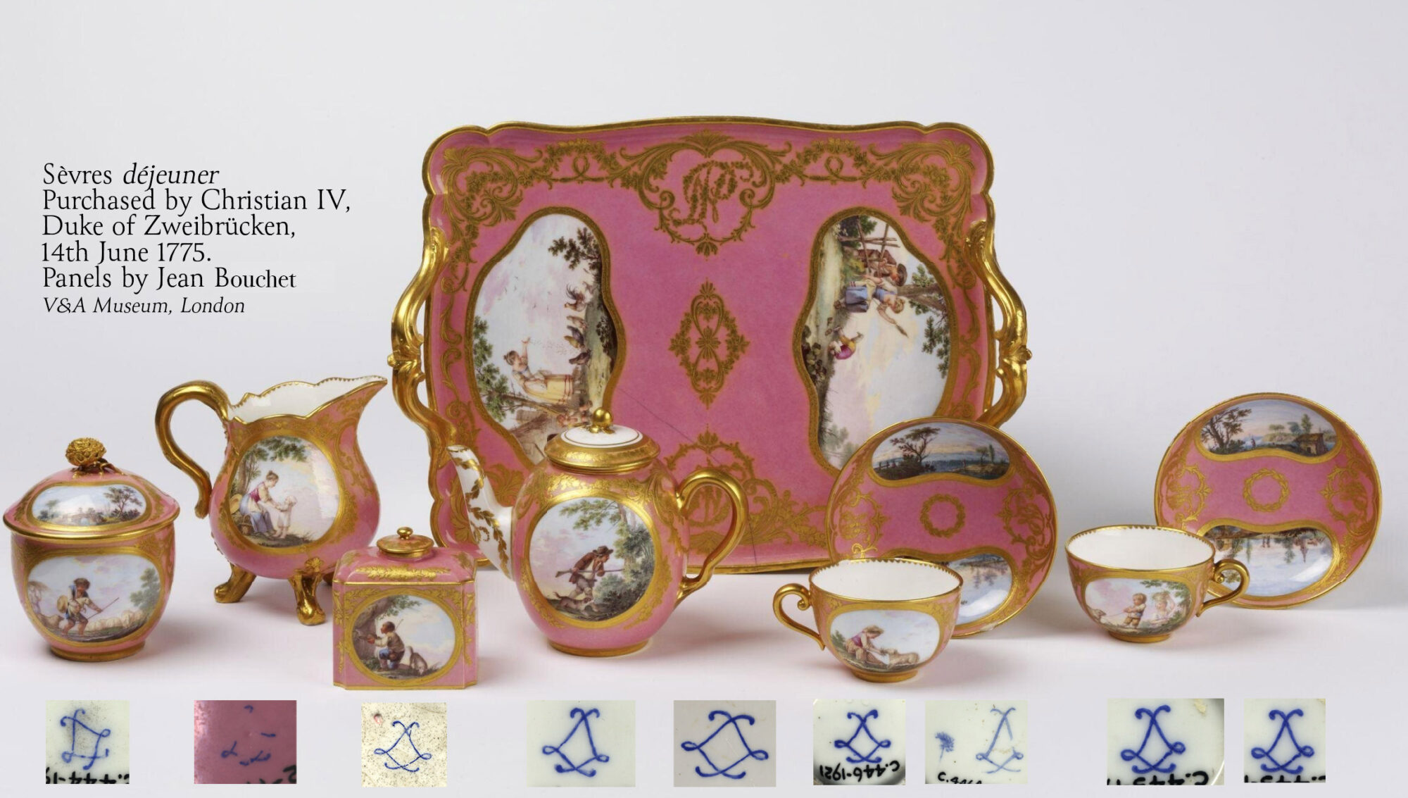
A complete déjeuner by Jean Bouchet, in the V&A Museum, London
It’s rare to see a complete group of porcelain from this era still together. This set in the Victoria & Albert Museum, South Kensington, is a fascinating rarity to study. It was bequeathed to the museum in 2015, and leading expert Rosalind Savill has identified it as one of four déjeuners bought by Christian IV, Duke of Zweibrücken, on the 14th June 1775. This was just 3 days after the event of the decade in France, the coronation of Louis XVI which the Duke naturally attended. Their cost was 840 livres, the equivalent of tens-of-thousands in today’s currency…. an expensive souvenir!
The marks on Sèvres should follow the rules and be very logical, but in practice they can be quite random. The system was there to provide the company with a way of tracking the various production steps and those responsible for the work: in a perfect scenario, the répareur, or workman who puts it all together, incised his particular mark, and both the artist and the gilder would include their mark. Then the factory mark, the crossed ‘L’s’ for Louis were painted, and inside them the code for the year it was decorated.
As you can see in the dejéuner set examples above, this isn’t always the case: of the nine components of the existing set, just a single example has a painter’s mark, here the ‘tree’ of Jean Bouchet, and none have a year mark! It is only the monogram found on the tray, along with the factory records recording Bouchard’s work on the commission, and the solid provenance that allow this remarkable set to be dated. This helps explain the number of non-conforming Sèvres items we come across, which have no date code or artist’s mark. They were quite probably part of a set where only a few items were marked.
Reference: Savill, Rosalind: A Sèvres Porcelain Tea Service in the Victoria and Albert Museum with Surprising Credentials, French Porcelain Society Journal, Vol. II, 2005, pp. 39-46.
Of course, fraud is always a concern, and later-decorated pieces can often be non-conforming – but usually, a date code is part of the deception, with the first years ‘A B C’ for 1754, 55 & 56 being the favourite – the trouble is, the style of decoration & object type was often not yet invented at that date, a dead giveaway!
The second porcelain manufacturer in Europe after Meissen (1709) was in Vienna, in 1718. While the initial establishment of private businessman du Paquier ultimately declined, it was revived by the state itself in 1744 when Empress Maria Theresa bankrolled the Imperial State Manufactory, Vienna. The blue shield mark came shortly after (sometimes called a beehive, as when viewed upside down it resembles one….).
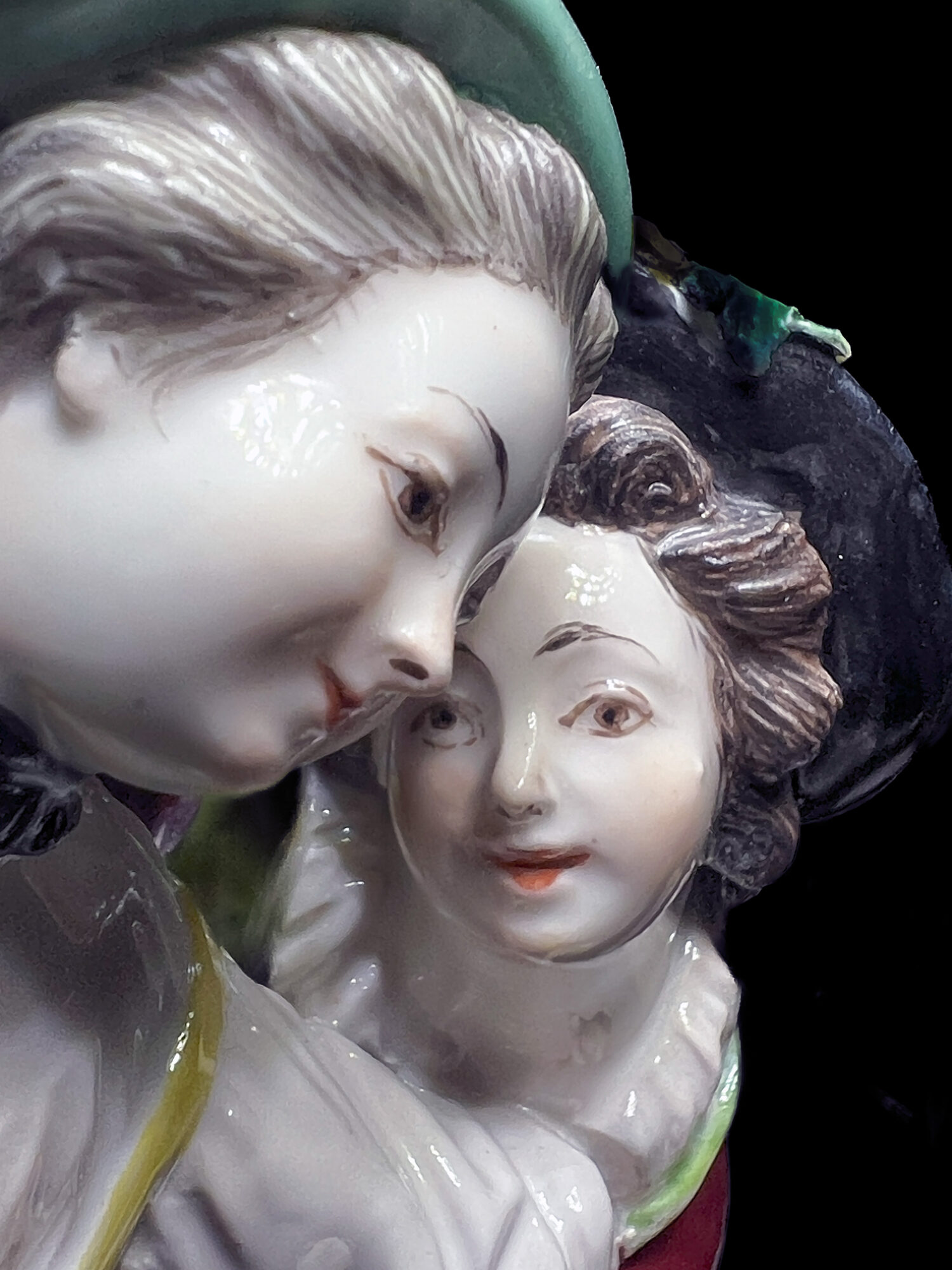
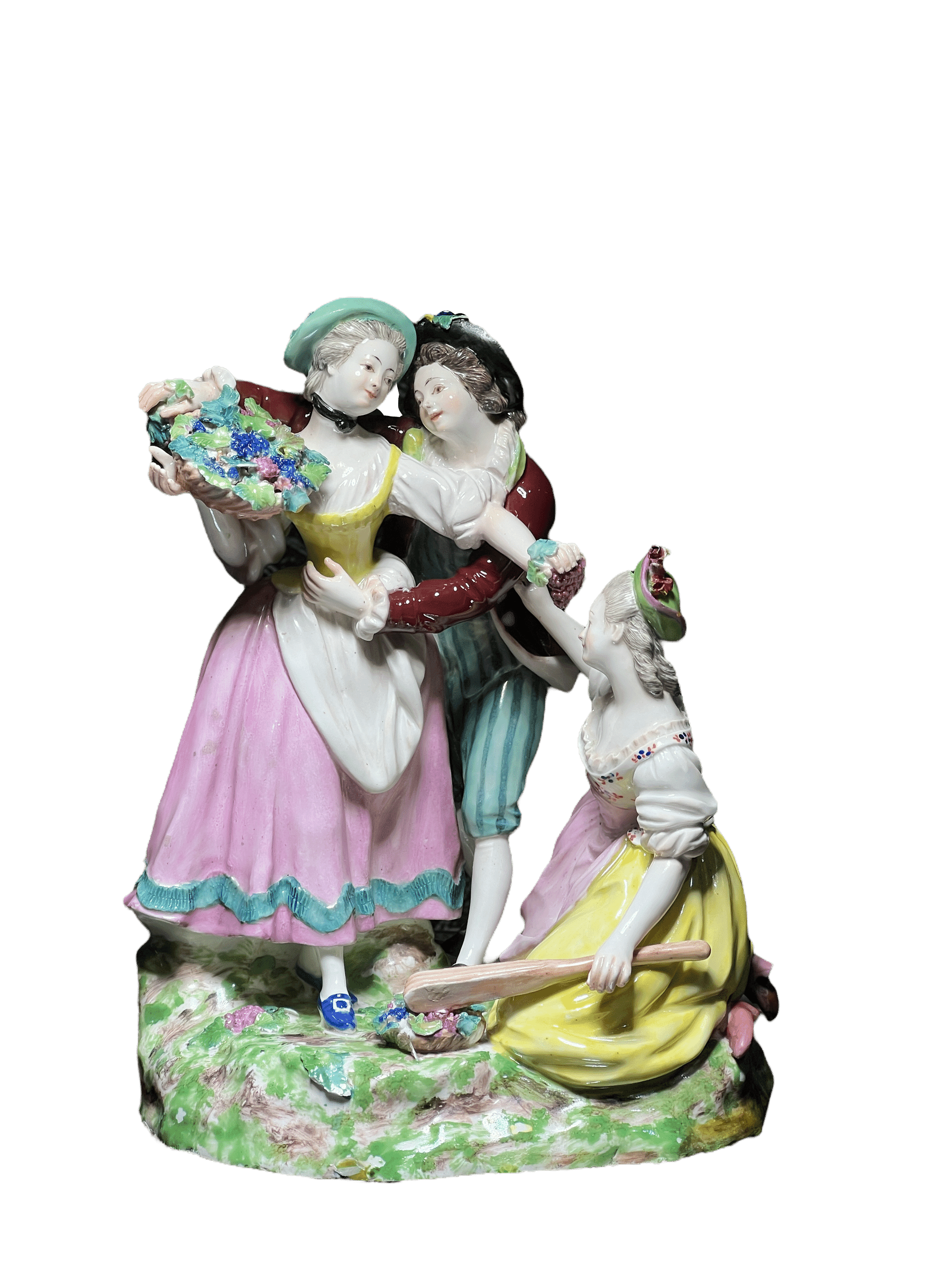
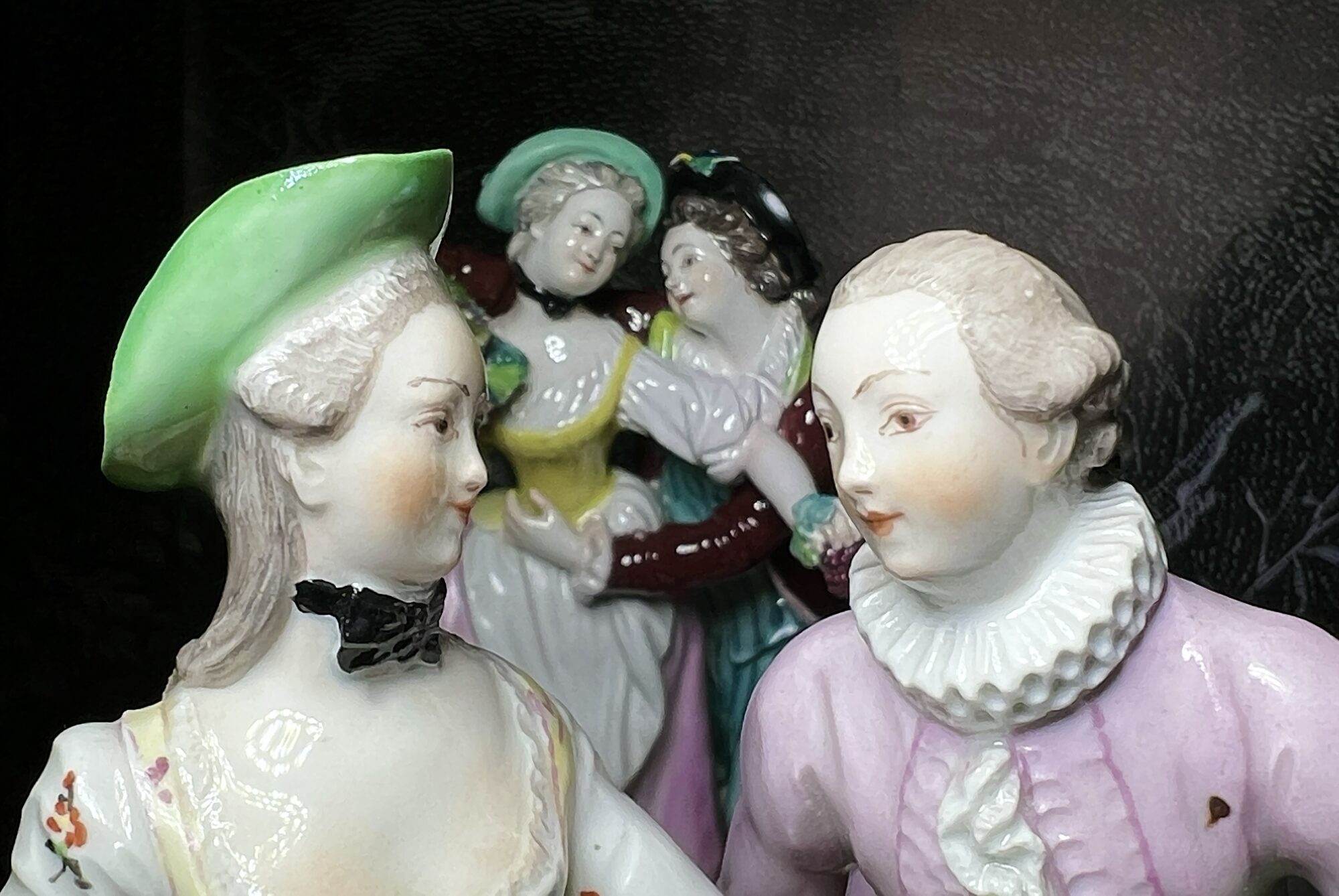
Vienna figure of ‘Autumn’, circa 1765
This remarkable figure dates to the 1760’s, and along with others in the same theme, would have been part of a grand table decoration for the banquets of an important household. The figures depict idealic ‘pastorale pastimes’, such as the harvesting of grapes seen here, and show us a favourite occupation of the Rococo courts in Europe: dress-up balls.
Marie Antoinette as a shepherdess is an image well remembered in the present, and such themed events were a common occurrence in the 18th century. Grand balls were held with attendees all dressing in ‘pastorale’ costumes, imaginative interpretations of the life of the ‘common folk’. Imagine such a ball, with an associated dining experience included. Sitting at the table in one’s costume, there was a splendid representation of the pastoral ideal in the form of the colourful figures spread down the tabletop between the guests. They were the perfect conversation starters, and with the lively & expressive interactions of the characters seen in these Viennese figures, no end of witty comments would be possible.
18th century Viennese Table Figures in use
Vienna Porcelain c.1765
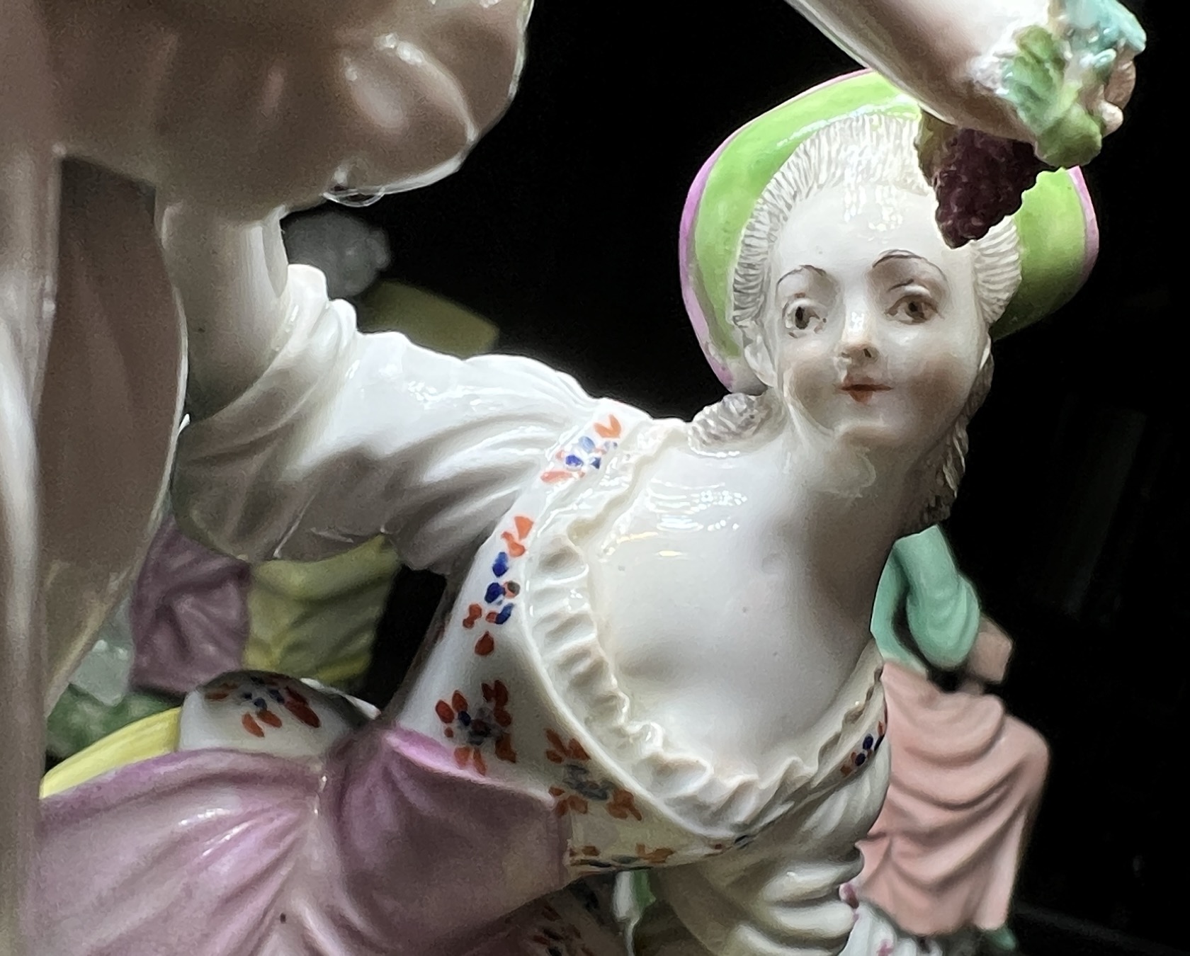
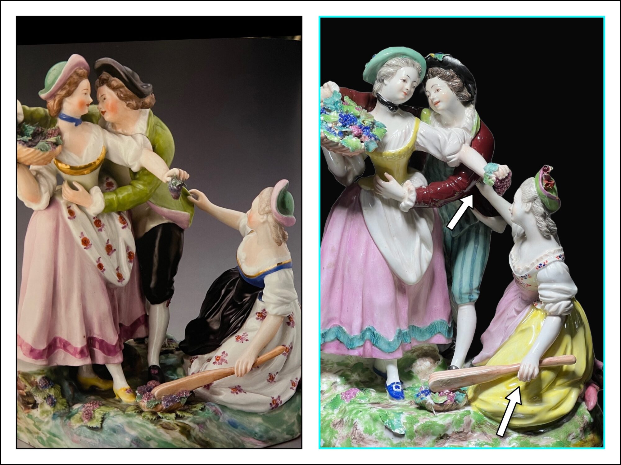
This example is one of a group of four figures depicting the seasons. With the grapes being harvested, it is Autumn; in the same Prague collection are two other figure groups matching (the key difference being 3-figures on a single oval base) – ‘Reaper as allegory of summer’ and ‘Ice skater as allegory of Winter’. Missing is a figure of spring; presumably the ladies depicted will have baskets of ‘spring flowers’ or fruits.
Viennese Porcelain c.1765
The modeller who incised ‘Q’ is well represented in any collection with early Vienna figures.
This example differs very slightly in the construction of the components, with the kneeling woman’s hand resting under the man’s armpit rather than on his coat tail, and her other hand not actually grasping the tool. The colour palette is the same yellow, pink, blue, and tones of green & brown, but the Prague example also includes two instances of gold being used.
Left: Prague collection Right: Moorabool Antiques, Australia
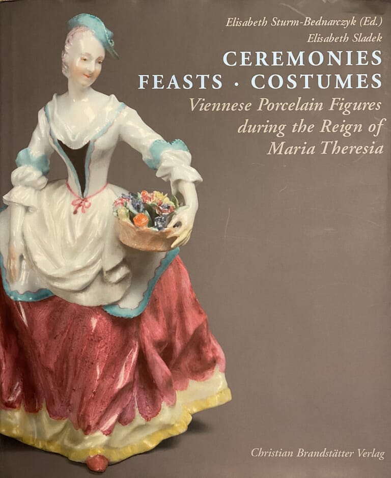
The definitive book on these early figures ‘Ceremonies Feasts Costumes : Viennese Porcelain Figures during the reign of Maria Theresia’ is a splendid 2007 publication with large clear illustrations, detailing hundreds of Vienna figures from the 1740’s until the 1780’s. A private businessman, Du Paquier, had started the porcelain works in Vienna as early as 1719 ( making it the second true porcelain manufacturer in Europe, after Meissen), but by 1744 he was financially struggling, and the Viennese State purchased the works. This was of course ruled by Maria Theresia, the Empress of Austria, and she loved a good party… the porcelain works were an excellent source of the needed table wares, and this included table figures.
Refer p148 of this book for an example of the above figure, also the frontispiece of the book; fig. 228 “Wine grower as an allegory of autumn”, c. 1765 (Decorative Arts Museum, Prague).
Some stunning Fresh Stock items @ Moorabool Antiques this week!
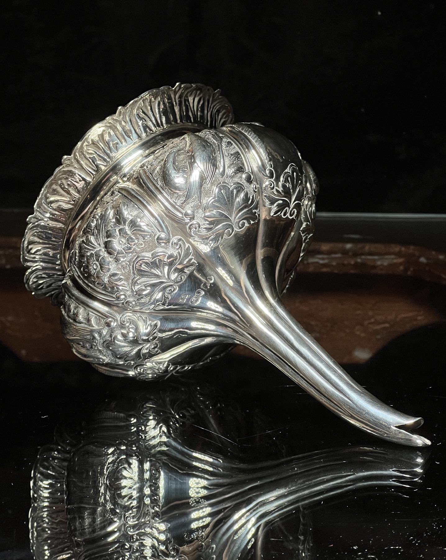
Richard William Atkins & William Nathaniel Somersall, London, 1834 Sterling Silver Wine Funnel
This is the ultimate wine funnel: a Sterling Silver lobed example, with 6 repoussé panels and 2 left blank for initials, the separate insert with acanthus leaf rim & gilt wash interior…. It was London-made in 1834, during the reign of William IV, the silversmiths being Richard William Atkins & William Nathaniel Somersall. While plain silver wine funnels are not uncommon, the embellishment of this example makes it an exceptional piece – and very usable!
Decoration of Sterling Silver Wine Funnel
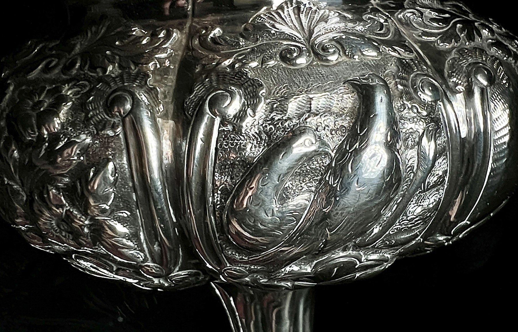
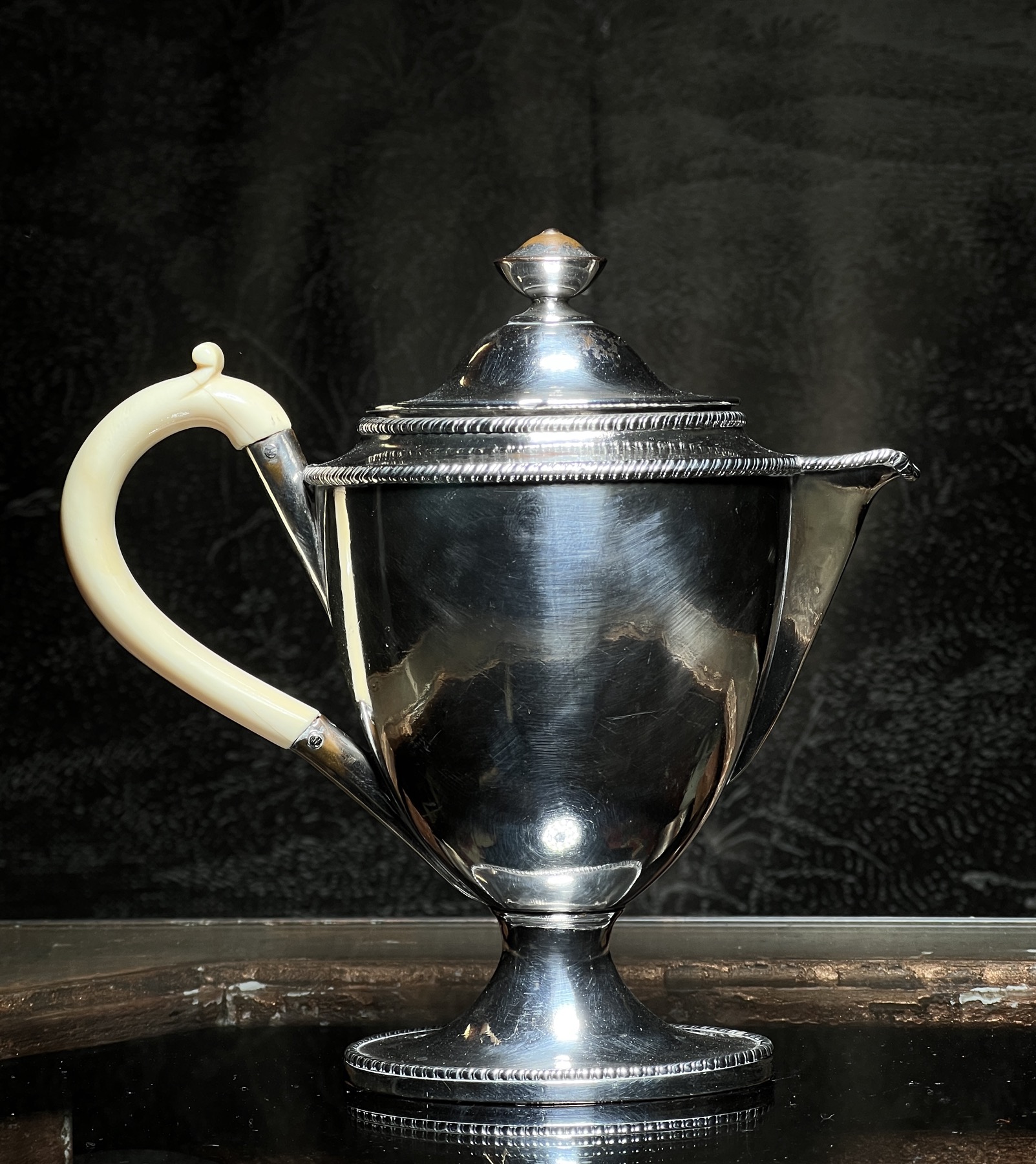
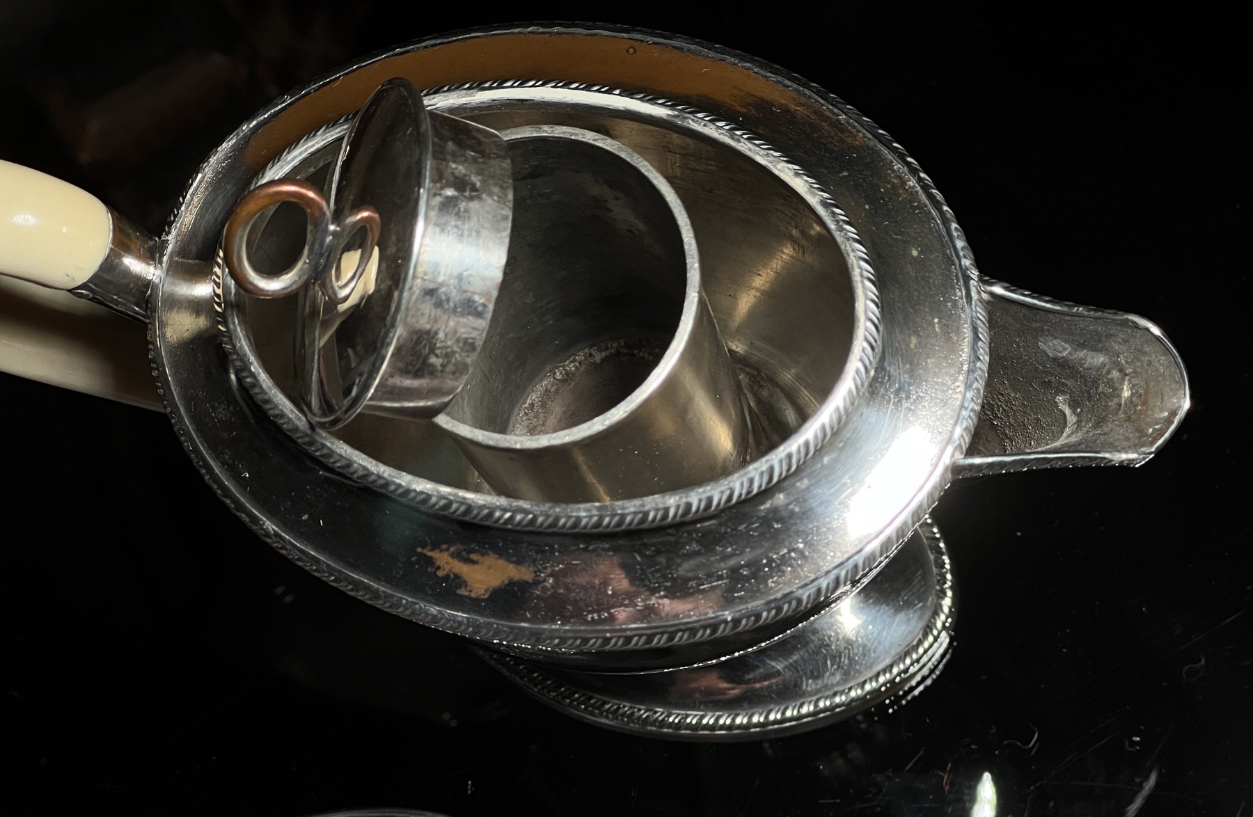
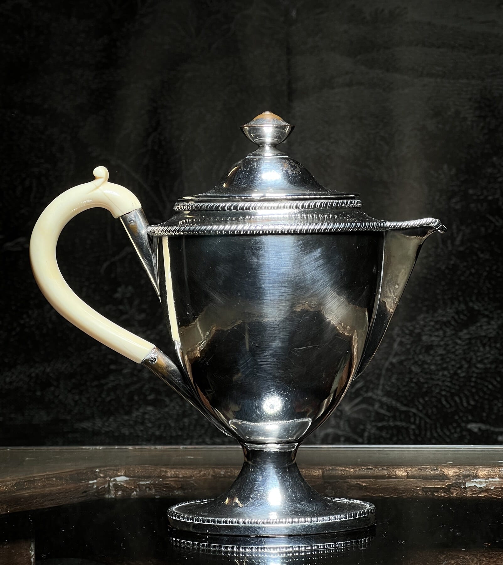
Old Sheffield Plate Argyle, c. 1795
This lovely piece of Old Sheffield Plate is a rarity. Known as an ‘Argyle’, it has an internal partition with a lid to take some hot water – this then keeps the contents warm. Legend has it that the Duke of Argyll, back in the 18th century, came up with the bright idea after bemoaning the cold gravy inevitably served on the Duke’s table, as the kitchens were a long way to bring gravy through the cold draughty castle, cooling too much on the journey. The insert made it lovely and warm…. or so the story goes. This is a particularly elegant example in the Adams Neoclassical style, with a dramatic ivory handle.
Old Sheffield Plate Argyle, c. 1795
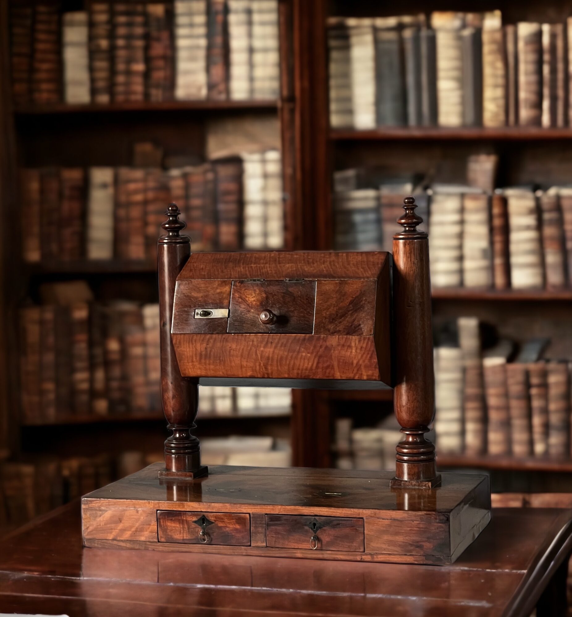
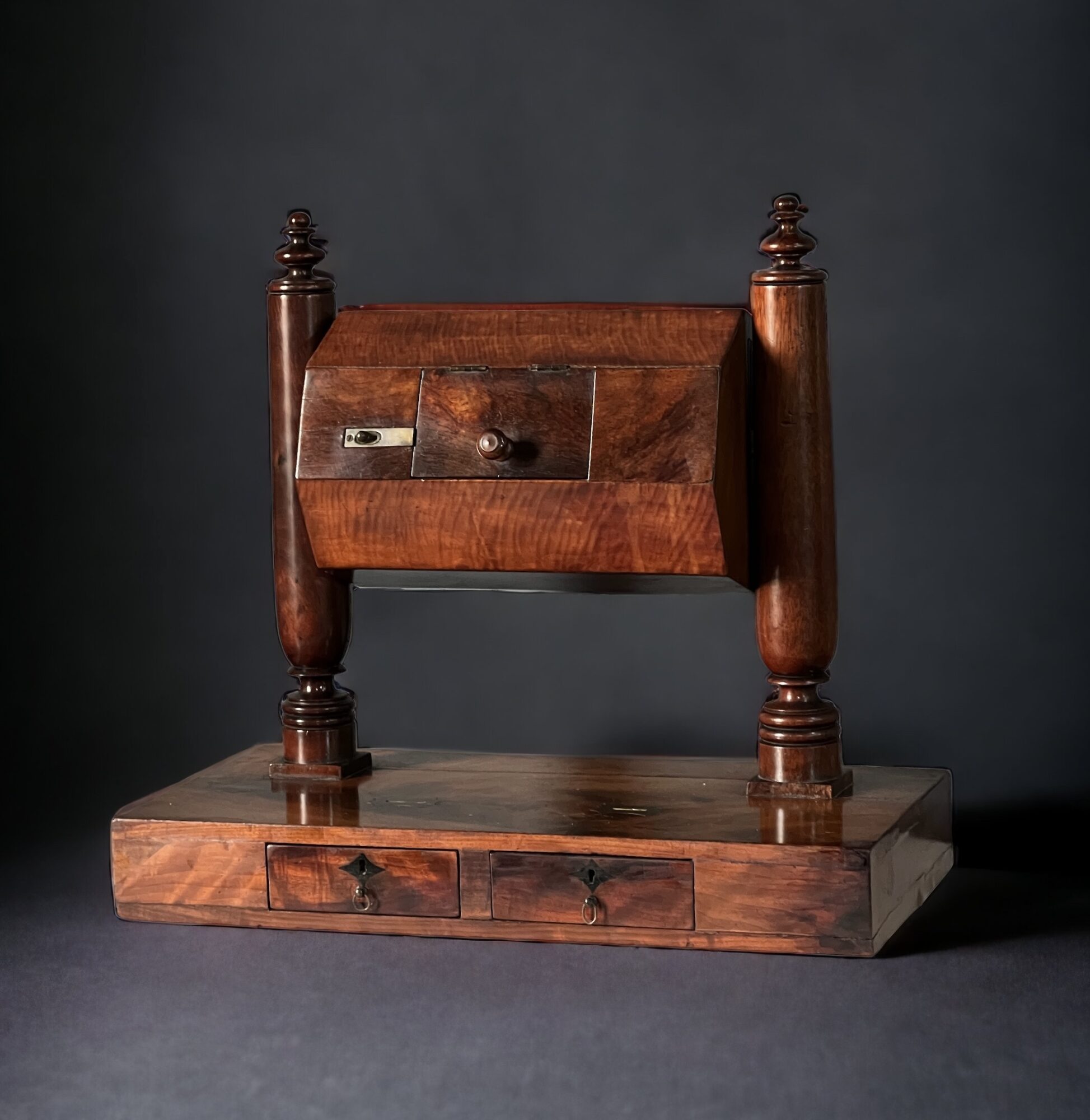
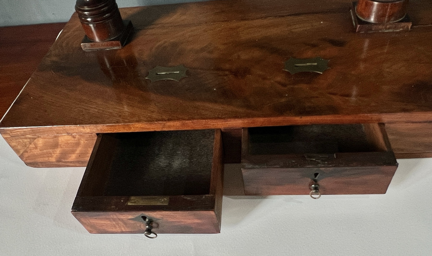
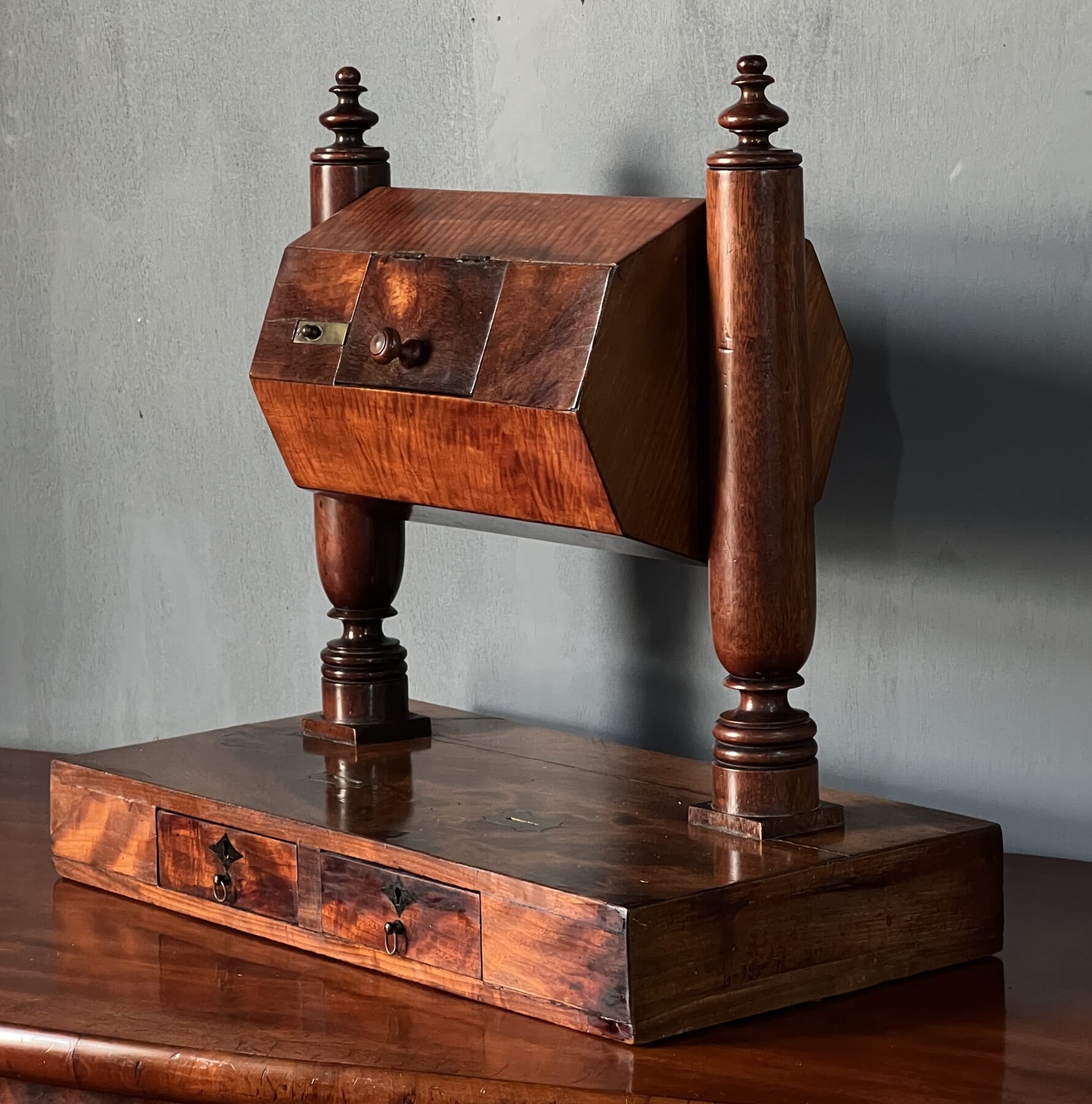
Mahogany Voting Machine, 19th century
Mahogany Voting Machine, 19th century
Mahogany Voting Machine, 19th century
A most unusual piece begging to be used is a ‘voting machine’, also from the William IV period. It is mahogany, with satinwood & rosewood veneer. The octagonal revolving drum has a hatch into which the nominations (names) can be placed & tumbled for a random selection, while below are two lockable drawers with brass slots above to take tokens for a vote – presumably ivory black & white for ‘Yes’ and ‘No’ votes. We imagine it being used in a gentleman’s club to make all those important decisions….
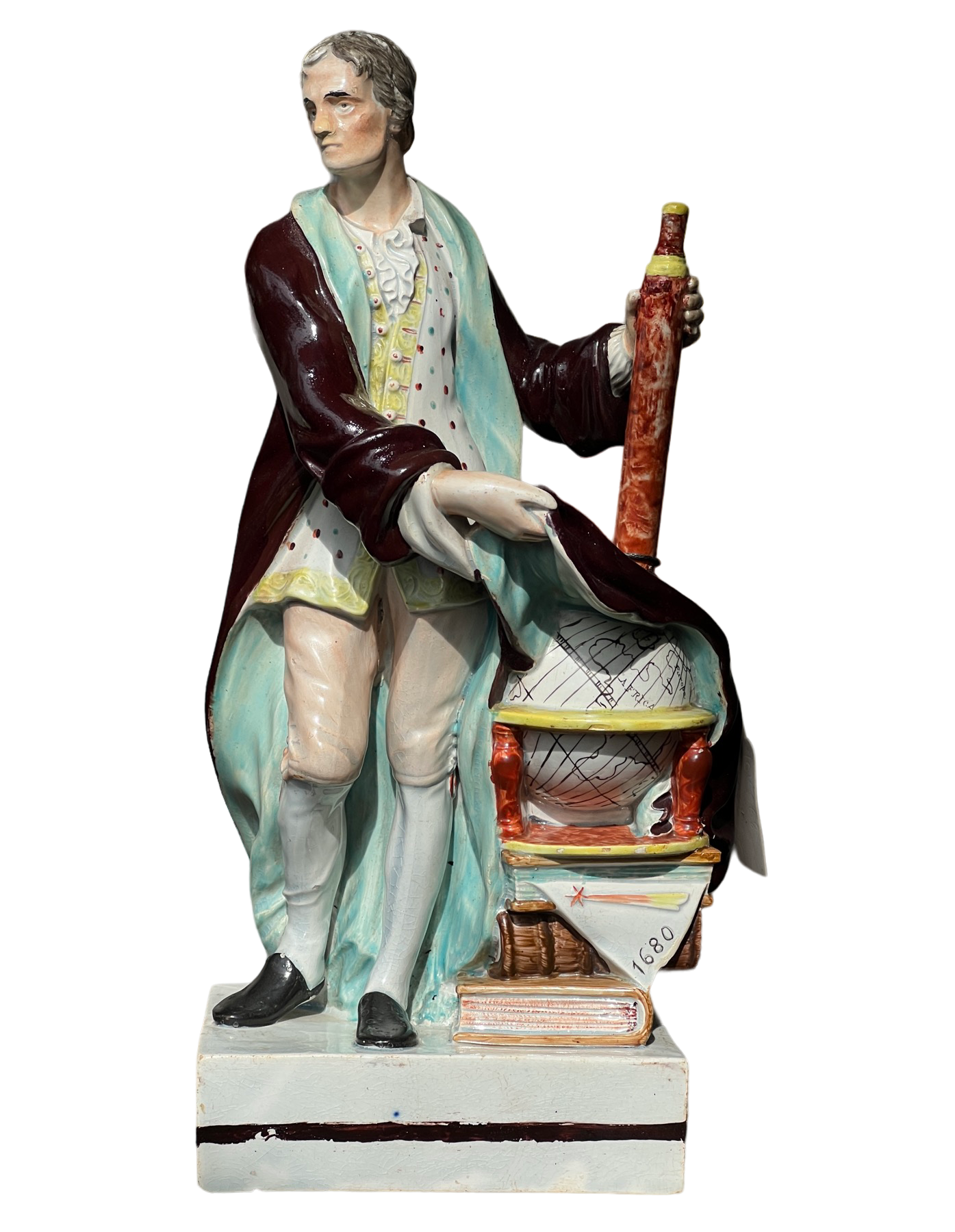
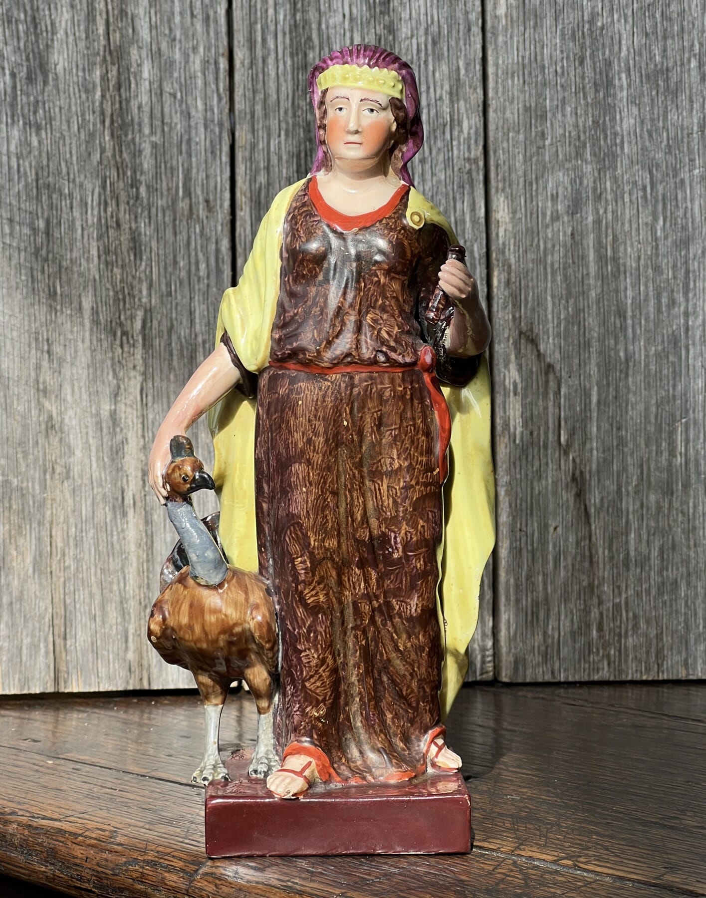
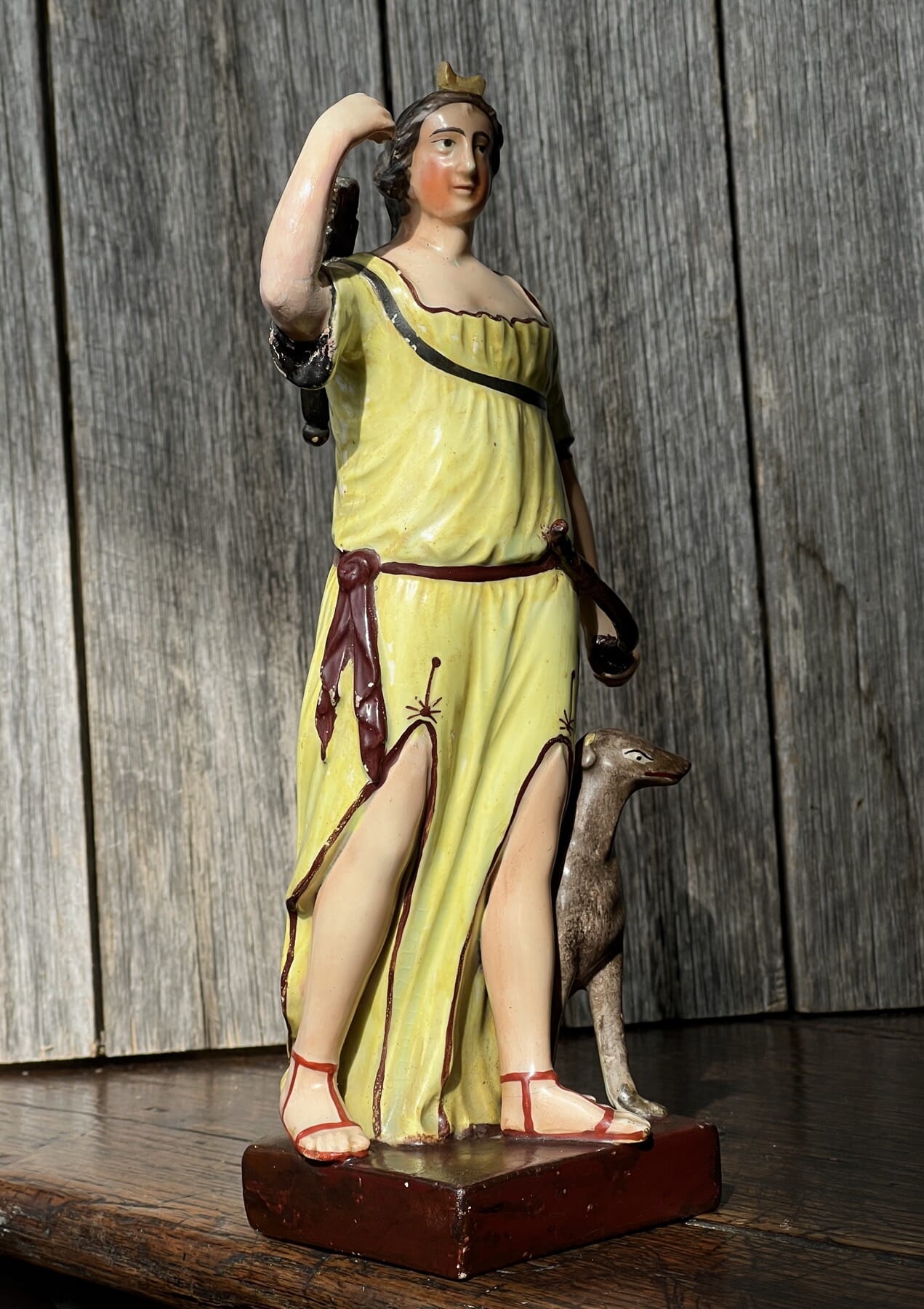
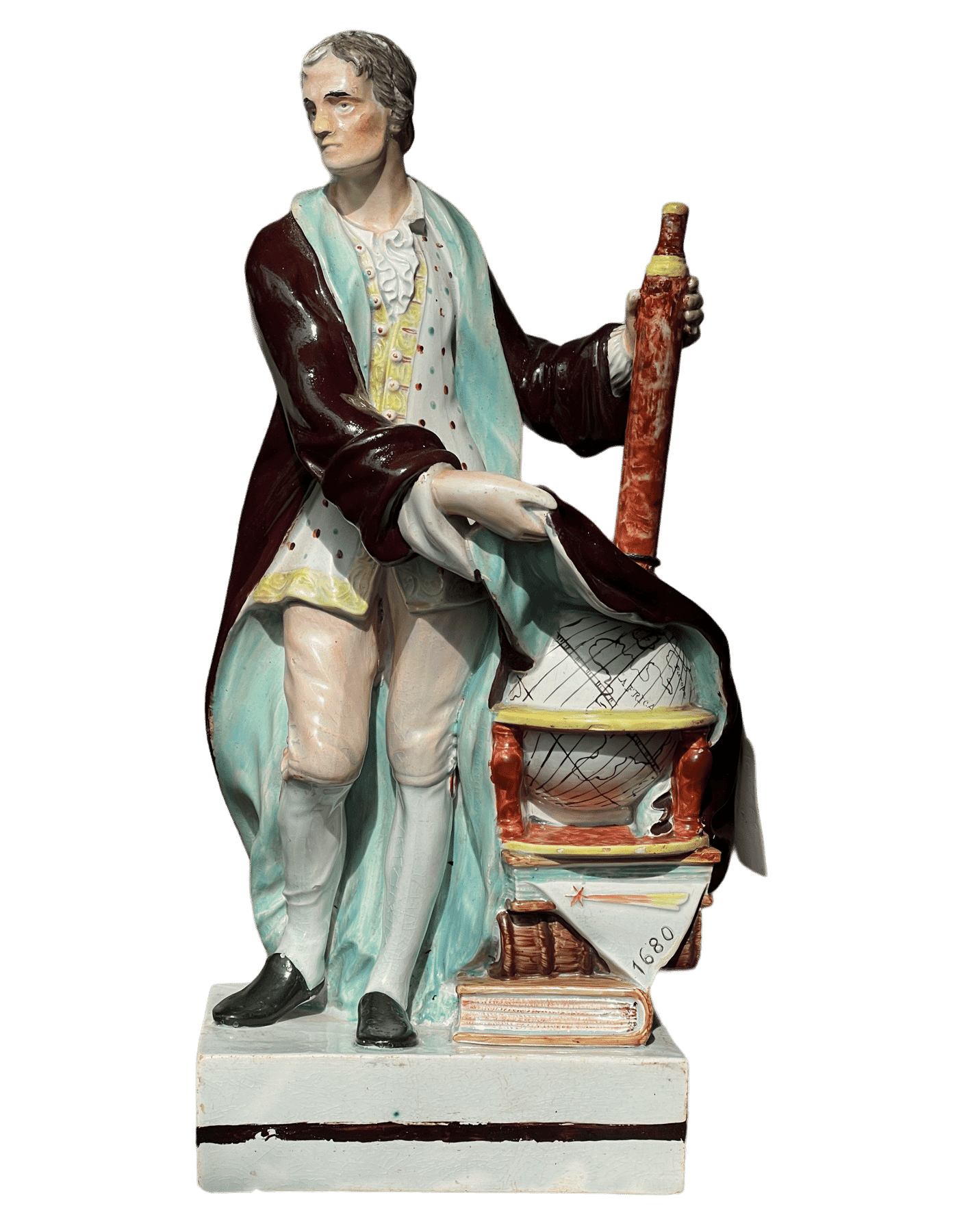
Sir Isaac Newton, Leeds Pottery Marked Figure c.1790 at Moorabool Antiques, Geelong
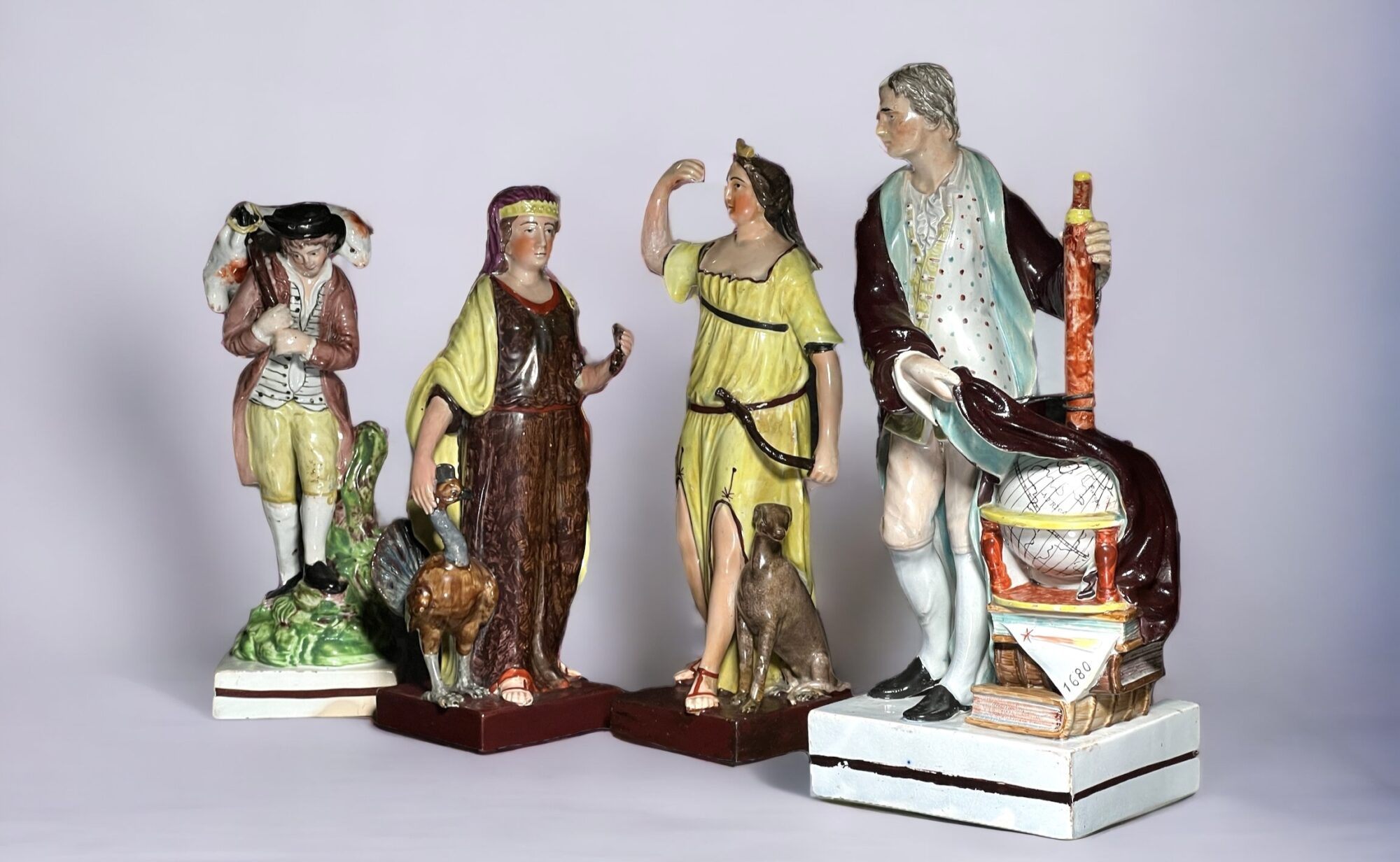
Some early Staffordshire rarities have just been released. Rarest of all is a figure of Sir Isaac Newton, almost unique in having an impressed “LEEDS POTTERY” mark – there is one other example with the mark recorded, in the Leeds Museum.
Rare LEEDS impressed mark on Newton figure
Accompanying it are two goddesses, Juno with her peacock and Diana with her dog – of a type known, rather unimaginatively, as the “Brown Base Group’ – until a maker can be identified.
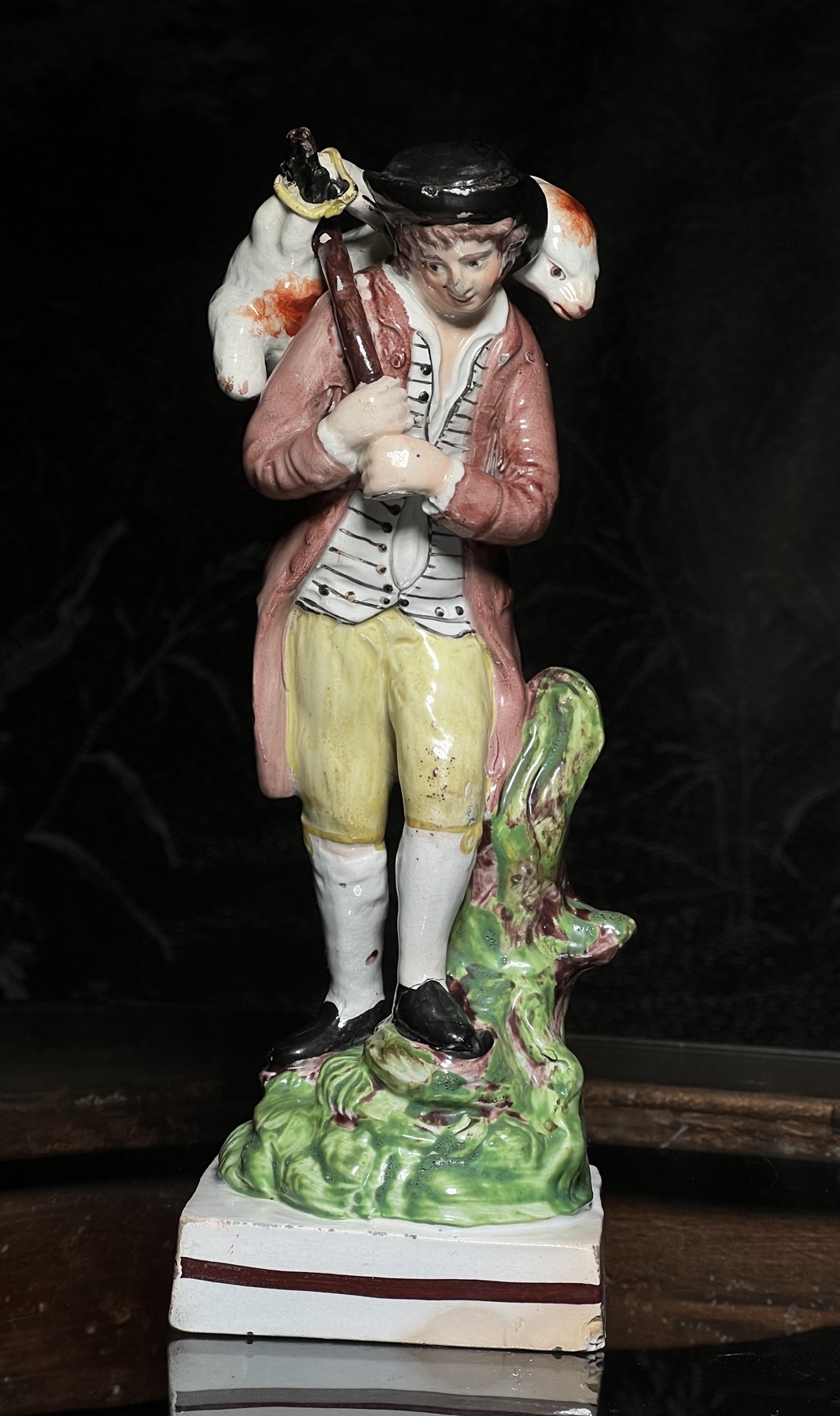
The Lost Sheep Returns, Woods Staffordshire figure c. 1790
The third is more identifiable, and yet also poses a question: it’s ‘The Lost Sheep Returns’, after the parable of the lost sheep. Standing on a square plinth base, it is one of the early detailed figures usually attributed to the Woods of Staffordshire. A ‘rule of thumb’ is that Ralph Wood examples have no brown line to the back panel of the plinth base, while Enoch goes all the way around. This example has a line all the way – and with some other small details, suggests a fresh attribution to Enoch.
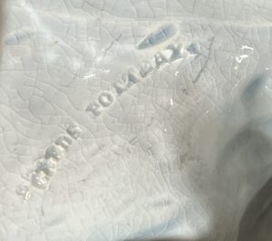
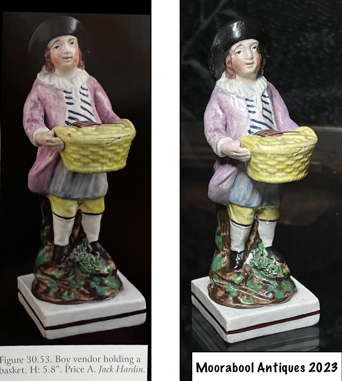
A smaller early Staffordshire figure just released is also of interest: we have our go-to resource for identification, Myrna Schkilne’s ‘Staffordshire Figure 1780-1840’. In volume 1, there’s an example of this figure, illustrated below …..
Spot the Difference! Early Staffordshire ‘Sweetmeat seller’ (clue: there is no difference…. it’s the exact same figure!)
Yes, it’s the exact same figure! It’s noted in a collection in the 2013 publication, and somehow has made its way to Australia in the past 10 years…..
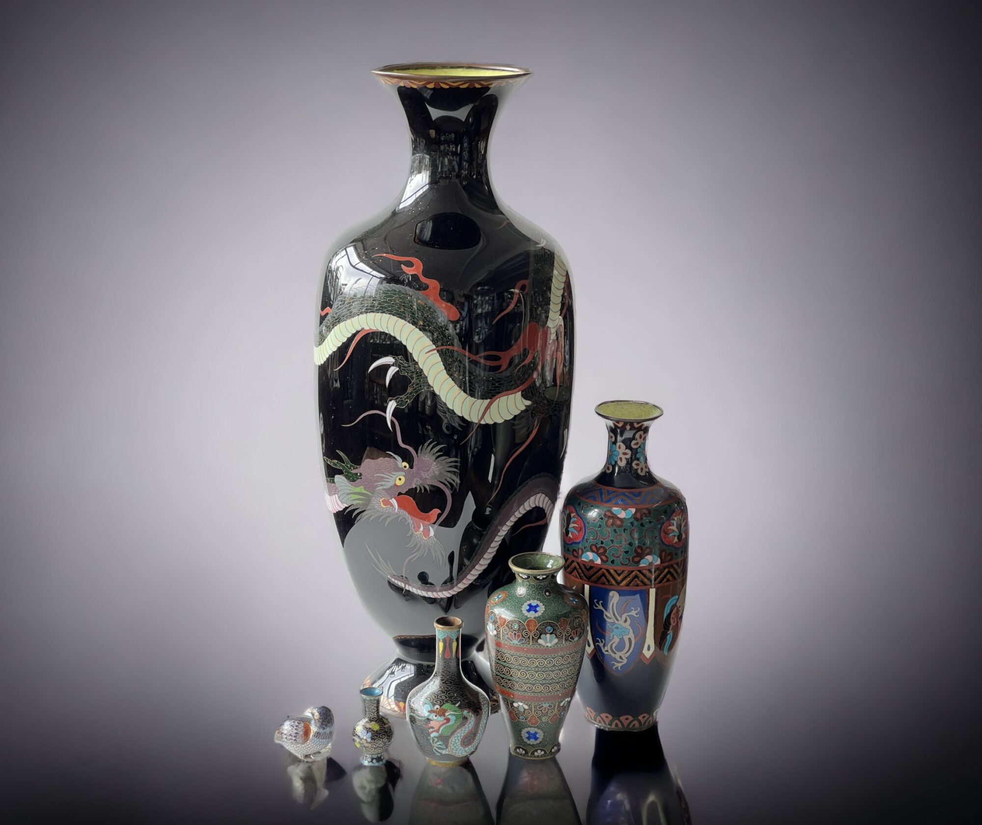
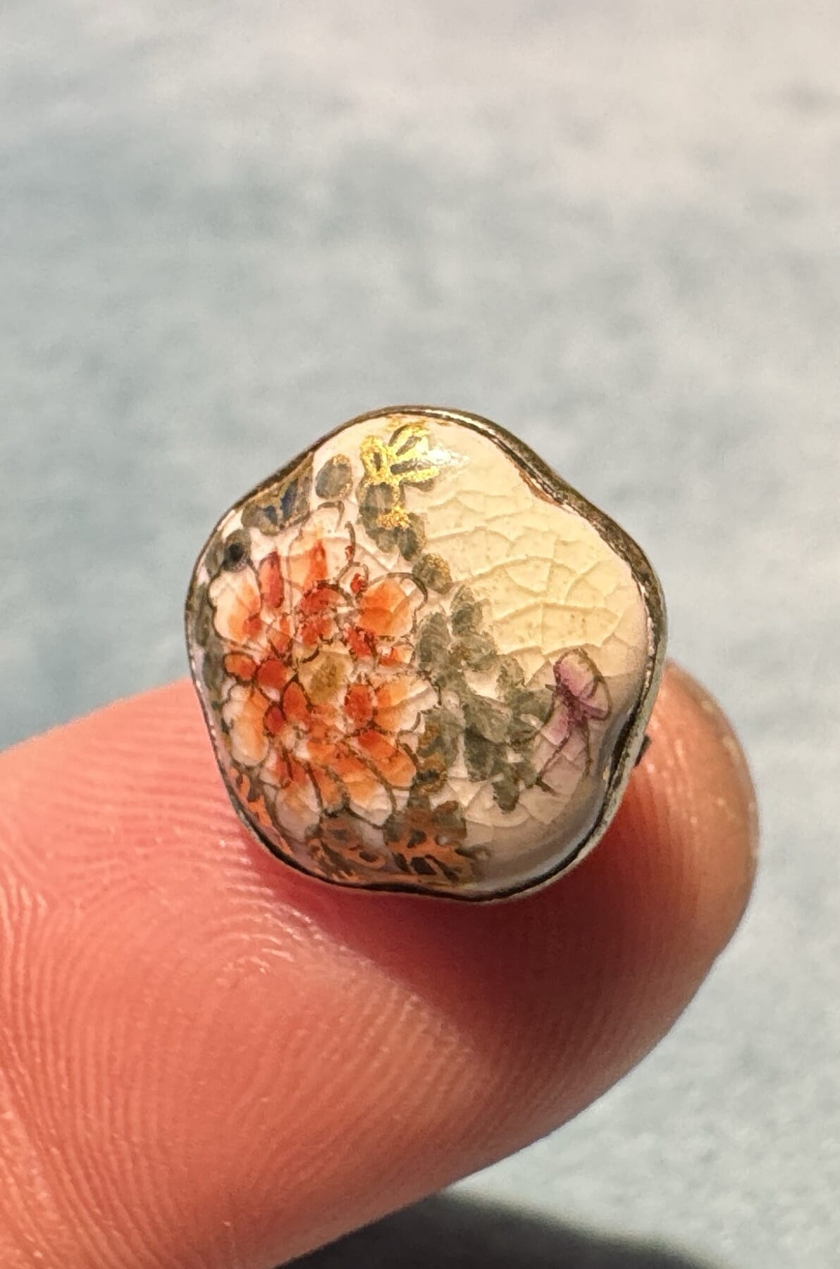
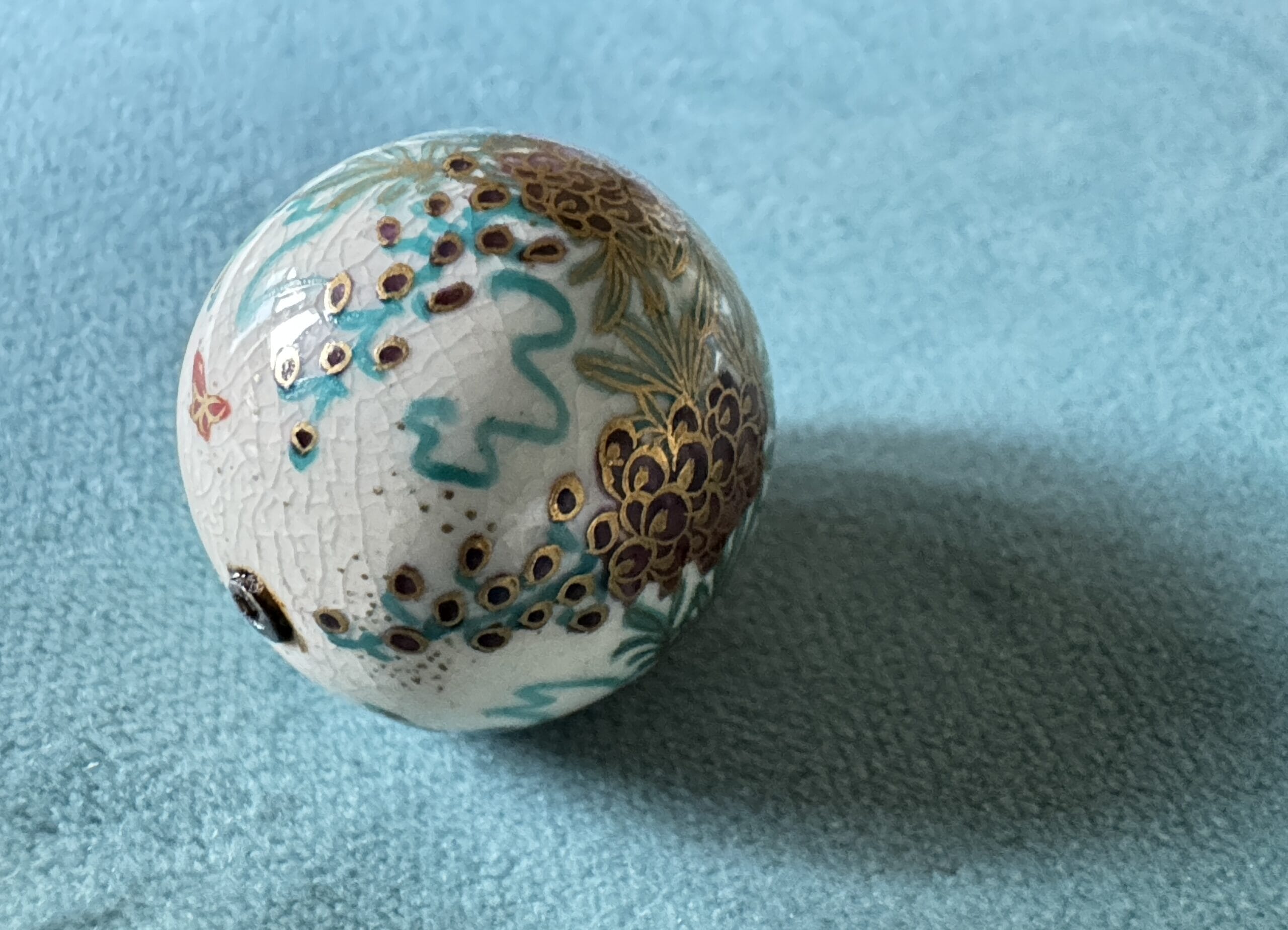
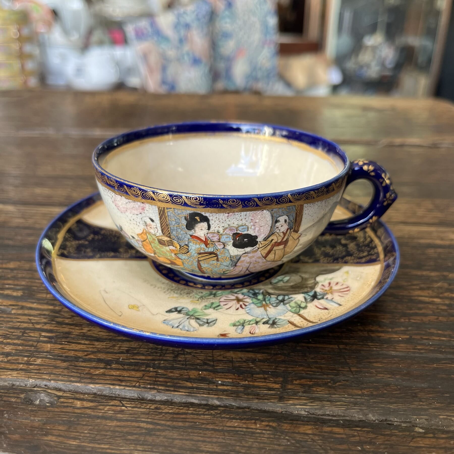
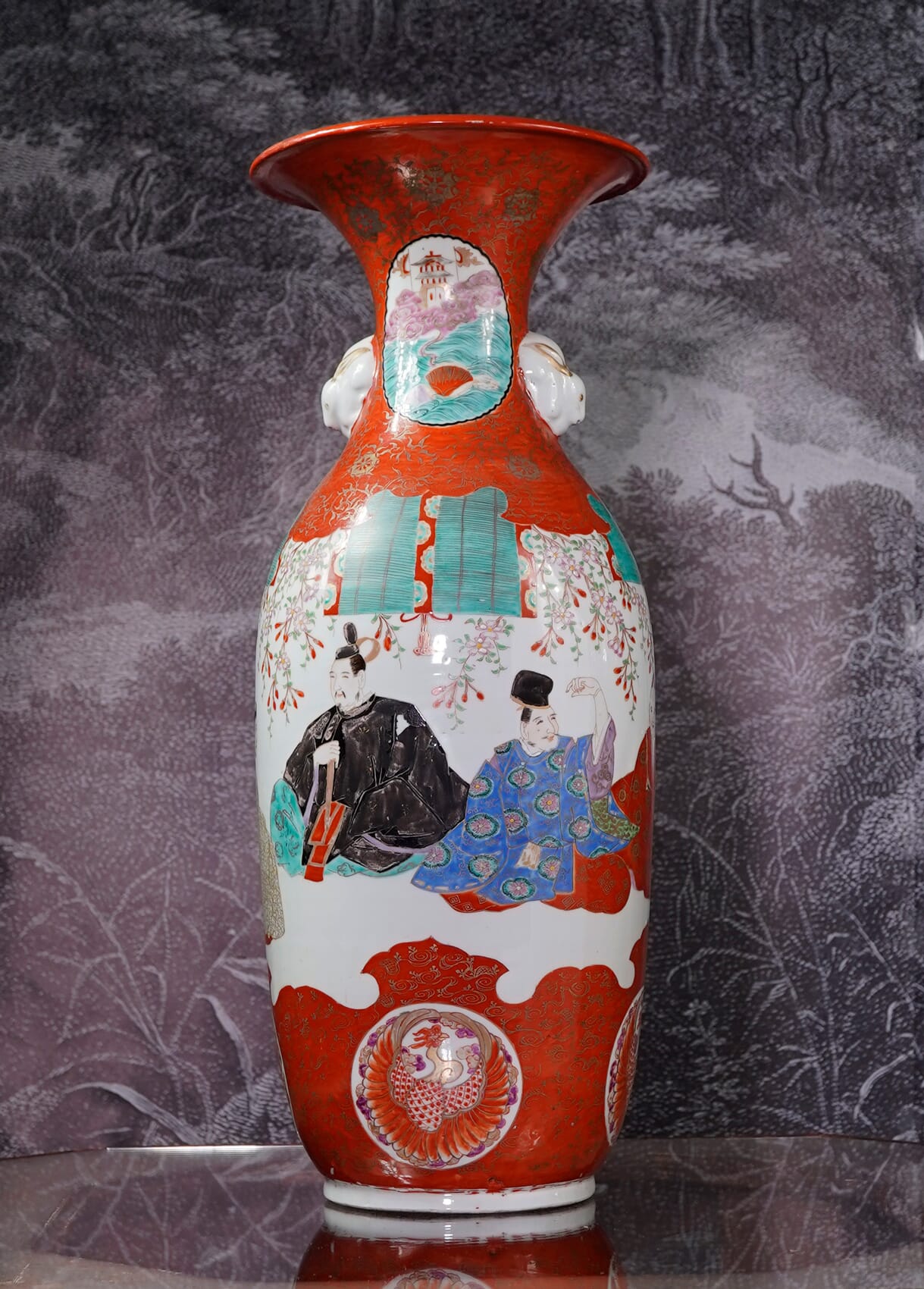
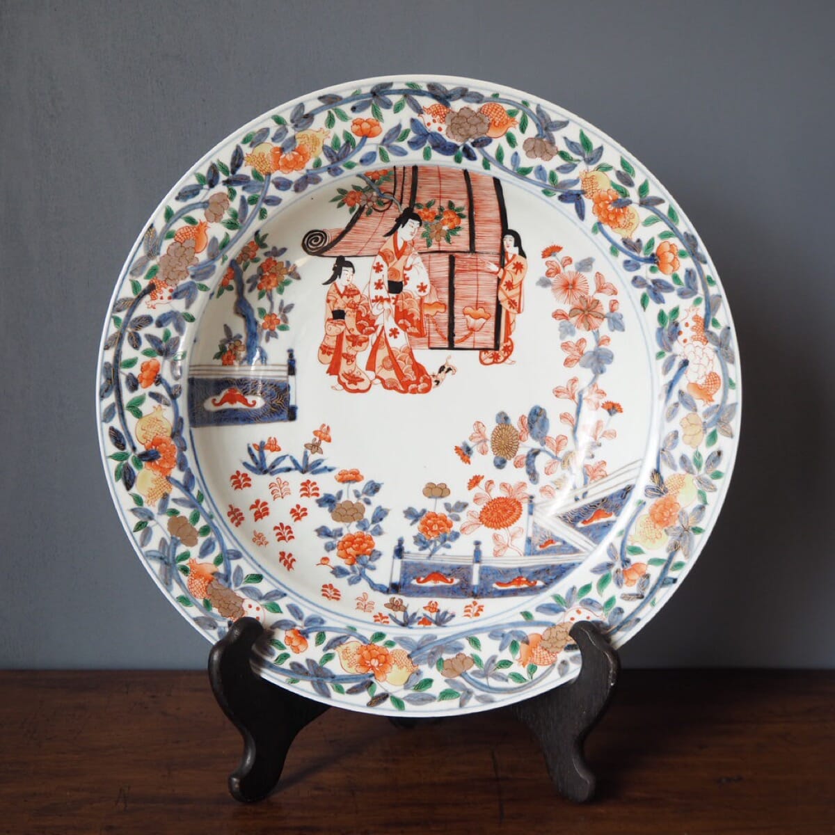
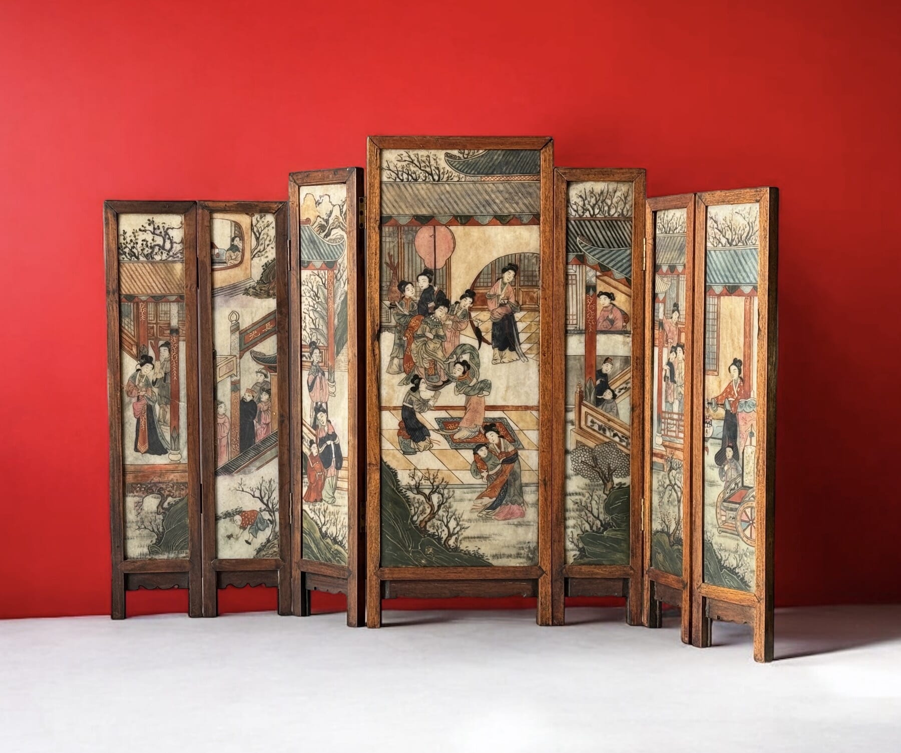
Welcome to the first of a series of Asian Specials. We’re amazed at the Asian items that turn up in Australia. From Ming Bronzes to Japanese Cloisonné, there’s a wealth of fine Chinese, Japanese, Korean & other South-East Asian works to find. This is due to two things; we’re close to Asia, and Australians are great travellers. Naturally, they bring things back with them!
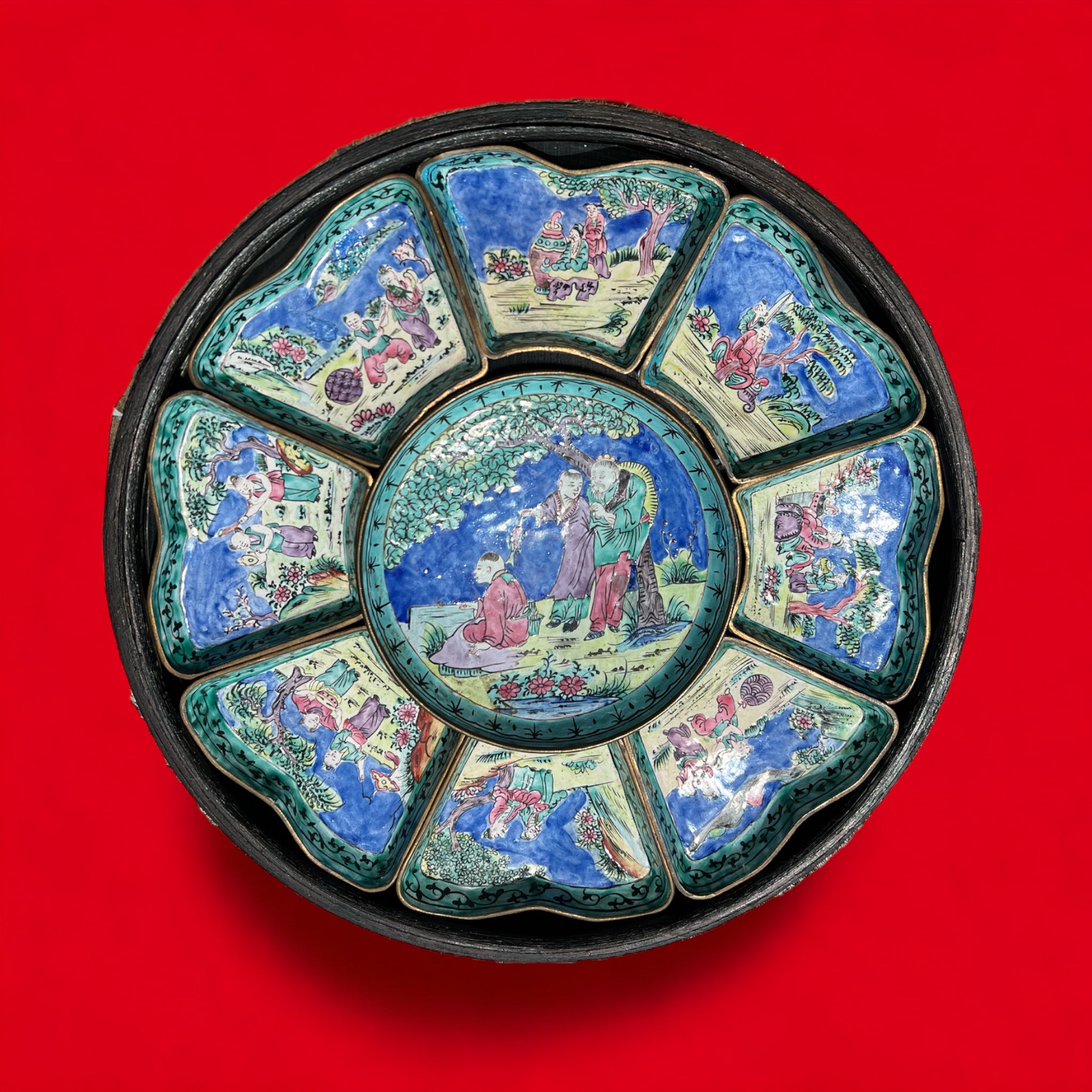
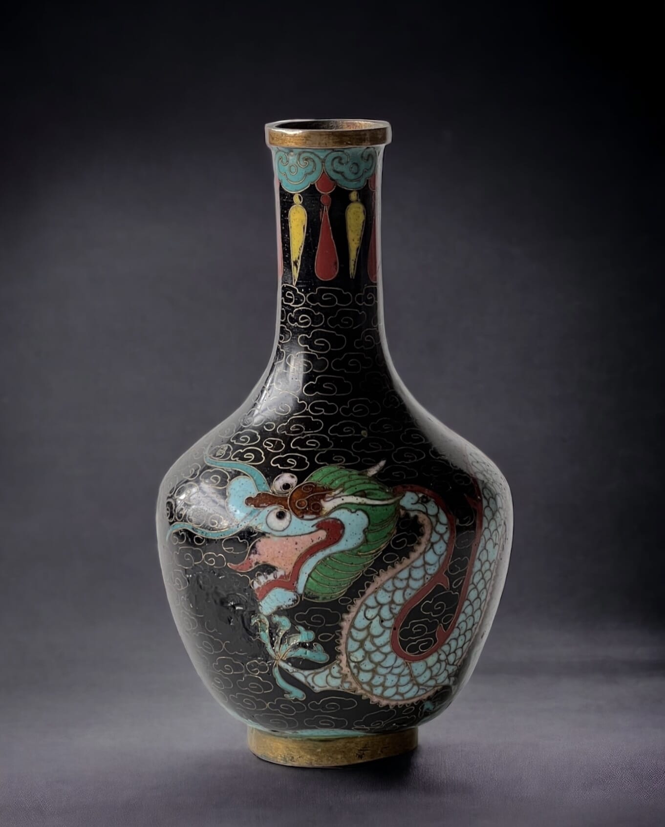
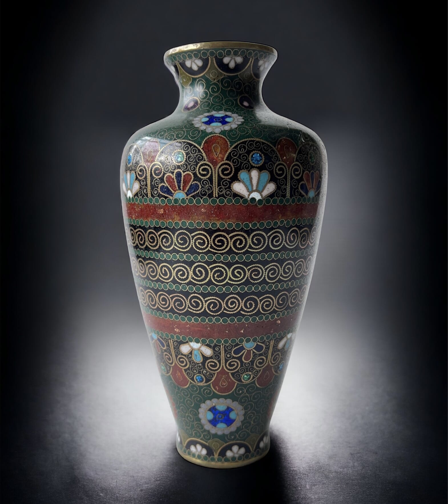
Chinese & Japanese Cloisonné at Moorabool Antiques, Geelong
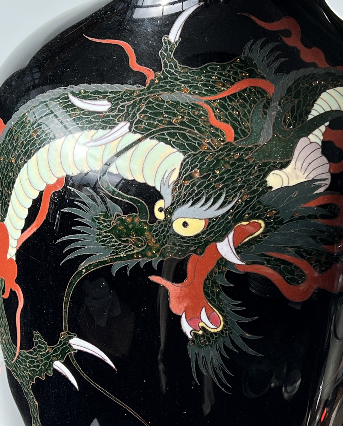
This week, we have a group of Japanese & Chinese Cloisonné – including a remarkable piece, an oversize Japanese vase notable for the pair of ferocious dragons dramatically writhing their way around the vase. This vase is giant – 61cm high! – and dates to the later 19th century. The bright enamel colours and glossy black background make it a dramatic display piece.
Dramatic Japanese Dragon…..
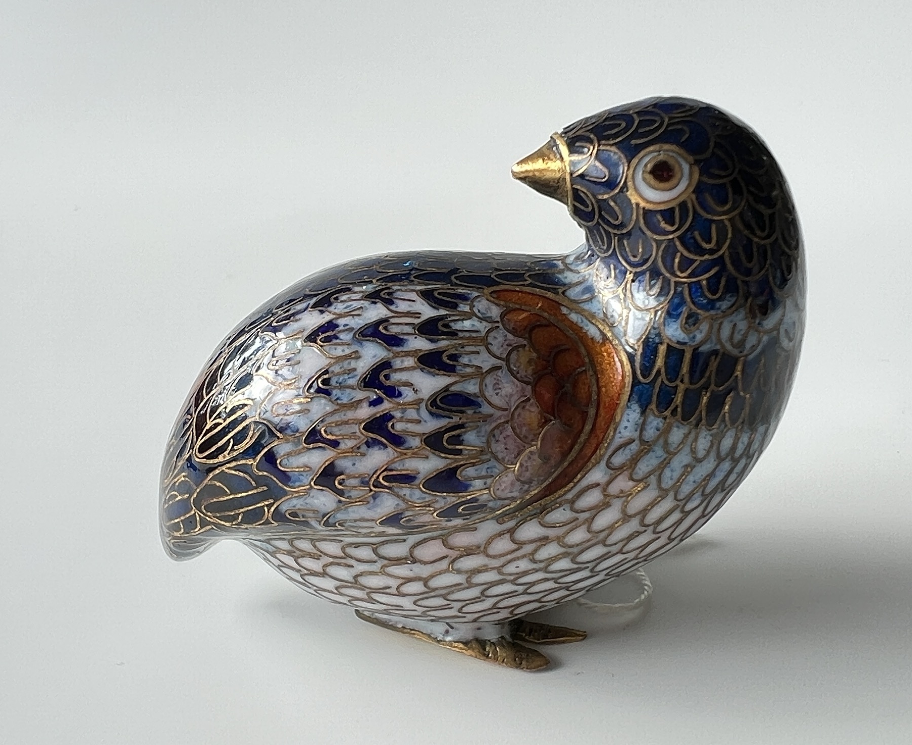
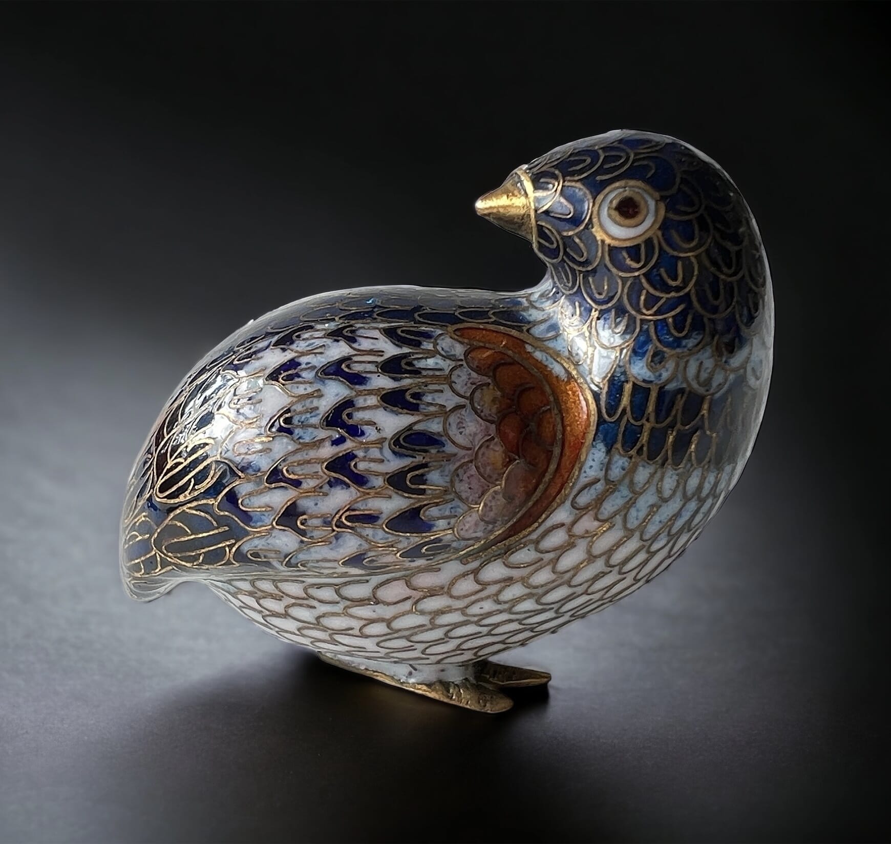
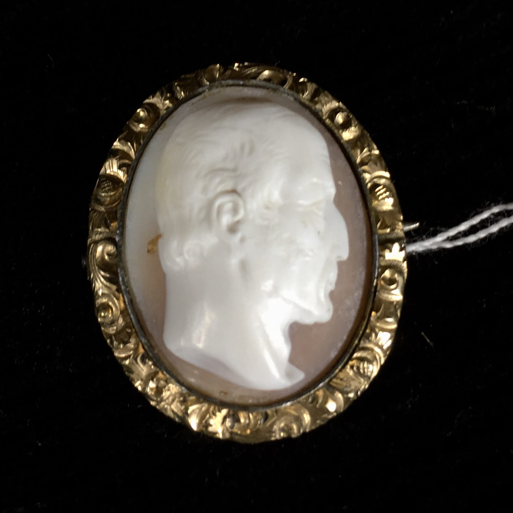
Antique Japanese Cloisonné Quail
On the opposite extreme is a tiny – fits in the palm of your hand, so actually life-size – quail in cloisonné, also Japanese & super cute!
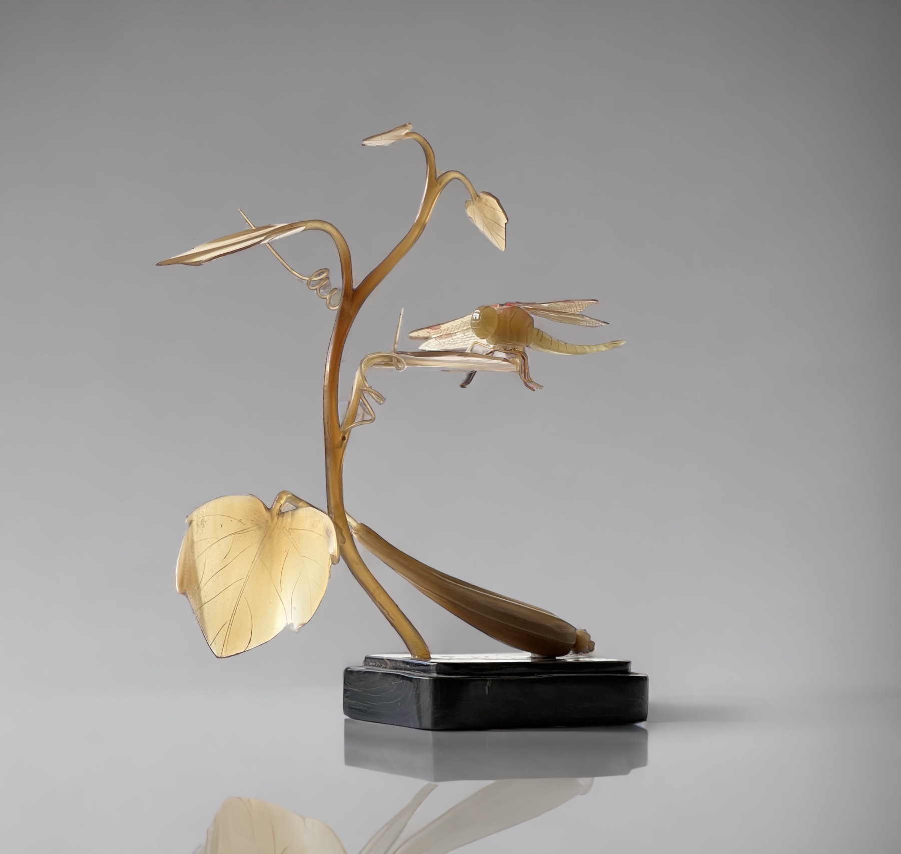
Life-size Japanese Horn dragonfly sculpture, Meiji Period 19th century
There’s also a selection of interesting Shipwreck items. We’re always looking for these, as they have the allure of being under the sea for hundred of years – and are therefore ‘guaranteed’ to be authentic. Compare this to items that just turn up out of nowhere without a rock-solid provenance like a shipwreck: they’re much harder to be certain about authenticity. We have a selection of pieces & shards from various known & dated shipwrecks as our pieces for direct comparison & learning.
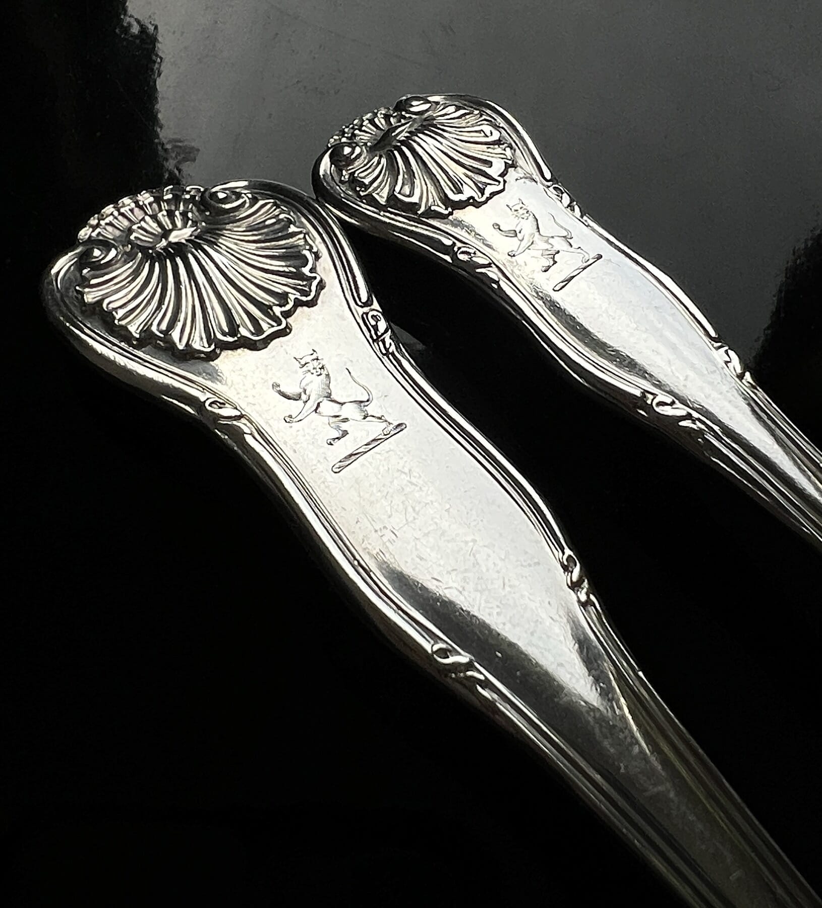
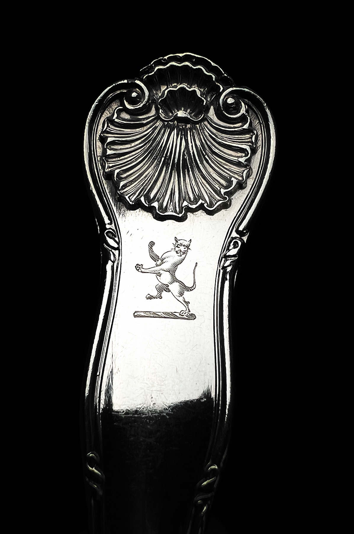
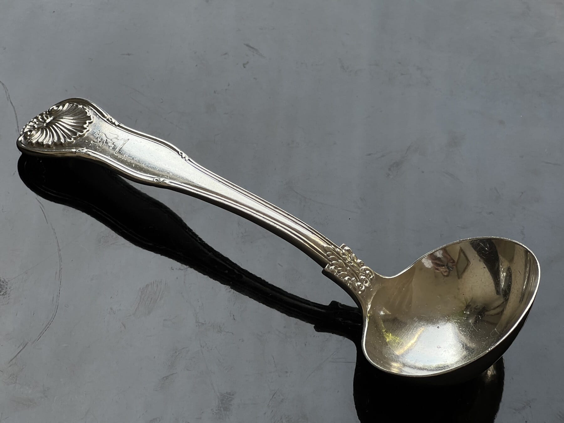
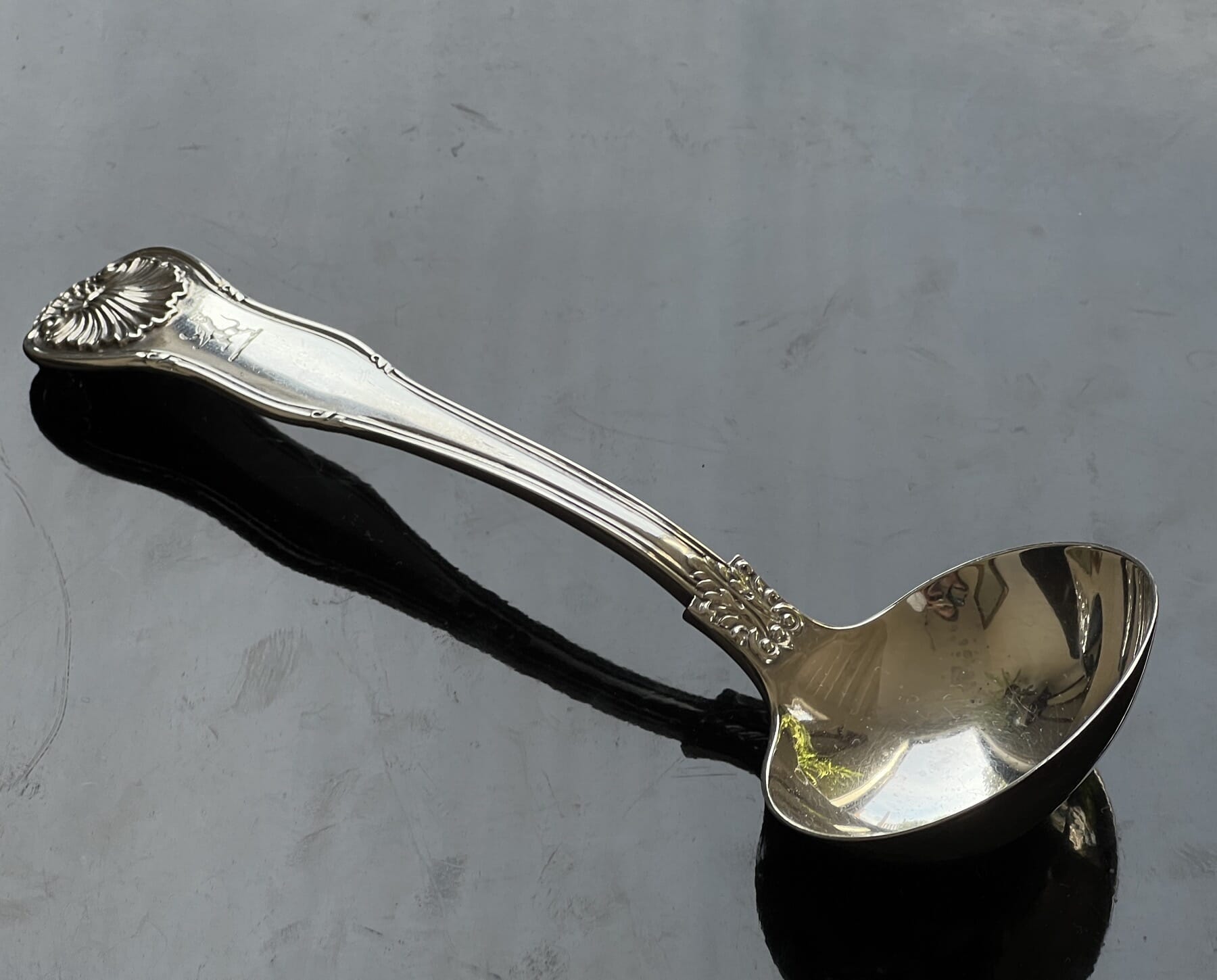
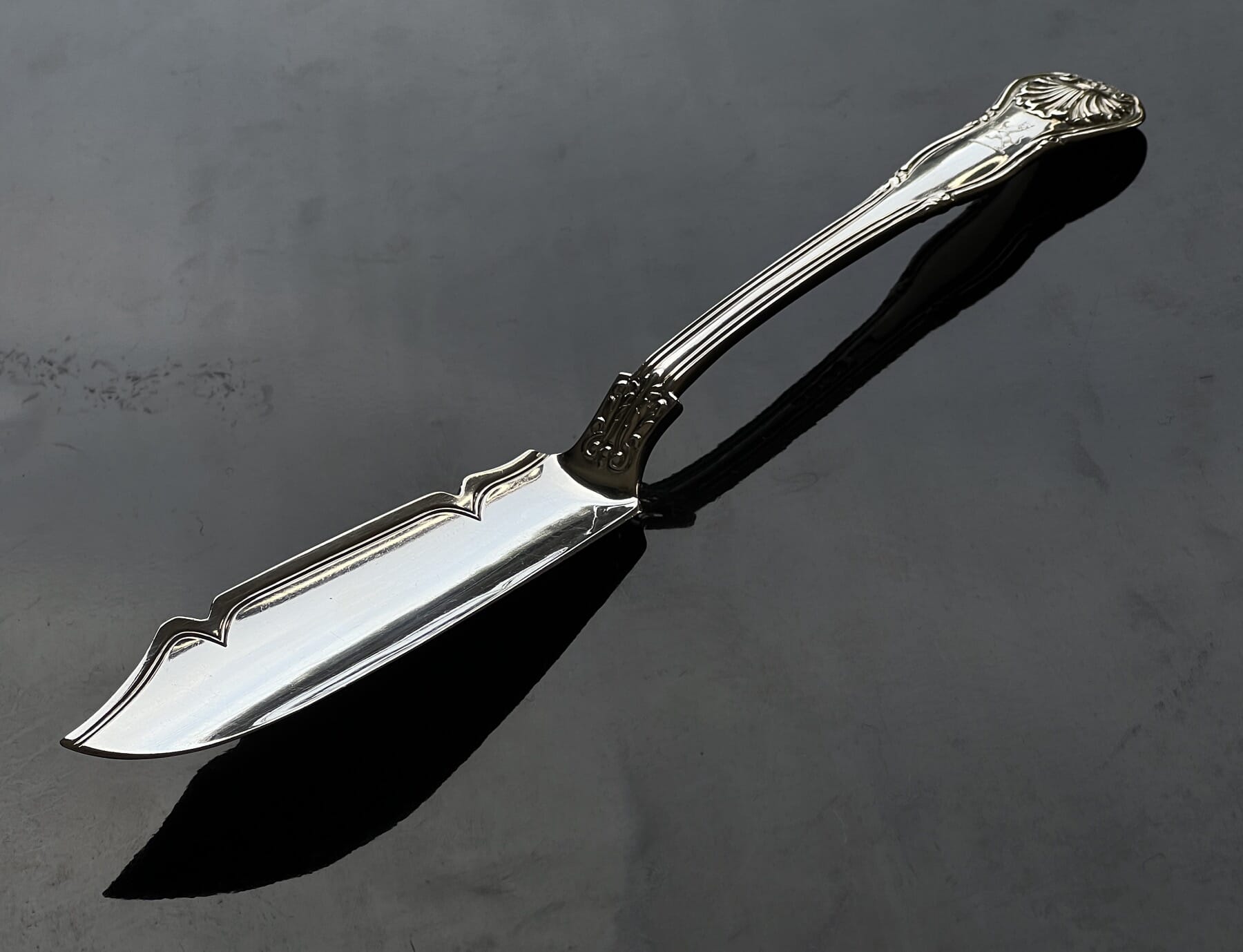
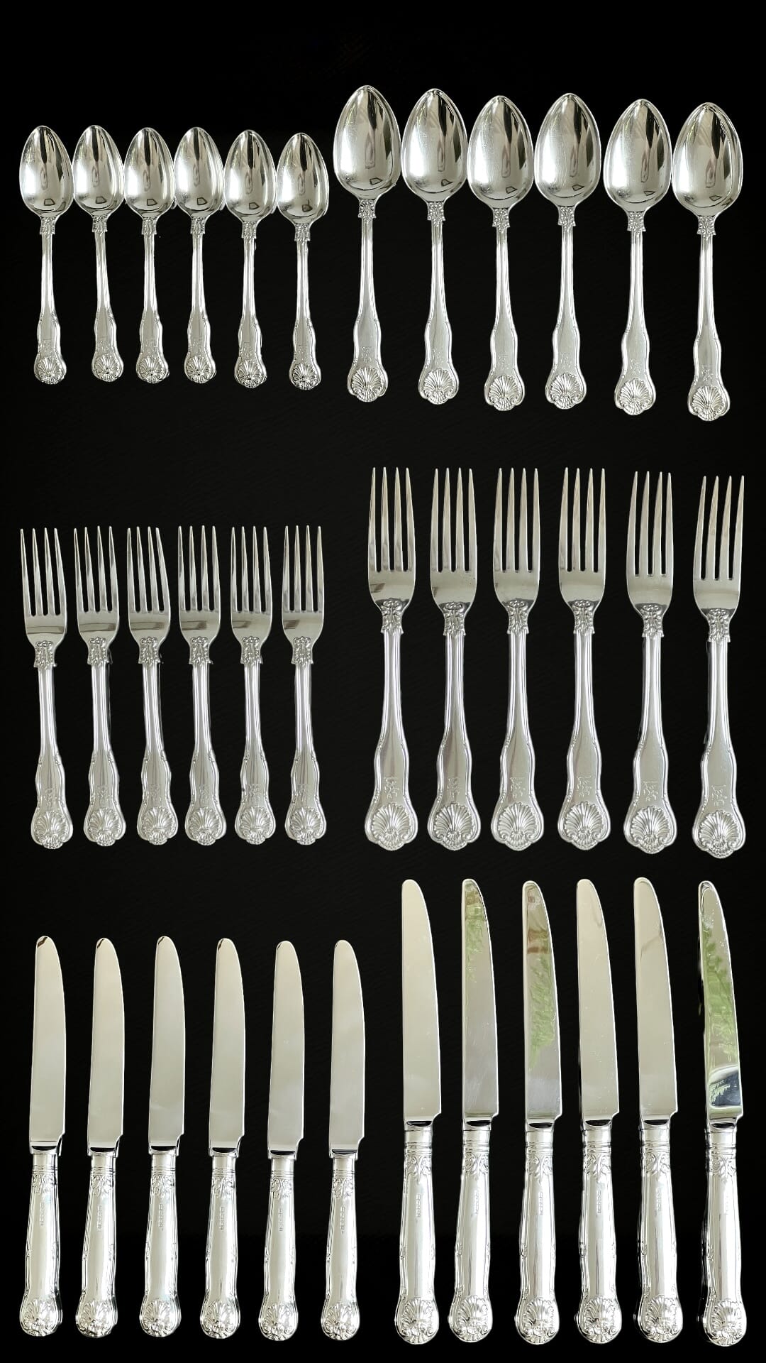
The Macintosh Clan Family Crest, on Sterling Silver cutlery at Moorabool Antiques, Geelong, Australia
“Touch not the Cat bot aglove’
The Scottish Clans are a proud lot of Gentry. Of all the clans, Macintosh is a very familiar name – and part of that is the very memorable crest.
It’s a Wildcat, beautifully engraved to each piece. The motto when included reads ‘TOUCH NOT THE CAT BOT(without) A-GLOVE’ – in other words, don’t mess with these wild Scotsmen!
These fierce Scots supported Robert the Bruce in the 14th century; Mary Queen of Scotts in the 16th century; and Bonnie Prince Charlie in the 18th century.
Their crest is in keeping with this ‘prickly’ nature: A wild cat, ‘guardant’ – rising up with claws out to attack.
The silverware is lucky to be here, having been rescued from the ‘Scrap Merchant’ recently in rural Victoria. The knives were made to match in England, with Sterling Silver handles, in 2015!
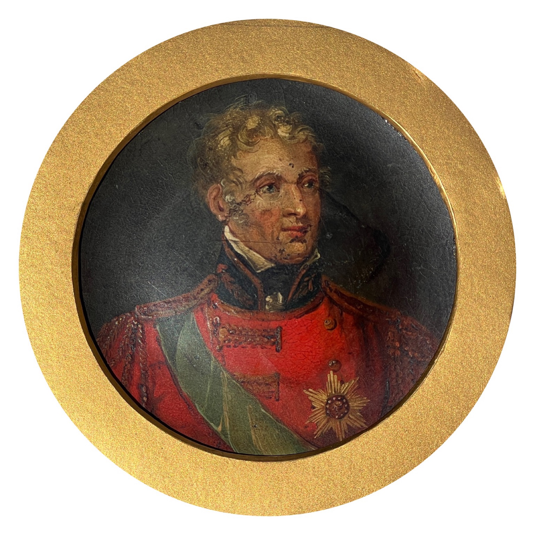
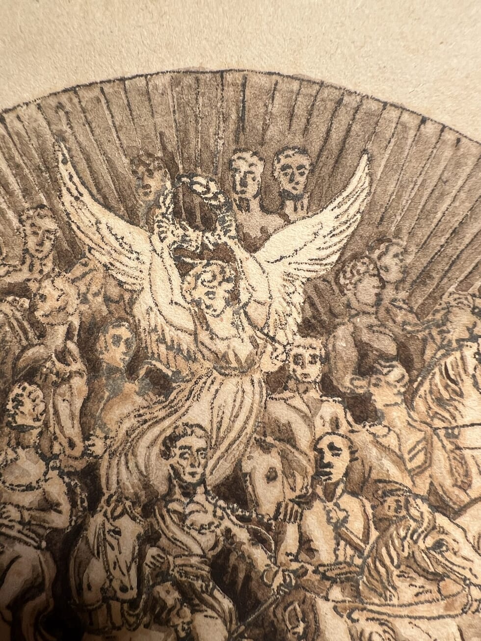
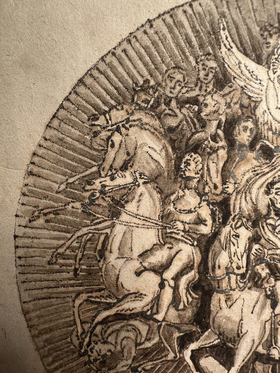
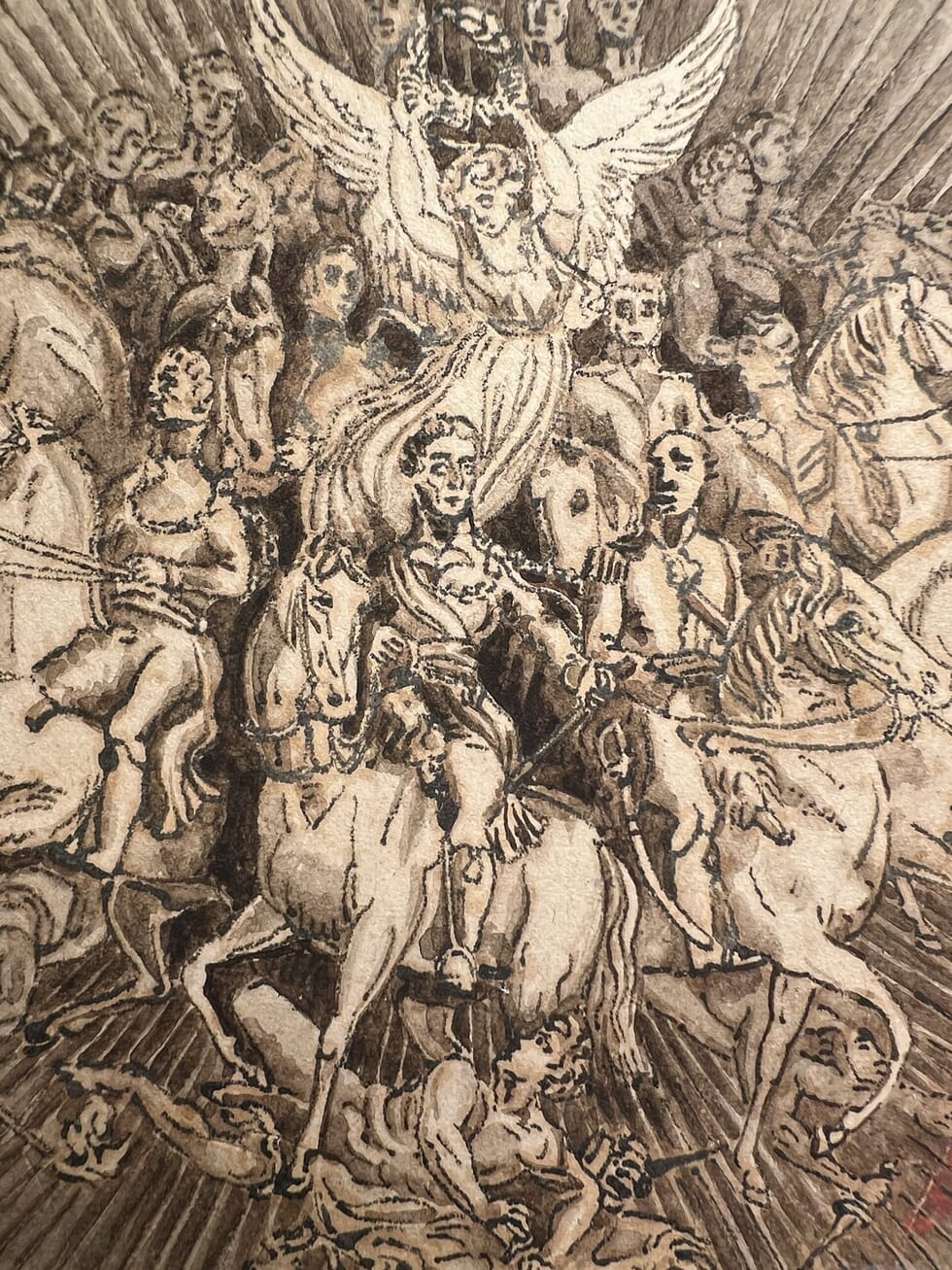
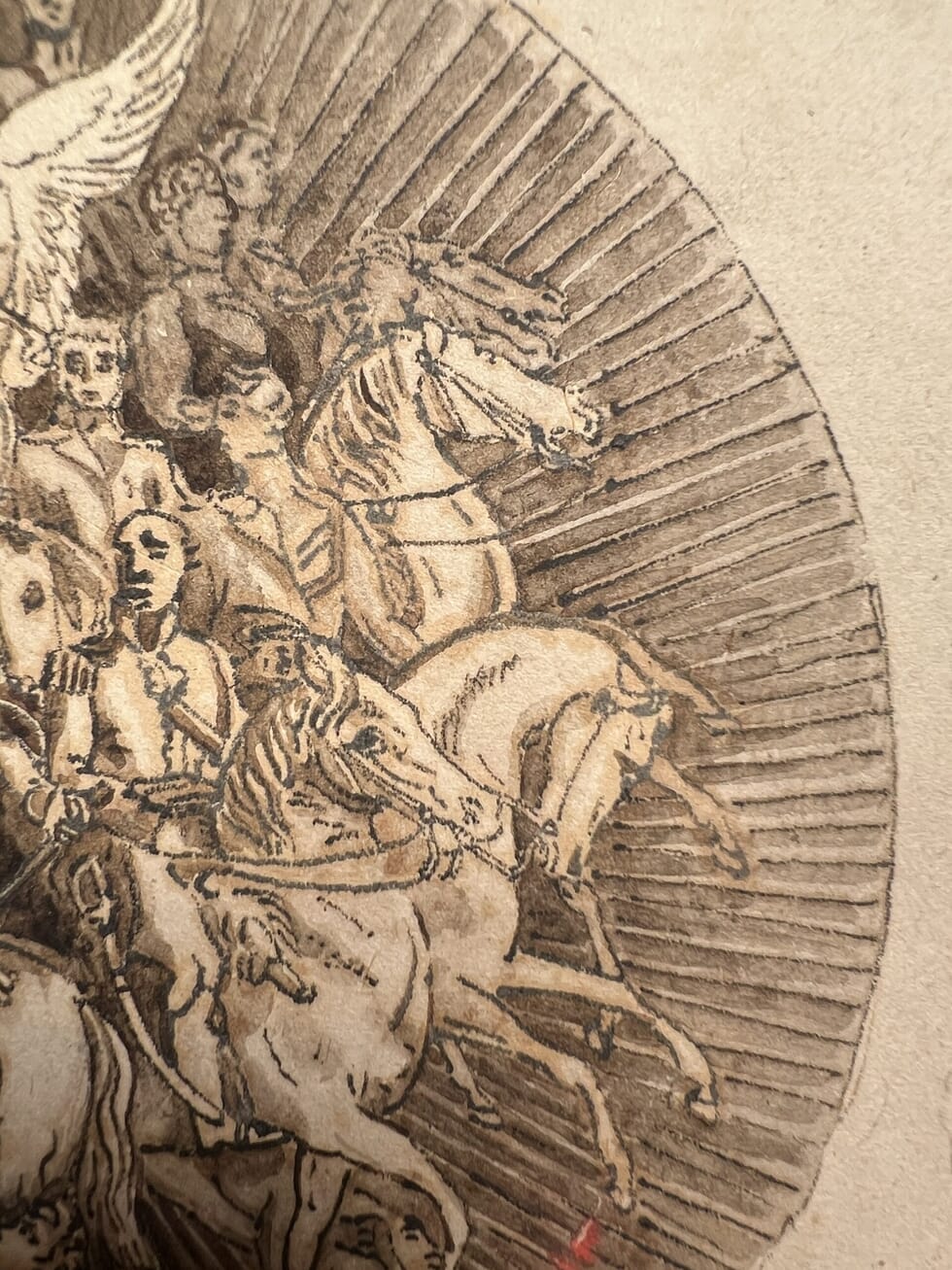
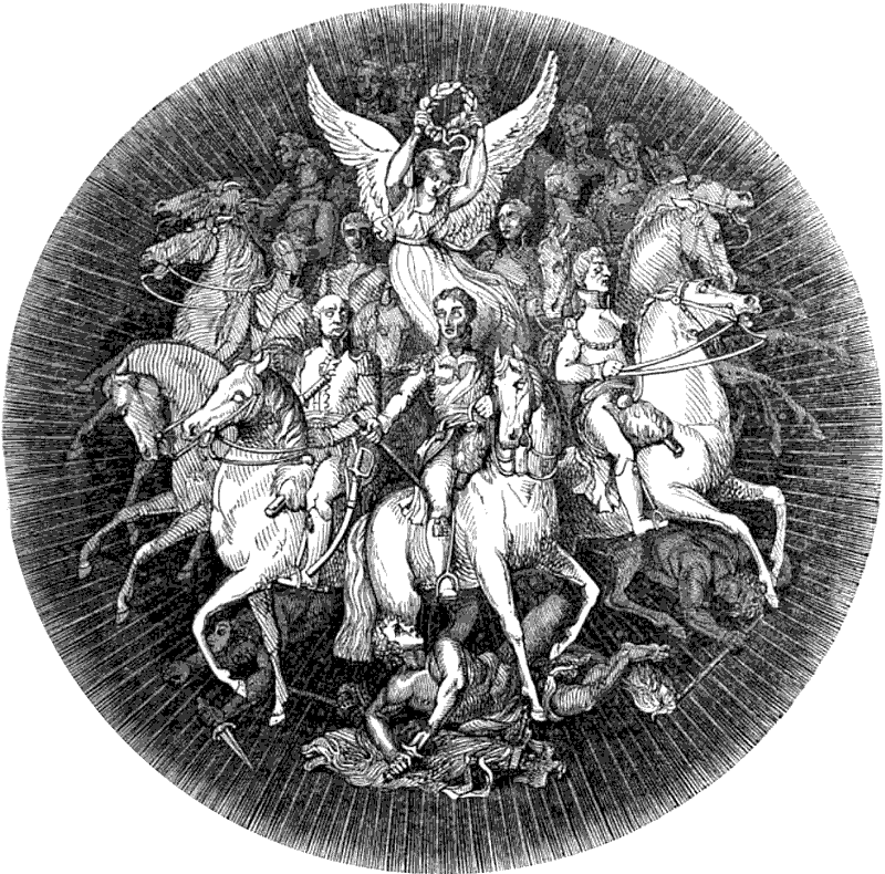
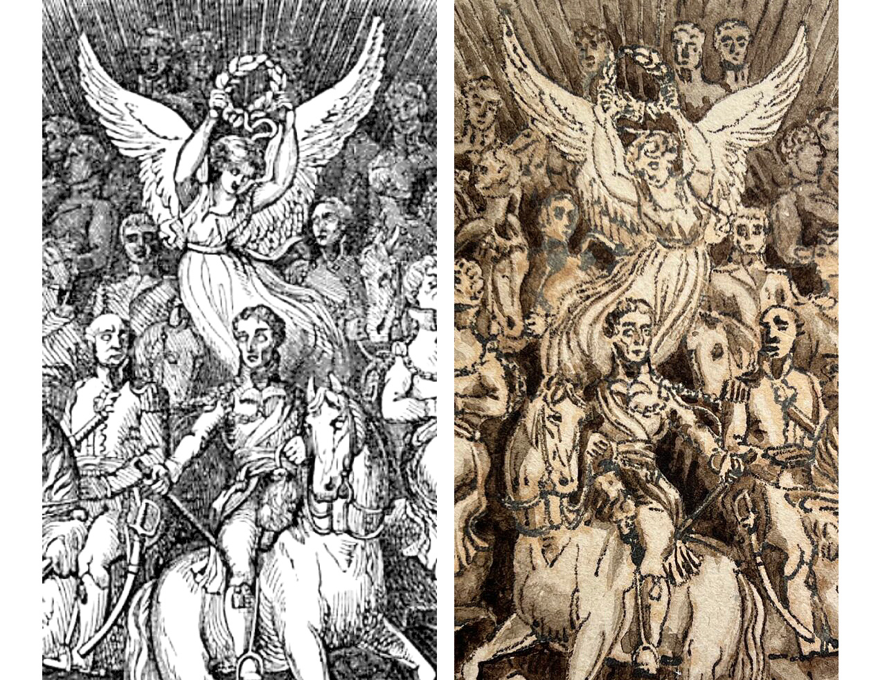
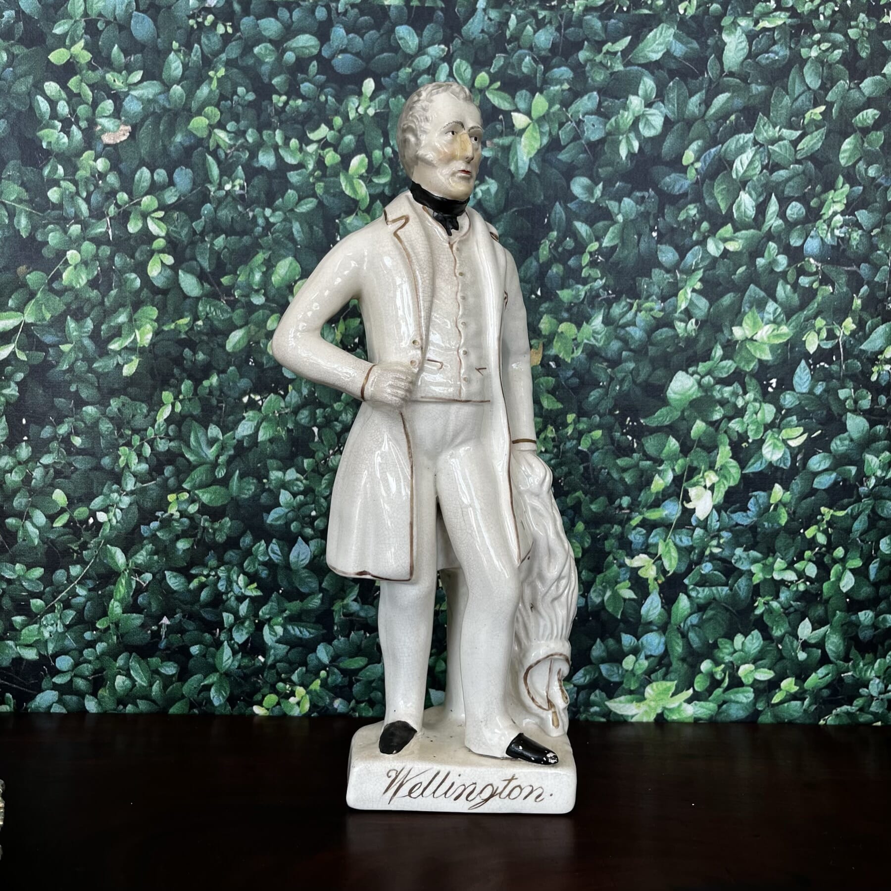
A curious ink sketch of the fabulous ’Wellington Shield’ has a story to tell. Arthur Wellesley, 1st Duke of Wellington (1769-1852) was the hero of the moment when he led the British & Allies to victory over the French at Waterloo in 1815. It had been 23 years of constant fighting with the neighbours – namely Napoleon’s France – and finally, there was the reality of a genuine peace. The National was truely grateful.
The Duke of Wellington, early 19th Century portrait @ Moorabool Antiques, Australia
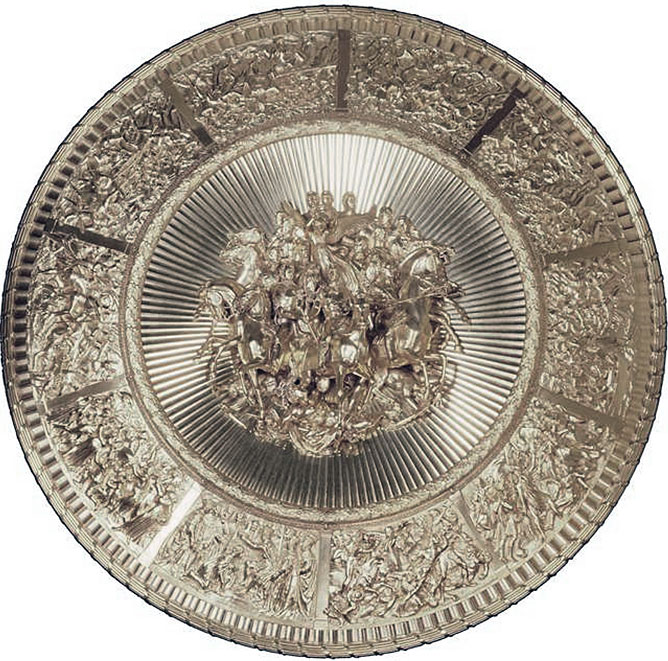
The Silver-Gilt Wellington Shield, Designed by Thomas Stothard, made by Silversmiths Green, Ward & Green, and presented to Wellington in 1821 by the Merchants and Bankers of the City of London.
The Wellington Shield is a magnificent creation, paid for by The Merchants and Bankers of London as a token of thanks for keeping Britain free of Napoleon – and the essential trade networks flowing. Commissioned in 1817, it was presented in 1821. Now in pride of place amongst all Wellington’s treasures at his London home, Aspley House, No. 1 London Road (also a ‘Present’ from the grateful people!), it was lauded as the most spectacular silver charger ever made at the time. Inspired by the description of Achille’s shield in the Iliad, it shows Wellington being crowned by a winged Nike ‘Victory’ figure, surrounded by his loyal troops, and surrounded by ten detailed panels showing scenes from his career. Large and highly-detailed, it was examined, described, and replicated in publications across the British Empire. It was put on show every year at the annual ‘Waterloo Banquets’ held at Apsley House until Wellington’s death in 1852.
The shield can now be seen in Aspley House, part of the Wellington Museum, No1 London Road. Photo source: WikiCommons
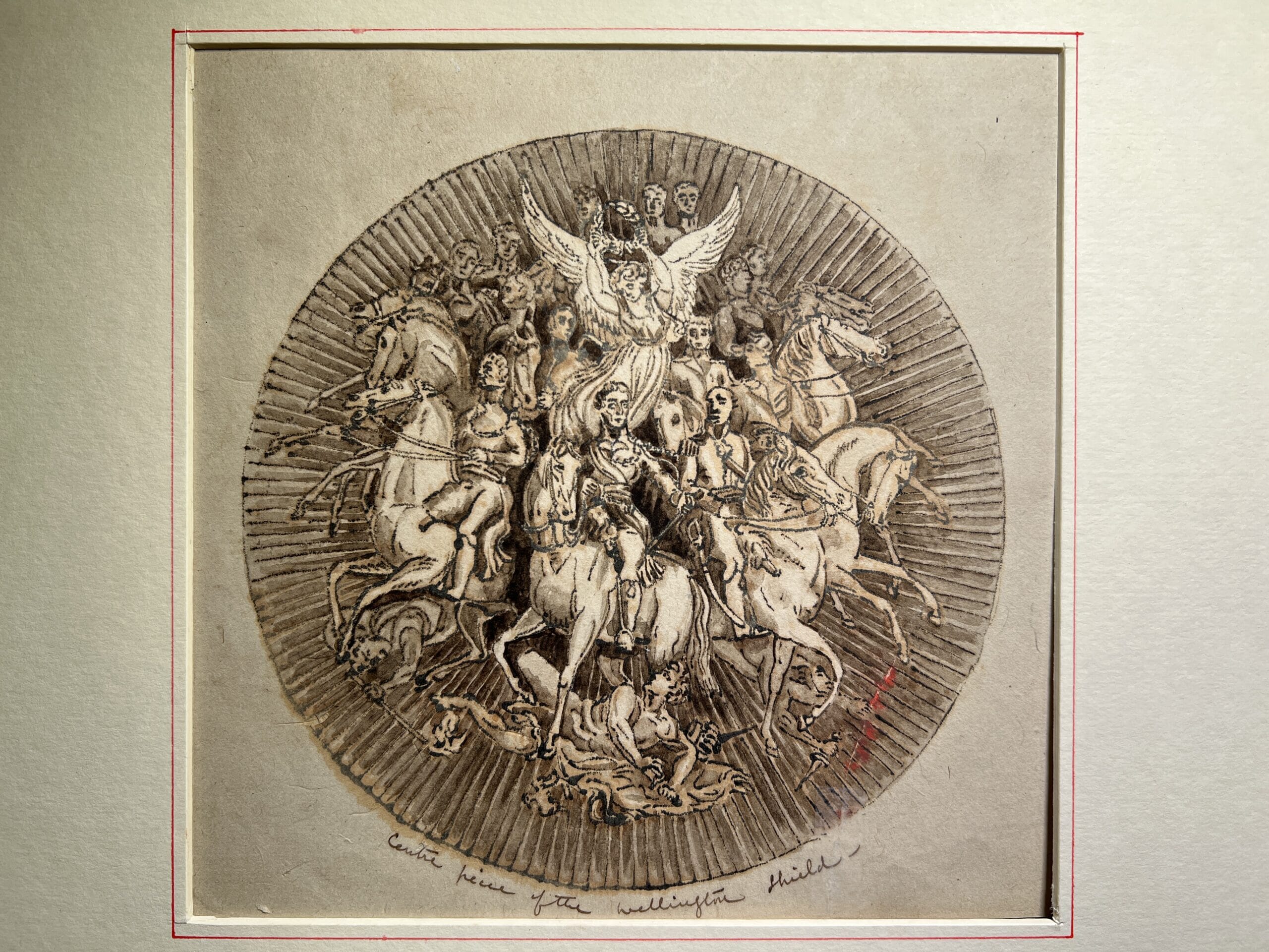
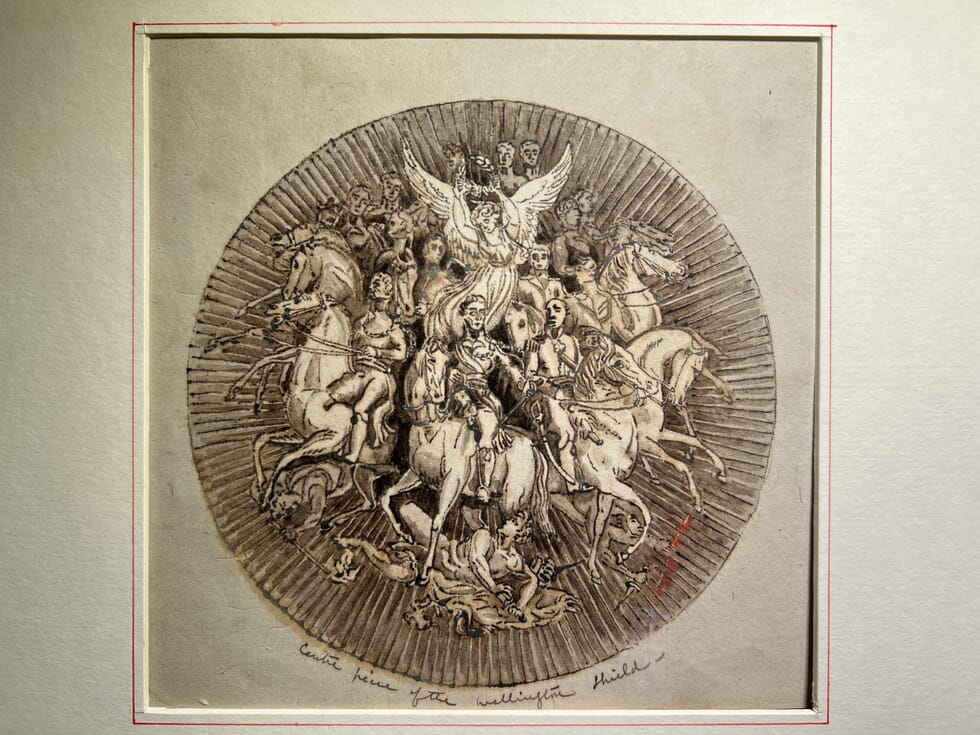
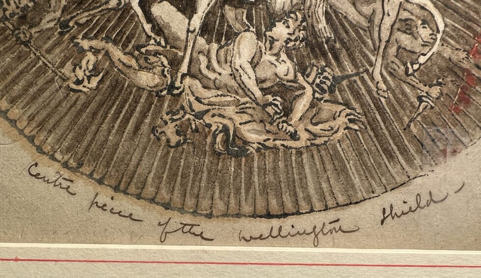
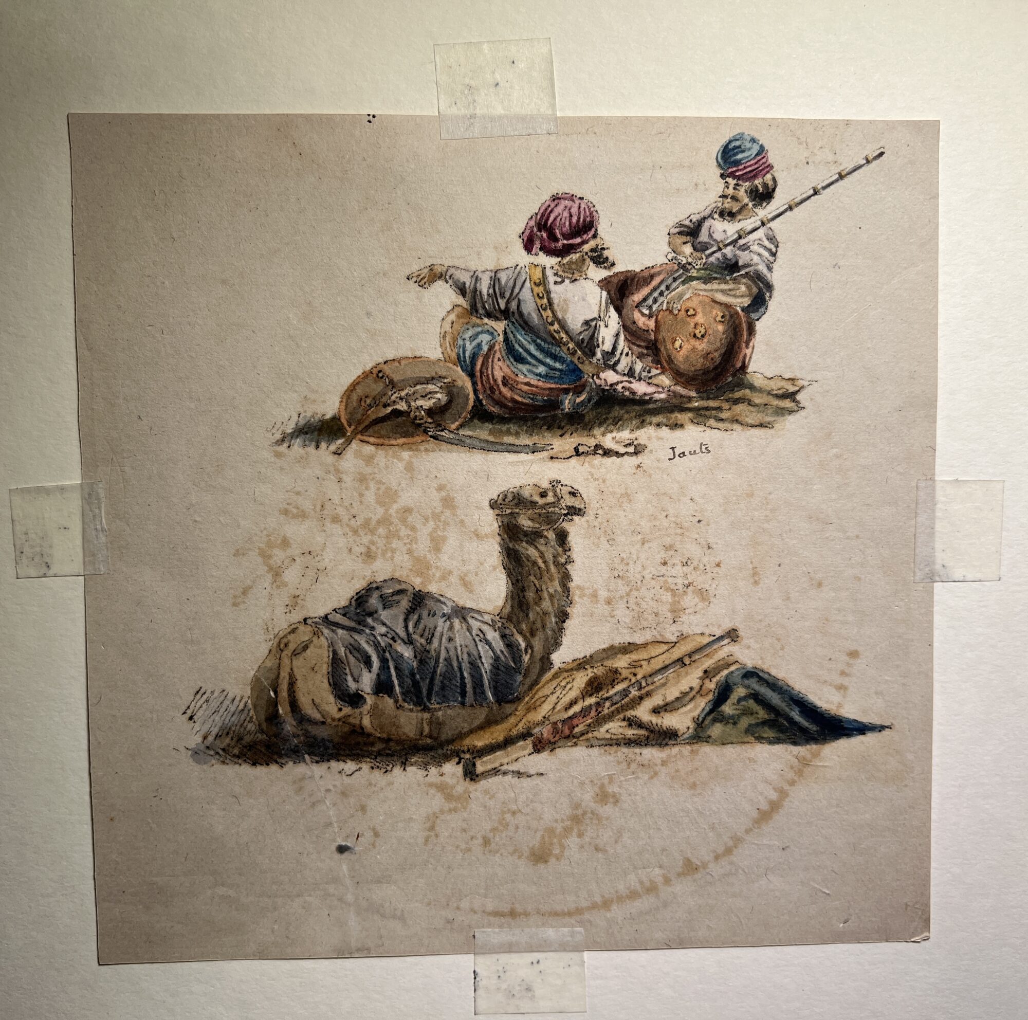
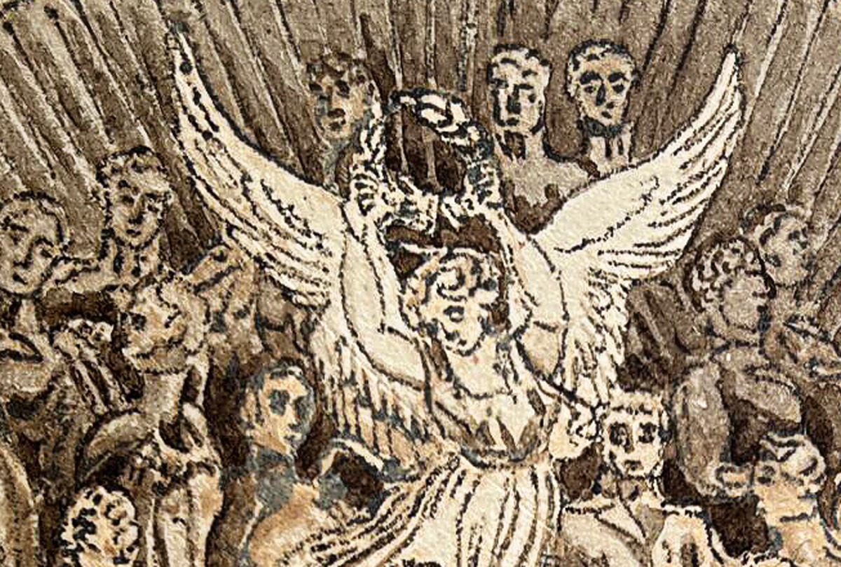
We recently came across an interesting hand-drawn ink sketch of the Shield. Part of an anonymous sketchbook, the other side bears an image of two Indian soldiers, and a camel resting alongside a rifle. Other works in the album had European views, portraits of notables, and quite a few images of ports in Europe. How do we interpret this all?
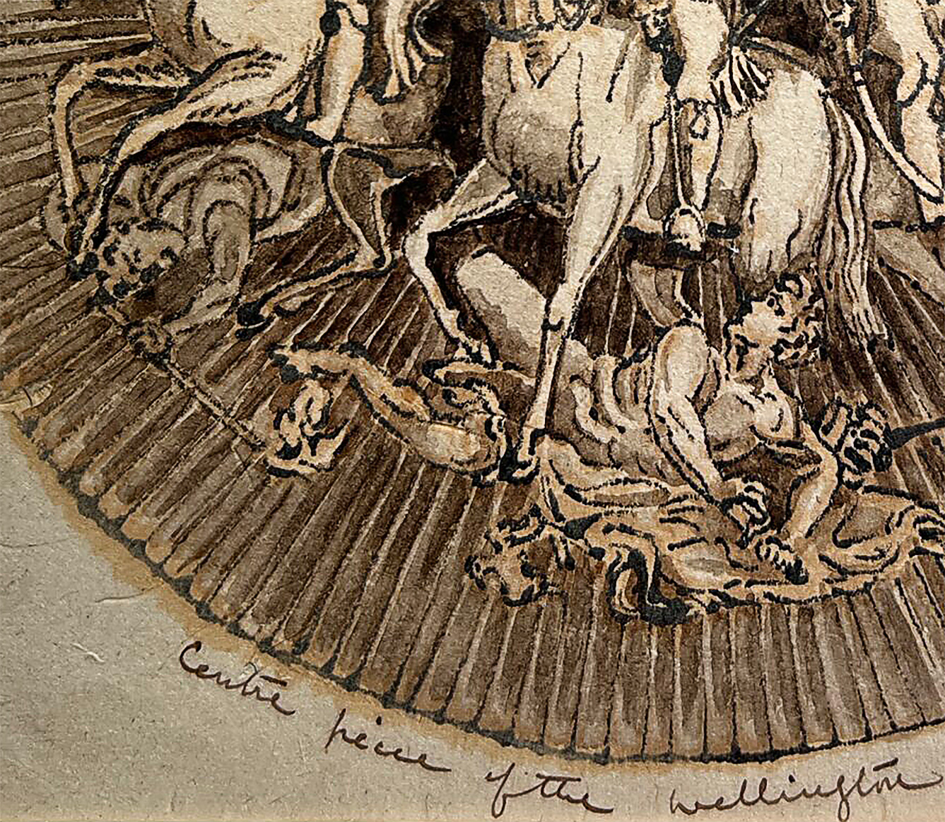
The Wellington Shield sketch c. 1835The Wellington Shield sketch c. 1835
The reverse of the sketch bears these interesting studies.
Dating to the earlier 19th century, I believe it is the sketchbook of someone who really wanted to travel – but perhaps didn’t even set foot in the exotic locations depicted. It may well have been a young lady (there were some flower studies, always popular with young lady artists), who had the ‘wanderlust‘ to see the exotic sights that these images portray – but she could well have done it all during her idle time in the ‘drawing room’ of her family home, thanks to the array of newspapers and magazines that came readily available as the 19th century progressed.
This theory comes from the discovery of the source of this piece, and also from a clue that both images share: a very faint black smudging along the edges of all figures.
The Source
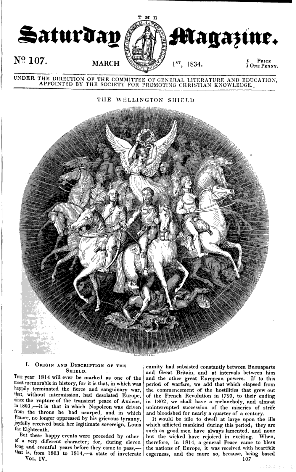
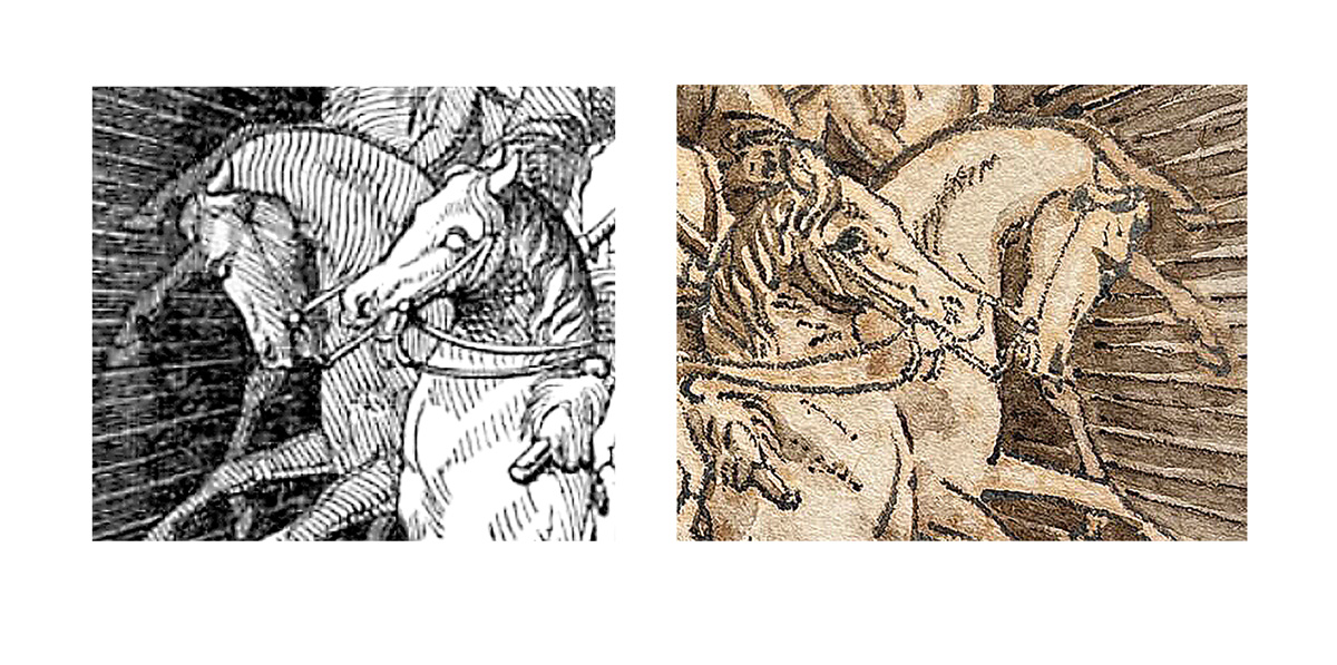
The Saturday Magazine March 1 , 1834
Left – image from the ‘Saturday Magazine’, March 1st 1834 Right – the sketch being discussed, desaturated for comparison.
This is the fine woodblock engraving which illustrated an article on the shield in the ‘Saturday Magazine‘, published March 1st, 1834. This was a small, illustrated magazine that was sold for one penny, ‘Under direction of the Society for Promoting Christian Knowledge‘ – although it’s contents are of social / scientific / political nature, not religious.
The publisher was John Parker (1791-1870). His father was in the Royal Navy, and Parker served his apprenticeship at a London printer, which he ended up managing. From 1829, he became the director of the Cambridge University Press – and the appointed publisher for the Christian Knowledge Society, for which the magazine was published. While he printed bibles, apparently when Parker introduced ‘steam power’ for the presses, the ‘Christian Knowledge Society’ revisited the technology!
This illustration of the shield accompanied a long article waxing lyrical about the shield and how it came to be:
“…..the Duke of Wellington, England’s great General …. had finally planted the triumphant standard of our country on the soil of France itself. ……. honours were heaped on him from all sides, and men taxed their ingenuity to devise modes in which they might best mark their gratitude to him. To this feeling, so universally displayed, is to be attributed the production of the Wellington Shield, one of the most magnificent works of art ever executed in the precious metals. “
The Wellington Shield – source in The Saturday Magazine, 1st March 1834
It is, however, reversed. How could this happen? The clue is the fuzzy, ‘bleeding’ nature of the principal outlines evident in the sketchbook, even on other pages.
Note the ‘bleeding’ to the dark outlines
This is evidence of the technique used: a primitive transfer, where the artist has used an ink to carefully trace the main features in the print, then placed the blank paper onto the still-wet ink. After some pressure, probably in a book press, the image would be transferred – somewhat fuzzy, and needing the secondary touch-ups and washes of solid colour to create the image as presented. As part of the process, the image appears in reverse – and tends to bleed.
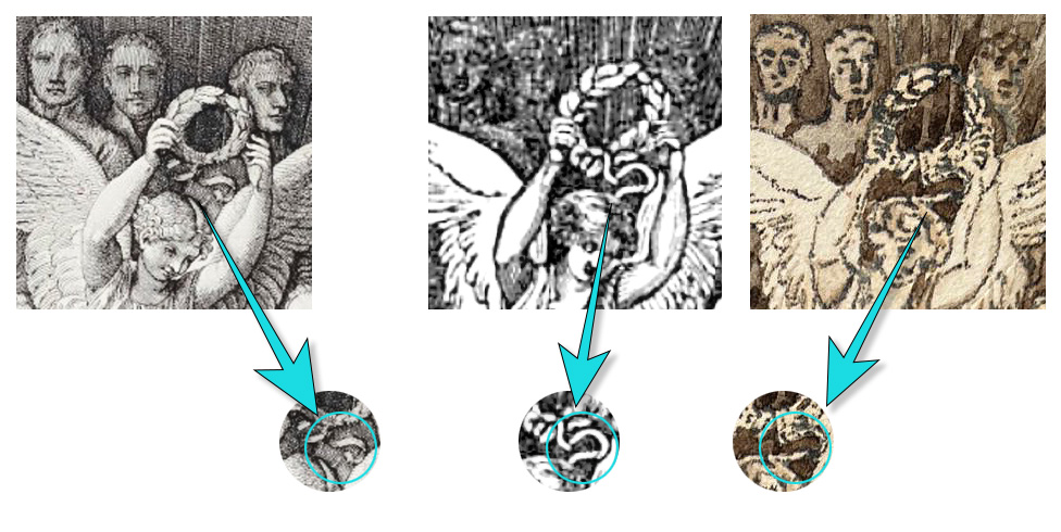
Left: Thomas Stothard’s 1820 very accurate engraving of the shield. Center: woodblock from the 1834 ‘Saturday Magazine’ Right: the same detail in the ink sketch, reversed.
The differences between these details reveal the ink sketch is not copied from Stothard’s version, but is identical to the ‘Saturday Magazine’ version. The give-away is the bow beneath the laurel wreath – while it is complete with two loops on Strothard’s depiction, the Magazine has unravelled the loop, leaving it out on one side – and the artist of the ink sketch has followed this mistake.
left: Magazine, 1834. right: Ink sketch
This is a fascinating depiction of a historical artefact, from the time when Antiquity was the inspiration for heroic representation. The artist has used an interesting technique to replicate their own version in reverse – and the result is not unlike an ‘Old Master’ pen & wash drawing from a much earlier period.
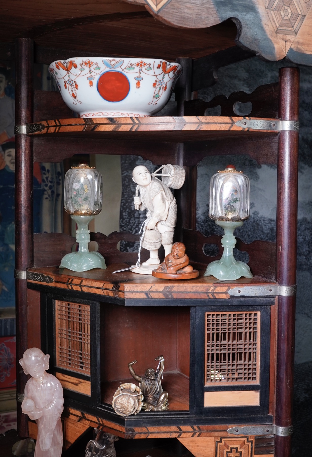
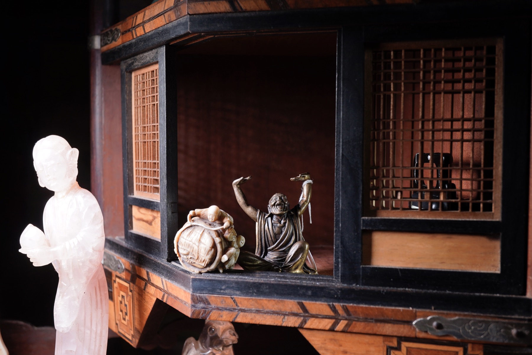
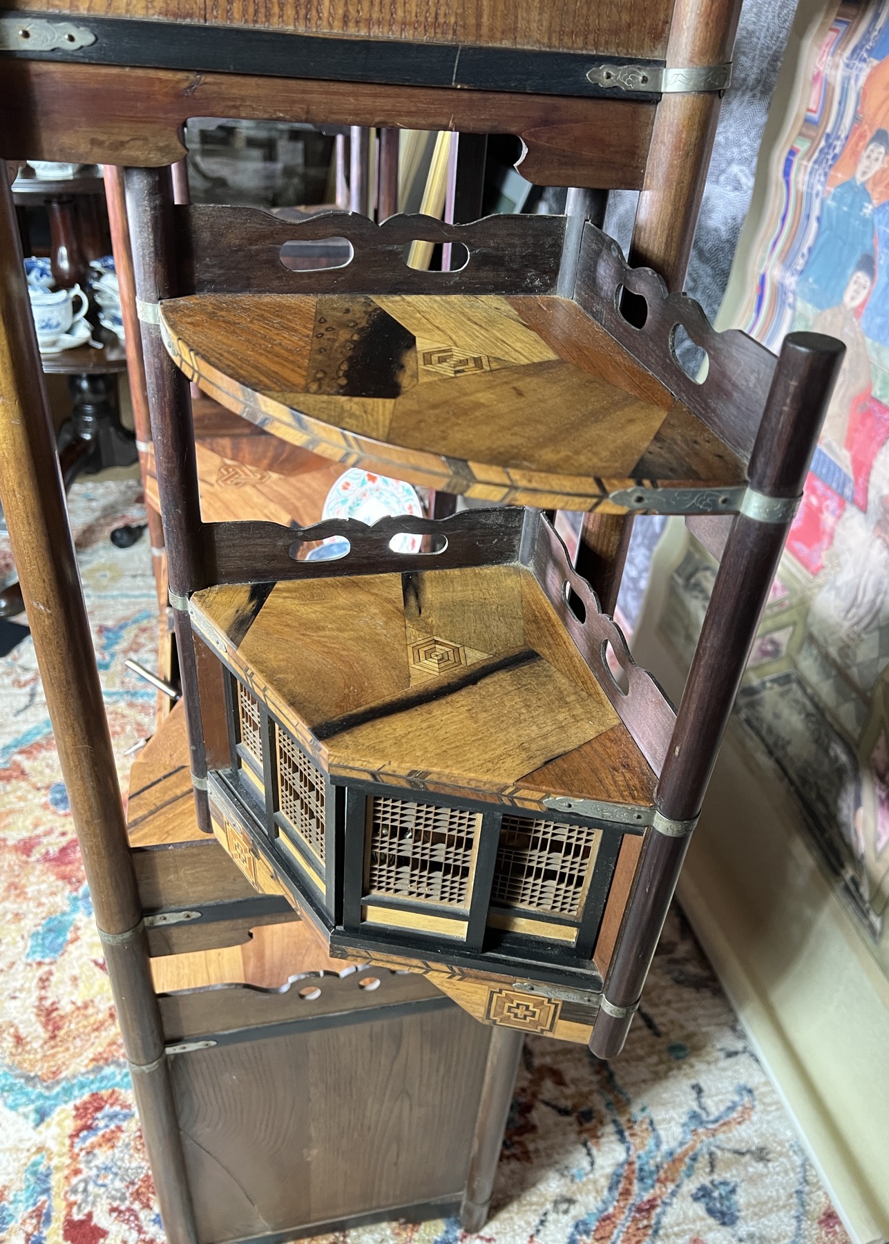
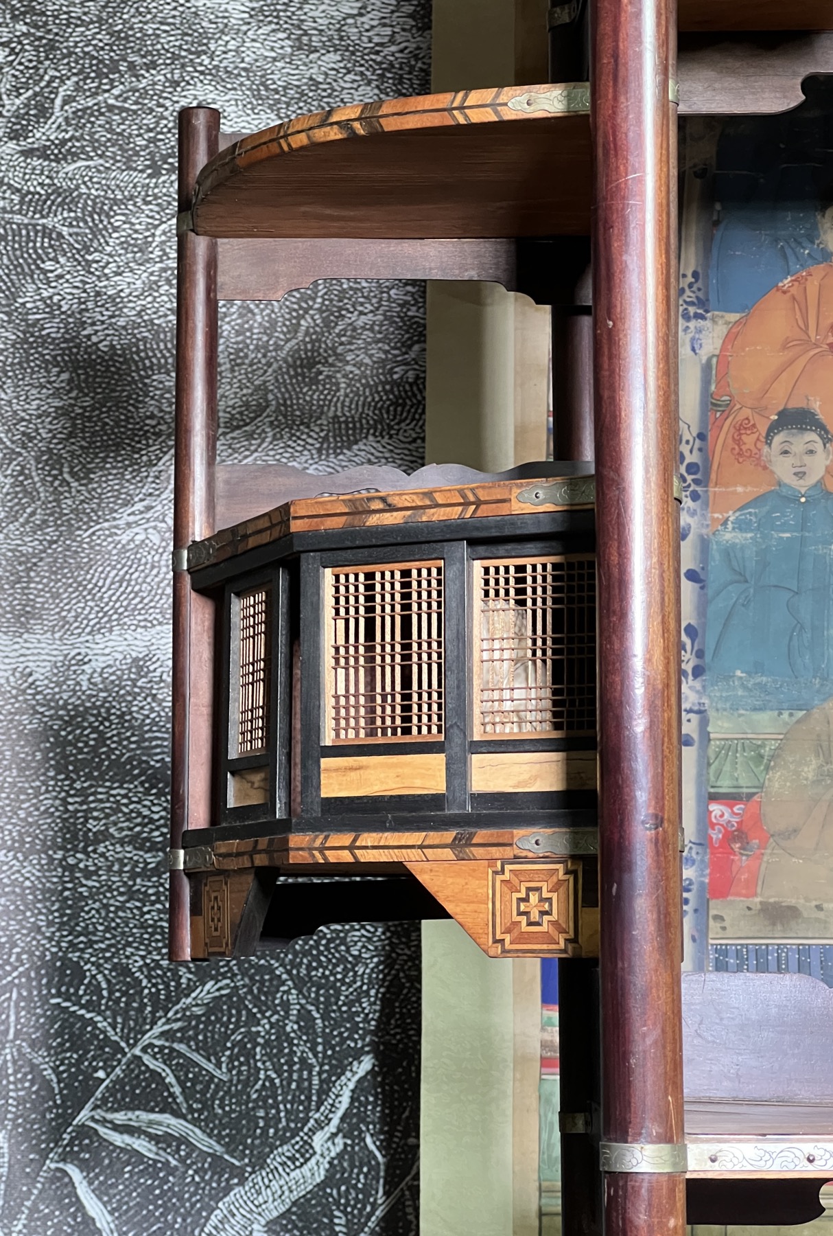
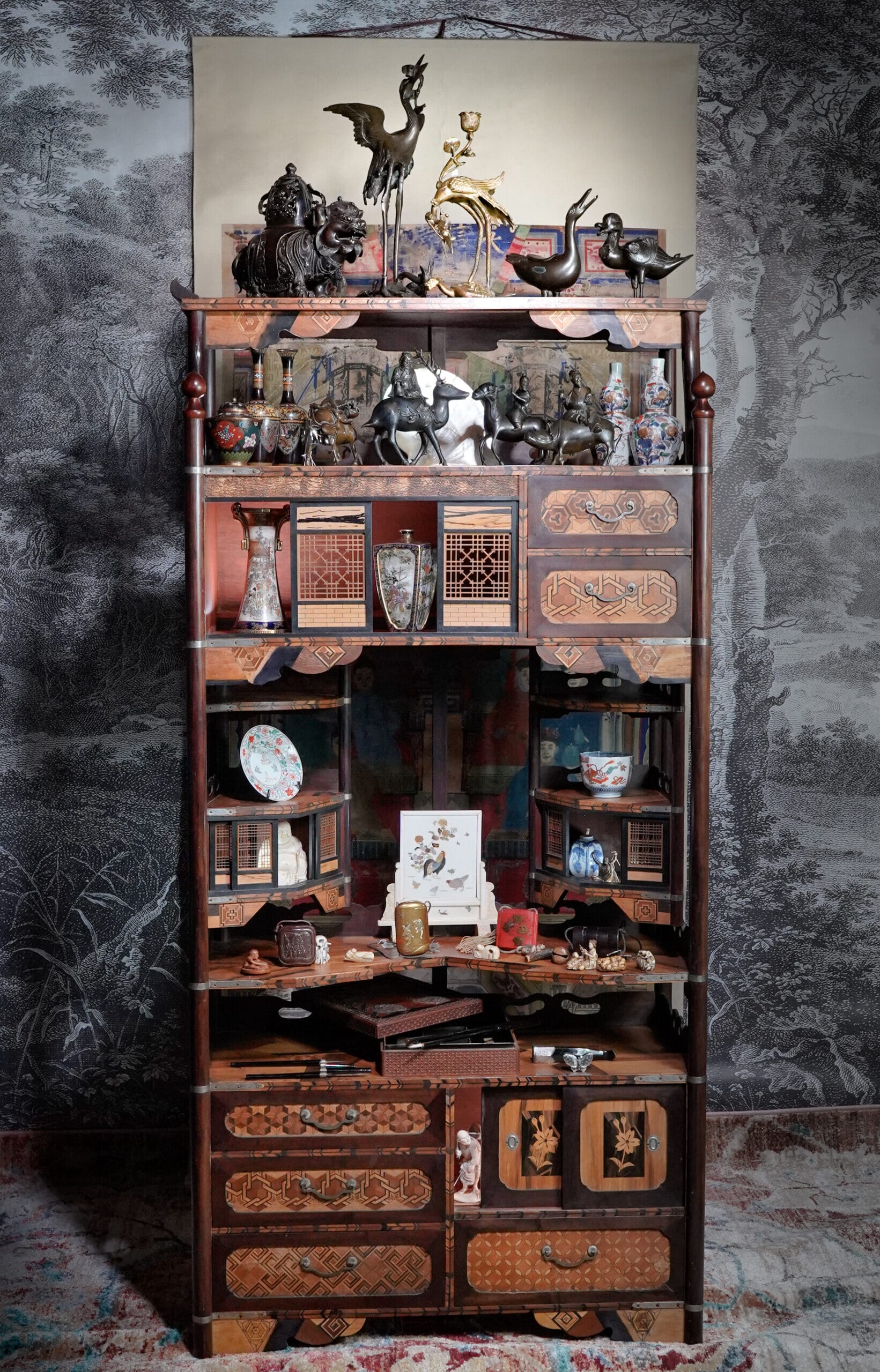
This stunning cabinet is known as a Shodana, and is seen here being used as intended – it’s a ‘curio cabinet’, to store your precious objects in. What makes this example so interesting is the architectural element – the central portion contains two three-shelf corner partitions, the lower one having four sliding screen doors – miniature versions of the Japanese house doors – and the entire segment hinges outward, to leave the interior space clear. Above is another larger shelf section with four similar sliding doors. The open fretwork on these is amazing for its fineness and accuracy, true miniatures of the full-sized house doors in Meiji Japan. Add to that the rich wood inlay, and this is a truely spectacular piece of Japanese Meiji period craftsmanship.
Our extraordinary Shodana cabinet
Shoji – sliding fretwork doors on the upper ‘apartments’
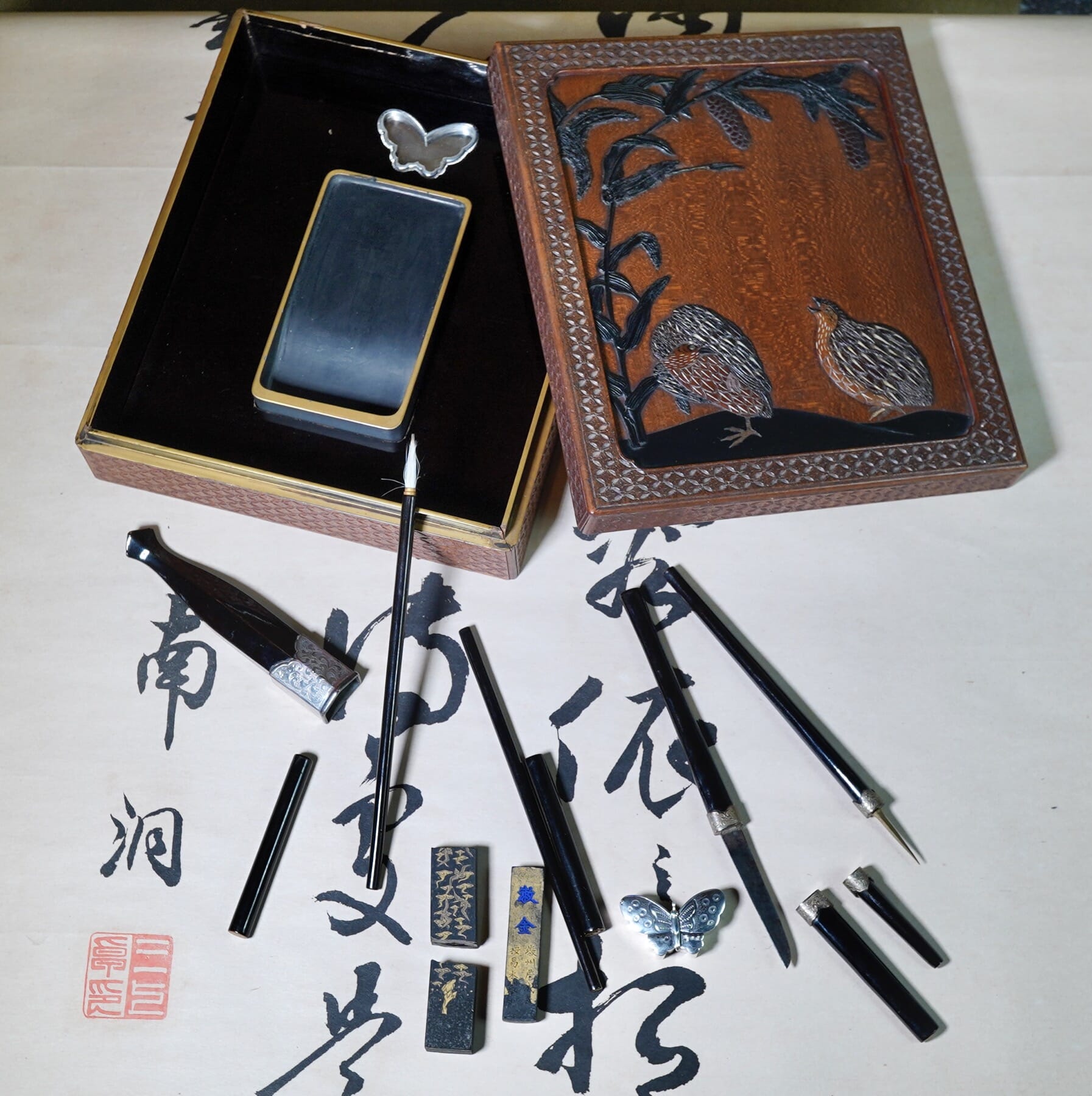
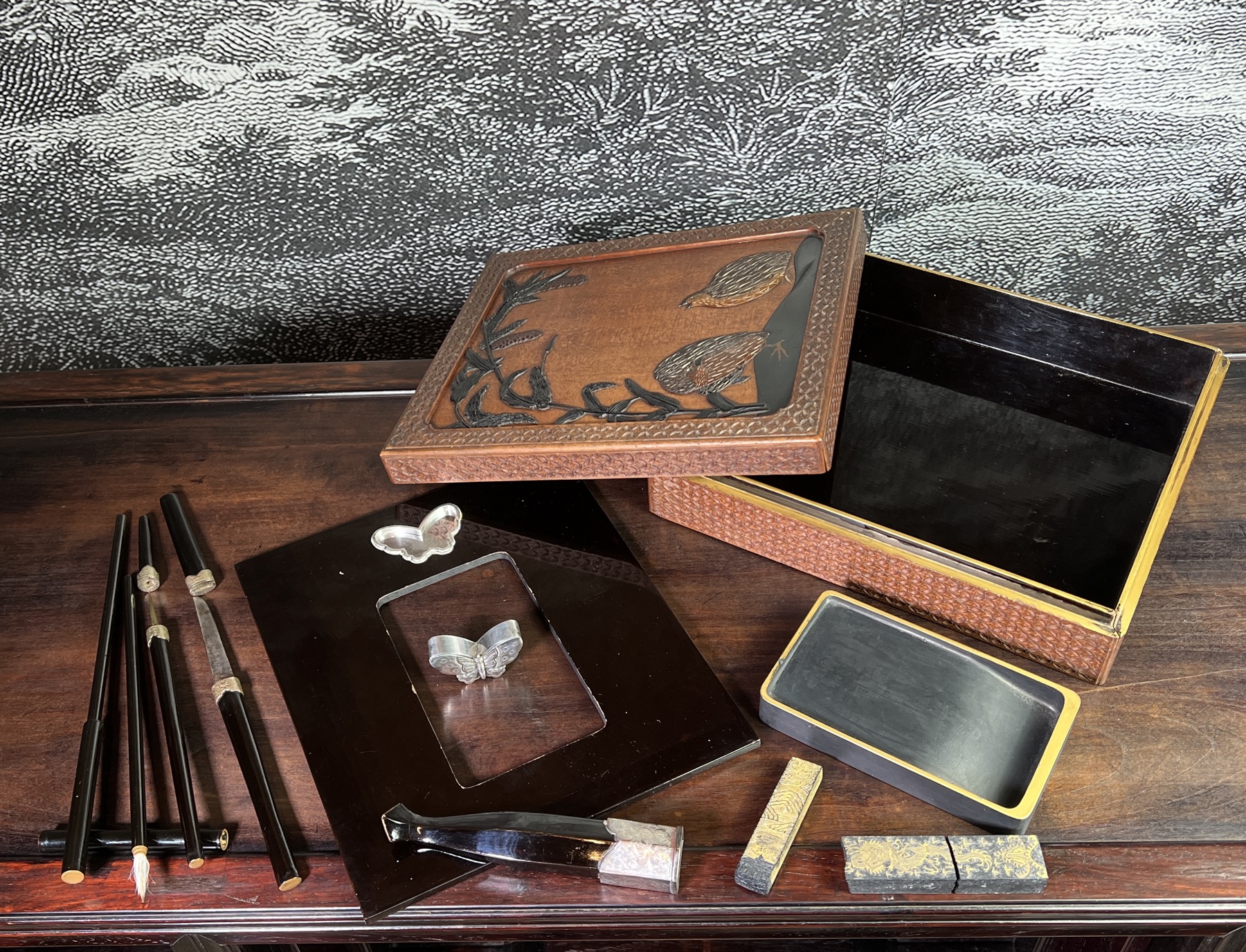
A fine quality Japanese piece fresh to stock is this Japanese Suzuribako writing box. The lid has an intricate panel of quail and a maize plant, modelled in high relief with various woods and bone, the rest of the box adorned with an intricately carved cell pattern, the interior lined in jet black lacquer with gilt foliage to the inside of lid, fitted with a full set of writing instruments, including silver butterfly Suiteki inset within a silver dish, a carved slate ink-stone with gilt rim, two brushes, a bodkin with lacquer sheath & a matching steel blade with inscribed maker’s inscription, and two gilt-decorated ink blocks.
Meiji period,
Circa 1870
23.5cm x 20.5cm, 6cm high blade 6.5cm, in sheaf 19cm
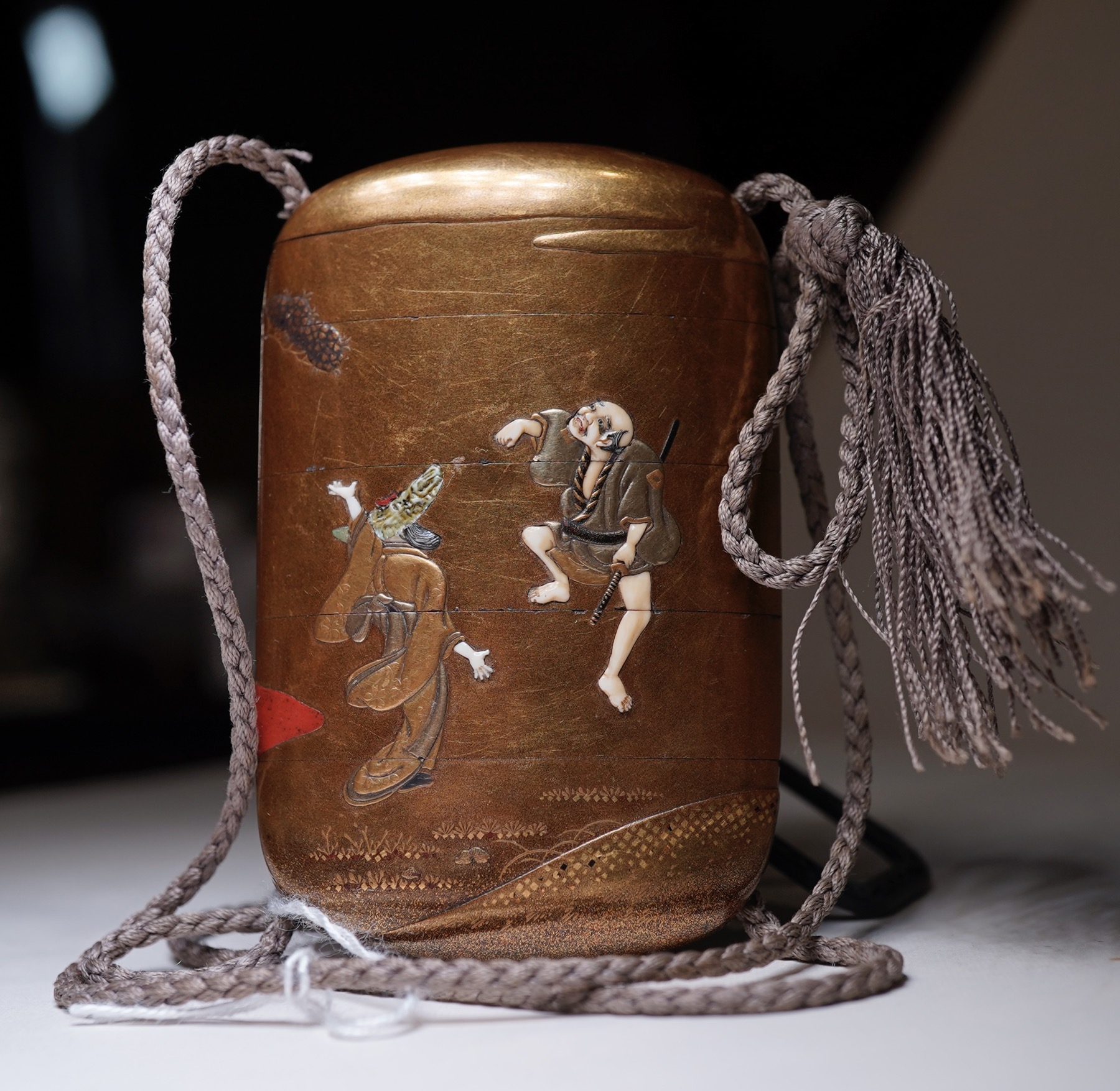
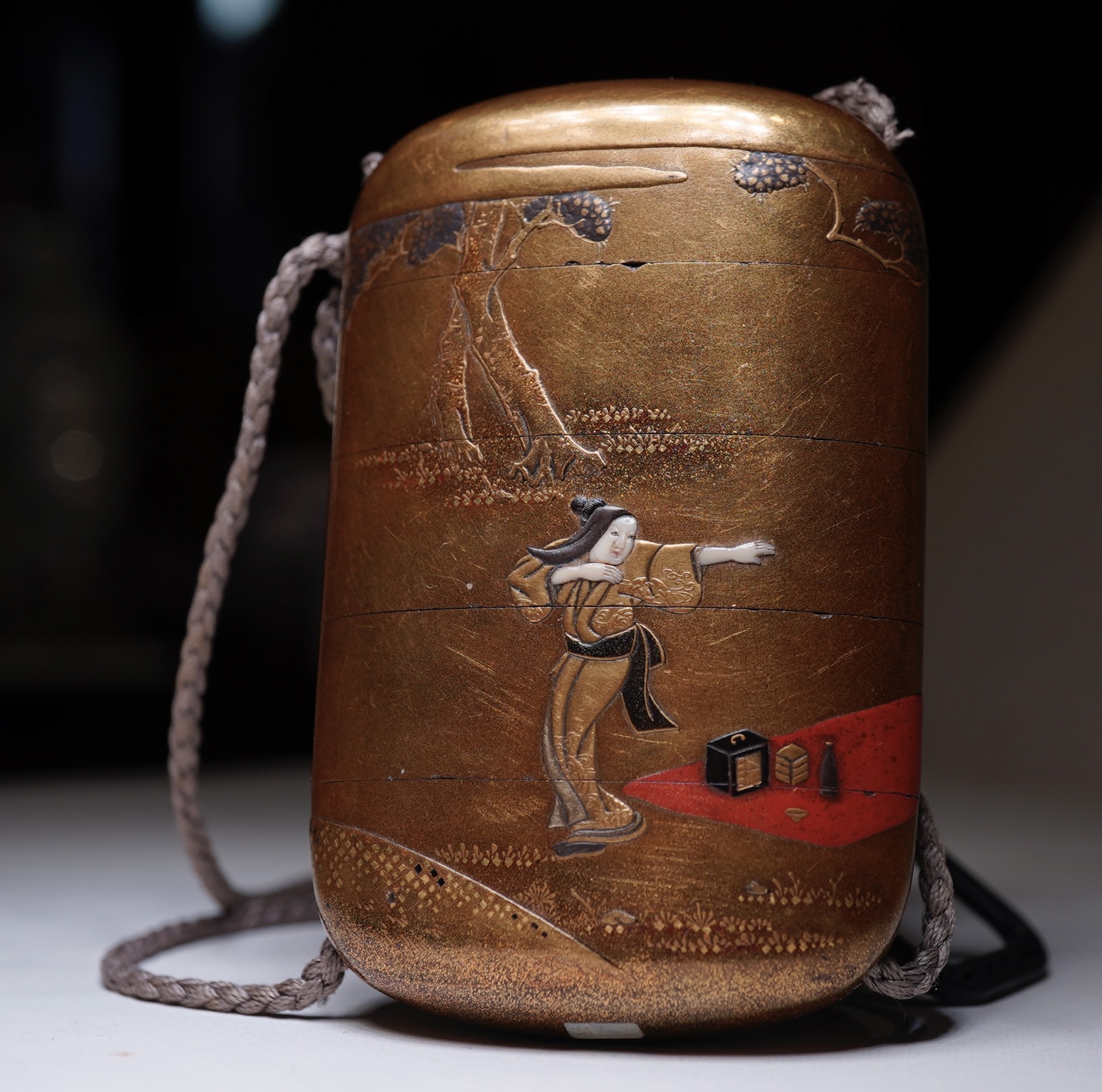
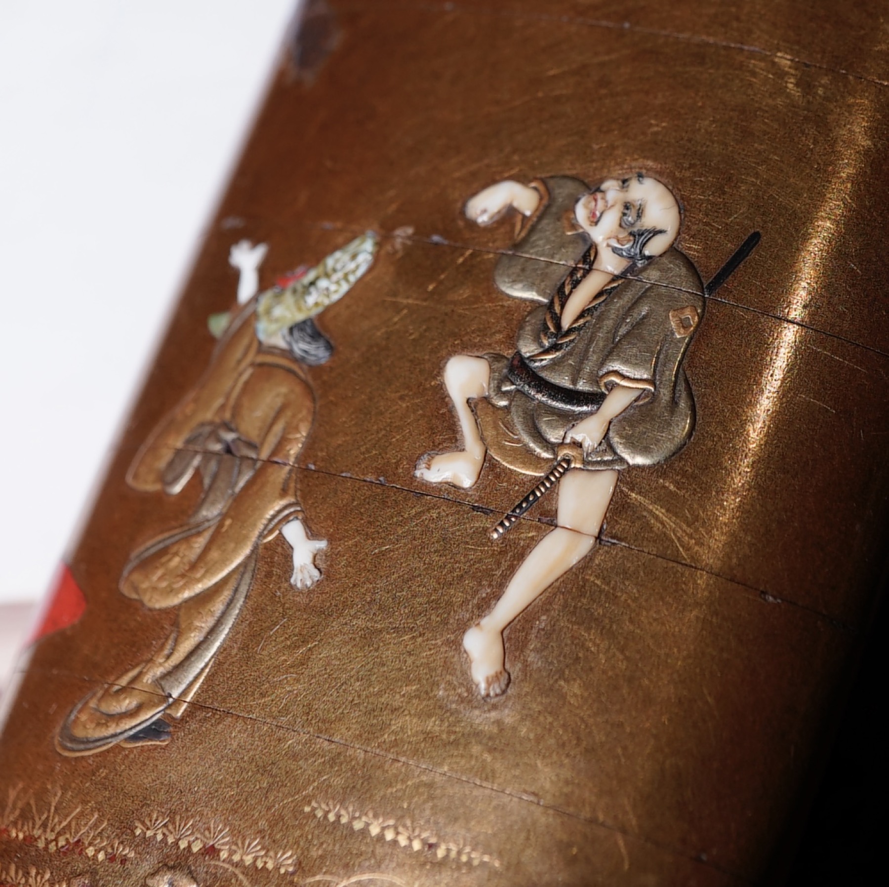
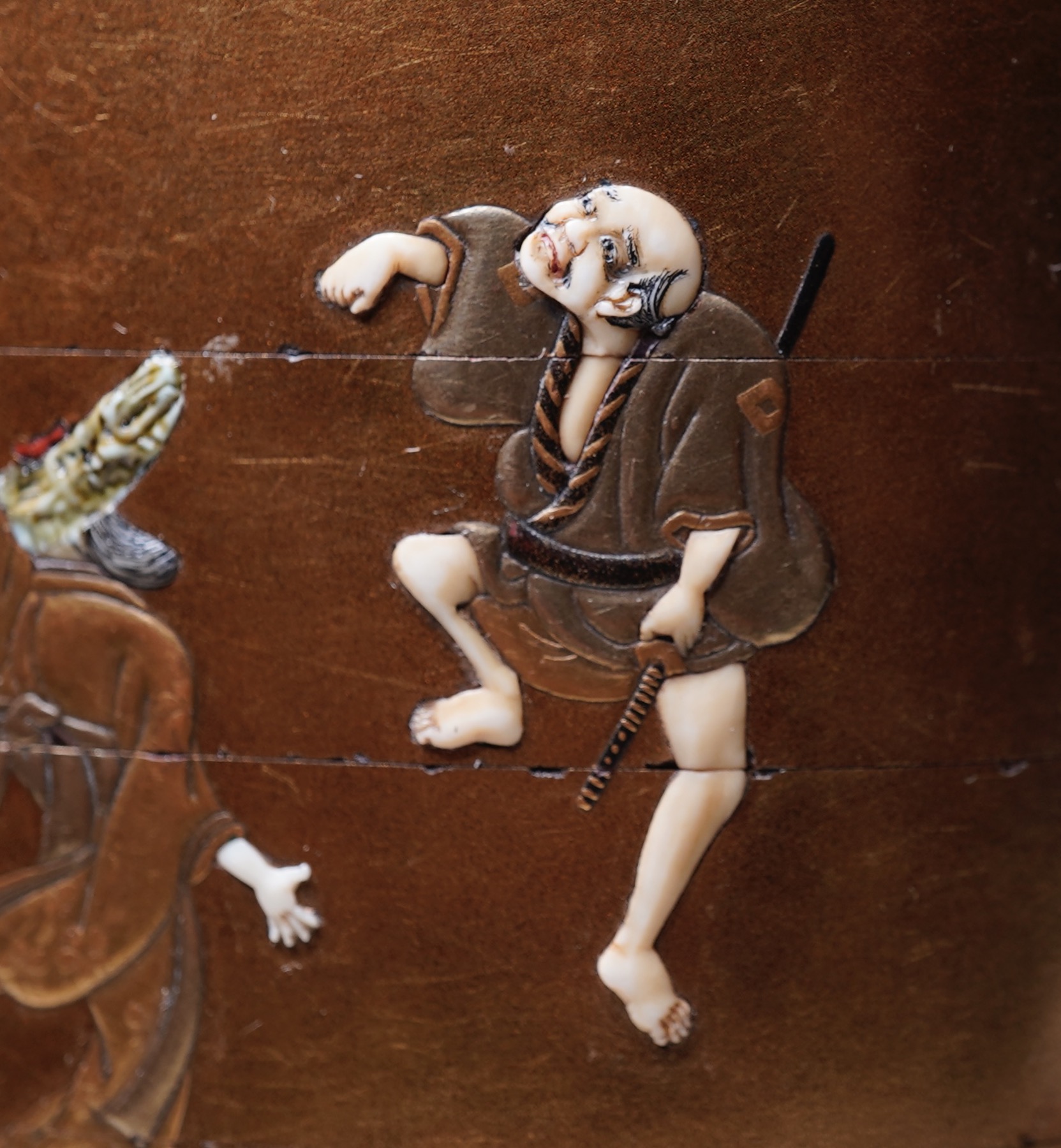
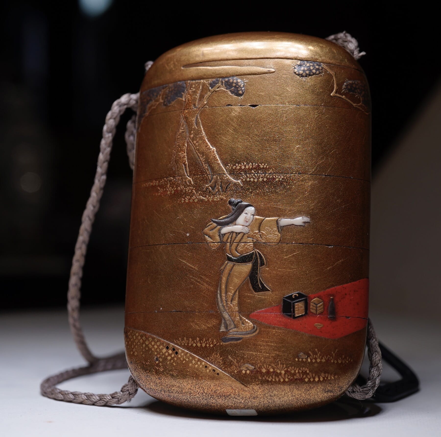
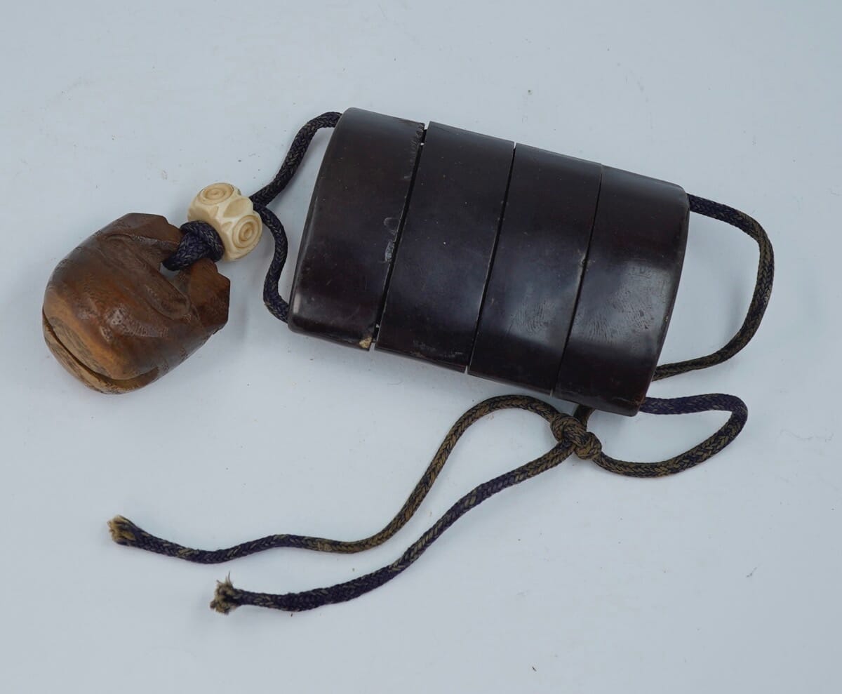
This is an ‘Inro’, a small box with cord to carry at your waist. Standing just 8cm tall, it was intended to contain ‘medicine’, via a series of segments that seal tightly together, a small usable compartment in the base of each.
Japanese Shibayama Inro
Japanese Shibayama Inro
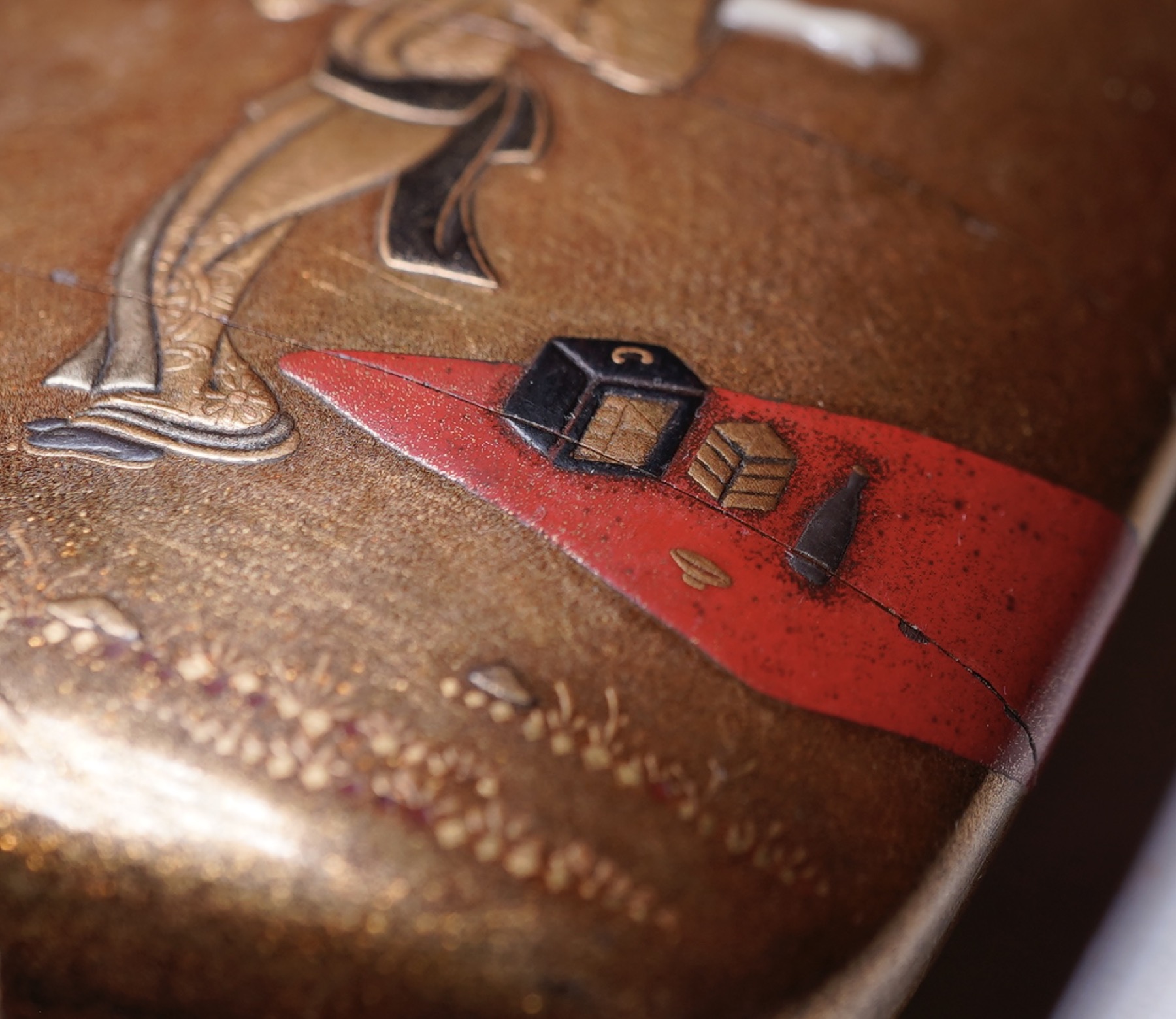
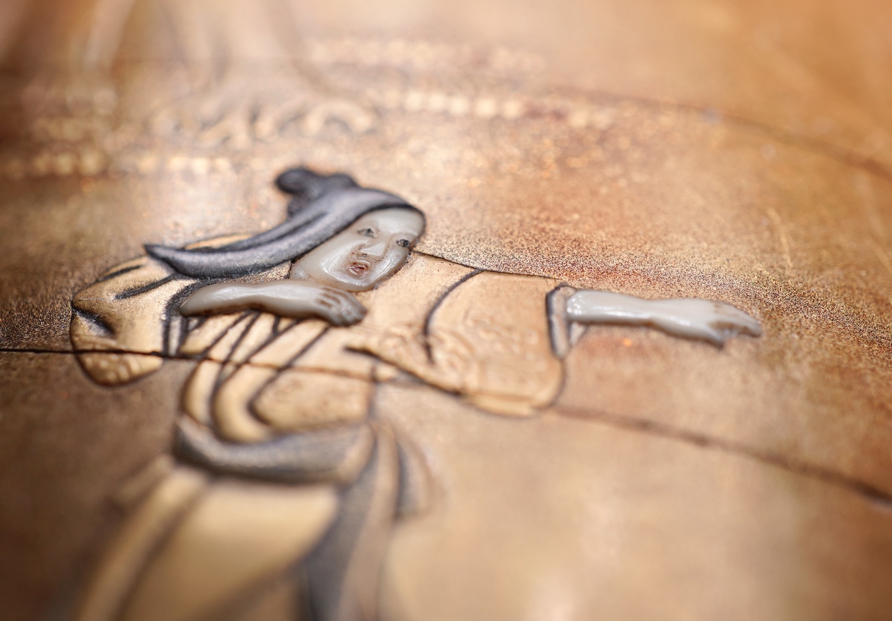
The quality of this piece speaks for itself, with a very finely detailed continuous scene – probably from a popular play – depicting two gracious ladies seeing off a bare-foot bald-headed Samurai, clutching his sword. They were enjoying a quiet picnic in the woods a moment ago, as can be seen by the red rug with picnic box, wine bottle and cup….. and the intruder on the other side, a wizen old Samurai warrior with his sword, is receiving a good telling-off by the startled ladies. No doubt it’s illustrating something form a popular play of the period – if anyone knows, please send us a message!
Shibayama | Shokasai marks
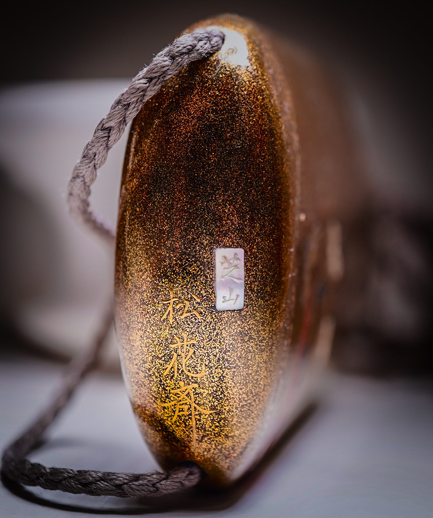
There is a signature to the base of the lowest segment, which is interesting as it bears to parts; first, an inlaid mother-of-pearl plaque with ‘芝山’ , and second, three characters in gold lacquer “松花齋”. These signatures reveal the origins of this piece; the lacquer case and landscape is by Shokasai, a well known & respected Edo lacquer artist, while the fine inlaid figures is by the fabled Shibayama artists, made as a joint effort & hence signed by both.
Japanese Inro, signature of Shokasai in gold to the left, for the lacquer; Shibayama on the inlaid plaque for the inlay work.
Shibayama: this Japanese family workshop of artisans was founded by Shabayama Dosho, also known as Senzo. He was a farmer from Shibayama who became a famous artist in the 18th century after moving to Edo to practice his trade. He had many descendents, such as his grandson & successor, Shibayama Naoyuki, who continued the workshop’s tradition for fine inlaid work into the 19th century. Records are not distinct when it comes to the later Edo period Shibayama artists, as they all used the simple signature “‘芝山” , for ‘Shibayama’.
Shokasai:
ref. Bonhams NY 19 Sept. 2008, lot 5036 for a comparable example.
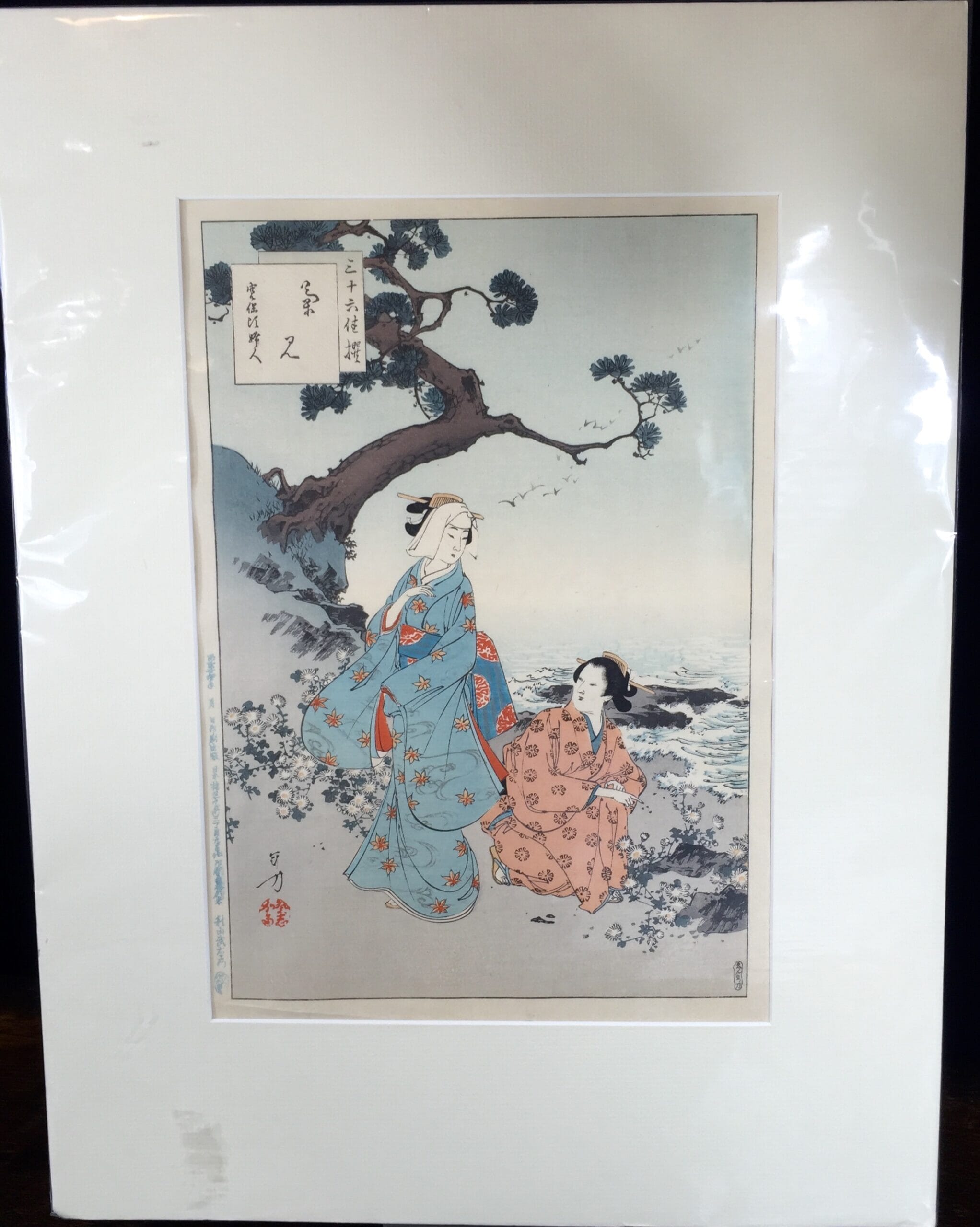
Japanese artists began to print in the 17th century, and technological advances meant that by the 18th century they were able to produce large & colourful images. For the multi-coloured images, a different wood block was carved for each, and carefully lined up consecutively to create the multi-colours image. They were initially commissions by the wealthy Edo period patrons to illustrate calendars, which they gave as New Year presents. Subjects were often beautiful courtesans, actors, or illustrations of popular opera scenes. Scenic splendour and historical events followed. They were hugely popular in Japan, and specialty shops existed just to sell ‘the latest’ from the famous artists. Collectors would be inclined to ’collect the series’ by a particular artist, storing them away in specialty wooden boxes. In many ways, it was just like the present day Comic Book scene! The simple lines, and the bright separate zones of flat colour were the result of the techniques used. They were very important factors in the development of Western Art, once collectors discovered them in the later 19th century. In fact, it’s well documented that the great ’fathers of Modern Art’ such as Gauguin and Van Gogh both collected and were inspired by Japanese Woodblocks, as they set about their quest for a break with the traditions of Western Art.
We have a selection of these vivid prints for sale, some shown below with more to come shortly.
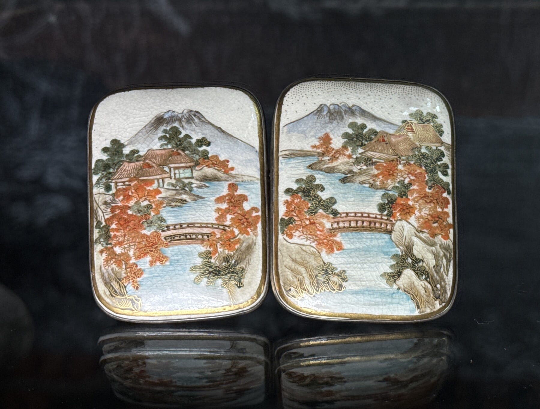
This Satsuma vase was no doubt directly inspired by a woodblock print of the time. Vase: Kyoto Satsuma, featuring rare ’Gosu Blue’ enamel, circa 1880
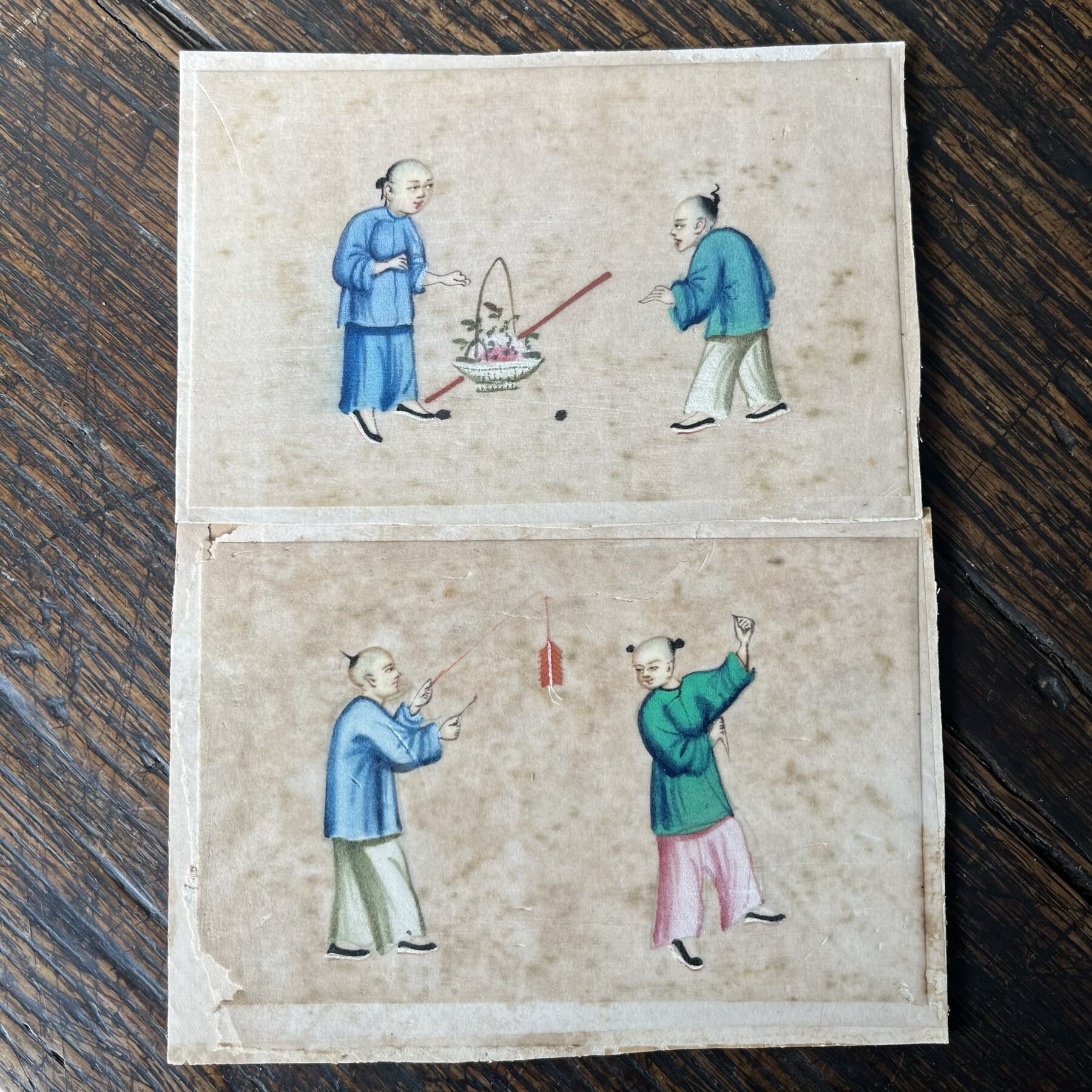
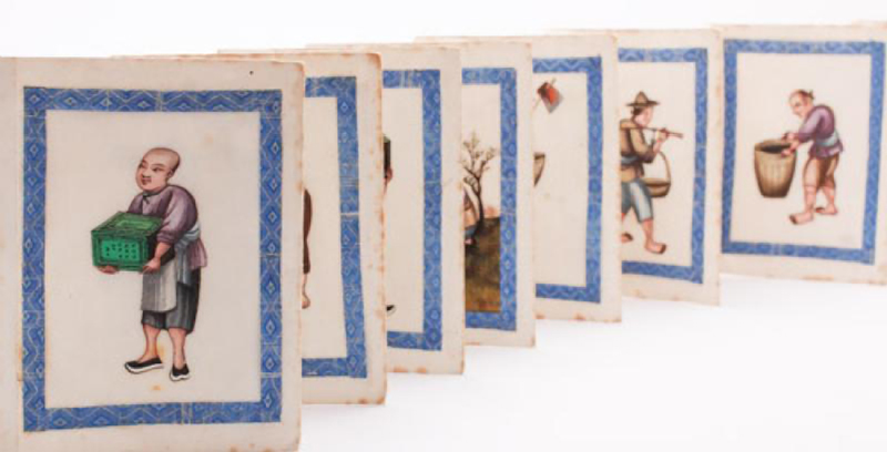
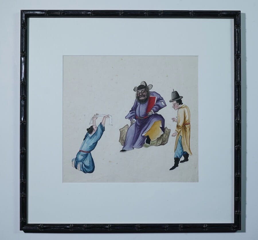
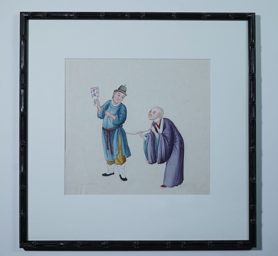
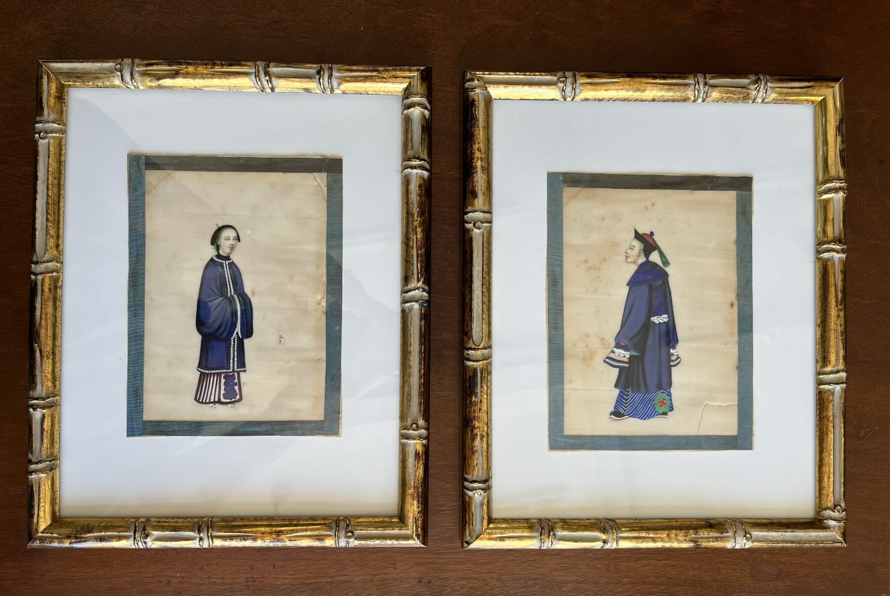
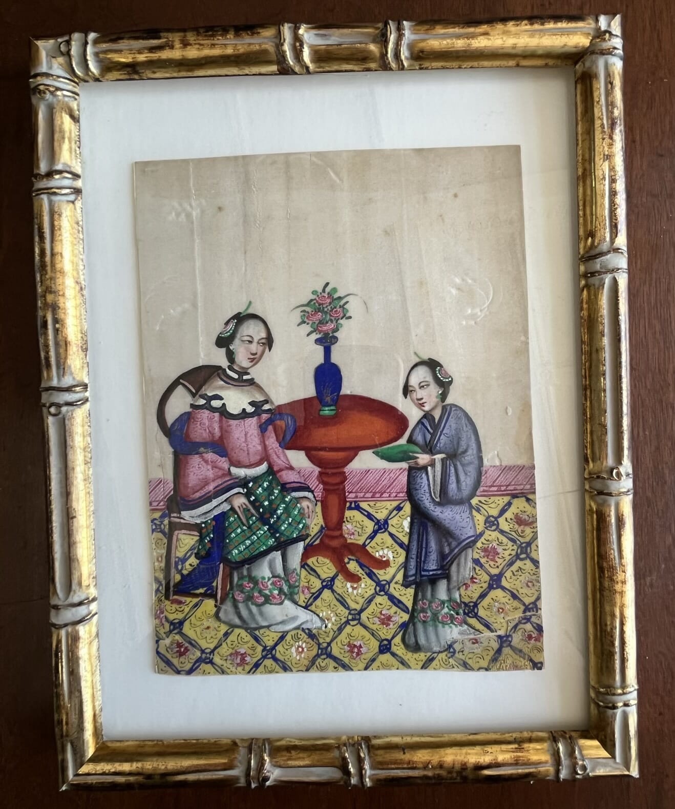
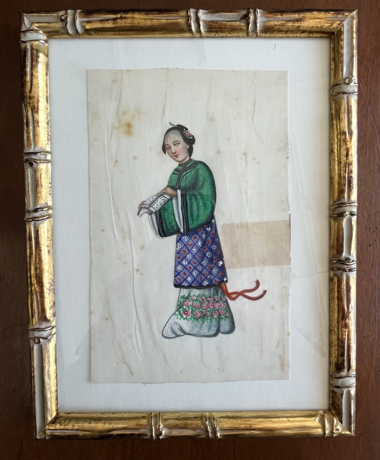
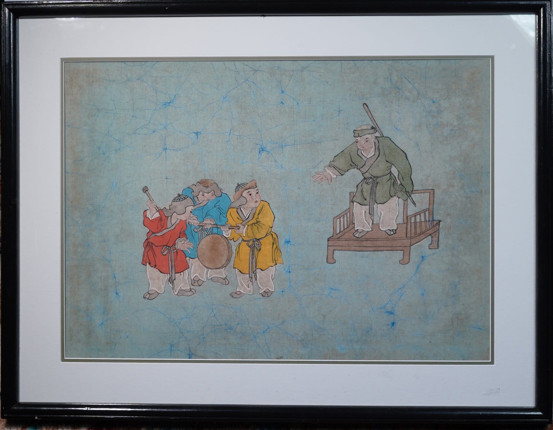
A remarkable folio of 200 year-old Chinese paintings recently came to Moorabool. They are large-scale examples of the ‘China Trade’ paintings, usually seen on a smaller scale on ‘Pith-paper’. These are on a thicker paper, using Mulberry bark as the basis, hence known as ‘Mulberry Paper’. They were popular with the European traders who came to Canton to buy Tea, Silk, Porcelain, and exotic Eastern produce. Rare early examples can be the mid-18th century, but they became very popular by around 1800 as trade flourished. Their subject matter reflects this intention as a ‘souvenir album’ – the distant ancestors of the postcard folio of the modern tourist.
‘The Story of Tea’, small folio, ex-Moorabool Antiques
One theme was ‘The Story of Tea’, showing the process it went through from the bush to the tea chest- appropriate considering the intended customer, visiting European merchants. Another rarer series follows the manufacture of Porcelain.
By far the most popular subjects were the everyday people that visitors would have seen on the streets – the umbrella mender, the fish sellers, the hat maker. Crime & punishment folios featured many macabre details not suitable for children… Others have children playing with toys, the dress of the wealthy & court, and the bright & lively processions for various holidays and celebrations.
Camellia Sensis, tea plant, Chinese Export pith painting, Moorabool Antiques
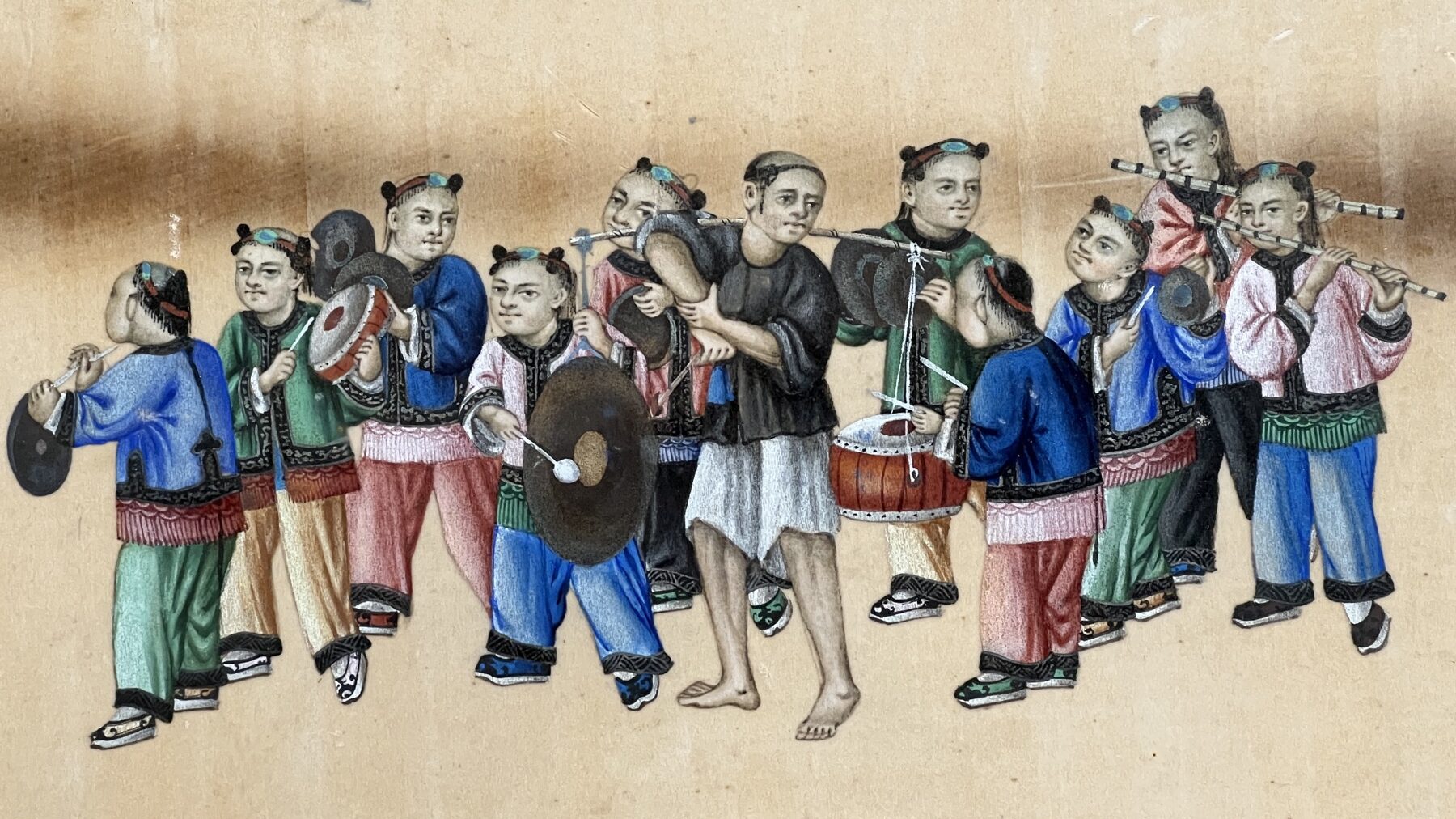
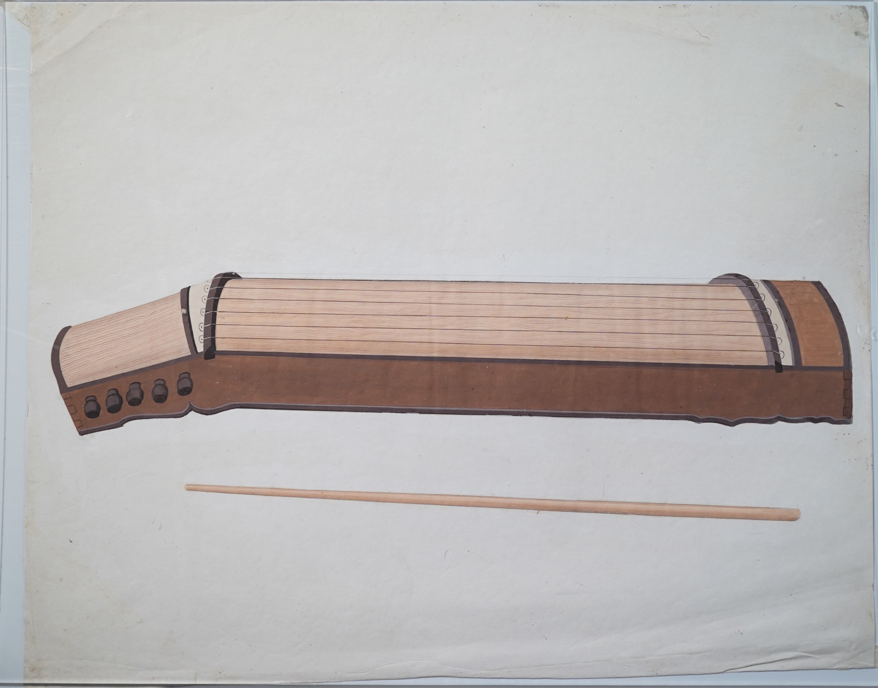
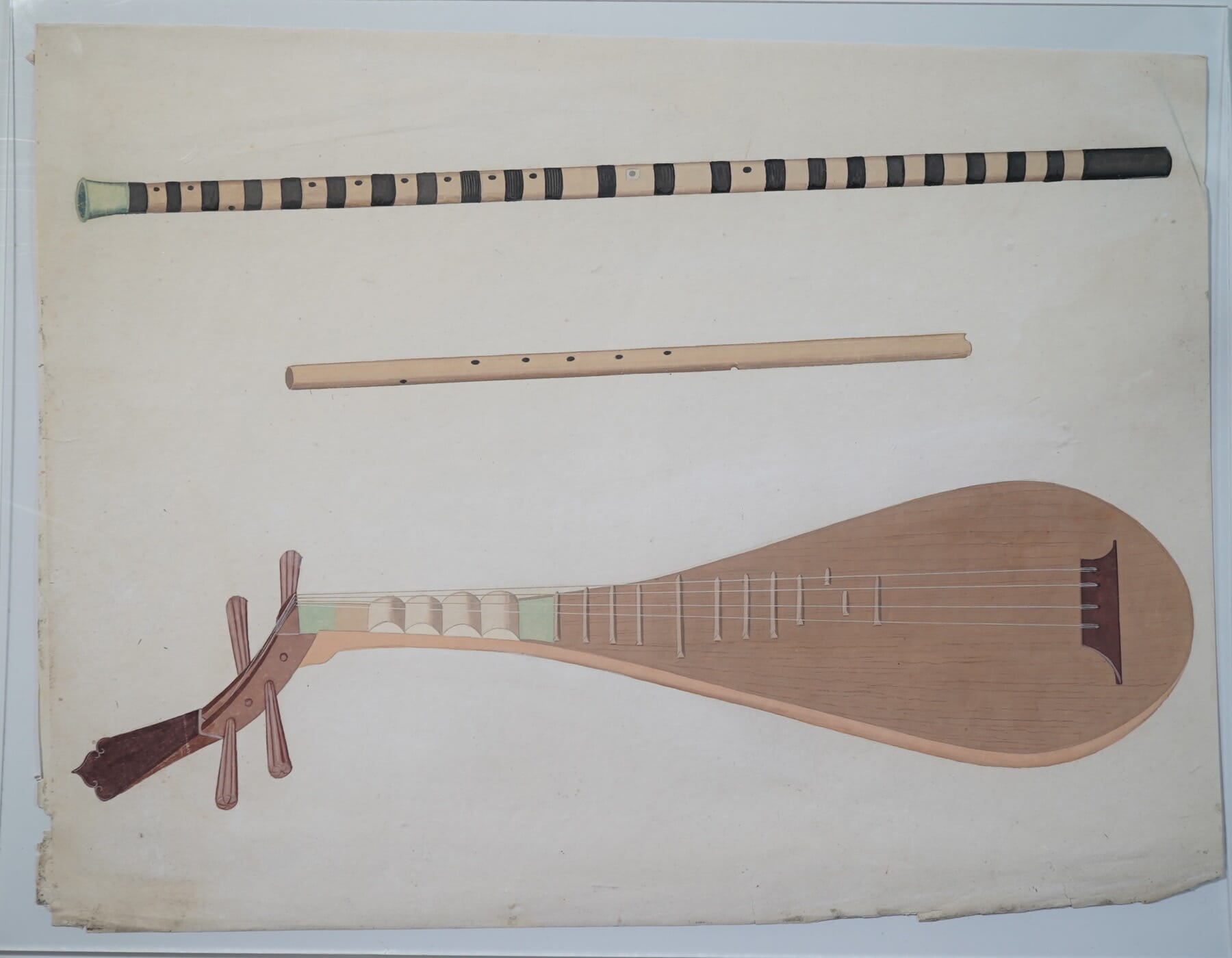
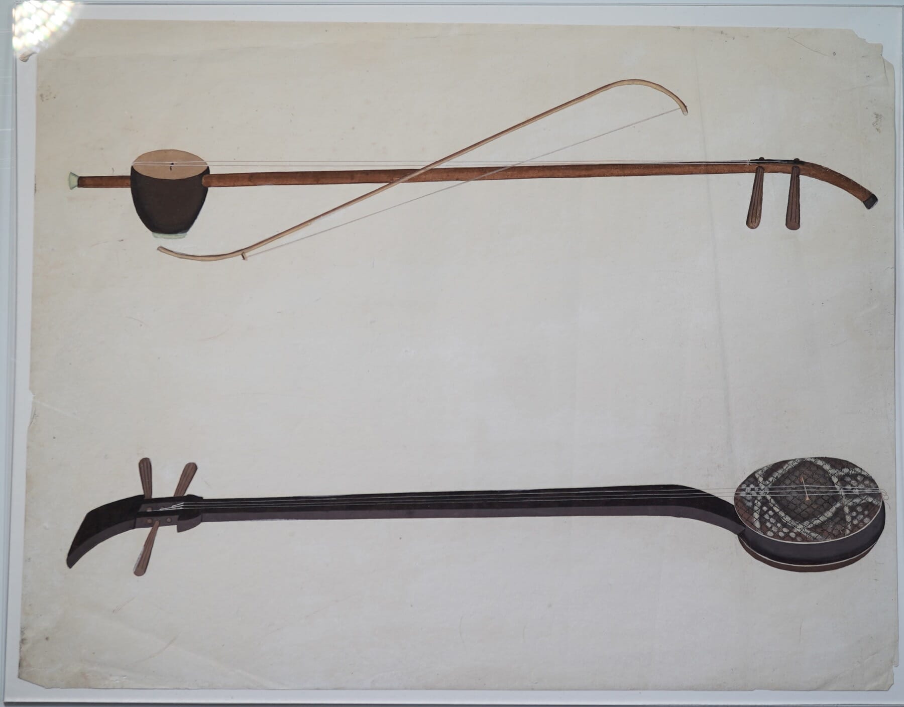
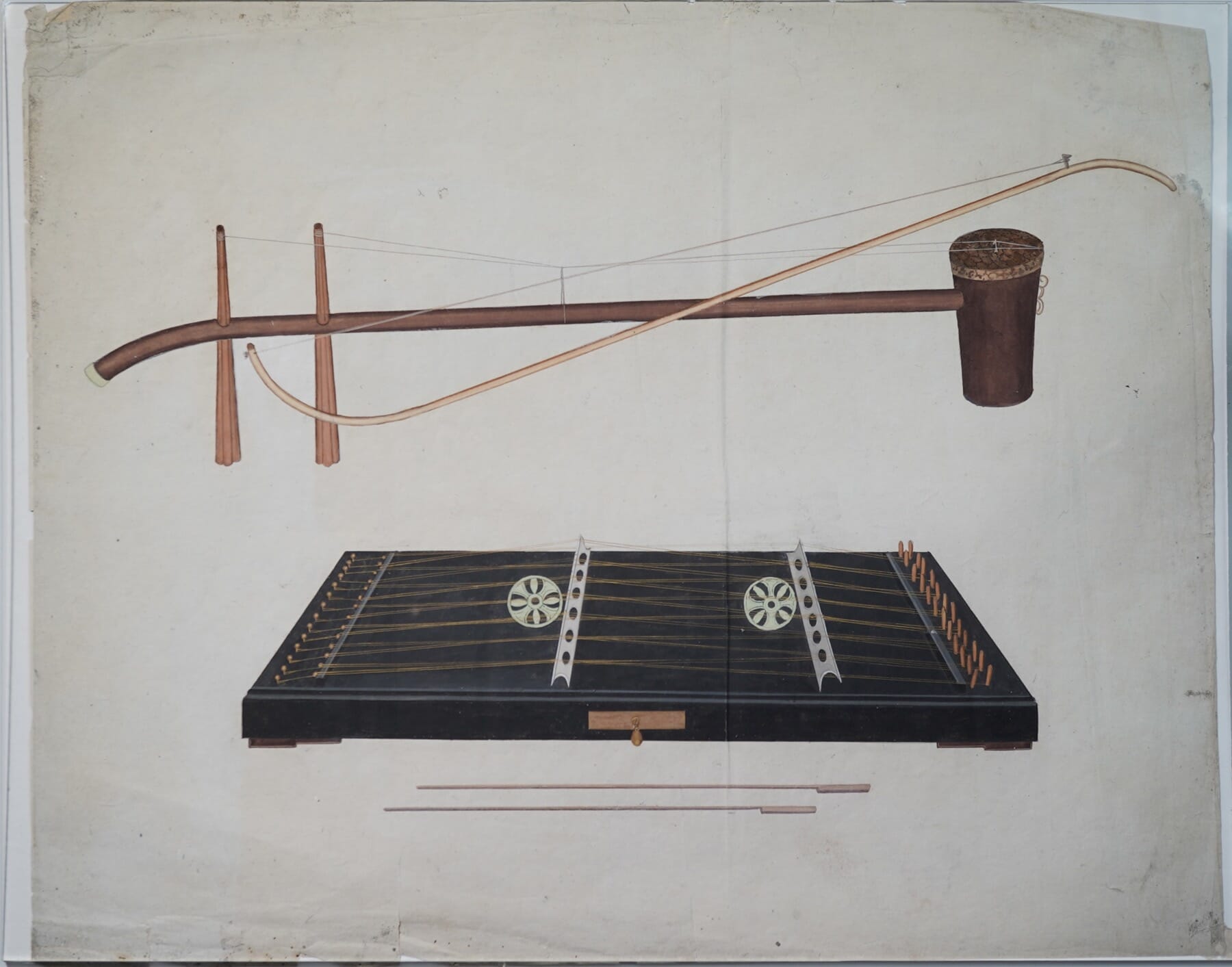
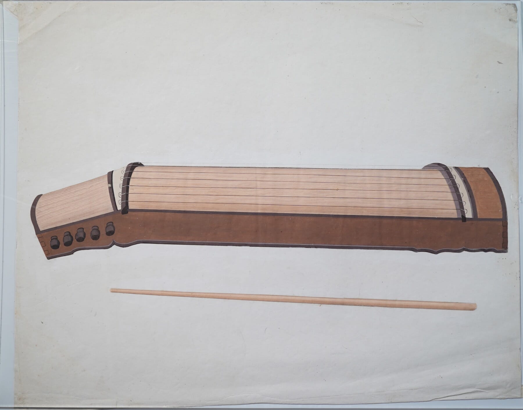
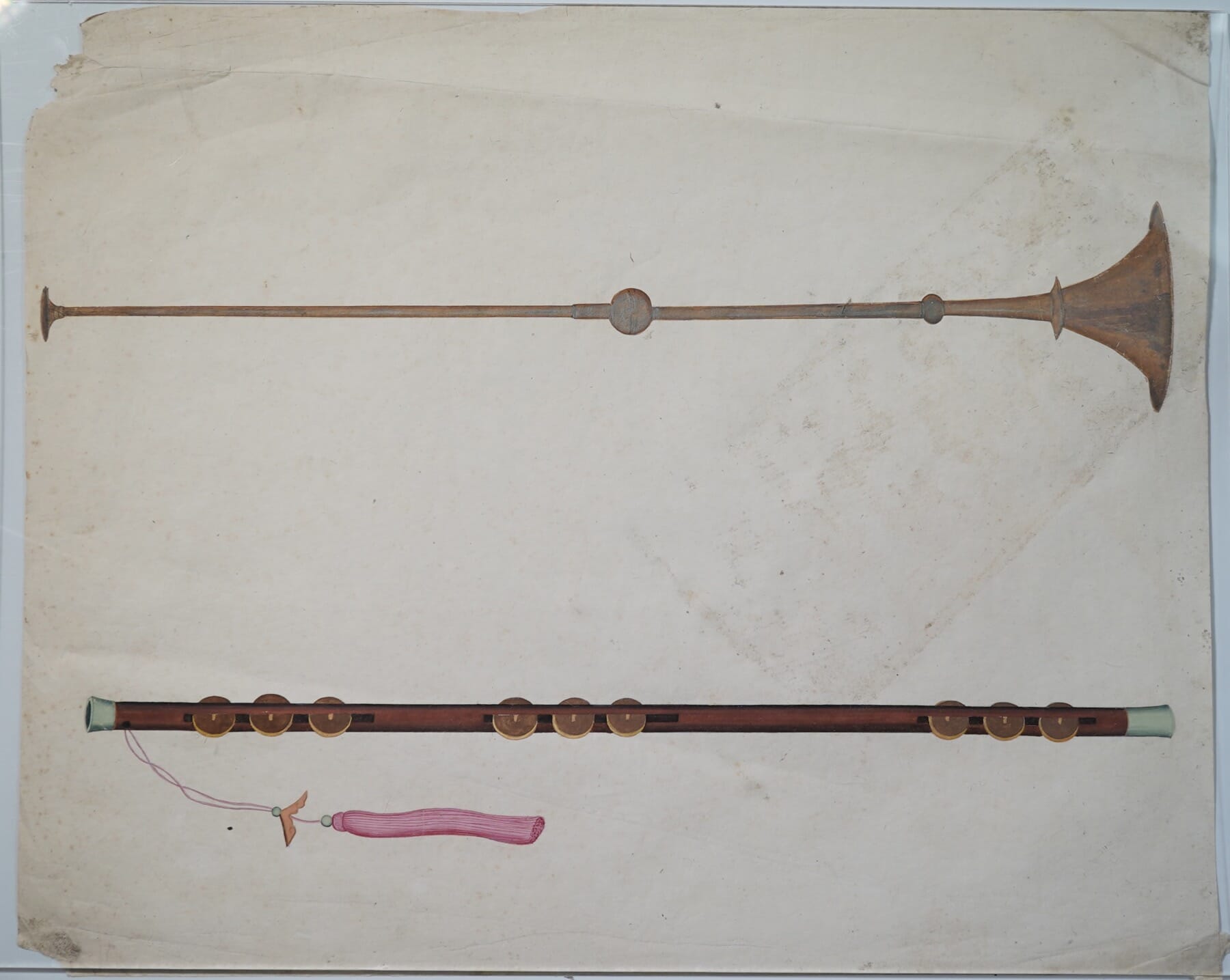
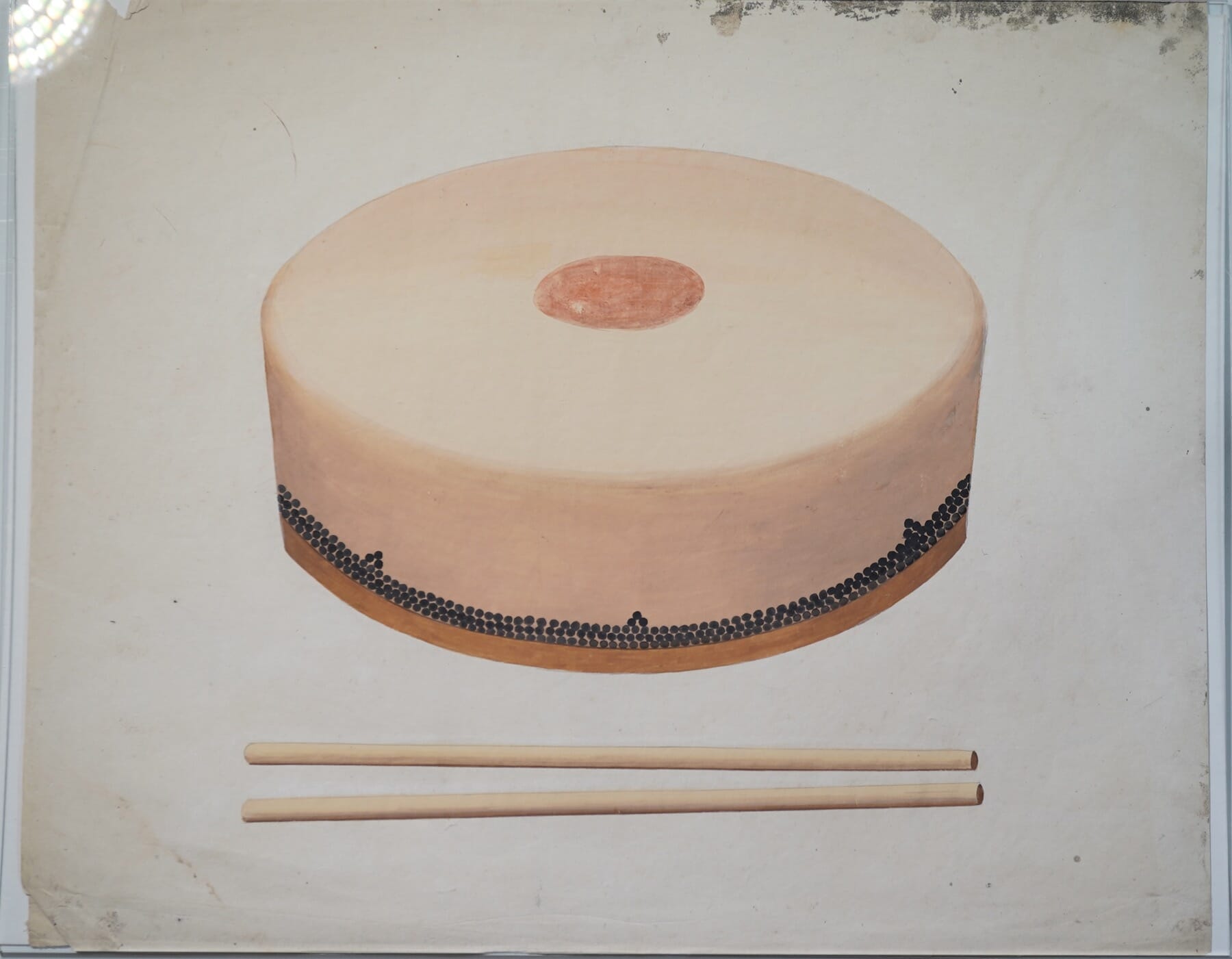
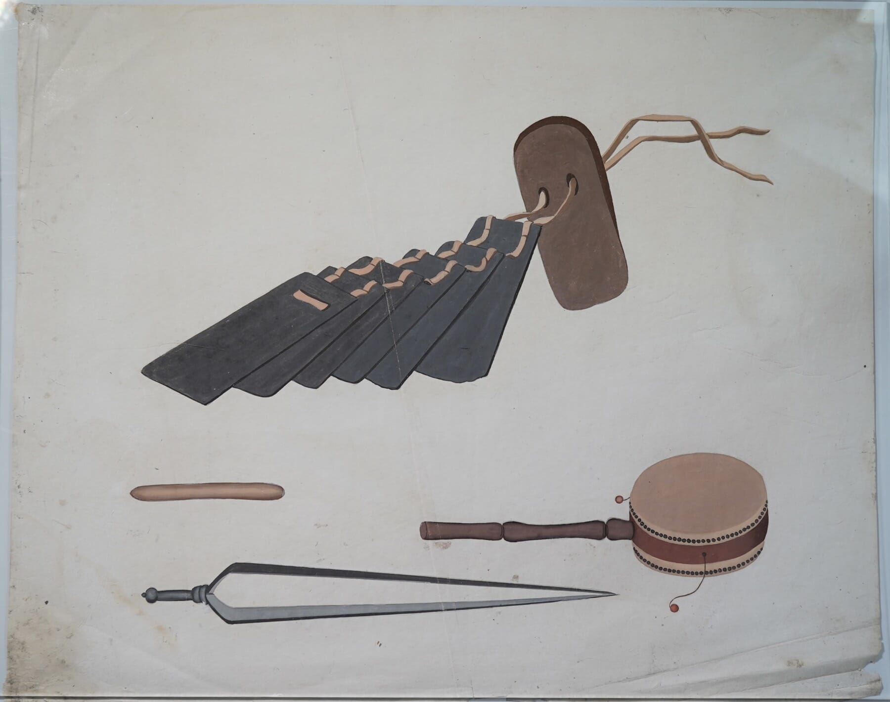
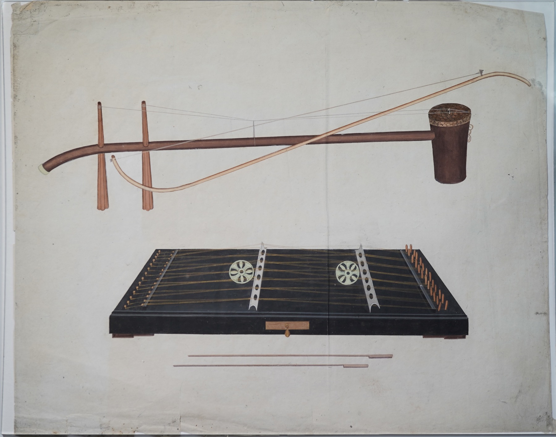
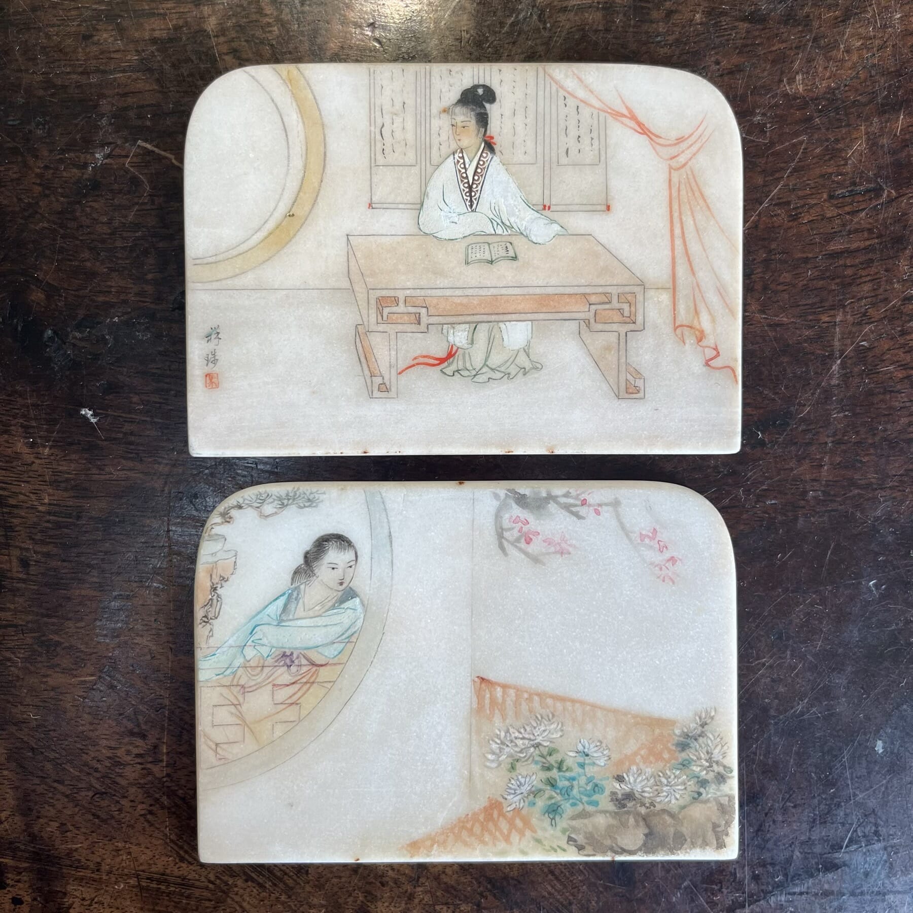
A third group served as a ‘Visual Encyclopaedia’ – with subjects such as flower specimens, birds & fish specimens, ship types, and even ’Antiques’. This album we are showing here belongs to this group, a Musical Instrument ‘visual guide’.
Occasionally there are small-scale pith paintings of Chinese musicians playing the various instruments – but it seems these depictions of instruments on this album are quite rare. No comparable example could be found.
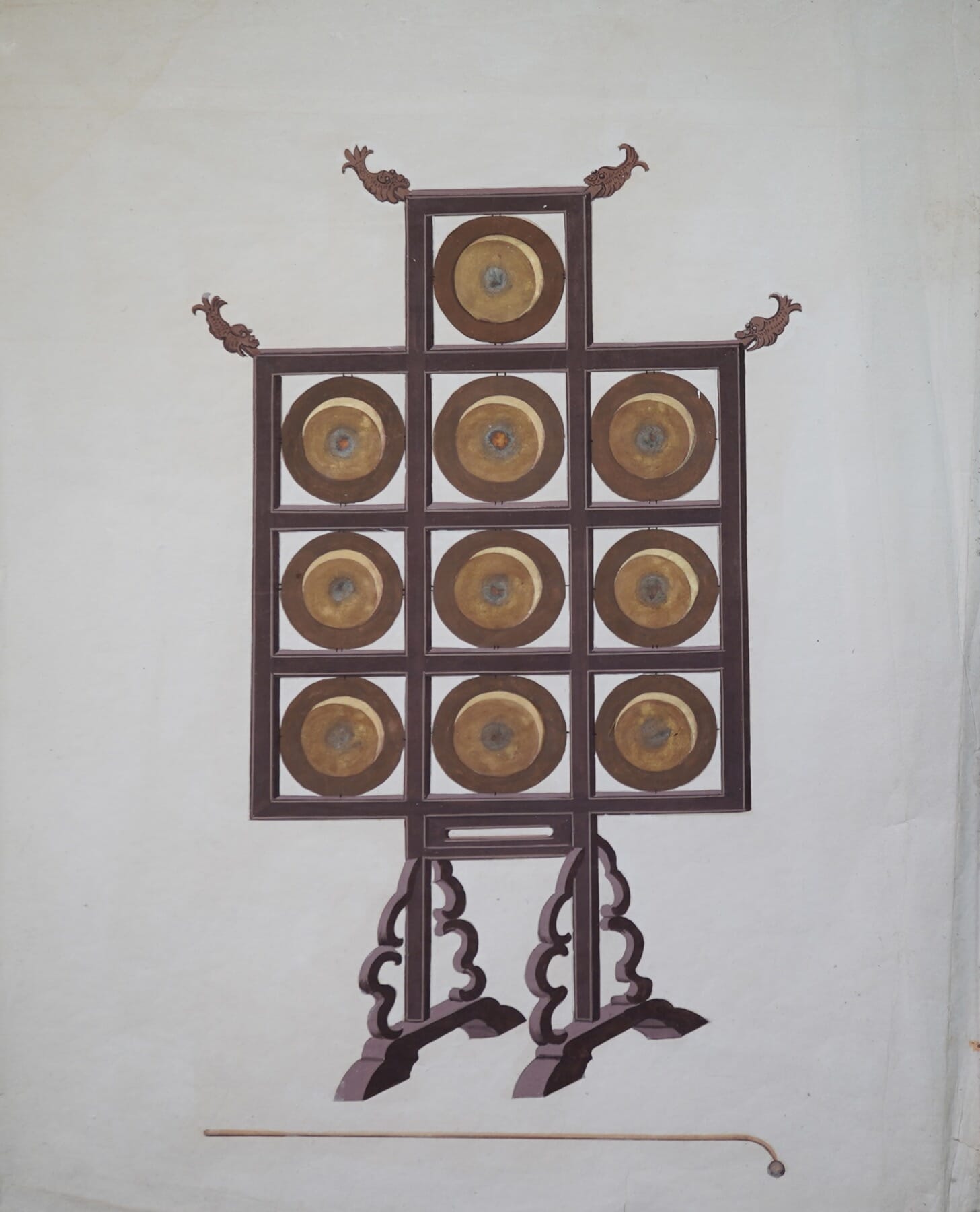
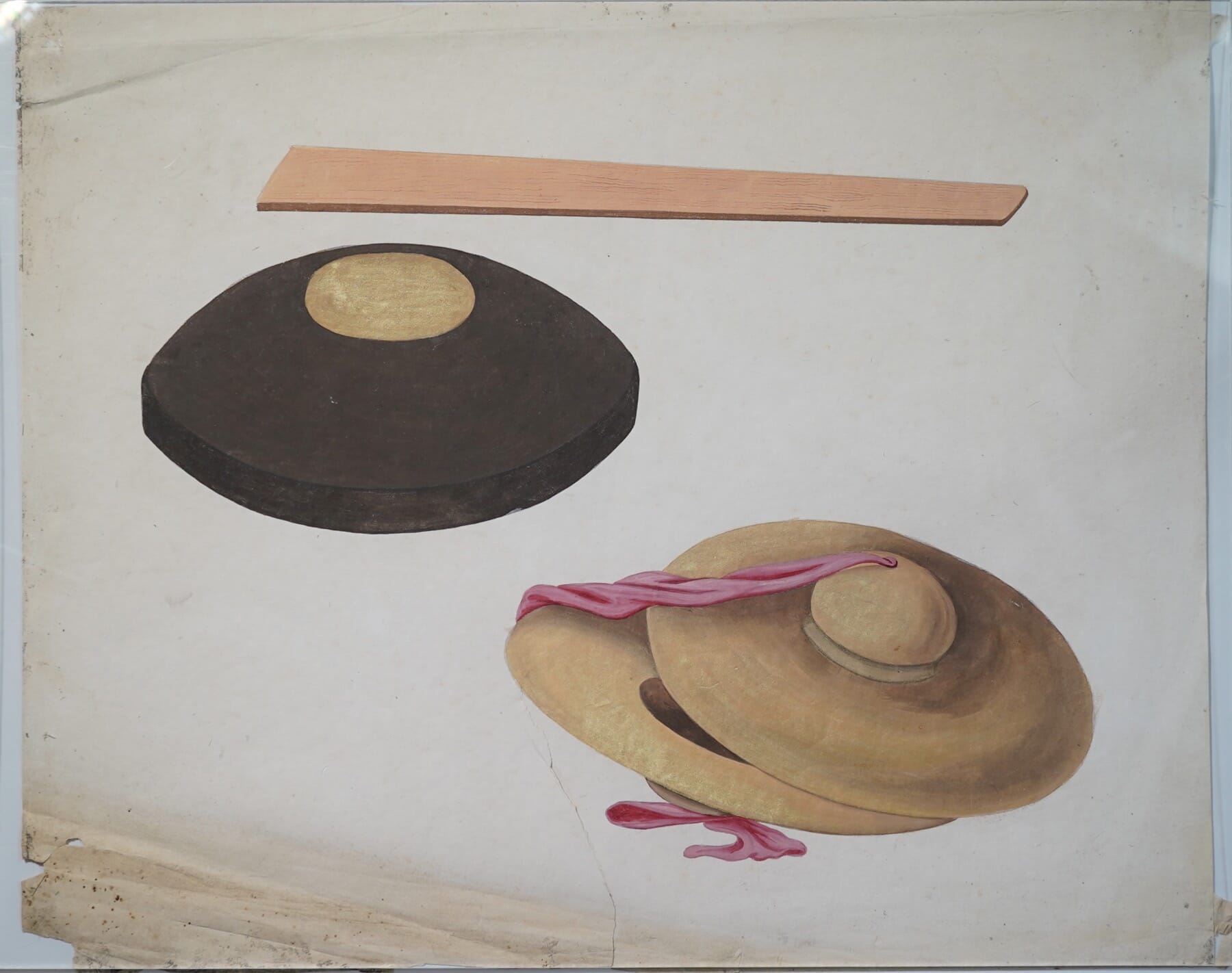
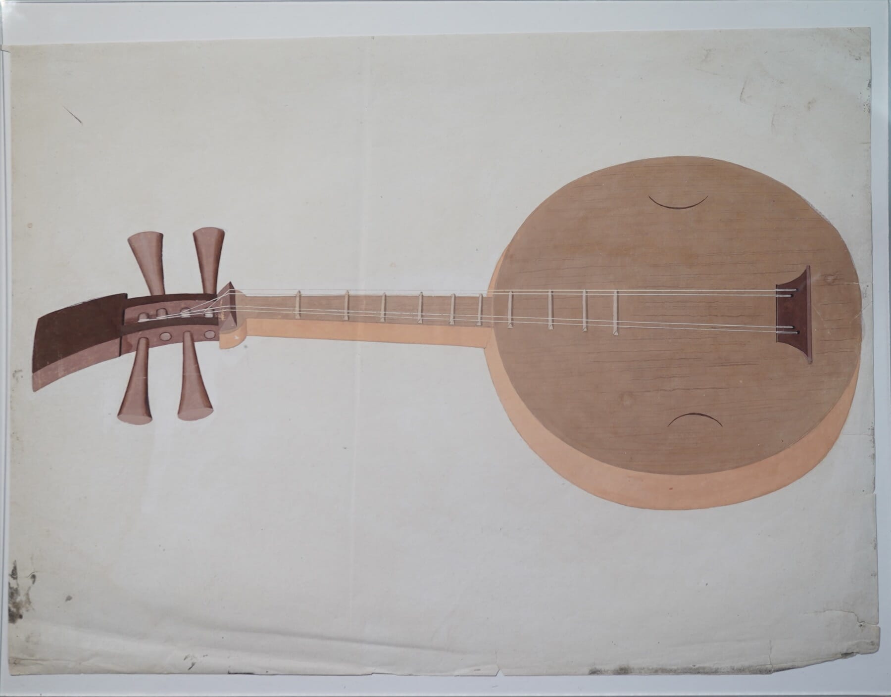
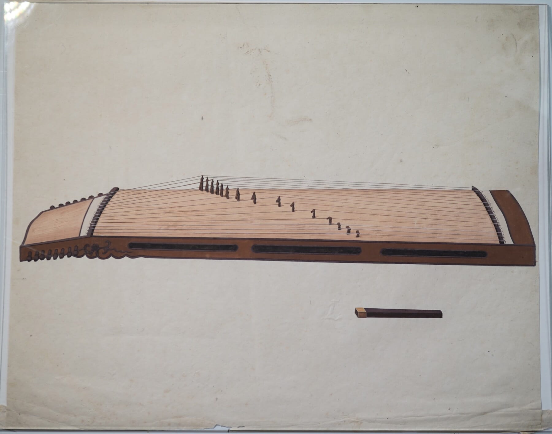
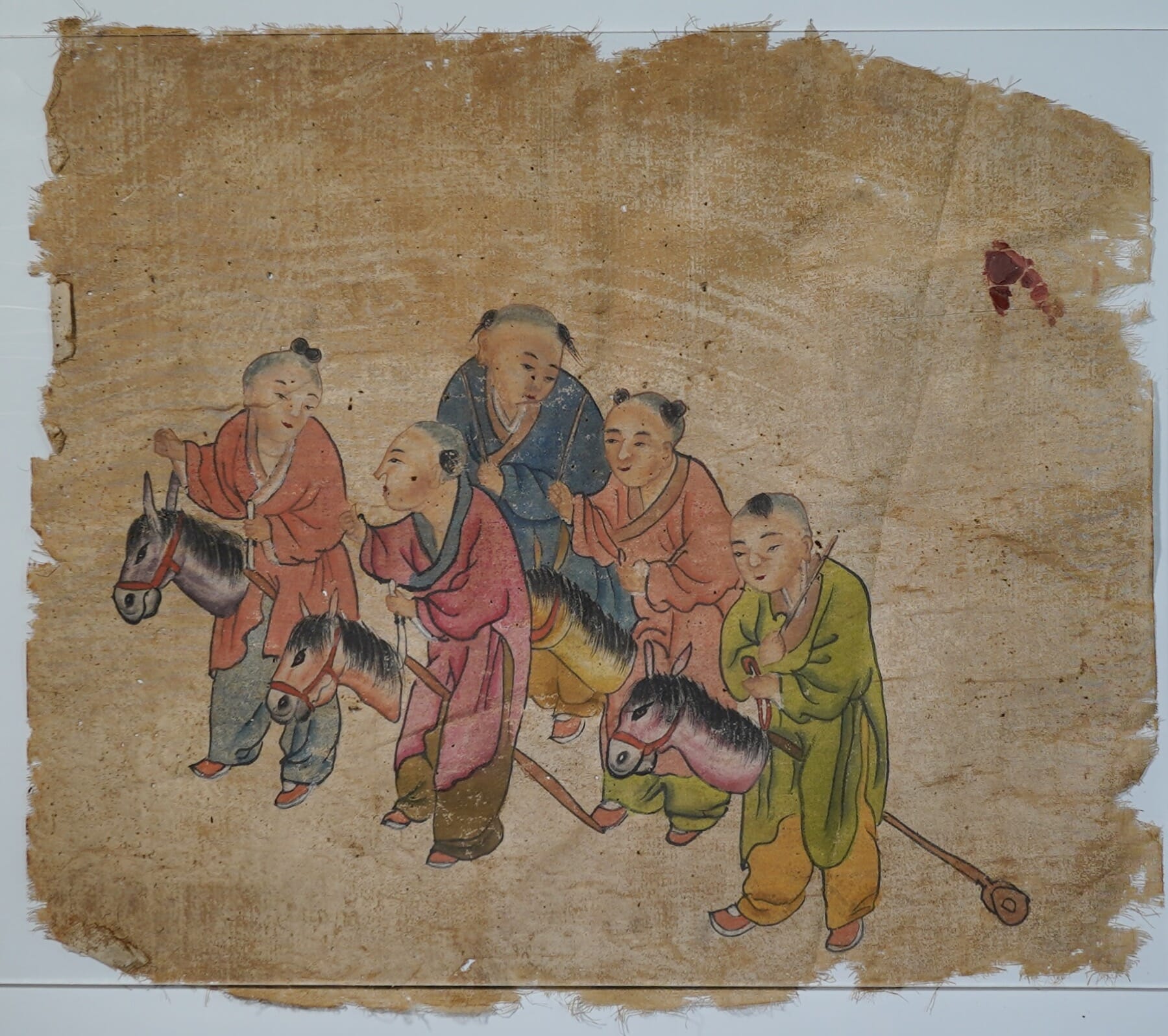
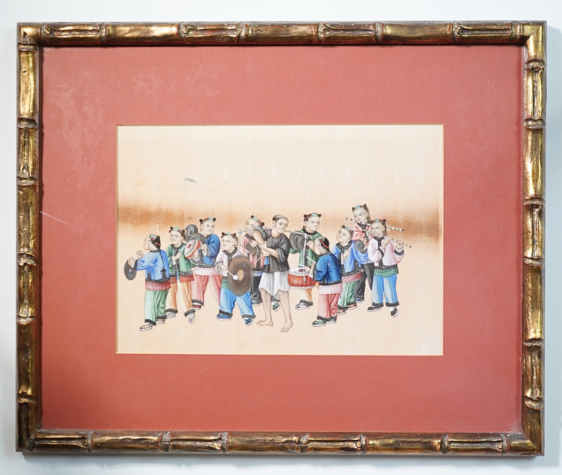
Chinese Pith Painting – a Musical Procession, c. 1830-50 Moorabool Antiques
They represent a large number of Chinese musical instruments, as were used in the early 19th century when they were painted. As a folio, they were a document of the types of Chinese traditional instruments, which brings to mind it’s purpose: to the Westerners who were often the clients for the China-Trade paintings, they were curios; to the Chinese, they would be a fine reference folio for the musically minded – a tutor to a prince, perhaps?
Ready to play….. a finely detailed Chinese Qing Dynasty Musical Instrument Painting depicting a ‘Qin’ harp, circa 1800- 1830
A total of 20 instruments are depicted, some single, several double, and two triple.
These works are for sale individually, or talk to us if you are interested in the complete group, or part thereof. Individual prices – $750 each, all 11 total price $7,000
Moorabool’s Guarantee: All items offered are as described regarding date, condition, and description.
We offer a money-back guarantee, for any return within reasonable time, excluding postage.
Buy with confidence!
POSTAGE
Getting your goods need not be expensive!
We make sure Postage is as affordable as possible – our experienced in-house team can ship safely anywhere in the world, for the best possible price.
Ask for a quote…
Use the ‘Compare Products’ below to keep track of items of interest.